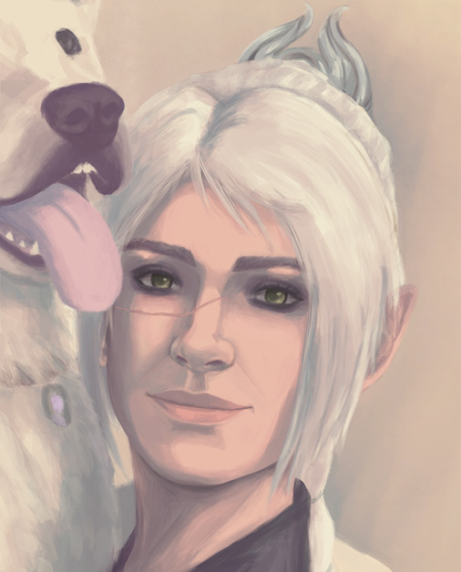
#messing around with my art style and multiply layers
Explore tagged Tumblr posts
Note
Your art is jaw-droppingly stunning. Can I ask, how do you render things so beautifully? Can you give any tips? Especially with colored lineart.
Aww thank you so much, that's so sweet of you to say. <:3
I don't think I can give much advice on rendering; I've always been highly dependent on line-art to portray form and any attempt at lighting more complex than "shade with one layer of a desaturated color on multiply" frightens me.
BUT I can share what I do with line coloring!

This is a drawing I've done both with and without the coloring on the lines, to show the difference it makes.
In general, the color of the lines is just a darker shade of the color surrounding it. The more defined I want a feature, the darker the hue.
The interior lines, everything that goes on inside the outermost line-art, is where I put most of my attention. I separate the lines into tiers of importance and color accordingly, with the most important things getting darker (and often thicker) line-art.

Here's a cropped image of Ambroys holding a very expensive future murder weapon to try and show what I mean. The big circles are the base color of his dumb face and ludicrous glove, and the smaller circles are the color of the line-art for each of his features.
The hierarchy tends to go like this:
Important Features: eyes, mouths, hands, forearms, anything that I want to be emphasized or needs to be very clear, etc. gets dark line-art. This separates these features from the rest of the image and makes them pop.
Secondary Forms: joints, noses, the edge of bangs over the face, the lines between fingers, big wrinkles on evil old bastards, cravats etc. get medium line-art. These forms are meant to be distinct from what surrounds them (fingers shouldn't look melted together, the hair is not part of the forehead) but giving them dark line-art would draw attention from the important parts (for example, Ambroys' punchable grin), so they get slightly darker line-art to make the forms clear but not distracting.
Fiddly Little Details: fabric folds, flesh creases, strands of hair, seams in clothing, etc. These add texture, but I don't want them to be making everything look like a mess of scribbles. So these have light line-art, relative to the base color, to allow them to blend more than the important features.
Sometimes I'll make the line color more saturated or a slightly different hue (cooler or warmer), but it depends on the image and how much skill I randomly roll in color usage that day. It just looks more interesting than just going over the lines with a low-opacity brush of the base color.
When it comes to the exterior lines, I have two approaches. If I want a form to be bolder or stand out I tend to leave the outside lines around the form black or a very dark color. If I want something to look softer or blend into the surrounding image, or want the form to appear to glow, I color the outside lines closer to what colors surround the form or a brighter, paler color.

For example, all the characters here have nearly black exterior line-art. The background objects all have pale line-art, so they don't overwhelm the characters. Even objects in the mid-ground have slightly lighter line-art than the figures so that the eye is (hopefully) drawn to the characters instead of my labored attempt at drawing a cash register.

Or here, the parts of Ambroys that are en flambé have orange-red exterior line-art, while everything else has dark exterior line-art.
Like most things with my art, it's not hard to do, it just takes a long time. :P
And of course, this isn't the "right" way to color line-art! My art style is pretty cartoony, heavy on line-art and low on shading and very focused on silly characters making silly faces. A softer, more realistic, more rendered style, or one that is more graphic and focuses more on silhouette, would likely require a different approach. But regardless, I hope this ramble is helpful!
#asks#i never feel quite qualified to give art advice... but this is less advice and more just my personal approach#it could use tweaking and refining i'm sure!#but anyway super flattered by this ask thank you anon!#chocodile did the heavy lift with the lineart color on that ambroys on fire pic but i liked that pic better than others i had with glow#thanks chocodile for being better at color than me!
133 notes
·
View notes
Note
Hello! Sorry to bother but do you have any digital art tips? I’m quite new to it and any tips, tricks or advice would be helpful! Your coloring style is very beautiful and I love it a lot!
thank you! 💚💚💚 sorry this is a bit late, hopefully there's still something helpful in it!
(also, it got pretty long, sorry!)
I think the biggest thing is to just take things slow -- digital art feels different than drawing traditionally, and it's SUPER easy to get overwhelmed by the billions of cool features that the digital world offers. (I say, as someone who spends a lot of time downloading cool brushes and textures...and then never using them ever.) there is a ton of really cool stuff you can do digitally, but because there's so much, I think it's really important to take time to figure out what is and isn't working for you. spend some time doodling without any intent to do a finished piece, figure out how you like to hold (or not hold) your tablet, what keyboard shortcuts you end up using a lot (and therefore might want to map to your pen/tablet buttons for quicker use)...that kind of thing!
everyone's workflow and preferred program and style are different, so it's hard to give hard-and-fast general advice. but the things that I think of as the essentials for learning digital art programs, and what I think of as a good order to focus on learning them in (although YMMV, especially depending on what kind of art you're doing):
brush customization (e.g. flow, opacity, softness)
layers and layer masks
selections and transformations (e.g. scale, rotate, flip horizontal/vertical, skew) (skew is underrated and I will die on that hill)
blending modes (e.g. multiply, screen)
adjustments/adjustment layers (e.g. hue/saturation, curves)
and I think most stuff after that is gravy! often very good gravy though! but yeah, as overall advice I recommend just taking things one little bit at a time, spending some time just drawing and messing around with each feature and what you can do with it. whether or not you end up incorporating any of it into your workflow, it's always good to try things out and just see how they feel! :D
and just so there is at least a little more concrete helpfulness in here, here's a few more specific things that I think are super important to keep in mind!
use! your! tablet/pen buttons! I mentioned this earlier, but they are extremely useful for keyboard shortcuts that you use often! most programs will also let you create new shortcuts for other things -- personally, I use the magic wand tool to fill in big color blocks a lot, so I made shortcuts for 'expand selection' and 'fill' and then mapped them to my tablet buttons.
flop your work horizontally often! when you're working on something, you get used to the way it looks, so seeing it mirrored is a quick way to see it with fresh eyes! in my experience, it often feels like this:
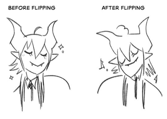
(a common thing is to find that everything is sort of 'leaning' too much one way, which is where skew really comes in handy!) (seriously, I love skew, it is my savior)

if you're working with color, keep a hue/saturation adjustment layer (or a layer filled with black or white and set to Color) on top and toggle it on occasionally to check your values! a lot of people who know a lot more about color than me (and are better at putting it into words) have written about why values are so important, so all I'll say is that the rule of thumb is that your image should still be readable in greyscale:

there are some exceptions and grey areas (do ho ho), but it's a good general rule to keep in mind! (some programs also have a colorblind mode, so you can check to see how your work will look to someone with colorblindness!)
and finally, here's some digital art programs I recommend, if you're still looking for a good one!
free: krita, FireAlpaca
paid: ClipStudio, Procreate (iOS/iPad only)
#art#...sort of#horizontally flipped mal isn't my favorite drawing i've ever done of him#but it's up there#anyway i do personally use photoshop#but i absolutely do not recommend it when there are better and free-er art programs out there#it is the equivalent of texting with a giant 90s-block phone that has been jury-rigged to somehow install whatsapp#because i don't NEED a new phone i KNOW how to use this one it's FINE#(oh god i've become my dad)#someday i will have to actually switch to clipstudio and learn new keyboard shortcuts :(
409 notes
·
View notes
Note
do you have any tips for drawing dynamic poses? i always love the way you draw bodies!!
i know this has been said a million times but the way i draw bodies significantly improved after i started drawing more frequently from reference. if i cant find a reference for a pose on the internet, i'll just use myself or a friend. i spend an unfortunate amount of time just standing in front of my mirror looking at my own joints. pay attention to where your body curves!!
other than that though—honestly my anatomy/pose knowledge is a whack amalgamation of art tips i've accumulated over the years (i miss old school deviantart/tumblr style art tutorials). i also like to look at how artists i admire draw bodies—what details to they include, what anatomical short-hands etc
i think i'm still figuring out how to draw dynamic poses, but here are some cheats i've picked up (under the cut coz this got long again):
gonna use this stray!tim as a base
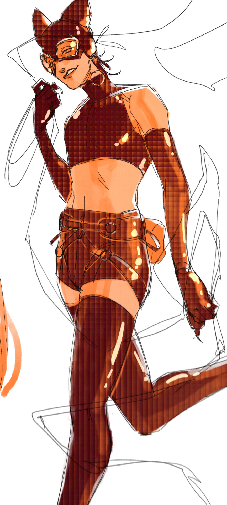
the easiest way for make up a pose is to start roughly with the head, collarbones, ribcage, and pelvis — you can build everything from there
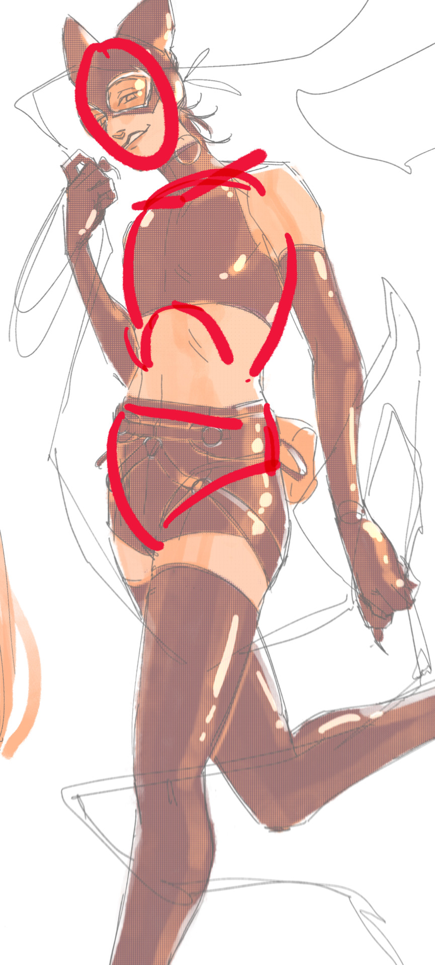
here's a couple more of what i mean by the ribcage-pelvis deconstruction:
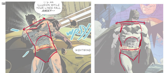
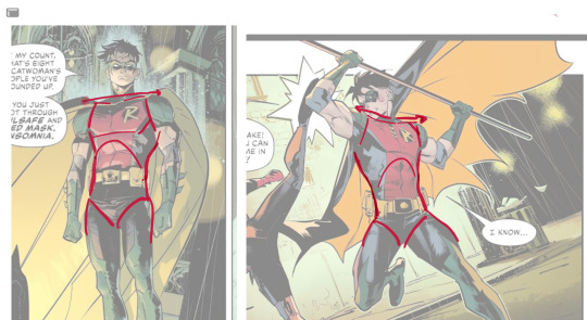
2. push your perspective a little!! imo things look more dynamic if you move your sight-line up or down—the horizontal orange line here. if you look at the panels above, the sight lines tend to be a little low, at around the character's torso or waist. i did the same below with stray!tim
to do this i usually try to get a sense of the space im working in by putting in some sloppy perspective grids
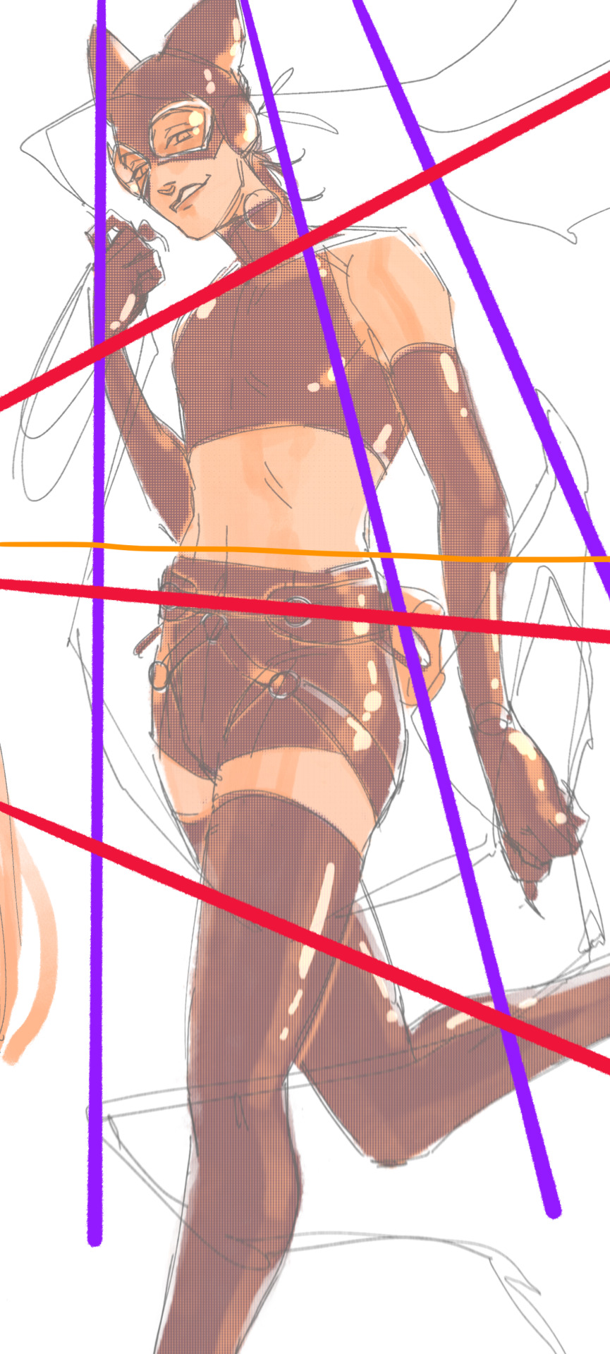
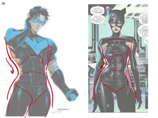
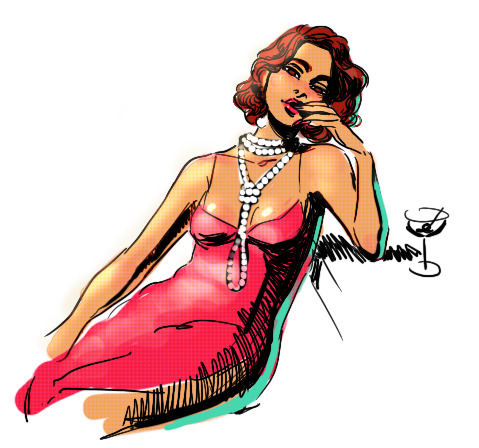
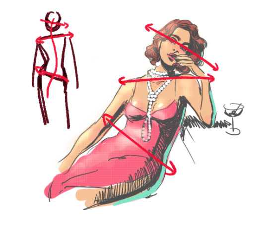
3. S curves!!! exaggerate the lines of the body. the body naturally has parallel horizontal lines—an easy way to get a body to look less rigid is to tilt those horizontal lines which in turn curves the vertical line of the body
this is what a mean by horizontal lines—usually i use the eyes, shoulders, and hips:
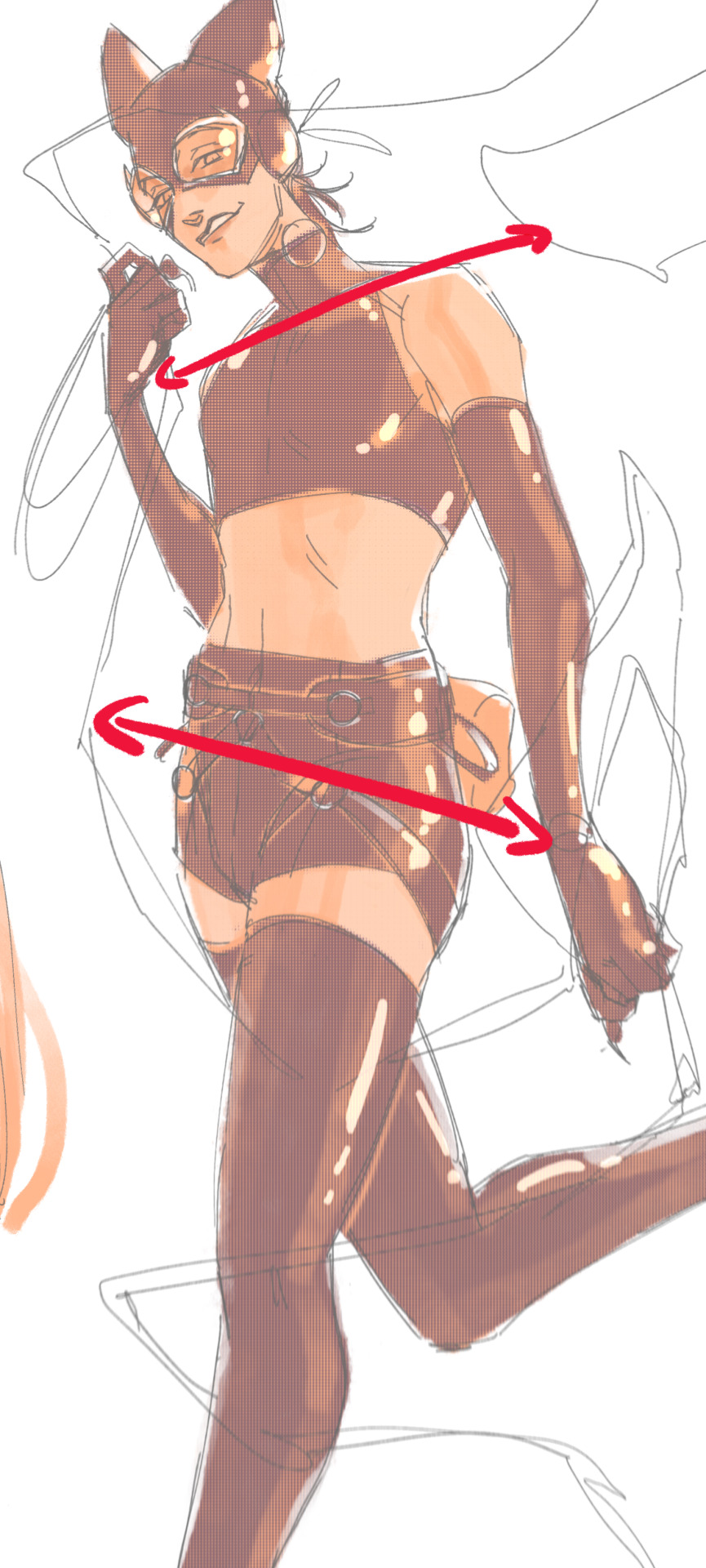
i'm gonna use caterina as a better example—usually you want the horizontal lines to sort of zigzag:
i've also picked up a couple visual tricks that don't exactly add dynamism to a pose? but they do give a static pose a little more oomph. a lot of this is done by visually highlighting one specific point of the body
for our purposes, i'm gonna make the focal point tim's face
motion blur! there are a couple ways to do this. i actually dont like working with traditional motion blur because you have to mess around with selections, so i usually fake motion blur using postional perspective blur:


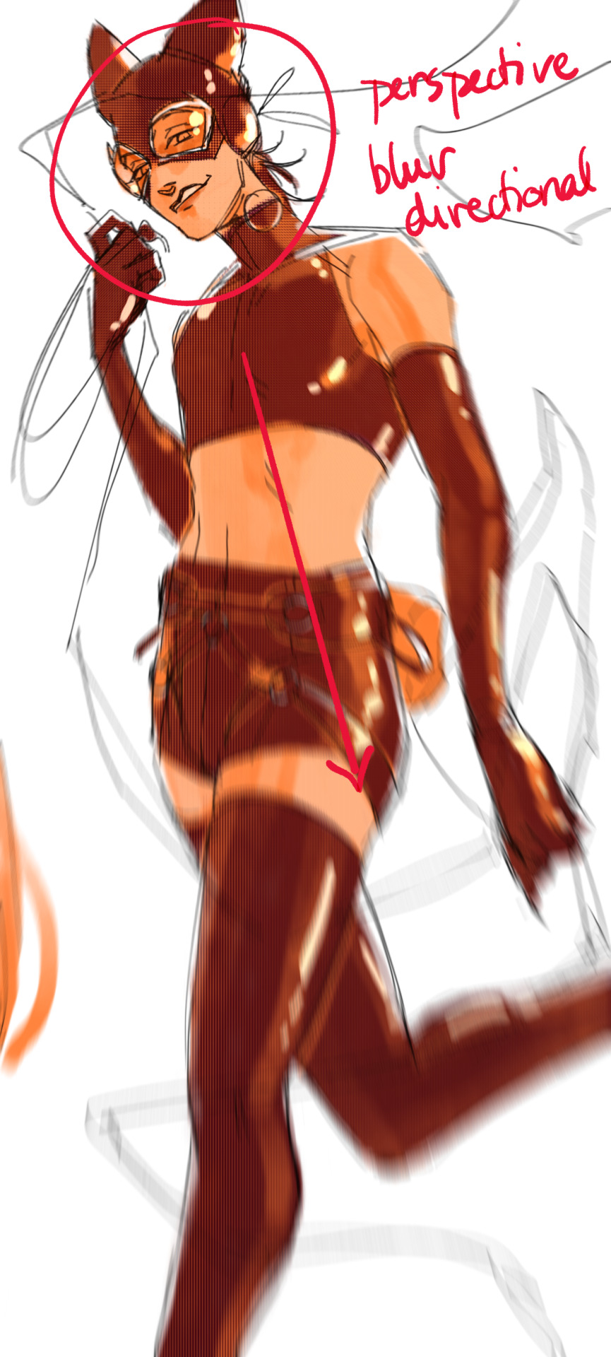
2. gradient lighting—you can add a lot of depth this way. usually i like setting the gradient in the direction of the focal point, e.g. tim's face
below, i added a layer above the base drawing, used an airbrush to get this gradient, and then set the layer to color burn and lowered the opacity. you can also clip the lighting layer to the base drawing and set it to multiply

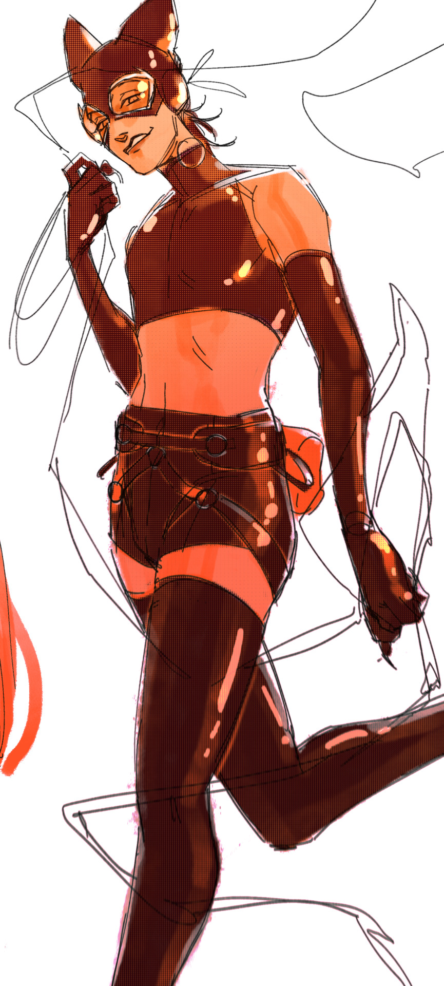
below, i did the opposite—instead of adding a gradient shadow, i added gradient light. i set the layer to add this time (instead of color burn) and then lowered the opacity again.
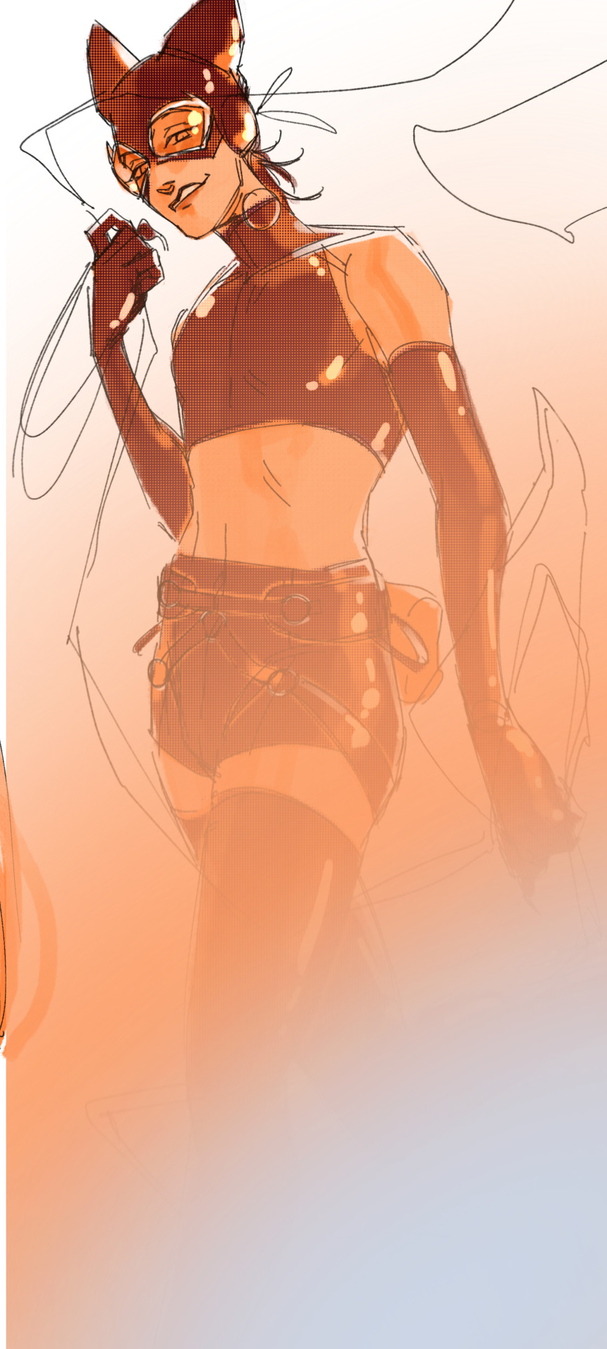
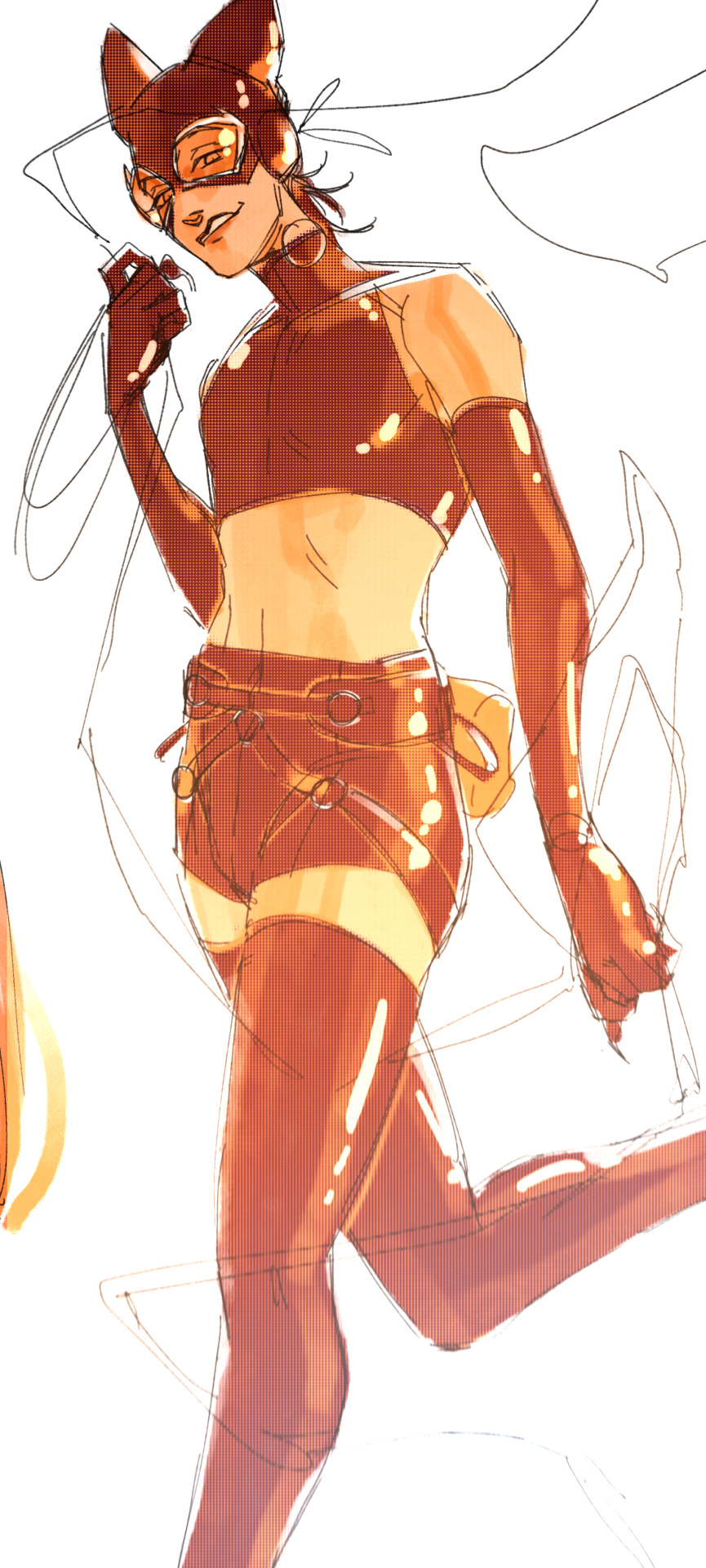
this kinda serves to desaturate the parts of the piece that are less important (ish i was kinda sloppy here), driving the eye to face—the most saturated. the motion blur does a similar thing, where the only thing "in focus" is tim's face
the gradient also sort of adds a directionality to the piece—it starts at the bottom right corner and goes up towards the upper left, causing your eye to follow that same path, which drags your gaze up tim's body
here's what it looks like when i combine 1 and 2:

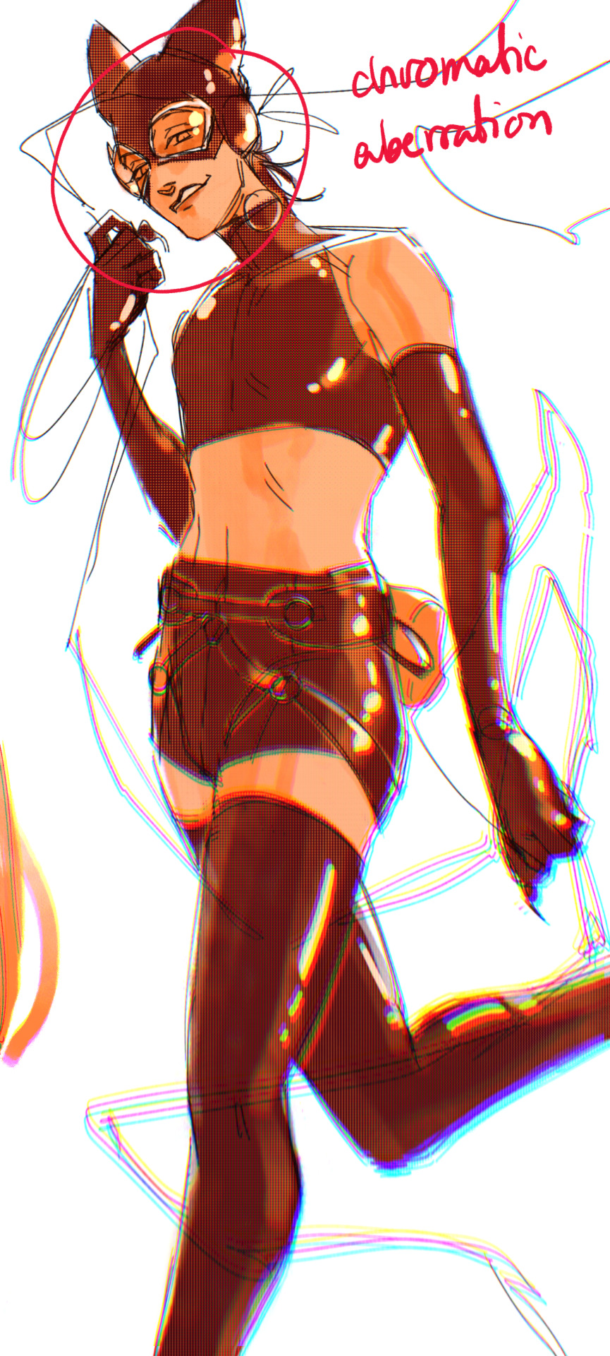
3. chromatic aberration's been pretty popular recently. it does a similar thing as perspective blur but with more eyestrain (although i went with a really exaggerated version below just to show you what it does) but it looks cool!
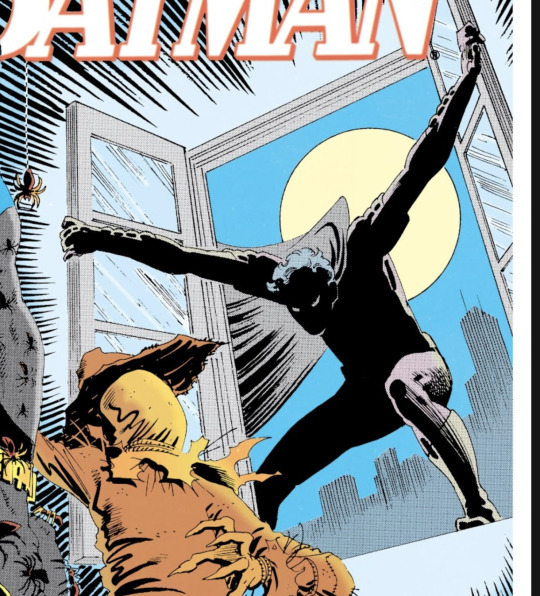
bonus cryptid tim as a reward for getting to the end :-)
#red talks#sart#art tutorial#YeAH UH this got long lmaooo i was on the bus for a Sec plotting this out so#also i am neck deep in a reincarnation/regression manhwa stress hyperfixation so i havent had the brain space to draw#so you get this instead!#if anyone wants recs lemme know lol#thank you anon :)))
68 notes
·
View notes
Note
Yo! Do you have any notes/tips for your coloring process? I've always had trouble with that part of drawings looking good lmao and I really like yours! If not for your specific style, do you have any tips with that in general?
Iv gotten a few asks about how I color but iv always avoided answering because
A) I am absolutely awful at explaining things, and
B) I am a very Very lazy artist you should probably Not do the things that I do
BUT i feel bad gatekeeping(?) my horrible technique if it helps anybody ig ill try and explain so
✨✨✨Welcome to Reegis’ Probably Not Reputable (But Very Long Winded) Art Advice✨✨✨✨


line art of a random character for the example, just pic whatever colors you have in mind for your base colors, you can try using palette generators or basing it off of existing palettes/characters/whatever I have absolutely no idea how color theory works (& this is why you shouldnt listen to me) so im solely going off of vibes. but it is Rough so onto step 2 & 3
(edit to add i usually start off with the skin hair & clothes on separate clipping layers and merge them together towards the end.. i think i forgot to say that at all here oops)
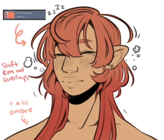

I abuse the hellll out of layer blending modes. overlay, saturation & multiply mainly, but also difference, brightness & screen. (just doodle something & try all of em out to get a feel for them honestly ik theres a Lot and they can be intimidating) for this i just wanted a more cohesive warmer tone to start with so i added a peachy overlay & a slight ombré to the hair to add a bit more interest to the character.
then just the most basic of rendering, some blush & highlights just wherever i think theyd go.


Another thing they tell you Not to do, my next step is to block out all my shading in a vaguely purpleish multiply layer!!! i cant be assed to do it any other way im sorry…. once i have the basic shading down, i lock the layer & go in with air brush eraser & also airbrush in other colors wherever I think the purple is maybe too harsh/clashing
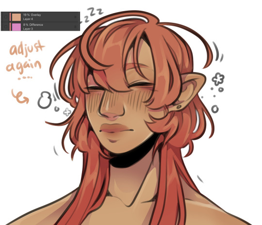
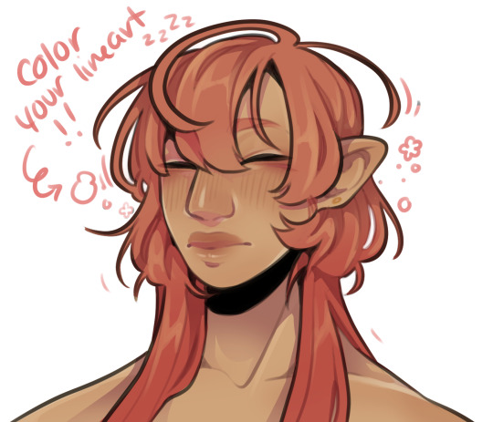
still wasnt 100% happy with the colors so messed around with some more layer filter/modes/whatever you call them then colored in my line art! i think this is honestly the saving grace for all of my art shshsdhhf color your lines people. doesnt have to be all (i dont, i like the contrast) but it usually helps to make some at least a little less harsh
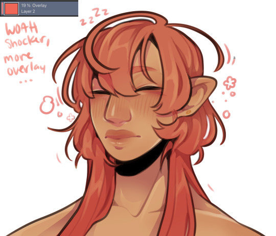
then with a little more color tweaking im done! one random sleepy dude, fully colored (by my standards)
and then if a piece needs more dramatic lighting you justttt
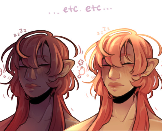
im so serious play around with layer settings! these are just basic multiply & add(glow), there as so many others you can abuse the shit out of & nobody will know or care in your finished piece.
was this?? in any way helpful???? I hope so.
#THIS IS A BELATED ANSWER FOR ALL OF U MY B#scrolled back to find the earliest one i could bc i mean… you asked first#if this was in Any way helpful…. im glad#and also sorry. probably dont do these things#hmu if youd like me to clarify anything ill… do my best#asks#my art
123 notes
·
View notes
Note
hihihi! recently found your art and im OBSESSED w the style!! the texture is so cool!! if you dont mind, how do you do it? like brushes, layer effects etc. anyway i hope u have a good day!! (:
aaa this might be a long answer!! also hi! and thank you!! 😭🫶 i'll try to detail my entire process!
with sketching and lines, i use the nikko rull brush just sized down and with like 70ish brush opacity! and then i use default oil brush to shade! as well as the nikko rull also to color and such, theyre the only 2 brushes i practically use (except maybe for the airbrush but i use it more for the effects (will circle back to that))
and then i do very simple shading, not thinking about lighting or anything, and once im done shading everything i merge it all down together and i clip on an OVERLAY layer on top, it's my bff... and i usually use a bright red or orange and use a soft airbrush to lightly glaze over the drawing in certain areas to make it more vibrant (i tend to base with very desaturated colors)
and then i merge everything together and clip on a MULTIPLY layer on top and usually use a color like a darker greyish blue or whatever depending on the environment and lighting that i've decided in my head, just to make the whole drawing darker, and then i use the eraser to erase out shapes in which i want there to be some light, and sometimes i use a hard brush like the nikko rull and sometimes i use a soft airbrush to softly remove some shadow and darkness or blend in harsh shapes. and for good measures i also mess around on another overlay layer.
and then i just add noise and mess with the color balance scales a little!
82 notes
·
View notes
Note
may i ask how you rendered the rainbow mop guy and purple hat guy artfight attack? it looks like its made of 3d materials or from an old mac game. is there a name for that style? are there any resources on how to achieve that look? i want to hold it so gently in my cupped hands
glad you like it!! really though its just a combo of a couple custom clip studio brushes i made (plus the premade spray brush)

for the base coloring its essentially a chalk brush with a halftone texture, the softer shading is the spray brush, the sketchy shading is a pencil w a watercolor edge and texture, and the hard lines are my personal lineart brush!!

i also tend to dress up my art with a light paper texture overlay, as well as gentle multiply and brightness layers of whatever colors you think look best (just mess around with layer styles and colors!! its fun :o]!)
hope i explained this well!!
#clip studio unfortunately doesnt let me post my brushes so i cant share them :o[ they are pretty easy to make though!!#doc talks#my art#undescribed
48 notes
·
View notes
Note
Seeing your art literally makes my day and inspires me to draw violentine art 🫂
Also, any useful resources for artists? Your coloring is so good!

abubububu aaa that makes me so happy to hear!!! thank you,,

coloring tips specifically? hmm here are a couple links to some videos on light and color and shadow stuff that does a good job explaining the way i approach those things. i dont always get super detailed with it but knowing how it all works will help you make your own creative choices
ive gotten kinda lazy with my coloring the last year or so. i started using blending modes to shade with instead of trying to do all the color logistics myself so now i can just throw down the true color flats and go. but the layer modes do a good job simulating light and shadow so it works enough for me aha
i use overlay layers for light and multiply layers for shadow pretty much, with the occasional glow layer for harder lights. plus sometimes either an overlay (day) or multiply (night) layer fill with the BG color to bring the flats into harmony with the BG before shading if it needs it. used a pin light layer for a night piece recently and i like how it looks (more saturated night look). just mess around with the layer modes until you like it honestly aha. but i try to use as few layers as possible since i dont want it to look over done or anything. intersecting overlay and multiply layers helps to give that saturated effect around where light meets shadow. you can see it pretty easily here (flats > multiply/shadow > overlay/light (+glow in the eyes))
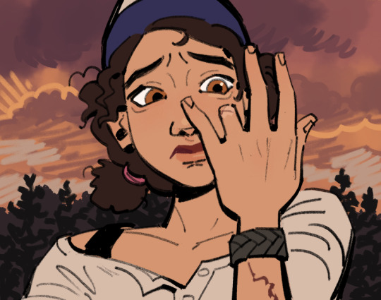
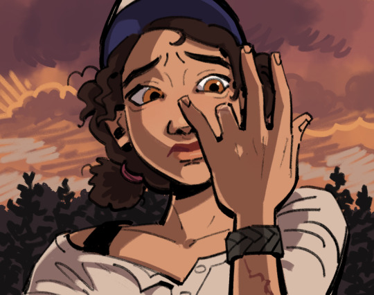

its just the overlay layer painted on part of the multiply layer. warm light cool shadow (or cool light warm shadow depending on the scene). i keep the ambient light thats in the shadow cool (no overlay) to imply it as indirect from the primary light source
UHH thats really it honestly for my coloring process. i also try to use a limited palette. i look for all the colors characters share and try to pull them from the same swatch as much as i can. it helps to keep things feeling in harmony. same with using colors for light and shadow that already exist in the BG
other random tips always include DOING STUDIES AND USING REFERENCES!!!! i know studies can be sooo boring but they really do help. and even just doing a few of them can help tremendously. make it fun draw your faves instead but at least do it using some references youll improve so fast. style is all about how you interpret the world, so look at the world and try to learn from it :)
35 notes
·
View notes
Text
Mello people!!
I took notice on how some folks don't know how to color non transparent bases around here
They end up somtimes having "rat holes" (which are small uncolored parts) or looking lineless/shadeless
Which there's nothing wrong with, especially the lineless and shadeless part, everyone has their own style they prefer!
But I bet some of you would like to have their base art look more solid and not have to finagle with it so much, so that it looks like how they want
But how can ya do that you ask?
Fear not!
For I have made a little tutorial on how to for Ibispaintx☆
Passing down the knowledge I got from DianaTHEchicken on Amino (and the tips I learned over the years on my own)
1. First, you import the base of your choosing!
I'll be using my HiveWing Medowhawk as my example

2. Now, you go and open up the layers, add one below your base, click on the bases layer, then press where it says "Normal"

3. This opens a menu on Blending Mode
4. Now pick the Multiply option

5. Go back down to your color layer below and presto, it colors without messing with the the lines or shading!

(The reason it is below the base is because on top makes it uh... come out like this lol)

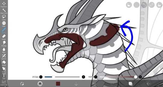
"But Thumper!
What about when it gets outside the lines? Erasing it is SO annoying and tedious!"
6. Well, that's when we go look at the side (for phone users you'll be clicking the pen on the bottom) and click the "Magic Wand" icon
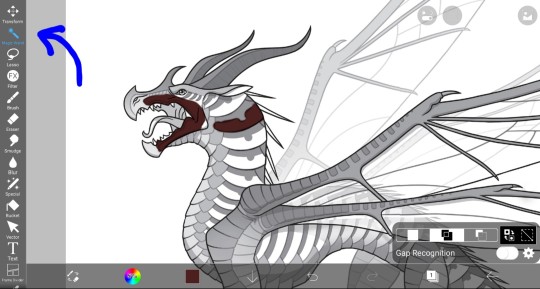
This brings up a tiny menu that says "Gap Recognition" and it is pre-selected on "Add", which you want, and moving lines around the canvas and base appear
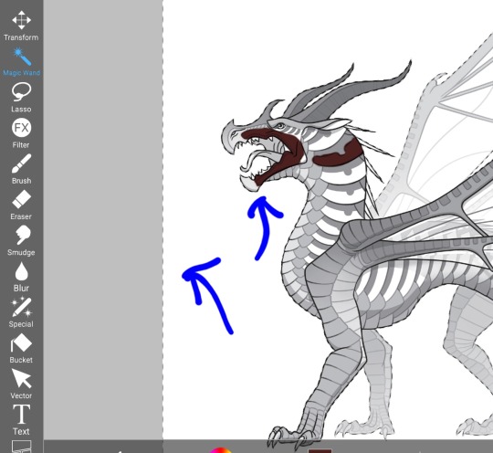
Now that on its own lets you color behind the base without touching the color you put, or the base

10. But to color without anything going outside the lines, you click the boxes that have two arrows next to them

This is the first part!
Here is the second part of the tutorial☆
21 notes
·
View notes
Note
I just found this blog and I noticed that a lot of your stuff seems, well, oddly 3D. I don't mean like in a bad way but it feels like rendered but untextured 3D models? I kinda want to ask what your art process is (sorry for mini-rant)
thanks for checking out my blog! and no need to apologize for anything.
hmm, my art process. honestly i have no idea what to say, i dont know how people normally answer this question so i cant base it off anything either. i'm still kinda new to this whole art thing but i'll try and answer, super sorry if i get this completely wrong and this was all a waste of time.
i guess i'll just talk about how i draw things step by step? for the high effort pieces at least.
ok, so for starters like step 0. when it's a high effort piece, i can already see the image in my mind. i see the pose, i see the general lighting, the layout of stuff, but it's a bit blurry. if i cant see this mental image, the drawing usually comes out extremely poorly.
this is kind of an example of what i see in my head? this might be all useless info idk, but this is i guess where i start.
well step 1 is just the sketch and line. i start with just sketching the general shapes, then slowly refining it until it fits close enough to the image in my head. then in the line layer i'll fix any mistakes the sketch had and add more details to it. oh and for brush, it's just a round brush, like default. i dont know how much of a difference using a drawing tablet does, but i dont use one so... yeah.
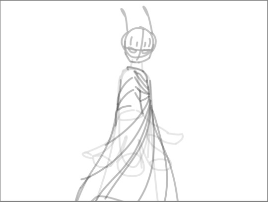
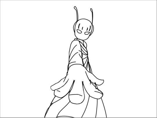
i should've put more effort into the sketch for this drawing, but i did not.
next i do flat colors. pretty simple, i just select the smart select the outside of the line layer, invert the selection and now i can't paint outside the lines. i dont really think about what colors i use, i just use whatever the characters normal colors are.
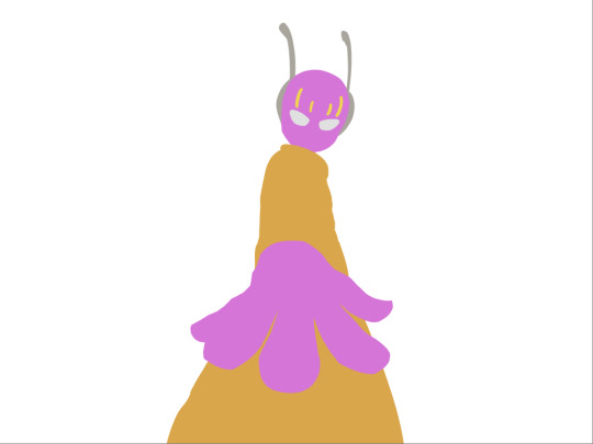
next i do the shading, but first. i duplicate flat layer and recolor it to like a cream color
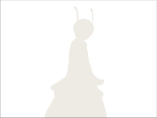
like so. for high effort pieces, i was told online to shade in pretty much black and white. now actually onto shading. there's 2 kinda shading i do, 1 from the proper light source, and 1 that's kinda just a shadow because things are close together (like corners and stuff). and i'll shade them on separate layers so i can adjust them individually however i want. oh right, i'll either use a very dark color, pretty much black and the the layer blending mode set to multiply. or i'll use a light kind of gray, tinted slightly yellow or something and set the layer blend mode to difference. then i just use a soft air brush and shade in the ways i described above. shading from regular light source, and the corner stuff thing.
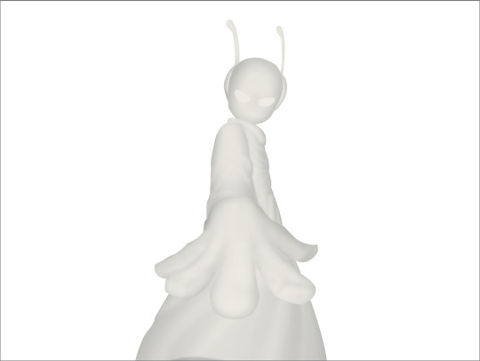
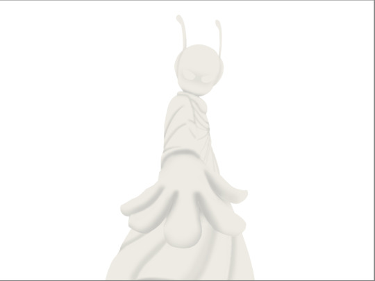
normal lightsource - - - - - corner thing
then toggle both layers on and mess with the opacity of each layer until you get what you want.
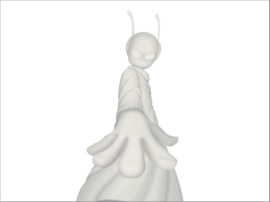
then you can toggle the normal flats layer, the one that has color and it should apply the shading decently. you can mess with the opacity again on the shadows.
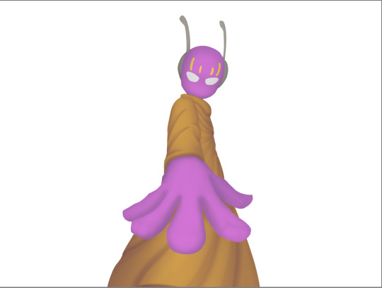
next i do lighting. i just grab a very light color, usually pretty close to white and set the layer blend mode to overlay. then i use a soft airbrush and "light" it? idk i just do like the opposite of the normal shadows, lighter the closer it is to the light source
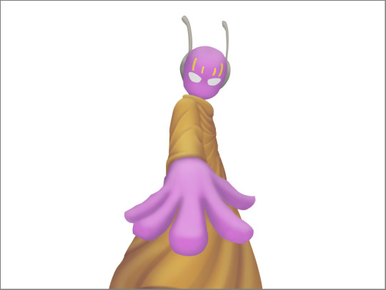
mess around with the opacity as usual. then i do pretty much the same thing if there's another light source. in this case there was a blue light kinda coming from underneath, so i did that.
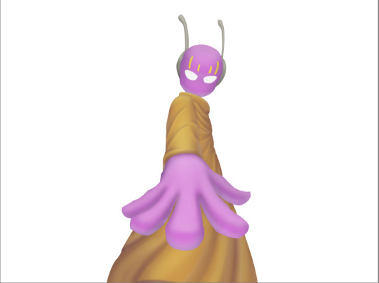
now from here i would go back to the flats layer, make a copy, and mess around with different layer styles and properties and settings. sometimes just messing around is useful. in this case, i felt it was too bright and colorful, so i decreased the brightness and saturation of it.

i think it helped a little bit but who knows.
now i do some kinda highlights and details. i grabbed the colors that were in the background and used those. it was a weird pale blue. i had 2 layers for this, 1 of them was specifically for his antenna things at the top, and one was just for his "skin". anyway, the antenna layer was normal, just kinda gave it an outline with the random reflective circles you see normally in pictures, no thoughts behind them. the skin tho had the layer blend mode set to soft light, i thought it looked best this way. it was just more random things to imply it was slightly reflective.
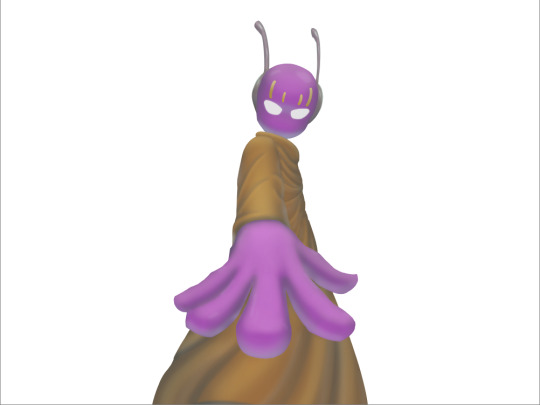
together the layers looked like this. i think it makes him look glossier which is what i was aiming for.
next, and it pretty much the end for pebbles, i got someone to look at it and let me know if they think anything was missing. they said it looked a little unsaturated. which it does. so i made a new layer, set the blend mode to saturation, grabbed the airbrush and made it pretty inline with the lighting layer.
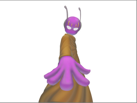
that's kinda it. the background i didnt really care about, just drew and colored it. blurred it a bunch and added a bunch of shadows. i did add some like, "overshadows" is what i call it, i just draw some big shadows down the screen as the top layer.

but yeah thats literally everything i did to draw this. i would like to apologize if this was not at all what you wanted to know, i'm certain i've screwed this up bigtime. super sorry for wasting your time. if there's anything i can do to help, please ask. i owe you a proper answer to your question, i'm just really dumb. sorry for rambling. sorry. and sorry if the drawing i used for example didnt showcase what you wanted to know.
also, i really like your art! please keep up the great work!
#i think i did this all wrong#i'm so sorry#i feel incredibly stupid#:I#rambling :I#now everyone get's to see how little i know about drawing
26 notes
·
View notes
Note
Your art is very beautiful! May I ask what brushes you use? I'd love to get the same effect with my art! (Oh, and I use Clip Studio Paint! Not sure which you use, but hopefully I can still find the same or similar brushes. Lol)
thank you very much!! Yeah for sure, here's pretty much all of the main brushes I use. I also use clip studio paint!
lineart/sketch brushes:


firstly, most of my stuff uses cy's grease pencil from this pack. it's funny bc i downloaded it years ago and didnt really like it at first. but when i tried it again a couple years ago i was like wait... this is SO good. i use it for sketching and lineart (first image). there's also csp's default "flat marker" which im apparently obsessed with (second image here). it's good for shading too! lastly (third image) i'll use the stumpy pencil pack here, this one i pretty much just use for lineart but it's by far my favorite clean lineart brush. i'll be honest i had to do weird conversion to get it to work in csp and i have no idea what i did at this point BUT ! if u search up how to convert it im sure The Internet can aid you as well. i think
Coloring:


when it comes to coloring i mainly use this water color pack and then this gouache pack (which doubles as what i use for my semi-lineless painting style- the second row here). if you see any coloring that looks more painter-like and textured it's most likely me using the gouache pack. sometimes i like to do the solid/base colors with an opaque brush and then use the water color to shade bc i like the textured look :P
side note: when i shade using another layer set to multiply, i'll either use the flat marker or cy's watercolor brush (both in the entry above this one)
Additional Stuff:
both of these for certain background help
this set of overlays (not a brush, but i figured i'd add it since it definitely helps adding texture to my work)
these textures (again, not a brush. i use these so that my backgrounds arent just Blinding White- mostly for myself bc plain white is hard on my eyes lol)
-
As You Can See I'm like. constantly messing around with new brushes. I actually have well over a hundred that I've downloaded LMAO. If you ever see a piece by me and want to know what I used, please let me know!! I'm usually able to remember the brushes I used, at least some of them :P especially more recent stuff, I've been experimenting a lot with painting methods and various new brushes
7 notes
·
View notes
Note
Hi! I really love the way you paint ecto on your sona. Would it be too much trouble to ask for art tips or a tutorial?

I don’t mind giving a teensy tutorial! For clarity’s sake, i’ll be explaining in text here! I’ll also be using clip studio paint for this tutorial, but you should be able to use whatever program you’d like!
before that though, i do have two older tutorials! a simpler one, and an old one using medibang. yaya! I also don't have a set way on how I draw hair, since i do like to mess around with different styles. But here's one is for when I really wanna give it a nice finished look!
Step one!
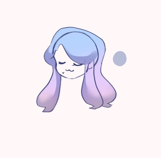
First you gotta get a head (with or without a body is up to you) and draw the hair and fill it with the base color on a separate layer, here’s what i usually use for my skelesona!
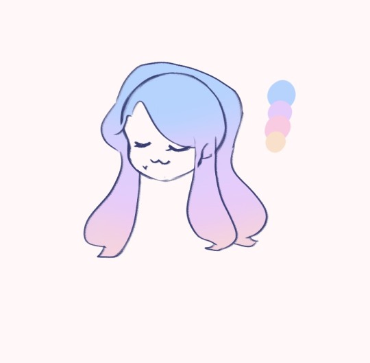
Step two!
In a separate layer set to multiply, add in the shadows! I usually clip this on top of the coloring layer so it’s easier for me to stay in the lines lolol
Step three!
On the same layer, add more shading! Here’s how i do mine but feel free to go wild
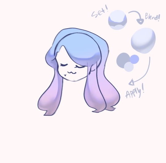
Step 4!
lighting time! Make a new layer and set it to a type of luminosity layer, put it under the Multiply layer! . I personally like to use Glow Dodge or Add(glow) for this! using a brush made of shapes like triangles and smaller circles, draw the patterns onto her hair! feel free to tweak with the opacity as you see fit! I'll save how to make custom brushes for a different time kek

Step 5! i think
new layer again! set it to glow dodge/add(glow)/etc. this one's for highlights! i also like to add sparkles because they're pretty. i use a darker color because the layer's blending mode tends to make brighter colors too shiny. This layer goes on top of the multiply layer!

Step 5.5
I almost forgot but I like to add some color to the lineart under the hair to match the base colors too! a bit darker though so it doesn't just become invisible

From here you can go wild and add whatever details you like!!
and Voila!!
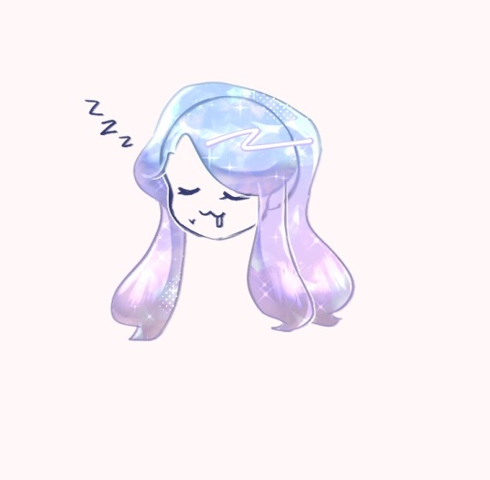
magic hair finish!! I hope this helped!! Feel free to ask me if you got lost somewhere in between, or for anything really! If you try out this tutorial please do let me see how it turned out!!
#bluechocowitz#bluechocoart#hair tutorial#ecto tutorial#magic hair#ask#art reply#skelesona#blue#i hope you found this helpful!#long post#my art#what other stuff should i put here#anonymous#drawing magic hair is always fun!!#i hope to share that with you guys!!
88 notes
·
View notes
Note
hi!!!! so ik your focus is on audios (which are absolutely amazing btw) but i was wondering if you could maybe explain how you color/render your artwork? i’m new to digital art and have been struggling a bit. if not that’s totally okay!! i understand <3
Hi! I totally can, though this is gonna get long lol. I tried going in depth? I'm not too great at explaining things so I'm 100% cool with clarifying things if needed. This isn't TLOU art, I was re watching Devilman Crybaby and sketched this out last night. I saw this ask right as I was about to start so the timing was perfect lol
I'm gonna try to go step by step? I haven't rendered digitally in a while, mostly just sketching. Also, this is kinds rushed, it's late, but it explains everything (I hope?)
1.After I do my sketch, I do a fuck ton of blending. It helps me build shadows/depth and I also just like the way it looks. (I also duplicated my sketch in case I mess up and can't go all the way back)
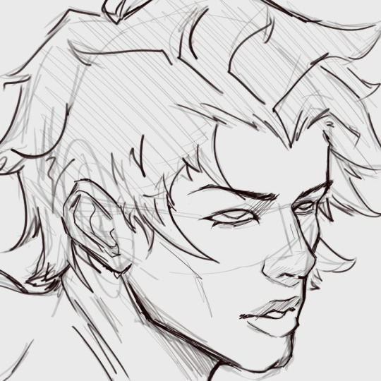
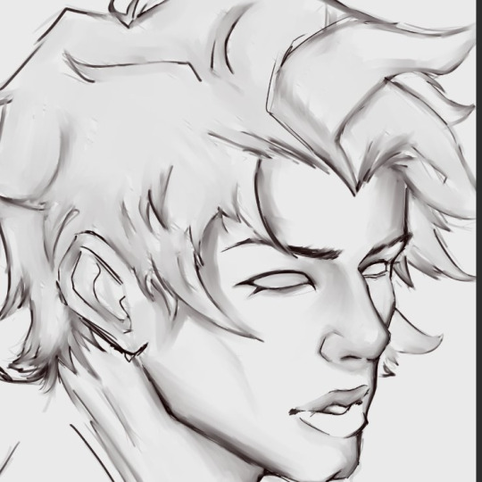
2. Ok, a lot happened, I zoned out, but I swear it's not a lot. I use a grey base on one layer. I clipped color layer to the grey base so that I wouldn't go out of the lines
I changed the line art color to a reddish-brown (which helps me with blending into the skin later) and I added the base color and certain tones.
This character is on the paler side, so a lot of the colors I'm gonna use are cool (blues, greens). And I'm gonna use a ton of red(bc blood flow, and a ton of blush is a stylistic choice for me).

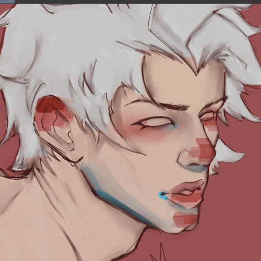
Note: Instead of going straight in with a blending brush, I use transition colors. Blending brushes are good too, I used one for blending the initial sketch, but transitional colors just make everything flow a bit better than just blending two completely different colors. (Color pick between different shades/colors to blend, its tedious but it's what I do)

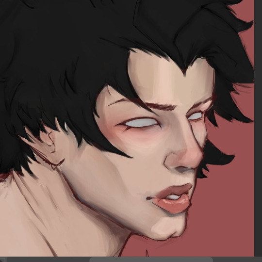
3. I created a multiply layer and deepened the shadows a bit using the same color as the base skin color, and I made a highlight layer as well (the opacity is pretty low on both the highlight and the shadow layer, you gotta mess around with it)
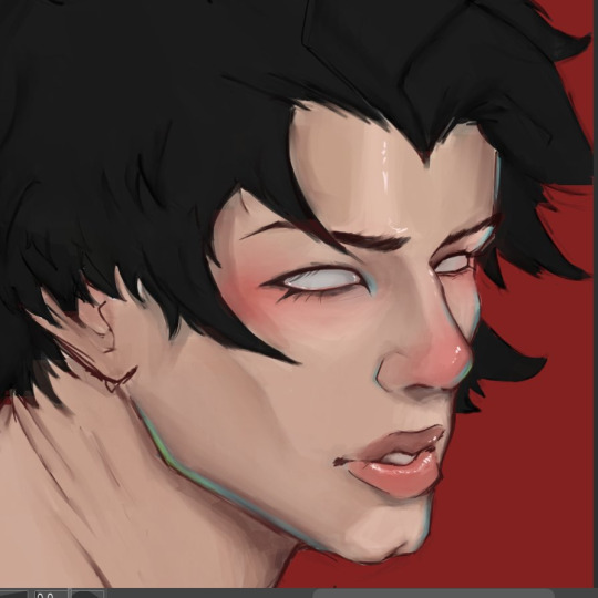
Has it felt like I've been rendering this entire time?? Absolutely. Have I? No.
I make the initial stages of my drawing all annoying so that when I get to the *checks notes* 8th layer, I can just do the fun stuff. I'm not done at all, but the rendering layer itself is pretty simple, I just add all the stuff that makes the drawing look less dull. Adding more pinkish color on the lips, nose and cheeks. Bringing back a lot of green and blue (that's just a style thing, also there is a 9th layer but thats just the little white highlights)
This definitely isn't the "correct" way to do this (there is no right way), but it's how I do it. I would show how I render hair but:
1.I have no clue what I'm doing when I do it, I just fuck around until it looks decent (even more so than I do with the skin)
and
2.My chair is hurting my butt
All in all, you just gotta practice a bunch and figure out what you like. Using pinterest and Youtube helps me a lot when I'm stuck or need a refresher💕
Again, please let me know if I need to explain something better, I'm not great at teaching stuff like this😅
I might finish this, I probably won't, but if I do, I'll post the full thing.
Update: I finished
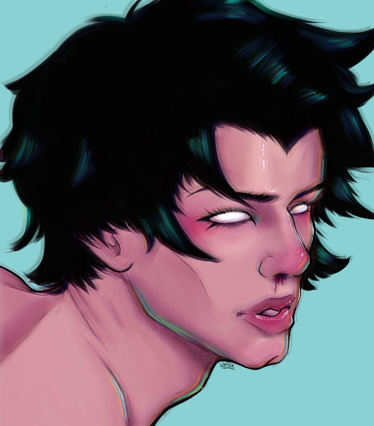
23 notes
·
View notes
Note
how do you do the “cut out of a piece of cardstock or paper or something” effect
i'm gonna do an image guide, if that's okay!
i use these texture overlays - i've been planning to make a post that credits all these sorts of assets i use that i can link in my pinned post, but i keep forgetting...
so, well, i'll credit them now! and you can get them yourself, too! they're quite handy. it's a name your price thing, so you can download it for free, or be kind and donate to the creator!
-> Natural Materials Vol. 1 by TOMB of NULL
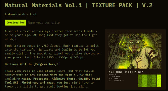
guzma art guide underneath all this, it does get a little long, but it should cover my whole process for getting this effect!
you download the thing above and unzip it, and get some handy files to open in basically any art program that can handle PSD files. there's other material packs, but i only use this one! and out of these, i really only ever use the ones i lined with blue. (CARDBOARD and WATERCOLOR-PAPER)

the idea is, that you draw a drawing and paste it within these folders. however, i don't do it this way, as you can see! it's a very different result. as an example, i'm gonna use the non-textured version of my old icon .
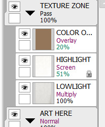
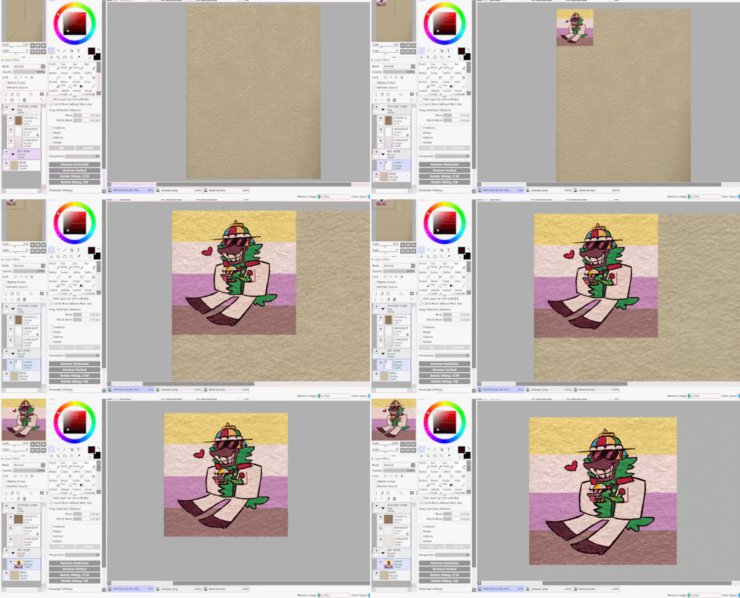
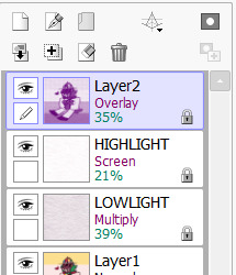
you can do this and get a nice effect, especially if you use more fitting colors for this sort of style, but again, this isn't what i do! i actually copy specific layers and paste THOSE into my actual pieces. (specifically "LOWLIGHT" and "HIGHLIGHT" from "WATERCOLOR-PAPER")
i paste LOWLIGHT first, and set it to MULTIPLY. then, i paste HIGHLIGHT on top of it, and i set it to SCREEN.
then, i lock the layers for both and either paint over or bucket-tool fill them with a different color that fits my piece more. i adjust the opacity of each layer. i don't get the color first try always, i spend some time to play around with it - but for demonstration i stuck with what i picked at the moment.
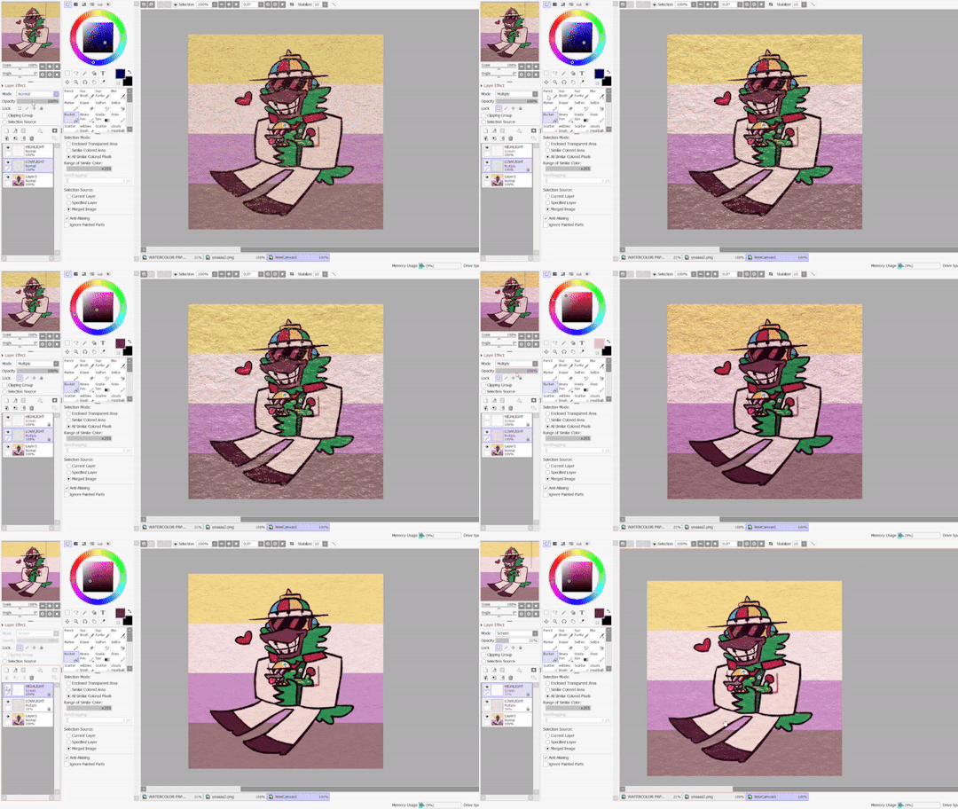
but that isn't all! i sometimes use "LOWLIGHT" from "CARDBOARD" as well, set on top of both of these layers, but instead set to OVERLAY. due to some scratches in the texture i don't like, i may move the position slightly. unless you draw really big, the texture will cover up your whole pieces and allow for some movement. if not, re-sizing is okay!
but i don't use that one always - what i use MOST of the time, and what i've done before i began using any paper overlays - were dot/halftone overlays! i either use these ones below, that are a specific, same size. (i resize for canvases all the time, that doesn't matter.)
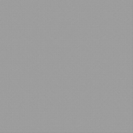

...or i also use another method! it requires krita.
you open up krita, and paste your whole piece into it. (what i do, is flatten my current piece, copy it, then undo to get all my layers back. then i paste the image into krita)
once i'm there, i go to FILTERS -> ARTISTIC -> HALFTONE. i adjust as i think it looks good, and then copy that.

then, i paste that back into sai. however! it may be off by a few pixels! zoom in and move it slightly left or right - turn the opacity down slightly to help you figure it out. once you do that, set that layer to OVERLAY. you can play with the opacity - or even do fun things! it makes it look better, so hang on a minute!
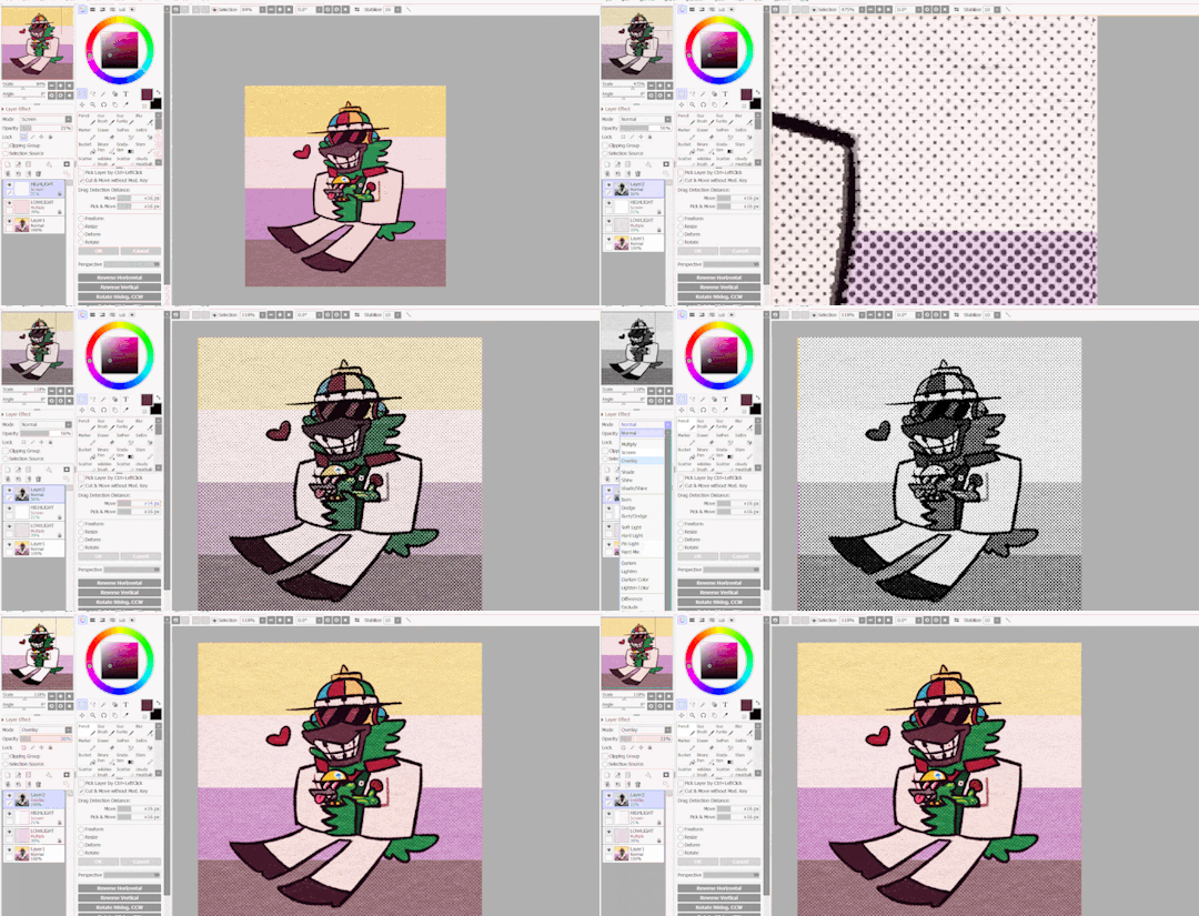
the "fun things" i mentioned is going over to LAYER and selecting "CONVERT LUMINACE TO TRANSPARENCY". in this case, it makes the white transparent and removes it, while it keeps the halftone! then i can change it's colors to be more fitting to my piece. (like we did with the texture layers!)
i used a purple overlay - so it makes the picture feel more purple and it ties the colors together a little bit more, without the use of an layer on top that's just one color set to OVERLAY or MULTIPLY to give it a different color hint. i usually do that, but set to super low opacity. but not always!
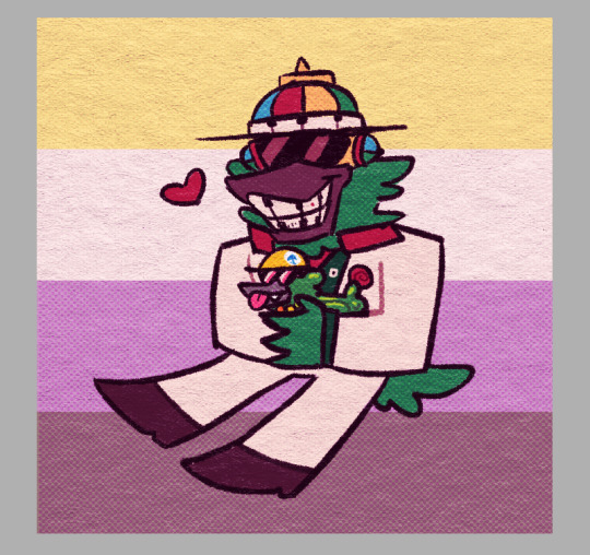
a lot of these are just done by "feeling it" and trial-and-error! just messing around and seeing what looks nice, after all, these are usually my final details i add to a piece once it's done to give it a more finished, uniform look. plus, the texture looks nice, and it's great to make more flat colored pieces just POP OUT !!
and of course, i use either the image half-tone overlay or the krita method depending on just what i think looks good. i don't really have a specific method!
and sometimes, i add different overlays on top and mix and match - sometimes from actual scanned paper textures! i've downloaded some from this google drive i'm going to link below. i use them rarely, but it's worth the credit, too.
-> PAPER TEXTURES GOOGLE DRIVE (not mines!) (unfortunately, i lost the tumblr post i got these from.)
------------------------------------------------------------------------
few other things i tend to do, also: i tend to add extra saturation once a piece is done. i like bright colors.
i also tend to copy the original drawing underneath all these effect layers, and paste it over all these other layers. i set it to OVERLAY and set it to low opacity. (or rarely, without the layer effect!) it helps gets a bit of the "original" feel out, while brightening/saturating the colors out a bit... i always play with the opacity here a bit.
and so, here's the layers again + the final piece!

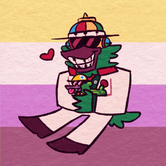
admittedly, this was supposed to be a softer looking piece from the get-go, so saturating it may make it look a bit goofy when the flag in the background has been made brighter previously... but it makes the characters stand out! still looks nice! i'd definitely tweak this a bit, but it's definitely the kind of result you may be looking for!
i did use sai as an example, but if you use krita, medibang paint, fire alpaca, csp or photoshop... this all should work there as well! i've done this in ibis paint as well - using textures from the app itself! using what you learned here could help you figure that out for your own.
------------------------------------------------------------------------
well, i hope this was helpful and somewhat comprehensive! if anything's a bit messy here, i can admit i made this while in a call, so that may be why. feel free to ask follow-up questions! thanks for reading!!!
8 notes
·
View notes
Note
Hiii can u pls do a face tut pls I’m begging you
heya! sorry this took some time, i just moved and it's been really hectic @@
and thank you for the question! i'll use stuff for bela and shadowheart as an example for ya for the two styles i usually do
warning, i am not a teacher and i'm still experimenting and learning so uhh some of this might be scuffed but is how i do it :>
also noting that i use csp or photoshop depending on my mood and what brushes i want to use but the same technique works for either and i use 2 brushes for the main bits and additional brushes if i want to add texture
--
1 - so after i have the sketch roughed, i usually put it on a multiply layer and add a background layer under it (i leave it white or almost white if i'm just doing a doodle or sketch) and i start to figure out the lighting and shading under the outline layer
the lighting is usually pretty rough and i'll start to understand what i'm going for as it starts to shape up but i try not to reduce the brush size too much so i don't get too muddled
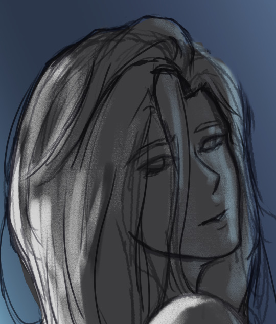
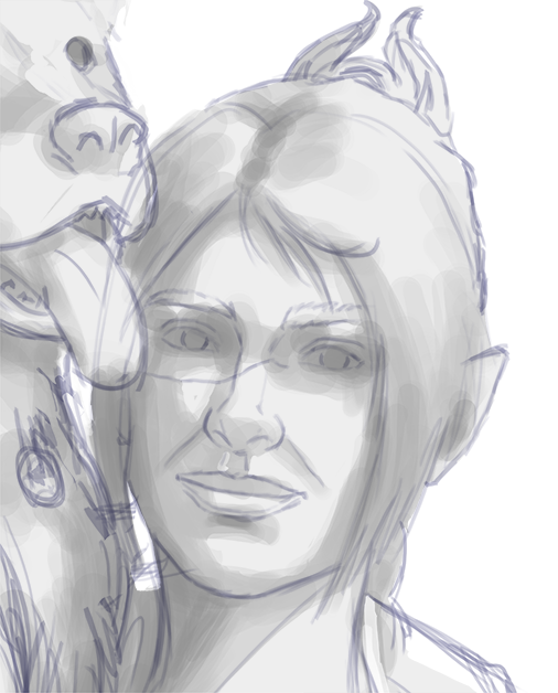
(at this point i'm going thru my mantra of "trust the process" and breathing into a paper bag and kicking and screaming about how i want to quit)
--
2 - once i have the lighting somewhat how i want it, i start tweaking the color and i do it by using adjustment layers and manually painting. this part is kinda like cooking and tasting as you go, if i feel i want the image to feel colder/warmer i'll adjust accordingly but i will tell you how i did it for both examples below:
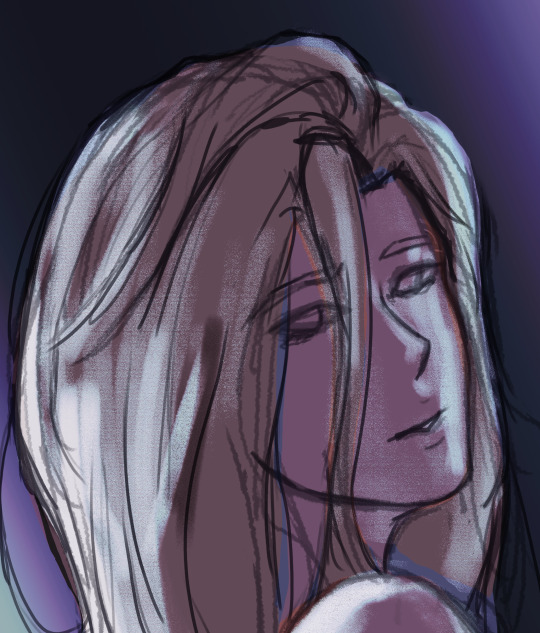
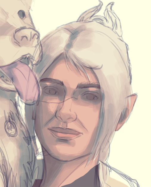
for bela, i actually painting above the shading/lighting layer and used "soft light" and "hard light" blending modes for the hair and skin to fit more with how i wanted it to look. i used color balance and curves for the background to get it to more of a purple/blue and darker
for shadowheart, i actually put the color below the shading/lighting layer and left the color as is and swapped the blending mode for the shading/lighting layer to "multiply" and then did adjustments using curves and gradient maps using "hard light" and "soft light" too and i think i had a "color burn" just for fun
this is my fav part of the process bc i just experiment and mess around with different layers. i usually have a vision for how i want the color and lighting to look but there's always room for new ideas! so i just mess around for a while here till i'm happy!
--
3 - rendering time! um i don't really have much advice here except i just start going in and rendering in closer detail. and remember references are your friend!!!
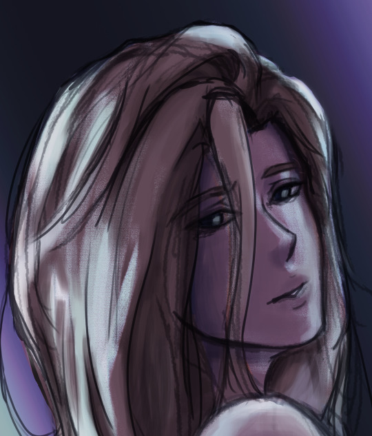
bela render progression:
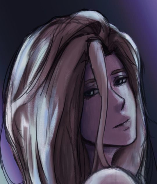
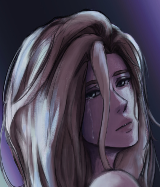
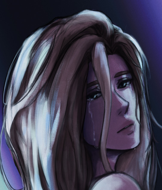
shadowheart render progression:


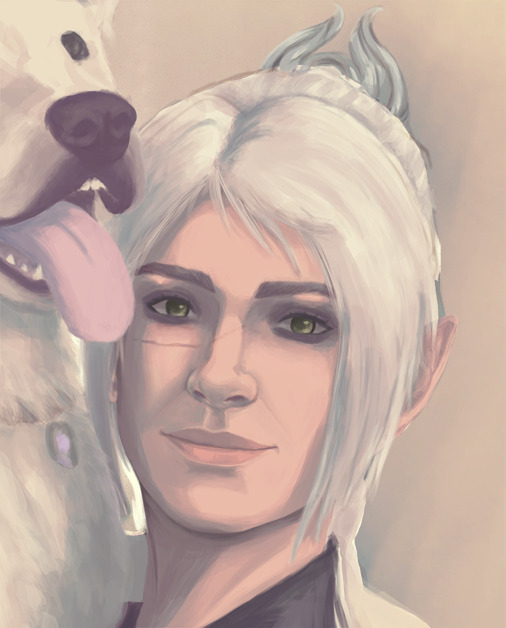
i sometimes end up changing the drawing quite a bit during rendering but that's okay bc as you go into detail, you will notice discrepancies from the pre-render stages
for the style i used with shadowheart i just paint over the outline pretty much with some bits of it left it and i blend more to smooth it out more. for the style i used with bela, i add back in any outlines i painted over that i wanted to keep
--
and at the end of the day it's your art and how you express it is what's always gonna be the best so trust your gut (and references) but also it's okay to take creative liberties and go with the "cool rule" :3
and keep practicing!!!! i def feel i've gotten better with drawing faces compared to a year ago
i hope this helps and if it didn't ":3 i hope you had fun reading
#i hope this makes sense#i had to go back into my files and disable layers to get these screenshots Dx and i have a LOT of layers but for you anon i did it#i didn't know if u just wanted a broad tut of how i draw the face or if you wanted smth specific but i hope this helps anyways#i didn't promise this would help#pretty long post#asks#anonymous#my art
5 notes
·
View notes
Note
hi :) i love your art and your style a lot, and i was wondering if you maybe have some tips?have a nice day <3
omg thank you!! this is such a sweet ask :)
Artists don't actually really. know how to draw. this is why they always tell you to practice. Unfortunately, this is true. You do need to practice. There aren't any shortcuts.
While true, the "practice" advice is pretty unhelpful, so my advice is make sitting down to draw as easy and seamless as possible. Carry a sketchbook and pencil (and pencil sharpener!) or download a drawing app on your phone (what I did) so that pretty much any time you could just be scrolling on your phone you can instead be drawing
(I recommend artstudio pro if you're willing to shell out I think $10 per year or $40 up front—i don't totally know the conversion rates, but for just doodling there are probably free ones. Doodling is also good practice.)
The MOST important thing about a drawing are the big things—proportions, composition, overall color scheme etc. It NEEDS to look good as a sketch or else it won't matter how good you are at rendering.
If your sketch is warped, it will continue to be warped in the final image. Trust your instincts even if redrawing something seems like it'll take too long and you really don't want to—it'll take longer if you need to redraw it later. Adding more detail won't help.
It's pretty common advice (if you're drawing digitally) to flip the canvas to make sure your drawing really looks good, and I recommend doing that at each stage—from the first sketches to the finished piece.
Colors next to each other need to be visibly lighter or darker than each other. Otherwise they clash.
As for my particular style—
i've developed a style where I don't need to worry about the details too much—my line art is kind of rough and my rendering is painted and a little messy. This is because I draw on my phone.
The thing about this is i need to spend a lot of time thinking about colors to make a piece look put together. Colors are soooo difficult you have no idea.
Mess around with blending layers! I like to put light colors on multiply for shading and darker colors on color dodge for highlights.
Anyways that's all I can think of rn :) hopefully it's at least a little actionable (the gold standard for advice)
11 notes
·
View notes
Note
yayayay yippee (≧◡≦) i love how vibrant & lively your art is, i think my fav pieces are Horse Surgery & hanyuu (even tho i have no idea who that is) but that one wip with the rainbow is also v ery special 2me because it reminds me of my fav kind of weather ^_^ generic Which Program Do You Use question & also which programs have you tried so far? which one would you recommend for someone whose only experience so far wiht digital art has been scribbling in ms paint -_-? on topic, what do you draw with (mouse, phone, drawing tablet, ??) & was it easy for you to get used to digital art? i always get overwhelmed by the amound of different functions available so im not sure where to even start, any advice? which physical art forms do you like / would you like to learn (anything at all, i personally have been getting into air dry clay... well actually ive been using my sisters playdoh but maybe ill purchase smthn fancier :3) & final question how do you come up with poses to draw? your characters (+creatures) seem very animated and i really like that :)
HI okay i guess ill answer these in a list. actually will put it under the cut since i ended up saying a lot (and dw i enjoy being able to talk a lot so thank you!)
-THANK YOU im glad some of my more recent works (in my more current style) are appealing 2 people! like i wanna draw my own way even though i think it gets less notes... the higurashi fanarts (hanyuu and shion) r very memorable pieces to me because its when i started doing the loose sketches with the thin lines and block colors and thats the direction i reallyreally wanted to take my style in. also the rainbow is rian my friend rian
-i draw in paint tool sai! the only program i used before that was sketchbook pro, which i didnt like because the brushes were kind of... blurry/smudgy? sai allows you to zoom in and draw pixel by pixel which is something i like, and i like the way it does its blending. its also just easier for me to understand. i didnt pay for it i think i found some deviantart page that had the link, id have to find it again
-i draw with a wacom intuos tablet! its lasted me... almost 10 years now. ive heard newer ones are poorer quality in terms of at least the nibs needing to be replaced constantly, so idk what the most recommended tablet these days is. ive drawn with my mouse and tbh it caused awful hand pain so i would not recommend this. i draw on my phone with my finger sometimes but i find doing it on my laptop easier, however it is doable once you get used to it
-the way i got into digital art... well. i still have an archive of my earliest art if you wanna see! i was 14 n just drew random shit, often lining over doodles i did on paper and coloring them in. i think esp if youre overwhelmed start with making like throwaway experimental pieces, scribble around, doodle stupid things and color them in with different brushes and see what you enjoy. and then you can just keep the files to yourself if they dont look too good or maybe itll look interesting, it depends i guess haha. the other thing that ive always found helped me was telling myself id draw every day even if it was a little scribble or the tiniest amount of work on a wip bc getting a habit going helped my art a Lot beause it helped me spend more time thinking n focusing on it
more specific advice for sai that i found useful- using clipping groups & the preserve opacity functions are both lifesavers in terms of not spending so much time trying to color in the lines. if you color in a base layer you can just put everything above it as a clipping group and just not worry about it anymore. i also really like using the filters (like multiply) to mess around with the colors a drawing has, though sometimes its more effective to just select a layer/individual color and fuck with the hue/saturation/etc until it looks good. when i color, esp when its not turning out how i wanted to, i rely on shifting colors A LOT. n also mixing colors together using a blending brush and then colorpicking the intermediate color. very useful
-for the most part i stick to uncolored pencil doodles on like, notebook paper (even though i have some fancy supplies X[ one day) but i LOVE making things with clay, wish it was more accessible to do at home. i have a handful of clay animal statues and stuff that i made in my ceramics class in high school. would looove to do more
-because my poses tend to be very pushed/cartoony using references of real people isnt always useful (though obv knowing the basics of anatomy always helps) so in those cases ill use other cartoony art i like as inspiration, i try to see what i like about their poses nd emulate that with my own. sometimes when im struggling ill just do a bunch of studies where i copy art i like to try to get a feel for what im missing. mostly ive realized i like when the pose conveys some level of like, volume and taking up a 3D space (which im still definitely not a master of but bullshitting it can be fun). and i also like to have a balance of curved and angular shapes. sometimes i try to just do a pose that conveys a specific emotion or i just make shit up lol
alsooooo i cant reccomend aimless doodling enough! just random shapes, turning the random shapes into creatures, trying and trying and trying different ways to draw something until you like it, i feel like the things my hand makes when i shut my brain off and just scribble can inspire me as well, and i try to emulate whatever i made by chance while doodling. and if your doodles turn out better in traditional i tend to consider using a photo of a drawing as a way to skip the "preliminary sketch" phase nd drawing a rough sketch over that which i then use for my drawing (or just directly color since i draw very fast/lazy...)
#long answer but i wanted to give good answers to everything!!!#thank you again!!!#and i hope i helped#yayyy talking about art#ask
3 notes
·
View notes