#medium hang
Explore tagged Tumblr posts
Visit Tumblr Blog
Explore Tumblr blogs with no restrictions, modern design and the best experience.
Last Seen Tumblr Blogs


Fun Fact
Tumblr has 411 employees.
Photo

Walk-In in San Francisco Large, modern walk-in closet with carpeting that is gender-neutral and shaker cabinets and light wood cabinets
0 notes
Photo

Contemporary Closet Inspiration for a sizable modern walk-in closet renovation with shaker cabinets and light wood cabinets that is gender neutral
0 notes
Photo

Contemporary Closet in San Francisco An illustration of a sizable, modern, carpeted walk-in closet with shaker cabinets and light wood cabinets that is gender neutral.
#green wall white trimming#vertical shoe rack#medium hang#gray bin#textured carpet flooring#double hang
0 notes
Photo

Closet San Francisco Large modern walk-in closet idea with carpeting that is gender-neutral, shaker cabinets, and light wood cabinets.
0 notes
Photo

Shaker Closet Walk-in closet - large contemporary gender-neutral carpeted walk-in closet idea with shaker cabinets and light wood cabinets
0 notes
Text

As Above, So Below. ph. Insley Smullen. 2024.
#photography#aesthetic#mood#dreamy#mamiya#medium format#analog#grain#film#film is not dead#long hair#white dress#picnic at hanging rock#bnw#portrait#water#core#insley smullen#mine
213 notes
·
View notes
Note
how do you plan the panel layouts for your comics? i always get stuck and it feels cramped or unsatisfying
okay so i went to college for 2 whole semesters and one of the only art classes i took (and definitely the only one i retained much from) was my sequential art & comics class. so i'm gonna try to explain my process in so many words, but there's a LOT of stuff that goes into a successful comic and i'm by no means a professional. i can however throw some tips and tricks and some recommended reading your way (another longpost ahead!)
first, know what you want to do. know where your comic starts and ends. if you find any joy in writing scripts, you can also do that, but i'm not the best at writing with no visual aide so i usually script while i thumbnail, but always make sure you've got a concept and a goal.
next, start thumbnailing. my initial thumbnails usually look like this:


(incidentally, my storyboard thumbnails look a lot like this, too)
there's no real structure, and i'm just noodling my way from the top left of the page to the bottom right. if you've got what you want from your comic in mind, this part can sometimes just pour out of you. i feel a very strong attachment to these characters and the situations i put them in, so that definitely has to do with how smoothly this part goes. draw the panels as small and as detail-free as possible. i usually don't do speech bubbles, and instead treat it like a storyboard, writing my rough script under the panels as i go.
once you're satisfied with the way your story is coming together, THEN you start laying your panels out. this part looks like this when i do it:

(these are actually from a gfalls comic i never cared to finish from like. five months ago but who's counting?)
honestly, it's best to do this as small as you can possibly get it, to really get your head out of the "but i have to fit all the panels exactly as i drew them on the page" funk. remember that, at least if you're writing the comic in english or other languages read in the same direction, that you're trying to lead the reader's eye from top to bottom and left to right. this is really hard to keep track of, and i still make mistakes and flub up the readability all the time. like here:

the panel layout should be reversed here. the panels in the top left and bottom right should be smaller than the other two, so the gutters would actually guide you to read it left to right instead of top to bottom, but laziness and initial drawing blindness struck me and i never fixed it.
once you have a layout that makes sense to you, it's as simple as blowing your thumbnails up to comic-size and going over your very rough sketches with your final clean panels & inks, or, if you're doing it traditionally, re-sketching your page on your big bristol board after doing some measuring to see where your panels should actually be.
there are other rules to keep in mind when you're in the thumbnailing phase of your comic, like the 180-degree rule (something that carries from film to animation to comics to, really, any form of sequential art), which is easiest to explain with a little diagram:


keeping this in mind really helps with readability. you can do a bunch of things with your angles, you can even omit the other character, but keeping them on the side of the frame you establish them on is very helpful. this is mainly for dialogue, but it does also help if you want to display one character walking in one specific direction, or if you want a fight scene to read as well as possible, etc.
and, if you look at your comic sketch now and think, hey, this looks great, this is so clear and easy to read, i highly recommend stepping away for a few hours to look at it again, or, if you're impatient like me, sending it to a friend. you're also totally welcome to send it to me, if you just need someone to tell you whether your comic is easily readable.
to learn more about drawing comics, i recommend two things. one, read some comics. by professionals in the industry, ideally, though there are many many competent and incredibly detailed comics by independent creators out there. people in the industry will (MOST of the time) be held to slightly higher standards of readability than the average independent artist, and the workflow for professional comics involves several people at once reading and reviewing and revising what's made so that it'll be digestible to the average audience.
two, i recommend getting your hands on a copy of "understanding comics" by scott mccloud. love this book. lots of comic artists love this book. it's fun and informative and packed full of tips, while also being a comic, which makes it even more fun to read. mccloud goes into a lot of detail on stuff i didn't mention, from the gutters between panels to lettering to working with other artists and writers and finding an art style that fits the story you want to tell. great stuff. go to the library, check it out. you won't regret it.
#ask#myart#wander over yonder#comics#rambling#comics are HARD man it's tough stuff to learn and even tougher to put onto paper#but when you learn about comics you also pick up lots of stuff for animation and writing and even film#because visual art is all connected. peace and love. but comics are one of the most involved mediums of storytelling out there#also quite possibly The best. because you get to read through it as fast as you want#but you can also hang back and look at the panels forever and really think about what makes them work as well as they do.#live laugh love sequential art
26 notes
·
View notes
Text


I had them keep me company while I did my hair and it spawned an idea
#love and deepspace#lads xavier#lads zayne#lads rafayel#i think xavier would initially be the one to take a minute to get the hang of it#what is hair but another art medium for rafayel#and zayne probably researched beforehand after learning there's a process
75 notes
·
View notes
Photo

WIP!! This is taking me FOREVER but I’m excited about it so here’s a sneaky peaky ;))
#the little fire is probably not going to stay i just like doodling lol#but no i'm having such a hard time with hair lately idk it's pissing me off#I am starting to get the hang of drawing digitally tho so that's nice#my style is still really inconsistent but hopefully that'll sort itself out when i get used to the medium?? idk#byler#corrie draws
1K notes
·
View notes
Text
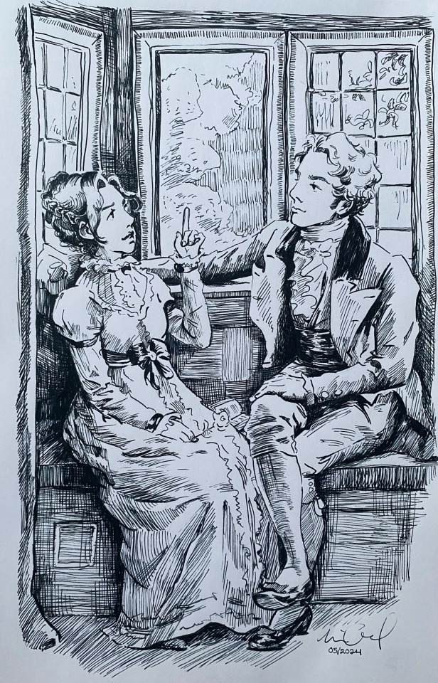
He is so enamored with her🥹🫶
(a continuation of regency period au💓)
#and he gave her a FLOWER 😇😭🙏#probably picked on the walk to visit her#🥹🥹🥹🥹🥹🥹🥹🥹🥹🥹🥹🥹 I am such a hopeless romantic it’s ridiculous#sideburn Sebastian is 😮💨😮💨😮💨😮💨😮💨#will I ever stop these studies? probably not bc I’m a masochist and I love scribbling 😍😍😍#hogwarts legacy#hogwarts legacy fanart#hphl#sebastian sallow#hogwarts legacy mc#hogwarts legacy oc#eloise#sebastian sallow fanart#sebastian sallow x mc#finally getting the hang of fountain pen what is the next medium to tackle����#if you want art consistency this is not the blog JAJAJAJAJAA#these are my experiments🙏#regency au
66 notes
·
View notes
Text
wonderful side effect of rye kind of being a slip of a thing (he's decently tall for an elf, he's about lucanis' height, and strong in a sinewy kind of way but just. a straight up and down line. no tits no ass all heart): can wear lucanis' clothes and somehow still have it look like a boyfriend shirt situation. if he ever put on one of davrin's shirts the lighthouse crew would have to stage a search and rescue operation. 'our little guy has to be in there somewhere but we just can't find him we don't know where he is' distressed friends report
#lucanis with his medium to slim build on a good day managing to look solid through the power of as it were wearing a lot of plumage#and standing next to rye all the time fjklf#dragon age#dragon age: the veilguard#lucanis dellamorte#oc: Ellaryen Ingellvar#rook x lucans#rookanis#rye hasn't had top surgery yet but nature also blessed him with basically nothing going on up there at all from the start#so it's not that urgent a priority for him he'll get to it one day when he has a week off or whatever#especially if emmrich is around to help with the spirit healing to speed it up. (rye is always wrapped in so many layers anyway#the vast majority of the time. the necropolis is COLD yall. he might prioritize it more after hanging out in rivain#and finding that many layers hm. unsustainable)#...do you think it ever Awakens anything in lucanis to see rye's slim silhouette as he wrenches an ogre into the air#and then slams it to the ground like a ragdoll to break all its bones like it's nothing? I suspect it does
27 notes
·
View notes
Text
*RUNS IN* HELLO HELLO HELLO I HAVE SOMETHING VERY IMPORTANT TO SHARE -- POPTART AND STICKERS ARRIVED TODAY!!!! The whole package is incredible and I've been looking forward to it all week!! Ell even drew a Leo and added my name on the back 🥺 my insides are in a happy puddle of tears and I keep happily wiggling and flailing. Thank you so much to the incredible @intotheelliwoods!! Now it's picture time!!

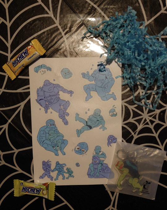

#I LOVE IT SO MUCH ELL#I DASHED OUT TO THE MAILBOX AS SOON AS I GOT THE NOTIF IT ARRIVED AND IMMEDIATELY OPENED IT#AAAAAAAA IM SO HAPPY AND DON'T HAVE ENOUGH WORDS TO EXPRESS MY JOY AND GRATITUDE#TYSM ELL I LOVE YOU MWAH/P#2al merch#2 arms left#hamato leonardo#leonardo#big leo#sprout#poptart#little leo#medium leo#big leo 2.0#little leo 2.0#lil leo#OH MAN WHERE AM I GONNA PLACE MY STICKERS THIS IS A BIG DECISION#i shall upload photos of the stickers when i know where they're going!#poptart is safely hanging out above my bed until my ita bag comes in#if he goes with my carabiner for my keys the other keychains will beat him up because they're so big. i won't allow it
101 notes
·
View notes
Text
True form Sukuna in just a goddamn fundoshi, emerging from a hot spring like a Heian era Calvin Klein model, arms raised as he cards his fingers through his wet hair, mist and steam under the moonlight and all that shebang.
#not me waking up from medication-induced sleep to this hyper-specific imagery#but like...#imagine drawing low-hanging branches off your path to a hot spring one full moon night and finding that#ideas. ideas everywhere 🤩#sukuna#jujutsu kaisen#ryomen sukuna#am i going back to my roots of writing olden times metaphor-injected literature? perhaps...#sukuna's a great medium#beyond great actually#on a side note emperor gojo be lookin' spicy! 😍🌶️#and the plotting starts one late August night when i ought to be sleeping#🤤#*fundoshi is traditional men's undies in japan btw lol
49 notes
·
View notes
Text
my hot take of the day: if you put Anna Lightwood and Alec Lightwood side by side in similar clothing they would be near-identical. okay I said it.
#tsc#the shadowhunter chronicles#anna lightwood#alec lightwood#it’s the medium length straight dark hair blue eyes pale skin tall and slender thing#i am. eternally sad that anna and alec will never get to hang out#cassandra clare#the last hours#tlh#the mortal instruments#tmi
242 notes
·
View notes
Text

ahem. Guess who started a Second animation.
i'm learning here i'm Fuckinf Learning!!! i will continue working on this later because uhmm,, it is. Quite Late ^_^
#this is Also. A Kenix Wip.#my first non-test animation and it's Kenix of course it's him. It is Always This Fucker www#i'm having fun with this!!!! i'm actually so fuckign proud of myself for exploring an another medium in depth!!!!#i'm getting the hang of it.. i'm Learning i'm Improving.. :'3#yomoart#.. should i tag this as an oc post with kenix. Yeag Sure why not#yomo ocs?!#kenix
9 notes
·
View notes
Text
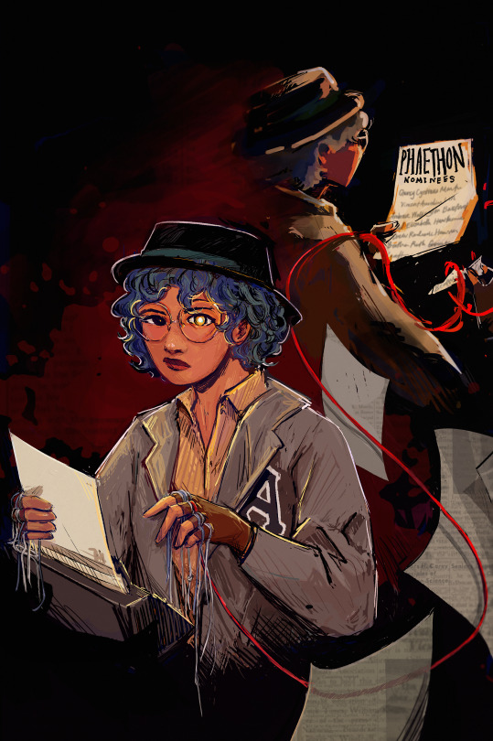
ghostwriter (their grandma would tell them she'd lose half her soul)
#or smth smth. having a lot of Thoughts. anyways here's the piece i've been working on and sometimes u have to just say Done#there's a lot of thinks but i am maybe a bit tired and so tmr i'll come in and add all the Tags that i'd personally want to get from myself#maybe i'll reblog the extras tmr too. this is an incredibly self indulgent piece + it probably deserves a tag ramble essay or smth#ig for now we see how it stands for itself + in the meantime:#adamandi#beatrix valeria campbell#hello!! i'm back with belated tags yippee!! alright so for funsies i'm going to make it sound like i'm going bonkers over this :3#the eye shine... the glowy eye... it's like phaethon shine but also smth about eyes to windows to the soul and like#there's two beatrixes here! half the soul. lost part doing things specific to the phaethon and here it's portrayed as tearing off her name#because that's really; truly; when it all starts!! also notable for the ghostly beatrix is i did it more painterly and cloaked in shadow and#fading into the bg. i think i was super duper specificish about where the glow comes from! front lighting back lighting beloved!!! like help#let's put it this way- beatrix face always glowy. important parts of paper also glowy. it's just that different elements are turned away#from the viewer by each beatrix!! also also. let's talk about the very gently implied blood and red etcetera#like the red string is canonical and i love personally the whole red strings of fate thing even though it's not Here Applicable exactly but#that definitely was an influence! and also the blood in the bg... i'm starting to think this is a recurring trend. but anyway shadowy bea#the other strings hang while the red string loops!! so like that one string feels almost alive. it's a sort of whimsical i put on the same#as metaphorical glowy eye!! also also the eye is lowkey influenced by the whole idea of Eyes and Spotlights within the show and also glow#as in power as in heyyy you ever think about writing as a visual medium huh#speaking of writing!! there is no beatrix thingy complete in my head without text sorrry but the black text overlays are always so >>> to me#and in the sense of art styles and overlays shoutout to all the black crosshatching outline thingys because For Some Reason in my mind#of all the characters beatrix feels like the bnw ink printed illustrations you get in books idk#fun fact! i spent so long rendering this and that was fine i liked it! but then trying to figure out text to go on the papers was a Thing#i tried to do. but then gave up on! sometimes i have to pick my battles and graphic design is indubitably Not my passion bc Fonts#fun facts about this is i Actually did start with a quick sketch in mind and there's been so many changed elements. in the og the front#paper for instance had 'ardess murders' written on it and the back one said phaethon interviews.. i like the nominee list better it feels#more narrative-esque and less passive than her just holding her writing.! other elements that got discontinued were that#front beatrix was supposed to blur into the other ghostly beatrix but i couldn't do it without sacrificing clarity so... no... no blurry#oh and the red string morphing at the ends to smth more abstract was always there from the start!! og had more floating papers#and also a silhouette of vincent and a scalpel bc 'one who pulls the strings' but that (pun intended)! got cut (hahahahahahaha) (sorry)#used also to be a lot of print room clutter but that got cut to bc compositionally i made beatrix larger (learned lesson from last art)
86 notes
·
View notes