#man im a fcking nerd LMAO
Explore tagged Tumblr posts
Text


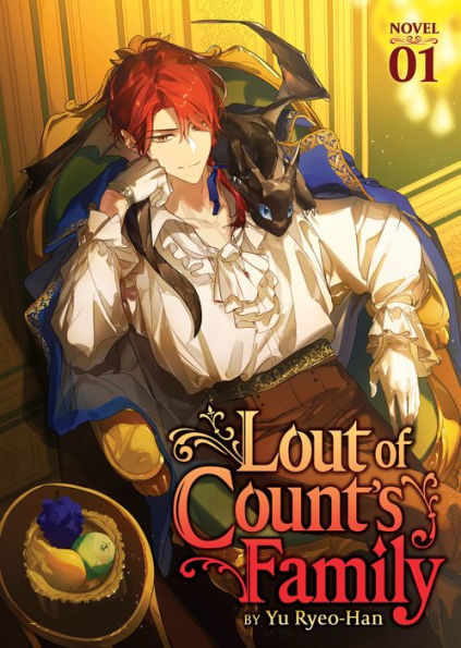
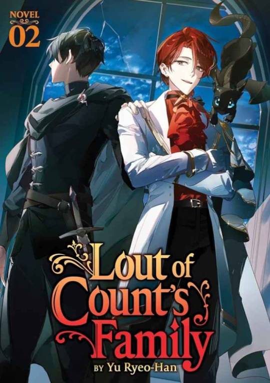
Speaking ab the cover art from a Design pov *aside frm the comments that Cale looks out of character in the lore standpoint of vol. 2 art
(spoiler free, dw)
◇ TLDR; vol. 2 cover is beautiful, but it couldve had better color synergy. I can see why the artists did what they did, its just not my fav.
. man I'm just happy to have an official English print lmao, ill take what I can get
---
At first I didn't like the red shirt cause it was too much the same color as his hair. (Like if it was a darker or desaturated maroon, I feel it would've looked better, at least so he isn't matching with his own hair-)
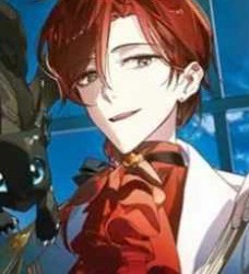
. But now taking a step back n looking at vol. 2 again, zoomed out, I actually think his Face is the most jarring part [more on that later ◇]
◇ . The bright red of the shirt being lit by a yellower light, altho matching w his hair, actually isn't so jarring to me anymore cause I noticed two things
◇ 1) his pants are also tinted red (if my eyes aren't deceiving me) meaning compared to the background and the other two characters, Cale *in his entirety* is a red-toned silhouette -> this is a illustrative design strategy where the artist assigns a group of colors to a specific subject n *Restrictvely* uses the Hue Differences to their advantage. In my opinion, its a good choice in making him contrast and stand out. You can definitely Tell he's the main character with just the cover art.
. BUT it can also give off an Outlandish or alien feeling because (in this case) Cale is the ONLY red in the scene. Theres no balancing of red tones from his character to the background At All (e.g. the artists doesnt add Any red to the surroundings so his character can "fit in" with the scene- like as if you photoshopped a guy in sunny lighting into a dark room, the lighting differences is jarring n you can tell the guy is just slapped on top [not saying the artist did that at all, but the way they painted Cale to stand out feels jarring in that sense). While this does an insanely good job at putting him in the spotlight, it perhaps does Too great of a job, making him feel isolated or strange compared to the rest of the piece.
. (Then again, you can justify that that was the goal. To isolate Cale n show hes alien from a lore standpoint as he's "not from this world" as an isekai story)
◇ 2) but we're forgetting this is a COVER art. It's not Just an illustration to be pretty. To break my earlier point, altho Cale IS the only red in the *Illustration,* this art piece is - fundamentally - a Cover Art. It has the Title thats a part of its design <-<-<- And if we looksey at the title, what do we see? Red and warm tones. Like what other thing thats only reds? Cale Henituse himself!
. The Title IS the balance I said was missing in point 1). My theory is thats Also why the artist tinted the lighting on Cale to be warmer n more yellow, so as to use the yellow orange in the title (and the contrast of cools n warms from the focal points to the rest of the art) to their advantage. It helps add reds to the lower half of of the piece where the only warm tones are Choi Han's hand (the other character) and the fleeting window curtain; both of those details being at the edges of the piece and Both very small so they hardly have an influence on the overall design.
. So the title, taking up the majority of the lower half of the piece, draws the warmth down n assists in balancing the overall cover design.
So the reds have now been explained, but why are the whites so white now?--
◇ . Earlier I had said Cale's face was the most jarring part of the cover. And I still fully stand by that sentiment. Its the same idea where the reds do Too great a job isolating Cale; the whites do Too great a job contrasting w the background n the two other characters - who are black n cool tones - to the point where it Heavily draws the eye, practically in a violent manner.
. The extreme paleness is quite lore accurate for Cale's character, who hes isekaied as, but the extreme lighting Highlighting just his face compared to Choi Han's face is an extremely bold design decision (again, not a bad thing as he IS the main focal point, but adding onto the Isolating Spotlight trait going on)
◇ Ok then, but why's his jacket also so freakishly bright white? I heard from a fellow lcf fan (love discussing w you dawg <3) that they think the jacket is the worst part of his cover design.
N I agree. The reds standing out can be justified as a design strat, his face is the focal point so thats why that stands out, but why the jacket??
. Here i am on my artist apologist era <3
◇ . The jacket being blindly white is (probably) to Dampen the Harshness of his face being so bright.
. Altho the guy looks great in white ☆°• with how extreme the lighting is in this cover art, I think the artist wanted to balance the laser beam that is Cale's face paleness by spreading it out to his jacket, specifically that left collar fold ( i think that's called the lapel?)
. Basically by making the jacket's collar also intensely white, the artist gives their best attempt at trying to make Cale's skin less jarring so as to not make it so ridgedly highlighted. Like black ink spilt onto fresh paper, they tried to spread it out so its not so condensed in high contrast. ...But that only made the jacket join in on the uncanniness- TTvTT
---
(Posting the pic again so yall don't gotta scroll far o7)

Other notes I've noticed n wanted to just point out while I'm here looking through the Design Lense ☆°•
☆ The red of Cale's hair and the red of his shirt n neck scarf sandwiches his face, making it stand out even More. Ealier I said the contrast of the vibrant red to the paleness makes his face draw the eye, but thats also thanks to the *position* of the colors! Not just the colors themselves B) isn't that so cool (tell me yes even if you have to lie-)
☆ The lighting on Choi Han's cape, chest, to face -> the window arch -> to Cale's entire person being lit up + how he's wearing a long white jacket
. It all creates this general arch of light tones and highlighted features which surrounds and hugs the title! The artists really knows how to use their darks and lights !!
☆ Choi Han's entire person, Cale's pants, and our lovely Roan Miru (the dragon) are the only deepest dark black tones in the entire piece! The privilege of being the subjects <3

☆ cale looks crossed eyed lel
. Im glad I'm not the only one who struggles with eyes still
. Or maybe this artist did it right n I just don't know how to draw eyes- (very plausible tbh)
Man I love artists
---
All in all, Im not a fan of vol. 2 cover art but I can see why the artists did what they did
◇ . One of the most important things of commercial art is that its visually pleasing, regardless of design, lore, or even logic. The design choices are golden but putting them all together couldve been done better. Not that the art is ugly in any way. Its still gorgeous af, there just couldve been more balance or overall color synergy.
This is just my opinion anyways :D! No hate anywhere <33
#textpost#man im a fcking nerd LMAO#lcf#tcf#lout of the count’s family#lout of count’s family#trash of the counts family#trash of the count's family#cale henituse#choi han#art analysis#spoiler free#color analysis#design analysis#oh jeez what a hefty post#i love art man
120 notes
·
View notes