#makes it very difficult to even want to do smooth lineart
Explore tagged Tumblr posts
Text
It’s not that I don’t do lineart, but uhhh, I definitely don’t do lineart like a traditional comic artist (think Archie) and I’m realizing this will be my downfall in this comics class 😭
#big fan of sketchy lineart#lines should never connect 😤 it is my preferred method#it doesn’t help that I have a mild to despicable tremor#makes it very difficult to even want to do smooth lineart
0 notes
Note
a few days ago on twitter you said you love discussing art process, pleeeaase do! i find your art so inspirational, i'd love to hear what you have to say about really any area of the process if you have time! if thats way too broad a question maybe lineart..?
yaaay i love art process :)
lineart!! one of my favorite things to do in a piece, and much to consider. this is just my personal approach-- i have a fairly specific approach to lineart, and lineart is fairly polarizing in that some people find processes like mine VERY tedious and restrictive, while others enjoy it the same way i do. it is by no means the only way you should be doing lineart, it's just insight into how i do lineart :)
so, some things to consider first:
-do i want a textured brush or a smooth brush?
-do i want loose lines or tight lines?
-do i want thin lines or thick lines?
-do i want to stylize my lines?
TEXTURE VS. SMOOTH:
-TEXTURED brushes make it easier to hide mistakes in your lines. your strokes won't have to match up flawlessly.
-SMOOTH brushes may show inconsistencies where you pick up a stroke mid-way through, for example, which bothers someone like me a LOT when doing lineart!
-TEXTURED brushes add unique character to your lineart
-SMOOTH brushes leave room for other techniques to do the talking, such as your coloring. it will steal less attention
-TEXTURED brushes can be difficult to do flats under, because it limits your use of the magic wand/equivalent tools
-SMOOTH brushes have fewer crevices, so it's much easier to do flats under them using automatic processes
-TEXTURED brushes can become so grainy when working on small areas that it's difficult to achieve fine detail
-SMOOTH brushes are going to be pretty discernible even at high zooms
-TEXTURED brushes do not translate well when you're enlarging images
-SMOOTH brushes can sometimes help you get away with enlarging an image using waifu2x, photoshop enlarging, or illustrator's live trace function (to an extent)
i will say i typically use a textured brush. SU brush (able to be found on the clip studio assets site) and evolve brush (for procreate) are some of my favorites, as well as one i modified myself that i won't post because it was me heavily editing someone else's brush and i don't wanna take that from them lol
LOOSE VS. TIGHT:
-LOOSE lines can capture the dynamic feeling of your sketch much more easily
-TIGHT lines can feel much more rigid, with less movement
-LOOSE lines are much harder to do flats under, as there are often many gaps in your lines that need to be filled
-TIGHT lines can be easier to do flats under, because the magic wand tool will work more easily
-LOOSE lines can capture a sense of nostalgia, friendliness, calmness, tranquility, et cetera
-TIGHT lines can capture a sense of decoration, symbolism, and intricacy
-LOOSE lines *can* be less time consuming, but may require specific skill and practice to get their energy feeling "right"
-TIGHT lines can take more time, but can achieve greater detail and may be more "impressive" to some viewers (entirely subjective!)
-LOOSE lines can sometimes get away with "implied" detail
-TIGHT lines sometimes suffer if you "slack off" in some areas compared to others; it'll be much more apparent
i typically use very tight lines! that means they're very exact, have a lot of detail, and not many gaps. personally i find that when you make your lines very neat and exact, they become the 'star of the show', so it makes it much easier to 'get away with' having less of an emphasis on rendering, for example. you can let the lines speak for themselves.
THIN VS. THICK:
-THIN lines draw less attention, allowing other parts of the drawing to take the spotlight
-THICK lines command attention
-THIN lines allow for greater intricate detail
-THICK lines are much more reliant on having a good sense of form and shape
-THIN lines can feel more delicate and soft
-THICK lines can feel more dynamic, solid, or cartoony
i'd say my lines are somewhere in the middle! i personally usually use 2 brush sizes, 1 for "main" lines and 2 for "details" (such as small lines separating pieces of hair, blush lines, clothing detail...)
STYLIZATION:
this is just a list of a few more ways you can stylize your lines!
-MONOLINE vs DYNAMIC WIDTH: you can turn off pen pressure and draw with a mono-width pen for a cool effect! you can also vary how much line pressure you have; very thick lines contrasted with very thin lines can give a very dynamic energetic effect
-HATCHING: look up guides on ink pen drawing and see how they use hatching, stippling, et cetera; it may help inform how you decide to use your lines
-ANGULAR VS. FLOWY: experiment with only drawing with straight lines combined to look round! experiment with doing no straight lines at all!
-PIXEL: using pixel-based tools can give a super fun effect on your lineart! i've been playing the game "yuppie psycho" recently and it has some cool examples of pixel-based art in its title card and cutscenes that aren't necessarily "pixel art"
-COLORED LINES: try coloring your lineart! this CAN match the color of the lines inside, or you can play with a totally contrasting color. helps give a lot of life.
GENERAL TIPS:
-test out the stabilizer in your program! it helps achieve much smoother lines. in procreate this is called "streamline," in csp it's called "stabilizer" (you may have to turn it on using the eyeball in certain brushes), and in clip studio it's "stabilizer" at the top
-this isn't something i did, personally, but try out using traditional tools. it'll help you get a smoother hand even when you're working digitally. try sketching traditionally in pen and marker; the inability to go back on your lines will help you gain confidence in your strokes
-adjust your pressure curve in your program, or the hardness/softness of your lineart brush, such that you can get a wide range of thicknesses without pressing too hard. learning how to control the delicacy of your hand's pressure will save your wrist in the long run.
-personally i haven't thought about this much, but i've heard that focusing on drawing with your shoulder rather than your wrist can 1. help dynamism and 2. be easier on your body
-speaking of which, in general, TAKE STRETCH BREAKS PLEASE
-for my style of lineart: god i love the undo button. wear that baby out. i'll do a line like, 6-7 times then still go back in with liquify or an eraser to touch it up. you're allowed!
-MAKE MULTIPLE SKETCHES. maybe this is just for me, but i like doing a sketch that's essentially "rough" lineart-- i solve ALL of the details, ALL of the problems, i just don't do it neatly yet. EVERYTHING is laid out completely for me. my lineart is then mentally much easier and quicker-- i don't have to problem solve AND line, i just have to line. it actually saves me time overall!
anyway have fun :)
145 notes
·
View notes
Photo

Since i got nothing to do this afternoon,i took on the @sealbatross challenge, but instead of drawing Stan, i did Ford instead
Since you can’t have his bro without his twin!
They aren’t exactly as equal as their orginal artist’s style, but i did my best!
The rules are simple
1: no tracing or copying
2: Try some different poses or expressions
I went with mugshots beacause i didn’t totally skipped this rule, no sir, i did not
So here we go!

@kiki-kit
This was relatively easy to make since we have very similar styles, but i gotta love how smooth and clean their lineart is
The style is very recognizeable and rounded with a great attention to detail,with a small yet cool color for shading
It made me slowly enter in the mood for this challenge and it helped my hand relax for the anxiety i was feeling of “not being as good as theirs”

@hellmandraws
Oh boy that was fun! I think this is my favorite of the bunch and i cannot express how much fun i’ve had with this one
I love how simple yet so awesome their style is and how clean the lineart is, i also love the attention to details in shading and the huge care even for the smallest of details
10/10 would draw with this style again

@eregyrn-falls-art
Another banger
This was fairly easy and fun to make, i only struggled with the shadin beacause i couldn’t find a brush similar to the shading tool that has been used so i guess we just had to stick with this :/
I just gotta love that half smile, it always melts my heart and it gives me some late 50s/60s PSA or commerical cartoons vibe
(also that jawline is THICC)

@sealbatross
i obviously add the creator of the challenge
It was a nice cooldown after i went out of my comfort zone, which is a thing i did multiple times during this challenge XD
I love this sharp and blocky style and the similarity between their arty and the doodles made by Alex when he goofs around or even makes them during charity events
It was really nice and solid to make and i loved it

@siriuslyart (or siriuslymeg i dunno)
This one is my least favorite, not beacause i think the style is bad, mind you, but beacause it’s the one i screwed up the most
I like how polish and clean their sketches are and i tried my best with it, also i love how they draw the jawlines and the teeth, UGH! it melts my heart!

@sleepsentry
I have been firends with them for quite some time now and i thought i wanted to bring some justice to it by drawing something in their style
It helped me to come out of my comfort zone, trying watercolors instead of markers and clean colors
It was a fun challenge and it made me shape interest in doing painting more often!

@smudgethistle
I’ve always loved her style and how intriguing it is, this is sort of semi-realistic style with some nice watercolors that give it these washed out and bleak tone to the picture as a whole
It was fun to come out of my comfort zone once again with this one just to show how much i love their style and them as a person
(also sorry if i forgot the glass holders or however they are called, i miss them like 24/7 when drawing)

@gruvu
And last but not least we have the moth boy itself, Gruvu
I love how messy his style is and how manly his characters always look, and that jawline that cheeckline that’s so good but so difficult to draw, holy frick!
It helped me cool down too and it was absolutely amazing to draw with this style
Welp, that’s pretty much it, if you want to add some feedbacks or comment about the artworks, especially if you are one of the guys i just mentioned,let me know
(Reblog are VERY welcome)
#gravity falls#ford pines#stanford pines#grunkle ford#ford tumblr art challenge#fta challenge#5 hours of my life well spent#oh gosh though it took me a lot#it was so much fun to practice them all and try new thigns#especially watercolors#like#watercolors are the shit man#i love them
211 notes
·
View notes
Note
Hello there! I read all of your how to zine thing and I've been thinking how to organize a portfolio online... Do you have any suggestions or tutorials on how to do one? I use Google drive but I don't like it anymore (it seems unprofessional) so I was wondering if you have any tips óvò thank you in advance and sorry for my English!!
aaaa it’s ok I’m no native English speaker either, so don’t worry!!
For your question, I personally have started using the Adobe Portfolio (it seems to be free?) as I have the Adobe CC for uni purposes and thus already an Adobe account. I innicially wanted to have it for design stuff only but then discovered I could make a second portfolio so I made one for my internet illustration/art stuff as well and used it as portfolio for zines (idk if it interests you but in case you want some inspiration, here’s the link.) I’m still kinda unsatisfied as it doesn’t really have a gallery option where you can click through the images individually, it really is catered to mobile users and the images look uncomfortably large on the desktop for me, but in general building them is kind of intuitive even if the layout options are rather limited.
I personally don’t have much experience with other portfolio websites (I only tried deviantart’s portfolio before and wasn’t really satisfied with it either, but that’s been years ago.) I would recommend doing some research (maybe some of my followers also has suggestions?) and maybe also consider using a general website from a website builder like weebly or wix (I think there are also free options?) as they are a bit more flexible in their layout.
EDIT: I added a list with some website builders and portfolio websites on the How to Apply post, if any of you have more suggestions, I’ll add them to the list as well. Just a note that I don’t have experience with every website on the list.
Some of my study friends also from other universities used a PDF file with their best works and sent that to agencies, so that might be an option, too, especially if you’re only allowed to a very limited number of pieces. With programs like InDesign it’s fairly easy to make a cohesive and nicely designed PDF (I recently got some suggestions for similar programs as a lot of people suffer from Adobe raising their CC prices but I haven’t tried any of them so I can’t vouch for them.)
For me, it largely depends on what specifically the portfolio is for.If I were to apply for an agency job, I’d try to fit in as much of my range as possible while still trying to focus on what the specific job is for. I think that tactic works for zines as well, even though it’s more illustration-heavy than necessarily corporate or editiorial design. I started to categorise my works more by projects/purpose so that the individual concepts are gathered together instead of having “sketches” “illustrations” “typography” etc. as throughout time, you’ll get more and more interdisciplinatory projects so you can’t sort them that easily. Of course you can sort them also on the main focus for the individual projects (a magazine might be sorted into editorial or typography for example.)
I made an extra category for my comic project to have everything together, currently most of them are just some illustrations but I’ll add more concept art and stuff like that later on.I also like displaying commission or zine works in a seperate category so it’s easier to see what people can expect from hireing me, plus it also shows that I actually already have experience with zines and commissioned work. Of course you don’t need to put all your commissions/zine works into it, especially if you don’t like them/don’t find the result very pleasing anymore. A portfolio is always courating your own works by what you consider your personal qualities.
As I already have mentioned in the portfolio post, I also try to kick out works that are older than 3 years from the portfolio staples that I use when zines only ask for a few of my best pieces (like 3-5) but I keep them in my online portfolio site if I still like them on a general basis, especially if the style is something I still can pull off. I also never use pieces I never published anywhere online so I usually just link to the tumblr post if there’s only a limited number of pieces allowed. I just try to keep my tumblr organised and aesthetically pleasing and check if all the links still work.
For the layout, I recommend using something simple and neutral as the work itself should be the focus, not the very fancy design around it. This especially should be the case if you want to display several styles and/or moods/colour schemes. If your style is very pastell-y and cute, of course a more cute and pastel design compliments it well. But if you also have very dark colours and for example gory designs, it most likely will clash with the works and thus isn’t a very wise descision. Safe colours are always white and any completely desaturated greys that are somewhere in the lighter and mid-range shades. Black can look good, too, but imo should be handled with a bit more care. I probably would recommend a darker grey instead as it doesn’t swallow too much light. You want your work to pop but having too much contrast between your work and the background can also get uncomfortable for the eye.
I also would recommend not using too fancy and playful fonts as they easily distract you from the actual work. I also wouldn’t use Times New Roman and Arial as they aren’t very comfortable to read (and don’t have a very good design.) Calibri is always a very safe and well-designed font that most likely is an option everywhere, but of course just look through the font options and test what suits your works the best.When picking a font colour, please always check the contrast to the background, especially when you use more saturated colours. I also wouldn’t recommend using 100% saturated colours as they are also very uncomfortable for the eye.My prime example of very little readability is bright red on pitch black background. It’s one of the most uncomfortable combinations to read as red is very aggressive to the eye and through the very high saturation also is difficult to distinguish in front of the very dominant black. Having a red-ish grey would work much better, especially if it’s a lighter shade, and not using black but a darker grey would take away the tension as well. Just play around a bit until you get to a visually satisfying result.
Always be aware that starker contrasts also always draw the eye, so you want the most contrast in your works and not in what surrounds them. If you have especially light works with maybe a very delicate lineart and little contrast, you might want to use a white, pastel colour or light grey with a fairly light font (that still has enough contrast to the background to be readible)
The most general advice I can give is focussing on displaying your works and not distracting from them. I would try to have a very simple and cohesive site that puts everything together in a harmonizing way and also doesn’t have too many subcategories so that navigation is easy and smooth.
I hope that helped in some way? ^^;
8 notes
·
View notes
Text
Final Character Mashups
After a month or so of the project, I finally completed all of my character mashups and corresponding character sheets, ready to add to the presentation. I had a lot of fun producing these and being able to stretch my creative mindset to go into territory I wouldn’t usually tread. When it came to choosing which mashup to start with, I considered which style I was most comfortable working with, and thought I’d go from there towards the more challenging style.
Mashup 1 - Steven Universe x Splatoon
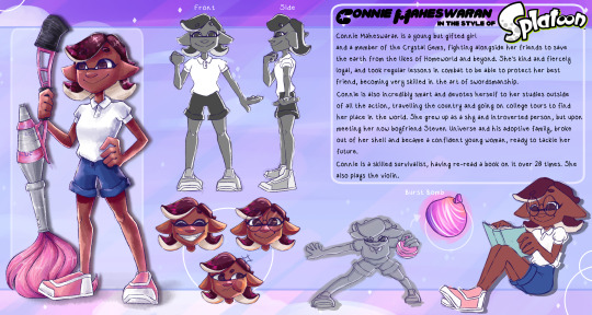
The first character mashup I made, therefore was the Connie Inkling mashup. For a good while before the summer, I had been practicing branching into more cartoonish proportion by drawing various characters from the Splatoon universe, and so by this point I was pretty well-versed in the anatomy of the Inkling and the proportions I would have to reproduce. Connie Maheswaran became my chosen character from the Steven Universe series, she just won out the top spot with her character growth and general personality and relatability. I chose to adapt her into the Splatoon Style in particular, since I felt like the Inkling species isn’t too far removed from humans, and so would make for a particularly easy and smooth mashup to begin with. Additionally to this, Connie being a warrior made her suited for a role as an inkling, and made for plenty of room to experiment with weapon choice and adaptation.
Connie already has rather exaggerated features when it comes to eyes and head size, but I took this even further and brought the 2D Splatfest style into it, which is even bolder. The limbs got thinner and lankier, but her pose got stronger, giving her that Inkling spark of confidence I wanted to portray. I made the lineart broken and split apart to try to mimic the quick-style sketch from the splatfest art, and the colouring followed an entirely different process to what I’m used to, bring splotchy like watercolour. Overall, I was really impressed with my adaptation of Connie into this style, and the smaller sketches also have their charm in showing her spunk and character. I had a lot of fun producing this in a time where I really wasn’t in the right headspace, it helped me to refocus my working brain on the tasks at hand.
Mashup 2 - Onward x Animal Crossing
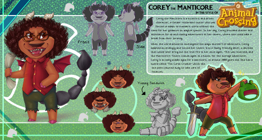
For the second mashup, I actually had a rather difficult time planning and executing the character, moreso than I originally thought I would have. Animal Crossing has a very regular style, the body types remain very similar to one another, with the only variations between characters often being colour and facial expression. The reason I chose the Manticore, is because of her uniqueness, she is after all, a Manticore, a combination of several different creatures. I knew I would be able to do something interesting for this, but when it came to sketching, she just wouldn’t look right. After a lot of trial and error, I came to a design I was happy with, even though she still doesn’t look exactly as I would like her to. The Manticore is a free spirit who definitely lost her path, but rediscovered the fire in herself and her calling as a beacon for adventurers. Personality-wise, there’s a lot there and I was hoping I could translate that into the Animal Crossing style well enough.
The Manticore is a large-bodied character with a lot of facial variation, so reducing that into a chibi style was going to be a task. The body wasn’t an issue, since it just follows a set type. The head and especially the hair proved difficult since there was so much going on, so I leaned into the detailed style and added as much definition as I could, drawing each individual curl and tooth. I mapped out the colours and parts of the body and got rid of the lineart for a while, but brought it back in at a lower opacity at the end. The shading was very fun, I don’t often work with a 2D-3D style so when I get to, adding exaggerated shading and texture was pleasant to do. The smaller figures, because I had added so much detail, proved harder to match but they look ok at the end. After she was finished, I was pleased, just not entirely with her outcome. There would be things I would change and improve should I draw her again, but as it stands, her design is still good in my books, and I did enjoy drawing her.
Mashup 3 - Ratatouille x Jojo’s Bizarre Adventure
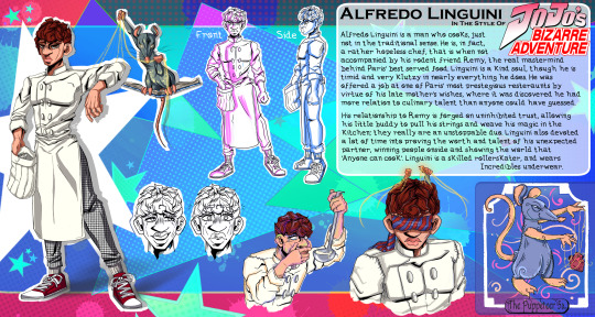
This final mashup was absolutely the most fun of the three to produce, the differerence between the subject and chosen style was just phenomenally fun to create and map out. Linguini is genuinely one of my favourite characters to come out of the Pixar universe, and so to be able to draw and adapt him and his personality into such a fun and interesting style made for an amazing experience. Linguini himself is very clumsy and incredibly awkward, but he honestly has a golden heart, and so to contrast that to the seriousness and masculinity of the Jojo style was entertaining. I wanted this piece to have the irony of the character being such a soft touch, presented as intimidating and I think I carried that out well.
The lineart took the longest, but I was more than happy to spend my time perfecting it and thickening the lines. I also dedicated a lot of time to drawing in the slight details, which I would usually add in colour, but the black helps them to stand out more. Even just in lineart form, the piece was already looking strong, but the two-tone colouring really helped to bring him together and to amplify certain features like his hair. Drawing Remy was also incredibly fun, since I got to go wild with his design, as well as the tarot card design in the corner. Shifting style halfway through to the tarot design was a welcome break from the mundanity. Even the background was a challenge, but I had to fill it and make it stand right out, so that the theme would continue of big and brash. After everything, this design turned out to absolutely be my favourite, and I had a lot of fun producing it. Though it’s so far removed from my own style, I will definitely be revisiting it in future.
Final Thoughts
The entire project up to this point has been really fun and refreshing. From the very beginning of summer I had a lot of personal problems going on, and this character mashup task has been a really welcome distraction from everything, getting me back on track for the animations and the beginning of Year 2.
1 note
·
View note
Text
QUICK TUTORIAL: lineart gifs & watercolours
i’ve received a few asks about how i made this gifset, so here’s a quick guide! i’m skipping right to the interesting parts, so you need to have basic knowledge of how to use photoshop to make gifs or you’re not going to get much out of this tutorial. the basic idea is very simple but the process can be extremely frustrating, as usual. proceed at your own risk.
things you’ll find behind the cut:
how i get from this:
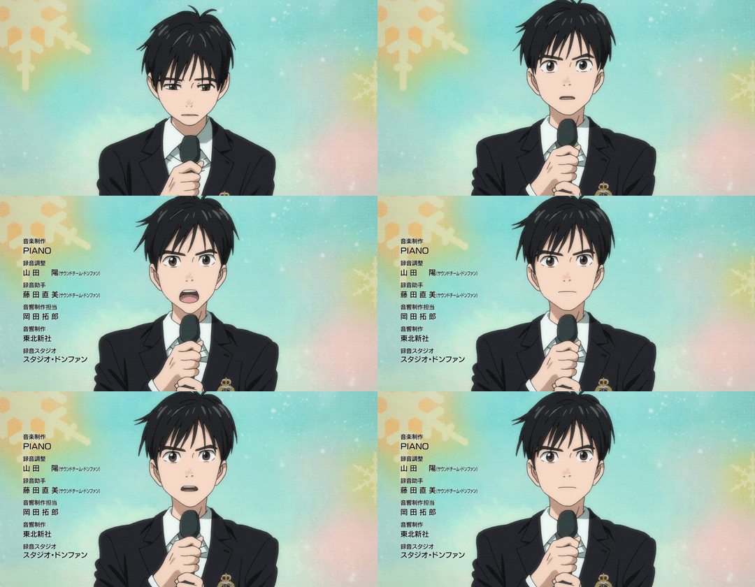
to this:

and to this:

still with me? great! let’s begin!
i use photoshop cc in this tutorial! all features should be available in other versions too, but they might be called something else. in that case please consult google.
YOU WANT YOUR GIF TO HAVE AS FEW FRAMES AS POSSIBLE! get them ready and do your basic thing ie resize, remove excess frames and set the framerate. next, flatten the frames into layers and download this action (19 frames at most) or do the following manually:
duplicate your first layer
set the copy to divide
add gaussian blur (approximately radius 0.6px) to the copy
use smart sharpen on the original layer. play around with the setting until the lines look clear and smooth (my settings: amount 300%, radius 0.3px, reduce noise 10%, remove gaussian blur)
check that the blurred layer is on top of the sharpened one
merge layers
repeat with every single layer :))))
now your gif should look something like this:
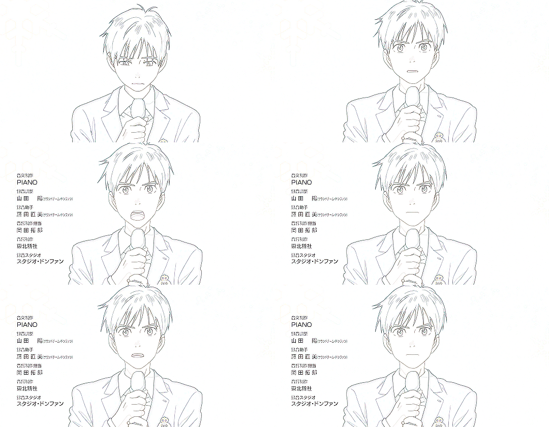
as you can see, if you wanted you could just paint over the parts where the background is still visible, add some colour or overlays and tadaaah, a perfectly fine gif! but we don’t want that today. we want to make our lives hell.
NEXT, WE’LL DO SOME MASKING AND GET RID OF THE BACKGROUND. i use the quick selection tool because it’s quick (lol), i’m lazy and these kind of gifs have nice and clear lines so it works like a dream!

make sure you’ve selected everything, it can be difficult to tell what’s part of the background and what’s the selection as you can see.
all done? next you’ll need to click mask and select. i invert the selection at this point, so the following settings only work with that! i forgot to put it in the pic but in addition to these setting, i usually have the output set to “layer mask” so that saves me a few clicks. when you’re happy with what you’re seeing, click ok and go though any bits that didn’t mask properly by hand.
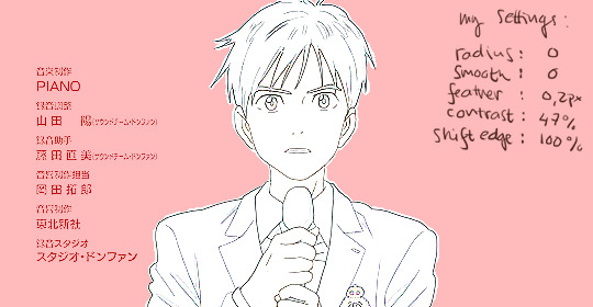
can you guess what the next step is? yeah. now do the same to all your layers...
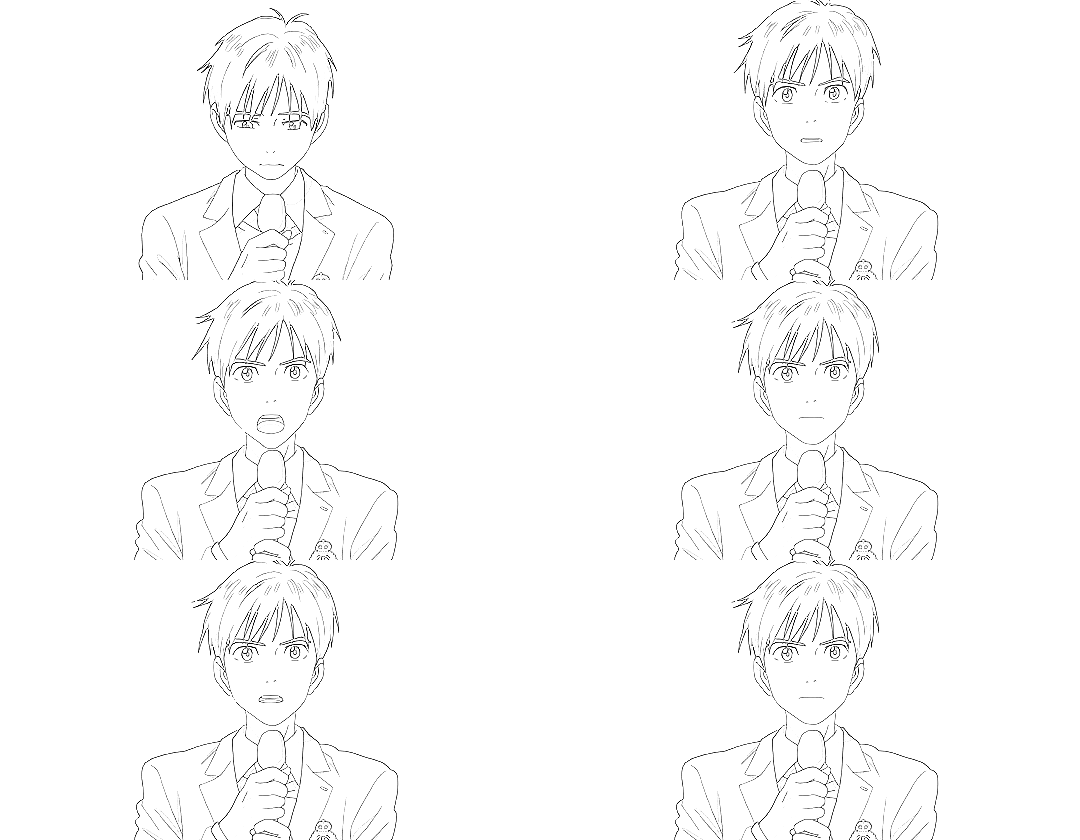
... and you’ll end up with something like this!
you probably can’t notice much difference, because it doesn’t show up properly on my blog, but the background is transparent! i’ve also added two adjustment layers to clean up the lines a bit:
black & white
levels (my settings: shadow 60, midtone 1.00, highlight 230)
//EDIT: naturally, the settings i used for the tutorial don’t work for all scenes but in my experience they’re a pretty good place to start from! also, if the scene has a very busy background i usually mask it before resizing and applying the lineart effect to make sure it looks as good as possible (and it also gives you the option to use the same frames in other projects without having to do it all over again)! in those cases the blurred layer leaves a fuzzy border around the image when you merge the layers, so you need to select the sharpened layer’s pixels before merging and mask the resulting layer with the selection. oh and i usually convert the layers for the first frame into smart objects before sharpening or blurring so i can easily adjust the settings to be optimal for the scene.
again, you could stop here, walk away with a nice transparent lineart gif and call it a day.
no? then we’ll start adding the watercolour.
this is, of course, all done manually as well, frame by frame. don’t blame me, i told you this was going to be frustrating.
add a white layer to act as a background, and adjust the output levels of the levels layer you just added a few minutes ago! my setting are: shadow 0, highlight 238
THE NEXT STEP IS TO START PAINTING
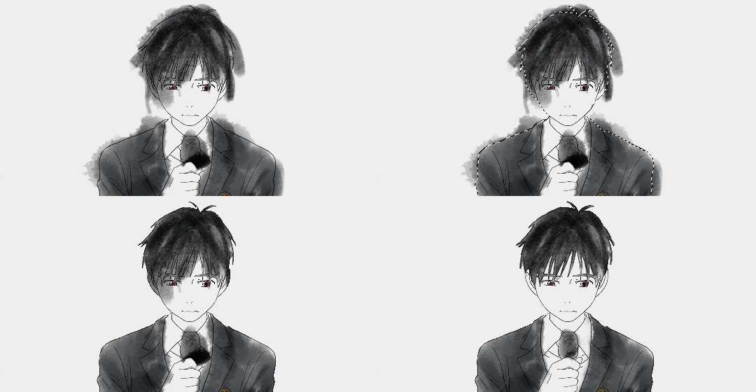
the gif should give you the basic idea of what to do from here on. basically, it’s something like this:
create a new layer on top of everything, pick a brush, add colour to appropriate spots, don’t mind if you can’t stay inside the lines. it’s actually better if you don’t! i usually have the colouring layers set to linear burn.
check what frame you have selected! you want to find the corresponding lineart layer, right click it and pick select pixels.
create a mask for your coloring layer from that selection. now the outline should be rather nice and smooth, and all you need to do is mask the inner parts using either a selection tool or do it manually. in this case i prefer the latter.
if your gif doesn’t have much movement, you can get away with duplicating the colouring layer for the next frame instead of painting everything from scratch! just duplicate the layer, delete the old mask, move the layer a bit if needed and add the mask from the next lineart layer.
repeat these steps until you run out of frames.
keep or delete the white layer you’ve used as a background.

before you even notice, you have a super pretty lineart gif painted in watercolour style, ready to be posted on tumblr or edited more!
i edited mine a bit more and ended up with this baby! i kind of lied in the beginning, since i’m not telling you how i turned it into this lmao oops. basically i just added the bg image and a few gradients on top of everything? super easy!
//EDIT: i can’t not tell you guys i feel so guilty lmao. okay, we’re starting from the bottom up!
changed the white background colour to #e6e6e6
a picture of flowers on top of it, color burn 60%
levels adjustment: shadow 60, midtone 1.00, highlight 230 and output adjustments are shadow 0, highlight 220
linear gradient fill layer, 90angle, colours #f3bfa5 and #fbeebc set mode to soft light 100% jump to between the lineart adjustment layers and colourings
color fill layer in #f3bfa5, set mode to soft light 100% jump on top of everything
vibrance adjustment layer, +100 vibrance and +31 saturation
gradient map adjustment layer, colours #f3bfa5 and fbccbc set mode to overlay 30%
duplicate the adj layer you just made, chance mode to color burn look at your beautiful gif and cry tears of joy

and that’s about it! i hope this cleared up the process a little!
thank you for checking out my tutorial! if you have any more questions, my ask box is always open ♥
oh and feel free to tag me if you post something made with this tutorial! i’d love to see your creations! i track #nikiforoov so just tag your post with that :)
#yuri!!! on ice#chaoticresources#photoshop#fyyoi#yuuri katsuki#tutorial#my edits#please let me know if there are some clear errors#in my defense it's 5am here rn and i should've been asleep ages ago#but noooope#here i am#what can i say i really love playing around with photoshop lmao
2K notes
·
View notes
Text
Grace Lee analysis
Grace Lee is an independent animator from the UK who currently works in London. She is one of the more lesser known artists out of the few I have selected to analyse and learn from, but I think considering the process and techniques of all sorts of artists will help me in my final project regardless of their fame. She made a short series of looping animations with vivid imagery and colouring which inspired me to do a 2D animation in the first place, and her short film ‘The Baths’ was shown on television and at numerous British film festivals.
Lee has a vimeo where she uploads some of her work. One in particular stood out to me, as it was not a polished animation, but a video of her process as she animated one of the trees for one of her short looping animations. This was very helpful as it showed her entire animating process including lining and colouring. She used the ‘onionskinning’ feature to animate frame-by-frame, as this emulates the traditional method of tracing parts from the previous frame onto paper as traditional animation does. Even with computers, we still use techniques created for hand-drawn 2D animation, so this reinforces my view that traditional techniques are as important to study as the more modern, digital ones today. While watching I also saw that she didn’t colour her lines until she was fully finished with lining the original animation, and I realised that this was a much better approach to the one I had previously been using while experimenting with Animate. Overall this process video has actually taught me a lot and I will most likely be using a very similar process while digitally animating myself.
vimeo
In the video, Lee also seems to animate different parts of the scene separately, then put the animations together for the final shot. Here we see that she is animating a tree, but at the end of the process video we see the tree animation being played alongside the rest of the scene. While I was animating some tests for my final piece, I also animated single parts of the scene first rather than drawing each part of the scene out for each frame. Watching this process video has somewhat reassured me that my process was at least somewhat effective, and I should do this for my final piece to be more efficient with my workflow. Drawing and animating different parts of a scene would also make me more likely to catch mistakes and be able to fix them without ruining the rest of the animation. This feels similar to how precomposing things in After Effects works, as a precomposed scene can be edited without effecting the other aspects of the animation that were not precomposed with it.
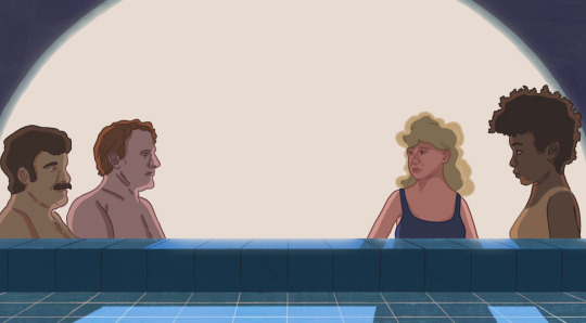
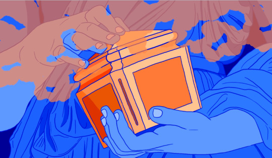
Similar to Rachel Kim’s art style, Lee’s animation tend to have lining that isn’t completely smooth and flowing from each frame. I feel like Lee’s vivid and unique subject matters and style make this work well, and also reminds me of my own rotoscopes in the past that had similar lining problems. However this could also mean that Lee herself uses rotoscoping for her animations, as everything else in the animation seems to animate slightly differently with less lineart discrepancy, and the movement of humanoid characters has a very realistic look to it that I think would be difficult to achieve if it wasn’t rotoscoped. Rotoscoping for my final piece is an option I could explore, although it does have certain advantages and disadvantages that I would have to consider (similar to using a messy lineart style inspired by Rachel Kim). Rotoscoping could help me save time as I wouldn’t have to storyboard and sketch out frames to trace off, but the movement style may not fit the tone of the animation I end up doing. However recording videos of people doing motions I want to animate for reference is always an option I could explore.
vimeo
0 notes
Note
Honestly your art is goals! Your lineart is insane! The poses! And the coloring!!! Oh my god the coloring is just perfect! I want to draw like you so badly aaaaah! Do you think you can give out any pointers? Or how did you got to making such a beautiful and smooth lineart ? Honestly I don’t want to bug you, but I would kill to draw like you some day!!! Bless you!
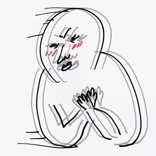
t-thank you!!!! i’m not super good at giving pointers or explaining things well, but i’ll try.
for the lineart, there isn’t much to say. what i do is use one layer for sketching,

i like blue for sketching, but the colour doesn’t really matter, use whatever is easier on the eyes for you. after i’m satisfied with the rough sketch, i try to trace it on a different layer which will later become the lineart layer.

^ like this narancia piece here, you can find it on my twitter, lineart vs sketch
> if you have shaky hands, or aren’t confident in your tracing abilities, or have problems tracing straight lines, choose a smaller resolution for the file. i used to work with files bigger than 3000x and i have to say, lineart was a lot more difficult because of its size. now, if i don’t plan on making it a print or if i don’t REALLY need the file to be so big, i usually go with a 1500x
> obviously, i don’t get it right the first time either, so working on the lineart involves a lot of ctrl+z and redoing the same thing at least 3 or 4 times

i use paint tool sai 99% of the time, if i’m feeling adventurous and want to try some different brushes, i open clip studio paint. ^ those are my settings for the brush i use to do the lineart
> advice #1: try to use different colours for different parts of the lineart (dark red or brown for the face, a slightly darker shade than what colour hair is, same with clothes, etc.)
> advice #2: make the lines on the outside of the lineart a bit thicker than the lines used inside the lineart. for example:

(sorry for using reigen’s ass, it was the first example i could find)see the outer lines? slightly thicker than the lineart for his hair or spine.
>advice #3: i don’t use black for lineart, but a slightly darker gray. looks smoother.
videos of me drawing are posted on my patreon @ https://www.patreon.com/netamashii
i have some uploaded on tumblr and twitter as well: link 1 and link 2
i get very VERY easily distracted when drawing, so it takes a lot more time than it should to finish a drawing. however, i am willing to start posting more videos of me drawing things, sketches, linearts, colouring, if people agree to donations to my ko-fi account.it’s quite time consuming and that would involve me focusing on something for more than 5 minutes without checking 2384732 tabs.
if you’d like to see more videos of the process, you can support me with coffees, leave a message, and i’ll try to post more videos.
obviously, i try to post videos regularly on my patreon, so check that out too
thank you for the lovely message, i’m extremely happy people enjoy what i post, i hope this helps, even a little bit!!!
#wow#long answer is long#i hope this helps!!#sorry for the questionable choice of examples#Anonymous
31 notes
·
View notes
Text
Sketchbook
This whole assignment is based around creating something of your own, a Personal Portfolio Project. This allows me to experiment and creating an outcome of so many sorts that I didn’t want to throw myself into it straight away without narrowing it down what I would like to do.
So, picking a list of three and developing on two this helped me thoroughly think about what I want to do. I narrowed the list down to concept art, character design and illustration. As illustration is so large and you can fit almost every category under it I decided to delve further into concept art and character design.
Environmental (Concept Art)
“Concept art is a form of illustration used to convey an idea for use in films, video games, animation, comic books or other media before it is put into the final product.” - Wikipedia
Concept art is what I believe to follow the most amount of artists that follow that career (or hobby) choice. For example, Sandara, Claire Hummel, Sergi Brosa and an artist that I found through deviantART, Myth-Keeper. Whilst concept art covers many forms such as environmental and character concepts, I focused on environmental with some side characters, taking most inspiration from Myth Keeper. For their concept art Myth Keeper (real name unknown) they can use quite blocky and sketchy styles, totally different to their final and fully rendered style. Here is an example of one of their concept paintings which I watched them work on during a Picarto stream: Evanesce. Their brush strokes are smooth and free and the characters included in the painting don’t hold too much attention and are mostly vague shapes. Whilst not quite the same I wanted to look into something similar of my own but traditionally on paper. I used some of my own photos that I have taken on walks along with inspiration from Myth Keeper themselves and creating two sketches.
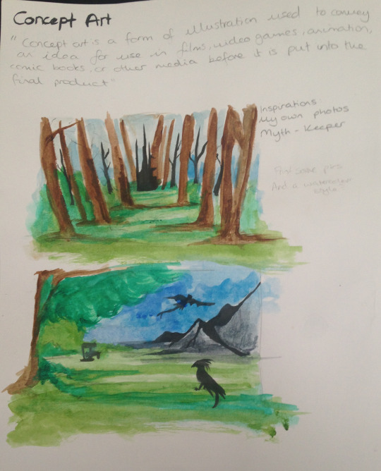
To add some colour and to show practice with other materials I also decided to colour using watercolours. I kept quite free with both the pencil lines and watercolour as it’s a vague concept with nothing fully rendered or decided.
Character Design (Concept Art)
“A character designer is an artist that creates new, original characters for a purpose.” - Tom Bancroft.
Character design isn’t all that different from the previous topic with how characters start off as a concept before slowly becoming developed and rendered with time and different concepts, as goes with most things in art. Quite a few of the artists which I have previously linked such as Claire Hummel and Sergi Brosa do character design, my favourite being Sergi Brosa. They have to be one of my favourite concept artists due to their anatomy and colours. Their designs are bright and detailed and share the step-by-step process of development. They delve more into their character designs and add extra sheets on the characters, whether it be different expressions, weapons or vehicles. Here is a good example of their process and character design for a character in a story: Atomic Delivery - The Hero, Zia. The artist has included a number of different colour examples to help them come to a final conclusion of what they think fits best. Over on their Behance they include the process for some of their characters such as Igor. They show their initial sketch done digitally and working up with a lineart, colour and shading. For this specific character even though he is wearing what I can only assume is a form of armour, they have still sketched out the basic body that would be underneath before building it up. For their artwork they use Manga Studio and Photoshop.
Whilst I did not delve into character creation and only skimmed the surface at the beginning I still find it relevant.

A character’s personality can be easily captured with their reactions and facial expressions to different events. The eyebrows and mouth often play the biggest part in reading a character, in both real life and not, along with any facial lines. Characters can be anything. They can be a human, animal, an alien, something with two legs but not human or quite frankly anything. A character can be whatever you see or want to see put down on paper with no limitations. To capture expressions the character must have distinct features, like how I captured “tired” with droopy eyes and mouth, trying to convey just how tired a character might be.
Illustration
“An illustration is a decoration, interpretation or visual explanation of a text, concept or process.” - Wikipedia
Illustration can be hard to describe. I think almost every form of art (such as concept art and character design) are all Illustration, making it almost limitless but sometimes I think illustration can sometimes hold a deep meaning, as does most forms of art.
Moodboard - what am I interested in?
To help my process and what to do exactly I created a moodboard. However, I didn’t include interests such as foods, games or films I may enjoy. Instead I included inspirations. A lot of my inspiration, especially for full illustrations come from the outdoors and what I see during my trips out and long walks. I often take photos of where I go even if it only ends up looking like a field with some trees in it to other people, whereas for me I see much more which helps in drawings, such as the way the ground is laid or how the trees are placed or the colours of the foliage and sky. Included in some are dogs I own or have previously owned where a lot of my inspiration also comes from, especially if they are set in the scene correctly. My favourite pictures that I take have to be of trees. Whilst it may seem boring to some, the way trees can grow in odd shapes or how they’ve been purposefully placed can be quite interesting, such as creating a straight line on either sides and directing the viewers eye to a certain point or the way they may have fallen during a storm and lay in such a way that light or water is seen through and creates a pretty image.
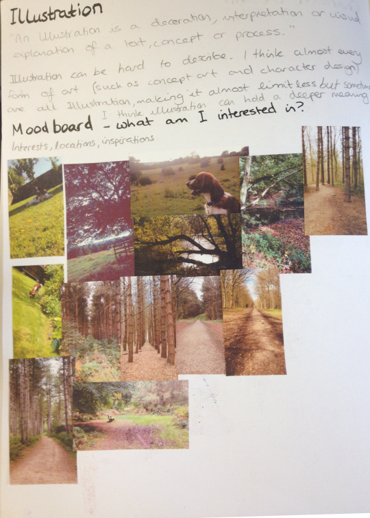
It was at this point that I decided that I wanted to create an Illustration of something that has meaning to me but I was still uncertain on what exactly.
Colour Practice
Colour is a difficult thing to use but can be effective in many ways, whether it be because the colours are very bright or very dark. The colour palette can solely tell a whole story and mood, whether it’s good or bad, sad or happy. Colour is important but getting it right can be difficult.
Finding two images from my moodboard I used them to take inspiration and sketch out a scene. I wanted to use these two scenes to create a light and a dark background. I decided to use markers which although I haven’t used that often, it gave a block-y style which I wanted for these quick concepts as I didn’t want to delve into too much detail.

I think it worked effectively and whilst the darker background could’ve used more work, it still helped me come up with an idea and how I would like to present. I soon decided that not only did I want to include an environment in my illustration but also a character to create a full illustration, perhaps fully painted digitally, but to do so would require more planning and work to finalise my idea.
0 notes
Text
Personal Illustration Process
04/06/18
For my final piece, I have pretty much decided that I will be having an illustration in my final piece, the illustration will be of me. There is more context and rough sketches of ideas in the 10-page sketchbook work post below which detail the ideas which I had relating to the illustration. Anyway, I’ll talk briefly about some ideas that I have for my final piece. My main idea now is to draw myself have a cityscape background behind me. The illustration will include me wearing a striped t-shirt, which will be added in Photoshop when I have finished the whole illustration - the stripes will be lines which I will distort so it looks like a striped t-shirt, but also not at the same time because it will look manipulated and unshaded - I think that this will look pretty good when it’s done. The background will be hopefully transparent so that I can export it into Photoshop, but if this doesn’t work, then I will try my best to cut around it using the tool available to me in Photoshop such as the pen tool, it will just come down to my own accuracy. The reason I’m keeping the background plain is so that I can have a cityscape background which I will create in either Photoshop or Illustrator, I say Photoshop as I recently created a scene for an animation there, and found that as long as I don’t use complex shapes such as shapes that involve the line tool to create, then creating a cityscape scene shouldn’t be too tricky - the whole reason for using Photoshop for this at all is because of the effects it offers as opposed to Illustrator.
So I started by sketching out some line art, which I think looks okay, but the face needs some working on. I decided to kind of exaggerate the eyebrows because I think it resembles me more that way. I think the hair looks relatively similar to my own, though probably a bit straighter-looking, but I tried to get the curl on the right hand side, and the hair which you can see at the back of my neck. The glasses may look a bit too big, but the neck and clothes look fairly good in my opinion. For this line art I used a very thin black watercolour brush with brush sensitivity on, as I’m using a Wacom drawing tablet - not really expensive one with a screen, but it does the job.

I started adding some basic colour to the segments which need to be coloured in, in this case being the hair, the visible skin and the jacket - I also thought that I would colour the shirt in white, so that when I export it when it’s finished, it’s not transparent because it wasn’t coloured in. The colours aren’t flashy or anything, but I think that it will still look good when it’s all finished. When colouring, there’s a specific way that I do it. I colour the different parts on their respective layers, and then add another layer above it, and enable something called ‘clipping layer’ or I think that’s what it’s called - basically, it means that whatever I do on this layer, will only happen on whatever I did on the layer below it, so it’s extremely useful for shading different parts of a drawing. This will take effect on the part below.

I began to start shading in places I thought would fit, like on the neck, where a shadow is cast from the head. I also shaded under the hair above my glasses, as the hair would be casting a shadow there too. For the shade I used mixes of orange and grey. Because of the blue jacket thing that I’m wearing here, I tried to reflect the colour from it slightly onto the neck shade, on the right. This was also the point at which I drew the glasses, which took a really long time to get right as I did it freehand with no shape tool or anything. I think that they turned out alright.
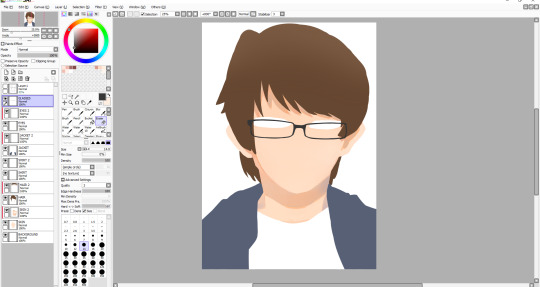
Next I shaded the face slightly, so that it didn’t look so flat. I also added a shade on the face to give the impression that there’s a nose - I also added a subtle highlight on the nose too. I drew a facial expression and also a little detail under the mouth to show that the chin is there. After this I decided to start working on the hair. I started by adding shade and lines where I thought my hair kind of parts, and then I added some highlights mainly near the left hand side. I didn’t have any particular idea for a light source in this illustration, though judging from the shadows on the face and neck, I would assume that it’s coming from the front. I also added a small shade under the middle of the glasses - I haven’t yet decided whether I want to have a shadow being cast from the glasses themselves, because it would be frustrating to draw them all over again except this time I’ll need to be even more accurate. I might be able to duplicate the layer and change the colour to the skin shade and have them underneath the glasses.
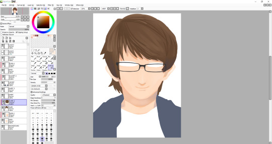
I worked on the hair for a while to try and get it to look kind of smooth, which I think I’ve pulled off for the most part, although I might work on it some more when I’ve done everything else. The hair contains a range of shades. I even used a desaturated purple, as well as some saturated browns and some greys. For the highlights, I tried to smooth them out and they’re just regular browns, with a bit of desaturation to them. After doing the hair, I decided I was unhappy with the eyes once I tried adding pupils, so I changed the shape of them a bit. I also added a more noticeable highlight on the nose as well as add one below the nose. I’m not very good at caricature, so facial features don’t tend to look a whole lot like how they should, so I have to rely on getting the hair right to some degree for now. I added a kind of gradient thing to my jacket, though I may remove it - I still plan on shading the jacket, I just thought it might be a cool touch.
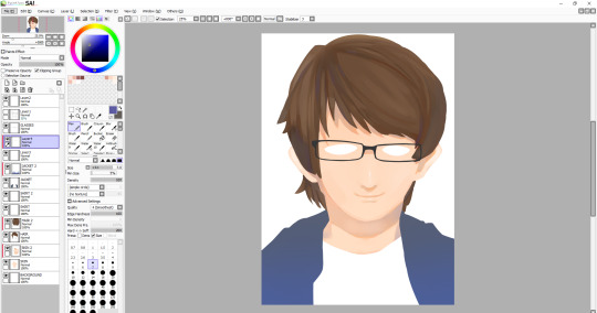
I decided to work on the hair some more, and added some more highlights, most notably on the left side of the hair. One of the more prominent things which I added here is the eyes. I think that they look alright, maybe it bit sad-looking, which wasn’t my intention - maybe I’ll work on them later. The face still needs things adding such as the eyebrows, which I think will be the thing to make it look more like me. The whole illustration still needs line-art around it, so I will add that when all of the colouring is done - though if line art doesn’t work then I’ll leave it as it is now. A problem that has been raised by my tutor, and that is that since my composition is going to be landscape eventually, with the illustration looking like this, the sides of my arms are cut off. I don’t know how I didn’t think of this, but I’m glad that it was pointed out much sooner than later. I suppose I’ll have to draw the arms on, which in theory might actually be quite difficult, since I’m working with quite a few layers, and also I’m not even sure if I’m able to expand the canvas, I’ll have to research this soon, as the deadline is creeping up on me, and I can’t spend too much more time on this illustration.
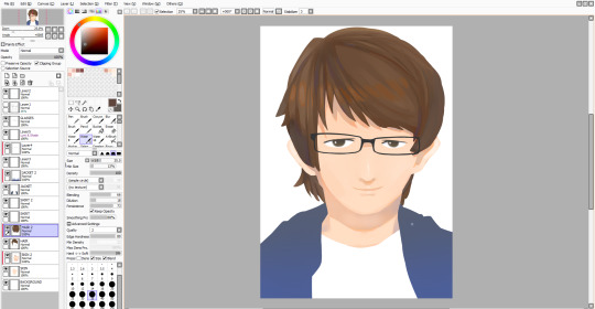
Luckily, I was able to expand the canvas as much as I wanted so I could draw on the sides of the arms. I decided not to sketch them first, so they may look a bit off, or that could be because I really need to improve on drawing anything from the head down. Alongside this, I drew on details around the eyes, most notably the eyebrows, which I think turned out well. I also changed the eyes slightly, though I still look sad. Also - I made the hair a bit rounder near the top, as I thought that it just looked a bit off before.
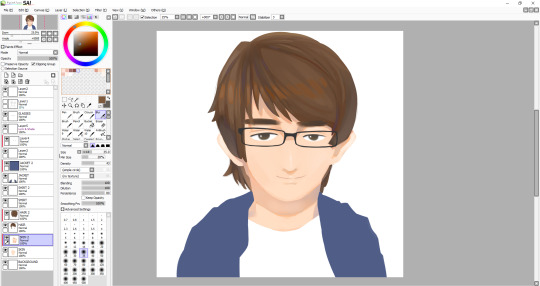
I am almost finished - except not, because now I have to work on the jacket, which was the part I was least looking forward to, so if the drawing doesn’t look as good now, I’ll be blaming it on the jacket. Anyway, to start, I very loosely stuck to my original lineart, though there are some differences between them. I stuck with one of the watercolour brushes that I’d been using throughout this whole illustration, though maybe I should’ve used something else because the texture just doesn’t really look like clothing. I suppose just a different type of brush may have done the trick, though it still comes down to how I handle the shading and where to put it. I usually like to draw things like hair and clothing in segments, like with hair, there’s different parts to, and with clothing, there’s folds, which I need to vastly improve it seems. After I finished with the dark tones, I decided to add highlights I deemed necessary, that or I just added them because it looked empty - though perhaps I shouldn’t have added highlights, and just worked on the darker shades because I’m not particularly pleased with how it turned out. Anyway, that was the end of the illustration, I thought I would add a kind of inner glow in the illustration, as I plan to have this illustration in front of a city. To do this all I had to do was go on each layer and use a large white airbrush. Also, I’m leaving the shirt blank as I still plan on adding some black lines in Photoshop which I will manipulate to look wavy.
Final Illustration

Overall, I think that this illustration turned out well, in particular the head and neck. As I mentioned, I’m not very happy with the jacket, but I think that no matter how many times I redo it right now, I won’t be able to make it look good - it just comes down to me needing much more practice drawing and shading clothes. Looking back at this, I noticed the head looks a bit too big for the body, which wasn’t what I had intended, but I guess after all, the whole thing is just an exaggerated drawing of me.
0 notes