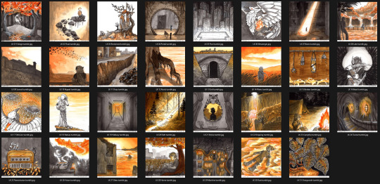
#make little color palettes for each album
Text
fuck it im making bracelets for the fall out boy concert im not letting swifties have all the fun
#i just think itd be FUN#make little color palettes for each album#bracelets w some lyrics#shut up riley
14 notes
·
View notes
Note
Sorry for the spam likes today. Favorite jazz album?? I saw a post on your blog that mentioned Mingus ah um. That’s either my fave or Birth of Cool (Miles Davis does do my favorite version of On Green Dolphin Street). Though both are kinda basic choices I want to expand my listening.
so i'm gonna give you a few albums (and album-adjacent things) with the caveat that i haven't heard most of what's out there ^_^ i'm just a casual fan
ornette coleman - the shape of jazz to come
this album is on another level. the multiple layers of brass crisscross each other, playing dissonant chaos, then they rip into solos that could melt charlie parker's fingers. the bass shreds and stumbles up and down some wild assortment of scales. the drums patter out a frantic rhythm that somehow ties everything together.
it shouldn't make sense, but it feels so alive. you'll catch quotes from flight of the bumblebee over rainy oceans of rhythm. herds of wild animals shuffle back and forth in a forest painted by jackson pollock. and then whoever's not soloing yells "woo! alright!"
it's not even my favorite ornette coleman recording. that honor goes to this youtube upload of a live show in germany, 1978. the bass intro, instantly picked up by the drummer, is so electric. the haunting melodies, borrowed from the rite of spring, are traded from sax to guitar. the whole band feels like they're operating on instinct. this is what a basquiat painting SOUNDS like. like a genius artist drawing with their non-dominant hand. LITERALLY coleman plays a violin left-handed at one point. it's incredible.
john coltrane - my favorite things
trane puts so much panache into this simple little pop song. the opening chords are heavy with drama. the groove is insanely tight. every time he plays the melody, it's got a new rhythm, to the point where he seems to be playing a game with the listener. "how many ways can i get you to feel this groove?" the song is melted, bent, and stretched like molten glass, in a 13 minute display of total virtuosity
and that's just track 1!!!! this album is timeless. every second is as fresh and vibrant as it was in 1961
herbie hancock - headhunters
herbie has always been at the cutting edge of jazz fusion. this is his definitive statement on funk
this album is intensely rhythmic, laying out catchy melodies over funk foundations. the whole band seems to just be having a blast. the grooves are often busy and hypermelodic, with no room to breathe as everyone jams at once. it's like an all-night house party in a bouncy castle full of confetti
if you're a fan of japanese jazz like caseopia, or jazz-influenced video game music, this album will feel shockingly familiar to you. its wildly creative synth work, uplifting and colorful chords, and eclectic sound palette are all DECADES ahead of their time.
where would we be without herbie? i'd wager the entire global music landscape would be different. from hip hop to big beat to drum n bass, we all stand on the shoulders of giants. hancock is a titan. the giants that raise us up are standing on his shoulders
39 notes
·
View notes
Text
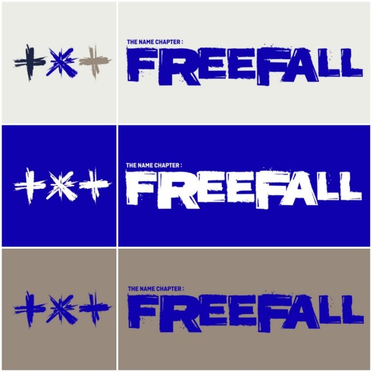
The Name Chapter: Freefall Logo Analysis and Predictions
uh? who would have thought, not me 🥸
you guessed it, it's TXT LORE O'CLOCK! let's start with the new logo motion because there's already a bunch to unpack here 👀
we see the Star shining brightly behind the Temptation logo
the Temptation logo literally disintegrates and the original one, the "X", shows up below it: TXT are now free from Temptation, it's not making their brain foggy anymore, the fake fantasy they were in is dissolving. This was represented in the Farwell, Neverland poster as well (in a sec we'll go back to it)
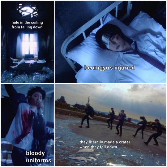
the logo is FREE FALLING, exactly what TXT are doing: falling back down to earth from Neverland ...and it's not a nice fall, they literally shatter the ground 🥲 we saw some big damage made after a fall like this already 👀 it was in Ox1=Lovesong Japanese Ver. music video (see picture below)
finally, the logo takes its new form, and so does TXT: let's put some bandages (literally Beomgyu) over those scars and OH LOOK THE STAR AGAIN!! Looks like TXT are finally going to remember their true names and the promise they made as children 😎
we also have the color palette for this album: blu as the sky, white as the star, brown/beige as the ground... the same palette they used for the 0x1=Lovesong music video now that i see the picture close to eachother 😮
Now, should we dive into a few more details and predictions for this upcoming album? 👀
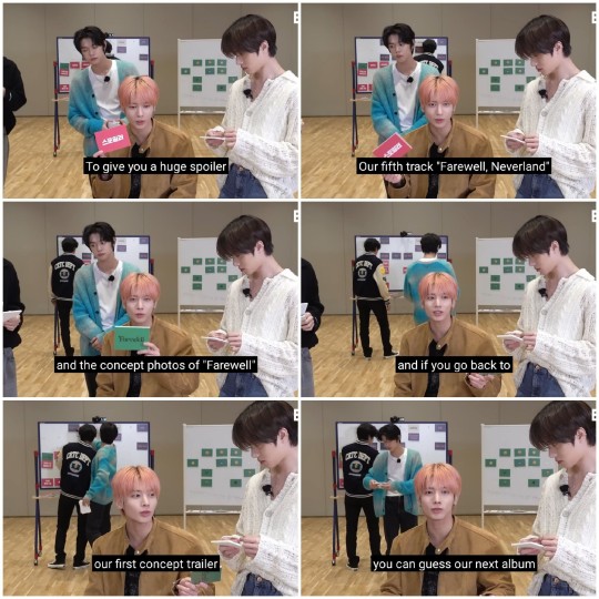
During the T:Terview video for TNC: Temptation (minute 12:45) Taehyun gave a spoiler about the next album...
so let's analyze them!
1) CONCEPT TRAILER
You can find my full analysis of it here !
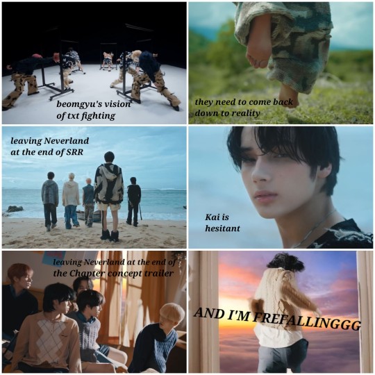
RECAP: after what we saw in Sugar Rush Ride, TXT should leave Neverland/Magic Island because they're too grown up now to keep living in that fantasy. In the concept trailer it's when they jump out of the falling house, the fall back from their hideout in Neverland to the real world... BUT, they'll all have to fight eachother and their inner demons to accept the reality of things now, as we saw in Beomgyu's vision.
2) FAREWELL, NEVERLAND
1) this was my analysis of its poster:
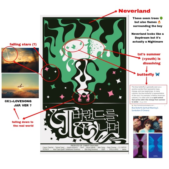
Because of the symbolism of the butterfly and the seasons motif (see my summary for my explanation), since in Sugar Rush Ride it was summer in Neverland, i think that in the next album we are going to have autumn like in Blue Hour, or anyway colder weather.
*months later* And now, WHEN does the new album come out?? October 😌 the timeline is timelining.
HERE you can find my little analysis of the lyrics of Farewell, Neverland that i highly recommend reading :))
here's a little summary anyway:
🎶 Neverland, my love, goodbye now / And I'm free falling / Stars, sleep with comfort / 'Til I be calling 🎶
TXT accept that they have to leave Neverland and they fall back down to the real world. Yeonjun's says that "stars" can "sleep" comfortably until TXT are going to be "calling" them: this is of course a reference to the Star, that is still asleep and is going to wake up only when TXT sing the promise song.
In the concept trailer we saw that TXT are leaving Neverland at sunset, like they always do: Blue Hour is the time of the day when the border between the magical and the real world is tinner and they are able to travel between the two.
And what comes after sunset? Night, of course.
so now let's now take a look at...
3) FAREWELL CONCEPT PICS
First of all, it is night ✨ 👀
each one of them is holding a lantern like in this scene of Sugar Rush Ride:

I'm pretty sure the lantern references the Star, txt's guide/compass to move through life.
And let's not forget that to enter and exit Neverland in Peter Pan you need the "the second star on the right" and they're all holding the lantern with their right hand.
The fact that the night approaching in time is showed through the solo pictures in this exact order is not casual either: we have Yeonjun (there's still some light), Kai, Soobin, Beomgyu and Taehyun (it's pitch black).
Yeonjun true name is "promise": he has to be the one to keep hope alive in the group and persevere to find the star. While Taehyun saw the dangers the future holds through the premonitions (in Eternally mv) so he's not very hopeful towards it.
This is also the exact same order as that of TXT fighting in the labyrinth in Beomgyu's vision in the TNC concept trailer (i explained in the storyline summary):
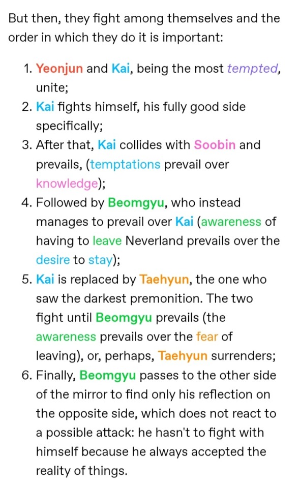
Taehyun is last one who's defeated (or surrenders) and from the Farewell concept pics that's not looking so good... another interesting detail is that Taehyun's boat is the only one flipped around:
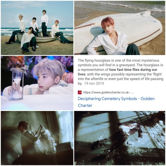
Seems like he's not going to make it, or rather his youth is not going to: he's the one that's going to fully lose his youthful self and fully face adulthood. This was hinted by his object in the Nightmare concept pics: an hourglass. He's afraid of time passing and aging, most of all.

literally.
AND, all of this also explains why in 0x1=Lovesong Japanese Ver. he has wings and disappears at the end of the music video!
If you read my summary you already know, but my theory is that 0x1=Lovesong Japanese music video (click to watch) fits after Temptation and comes with the second part of The Name Chapter. We literally see them falling from the sky! and now that we know that the next TNC album is called Freefall looks like the dots are connecting! 😈
Finally, let's unpack this silly little image they gave us in January...
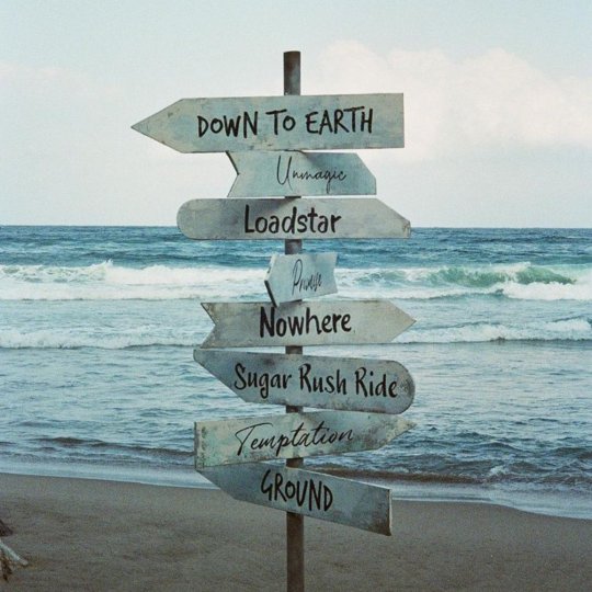
Since Temptation, being the name of the first album of The Name Chapter, is written in cursive, a very diffused theory was that the words written in the same fonts were the titles of the next two albums: Promise and Unmagic...
LOOKS LIKE THEY FOOLED US🤡
i had a feeling they were deceiving us with this one, it couldn't be this easy, they couldn't have gave away such a big anticipation... but hey, these silly little words still have some kind of importance ☝👀
— Loadstar means "a star that leads or guides, especially (used for) the north star". We just talked about the Star symbolised by the lantern being their guide 👀👍
— Promise is the name of the train that took TXT to Magic Island/Neverland in Sugar Rush Ride, but it's also Yeonjun’s true name, and it refers as well to the promise TXT made with eachother and the Star... and it looks like, in the next album, TXT are finally going to remember it... CAN I GET AN HALLELUJAH? 👼🏻
So these signs were a summary: on Neverland's Ground, TXT are under Temptation through the Sugar Rush Ride. Nowhere can they found their Loadstar, but they need to remember the Promise they made with her. This will lead them Down to Eart, to a world of Unmagic.
And that's all I have for now!!
Thank you so much for reading, let me know your thoughts and theories if you have them, i'd love that 😊♡
Until next TXT LORE O'CLOCK, byeee take care!
READ NEXT -> The Name Chapter: Freefall Concepts Analysis
Masterlist
#this was very fun to make i hope it's fun to read too :))#txt#tomorrow x together#the name chapter: temptation#the name chapter: freefall#the star seekers#txt lore#txt storyline#— txt lore
72 notes
·
View notes
Note
your lancer edits are absolutely AMAZING!!! i've done edits for non-lancer stuff, so i'm curious, what is your process usually like?
Thank you!
The process is, admittedly, VERY time consuming. (which is why i haven't done any recently, it's just a massive time investment)
My workflow exists entirely within Photoshop
I start off with an image of the base mech I rip off of Comp/Con, and I spend a few hours meticulously isolating every part of the mech by hand (polygon lasso tool my beloved). I found that the automatic solutions like magic wand tool & such just. aren't very effective when it comes to holding together detail. Too much or too little is lost in the process, and it usually requires manual touchup anyway, so I just decided to do the whole thing by hand to save the tedium.
This usually takes anywhere from 1-3 hours? It's hard to say. But, the catch is, once i've done it once for a mech, I don't have to do it ever again.
Once i'm done with separating the pieces i want to color/reuse individually, I move on to base coloring. I usually have some idea in mind, but sometimes I just freestyle it. I usually use pretty simple color palettes, and I work almost exclusively in Photoshops Blending Options panel to get those colors to work. Having a non-destructive workflow is..vital. Mixing types like Overlay, Hue, Color, and Multiply are my favorite toys during this process. I also make sure to give everything a 2px black stroke, usually internal, to better match with the base art & clean up any of my mistakes.
When i'm ready to go for the more advanced edits (where i need to add stuff instead of just change things), I spend a little while scrolling through C/C like i'm at a shopping mall looking for parts. Anything interesting, I play around with. I like to rip various greebles off of mechs like the Tortuga, Caliban, Kidd & Nelson the most, but every one of em gets time in the spotlight. At this point, I have most of the parts I could need memorized quite well, and if something calls for a certain shape, I'll know where to find it & take it from.
Trying to get each asset to fit the style of the base frame is quite easy, and adding a simple 2px internal stroke does miracles.
When i'm happy with most everything, i'll play around with gradients to highlight the most interesting parts, give it a flashy name stolen from some album i've listened to Twice, and send it on it's way.
I have an upload of all my raw .PSDs available for download if you're curious- do be warned though, my layer organization sucks and i didn't plan for anyone else to be looking over my work.
I hope that helped!
27 notes
·
View notes
Note
What would your dream album aesthetic be for LT3? Like colour pallette, album cover, promotional vibes, song vibes? (That last one is not quite an aesthetic question but I'm curious if there's a sound from his previous work you'd like to hear more of?)
(I'm definitely doing soooo well with the potential wait, not already dreaming of LT3 at all!!! 🤣)
Hi, anon. I'm not doing well with the wait as well. I was really hoping for a new single for the festivals 😩. Just something to take the edge off and give us a little more patience while we wait for him to "let life in" and finish his album in peace. (who am i kidding even then, i could never be patient for a new Louis album) . For the color palette, i would LOVE a purple/ pink themed album but i'm not too picky as long as he goes with soft pretty colors (the 28 clothing color palette always eats, he should take notes for the album 👀). As for the album cover, i can't give you an exact image bc the ideas are endless. My only request is that they do a lighter one than the walls and fitf covers. And just like the cover, i want the songs to be happy ones 😭. It's ok if he squeezes a couple of heart wrenching songs in, but as a whole i want a happy album and with new themes (pls i don't want another song about the toxic relationship that he keeps referencing to in songs like defenceless and habit and waoyf...). For the sound, as long as he doesn't try to fit in "the indie" persona and allows himself to experiment (or not) with the sounds, i'm more than happy with anything he comes up with (fitf is proof of that). BUT ngl, i think the man has the special gift of making pop perfection, so i would love a full on poppy song à la always you. All this time, she is beauty and written all over your face are such good songs but more importantly so unique to his voice and fit his voice to PERFECTION. I mean he always sounds heavenly but all this time and waoyf are something else. For promotion, it's really naive of us to expect any good promo atp (his team sucks 😔) and i'm not really keeping up with that stuff but i think it's all about payola nowadays (which he doesn't have AT ALL) and some selective public appearances and viral segments. Those interviews with the same 5 questions (at least two of them 1 dead related. The 1dead questions NEED to be banned btw) are almost useless. Ideally, i think he should do the fun segments/ interviews with potential viral moments like that chicken shop date and hot ones (let me dream ok 🤣) and some ladbible segments, a Zach Sang interview ( i mean a long, honest interview where he talks about everything while being his funny witty self. Could be another interviewer i only mentioned Zach bc Louis seems to open up to him and he did give us two amazing interviews), an interview on his YouTube channel where he talks about the album as a whole with details about each song like the breaking down walls and fitf ones (but perferably with a different interviewer), one or two podcasts bc they're really popular rn and they do ask questions that celebrities aren't asked about often and sometimes give you a glimpse of their true personality. A couple of tv appearances with performances at late night shows. That's all that comes to my mind rn but even then, without payola and with the media blacklisting it's very hard for his music to truly reach the gp and get the smash success it deserves. Anyway, regardless of the promo he is (or not) going to get i can't wait for LT3. That's all i can do as a fan. I can never put into words how much that first listen to a new album of his mean to me 🥹. Life changing that's for sure! I look forward for this man to change my life for the third time soon (fouth if we count LIVE).
2 notes
·
View notes
Text
Corvid late night thoughts/rambles time. Just some lore ideas regarding Ranne, art ideas for the future, and other random things on my mind. Pardon the spelling errors.
I want Ranne to have a friend, despite them being not the most likable personality wise. Ranne is a middle-ranking god of winter and birds, specifically crows and other birds of the corvid family (I have a bird obsession and it is not hidden well). Ranne has a cool color palette and I plan on finalizing a reference sheet for them soon with more black accents to convey the bird theme. Back to making a friend for Ranne, I want this other creature to have a warmer color palette while still being desaturated to go with the theme of this story/world. Ranne is very androgynous representing and I want this other character to lean towards a more masculine androgyny. Ranne has metal armor and wears a knight like helmet/mask and I want this other character to have a more natural raw material-like armor, leather and fur. I want a contrast between these two characters. Ranne, cold and rebellious and reserved and full of sinister energy, and this other creature calm and stable and friendly. This masculine creature will most likely have an earthy appearance. I’ve talked a bit about Ranne’s lore before and how I either want them to make a mistake or get a little too mischievous and is forced as punishment to gaurd a sacred forest for a thousand years OR the lone wolf Ranne becomes friends with another god (this earthy masc creature concept) and the friend dies in a war between the gods and Ranne gets angry, rampage and kills, and as punishment is forced to guard a forest for thousand years. THEN AGAIN, if I don’t like how earth creature man is turning out design wise, I will go with lore option 1. If he looks cool is sparking joy, lore option 2. This was hella long my bad gang.
Art ideas for the sleep token fans: you know, the TMBTE creatures? Amazing designs, love them. I will drawing all of them eventually (I have drawn a few but not all). I was also thinking… with if other albums had creatures too? TPWBYT has a couple various fish designs, the aquatic creature we see in the mini art book that came with the TPWBYT vinyl so I probably won’t touch those but what about Sundowning? I defiantly won’t do a creature for each song but maybe for The Offering and Blood Sport. This is just a fun idea and an excess to draw Sleep Token style knight cryptids.
Personal art ideas: I will make drawings of all my characters (chibi style) and stickers will happen. It will be far into the future though.
3 notes
·
View notes
Note
What do you think about Olivia’s new album! Interesting to see that she’s maintaining the purple, just in a darker shade, it kind of makes it feel continuous from the first album
it is always so sweet when you guys ask me this <3 thank you. I have less thoughts on the actual album cover than I do on the conversation surrounding it, but I will compile them both in this post.
I like the album cover by itself. I LOVE when the title is integrated into the cover photo in the form of a physical object and I am glad Olivia did that again. I also simply love the title. Very gore-y, very visceral, it intrigues me and promises a very raw and insightful record. The photography, with the bra sneaking out and the finger in Olivia's mouth, matches this idea of corrupted girlhood/feminity as a whole. It is fully giving the mess that is "coming of age and into your own as a young woman", and it is always good when a cover gets my brain churning like that.
I do not love the very clean eye liner and overall something about the lighting sets me off, but that is truly subjective. I am surprised how little I mind the amount of empty purple space, considering my issues with the SOUR cover (they should have zoomed in!). I think it is nice that it has texture.
NOW. Onto the whole "it is bad that there is so little visual distinction between her two albums!": I get it, I really do. I think it never hurts to have a distinct aesthetic for each album, to avoid confusion and really cement the album as a standalone thing in the pop culture hivemind. That said: The idea that every artist HAS to make albums that neatly fit into a seperate color palette is a bit odd, and it is not something that works for every artist. Some artists like to create albums that feel like continuations of one another, which does seem to be the case with Olivia, and I think we just have to see how it works out! There is no one way to do it right, every artist is unique and does their own thing.
14 notes
·
View notes
Text
Presenting the project that made me heterophobic:
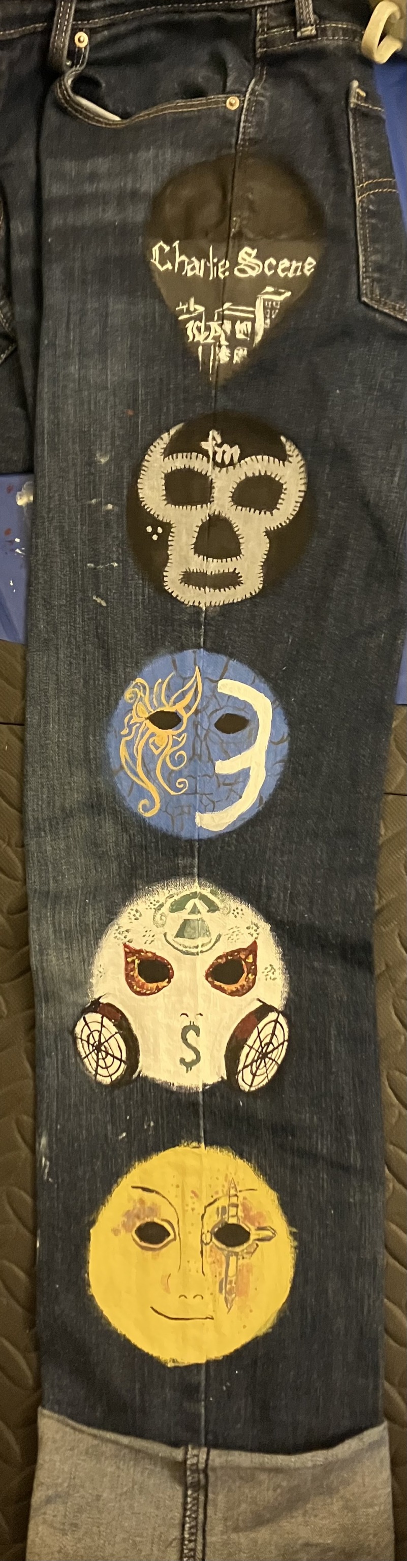
Yep! I am the dork that painted the masks of our current five boys over the course of three-four days (easier to space than six would be and lets face it, I do not care for kurlzz). I chose the Notes from the Underground masks because I've realized that it's the album that most of my favorite songs thus far come from. I quickly began regretting my decision at the point where I realized exactly how limited my paint options were and how many cool colors I would need. More details for each mask below (going bottom to top).
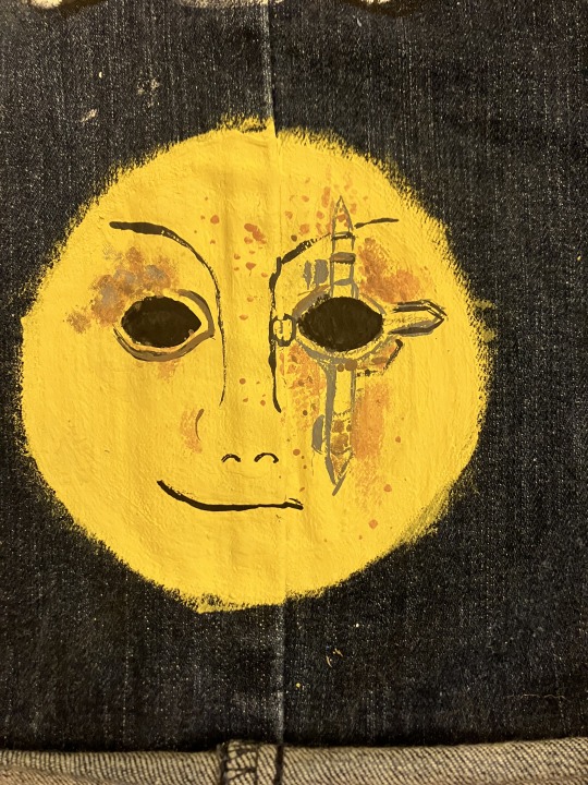
Danny's mask looks almost nothing like the actual one mostly because I painted the circles first and did not realize the mask was more angular than I initially thought. I also had no gold, so we've got a lovely yellow mixed with tan for the base color. The bullets are rough but also smaller than you'd think and a basic brush set from Michaels does not, as I have learned, have super tiny brushes, so I did the best I could on the casings. I am proud of the fact that I tried to make the rust work as best as I could, and if you look really closely, you can even see the mesh in the eyes (looks a little clearer on the left eye). The smirk is present on the right side and I do think it's decently recognizable.
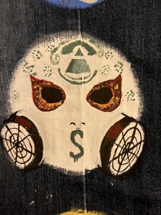
This one made me cry. Any criticism of the fire around the eyes will be met with the response to suck dick because, to be quite frank, I challenge anyone to do better at 1 am and remain disturbingly proud of them. I'm kinda sad that my green (mixed from blue and yellow, because my budget is two pennies and all previous supplies) dried up early cause I was hoping to get more of the Louis Vuitton-style details, but still pretty damn good. I think the pyramid and the canisters turned out nice. Also, a little bit of a cat-eye shape for the eyeholes and the fire, but that was deliberate and I will not be ashamed of it in my moment of pride (I will undoubtedly feel the shame within five minutes of posting, but that is a problem for future me).

A fun an interesting fact is that this is the second time I've done this particular mask of J3T, and both times I have realized I love doing the butterfly. It's super fun because as long as we get the basic swirls in, it's alright if they don't match length perfectly. The cracks are slightly off because the very first ones were free-handed, but I did my best to get the rest of them proper, and they even work to form the nose. Apparently the orange looks more yellow than I thought.
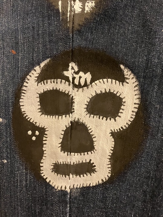
This one was a welcome relief after crying over the detailing of J-Dog's mask. Again, no metallic colors, so our silver is grey. The little black lines are there to add texture to the edges (as it turns out, none of my brushes added it in a sufficiently noticeable way), and this one looks the cleanest imo.

Last but not least, Charlie's bandanna (sunglasses painted over because, as it turns out, I continue to suck at painting and drawing glasses). The buildings are likely not accurate to the actual picture, but my reference photo did not show the actual city on the bandana so I just did some buildings, a fancy lil' LA and we're calling it an artistic interpretation. Also, check out that S. Coolest S I will ever draw in my life, got it right on the first try.
Anyways sorry that I didn't post this sooner cause I technically finished all of this yesterday evening, I have a flight soon so I am typing this up at 4:30 am at the airport.
(Tagging @vampswillhurtyou and @cutelittlenightmarethings cause both of you said you were interested and I have no idea whether or not this will show up in the main tags.)

Final pic to show what it looks like at a slight distance and with other object to provide scale. Note the paint palette thingy having 3 shades of grey in it because, again, shoestring budget and persistence substitute everything for us.
#anachronistic falsehood/whiskey you follow me so I'm assuming you'll see this drift on your dash without me tagging you#hollywood undead#danny (hu)#jdog#johnny 3 tears#j3t#funnyman#funny man#fm#charlie scene#I will continue to remain overly proud of this for a while#wearing these jeans at the airport rn btw#I am so tired and so awake I slept 2 hours and I have a production meeting tomorrow
13 notes
·
View notes
Text
Alright, I couldn't decide how to best present my thoughts about this art challenge, so here's just a summary screenshot to start with - if you would like to see the big versions with the lore you can check out my tag, and the actual list itself is here!
And without further ado, here are my thoughts on this art challenge and finishing it!
Things that helped me finish the challenge
Taking a break day (or two) a week – I have a day job so this was absolutely required to not burn out, lol
Having a theme – This was nor originally intentional, but keeping it worldbuilding related really helped me come up with ideas as there were several prompts where I was just coming up with nothing otherwise.
Small canvas size – These are all fairly small - it was a 6x6 pad. Originally thought it was going to be too small, but ended up being perfect. Since I opted to do full blown scenes I don’t think I would have finished otherwise
Limited Palette/Materials – I learned this from completing previous challenges, but the fewer decisions I have to make the easier it is to do these. This one happened to actually be ink (see materials section) but I have done challenge before with like, "single set of markers"
Displaying the Art – I didn’t like having a loose stack of completed pictures, so I bought a 6x6 photo album to store them in. This was a great decision as they look very cool in there I was very motivated to complete the set
Completion Stickers - Yes, I am 2 years old. I had a paper list where I was putting stickers next to each word as I completed it, and it was very satisfying >_>a
Stuff I liked
Able to practice a medium - Yeah by the end I was feeling way more confident with ink and different techniques (wet on wet, wet on dry, etc)
Got to practice scenes and lighting – I even fit in a ton of OC cameos
Posted all pieces regardless of quality - Although this was not my first list-based challenge it is the first one I posted ALL pieces for
Got some fun pieces to revisit later - There are quite a few I REALLY like for different reasons so it would be fun to do them again later, but spend more time
Kept a consistent quality for the whole challenge - It was tempting to "get lazy" at the end but I think I managed to keep the same general quality the entire time
Used up a bunch of pages in a sketchbook I’m not overly fond of by doing tons of thumbnails - To be quite honest, if I have a sketchbook I hate enough (because the paper is bad or whatever) I will often uh, dismantle them. 8Da; I am not overly fond of the one I'm currently using, but now there's only about 14 pages left so, I will persevere.
Stuff I didn’t like
Time commitment required - Even with the breaks, I was spending almost all evening for 5 weeks working on these, which was a little Much for me. I will have to rethink my approach to any future challenges.
Using WIP designs/Not being able to spend a lot of time on anything – There’s a couple pieces where I wanted to go a certain direction and had to go with Vibes rather than accuracy for the sake of getting it done….which is fine, some of them turned out nice regardless. However would have still liked to hammer things out a little more.
Materials Used
Artsnacks Inktober Box, with some modifications - Something you should know about Artsnacks, is that often the colored materials will be the brand shown, but the color you actually receive will be random. Luckily, I got an Orange ink. Unfortunately, I also have terrible luck with PH Martin’s Orange in that it always separates no matter how much I mix it, so partway through the challenge I replaced it with a Daler Rowney Flame Orange Ink. This is a VERY similar ink, the only difference I really saw was that when diluted a lot it leaned more yellow. Additionally I did not use the blue Faber Castel Pitt pen in the box. TECHNICALLY I could have made green for all those plant pictures, but I refused for the sake of keeping a cohesive Black/Orange color scheme
Ranger Craft-It! Heat Gun - I would not have been able to finish had I not been able to speed up the drying time with this thing, it is the best
Lots of background noise - My noise of choice was a mix between scary cave and cave diving stories, as well as the White Vault podcast, which is a fictional horror audio drama
Bonus Round: Number of OC Appearances
Tower: x4
Torch: x4 (one of them in his plantbeast form)
Cavi: x3
Mady: x1 (also the only non-sion in this list)
Team "New/WIP OCs" -
Aki: x5 (one of them as a doll)
Jas: x2
Aki's sibling (final name pending): x1 (as a statue)
2 notes
·
View notes
Text
Songs of the Summer, 2023: Intro & Rules
check out #my fave songs for my (admittedly inconsistent) past best-of lists! consistency is NOT my strength, but i have so much fun writing these & i want to practice finishing what i start, so i hope you'll have fun along with me :)
Intro: A Summer-y (haha)
My listening this summer has been embarrassingly chill. It’s not that I normally dislike really soft tracks—I’m a BOL4 fan, after all—but I definitely wasn’t expecting this many of them on my favorites list, and certainly not in the top spots. I like melodrama; I like shimmery, glitzy things; I like to dance. But this list’s color palette is beige, like a day where the sun is so bright, the heat so heavy, that it just kind of washes everything out. Even most of the dance tracks here are pretty toned-down—the kind you can leave on repeat while studying.
So, I don’t know, it just feels kind of weird. It’s not that there weren’t any big, exciting statement-songs this summer: Stray Kids and Ateez and Itzy had big, noisy releases, and I just… I don’t know, I couldn’t make myself care about them? My favorite song from the Itzy album isn’t even the cool, fast-paced rock track, which is what I usually like from them—it’s the muted, simple, repetitive “None of My Business”. And Dreamcatcher’s album, which I think is absolutely stellar, didn’t consume my listening nearly as much as it should have this summer. Instead, I found myself drawn to sleepy indie and end-of-album ballads. Do you see why it’s kind of embarrassing?
And I don’t think it’s that I didn’t have any fun this summer. This summer was actually pretty great, especially considering my how past few summers went. Comparatively, oh my GOD this summer was absolute heaven. Hell, maybe that’s why this list is less angsty. Maybe I’m sick of the angst, and I just wanted a nice, sleepy summer to balance out the others.
Or maybe it’s NewJeans fever. I still can’t stand “Attention” (I'm SORRY), but their laid-back style did finally get to me with “Ditto”, and so my obsession with barely-there, TikTok-ready music this summer might just be a reflection of the NewJeans trend hitting me a bit late. And anyway, strange as my list turned out, I like the songs I chose a whole lot, so I do stand by it!
There was another defining trend of this summer’s music for me: Barbie movie anthems. And not just songs from the Barbie soundtrack—the movie’s super-popular, super-iconic advertising seemed to kick off a trend of unapologetically mean-girl music, arrogantly teenage in a way that I find quite fun (& good for my confidence, too, as an obnoxious, girly teenage being-thing). I loved these releases, from Aespa’s “Spicy” in the spring, to G-IDLE’s “Queencard”, to Kiss of Life’s “Shhh” (though none of these are on the list, the mean-girl vibes will definitely show up). I’ve always loved when Flo Milli took on this kind of aesthetic, so it’s really fun to see 2023 become the year of hot pink, both inside and outside of kpop. Still haven’t seen the movie, but thanks, Barbie!
Rules
Songs on this list are from singles or albums released between May 12, my last day of spring semester, and August 21, my first day of fall semester. I hope to work in education for the rest of my life, so I figure it makes sense to let the school year determine my list! Though, because it takes so long for songs to grow on me, I’m willing to fudge the rules a bit to encompass some songs that, despite being released a bit before ‘summer’ started, were truly my Songs of the Summer anyway.
In keeping with my tradition, I’m allowing myself 14 list entries this year (plus some honorable mentions), one for every year of school I’ve completed since kindergarten!
Blame it on the creative writing class I’m taking this semester, but I decided to, alongside my usual description of why each entry made my list, write a little poem-thing trying to capture what each song feels like to me—not similarity in subject, but instead in atmosphere and sound, was what I was going for. So hopefully you’ll enjoy those as much as I enjoyed writing them, and hopefully they’ll be a good intro to the songs you haven’t heard of before!
2 notes
·
View notes
Text
Ways of a Running King
And here we have him, at last.
The poster boy of all of the Kiss fan forums around and name-dropping world champion whenever it comes to Crazy Nights (1987) or Hot in the Shade (1989); the man that Paul Stanley chased after as eagerly in the second half of the 80s as only David Lee Roth's pants before, when he himself and his band were still allowed to open for Kiss in 1984.
Ladies and Gentlemen, Mister Jon Bon Jovi, the most handsome fuzzy head of hard rock and dream son-in-law of the hairspray decade, and quite a bit beyond!
And, well, it is precisely into that ass that Paul has made it his mission to sink his teeth into like one of those little fighting dogs for King of Hearts (1989), or rather into the verses of Bon Jovi's early little hit Runaway from 1982 (1), which actually sounds like it was inspired by Bonnie Tyler's Holding Out For a Hero, which itself wasn't released until two years later.
Nonetheless, I suspect that Paul must also have bitten off a small chunk of Runaway's chorus, because it somehow also makes itself felt in King of Hearts.
And this is noticeable in that it doesn't necessarily sound like a rip-off of Runaway, but rather like a quasi-sequel to it, which merely remains true to its melodic theme and dramaturgy. And of course that no questions remain unanswered as to where the Bon Jovi replacement product is heading. Fair is fair. You could therefore play both songs back to back for hours on end without them getting in each other's way, but rather linking up almost seamlessly.
The only major difference is the cheese in King of Hearts, and Paul had a lot of it in his voice, especially in the first half of the 80s, and for this song he must have squeezed every last bit of it out of himself.
Side Notes:
(1) Recorded in 1981 and chosen as the winner of a radio competition 1982, released as a single in 1983, and ended up on the debut album in 1984, or something like that.
And interestingly enough also a Bon Jovi song from the days when they actually managed to exist without Desmond Child. But that doesn't matter much in this case, because Desmond wasn't supposed to be on Kiss' side with King of Hearts either, and the main point must have been to serve the cultural memory of Bon Jovi music consumers anyway.
(2) Perhaps the good Jim Steinman has added some of Bon Jovi's drama to his own color palette. Who knows?
King of Hearts (1989)
youtube
Runaway (1984)
youtube
#Kiss#King of Hearts#Paul Stanley#Vini Poncia#Gene Simmons#1989#Hot in the Shade#Bon Jovi#Jon Bon Jovi#Runaway#1981#1982#1983#1984#George Karak#Bonnie Tyler#Jim Steinman#Holding Out For a Hero#Desmond Child#Crazy Nights#1987#David Lee Roth#Roland Rockover#Youtube
1 note
·
View note
Text
Album Review: "15913" by Nerdhappy
Today, let's dive into the cool vibes of Nerdhappy's new album, "15913." You might know Nerdhappy as Brian WF Tobin, the guy who creates his own songs from scratch. He's come a long way, especially in learning how to make music sound awesome. And guess what? His latest album is like a showcase of all that hard work paying off.
This album is a collection of 8 songs that take you on a musical adventure for about 37 minutes. The first song, "Be Yourself, Tamiko," is like an exciting start to this journey. It's about a girl who does something pretty magical – she calls a Japanese Sea God to splash water on her friend who wasn't nice. And guess who's there too? 'Hatsune Miku' – adding some extra magic to the music.
Originally, Nerdhappy wanted to make songs that had a steady beat, but things got a bit crazy along the way. Each song tells a story from Nerdhappy's mind. Some are short, like "Bop," which is just 2 minutes and 14 seconds long, and some are longer, like "Bee," which lasts for 8 minutes. But each one is like a little peek into what Nerdhappy is thinking.
Now, you might wonder about the album's name, "15913." Well, it's like a secret code for making cool beats on a drum machine. It means hitting the drum on beats 1, 5, 9, and 13. Originally, Nerdhappy just wanted to make songs that make you want to dance, but somehow, a bit of weirdness found its way into every song. And you know what? It's what makes them so interesting.
If you listen to "15913," you'll feel like you're hanging out in Nerdhappy's creative space. Each song is like a different color on his musical palette. Some are catchy, some are dreamy, and some are just plain fun. The album shows how Nerdhappy has grown from writing songs to crafting a whole musical experience.
So, if you're into music that's a mix of cool stories and groovy beats, give "15913" a listen. Nerdhappy's done a great job of making an album that's both easygoing and exciting. It's like a journey into his musical world, and you're invited!
Listen to 15913 below
https://open.spotify.com/album/2787vGCjXTQfvPmPOJ6MMy
Follow Nerdhappy on
Spotify
Tiktok
#Music#ELECTRONIC#15913ALBUM#15913BYNERDHAPPY#AVANTGARDE#DANCE#EDM MALE#electro#ELECTRONICPOP#EXPERIMENTAL#LEFTFIELD#NERDHAPPY#NERDHAPPY15913#NERDHAPPYLATESTALBUM#NERDHAPPYRELEASE#SOUNDTRACK#SUPEREDGY#synthpop#TECHHOUSE#TECHNO#USBASED#VOCALDANCE#VOCALS#WORKOUT
0 notes
Text
2D Design - Week 5 + 6 - Book Cover + 70's-Inspired Album Cover


For the final assignment of 2D Design, I was tasked with having to create an original rendition of a front cover for my favorite book and an album cover for my favorite band in the style of the album art of the 70's. The book I have chosen was Gary Paulsen's "Hatchet" and the band I have chosen is named "Pendulum."
Starting off with the book cover, I wanted to have a go at making representational art to describe the book since its original cover can also be regarded as representational art. Based on the sketches I did on Monday, I've originally had the idea of just a lone hatchet axe in the middle of a gray space while having a white spotlight on top of it. The text of both the author and novel's names were intended to be on the left of the axe, but later on, I decided that it would be better to have the text near the bottom and much bigger in size in order for it to be easily readable. I also later on decided to incorporate a bit of the "abstract" by adding long curved lines coming out of the axe's far edges and spanning out into the middle-left and top-right margins of the canvas (in addition to having little shapes lie next to those curved lines). The forest accompanying the inside of the lines is a near representation of the same setting that the protagonist stays in for the majority of the novel and the character that is also part of the main focus of the cover is a mock-up of the protagonist's attire considering that in the beginning of the novel, the protagonist was a pilot.
With the album cover, I took inspiration from retro wall-art of the 70's. When looking for ideas to resemble the 70's "art-style," I've come across wall-art that is mostly abstract and leans more towards a warm color palette rather than a cool palette. With this is mind, I've wanted to put my own spin on the band's logo and incorporate warm colors on top of constantly varying line-art. The background resembles both very light shade of red-orange, while the main focus of the cover was the constant switching between warm and cool colors on each side. The left-most side of the logo shares most warm colors, from red to yellow (with a bit of red-violet even though that is technically a "cool" color), while the right most side contains shares cool colors, from yellow-green to blue-violet (with violet). I took advantage on the curved line-art of the logo and made it so that lines that descended into the center of the canvas would be diagonal instead of just straight lines. In addition, I took advantage of the negative space by giving each line some room to "breathe" across the canvas as they get closer to the center. Finally, I've applied the band's bold typography to the far right and applied the same color scheme as I would with the logo itself, going from red at the top to blue-green at the bottom.
0 notes
Text

#178 - Beyond The Fleeting Gales - Crying (2016)
I consider prog rock to be a more boundless genre. It can take on many forms, from the very weirdo music of zeuhl, to the more extreme sounds of technical progressive metal. You get quite a bit of everything with this subgenre of music, and it even extends to more pop outputs as well. Some of my favorite groups are in the progressive pop subgenre, such as Kate Bush, Supertramp, The Moody Blues, and ELO, but it seems like a potential new favorite has entered the ring in the form of Crying and their debut record of Beyond The Fleeting Gales.
Do you like power pop? Do you like indie rock? Do you like prog pop with a more rock sound? Well this album is for you. You get some very tasty music on here that is as joyous as it is quick to the punch of what it tries to be. I feel like with each song, you get a good mixture of the band’s more poppy direction, whilst also greasing up some technical skills. The biggest highlight here has to be Elaiza Santos’ vocals for me. Her range is quite great all things considered, and how she perfectly fits right into this music is also quite nice, which is exactly how a vocalist should be within the whole musical space in my mind.
The instrumentation work here is also really great. You get many power pop soundscapes that make me feel a sense of joy and wonder, but not only that, but they do tease you with some delightful snippets of more contemporary prog elements and technically charged melodies. This music does remind me a lot of the band ‘Cheeto’s Magazine’s’ works, particularly on Amazingous, but instead of more cartoony pop melodies, here it's more focused on an alternative sound, stretching to more of an outward alternative prog push to my ears. They are kinda mashing a lot in here, and they manage to make it all work so well for me. Some really good stuff found here.
Now, I will be here to say that there is one aspect in this music that I do not really enjoy, and it is the lack of emotional range. All the songs here are very upbeat and played in the major chord, which I’d say really weakens the album. It feels like it clashes more with the overall showcase of what these songs can do, especially with the more sad lyrics found within these songs. I say this band should take some notes from acts like Peter Gabriel and Bjork so they can REALLY progress into their music, and more importantly, for me, make them a hit in the more wide-ranged prog pop genre. Don’t JUST make happy sounding songs, have more colors in your palette.
A very great debut album from this little band. I recommend this to those who like progressive pop, as well as fans of some bands like Cheeto’s Magazine and Moon Safari for their very happy demeanor and output. Truly a happy go lucky record for that pop lover in all of us prog fans.
4.5/5
0 notes
Text
BoXiao : Endorsement CPNs
Just listing a few of my favorites, where we clowned so hard with what appears to be bxg biased signs from brands. Mostly 2020-2021. This was supposed to be a simple post but it got a little bit out of hand. So. Here you go. Enjoy!
Note: If you don’t like CPN posts, just scroll along. If you don’t like BJYX — this is not for you. don’t hurt yourself and skip this post.
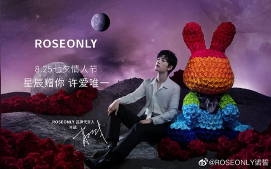
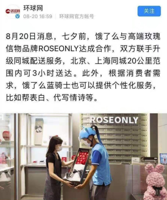
1. RoseOnly - I will not add the RoseOnly x Peace Elite collaboration here anymore cause most of the people reading this should be familiar. A little bit of my thoughts on that are here.
Now let’s move on to other clownery, cause when I said we did see some 👀 before, I meant it.
• GG’s campaign with them where he showcased a bunny with rainbow colored flowers. They could be showcasing all the kind of flowers they have or LGBT friendly advertising. After all, All love is love. 🌈
• For Roseonly’s 8th anniversary, GG had a campaign and VCR w/ them and that big 8 flower. 8 means bo. It’s truly used for the anniversary but of course we CPN cause we are clowns.
https://www.youtube.com/watch?v=fwGnDR4zspI
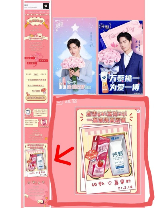
• During Web’s promo for rules of my world and when his teaser photos came out— RoseOnly released a photo of a black rose ( same color as Web’s clothes in the teaser ) with the caption:
You’re the coolest guy in my heart.
• When they were doing a teaser for their new endorser, some people were pointing out that the silhouette looks like Bobo. lol. Twins!

• All the references to the Lonely Planet and Little Prince for this promotion. We all know that they both love LP and whether this is CPN or a personal preference— we’re claiming it!

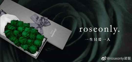
• The green rose they once advertised with the caption I ONLY LOVE YOU. and with the green rose symbolizing innocence, simplicity and forever young. Green and those keywords, who do you remember?
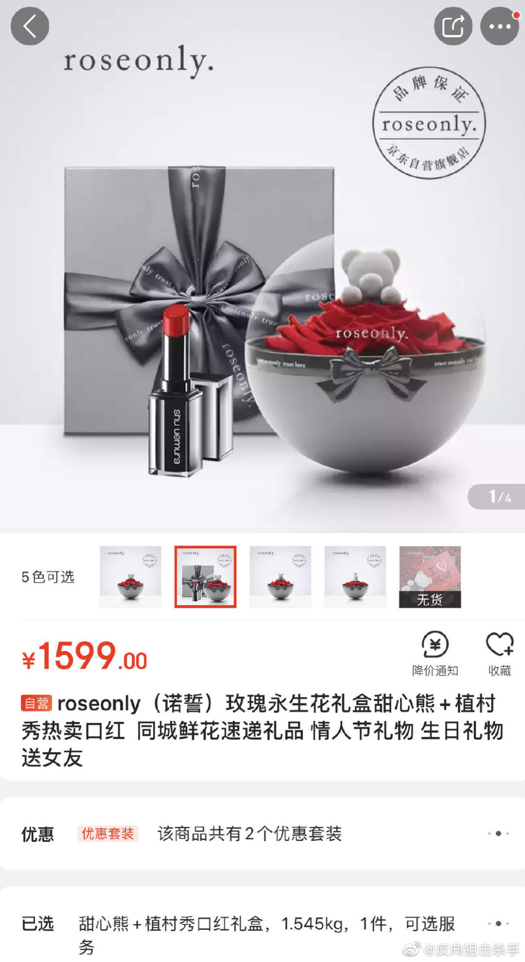
• In 2019, they did a selling bundle with Shu Uemura which was a brand Web was endorsing at that time.
• In a live, the color green and red rose were together — GG and Web colors.

• An Ad in their online store where the display is the Leo rose which is Bobo’s zodiac sign. and GG is holding Libra. Leo x Libra. And with the caption below for their advertisement. We know Web is the Leo of all Leos but it’s still 👀
The proud Leo has a child-like arrogant temper. Some people think they are not easy to get along with, but they don’t know that they just have not entered their hearts. Actually, Leo’s tenderness is only for the right person.

Some other thing that I will add here for reference but I don’t necessarily believe. Link from weibo.
• When GG was announced as their brand spokesperson and Web gave a clue in his post. Also GG making 3 different posts and kadian combinations.
I’m adding in this collab they had with Eleme, the same time Web was endorsing the brand.
I’m sure I missed a couple more from RoseOnly but that just depends on how clear your BXG glasses are. To me the most important is their Lonely Planet / Star campaign with GG last year.
2. Shu Uemura - This is one of the OG brands that Web endorses and who loves him very much. They signed him when he was not yet a big star and flew him to different countries. They treat him very well. 🤍
• The most recent one is from their Ad with Bobo and a red ribbon which made us all think of WWX. I can understand from an Ad perspective that it’s perfect to pair up with a red lipstick — but our brains are wired to CPN. Soooo. And this is not their first offense with stuff like this.
• This Ad featuring Bobo : - "博"君一笑 BJYX.

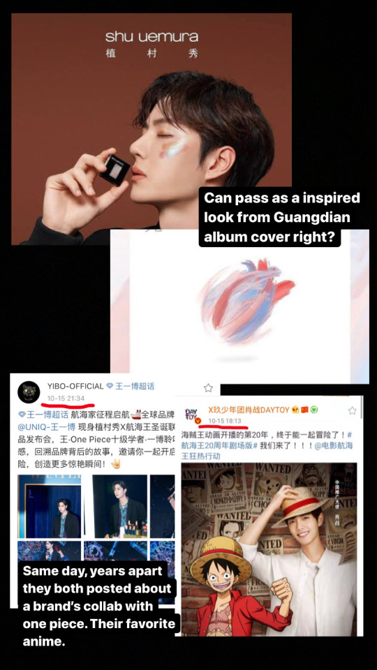
• For the promotion photos of this eyeshadow palette, the colors and look is similar to GG’s painting for the Guangdian album cover. Yes. This was done some time after the song was released.
• This one is more of a coincidence. Years apart, both on the same day, they posted about a collaboration with One piece. It’s their favorite Anime. GG as Luffy & Web as Roronoa Zoro.
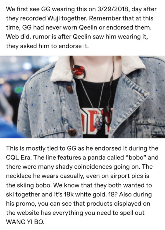
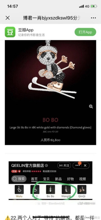
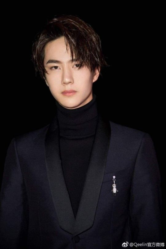
3. Qeelin - will be very lazy with this one and copy/paste from my jewelry post. Take note that this Bobo design is not new and had always been a classic from Qeelin.
4. Kai Xiao Zao - Ah! KXZ! The brand that loves GG the most. So what signs did they give?
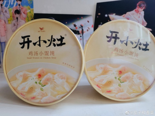
• Their recent new product is wontons. Who do we know that likes wontons? It reminded BXGs of the unofficial BTS when Web was nagging GG to eat Wontons.
• They used a well known BXG idiom:
"你是夏日限定, 也是来日方长"
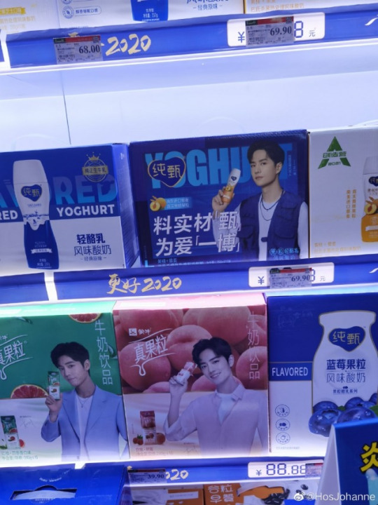
5. Chunzhen - Endorsed by Bobo, and this is under Mengniu. It caused some drama— cause GG & Web are technically promoting the same company. but like, there are so many other c-ent artists endorsing this brand.
• They posted for this year’s Qixi, stating in the Caption that Bobo is able to balance love and work. Really? How did they know? And they had made a character called XIAO ZHEN for qixi ( a cartoon girl with blue hair ).
• Zhenguoli ( endorsed by GG ) and Chunzhen drinks which are under the same company posted graphics of the two drinks together. 👀
• Also since it’s both under the same umbrella company, and both yogurt drinks— you can see their boxes together in shops.
6. Stride - In Bobo’s box set initial release, 3 flavors were included and one of them is passionfruit or bai xiang guo ( bxg ). Of course, bxgs bought it because we were represented. ✌🏼
Also in a message, the brand acknowledged BXGs but later had to delete it because of well— you know who.
Dear Moto/Passion Fruit fans,
Thank you for your support to Hyunmai's spokesperson~. The gift box endorsed by Yibo is temporarily sold out, it is recommended You first collect and purchase, if it is sold later.
Please buy it as soon as possible~
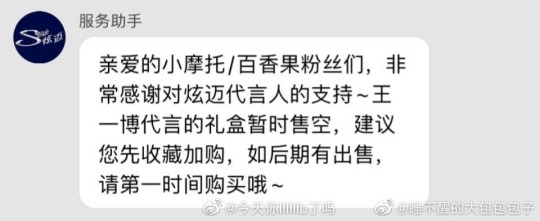
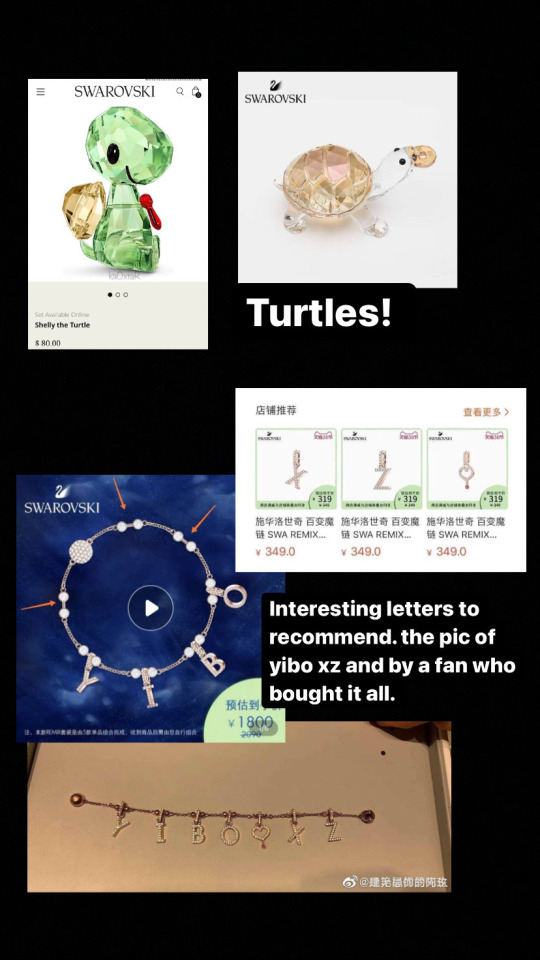
7. Swarovski - endorsed by Web 🤍
• They had turtle charms and bracelets, which endeared them to BXGs.
• They had a bracelet where you can put charms and in their Ad, it spells YIBO. of course. However a BXG noticed that on their recommended letters to add next, the letters are XZ + heart with a dot.
• Last year’s promotion of a lock necklace— Web changed his Weibo header. ‘Lock love, lock you.’

• His May 2020 Mother’s day promotion video that includes a confession (?). I know this is far off but the line used:
“ I love you, want you to see. I am Wang Yibo, this is my unique confession" is so similar to GG’s Bazaar confession.
youtube
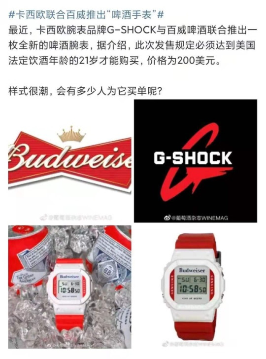
8. Budweiser -- What we basically CPN about them is that they are an LGBT friendly brand and it’s always a plus when our boys endorse those kind of companies.
• Here you can find the CPN on the can that GG supposedly created with them.
• Their ad about ALL LOVE IS LOVE.•
An earlier Ad that had two male leads. and another one recently released with same sex couple. 🌈
Also they did a collab with G-shock which is a brand that Web endorses.
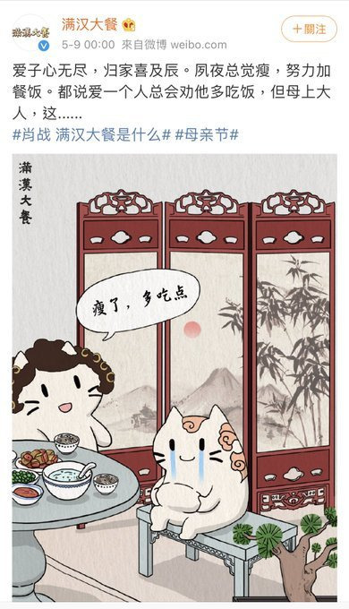
9. Man Han Feast Noodles
• The most recent one is GG playing the Guqin ala LWJ and looking out the window to see the moon ( again ala LWJ ). Best part is GG looking like he would burst out laughing and they kept in the Ad.
• In their Mother’s Day post one line says “if you love someone you’ll always encourage them to eat more”. Sounds like a familiar gesture right? Who do we know nags each other to eat?
10. Zenith Do I even have to explain this?
• GG chose a rainbow watch from Zenith collection for Qixi Festival. 🌈
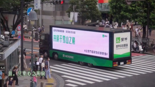
11. Mengniu - Oh well, just last week they had to clarify as an Ad from them was seen with the words: "并肩于雪山之巅" = BJYXSZD. (Side by Side at the snowy mountain top)
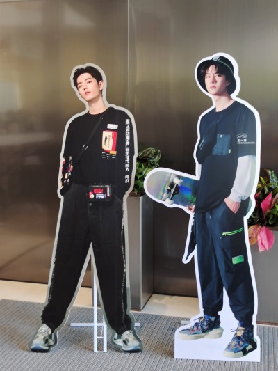
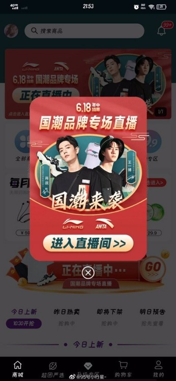
12. Anta/ Li-ning - I’m adding it here cause the store owners in this video brought out GG/Web standees together 😂 Context is, there was a BJYX gathering going on so they took that out cause they knew the attendees loved them.
Plus this shopping app that put them together.
I’m capping this post here and will update this sometime in the future. However the ones I added here stood out to me or I experienced when it came out. I wanted to add Luckin Tea / Lays / Olay but that will be for another time.
As with all the CPN, feel free to not believe any of these and just take it as a coincidence. Or people clowning and reading into things more than they should. lol. Whether these are intentional or not, BXGs are always there to support the boys whenever they can. 🙏🏼
117 notes
·
View notes
Text
best friends ➔ johnny seo
» navigation

──────✱*.。:。✱*.:。✧*.。✰*.:。✧*.。:。*.。✱ ──────
∗ the boys joking about how stupid you both would look in “couple’s” matching outfits and, to their surprise, you’d do it and pull it off extremely well
∗ and ever since then you’d try to match at least something, like your jewelry, or face masks or hats, and maybe ever color palettes
∗ “why won’t you two just date?” is a question that makes both of you roll your eyes
∗ “wait so are you dating or are you siblings?” is another
∗ fake that it’s your birthday or that he’s proposing or that it’s your anniversary when you’re in a restaurant so you’ll get free dessert
∗ so. many. pillow. forts.
∗ roasting battles against each other but if another member joins, you both team up and go against them
∗ starting the day with a dad joke each time you see each other
∗ his mom loves u more than him (of course she could never, but anytime he’s back home she’d always ask “so where’s y/n?”)
∗ you go on little bro dates all the time, like he’d take you on a picnic on friday and you’d pay for the movie tickets on saturday uwu
∗ always snapping pics of each other (and probably have dedicated albums on your phone)
∗ can never stay mad; like yeah you’ll disagree over something small but end up laughing because both of you look like dummies when angry
∗ you probably kissed once when you were both drunk and instantly recoiled
∗ “yeah no i didn’t like that” “same, i think we should just be friends”
∗ and now you laugh at it because why would you ever think to date (you’ve got the other members for that ;) )
∗ probably will end up living either together or legit be neighbors when you’re older
∗ your partners will be friends, your kids will be friends, your friends will be friends with his friends.. you get the point
∗ know instantly when something’s wrong (as you would)
∗ and would pull the one upset out of the room and talk and cry with them
∗ “oh my god don’t cry or else i’ll cry”
∗ when some creepy bartender is hitting on you he’d always approach you and hold your waist and pretends to be the overprotective boyfriend
∗ you both will absolutely fight any person that insults or upsets him - you’re the only one that can do that !! he’d legit have to hold you back but honestly, he’d react the same way if somebody did anything to you
∗ contradictory to the random roasting battles GOD you’d give so many compliments to each other
∗ would also recreate that one tik tok where person A is playing video games and person B climbs onto their lap to cuddle
∗ haechan would see you cuddling johnny in their shared room and would first cringe and then join
∗ and you’d be constantly helping the other boys with dinner because god knows how dangerous the kitchen is for 9 young adult males
∗ “y/n said that dinner’s ready!!!” mark would yell so that legit everybody in the entire dorm could hear
∗ goodness you’re both such puzzle pieces for each other ,, he’d judge your dates and partners and always act all tough and intimidating to show them that they can’t mess with you
∗ and they won’t because johnny can be terrifying
∗ like i said, ready to fight at any time
#kpop#nct#neo culture technology#nct u#nct dream#nct 127#nct smut#nct fluff#nct angst#fluff#smut#angst#nct 127 smut#nct 127 angst#nct 127 fluff#reaction#reactions#imagine#imagines#moodboard#moodboards#aesthetic#blurb#blurbs#scenarios#one shot#nct johnny#johnny seo#johnny suh#best friends
115 notes
·
View notes
Last Seen Blogs

taeilormoons
my name is youngjae

gta-san-andreas-weapon-ch5o
👑 gta san andreas weapon cheat (PC 100% working)

gsstudyabroad
Untitled

staycaribbean
StayCaribbean

ejecuta
Etcétera