#made it easier on my mouse-drawing skills and went with Xs for this one
Explore tagged Tumblr posts
Visit Tumblr Blog
Explore Tumblr blogs with no restrictions, modern design and the best experience.
Last Seen Tumblr Blogs


Fun Fact
Tumblr Inc. is funded by 13 investors.
Note
Bruiseshipping…
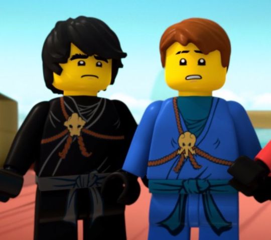
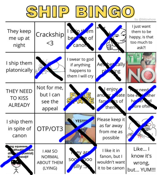
Oh my god ninjago.... how long it's been since I've thought of you..... anyway yeah season 3's love triangle sucked ass and Nya deserved so much better but damn if Jay immediately attacking Cole and Cole responding in kind with no idea what Jay was even angry about wasn't the funniest fucking thing. They should kiss about it <333
#ask zaz#ship bingo ask game#ninja-go-to-therapy#lego ninjago#cole ninjago#jay walker#bruiseshipping#geodeshipping#i also love whatever the fuck people call cole/jay/nya too!!!#i called it lovetriangleshipping but i don't think that name ever caught on 😞#but yeah ninjago was where my multishipper tendencies peaked bc i didn't have any huge preferences outside of main blorbo (cole)#anyway yeah bruiseshipping is cute/funny/neat. earth and lightning elemental opposites (to me)#motormouth/zaptrap and dirtclod as petnames is so funny and so real for them <333#made it easier on my mouse-drawing skills and went with Xs for this one#it fits them <33333#also if you saw this post earlier uh. no you didn't <3#they're like the proto-diomorris enemy lovers dynamic oh my godddddd#i just realized
30 notes
·
View notes
Text
Character Illustration: Class 1
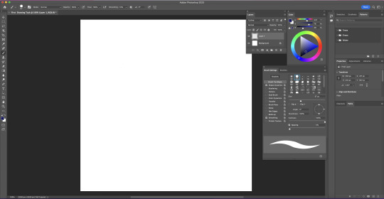
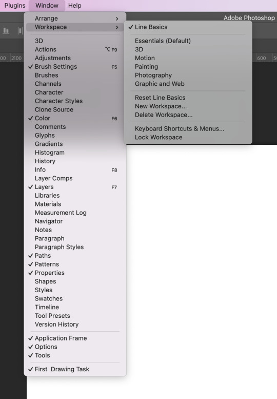
I started this class by opening up some of the palettes which Toby said we would be using today. These palettes were the layers palette, colour palette (colour wheel) and the brush palette. I then saved the layout as a workspace by selecting new workspace in window.
Today we talked about line work for illustrations. We were all given a Wacom tablet to plug into our computer and then I played around with it for a bit. It's very different to drawing on paper or an iPad as what you're drawing appears on the screen rather than the tablet.
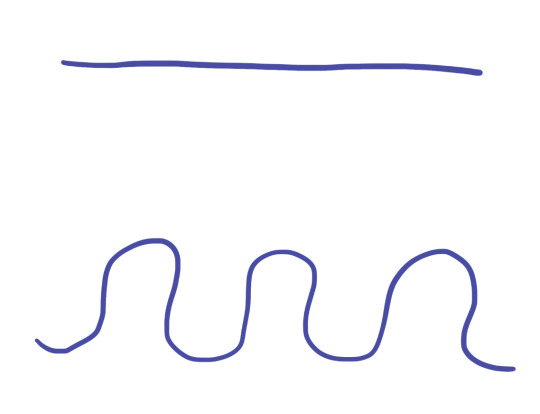
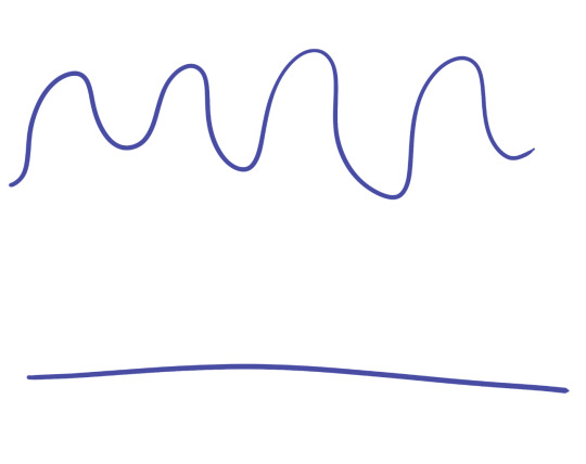
I tried drawing a straight line and a curvy line. As you can see, the lines aren't very clean and are really bumpy.
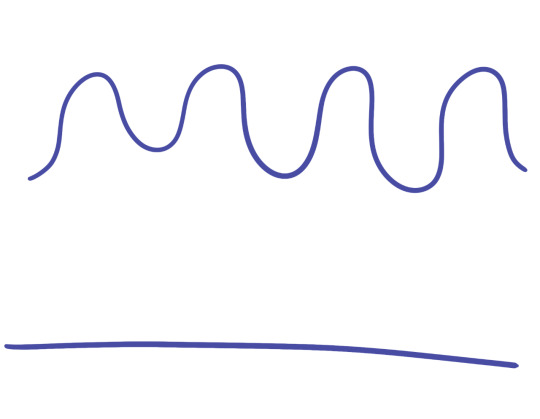
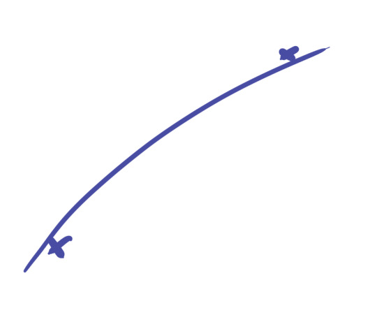
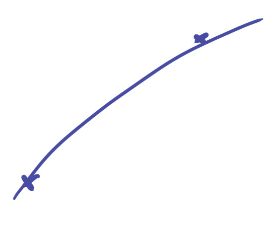
To fix this, I needed to increase the smoothing of the brush. Originally it was at 0% so I tried it at 50% and 100%. This allowed me to understand how the tool works and which percentage I should have it on when drawing.
This was the 50%.
This is the 100%.
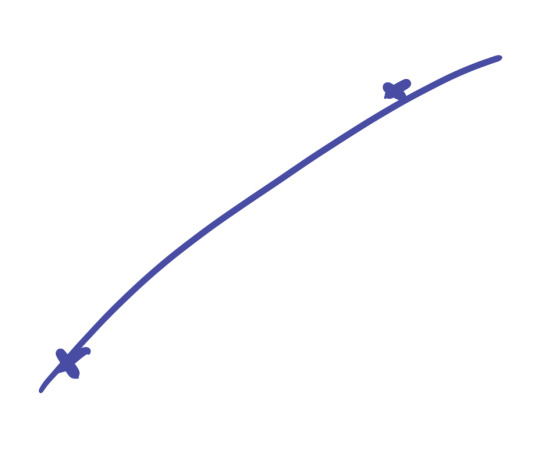
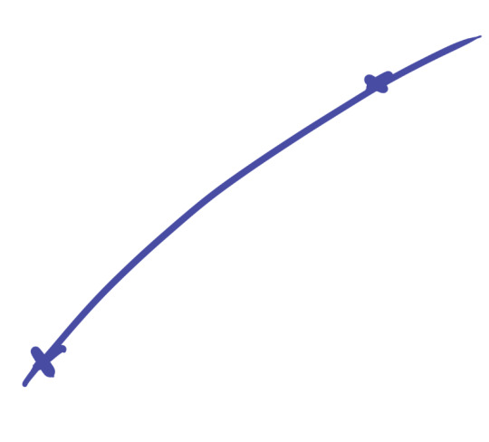
Since I am use to drawing on paper or onto a screen, it was difficult at first getting the line to go in the right direction. To refine this skill I drew two Xs and practiced drawing a smooth curved or straight line that went from one to another. It became easier time and I found zoning in helped at times. I think this is something would definitely take time to get really good at so I'll just have to be patient.
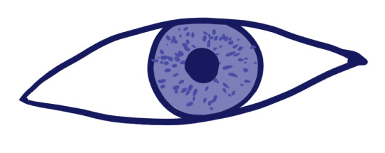
Using these curving lines we then tried to draw an eye. It was just a quick rough exercise to adjust to the tablet. I added another layer underneath and gave the eye an iris colour. I played around which the sensitivity of the tablet and pen when I made the specks in the eye.
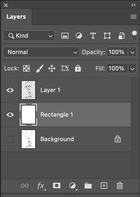
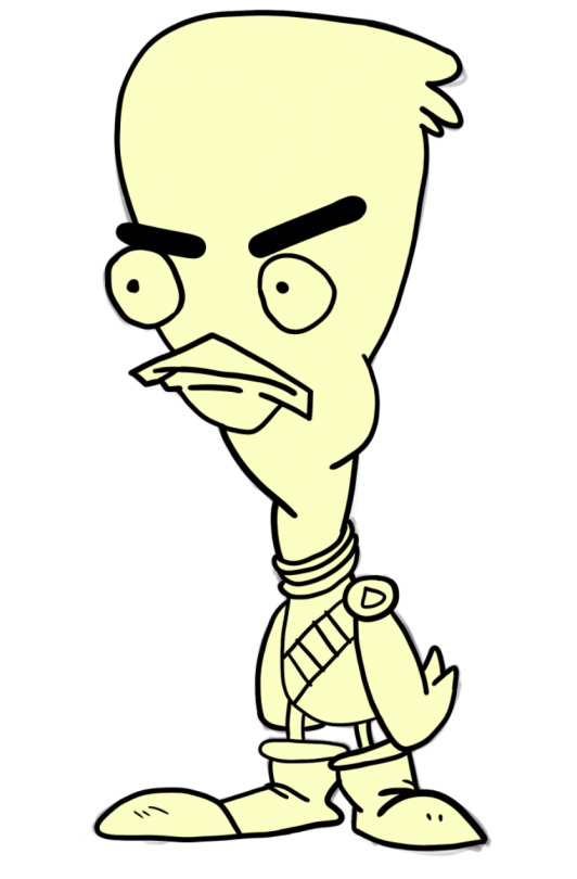
We then moved on to tracing a shape from a template. The first template we were given was this duck. It has a large variety of line lengths and curves so it will be a really good drawing to use to adjust to the tablet. I brought the image into PhotoShop and then added a layer. I placed a white rectangle over the drawing and then lowered the opacity to make the sketch less visible.
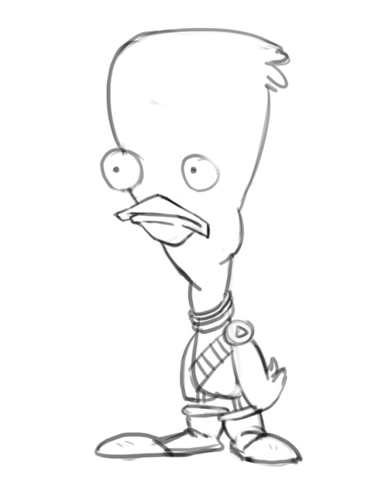
I then added another layer and started to draw the outline of the duck. This took we a bit of time as I was trying to make the lines as smooth and clean as possible. For a few sections, I had to redo the line about 10 times until I produced one I was happy with.
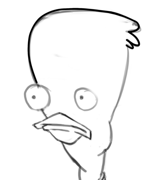
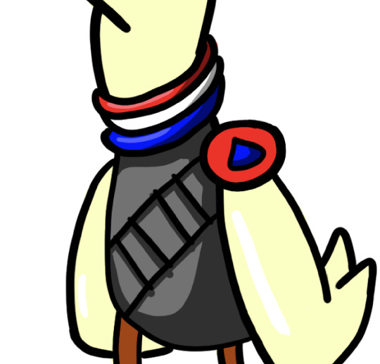
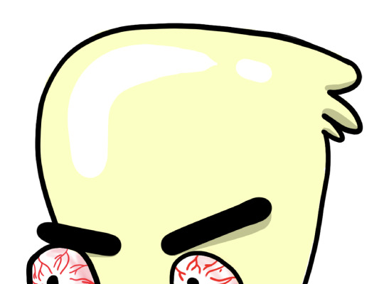
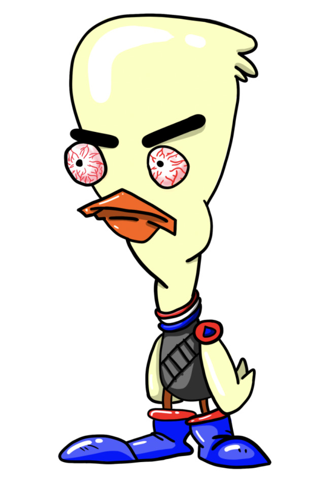
This was the final outline I had for the duck. I'm pretty happy with how it turned out. I think the curves are mostly all really smooth. The eyes are a bit rough but it's the best I was able to do. I decided to go for more of an angry duck so I gave him some big tilted eyebrows.
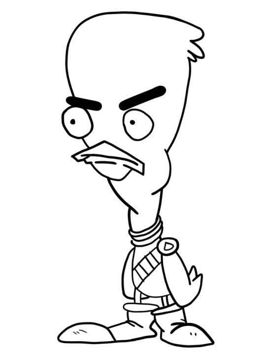
I then moved on to colouring the duck. I decided for this drawing I wanted to try and get use to the tablet more so I coloured the entire illustration in by hand rather than using shortcuts like fill. I'll use these better techniques in my second drawing.
I started by adding base colours on a layer behind the outline. I coloured the entire duck in a pale yellow colour for a start. This gave me a simple base colour to build off.
I then went and added all of my other base colours using the brush tool again. I frequently went over a line so I used the option key and mouse to select the other colour and quickly fixed it.
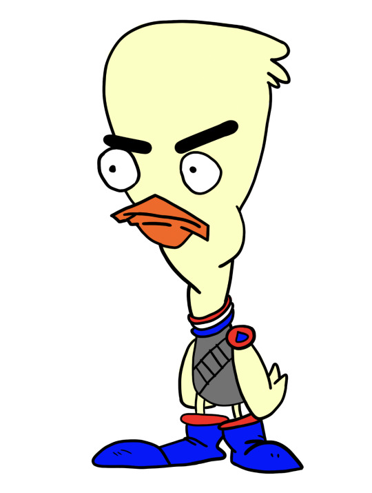
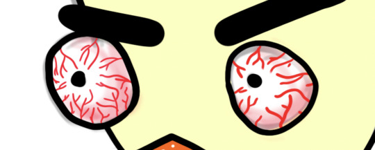
The next step was to add some details. I started by adding some detail to the eyes. Since he was angry I wanted to give him some red bloodshot eyes to match his fury. I made my brush a lot smaller and changed the colour to red. I then made a collection of squiggly, branching lines. I then wanted to add a redness around the edge of the eye. I started made my brush a lot bigger so it would blend evenly. I lowered the opacity of the brush to about 10% and started to build up the redness.
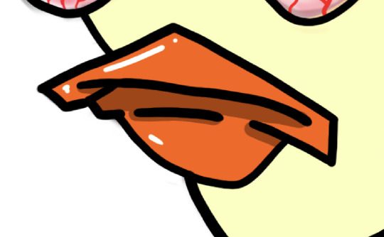
I then added some shadows and highlights to the beak. I used the colour wheel so select a slightly darker shade of orange. Shadows typically are under raised points so I added them under lines on the beak as shown in the image. I added a highlight on the top of the beak and a small one on the bottom.
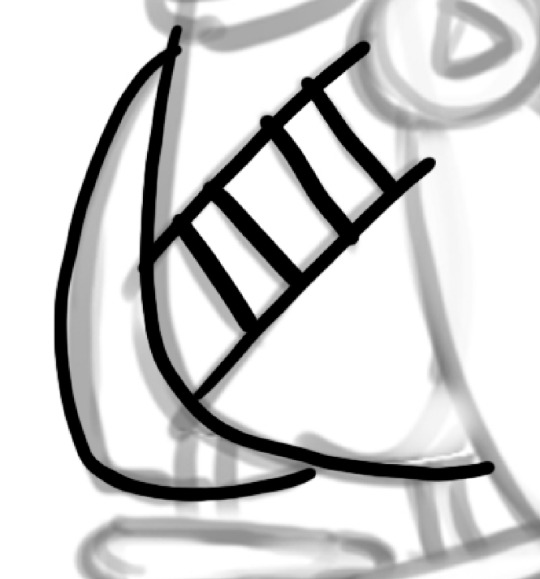
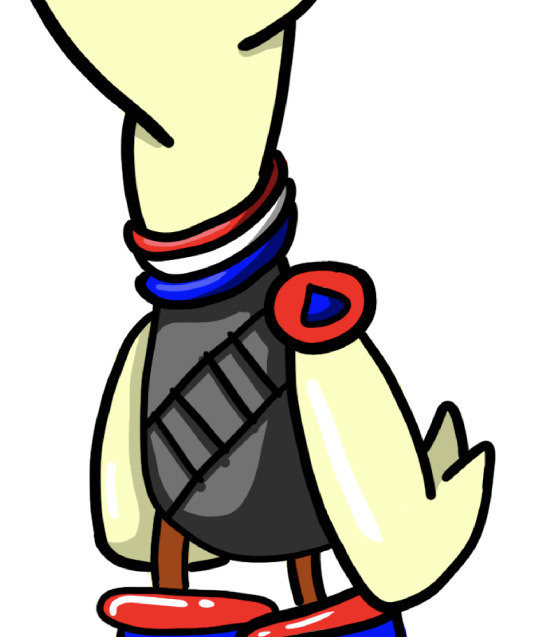
I then moved on to his outfit. I decided to make it so it looks like he was wearing a vest with some sort of shell (bullet) belt. I started by adding the darker grey shadow to vest. I just played around with the shape of the shadow as there wasn't any guide in the template. I then added some shadows on to the neck of the vest. I also changed the colours of the legs to match the darker orange from the beak. I think the yellow was a bit too light.
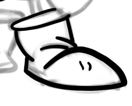
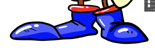
I then moved on to adding highlights and shadows onto the boots. I made the boots have a massive lip rather than a really thin one. I added a lighter shade of blue so that the darker one became the shadow. It took me quite a while to get the shape of the shadow right as I was trying to make it fit with the rest of the boot.
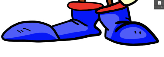
I then added some highlights to it to make them seems shiny and new.
I then added some shadows and highlights onto the duck itself. I added some shadows on the underside of some feathers and under his eyebrows to help express the anger. I added some highlights on the top of his head and on his wings.
This was first final drawing. I'm really pleased with the outcome as I've never drawn anything on PhotoShop or using a wacom tablet so I think this was a really successful first attempt. Next time I'd really like to try and add some more shading using brushes with lower opacities. I think this would really elevate the illustration. I think tomorrow I'll move on to the Rooster cop template and try colouring in using the proper way shown in the tutorial.
0 notes