#luxury redesigns
Explore tagged Tumblr posts
Text
Designing the Ultimate Luxury Office: Modern Ideas for a High-End Space

In a world where first impressions are everything, your office design can say as much about your business as the products or services you offer. An opulent, well-structured office doesn’t just impress — it boosts productivity, reflects professionalism, and enhances brand image. That’s why INHOUSE Design Studio specializes in luxury office transformations, offering tailored solutions that merge aesthetics with efficiency and functionality.
If you’re wondering whether it’s time to upgrade your workspace, here’s an in-depth look at why luxury office design matters, the common pain points it resolves, and why INHOUSE is the ideal choice to bring your vision to life.
The Pain Points of Office Design: Why a Luxury Makeover is Essential
1. Outdated Design Hurts Brand Perception A bland or outdated workspace can diminish the value of even the most forward-thinking brand. Clients and partners may question your relevance, while employees may feel uninspired. With a luxury design overhaul, your workspace becomes a powerful extension of your brand identity, showcasing your commitment to quality and forward-thinking innovation.
2. Functionality Boosts Productivity Functionality and style go hand in hand in a luxury office. Poor layouts, clutter, and uncomfortable spaces can hamper workflow and morale. Our luxury redesigns at INHOUSE optimize every inch of space, ensuring a seamless flow that caters to your team’s needs. By combining open, collaborative areas with private zones and integrating high-end furnishings, we enhance productivity and provide comfort without sacrificing elegance.
3. Sustainability and Wellness Can’t Be Ignored Modern luxury is about more than just aesthetics — it’s about creating a workspace that nurtures wellness and respects the environment. At INHOUSE, we prioritize eco-friendly materials, ergonomic furniture, and biophilic elements that bring nature indoors. This fosters a healthier environment, shows employees and clients that you value their well-being, and aligns with contemporary standards for sustainability.
4. Flexibility is Key in a Dynamic Work Environment Businesses evolve, and so should your office. A luxury design should be adaptable, accommodating diverse needs such as collaborative spaces, quiet zones, or areas for specific projects. INHOUSE Design Studio’s experts create flexible layouts that allow you to customize spaces according to your evolving requirements, ensuring that your office remains as dynamic as your team.
Why Choose INHOUSE Design Studio?
1. Tailored Luxury with a Vision We don’t believe in one-size-fits-all solutions. At INHOUSE, we dive deep into understanding your brand, workflow, and aesthetic preferences. From there, we develop a unique design that harmonizes luxury, functionality, and brand essence. Our meticulous attention to detail ensures that each element of your office reflects the exclusivity and elegance your brand deserves.
2. Expertise in High-End Design Our team brings years of experience in luxury interiors, blending innovative ideas with the highest standards of craftsmanship. From high-quality materials to the latest in design technology, we handle every element with precision, ensuring a flawless result that leaves a lasting impression.
3. Comprehensive Project Management Designing a luxury office is a significant investment, and we make sure every step is managed to perfection. From conceptualization to execution, our dedicated project managers oversee every detail, ensuring a smooth process with no surprises. With INHOUSE, you’re not just getting a design — you’re investing in a seamless transformation that respects your time and budget.
4. Sustainability and Innovation Incorporating sustainable practices isn’t just a trend; it’s a responsibility. Our designs prioritize eco-conscious materials, energy-efficient systems, and innovative solutions that minimize environmental impact without compromising on style. This ensures that your luxury office doesn’t just look good but does good, too.
Challenges We Overcome in Luxury Office Design
1. Harmonizing Function and Luxury Creating a space that’s both practical and luxurious can be challenging, especially when you’re trying to accommodate a variety of work needs. Our designers expertly balance style with function, ensuring that every space not only looks stunning but works seamlessly for your team.
2. Working Within Constraints Every project comes with unique constraints, be it budget, time, or space. INHOUSE thrives on these challenges, creating innovative solutions that maximize your resources while delivering a result that feels anything but restricted.
3. Staying Ahead of Trends Without Sacrificing Timelessness Luxury design should feel current yet timeless. At INHOUSE, we combine the latest trends in luxury office design with classic elements, ensuring a look that will stay impressive and relevant for years to come.
Modern Ideas for a High-End Office Space
Statement Entryways — First impressions count, so we create grand entryways that reflect the prestige of your brand.
Customized Furnishings — High-quality, ergonomic furniture with bespoke details sets the tone for both luxury and comfort.
Integrated Technology — From smart lighting to soundproofing, we incorporate the latest tech innovations to create a sophisticated, user-friendly environment.
Natural Elements — Biophilic design elements like indoor greenery, natural textures, and daylight-enhancing layouts make your workspace healthier and more inviting.
Art and Aesthetics — Handpicked artwork and elegant décor add personality and exclusivity to your space, enhancing its overall ambiance.
Ready to Transform Your Office?
A luxury office is more than just a place to work — it’s an experience, a brand statement, and a driver of productivity. At INHOUSE Design Studio, we’re dedicated to creating spaces that inspire, impress, and elevate every person who steps into them.
Contact us today to discuss how we can bring your vision of a high-end workspace to life, reflecting the unique character and ambitions of your business.
#inhouse design studio#interior design company#interior design studio#design studio#Office Design#Interior Design#luxury redesigns
0 notes
Text
【 Miracle Nikki CN 】 Luxury Suit


【 Miracle Nikki CN 】 Luxury Suit
At the Freshman Ceremony of the Equal Future College branch, Jie Jieyun encouraged the students to make firm choices with calm but powerful words.
"While achieving yourself and interpreting yourself, please never forget to respect the freedom and rights of all people to bathe in the sun and absorb the rain and dew."
Suit Display : Redesign :: Still Sleeping (莹蕊犹眠)
Collection :: Treasure • Luxury
Type :: 8th Luxury Suit
Date :: 31/03/2023…….
.
#Treasure#Luxury#Redesign#奇迹暖暖#Miracle Nikki#Love Nikki#Nikki Up2U 3#Nikki 3#Orangecatty#Dress-Up Game#Nikki Diary Thailand
33 notes
·
View notes
Text

Welcome to my artistic nook! I'm Fokhrul Islam, a passionate logo and branding design professional with over five years of expertise. My design concept is based on simplicity and originality, and I strive to create visually beautiful and meaningful logos. Order me on Fiverr:
https://bit.ly/3SdZtLX
Services Provided: - Custom logo designs that reflect your brand's identity, including minimalist and modern styles.
High-quality printable and digital files in several formats (AI, EPS, PDF, PSD, JPEG, vector, and transparency).
Comprehensive brand assistance provided by a team of expert designers.
100% satisfaction guarantee, including a money-back policy if the designs do not reach your expectations.
Exclusive gifts, such as free mockups, utilized fonts, and color codes.
Specialties: - Minimalist modern designs that are versatile.
Experience with business logo design and brand building.
You can browse my portfolio and get inspired. Please don't hesitate to contact me for a free consultation on your project on Fiverr. Let us work together to create something extraordinary!
#logo design#logo#business logo#minimalist logo#modern logo#logo creation#design logo#custom logo#company logo#create logo#brand logo#minimal logo#3d logo#logo redesign#mascot logo#professional logo#real estate logo#modern#luxury logo#tech logo#startup logo#graphic design#logo design business#logo update#edit logo#logo edit#modify logo#badge logo#signature logo#luxury logo design
3 notes
·
View notes
Text
As companies seek to market high-end products to an exclusive group of consumers, luxury branding is becoming more and more popular. Whether you're creating a luxury design or are simply interested in the subject, knowing how to create a luxury design that successfully targets the right audience can be a challenge. If you miss the mark, your brand is in trouble.
19 notes
·
View notes
Photo

Walky Chat || Branding identity
PS20 Studios. Fiverr.com
#logo design#custom logo design#professional logo design#creative logo design#modern logo design#minimalist logo design#unique logo design#business logo design#company logo design#Brand logo design#graphic design#Logo redesign#vector logo design#3D logo design#typography logo design#Signature logo design#luxury logo design#mascot logo design#fiverr logo maker#ps20 studios#chat app
2 notes
·
View notes
Photo

Home Bar in Phoenix
#Inspiration for a sizable transitional enclosed family room redesign that includes a bar#multicolored walls#a regular fireplace#a stone fireplace#and a wall-mounted television. fratantoni interior designers#fratantoni lifestyles#fratantoni design#designers#residential architects#luxury designers#fratantoni luxury estates
4 notes
·
View notes
Text
Custom kitchen remodeling in Pelham offers you the perfect opportunity to create a personalized cooking and dining area tailored to your lifestyle.
#Luxury Home Renovation Pelham#Modern Home Upgrades Pelham#Modern Bathroom Upgrades Pelham#Kitchen makeovers Pelham#Kitchen remodeling contractors Pelham#Best Kitchen Contractors Pelham#Custom Kitchen Remodeling Pelham#Kitchen Remodeling Pelham#Master Kitchen Redesign Pelham#Small Kitchen Remodel Pelham#Kitchen remodeling near me Pelham
0 notes
Text
Welcome to Outbuild Inc. - Your Gateway to Modern Luxury Living ✨🏡
Discover the art of exceptional home transformation with Outbuild Inc, your premier partner for kitchen and bathroom remodeling in the Greater Toronto Area.

Why Choose Outbuild Inc.? 🤔
For homeowners who demand nothing but the best, Outbuild Inc. is the epitome of luxury remodeling services. Our commitment to excellence and our extensive experience in the market ensure that we exceed the high expectations of our discerning clients. With Outbuild, you’re not just renovating a space; you’re elevating your entire lifestyle. 🌟
🌈 Our Exclusive Services
Tailored Design Solutions: Explore a customized approach to remodeling, from modern kitchen upgrades to spa-inspired bathroom renovations, designed to reflect your unique style and needs. 🍽️🛁
Expert Craftsmanship: Our team of skilled professionals brings unparalleled expertise and attention to detail, ensuring that every project is executed to perfection. 🛠️✨
Seamless Remodeling Experience: With Outbuild, your home transformation is smooth and hassle-free, thanks to our comprehensive support and commitment to customer satisfaction. 🏠💼
💎 Unlock Your Dream Home
Whether you’re looking to enhance your kitchen, renovate your bathroom, or undertake a complete home remodel, Outbuild Inc. is your ultimate partner. Discover how we can help you create the home of your dreams, where modern luxury meets timeless design. 🏡💖
Connect with Us Today! 📞
🏢 Business Address: 702 Bronte Rd, Oakville, Ontario, L6L 6R9 📞 Phone: +1 647-724-2376 🌐 Website: https://outbuildinc.com/
Visit Outbuild Inc. Today and Start Your Journey Towards Luxury Living! Outbuild Inc. - Where Your Vision Becomes Reality. 🌟✨
1 note
·
View note
Photo
INTERESTING

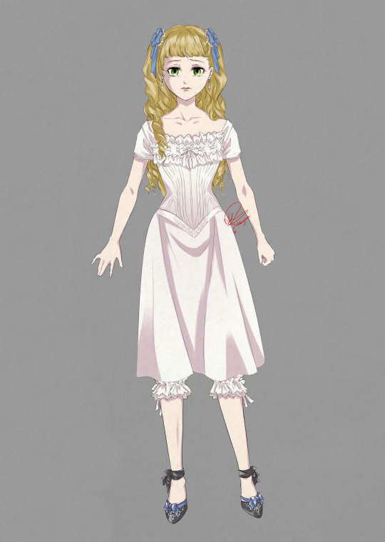
Lizzie’s Campania Dinner Dress REDESIGNED
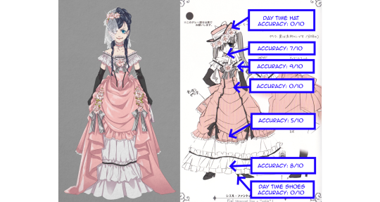
After having redesigned the Notorious Robin Dress of O!Ciel (click here), I thought I’d try my hands on another well-known dress; Lizzie’s dress on the Campania!
As explained in the post linked above, Yana seemed to not have an inkling of historical fashion knowledge at the beginning of the series. As the series became bigger however, she employed a Victorian Era expert and the results are clear.
In this post I will examine to what extent Lizzie’s dinner dress is accurate and break this costume down from the top, and propose how to “correct” these while trying to keep as much of the original design as untouched as possible.
I. Dinner Dress

Hair
Just like I said in the Robin Dress™ REDESIGN post, needless to say, 19th century people would not have worn twin tails. Wearing the hair down was considered ungroomed for women in the 19th century, but young, unmarried girls were allowed to spare a few hairpins.
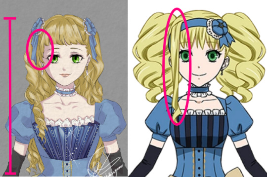
Unlike O!Ciel who would always try to strive for a more mature look, Lizzie would aim for the opposite.
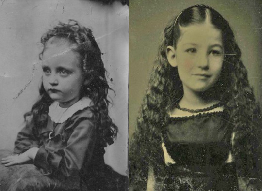
In the late Victorian era it was normal to have bangs, but it was proper to have it cut well above the eyebrows. So Lizzie’s bangs only need to be trimmed a bit to be period accurate.
The long dangling fringe of Lizzie’s is a tribute to her mother, but alas, that one does need to go… I do not dare fully risk the WRATH of Frances the Formidable however, so in honour to her, I have kept that bang as much as possible. The sides of the bangs were allowed to be longer in order to frame the face better, but the point remains that the face should not be covered.
(I know, I know, two symmetrical half-arsed fringes would have been better, but I promised to try change as little as possible…)

Victorians hardly ever cut their hair, because the longer the hair, the more feminine and desirable a girl/woman was deemed to be. The aesthetic of hair in 1880s was more in the vertical direction instead of horizontal. Hence Lizzie would probably have worn her curls a bit smaller, therewith using up less hair into the width.
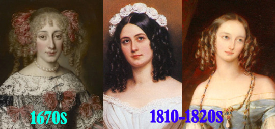
The period wherein people strongly favoured a horizontal aesthetic was approximately 200 to 70 years outdated. If we had to justify what type of hair Lizzie’s hairdo was supposed to be historically, I could only say it is probably the 1670s early baroque hairdo. (I mean… that portrait IS fairly similar to Lizzie’s hair, is it not?)
The hair ornament Lizzie wears is not entirely impossible, just very unlikely for the 1880s. I have kept the weird rosette that she wears, and used them to pin up both sides of her hair. I could not find any visual sources of people wearing rosettes in their hair instead of their chest after earning some type of prize, but since there were no regulations regarding how a ribbon must be tied into a bow, the rosettes can stay.
Neckline and Bodice
The design of the original bodice also requires a bit of work. Just like with the Robin Dress, the main problem lies with the silhouette.
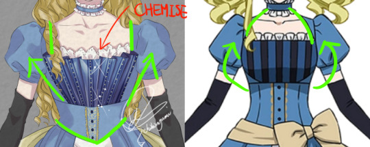
In the height of the Victorian Era, the main endeavour was waist reducing, hence the chest area would be accentuated and “streamlined” towards the shoulder, while the seams would detract from the waist optically.
Instead of the straight design of the chest panel, I replaced it with a fan-shaped front piece, of which the lines would achieve this ‘streamline’ effect.
The halterneck-like neckline as in the original design would have been quite unlikely as it would have made the neck stand out, and make the much thinner neck compete with the desired small waist. The rule of thumb for what aesthetic bodices should have was generally open wide top, closed small bottom (V shaped, not O). Usually when there is a halterneck-line, something else that would redirect the eyes towards the larger shoulder-chest area would adorn the bodice too for compensation.
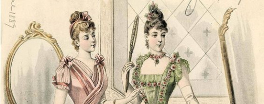
Thus, instead of the rounded halterneck-line, I replaced it with a straight square neckline. Though square-necks were not very popular in Lizzie’s time, they were not unheard of. Miraculously I happened to stumble upon this illustration from 1889 (exactly Kuro’s present day setting), and herein we can see both the short lantern sleeves and the square neckline.
Decoration wise there is nothing inconsistent with 1889 fashion, but as Lizzie is the daughter to an influential Marquis and the dress is supposed to be a dinner dress, it should be a tad gaudier. The elaborateness of Lizzie’s original dress was more alike that of a daytime walking dress. I did not deviate too much from the original manga’s design, I simply added some gold details that were not there yet.
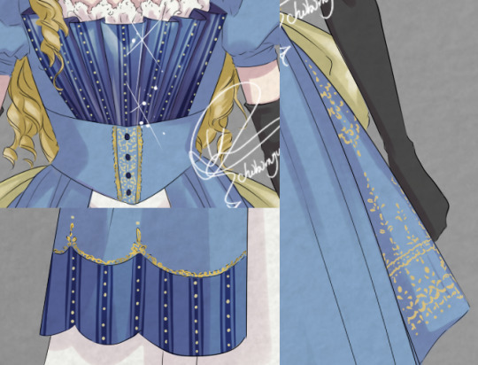
(The anime’s dress had been simplified for animation’s sake, so my redesign is based on the manga’s slightly more elaborate triple panel decoration.)
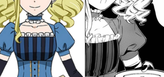
This choker ribbon necklace is the same as for the Robin Dress. Like I said before, these were worn by people in the 1880s, but they were not standard for fancy night time events. However, as it is technically not historically ‘inaccurate’, it can stay.

Waistline
Just like the Robin Dress, Lizzie’s waistline is the most historically inaccurate part that renders the entire design a period amalgamation.

First of all, I gave the waistline a pointed end and swagged the inner skirt up towards the hips for a dramatic V-shape. The bow-sash worn around the waist was something that was in fashion during the 1780s and 1790s, and was part of the ‘Chemise de la Reine’ look that was named for and popularized by Marie Antoinette.

Fashion trends do always come back every now and then, so a ribbon bow is not necessarily taboo. But the height at which the bow sits on the original dress would guide the waistline towards the hips, which would have gone against the small-waist aesthetics of 1880s, which would have been taboo.
Hence, I removed the sash entirely, and shoved the bow itself to the back (more on this below.)
Skirt
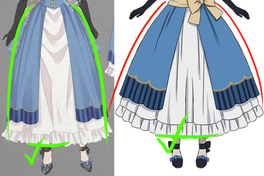
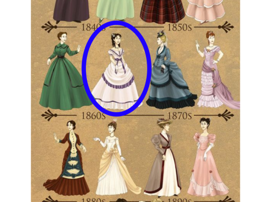
Again, the same problem Yana had with the Robin Dress; the bell-shaped silhouette that would be at least 30 years outdated by 1889, so I simply reduced its volume.
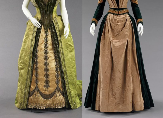
The split panel front however, was common in the 1880s, as such it remains untouched.
The dress code for formal events would require a floor-length hem for dresses, but a dinner party such as the one on the Campania would be semi-formal, and Lizzie who strives for a very youthful look would have been able to get away with a shorter hem. Hence, the skirt length also remains unchanged.
Bustle
“Does this dress make my butt look small?” would have been the question women asked. Late Victorian fashion just LOVED a huge behind, and the bustle was the absolute star of any feminine outfit.
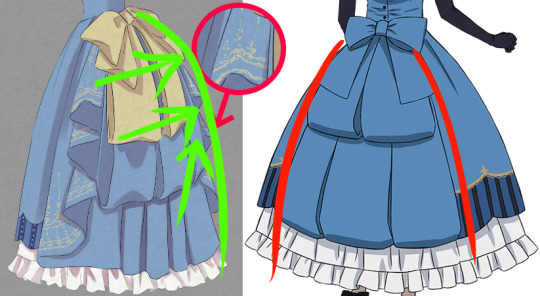
The design of the ornaments on the original dress is actually spot on, except that it would simply lie flat over the skirt, rather than help the skirt get a large bulge.
So for the redesign, I have decided to use the golden bow that sat at the front to draw the attention towards the maximised behind. Underneath I used the original triple row tails, and flanked this decoration with large pleats to produce a dramatic back. For completion’s sake, I have added golden embroideries to the pleats so that the large golden bow will not just sit there as a random piece of ornament.
Shoes
I could find relatively few sources on late 1880s shoe fashion, so my caveat here.
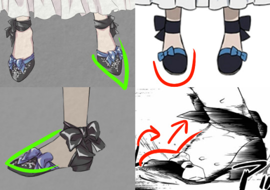
Lizzie’s d’Orsay type of shoes were not standard in the 19th century England, but they were definitely not impossible. 1880s d’Orsay pumps were a bit more closed around the lateral arch, but the technique to make completely open d’Orsays was already available in the 1600s, and wildly popular after the 1830s. As I could not find any sources on when they stopped being popular, I think Lizzie’s shoes would probably have been acceptable.

What I do propose to change is the point of the toe. Only very, very young girls (up to age 4 ish) would wear a rounded nose. Slightly older children and adults would wear pointed toes instead.
The only other thing I propose to change is only a “problem” if I were to be perfectly pedantic and nitpicky; namely the arch of the shoe. Arches of the shoe until the 1910s were mostly straight, and did not have the same arch as our natural feet have. So in order to create the perfect 1889 shoe silhouette, I straightened Lizzie’s shoes too.

Y’all still with me? Good. Now comes the trickiest part, THE UNDERWEAR, a.k.a. Lizzie’s Battle Suit.
II. Battle Suit
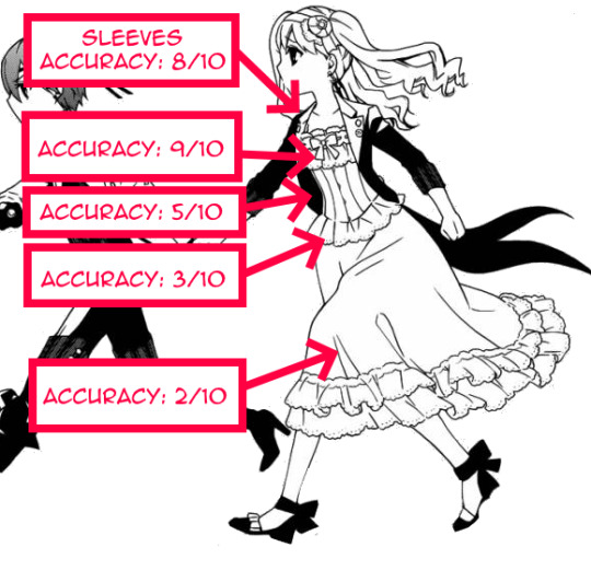
Lizzie’s dinner dress was actually fairly historically accurate, earning a personal Chibimyumi rating of 6.6/10 in total (as opposed to Robin Dress’ miserable total rating of 4.1/10). Her Battle Suit however, scores less well, reaching only a 5.4/10.
Chemise
Victorian undergarments were nothing like our contemporary ones. If you have no breasts then it is easy, but if you do… well, a bra is bad enough, right?

Well…. In the Victorian times women wore layers on top of layers, of which the first was the chemise. Contrary to popular belief, people did not wear corsets directly on their skin. Corsets were very hard to wash, thus the chemise served to both protect the corset from getting dirty, as well as absorb the sweat.

Yana did do pretty good research as attested by her not having fallen for this popular misconception. Lizzie does indeed wear a type of chemise underneath her corset, though I would say that the sleeves are too elaborate for the dress she has chosen to wear on top.
Such elaborate sleeves were worn to be combined with smaller sleeves so that the lace can protrude from underneath, giving the entire outfit a little icing on top (like the lace at the chest). Lizzie’s dinner dress has lantern sleeves that would not reveal any of the chemise’s sleeves.
Chemises were washed quite regularly, but lace is a very expensive and delicate material. Hence, in order to minimise wear-and-tear, people would probably have avoided wearing ultra fancy chemises if it cannot be seen anyway. But who knows. Lizzie is a rich kid, she probably has enough lacy chemises at her disposal. Still, just to be perfectly historically accurate, I gave her chemise simpler sleeves.
Corset
Unlike the chemise, corsets were not regularly washed, and thus elaborate lace was very desired.

The large ruffles on the chest of Yana’s design however, are probably a tad too elaborate, and judging from the thickness, they could easily disrupt the smoothness of the outerwear.
1880s corsets were generally not very decorated as their function was valued over anything else. This corset I found dating from 1887 is the most elaborate authentic one I could find, and it indeed strongly resembles the one Lizzie wears. However, as even this one does not have lace protruding as much as Lizzie’s, I have toned the corset down too for the redesign.
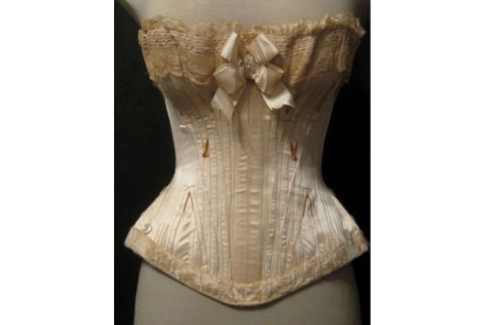
In the 1880s, both corsets with and without front closure were worn. However, the pieces as elaborately decorated in the front would not have front closures. Hence I removed the hook and eye closure in the redesign.

The thing that is the least accurate about Lizzie’s corset is the boning structure. What produced a well-shaped waist was not how tight you lace the corset, but the structure of the boning. An unlaced corset of that time would have looked much ‘curvier’ than any tight-laced straight-boned corset.
By the late 1880s, boning techniques were so advanced that they were very soft and flexible, and yet also provided the firmness necessary for the desired look. The straight paneled type of boning drawn by Yana was outdated and strongly advised against.
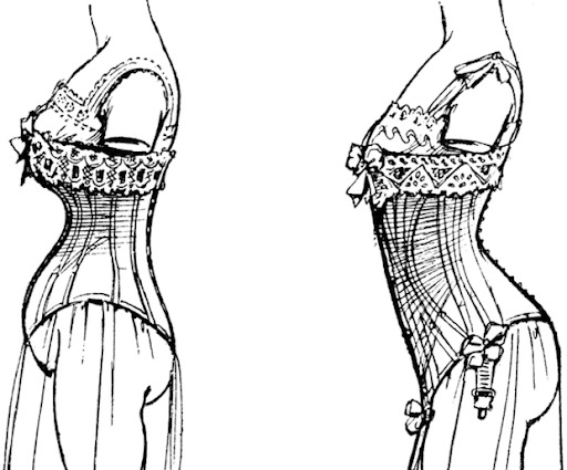
Finally, the mini-skirt at the bottom of the corset is cute, but I have yet to find one like that in the 1880s. I don’t think that tiny piece of fabric would disrupt the desirable silhouette, but there will be PLENTY layers on top, so I removed it just to be sure.
Skirt
The skirt - or rather, everything that happened UNDER the skirt is a stack of complexities.
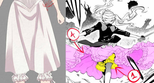
The most bottom layer would have been the underwear with trouser-legs, layer 1. Layer 2 is the protruding hem of the chemise, that may either have been long or short. But the chemise and the underwear are the only things that were worn UNDER the corset, hence the frilly-frilly skirt we see Lizzie fight in should have been the chemise, and not the underskirt.
The chemise was never something as wide as the one drawn by Yana, and could therefore not achieve that flare effect. I know it is absolutely gorgeous, and from an artistic point of view I myself would not have done otherwise. But as I am doing historical fashion research and redesign, I shall compromise myself and settle with a narrow skirt. The skirt would probably have been so narrow Lizzie would have trouble fighting. So it would not have surprised me if she decided to make a large split in it, or rolled it up and tucked it under her corset.
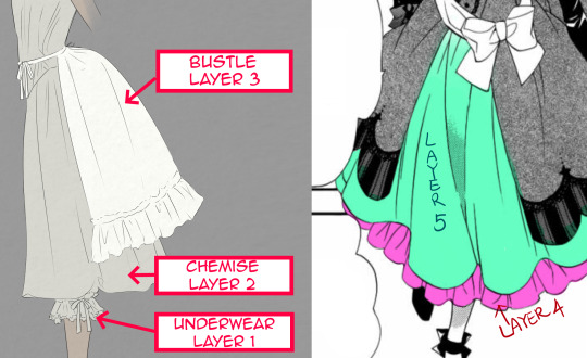
The frilly underskirt we see Lizzie wear should be layer 4 rather than 2. If we study Lizzie’s dress, we can see that the frilly part is a separate piece of clothing, unlike what the anime-art suggests.
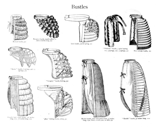
Underneath this layer, there would have been a bustle (layer 3) that was strapped around the waist, over the corset. Like I explained before, bustles were essential to any Victorian dress. They came in many shapes and sizes, but I have settled with the simplest one.
Should we wish to keep the frilly skirt, then we need to keep in mind that Lizzie would have worn FOUR layers, which would hardly have made it any easier for her to navigate through the water than before. So why bother remove the dress and expose herself at all then? Hence, all layers from layer 2 on will sink with the Campania.

From our 21st century point of view, the Battle Suit looks quite cute, and we would probably just wear it like that. But if we consider down to what layer a real 1889 girl would have to have stripped, and how many somewhat embarrassing contraptions had to be removed first before reaching some level of mobility, we can probably understand how embarrassing it truly must have been.
Well, I had tons of fun doing this research, and I learned a great lot about what corsets really were (and not the inhumane torture devices they are claimed to be). I hope you all also had fun reading this too. (*´▽`*)ノ

【Related post: Ciel’s notorious Robin Dress™ REDESIGNED】
【Related post: Redesign: O!Ciel and Sebastian in different eras】
MASTERPOST My Art
MASTERPOST Furukawa Era Kuromyu
MASTERPOST Gender in Kuroshitsuji
MASTERPOST Analyses & Info
#Black Butler#Redesign#design#Campania Arc#Luxury liner arc#Elizabeth Midford#historic accuracy#Historic fashion accuracy#Historic fashion#fashion#historical fashion#tidbits
2K notes
·
View notes
Text
Transform Your Bathroom into a Luxury Retreat!

Looking to upgrade your bathroom? Whether it's a small update or a complete remodel, our expert team at Nirvana Builders can create the bathroom of your dreams. From modern fixtures and stunning tile work to custom vanities and lighting, we’ll turn your bathroom into a luxurious retreat you’ll love. Contact us today to start your Bathroom Remodeling journey!
Nirvana Builders Seattle, WA, 98121 (206) 806-4212 https://nirvanabuilderswa.com/
#bathroom renovation#bathroom remodel#custom bathroom design#shower installation#bathtub replacement#bathroom tile installation#bathroom cabinets#bathroom fixtures#bathroom flooring#bathroom lighting#bathroom vanity#bathroom makeover#small bathroom remodel#luxury bathroom remodel#modern bathroom design#bathroom plumbing#walk-in shower installation#bathroom countertops#bathroom renovation contractor#bathroom remodeling services#bathroom remodel cost#bathroom layout redesign#eco-friendly bathroom remodel#bathroom renovation ideas#master bathroom remodel#bathroom tiling services#bathroom remodeling expert#bathroom remodel contractor.
0 notes
Text
i have an object show that i wanted to make and its still a wip
like legit i dont even know how it ends,,its just,, rotting in my object shows and ive had it for like. what. 3 or 4 years???
i WOULD get a friend to help me on it but honestly i think i might just work on it myself even though the storyline is everywhere and i need to work on the plot badly
theres also a lot of characters that i need to name/design
its just. ouggugh and then everyday i get an idea for an object show like. dude!!!!!!!! chill out!!!!!

#i was once hyperfixated on one of the characters i made in there even though she was. horrible#theyve also gone through SO many redesigns and then recently my friend redesigned her like oh god.#i still love them though…silly fish. object. god what is she#i wanna watch life of luxury am i ok. this is my cousins fault💔💔💔#liam rants
1 note
·
View note
Text
Atlanta Pool Infinity

Ideas for a large, classic backyard remodel with a rectangular infinity hot tub
0 notes
Text

Welcome to my artistic nook! I'm Fokhrul Islam, a passionate logo and branding design professional with over five years of expertise. My design concept is based on simplicity and originality, and I strive to create visually beautiful and meaningful logos. Order me on Fiverr:
Services Provided: - Custom logo designs that reflect your brand's identity, including minimalist and modern styles.
High-quality printable and digital files in several formats (AI, EPS, PDF, PSD, JPEG, vector, and transparency).
Comprehensive brand assistance provided by a team of expert designers.
100% satisfaction guarantee, including a money-back policy if the designs do not reach your expectations.
Exclusive gifts, such as free mockups, utilized fonts, and color codes.
Specialties: - Minimalist modern designs that are versatile.
Experience with business logo design and brand building.
Feel free to browse my portfolio and get inspired. Please don't hesitate to contact me for a free consultation on your project on Fiverr. Let us work together to create something extraordinary!
#logo design#business logo#minimalist logo#logo#modern logo#logo creation#design logo#custom logo#company logo#create logo#brand logo#minimal logo#3d logo#logo redesign#mascot logo#professional logo#real estate logo#modern#luxury logo#tech logo#startup logo#graphic design#logo design business#logo update#edit logo#logo edit#modify logo#badge logo#signature logo#luxury logo design
1 note
·
View note
Photo

Houston Bathroom Modern ideas for a powder room
0 notes
Photo

Infinity in Atlanta Large trendy backyard stone and custom-shaped infinity pool fountain photo
#infinity edge lap pool#cultured stone retaining walls#exterior#backyard space#luxury backyard#backyard redesign#beautiful pools
0 notes
Text

Transform your home in Briarcliff Manor with Prestige Line Contracting. We specialize in top-quality renovations, including kitchens, bathrooms, and more. Trusted by homeowners for exceptional craftsmanship and attention to detail.
#Modern Home Upgrades Briarcliff Manor#Luxury Home Renovation Briarcliff Manor#Kitchen makeovers Briarcliff Manor#Master Kitchen Redesign Briarcliff Manor#Home makeovers Briarcliff Manor#Best Home Contractors Briarcliff Manor
0 notes