#looks that way. All of that stuff is also basic clip studio paint stamps. i prefer to use those than Other peoples cuz ..
Explore tagged Tumblr posts
Text

#flowers arts#a lot of the time whenever i draw something and then forget about it until the end of the day i like to slap a bunch of stuff on it and cal#it done. This was one of those times. i liked the lineart. and now i like the phrase 'everything's a melody.' i added a music note i#thought was cute but it was hidden.. by a flower. and possibly the lineart itself which is a shame.#i couldve done more text stuff which i WANTED to do but it was getting late so i stopped.#i feel like i couldve made the I in I love you visible but i didnt consider the empty space up there so it now it just says love you.#the rainbows were supposed to be like Ohhh somethings messed up cuz theyre all overlapping eachother at the end. but i dont think it really#looks that way. All of that stuff is also basic clip studio paint stamps. i prefer to use those than Other peoples cuz ..#I dont know the copyright for stuff people uploaded on that store. i dont know if they know either.#brushes are ok but Small Picture Stamps?#i havent been doing anything that big artisticly recently. UMM. ive been working on my camp entries mostly.#im a litlte sad that sometimes i make something and then have to add serious elements to give it 'meaning.' Well.. Thats dumb#(not about camp entries. it is fun to think about. just small pieces i dont think stand on their own. they do. just give it time.)#i havent given my Normal Memory talk here in a while. i should see about posting some stuff i have
1 note
·
View note
Text

🇵🇸 DONATE to save Gazan families in the ongoing genocide (link to gazafunds.com) 🇵🇸
🇵🇸 PURCHASE E-SIMS to keep people in Gaza connected with the world. (link to a guide that lists the several ways you can donate) 🇵🇸
Other links to help: @/gaza-evacuation-funds, the vetted gaza evacuation fundraiser spreadsheet Any fundraisers I share are either vetted or seem legitimate through other means. I recommend you do your own research into the vetting of any you plan on donating to, just to be safe.

hi im oliver knightobreath and this is my Pinned Post

CHECK OUT MY OBJECT COMIC - ORIGINAL ACRONYM
or my older comic, GMOLab, which is on indefinite hiatus.
KNIGHTOBREATH.STRAW.PAGE! (you can send little Things) ART TAG - TEXT TAG - STAMP TAG


(that hostilestuck and four equation are from thisdastampdoesnotexist) those below that are from @objectshowstamps
FAQ
Why are you so obsessed with Showvember? I have brainworms.
What programs do you use? Primarily Clip Studio Paint for basic art (old stuff is usually ibispaintx) and OpenToonz for animation! (old stuff is flipaclip) although i do sometimes draw lineart traditionally and then color in ibispaint! it can end up looking pretty seamless sometimes.
What's going on with this blog? Stuff happens, man.
Are you associated with oscconfessions/oscc? Huh?? No!! I know nothing about that wretched blog! Who the hell do you think I am?! (I'm mod 🫒! I made it!)
What is olipad? selfship with that ipad im obsessed with
How are you doing after the ii finale? AUUUUGHHHHHHHHH!!!!!!!! AHHHHHHHHH !!!!!! AHHHHHHHHHHHHHHH!!!!!! AHHHHHH!!!!! Great movie! 👍
Why olive? I. REALLY. like olives. like a lot
What's up with your objectsona? Really all you gotta know for the Olive lore is that he's gay (@drawingtablet) and when he dies he goes to hell (@/oscconfessions). the lore is inconsistent (he's a cameraman on ii s2. i rarely depict this. he dies during the time freeze. i often ignore this. i also ignore ii canon so that i can draw him being gay with his bfs after the events of the finale. the olipad divorce arc and drawingtablet comics exist. neither are canon to anything.)
122 notes
·
View notes
Text
Tutorial Tuesdays--Getting Started
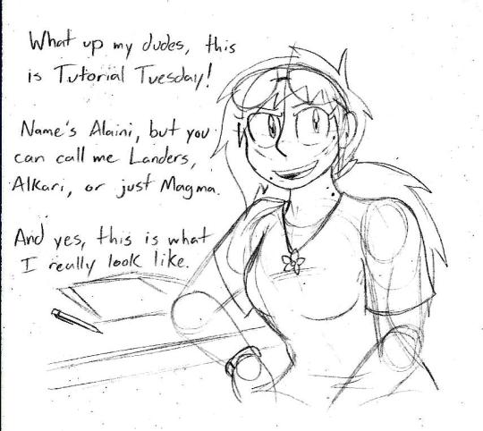
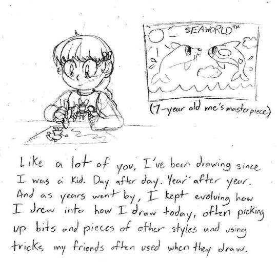
Tutorial Tuesdays is a new block on my blog in which I give art advice and tutorials for anyone looking to improve their art. But before we get into the good stuff, a quick obligatory background.
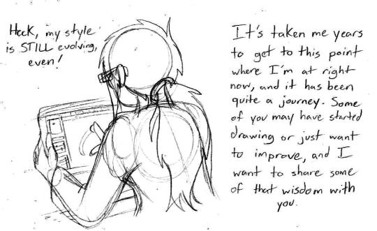
I know it’s tempting to look at my art and the art of people you look up to and come to the conclusion you’ll never get to that level no matter how hard you try, but it is possible to get to that level. You just gotta practice regularly and before you know it you’ll have it down-pat.
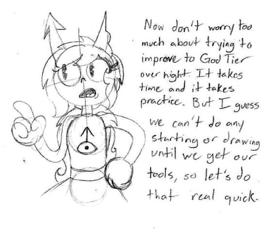
These posts will be pretty long, so to save Dashboard space, I’ll put the meat of things under a Keep Reading link so you can visit them in full. Alright, with that out of the way, are ya ready kids? Let’s go get some art tools!

I only say this because I’ve seen people make fantastic things with very limited materials and people with some of the finest tools but don’t use them to their full capacity. Again, it’s not what you use, but how you use it. When I talk about art tools, I’m mostly going off of what I use since those are the tools I’ve worked with a lot.
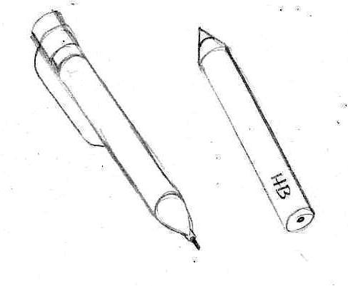
Pencils. Your most basic writing and drawing tool. For sketching and drawing, I use a 0.7 mm mechanical pencil with a good eraser. It’s quick, it’s convenient, and I often stick it in my ponytail when I’m not using it so I have easy access to it. They’re also pretty cheap. For commissions and grayscale shading, I use drawing pencils that come in various hardnesses. The hardness of your pencil will be noted by a number and a letter. A pencil with an H stamped on it will be harder, won’t smudge very easily, and has a very light load when the graphite is on the paper. A pencil stamped with a B will be softer, smudges very easily, and has a darker streak on the paper. The number on the pencil following the letter lets you know how hard or soft it is (4H is a very hard pencil, 8B is a very soft pencil). Your typical No. 2 pencils from school are in the HB category, which is middle of the road. You can find them individually at art stores or in packs. Walmart in my town offers a package of 6 drawing pencils bundled with two animation colored pencils, two markers, and an eraser for about $9. Pretty good deal. Speaking of...
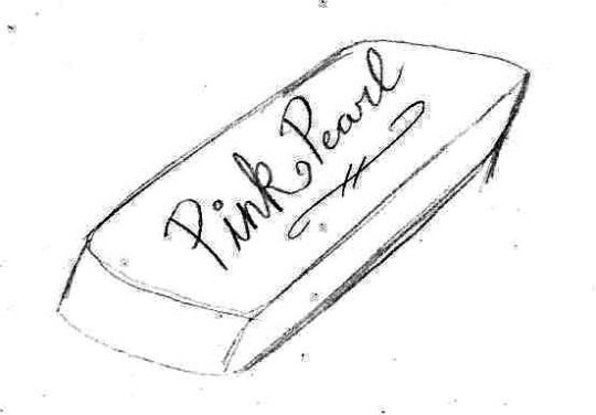
Erasers. A pink rubber eraser will do you just fine, though make sure your pencil has a nice one on it for finer details and while you’re drawing. You can use a kneadable eraser if you have one, they’re squishy, you can mold them to how you see fit and they don’t leave any crumbs to clean up, but I’m not quite fond of them.
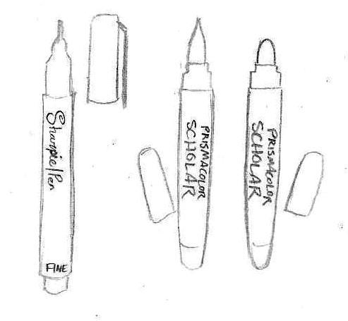
Markers and ink pens. Let me tell you, once you use a pen like one of these, you’ll never go back to ballpoint, which often has far too many broken lines to be practical to use and make your lineart look like trash. I use a Fine Tip Sharpie Pen, preferably in the no-bleed variety so the lineart doesn’t sink into the opposite side of the page. Recently I’ve been using Brush and Bullet tip Prismacolor Scholar markers for comics and good drawings. They’re a bit erratic to use at first, but it takes practice.
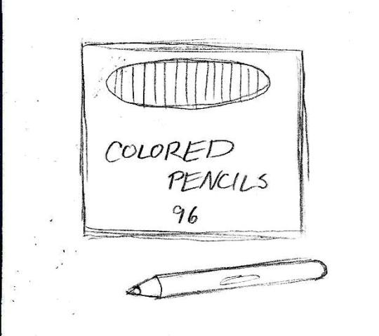
Colored pencils. Now these are my go-to for coloring since they give a wide range of color, combinations, and effects. For best results, I stick with Crayola or Cra-Z Art since the color tend to remain consistent from box to box and you can get a big box of them for a pretty good price. Prismacolors would be nice, but they’re pretty expensive and I don’t quite like the feel.
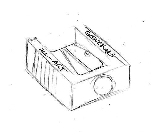
Sharpeners. Electric ones you can just keep at home, but for on the go I recommend a small manual one you can throw in your bag. Bonus if you get one that has a shavings catch so you don’t have shavings making a mess of your space.
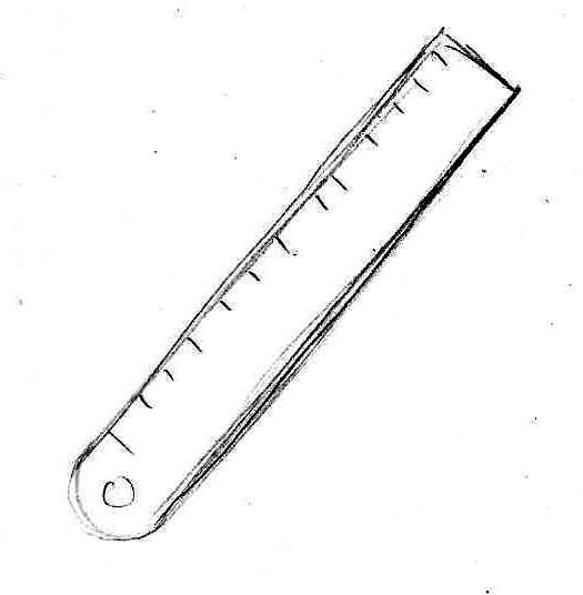
Ruler/straight edge. You’ll want one of these for comic panels, perspective guidelines, and, well, straight lines, though in some cases you might want to practice making straight lines without the use of it. I use a metal one, but a plastic will do you good as well.
And now, the most important thing of all, your drawing canvas!
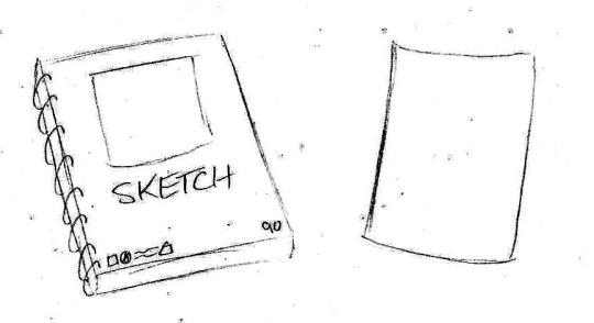
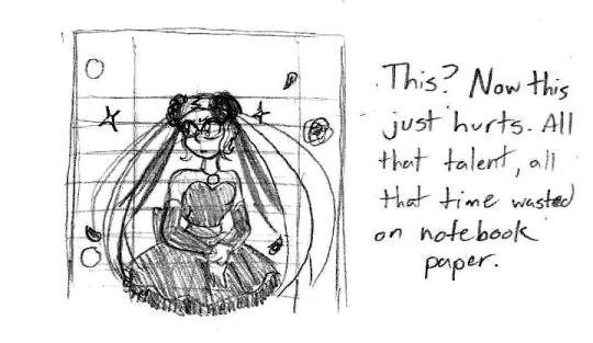
For starters, I recommend you get yourself a good sketchbook. Nothing too fancy, just one of those spiral-bound ones ideal for sketching. For your really good art, copy paper will work just fine. Really any kind of paper (or even cardboard!) will work but I implore you to avoid using loose-leaf notebook paper. I cannot tell you how much it hurts to see something so beautifully drawn wasted on lined paper. Not saying you can’t doodle in your notebook and show off something silly you sketched, but if you’d count a drawing as your magnum opus, your drawing probably deserved being on blank paper where it can shine.
I was considering making this an entry for Digital Art tutorials, but I’ll put these here just in case.
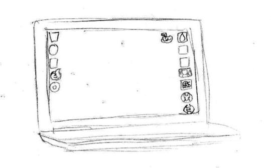
I do a lot of digital art using my HP laptop built with a touch screen. It can’t stream for sh1t but it runs single player Steam games alright and I use it for homework a lot. Before this, I had a desktop computer and used a mouse. I would like to own a Wacom tablet in the future, but until then this setup is nice enough. Remember, it’s about how you use your tools, not the quality of tools at your disposal.
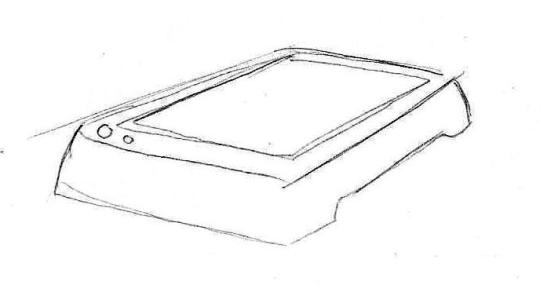
Now this is a scanner that’s used only for pictures/documents. You can’t print or fax anything with it, but it’s good for just pictures. I own an HP printer/scanner combo, but it is pretty finicky and no longer prints. Alternately, you can just use your cell-phone camera to take pictures of your finished piece, but I do not recommend doing so for comics unless you’re giving previews of one panel.
For my programs, these are the three that I use:
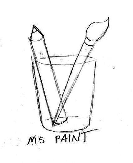
Good for doodles, already on your computer (probably), and I use this program to make authentic looking Homestuck drawings (like, you could mistake it for being an actual panel in Homestuck).
My primary art program. Operates much like Paint Tool SAI and photoshop. Very good for general art and comics.
Still learning this one, but it’s just like Medibang and is equipped with tools for animation.
And yes, these three programs are downloadable for free. I do want to try out Clip Studio Paint EX, but the cheapest I can get it is $80 when it goes on sale during the holidays. Normally, it costs $250.
Next time, we go over some drawing basics and some tips that will save your sanity while sketching. Stay tuned!
#tutorial tuesdays#art tutorials and refs#sh1t magma-paint does#getting started#art supplies#art software
16 notes
·
View notes
Text
Studio Saturdays: Mixed-Media Planner, Part 3
Welcome to the third and final installment of our Create Along series on making a unique mixed-media planner from scratch. You’ll love using this planner all year as a diary/datebook and an art journal. The idea was inspired by Dawn DeVries Sokol’s article “Creative Days Ahead” in the January/February 2017 issue of Cloth Paper Scissors magazine, and this is her take on creating a one-of-a-kind planner that reflects your artistic style.
Today I’ll show you how to art up the inside pages, which is the most fun part of the project. If you missed the first two installments, you’ll learn how to make the covers in Part One, and how to bind the book in Part Two. If you’d like to work with an existing blank planner, journal, or sketchbook, feel free to jump in and start!
Below are the materials you’ll need. With the exception of a few basic supplies, feel free to use what you have on hand—this planner is all about playing and having fun, and the pages will ultimately reflect your style and artwork, so use what you love. You can also experiment with some new supplies if you like, or give that tube of paint that’s been sitting on your shelf a spin.
• Acrylic paint, a variety. I used tube and fluid acrylics in a range of colors, including fluorescents.
• Spray inks (optional)
• Collage materials, such as book text, maps, ledger pages, and magazine cut-outs
• Gel medium
• Gesso, white
• Expired gift, credit, or hotel card, or a Catalyst Wedge
• Paintbrushes, a variety
• Large binder clip (optional)
• Washi tape
• Stabilo Woody Crayons, or Stabilo All pencil, in black and other colors if desired
• Artist crayons (optional)
• Rubber stamps (optional)
• Stencils (optional)
• Inkpads (Use permanent ink if you want to color over the stamped images.)
• Stickers (optional)
• Permanent pens, a variety
Open your planner to the two-page spread you want to use, and spread some paint on in select areas. I worked on two spreads at a time using different colors and techniques, so I’ll show you the processes for both. You can spread the paint with an old gift card, your fingers, or a brush—the idea is to not overthink it. I had the most fun and got the best results by applying paint with my fingers.
I had specific color palettes in mind when I worked on both spreads, and used paints in those tones. But since the paint will be mostly covered by gesso in the next step, and we’ll be adding more color later, you can experiment and see the effects different colors offer.
Add some collage materials, adhering them with gel medium. I used torn and cut book and map pages and sheet music. Here’s the first planner spread, where I incorporated fluorescent orange and magenta paint:
For the first layer of the two-page spread, paint was spread on the page, and ephemera was adhered.
Here’s the first layer of the second spread, which incorporates blue and green tones and paper cut into circles. I also used spray inks in addition to acrylic paint:
For this planner spread, I used a combination of acrylic paint and spray inks.
Quick tip: Place a sheet of scrap paper underneath both sides of the spread you’re working on to protect the pages and covers underneath. Dawn also has a great tip: Laying a large binder clip on a page allows you to work on the next pages while the previous ones dry.
When the paints and inks dried, I spread a layer of white gesso over the pages, again using the gift card.
The first layer of gesso covered the paint and collage, but I wanted to mute the colors even more.
The colors were still vibrant, so I spread on a second coat of gesso, letting the first dry before applying it:
A second coat of gesso gave this planner spread perfect coverage.
On the second spread, I used only one coat of gesso because I loved the look of the dot pattern from the spray.
One coat of gesso was perfect for this spread, which still reveals much of the color underneath.
Quick tip: Gesso comes in a variety of thicknesses; try a variety to see what works best. You can also try using watercolor ground in white or clear, if that’s your preferred medium.
When the gesso was dry I drew light pencil lines to mark off the days of the week. In her article, Dawn said that she needs less room for weekends, so she makes those days smaller. Think about how you’d like your week to be laid out. I like a Monday-through-Sunday view, but you may prefer a Sunday-through-Saturday grid.
You can divide the week up any way you like in your planner, and change it for each week.
I created another configuration for the second spread.
Next, divide the areas using a variety of materials: washi tape, rubber stamps, hand-drawn doodles, postage stamps, stickers, and strips of paper. Decorating planner pages is a great way for me to justify my washi tape addiction, so I love using it. I also split up the spaces with rubber stamps and collage papers, which I adhered with gel medium. By the way, if you’ve never used washi tape before, be warned that it’s a slippery slope.
Add the month at the top of each spread, and add the dates and days to the boxes. Get creative with the numbers—cut some from magazines, stamp them, hand write them, cut up an old tape measure���when you start looking, you’ll see that numbers are everywhere.
Washi tape is a great way to divide the planner pages into days; create numbers in a variety of ways.
Here, washi tape was used along with stamps and a strip of book text to create the grid.
Quick tip: Writing the months and days on your planner pages is a great way to practice your hand lettering.
Now it’s time to start building layers of color and depth. I love how Dawn often highlights images with shadows, adding deep color values. She recommends using Stabilo Woody crayons or a Stabilo All pencil; those are excellent, as are water-soluble artist crayons. I used a combination of all three, lightly drawing black lines around images and along the edges of the washi tape, then going over the lines with a wet paintbrush or water brush. I snuck a little extra color in as well with stencils, water-soluble crayons, and watered-down acrylic paint. If you compare the pages with and without the shadows, you’ll see what a dramatic look they provide.
What a difference a little depth and shadow make!
More shadows add deeper color values on the pages.
After that, I continued to add more color with the crayons, paint, stencils, and ink pads, plus extra collage, a few sketches, and some writing, rub-ons, and photos. The pages feel very organic to me. While each spread has its own look, the book as a whole feels cohesive.
Here is one finished spread:
This planner spread incorporates a huge variety of mediums and techniques.
And here’s the other:
The collage I added on the first layer became jumping-off points for doodles and sketches.
I decided to dedicate the first page of each signature to a list of my goals for the coming weeks. This goals page started with paint and Gelatos spread and scribbled across the page:
Paint and Gelatos were spread across the page to add color.
I covered the page with gesso, and lightly stenciled a pattern on top:
A layer of gesso muted the paint, then a stencil pattern was added.
I added sketches and lettering, plus collage and washi tape, to finish it:
The finished goals page includes washi tape, sketches, and collage.
Try raiding your art journals, sketchbooks, and scraps for odd pieces to use in your planner; sometimes I’ll like one element of a page and hate the rest, so I’ll cut out the part I like and add it to something else. This planner spread was the perfect place for a hand-carved flower stamp:
A hand-carved stamp image was cut from another project and added to a planner page.
In Part 2 of this Create Along series I explained that the binding for the planner left room to fill it with lots of stuff. I’ve started down that road already—on the goals page I created a small envelope for receipts, business cards, etc.:
A scrap of hand-printed map paper was used to create a custom envelope.
And here I created a tiny sewn book that I adhered to the page. The cover is a subway ticket:
I added a mini sewn journal to the page, using a subway ticket for a cover.
While working in the planner, I realized that if I didn’t have a super exciting week, I could still use the spaces to add sketches, doodles, journaling, and collage. I think what I love most about the way Dawn builds the spreads is the element of surprise. Those collage bits that you added in the first layer become great jumping-off points for drawings and doodles.
I’m having so much fun working in my planner that I can’t wait to get to it, even I only have a quick 15 minutes. I hope you love this project as much as I do, and make sure to post your handmade mixed-media planners in our member gallery! If you have any questions about the materials or techniques, please leave them in the comments section.
If you’re looking for even more ways to fill your new planner, check out these books, videos, and magazines from North Light Books—there are tons of ideas that you can use on your pages!
Don’t miss Dawn DeVries Sokol’s article on making mixed-media planners in the January/February issue of Cloth Paper Scissors!
Let Kass Hall show you how to make your art journaling pages come alive in her book Amplified Art.
Learn how to create whimsical hand lettering and make colorful journals in this Inspirational Art Journals video with Joanne Sharpe.
In Mixed Media Techniques in Art Journaling, you’ll discover how to incorporate easy and eye-catching techniques in your planner.
The post Studio Saturdays: Mixed-Media Planner, Part 3 appeared first on Artist's Network.
from Artist’s Network http://ift.tt/2kDAy67
http://ift.tt/2kcuald
0 notes