#look up artists with saturated art and see how they work with it
Explore tagged Tumblr posts
Text


Meeks tries to explain how they color, except it is disjointed because you can’t explain years of color theory and practice in one post.
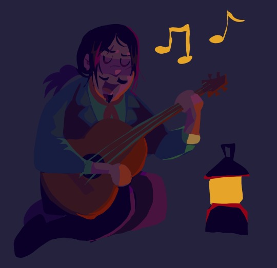
I wanted to beat the allegations that I only draw warm colors so I made this Javier drawing with cool colors. Okay… well, cooler colors. I will never draw with strictly blue. Dark blue is my enemy.
#rdr2#javier esquella#javier escuella#art advice#art tutorial#color theory#color advice#art#artists of tumblr#red dead redemption 2 fanart#red dead redemption two#my genuine advice is to fuck around and experiment#look up artists with saturated art and see how they work with it#there is a fine line between eye strain and appealing to look at#take all this with a grain of salt. these are just my opinions#meek’s art
79 notes
·
View notes
Text
Click here to directly send feedback to Tumblr Support about the new feature of training AI generators with OUR creations.
@staff turned off replies on their post about AI implementation. They’re dropping this on us, plugging their ears, and looking the other way and we can’t even tell them how we feel. That’s unacceptable.
This is a suggestion box that the Tumblr Staff themselves have set up. Let’s use it.
Tell them exactly how you feel about this new AI generation- its effects on the artist and writer communities, the blatant theft of our hard work and opportunities, the saturation of online feeds with these soulless, misshapen images and unintelligible writing. Express that disappointment, sadness, fear, and anger. They need to know.
And!! I haven’t see anything about using just art and images to train their AI generators. Writing is probably also fair game!! Everyone who posts on this site is affected by this!

Select the category “Feedback” and “New Features” and let the people in charge here know exactly how we feel about being automatically opted in to train AI generators with our creations.
Yes, you are opted into this by default!! If you still need to turn off third party sharing for your blog, Here is a quick guide on how to opt out of training AI with your blog’s creations. It’s just a hidden switch to flip in your Settings menu.
Together, our voices will be loud and clear.
#I don’t want to give up#I’m not just sad anymore. IM ANGRY.#And I’m going to raise my tiny little voice however I can.#anti ai#not art
1K notes
·
View notes
Text
Whitewashing in Anime - Agni ft. Cithis
Browns of the Same Shade
Hello again! I decided to revisit this topic again now that we have Agni's official appearance in the anime. I also wanted to go over some aspects that I did not get to include in my first post.
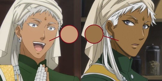
In the end, Agni also got lightened! His skin tone was always somewhat darker than Soma's in both the anime and manga appearances. Yana does describe his appearance as a "dark-skinned woman" in her genderbend sketches. So, for the anime to lighten him this much to such an degree is disappointing.
The skin diversity in the anime has been pretty lacking so far. Once again, A1 studios was not perfect, but they did manage to give all three Indian characters different dark skin tones, while this anime has every Indian generally the same lightened shade.
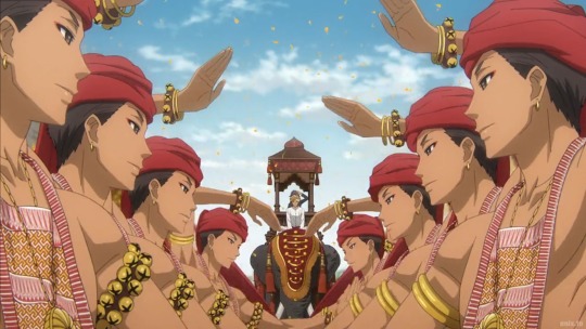
(every indian character in the anime are the same skin tone... cloverworks stand up, you can't let a-1 studios beat you like this)
Personal opinion of mine, I feel like animation studios aren't willing to play with skin color values as much anymore. I remember even seeing white characters being various shades of brown, especially under certain lighting and environments. Unlike now, when every character looks bleached the second they hit the sun.
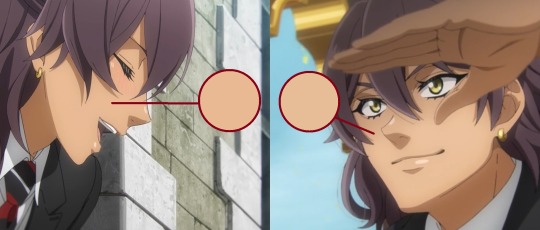
I also wanted to review what I think of Soma's appearance. Soma's skin tone isn't any darker than it was in the teaser shot sadly, so we can't blame the lighting. I already was expecting it, but it's still a shame.
One positive feature I'll give to the anime is that Soma's nose isn't pronounced all the time. In certain scenes, his nose isn't as sharp as it would be for other characters. I believe that's just the style for the anime and its dependent on the shot.
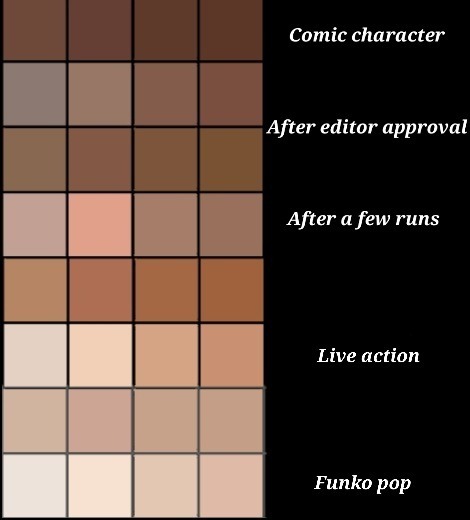
Anyway, I felt this image was pretty on topic with Soma and Agni's situation and just anime remakes/reboots in general lately:
Brown ≠ Grey
Something I'm embarrassed I forgot in my last post is saturation! I mentioned often how darker skin tones tend to be neglected, but not only that, but the color! The vibrancy in the skin, the life!
A common feature I noticed, especially in East Asian media, is how they avoid the "brown" in dark-skinned characters, by constantly making their skin tone duller, ending up with more grey-toned skin.
I often see art advice for digital artists that they should pick desaturated colors or colors in the "grey zone" as to not overwhelm the art piece. Which is fine most of the time! But when you apply that advice for brown skin, what you get are mostly grey tones, and end up having your character look like a zombie.
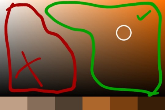
Here are some colors I randomly picked. The colors on the left are those sandy, dull grey tones I was talking about. If you want to get those richer, deeper-toned browns, you need to pick colors with more saturation like the ones on the right.
Now of course, color is relative and you can't just color pick your way around without considering how it fits in with the rest of the piece. You can even end up washing out your brown character despite choosing a strong brown color. You have to consider the background, lighting, undertones, the environment, and how they'll affect your character. There may even be times desaturated colors work better, but you have to at least consider why it works "better".
Let's take a look at everyone's favorite manga artist right now, Ryoko Rui! Ryoko Rui is praised often for her diverse character roster and creature design, however I always found her darker skin tones rather... lacking, as such for the elf Cithis.
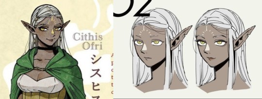
(I color picked her skin tone and it matched my light grey shades above lol)
Her skin tone is very washed out and grey. She not nearly as dark as she appears in the manga. Once again, there's that dissonance between skin tones. Now take a look at the manga's grey tones.
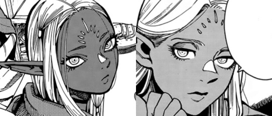
When you see this, what skin tone do you imagine for her? Do you imagine the greyish, washed out tones from above or do you imagine something more akin to these black fae models I found?
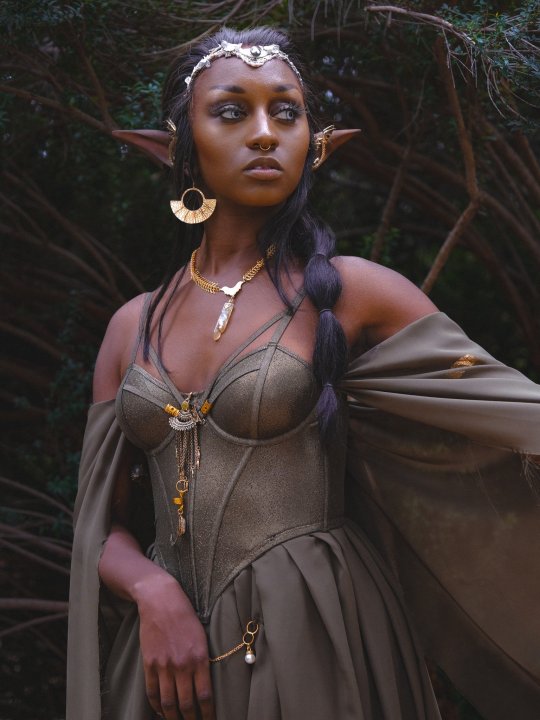
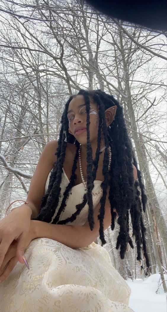
(credit: @jaharajayde on twitter and @glassmarigolds on pinterest)
I'll give Rui credit that her color illustrations of Cithis improved and she's gotten better giving Cithis stronger undertones. I really like how the fandom has been illustrating her too, there's been some amazing fanart of Cithis such as these (the lighting in the last one is lovely).
Just adding saturation helps so much with skin tone. I even found an fan edit of Soma that added more color back into his skin, and he looks so much better for it.
One might say, "Oh what's wrong with having grey skin tones in a fantasy story!" Well... nothing really! You can have green or purple or blue characters if you like. But when there's already a startlingly lack of brown characters in a fantasy story, it can get awfully uncomfortable seeing the story portray different fantasy "races" with obviously non white racial features... but don't want to include any black/brown skin tones.
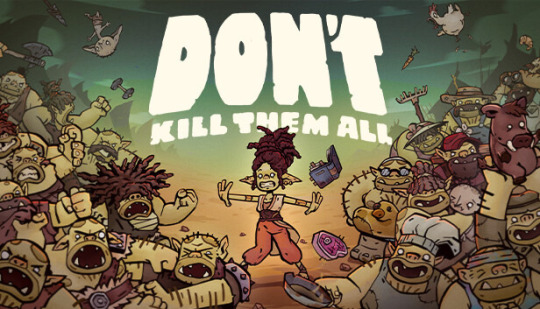
(fantasy artists would sooner give an orc dreads than a human, forget a "noble" creature like an elf... such decisions only reveals the artists' viewpoints)
It all just comes back down to avoiding that dreaded "brown". When it comes to these "reasons", we have to question whether they aren't just more excuses to not include black and brown people in stories, which makes me come to my next point:
Essence of Brown
There's some severe misinformation I want to address about Soma. I saw a fan a while ago say that Soma has a white mother which explains why he has light skin.
Firstly, that information is false. It was a concept Yana had for Soma, but quickly decided to drop it. Soma is not half white.
In the early drafts of the series, Soma had a white mother and, thus, white skin. However, this was later omitted in final revisions.
(quoted from the official kuroshitsuji wiki as an excerpt from the character guide)
Yes, you can have mixed parents and any kind of skin tone really! But it feels... dishonest to create "reasons" why the manga's first major Indian character, joining a cast of white people in a European country, should have white skin as well. Especially considering Yana's artstyle, without Soma's skin tone and Indian wardrobe, is his physical characteristics like his face even distinguishable enough for him not to be mistaken as white?
Imagine I wrote a story set in France, and teased an appearance of an African character in story that only had white characters until now, only for him to be completely white in appearance, and identical to every other white man, except for the occasionally exotic dress and other drab stereotypes.
What would you think? That his race is only a dressing to fulfill an exotic need at times? That he's a supposed homage to another culture, but it's wrong to have him actually look like the majority of people who made said culture? Why is he even this way?
Did he have a white parent? A white upbringing? Lived in a white culture, lived a white life? Maybe he was separated from birth! From his hometown, his country, his people, anything to justify why my "brown" character is so divorced from that part of his identity, from that side of the family whose skin tone runs a little too dark.
And I think that's why Yana decided to drop the concept of giving him a white mother. Why go through all those loopholes and explanations? Why all that justification for him to have white skin?
It's just another way to avoid the "browness" again for a character, what makes them brown in the first place and related to black/brown cultures. It's what we should consider in the future when we find ourselves coming up with "reasons" why black/brown characters should be anything but themselves.
Whitewashing in Anime - Soma ft. Usopp
#awgh so many links#this was floating around in my drafts for a while#glad i can get it out now#i really wanted to address the white mother rumor#soma asman kadar#agni#b.txt#yana toboso#kuro#kuroshitsuji#kuroshitsuji season 4#public school arc#weston arc#cithis#dungeon meshi#ryoko rui#dunmeshi#racism#whitewashing#fandom racism
163 notes
·
View notes
Text
PAC: How would a tarot reader describe you to your future spouse and their thoughts
collab w @daninixx
1 2
3 4
. . .
♡ Group 1 ♡
By @ariesluvz
# How would a reader describe you to them?
This person might like hip hop (😂). This person might actually have alot of worries and they might stay up all night thinking about their worries. Their work might take up all their energy and focus. This person is like a chameleon, despite of their condition they are able to work with people and match their energy very well. They are giving me strong business person aura. They have a huge sense of responsibilities. They might had to take care of their own responsibilities as well as others at a very young age that made them very strict towards themselves. Your person also has an artist side to them which they express very well. They might like art by itself. But they are more attracted to different color variations. Yes your person love to portray their mood through different colors. They might do that by playing with their fashion, dying their hair often. They might have colored their hair in a bizarre color. I see neon/pastel pink, mint etc. They might wear beige suits with their crazy hair. Might have beautiful tattoos or piercings. They are very chic and elegant and has a great sense of fashion. Their art might be their fashion. I think your person has a purple aura or surrounds themselves with purple colours. Especially purple neon light. I really think that this person likes bright, saturated and neon colors. Not like they don't like pastels. Y'all know those people who look dangerous by their looks but actually are the most warm hearted people you'll ever meet, your person is like the same. They might love to party. This doesn't mean that they are playboy/girl, spoiled. I think they stay alot of time or spend nights partying outside cuz they are very lonely. They also need warmth and people around them who radiate good energy. If not partying exactly then, they like to keep themselves busy and surrounded by many people. I think they might be very lonely for a long time but still are trying to get use to it. I find a little child in them. Possibly unhealed childhood trauma/inner child. They might be very fond of their friends trying to find warm in them. This may sometimes lead them towards wrong people and heart breaks. This person is like a fragile flower. They tend to fall for people who show just a little bit kindness towards them, maybe cuz they never had that. They never forget even the tiniest kind gesture ever done towards them. They rely on their good memories. They easily forget about the bad things they go through. Awwww group 1, I really love this person as if I wanna protect them and say words of love and appreciation to them. They are very afraid of doing any kind of mistakes. I think thing them doing mistakes is like doing any sin. They put themselves on a pedestal group 1. But nonetheless your person is a very strong and kind soul. They are not afraid to be bold but also vulnerable when needed. I really appreciate and like them.
# Their thoughts?
They will of you as their king/queen. They will be mesmerised by your amazing and so unique personality. They would want to tell you that you are so strong and that you are not alone cuz you got them. They would think of you as a very strong person. Also very fancy, they will think that you have a chic and rich personality. They might feel inferior to you honestly. They will be motivated to do well to match your level. They will kinda fall in love with you at that moment itself lol. They would be at peace knowing about you but also would be very eager to meet you. Their heart would be beating fast af. They will literally on the spot decide to give you alot of love. Does anyone trust 'red string of fate' theme? They honestly kinda do. For them it's like you are their destined fate. They would not really be in the mindset of actually believing it but will end up fantasising about you and your existence. It will all fascinate them alot. Predicting future might be very normal or like popular where they live but they will not be someone who was ever interested or believed. I am also thinking that their friends will be the one who will take them to the reader as an activity. So everything described about you will change their thoughts on/about you. They will be happy to get to know you.
. . .
♡ Group 2 ♡
By @daninixx
# How would a reader describe you to your fs?
This is someone who is flirt and knows how to have fun, your person isn't overly dependent, someone who is passionate about their goals and dreams in order to take achieve them, and will be comfortable about you because they know you are not boring, not too demanding, funny and put a smile on their face even on the worst of days. Someone who is determine to achieve their goals to have a better future for themselves, so maybe they're still studying (student). They can also be an attention seeker, someone who always imagine or day dreaming to be admired by others like i'm getting here that's this person wanted to be singer sort of, someone who talks shit behind their friends(if they have) or someone who likes to make-up stories so they will be admired by others. Someone who likes texts, phone calls and emails — i see that they might like to use discord or snapchat. Your person might have this motto " Do things you've never done before", someone who is making impossible become possible, this person likes adventure or travelling, they might plan or like this idea for their future purposes. Someone who interest of being an extrovert , someone who is elegant, rational, and intelligent. Your person is someone who are attracted to the charm of the enchanting mind. Your person is someone who is calm and has a serious personality, alongside with a unique perception and knowledge of the world, is accentuated by a powerful voice. Someone who will be professional in the field they have or they will going to take, your person will be well educated, so this will finish their bachelor, masteral or degress. Someone who have a good reputation on school or work, but if not this person can be cold and aloof. So yk this person will just be a normal type of student along with no bad records in school, if they're student or when they're still student before. Lol, someone being polite in public, but can be rude to people they know. There's is truly burdened in this person life that doesn't necessary needed, someone who doesn't what to look of what's going on around them, so this person will think that the time for them is running out very fast and quickly. It's like they think this person think they can't keep up with this, even though they really do. No way, you will be happy because this person is on their own phase of growth and healing seems like they're dealing from anxiety or fears from a very long time, this person will gonna start believing about what they can do, about themselves and will trying to move forward for the betterment. So whatever negativity is forcing them to don't do these things they really love since they're afraid of change before, this person will gonna change it and been starting facing them, negative energies will slowly fading away on their side and this person will discover the positive side of things. This person might be water signs on their moon to their chart a high tendency that it will be a pisces moon. Your person qualities, you will find them very attractive since at a very first place or beginning. But honestly, you won't be attracted to this person physical appearance, you will find this person interest of beliefs are way more into unique that somehow can influence you, someone who meets the eye with them also might be somewhat has mysterious aura. This person can also have a psychic powers or just have a hidden talents, this person likes to making plans that will be good for you rather than what suits to people, they will know the answer and the right thing to do with it. I see, you will see this person as lucky charm that will bring positive change in your life. Also, if you will be friend with this person i can't deny that in your relationship there's a lot of ups and downs.
# Their thoughts?
So, this person will think that can they already find the right one that makes them feel calm, someone who will not judge them as a person and can be someone to cry on or lend on to. That they're already reach the peace since they're feel a very strong connection with you, they love your qualities even the negative ones. They will be like "two people can blend together in harmonious way" or someone that have a long lasting love. They love how you view life and they will think that it's quite interesting since they never encounter such someone like you, your person will be having a good feelings for you perhaps that this person doesn't like drama or big displays of connection, but they will think you are out of their league seems they doubts about themselves. They will also feel very inesecure about themselves, they will have this deep and hidden insecurity. Someone who wishes to take care of you after hearing those messages that you'd been through a very tough phase, they wanted to be a provider for you, that kind of someone will look after you. They wanted to see you and love you immediately but they are still not yet ready to face you because of their strong insecurities, they will trying to heal and face these fears before connecting with you.
. . .
♡ Group 3 ♡
# How would a reader describe you to them?
Very charming. They are very classy. Tsundere kind of personality. They were born in a strict household which made their life very much planned or schedule oriented. They might also have OCD. They get anxious and frustrated if something messes up their schedule or work. Pretentious is also something that I'm getting. Not sure if they enjoy their life. They are very much careful about how they portray themselves and their social image. People might not describe them as the most warm hearted person. They might know that and try to maintain a personality that scares away(?) people. They don't show the emotions of love. They show more frustration or determination. They prioritise their job first. They are very much driven by logic. They are not the type of person to get "fixed" I'm sorry if that's like something you are imagining. There's nothing you can do to fix a person. You are just an addiction to their life but don't expect their life to completely shift of change once you meet them. But nonetheless they are very charming. They leave a strong impression on everyone they meet. You will be charmed by them as well. They have an enchanting presence. They definitely have fire dominating their charts. Their aura might be red or lucky color or something. For a woman I see red lipstick might be their favourite. For a man I don't see a colour but their facial structure is very strong or like prominent. High cheekbones, sharp jawline, prominent nose for some it's straight and for some it's a Romanian nose I think. They have an advantage in their looks/appearance which they manage very well. They remind be of those very masculine guys in Taylor Swift's songs. If woman, then probably taller bone structure lean and slim. They have ectomorph body structure. They are success oriented. I think they take everything as a deal which should be profitable for them in some way. They crave stability. They give very stereotypical Capricorn vibes. If they have a childhood trauma that might be around their home life. They might have felt very different and has now embraced the theme very well that they feel unsafe or vulnerable or weak to not be different from others. They see that being different is a powerful thing. They want people to respect them and to have a certain position in the society. These things are their moral values. You can call them selfish and I won't correct you on that. Everyone is selfish but they are very openly selfish. They are living their best life to be honest. They are very hardworking in whichever field they are in and probably one of the best in their field. And they live their life very unapologetically. They respect their parents alot. They are sensitive about their family and personal life which they prefer to keep very hidden or secret because that is only one thing they are emotionally attached to. They try their best to keep their family safe.
# Their thoughts?
Ok so you might be very different from them. Like your vibe, aura or aesthetic might be different from them. You just have a different pov on life in general and take things differently than them. They are mesmerized by this trait of yours. If makes you mysterious to them even if you don't think you are the mysterious type of person. They kinda feel very calm and happy and delighted whenever they see you or think about you. Because you are different from the environment they usually are in l, they take a lot of interest in knowing you and love the time you spend together. They take a lot of pride in you for some reason. Like when they will know about you through a 3rd party they will be like "yeah that's my girl/man". You are very beautiful in their eyes and maybe that's why they are so proud of the fact that you are their person. I get yin and yang energy. I feel like that's exactly what they are searching for as well. They want their partner to be like their other half, a part of them. This kind of thought makes them happy and satisfied. I already told you that they give me 90s vibes. So they are also very traditional and they do follow certain believes and think that some things are better in traditional way. Ok I see a red lehenga, it's an Indian attire that brides usually wear for their wedding so yeah they definitely picture you guys' wedding together lol.
. . .
♡ Group 4 ♡
By @daninixx
# How would a reader describe you to them?
Pile 4, this is a secret i accidentally pulled one more card for you so maybe my guides wanted you to have more messages. So to start this person is someone who can be a bully or the trouble is always on their side even though they don't do nothing wrong. Someone who will see your dark side and will try to get ride of it away from you, someone that is type of person "winning at all cost!", someone who have an internal conflict and inner anger but this person will fear to openly or express them of how they feel definitely this person has anxiety or depression. This person is someone who is doesn't have a filter and say what they wanted to say in his or her mind. If this person wanted to settle in a relationship they want it to be passionate, somehow this person is not yet ready for any commitments as of now seems like this person is just like the idea of being in love but don't want to be in a relationship as of now because their fantasies to "happily ever after" and healthy and fullfilling relationship, they afraid that they might end up to a wrong person and toxic one. This person is bubbly, upbeat and wholesome, woah another card confirm that this person is really "dreamy" and "airy-fairy" might be a little kook too. This person might dress like a tomboy, may have a high levels of stress. Someone who is very faithful so they tend to be trustworthy and family-oriented, the communication with will be easy for each other. The relationship with them will be friends to lovers, someone who is physically attractive and always taking care of how they look or presenting themselves. This person is probably still studying and still the progress of towards their goals, someone who is practical and following rules. Someone you can consider as charming, gentle, and sensitive, as well as fearsome and powerful. In short, this person is ✨awesome✨. They might appear to have a solid strategy and know where they going; however, this person may appear arrogant and opinionated at times. This person might be afraid to show their real thoughts however they're fearless when it comes achieving success and victory, someone who will use their will power to achieve their goals, they might own a vehicle most likey a car or a motorbike. Someone who will looking or finding their own interest and what they really wanted to be in life. They need to get out in their comfort zone since i see here they really love home or to stay at home ; if they do nothing, nothing will be moving too or everything will out of their control because success is already waiting for them they just need to claim it, and if would failed to do that they will be dissapointed for the chances. This is someone who is kind and understanding, this person is talented and creative but somehow there is something stopping them to show them off, they're overthinker. Someone they love might loss to them, it's female figure can also be grandparents or this also indicates of end of their struggles will going to come. You might meet this person through social media, i'm not really sure if this person has a family member that working to government or an authority figure seems like this person is just died recently.
# Their thoughts?
So they will feel confident about you, they will be more fallen in love with you right now, you will be someone whom capable to enjoys their company. They will also think that this connection needs more understanding before jumping or trusting their guts, so they ask you to wait and give them some space to think for it, they might feel emotionally disconnected with it and needs time to resolve it. They want you to be communicating with them with honesty and integrity, this person think you are allowing your emotions to take control of your life. Also, they feel sadness and loneliness for what you've been through, they think it's right for you to get out your comfort zone and start enjoying and doing a better lifestyle, You might be focusing on your innermost feelings, therefore they want you to withdrawing from the real world, that you need accept the situation and work on your well-being. They're someone that enjoy their flow of your emotions, and this type of person will bring balance and harmony in your life because they feel the same wavelength before. In addition, someone who they think needs acceptance of the situation, they wants to motivate you, they know this is hard for you but you need it. It is time to speak up and move about what is needed or desired before getting everything is too late. Your person think you are like a precious thing to take care of, a breakable glass. Totally they wanted to meet you and love you unconditionally but they know you need more growth and healings, so they telling you take your time to take care of yourself since you are unbeatable and unstoppable, they also like the that you are family oriented type of person that can take care of them and your future kids. They also imagine to making you a morning breakfast in bed and see your morning face like even your feeling ugly they want you to don't feel ugly to yourself 'cause you'd beauty , honestly you feel confident with this person.
#tarotcommunity#tarot reading#tarot community#tarotblr#tarot#pick a card#tarot readings#pick a card reading#pick a photo#future spouse#pick a picture#pick a pile#love reading
1K notes
·
View notes
Note
HFDOSN OMG YOUR ART IS SO LOVELY!!
I was wondering if you have any tips to rendering or the way you pick colours?? It's something I struggle with and yours are so vibrant and full of life!
HII I’m actually so happy to answer ur question! I work at the studio I took art classes at to help highschool kids learn the basics to art, so I love teaching a bit of art!!
Mind you, I’m still a younger artist, and I still have a lot to learn. And this is only talking about my style and my tastes! Make sure to look at how the true masters do it too! (My favorite master artists are Redum4, Octahooves, and Matchach on Twitter)
When it comes to rendering, values, and color, it’s all about balance and contrast.
For rending, (at least for my style) it’s all about lost and found edges. Balancing lost edges vs soft edges. Smooth vs textured, harsh vs porcelain.
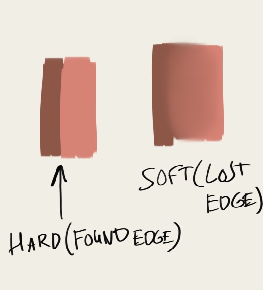
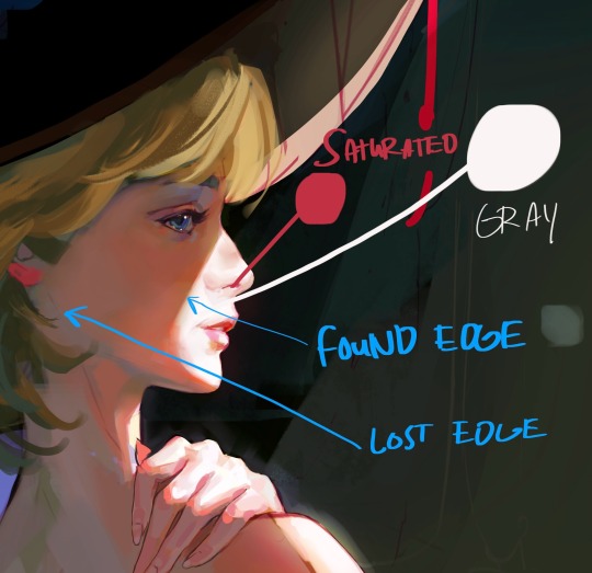
In my style, I see rendering as a way to convey character and mood. Lost edges equals softness and grace. Found edges equals harshness and severity.
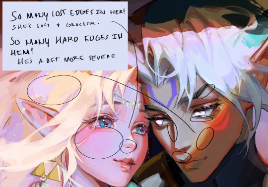
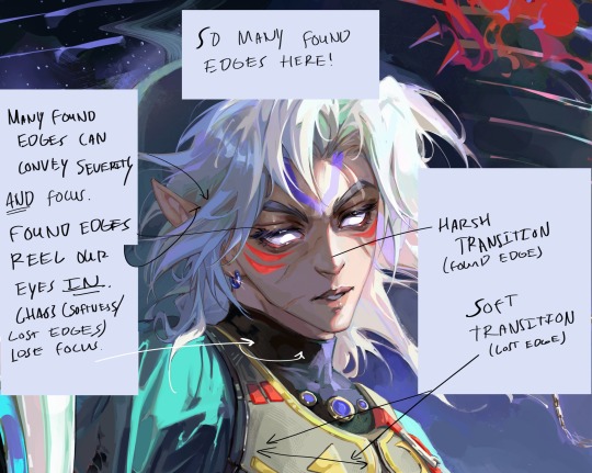
I utilize lost and found edges in this way! In other words, if you ignore balance (such as utilizing many found edges and hardly any lost edges) then give it a narrative/mood reason, I say! :3
But in terms of the basics, lost edges means a smooth surface, a smooth transition from light to dark (or transition of color). While found edges suggests a harsh transition from light to dark. ALSO and probably most importantly when it comes to edges in rendering: Found edges reels the eye in, creating focus. Lost edges typically lose the eye, creating a rest for our eyes. It’s important to balance them for these reasons too!
For colors, it’s all about THE GRAYS. (Ironically enough!) The basics of my coloring method can be described via this sphere:
Basically, a highly saturated color can only have its high saturation in the spotlight BECAUSE the gray tones make it pop by giving the eyes a break period saturation wise. All about contrast!
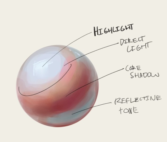
As you can see, I differentiate the colors and saturations by values. My shadows are deeply saturated, typically warm. (It’s more typical to make the lighter area warm and the shadows cool! But I find that vibrancy comes easier if you desaturated the light, make it colder, and really PUMP UP the saturation and heat in the shadows.) And the areas lit up are typically cooler and have hints of gray in them! This is great for conveying strong direct light (which is typical in my style), and it makes it look as if the light is so powerful it seeps through their skin. You can see how I do this in some of my work, I typically exaggerate these qualities in skin!
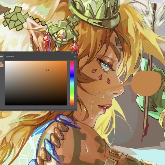
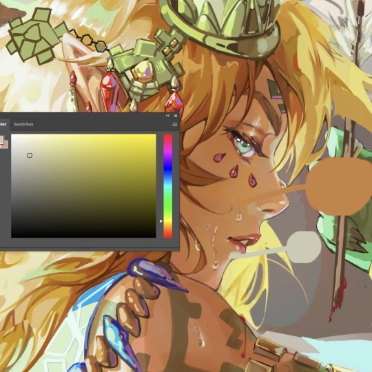
You can also do this especially well for skin with melanin!
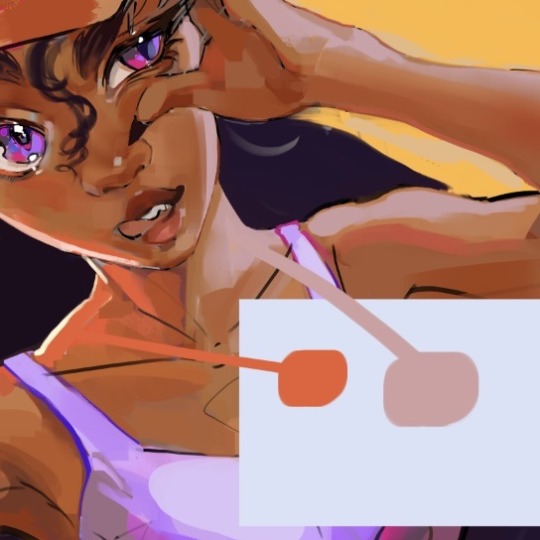
This also works especially well digitally, because saturation and value works in tangent in the color square! Pure white has no saturation, and the more saturation you add to pure white (the further right you go on the color square) the more value you get.
The use of grays are the most important thing when it comes to vibrancy, in my opinion! Too much saturation is, well, too much. Again, you can disregard this rule if you have a reason for it. Such as a high energy mood or overstimulation you’re trying to convey! Or desaturated to convey coldness, stillness, etc.
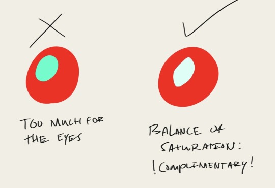
Anyways, I hope this made sense! (And sorry about it being more of an info dump than tip-giving >w<) If anyone wants clarification on anything, feel free to ask me in the comments! 🫶🏼🫶🏼
100 notes
·
View notes
Text
alright, here it is: ZENO'S COLOR GUIDE 3.0 !
here, i'll have three "chapters" regarding color:
CH1: how i color in illustrations
CH2: color and character design (in zeno's case)
CH3: how zeno makes his colors cooler
CH1: HOW I COLOR IN ILLUSTRATIONS
it must be noted that, as of lately, i heavily use halftones in my art and the way i use them for gradients effects my color choices. of course you don't need to use halftones if you don't want to, as it's just my personal choice, but anything regarding halftones here could (probably) also apply to regular gradients!
when choosing colors in an illustration, i usually have three things in mind: mood, character, and contrast. we'll be using "gloomy bunny naptime" as an example here.
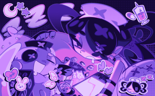
MOOD: what's the vibe of the piece? for example, here in "gloomy bunny naptime", wanted a mellow, sleepy vibe, so purples and pinks seemed like the best choice. these colors also have a dreamy effect due to being common in real-life early mornings/summer nights - basically, i tend to use associative colors in illustrations.
i usually only use a pallete of 3-7 colors, though of course more characters calls for more colors. for multi-character pieces, i would actually make a "rainbow" of colors based on the mood of the piece - essentially, a bank of colors to use for your colorful casts based on the actual rainbow. you can alter this based on the saturation levels you want! hope that makes sense. i'm not the best at this though, so i would heavily recommend looking for guides from artists who are more skilled in that department.
CHARACTER: velvet is the focus of the piece, and as a character her palette is made up of many purples and pinks. of course, it's easier because she and ribbon both have similar designs, but i would still recommend using colors based on/complementary to the focus character's pallete, though this is a rule that can and should be broken if needed. gradients can be used to provide a smooth transition from color-to-color and add depth to the piece, as well as showcase velvet's pallete. when making any gradient, you probably want to have a vibrant middle color. this is difficult to achieve in most art programs, so i'd do it like this:
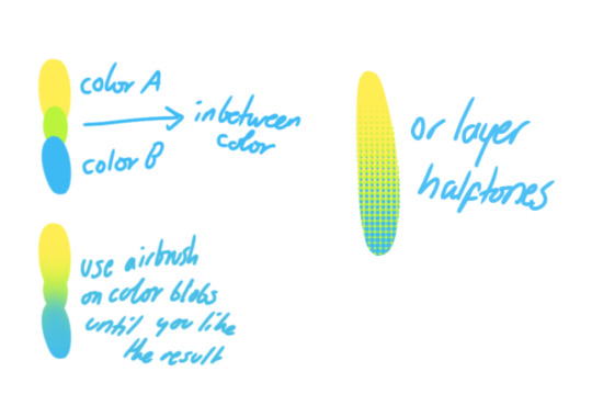
you can use gradients in lots of cool ways to make stuff pop! (i think this collage shows i use too much purple and pink though.)

CONTRAST: the context of the piece also aids the color through contrast. (that's a lot of Cs!)- we see that velvet is just waking up, and the light from her switch is glowing brightly. i wanted to convey something like her switch suddenly turning on in the middle of the night, waking her up - so the console emits "light" in the form of illuminating the contrasting color of pink against the purples. it might seem specific to this piece, but what i'm trying to say is that contrasting colors can lead the eye to the focal point of the piece, that being velvet herself. because a great deal of the rest of the piece is dark, we look at the contrasting switch screen - the brightest thing in frame - and our eyes move around and up to take in the focal point character. at least that's how i wanted it to be ;w; i guess you could convey it as something like this?
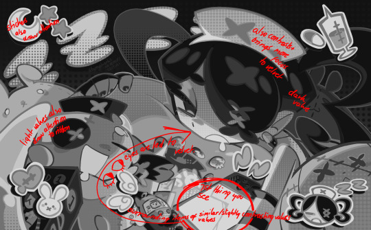
CH2: COLOR AND CHARACTER DESIGN (IN ZENO'S CASE)
this is where i start to get annoying, so stand back! when deciding on colors for a cast of characters, there are many factors: time period, variety, personality, and more that i can't think of.
TIME PERIOD: this one is simple. for example, a futuristic time period (such as that in x-calibur) calls for colder colors, such as greens and blues. for characters involved in futuristic professions such as space exploration, this works incredibly well. for modern time periods, less focus can be on colors and more on the shapes of the clothes, but this is not a shapes tutorial! i don't have any ancient times oc stories, but i'd probably use earthy and warm tones.
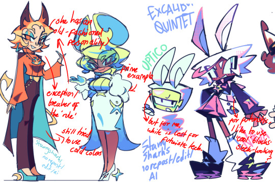
VARIETY: this is also rather simple. i try to be aware of the palletes that i used, and the similarities they might have with other characters. i try to use similar colors for characters who belong to certain organisations or have a uniform, but of course, it's not like catholic school students adhere their entire look to their uniform, so this is a rule that can be broken yet again. art is all about learning things and breaking them, remember that!!!
color can also be used for symbolism. my absolute fav example for this is vivica and octavia - the amount of red in their designs is supposed to represent the amount of freedom/passion/anger/confidence they have or are allowed to express under their different circumstances. as vivica belongs to a strict organisation, she has far less red in her design, showing her emotions are stifled - meanwhile octavia has it as her main complementary color because of her freedom to express her emotions, though those emotions may be destructive because of her circumstances.
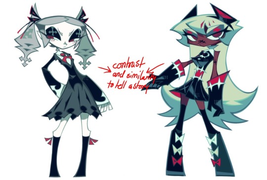
PERSONALITY: what colors are associated with your character's personality? i actually usually refer to magical girl groups to see what's commonly associated with different colors. here's the main trend:
red: hot-headed, passionate, firey
orange/yellow: bright, happy-go-lucky, sunshine personality
green: wise, mellow, kind
blue: serene, graceful, elegant
purple: magical, regal, fancy
pink: usually the main character (though this because magical girl anime tends to be marketed towards young girls), sweet, relatable, determined
of course these are only stereotypes from one genre of anime, and different colors have tons of different meanings. color theory is the best way to learn this! these colors can also express different moods, which ties into ch1. i myself constantly ignore these rules - v-con, a bombastic hyper DJ, is purple (though he does have yellow accents) for example. basically, i just take them as a general rule and try to have them in mind while drawing.
CH3: HOW ZENO MAKES HIS COLORS COOLER
this might be the most important part of this guide. once again, there are a few things to consider here: filters, hue, overlays, and more!
FILTERS: for ibispaint, you can use an adjustment layer on your whole piece to use a filter. i usually only use brightness/contrast here - upping the brightness (or darkening it based on the mood of the piece) and upping the contrast. this helps to better express values and intensify the colors if that's what you want. i often use it in all my pieces to some extent.
hue/saturation/lightness is also helpful in moderation. you can alter the hue - though it usually only helps if you bring it back or forward by just a few points, or the entire pallete will change. saturation is what it sounds like, and slightly over/desaturating the piece can help with atmosphere. lightness is what it sounds like - lightens the colors in the piece. i don't use it at all.
posterize and sharpen mask are some that i've used recently. posterize can add some crazy effects to your art, but i'd probably need to edit it slightly after using it because it can mess with certain colors.
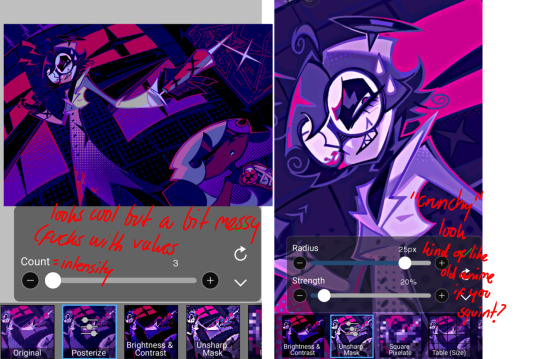
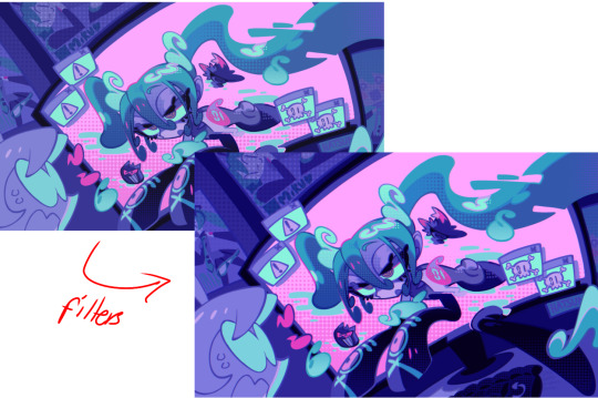
HUE: it's a layer type that can change the overall hue of the piece. i usually use it at a low percentage for atmosphere. kind of like a gradient map but nothing like it? idk
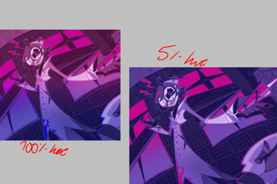
and OVERLAYS: i just use a very saturated blue/purple color over the entire piece at a very low percentage, around 5-10%. it can wash out the piece at too high a percentage.
and that's basically it! sorry it kind of derailed at the end i spent like 2 hours on this and got super tired. goodnight i'm going to sleep please also look at other artists etc etc. bye.
#zeno's art#long post#color tutorial#liar by korn is actually a really catchy song yea the lyrics are weird but its so good tbh#peak drums and bass and guitar and vocals and then the lyrics are hot booty. this is what nu metal's all about people#ask questions if you want#about nu metal or art i dont care
364 notes
·
View notes
Text
Making a Gamut Mask in CSP
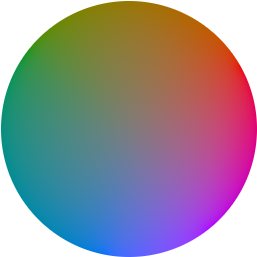
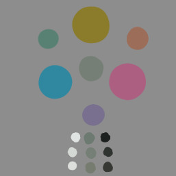
Strap in folks! I'm going to show you how to make a "gamut mask" and palette using nothing but a color wheel and Clip Studio Paint!
*I made this tutorial using CSP Pro 1, but the same principles should apply for any version.
Introduction
First, what's a gamut mask? The term comes from physical painting and printing, where artists only have so many pigments to work with. A 'gamut' is the set of all colors that can be mixed from a certain set of pigments. Painters and printers have been looking for 'wide' gamuts for a long time -- so they can make the widest variety of colors from the fewest number of base pigments or dyes. Some base-color sets you may have heard of are CMYK, RGB, or RYB.
One of the easiest ways of making a painting harmonious is to use color theory to limit the number of colors of your palette. The technique of covering up, or 'masking' your reference color wheel also lets the artist see what intermediate colors can be mixed and still remain part of the cohesive palette. And in the physical world, where more pigments means more tubes of paint you have to spend money on, it's important to know exactly how few pigments you can get away with.
In digital art, painters have access to every possible RGB color right out of the gate, which can sometimes feel overwhelming or make it harder to see relationships between colors. So let's try gamut masking! Using this tutorial, you'll make a general-purpose file you can change and adapt to your liking for future projects!
Part I: The Setup
In this tutorial, I'm using a color wheel image obtained from Björn Ottosson's blog, showcasing the OKHSL color space. I like it because the OKHSL space has perceptually constant lightness and saturation per hue. Try out his comparative color picker here. (I also like this image bc it has a transparent background)
You can use whatever color wheel you like! Just one thing is important-- it should gradually become more unsaturated toward the center of the wheel. This saves you some manual color mixing down the road.
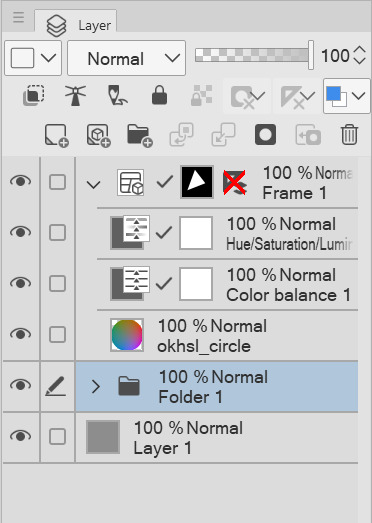
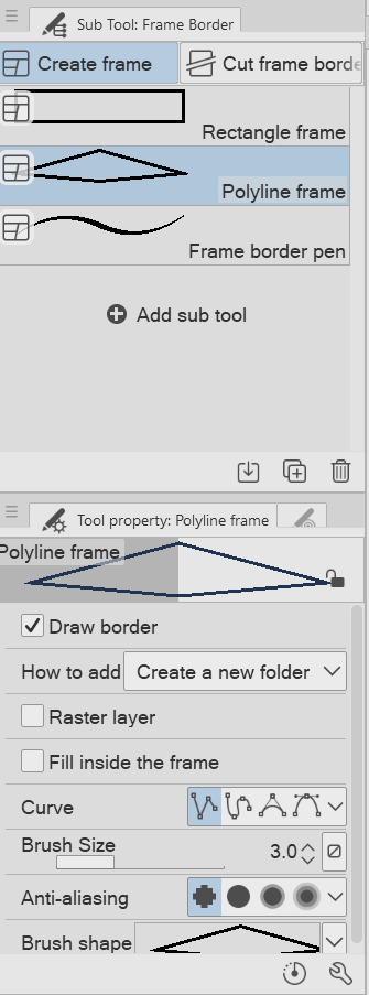
Here's our basic layer template. To get started, follow this:
Open your color wheel in Clip Studio Paint. It will be the only layer.
Select the "Frame Border" tool (U), pick the shape or subtool you think is best. I've picked 'polyline' since I'm making a triangle. (HINT: if you want an elliptical/circle shape, click the wrench in the tool properties window, then the "Figure" submenu, then you should see the option to choose an ellipse shape.)
Create the frame shape on the canvas over any section of the wheel. If it's not quite right, choose the "Operation" tool (O) and adjust the rotation, corners, or size of the frame!
You'll now see your frame border shape over the color wheel. Drag the color wheel layer into the Frame folder and it'll be masked!
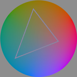
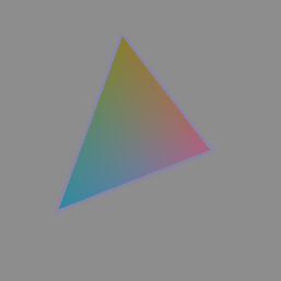
That's the very basics! Here's some extra steps I took to make it extra helpful:
*In the Frame folder, I added two correction layers: a Hue/Luminosity/Saturation and a Color Balance. The first is in case I want to work with darker/lighter tones. The second is if I want to apply a tint to my gamut while preserving the color relationships of the mask! eg: if I want to make a painting that's overall blue, but still want colors that 'feel' red, yellow, etc compared to the strongest blue.
*I've created a uniform neutral grey layer at the very bottom, so I can judge tones and colors without bias.
*("Folder 1" was unused, just some layers not relevant to this tutorial)
With that mask, you technically have everything you need! For each new painting you want to make a palette for, just edit the shape of the Frame Border layer and change the adjustment layers to your liking. Then you can save it as your favorite image type to use for reference!
But let's talk about how you can further use the mask...to be continued!
99 notes
·
View notes
Text
2023.
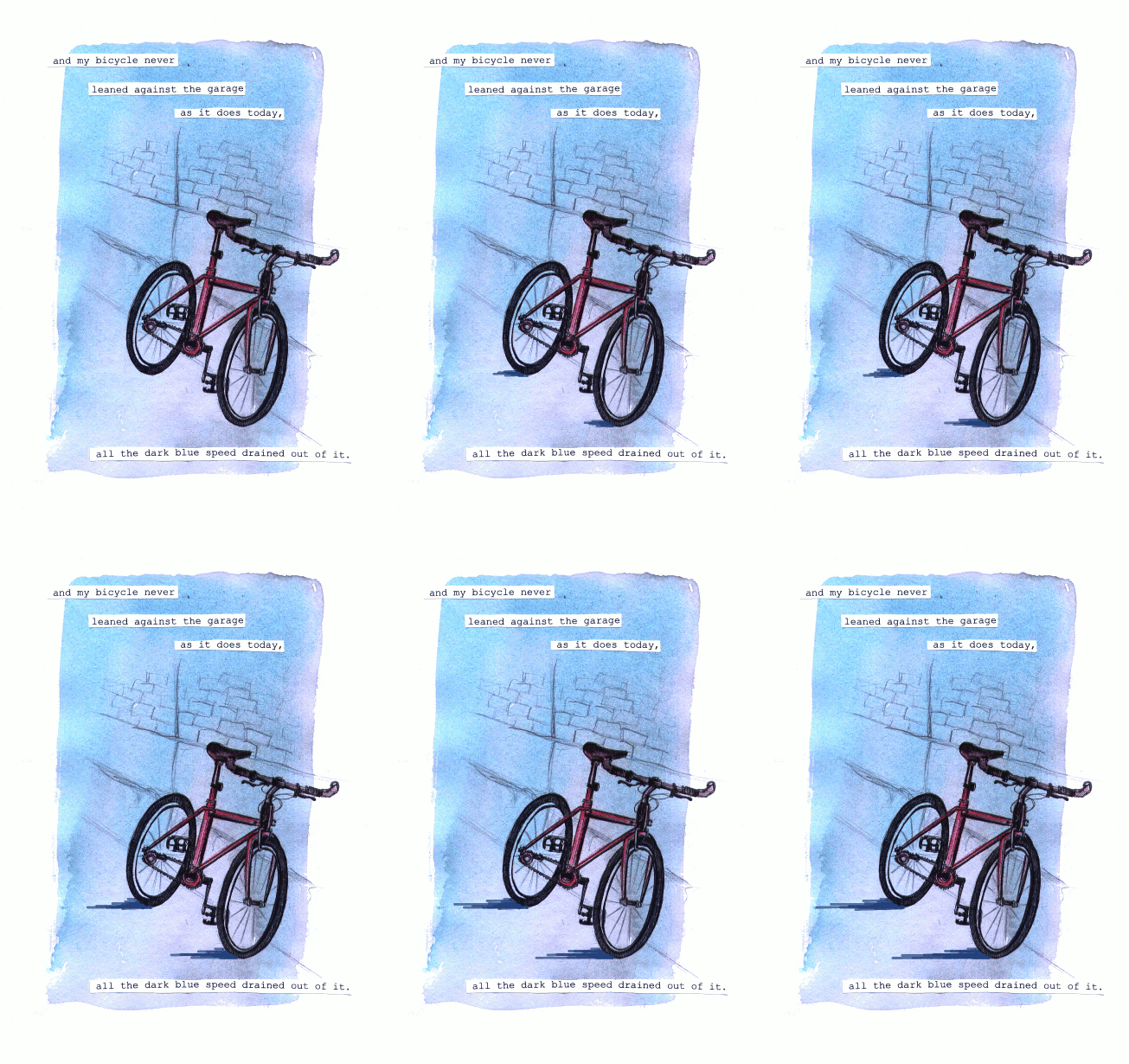
i hope any of you reading this will forgive the essay. i started posting to this art blog ten years ago in 2013 when i was just at the very end of high school, uploading short animations i'd made for one of my final projects, preparing myself for art school where i was gearing up to become an illustration/animation student.
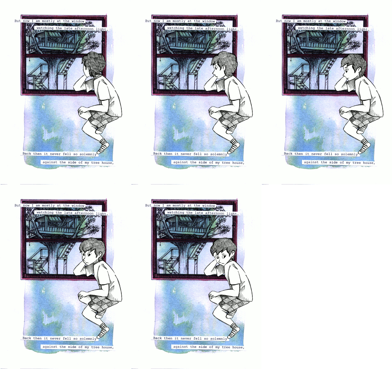

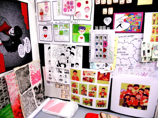
i went into my art foundation course in 2014, still thinking i was going to be going into storybook illustration or with faint hopes of becoming like a concept artist for game/animation, although even then i'd started thinking about patterns...
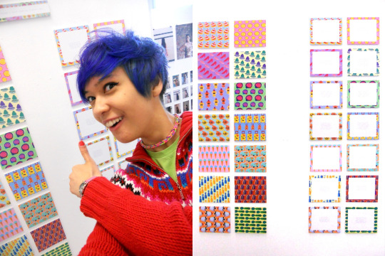
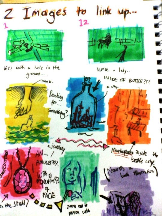
and then in 2015 i did go into my BA, going in for that illustration with animation degree that... usually when i talk about it in real life, i say didn't really feel like the best place for me. if i think back, the best things i got out of it were two of my best friends, one of whom is now my partner. looking back on my BA era, there's some bits of sketchbook stuff...
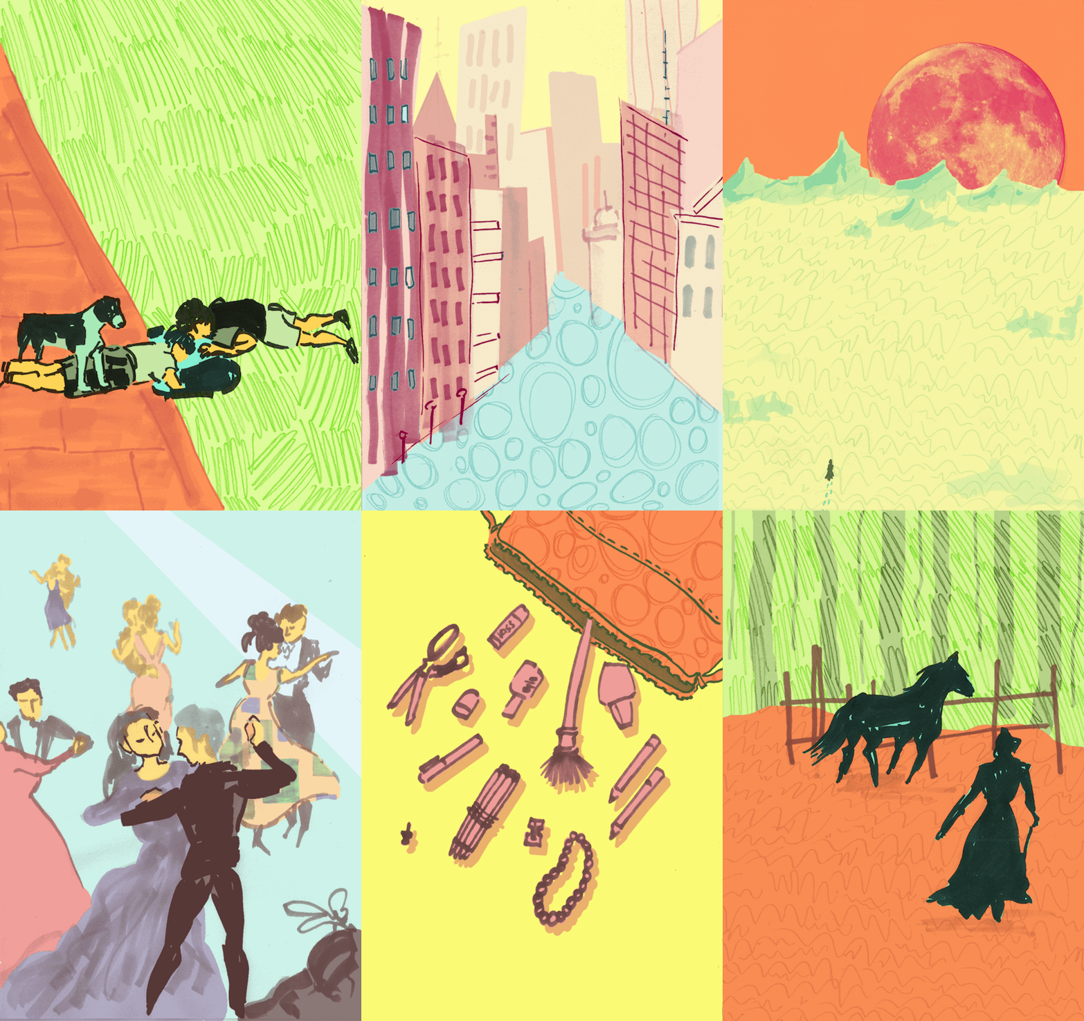
and while i was at university my main fandoms were thunderbirds are go and x-men for a bit... these are from the end of 2015 into the beginning of 2016...
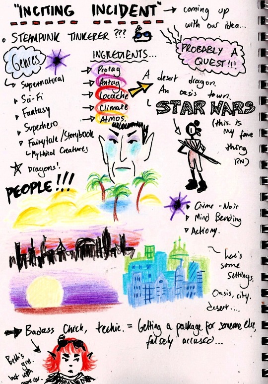
then for a little while i was doing this still sort of pastel-ish lineless situation:
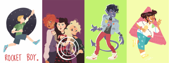
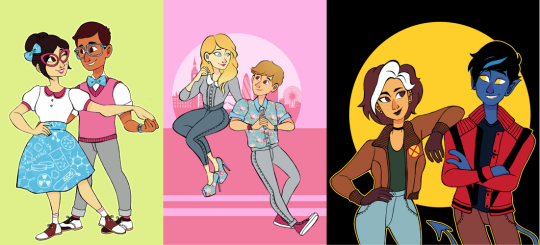
and i alternated between that and this thin fineliner type work (pretty sure all of the linearted pieces were done on paper and scanned, and all the lineless were graphics-tablet-only) - it was in this style that i started to offer commissions for the first time too.
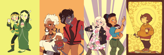
and i also had fineliner-lined work in sketchbooks that i coloured with marker and posca pens, the colours of which were generally a bit more intense just based on not being able to slide the hue/saturation around on paper:
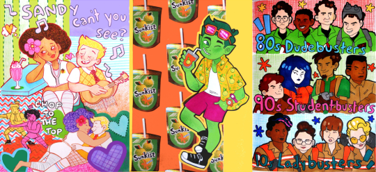
also 2016 was when i discovered the spongebob musical just after it's trial run in chicago (which ended in july of 2016) and i started making fanart at that point... which would have the biggest effect on the way i drew (and i did end up handing in a piece of spongebob musical fanart as one of my art school homeworks lmao)
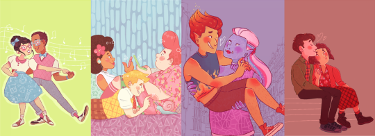
from summer 2016 until early 2017 things were still quite soft and pastelly in my digital art, colour-wise:
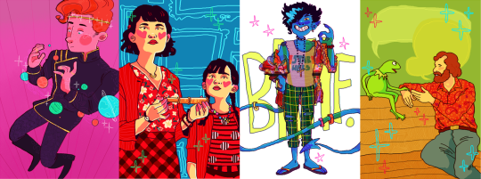
and then suddenly everything got whacked up to 100% on saturation. also i was using the binary tool to give everything really thin pixel lineart for some reason.
then i went on vacation in summer 2017 and didn't draw for maybe a month? just short of? and when i came back i decided to change everything up again... giving characters blobbier, more ugly-cute faces with large squinting eyes and big nostrils and i was worrying a lot less about making anything look smooth, lineart-wise. i turned off the pen stabiliser in SAI and let it wiggle.
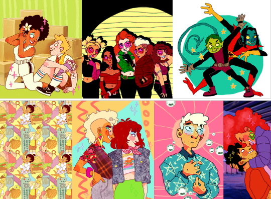
then... the spongebob musical opened on broadway in late 2017, i went to see it live in person for the first time... and my whole brain was ENTIRELY consumed by my love of it. i was putting that david zinn inspired pattern explosion into everything, even if it wasn't sbm fanart.
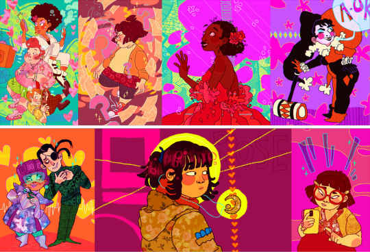
as we go into 2018, i started colouring my lineart. my biggest interest was still broadway musicals (with spongebob at the top of the list)
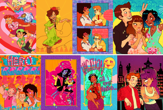
i think summer 2017 - early 2018 is probably my favourite art era, i was at my most bright and colourful and exciting... although i know in my actual real life i was struggling a lot with my home situation and i had been for some time. art was definitely my escapism back then, and i think a lot of the time i drew really bright, joyful stuff to try and inject that feeling into myself.
as for my university work, i was putting my focus into 3D paper-mache puppets:

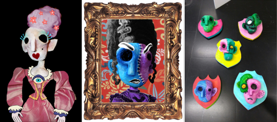
and i was also starting to do more repeat patterns, mostly inspired by things around me. i'd learned how to make patterns actually tile and repeat in 2017, so made a few during my time at uni just to accompany some of my projects, but never as the focus of them. one of my university tutors told me that maybe i should put more focus on doing surface pattern, and maybe applying it to textiles, but i said i wasn't interested.

i graduated from my BA in the summer of 2018, and immediately began volunteering at the whitworth art gallery doing anything i could - stewarding, helping with arts and crafts, dancing with families...
in 2019 i was still very colourful... i was trying out more chunky colouring on characters skintones that i think was def inspired by tumblr artist jadenvargen:
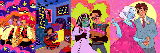
but the blobbyness and ugly-cute style of drawing faces was gone by here, and i think... the way i drew characters probably had better *anatomy*, proportions were maybe a bit more realistic...
in 2020 i started adding the black shading to under the chins and some other places on characters' bodies because i started watching the anime my hero academia with my brother, lmao (and i was starting to pastelise colours a bit again, these are the most pastel-ish examples) my lineart has really smoothed back out too, though i never turned my pen stabiliser back on in SAI. i think my hand just adjusted. probably seems a bit insane to miss that, but i do.
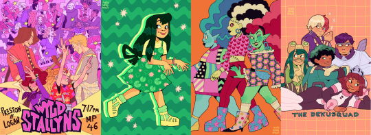
by the end of 2020, the almost-year of lockdown over cobid had... made me a bit insane, i think, and i moved out of my mother's house and into a flat with a friend from university.
in 2021 i think things were much the same... i think from this point on is where things have sort of settled. i don't want to say stagnated, but i do think things have been very... like this for a while.
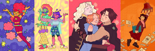
2022 - got the most exciting examples out...
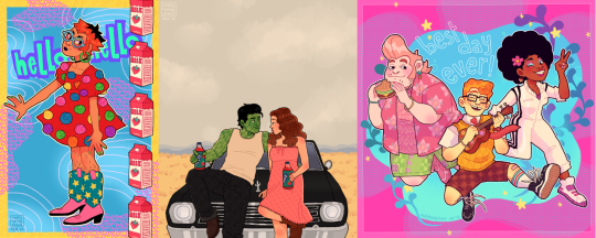
also i was very into these little frames in 2022.
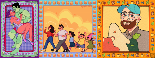
and then on to 2023! in 2022, i did begin trying to shift gears a bit -- hoping to put more energy into sewing and making products (like my tutor has suggested back in uni, even though i'd really resisted the idea.) i sold at a few in-person markets during winter of 2022, but got disheartened by the amount of money i had to sink in up front to sign up for a spot...

which has made me VERY grateful for the people who have supported me via online sales. it has really helped me stay afloat in 2023 - AND it has felt more wonderful than i can describe that there have been people interested in my work... especially when a lot of it has been my original designs, rather than the fanart that i expect a lot of people initially followed me for.
i've also... in the past 2 years... branched out a bit more when it comes to 'being an artist' - and have had the opportunity to deliver arts & crafts workshops with local refugee & asylum seeker support charity, afrocats. it's taken me to their home base in a church to hotels across the city where asylum seekers were temporarily placed while waiting on their new homes, and of course to my beloved whitworth art gallery, where we welcomed visitors from all backgrounds: from the typical white middle class visitors the gallery usually expects, to all the refugee visitors coming into the space for the first time.

and through my volunteering at the whitworth, i showed up so often they decided they might as well pay me. so i've also become a facilitator of... creative play sessions, my favourites of which have been outdoors. monthly, year-round, we have 'outdoor art club', where i get to paint with mud and make potions from leaves with kids & families - here you can see me tell you a little bit about it in this video below with 'crempog' a puppet character that makes videos about activities for kids and families around manchester (my bit starts at 01:10 although i am in the intro and thumbnail haha)
youtube
and then of course the summer 'PLAYTIME' activities we've had the past two years: scrap studio in 2022, and play market in 2023. it's the best freelance gig ever -- just to hang out and encourage families to be creative and have fun.
youtube
youtube
in working more in these new avenues... outside of being - as i've called myself for a long time - "an internet artist"... i've found myself more interested in this sort of thing. in being a "real world artist" too. in doing surface pattern design, and being a workshop facilitator, i find myself wanting to put more energy into these sorts of projects.
in 2023 i've also dabbled a little bit more in youtube videos! i have had a channel for a while and have made videos in previous years, but 2023 has been the year i've done the most in. admittedly most of them haven't been about my art, and more just like... random things that interest me (the spongebob musical in particular) but i've really been enjoying video editing. that's kind of an art form too, so i'm including it here!
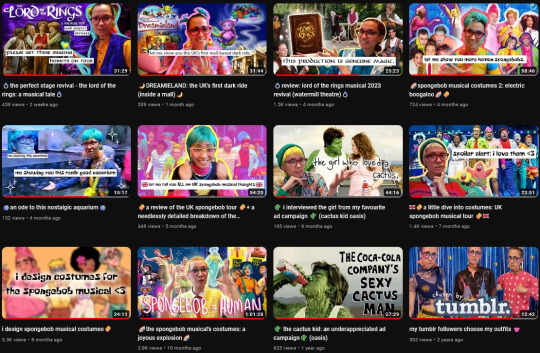
moving forward, want to keep putting even more of my energy into other things. my shop, with a bigger range of products to offer. workshops in real life, where i can make a difference.
as for my art blog... i feel like i've done the least drawing in many years in 2023, and... well, things have been weird and complicated for a bit in my real life. i hope to draw for fun a bit more again very soon, and to return to doing things in more of a wild and crazy way, to be more creative and exciting with the way i draw things. still, here's some of my favourites from 2023:
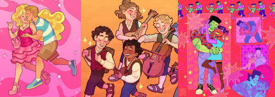
thank you so much to everyone who has borne witness to my art journey this past decade!!! i hope you will stick with me, who knows, maybe for another 10 years if tumblr holds out. especially a big thank you to everyone who has ever commissioned me, or bought anything from my store, you literally keep me able to make art at all and i cannot, cannot, cannot overstate how much it means to me.
i'm moving homes soon, possibly into very cramped temporary conditions for a little while before HOPEFULLY starting my real life with my partner. if i can take one more moment to plug my work, then [here is a link to my online shop] and [here is my ko-fi page too.]
cheers, cheers, cheers!
- LOREN 🌈🍍🎉
#also: i did post. monster high and steam powered giraffe fanart on my main blog when i was in high school#in 2012/2013 it seems like i did absolutely LOADS of fanart for both of those fandoms but didn't cross-post it to my art blog#and uh. well. i'm not about to do it now hahaha#art summary
164 notes
·
View notes
Text
rough art tips to learn and then break at your leisure.
the distance between your eyes is roughly one eye. the corners of your mouth dont extend past the middle of each eye. ears are roughly in the middle of the tip of the nose and the eyebrow. the eyes are in the very centre of the head. the neck is just a Little slimmer than the width of the head (varies with fat distribution, but fat tends to build up under the chin). hair is easier to draw when you plot out the hairline and then where it parts. leaving appropriate distance on the side of the face (cheekbone area and back to ear) contributes to making characters look more realistic/hot as hell. i dont know specific tips for that so use reference. an amazing reference/study site is lineofaction.com . if you think of the face in planes it makes it easier to construct (look up tutorials). if you draw a spiral like a tornado it can help you figure out awkward perspective for extended limbs (look up foreshortening coil technique). tangent lines are when two lines intersect and cause visual confusion (when it looks like a line that defines an arm is part of the line that defines a building, for example) and avoiding them makes your art way easier to comprehend. quick trick to good composition: choose a focal point (where you want your viewer to focus), detail that area the most, and make sure various elements of the piece are pointing to that focal point. you can use colours to contrast hue, saturation, and brightness and make certain elements of your drawing stand out. drawing in greyscale can help you figure out values. using black in a piece isn't illegal but you should know what you're doing when you do use it- it desaturates a piece and if used as a shading colour can desaturate and dull whatever youre shading too. if you use almost-black lineart and then add black to darken the very darkest areas it will do a lot to add some nice depth. the tip of your thumb ends just above the start of your index finger- your thumb also has two knuckles and all your other fingers have three. if you see an artist doing something you like (the way they draw noses or eyes or hair or anything else) you can try to copy that and see if you want to incorporate it in your style <- this is ENCOURAGED and how a lot of us learned and developed our styles. there are ways to add wrinkles to faces and bodies without making the character look a million years old, you just have to keep experimenting with it. The smile wrinkles around your muzzle dont connect to your mouth or to your nose; there should be a small space in between smile or nose and the wrinkle line. eyes when viewed in profile are like < aka a little triangle shape. think of the pupil like a disk and apply foreshortening to it (it looks like a line when seen from the side instead of a full round dot). subtle gradients can add a LOT to a piece. texture can also add a LOT. look up Tommy Arnold's work (his murderbot pieces are some of my FAVOURITE) and zoom in. find those random little circles he added and try to figure out why he added them there. light bounces. there's lots of way light bounces. sometimes it even spreads through the skin. i do not know these light tricks yet but i want you to know that they exist. draw a circle to indicate hand placement, draw a straight line between that circle and the shoulder, and then (normally at a right angle) draw a straight line on top of that line to find the placement of the elbow. elbows are normally placed Just above the hip when standing and your arm is at rest. there are no bad colour combos if you're brave enough about it, just fuck with the saturation and brightness until it works. keep playing. try new things. add your own tips to this post if you want or even expand on some ive mentioned here. good luck go ham etc
#look at this post#the sum of almost all of my art knowledge#all that i can remember rn anyway lmaooo#shit i didn't mention the tips for backgrounds that i know#eh that's environment most of this deals with character work anyway#i learned most of this from tutorials and kind artists who like to talk about their work#i would not know NEARLY as much about creative shit as i do if it weren't for the people who were willing to talk about their skills#and their tricks and their observations. id be nothing without them i dont remember most of them but i am so so grateful for that kindness#so ig here ill spread that a little further#if you have any questions go ahead and ask i am a NERD about art okay i do not know everything but i am always willing to talk about what i#do know#art tips#one of the most important things for you to do as an experienced or beginner artist tho#is to PLAY#experiment#figure out what's fun and what looks nice and what looks nice faster and just. whatever the fuck you want to learn#it is SUCH a joy
283 notes
·
View notes
Note
I really love what you do with the colors pallets. I was wondering if you had any tips on how todo them? I over complicate things, and I feel like I can’t do the pallets right, like is there a certain rule on color placement? Like the darker colour goes in the background, lighter further front?
… sorry 😭, other artists just make pallets look so easy, would you recommend using 3 or 2 colors to start with?
Sorry for babbling and thanks again 😂, honestly love seeing your art 😙, also, if someone wanted to gives your art/fic would you mind if they tagged you or would sending it in an ask be better?
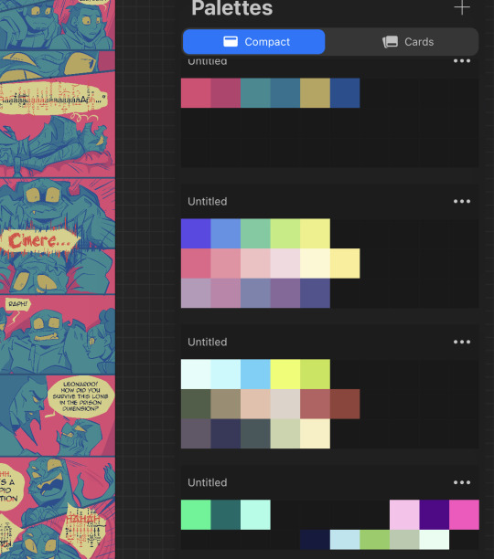
I’m still very new to choosing my own pallets. As for order, often I find the “pop”, or most saturated color works good for the background. Then for the characters, a less saturated version of the compliment color….or one that just looks nice. Then I do a light color for the eyes and any other elements I wanna emphasize. Lineart is done in black and then just alpha lock->fill layer with a color and slide around the adjustments until I’m happy. There’s not really a particular number of colors I think looks best, but I’m starting to like five color pallets. You can do three or even two, but five gives you some breathing room for variety.
A lot of it really is just what looks nice. I hate to say that, but there’s not an exact science behind it. Yes, you have to have knowledge of color theory, but also…It is just training your eye. Studying other people’s palettes, figuring out what rules they’re following, and how to play with and bend those rules.
This is why I will often go into the “color palett” tag for a starting point. But as a way to make them my own…I’ll do each color on its own layer. This way, I can change the hue/saturation/brightness and change, change, change, change, change until I’m satisfied. So much of the process is just playing. Play with one color, hop to another layer, play with that color, hop back to the other and adjust it slightly. And so forth. It sounds like a lot of time, but you get faster the more you practice.
This most recent color pallet actually started off as the THIRD row of colors, and then I just adjusted it until it was different, but still satisfying to me.
Finally I added one solid color (for this one I believe it ended up being a dark blue) above all the layers, and then just cycled through each of the adjustment layer types, until I found the one that looked the best. This last step is the clincher for tying all the colors together, and making them look cohesive.
Then colors are picked and saved. New pallet to use in the future!
138 notes
·
View notes
Text
With the WGA and SAG-AFTRA on strike, I want to take this moment to talk about one really important thing that I've alluded to but haven't gone into depth on, and people don't like to hear because of a lot of the noise, but-
We need to also support VFX unionization efforts (everyone's with me so far right...?), and in doing so, acknowledge the labor actually involved in using new technology (not just AI, but whatever the NEXT big breakthrough is too, and the one after that, and the one after that, indefinitely) and credit the people operating it properly-
Aaaand I've lost some people, but hear me out.
Sure, it's easy to type a single prompt and get a result that looks kinda nice. "Kinda nice", however, isn't going to cut it for most productions! It's like photography that way. As ubiquitous as good-quality cell phone cameras are, anyone can just point and click with some very basic understanding of what makes a passable composition and get something that's pleasant on the eyes.
And yet, generally speaking, people aren't grabbing random people with cell phones off the street to shoot movie posters! Because even a layperson can tell the difference between the photo you get when you stop a random stranger on the street and ask them to take a photo of you and your friends together, and the photo you get when a trained professional sets up the actors in a studio, with deliberate lighting, a thorough understanding of what lens(es) to use, and so much more.
Photography is easy. To be able to get a professional quality result? Not so much. Sure, sometimes a total rando who barely knows how to use a camera will luck out and get the shot of a lifetime - but it sure doesn't happen often and you DEFINITELY can't make a whole profession out of hoping for it.
The same goes for AI.
Most singular AI pieces that are high enough quality to get people really excited take hours, and hours, and hours of work and refinement and retrying and tweaking to get right. I mean, go test out a free image generator and pay attention - you might get a lot of results that look fun just by typing in a very silly prompt, but good enough to be a major part of a movie without any alteration? ....maybe one in a million - and then you still probably have to upscale it! And the standard for "nice to look at for a moment" vs. "good enough to be a major part of a professional production" will only get stricter and stricter as things get more saturated and people see Default Midjourney Style or the like as being super boring and amateurish for anything bigger than a literal one-man production, too (which sucks on a tiny level for me personally because I like Default Midjourney Style, but that's not important).
I point this out because bringing this up in the context of unionization helps to kill the entire motivation behind using AI to undercut manual art. The higher-ups want the world to think it's just mindless, super-easy button-pushing that anyone can do, so it's fine to crunch people even HARDER than they already crunch VFX artists or outsource it to people they can pay subminimum wages, right?
It's not. It never is. It never will be. We need to cut it off at the pass before one more studio even fucking tries it.
331 notes
·
View notes
Text
Tips and Tricks for krita (part two electric boogaloo)
Ok so this one is going to be a doozy because im going to include a lot of examples and tips for how to use filters (AKA YOUR NEW BEST FRIEND)
Link to part one.
Ok so filters in krita can be a doozy so ill cover the ones i use in my art the most, these will be adjust, artistic, and enhance dropdowns. I will be using my art pieces to show how i modify my art- colourwise!
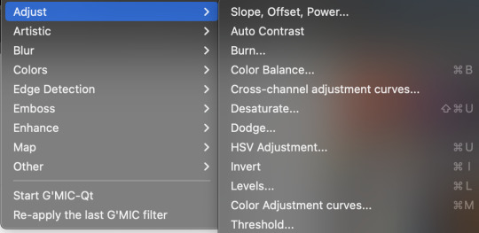
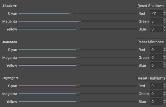
Obviously, start off with opening the filter menu up. Color balance brings you to this menu, where you can play around with the colour of your shadows, your midtones, and higlights. Its a lot of trial and error, just messing around to see what fits, and its how i got to this point. through just pushing the dials up and down. Honestly, a lot of this part of the tutorial is going to be me telling you to hit those dials and levers like you dont know nobody.

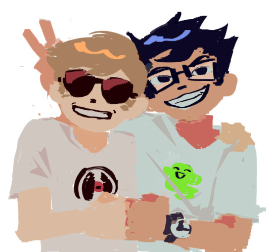
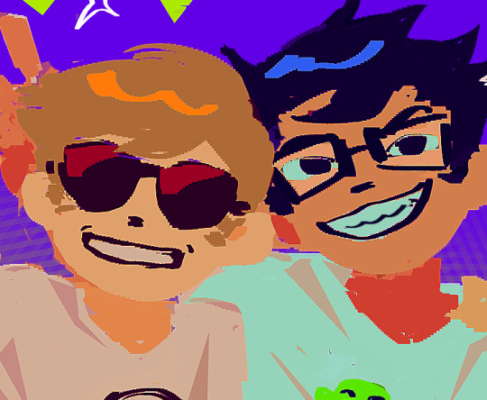
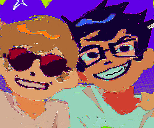
Even just small modifications as you can see can play so much of a difference. For here, i upped the cool tones for john, and upped the warm ones for dave. Colour theory without colour theorising i suppose you could say.
Crosschannel adjustment curves can help with contrast and colour intensity. Usually i have one point which i use to move up and down per my whims to control how bright my work is, and it can really help with really bringing out those colours so it doesnt all fall into one hue. Colour adjustment curves works similiarly, play around with them to get the desired effect.
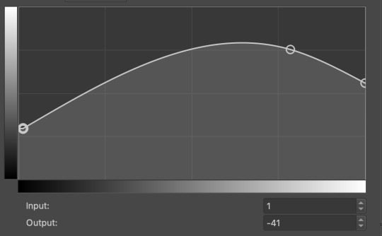
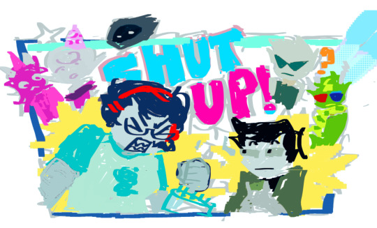

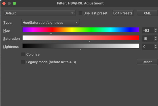
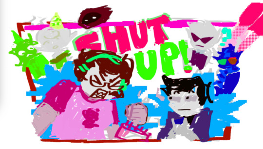
Krita also has HSV adjustment, but i usually use just the hue and saturation. Theyre pretty self explanatory, and can switch up your palette in pretty fun ways.
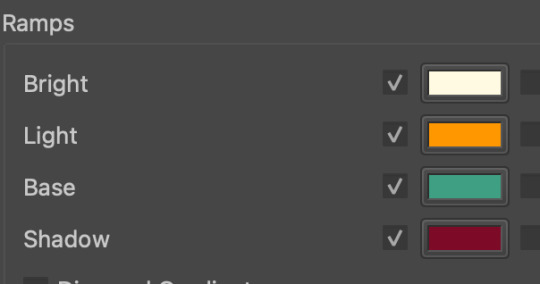
Now we move on to the ARTISTIC part. Again, i recommend you play around with them yourself, but i find index colours works really well for making really pretty art really fast! You just put in a few colours with descending lightest to darkest and you get an awesome art piece! Id say this is useful for pixel artists, but also useful for other parties. I might just start using this more myself. Its so easy wtf.
AND FINALLY THE MOST IMPORTANT THING.
HOW MY ART IS SO CRUNCHY.
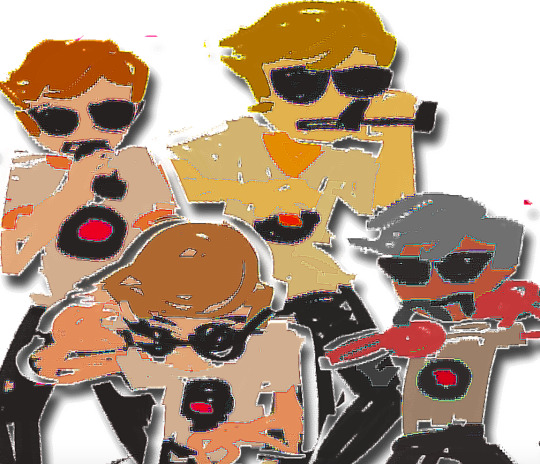
If youve been following me for a while you probably noticed theres a slight crunch to my art. It gives it a slight bit of texture and makes it noticable. How do i do it?


You're welcome.
insert image of face on 90% opacity and comedic text for purpose.
Alternatively, if youre looking for a sbahj level of crunchiness, smack that "mean removal"for some fun.
Thats all! Happy drawing.
140 notes
·
View notes
Note
Seeing your recent work made me curious as to how you pick your colors? I always feel like mine are too flat.
oh man, COLORS. my angel.....and my devil......
ok im going to try and figure out how to break down my thinking process
i guess the first question is. what do you want your art to feel like? i dont say "look like" cause sometimes i fall into the trap of obsessing over a painting being one for one PERFECT while "feel like" helps me think about atmosphere
heres a some paintings with a few of the inpso color palletes i wanted them to "feel" like

Heres an example of how i would give myself a jumping off point.
In this homumiko painting i started off by thinking about how i wanted something that feels like a Jules Chéret poster.
Now the next question is. What are the rules to these set of paintings?
the use of pure primary colors, blue tends to be in the bg while yellow and red are the focal point
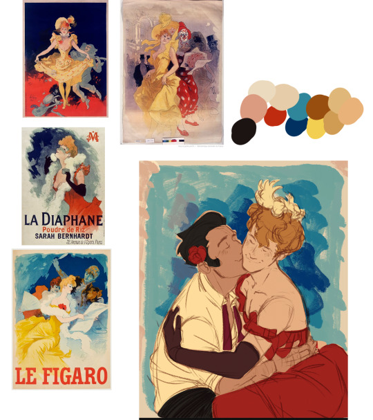
for this i wanted only the red dress to be the focal point with yellows being a less saturated and blue still being the bg. this means since herlock is the focal point mikotoba has to be muted. but i wanted to tie him and herlock together so made the flower in his hair the same color as the dress
Meanwhile my lastest otacon is a bit more complicated cause now we're dealing with lighting but again,
what are the rules to this set of nature paintings?
shadow areas are bluer
places where light hits the main figure will be an intense yellow
skin will be redder with darker areas being saturated red/brown and areas closer to the light source start skewing towards yellow
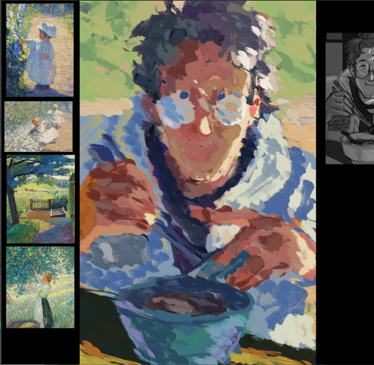
this is when we start getting into color theory and THAT is a whole nother can of worms. but its extremely helpful when trying to figure out how to add colors that arent in the inspo you picked out or figuring out what the FUCK is happing in pieces like this

those patches of purples in this are just a very specific type of red/orange grey tones matched in a way to make it feel like its blue. IT MAKES ME WANT TO SCREAM
i actually tried to attempt to figure it out while working on my pin up ryuu piece......
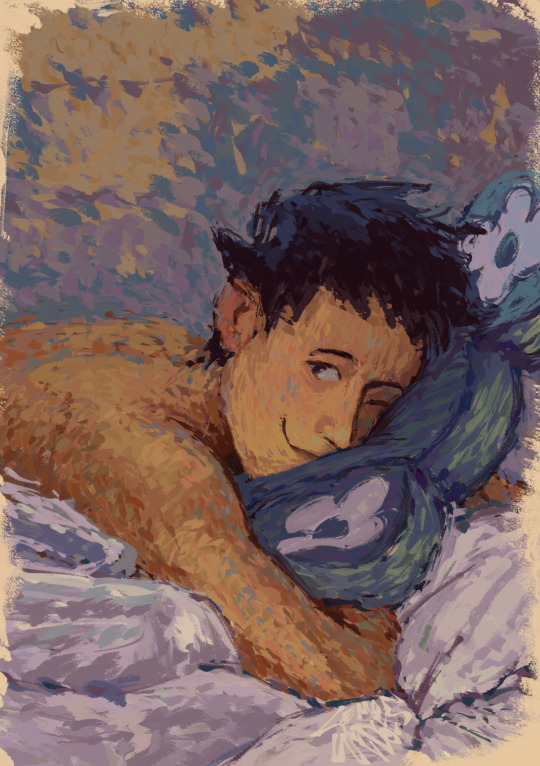
anyways.....i think im off track now....
i hope that helped a little? I tend to stick to late 1800s/early 1900s art cause thats just my personal preference. so the colors im gonna pick are gonna limited a very specific way (if ur into history its really fun breaking down why certain colors appear in certain time periods and how styles evolved as more paints became readily available. or painting for portraits vs painting for mass printing vs painting for animated movies affects an artists pallete. or maybe u dont give a shit? in that case...ignore this....)
71 notes
·
View notes
Note
helloo. your palettes rule do you maybe have any tips on how you choose your colors :^) no pressure
Ah!!! Thank you!!!
my main tips are to keep values in mind, to not be afraid to saturate the HELL out of your colors, and to use the tools you’re given in digital programs!!!
elaboration & extra tips vvvv
Values- every hue has an inherent value, blue is the darkest, yellow is the lightest, so a saturation or hue change does mean a value change! Whenever i’m working on something more serious, i add a layer with a solid gray on “color“ mode to check my values throughout me making it. (do this as often as you flip your canvas, which you should also be doing fairly often) Values are super iimportant to the composition of your piece, so zoom out really far and see if your piece is still readable off of values!
Saturation- SATURATE YOUR COLORS. every time i color things, i start with a very (halfway to the full saturation or more) saturated color blocked in- often a color i want my character to be tinted- and start from that main color whenever i choose a new one. Though I like to use INCREDIBLY EYE-BLEEDINGLY saturated colors, greys have their place too!!! especially in more soft pieces. I never use fully desaturated greys, whites, or blacks. Again, i keep in mind the inherent value of colors, and use that to keep even my white tones saturated. (often i use a decently saturated cyan or yellow instead of white, and blues, purples, and dark reds instead of black) i also never touch the sides of the color picker when choosing my colors by hand, because it looks nicer.
Tools- this one’s for digital art specifically. Digital programs come with SO MANY useful tools that can improve your pieces so much, it’s silly to overlook them! USE filters, USE curves, USE layer modes!!!!! They’re there for a reason, and they can totally help if you’re too timid to saturate or darken your colors too much.
Other random tip i thought of while writing this that really opened my eyes recently. Try Starting by blocking in your LIGHTEST color, if you change it to be a wildly different hue than your character, then you can use that “white“ hue as reference for the rest of your colors. boom, LIGHTING!!!
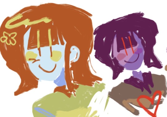


^a doodle that came to mind using this. i started wanting the whitest color, their skin, to be this purple hue. so the color of their sweater, normally green, ended up a desaturated Orange because that’s how far it needed to go to appear green!!! Its really good to practice doing colors like this, it gets your artist brain flowin~
i freakin LOVE color theory, i’ve absorbed a lot of my color knowledge from learning from other artists. I reccomend the youtube channel Lighting Mentor for some really good tutorials on color and lighting. That’s one of my favorites, but there is literally a million channels and videos out there for you to learn from! If you type just “color theory“ into the youtube search bar you’ll find so many amazing videos by amazing artists. Don’t shy away from learning more about art!!!!! Embrace it!!!!!!!!!!!!! And GOOD LUCK, HAVE FUN!!!!!!!!!! x^)♡︎♡︎♡︎♡︎
#i hope these make sense. i just woke up lol#anyway im very muchstill learning but i am super passionate about color!!! i’m glad you like my stuff anon! :3#art tips#asks
31 notes
·
View notes
Text
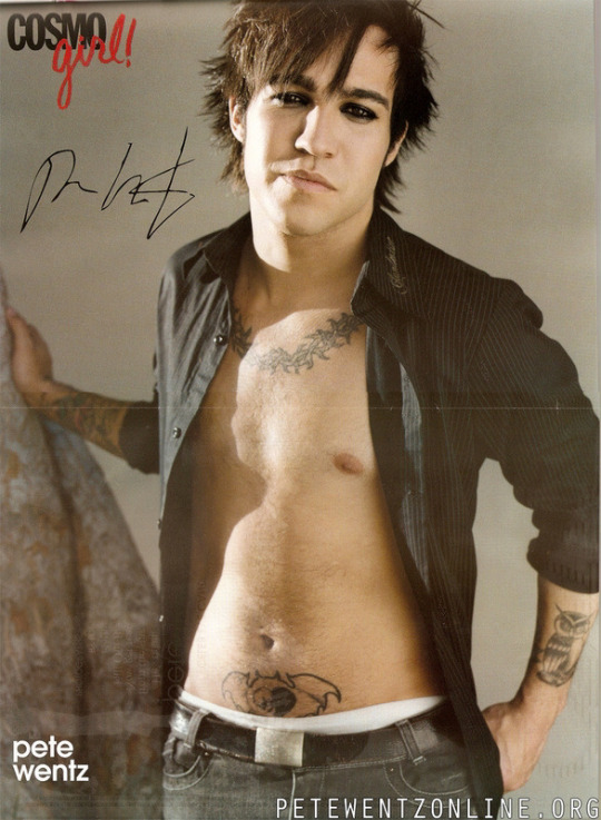
Saw this photo floating around and it is…SENDING ME. In multiple ways. So I’m going to ramble.
Ok first off - this is like, quintessential mid-00s teen heart throb photo shoot. Literally erase Pete’s tattoos and photoshop on a head of any popular male celebrity at the time and it would honestly work. This was The Template.
I think it’s easy to either forget (or just not realize) how TRULY big the FOB/“emo” hype train was back then. Cosmo Girl, Tiger Beat, and countless other magazines that solely focused on HUGE celebrities like Beyonce and Justin Timberlake and Lindsay Lohan were suddenly putting FOB, MCR, and Panic on their covers (although, let’s be real, usually just one or two members - i.e. Pete, Gerard, Brendon, Ryan).
There are…slightly less boundaries now with stuff like this because of the saturation of social media making “normal people” famous, but, back then, that was almost unheard of. You’d only see pictures of these bands in like, ALT Press or Kerrang. For them to get lumped into the same category as these A listers was absolutely bonkers.
So to see this picture of Pete…it kinda makes me laugh tbh, but it also makes me sad. Because that didn’t…FIT him. It looks ridiculous. It’s not an authentic picture of him- it’s him being placed into a mold. Him accepting “The Template” because that’s where he was expected to go. Which makes it…not at all surprising that he was only able to keep that up for so long before it fell apart.
It reminds me of that part in the Zane Lowe interview where they’re talking about this time of their career. Like, just go watch from min 35-42 because it’s fantastic but some highlights:
Zane acknowledging how easy it is to fall down the rabbit hole, especially when you’re thrust into it so quickly - it’s not really a choice. Patrick seconds this later by saying that once that fame light is on, it’s on, and you don’t really have a way to turn it off
Pete acknowledging how it kept him from being a “real person,” how little he liked it, and how much he had to grow during the hiatus to get away from that
Patrick saying how you really can’t win - you either accept the attention and you’re hated for it or you reject the attention and you’re hated for it. And this was ESPECIALLY true then. The media is still brutal but it was absolutely HORRENDOUS at that time. You really had to be “on” 24/7 and that’s…impossible.
Talking about how that level of fame creates a wall around you that is not only difficult for others to penetrate, but also yourself. And if Pete can’t access himself, he can’t access what he can give Patrick to create around, which then makes everything crumble like a house of cards.
I give FOB so much credit for realizing that, if they didn’t take a break, they would’ve ended VERY poorly and likely forever. Look how a lot of careers ended from that time. Either not well or a fade into irrelevance because of just trying to “keep up” and failing. Because, at that point, you’ve lost a lot of your “real person-ness” and, if you’ve lost that, what authenticity can you bring to your work? And if you’re BUILT on authenticity (which FOB is), then what is there to put out that is meaningful and relevant to your art?
Part of FOB’s magic has always been their authenticity and that they really are just “some guys.” That is what has allowed them to be so innovative and grow as artists and as people because there is a constant striving to push themselves and still remain grounded in who they are at their core. Pre-h, they didn’t know how to do that yet, and it was hell.
Pictures like this honestly just remind me of how deep in the hole the pressures of fame at that time did to not only them as a band, but Pete himself. Like, look at this picture. Does he look…genuine? Happy? Does this look like the Pete Wentz you know and love? Of course it may on the surface, but if you really look at it…to me it looks more like a caricature. The clothes, the pose, the styled hair and eyeliner…it just looks off. It’s Pete Wentz through a lens meant to appeal to the masses.
These lyrics from So Good Right Now feel extremely relevant to this time:
I am endlessly grateful that…regardless of the other reasons and intense drama around it…they recognized that need to step back from…all of this. That they didn’t let themselves just get covered by the weeds. Chewed up and spit back out like so many others. And so many years later we are still getting incredible, meaningful music from them. Like, it truly just keeps getting better. You can’t say that about…A LOT of people/bands who have been making music for this long.
I think I’ll end this here for now. LOL at a thirst pic of Pete Wentz making me wax poetic….
#I am aware none of these are super original thoughts#just yelling into the void over here#fall out boy#fob#pete wentz#patrick stump#joe trohman#andy hurley#mid-00s fame bullshit#band of all time#growing up with them has been a blessing#truly
92 notes
·
View notes
Note
tips on drawing/how you choose yours colors?
im not really good at giving tips nor explaining how i do certain things but ill try my best >:)
this is prolly gonna be a long post so... yeah (i get passionate about these things so i might add a cut here..)
for the tips part, here are some things that i followed to get better!!
try not to focus on too many things at once when you want to practice! it may be different for other people but for me it kind of burnt me out at certain points, so i like to focus on improving minimal amounts of things in my art!!
another thing is to be proud of what you draw, sure looking back to my old art is a certain negative feeling i cant explain but i just remember its those drawing that pushed me further into improving my art :3
you shouldnt feel like your being forced to create, another thing i struggled with!! now im starting to draw for myself more, and if i feel like drawing for others willingly i will do that!!
and for the last bits, dont be afraid to reference your favorite artists!!! and with references in general :3 i got inspired by alot of artists i like!
FIND THE STYLE UR COMFORTABLE WITH ive only recently found my style and ive loved it since (lasso fill tool my beloved), dont be afraid to be unique🔥🔥🔥🔥
now for color picking! if i want a certain look for my art, whether itd be saturated or desaturated, light or dark, and warm or cold and so on...
i usually take a color on the lighter side for my whites!! something like a light grey, a warm light yellow and a light blue!!!
as seen below here are the colors for the light parts of my art!! (ralseis fur is kinda white right idk AUUGGHGH)
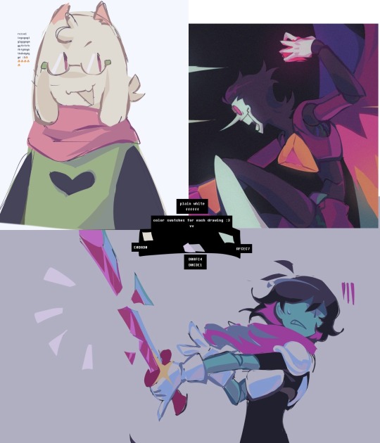
with the color codes and swatches right there you can see the difference in tone!!
the ralsei drawing is more warm, the spamton one is supposed to be more saturated i think, and the kris one is more grey!! (and looks colder!!)
those single off white colors help me think of the feeling i want in my drawings!!!
it works for black colors too!! you can maybe see that the black i used in the drawings arent straight up pitch black!!
#whole lotaa yapping#if you see any spelling mistakes no u dont#anyways theres the ralsei drawing i frogro to post#yapping#art
31 notes
·
View notes