#literally staring at it for hours
Explore tagged Tumblr posts
Text
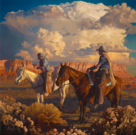

Mark Maggiori painting but I turn the cowboys into Johnny and Gyro
(WIP still gotta finish the horses and Johnnys chaps and such)
#steel ball run#sbr#jjba sbr#johnny joestar#gyro zeppeli#gyjo#mark maggiori#I love his art so much#literally staring at it for hours#it’s been really cool to appreciate it in such detail while I re-work it#please check out his other stuff it’s stunning
2K notes
·
View notes
Text

they remade hori’s popularity poll art 😭😭

#this literally gave me an excuse to stare at the og for hours againFUCKCKFK#hori’s comment about deku joining his childhood friend’s bandit brigade#THEN LITERALLY NOTHING ELSE SHDKDGSJ#he said bkdk then dipped#bkdk#dkbk#bakudeku#dekubaku#:’)
459 notes
·
View notes
Text
I think 90% of my gripes with how modern anime looks comes down to flat color design/palettes.
Non-cohesive, washed-out color palettes can destroy lineart quality. I see this all the time when comparing an anime's lineart/layout to its colored/post-processed final product and it's heartbreaking. Compare this pre-color vs. final frame from Dungeon Meshi's OP.
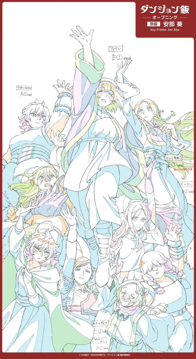
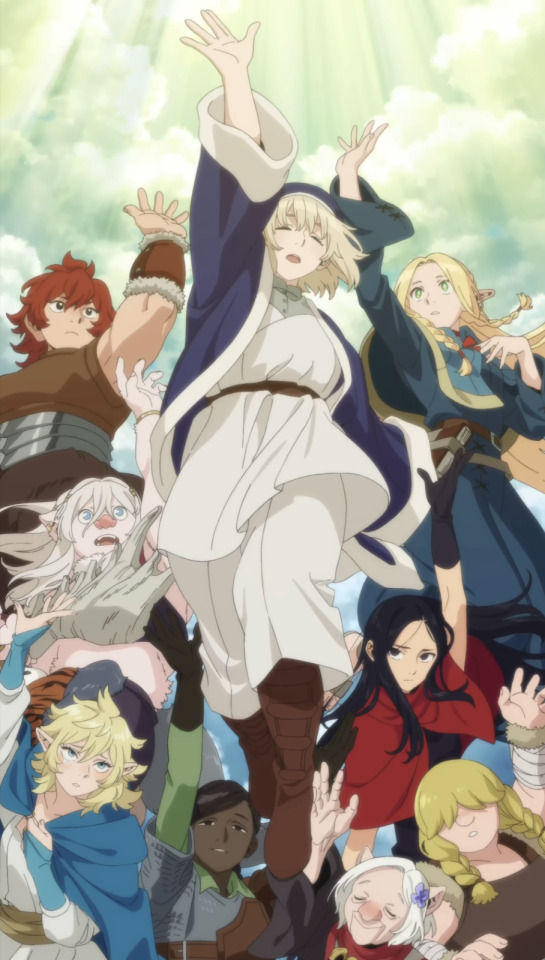
So much sharpness and detail and weight gets washed out and flattened by 'meh' color design. I LOVE the flow and thickness and shadows in the fabrics on the left. The white against pastel really brings it out. Check out all the detail in their hair, the highlights in Rin's, the different hues to denote hair color, the blue tint in the clothes' shadows, and how all of that just gets... lost. It works, but it's not particularly good and does a disservice to the line-artist.
I'm using Dungeon Meshi as an example not because it's bad, I'm just especially disappointed because this is Studio Trigger we're talking about. The character animation is fantastic, but the color design is usually much more exciting. We're not seeing Trigger at their full potential, so I'm focusing on them.
Here's a very quick and messy color correct. Not meant to be taken seriously, just to provide comparison to see why colors can feel "washed out." Top is edit, bottom is original.
You can really see how desaturated and "white fluorescent lighting" the original color palettes are.
[Remember: the easiest way to make your colors more lively is to choose a warm or cool tint. From there, you can play around with bringing out complementary colors for a cohesive palette (I warmed Marcille's skintone and hair but made sure to bring out her deep blue clothes). Avoid using too many blend mode layers; hand-picking colors will really help you build your innate color sense and find a color style. Try using saturated colors in unexpected places! If you're coloring a night scene, try using deep blues or greens or magentas. You see these deep colors used all the time in older anime because they couldn't rely on a lightness scale to make colors darker, they had to use darker paints with specific hues. Don't overthink it, simpler is better!]
#not art#dungeon meshi#rant#i'm someone who can get obsessive over colors in my own art#will stare at the screen adjusting hues/saturation for hours#luckily i've gotten faster at color picking#but yeah modern anime's color design is saddening to me. the general trend leans towards white/grey desaturated palettes#simply because they're easier to pick digitally#this is not the colorists fault mind you. the anime industry's problems are also labor problems. artists are severely underpaid#and overworked. colorists literally aren't paid enough to do their best#there isn't a “creative drought” in the anime industry. this trend is widespread across studios purely BECAUSE it's not up to individuals#until work conditions improve anime will unfortunately continue to miss its fullest potential visually#don't even GET ME STARTED ON THE USE OF POST-PROCESSING FILTERS AND LIGHTING IN ANIME THOUGH#SOMEONE HOLD ME BACK. I HATE LENS FLARES I HATE GRADIENT SHADING I HATE CHROMATIC ABBERATION AND BLUR
2K notes
·
View notes
Text

these guys are outrageously fun to draw
#literally was supposed to be a warm up#several hours later...#hazbin hotel#alastor#niffty#charlie morningstar#angel dust#husk#sir pentious#egg bois#how obvious is it that sir pent is my fave LOL#vaggie#yes i gave alastor a tail#yes niffty is staring right at it
2K notes
·
View notes
Text
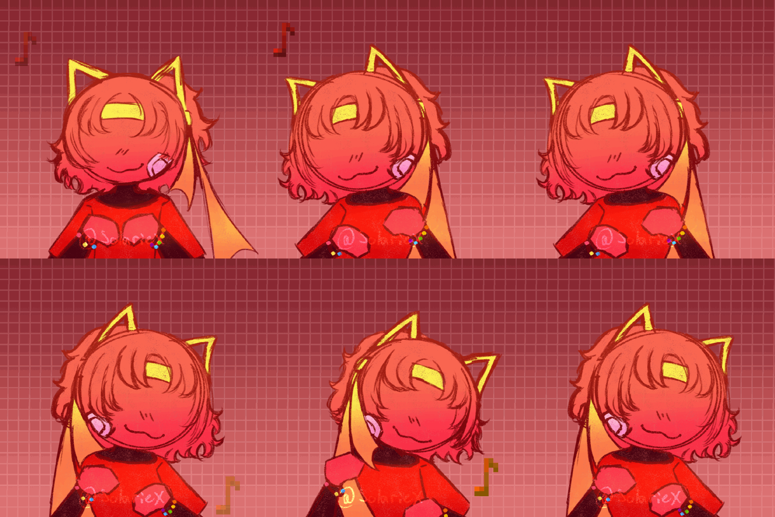
silly red dancing gif i made !! :3
originally i was gonna add cat headphones, because it was based off someone sending red music recommendations on the red askblog (cough cough @kittycatred sorry self promo) but its literally 5am as im typing this so i didnt feel like adding that right now :,) also i realized after making this that it looks VERY similar to this by starrypawu and that was purely by accident oops!! i think i got unintentionally inspired though so im linking it just in case for credit !! :D also timelapse ?? speedpaint ?? (whatever its called for animation lmao) below !! !! FLASH WARNING !! THOUGH cause i flip the canvas ALOT and switch frames alot and its sped up !! (also ignore the timeeee....ignore the time....shhhh i wasnt up until 5am at all....)
its 3 minutes long but i sped it up AS MUCH AS I COULD sorry its like 5 hrs of footage originally so thats why </3
#okay so this is quite literally only my second time animating on clipstudio so if theres any errors or anything just ignore it LMAO#also its 5:30am help i did NOT mean to stay up LMAO#i was originally just gonna draw red with cat headphones for the red blog until i was like ooh what if i animated them instead#and then i was too tired to even add the headphones SO LMAO :')#i dunno how i did this though im not gonna even lie like i dont animate much although id love to more#but ive only ever animated stick figures aside from 3 months ago animating a little test that was actually drawn but it wasnt-#-anything like this or anything HOW DID I DO THIS#and i did frame by frame...........i am baffled at myself#like okay as im typing this cause ive been staring at it for 5 hours it looks a little choppy and kinda stiff to me#but for ??? my rarely animating skill ???? im still suprised LMAO#also note on the minecraft notes....i didnt feel like reanimating it so i TRIED to color it yellow it didnt rlly match the actual yellow-#-note but oh well i did not wanna reanimate that rn </3#okay im rambling i need to go to bed hopefully you guys enjoy thisss cause i need to sleep </3#solar draws#alan becker#animation vs minecraft#animator vs animation#red avm#ava red#avm#avm red#red ava#ava fanart#animation vs animator#animator vs minecraft#minecraft#art#artists on tumblr#digital artist#animation
179 notes
·
View notes
Text
ZHANMADAO IS THE ONLY SPIRITUAL WEAPON WITHOUT A NAME IN TGCF AND I ALWAYS WONDERED WHY MU QING DECIDED TO KEEP IT LIKE THAT.
Like, the cultivation and training meant a lot to him, he always tried to act properly regardless of his status AND YET HE DIDN'T GIVE HIS SABER A NAME??? naming a weapon is a big thing for a cultivator, the sword have spirits, yet he keeps calling it by its type???
NEED YOUR THOUGHT ON THAT
#i personally think it subtly demonstrates that mu qing felt like an imposter even after all of his great achievements#he got it and was staring at it for hours trying to come up with a suitable name but each and every one felt ridiculous#yeah sure some “ray if justice” in a sweeper's hands#sounds completely legit not stupid at all#eventually he just left it the way it is and grew comfortable with the fact that the name illustrates nothing but the type of the weapon#and that there are thousands of other zhanmadaos around#just like thousands of sweepers#and they all just do their jobs#xie lian learns about it and says that he finds it poetic because the blade gets to be whatever mu qing wants him to be without any label#mu qing#tgcf#tgcf mu qing#'i cant wield a blade of justice or some shit my father was literally beheaded by the crown“#mxtx tgcf#tgcf headcanon
286 notes
·
View notes
Text
no thoughts just his eyes
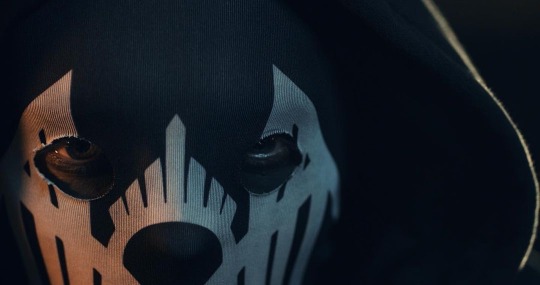
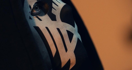
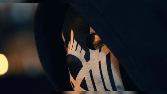
#source instagram#boba eyes#look at him#god he’s so pretty#could stare at him for literal hours#no thoughts just him#sometimes i miss their old masks bc they looked so CUTE#sleep token#ii sleep token#ii#worshitposting
418 notes
·
View notes
Text

thinking about that damn kiss between art and patrick. GOD. !!!!!! they were going at it hardddd nghmmmmm…….. so aggressive n passionate FUCK! art’s pink wet lips crashing into patrick’s all desperately, patrick’s tongue ! both of them wanting to consume the other.. i’m dizzzzzyyyyy 😵💫
#i can literally stare at the gif for hours i’m not even kidding#boys kissing is the best#i love being a boygirl fujoshi#fujoshis rise up#FUCK#they are so hot#lemme get in there for the love of god#artrick#art x patrick#art challengers#art donaldson#patrick challengers#patrick zweig#challengers
130 notes
·
View notes
Text


Band of Brothers Episode 5: Crossroads
for HBO WWII Rewatch: Week 10 - Black
#band of brothers#hboww2rewatch#hbo war#mine: gifs#now THAT’S how you light a nighttime scene#*stares pointedly at The Pacific*#I’ve wasted countless hours of my life on trying to make night scenes from the pacific into remotely presentable gifs#whereas these took less than an hour to make#and i'm not even mad i'm literally just disappointed#bc i love TP but god can you imagine if you didn't have to squint to see what was going on in every single night scene
113 notes
·
View notes
Text
not to Beat a Dead Horse but Rick not at all addressing how he he gave percy the craziest prophetic dreams out of anyone we ever see, including a guy who learned how to dreamwalk from the son of the god of sleep, makes me lose my Mind
#percy is out here doing shit the egyptian magicians can only do after years of practice at age 13 and we just. move on#bro got dream messages from a ghost and then stared like this 👁👁 for several hours. but thats normal! hahahahha#'oh all the demigods get dreams he's not special' percy literally had a dream where he was living a memory of heracles. Through his body.#the next ghost he meets better be cassandra or I will Sue#pjo#percy jackson
70 notes
·
View notes
Text

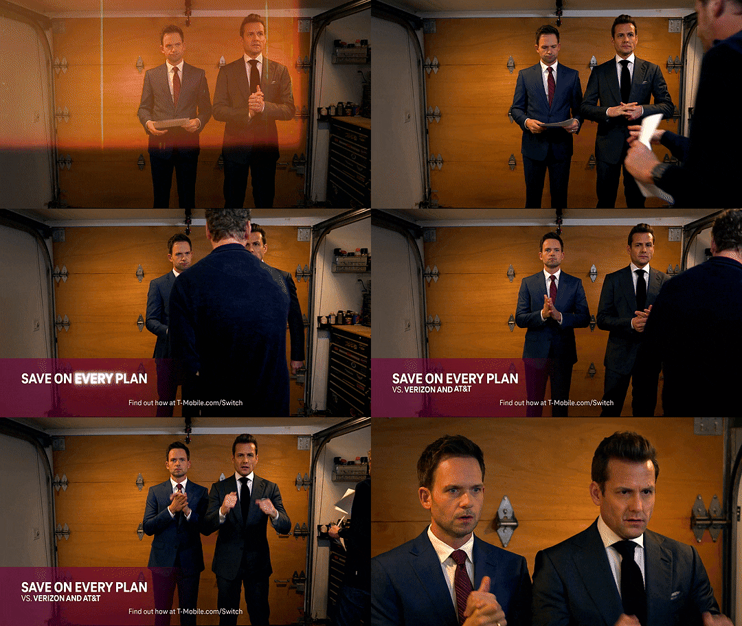
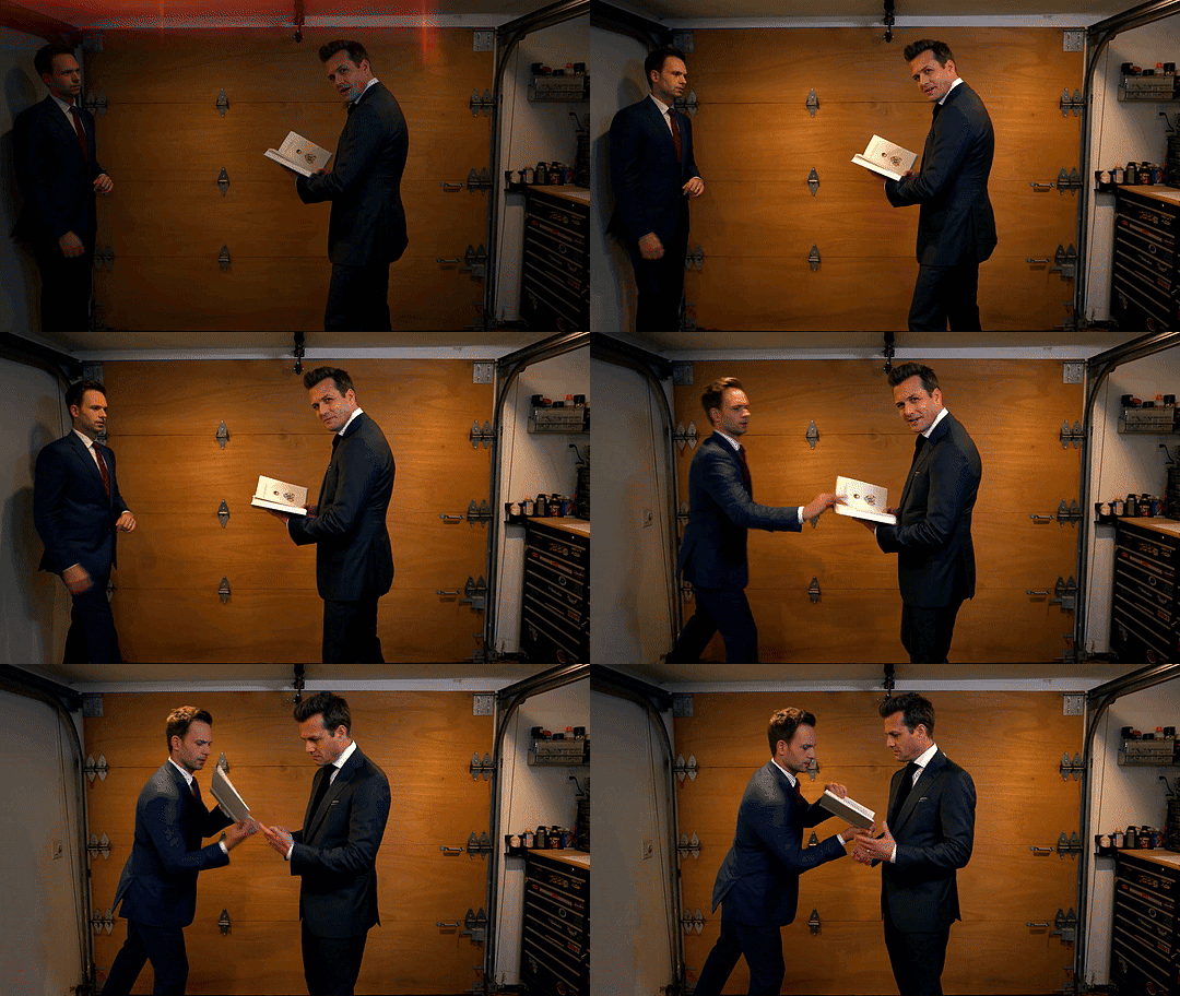
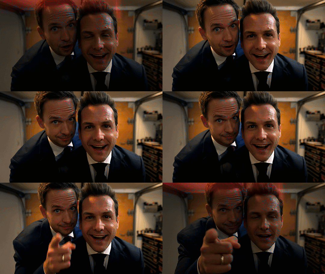
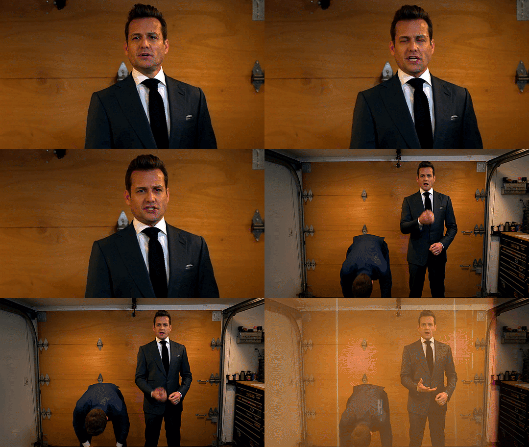
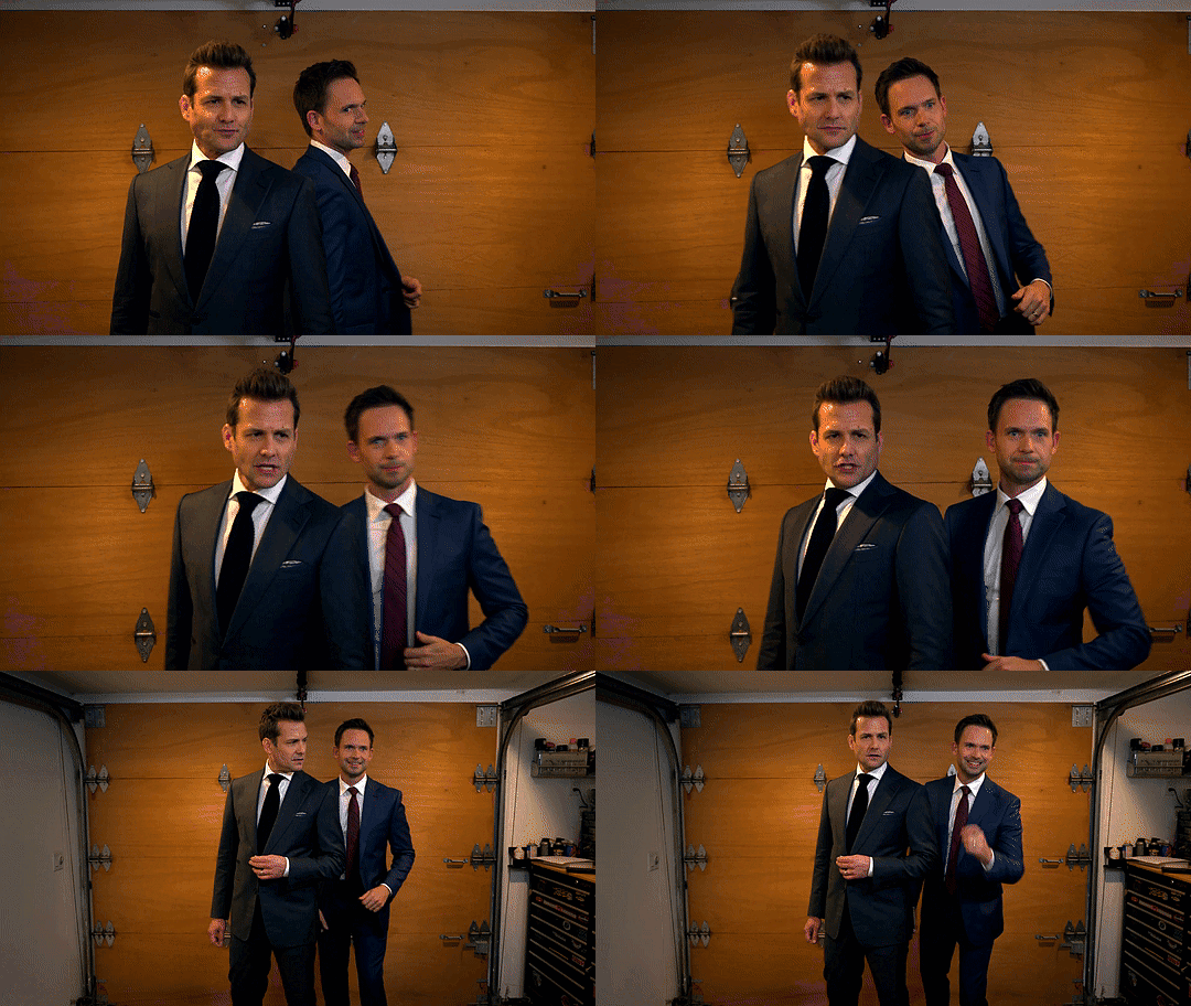
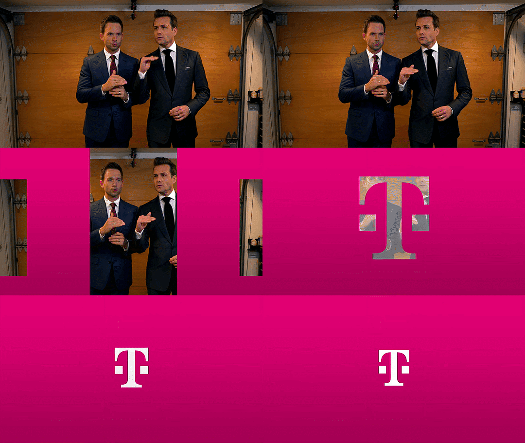
#I am literally going insane!#gif three is giving. practicing a presentation or pitch. or statement. specter ross era. they're a team!!!!#and mike's like. analysing but also. the touch so familiar gentle 🥹🥺#and GIF FOUR. I HAVE STARED AT THIS FOR HOURS NOW?#happiest they've ever been because they're! in! a relationship! now! open close comfy loose happy happy happy themmmmm them them#they're just??? they're literally each others. couldn't be more compatible. more simpatico. with any other.#they invented being in love. no one will ever be it like they are#anyway thank you t-mobile for my monthly put-them-in-situations + remove-the-context + brainstorm-it-from-there -athon 🙏#suits#suits tv#suits usa#marvey#harvey specter#mike ross#gabriel macht#patrick j adams#harvey x mike#mike x harvey#tmobile#t mobile#t-mobile#late to the party on this one lol but I am turning up the music! marvey party never stops
233 notes
·
View notes
Text
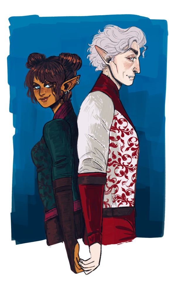
I'll be your king, you'll be my queen Unbelievers get down on your knees
I've been incoherently screaming over this gorgeous art of Vittara and Astarion by @tadpole-apocalypse - thank you so, so, so much ♥ Des was so nice and super patient despite all my ramblings, and her art is stellar, you need some of her art in your life!
#bg3#astarion#oc tav#y'all have no idea how many literal hours i've spent staring at this#can we talk about the details#the pattern!#the HAIR omg its so floofy ahhhh#his lil fany smile!#and the way they're looking at each other#HANDS TOUCHING#please i'm so weak for them and this is so beautiful i weep#vittara sinfel#commissioned art
159 notes
·
View notes
Text
AUEGH
#ruby rose#rwby#obligatory tiny distressed ruby#my art#HELLO I HAVE OFFICALLY FINISHED YET AGAIN ANOTHER ONE OF MY SEMESTERS#and holy shit it was the most awful by far#i felt like absolute shit the entire sem and was behind in literally all of my classes#it was so shit that i actually skipped a class because of the stress of being behind on work. which i had never done before.#i am a criminal now lmao i feel so bad#also a little mad at myself because i know i could've done better. i've been doing the bare minimum and cutting corners#which was very noticeable lol#im gonna actually split my upcoming semester this time my ass and health cannot do this anymore#BUT ANYWAY I FINISHED MY SEMESTER RAAAAAAAAGGGGGGGGGGGHHHHHHHHHHHGHHHHHHHHHHHHHHHHHHHHHHHHHHHHHHHHHHHHHHHHHHHHHHHHHHHHHHHHHHHHHHHHHHHHHHHHH#COUGHS OUT BLOOD AND SINKS BACK INTO EARTH'S CORE AND EVAPORATES#IM DONE!!!#also my eyes are really red now for some reason#probably from the lack of sleep or the long hours staring at my bloody laptop idk#probably both#yeah i should go sleep now lol bye#ranting in the tags because i don't know how to talk like a normal person lmao#sorry if you read all this nonsense jkdhkfsdhfkhd#but i should be more active around here again!
372 notes
·
View notes
Note
Snap, pls 😭 Thanks for the slaying 。^‿^。

FRANCESCA PL E A S E
#fave#snap chats#FRIEND OF MINE PL E AS E THANK YOU FOR THIS GIFT JVKLEVJKLE#i have the most Inexplicable headache (it is NOT from hunger i swear) and yet i feel at peace now#my bitchass friend said the food at the dining hall is terrible today but a mans gotta eat#AND A MAN EATING NOW this is so cute PLEASSEE i love this so much .... thank you again.....#charles when we say Slay we dont mean it literally </3 its out of his control i fear ..........#anyway gonna stare at this while i wait in line for food THANK YOU im blessed today ...#franny please get off erik im CRYINGLKEJAEKLJ#obsessed. .. obsessed TRULY i am ... i gotta look at this for the next hour then ill be ok ..
63 notes
·
View notes
Text


save me shauzia save me
#the breadwinner#shauzia#if they were to release an entire book of art that was just her…..im buying all of the copies…#I’ve been staring at this book for 2 hours now#im literally going crazy
57 notes
·
View notes
Text
Was thinking a lot about the two animatics, especially the newest one, @tapakah0 has made and it kinda… inspired me to create this video edit haha. Could have not been made without (L.O.V.E, Episode 5) and (L.O.V.E, Episode 11)! Thank you Tapa for your amazing works and the effort you’ve put into this lovely comic 💙💙💙
Song: Little Talks - Of Monsters and Men
#tapakah0#I literally just stared at your animatics for like a good few hours and just#still cant get over how beautiful they are#L.O.V.E#rottmnt#future leo#future mikey#I originally thought that the newest comic had little talks as its music#but then realized that it was a different one from the same music artist
690 notes
·
View notes