#lifecolorpost
Explore tagged Tumblr posts
Text

The pinks in this color are very dreamy. It’s a very floaty pink that is somewhat cloudy, soft, and fun. The skeleton, pond, and butterfly as well as the color really makes the picture feel very dreamlike and abstract. I really like this color and I’d totally use it in an artwork
2 notes
·
View notes
Text


photo #1: my brother gave me a snapple drink i noticed that i’ve always loved the snapple logo and the colors that they use, it looks so clean and simple. the contrast of the dark blue snapple logo with the red background goes well together.
photo #2: as i was getting ready for school, i passed by my bedroom saw that my window looked really cool. the sun was still rising so the shadows looked blue and the yellow looked really good with it, and my star lights were still on so it gave my window a twinkly effect :3
photo #3: i was looking through pinterest for some inspiration for my art show project and i came across this fanart of rosalina and luma. even though i find space terrifying, i feel like space/galaxy related art pieces give me comfort. one of my favorite color combos is deep blue and golden yellow, and this piece had a little hint of that.
2 notes
·
View notes
Photo

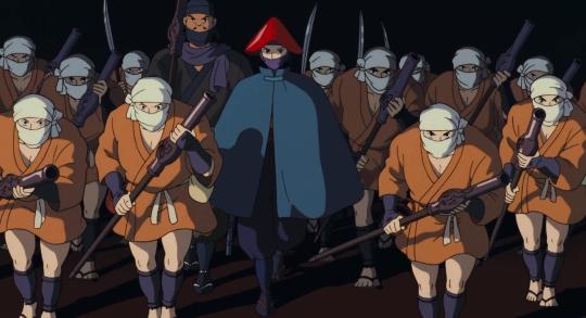
B L A C K W E E K
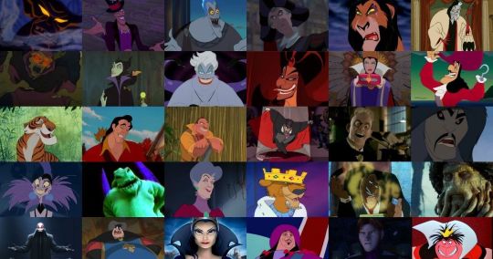
I wanted to talk about the use of black in animated movies, specifically the difference between Disney and Studio Ghibli movies.
Disney Movies -
1.) The majority of the time, black is a universal color among villains in Disney movies; its practically a rule. Black is either apart of their costume, hair, or body. Along with this is a rather 2D personality/motivation. These villains are rarely complex and don’t have redeeming traits that make an audience member sympathize with them. Their motives are plain and clear - money, power, youth, etc. Their opposing protagonist never wears black (unless their hair is black, such as a POC or Snow White whose hair is a defining trait). Black is an easy way to convey evil. Dark color = dark aura/essence = evil. This is in no way bashing these movies; I love Disney movies more than most. This use of black is just an easy way to convey an evil character.
Studio Ghibli -
Studio Ghibli movies are applauded for their complex characters and storylines. Their use of the color black is a perfect representation of this.
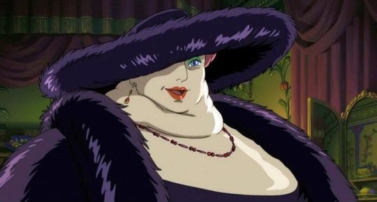
2&3.) Witch of the Waste from Howl’s Moving Castle - In the beginning of the film, this character falls into the typical villain archetype/trope. However, over the course of the movie she loses the bit of youth and health she still had (from her magic). By the end, she is her pure, raw self. At moments, she retains her sense of superiority/ disregard for others, but she has many “cute old lady” moments (mostly in her relationship with the dog Heen). Her black clothes go from conveying her “evilness” to her old age.
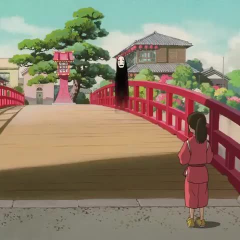
4.) No Face from Spirited Away - Studio Ghibli often uses black as a way to convey mystery and complexity. No Face is a mysterious spirit with mysterious powers (he can shape-shift, create gold, eat pretty much anything, but he never speaks). When first introduced, he is a nuisance and hazard to the bath house (at one point he ate someone). But soon his soft character comes through. He tags along on the protagonist’s journey, keeping her company in lonely and hopeless moments (he also endlessly offers her gold). Growing up I always thought he was somewhat cute, like an old dog with little energy but endless love. His black figure assists in his “mysteriousness.” He doesn’t have a definitive shape and he can disappear in dark spaces. I like this picture specifically because of his contrast with the scenery around him. In class, many students agreed that black is a inconspicuous color. However, in this setting, No Face’s black body clearly sticks out and draws the viewer’s attention.
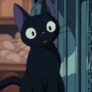
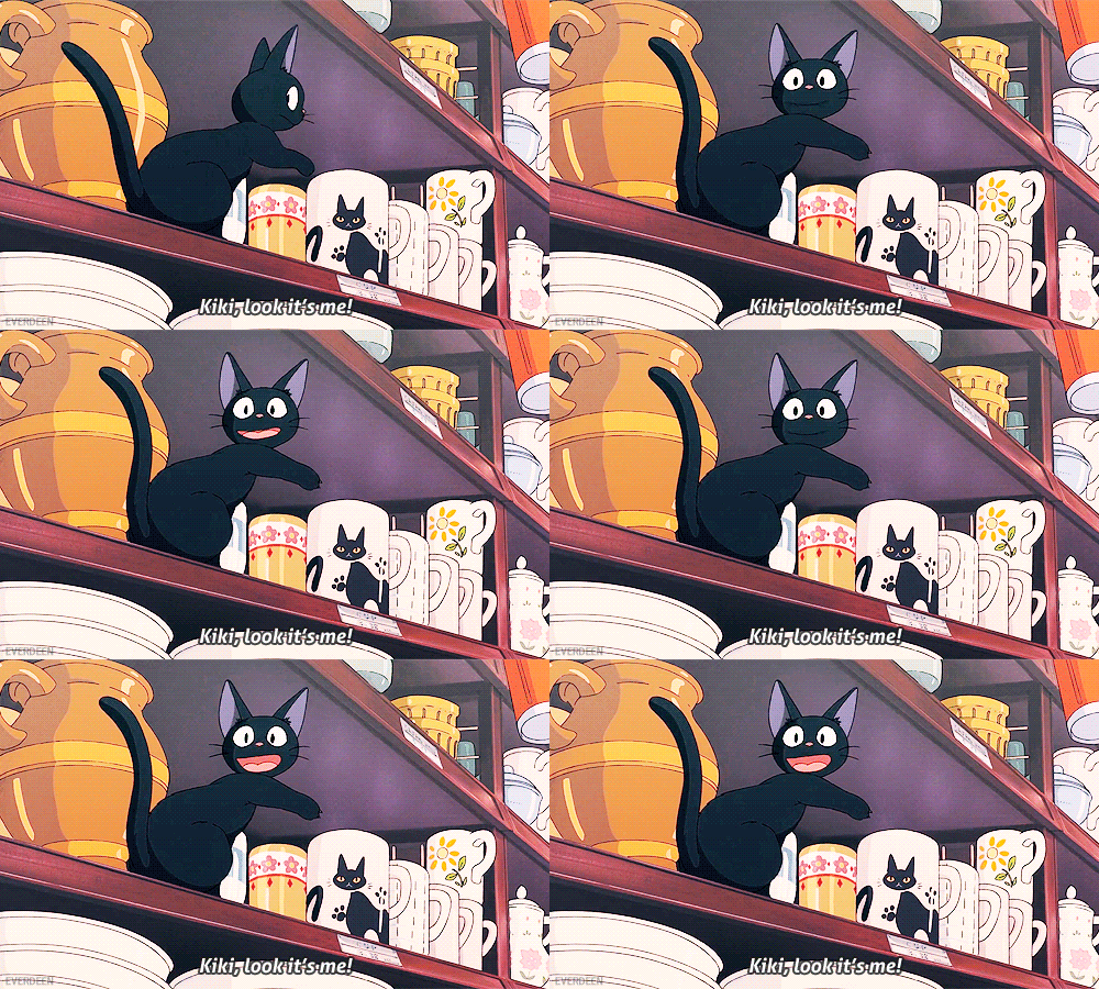
5&6.) Gigi from Kiki’s Delivery Service - Gigi is Kiki’s adorable sidekick. This movie already fights the typical stereotype of an evil witch, showing that witch’s are kind and helpful. Gigi isn’t the typical black cat; he doesn’t bring bad luck and isn’t the pet of an evil villain. He is a hilarious supporting character that brings Kiki’s naivety down to earth through comedic pessimism. Also, the black makes his large eyes and mouth pop, making him a very cute cat :). Ghibli took the traditional mysterious black cat to create an adorable and funny character.
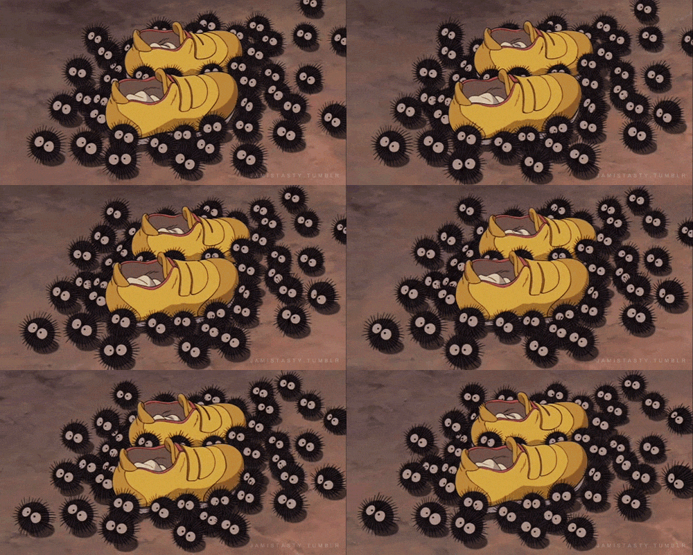
7.) Soot Sprites/Gremlins from My Neighbor Totoro and Spirited Away - Once again, black is used to make a cute and mysterious creature. At first, these sprites surprise and “spook” the main characters in each movie. But as the plot progresses, they become a cute companion. In Spirited Away, the protagonist is scared by the swarm of these eerie bug-like creatures, but they soon prove to be ADORABLE; they carry and keep safe the protagonists shoes and socks, they work really hard carrying coal in the boiler room, they make cute little squeaky noises, and they LOVE sprinkles. I’m sorry, I just love these little guys. In My Neighbor Totoro, the sprites are the protagonists’ first encounter with the mystical woods. They are a precursor for their magical adventure. Naturally, the sisters’ are initially scared by them. The sprites’ black design is similar to that on Gigi; they appear mysterious, but their large white eyes make them very cute :)
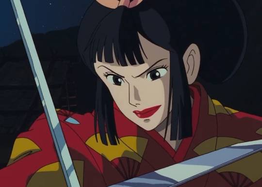
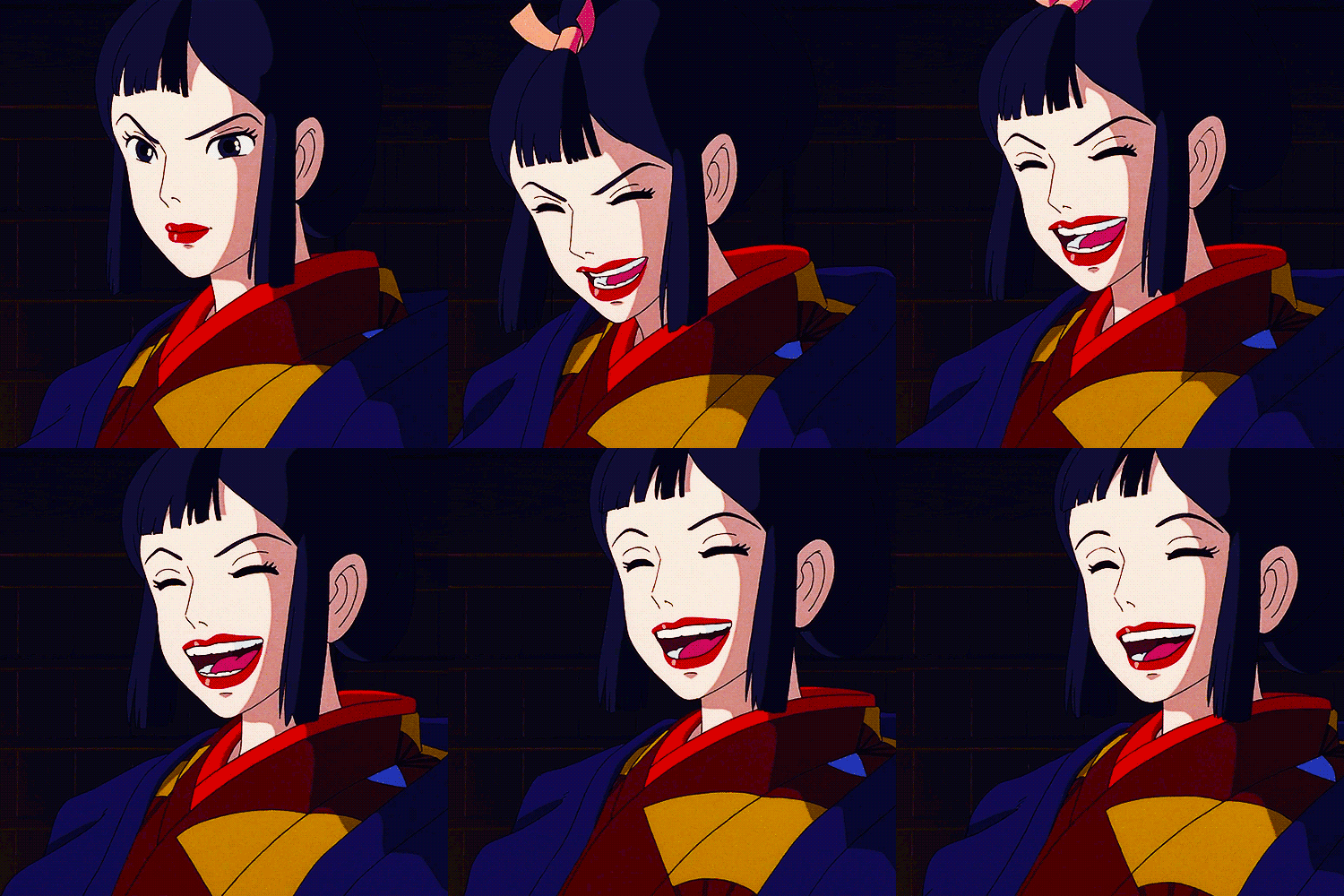
8&9.) Lady Eboshi from Princess Mononoke - Princess Mononoke is famous for character complexity (among many other aspects of the film). Lady Eboshi is initially seen as a villain; she is destroying the forest, angering forest spirits, causing discourse in the land, etc. Her main goal is to kill the Forest Spirit (which is viewed as impossible by most as he is the highest god) to continue mining ore and expanding Iron Town. However, as the protagonist, Ashitaka, meets with and befriends her, she is seen as a kind-hearted and driven woman. She took in, helps, and hired outcast lepers and female brothel workers, giving them a home, family, and honest work. The audience never dislikes her; she has a calm, kind demeanor and is very welcoming to Ashitaka. Her character design is the darkest of all the characters (at least all the human characters). She is the only person with black hair, and her main outfit sticks out among the other towns people. The use of black in her design contrasts her from the other characters (ie, Ashitaka is dressed in soft blues to portray his humble and kind nature). She appears more powerful and mysterious among everyone else (Why does she have these goals? Where did she come from? What motivated her to help people less fortunate? How did she get in such a powerful position? etc.)
10 notes
·
View notes
Text
Life Color Post 🎨 📸
➡️ It's week 15! I can't believe how close we are to the end of the semester! 🎉 I'm sad that color theory is almost over, though. I've had so much fun in this class, and I feel like I've really grown as an artist through our color explorations!
Here are some of the gorgeous colors I found over the past week ⤵️


📸 This one was a fake stem I stumbled across in a parking lot. I was amazed by the colors––they actually look pretty real! We're heading into summer now, but I liked this little reminder of fall 😊🍁


📸 This was actually a behind the scenes picture of my studio project. I spent much of my weekend finishing it, so I thought it would be fitting to include its colors here! 👩🏼🎨


📸 Here's a little acrylic painting from an artist I follow on Instagram. I just love the colors in it! The pastel pink with the plum mountains and little pops of orange and yellow are all just lovely! I especially love the eucalyptus color in the mid-ground! I'm definitely thinking I want to try a little painting like this soon 😊
5 notes
·
View notes
Text


Life Color Post Week 10
This week is devoted to this one sunset we experienced in Santa Cruz because LOOK AT IT!!!! This is so unreal and completely unfiltered. This is truly what it looked like in real life, and of course it looked so much better in real life and I so wish I could somehow show the full effect through these pictures, but sadly I can’t. I think this was one of the most color-immersive experiences I have ever had. We were all just surrounded and engulfed in these amazing colors and I just about teared up. Almost every person there stopped even if for a moment to just take it all in. A truly glorious experience and one I won’t forget. The second picture is when the sun already went down and the sky was getting dark and once again we were immersed in this beautiful blue-violet color!
3 notes
·
View notes
Text
Life Color Post # 10


https://pin.it/6e0PBN5

https://pin.it/4cktPfw

1. They planted some beautiful snapdragons on campus! This coral color is breath taking! I love how there are so many colors in one flower too, with the yellow, orange, light pink, coral, and bubblegum pink
2. This one is a little different. Instead of it being colors I noticed I liked, this was ones I greatly disliked. I really can’t stand this red and dark blue with light yellow. I do not think it looks very good together
3. I really like the color combination this lady did with her make up. It’s colors I would’ve never thought of, especially since I am not a huge fan of orange, but putting the light pink with the light yellow and different shades of orange is actually beautiful!
4. How amazing are eggs! I cannot believe how many colors and patterns they come in, and these colors together are so beautiful! The different whites and browns mixed with the blues is such a cool combination!
2 notes
·
View notes
Text


Life color posts- black
1 & 2- when I think of great uses of black, I immediately think of florals. Something about a bouquet of flowers against a black background makes me really happy and causes me to appreciate nature more.
3- intense black eyeliner- really makes you think.
4. I also love the concept of a black statement wall in a room, for the same reasons as the flowers, just architecturally.
5- when doing my research I found that most things that are black aren’t truly black, they have a lot of varying colors in them, like this satin has much grey in it
1 note
·
View note
Photo


Life Color Post: Week #15
Here’s some color I found this week....
1.) The first image is called a “sunshine box.” My family received this box filled with all yellow things, making it fit its name. As an encouragement, some people from my dad’s work sent this to us anonymously to encourage us through this tough season. It truly did brighten my day, especially with the immediate effect yellow has on me.
2.) The second picture is a beautiful Gibson guitar. My boyfriend just added this to his collection of guitars and we both couldn’t stop obsessing over the sunburst red-to-orange fade in contrast to the white pick guard, giving it a retro look for sure. All of his other guitars are either black, white, or simple wood so it was bold and fun to break up the monotony with color.
3.) The third picture is artwork by Karen Cheok, an artist based in Kuala Lumpur, Malaysia. I follow her artwork account on instagram and when I came across this picture of the hands painted on the black background, I felt it was a perfect example of studying the power of color. As I took a few moments to analyze this work, I started to ask myself what each hand was supposed to represent, and why each color was on each hand. These are liberties that Cheok had to take and her intentionality is obvious. Each painted hand has a different feeling, not just because of the positions they are in, but because of their distinct colors.
4.) The fourth image is another instagram artist I follow named Beverly Salas who is based in Orange County, California. Her work consistently follows the theme of psychedelic paired with retro/classic looks. She tends to use black and white images in collages or drawings, and then overlays the rest of it in a wild use of color and patterns in order to give off the psychedelic vibes. Her use of color demands attention and hard to ignore, but also vividly interesting as all the color combinations contrast each another but also bring out one another as well.
5.) Lastly, a “cheat sheet” I found during some research about mixing colors. Very interesting and helpful, thought I would add it to my findings this week.
1 note
·
View note
Text


For this week’s color palette, I was inspired by the shades from a bouquet of flowers my mom ordered for the house. I thought the warm yellow, pink, red, orange and off white complemented each other really well. I also found the colors of my shoes (especially the navy and peach) to be really pleasing with the wash of my jeans. The next photo is of the fig tree in our living room. The contrast between the teal blue wall and the vibrant green leaves stood out to me. I also found 4 shades of pink in the last photo I took of my breakfast- the pink of the bowl, my nail polish, the yogurt, and the raspberries. I thought it was an interesting observation.
1 note
·
View note
Text


I have a monster life color post for you!!
My first one needs no explanation... sunset. The usual.
However, I started a new photography series this week... I titled it Before and After and took photos of the snow and then after in generally the same location. So the next 4 photos are part of that series. (I’ll be posting more on my photography instagram if you’re interested [@eternallywantedproductions] in looking.).
We think we have finally had the last snow fall of the season (it’s currently 75 degrees) here in Nebraska... but the snow has had a way of surprising us and making me very happy. My favorite thing is to be in snow and then see the same spot once it has melted. To see the nature of stark white with hints of brown, and then all of a sudden Spring appears. Browns, greens, red. The sky coming in a bright blue... it’s remarkable.
Lastly, (and the color swatch of the week) is this sticker designed by an instagram artist. She loves Jesus and has been crazy encouraging to view online during this time. She designed these stickers (and many more) and sold them for $3. At this time of quarantine... I need the color. The reminder not to fear. The nudge to stay joyful. This sticker helps. She’s @cathartic_word on Instagram. Has verses, Co-vid encouragement, loves the enneagram, and does a lot of graphic design/art that is really helpful during this time. A lot of my Jessup friends already follow her... but I figure I’d tell you about her just in case.
1 note
·
View note
Photo


I noticed a lot of bold colors lately!
1 note
·
View note
Text


these are all the interesting colors i’ve found in the past week!
photo #1- i found this art work on pinterest and i fell in love with the art style and colors. even though i’m not a big fan of neon or bright colors, the way it was colored went really well together. it gave me an edgy punk vibe.
photo #2- i was scrolling through some artwork on pinterest came across these beautiful pieces. the pastel colors with the art styles pulled it all together. i love the pastel pinks and blues, and all the color combos looked amazing. it showed a soft and soothing aesthetic.
photo #3- after my uco concert on sunday, i went to red robin with some friends and i saw on their menu that they had purple lemonade, and obviously i had to order that. the lemonade was so vibrant and pretty. it looks pink in the photo because of the restaurant lighting, but it was more of a magenta/warm purple. and it tasted so delicious and refreshing :p
2 notes
·
View notes
Photo

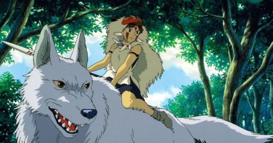

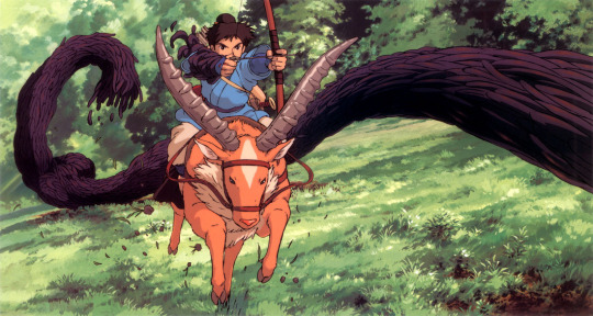

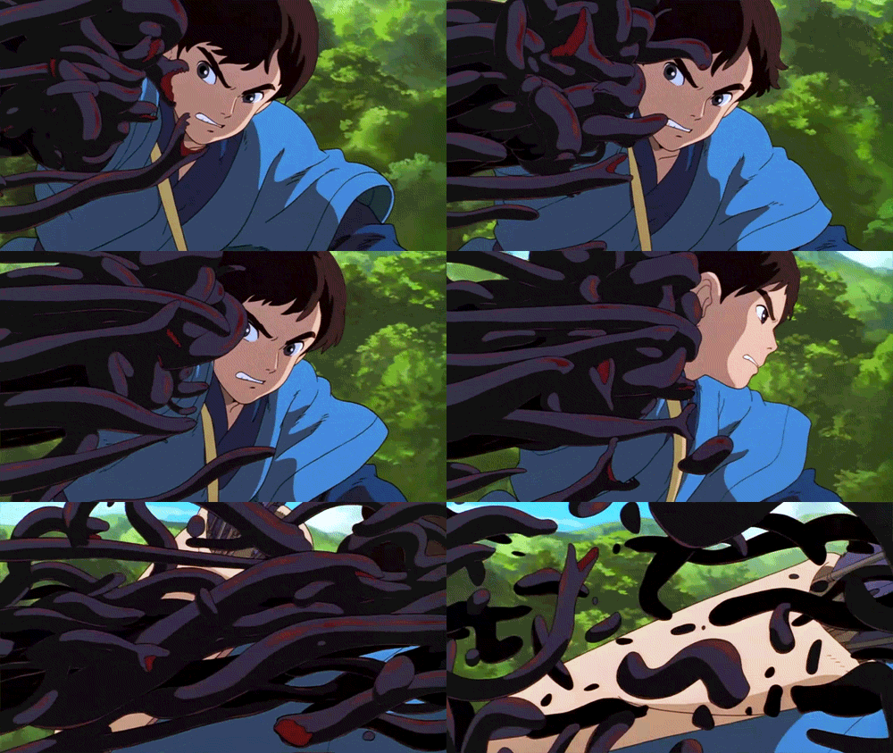
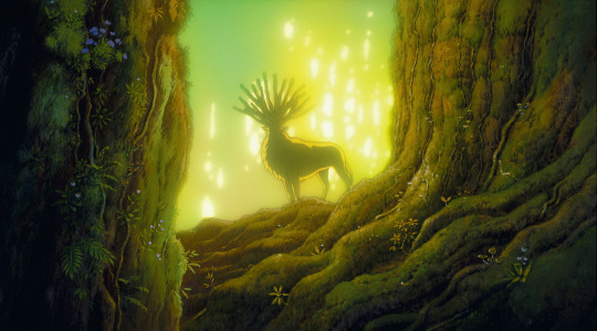


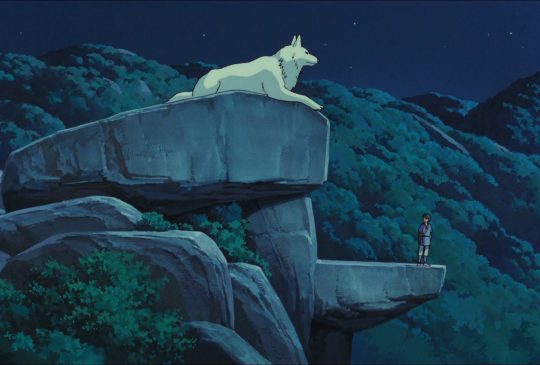
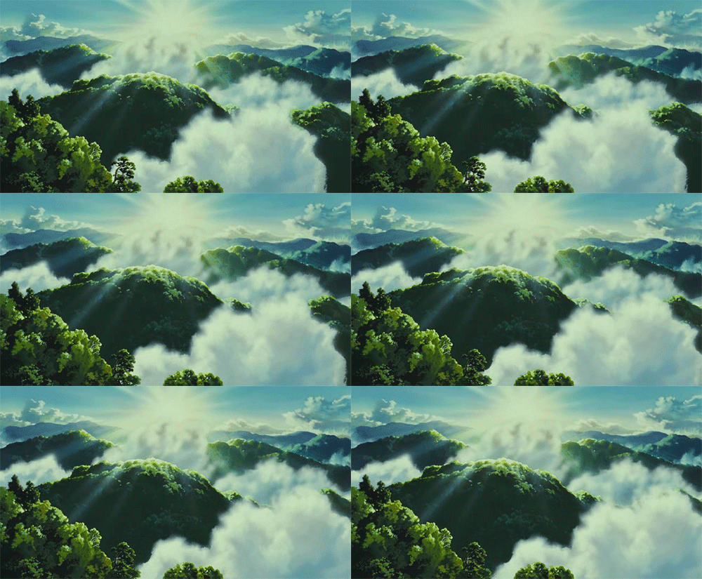
~ G R E E N W E E K ~
For this week, I chose scenes from Studio Ghibli’s ‘Princess Mononoke’ (1997).
1,2,&3.) I am fascinated by the use of light throughout this movie. Scenes under foliage, such as this one, have amazing speckled light and harsh shadows. This gives each scene a sense of depth within the forest. The gradual desaturation in distant trees also gives a sense of depth and density to the forest.
4,5,&6.) This opening scene quickly gives the audience the main theme of the movie: the battle between nature and humans. The demon in this scene was formed when a human shot a boar god. The now disfigured boar greatly contrasts the landscape around it. While the landscape is a lush green and the “pre-demon” boar a muddy rust, the demon stands out with its dark black and red-violet tentacles and bright red eyes. Its color palette greatly differs from anything natural, giving the demon a better sense of unnatural death and evil.
7&8.) The unnatural demon who brought unnatural death was given unnatural colors. The forest spirit (seen in these pictures) is given earth tones and animal-like features; he governs life and death within the forest. This contrast in colors shows the forest spirit’s natural ways.
9&10.) I LOVE Studio Ghibli background paintings. Their landscapes are mesmerizing. In the first picture, you can see the sense of space given by the desaturated mountains in the back with a vibrant foreground. The second picture is from a scene that takes place at night. Color is hard to discern at night under moonlight, so in this scene the landscape has little variation in pigment of plants. Every thing is very dull, dark, and cool-toned.
6 notes
·
View notes
Text
Life Color Post 🎨 📸
This week was white week! 🤍 Here are some of the things I found ⤵️


📸 This is the latest mug addition to my family's collection 😉I love the simplicity of the design. The white/cream flowers and lettering against the warm gray background gives it a relaxed feeling. I also liked all the neutral shades picked up by the color generator. In this case, white is acting as an accent, and it also plays a part in the neutral color scheme.

📸 Here's a picture from our white comparison exercise the other day. One of my takeaways from that research was the realization that white is a very special color. You might find something that you think is definitely white, but then you compare it to some other white thing, and the first object becomes more of a cream or a gray. And then you add different lighting and you change up the different materials, and you're left wondering whether there is such thing as true white. I've never really experienced this with any other color. 🤷🏼♀️

📸 I received this shirt as a gift recently, and I love it! I was just noticing how white acts a backdrop for other colors to stand out against. Even yellow, which is such a light-value color, can shine against white. White emphasizes other colors and seems to increase their brightness.

📸 I was on a walk with my sister the other afternoon, and we stopped to appreciate these pretty purple wildflowers. I love the mood the colors in this picture create––calm/gentle, but also vibrant. White isn't so much the focus of this one (although I do see white in some highlights), but I wanted to document these colors too.
➡️ I so much fun exploring white and its properties this week! It's such a unique and necessary color 🤍
2 notes
·
View notes
Text


Life Color Post Week 9
These pictures are from my family trip to Monterey during spring break!
The first is the view of the indoor pool at the hotel from a window. The windows have a pink tint to them and it made the whole room look so cool especially with the blues of the pool and walls and the green chairs! I had to take a picture.
The second was just my outfit for day 2 of the trip. I went for a monochromatic look and I was digging it so I had a little mirror photoshoot.
Picture three is just a cute little inn we were walking by and I loved the rich emerald green of the railing and shutters and how they look against the white walls and ivy-covered building next to it :)
Last but certainly not least is from the pier. It still had valentines banners hanging over it between the buildings and just look at that color palette!
3 notes
·
View notes
Text
Life Color Post # 8


FLOWERS GALORE!
Over Spring Break, I had many wonderful flower color experiences...
1 & 2. Flowers I stole from a wingmate who didn’t want them anymore. The colors are so bright although they’re dried! The yellow and purple are both such happy shades, and they make each other pop
3. I stole some cherry blossoms from a tree at a park, and pressed them because they were too gorgeous! The pink stayed so well, and the differing shades of pink gives it such a sweet feel
4. My mom and I went to Green Acres while I was home for break, and we had a blast looking at all the unique pansies. We bought handful, picked the best ones, and planted the rest in the front yard. It is such a sweet memory! Each of these pansies is different, and they have so many colors within them!
5. Here are the pansies after being pressed, and they still are so beautiful! It is so interesting to see what colors faded to what. For instance, the burgundy one turned almost black, which is not expected
6. My mom’s favorite flowers are ranunculus, and this is the one time of year they bloom! She bought some at Trader Joe’s, and we were just in awe of them the whole week! What gorgeous vibrant colors! My favorite would be the peach color
7. Finally, on my way to work, I found this giant magenta bush and I was taken aback! It is so cool, and the berry with the burgundy leaves is such a beautiful combination
2 notes
·
View notes