color theory blog. for work, research, and general intellection purposes.
Don't wanna be here? Send us removal request.
Text
Black Color Research
Robert Motherwell “Elegy to the Spanish Republic No 110”, 1971, acrylic with graphite and charcoal on canvas, 82” x 114”.
This piece was inspired by the Spanish Civil War. Motherwell uses the black figures as a memorial for all the death and tragedy that took place. I think the artist uses black to symbolize the consuming nature of wartime death. I’ve never experienced war, but looking at this piece kind of reminds me of how I felt when I saw the film 1917. In both the movie and in this painting, there’s this distinct feeling of overwhelm, like death is everywhere. It’s very somber.
Odilon Redon “The Eye, like a Strange Balloon, Mounts toward Infinity”, 1882, lithograph, 10 5/16” x 7 11/16.
I didn’t find very much on this piece, but I was able to find that it was inspired by the work of Edgar Allen Poe. It’s not meant to illustrate any specific poem, but to evoke the feeling of macabre that comes from his poetry. The black Redon uses is softer and more diffused than Motherwell’s, and for that reason, it feels less overwhelming to me. It has a creepiness to it, but it’s not quite as heavy as other all-black works I’ve seen.
4 notes
·
View notes
Text


For this week’s color palette, I was inspired by the shades from a bouquet of flowers my mom ordered for the house. I thought the warm yellow, pink, red, orange and off white complemented each other really well. I also found the colors of my shoes (especially the navy and peach) to be really pleasing with the wash of my jeans. The next photo is of the fig tree in our living room. The contrast between the teal blue wall and the vibrant green leaves stood out to me. I also found 4 shades of pink in the last photo I took of my breakfast- the pink of the bowl, my nail polish, the yogurt, and the raspberries. I thought it was an interesting observation.
1 note
·
View note
Text

Hebrews 13:5. I will never leave thee, nor forsake thee.
2 notes
·
View notes
Text
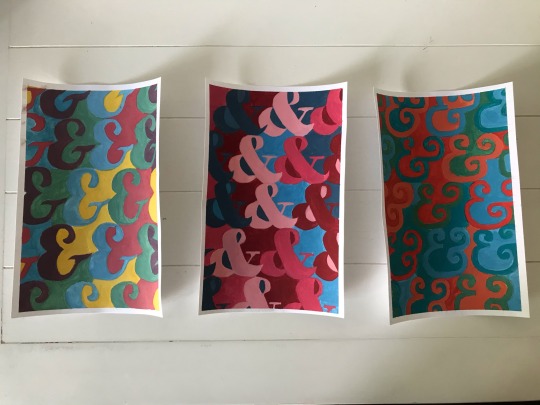
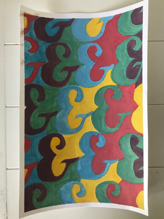
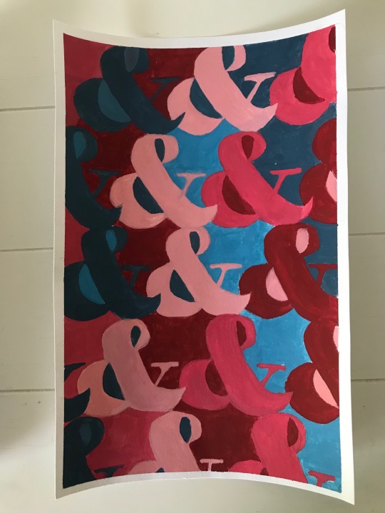
“Semantic Satiation,” a series inspired by the work of Bridget Riley. From left to right: Lobster, Elephant, Scorpion.
2 notes
·
View notes
Photo
The role of the artist is simply to create. When answering this question, I tried to think about how I see my “role” as an artist. For me personally, I use artwork to serve my school and my church and to help me process and express different feelings or concepts. However, not everybody sees their art in this way. Every artist has different reasons why they create and why they make the things they make. The only common thread between one artist to the next is the act of making.

What is the role of the artist?
5 notes
·
View notes
Text
Color Focus: Grey
For this week’s color focus I chose to research Pablo Picasso’s “Guernica.” The painting is named after a city in the Basque area of Spain. The city was bombed by the Nazis during the Spanish Civil War, and Picasso painted this piece immediately afterwards. It was painted as a reaction to the devastation and pain the bombing caused, and for this reason, “Guernica” is regarded as a famous piece of anti-war artwork.
During my research, I was really curious why Picasso would choose to work in grey. Personally, I don’t really associate grey with pain or brutality. Having grown up in the bay area, I associate grey with the fog, the ocean and the city- things that gave me a sense of home, peace, and contentment. If I were to represent pain I’d work in red, or blue for tragedy. However, Picasso’s intention when he chose grey wasn’t to convey an emotion- it was to make the painting look like a photograph. He wanted to draw attention to the urgency of the situation in Spain, and he chose to accomplish this by making the chaotic scene look fit for a newspaper. He ended up getting his wish. The painting was used to raise money for war relief, and he garnered a lot of publicity for the cause by allowing reporters to watch him work, which he rarely did. To me, this painting is a good example of the reasons why artists choose colors other than for their immediate connotations.
0 notes
Text


My digital color palette comes from the colors I had on my actual palette by the end of a painting session earlier this week. I found the mix of warm and cool colors to be really pleasing. Some other color observations I noticed this week include some blueberries, a fuschia flower, and my dog Charlie relaxing in the sun on a teal blue lounge chair. I thought the blueberries warranted a post because they matched my leggings almost perfectly. Lululemon calls the color of the fabric “true navy,” but I think “blueberry” might be a more fitting shade name. I took a photo of the patch of flowers because it was one of the only things I saw on my walk that wasn’t green. I’ve been spending a lot of time on the trails by my house, and most of the flora in my neighborhood is long green grass- it’s rare to see anything pink. I also took a photo of Charlie because I liked the way the yellow pillow and blue cushion looked with his reddish brown fur.
0 notes
Photo
An artist might work with restrictions for a few different reasons. Restrictions can create a fun challenge to make a kind of game for entertainment purposes. Sometimes when I’m bored I like to look up drawing games, which usually involve a restriction like “you can only use shades of red” or something like that. Restricting materials or colors can also create a theme and sense of cohesion for a particular series or exhibit. I think restrictions and rules can help form ideas because they can push your way of thinking. Creative problem solving can lead you to make things you wouldn’t have made otherwise.

In what ways do artists work with restrictions and rules? How might restrictions or rules help to form ideas?
4 notes
·
View notes
Text

Here’s a bonus #lifecolor post. I had a whole bunch of purple, green, gold and tan paint left over from my color research this week, so I used my leftover paints to do a quick gouache painting of a woman in a lavender field. Every color used is a shade taken from the two paintings on the right. I’ve never painted a human face before, so it was a fun challenge! 🌸🍃
0 notes
Text


My first color observation this week came from the sunset casting light on the plants in my backyard. I was really struck by the warm, bright yellow color of the branches, since they’re usually a cool ash grey color. I spent a lot of time thinking about the way color and light works after seeing this. Next is a produce display I saw at Nugget. I thought it was so cute, and a really good example of effective color in marketing. The idea of the oranges announcing “I’m pink!” is adorable to me. Next, I took a photo of my airpods leaning against my hydroflask as I was working on an assignment at my dining room table. I found the juxtaposition of the hot pink/coral and dark, rich turquoise to be interesting. Lastly is a shopping bag I saw while checking out at the grocery store. I noticed the design contained all of the primary colors, and it felt so harmonious and visually pleasing.
0 notes
Photo
As somebody who works in design and creates visual art, the main way I distinguish between the two is the purpose of the work I am creating. Most of what I design in Photoshop, Illustrator, or InDesign has a purpose beyond the making and viewing of the piece. Some of the things I create for my graphic design job are for informational purposes or include a call to action (some examples being a poster, infographic, or business card). A lot of my design portfolio includes designs meant to be printed on stickers or t-shirts, as well as logos for businesses. Almost always, there is an idea, message, or brand that I need to convey or promote through the medium of design. With visual art, however, there is no distinct purpose or intention behind what I make. I can have a feeling I want to evoke or an implicit meaning I would like to convey, but I can’t control the way my audience receives the piece.
When I hear the word “craft,” I automatically think of two different ideas. The “crafting” you might do for fun like making pom poms, macrame wall hangings, or painted Bible verses. Or, “craftsmanship,” like making a desk or table, crafting an elaborate hat or leather garment, etc. I’m not sure which one the card is referring to, so for the purpose of keeping this response concise (ish) I’ll just talk about crafting. The way I think about crafting is that it’s more about the activity and the making than it is about the product. I explain this to my mom’s first graders all the time. Whenever we work on an art project together, they tend to get upset because my lines will be neater or my paper-cutting will be cleaner than theirs. I always tell them, though, that crafting is about the fun we have together in the process, not the end result. Although, the final product can often be interesting to look at, moving, or beautiful.

What distinguishes visual art from design? What distinguishes visual art from craft?
6 notes
·
View notes
Text
Studio Project Update
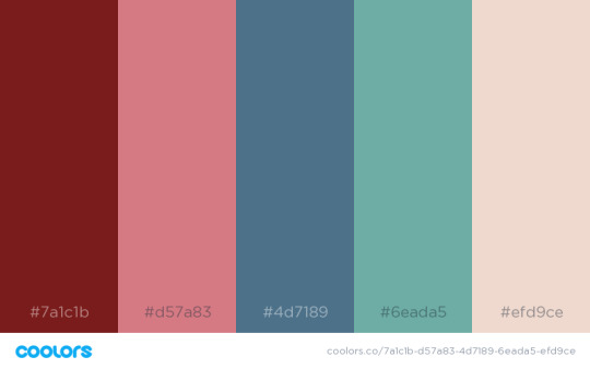
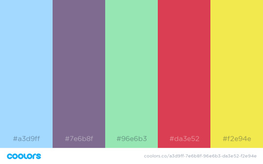

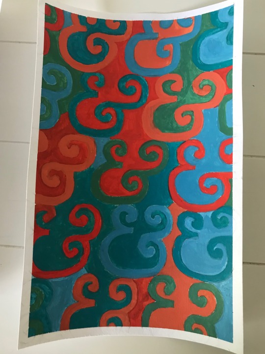
As I continue my research on Bridget Riley, my assigned artist, I have begun to narrow down which aspects of her work I want to enter into conversation with as I finalize my studio project. I know that her body of work is extremely complex and to try to reduce it into a particular set of themes would be unfair and disingenuous. However, personally, I see her as having two distinctive phases- her black and white op art and her more recent full-color paintings. For this project, my main inspiration is her color paintings.
Her color paintings, made from 1980-present day, explore color as a sensation. Her process in making these pieces begins with a color palette, so I have decided to try to emulate the same process. I created three palettes- one based on the most common colors from my life color posts, one loosely based on Riley’s piece “february 6,” and one random, computer generated palette (all pictured above, in order). I went about choosing my colors in this way because of Riley’s insistence on giving her audience a “full experience” or “full sensation” of color. I know that I am biased towards colors I like when choosing which to use in my work, so I wanted to make sure that in creating this project I am branching out to include a fuller range of color.
With these colors and their relationships in mind, I then had to decide what form I would like my colors to take. When I look at Riley’s work, the feeling I get is reminiscent of when I’m working on a graphic design project and I’ve been looking at the words and symbols so long they stop looking like words. You know that feeling? (Fun fact: I googled what it’s called and apparently it’s called “semantic satiation.”) It’s this overwhelming, fuzzy, messy feeling. Combining this idea with Riley’s use of distinctive shape, I decided I wanted my focus to be on a repeating element of typography. After much deliberating, I decided on an ampersand (&).
Originally, I wanted to create a digital piece, but I’ve been loving painting lately so I decided I want to work in gouache. Here are the sketches I’ve been working with so far:

The next step is to begin blocking out how I want the colors to be patterned, and then begin painting. I’m feeling very good about this project and can’t wait to share the final product.
1 note
·
View note
Text
Color Focus: White
Le Corbusier (Charles-Edouard Jeanneret), “Villa Savoye”, 1929-31, reinforced concrete, Poissy-sur-Seine, France.
This villa is considered to be a work of modernist architecture. Modernism is a movement based on minimalism and function over form. Jeanneret’s use of white could have been inspired by the ideals of modernism, since white is associated with simplicity. Choosing a different color may have drawn attention away from the futuristic, sleek design and overcomplicated his work. This building is considered by many to be a work of art because it pushes the boundaries of architecture. It is mainly composed of concrete, similar to a sculpture. It also uses principles of geometry to achieve its innovative shape and function.
James Abbott McNeil Whistler “Symphony in White No 1: The White Girl” 1862, oil on canvas
This painting is part of a series of several paintings of women wearing white. Whistler has stated multiple times that he creates art just for the sake of beauty, and he doesn’t have any implicit meaning in his work. However, the popular interpretation of this series has to do with innocence and virginity. Critics have said that the white dress, white lily, and white background are symbolic of female innocence. The wolf skin is said to represent the loss or corruption of that innocence. The allusions to feminine virtue are seemingly overt, and the overpowering use of white only reinforces this. Maybe Whistler is right and there is no meaning, and the symbols only come from his own subliminal ideas about women. There is no way to really tell.
1 note
·
View note
Text


My color palette this week comes from the colors on my desk. I don’t think I’ve ever used my desk as much as I have during this shelter in place order. I used to do most of my work at school or in my office. Now I need a designated space to get me in “work mode” while at home, so my desk is actually serving a purpose beyond housing all my miscellaneous papers. This is why the colors stood out to me- the green in my fake plant, the teal paint on the desk and the gold accents on my office supplies. I’ve spent much more time looking at them than usual. I also noticed two pops of bright pink this week- my new Brooks running shoes and the blooming flowers on the tree in my front yard. Usually I gravitate towards dark colors for my workout gear, but now that my gym is closed I can only run on the road by my house and I have to make sure I’m visible to passing cars, hence the bright shoes. I photographed the flowers on the tree because the first signs of color always make it feel like spring outside. Lastly, I took a photo of some cans of tomatoes at the grocery store. The blue, red, and yellow felt very retro which made me immediately gravitate towards the design. I love seeing classic-looking packaging, especially in a sea of gaudy cans all trying to be as obnoxious and bright as possible to catch a buyer’s attention.
1 note
·
View note


