#letterpress books
Explore tagged Tumblr posts
Text

published in FRUITSLICE
preorder my book
#poetry#trans poetry#bookbinding#book arts#letterpress#lgbtq#transgender#poem#poems#writing#queer#trans#queer art#spilled ink#quotes#chest binding#ftm#binder#literary magazine#trans poets on tumblr
540 notes
·
View notes
Text


A Poultry Piece Feathursday
Here are four hand-colored illustrations from A Poultry Piece written, illustrated, designed, and hand-printed in 1978 by Carol J. Blinn at her Warwick Press in Easthampton, Massachusetts, in an edition of 250 copies signed by the artist/printer. The book is a brief memoir of Blinn's time in Warwick, Massachusetts, "a picture post card New England town," and her most cherished memory of raising ducks and geese, particularly Pekin ducks: "It was not only the Pekins' beauty that attracted me, it was their cleverness." She writes:
Many years have passed since leaving Warwick and those ducks and geese behind. Living in Warwick enriched my life and I often yearn for another country home. . . . The building where I have my printing shop has a canal running behind it. Early in the morning I often see three sparkling white Peking ducks lazily swimming up the muddy water course. Standing quietly and watching, I hold my breath, secretly making believe they are mine.
Carol Blinn is among what we call the Pioneer Valley School artists. She apprenticed with the legendary master printer Harold McGrath at Leonard Baskin's Gehenna Press before beginning her own work as a printer, artist, paper decorator, and founding Warwick Press in 1973.
This book is dedicated to Blinn's friend Ron Masse who "helped share my anxieties & joys in the writing of this book. (What he actually did was egg me on.)" Our copy is another donation from the estate of our friend Dennis Bayuzick.
View posts on other Pioneer Valley artists.
View more Feathursday posts.
#Feathursday#Carol J. Blinn#Carol Blinn#A Poultry Piece#Warwick Press#Pioneer Valley School#Peking duck#American Peking#domestic ducks#ducks#letterpress printing#fine press books#Dennis Bayuzick#birds#birbs!
211 notes
·
View notes
Text
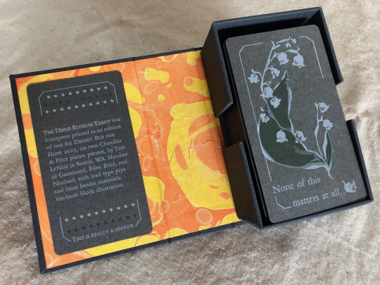
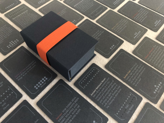


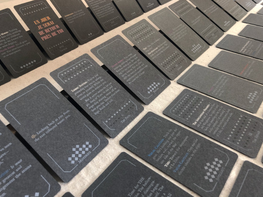

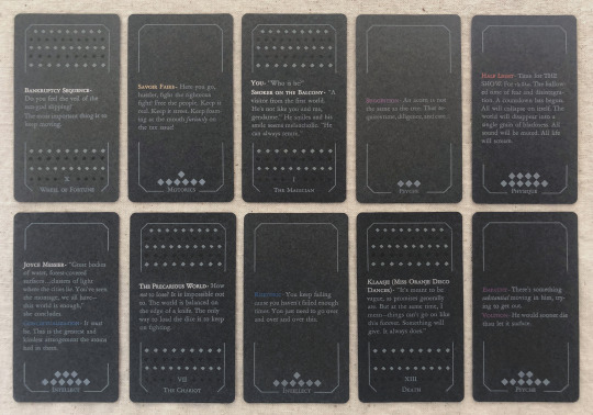
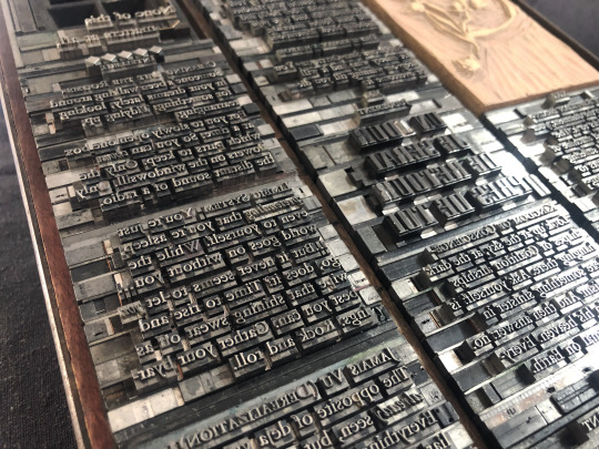
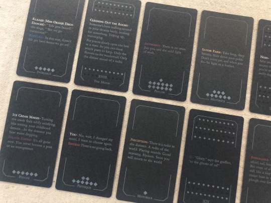
[image description: photos of The Disco Elysium Tarot, printed letterpress in an edition of one from handset lead type and linoleum blocks. It is a complete 78-card tarot deck printed primarily with white text and illustrations on medium grey cardstock, in a custom dark grey hardcase box with a hand-marbled orange and yellow endsheet. The backs of the deck are decorated with an illustration of a sprig of may bells, and a quote from Smallest Church in Saint-Saëns: "None of this matters at all." The interpretive meaning of each card is expressed on its face with a small excerpt of the game's text. The Minor Arcana are divided into four suits of Harry's Attributes—Motorics, Psyche, Physique, Intellect—and each card in that suit is a quote from a skill under that Attribute. The Major Arcana are assigned quotes from other sources like NPC dialogue or Thought Cabinet problems & solutions. Pips for the Minors are counted with diamonds like the game's skill points; each actor or title is printed with their in-game color, but made shiny & metallic with bronzing powder.
each piece of text was set in handset lead type, assembled from individual pieces for each letter and space, and printed relief on a chandler & price clamshell press. end description.]
🎊🎊 Desert Bus for Hope starts for 2023 on nov. 11th and i have made an item this year for the craftalong that will be up for giveaway between 6am-12pm on Monday the 13th! 🎊🎊 It is a full tarot deck based on Disco Elysium and it has several pieces of my heart & soul in it but NOT my blood because i put a bandaid right on that :) donations for this and any other auctions & giveaways for Desert Bus go to Child's Play Charity.
notes: i did not make a whole new interpretive model for this deck, apologies, that was outside of my scope. it's generally compatible with a Rider-Waite model, with Motorics for Wands, Psyche for Cups, Physique for Swords, and Intellect for Disks. (full distribution of text listed by card, linked below. any spelling or transcription errors you find there, i promise i fixed them in print—that's copied from my digital mockup which was copied hastily from screenshots.)
i also do not track hours on these kinds of projects because that way lies madness, but i will say: i knew how much time it would take to print it. it was a lot but i was not worried about it, i know how to print. i was very worried about how much time it would take to absorb the sheer amount of text, and distribute it across the cards, and really get an array i believe in. i was right to worry, and i have absolutely had a few anxious nightmares about discovering the Perfect excerpt that should've gone in and i missed it, and the suit of Intellect made me want to lay on the floor a few times, but still! i believe there's many versions of a deck you could make from this game and this one is a good one.
i think the Minors fit really well with the double-edged sword of Harry's skills, their advice, their priorities. the circular way the Fool-World assignment works out makes me smile every time. The colors on The Star came out so nice. i think Justice fulfills some of my favorite things about Kim's character & purpose in the story. i worried sometimes that editing to such short clips would lose too much of the politics of the game, but of course you can't really take them out and they're especially present in the Majors—the Devil and the Hierophant, The Star and The Sun. i've wanted to design a tarot deck for years and i love this game deeply and i let this idea percolate for a few months and it never stopped making me laugh so here it is, & given a beautiful purpose :)
i also literally could not have done this without xyrilin's Disco Reader and the FAYDE On-Air Playback Experiment to navigate the dialogue and skill checks. Really couldn’t have tied the whole concept & colophon in its final bow without the Disco Reader :)) thank thank thank, they're so fun to investigate that it was honestly very difficult to focus on my task instead of veering off and exploring every branch in an extremely disorganized way.
actual printing went well honestly, very few problems! i think that means i'm getting pretty good at planning one of these monstrosities, although perhaps it also means i'm not challenging myself enough. hmm. no that's silly there's 78 ding dang cards in this thing. anyway the drop & replace formes worked well, no registration issues. mum convinced me to overprint another half a deck's worth of cards when I was printing backs & borders and of course she was right :/ there were a handful of cards that actually had better line breaks and fewer lines total in true type than in the digital mockup, so i needed all the spares I had to put those new short quotes into the appropriate border breakage. next time i will not question her.
handset in Garamond, Eden Bold, and secret Neuland.
WIP : full text card assignments
bonus photo of the kind of trash notes i always take to plan things like how many borders were printed with space for short excerpts vs long excerpts, and how many of those are majors vs. minors, because they have a slightly different frame at the bottom edge, etc.
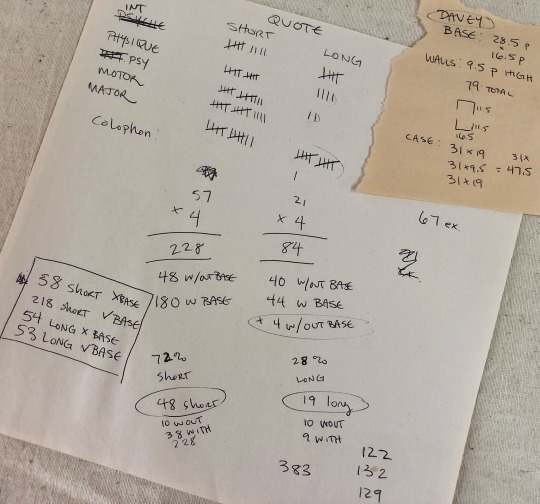
[image description: they are truly garbage notes, i tell you. half of it is written at angles to the other half, many numbers in the math problems are not labeled, mistakes are scribbled over. it gets me there but it doesn't look pretty. end description.]
#desert bus 2023#desert bus for hope#disco elysium#book arts#letterpress#letterpress printing#handset type#printmaking#db2023#finished works#long post
876 notes
·
View notes
Photo

Support your local library as much as you can because libraries matter more than ever before.
Your local library will welcome every support.
(via Support your local library elegant vintage design)
#library#librarian#libraries#libraries matter#books#booklover#bookworm#reader#book reader#library team#librarianship#support libraries#vintage#retro#letterpress
41 notes
·
View notes
Text
Next week! Making Books with Virginia Woolf

Mrs. Dalloway, [Book jacket front and back], Henry W. and Albert A. Berg Collection of English and American Literature, The New York Public Library Digital Collections. 1925.
Join us with the library's Book Arts Studio on the Diag (or in the Shapiro Gallery if it rains!) next Thursday, 12 September at 5p to print your own copy of the first page of Virginia Woolf's Mrs. Dalloway.
It's widely known that Virginia Woolf was a writer, but she also started a press out of her home with her husband, Leonard, called the Hogarth Press. The couple bought a small letterpress and set it up in their dining room, producing many of Woolf's books, including Mrs. Dalloway. Hogarth Press ran for nearly 30 years before being absorbed by a larger publisher. Having their own press allowed the Woolfs to decide what got published and get it out into the world directly, something still shared by small presses today.
This printing event is being offered in conjunction with the exhibit Mrs. Dalloway and WWI: Home Front and War Front, on display in the Hatcher Gallery Exhibit Room (1st floor, Hatcher Graduate Library) from 3 September until 13 December 2024.
We hope to see you there!
#libraries#archives#exhibits#events#special collections#special collections libraries#libraries and archives#special collections and archives#exhibitions#mrs dalloway#book arts#printing#letterpress printing#book arts studio#small press#presses#publishing#hogarth press#virginia woolf
35 notes
·
View notes
Text

From: Alberto Blanco, Book of Equis, Monotypes by Nacho Gallardo Larrea ("El Nacho"), Intagrafia, San José del Cabo, 2012, Letterpress printed with Bembo Roman and Bembo Roman Italic types, Printed on Rives BFK paper, Edition of 50 plus 15 artists' proofs (P.A. 1-15) [Photo: Books On Books Collection. © Alberto Blanco and Nacho Gallardo Larrea ("El Nacho")]
#graphic design#typography#art#poetry#monotype#letterpress#book#alberto blanco#nacho gallardo larrea#el nacho#books on books#2010s
26 notes
·
View notes
Text


Hail, Holy Queen, 2025
2” x 2.5” x 2” 12 rag mat board panels, featuring 12 pages of the prayers of the rosary and 3 pages of supporting text, hand set in 6 pt. Century Schoolbook and printed on Zerkall Frankfurt Cream, mounted on burgundy end sheet paper (leftover from the For Dust I Am books); and one giclee print of an original analogue/digital collage featuring song bird egg drawings by JoAnna Poehlmann divided between 9 panels; linked though 48 grommets with copper jump rings; and covered with copper plates embossed by Gwen Youngblood and patinated by Nan Marshall; held tidy with a leather strap by Ashley Neary. Limited edition of 11 copies.
Mary as mother, as nature, as our beloved earth.
#collage#artists books#art#kunst#letterpress#book arts#artists book#mary#rosary#mother mary#mother nature#mother earth#prayer#prayers#hailholyqueen#hhq#poehlmann#joanna poehlmann
12 notes
·
View notes
Text

made by Nat
#booklab op#from the archive#nat#letterpress#typography#activist posters#book arts#printing press#vaccines#covid#get boosted
33 notes
·
View notes
Text

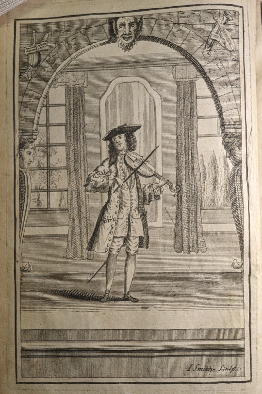
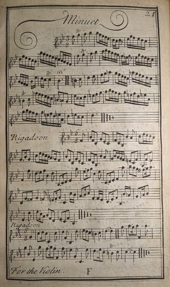
Prelleur, Peter. The Art of Playing on the Violin; : With a New Scale Shewing How to Stop Every Note, Flat or Sharp, Exactly in Tune, and Where the Shifts of the Hand Should Be Made. To Which Is Added a Collection of the Finest Rigadoons, Almands, Sarabands, Courants, & Opera Airs Extant. London: Engrav’d, printed and sold at the Printing-office in Bow Church-yard, 1731.
MT262 .P88 1731
#illustration#violin#music#music instruction#minuet#18th century#scales#libraryofva#specialcollections#rarebooks#printing#letterpress#book art
39 notes
·
View notes
Text





#Miniature Monday
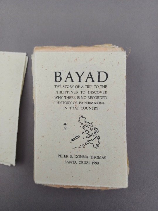
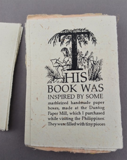
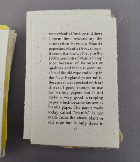
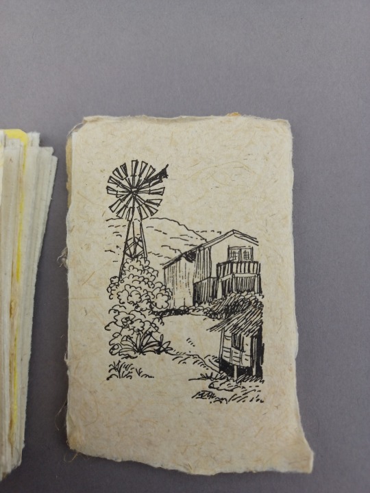
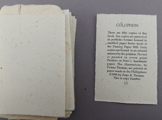
Bayad : the story of a trip to the Philippines to discover why there is no recorded history of papermaking in that country.
This is part of a series focusing on a small fraction of the lovely artists books by Peter and Donna Thomas!
As is the case with many traditional crafts, it can be hard to find written information about the background of papermaking in some countries. This is true in the Philippines, compounded by the fact that "Spanish colonists destroyed many of the country's famous bamboo papyrus scrolls that documented some of the earliest written accounts of Filipino history. And, as one of the Philippines' most notable hand papermakers Nida Dumsang states in The History of Hand Papermaking in the Philippines, "...historians have found it difficult to piece together facts because there are only the scantiest written records of that era."" --review in Hand Papermaking, Winter 2006. Peter and Donna Thomas's book, The history of paper making in the Philippines sought to fill some of those gaps.
This mini tells the story of that larger book, exploring the background, research and writing which started with the visit of Nida Dumsang for a workshop.
Peter and Donna Thomas are "book artists from Santa Cruz, CA. They work both collaboratively and individually; letterpress printing, hand-lettering and illustrating texts, making paper, and hand binding both fine press and artists’ books." They have made over 100 limited edition books, often with Peter making the paper, and Donna doing the illustrations.
Check out more of Donna and Peter's books at Uiowa here.
--Diane R., Special Collections Graduate Student

#uiowa#UIowa Special Collections#Peter&DonnaThomas#Papermaking#Philippines#Nida Dumsang#Bark Cloth#Duntog Paper Mill#Artists Book#MiniatureMonday#Filipino papermakers#letterpress
74 notes
·
View notes
Text
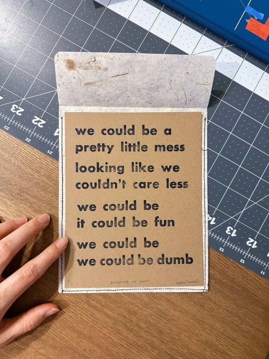
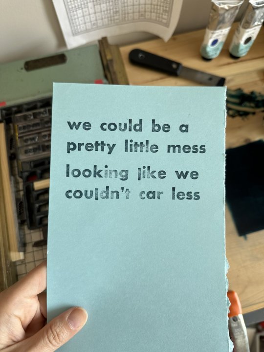


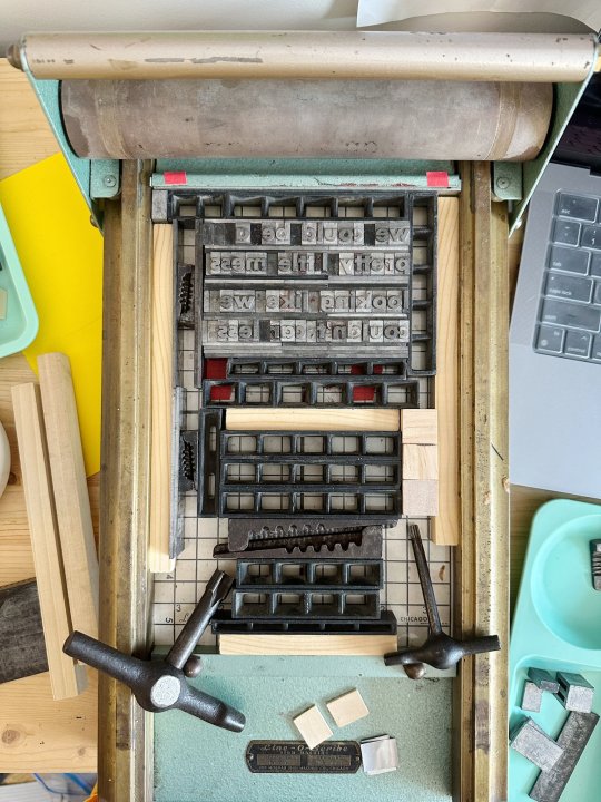
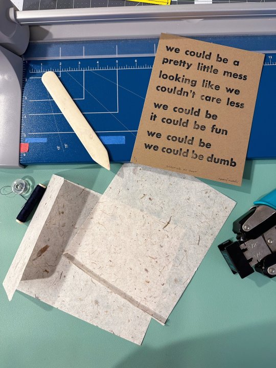
A special little something for a special big someone made on my smaller Line-O-Scribe. I didn't have quite enough of the font to do the whole thing in one go, so I had to set type for one half, print that, and then print the other half. Worked out well enough!
Copy is abridged lyrics from the song Bedroom Eyes by The Knocks.
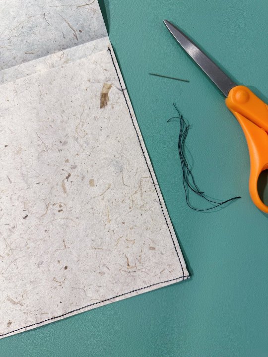
I also sewed a little envelope out of mulberry paper:

#book arts#printmaking#letterpress#typography#graphic design#design#stationery#print#romantic#the knocks#love notes#love language#artblr#designblr#artists on tumblr#tumblr creators#creatr#printmakers on tumblr
24 notes
·
View notes
Text

The most recent letterpress project from the on-campus studio. I’m planning on giving these to my coworkers at the library!
2 notes
·
View notes
Text


Brrrrrrr! Too Cold to Go to Work Today.
It is currently -4F, with potential -30 windchills here in Milwaukee today. So, Special Collections, the UWM Libraries, and 95% of UWM Campus will be closed today, January 21, 2025, because of extreme temperature conditions. We're just hunkering down in our cozy little cottages for the day, and hopefully we'll see y'all tomorrow.
These color wood engravings are by Kentucky wood engraver Joanne Price as illustrations for Sena Jeter Naslund’s winter story, When Children Ruled the World: A Christmas Story, handprinted and published in Monterey, Kentucky by Larkspur Press in an edition of 42 copies in 2021.
View more of our posts on the work of Joanne Price and her Starpointe Studio.
View more posts with wood engravings!
#Cold Day#extreme cold#wood engravings#wood engravers#women wood engravers#Joanne Price#Sena Jeter Naslund#When Children Ruled the World#Larkspur Press#Debbie Shannon#letterpress printing#fine press books#Starpointe Studio
84 notes
·
View notes
Text
[video description: process recording of making a small edition of hand-bound books, printed both digitally and with handset type. Two Parables, written by the author for family, set in Century Schoolbook, with titles and decorative drop caps letterpress printed in silver. Made with custom dark green slipcases, dark green covers, exposed yellow bindery thread, and the flyleaf printed with the constellation Gemini. end description.]
boy slipcases are a lot of work but are so so satisfying. perfect enclosure for singular object, there is nothing better!! i never got well-lit footage of it but the inner sheets on the slipcases are this brilliant emerald green stuff lightning-shot with gold.
never did find an ID for the drop caps. I am. notoriously bad at googling things. If it's not in a catalog i have it's a mystery to me :( lmk if this deco-looking celtic knot redux looks familiar to u.
15 notes
·
View notes
Text
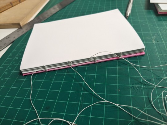
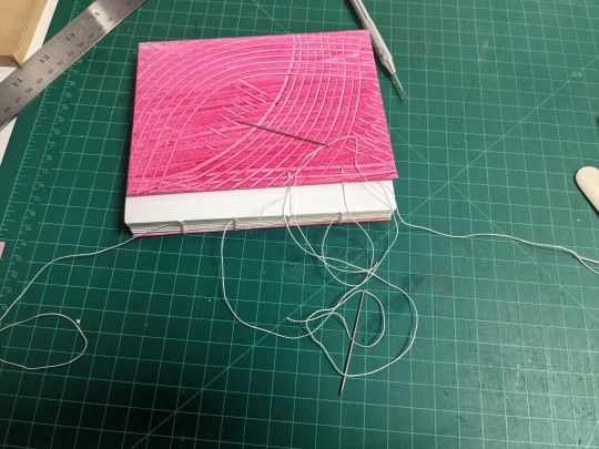
one step closer to knowing how to bind my own books the way I want
7 notes
·
View notes
Text

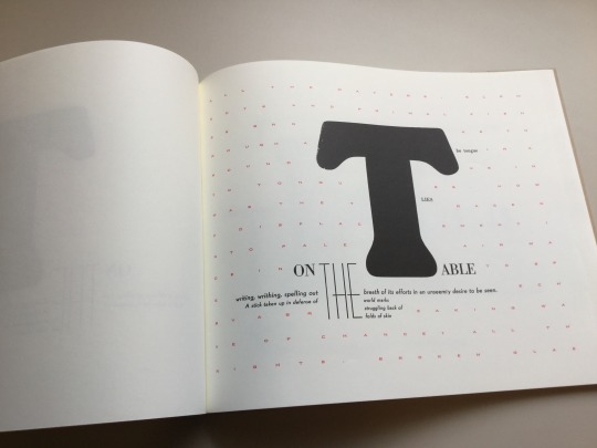
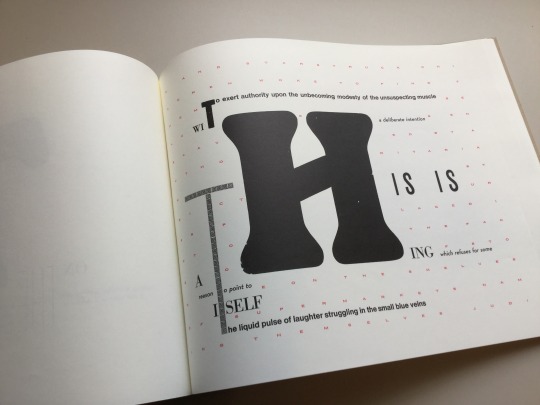
Since 1978, Bow & Arrow Press has resided in a tiny corner of the Adams House, one of a dozen residential Houses devoted to Harvard undergraduate students. It is located in a building at the intersection of Bow and Arrow Streets, which its name originated. For 45 years, Bow & Arrow Press welcomed everybody in the community--students, faculty, staff, alumni, and the Adams House residents--and taught the art of letterpress to anybody who wanted to learn largely free of charge.
This Monday, the movers came and packed the contents of the studio, including the vintage presses and type cases, for storage while the Adams House renewal project takes place. The renewal plan had included the Bow & Arrow Press until April 16th, when Adams House’s faculty deans informed the community that the studio would not move back into their space after renovations are completed in 2025.
For 45 years, the Bow & Arrow Press has been a true community press. Over the years, thousands came to learn to typeset, get their fingers inky, and joyously run the century old letterpress. The creator of this artist’s book, scholar Johanna Drucker, used the press while she was a Harvard Mellon Faculty Fellow in the Department of Fine Arts. Drucker produced the letterpress edition of “The Word Made Flesh” in the winter of 1988-1989 with the assistance and support of James Barondess and Gino Lee, founders of the Bow & Arrow Press. Last Wednesday, Barondess (A.B.’79, Ph.D. ’93) came to the last Open Press Night and shared the early history of the press with the many younger generation printers who attended the event.
Poet Seamus Heaney also became familiar with the Bow & Arrow during his Harvard years, and theater director Peter Sellars was among the first students to get their hands on the press.
You can read more about the Bow & Arrow Press in an article, “The Eviction of the Bow & Arrow Press” written by Craig Lambert on Harvard Magazine.
The word made flesh Drucker, Johanna, 1952- New York, NY : Granary Books, c1996. "This is a facsimile reprint of copy #50 of the original letterpress edition"--Colophon. "The Druckwerk edition was produced in winter 1988-89 at the Bow and Arrow Press"-- HOLLIS number: 990072967770203941
#Bow&ArrowPress#BowandArrowPress#LetterPress#Letterpressprinting#JohannaDrucker#AdamsHouse#CommunityPrintingPress#HarvardFineArtsLibrary#Fineartslibrary#Harvard#HarvardLibrary#harvardfineartslibrary#fineartslibrary#harvard#harvardlibrary#letterpress#letterpress printing#artists books
40 notes
·
View notes