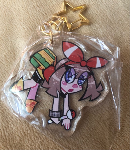
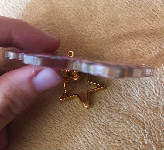
#let me know if you want the cmyk file for printing so you can make your own sticker!!
Explore tagged Tumblr posts
Visit Tumblr Blog
Explore Tumblr blogs with no restrictions, modern design and the best experience.
Last Seen Tumblr Blogs


Fun Fact
The KCSC sent more than 20K requests to delete posts related to prostitution and porn to Tumblr from January to June 2017.
Text

Twig enjoyed going for walks alone. It turned out she liked to go for walks with company even more.
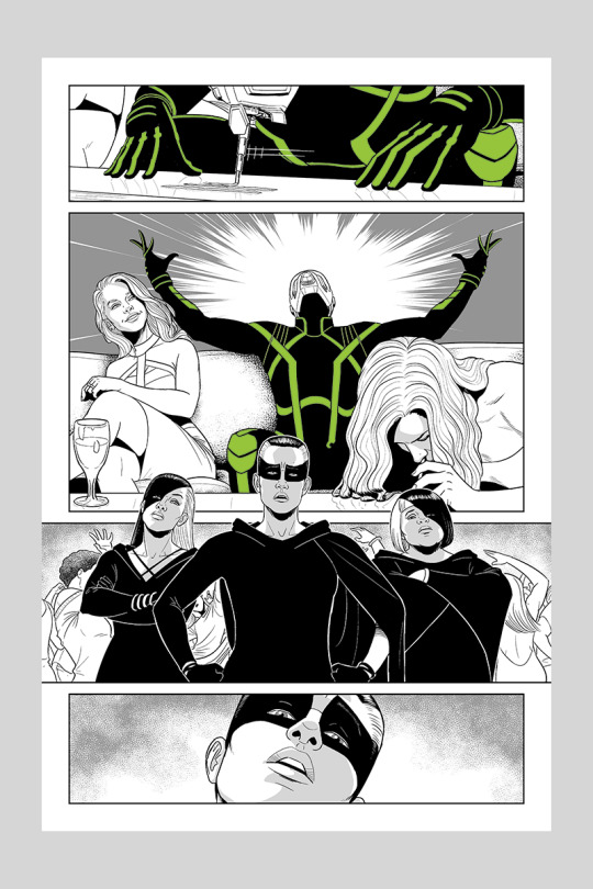
Go read The Present is a Gift by @sincerely-sofie. Her lovely characters Ark and Twig are always on my mind.
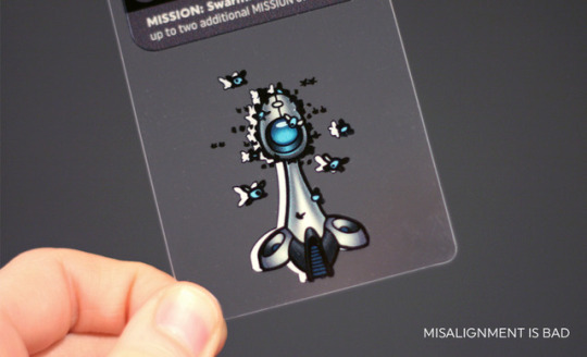
#hey sofie I know we've never interacted but I've been loving your content forever!!#your fic was amazing and being able to follow it through your writing process was so cool#anyway I loved your blorbos so much that I had to make a sticker for myself#let me know if you want the cmyk file for printing so you can make your own sticker!!#also if you want me to remove the @ just let me know but I wanted you to see this#and... this art is also me shyly asking you if we can pls be mutuals#I just think you're pretty rad ngl#(holds Ark and Twig in the palm of my hands) I just think they're neat#pmd ocs#the present is a gift au
126 notes
·
View notes
Photo

Hello! I am... ✨opening commissions✨!
Please pay me to make pictures, I would like to live off this kind of thing one day~
If you would like one:
message me either here or via email with what you want.
if I agree to do it, I’ll tell you the price and when I can do it. if not, I’ll let you know asap.
if you agree that works for you, I’ll send you an invoice using Stripe.
once I get the money, I’ll draw your picture!
for best results, give me references: model sheets (for fanart and preexisting OCs), expressions, poses, drawing style, clothing, actors, general vibe...
...but if you want to leave things up to me, that’s cool too!
let me know in advance if you want to watch a stream or get a timelapse video.
if you want changes, I’ll do one round of small revisions for free. if you want major redraws, we’ll negotiate a price.
Technical information: I will generally speaking produce pictures as PNG images in the sRGB colour space. I can also provide the Krita project file. if you want to print a commission, I should work in a different, CMYK colour space, so let me know your requirements before I start!
Licensing: by default, I will post the picture here and on Twitter under a CC-BY-SA license. that means, you and anyone else can repost it and make derivative works, as long as you release it under the same license and credit me. if you want a different license, we should discuss it before I start work.
Two no-go subjects: NSFW involving kids, and NSFW/guro involving real people without their consent.
Other than that, the main reason I am likely to refuse a commission is if I don’t have time. Likewise, if for some reason circumstances make it impossible to fulfil the commission, I’ll let you know as soon as possible and give you a refund.
Other things I might do: Simple looping animations are possible - let me know if you’re interested and we can negotiate a price. I’m not offering more complicated animation at this time but I may in the future.
137 notes
·
View notes
Text
Comic Book Page Technical Specifications
This is a post for comic book artists preparing their pages for their publisher or colourist. I'm aware that many pros still don't know some of this stuff, often because the bigger publishers have production teams who will take the incorrectly sized or shaped pages and adjust them before passing on to colourists or for print. However, this a) is giving more work to people that you can easily do yourself and b) reduces the amount of control you have over how your work is printed. It makes sense to provide files that will present your work in the best way possible.
So, the basics of a digital page file:
A standard US comic book page size is 6.875 by 10.438 inches bleed, 6.625 by 10.187 inches trim, with a live image area of around 6 by 9.5 inches. The DPI depends on your publisher, but the higher the better. 600dpi is standard at DC, Image and Dark Horse, Marvel prints at 400dpi (or did when I worked for them – if that's changed, someone please let me know). What do those terms mean?
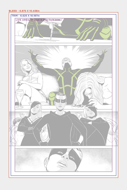
TRIM: This is the final page size of the printed publication. The paper isn't cut to size before printing, it's done afterwards. Now, with mass produced offset printing, pages are trimmed at speed and in batches. This means that the trim on the digital file isn't EXACTLY where the trim will be in real life. Closely compare two copies of the same comic, where art extends to the edge of the page. You will more than likely see that they're not cut at exactly the same part of the artwork. This means that, when you're providing art that extends to the edges of the pages, say with a cover, it's not good enough to have art that just goes to the edge of the final printed page. The cut will more than likely not land exactly where you've drawn to. This is why we need the...
BLEED: The bleed is the area of art that extends beyond the final trimmed comic page. To compensate for shifts in the cutting process, it is 0.125 inches around the entire page. You’ll note in the image above that panel 3 extends past the edges of the trim to the bleed, so that it reaches the edges of where the page is cut.
LIVE AREA: This is the area of the page where it is safe to assume that wherever the trim cuts fall, everything inside this area will be safely on the printed page. Now, modern printing presses are MUCH better at this than in the past, so it's not as much of a worry as it once was. But all lettering, for example, should ideally fall within this area, at least 0.25 inches away from the trim.
DPI: Dots Per Inch. This is the “resolution” of a printed comic book page. Literally how many dots (pixels on screen) of ink there are in each inch of page. A DPI of 600 means there are 600 pixels across or down in every inch of printed paper. It's worth noting that if you're zoomed into 100% in Photoshop or whichever art program you're using, this will look massive on most screens. That's because your screen probably isn't 600dpi – at most, in modern screens, it's 300dpi, so your art will look about twice as big as printed at 100%. This is very important to note. Print requires MUCH higher resolution than screen. Your 72dpi image that looks great on your computer will print like blurry crap.
If your linework is aliased – meaning it's pure black and white pixels, with no grey edges – 600dpi is essential to print smoothly, with no jaggies (the visible square pixelated effect). If you use anti-aliased lines then 300 to 400dpi is OK, but still, the higher the better. This also applies to more painterly styles. I personally don't use anti-aliased lines when inking, for sharper images, and it can be easier for the colourist, but that's down to personal preference.
For digital artists, it's probably easiest to set up your page dimensions for the canvas you work on, so you don't have to do anything afterwards. Manga Studio/Clip Studio only goes to two digits after the decimal, so after drawing a page in MS and exporting it, it must be correctly sized in Photoshop using Canvas Size. For traditional artists, the standard board is 150% bigger than the printed page. An easy way to make the art the right size before you change the Canvas Size to the exact inch size in Photoshop is to scan at 400dpi, then use Image Size with “resample” unchecked to change the DPI to 600. This keeps the number of pixels in the scan the same, but tells the computer that they will print in a smaller space.
It's worth noting that many artists don't like to scan at this low a resolution, and prefer to scan at a much higher res then reduce the image size in Photoshop, to better control the quality of the scan.
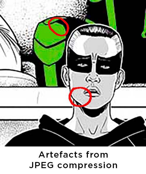
File format: Pages should NOT be provided as jpegs or PDFs. Both these formats compress the artwork to reduce file size (PDFs can be set not to, but it can make the file size enormous). What this means is that the art is degraded, with artefacts appearing especially around the edges of big blocks of colour. JPEGs are fine for the web, as they reduce the file size for quicker downloading, but are not at all suitable for print. If you've got a painterly style, and your jpeg quality is set to maximum, you can juuuust about skirt this, but it's not preferable. Especially if they're not CMYK (see below).
Printers do often use PDFs for printing, but that is the final product, NOT the page you're providing for your colourist. If in doubt there, talk to your printer or publisher.
Your pages should be provided as CMYK files (Image>Mode in Photoshop). CMYK is the format used for offset printing, with each letter representing one of the four colours of ink used in the process. RGB is the format for screen work, with each letter representing the three colours of light used to make any screen colour. This is worth noting when you colour your own work too – some people colour in RGB because there are more effects available in Photoshop, but always have a CMYK preview window open so they can monitor how it will look when it is switched to CMYK for print. If you send off a RGB colour file, prepare to be disappointed in how it will print – inks just aren't capable of recreating some of the colours that a screen can support.
If you can – this is easy for people who work digitally, less so for traditional artists – separate out linework that you want coloured or have a special effect – rain, lightning, reflections, speed lines, explosions etc. This can be done either by having the lines a different colour in the file, or saving them as layers. Layers will increase the file size, but your colourist will be very grateful that you made their life easier.
The best format for providing linework is TIFF. When saving as a TIFF, check the “LZW compression” box. This will usually MASSIVELY reduce the file size, without affecting the quality of the image whatsoever. For “byte order”, select Macintosh. Why? I dunno, possibly because the publishing industry used to rely on Macs so heavily.
So, there you have it. It's all very easy once you grasp it, but you'd be surprised how many people haven't learned these specifications. Doing so will make the lives of your whole team easier – the colourist, the letterer, the production team – and your work will print beautifully.
4K notes
·
View notes
Text
jinlei craft acrylic charms review!
i haven't seen any reviews of this company outside their alibaba page and i recently worked with them to make a few acrylic charms, so i figured i'd make a little mini review of my experience!
with a certain popular charm supplier that i'm sure we all know's quality slipping through the cracks recently, i wasn't willing to take a gamble with their now inconsistent quality. so after searching a bit, i stumbled across jinlei craft on alibaba and thought "i've got nothing to lose might as well" because god forbid i am not working with v*grace. how did they do?
first, i have to talk about all that preparation stuff. the representative who talked with me, ray lin, was super nice and helpful! this was my first time making acrylic charms so i had some questions, but they answered them all very quickly. if you're a clueless idiot like me, they can even do cutlines for you! responses were fast! excellent customer service overall
the charms themselves were 3 us dollars a piece (side note, don't assume that tempting .20 per piece alibaba price is what you're gonna pay for small orders!) for double glitter epoxy, and shipping was 23 dollars. okay, i guess. i know v*grace does it at like half the price, so these charms with fun extras can be a bit pricey. i can only assume standard acrylic with no extras is cheaper but i'm not sure. it took 2 weeks for my charms to be made, but ONLY because i'm ✨extra✨ and wanted double epoxy. they tout a production time of about 3 days on their product pages for anything else.
shipping only took a week from china to the us. they arrive in a box and in the box is a LOT of bubble wrap....
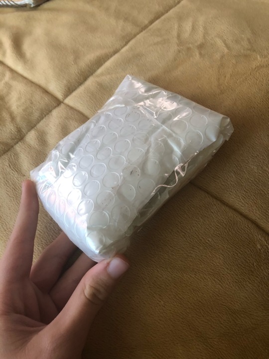
and in the bubble wrap is a ziplock baggie with the charms! they're all individually wrapped and pre-assembled with the FREE accessory they let you choose!
now what about the charms themselves? let's take a look
they're about 1/8 inches or 3mm thick, and no charms out of the 4 i ordered had chipping on the edges
the one thing i noticed right away was the colors. oh man, the COLORS. the charms seem to print a bit darker and saturated compared to your cmyk files, so the colors look stunning!
here's one in direct natural sunlight. the dark blues look so good!
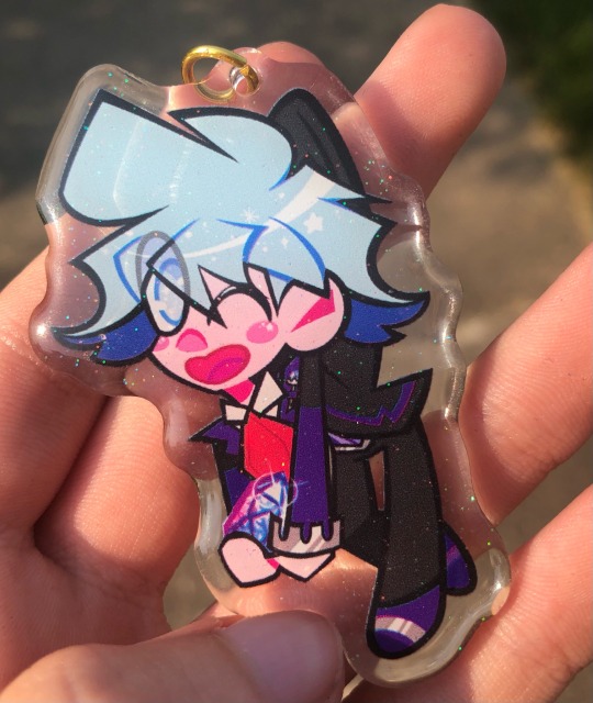
it honestly looks better than the cmyk file i sent in

the print quality is pretty good: it's not as good as in-house manufacturing as expected of overseas companies, but it does the job and doesn't look grainy. and unlike a certain company, there are no ugly streak lines! in my case, the glitter in the epoxy is just right. not too overbearing, but enough to let the design sparkle
i really only noticed one little nitpick..... some areas of the printing can appear "chromatic-y" in spots. i can't really say if this is something that shows up often in their printing: all the photos i saw on their review page seemed just fine. maybe i just got unlucky?

it's an offset of 1-2 pixels, so you would have to be looking pretty close to see it. so it's not distracting, but it might be something to keep in mind. once again, i can't say if this is a consistent issue in their printing or if i got a wacky batch
the whole process took about a month, but i'm sure you can get faster production times if you're not ✨extra✨ and don't order epoxy. was jinlei craft worth my time and money?
pros
great customer service!
pretty good print quality and AMAZING colors
fast shipping
free accessory and pre-assembled to save time!
NO MINIMUM ORDER QUANTITY!!!!!!!
cons
slight "chromatic-y" printing in some areas
a bit more $$$ than v*grace for extra effects, and international shipping is always a bitch
so..... i would say yes! if you want a few charms made and don't wanna rely on v*grace's gamble of quality, maybe give jinlei craft a try. it can't get worse than v*grace after all lmfao
thanks for reading!
0 notes
Text
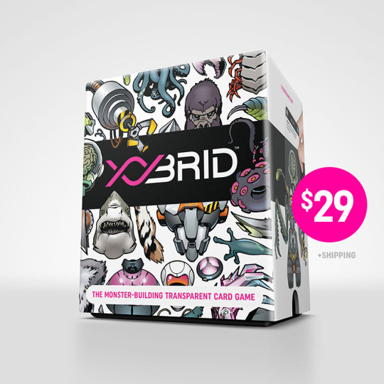
Prototyping Transparent Game Cards
Have a game concept that relies on transparent printing but aren’t sure how to pull it off? It is possible… here’s how I did it.
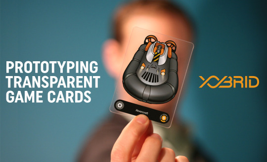

Transparent cards are the heartbeat of the XYbrid play experience. Giving players the ability to overlay parts to build monsters in a visual way is what makes the game distinct and memorable. For most of its life, XYbrid was playtested with paper cards—good for testing mechanics, but ultimately inadequate for making the best impression during demos. As XYbrid evolved, the value of having transparent cards became quite apparent: it would not only prove the concept, but also provide real, tangible objects to showcase on the Kickstarter campaign page .

Game manufacturers who could handle transparent plastic printing required a minimum order of at least 500 units; some as many as 1,500. They are sure to do a great job on a true production run, but ordering that quantity pre-funding is out of the question (and counter to the Kickstarter model).
There are short-run game printers who handle any manner of printed paper products (including cards, boards, rulebooks, etc), but clear plastic cards, I came to discover, are not so easy to source. None of the short-run printers I found offered that service.
What I needed was a prototype.
The Challenge
A prototype, as I defined it for XYbrid, has two attributes:
As close to the envisioned final product as possible.
Durable enough to withstand shuffling and contact with hands and tables
Perfectly clear plastic, with the thickness of a typical game card
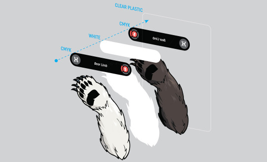
Two-sided printing with near-perfect alignment front-to-back
Normal color printing plus a layer of opaque white ink, to provide a base for the colors
A tiny print run.
I only needed 15 sets—enough for playtesting, demos, and sending to reviewers.
After finding game production specialists to be a dead end, I started reaching out to my print contacts in the graphic design industry. While most were eager to help, they were unable to solve the problem. Most conversations led to the suggestion that I repurpose a custom gift card product, which is too thick, the wrong size, and the wrong material.
I finally had success with Hopkins Printing in Columbus. They took time to understand my goal and went beyond their normal process to figure out how to do it.
The Solution
The project would be printed on a digital press. Digital presses are built for short runs—think of them as ultra-high capability desktop printers. Hopkins operates a digital press that can print on 15 mil (that’s roughly playing card thickness) clear vinyl, including white ink. Aligning the art on both sides was a struggle. When a human being flips over a sheet to print on the other side, some degree of misalignment is inevitable. If the alignment was off by even a small amount, the art was ruined.
The team at Hopkins came to an ingenious solution: to print all the inks on one side of the plastic, so no flipping was necessary. They would first print a layer of color ink as a mirror image, then the white, then the other layer of color ink, without ever having to move the plastic sheet. Because the material was clear, you would see the mirror image through the back side of the card, effectively un-mirroring the art.
The end result looked and worked great.
Getting Technical: Preparing Art Files
My art files were created in Adobe Illustrator (I highly recommend Illustrator or InDesign over Photoshop for final art for many reasons). Fortunately, all of XYbrid’s art was vector-based (i.e. created in Illustrator) so managing the art all took place in one application. If your art is pixel-based, as many illustrations are, you’ll need to manage your inks/colors in Photoshop and import the images to Illustrator (or InDesign). That’s a bit trickier but the principles described below are the same.
The basic idea is that you are creating two layers for each piece of art: a normal color layer, and a white underlay.
Each card has its own file, and each file contains art for the front and back, on two separate artboards. The art on each artboard is a mirror silhouette of the other—it’s exactly the same shape, and in exactly the same position.
LAYERS
I used layers to stay organized in Illustrator. This method is a lifesaver if you ever need to go back and edit your art (you will).
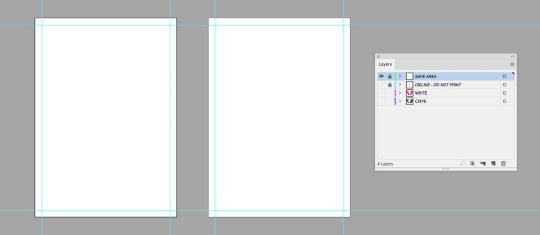
Safe Area There is no actual art on this layer, just guidelines. These lines mark a .125” safe zone around the edge of the card—I kept all my art within this designated area. This zone assures that any minor shifts during cutting will not cut into any important printing. If your card art “bleeds” (i.e. goes off the edge of the card), you can go into the safe area; just keep important stuff (such as text) out of there.
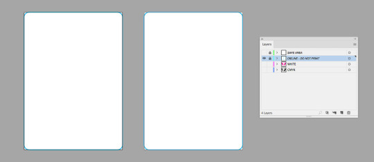
Dieline This layer holds the outline of the card so the printer will know where to cut. It’s a rounded rectangle with .125” radius on the corners. This layer should also be non-printing.
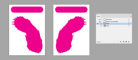
White All of my elements that are printed with white ink are on this layer. Remember, this is the foundation for all the art you want to be opaque.
IMPORTANT! DO NOT USE THE STANDARD WHITE INK SWATCH. Remember, objects that appear “white” on screen are actually just the color of the surface you are printing on, which in this case is transparent! Instead, create a new, brightly-colored “spot color” swatch and manually rename it “White”. It will look wrong on your screen, but this setup will help the printer understand your intent.

If it seems counterintuitive to have this layer above the colored ink layer, that’s because it is… my printer requested the files be set up this way, with the white objects set to “Overprint Fill” in the Attributes palette. Your printer may request a different layer setup.
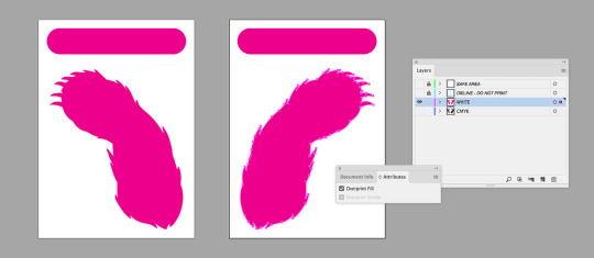
Setting “Overprint Fill” lets the printer know the selected object is to be printed even if it appears concealed by another object on screen. This is important because the white and colored ink layers overlap.

CMYK (Cyan, Magenta, Yellow, Black) This layer contains all the art that uses colored ink. Remember that colored ink is translucent, so anything you don’t want to be see-through should have white overlapping it.
TRAPPING
Accurate alignment of colored printing with white underprinting is super important. However, even with awesomely precise machines, tiny shifts can cause misregistration. If your white layer is exactly the same size and shape as your CMYK layer, these tiny shifts can cause a sliver of white to appear at the edges of your art. If this happens, it looks bad.
You can eliminate this risk by putting “trapping” on the CMYK layer. Trapping is just an extra amount of buffer around the edges of the art to cover up any slightly imperfect alignment. For XYbrid art, I added a 1 pt stroke outline (usually 100% black) to all the CMYK art.

ADDITIONAL NOTES
Having a good, communicative relationship with your printer is critical. This is an unusual job and you must be confident they understand what you want.
Printing this type of prototype is not cheap—estimate it to cost 15 to 20 times the cost per unit of mass-producing a card game (Each 116-card XYbrid deck was about $100). The benefit is that you can order as few as you need, so it’s easier to factor that expense into your budget. For me, proving the concept and having high-quality, photogenic samples was definitely worth it.
In the process we used at Hopkins, the white ink is noticeably thick. It has a texture you can feel. This type of ink is generally NOT used in mass-produced transparent cards (the final printing for XYbrid used a much thinner white), so there will be a discrepancy between your prototype and final product in this way.
You can try advanced techniques on the white layer, such as gradients, if you want to achieve a fade from white to clear in some areas. For me, this experimentation had mixed results; the thickness of the white ink seemed to hamper the gradient effect.
Be prepared to adjust your files and techniques when your game goes into final manufacturing. Each printer has different standards for art files and inks. The thinner white ink mentioned above required six coats of printing to achieve acceptable opacity in the final product.
Comment or message me if you have any questions.
Here’s the contact info for my rep at Hopkins:
Jonell Murphy Hopkins Printing (800) 319-3352 Hopkinsprinting.com
Get your copy of XYbrid at shop.xybridgame.com.
1 note
·
View note
Text
How Do Professional Photographers Print Their Pictures
Printing is one of the most important parts of photography. Though people are using digital images more often than print copy nowadays.But still printing pictures is an important matter in photography. When you are willing to make your photo album you have to print your pictures anyway. Are you enthusiastic to know about the process? Let me show you how do professional photographers print their pictures.Beginners are also going to find this post helpful as I am going to cover some important topics for beginners.Why we are making delay then? let’s get started immediately.
Try Our Best Photo Editing Service
Choose Appropriate File Format
To print pictures like professional this is the first step to follow. You have to make sure that you are using proper file format.Different types of file format indicate different types of printing instruction to the printer. File format of photoshop, Microsoft word, Adobe In Design are not supported by most of the printers. So, which file format is the best option for printing pictures? To have a better experience in printing you ought to go for JPEG. Uncompressed TIFF file format will give you the best experience for printing photograph.
Perform Color Management properly
After you choose accurate file format you should also do the color management in the right way. When you are seeing your digital image in the computer you are seeing this in RGB color mode. But most of the printers print pictures using CMYK color mode. In this case, you ought to change the color in CMYK form. But some printers use 6 colors to print pictures. For these devices, toucan use RGB form. If you don’t follow this procedure, do you know what will happen?
You will see a color in your computer screen, but the color in your printed photograph will be different. To avoid it, you must follow this step.
Keep the resolution high

Without high resolution it is never possible to get a nice resolution picture. But unfortunately, most of the beginner photo editors make this mistake. If you also make the same mistake you are going to be end up with a blurry image. That is not good at all.Never ever make compromise with the picture resolution what so ever.
But do you know what is the decent resolution? Just increasing the size of the digital image will not be enough. You should set right dpi (dot per inch). It indicates the amount of ink to be printed in each inch.To get the highest printing quality image you should set the number to 300dpi. Setting a resolution lower than this can be the cause of your resolution loss. Cause, this is the highest number of resolutions that a printer can maintain. Setting a higher resolution than this will just increase size of the picture. It will not effect on the resolution. Otherwise, the picture will not look professional in the blurry touch.
Low resolution will effect on the printing quality.It can be the cause of showing visible pixels in the picture. That is disturbing to see for the viewers. It looks so unprofessional too.So, keep this in your mind to print your pictures like professional photographers.
Choosing right Photo paper
Do you know why the printed pictures of professional photographers look so elegant?Cause, they cover each and every point with the perfection that is related to printing pictures.Choose the right photo paper is also a key thing to get the photo that looks great. Different types of paper thick or thin, coated or undercoated has different properties of printing. Purchasing the expensive one is not the best choice always.Depending on which types of photo you are going to print, you have to decide the paper quality. Let me give you a suggestion here.
If you are looking for high definition image,you should use coated paper. Coated paper gives the printed photo a crystal-clear look. When you print your image in normal undercoated paper, you are going to end up with a messy look. So, you can bring an extra special look by using coated paper.
Using Bleed Properly

To print your picture like professional photographer, you ought to have a proper idea about bleed. Bleed indicates the boundary area of the picture after printing. Without using the bleed option properly, your printed image will not cover the full area of your paper. So, keep this in your mind and uses the bleed option according to your needs.
That’s it for today. The thing is your job is not done after taking the picture. You should handle all the things properly till the printing of the image. That’s all you have to follow to print your pictures like professional photographers. By following these techniques, you can also follow the same route and can get the same results. Best of luck for you.By the way, if you want to enhance the beauty of your image, you can try our professional image editing services.Want to have an experience about the quality? Free trial is available for you. It will take only a few minutes.Let’s have a try.
The post How Do Professional Photographers Print Their Pictures
0 notes
Text
HOW MUCH DOES A LOGO COST IN 2019?
Logo Design Agency
If you are thinking of taking your side thrust to the next level this year, getting a killer logo design can help you transform your business idea into a profitable company.

Which raises the question: how much does a logo cost? From DIY design to working with a graphic designer or agency, the cost of a logo can vary from $ 2 to $ 2500 +, with several intermediate options. Mid-range options include buying a logo from an online logo maker (starting at $ 20) or a design crowdsourcing website (starting at $ 99).
But the truth is that there are so many variables that influence how much you will pay for your logo design. This is what you need to know before choosing how to make your logo.The logo creation tripDesigning a logo with or without external support is an iterative and multi-step process that may involve research, brainstorming, sketches and various design concepts.
That's why custom logo packages can vary greatly not only in price, from relatively free to a few thousand dollars, but also the amount of time and effort required to do the job.
Before diving, go back one step to discover how you will use that logo on channels and brand applications.
NY Logo Design
Custom Logo Design Company NY
Graphic Design Services New York
Custom logo Design Services
Professional Custom logo Design Services
SEO Services New York
New York SEO Company
New York SEO Expert
Branding agency NYC
Brand Identity Design
Brand design agency
Web design agency NYC
Web Design Company NYC
Will your logo only live digitally, or do you plan to print it on business cards and other marketing materials? The answer to that question may change the type of logo file formats and the color variations you will need.
Let's start by explaining that there are two basic categories of image files: raster and vector.Raster files are measured in DPI (dots per inch) and have a file extension of .jpg, .png or .gif. Since raster files are based on a pixel grid, you run the risk that your logo will distort when the image size changes.
Vector files, on the other hand, can be scaled to any size without losing quality, from an Instagram profile picture to a subway station ad. They can be opened, edited and saved in different programs, and have a file extension of .ai, .eps, .svg or .pdf.
While it can make a high resolution raster file work for you, they are not ideal for all applications. Vector files are what you want to ensure your logo looks amazing on all brand assets.
And when it comes to color variations, make sure you get light, dark and full-color versions of your logo for your brand needs, as well as versions with transparent backgrounds.
Export options for color may also vary: RGB is used for digitally displayed logos, and CMYK is better for printed products (Pantone can work for both).
Web Designers NYC
Graphic Design Agency NYC
Logo Design Agency
Logo Design Services
Logo Design Services
Logo Design New York
Ny Logo Design
Custom Logo Design
Logo Design Company New York
Professional Logo Design Service
Logo Design Agency New York
Best Logo Designers Nyc
Ny Brand Logo
Is your head spinning already? Don't worry, we are here to guide you through the cost of making a logo and what each type of package includes.Option 1: do it yourselfIf you are looking to flex your design skills, you may want to try your own logo. But creating a design that suits your brand and can be used on all channels is a challenge.
The biggest cost will be your own time creating a paper logo and choosing the right design software to bring the sketch to life.
We want to warn you that there is a reason why people pay to design logos. It is not easy, especially without design experience.
Logo Design In New York
Logo Design Agency New York
Professional Logo Design
Custom Logo Design Services
Graphic Design Agency New York
Custom Logo Design Companies
Graphic Design Companies In New York
Logo Design Company Near Me
Seo Service
Web Design Companies In New York
Website Design Companies Nyc
The good news? You will have complete creative control, and there are online tutorials to take your hand while learning new software.SketchOnly available for Mac OS X, Sketch costs $ 99 for a one-year license. The vector-based design software will allow you to export your logo in various formats: PDF, SVG, PNG, JPG and EPS. While Sketch is becoming a favorite in the design community, it is not a tool for print design, since you cannot export logos in CMYK colors compatible with the printer.Adobe IllustratorIllustrator is the reference application of the design industry for vector graphics and is designed to work with other Adobe programs. You can export your work in more than ten formats for digital and printed use. Access the software through an Adobe Creative Cloud membership for $ 20.99 per month on an annual plan or $ 31.49 per monthly use.VectrA free (but basic) vector graphics editor, Vectr can be downloaded to your desktop or used online. The program offers lessons in the application and the files can be exported in both raster and vector format, including AI, PNG, JPG and SVG.CanvaThe paid Canva subscription costs $ 9.95 per month or $ 12.95 paid monthly in an annual plan. The program features more than 1000 logo templates to customize and allows you to download your finished work as JPG, PNG, PDF or GIF.Option 2: Buy and customize a logo templatePrefabricated templates reduce part of the effort and time required to create a logo from scratch.Because you need software to customize the design, most template logo files are compatible with Adobe Illustrator (again, you will need a paid subscription to these programs). Then it takes time to alter the colors and change the generic text to the name of your brand.
These templates can come with more than just a logo, offering a brand package and social media designs. Be sure to read the template description to find out what you get, including the file types included.
And remember: using a template means that other people might have a logo very similar to the one you choose. We do not want you to disburse the money that cost you so much to earn for an excessively used and unoriginal design!Creative marketThere are more than 49,000 logo templates in Creative Market to explore, ranging from just $ 2 to $ 500. Most templates cost between $ 19 and $ 39 for a package with two license options: standard, for business that will not exceed 500 sales, and extended, for unlimited sales. Expect to spend three times the price indicated for the extended license.GraphicBurgerGraphicBurger carries lots of logo-worthy icons in a variety of formats with complete kits for between $ 20 and $ 100 per package, ranging from a couple of hundreds to a few thousand icons. These icons can be inserted into design programs such as Sketch or Illustrator to modify and combine them with typography.GraphicRiverWith almost 58,000 templates, GraphicRiver offers low-grade templates of around $ 10 and high-end packages that can reach the $ 200 mark. Most non-exclusive logo packages on this site will cost you between $ 30 and $ 50 and they come with vector-based files.Option 3: use an online logo makerWithout the need to buy or learn design software, logo creators could be the cheapest option on the market. Some sites charge absolutely nothing to use the service: you only pay when you are ready to download the logo files.
An online logo creator (like Logoengine!) Can generate hundreds of logo variations using basic information about your company and your design preferences; You can then edit and adjust the models you want.
But be careful: although logo makers have low prices, the quality of the designs can differ dramatically. While there are gifts on the market, a paid option is more likely to provide you with the correct files you need to use your logo with confidence.
Logoengine falls into this category, which offers a basic PNG logo package for $ 20 and $ 65 for a high resolution logo package with PNG, EPS, SVG and PDF files (more pricing information here).You can also buy add-ons such as a social media kit (with the size of your logo for different platforms) and business card design templates.
Website Design Company Nyc
Brand Identity Design Services
Seo Company Nyc
Branding and Identity Design
Best Seo Expert Nyc
Branding Logo Design Services
Graphic Design Agency in New York
Graphic Design Company New York
Option 4: Crowdsource the designThink of crowdsourcing as a contest: publish a detailed summary of the logo in a community of designers, including the price you are willing to pay for a design. Freelancers can submit their unique designs to have the opportunity to be chosen.Once a design is finalized, the designer will send his logo in multiple types of files to start his business.99designs99designs runs seven-day contests divided into two rounds: qualification and final. You have the opportunity to give feedback to designers to refine your entries, and up to two weeks to review the final designs submitted before choosing a winner.Four different logo packages range from $ 399 to $ 1699, the most expensive option exclusively for those who call "top-level" designers. You will have to pay in advance for your design contest (before obtaining any logo file), but it comes with a money-back guarantee.DesignCrowdYou can set a three, five or 10 day deadline for your design contest on DesignCrowd and provide a detailed design summary. Start a contest for just $ 109, and you can expect to receive up to 50 designs from a handful of designers. They also offer a money back guarantee.DesignHillThrough DesignHill, the crowdsourcing logo starts at $ 199, but you can set a higher budget if you want to get the attention of top-level designers. Although you can choose the duration of the contest to meet your needs, you will have to pay the cost in advance.Option 5: hire an independent logo designerClicking on a freelancer means that you can work with an expert to create a professional logo design while watching several concepts come true. Depending on the skill of the designer, a new logo could cost between $ 250 and $ 2,500.
Through different platforms, there are online communities of designers that you can search to find one that meets your needs. But remember that this will take time!BargainDespite offering a free basic membership, to find hired designers, Dribbble charges $ 199 for a monthly membership or $ 99 per month, paid annually.
Through the platform, you can establish how much you are willing to pay, the type of work you need and the level of experience you are looking for. Designers set their own hourly rates, which can vary from $ 15 to $ 200 per hour depending on their experience.FiverrSet the style, file format, price range and design deadline through Fiverr. You will then have to pay a designer in advance for your work, usually in the range of $ 25 to $ 150 per hour. Fiverr offers three packages: basic, standard and premium, each with its own set of design and file download options. For a simple logo design, packages generally range between $ 50 and $ 100.UpworkConsidered to be the largest independent exchange in the world, most designers will charge between $ 10 and $ 200 per hour. A basic account is free, apart from a 2.75% transaction fee.
If you upgrade to a professional account, Upwork selects freelancers for a flat rate of $ 500 and an additional 20% transaction fee. Upwork also allows you to keep your funds in custody, which means that designers must complete the work to receive payment.Option 6: hire a logo design agencyThe most expensive logo option that exists is to hire a company to do the work for you.Agencies charge more than $ 2,500 for a logo design, and some reach the $ 5,000 to $ 10,000 mark. That can be a prohibitive cost for someone looking to evolve a side bustle in their 9 to 5.When considering an agency, this is what you should consider:Deposit: Expect to pay up to 50% of the cost for the design of a logo before an agency goes to work.The contract: not all agencies will ask you to sign a contract. If you do, you will be legally obligated to pay the full fee when the work is finished.
Time: With the support of a design team, an agency can take the time to create its logo. Wait at least one week before seeing any model.Additional costs to considerOnce your logo is complete, you can consider rounding up your company's visual identity with custom designs for social networks and business cards. Setting brand guidelines and obtaining a brand could also be on your list.
These costs can accumulate quickly, so keep them in mind when selecting (and budgeting) a logo creation option.Choose the correct optionEven if you are just starting a business, a logo is the starting point to build your brand identity.Once you have an idea, think about how you are going to show your brand online and offline. Then, find out what price of the logo design package will work for you.
At the end of less than $ 100, you might consider designing a logo yourself or customizing a template if you have some editing options. An online logo maker is another economical option if you don't want to buy design software but still want to control the process.
More to spend? You can consult the crowdsourcing design or hire an independent designer or agency if it seems appropriate.
Whichever option you choose, we wish you the best in your logo creation journey!
Branding and Identity Design Services
Top Seo Expert Nyc
Graphic Design Company in New York
Brand Design Services
Brand Identity Design Agency
Website Development Company Nyc
Local Seo Expert Nyc
0 notes
Text
Being a brand designer! Part 2
- Yeah, that's where I spend most of my time is on our main marketing site, yeah. - I think I'm writing a site, it does well, but we wanna do a lot more to it. - Yeah. - You know, we're releasing e-commerce in a few weeks and with that comes with a feature page and it comes updating every other part of the site. - Yeah, all the screenshots, yeah. - All the screenshots, yeah, we're updating our UI, we have to update all of that, and, you know, with this new page that we're working on it's like well should really update these other ones if we do this one. - Yep, and it just turns into a whole refresher of the whole site. - Yeah, and then, with that we're doing a video, so we're working with a contract agency to produce this launch video, we're all working really hard on that. Lot of work to be done on our blog, there's a lot of like side programs we have. There's a lot we're always working on. - Is it mostly digital for you though? Do you ever do any of the like print or like swag stuff? - You know, I really want to, I would love to take a week and just make swag, but just don't have the time right now. - Just doesn't become the priority, right, when it's a whole saturated line. - Yeah, we recently had to make a banner and some flyers for a conference. And that was like oh yeah CMYK is a thing. - Yep, you gotta go back to it. - So there's a very small amount of that, but yeah, a little bit, I think that's more typical for brand designers. Especially as I look around and look at the work of people that call themselves brand designers. It's a lot of internal, I think marketing related, but usually a lot of internal swag related and illustrations. Me and my team do a lot less of that type of work. - Right. - But there's a project we wanna do really badly and we got close to doing it for the launch of e-commerce where we were actually gonna produce our own swag store. - Oh my gosh, that's such a good idea. - So it's like, it serves a lot of purposes. - Yeah, yeah, yeah. - One it's, a lot of people ask for Webflow t-shirts and pens and stickers all the time, and we're like yeah, sure, here, take it, you know. And then we do have like events, it's hard to organize, you know, getting all that swag in the instant and all that, at the same time we're producing an e-commerce products and we, very few of us have run an e-commerce store. - Right, so this would be good practice for you all. - Exactly, so it's a test for us internally. - Yep. - To really even find the pinpoints and be able to mark it towards those and talk to product, be like hey, this was hard, let's fix this, you know, so it's gonna be really fun too, cause then we'll just get to make a bunch of crazy shirts and stickers and all that. - Yeah, that's cool. So with projects like that, that was you and your team come up with the idea for it and do you have a lot of freedom in that in suggesting the projects that you work on essentially? - Absolutely. - Yeah. - There's absolutely, you know, we're a design focused company. As a designer here there's a lot of respect that goes on and everyone's really supportive of the ideas that we have. - That's cool. - I come up with a lot of crazy ideas. Not all of them are feasible or fit in with the timeline of what we wanna get done, but there's always support to at least explore the idea or put it in the backlog or whatever, but like this one, you know, there's other things that took priority, but. - But you know it's safe for later. - But it's safe, yeah, it's gonna come. - Yeah, I do a similar thing at ConvertKit when in my marketing design work I can always feel free to suggest how I think is the best way to solve this problem, you know, cause it is a problem, how do we market this feature or whatever. - Totally. - Sometimes there's time for it, sometimes there's not, but yeah, I think it's great when we can have the freedom to suggest things like that. - Totally, I think the best ideas come of like, all right, let's random thought in a meeting, I'm just gonna share it, and you know, if there's a culture of that being out of place or a culture where that's not supported and encouraged then you're gonna lose a lot of good ideas. - Yeah. - And so everyone here's always like yeah that's cool let's see what we can do with that. And I love that. - Yeah, I love that too. - I think that that's something that makes for a really successful in house designer in general is when you're not just doing the work that someone asks of you, but you're coming up with your own ideas as well, and suggesting things. - Totally, like when we released the ability to search within a Webflow site, we created a essentially Google for dogs, and it was Kibble, and it would like look like Google, acted like it, you could search for stuff, you'd get articles that were like tailored towards dogs, it was just, yeah, just stuff like that where we were like hey, let's just do something fun and it'll take a week or whatever. - Yeah, do you wanna show me some of your favorite, I don't know, like what are you working on now or some of your favorite projects? - Okay, I'll show you what I'm working on now. - Yep. - It's the e-commerce feature page. Coming soon. - It'll probably be out by the time this video goes out actually. - Okay, it's live, here's the URL. This is the e-commerce feature page, work in progress, there's a heal that's not done. But our main focus with the page is talking about design cause that's really our largest selling point is all the things we can do with that. So there's six sections, which, this one's done. - Oo, that's cool. - It's talking about the checkout. It's really rare, I've experienced this both shopping a lot online but shopping on an e-commerce store now built by Webflow where you're like oh yeah the checkout always looks terrible and doesn't match anything. - And it always looks the same on every e-commerce site you go to as well. - Exactly, it's like being able to have a custom like checkout, like yeah that's cool and now that I'm experiencing I'm like oh wow, that's really nice. - This cool I love the animation. - Cause you build out everything you design as well, obviously, in Webflow. - And then, talking about the shopping cart. - Love, oo. - Customize it, and there's different ways you can display it. We get to your product pages, there's gonna be a video here, it's not done yet. Here we have. - I love all this animation, it's so cool. - This, the shadow kind of popping up there. - So what's your process with making a learning page like this, do you have like a copy team or something give you the content for it first? - It's definitely a couple rounds back and forth between copy and design. - Mm hmm. - It'll always start with a Word doc, for sure, and we have a few people that are very good writers and very good at starting there, and then kind of once we actually JP threw this into a sketch file and we started to play with the layout, and we actually get to see the content in the design, it's like oh this is not working as well and let's see what we can do here. - Yeah, yeah, yeah, for sure. - And over time we wanna change what we actually show in the page. So there was a lot of back and forth between copy and static layout. I typically, when I designing something don't use Sketch or Figma or Illustrator or whatever, I usually just kind of go straight to Webflow, but it does work well for getting ideas out there quick, you know, from there we adapted the designs to Webflow, a lot of it changed, it's almost completely different, but it was at least a starting point to get us here. - It's a starting point to have the conversation, right? - Yeah, totally, and then this was actually really nice cause we had just started with a very basic layout, we didn't do anything too fancy, and then just kind of tested the content structure across I think 10 users right now, and then got some really good feedback as to what they felt was missing, and you know, what we can do different. So it's gonna go live already being tested. - That's great. Is that usual for you? Because I was gonna ask you about A/B testing and user testing, that sort of thing as well. We do, well not so much right now, but we have been doing a lot of A/B testing at ConvertKit, like little pieces on our site, or sometimes like full pages, like we did two completely different home pages. But user testing for me, normally happens after the page is live. - Yeah. - Mostly because I'm like, I don't know, I feel like I'm always behind our product team in getting like, you know, they've got a new feature that's launching and I'm like ah I've got to get the lining page done. - Sure. - Yeah, how does that normally work for you? - We don't do a lot of A/B testing. - Okay. - It's something we wanna do more this year for sure. A lot of it's usually, we have enough of an idea of what we need to do that it's gonna, it's not gonna fail, but it could always be better. - Yeah, but there isn't any point in testing, I don't think, unless you're willing to like take the time to implement results from it as well. So like when you've got other projects on, like that's why I said at the moment at ConvertKit we're not doing much testing cause there's just so much going on. - Exactly, we're in a similar spot for sure. It's unfortunately a luxury to test, I feel like. - Yeah. - As designers we like generally know what's gonna work, and that's usually like yeah, cool, let's do it, but, testing is something I definitely wanna do more of. - I think that as brand designers as well, perhaps our projects are launched on a more regular cadence than product designers, so testing is obviously a huge part of product design like before you launch a feature out to all these thousands of people, that's really important, whereas with what we do it's pretty easy to like make an update to the website without it like affecting too many people's lives. - Yeah. - If you need to change something later on. - It's a little bit quieter, you know. - Yeah, exactly. - Doesn't break anything, not necessarily. - Which is again, something that I like about doing my own design. - And if we do fail, we'll know on Twitter or wherever else, people are gonna be like hey. - Yep, someone will tell you, this link is broken! - That happens for sure. - Yep, for sure. All right, Ryan, thank you so much for sharing all this. Where can people go to find out more about you? - Yeah, I've got a website, ryry.io, r y r y. - Great URL. - Yep, there it is. - Or just like Twitter, I'm slash ryryjmo. - We'll put that on the screen as well. - I love following Ryan on Twitter, would definitely recommend giving him a follow. - I tweet mostly Webflow stuff, just be warned. - Oh there we go, yeah, so you're gonna be like promoted too, the people that want it. - Yeah. - But it's interesting stuff, you get to see all his projects and things like that. - Thank you for being here Ryan, this was really great, I hope you enjoyed watching it, give it a thumbs up if you did and I will see you in the next video. Bye! Just don't get scared and like move too far away. (laughing) Thanks Tim. - Bye, love! - Bye, I love you! (laughing) - I say that more than you'd expect.
https://youtu.be/nGSszoFSWV8
0 notes
Text
logo design services company
https://www.kooldesignmaker.com/logo-designA great logo can help a business project a positive image while a bad
logo can bring a negative impression about a company. For many
companies, a logo is the only identifiable mark a potential customer may
ever see, so it needs to be memorable, descriptive and easily
recognizable. If a logo is the company spokesman, how much is it really
worth?
Shoddy logo plans are everywhere throughout the Internet - logo outlines under $150! logo design services company
$99 logo outlines, $75 logo plans, $49 logo outlines and even lower!
You will effectively locate an extensive variety of costs for logo outline on the
Web. Be cautious of shoddy logo configuration offers, a few originators might be
utilizing cut workmanship. A logo outline that incorporates a sovereignty free bit of clasp craftsmanship
can't be copyrighted. That same bit of clasp craftsmanship could be utilized on
many other logo outlines. An originators portfolio ought to be shown
what's more, there ought to be a wide assortment of logo tests. At $49 each, do all
of the logos appear to be identical? Do the greater part of them have piece lettering
what's more, a swoosh?
Some logo creators charge one level expense for a logo without any inquiries
inquired. Will you envision Coca-Cola buying a logo plan for $99?
What an arrangement! Or, then again what about Bob's trap shop paying $750 for a logo.
There goes the financial plan! All organizations are not equivalent in size, spending plan and
use. All outlines are not equivalent. Does a swoosh take a similar sum
of time and exertion as making a point by point bike?
The perplexity doesn't stop there. Some logo architects charge
extra expenses for additional hues, additional adjustments and additional
preparatory plans. You need to get your number cruncher out just to figure the
last cost of your logo. Do you truly know what you are paying for?
What amount is a logo outline truly worth? Ask Coca-Cola, Polo, Nike,
The Hard Rock Cafe, Hallmark or whatever other organization that depends on their logo design services company
logo as their main representative. Not each organization is as expansive as
these however every organization ought to have a logo that is anything but difficult to distinguish and
remains for the respectability of that business.
A logo configuration is more profitable to an organization than a solitary spot
outline. A representation is ordinarily utilized once or utilized for a restricted
battle, while a logo is utilized for quite a long time and is put on business
cards, letterheads, envelopes, sites, vehicles, structures and
items. Do you see the distinction in incentive to an organization? A logo has
more incentive than simply the hours spent on making it. It turns into the
organizations personality.With that said, shouldn't a logo be worth more than just the time involved
in creating it? Professional graphic design rates average anywhere from
$30 to $75 per hour. If you see a logo design priced at $125 and that
designer charges $50 per hour for design work, do you assume that
they spent 2.5 hours on your logo? That price would include the time
spent to contact you, the research done on your company and
competition, the preliminary ideas, the changes, the finalizing of the
logo, the file prep for each different format, sending the logo, billing and
allowing you to have all rights to the design. So how much time was
actually spent creating your logo?
My conclusion is that a logo is much more valuable to a company than a
standard illustration so the price should reflect the added value. Many
professional graphic designers would be hard pressed to create a top
notch illustration for under $150 let alone a creative, well designed logo.
So beware of logos priced under $150, you may get what you pay for.
There's even more confusion about logo pricing. Some designers base
their logo rates on several of these factors:
Logo Modifications - You could get charged for each time you want a
change or modification to your logo. If a logo designer asks the right
questions, does the research and stays in close communication with the
client there should be no need for major changes during the creation of
a logo design. Be a good communicator and explain to the logo
designer exactly what you want your logo to be saying about your
business. As a designer, you should get signed approval for each
modification showing that the client was in agreement at the time.
Extra Colors - Printers charge more for extra colors. If a logo designer
charges more for a two color logo than they do for a three color logo, get
a detailed explanation as to why. It only takes the click of a mouse to
add an extra color. In today's world there is very little need for color
separations so there should be no need for a designer to charge by the
color.
Preliminary Designs - A few choices is good, to many choices is overkill.
A logo designer should be able to decide for you the correct amount of
preliminary designs it will require to create your perfect logo. Be leary of
eight, ten and more initial designs. How much time could actually be
spent on each design? If you don't like your first two or three designs
you can easily request two or three more.
If you are on a committee or a board, I assure you that you do not want to
present ten logos to ten different people. You may never get down to a
winning design.
logo design services company
On the other hand, if you need an additional presentation of logos due
to a complete change in direction on the companies part, there should
be an extra fee. An example would be asking for a yellow duck logo
design and changing your mind to a red dog design once the logos are
presented to you.
Adding a personality program to your logo is a honest to goodness cost. Outlining
the business card, letterhead and envelope designs are regularly a
higher evaluated bundle. You ought to get camera prepared records for each
outline.
There is a standard reference for evaluating visual communication and corporate
character ventures. It is Pricing and Ethical Guidelines, distributed by the
Visual Artists Guild. Any logo planner can buy the book. A
proficient visual fashioner would have an intense time supporting a
family and a studio outlining the majority of their logos underneath $200.
I'm not composing this to give correct costs for a logo outline in light of the fact that each
logo architects conditions are distinctive. Beginner logo architects
charge significantly less to get their feet wet, however gradually increment their rates as
they pick up understanding and innovativeness.
The standard logo configuration rates depend on two noteworthy segments,
organization size and application or conveyance measure. The dominant part of logo
outlines made over the Internet are made for little organizations and
people with constrained application and conveyance employments. Fortune 500
organizations regularly pay significantly higher logo configuration rates and utilize
publicizing offices.My conclusion is that the value of a logo should be based on a few
important criteria:
1. Experience of the logo designer
2. Size & budget of the company using the logo
3. Scope and usage of the logo
4. Difficulty of the design
An individual or small company with small to average uses should be
prepared to pay anywhere from $300 to $1500 for a top quality, logo design services company
logo design.
What's included with your logo? The worst part of paying for a cheap
logo is finding out that you were not sent the correct file formats for
printing and web. You will then have to pay another graphic designer or
printer to create the correct files. Be aware of what file types you will be
needing and ask your logo designer what file types are included in their
price.
The most common file types needed are AI (Illustrator) and EPS for most
professional print jobs. These are vector format files. These files should
be in a CMYK color format. Vector art allows you to reduce or enlarge a
design to ANY size without losing detail or clarity.
For home use and some print jobs you will need TIFF and BMP files.
These are pixel files and should have a DPI (dots per inch) of at least
300 dpi. 600-1200 dpi is best for professional printing. These type of
files lose their detail when enlarged but can be reduced.
The last file types you will need would be JPEG and GIF. These are
pixel files and are used for web design. They should be in a RGB color
format. Be aware that not all colors translate well on the Internet,
especially GIF files. Ask if the logo designer used web safe colors. You
should receive crisp 72 dpi files for the Internet. A GIF file should be
transparent if you do not want a white box around it when displayed on
your page.
Be sure and ask your logo designer about your logo colors. Ask them for
the Pantone PMS color numbers for each color. You will need this
information each time your logo is printed. This insures that you get the
exact same colors with every printer that you use.
Will you get your files over the Internet or will you receive a CD? Try to
get a CD, it is much easier to take that to your local printer. Ask your
designer how long they keep your logo on file in case you lose your
versions later down the road.
You should also receive all rights (copyrights) to your logo. logo design services company Since a logo
is a companies identity you will need to own all rights to get a trademark.
Ask for this in writing if you have any doubts.
Ask for the background on the logo designer you choose, you should at
the very least know their name. Do they have a degree? How long have
they designed logos? Is this their profession or a hobby? Where is there
portfolio? Can you contact their other clients? Can you speak to them
directly? With the amount of software available today and the invention
of the Internet, any sixteen year old kid can start his own logo design
company.
In closing let me say that the information above is a personal opinion
and is taken from years of searching logo design web sites and reading
books on graphic design. The prices and information I have explained
here only pertain to the work of graphic designers, not advertising
agencies. An advertising agency handles logo design on a larger scale
and incorporates an entire corporate identity service. Their logo design
rates are many times higher than a graphic designers. logo design services company
8 notes
·
View notes
Link
A logo is used as a branding tool so clients who are picture and image thinkers recognize your brand on advertising and marketing across many platforms from social media to billboards and print. Your logo should generally reflect on the business you do. There are exceptions to this, but most small businesses have a product or service that CAN be illustrated in some way. Your logo (generally) should be a mixture of illustration with text that loosely explains the concept of what you do, or service you offer. There exceptions to this, as the Starbucks logo and Amazon smile are completely unrelated to what they do. However, most of us use some kind of mix of words and illustrations. A quick google search of 'Spartan Golf Logo' you will see a really cool face/helmet of a Spartan and a golf swinger, making a very cool logo, (which I am jealous I didn't design) probably one of my favs.Now, your logo should look GREAT in black and white. It will usually appear on your paperwork this way, especially if you are a new small business and just upload the .eps or .jpg into MSWORD so it prints at the top of every page.So, already I am getting off topic, and I could literally spend hours writing a giant synopsis, so let me just wrap this up.• Do a brainstorming with friends and family to get their ideas down on paper. Then, do another brainstorming with the graphic designer to hash out potential concepts.• Have the designer submit several sketch ideas, in black and white. It's just rough pencil, or digital layouts with different fonts, concepts, or shapes. This will be your first and maybe second round of revisions.• Finalize the black and white .eps. Your logo should ALWAYS be in .eps format. No weird photoshop files, or anything else. Also, it needs to be in VECTOR .eps. I once saw a charlatan take a .jpg and just embed it into a .eps. Nobody caught it until it went to a sign shop and the client got charged $500 to recreate it as a REAL vector eps.• Do a color exploration. What green, red, blue, yellow, etc should you use? CMYK pure colors look better than halftone, but sometimes you need that off-green for money or something peach for fruit. There are experts on color theory who have masters in color design. Be cognizant of the colors you pick and why. Reds are passionate, blues are cool and relaxed. Greens are BOTH fresh AND toxic. Browns are both NATURE and toxic. Greens, especially neon, are great on backlit stuff like computers, but don't print that way on paper. TD Bank has this issue all the time with their branding. Green is a much less used color than others because of this.• Do a sizing chart. I usually do this step after the B&W logo is first developed. What you do, is take the logo, and shrink it down to a 1/2" x 1/2" box. Do you lose ability to read all the lettering? Can you still see the logo to get it? If it was that size on a website, will people still read it? Often, logos have 'branding standards' that accompany the logo. These standards allow for variations of the logo. For instance, maybe at the 1/2" size, the text underneath is removed, and written larger on the right. Maybe in a vertical design, the logo changes again with text in a different configuration. Also, your branding standards show how NOT have 'common page text' within a specific distance of said logo. In other words, you want white space to appear around the logo on all marketing and website materials. You don't want text jammed up against the logo.• Do a 'mobile phone' text. What does the logo look like all tiny on a phone? Does it hurt the brand? Can you read the text in the logo and get it?lastly, before you pay full, get a .jpg version, (b&w and color), a .tif version (CMYK, 300 DPI, 6" x 6" or similar in color) and make a few backup CD ROM's or some other external storage of it. It's amazing how often logos get lost. PRINT A FEW OUT to see how it looks on paper AND on screen. Colors change from screen to paper. Your green on mobile might be great, but be poopy on paper.You can pay $50 to $5,000 for a good logo or logos. I tell new businesses to never spend more than $500 because if the logo stinks but the business is successful, you can change it later. If the logo is incredible, but the business stinks, your doors will close in 6 months.That being said, I typically got anywhere between $100-$400 for a logo depending on the client, and the nature of the person I am working with. Some are easy going, some are not. It really boils down to hours and time and what you are willing to spend.Also, I encourage you to find someone local vs international. Find someone who is an artist.Hope this helps!Edit: Because you are using .eps, avoid things like gradients, shadows, or idiotic solar flares. Keep it as simple as you possibly can.
0 notes
Text
USB keylogger is not just tricky a keylogger, nevertheless it's one through that your screenshots can additionally be taken. This won't disappoint like the fussy installers will do, since it requires a very a shorter period. A parent can simply instruct it that each time a specific word is entered by the child, then a screenshot should be studied. Once you've installed the software, then it will record every key stroke. Do anything your bookkeeper to pay bills? Sign checks? A person have do, I would recommend your bookkeeper email upon a weekly basis the debts they pay and the checks they write an individual are associated with what's having. You can also show an agreement that they will not pay bills over troubles performing dollar personality. It's improbable for you to definitely detect the existence of of the USB key logger. Even the most threatening tools for virus protection won't give you the option to detect it. It's absolutely untraceable, which is quite an amazing feature. Person won't be also notified until this keylogger is running mobile of laptop in implementation. So, as the kids won't know about that keylogger, thus won't have a chance to difficulty. You could design a calendar utilizing a simple program such as MS Term. Do not be intimidated. Plus, are usually several printing companies around who may process your files and print that. Just make sure your photos or illustrations are developed in CMYK structure. Ensure a person simply exchange hard disks in your drive when your pc says to you. Choose the write sensible choice. Once the window appears, the right gifts PlayStation 3 game documents that you copied to a pc hard disk. Click in regards to the create option again have got have chosen the file. I desire to let website visitor stays that had I done 2 years ago what I'm doing now, I might have been rather more financially solvent 2 years ago than a few things i became during that time. I purchased lots of promotional software, spent money on promoting my links and gained a small amount of. The secret that I missed was that my links were being taken and useful other persons gain. F. Whenever you have researched your method for advertising merchandise you are intending to promote then find and calculate your budget. THEN STICK TO Keep in mind this. Note: It size on the output files may unfit the screen of your iPod. In this case, discover upgrade Clone2Go Free YouTube Downloader for Mac to Clone2Go Video Converter Professional for Mac and import the output videos into the program. Throughout the "Profile" drop-down list, choose "Apple iPod Nano/Classic MPEG-4 Movie (*.mp4) as the output format to convert the output video files for playback on mp3 music player.
Lets first understand the concept of automated forex trading. A software package is installed on your machine, which automaticly trades the forex market, with no human intervention needed. And we all know, a profitable trader, is a fast paced trader. Being System Mechanic Pro 16.5 Crack takes time, and alot with it. When an individual at Alexa number 5,000, maybe individuals will offer to pay to put banners and ads from the site. However, if their ads do not work, you'll have not be paid whole lot. This short scene reminds me of the circumstance that many executives and business professionals get trapped into when preparing for a speech. They feel that their 20+ years of business experience or countless hours of executive coaching demonstrates they need no prep time before presenting. Create Internet Download Manager 6.28 Crack . It is extremely important to assist the campaign recipient all through the process. By creating Malwarebytes Premium Crack on your web site that mirrors your campaign's message / offer both from a design and copy perspective, you will encourage the recipient comply with through and fill out the form. In addition, you have to give prospects the option to call you, in case they do not feel comfortable filling out the form. Also decide the point where doing financial information gets too overwhelming. Various other words, you ought to tell your bookkeeper how much info you want and an individual want to convey. Not long ago, I was introduced together with a piece of software that translates your spoken words into text that you observe on pc screen. Incredible wonder why this valuable. Well, if you're someone that interested in creating eBooks faster than before before, subsequent the is software that I highly recommend you consider purchasing. There are tons of different vendors that supply this connected with software, so you'll in order to go to Google.com or perhaps favorite search result and browse using the voice recognition software. After possess to chosen probably the most appropriate photo for your frame, you can continue by loading canvas paper about the laser print. Make sure that you have spare canvas sheets because could not get things in your first attempt in printing the picture on the sheet. Many say attract traffic how to print on canvas sheets but they cannot even perfectly align photographs on the paper. Thus, it is of utmost importance to become cautious a person choose photographs and load the canvas sheet relating to your printer. Inside your think you were given it right then obtain proceed to print it immediately. While it holds true that pictures on picture frames are not a common trend, it is identified as one of the sweetest things that anyone could show. For you to know easy methods to print on canvas sheets, you should remember these steps as well as use a canvas paper to boost best output. Have a go out now; positive will soon surely win the heart of your 1 for eternity.
0 notes
Text
Color space matters. It matters when making a print. It really matters when posting on the Internet.
What is Color Space?
Color space is the working color that is set either when the photo is made in the camera or while it is being edited in Photoshop, Lightroom or a stand-alone editor like Luminar. Color space represents all of the colors a camera sees, a printer prints or a web browser displays.
Common color spaces
The following are the most common color spaces from the one that sees the most colors to the one that shows the fewest.
ProPhoto RGB created by Kodak to show all possible colors in Ektachrome film. ProPhoto RGB is the largest photographic digital color space. Lightroom works in a version of ProPhoto RGB.
Adobe RGB (1998) encompasses the CMYK color space used for printing presses. It is larger than sRGB
sRGB developed in 1977 by Microsoft and Hewlett Packard (HP) for tube type color monitors. It is referred to as standard RGB. It is the only color space to use on the web. Printing press companies and most photo labs use sRGB.
Color Spaces in Cameras
Typically, our cameras offer color spaces. These are usually either sRGB or Adobe RGB (1998). Choosing one of these only works on camera-produced JPEGs. RAW files have no color space. When a file of pixels is generated from a RAW processor a color space is assigned.
sRGB Rocks the Web
ProPhoto RGB (left image) looks just plain awful when it’s posted on the internet.
ProPhoto RGB
sRGB
Working Color Space
Personally, I edit in the ProPhoto color space. It supports the most colors available digitally so it just makes sense to me. Here’s why — over time, the quality and number of colors that can be displayed on a monitor or printed on an inkjet printer have gone up. Today, many monitors and some printers can show or reproduce more colors than sRGB has in it. Editing in ProPhoto RGB means that my files will have the most possible colors for reproduction. It also means that when a ProPhoto device, monitor, printer or browser becomes available, I won’t have to re-edit my photographs to take advantage of the increased number of colors.
Converting Color Spaces
Lightroom saves photos in a flavor of ProPhoto RGB unless it’s told otherwise. Photoshop’s standard color space is sRGB due to the predominance of printing presses that have standardized on CMYK from sRGB. Let’s begin in Lightroom then move on to Photoshop.
Lightroom
Color space conversion in Lightroom takes place in the Export dialog. Highlight the photos you want to use. Click the Export button in the lower left-hand side of the Library module. When the dialog opens, choose File Settings > Format > Color Space. Select the color space you want then click Export.
There is one more way to manage color spaces in Lightroom. That’s from the Print module. Set the Print Job sidebar to Print to: JPEG File. In the Color Management section click on the double-headed triangles and choose the color space.
Setting Photoshop’s Working Color Space
This can get complicated. Keeping it simple means not explaining everything in the Color Settings dialog. Go to Edit > Color Settings… Change the working space to ProPhoto RGB. Click on Save… on the right edge of the dialog. Name your working space.
Photoshop’s default color settings are on the left. I work in ProPhoto RGB so my RGB working space is set to ProPhoto RGB. That is the only change.
Converting a Color Space in Photoshop
Check which color space a file is using by looking at the bottom left corner next to the viewing percentage. If it doesn’t show a color profile, click the disclosure symbol and choose Document Profile from the menu.
For a photo going on the web, the color space must be sRGB. The example above is in ProPhoto RGB. The 8bpc notation tells that the file is in 8-bits. Convert this one to sRGB by going to Photoshop’s menu Edit > Convert to Profile… The dialog shows the Source Space and the Destination Space. Choose the new profile for the destination from the drop-down.
It’s not hard to do. It is hard to remember. Now, when one of your photos looks wonky on the web, you know what is wrong and how to fix it.
sRGB vs. ProPhoto Color Spaces on the Internet Color space matters. It matters when making a print. It really matters when posting on the Internet.
0 notes
Text
Advice For Web Designers When Expanding To Print
Do you have a proven expertise in web, but want to expand your design services to include print? If you do it right, you can fulfill almost any design request, which could expand your customer-base. This was the case when a design colleague who is a fantastic web developer asked if I had any tips that could help expand his business to include print; especially color matching. I eagerly responded by firing off an email that included about nine years worth of first-hand print knowledge gained by working with great printers (and some not-so-great). This seemed to help him tremendously; hopefully it can help you too.
Color Matching
Color matching is difficult and varies from printer to printer. The only way to consistently hit a color is by using Pantone colors on an offset press; however, this is costly and only recommended for large quantity jobs. With low-quantity digital printing, you’re at the mercy of the printer and how often it’s maintenance and calibrated. Having a print shop you trust is also very important. I’ve had print shops drop the ball completely, but I’ve also had trustworthy printers go above and beyond. Trial and error is key; once you deal with enough print vendors, you’ll be able to differentiate the shady one’s from the ones that care about quality and customer service.
You Get What You Pay For
If you’re looking for the cheapest digital printer because that’s all you can afford, you’ll most likely not love the end result—no matter how good your design. There’s not a lot of profit margin on low-quantity digital prints, so little care is put into color calibrated / matching or quality. I’ve felt that my small jobs were neglected because the printer just wanted to get them out of the way in order to make time and room for the bigger jobs. Not fair, but I get it…and if this happens, don’t be afraid to call them out on it. I like to build relationships with printers who do quality work and go above and beyond, and drop a few hints that I’m a designer that expects work of a certain quality. Sometimes just letting them know that you’re not gonna take any shit will go a long way, and they’ll pull out the extra stops to ensure that the finished result is of the highest quality. I use the same printer for everything because they do stellar work cost-efficiently, they respect me, and in return I trust their judgment. Go above and beyond the call of duty, and I’ll keep feeding you files to print.
The paper stock you use will affect the color as well. Glossy, coated stock makes the color more vibrant (since it sits on the surface), while matte, uncoated or textured stock absorbs the ink which decreases color vibrancy.
The Press-Check is Your God-Given Right!
Your printer should always allow you to do what’s known as a press-check; meaning, you can be there when they print the job so you can sign off and approve the first test sheet to ensure that the color and quality is to your satisfaction. Printers love printing botched print jobs, because they make twice as much money when you have to reprint it. But to protect yourself you are entitled as a customer to see a hard-copy proof before he hits print. Even if it’s just one super-large banner, he can run off a small section of it in-advance (and free of charge) for you to see how his printer will produce the color. It is at that time that you compare it to your swatch book, and if it is off he can calibrate the printer to hit that color. He should be having you sign off on proofs before printing anyway. If he’s not offering them, ask for a hard-copy proof. It’s standard practice and just lazy (or deceitful) on his part.
Also, any good printer has the capability to adjust the 4-color process digital printer to hit a PMS color. I print a lot of low-quantity business cards that I designed with a PMS color in mind, but it’s not economical to run 500 business cards on an offset press; so they print our cards digitally, and created a custom print profile setting where the tweaked and calibrated the color to consistently hit a PMS equivalent every single time. Don’t let your printer tell you this is not possible; It is.
And do yourself a favor, get yourself a Pantone Formula Guide . That could be the cause of many headaches for you as you’re arbitrarily sampling colors with the eyedropper in an RGB color space, and wondering why the color is off. As you’re well aware, the monitor is RGB and print is CMYK. Computer monitors do a mediocre job at representing CMYK colors on screen, but it will never be accurate (if your monitor hasn’t been color calibrated recently, you can throw all hopes of getting even close to a color-matched print). Your best bet is to get a Pantone swatch book that shows you pantone colors, compared to their CMYK equivalents.
His Response was classic: “Did I just get schooled? I think I just got schooled?!?!”
There you have it; 13 years of print experience dumped out in one email with my old friend and design colleague. this seemed to help him tremendously, hopefully you get something out of it tool. Feel free to email me or leave a comment if you have any questions or would like to argue instead. Till next time…
0 notes
Photo


What can I learn from other practitioners that would help me to self-publish “Hickory’s Day in the Sun?”
Beth Grieveson 1600344
‘Hickory’s Day in the Sun’ is a short graphic novel drawn and written by me during my final year of Sixth Form study as a graded project. My main goal was to make it look as ‘professional’ as possible as to get a high grade but, as a result, was never taken any further than the communal space of The Sixth Form itself, and I have since considered revisiting it as something for me to use to experiment with the idea of self-publishing for the first time, now I have been introduced to both the concept and practitioners.
After reading about how Karen Inglis (1) goes about self-publishing her own children’s picture books, it has become apparent that my original project lacked nearly all the processes that go into developing a publication for print. For example, she writes that freelance editors can be paid to right any errors and check the file formatting of a publication before any commitments are made (Inglis, 2017). This didn’t happen when I was preparing Hickory for print as time was so short and I had so many other commitments that made proper editing, let alone by another person, possible. This lead to some rather critical typos and the exclusion of entire lines of text being allowed to persist in the final publication (fig.2). It goes without saying that it’s going to be difficult convincing bookshops to stock a certain publication, let alone when said publication has such basic errors. Therefore, at the very least I’ll be wanting a more rigorous editing process in future and another set of eyes to check to mistakes that I’ve become blind to.
As I mentioned earlier, Hickory never left the educational space it was created in, and this presents another problem I’d have to remedy in order to self-publish it – a lack of communication with potential buyers. Karen Inglis has been using her website to achieve this, as well visiting schools (Inglis, 2017), and I think it’d benefit Hickory to have an online presence. But also, when it comes to an online presence, I’m reminded that I need to make room for the possibility that Hickory isn’t the only publication I’ll publish which Inglis, being a long-term practitioner, has had experience with:
“I now have a catch-all author website – I don’t recommend setting up separate websites for each book as there is too much to maintain and it doesn’t offer a smooth cross-marketing journey!” (Inglis, 2017)
Therefore, it seems more fitting that a website be centralised around the person running it rather than a specific publication, as it broadens the variety of content that the individual is exposed to, to do with the creator. This may then lead them to discover more about the creator than they would have known and become aware of any other work they have done. Having all my work localised to one specific public online space therefore would perhaps act rather effectively as a sort of calling card (Inglis, 2017) – I’d only need to give those interested the website details and they’d have easy access to all my projects.
Another thing I’m become aware that I need to consider is the truth that the method I used to print Hickory’s Day was not remotely practical in the context of self-publishing with the intent to at least make back the money spent printing and distributing the publications. You see, the final print of Hickory’s Day was done through Book Printing UK (Bonacia Ltd, 2017), a website that allows people to upload PDF documents that they then print and bind, with the price depending on what specifications the client gives. This cost me £77.88 for 10 copies, in full colour, full gloss paper, perfect bound, A4 leaves, and each page at 115gsm. This is not practical for true print runs. However, risograph printing, which I have only recently been made aware of through exposure to such collectives as Hato Press and Note Well Press, is much less costly than photocopier printing to have done for larger printing runs.
Fig.3 (Hato Press, 2017) Fig.4 (Hato Press, 2017) Examples of images printed using a risograph copier.
However, as is true in most occasions where a piece of work is transferred from one medium to another, I must consider how I would work around the limitations of risograph printing and take advantage of its benefits as much as possible. To start, risograph printing cannot be used to print on glossy paper stock (Hato Press, 2017), which is what the original Hickory’s Day was printed on.
Therefore, this would force me to experiment using alternative paper stock to find something that shares the integrity and quality of the original. This seems to be for the best though as I think a more organic look would better fit the story of Hickory, having antiques and bereavement as its primary focuses, more than the original which I only wanted to look as professional as possible at the time.
More significant is the difference in how colour would be applied as risograph ink is only available in a very limited palette instead of using the CMYK ink colours used in photocopiers, which result in full colour. Any colour outside of this palette must be produced by printing the colours over each other one colour per layer (Hato Press, 2017). Hypothetically, I believe that Hickory’s Day would lend itself well to this process of colour printing as the palette used in the original printing was limited to only shades of black and yellow. However, I can’t know exactly how Hickory’s Day would look without experimenting with an actual risograph, which I lack access to as far as I know. But, I can look at how existing images made the same way turn out and apply that to my own work. As you can see (Fig.3-5), the various tints used in Hickory’s day can be achieved using a risograph as can the bold combination of black and yellow. However, Hickory’s day was not made for print using a risograph, and therefore will contain some colours other than black and yellow. To improve this situation, I’ve edited one of the pages to only contain these colours, which conserves the image but makes it look much paler than the original.
I think that, using what I’ve learned, I could conceivably self-publish Hickory’s Day in The Sun, but this would take a lot of hard work in making the publication accessible to and known by the public, which requires an effective use of both digital and personal communication. It seems like an easy choice to say that I’d print the publication using risography, through a company like Note Well Press as I couldn’t afford the setup costs of a risograph printer. However, I have my doubts that Hickory’s Day is something that can be successfully transferred to this new form when its original, intended form was so different. Perhaps this means that, if I ever want Hickory to see the light of day, I’ll have to re-illustrate it from the ground up so that I end up with a publication I can truly get behind.
Bibliography
· Inglis, K., (2017) Self-publishing at a glance. Available from: https://selfpublishingadventures.com/self-publishing-at-a-glance/ >[Accessed 24th February 2017}
· Hato Press., (2017) Introduction Available from: http://hatopress.net/about/ >[Accessed 24th February 2017]
· Bonacia Ltd., (2017) Simple. Quality. Book Printing. Available from: https://www.bookprintinguk.com/ >[Accessed 24th February 2017]
· Hato Press., (2017) Dogs’ Artist Print by Jean Jullien Available from: https://shop.hatopress.net/collections/prints/products/artist-print-by-jean-jullien-1 <[Accessed 24th February 2017]
· Hato Press., (2017) Vote for Change’ Artist Print by Jean Jullien Available from: https://shop.hatopress.net/collections/prints/products/vote-for-change-print-by-jean-jullien <[Accessed 24th February 2017)
0 notes
Text
Prototyping Transparent Game Cards
Have a game concept that relies on transparent printing but aren’t sure how to pull it off? It is possible… here’s how I did it.

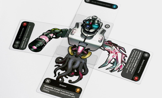
Transparent cards are the heartbeat of the XYbrid play experience. Giving players the ability to overlay parts to build monsters in a visual way is what makes the game distinct and memorable. For most of its life, XYbrid was playtested with paper cards—good for testing mechanics, but ultimately inadequate for making the best impression during demos. As XYbrid evolved, the value of having transparent cards became quite apparent: it would not only prove the concept, but also provide real, tangible objects to showcase on the Kickstarter campaign page .
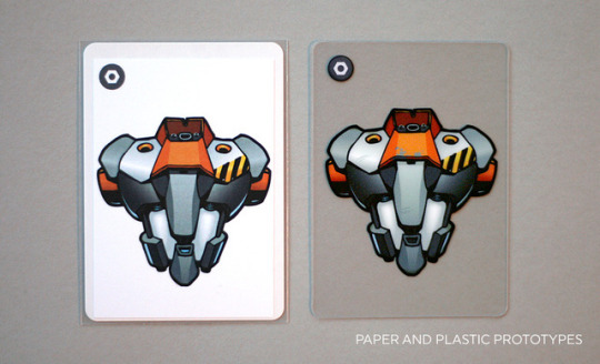
Game manufacturers who could handle transparent plastic printing required a minimum order of at least 500 units; some as many as 1,500. They are sure to do a great job on a true production run, but ordering that quantity pre-funding is out of the question (and counter to the Kickstarter model).
There are short-run game printers who handle any manner of printed paper products (including cards, boards, rulebooks, etc), but clear plastic cards, I came to discover, are not so easy to source. None of the short-run printers I found offered that service.
What I needed was a prototype.
The Challenge
A prototype, as I defined it for XYbrid, has two attributes:
As close to the envisioned final product as possible.
Durable enough to withstand shuffling and contact with hands and tables
Perfectly clear plastic, with the thickness of a typical game card
Two-sided printing with near-perfect alignment front-to-back
Normal color printing plus a layer of opaque white ink, to provide a base for the colors
A tiny print run.
I only needed 15 sets—enough for playtesting, demos, and sending to reviewers.
After finding game production specialists to be a dead end, I started reaching out to my print contacts in the graphic design industry. While most were eager to help, they were unable to solve the problem. Most conversations led to the suggestion that I repurpose a custom gift card product, which is too thick, the wrong size, and the wrong material.
I finally had success with Hopkins Printing in Columbus. They took time to understand my goal and went beyond their normal process to figure out how to do it.
The Solution
The project would be printed on a digital press. Digital presses are built for short runs—think of them as ultra-high capability desktop printers. Hopkins operates a digital press that can print on 15 mil (that’s roughly playing card thickness) clear vinyl, including white ink. Aligning the art on both sides was a struggle. When a human being flips over a sheet to print on the other side, some degree of misalignment is inevitable. If the alignment was off by even a small amount, the art was ruined.

The team at Hopkins came to an ingenious solution: to print all the inks on one side of the plastic, so no flipping was necessary. They would first print a layer of color ink as a mirror image, then the white, then the other layer of color ink, without ever having to move the plastic sheet. Because the material was clear, you would see the mirror image through the back side of the card, effectively un-mirroring the art.

The end result looked and worked great.
Getting Technical: Preparing Art Files
My art files were created in Adobe Illustrator (I highly recommend Illustrator or InDesign over Photoshop for final art for many reasons). Fortunately, all of XYbrid’s art was vector-based (i.e. created in Illustrator) so managing the art all took place in one application. If your art is pixel-based, as many illustrations are, you’ll need to manage your inks/colors in Photoshop and import the images to Illustrator (or InDesign). That’s a bit trickier but the principles described below are the same.
The basic idea is that you are creating two layers for each piece of art: a normal color layer, and a white underlay.
Each card has its own file, and each file contains art for the front and back, on two separate artboards. The art on each artboard is a mirror silhouette of the other—it’s exactly the same shape, and in exactly the same position.
LAYERS
I used layers to stay organized in Illustrator. This method is a lifesaver if you ever need to go back and edit your art (you will).

Safe Area There is no actual art on this layer, just guidelines. These lines mark a .125” safe zone around the edge of the card—I kept all my art within this designated area. This zone assures that any minor shifts during cutting will not cut into any important printing. If your card art “bleeds” (i.e. goes off the edge of the card), you can go into the safe area; just keep important stuff (such as text) out of there.

Dieline This layer holds the outline of the card so the printer will know where to cut. It’s a rounded rectangle with .125” radius on the corners. This layer should also be non-printing.

White All of my elements that are printed with white ink are on this layer. Remember, this is the foundation for all the art you want to be opaque.
IMPORTANT! DO NOT USE THE STANDARD WHITE INK SWATCH. Remember, objects that appear “white” on screen are actually just the color of the surface you are printing on, which in this case is transparent! Instead, create a new, brightly-colored “spot color” swatch and manually rename it “White”. It will look wrong on your screen, but this setup will help the printer understand your intent.
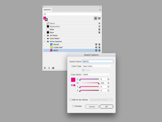
If it seems counterintuitive to have this layer above the colored ink layer, that’s because it is… my printer requested the files be set up this way, with the white objects set to “Overprint Fill” in the Attributes palette. Your printer may request a different layer setup.

Setting “Overprint Fill” lets the printer know the selected object is to be printed even if it appears concealed by another object on screen. This is important because the white and CMYK layers overlap.
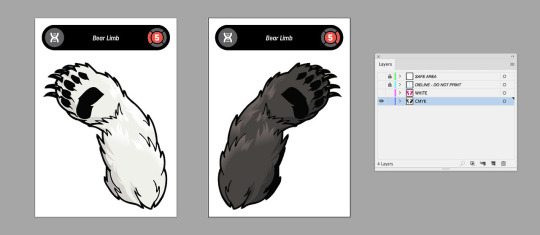
CMYK (Cyan, Magenta, Yellow, Black) This layer contains all the art that uses colored ink. Remember that colored ink is translucent, so anything you don’t want to be see-through should have white overlapping it.
TRAPPING
Accurate alignment of colored printing with white underprinting is super important. However, even with awesomely precise machines, tiny shifts can cause misregistration. If your white layer is exactly the same size and shape as your CMYK layer, these tiny shifts can cause a sliver of white to appear at the edges of your art. If this happens, it looks bad.
You can eliminate this risk by putting “trapping” on the CMYK layer. Trapping is just an extra amount of buffer around the edges of the art to cover up any slightly imperfect alignment. For XYbrid art, I added a 1 pt stroke outline (usually 100% black) to all the CMYK art.

ADDITIONAL NOTES
Having a good, communicative relationship with your printer is critical. This is an unusual job and you must be confident they understand what you want.
Printing this type of prototype is not cheap—estimate it to cost 15 to 20 times the cost per unit of mass-producing a card game. The benefit is that you can order as few as you need, so it’s easier to factor that expense into your budget. For me, proving the concept and having high-quality, photogenic samples was definitely worth it.
In the process we used at Hopkins, the white ink is noticeably thick. It has a texture you can feel. This type of ink is generally NOT used in mass-produced transparent cards (that type of printing uses a much thinner white ink), so there will be a discrepancy between your prototype and final product in this way.
You can try advanced techniques on the white layer, such as gradients, if you want to achieve a fade from white to clear in some areas. For me, this experimentation had mixed results; the thickness of the white ink seemed to hamper the gradient effect.
Comment or message me if you have any questions.
Here’s the contact info for my rep at Hopkins:
Jonell Murphy Hopkins Printing (800) 319-3352 Hopkinsprinting.com
XYbrid is live on Kickstarter through April 20.
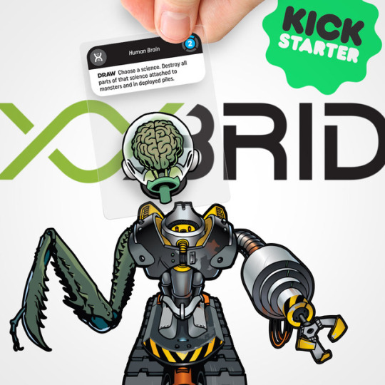
0 notes