#languageproject
Text
Language Research Journal


FORM: This work is just graffiti art on the sides of buildings by Steve Powers.
CONTENT: The artist uses words to convey a various array of messages, some of which are witty and some thoughtful messages.
PROCESS: There are possibly stencils used to get the crisp lettering like in the example to the right. Uses colors and font type of neon signs to catch the attention of the audience.
https://mymodernmet.com/text-art-masters/
1 note
·
View note
Photo

Research Journal #2
Artwork: Indecision and Weakwill
Artist: Winsor McCay
Form: In the drawing, the elephant is chain to the ground while the men in the suits are chain to the big boulder ball. On the boulders, it has words on them and it says “Indecision and Weakwill”. Also, the men in suits are cover up with webs as they were there for a very long time.
Content: I think the meaning of this drawing is don’t overwork yourself or you will not make the right decision, feel weak, and have slow reaction time. The elephant represents to not give up because he’s tired but he’s still standing.
Process: McCay’s process is he started doing handwriting with pencil first then he started to ink over the pencil drawing.
I chose this piece because inking is a media that I want to try for this project and I like comic book art.
1 note
·
View note
Text
Language post-crit response
During the critique, the class talked about a couple things regarding my project. One thing was that someone noticed was that one rabbit was white and the other rabbit was brown, and it reminded them of race and interracial relationships. To be completely honest, I did not think about this before, but I like the connection and the point that was made. This is very similar to what has been going on in society, especially with the Black Lives Matter movement. Also, I know that many people have a hard accepting interracial relationships, but that is mainly because it is different and it was not socially acceptable a long times ago. I personally am not against interracial relationships and I do support black lives. Another thing that we talked about was scale. If we had the critique in person, I would have probably had this printed and hung up. Many people have said that it would have been better to look at it that way, which I agree with them. When working on the final part of this project, I used adobe apps to make sure each frame was straight, each part was placed correctly, and more. Everything was drawn with oil pastels, photographed, and placed digitally.
When talking about it and looking at the project before the changes, I knew that I needed to add more to it. I drew a few new things to add more to the story and the message of the art work. I still used multi-colored oil pastels, and then I transferred them digitally. Before, I had 4 frames, and now I have 6 frames. The first picture in the artwork has the two rabbits, about to fall in love, meeting and looking at each other for the very first time. The second frame contains the bunnies being in love and kissing. In the third one, there is an arrow flying across. The fourth one shows that one of the rabbits was shot by this arrow. In the fifth frame, we can see that the rabbit has dies as a result of the incident and the tree behind it has died along with it. In the last one, it shows the other bunny, which is still alive, visiting the spot that it spent time with the other bunny and witness its’ unfortunate death. The tree in the background is still dead with absolutely no leaves on it. I would also like to add that for the meaning of this project. In many cases, when someone you love dies, a part of yourself dies as well. For future projects, I would like to do more digital and similar to Graphic Design, but I don’t know if I would do any more drawing.
0 notes
Text
Post-Critique Response
One of the strengths of the finished project was that compositionally it was sound. One weakness that O has gathered was my conceptual idea didn’t shine through as well as I had hoped it would. The many interpretations of the finished project were very skewed from the original. That came from me omitting the poem that it was based on. One suggestion that I plan on implementing is the inclusion of words and more importantly the poem that the entire project was based on. I definitely expanded my skills in Adobe Illustrator, with the knowledge I had acquired from Ad127 which I am currently taking and youtube videos. I also learned how to convey strong emotions through images. That’s something that I've never really delved into when creating. Most of my work is straightforward and doesn’t have a lot of emotive messages behind it so, it was interesting and difficult for me to combine two things (art and poetry). I definitely would like to see all of what I can create using my poetry and visual artistic ability. I would take the idea that Professor Wind suggested and try to present the finished project in a different way. She suggested since I drew my inspiration from an album cover to possibly put it on a vinyl cover. So, I might dig deeper into how I can get one printed that way and how it might add to the message.
0 notes
Text
Project Two Ideas
My first project idea involves using text messages between me and my friends, as well as any pictures we have together, showing the story of our relationship through them. This could be done by collaging in a digital or physical way, or they could be painted or drawn. This would most likely be executed on a large sheet of paper. I would like to use either markers or possibly even charcoal. Markers could be used to depict the good in the relationships/text, and the charcoal could be used to depict the bad or messy parts.
My second idea is to show the idea of a political movement through art. The subject would most likely have to do with freedom of speech, possibly involving LGBTQ+ matters. This could be done one of two ways--drawing an image of people in the LGBTQ+ community coming together in a peaceful way and collaging headlines of what good has been done in the community on top of/surrounding the drawing, or it could show some of the worst times that have ever been experienced by those in the community, such as the Orlando nightclub shooting, with negative headlines incorporated into it, showing the loss and hurt that has been endured so as to raise awareness. These two ideas could also be combined, showing a positive image with negative headlines, or vice versa. This would most likely be done with pencil, colored pencil, and charcoal.
My third idea involves wood burning or etching. I want to be able to show an image of unity between women of all shapes, sizes, ethnicity, language, etc. I would like to wood burn the words “girl power” into a wooden board over and over in all different languages, and then have a drawing depicting unity etched into the wood, or vice versa. This could also be done with paint on wood. The idea of wood burning really intrigues me though, as I’ve never experimented with that medium before. I may use a rounded piece of wood, paint an image of something such as hands joining together, and put the words around it. I’d want this to be a fairly large piece, possibly the size of a small side table.
0 notes
Text
Project 2 — Proposal
Form:
This will be a large poster, 18”h x 24”w. It will mainly be done using typography, and very few, if at all, images. It will be printed on matte paper, and framed in black wood. Various texts will form an image of a fence. In one section of the fence, there will be a hole, or break. The words will be very negative the farther away from the hole, and slowly become more positive as they get closer to the hole.
Process:
This will be created in Illustrator, printed, and framed.
Content:
You want out, you want to experience what people outside of your self imposed enclosure are experiencing; you’re trapped behind this fence. However, at the same time, people want what you’re experiencing; they want what you have — they want in. Sometimes we need to take a step back and appreciate what we have. Think about the things that are good in our lives and what we take for granted.
Also, we might be building fences to keep ourselves safe. We end up feeling comfortable or complacent within our confines; the outside world is scary, change is scary. You need to break free, to step outside of your comfort zone to experience life, to grow. To be complacent is bad you need to experience the unknown.
Fences also imply borders, or separations — keep out and stay away. I think in today's society we need to move away from separation. The world is connected in so many ways now that putting up a barrier is not what we should be doing. We need to share ideas, culture, and experiences.
So, breaking free from your “fence” is good for growth. At the same time don’t be jealous of what others have, don’t break into their “fence” for selfish reasons.
0 notes
Text
Project 2: Research Journal #3
Language of Colour, Pink
Rob and Nick Carter
2017

Form - neon tubed lights, mounted on aluminium box.
Content - Each of the words on the pink aluminium box represent something that is associated with the word pink. Like for Lady, red and pink are usually associated with girls and ladies.
Process - I believe that the artists drilled holes through the aluminum, and put the wire through. They bound the wires together with pink electrical tape as well, I’d assume and through the neon lights. But most of the wire work is on the backside of the piece.
0 notes
Photo

Been working on a language video project with the elders and media. Excited to see how this goes. We focused on beadwork, Quillwork and tufting. We will be doing the birds next and finally putting the bag together, all described in the language. It’s been fun. The speakers are always amazed that the techniques are as easy as they are. I mean I always tell them but to actually see me do these things really helped them truly get it. Exciting!!! #LanguageProject #TraditionalArts #MaterialCulture #OldSchoolArts #BrainTanned #BuckSkin #BlueBirds #Floral #Vines #GlassBeads #NativeArt #NativeMade #Seneca #ArtInProgress #I❤️MyJob #UsingTechnologyInLanguageAcquisition https://www.instagram.com/p/BvhNmymlypu/?utm_source=ig_tumblr_share&igshid=1b0d26y0b8cym
#languageproject#traditionalarts#materialculture#oldschoolarts#braintanned#buckskin#bluebirds#floral#vines#glassbeads#nativeart#nativemade#seneca#artinprogress#i❤️myjob#usingtechnologyinlanguageacquisition
0 notes
Note
hey do you guys have any norwegian fics? (:
In my weeks of searching I haven’t been able to find any, but! I’m excited about this ask! I’m planning to sign up as a translator and I encourage everyone else who feels up to it to do the same. Hopefully there will be some in the future!
-Mae
21 notes
·
View notes
Text
QUICK LINKS FOR TUMBLR APP USE
https://emuscfall19.tumblr.com/syllabus
https://emuscfall19.tumblr.com/readings
https://emuscfall19.tumblr.com/readingresponse
https://emuscfall19.tumblr.com/projectideas
https://emuscfall19.tumblr.com/proposal
https://emuscfall19.tumblr.com/artiststatement
https://emuscfall19.tumblr.com/postcritiqueresponse
https://emuscfall19.tumblr.com/researchjournal
https://emuscfall19.tumblr.com/courseschedule
https://emuscfall19.tumblr.com/gradingrubric
https://emuscfall19.tumblr.com/timeproject
https://emuscfall19.tumblr.com/languageproject
https://emuscfall19.tumblr.com/identityproject
1 note
·
View note

Text
Language Project/ Artist Statement

Originally my project was going to be a video that used people who know how to tell stories in a creative way. I was going to have it be shot in the lighting studio and the shirt in the formal interview and have it be super lan originally my project was going to be a video there used people who knew how to tell stories in a creative way. I was going to have it be shot in the lighting studio and be shot in the formal interview and be super bland and mundane but the colorful with words. unfortunately I was unable to carry out there idea for the project. Therefore, I troubleshoot and still had the same idea but in a different medium. My overall theme for the video was going to be poems about love in whatever form or fashion whether that be heartbreak, falling in love, falling out of love, loving someone, loving something, anything as long as it involves love in some form and/or fashion.
My project was created in adobe illustrator. I narrowed in on heartbreak and ran with that idea. I had poems that I created and I took bits and pieces of those to create the concept that I wanted. One palm in particular that was the pinnacle point of how my contact list created was my poem “Side effects of a Heartbreak”. Are use a silhouette of version of myself and placed it in my project to make it more personal as well as using my own forms to function as a foundation of whether idea stemmed from.
0 notes
Text


FORM: This work is just graffiti art on the sides of buildings by Steve Powers.
CONTENT: The artist uses words to convey a various array of messages, some of which are witty and some thoughtful messages.
PROCESS: There are possibly stencils used to get the crisp lettering like in the example to the right. Uses colors and font type of neon signs to catch the attention of the audience.
https://mymodernmet.com/text-art-masters/
0 notes
Text
Project Two Research Journal
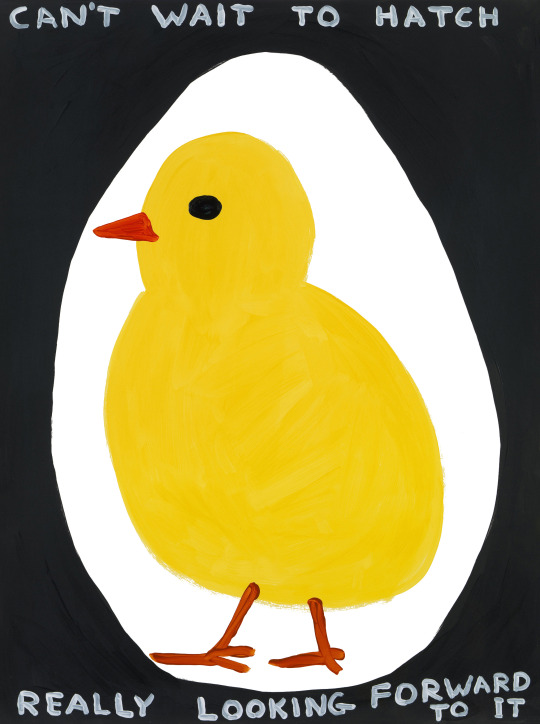
David Shirgley, Untitled (Can’t Wait to Hatch), 2018
http://davidshrigley.com/category/drawing-painting/
Form: This work is created with painting on paper.
Content: There is a chick inside of what is assumed to be an egg, and it is thinking that it can’t wait to be hatched, and that it’s really looking forward to it.
Process: Shirgley most likely painted this using acrylic paints on paper, and put good humor into this piece.
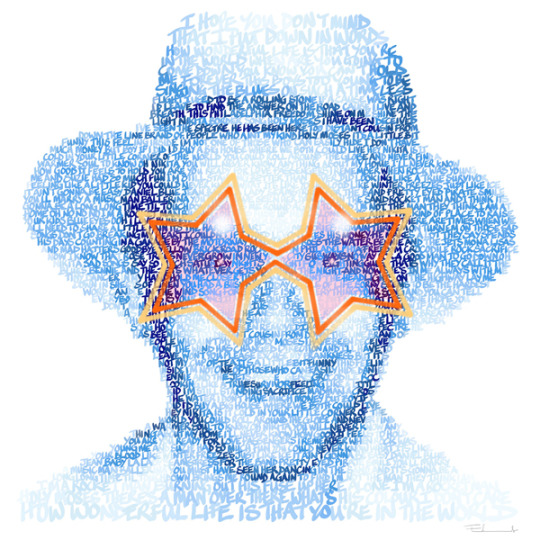
Mike Edwards, Elton John Superstar, date unknown
http://mikeedwards.co.uk/gallery/prints/Elton_John_Superstar.htm
Form: This is a digital typographic image printed on paper.
Content: Using language, Edwards created a portrait of Elton John. He used type that related to his music and his life. The language used here is not the most important part of the work, but it’s form is.
Process: A program such as Adobe Illustrator was used to create this work digitally. It was then printed out on paper and prepared to be displayed and sold.
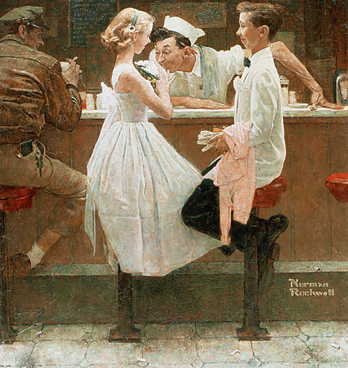
Norman Rockwell, After the Prom, 1957
https://www.nrm.org/thinglink/text/AfterProm.html
Form: This is an oil painting on a canvas.
Content: The story of a couple after their prom is depicted in this piece. You can see the same type of inviting smile on all of the subjects in this painting, giving it an inviting feeling and telling the viewer that the prom went well for all parties involved.
Process: Rockwell used reference images to create this oil painting on a canvas.
0 notes
Text
Project Language — Project Ideas
1. Using nothing but text and color create wired fences using the words “let me out” over and over. Then in one section have an opening and have the text say “let me in.”
2. Create a multi panel comic telling a story without words.
3. Create a triptych using as little words as possible.
0 notes
Text
Project Language — Research Journal
Artists name: Sydlexia (Australia-based dyslexia correction organisation) in partnership with branding and communications specialists BBDO Dubai.
Weblink: https://www.creativebloq.com/inspiration/clever-typography-posters-explain-dyslexia
Form: Printed on newsprint, with jumbled up text printed on it.
Content: Helping explain dyslexia through the use of origami, and text. When unfolded the text is broken up and unable to be read. When folded to resemble the animal, the text is visible. So paper folded into a dog would reveal the text, dog.
Process: Printed as newspaper advertisements, with instructions on how to fold. Once completed the text is revealed, and so is the origami animal that corresponds to the text.
Artists name: Marc-Antoine Mathieu
Weblink: http://paulgravett.com/articles/article/marc_antoine_mathieu http://paulgravett.com//articles2/article_images/Mathieu3-secondesPgSmall.jpg
Form: Black ink on white paper, or digital?
Content: Wordless comic. Nine panels used to convey a story without words.
Process: Either inked by hand, or done digitally on the computer. I don’t know.
Artists name: David Sandlin
Weblink: https://www.uab.edu/news/arts/item/8297-uab-s-aeiva-presents-exhibition-of-works-by-artist-and-alumnus-david-sandlin-from-june-2-aug-20
Form: Triptych. Oil on canvas; 84 inches by 280 inches.
Content: A triptych telling a story about a husband and wife bringing a child into this crazy world.
Process: Oil painted on three canvases.
0 notes
Last Seen Blogs

1qualia1
Qualia_escritorA

100lbsofsalt
All of the salt

dphie-scsu
Delta Phi Epsilon

fromlawithlove-blog
From LA with Love
