#kodak high definition 200
Explore tagged Tumblr posts
Video
Untitled by Gonvsky Tsai
4 notes
·
View notes
Photo


Ulcinj, Montenegro 07/2018
Canon Sure Shot del Sol + Kodak High Definition 200 expired 2005. Shot July 2018. Grainy! but still not bad at all.
#Canon Prima Sol#Canon Sure shot del sol#35mm film#expired film#beach#Montenegro#Ulcinj#Velika Plaza#color film#ishootfilm#buy film not megapixels#istillshootfilm#Lomo#Kodak HD200#kodak high definition 200#grain#film photography#film photograhers#Holiays#sandy beach
3 notes
·
View notes
Photo
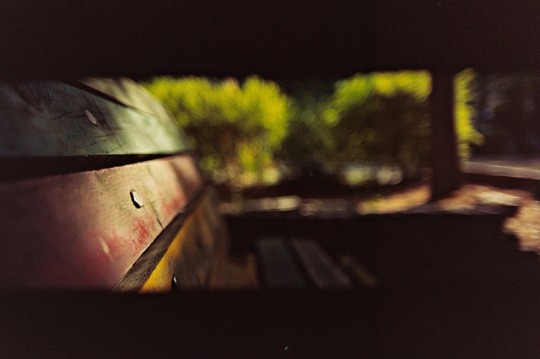
Ends Well...
Vivitar Series 1 MC 28mm/f1.9(M42 Version) + Canon EOS 500(Kiss) + Kodak High Definition 200 Panoramic Mode 36X13mm Size
#film photography#analog#35mm#vivitar series 1#vivitar 28mm/f1.9#canon eos kiss#canon eos 500#panoramic photography#panorama photo#kodak high definition 200#Expired Film#film is not dead#istillshootfilm#original photographers#original photography#photographers on tumblr#seoul#필름#필름사진#필름카메라#아날로그
293 notes
·
View notes
Text

I said I wouldn't do it. I promised myself that I would never go there again. I knew my heart could take it. But in a moment of weakness, (and wanting to clean out the freezer store), I shot expired film again. And I was.... pleasantly surprised. instead of being a majority disappointment, I quite like the majority of these shots.


These came from a roll of Kodak Gold 200, and roll of Gold 100. Shot through the Mamiya 645 of course. Of course there's tons of loss of resolution, color shifts, limited dynamic range, but all together, it's definitely a vibe.
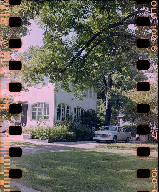
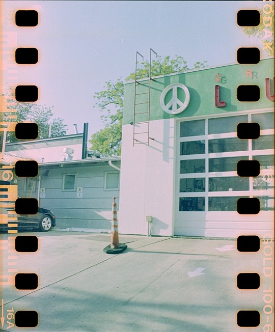
But of course these aren't without their problems. What happened is this: The Mamiya 645, with a 120 film insert, can get 15 shots on a roll. Almost every other 645 camera can take 16. How to get around this? Use a 220 insert, which allows the camera to take 30 shots, so you take your 16 then fire blank shots for the rest of the shots to finish out the film counter. However, the 220 insert isn't calibrated to take 120 film since it has backing paper.

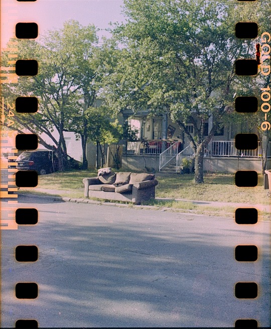
So what I did is I put in a little bit of tape to shim the pressure plate away from the film plane, effectively calibrating the 220 back to the thickness of 120 film. However, I didn't think of this when I loaded in 35mm film into the camera, I didn't remove the shims, and since 35mm film doesn't have backing paper, the film plane was in the wrong place. The result of this is that many of the shots are out of focus.
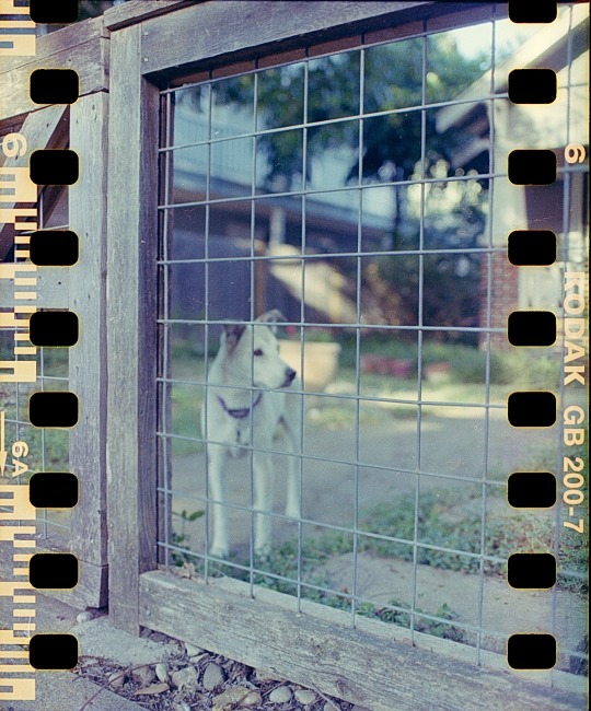
Here's a good example. The dog is out of focus, the fence is in. Or here. Plants are in, car is out.

But having said that. I'm still done with expired film. These few rolls were the last of it, at least the color stuff. Nice to end on a high-ish note though!

#home developed fim#filmsnotdead#filmisnotdead#kodak#kodak gold 200#kodak gold#mamiya#mamiya 645#sprocketshots#austin#atx#texas#expired film#expired 35mm
3 notes
·
View notes
Text
The “film look” in digital - what I’ve learned so far
Let me start this article by addressing the elephant in the room: if you want a real authentic film look, shoot film! There’s just no way around that, no matter how close you can get with digital these days, there’s something about film that digital just can’t touch. I’ve been shooting film sporadically over the last couple of years and I still get a big ol’ smile on my face when I get the scans back from the lab, it’s a very different kind of reward than the immediacy of digital. Plus, the experience of shooting film has been extremely helpful for my digital photography - shooting with an old film camera forces you to slow down, learn the basics of the exposure triangle and focus on composition, as opposed to navigating through menus and letting the camera decide all of the settings for you.
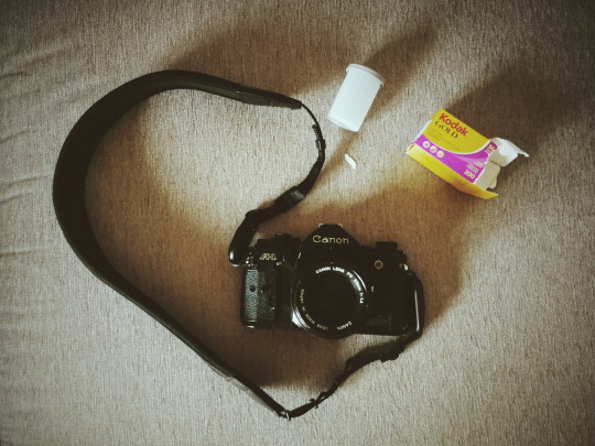
My trusted Canon A1 ready for summer vacations
But of course there are a large number of practical reasons for shooting digital, and at least for my needs and reality shooting film exclusively is just not an option. I shoot digital 95% of the time, but I always strive to make my photos look as “organic” and close to film as possible, because that’s the aesthetic I like the most.
For the purpose of writing this article I’ve questioned myself where does my fascination with film come from, and I guess it’s probably due to the fact that all of my childhood and teenage memories where shot on film. When I think about film I think about long summer vacations, family get-togethers and embarrassing haircuts - in other words, instant nostalgia! And that’s the kind of warm-fuzzy feelings that I want to associate with my photos, so basically ever since I got my first mirrorless camera back in 2015 that has always been my reference.
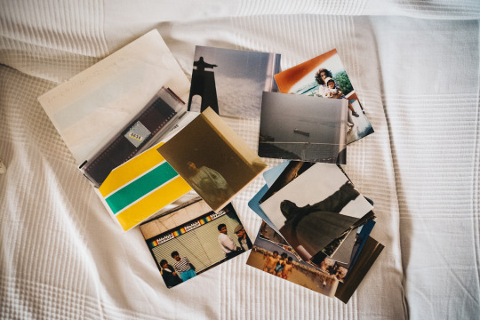
The first roll of film I ever shot when I was around 10, with a tiny plastic 110mm film camera
Over the course of these last 3 years trying to emulate film I’ve tried dozens of different presets for Lightroom, some of them really good, but quickly discovered that these will only get you halfway there. If you apply a film-preset to a perfect digital image file, in most cases you'll end up with a perfect digital image with some vintage tones, but there’s much more to film than that! There are a lot of “imperfections” that come from the limitations imposed by the gear used and the film itself, which have been eliminated in modern digital cameras and just can't be introduced in post-editing.
The best way I’ve found to mimic these imperfections is to actually impose some of those same limitations when shooting digital, so here’s a few tips on how to do that:
1. Use vintage lenses
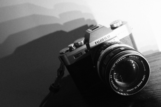
Modern lens are amazing pieces of technology. Most of them offer perfect corner to corner sharpness, great anti-flare coatings, amazing contrast, you name it. But if you're going for that 70s / 80s consumer film look, that's pretty much the opposite of what you need! Lenses back then where far from the perfection we know today, the consumer photography market was booming and there were a lot of different brands coming up with different designs, new materials, new focusing systems, etc. As a result, each lens had its very particular set of characteristics and quirks (sometimes design flaws, really) that got imprinted into every photo taken and ultimately defined its character. A perfect example of this are the Helios 44M lenses: these Russian copies of the Carl Zeiss Biotar became famous for a design flaw that resulted in a very unusual swirly bokeh. Earlier models displayed this effect very pronouncedly, but as they improved the design in subsequent versions that particular characteristic was lost, and that’s why the earlier models are the most sought after nowadays.


That classic Helios 44M-4 swirly bokeh
The good news is that these old manual lenses are (for the most part) dirt cheap and you can use them on mirrorless cameras with a simple plastic adapter, so you can get that specific look they were known for without any need for Instagram filters or post-processing magic! In my next article I'll go into more detail about these vintage lenses and how to use them.
2. Use manual focus
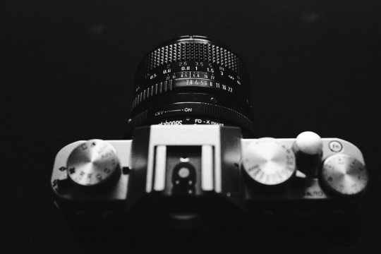
One of the biggest innovations in photography in the late 70s/early 80s was the invention of autofocus. Before that cameras were limited to manual focus, and even when the first AF systems were introduced to the consumer market they were rudimentary at best. Chances are that if you look at your film photos from that period, half of them will be slightly out of focus (or completely out of focus, depending on the competence of the photographer! ;)) But that’s not a bad thing at all, I feel that in most cases it only adds to the nostalgic feeling and can sometimes create an additional layer of mystery.

The missed focus on this one gives it a timeless feel
So if you want that classic film look, switch to manual focus on your modern digital camera or use an old manual lens. Don't be afraid to miss focus sometimes, this was something that took me quite a while to realize and “accept”, and I only did so thanks to shooting film. Some of my favorite photos shot on film are pretty out of focus!

Blurry? Definitely, but the fact that you can’t distinguish their faces makes this so much more universal
3. Use slow shutter speeds
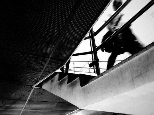
Another limitation of film is the maximum ISO speed available, or Asa as it was called originally. Nowadays our digital cameras have incredibly high ISO sensitivities, but on film the maximum you get is 3200, though most consumer films are rated at 200 or 400 Asa. This means that to get a proper exposure on film you have to use much lower shutter speeds than on digital to get enough light, and as a result motion blur is highly likely. Personally, I love some blur, as it gives a sense of movement to an otherwise static medium. One of my favorite all time photographers, Anton Corbijn, shot many of the world’s most famous bands and musicians on film using slow-shutter speeds, to get some movement in the frame and that extra grit!
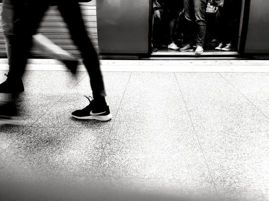
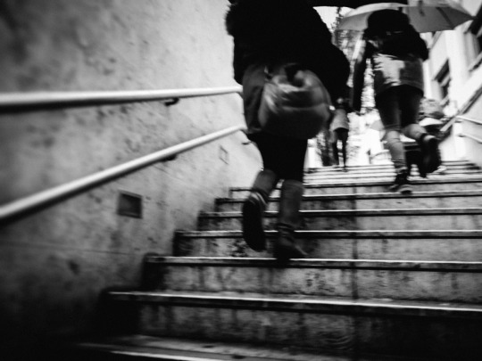
The subway rush - shot on a Huawei P10 smartphone
If you wanna try this out, I would advise to start with 1/30th of a second, look at the results and then adjust as necessary. If you’re shooting in bright sunlight this probably won’t work unless you use a neutral density, but again experimentation in the key.
A little extra tip: smartphones are actually great for this if you turn off the flash, as their small lens aperture and tiny sensor force slower shutter speeds to compensate.
4. Use High-ISOs for authentic film-like grain
This tip is in direct contradiction with the previous one (unless you’re shooting in really low-light), so usually you’ll have to choose between one or the other. It is also a tip specific to the Fuji X series cameras, as I haven’t tested other brands in this particular aspect.
I’m a big fan of grainy photos, it’s one of my favorite things about film. But the technology in digital cameras these days is so good that in most scenarios you’ll get perfectly clean images straight out of the camera. Even though image-editing software has also evolved tremendously in the past few years and can deliver very believable grain simulations, I’ll be the first to admit that it’s not the same as the real deal and it also feels kinda like cheating to be adding fake grain. That’s where the Fuji X-trans sensors come in, in particular their latest iteration X-trans III.
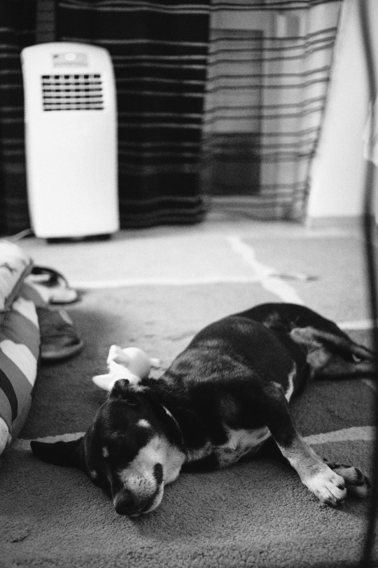
My furry friend shot at ISO 12800
The ACROS film simulation when used with high-ISOs of 6400 and above produces some digital noise that, to my eyes, is very very close to real Black and White film grain - and the best part is that you’re not adding anything fake in post-processing, it’s a real side-effect of ISO just like with real film! So most of the times when I want to shoot in Black & White I’ll use my own Acros custom setting at 12800 ISO and use the SOOC jpegs. This technique also works with color film simulations, but not so well in my opinion.
5. Post-process your photos accordingly

Different films have different characteristics, so it’s important to decide exactly what film look are you going for and learn a bit more about what defines it. Is it a low-contrast or a high-contrast film? saturated or muted? Fine grain or heavy grain? These things will help you understand what you can do in post-processing to get closer to that film look, and most of them are very simple to adjust. Where it gets a bit more complicated is getting the right tones to match the original film stock, but with some investigation and patience it can be done.
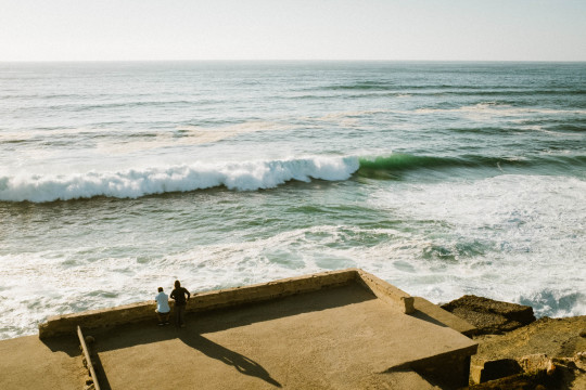
Going for that warm Kodak vibe
Of course if you want to save time you can just buy one of the many film presets out there! Like I said in the beginning of this article they will get you close to the original film tones, so if your base digital file already contains some “imperfections” introduced with the techniques above, it’s as close as you’ll get to the real thing. You can also use in-camera film simulation settings to mimic some film types, which I already covered in my previous article.
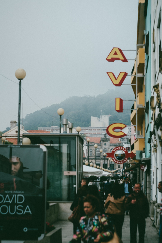
Can you tell which is which?
These are some of the techniques I’ve learned by trial and error mostly, I hope you’ll find them useful if the film look is your thing too. I can’t stress enough that the best thing you can do is to actually shoot film whenever possible, not only it will be great fun but it will surely improve your digital photography as well.
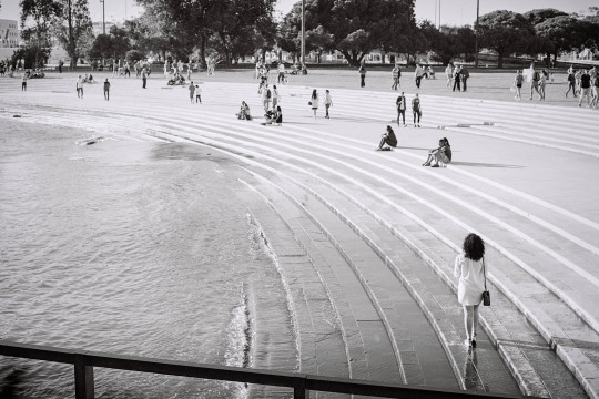
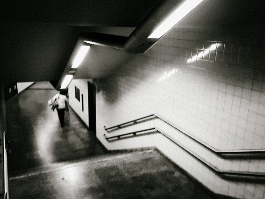
Let’s end this with a fun little game: can you tell which of the photos below are film and which are digital? No cheating looking in the exif data, I’ll post the results in a couple of days! ;)
1:
2:

3:

4:
5:

6:

7:
8:

9:

10:

#photography#film photography#film#digital photography#vintage lens#slow shutter#grain#grainisgood#post processing#fuji#fujifilm#fujifeed#fujilove#fujixseries#fujifilm x-t20#fujifilm x100f#canon a1#canon fd 35mm#helios 44m-4
12 notes
·
View notes
Text
20 Mind-Blowing Reasons Why Best Colour For Room Is Using This Technique For Exposure | Best Colour For Room
For white trim:
To add amore to a rental with a bad lighting situation:
If you’re attractive to balmy up a amplitude with acknowledgment light, opt for a able aloof with balmy undertones like Timeless. Around-the-clock is a buttery and agreeable fair acrylic blush that will blanket your amplitude in amore and reflect ablaze beautifully. A abundant advantage for a rental with less-than-perfect lighting. —Nicole Gibbons
To accomplish baby apartment attending bigger:
Paint your beam a aside blue. It lifts the beam in beheld perspective. —James Farmer
Current Affection is the arctic adverse of the “safe neutrals” bodies tend to approach towards, but it’s a rich, adult blush absolute for bringing ball to a baby space. A around-the-clock aloof beige, like our Aloof Territory, is additionally the absolute blush to advice accessible up a baby amplitude like a
20 Mind-Blowing Reasons Why Best Colour For Room Is Using This Technique For Exposure | Best Colour For Room – best colour for room | Encouraged to be able to my blog, in this particular occasion I will explain to you with regards to keyword. Now, this can be a first impression:

Living Room Blue Paint Colors Ideas Drawing Fascinating Design .. | best colour for room
Think about impression over? will be that will remarkable???. if you think maybe thus, I’l d explain to you a few picture once again underneath:
So, if you want to receive all these awesome pictures related to (20 Mind-Blowing Reasons Why Best Colour For Room Is Using This Technique For Exposure | Best Colour For Room), press save link to download the images to your personal pc. There’re ready for transfer, if you’d rather and wish to grab it, click save badge on the post, and it will be directly saved to your computer.} At last in order to secure unique and the latest graphic related to (20 Mind-Blowing Reasons Why Best Colour For Room Is Using This Technique For Exposure | Best Colour For Room), please follow us on google plus or save this page, we attempt our best to present you regular update with fresh and new shots. We do hope you love keeping here. For most updates and latest information about (20 Mind-Blowing Reasons Why Best Colour For Room Is Using This Technique For Exposure | Best Colour For Room) pics, please kindly follow us on twitter, path, Instagram and google plus, or you mark this page on bookmark area, We try to give you update regularly with fresh and new shots, enjoy your exploring, and find the perfect for you.
Thanks for visiting our site, contentabove (20 Mind-Blowing Reasons Why Best Colour For Room Is Using This Technique For Exposure | Best Colour For Room) published . Nowadays we’re delighted to announce we have discovered an incrediblyinteresting contentto be reviewed, that is (20 Mind-Blowing Reasons Why Best Colour For Room Is Using This Technique For Exposure | Best Colour For Room) Lots of people trying to find details about(20 Mind-Blowing Reasons Why Best Colour For Room Is Using This Technique For Exposure | Best Colour For Room) and definitely one of them is you, is not it?

Best Paint Color for Living Room Ideas to Decorate Living .. | best colour for room

A deeper look at the world of High-End Italian furniture design – best colour for room | best colour for room

20 Best Color Schemes for Your Bedroom { Deep ocean + Teal + Mauve .. | best colour for room
Daycare – best colour for room | best colour for room

entryway, foyer and stairwell decorating ideas. Behr .. | best colour for room

Best Plants For A Bedroom – best colour for room | best colour for room

What is the Best Paint Color for Dark Rooms? | WOW 20 DAY PAINTING – best colour for room | best colour for room

Interior Front Door Paint Color Ideas Colour Bedroom Best Colors .. | best colour for room

The Best Colours for Bedroom Walls | Houzz AU – best colour for room | best colour for room

St Peter’s Basilica Vatican City Rome Italy – best colour for room | best colour for room

Architectures Design Ideas Inspiring Winning Bedrooms Wall Colour .. | best colour for room

Best Paint Color for Living Room Ideas to Decorate Living .. | best colour for room

Best Colour For Large Living Room Color Combinations Walls Rooms .. | best colour for room

Best Paint Color for Living Room Ideas to Decorate Living .. | best colour for room

Bury St Edmunds Cathedral – best colour for room | best colour for room

how to make a dark room, family room or basement feel .. | best colour for room
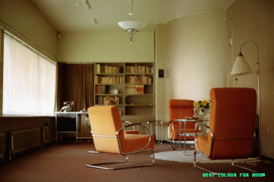
Untitled. (35mm) | Kodak ColorPlus 200 | best colour for room

20 Best Bedroom Colors 20 – Relaxing Paint Color Ideas for Bedrooms – best colour for room | best colour for room

Best Paint Color for Living Room Ideas to Decorate Living .. | best colour for room
from Wallpaper Painting https://www.bleumultimedia.com/20-mind-blowing-reasons-why-best-colour-for-room-is-using-this-technique-for-exposure-best-colour-for-room/
0 notes
Text
Production Journal - GQ
060320
The final presentation of my photographs for this project should be appropriate for a men’s lifestyle magazine. GQ is a publication that would print an editorial shoot of this nature and I shall use it as a case study. The magazine’s focus is fashion, style, culture, fitness, music, travel, sports and technology for a male market. An article by photographer Matt Martin is the basis for my project and I will consider the requirements of print and digital platforms.
Gentlemen's Quarterly (GQ), formerly Apparel Arts, started as a men’s fashion magazine for wholesale buyers and retailers. It was launched in 1931 in the US for a limited run; however, its popularity promoted the advent of Esquire Magazine and other publications that built upon its success. Apparel Arts was rebranded as Gentleman’s Quarterly in 1958. The acronym GQ followed in 1967. It was later acquired by Condé Nast, who added articles beyond fashion. Various editors have influenced the reader base over the years - Nonnie Moore as fashion editor dressed up the pages to make the content approachable yet aspirational then Jim Nelson attracted younger and more casual readers. Finally, the term ‘metrosexuality’ was coined in response to the lifestyle that GQ promoted - ownership of an impulse to shop for high fashion. It is thought to trace back to a Mark Simpson piece for The Independent via his book Male Impersonators (1994), ‘The promotion of metrosexuality was left to the men's style press, magazines such as The Face, GQ, Esquire, Arena and FHM, the new media which took off in the Eighties and is still growing. They filled their magazines with images of narcissistic young men sporting fashionable clothes and accessories. And they persuaded other young men to study them with a mixture of envy and desire.’ (Condé Nast, 2020)
Matt Martin is a New York-based photo editor and photographer. At GQ Magazine he has held the positions of senior visuals editor and visuals editor from 2015 to 2019. As a former e-commerce and product photographer, there is characteristic precision to his style - colours are true to life with lighting that elevates the subject to appear pristine. In an editorial shoot with boxer Deontay Wilder, Martin worked as part of team involving a stylist, cinematographer and video editor. As a showman and undisputed champion in his weight class, Wilder has many visual traits that are the subject of tropes - a gold studded mask, crown, jewellery and boxing gloves. The styling of the shoot reflects his passion for luxury and he wears Bottega Veneta, Dolce & Gabbana and Versace. In the video footage, the sitter is playful yet physical. Poses are clearly those of a boxer as he flaunts his form. The lighting is low-key with a background that falls into darkness. A soft key light, absent fill light and carefully placed back light emphasise the broadness of his shoulders and angular musculature. Metallic-based textiles and a black skin tone complement these creative choices. Cropping is bold in the video footage and high key still images. There are some full length and profile shots; however, cropping at the chin to frame his golden chain and presenting a lone tattooed fist are signifiers that are all unmistakably Wilder. (GQ, 2019)


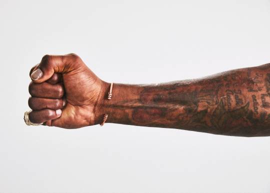
Matt Martin, Deontay Wilder, 2019
Summary
The list of photographers and cinematographers that I have blogged about for this project is extensive - Smith, Andrew, Refn, Sigel, Norwood and Kander. Martin is being added for his clean-cut editorial approach. The opening sequence of my series will aim to recreate his low-key Deontay Wilder lighting that I have described. It champions the look that GQ has come to represent. Back lighting exaggerates the masculinity of a subject because angular features become more pronounced. Reflective textiles in this shoot were successful and Ben’s red jacket should create a similar outcome. Acting in combination with the lighting, a sense of the luxury will be inferred. The innovative cropping is effective for Wilder as he has characteristics specific to him as a boxing personality. Ben and I shall search for framing that defines him. Furthermore, there needs to be some dominant statement expressed with his drumsticks.
Production Notes
I have worked as a portrait photographer for the past eight years. Studio Photo Gallery is my preference of studio space. It is compact and well equipped for photographers on a budget. The owner provides Elinchrom heads with a variety of modifiers. Ben arrived with his clothing, drumsticks and hair product to prepare for the shoot. I set up the lighting as shown in the diagram. It refashions Martin’s design almost directly. There was a head with a soft box camera left and black polyboards either side of it. This prevented flare into the lens and flagged light from the background. A head with a snoot was placed camera right at an angle. Again like Martin, a hard back light enhanced Ben’s masculine characteristics. Finally, the black paper background was a few metres behind him. This imposed several stops difference between the subject and background, ensuring a pure black aesthetic.
My professional studio settings are f8.0, 1/125s and 100 ISO. I feel that this gives me the optimal performance of my lens and camera - Nikon D750 and 50mm lens. It is natural for me to work with people and empower them to present their personality. Ben had several ideas for poses. We started casually with his arms by his side and at an angle to me. There are variations between him looking at the camera and away. The way that he held the drumsticks came from him. Making a cross was aggressive and purposeful. We felt that worked well. Reaching with a single stick straight into the lens was another successful composition. I rejected poses that seemed forced, although I did not communicate this at the time. My final images have been retouched on Photoshop. His hair was reshaped and trimmed to remove any fly aways. His skin is free of most blemishes; however, I left some to maintain a rugged appearance. Otherwise there is relatively little post-production and the look I was attempting was captured as practical effects.
In a second phase of the shoot, I began to take more risks and to work outside of my comfort zone. I mounted my Nikon D750 and 50mm lens on a tripod and attempted long exposure motion blur. After many test shots the most efficacious combination was f8.0, 4s and ISO 200. If the shutter speed was too long then forms clumped together. If it was too short then there was no trace of a blur. Since my Mamiya 645 with 80mm lens is analogue, I had to wait until the film was processed to see if I was successful. The Kodak Professional Ektar 100 that I loaded performed admirably. It was pushed a stop to 200 ISO to reproduce the digital test shots. My lighting design was comparably simple. The head with a snoot was switched off and the head with a softbox had a range of gels taped to it. It was used as a constant light with the flash unit off and the modelling light switched on. Finally, a domestic table lamp with an open bulb was positioned under it. This had a contrasting gel taped to it. Red and blue was my preferred choice of gels. When it came to the movement, I asked Ben to be seated and to drum on his thighs to give the impression that there was a drum kit present. Music was played loudly and it was interesting to watch the movements that he would make. In the end, we selected several heavy metal tracks for him to drum to. Head banging added an extra dimensionality to the action. This definitively condensed the spirit of his music into a selective range of shots. It was Ben who suggested spinning the sticks in his hands and cropping him out. With practice he could hold still for 2s and then spin for the remaining 2s on the same exposure. This is how the solid outline of his hand was created with cyclical distortion appearing to emanate from it.
Using Photoshop, I pulled the saturation and vibrancy down on scans of these negatives. The grain gives the images a warmer and more vintage feel than a digital alternative. There was some clone tool used to remove excess blur, otherwise I felt it was necessary to preserve their rawness. A mock up magazine spread was created in the same vein as GQ. I kept the graphic design motifs minimal and made suggestions for where text could potentially appear. Each photograph is a different size to be indicative of the frenzied nature of drumming - back and forth, round and round. Ben is identified as a hand with a drumstick and two blurred profile images. I selected these latter shots because they were still identifiable as him amongst the chaotic blurriness.
Bibliography
Condé Nast (2020). GQ. Condé Nast. Available from www.condenast.co.uk/gq [Accessed 10/04/2020]
Martin, M. (2020). Deontay Wilder Always Prefers the Knockout. GQ. Available from www.gq.com/story/deontay-wilder-tunnel-style-profile [Accessed 10/04/2020]
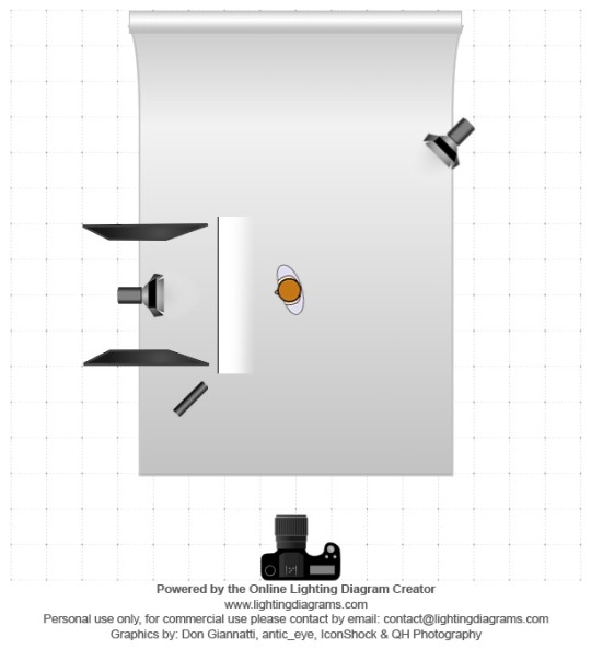
Lighting Diagram


Digital Shoot, f/8, 1/125s, ISO 100
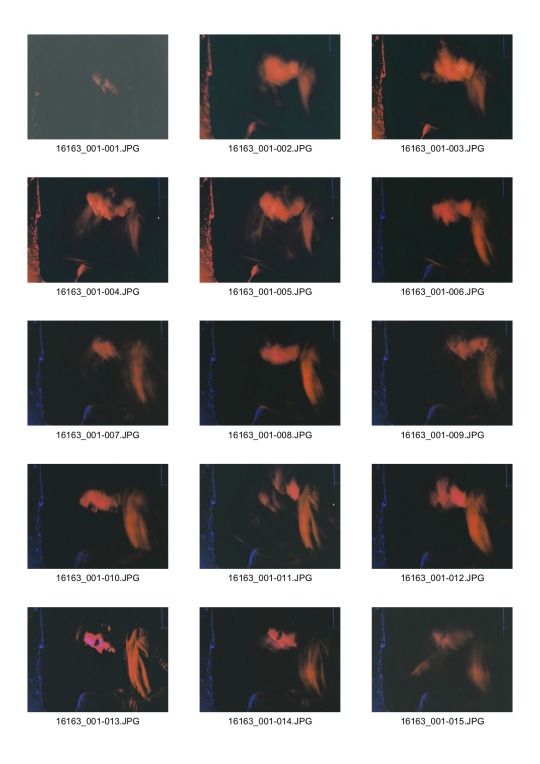
Contact Sheet 01
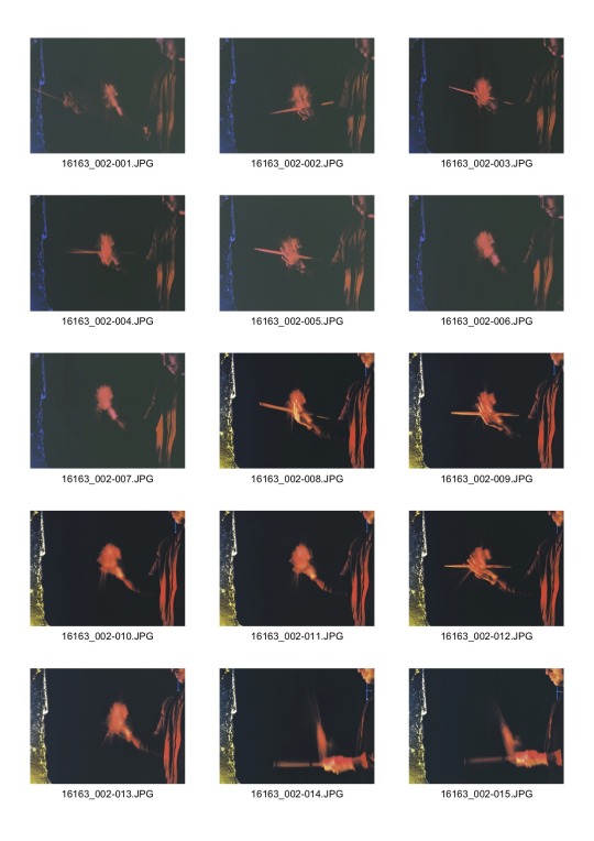
Contact Sheet 02
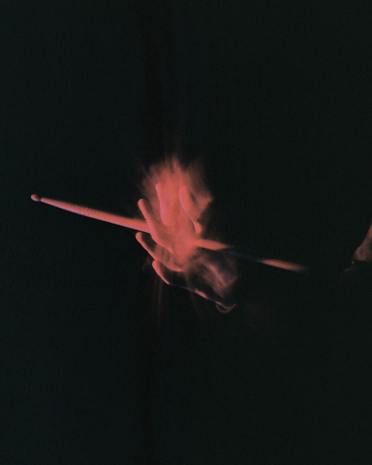
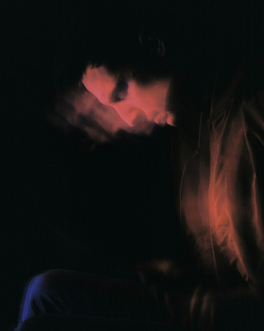
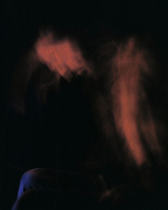
Analogue Shoot, f/8, 4s, ISO 200

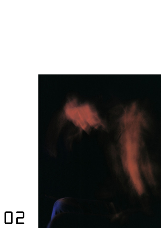
Mock Up
0 notes
Text
The Printer’s Dilemma: Choosing Resolution and File Sizes for Printing Vinyl Banners and Images
One of the most confusing things for someone new to graphics printing is just how to determine the ideal resolution for different size images. In this blog we’ll go over exactly how to choose the right image quality in order to make the best-looking end product possible — in a variety of different media. For more information on finding a resolution that fits your project to a “T” and to learn more about Graphics Printing NYC, please follow this link.
First, let’s go over a few basic definitions of printing/imaging terms you need to be familiar with:
Pixel: Pixel is an abbreviation of “picture element”. Just as your body is made up of cells, it is the smallest component that makes up an image on a screen.
Dot: A dot is the smallest building block that makes up a printed image.
Print Resolution: Print resolution, also known as “image resolution”, describes the quality of a printed image. This quality is measured in either pixels or dots per inch of print. The larger the number of pixels or dots is, then the higher the image quality.
Digital Resolution: Similar to print resolution, digital resolution refers the quality of a digital image as seen on a screen. The digital resolution value is normally expressed in pixels per inch (we’ll discuss more about pixels per inch soon).
Image Dimensions: Image dimension tells you the number of pixels contained in both the width and height of an image. For example, a monitor with a full HD 1080 digital resolution uses image dimensions of 1920 x 1080. This means that the display will contain an image width of 1,920 pixels and a height made up of 1,080 pixels.
PPI: is an acronym that stands for “pixels per inch”. This measures the digital resolution of an image.
DPI: Stands for “dots per inch” and measures the printed resolution of an image.
Megapixel: A megapixel is a unit of measurement equal to over one million pixels. One example of this is how it is used to describe the quality of images produced by a digital camera. An Eight Megapixel camera will normally produce image dimensions of 3266 x 2450.
If you multiply 3,266 x 2,450 you get 8,001,700 — or just over 8 million pixels.
PPI vs. DPI – Which is the right term to use?
PPI and DPI are often used synonymously. However, they are technically not the same thing — although the difference can be considered subtle and a fuzzy overlap does exist between the two. While DPI can be used to exclusively refer to a printed image — which is literally made up of dots — it is often used interchangeably with PPI when discussing digital images. For the sake of consistency and brevity, we’ll solely be using the term “PPI” when referring to resolution quality in this article.
Print vs. Digital Resolution Quality
Generally speaking, 300 ppi is considered the golden standard resolution for printed images, while 72 ppi is the standard resolution you’ll see on most websites and social media. This is precisely why you should never simply upload images from the web and expect them to produce a high quality print. Webmasters and site developers are concerned about download speeds and will therefore always use the lowest possible resolution that will look acceptable on a smart phone screen up to an average-sized computer monitor. Digital resolution at around 70 ppi will appear pixelated and blurry.
However, even if an image starts at 300 ppi at a particular size, enlarging it will lower the resolution quality. This is why image dimensions are so important. For example, a 320 x 240 image will look acceptable on many screens and print as a good-looking 2 x 3” sticker — but a 5 x 7” sticker in the same dimensions will come out as a pixelated mess.
The following dimensions are the minimum image dimension recommended by the film and camera product manufacturer Kodak for the following size prints:
Print Size
Recommended Minimum Image Dimensions
2.5” x 3.5” (Wallet size)
320 x 240 pixels
4” x 6”
640 x 480 pixels
5” x 7”
1024 x 768 pixels
8” x 10”
1536 x 1024 pixels
16” x 20”
2980 x 2384 pixels
20” x 30”
4470 x 2980 pixels
Large Format Printing Resolutions
Following the logic of these trends, you would probably assume that as you go larger, your print resolution will also need to be increased. That’s actually not always the case. For example, a large billboard above a highway can have a resolution as low as 1 ppi. Why is that? Because the resolution quality will depend on how far away the viewer is. The further way your audience is, the lower the resolution quality can be. In fact, some billboards have such a low print resolution the dots can actually be seen with the naked eye from close up!
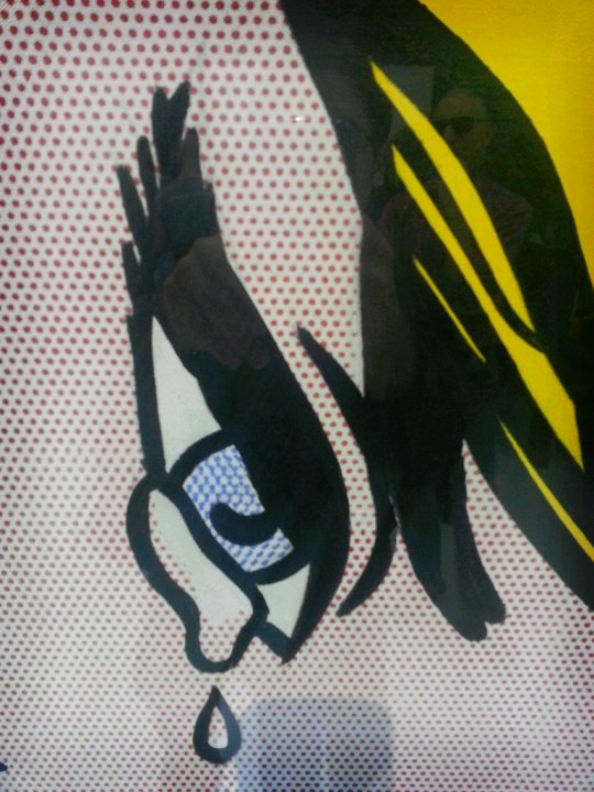
From close up a billboard can resemble a Roy Linchestine illustration
The following is the recommended print resolution qualities for images, from a range of different viewing distances:
Viewing Distance
Recommended Minimum Resolution Quality
0.6 m / 2 ft
300 ppi
1 m / 3.3 ft
180 ppi
1.5 m / 5 ft
120 ppi
2 m / 6.5 ft
90 ppi
3 m/ 10 ft
60 ppi
5 m / 16 ft
35 ppi
10 m / 33 ft
18 ppi
15 m/ 50 ft
12 ppi
50 m / 160 ft
4 ppi
60 m / 200 ft
3 ppi
200 m / 650 ft
1 ppi
As you can see, while the latest digital ink jet printers can crank out resolution qualities of more than 2,000 PPI, that’s a far higher image resolution than most projects will require — even when it comes to larger size prints. A professional print shop will adjust the print resolution based on the exact application of each job — including not only the project’s size but also the location of its intended audience.
File Size vs. Image Resolution vs. Image Dimensions
File size is another term that, while related to resolution quality, is not the same thing — although file size and image quality are sometimes used interchangeably. In general a higher quality image will require a larger file size than a lower quality image — but resolution by itself isn’t enough to describe the quality, or the file size for that matter. For that you need the dimensions, aka the actual size of the image. Let’s use a 300 ppi image on an 8” x 12” print as an example and determine the file size.
If there are 300 pixels per inch then an 8 x 12 will be 2,400 pixels (8 x 300 = 2400) x 3600 pixels (12 x 300 = 3600). To get the file size you simply multiply the image dimensions.
2400 x 3600 (dimensions) = 8,640,000 pixels (file size)
If you look back to our definition of megapixels, the file size can also be expressed as 8.6 megapixels.
For more information on how to print or submit your own designs for commercial-grade large format printing, please visit the Signs NY Graphics Printing page, call (718) 453-8300, or simply fill out this form for a free quote.
0 notes
Text
it's sad how many shitty people stories i've collected over the span of like two weeks
Some gems of a customer I have had recently:
The lady who comes up to my counter with a couple of basic-ass mechanical pencils and DEMANDS the date the sale on them ended, since ofc, “these were on sale just a couple of days ago!!!!” Our sales mostly run weekly, so I explain they had ended the night before (Saturday) and we had put out new sales for this week already (Sunday). Lady gets huffy, refuses to buy full-price mechanical pencils. Whatever.
The old cranky lady who is shocked by the obscene .14 cents a page charge for full-service black and white copies, and says as she’s flouncing her ass out the door, “Next time I’m going to [competitor]; they’ll do it for free!” Like, good, we don’t want your cranky ass and also that’s probably why they’re going out of business?!?? Also it’s cheaper if your dumb ass could figure out how use the self-serve machines.
The lady who tells me she has a tax-exempt code for our local university AFTER the transaction has processed and I can no longer go back. Of course, she that means she also has contract pricing she neglected to mention. I tried to do a “return” and re-apply the code, took me two tries due to how the system is set up, but didn’t seem to work, manager came and got it figured out in the end. THEN she comes back like a day later and says she got the contract pricing but not the tax removed after further receipt inspection, needs it removed per her employer. Very snippy the whole time, as if it wasn’t HER fault she didn’t tell me about her exemption at literally any stage in the transaction until I couldn’t do anything about it. Different manager was working when she came back, and I don’t know what he did, but after I figured out how to fix the problem, had to do a bunch more fixes because he somehow made it worse until I had explained what had happened initially, because Lord knows, the dumb lady didn’t fucking understand anything, so I’m sure she couldn’t explain properly.
Annnnnd this one made me and my manager laugh so hard we couldn’t stop for a solid minute: lady calls just before 2pm, asks about having flyers made. I tell her we do make flyers, and she asks if we could bundle them by grade level for this event. I tell her probably, but it might take longer if so. She asks how long, because she needs them done by 4pm that day. I’m already thinking it’s not happening since a) both our full-time regular print employees are no longer employed and b) I know they’ve been swamped back there all day. So I ask how many she needs, saying, if it’s a small amount, we might be able to do them by four. She says, oh it’s not a small amount. I ask again how many. She says five or six…THOUSAND. That’s right, she thought we could do 5 or 6 THOUSAND flyers in 2 hours with no notice or prior design work or anything. I told her, definitely not happening, sorry. She says okay, hangs up, and I die laughing at the sheer IGNORANCE. I knew she’d probably be calling every print shop in town asking and they were all gonna tell her IMPOSSIBLE in that timeframe. AND THEN SHE CALLS BACK. Maybe 10 minutes later. Asks if we could do 400 flyers…I check with the print people, they say no not with what they’ve already got going on and with her not even being there yet or anything. She then sighs very heavily, asks about 200…we probably could have done, but my manager said to tell her no, since we did have four fairly large projects ahead of her and it was such short notice. It’s just so wild she thought she could have hundreds, or even thousands, of flyers printed in two hours anywhere. Serves her right though, for leaving something so heavy to the last minute. Also, she was with a swim team, and I don’t know why any high school/middle school swim event in this small city would need THAT MANY DAMN FLYERS. Like 200 probably would’ve been a lot.
Dude comes in wearing straight-up white suspenders, red and white gingham shirt, and the classic turned-up-end mustache and hipster beard combo. I was cringing internally watching him walk in, because he was trying SO HARD TO BE COOL. But whatever, you wanna be a hipster douche, be a hipster douche. He comes up after a while with a basket full of envelopes, and I ask him if he found everything okay. He starts asking me about fancy, large size paper, but I can barely pay attention due to his put-on faux-British accent. I was stunned, because I could tell it wasn’t real from the first few words, and I couldn’t believe what I was hearing! I send him back to the paper aisle, where my manager is waiting to assist him, and after he leaves, I ask over the radio, “That guy’s accent was totally fake, right?!” and she starts agreeing immediately, and laughing, of course. The best part? He didn’t even buy his “AHN-vehl-lohpes”!
Old dude comes in asking where our paper is, and I immediately offered the 2 for 10 paper that was right there at the register, since a) it was there and b) we do get spiff money for it. He says his wife wants something thicker than a regular piece of paper, so I proceed to tell him aisle one and watch him head that way. He pauses and looks confused right at the aisle, so I go and try to help him. Even though the aisles are numbered and aisle one is the last aisle before the end of the building, he couldn’t tell the difference between aisle 1 and aisle 3???? Anyway, I lead him to all the paper, and explain how 20 is the standard weight (and what was up front) so he probably needs the next weight or two up, like a 24 or 28 if he wants something slightly thicker. He of course, hears only the word, “standard” so he’s all, “well if it’s the standard, that should be fine,” despite my explanation to the contrary. He doesn’t know what the specific weight his wife wanted, doesn’t even know if he has an inkjet or laserjet printer, claiming it doesn’t matter (um yes it does?? If you buy the wrong kind your prints won’t work or will look like shit????). Explain the weight thing to him like three more times. Finally he goes back up front and buys the spiff paper, which probably wasn’t what his wife even wanted but whatever. I tried.
A lady comes up and asks for a price check for a large, plastic desk calendar. I scan it, tell her it’s 29.99 or something like that. She asks if the price is wrong, if it was supposed to be on clearance since she “found it on the back wall.” Now we do have clearance back there but also regularly priced stuff and it’s pretty clearly marked. I try to check using my mobi (scangun thing) but it of courses freezes so I just ask my manager over the radio. While I’m waiting for a response, I try to explain that it’s probably not on clearance, which pisses her off because it had like July 2016 through 12/16 on it, even though the other side had all of 2017 also?? She says, “If you want to sell it to me it better be, because I’m not paying that much for half a year!” even though I really don’t care whether she buys it (along with like 3 other calendars) and it does have all of this year and if you put it on a desk or a wall you wouldn’t even see the 2016 bits. Ended having the manager take off 50% for her–sooooooooooo not worth it.
Dude comes in, and he’s been in before and kind of hard to deal with ‘cause he can’t really hear and gets mad that I have to explain things a few times before he gets it, but whatever. He asks for a part for his Kodak camera. Now, we sell like 3 digital cameras and almost no accessories, all of them are Canons and we don’t sell parts for anything electronic that isn’t like a universal charger or an hdmi cable or something. Also, I think Kodak is like out of business now??? Or at least they don’t make or sell cameras anymore, let alone parts for what is probably a fairly old model. So I explain, as best as I can, that not only do we have nothing like what he’s looking for, and we don’t sell any Kodak brand stuff, but Kodak may not be able to help him due to their phasing out of camera selling. Of course, I have to explain several times, with interruptions as he keeps trying to explain what he needs even though I already had listened to him tell me several times as well. Then, once he understands we don’t sell his product, asks me to contact Kodak so they can fix his camera, and I’m just like, dude. I don’t have Kodak’s number or any contacts and we don’t send stuff to them. I have no way of helping you and I’m sorry about that, but did you really expect your local office supply store to have direct contact with a bankrupt company whose headquarters are who knows where so your camera can get fixed????
Lady comes up and sets her kid on my counter, dirty shoes and all, a kid who is definitely old enough to stand up for a minute while she pays, at least three or four. He keeps trying to grab stuff we have for sale at the register, my phone, etc., and she snaps at him a few times but is completely ineffectual. I’m already just annoyed about that, then she chooses to pay with Paypal, and like everyone else who tries that, gets mad when she doesn’t know her PIN and therefore can’t use Paypal. Acts like it’s my fault I can’t bypass it somehow. Mumbles “that’s r*tarded” under her breath, which is not only offensive, but it’s like, hon, you gotta have some way to verify your Paypal account/identity so your shit doesn’t get hacked/stolen. Get a Paypal card or learn your PIN.
Dude who tries to buy some Quickbooks software which is expensive, pulls out a card that’s clearly been through the wringer–completely faded, worn out looking strip, etc. It doesn’t have a chip, so he must swipe. It’s not really working but he’s getting angry and just repeatedly swiping really fast over and over before the machine even beeps and says it can’t read it. Asks if we can input it manually, I say no. Tries swiping again, doesn’t work asks again about inputting it by hand, asks if a manager can do it. I explain we don’t have any way of doing it, manager or no, because the pin pads or system or whatever have removed that functionality completely, which was definitely something handed down from corporate. He gets red in the face and says, “well you guys just lost a 350 dollar purchase! I’m going to [competitor]” I’d be willing to bet his shitty, maltreated, obviously in need of replacement card didn’t work there either. What kind of grown ass adult tries to blame that shit on a cashier/store when it’s obvious you just are too lazy to get your card replaced. IIRC, it was a local bank, too, so totally easy to do.
Lady comes in asking for sheets of printable personal checks. She has some generic brand box of her old product with her, which we don’t carry, but we do have exactly the same thing, compatible with the same softwares, just under our store’s-own brand. I tell her like 5 times it’s the same thing as what she has had (comparing the two boxes directly and pointing out the specifics), but of course she doesn’t really understand or know what she has/wants and doesn’t believe me. Makes me open the package and show her before she finally is satisfied, but ofc, the moment I show her our product she goes “oh! That’s exactly what I need!” Like yeah, I know, I just spent five minutes telling you it’s the same thing.
Dude comes in asking for 30-day notices, I run to grab one and realize there’s a few different varieties, run back to ask what kind, get a vague “tenants” reply and have to guess. I luckily grab the eviction warning one which is the one he wanted, but then he gets upset that it only comes with one in the package. Now, I’m not sure of the legalities of photocopying those types of things, since it’s kind of an official thing or whatever, so I don’t mention copying it in-store, but I do let him know it comes with a digital download so he can print as many as he needs. He doesn’t have internet, apparently, so I explain that the one I brought is all they’re sold as, singles + the download but he could maybe use the library and print for free there? He did buy it but it’s like, dude…figure it out or don’t buy it but don’t get upset over something digital because it’s 2017 and that is a thing. Also how many tenants are you sending 30-day eviction warning notices to at a time anyhow???
The old dude who interrupted himself halfway through telling me his phone number rewards to tell me all the things he’s bought recently while I stood there with a fake smile waiting to input the other four digits while he rambles on.
And I swear to whoever, if I hear any more complaints about the price of faxes, chair mats, or ink, I am gonna Do a Murder. Learn how to email if you don’t like paying for expensive faxing! If you can afford an expensive chair (i.e. the ones that actually need the mats) then you can afford the mat. Otherwise, you probably don’t need one. And yes, ink is expensive–so print at the library for free! Or buy a cheaper printer that takes cheaper ink! Or get a freaking laser printer so you only have to buy toner once like every nine months so even if it’s expensive it’s more worth it! But I don’t set prices! Nobody does! It’s all corporate controlled! We don’t even get to pick our own air conditioning levels! Stop complaining to me and arguing with me, a part-time cashier who works in a store over two thousand miles away from headquarters, about the damn prices!!!!!!!!!
162 notes
·
View notes
Video
Untitled by Gonvsky Tsai
0 notes
Video
是否該來台? by Tai Via Flickr: MINOLTA XE / MINOLTA MC ROKKOR 58MM 1:1.2 / Kodak High Definition 200(Expired 51 months)
0 notes
Photo

Ours Everyday
Contax RF Carl Zeiss Biogon 35mm/f2.8 + Contax IIa + Kodak High Definition 200(Expried 06/1999)
#film photography#analog#35mm#35mm photography#Rangefinder#contax rf biogon 35mm/f2.8#contax#contax iia#kodak#kodak high definition 200#Expired Film#original photograpers#photographers on tumblr#artists on tumblr#Street Photography#seoul#필름#필름사진#필름카메라#아날로그
350 notes
·
View notes
Photo

Advanced Concepts: Analogue 2 - 1/01/2017
Matthew Thompson - The Anxiety of Photography. The word anxiety its the key word within the culture of current photography theory. It most likely was when 35mm handheld cameras were first introduced and it certainly was back in 1839 when the medium of photography was ‘invented’. It will be a continual mindset that will continue until the end of time, we are afraid of the unknown and rightly so. The preservation of technologies that have brought humanity so much positive advancement are the same ones that cause critics and professionals to lose their mind once they are adapted. Understandably people are worried that photography will become so detached from its roots and foundations that it becomes something else - mutating into a different form. In my opinion however mutliated we see photography become, there will always be a core collective that keep the original form alive. We see it now - professionals still working with large format cameras on photoshoots, many of my fellow classmates using 35/120mm and spending their hard earned money on expensive film and development.
In contrast, what I personally apprehend is whether the big camera companies will see the value in the continuation of analog camera and film production. Currently Leica and Nikon and a few others offer brand new film cameras but the cost is unreachable for a large amount of people, most likely because they are not mass produced like they were in their prime. We see the discontinuation of many film rolls and the hike in the prices of those that survive the purge but we also witness the announcement of film rolls such as the Kodak Ektachrome being re-introduced to the shelves. People also complained when Poundland the high street retailer discontinued its £1 Agfa Vista 200 rolls, resulting in their hand being forced to re-introduce it to the UK shelves. There most definitely is still an audience out there for analog photography with the numbers becoming stronger and stronger. In a way this is increasing the auratic presence of the medium as it becomes further niched in its own exclusive market. Taking it away from the mass produced and launching it into a bespoke, collectors range. During the lecture we were read an extract from an interview with Tacita Dean with her claiming that ‘anything we can quantify physically is analogue’ which as I see it, is a way of reassuring us about our anxieties. Benjamin believed film photograph would undergo a revolution, being reborn. Of course digital is the now as it is within other industries such as music to even books, with e-books rising to prominence in recent years due to Amazons Kindle. Of course it is not just the hardware people are anxious about - Intentions, ethics and purpose are all fragile qualities which change with the hardware.
1 note
·
View note
Text
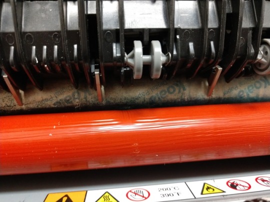
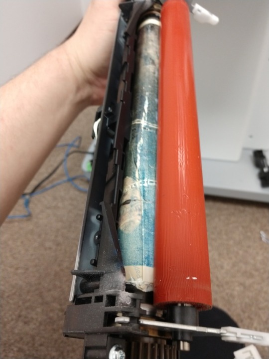
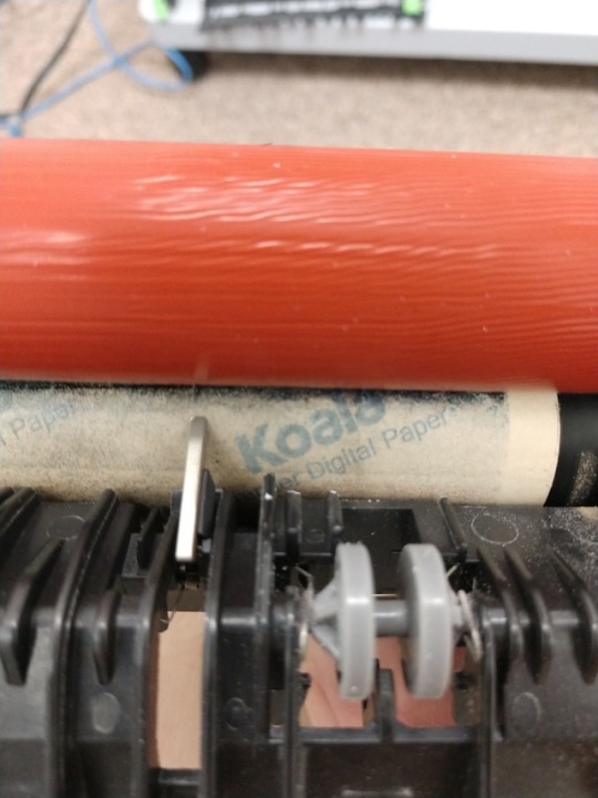
If your curious about what happens if you feed a sheet of plastic into a laser printer, it breaks it. This is Kodak photo paper, which is a high gloss, plastic coated material meant for ink jet printers, melted onto the fuser. It's trashed. That fuser unit is around $200 and this is definitely not a warranty issue.
This is what broke the rear feed trigger in the last post.
0 notes
Text
Why Black Social Media Lost Its Mind Over The Guardian’s Colorism Article? By S.A. Buchanan
Thanks for stopping by to read my little rant/opinion piece, enjoy your stay.
Writer, Dream McClinton penned a piece for The Guardian’s Shades of Black series originally titled: Dark-skinned Black Girls Don’t Get Married and black social media collectively lost its ding-dong mind! You could almost hear black women throwing their phones and laptops against the wall after writing angry tweets to respond to the article. Black women were enraged and let Ms. McClinton and The Guardian know the article was dead wrong because they are dark-skinned and married and how dare she—Ms. McClinton, speak for all black women. However, one must wonder, what indeed caused this anger from dark-skinned black women, was it the article’s content or the article’s title? Ms. McClinton’s article has since been retitled: Why dark-skinned black girls like me aren't getting married. The backlash (over the original title) has calmed considerably, but it’s now opened an entire conversation that makes people, specifically black people really, really, uncomfortable and it’s about colorism.
In case you’re unaware of precisely what colorism is and to make sure we’re all on the same page here’s what I got when I typed the words: define colorism into Google.com:
col·or·ism
noun
US
noun: colorism; noun: colourism
prejudice or discrimination against individuals with a dark skin tone, typically among people of the same ethnic or racial group.
If you are a non-black person reading this, welcome to my rant, thanks for coming. Black folks, we know that colorism is kind of like that creepy-ass uncle at the cookout that we keep the kids away from. We don’t discuss him with other family members because it’s too distasteful, we just avoid him. This is the way the black community has dealt with colorism for centuries, dating back to slavery, where lighter-skinned slaves (often the offspring of slave owners) received preferential treatment over darker skinned slaves. However, for many dark-skinned black women colorism is akin to terminal illness. Colorism can be like pervasive cancer that runs through our lives, slowly eating away at our self-esteem, sense of belonging and often our ability to find a mate among our contemporaries, as illustrated in Ms. McClinton’s article.
We’ve done the prerequisite history lesson, and proper definition of our subject matter now let’s get to the good stuff… Dream McClinton’s controversial journalistic piece. The article is written from Ms. McClinton’s perspective and in her voice, she’s a dark-skinned black woman, this is her experience. Therefore, social media responses leave me a bit baffled. How can someone’s personal experience be labeled wrong? “I’ll take Crock of Bull for $200, Alex!” The answer is: You were triggered by Ms. McClinton’s article because you recognized her truth. You recognized the colorism in the black community, and you probably even recognized your own complicit behavior in colorism towards people who look just like you. In my opinion, that’s one of the main reasons this piece has some people so shook.
Ms. McClinton speaks of online dating and the preference of men who look like her in skin tone preferring women of lighter complexion. Preference is the word dark-skinned black women often hear from black men (especially dark-skinned ones) stated as their reason for why they don’t want to date/marry women who share the same complexion as them. This is a running theme throughout the article, and unfortunately, it’s a running theme throughout the lives of many dark-skinned black women. Being chosen last or not at all by men who are the masculine reflection of themselves, and it’s an incredibly hard pill to swallow, one that dark-skinned black women have been force-fed in silent obscurity for decades.
In recent years there’s been a change in the colorism conversation and a blessed one at that, in the form of the social media colorism movement. I can only speak on the ones that I follow, the most prominent one in the group is Chrissie, mocked by haters as a fat, ugly, and faceless YouTuber. Chrissie has started a platform exclusively for uplifting dark-skinned black women by addressing colorism head on. She steamrolls into the issues with a no holds barred approach in a telling the truth till it hurts kind of way. She tackles the effects of colorism on dark-skinned black women, addresses problems dealing with colorist men in relationships, how to work around people who try to gaslight dark-skinned black women when they call out colorist behavior from other, and even how to navigate colorist friends and relatives. Chrissie also endeavors to negate the helplessness that dark-skinned black women often feel dealing with colorism by giving dark-skinned women solutions with her Femininity and Leveling-Up Series. Her platform is highly effective and has a near cult following because she’s not just saying, I’m dark-skinned, woe is me, she offers practical tools to dark-skinned women. This March, Chrissie accomplished what she promised years ago and launched the first fashion and beauty magazine of its kind, specifically for dark-skinned black women called Divine Dark Skin, available in print and digital formats. During the past three years that I’ve been following Chrissie, she’s been threatened and doxed several times. However, her detractors can get no real traction because quite frankly, she’s a force to be reckoned with, who remains determined and vigilant in her mission.
There are other dark-skinned black women on YouTube making a difference in the colorism conversation as well: Author, of Swirling: How to Date, Mate, and Relate Mixing Race, Culture, and Creed, Christelyn Karazin has her YouTube platform Beyond Black & White Elite which receives hate regularly. She is known on YouTube as an advocate for Swirling (interracial dating). She discusses colorism and a plethora of other issues facing black women and her mantra for black women is; Choosing the best man for the job even if you date outside of your race. She’s received threats and doxing for her message but grows her platform undeterred. There’s also a younger generation of YouTubers getting the word out there to dark-skinned black women and girls like Paris Milan, Leah Gordone, For Harriet, and I am Eloho. These younger ladies are impressive in their passion, determination, and grit in schooling their contemporaries on colorism, and I wish I had this medium available when I was growing up.
The Guardian’s article on colorism and the series is a small drop in the pond, the colorism conversation has been going on for some time. It seems the reason some people have taken exception to Ms. McClinton’s article is that it’s in The Guardian. Twitter was dripping with tweets and comments so grimy and tacky you could use them to stick up wallpaper. Many people stated their disdain was because the article aired our dirty laundry in white media. Really? How about we clean our laundry ourselves then there’ll be nothing to air out? When dark-skinned, (so-called) rapper Kodak Black makes his contempt for dark-skinned women known on social media outlets, the black community (collectively) is quiet. When black men on YouTube make video after video spewing vitriol on how they hate dark-skinned black women and dark-skinned black women ain’t sh!t, the black community (collectively), is quiet. Then finally, when dark-skinned women begin to speak about the systemic abuse through colorism, they receive at the hands of the community that is supposed to love and embrace them; oddly enough, they are told to be quiet. And that my dear reader, is why Ms. McClinton’s article has folks so shook because it’s not YouTube, you can’t brush it off as some nut job with an opinion that’s solely their own. The Guardian is a respected newspaper in two countries, and you cannot brush that off or bury it. It’s too forthright, too in your face, has too much clout. Reading Ms. McClinton’s article, which contains interviews from professors who had hard facts, data, charts, basically, McClinton came with receipts! So, for those of you who are acting like your foundation has been shaken, I say, GOOD!
Dark-skinned black women will no longer remain mute and suffer in silence like good little girls. There’s no need to yell or scream; however, we will no longer stay quiet either. We are your mothers, wives, teachers, sisters, and daughters. We are the backbone of the black community, and we deserve better collectively. I know colorism will not end in my lifetime and I’m okay with that. However, what won’t happen on my watch is any young black girl that I’m responsible for, she will NEVER feel the sense of inadequacy that I was made to feel growing up. That’s the challenge I place before every dark-skinned black woman now, find a young girl (if you don’t have a daughter) and mentor her about colorism and its effects. Teach her how special she is and how to love an appreciate all the melanin she’s been blessed with and more importantly how to navigate colorism in our community.
I must be frank, the article did affect me as well because honestly, I identified with Ms. McClinton’s story. I think it’s safe to say that several dark-skinned black women reading the story could relate. Here’s the thing, we know what the problem is, and yes, we should continue these colorism conversations because they are essential and dark-skinned women need to be heard and supported. However, I think the article left me with a sense of yes, Dream, it’s all true girl, now let’s get to the business of fixing this mess! These are the conversations I want to start having in mainstream media like The Guardian very soon because it’s high time. It’s time for dark-skinned black women to start being more pro-active in the fight against colorism. I take nothing away from Ms. McClinton’s article, I loved it. However, I’d like to see more solutions in mainstream media about colorism instead of stories about the problem. Clearly, I’m not the only one who feels that way either, the inaugural issue of Divine Dark Skin Magazine sold out its first print run in record time and is on back order. Like many others, I am patiently waiting for my issue.
Truthfully, as a dark-skinned woman, I’m exhausted with the foolishness that I endure from my own people. I’m not, “pretty/beautiful/sexy for a dark-skinned woman.” Normally, I respond to these comments with resting bitch-face, “well, gee thanks, I suppose you’re handsome for an asshole.” Understand I’ve received these comment from men and women growing up. “She’s so pretty for a dark-skinned girl,” I remember one woman telling my mother in the grocery store. I rolled my eyes at her, I was twelve. I usually get called a bitch for my various unhappy reactions, c’est la vie. But you, my brother/sister didn’t give me a compliment. As a man, if you, “normally don’t date dark-skinned women,” please don’t let me break your tenet. I wouldn’t dream of asking you to bend your rules for little ole’ me…really. It’s old, it’s trite, and it’s tired.
Dark-skinned black women, you aren’t crazy, if you think a remark or action was colorist it is colorist, don’t let them gaslight you, you have a functioning brain. Remember you are not alone, find the support of other women who are like you and having similar experiences, not to whine on each other’s shoulders but to lift each other up. Hard facts: if we don’t do the work to help ourselves, no one else will, the black community has told us over, and over, that collectively they do not care about us, they do not value us, and dark-skinned black women, for the most part, we are on our own. Hopefully, we will gain allies along the way but first things first, we must help ourselves.
Please be sure to check out the rest of The Guardians’ Shades of Black series specifically focused on colorism.
You can also check out the YouTube platforms that I mentioned above using either the links in my piece or the links listed below:
Chrissie Divine Dark Skin Magazine Beyond Black & White Elite Paris Milan Leah Gordone For Harriet I am Eloho
Also, be sure to follow me on my Social Media platforms:
Twitter: @SusanABuchana15
Facebook: @sabuchananauthor
Instagram: @paidforthenight
Pinterest: susanabuchanan0739
GoodReads
Amazon
BookBub
Tumblr Blog
[AW1]
0 notes
Text
A Review of 35mm Kodak Ektachrome E100 Film
Those who follow my work know that I consider myself a large format photographer. I will photograph with a medium format camera, particularly when I’m trying to save weight on a backpacking trip or save time when I’m teaching a photography workshop, but 35mm has been somewhat shunned in my arsenal, being a format I deemed too small to be used effectively for my work.
In late 2017, Kodak Alaris announced they were going to rerelease a redesigned version of their old Ektachrome film stock as E100 in 35mm. When I heard this news, I was absolutely thrilled. Lately, film stocks are being discontinued left and right, from particular sizes to the entire stock altogether. With Kodak releasing a NEW film stock, I feel like there was a bit of light at the end of the tunnel – especially for transparency film. While I was disappointed it would not be announced in medium or large format film, I decided to give it a shot in 35mm.
My first pack of rolls finally came in during the fourth quarter of 2018, and I decided that what better opportunity to try out this new film than at the bottom of the world? I had my second trip planned to the Antarctic Peninsula where I was teaching with Muench Workshops in December of 2018 and figured I’d toss in a few rolls with my Nikon F5 and give it a whirl.
A large, tabular iceberg, photographed just north of the Antarctic Peninsula. Photographed on a Nikon F5, Nikon 70-200mm f/4, and Kodak Ektachrome E100
Pros
After shooting about 6 rolls, I selected about 20 frames for drum scanning. The scenes varied and lenses used were a Voigtlander 40mm Ultron, a Nikon 70-200 f/4, and a Sigma 160-600. My favorite shots tended to be closer to the telephoto and super telephoto range with a shallow depth of field. With high-resolution drum scans, you’re able to truly analyze grain unlike any other scans and with E100, and I was impressed. When compared to a film such a Provia 100F, the grain seemed smaller, more even, and produced slightly sharper images.
Overall, I was very impressed with the film. It metered easily and performed as expected for a transparency film. Fortunately, in Antarctica, my dynamic range was relatively limited (it was all pretty much white), but even on bright, sunny days, I don’t feel like I had any problems blowing my highlights. Generally, I would say that I would keep this film within the 5-7 stops of dynamic range, as you would with any other transparency film stock.
The color seemed very accurate, neutral, and even. There did not seem to be any overall color cast (which I will discuss below a bit further) and, especially in the deep shadows, there was not any unnatural color casting, as typical with most transparency films.
The most notable benefit for E100 for me was its overall sharpness. When using proper technique and with limited diffraction, the film does seem to be incredibly sharp. Particularly with images with a shallow depth of field, where your subject is in focus and you have a clear out of focus area, the prints resolve amazingly at 24×36”. While pouring through images, pixel peeping each drum scan at 100%, I couldn’t help but be wowed by the sharpness I was seeing with 35mm. Below is an example of a 100% crop from a drum scan of a 35mm E100 frame.
The film also seemed to have a very strong ability to recover shadows. On my first roll of film through the Nikon F5, I had accidentally set my exposure compensation to underexpose by 1.3 stops, rather than overexpose by 1.3 stops, compensating for the white snow/ice I was metering. So, as you can fully imagine, everything was drastically underexposed. I decided to go ahead and drum scan a frame from that roll to see what I could pull out, and the results surprised me.
The image below is one that I pulled from the darkness, so to speak. Fortunately, the light was very flat, the tones were very even, and everything came out very clean. That being said, I think my results could be challenged with an underexposed image with more dynamic light, but I was still impressed with the information the film stored in the shadows.
Cons
Firstly, most of my frustration isn’t with the actual film stock itself, but more in the size of the film. I think that given what a drum scanned 35mm can provide, E100 will provide some of the best results you can get. 35mm is, in my opinion, somewhat inherently flawed in its size. It’s just too limited. Diffraction is much more noticeable on landscape shots when your compositions require a substantial depth of field and your aperture is small, and the resolving power of 35mm just isn’t quite there for most traditional landscape photographers who are printing larger prints.
35mm is based around a fast shooting style, which requires fast lenses, higher ISO speeds, and being light and nimble, and all of those seem to be each other’s Devil’s advocate. With that being said, I think my biggest issue (and I wouldn’t even really call it an issue) with E100, is its color cast – it’s nonexistent! While some might love this, I somewhat enjoy getting results from transparency film that have a bit of a color cast – that is one of the reasons why I choose a particular film stock.
Having a neutral color palette definitely has its advantages, and a bit of white balance can be adjusted for taste after the scan, but sometimes I like to see that in the actual film itself – the film’s character, so to speak. While this is ‘issue’ is definitely a nitpick, it does have its drawbacks. I feel that with some images, they quickly became bland without a bit of a color cast.
Penguin and Iceberg, photographed on a Nikon F5, Sigma 160-600, Fuji Provia 100F, drum scanned on a Heidelberg Tango
The example above was photographed on Fuji Provia 100F and has a very noticeable blue/magenta cast, which that film is known to have. In my opinion, the slight blue cast absolutely benefits this scene. On a snowy, overcast day, the grays can be a bit overwhelming, and a bit of blue can add interest and emotion to a photograph. Whether or not you want to add this in post-processing is your choice.
Printing From E100
You must ask yourself what you intend to do with your results, and then choose a film based on these results. I’m in the business of making detailed, sometimes very large prints which has always held me back from 35mm because of the dreaded word: grain. Whether you’re shooting 35mm or 16×20 sheet film, grain remains the same size, so as you begin enlarging film, whether it’s scanned and printed larger, or optically enlarged, the grain becomes larger. So it is up to the discretion of the artist who is printing the final image to decide just how much grain you want to be able the viewer to see in the final image.
To me, this is the beauty of film – with digital, you’re just going to eventually see pixels, but with film, you see grain! And grain is beautiful. For me, I have a limit to this. I naturally gravitate towards fine grain film, such as E100, but my limit to printing 35mm will most likely be 24×36 for most prints, which is actually still quite large. These prints I’ve chosen to print at 24×36 are images that might not have as many fine details as a “big landscape” shot.
Moving Forward With E100 and 35mm
While I’m not exactly a wildlife photographer, I did enjoy photographing portraits of wildlife with 35mm, which probably how I would tend to shoot this film in the future. While I would be comfortable printing some of my images up to 24×36″, most of those images are from a telephoto lens with a shallow depth of field, which doesn’t require a ton of resolving power.
For textured, detailed scenes, such as big landscapes, I will stick to at least medium format film moving forward. I don’t feel like I will be using 35mm film for big landscapes, where I have to use small apertures. For those types of scenes, I intend on having a medium format camera alongside, such as my Mamiya 7ii.
Overall, I’m incredibly happy with my results from Kodak’s 35mm Ektachrome E100, and I’m extremely excited to see a company reinvesting manpower into a new transparency film stock. So, will I have room for 35mm in my kit now? Perhaps on certain trips, particularly where I might be photographing more wildlife. I see myself pairing my Nikon F5 with a 500mm lens for my next trip to Antarctica this coming December, and to Svalbard in 2020. We’ll see where it takes me!
Now I think it’s time to see it in 120 and large format sheets! Are you listening, Kodak?
P.S. You can check out my prints from Antarctica here. Interested in my drum scanning services? Click here.
About the author: Michael Strickland is a large format landscape and nature photographer based out of Kansas. The opinions expressed in this article are solely those of the author. You can find more of his work on his website, Facebook, Twitter, and Instagram. This article was also published here.
source https://petapixel.com/2019/01/16/a-review-of-35mm-kodak-ektachrome-e100-film/
0 notes


