#kind of a redraw also since I used the original issue for pose references
Explore tagged Tumblr posts
Visit Tumblr Blog
Explore Tumblr blogs with no restrictions, modern design and the best experience.
Last Seen Tumblr Blogs


Fun Fact
Tumblr was attacked by a cross-site scripting worm deployed by the Internet troll group GNAA on Dec 3, 2012.
Text
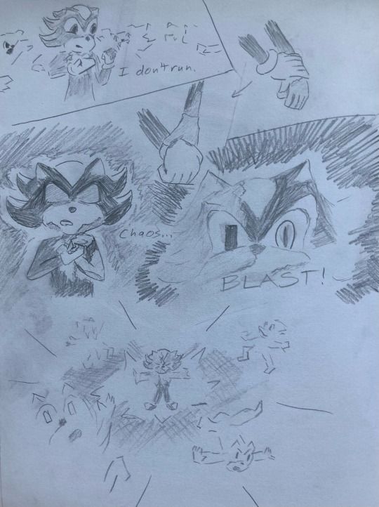
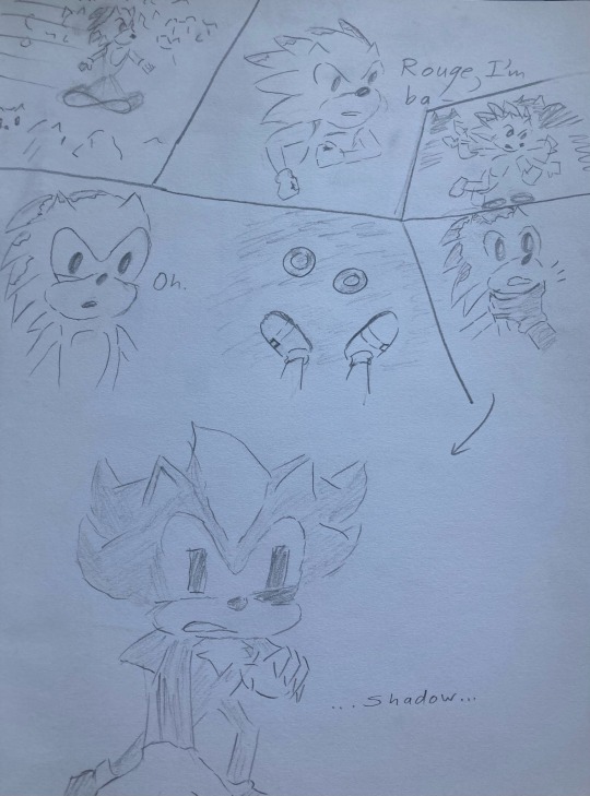
Comic I badly sketched for “what if IDW went with the original guy plan of Shadow removing his inhibitors”
[ID: Two comic pages sketched in pencil. In the first panel, Shadow stands in a crowd of zombots, looking down at the metal virus on his hands as he says, “I don’t run.” He takes off his inhibitors, saying “Chaos blast!” before blasting away the crowd.
On the next page, Sonic runs back, returning from running off his infection. “Rouge, I’m ba-“ he starts, before tripping over something. The next panel is his shocked face as he sees Shadow’s inhibitors on the ground, whispering “oh”. In the next panel, a metal hand grabs him by the neck. In the final panel, the zombified Shadow is revealed as Sonic whispers “Shadow…”]
#sonic the hedgehog#shadow the hedgehog#our art#sonic idw#sonic IDW issue 19#kind of a redraw also since I used the original issue for pose references#metal virus#are we drawing this to cope with exomemories? noooooo /lying#🖤🌻#sorry for the awful ID I’m no good at this
2 notes
·
View notes
Text
Evaluation
This was a really interesting project to work on, as it was a task to make a games concept but with a literature based starting point. I came up with the base concept for the game (Halloween Dating Sim) before we even started this project as it’s something I hadn’t really done before yet, and would give me a chance to explore a new aesthetic. I also really wanted to do a game like this as it would allow me to work on my background drawing skills - since they are a huge part of these types of game.
Since I already had a brief idea of what I wanted to do before I started, I chose to research all the books that had supernatural themes or creatures that weren’t regular humans - so that I could relate it to the monster idea I had. I chose these books to research: Woman in Black, Jekyll & Hyde, Frankenstein, Let The Right One In, and Do Androids Dream of Electric Sheep?
The main book that I chose to influence this project was Jekyll and Hyde, since I loved the mystery and secrecy aspect of the novel, as well as the main character - Jekyll - and his issues with split personality and the supernatural. This Victorian Gothic novel combined with my original idea to make the dating simulator meant that I now had a dual genre game. While the initial game appears to be a modern dating simulator set in a cursed town, it is actually a detective game which allows you to expose the darker side of the town’s residents. In that sense, the novel starting point has actually stayed very prominent in my project - there is a character who is based on Jekyll & Hyde who is the main villain, and the main character you play as (Bailey) almost takes on a similar role to Utterson, trying to solve the mystery.
For this project - Cauldron Hollow - I have created many different characters, some background artwork and a book cover, as well as some fake screenshots of how the game-play could look. When I went into the project I had planned to create more expressions and poses for each character and draw more backgrounds, but due to my limited time frame I am happy with the amount of work i’ve been able to produce.
The Characters
I wanted to design a range of date-able characters for this game so that I would have more examples of character design for my portfolio. My poor time management definitely affected the outcome of this work quite significantly - as it was at least a week into the project when I started making the characters. I gave myself some time to think about the designs but did very few concept sketches before jumping into the final artwork, as I was worried that I wouldn’t have any actual finished work to show if I didn’t do it quickly. I wanted to have a decent amount of characters to show a lot of variety in the designs, which led to me having hardly any time to focus on each one.
I did all the artwork over one weekend, which was a very poor idea - as I had no time to come up with several iterations for each. On top of this, drawing 9 characters in such a short amount of time left me severely burnt out by the end, and as a result some character artwork clearly has significantly less effort put into it. The character I made last, Robin, as a result was the one I liked the least - the colours didn’t really fit properly, the pose was a little rigid and the linework was messy. I think that this was partially due to the type of brush I was using, which I don’t think is suitable for the kind of clean line-work I was after - as a result I will change my brush for the next project to try and get a more appealing finish.
If I could redraw these characters, I would do a lot of things differently. I would dedicate more time to each one and really focus on the ‘quality vs quantity’ as my mindset for this project was ‘more work means better’. I would also spend more time creating multiple different looks for each character so I could then pick the best concept and refine it, rather than finalising the first result in my head. On top of this, I would like to spread out the character design across a wider period of time, so that I don’t overwork myself on one - or even just do less characters.
There are some things I did like about the character design - I did try and vary my poses more; each character does have a fairly unique pose (even if the anatomy isn’t great, which I’d like to focus more heavily on in the next project) which I haven’t really tried before, and I think that they definitely look better because of it even if it isn’t a massive change. I also really like the colour schemes of some of the designs, and the outfit design I did, as I think it matches the kind of aesthetic I was going for. One final thing i’m glad I did was to keep the characters consistent in terms of shading, highlights, art style and brush texture - they do all look like they’re part of a set rather than all being drawn in completely different ways. I think the fact that I used a consistent colour palette throughout the project definitely influenced this, as I found that most characters fit pretty nicely together.
The Backgrounds
I came into this project wanting to improve my backgrounds, since they’re a big part of dating sim games and aesthetics. I am actually really happy how they turned out since I’m not normally very confident with them. The first background I made was of a bedroom and window, which I coloured in the same way that I had done the characters. Thanks to the perspective drawing feature, all the features of the room look relatively accurate, which I’m really happy about. It was only the hand drawn features (such as the pumpkin clock) which look a little out of place- but to remedy this I think I just need more practice with perspective.
For the window background, if I could improve it I think I would have added more detail to the walls - as the painting and picture frames are empty. I would have also liked to make the space outside of the window a lot more detailed - but I was too tired after drawing the initial room to bother spending more time on it. To fix this, I could have left it and came back later to finish it off when I was inspired to do it.
I coloured the room with the same colour palette I had used for all the other work, which complimented the character well but also left me with a very limited range of tones that I could use. Overall, I think that trying to work entirely in a certain set of colours was a nice experience, but I don’t think it was really noticeable at all for the most part - I think I should either use 4-5 colours in a palette next time or non at all, but it was still an interesting experience.
I was planning on creating a range of backgrounds but I had not anticipated how much time I would spend on the next one. It took me over 7 hours to draw from start to finish, and while it was absolutely worth it, it didn’t really give me a lot of time to do anything else. This is also an issue which I think can be fixed with practice - as I was still pretty new to the idea. I do really love the Garden background and how it turned out, especially thanks to all the soft lighting and level of detail which I included. For these backgrounds, I actually looked at a variety of reference images while creating it, and it really paid off I think - so hopefully I will continue to do so in the future. While I’m really happy with the few backgrounds I did produce, it would have been nice to have the chance to do more.
The Book Cover & Designs
Having to design a book cover was a pretty challenging part of this project as it’s new to me, so I wasn’t really sure what to put on the front. I did a few different ideas and eventually settled on the one that would allow me to both draw a background and a detailed character. This particular scene involved me having to draw a foreshortened character, which I struggled with. I kept at it until it looked right to me, but in hindsight I could have just looked up a reference to help me. Like the other backgrounds, I looked up reference images for the building rooftops, and as a result I think they turned out really well.
The actual character artwork had some issues initially - her face was too wide, the eyes were slightly wrong for a reason I couldn’t pinpoint, and the whole thing looked a bit flat. I ended up having to change the colour palette at this point just to help the character stand out from the background. I’m glad that I went back and fixed all the issues before finishing the work, as i’m a lot happier now with how it’s turned out, although the face still bothers me a bit. I think if I could do this again i’d love to attempt an actual painting, rather than just soft shading and adding overlay layers, as it’s something I haven’t done in a while. I’m happy with how the character is posed as well as I think it actually looks different from my usual static poses. On top of this, I’m really glad that I went for a handwritten title as it gives it more of a fun feel. I do however think that it doesn’t really show the dating simulator aspect of the game- but I would have liked to create an alternate cover that is a lot happier and more pastel if I had more time, to show the dual genres present in the game.
0 notes
Text
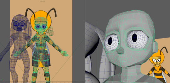
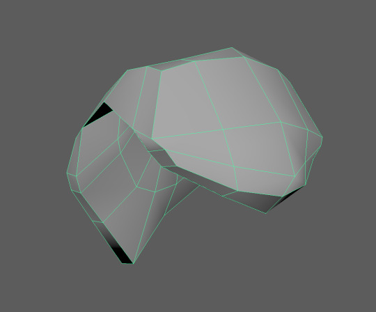
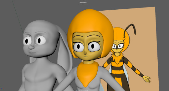
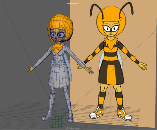
A02 - Finalising the Base Mesh continued
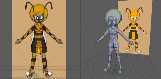
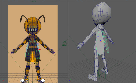
Continuing from where I left off, I’ve begun to model the base meshes for the hair, the scarf/mane and the wings, as seen above.
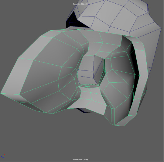
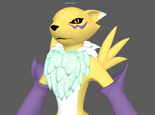
Here is my solution for the n-gons inside Honey’s mane. It’s a bit stretched at the moment, but I was thinking I could get away with it, since I’ll be refining it during sculpting in Mudbox and redrawing the topology as required.
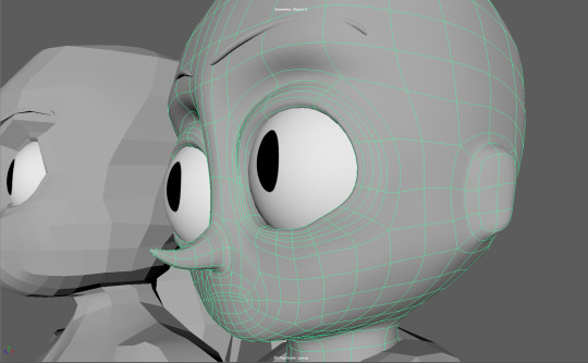
However I’ve later decided that the base mesh needed a whole lot more work done on it before I moved onto the sculpting phase; especially on the face, which I feel, and was recommended, needed to be brought up to the same standard as the Perry model. Although I originally had that in mind with the sculpting phase.
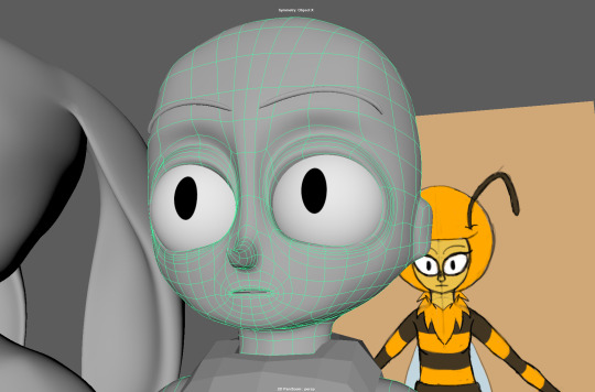
So I decided to add eyes and revise the topology of Honey’s face, based on what I learned from modelling Perry the Rabbit.
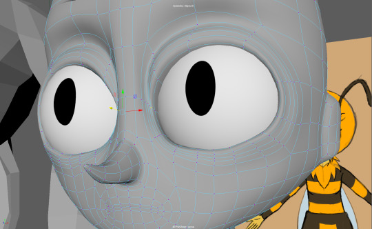
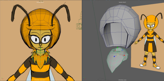
Here is a smoothed (preview), close up of Honey’s eyes, showing the work I did for the eyelids. The upper eyelid fold is loosely based on a still reference I acquired from a YouTube video tutorial series (lower image) about character modelling, when I was searching for “Pixar Eyelids.”
Honey’s eyelids are far more pronounced than Perry’s and they look more obviously Caucasoid, while I felt Perry’s appeared more racially ambiguous, despite my intentions to make both characters primarily Caucasoid.
Work needs to be done to ensure that the eyelids have a uniform slope along the vertices, otherwise if they’re wonky, they’ll look unintentionally wrinkled.
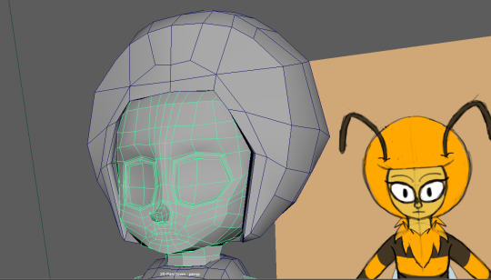
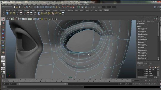
Here’s another view of Honey’s face, showing the eyelids more from the side, as well as further updates to the topology, especially around the mouth-nose area and the side/back of the head, so that it flows more intuitively. I’ve also added some additional edge loops leading to the bottom of the eye in the process, which will require moving around in order to preserve that round eye shape.
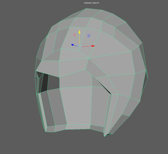
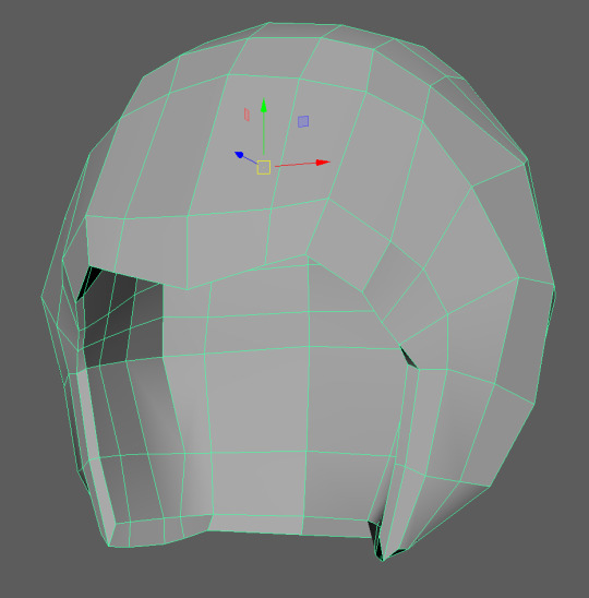
I’ve also decided to put some attention towards re-topologising her hair mesh, which is kind of like this weird, unappealing ‘helmet’ at the moment. This is to ensure the sculpting process goes a bit better with more intuitive edge flow, since I anticipated that all the unnecessary half-loops could complicate the process and limit the mesh’s flexibility.
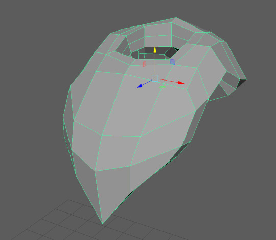
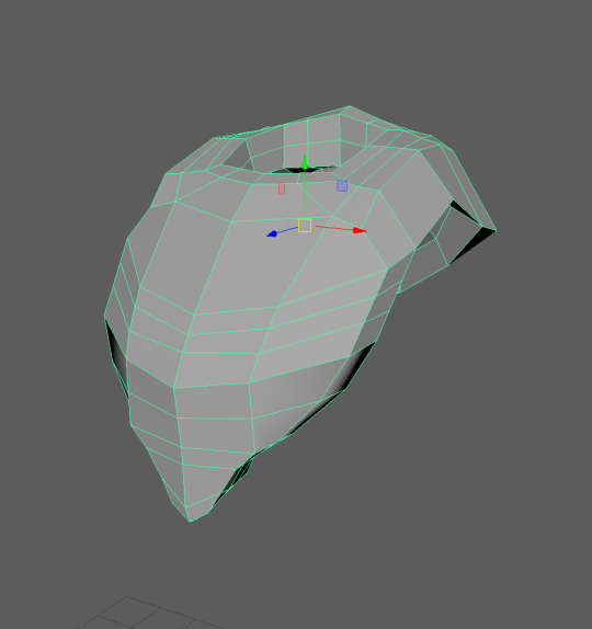
Same applies for the mane-scarf mesh, which is a bit uneven at the moment.
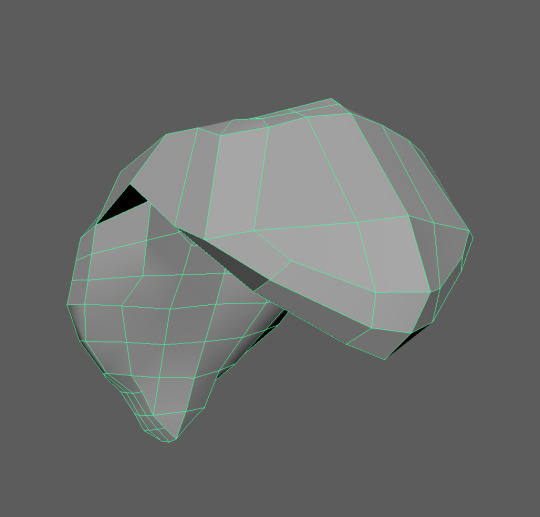
Here are the back views of the same mesh.
I later modelled a mouth cavity, with altered copies of the teeth and tongue from my Perry model added.
Originally I had a whole lot more edge loops inside Honey’s lips, but I later removed most of them, bringing them down to the same amount as Perry’s, since they made mouth-posing a lot harder and more distorted.
I then modelled some eyelashes for Honey, based on a flat-plane, referencing the relatively simple, Grandma’s House Lucy eyelashes to get an idea of how to produce them.
Clipping issues can easily arise from having them make close contact with the eyelids, especially when they don’t have the same amount of edge loops (which I might update) and when they don’t have the same colour as one another.
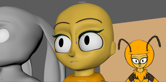
So I began to colour parts of the mesh accordingly to get an idea of what Honey would look like without the plain old, grey Lambert; adding eyeliner with the inner-most eyelid faces in the process. Something that helps with the clipping issues on the eyelids a bit.
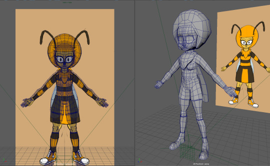
Here is an upper-body shot of the mesh with corresponding, single-colour materials and the updated hair/mane base meshes.
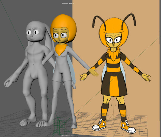
Same as above, except full body shot.
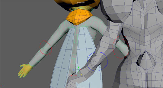
I’ve also updated Honey’s back topology a bit as well, deciding to add ‘elbow loops’ (circled in red), just like how I had with Perry later on (circled in blue).
Folds/circle loops for where the wings come out have been added as well, so they look more organic.
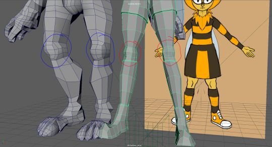
Ditto with the elbows above, except with the kneecaps. The extra geometry could be useful during rigging. I may need to add an extra loop or two, like I did with Perry’s in order to achieve more of a kneecap-appearance.
Finally, I’ve decided that the base mesh needed a skirt to go along as well. Something that I was also kind of planning to do in Mudbox, but I ultimately decided that it wasn’t the right program for that kind of work.
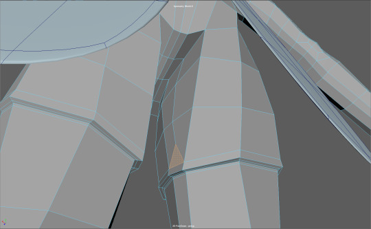
Meanwhile, Andrew during this week’s tutorial recommended to solve the extra polygons on the thigh with a single triangle. As opposed to the half-loop that I had before, due to how unnecessarily odd he felt it was and because he felt that it was in a relatively obscure area.
It helps that I have the dress to also hide it as well.
Meanwhile, I’ve been thinking about how I was going to approach properly sculpting/modelling Honey’s mane. So I looked back at an older model which I’ve known for quite a while as a reference.
It’s a model of the anime character, Renamon, produced by KP-ShadowSquirrel; who has a similar mane, if not inspired that of Honeydoo’s. Upon inspection, it seems that ShadowSquirrel has modelled the mane in a way involving layers of closely overlapping, slightly modified duplicate ‘shards.’
This is something I’ll need to consider when sculpting/modelling Honey’s mane, since starting with a simple, flat base mesh may not be enough or it may even be the wrong approach in the long run.
#KNB217#Digital Creatures#Honeydoo#Human Character#Assessment 02#Base Mesh#Maya#Retopologising#Retopology#Model Blocking#Updates
0 notes