#kaiju paradise hazzy fan art
Explore tagged Tumblr posts
Text

Hazzy~
Kaiju Paradise, art by me~
#drawing#sketch#art#artists on tumblr#fox#cat#hazzy#kaiju paradise#hazzy kaiju paradise#kaiju paradise hazzy#cute#angry#angry fox#angry cat#fanart#kaiju paradise art#kaiju paradise fanart#fan art#kaiju paradise fan art#hazzy art#hazzy fanart#hazzy fan art#kaiju paradise hazzy art#kaiju paradise hazzy fan art#kaiju paradise hazzy fanart#fluffy#very fluffy#:3#<3
5 notes
·
View notes
Text

an attack on mirovust of their goodrax OC !
#maría la gata#maria the cat#mirovust#art#art fight#farscribbles#fanart#roblox#kaiju paradise#goodrax#cat#anthro#hazzy#fan oc#im op
6 notes
·
View notes
Text
Ratings + Insights on the Kaiju Paradise gootraxian redesigns
So the 3.1R update came out and gave me a bunch of furries to brainrot about. And as an enjoyer of Furry Character Design myself, I felt like reviewing most if not all of them.
Know that these are all personal opinions and art is, as always, subjective and disagreeing is okay!
anyways....
KAIJU
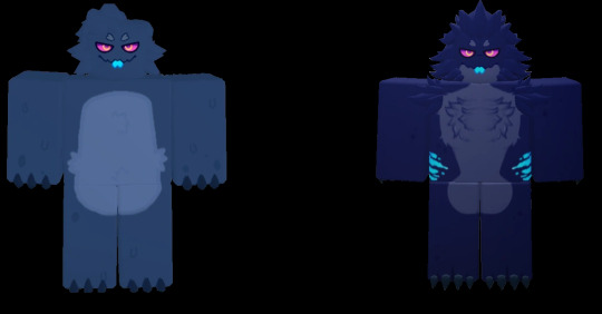
Originally a pretty good design. Average "gozilla-esque" look, the redesign is essentially a polishing so it fits more with the newer gootraxians. Looks cute, looks cool, still looks iconic. 10/10
CATTE
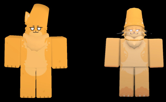
Once again, just a polishing of the original design, I like the whiskers, they're cute! Though I'm not sure if I'm a big fan of the washed out colors, and the bucket standing straight on their head. The one ear sticking out was cute. 8/10
FED
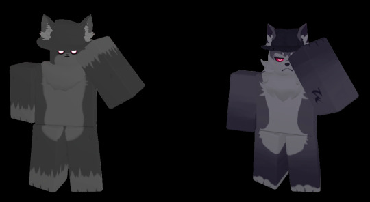
A design polish. Which is the treatment that the whole Wolf Quartet as I like to call them got. Well at least now I know that they're wolves. Still a pretty plain design, though the eyes look cool. 5/10
FIG
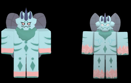
Can't get more "just a polish" than that. Fig is a pretty anecdotal gootraxian in itself... The texturing of the fur is a nice addition. 10/10
GHOSTFOX
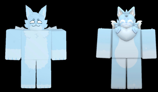
At first I thought it didn't really need the polishing treatment. Until I got another look at its render and yeah, lol. Their face looks weirdly elongated, and the tails have become wispy, likely to emphasize the 'ghostly' look. Though I very much preferred the old fuzzy tails that emphasized the death by electrocution. But I guess it's one or the other.... 6/10
GLUBBY
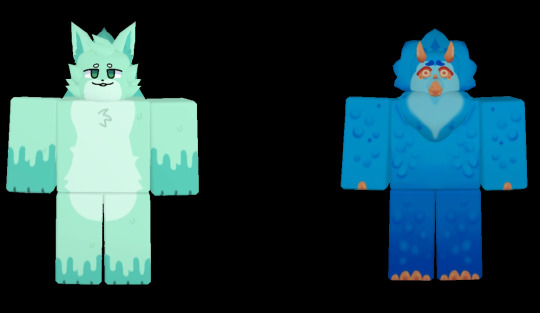
Formerly known as Feizao, as it's more of a replacement than a redesign (because I'm including them too. Why not?)
Aside from the obvious design having to derive completely from the original, I feel like Glubby is cute and interesting! But it is dragged back completely by how poorly it translates to the 3D roblox models, making it look.... ugly. Unfortunately. 5/10
HAZZY
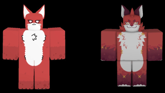
A really good redesign, holy shit!! I used to really dislike Hazzy because of how plain it looked and it was a pain to unlock it. But the buff not only made it grow on me a bit, the redesign made it actually top tier to me haha...
The hazmat suit patterns, stitches, fucked up and evil attitude are all incredible additions. 11/10
TOXIC RABBIT
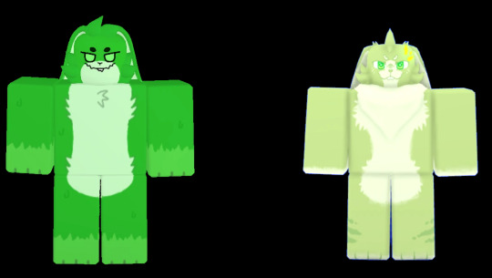
A gootraxian that was in dire, dire need of a redesign holy shit lmao. Well it certainly looks more like a rabbit now, but once again, why the desaturated colors...? There's also not much of the evil gremlin energy is used to have. 5/10
SPRINKLEKIT
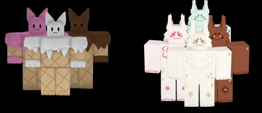
I started playing Kaiju Paradise, honestly, kind of late... So I didn't exactly experience Conekat firsthand. What I can say from what I see.... Sprinklekit is so much more superior, sorry Conekat fans.
Though I've heard Conekat could merge and have 3 heads so... points goes to them. I do like the sprinklekit variants though, strawberry is my favorite. 10/10
SLIMEPUP
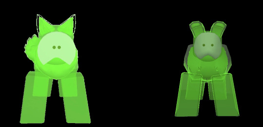
Ah yes, the slimepup. Simple but effective and cute design, the lime color is actually my favorite! The floppy ears definitely makes it look more like a pup. Its artwork is reeally cute! buuuuuut, the design really doesn't translate well to roblox models, unfortunately.... 6/10
SLIMEHOUND
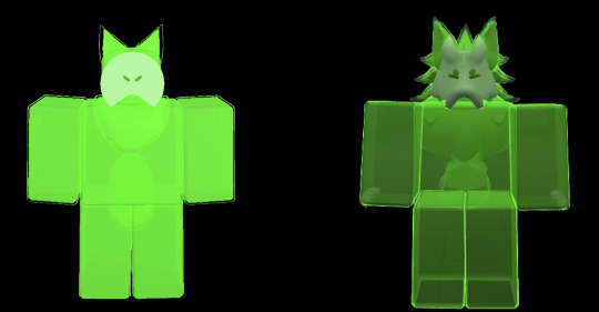
The slimehound looked super cool in artwork.
3D model had me disgusted.
2/10
SHORK
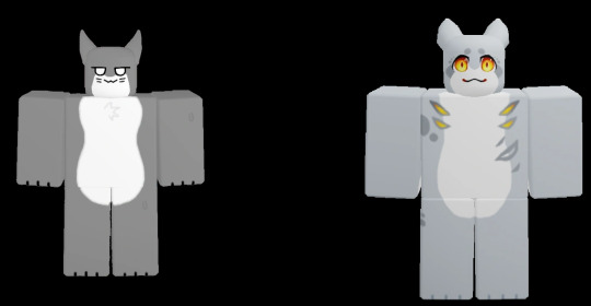
A very plain design that desperately needed an upgrade. And that is a good upgrade indeed! It's still shork, but at least it's not... boring. 10/10
SHADE
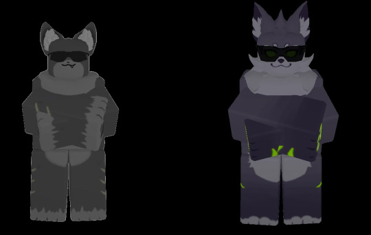
Another one of the wolf quartet. Shade is a little cooler than Fed to me. Its redesign is pretty good, it has its own color coding now! Congrats on losing your achromatic palette, Shade! 10/10
PLANTIX
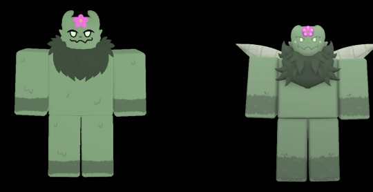
Just a polish, and a very straightforward one too. The new tail looks really cute, I could play as plantix just to look at the flowers on it. 10/10
MOCHA

Mochi is. Very forgettable to my eyes, sorry Mochi fans...
The redesign makes it look more goat-like, I like goats. Oh, and the fur pattern resembling latte art is a really neat touch. Now I know it's a coffee dragon! Mochi/Mocha is boring to me, but it's undeniably a good design. 10/10
LEMONSHORK
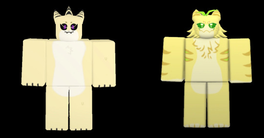
Congrats on her transition!
More seriously, I think all the shorks have had the best redesigns haha. I always liked lemonshork design-wise, but the redesign actually looks like it smells and tastes like lemon. True advertising! 11/10
MANIC
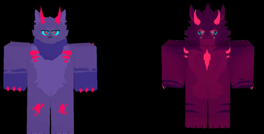
Carneline was... my favorite gootraxian among them all. Its design was cute, effective and unique, its color palette was really good and balanced. I understood it being cut from the game so I wanted to welcome Manic with open arms.
But the design just... didn't translate well. It's also so... Monochromatic, so much redder. And the eyes have a busy design. The cyan sclera with fuschia irises is a simplistic yet perfect design. The purple fur contrasting with the red crystals was real neat too.
Manic doesn't look bad, it's just... not as good as Carneline.
....At least Manic's hot in its concept artwork... 2/10
DAGODA
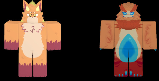
Just like with Glubby, gotta push the drama aside. I really like raptors so there's bias there... People think Dagoda's ugly, I personally really like it! It's no Fashui (one of my old favorites), but it's no big downgrade either.
Although I wish it at least had a few glowing features, given it's a power outage/blackout gootraxian, and that's what made them special. The little lightbulb tail on Fashui is what made it cute...
7/10
MELONSHORK
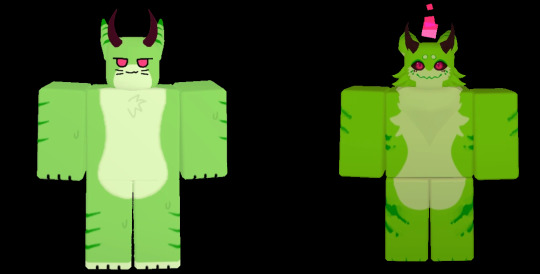
Okay, I said all the shorks had the best redesigns... BUT.
Melon shork has... the opposite problem of toxic rabbit!
Why are the colors so saturated??? It looks closer to an actual watermelon, but it just looks... not that great. The pastel colors were much nicer. Maybe some thicker, more abundant stripes would make it more melon-y? I don't know...
4/10
PSEUDOSHORK
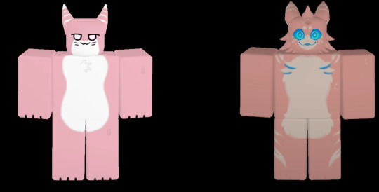
Now THAT is a redesign I fell in love with instant-fucking-ly. This might actually be the best redesign, if not just my favorite!
From a plain pink shork to this absolute murder gremlin, who bleeds gatorade and laughs at death. The asymmetrical fangs are a really cool touch too.
Top tier/10 Would make this my fursona.
HEBI
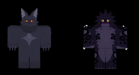
Okay, I respect Carneline and Panther's creator to have stepped down and dissociated from the whole concept but daaaamn why were those designs so good...
Panther was peak, unfiltered edginess that was still somehow cool.
And just like with Manic, my issue is the eyes... Hebi doesn't look like a shadow-lurking predator, but more like... a goth clown. Don't get me wrong, it's a really good design on its own! But compare it to Panther?... Man, I miss being edgy.
5/10
BUCK

Why is it red?
Why did they make it red?
It's a blackout gootraxian, not power outage. Why is it fucking red?
??/10
JAMMER
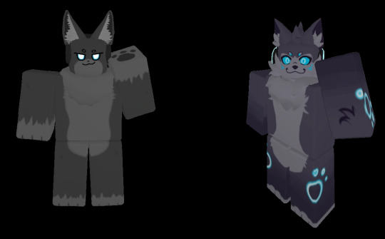
Ooooh the blackout wolves... They have been done dirty. The new patterns and fur colors look nice but Jammer looks too... silly. Too cute... I miss the cool attitude it had! And the outline glow really doesn't look nice either. It feels out of place, it doesn't feel like the Jammer is actually glowing!
no VIP variant can salvage this.
0/10
NIGHTSHADE
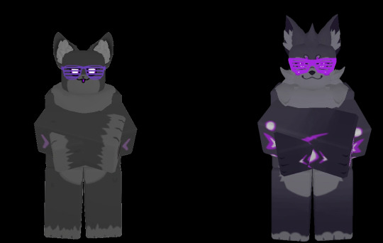
I don't have much to say about this. It's just like Jammer. The blackout wolves were done dirty. At least Nightshade kept its original vibe. 2/10
NUCLEAR RABBIT
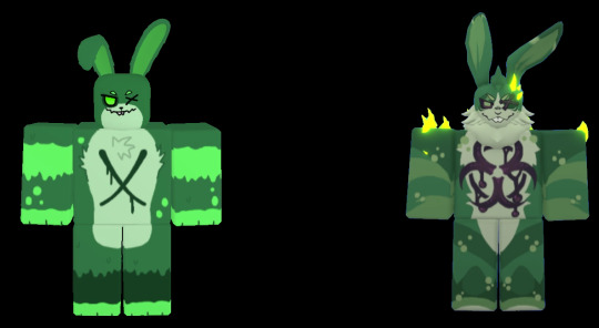
Absolutely nasty. And I mean it as a compliment. That rabbit will give me every disease and call me a slur. 10/10
SINOX
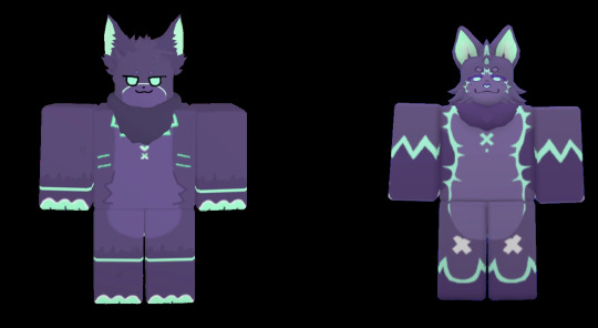
I didn't have a big opinion on Sinox until I actually saw it in a blackout ingame. And thought "omg it's fucking gorgeous!"
The back is super sparkly, on top of the particles it sheds. Sinox has been given so much more personality, and really went all the way with its concept! That being... a glowstick in a rave. 11/10
WISP
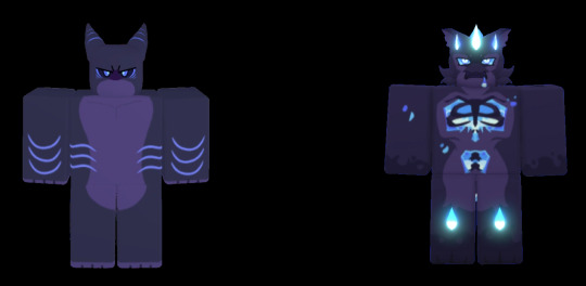
Same creator as Carneline and Panther, and somehow the original design is so.... bland and uninspired. How? That shork doesn't feel very "lantern" to me. On top of looking quite plain.
Wisp brings justice to that idea. This shork is indeed lantern!! Also I really dig the bones. Is it see-through flesh? Is it just not there? Who knows! This design bangs
10/10
4 notes
·
View notes