#jellyfishin research
Explore tagged Tumblr posts
Text
A weird AI drawing exercise I did
Preface:
Let me preface this that I don't recommend this exercise as standard practice, largely (1) due to the [lack of] ethics surrounding AI-generated images as of late and (2) using AI-generated images as references is just a really bad idea (as they say: garbage in, garbage out). I just thought it would be interesting to talk about my overall experience.
The exercise:
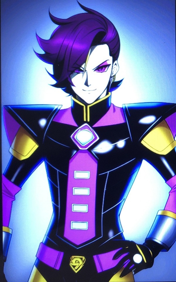
Sometime before dream.ai became an app, I played around with it to see if I could prompt it to get a reasonable looking "Mettaton", the leggy robot from UnderTale. Since the character comes in three different designs (box, EX, and NEO), I had to do add the word prompt "bishounen" to get dream.ai to generate something that resembled Mettaton in the EX form or NEO form. But none of the generated images could correctly capture the fact that he has a heart-shaped core in his abdomen (left: The sprite from the game; right: AI generated image):

I thought it would be an interesting exercise to try and "correct" some of these images while still staying somewhat true to the design the AI spat out.
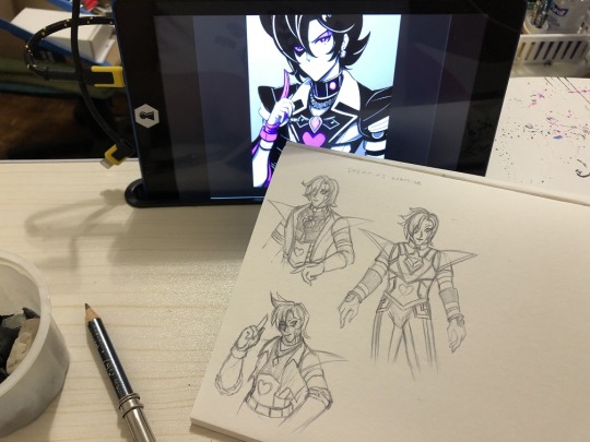
I found it to be actually be somewhat difficult, because the AI was adding in a lot of small details to the point of excess, leaving little room to add in the iconic heart-shaped core. In the process, I ended up simplifying a lot of designs.
Results:

These two best captured the likeness of the AI's output.

For some reason, the AI generated capes in some instances. My sense is that it is mistaking the wings in the NEO form as a cape, or it may be picking up on fan-generated content where Mettaton has a cape (such as alternate universe designs of OceanTale or OuterTale). I did like some of the pointy boot designs, though, they somewhat reminded me of anime mecha designs.

More capes. And one of them has a cane for some reason.

Last batch. In one of the images, the arms were not in full view, so I decided to cheat and give him the iconic tube arms you see in the EX form.
End Discussion:
Although I was amused by the aesthetic looks of the AI images, the designs reveal themselves to be rather crappy when putting pencil to paper. Most of this is due to the heavy emphasis on difficult-to-replicate details over practical character design.
Maybe the only positive learning I got out of this was playing around with the hairstyles. :P
#mettaton#mettaton ex#mettaton neo#undertale#dream.ai#AI image#jellyfishin draws#jellyfishin research
17 notes
·
View notes
Text
A not-so-perfect art hack
Years ago, I talked about the FiveBelow alcohol markers, of which one of the cons was that the marker color was only indicated on the side label and not the cap like with other name brands. This prompted me to come up with a potential fix, which was to put the actual colors on the caps myself using adhesive label paper.
By doing it this way, I could immediately know what the color was without needing to resort to a marker color swatch.

And this seemed to be a great idea! I wanted to do this with all my markers, even the name brand ones. Except the more I looked at it, the more I swore that the colors looked slightly desaturated when compared to my original swatch.

It turns out I was right about that hunch.
A close up comparison of the colors on the swatch and the colors on the label showed that there is indeed a color difference - for example the color 416 Light Caramel as shown below.

I'd overall chalk this up to paper substrate difference (though what causes this color difference exactly, I don't know), which is why this is a not-so-perfect hack (and a good reminder of why one should always do a marker color swatch based on the paper being used).
3 notes
·
View notes
Text
Some baking soda clay creations and tests
I've been on a creative kick recently with DIY baking soda clay. One of the things I read online was that baking soda clay creations can be colored with watercolors. Now I have heard of baking soda being mixed with gesso to make a DIY watercolor ground, so I figured there was no harm in trying out watercolors on some baking soda clay creations.

So, first off, a close-up of this lovely little goober, based off of a common rain frog. A relatively simple paint job, and the surface does take watercolor paint well, but I found that the gradient technique used in typical watercolor painting on paper doesn't work on the clay surface (I figure this is a limitation caused by lack of proper water flow over the clay surface).


Next up were some creations made out of a silicone mold. It turns out that watercolor does not penetrate very deep when applied to the surface, and so you can scratch-off/sand-off/shave-off away some areas to create a fine white line or faded parts without need for white paint.

I also tried to see if the clay could be tinted with alcohol markers (the equivalent of adding an alcohol-based dye to clay material while the clay is wet). In this case, I tried with a red marker, though I could only add so many marker strokes, and so the color of the clay turned out pink.

It seems I would need an otherwise significant amount of alcohol-based dye to get a saturated color. That said, I have seen videos where others tried to apply acrylic paint as the colorant and yet the clay becoming lighter upon drying. (The clay does start off as translucent and then dries a semi-opaque white color, so this would be expected.)
I did also read online that baking soda clay creations can also be colored with markers, so coloring with water-based and alcohol-based markers might be my next thing to try.
0 notes
Text
FiveBelow Alcohol Markers
Some more art supplies I got from FiveBelow - this time, it's alcohol makers (or rather two sets of alcohol markers):

FiveBelow's alcohol markers are dual tip (broad/chisel and small round/bullet nibs) and come in either an assorted color pack or neutral colors pack, with each pack containing 12 markers. Combining both packs should give you a grand total of 23 colors (two markers will be black). I say should because one marker was mislabeled - what was supposed to be "mint green" was actually pink, so I have double the amount of pink.
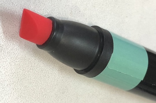
Boo. >:(
In any case, below is the color breakdown (sans mint green):
Assorted Color Pack

Neutral Color Pack

One of the cons I find to using these packs is that the label color doesn't always match up well with the ink color (especially the markers from the neutral packs). You will definitely need to make a reference color chart beforehand to keep track of color names.

Other cons to these markers:
the color output is not as super saturated as name brands.
the color name/code is on the side of the marker as opposed to the marker cap. Therefore, upright storage isn't impractical here.
I guess that's what I get for buying cheap in the end. But $10 USD for 24 alcohol markers is a pretty good deal, and these markers are usable - just don't expect them to have quite the same heavy color density output as the more tried-and-true brands (like Copic, LePlume, or Prismacolor) that can cost around 4-5 times as much.
12 notes
·
View notes
Text
FiveBelow Artist Pens
So I recently picked up a pack of "6 Artist Pens" product from FiveBelow (chain store selling goods for $5 USD and under). I've had bad luck previously with other cheaply-priced off-brand artist pens before, but this purchase turned out to be a very pleasant surprise.

The pack is fairly basic, and contains six black ink pens of various nib sizes (0.2, 0.4, 0,6, 0.8, 1.0, brush). A quick test with my markers showed that these inks were resistant to both alcohol-based markers and water-based markers. Yay!
The ink seems a similar consistency to that of the Faber-Castell PITT pens, but with a slightly faster flow. Like the PITT ink, the FiveBelow ink generally "sits" on top of the paper and isn't likely to bleed through most sketchbook papers, but some of the ink particles can lifted when erasing and result in lineart that is slightly faded.
Similar PITT pen packs are generally around $10-15 USD, so if you're looking for a cheaper alternative, I suggest giving these FiveBelow pens a try.
9 notes
·
View notes
Text
Trying alcohol markers on inkjet matte postcard paper
Not too long ago, I picked up a stack of Staples inkjet matte white postcard paper (reorder number 12496) from a swap meet. I thought I could use these to do mini illustrations and whatnot. So, I ended up trying to do a marker drawing on one of the paper cards.
To make a long story short: I found it rather difficult.
Not unbearably difficult, but definitely an unpleasant experience.
Below is a copy of the drawing I did, along with some comments pointing out which parts I like and which parts I dislike about the result. For reference, I was using Marvy Uchida LePlume markers, with Faber-Castell for the lineart:

Not mentioned above is the fact that graphite pencil does not erase well from the paper if applied heavily (it will streak and leave a mark when erased). I was using a standard #2 pencil with hard lead. I can only imagine what a much softer lead will do.
Also not mentioned is the fact that it is possible to smudge the lineart. The more ‘heavy’ the coloring, the more ‘abrasive’ the marker will be.
Some theories on why this was so difficult
I don’t know all too much about matte paper, other than the fact that it’s paper that has a matte coating on it; reading about it mentions that a disadvantage to using matte coating is that prints using this paper can be prone to abrasion, which makes me think the ink just sits on top of the coating or doesn’t go past it. This probably explains why I could smudge the lineart under certain circumstances - most home inkjet printers use a water-based ink, and if this paper was designed for inkjet, a water-based ink like Faber-Castell would probably also be just only surface deep at most.
The paper I was working with was specifically designed for inkjet printers, and this also suggests that the paper likely contains a pretty significant amount of titanium dioxide and clay (or some other absorbent material designed to prevent feathering). I had a hard time blending in some cases, and I have a feeling that the paper composition causes the inks to potentially settle in layers as opposed to blending, for the following reasons:
Usually (though not always), grey inks are just black ink that has been diluted to various concentration to get a different color saturation. The odd caking of the dark greys and black could be a result of the black colorant being piled on top of each other.
The background where the ink doesn’t blend looks like as if the inks are just sitting on top of each other.
It seems like the only case where the colors are blending well is where the colors are very similar. My guess is that the inks are still sitting on top of each other in those cases, but it’s hard to notice due to color similarity so it looks like a good blend.
It would be interesting to retry this with water-based markers.
2 notes
·
View notes
Text
Marvy Uchida LePlume Markers
For those of you who saw my last blog post, you might already know that I bought some Marvy Uchida LePlume markers from NYCC 2018. I thought I’d talk a bit about it.
The sets I bought were the 30-piece set (3000-30PD) and the fine brush 36-piece set (3100-36A). [Technically, they both come with a blender, so it’s really more like 29 regular markers and 35 fine brush markers.] These are not the double-sided markers, and all these markers use brush nibs.
I don’t know if it’s available when you order online, but my purchase at NYCC included a chart to use as a swatch board (very handy!). Here’s the swatch board filled in:
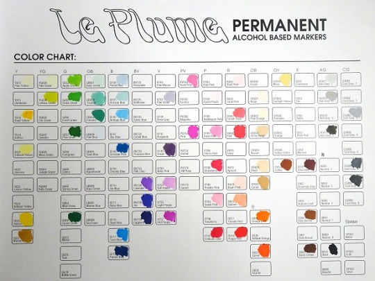
Obviously not all colors are filled in, but that’s because both packs don’t include the whole spectrum collectively. Overall, buying both packs gives you 59 colors total (60 slots are filled in here because I did get one extra color in their freebie giveaway from a previous convention, it’s the darkest of the greys). [To note: Marvy Uchida’s color spectrum includes 144 colors while Copic’s color spectrum includes 358].
One thing I’m not quite a fan of is the way the 30-piece set is packaged. Their package does have a handle and can be easily be re-opened and reclosed, but it seems like you have to spill out the markers to know what colors you’re getting at.
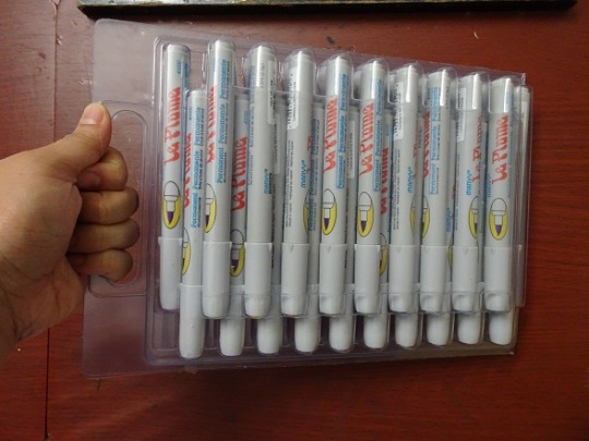
I’m not sure if the intent here was to have users throw out the packaging or keep it. If intended to be kept, I would like to see a packaging design to make it easier for end-users to get access to the markers.
On a sad note: one marker ended up being a bit of a dud.
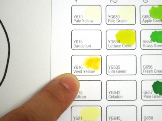
Vivid Yellow Y616 was partially dry and the tip seemed to be slightly blunted when I tried it. I don’t know if it was a marker used for quality control testing and they accidentally tossed it back into the pack, or if it was a return that was being resold, or if something else happened to it.
On the main website, 3000-30PD costs $89.80 USD and 3100-36A costs $71.74 USD, which makes it about $3.00 USD for the regular markers and $2.00 for the fine brush markers. The cheapest I’ve seen for a 36-set from Copic is $153.99 on Amazon, which makes each marker about $4.28 - but note that Copics are designed to be refillable/reusable, and have a larger color spectrum. Take that info as you will.
1 note
·
View note
Text
Marker study: Mettaton redraw
So for anyone who saw my last post, I mentioned about being at the Marvy Uchida booth at New York Comic Con 2017. The booth personnel were giving out a three-pen sample pack of their products for those who signed up for their e-mail newsletter at the booth. The pack they gave me had one LePlume in dark grey and one LePlume Fine Tip in pink.
So hey, I will redraw Mettaton and post that side-by-side comparison. But I might as well test the LePlume against my other markers while at it.
Marker comparison:
Before I dive into revealing the redraw, here is a comparison of the LePlume pens compared to my Faber-Castell PITT and TriC Art Performance pens:

The Faber-Castell PITT pens are water-based. However, they use an India Ink-based composition, so they’re more-or-less waterproof when dry and can’t be really blended with a waterbrush later on. The pens I’ll be using here comes from the designated “MANGA Set”.
The Marvy Uchida LePlume markers are alcohol-based. The light-grey barrel is standard size and has a fairly fat tip, the black barrel has more of a fine tip. (Marvy Uchida also sells a dual one with a fat nib and a chisel nib, btw).
The TriC Art Performance pens don’t have any indications on their label, but I suspect they’re water-based since they don’t give off a smell when I sniffed the tip. Unlike the Faber-Castell PITT, these appear to be blendable with a waterbrush pen.
For outlining I’m using a dip pen with Higgins India Ink. I never did marker coloring on an outline done with a dip pen, so this was interesting experience.
I’m going to be testing these on some kind of slightly thick matte paper with a smooth surface. To note: This paper was less smooth than what I using at the Marvy Uchida booth.
Re-draw comparison:
So here’s the redraw reveal. Left is the original image done with Marvy Uchida products. Right is the redraw done with multiple markers (I marked where I was using each marker brand).

A few things I found interesting:
1) The standard LePlume pens give off a LOT of ink. Compared to the other markers, the ink from the standard LePlume ink bled through to the other side. I had to place a piece of scrap paper underneath to prevent bleeding onto the next page.
2) Not surprising, but saturation was an issue when coloring due to the paper quality. I got the LePlume pens to move smoothly, but the coloring wasn’t quite as even-looking as what I saw before at the Marvy Uchida booth. But I still think the saturation with LePlume was pretty good, and this is due to the very heavy ink deposit it gives.
TriC Art Performance gave good coverage for darker colors, but I ran into some paper piling issues with lighter colors.
Faber-Castell PITT had less of a consistent color, but no piling and I was able to get the colors to blend into each other. Seems to work pretty good as a means of shading in some areas.
2) The finer-tipped nibs seem to partially lift off some of the black pigment from the outline. TriC being the worst offender here. Seriously, it made Box Mettaton’s screen look absolutely awful. There’s no real way to fix his screen except to excise the screen area and replace it with a new piece of paper the same size as the excision and start over. (Hmm, maybe I might do that as a tutorial post).
Maybe finer tip nibs in general have a tendency to be more abrasive, as I didn’t see this problem with the grey-barrel LePlume marker that had the fatter tip. I probably would have to stick to using outlining pens sold with markers (PITT or LePen) or find an India Ink brand that has a better binder if I ever plan to color with markers in the future.
3) LePlume ink seems to “sit” on top of TriC ink. Or at least the pink LePlume ink sits on top of the pink TriC ink (can’t say the same for other colors). I teased it around with an alcohol-based blender to pull some of the LePlume pink ink off from the TriC pink ink to make some areas look lighter.
#mettaton#mettaton ex#mettaton box#undertale#marker#marvyuchida#fabercastell#TriC#jellyfishin draws#jellyfishin research
8 notes
·
View notes
Text
Marker Study (continued)
So a while back I had posted a blog article on a marker study of sorts, andnoted that the markers were smearing the lineart I did in Higgins ink. I was looking at the tags of those who reblogged my post and noticed the reblog by @nonbinary-aigis mentioned that Higgins has a tendency to be easily dissolved by markers in general.
It got me thinking about other types of inks on the market and how well they stand up to marker ink. So I did some more trial-and-error research on the subject.
I had the following inks in my drawing arsenal:
Faber-Castell PITT (small tip): water-based India Ink. Website mentions this ink is acid-free and pH neutral.
Marvy Uchida LePen: alcohol-based ink. Website mentions this ink as being as acid-free.
Japanhome: Ink composition unknown. Probably not a high-brand pen since I bought this when I was on a trip in Hong Kong in a shop equivalent to one of those dollar-based stores (ie., the price was pretty cheap). I don’t think they sell these in the Western hemisphere. Pen design is free-flowing ink in a plastic barrel, ball-point tip.
Pilot G-2 05: gel ink (which means the ink is a pigment suspended in a water-based solution and contains thickeners).
Higgins Calligraphy waterproof black ink: Pigment suspension (liquid composition unknown). NOTE: This was the ink I had used in my first marker study. I had originally thought this was India Ink, but apparently Higgins has a separate product labeled India Ink.
Deleter-Mangashop Black 1 ink: Ink composition unknown. As you can probably figure out, this type of ink was specifically designed for manga artists in mind, and the Black 1 version is one of the best sellers. Website mentions this ink is good with alcohol-based markers.
Tom Norton Walnut Drawing ink: Water-based ink intended for sepia-based drawings. Not real walnut ink, just a well-designed replica. It’s slightly alkaline, having a pH of 8.8. Website mentions ink being lightfast.
Higgins Pigment-based ink (Carmine Red): Pigment suspension (liquid composition unknown).
Higgins Dye-based ink (Carmine Red): Dye dissolved in (unknown) liquid composition.
I put them up against the following coloring tools:
Marvy Uchida LePlume: alcohol-based marker with brush tip
Faber-Castell PITT (Brush Tip): water-based marker, but with composition similar to India Ink.
Waterbrush pen: These types of refillable pens are intended to act like paintbrushes. They have a nylon tip. I’m using just regular tap water here.
Crayola color pencil: color pencil with a fairly soft lead
TriC Art Performance: water-based marker with brush tip
Sargent color pencil: color pencil with a fairly hard lead
Test Results:
Study was done on a piece of cardstock. Ink was allowed to dry overnight. Coloring tools were then passed over the ink lines four times to simulate an overkill-coloring scenario:

I think it comes as no surprise that the Faber-Castell PITT and Marvy Uchida LePen pens were pretty resistant to everything thrown at it. These were designed for line art, after all. The Higgins Pigment and Higgins Dye inks also seem to stand up pretty well, too (though the line art does not look as clean in comparison of PITT and LePen)
But I found that certain inks smear for some coloring tools and not others, even if the base liquid composition is the same. This is the case for Japanhome pen and Walnut ink, which were resistant to everything but the waterbrush while resistant to the water-based markers. This makes me think that these inks will resist a small amount of water, but a large amount of water will eventually loosen up the ink enough that it will bleed. In other words: water-resistant but not water-proof.
Other things I’ve observed:
1) Pilot G-2 was resistant to everything but the waterbrush, and slightly smears when exposed to the Faber-Castell PITT pen. The case for the waterbrush is likely the same as that of the Japanhome pen and Walnut ink (ie., water-resistant but not water-proof). As for the PITT pen, I have a feeling that there probably is a co-solvent or other chemical in the PITT that partially dissolves the Pilot G-2 ink (India Inks in general have a different composition than other aqueous-based black inks).
2) Higgins Calligraphy just... smears for nearly everything. The Crayola color pencil was the only one that did not damage the ink line.
That being said, the smears are kind of small. It takes more than one pass before any smear appears. My sneaking suspicion is that the amount of pigment in Higgins Calligraphy ink is rather high, and the binder of Higgins Calligraphy is just not able to hold down the pigment very well, such that excessive force can cause the ink to smear.
3) Mangashop-Deleter 1 was resistant to alcohol-based markers (as the website mentions) but was not resistant to water-based coloring tools. To note: there is a version, Deleter 4, which is designated as being water-proof and good for use with alcohol markers, so I think if you’re into using a combination of water-based and alcohol-based mediums on the same lineart, you’ll probably want to get Deleter 4.
1 note
·
View note
Text
Doll hair experiment
A while back, I saw a couple of YouTube videos and a Tumblr post about how acrylic yarn can be used to make customized doll hair for plastic dolls (such as Barbies or Monster High dolls).
I’m also been looking into acrylic fiber, and it seems like yarn can be brushed out to get fiber for needle felting.
And then this crazy idea popped into my head: perhaps there’s a way to combine the two, such that you could make yarn hair for needle felted dolls?
I didn’t entertain the idea that much. Until now. I recently went to a community swap recently and managed to obtain a fist-sized ball of red acrylic yarn. And let’s just say a certain needle felted doll modeled after a certain red-headed fish lady has now become my first victim subject for this experiment.

Yeah, I was daring enough to try and redo Undyne’s hair with acrylic yarn.
So, I started off with making a long hair weft with yarn...
I measured a piece of yarn around Undyne’s original hairline and added 2 inches extra to get one long string.
I then cut out several smaller pieces of yarn 2x the length of hair I wanted and tied it to the longer yarn string, until I got my desired weft length.

Big mistake: I thought I could get away with just brushing the yarn out with a doll brush, but that wasn’t working. I had to detangle the yarn strands here by hand. The brushing worked better after manually detangling.

Speaking of which, I knew that brushing causes some fiber to be pulled out. But I had no idea how much leftover fiber I would get.

..... Yeah that’s a lot of fiber.....
Anyway, here’s what happened after I finished brushing.

The result was rather frizzy, and the strands retained some curl to them. Not that this was a bad thing - I could imagine making something like this in the future if I plan on ever making curly-haired or frizzy-haired characters - but, for my experiment, I needed the hair mostly straight. So I dunked the weft under some hot tap water and began brushing out the yarn some more, which got rid of most of the curl.

It looked pretty good at this point so far.
Now, typically, if making this for a plastic doll, the hair strands would be put through a straightening iron set at low heat to make it shiny; however, since I’m making this for a needlefelted doll, I just kept it as is at this point.
Now, for the moment of truth: Could I needle felt this weft?
I carefully pulled off the original hair from Undyne’s head. I prepared my needles to stab the weft onto the back of her head. And...

... it didn’t work. T-T
Well, okay that’s kind of a lie. The acrylic weft did felt into the head, but the connection was really weak and could be dislodged easily even with gentle handling. :(
My guess is that the weft was pretty bulky from the start, and it’s overall design made it difficult for fiber to penetrate into the head. I could see the possibility of felting on loose hair strands instead of a long weft. Or, maybe tying yarn onto sewing string so the weft isn’t too bulky and the fiber could dig deeper more easily.
There was also the possibility that dunking the weft under hot water caused some of the acrylic fibers to straighten, making the fibers less rough and less likely to felt.
I also have to consider the fact that Undyne is made of polyester that has been felted over a foam core. So there is also the possibility that the acrylic fiber isn’t sticking too well into the foam core. Maybe the yarn hair requires a felted core in order to stick properly.
So, yeah. Kind of a fail. But not completely.
I was getting pretty impatient at this point, though. Making the weft was a very time-consuming process (that’s why my pics are taken over a laptop, I was watching YouTube videos the entire time). I didn’t feel like cutting the hair from the weft to felt into the head. I proceeded to sew the weft on to the head instead.


That hair was super unmanageable, though. Particularly the hair fringe.
A common trick used for treating Barbie doll hair that has gone frizzy is to dunk the hair into boiling water. I did the same thing here. I pulled the hair into a ponytail and dunked the ponytail and hair fringe into near-boiling water (basically just heated some water in the microwave) and began to style the hair with a doll comb while it was still hot.

Undyne’s hair looks way better now. :)
#doll hair#yarn hair#yarn#needle felting#needle felt#needlefelt#needlefelting#jellyfishin tutorial#jellyfishin research
15 notes
·
View notes
Text
Doll hair experiment, re-do
So, for anyone who saw my last post, I talked about how I experimented in trying to make needle-feltable doll hair using red acrylic yarn that I picked up at a swap. The experiment was semi-successful, in which the hair was kind of feltable, but didn’t stick as well as I would have hoped.
But the red acrylic yarn wasn’t the only yarn I picked up at the swap. I also picked up a skein of gray yarn.

I noticed on the label that this yarn was a wool-acrylic blend. By nature, wool has scales that allows it to be feltable. And I was hoping here that the doll hair from this yarn would felt better than the pure acrylic yarn I tried earlier.
But, who to try it on? Here’s victim subject #2.

I’m sorry Mr. Napstabot, but to be honest, I never liked the way your hair turned out. So I’m getting rid of it. *chop chop*
Making the weave again...
First thing I noticed when making the weave was that this yarn is made of more strands than the red yarn, despite the two having near identical diameters. It was also easier to pull apart.

Same process in making the weave. Went a bit more liberal this time in picking the hair length (longer was better, I planned on cutting the hair later anyway after styling it). However, this time, I took the time to detangle the yarn used to make the hair. Or, rather, semi-detangle it, since there were so many strands to contend with.

I remembered the original red hair weft being bulky at the root. So I tried to do a single strand for the root base in order to reduce bulk. But I found it too fragile and had to make it a little thicker. Hence the two strands in the pic above.
It still had some give, though, and I had to be careful when brushing it out, even going so far as to using tape to make sure I didn’t destroy my weave during the brushing process. Also, since the strands were so small, I switched out to using a more fine-toothed comb (doll brush was not cutting it). The result was not as floofy, though, which began to make me concerned.
I didn’t bother wetting and re-combing the hair like I did last time to get rid of the curl. I left the weave as is.

Determining weave length was an issue I had to tackle. With Undyne, her hair was pulled back, so I knew that the weave wrapped around her head and length had to be, at minimum, as long as her hairline.
But since I’m dealing with someone whose hair would not be pulled back but drapes down from the middle of the head, I wasn’t sure how long to make the weave. All I knew is that the weave would start from the top of the head and spiral downwards going around. I originally gave a rough estimate of needing a weave the same length as Napstabot’s hairline and was relying on floof to give the hair some volume. Lack of floof meant that the hair was thin, which also meant that I was potentially coming across an issue where I might need a longer weave to add hair volume.
So, after pulling off the old scratchy hair, I pinned the weave to the top of the head as a test.

I had this much scalp left over.

I was concerned about not having enough floof. But after draping the hair down, I decided that maybe I didn’t need to make the weave any longer.

Now, for the moment of truth, could this hair be needle felted?
At first, I began to needle felt the “hair roots” to the top of the head and began to pull as a test. I ended up making a bit of a hole in the head in the process, but I could see and feel the weave was catching a lot better than the red yarn.

So, along with the “hair root”, I began to extend the felting area to include right below the “hair root” as well.

And...

Yes, that is me pulling the hair and letting the doll dangle. The weave is sticking strongly where I felted it.
SUCCESS! 8D
So, the method worked here. But why did it work with Napstabot and not Undyne?
My first guess is the yarn. I’m working with a wool blend now, not 100% acrylic. But I’m not sure at this point if this is just a case of a wool blend necessarily being better than 100% acrylic here. In my previous post, I mentioned the possibility of the acrylic fibers straightening under hot water and making the fibers less rough and thus less likely to felt.
I still got some red yarn left. Maybe I can do a small test on that theory regarding warm water later. But not now. I’m tired, and I gotta rest a bit.
Onto finishing the head...
Unfortunately, the floof problem caught up to me again after I finished felting everything down. I have a bald spot. 8(

Not to worry, though, I have brushed out fiber from earlier.

Just gotta comb out that sucker with a doll comb and cover up that bald spot.

Now for the fun part on styling the hair. I draped the hair down in the direction I wanted it to fall.

I then wetted the hair lightly in lukewarm water and... okay, I totally forgot that wool contracts in water and makes it harder to brush out! I cut the hair while it was still wet and towel-dried the hair as much as I reasonably could. I then gently brushed the surface of the hair, and the top and underside of the bangs while the hair was damp. After drying, I lightly felted the back down. Here’s the result after drying:


Not too bad. But now the eyes look a little weird to me with that hair. So I also went ahead, plucked out his old eyes, and redid the eyes too.

Oh, forgot about his beanie hat.

Much better. :D
#doll hair#yarn hair#yarn#needle felting#needle felt#needlefelting#needlefelt#jellyfishin tutorial#jellyfishin research
10 notes
·
View notes
Text
Crayola Fine Line Marker Testing
So, when I heard that Toys R’ US was closing down their stores, I went to my local store and decided to see what was left in their going-out-of-business sale. I intended buy some doll accessories I could use for my doll photography (sadly, that ended up being a no-go since they didn’t sell anything at a size suitable for my purpose) but to my surprise, I found that they were selling boxes of Crayola Fine Line markers.


Yeah, I caved and I bought myself a box. It seems like a pretty good spread for 40 markers.
First things first, I decided to see how the markers were packaged. I found it odd they packaged everything in smaller boxes, 10 markers each.

Even more weird is how they grouped the markers. It looked very scattered and non-cohesive.

I had to do some rearranging of the marker colors, basing it on the color reference on the back of the box.

Now that’s much better.
In the process of rearranging everything, though, I began noticing that the color on the caps do not match the color reference on the box. This is kind of expected, since color-coded marker caps/barrels don’t always match the ink due to manufacturing limitations.
Of course, it’s still always good practice to do a marker color swatch (this even if the marker kit comes with their own printed swatch, because printed swatches can become distorted over time from exposure to UV light over time).

My swatch was done on paper from a Canson sketchbook. The “tail” on the left side of each swatch is an exposure test to a watercolor brush, because I wanted to see how they would react for watercolor purposes.
The swatch I got was not too much different from what is on the box with the following exceptions:
Pumpkin: more yellow-ish than box reference
Seafoam Green, Graphic Green, Royal Purple, Ultraviolet, Violet: more blue-ish than box reference
Teal, Plum: more darker than pox reference
Sandy Tan: more pink-ish than box reference
The markers also seem to be fairly well-pigmented, but Laser Lemon and Pink don’t seem to give off as much color when a waterbrush is applied to it, which makes me think these markers use a dye that is not as water-soluble.
Speaking of Pink, I noticed that marker in particular seemed to pill the page when coloring. The ink from this marker felt a bit more wetter than the others, and I think the ink of this one marker has more water content than the others. I don’t know if this is a manufacturing defect or if that’s just how the ink is manufactured. I’ll probably be resorting to my equivalent TriC pink marker for that color when needed.
3 notes
·
View notes
Text
Quick update about the markers: apparently the broad nib and the bullet nib give different ink flow rates, so if you're coloring, you may need to adjust your coloring method accordingly.
FiveBelow Alcohol Markers
Some more art supplies I got from FiveBelow - this time, it's alcohol makers (or rather two sets of alcohol markers):

FiveBelow's alcohol markers are dual tip (broad/chisel and small round/bullet nibs) and come in either an assorted color pack or neutral colors pack, with each pack containing 12 markers. Combining both packs should give you a grand total of 23 colors (two markers will be black). I say should because one marker was mislabeled - what was supposed to be "mint green" was actually pink, so I have double the amount of pink.

Boo. >:(
In any case, below is the color breakdown (sans mint green):
Assorted Color Pack

Neutral Color Pack

One of the cons I find to using these packs is that the label color doesn't always match up well with the ink color (especially the markers from the neutral packs). You will definitely need to make a reference color chart beforehand to keep track of color names.

Other cons to these markers:
the color output is not as super saturated as name brands.
the color name/code is on the side of the marker as opposed to the marker cap. Therefore, upright storage isn't impractical here.
I guess that's what I get for buying cheap in the end. But $10 USD for 24 alcohol markers is a pretty good deal, and these markers are usable - just don't expect them to have quite the same heavy color density output as the more tried-and-true brands (like Copic, LePlume, or Prismacolor) that can cost around 4-5 times as much.
12 notes
·
View notes