#ixd504
Explore tagged Tumblr posts
Visit Tumblr Blog
Explore Tumblr blogs with no restrictions, modern design and the best experience.
Last Seen Tumblr Blogs


Fun Fact
Kazakhstan’s Minister of Communications and Informatics has blocked the Tumblr site because it contained 60 sites of terrorism, extremism, and pornography in 2015.
Text
Brand Dev/Inspo
I’ve moved really far in a few weeks regarding brand development of my card game project for final year. Originally it was called refracted and characterised by black backed cyan and magenta illustrations framed by Art Deco elements.
As I’ve moved on with content design, the aesthetic has grown and evolved. I settled on a type pairing: Space Mono x Playfair Display. But as I continued with content design and experimenting with the content itself, I found myself leaning heavily on the Playfair Display font family.
Quotes = Playfair Bold, attributions = Playfair Italic
Questions = Playfair Italic
Tasks = Playfair italic (body copy) bold (headings)
After stepping away from colour for an extended period of time, I find myself wanting to stick to black and white. Or perhaps an anthracite/cream combination. Monochromatic and timeless.
I’ve been looking at brands for inspiration and have included some below.


1 note
·
View note
Text
IXD503 and IXD504 Submission
It is hard to believe this is my final University submission. I want to thank my lecturers for an amazing four years. I have learned so much and I have made some amazing friends. The course has also helped me get an amazing job at Rapid7. THANK YOU!
Edible - IXD503
V2 High Fidelity Prototype
Wireframe Prototype
Prototype Screen Recording
New Screens and Sketches
Launch Strategy
Promotional website
Major Project Posts
So Whats New this Semester?
Edible Login
Searching for an Item of Food
What must the Menu include in Edible
Support for Edibles Users
Location Settings
Some Tips!
Inspiration - Dark Theme Apps
Edible Dark Theme
New Food Bank Feature
Research
The Last Semester
Designing Final Pages
Notifications
Starting to Research Usability Testing
Usability Testing Research
User Testing?
User Testing vs Usability Testing
Steve Krug - Don’t Make me Think, Revisited
The System Usability Scale
What do I need to ask?
Research - Promotional Websites
Edible Promotional Website
Three Steps to a Successful Mobile App Launch
Corona Virus and Food Banks
Questions for Usability Testing
Should Dark be an Option for my Users
Why Include Dark Theme
Dark Theme Design Standards
Edible - IXD504
Edible - Colophon Report
3 notes
·
View notes
Quote
I want to make beautiful things, even if nobody cares
Saul Bass (1920-96
1 note
·
View note
Photo

https://www.invisionapp.com/
Website inspiration
I like how InVision’s website breaks down features, pulling out elements within the screenshot to clearly display how the feature functions. I feel these would work well animated showing the feature in action like they have down further down the page.
I also like the balance between the different font sizes to the side of the product imagery.
1 note
·
View note
Text

Colophon Report
Using my sketches as a reference for my layout I set to work creating pages to hold my written content. I started by creating my colophon in Figma, before later moving on to recreate the design in Adobe InDesign. The reason I made this decision is because I find InDesign quite awkward to use, as such I felt quite hindered when it came to quickly explore different layout options as it would take me longer to iterate, by starting in Figma and later replicating my chosen designs in InDesign I could avoid this.
Overall, I'm happy with how my report has turned out. I ended up really liking my decision to have imagery backgrounds that bled into the other pages, it helped tackle the issue of excessive white space whilst also adding a creative flare. Additionally also like that my design has come out very consistent overall, making it appear well-polished and thought through
Read Finished Report
0 notes
Text
Researching Bubble
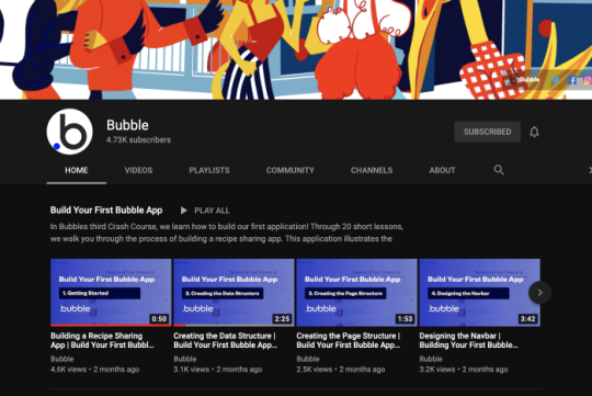
I’ve spent the past couple days researching Bubble to see if it would be feasible to work with. I learned a bit about APIs and Databses. I was quite surprised at how advanced the app is - if I wasnt coming from a tech background, I would have no idea how it works at all. Thankfully I am, and I’m learning a lot about backend as well as frontend design. I actually discovered a couple cool pattern libraries which will help me with a range of projects. I already knew material design, but hadn’t referenced it in a while https://material.io/design Apple’s human interface guidelines https://developer.apple.com/design/human-interface-guidelines/ Airbnb - some great articles https://airbnb.design/ iOS design patterns https://mobbin.design/
0 notes
Text
BEMIND FINAL SUBMISSION
IXD503
Dashboard
Research
PDF
Launch Strategy
Website
Low fidelity Wireframe
High fidelity Wireframe
Walkthough App
Apple Watch Prototype
App Notification Prototype
-------------------------------------------------------------------------------------------
IXD504
Colophon Report
0 notes
Text
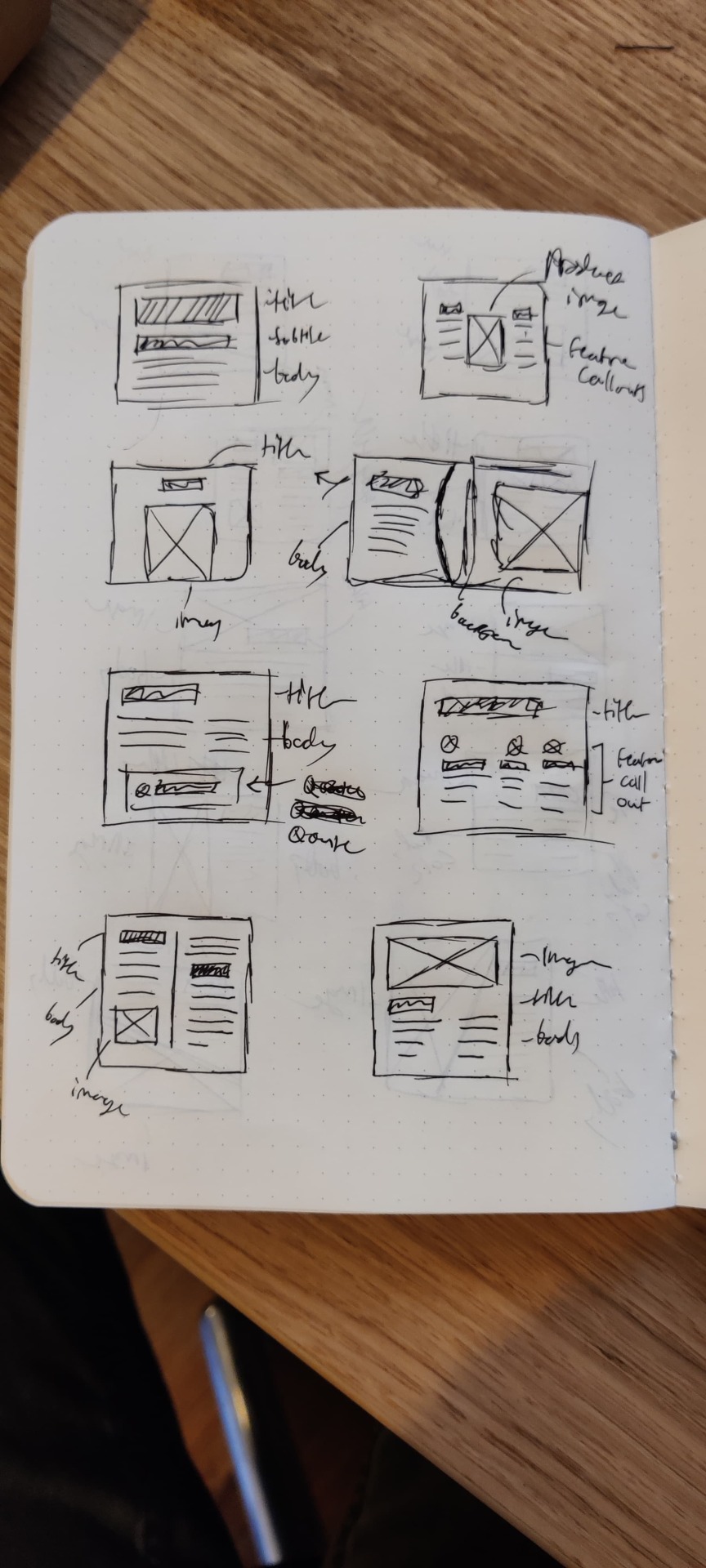
Colophon Inspiration #3
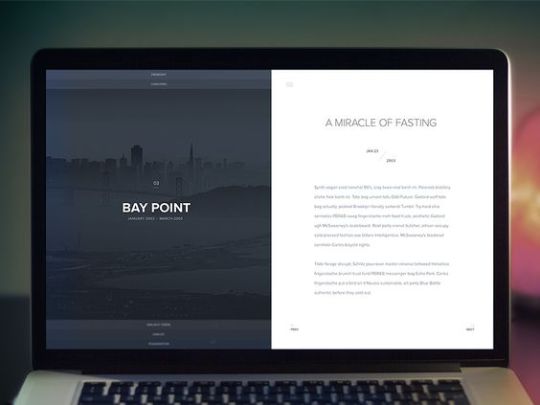
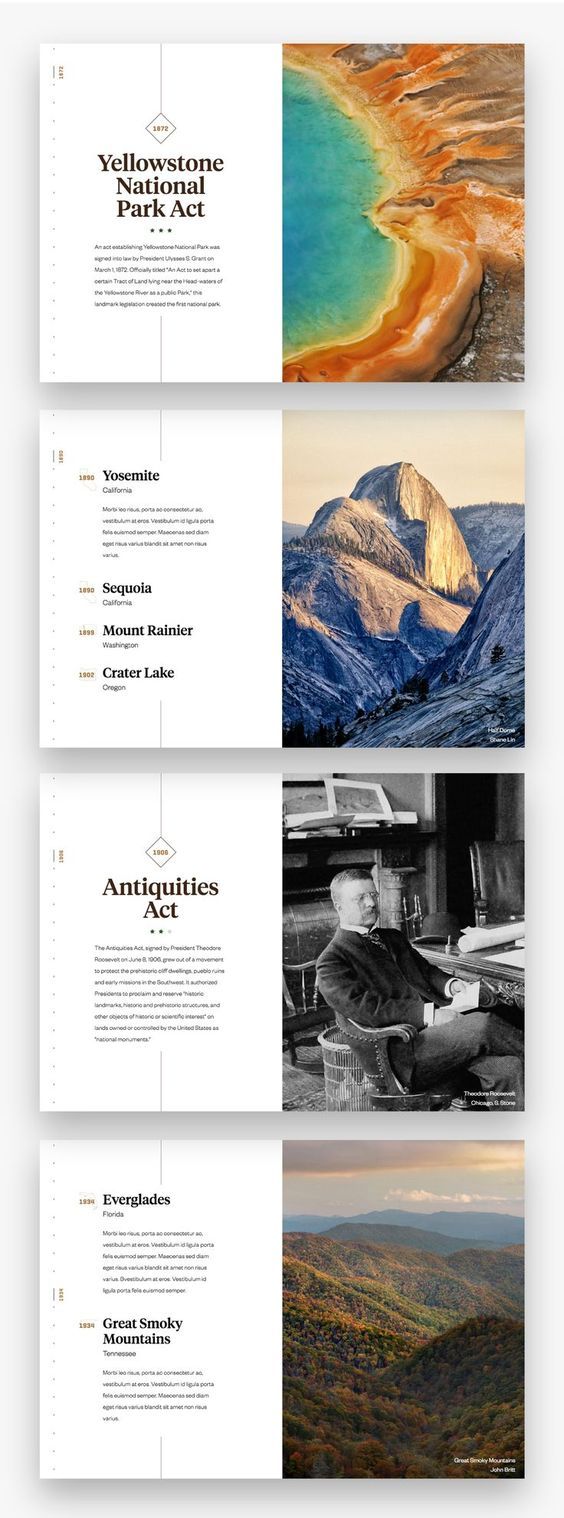
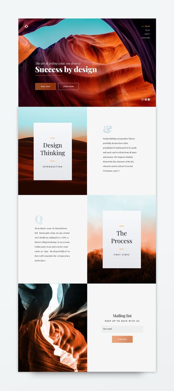
I wanted some “normal” pages throughout my Colophon. By normal what I mean is a 50/50 split with no overlapping elements. The design would be split with the spine of the book.
I was inspired by the above examples, I was inspired by their use of detailed imagery, mixture of serif and sans-serif text and the rather simplistic nature of the layout. Instead of adding elements like I did with previous examples, I started out with the bare minimum and tried a number of layouts. The key was for everything to be in harmony with each other and for the elements to be balanced, often this is the hardest part about designing for print or for web.
As you can see from the second last example, I just did a rough draft and then slowly added elements (such as the number design from my content page.)
Overall I am pleased with the result.
0 notes
Text
11- Merchandise #1 - Stickers and Print Colours


While I have been mainly focusing on building a functional VR Tourism app, I have also been experimenting with my brand and its merchandise. I decided to start off with the most basic form of merchandise, stickers.
You may notice that the colours of my merchandise brand appear somewhat subdued in comparison to my digital brand. This is because the colours of my brand are not easily recreated in print format without resorting to spot printing which is considerably more expensive (especially on a small scale).
It was with this realization that I started to experiment with colours to discover what would be the best alternative. I found once I started to venture into the brighter hues of green they would start to turn a lime colour (due to the mixing of the blue and the yellow ink). Because of this I decided to settle on the above shade of green, as it better fits my brand.
If I were to order on a larger scale and had more funds at my disposal I would have went with spot printing without a shadow of a doubt. However I am pleased with the result regardless.
I will trying out a number of other merchandise ideas I have in the future.
0 notes
Text
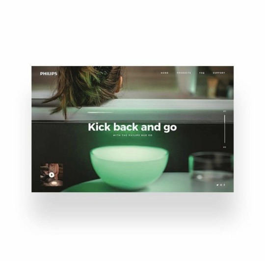
Product landing page inspiration
I came across this landing page by @defects while trailing through Instagram in search of inspiration.
While extremely minimal this product landing page immediately caught my eye. With big visuals and the product in use as the centrepoint it immediately immersed the viewer into the product use case. Showcasing both the beautiful product design tied with a enviable scene. This clever imagery ties relaxation, luxury and happiness to the product.
This is a good example of how minimal design can be extremely effective. A picture is worth a thousand words, and sometimes good imagery can do all the work for you. Particularly where beautifully designer products are concerned.
My only criticism of this composition is the focal point being on the user in the imagery. While important to create this connection with the viewer the focal point of this design in my opinion should be the product itself.
0 notes
Text
Such a clever animated prototype using adobe xd. I love the how they animated the little rocket a really nice touch.
2 notes
·
View notes
Photo


Kickstarter Launch Date
I know this post has past the deadline so I do not expect any marks from it I just wanted to put it up so I can still track my on progress on the campaign. I had everything on my Kickstarter finalised then was made aware that I could include delivery charges on top of the my their prices so I had to slightly amend the prices to make them a little cheaper so people wouldn't feel so put off with the delivery charges.
It took them a day to confirm my identity and then after that I just had to submit my payment details and then send it over for review which usually takes 3-4 Days with Kickstarter but it only took 2 minutes so that was a surprise.
The Kickstarter is ready to go and you will be able to purchase it online Friday May 1st 2020. The first image is the one I am going to go with to advertise this for the campaign the others where didn't look right in regards of positioning of the Kickstarter logo.
0 notes
Link
A lot of extremely useful techniques for promoting your app before launch. Some methods I have already considered in the lead up to Stamina’s launch and others that are new to me. This article helped highlight additional methods that would be appropriate for my apps launch also.
1 note
·
View note
Text
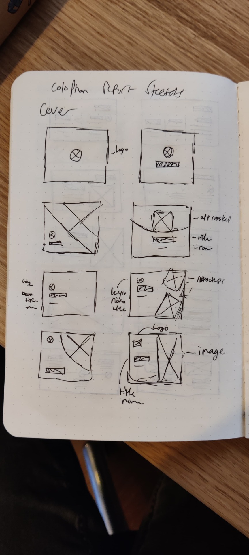
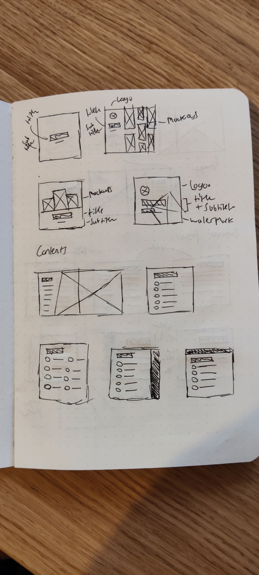
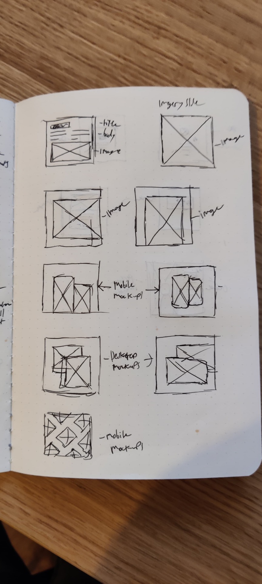
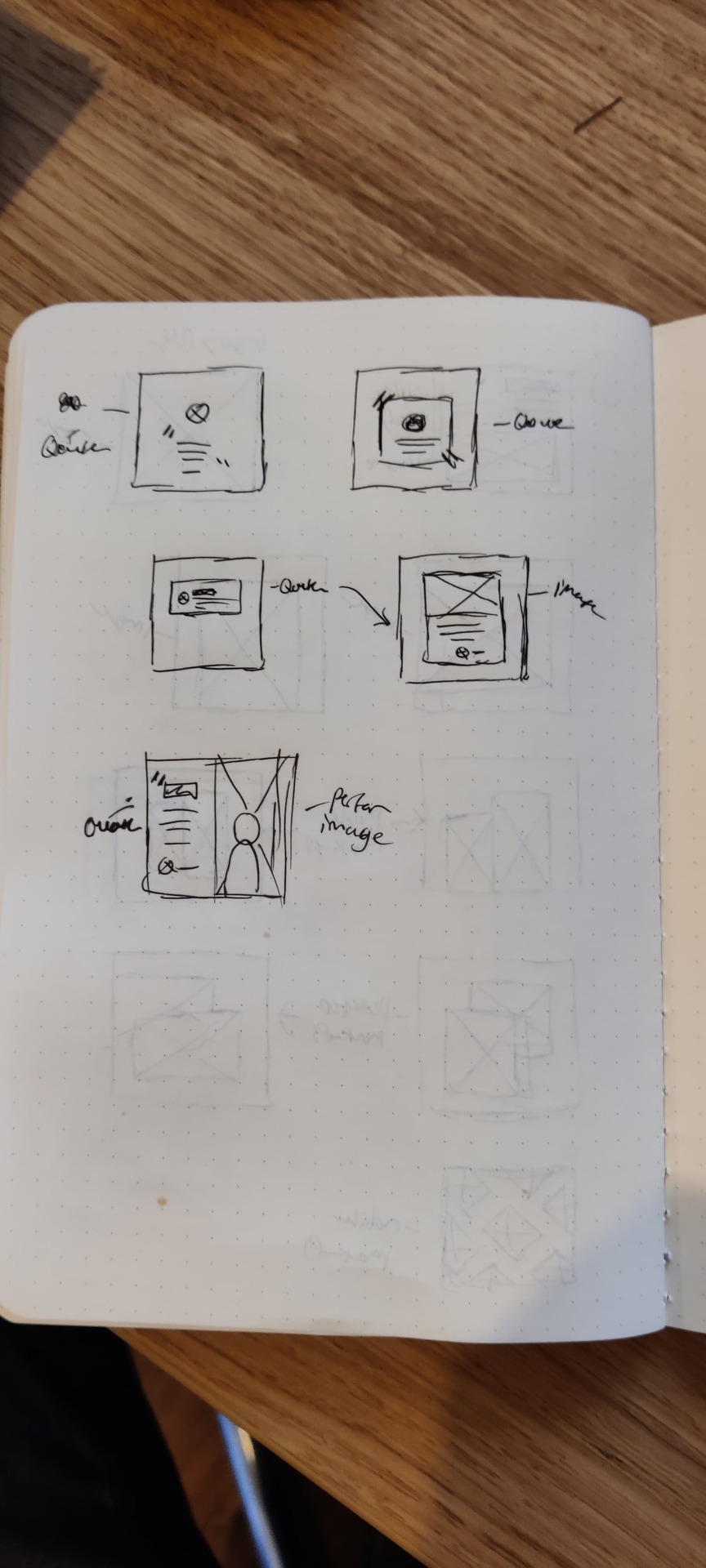
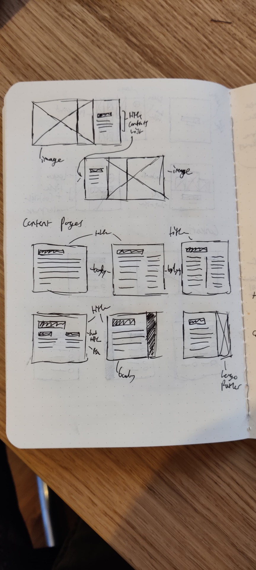
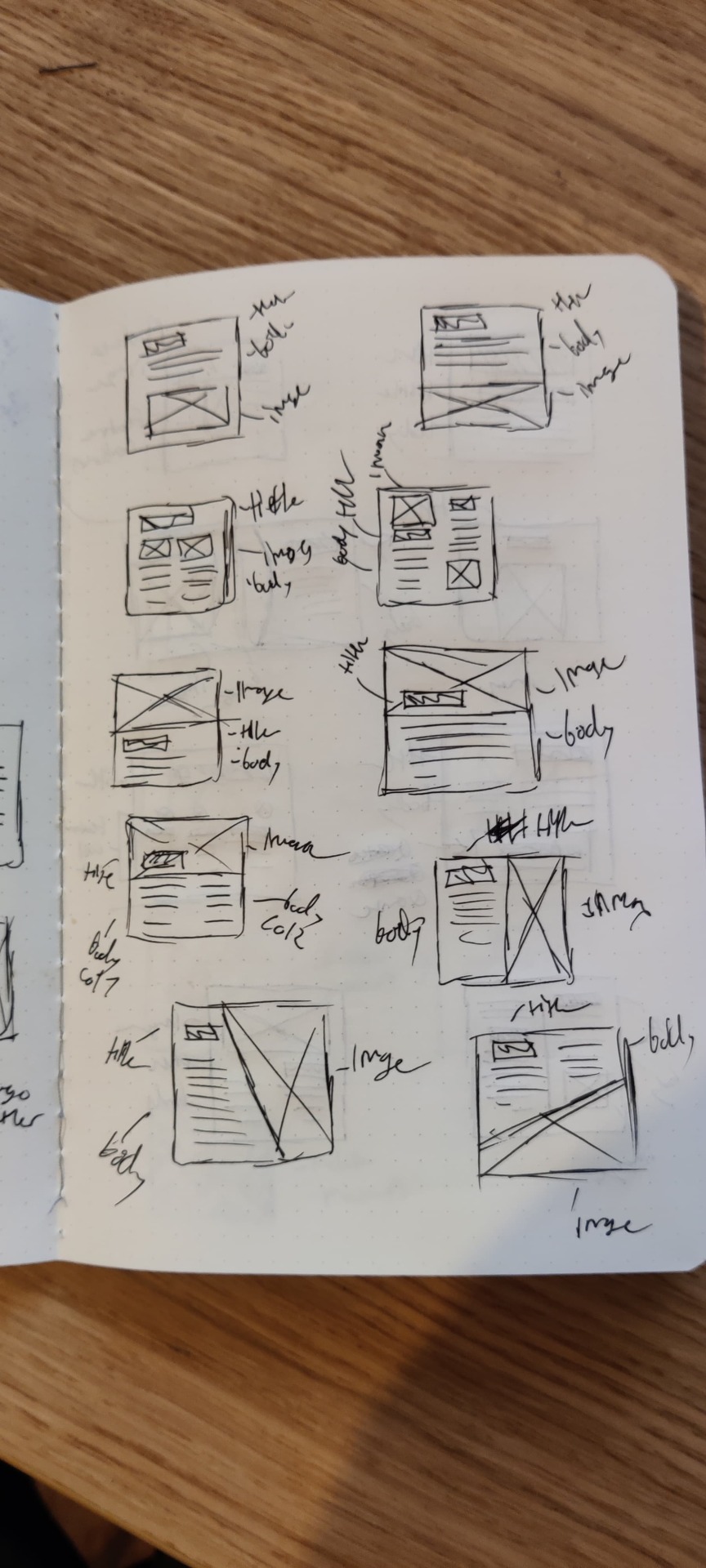
Colophon Report Sketches
0 notes
Text
North Star Direction
Today was my first day back at uni after Christmas. I met our new lecturer Daniel who gave me incredibly valuable feedback for my project. We talked about what direction Environfriend could head in after it is built. My plan was to research & build all my courses now so that there is a finite amount. This means once the user has completed everything, it’s ‘game over’.
Daniel and I explored whether the courses could be continually updated but I concluded it wouldn’t be feasible as I wouldn’t have the time while working a full time job and from my research I’ve discovered this kind of education isn’t something developers are really willing to pay for via subscription. Daniel then suggested that perhaps I could sell it as an onboarding training course - similar to ‘ethics’ and ‘code of conduct’ courses you have to complete when joining a new workplace. I thought this was a brilliant idea and could work really well. I considered the format this would take. During my time at Synergy Learning I saw all those courses being built out as SCORM packages (exclusive to Learning Management Systems [LMS]) and even had a go building some myself. This would be perfect except I imagine this kind of training would be picked up by indie companies like Wholegrain Digital, rather than big companies like Western Union. Indie companies don’t tend to use LMS but rather, Notion or Jira so I wouldnt be able to integrate the app. Exploring this idea further, I considered whether I could extract the content from Environfriend and create a Linkedin Learning course. I also considered other popular applications such as Udemy or Codecademy.
Right now I’d like to build the gamified version of Environfriend in Bubble in order to develop my skills. I have been looking at building APIs with GET and POST protocols so I could encourage the user to link their linkedin account and post their progress as a status. I think I may develop a second version as a LinkedIn Learning course, or perhaps even something as simple as Google Classroom. I will need to do much more research before I make a decision.
0 notes