#ixd503
Explore tagged Tumblr posts
Text
Pinterest
A link to my Pinterest image research. Here i've looked at images that could help develop my brand.
1 note
·
View note
Text
Brand Dev/Inspo
I’ve moved really far in a few weeks regarding brand development of my card game project for final year. Originally it was called refracted and characterised by black backed cyan and magenta illustrations framed by Art Deco elements.
As I’ve moved on with content design, the aesthetic has grown and evolved. I settled on a type pairing: Space Mono x Playfair Display. But as I continued with content design and experimenting with the content itself, I found myself leaning heavily on the Playfair Display font family.
Quotes = Playfair Bold, attributions = Playfair Italic
Questions = Playfair Italic
Tasks = Playfair italic (body copy) bold (headings)
After stepping away from colour for an extended period of time, I find myself wanting to stick to black and white. Or perhaps an anthracite/cream combination. Monochromatic and timeless.
I’ve been looking at brands for inspiration and have included some below.


1 note
·
View note
Text
IXD503 and IXD504 Submission
It is hard to believe this is my final University submission. I want to thank my lecturers for an amazing four years. I have learned so much and I have made some amazing friends. The course has also helped me get an amazing job at Rapid7. THANK YOU!
Edible - IXD503
V2 High Fidelity Prototype
Wireframe Prototype
Prototype Screen Recording
New Screens and Sketches
Launch Strategy
Promotional website
Major Project Posts
So Whats New this Semester?
Edible Login
Searching for an Item of Food
What must the Menu include in Edible
Support for Edibles Users
Location Settings
Some Tips!
Inspiration - Dark Theme Apps
Edible Dark Theme
New Food Bank Feature
Research
The Last Semester
Designing Final Pages
Notifications
Starting to Research Usability Testing
Usability Testing Research
User Testing?
User Testing vs Usability Testing
Steve Krug - Don’t Make me Think, Revisited
The System Usability Scale
What do I need to ask?
Research - Promotional Websites
Edible Promotional Website
Three Steps to a Successful Mobile App Launch
Corona Virus and Food Banks
Questions for Usability Testing
Should Dark be an Option for my Users
Why Include Dark Theme
Dark Theme Design Standards
Edible - IXD504
Edible - Colophon Report
3 notes
·
View notes
Text
Final Links
Jan 2020 - Apr 2020
Dash
Link Dashboard
All Research
Website
Blockframe Prototype
HiFi Prototype
Presentation
Launch Strategy
Launch Strategy
Colophon
Design Report
6 notes
·
View notes
Link
My promotional website is up and running. Coded on brackets and hosted on Dreamhost. I was able to upload it via FileZilla. Im happy and proud of the outcome of my promotional website which included a breakdown or features and what the app is about.

2 notes
·
View notes
Photo


Some helpful encouragement cards for the current situation
1 note
·
View note
Quote
I want to make beautiful things, even if nobody cares
Saul Bass (1920-96
1 note
·
View note
Text
Why is this character loved: Hulk
Bruce Banner will never have a happy ending
The sad reality of banner is that the hulk can never truly be happy, every time he goes outside he knows he is risking the life of the people around him. He is constantly reminded of the destruction the hulk has caused, reminded of the lives he’s ruined. This is why he mostly travels the roads, never settling in one place for long, because eventually the hulk will go rouge again. This makes the story of banner an undoubtable tragedy because even though he plays the hero he knows deep down the hulk will turn again its only a matter of time. This is the tragedy of his character he still feels the need to protect people despite how much they fear him and try to hurt him.
“I've been "cured" before. And the Hulk always found a way back. I have to keep focus. Stay in control. Slow my breathing. Lower my heart rate. Push down these boiling emotions... because no matter what those machines say, I can still feel him, just under the skin... or can I?“
Dissociative identity disorder
The character is essentially many different characters due to banner having dissociative identity disorder due to his traumatic childhood and each personality manifests as a hulk. Some of his different personalities are:
Bruce Banner: A brilliant scientist whose superior knowledge of gamma radiation and the original personality
Savage Hulk: A huge, angry, green man, who Bruce turns into whenever he gets mad. Not actually evil, but super strong, angry, and not very rational. Low intelligence. Embodies Bruce's anger and inner child.
Joe Fixit: A huge grey man, who Bruce turns into at night. Super-strong, but not to the extent of Savage; intelligent and crafty, but lacks Bruce's genius. Enjoys life's baser pleasures - good food, fine clothes, and alcohol. Represents Bruce's antiheroic aspects.
Professor Hulk:. A Hulk possessing Savage's strength, Joe's cunning, and Bruce's intelligence. Was apparently a fusion of the three, but turned out to be another alternate personality.Represents Bruce's idealised vision of himself.
Devil Hulk: A reptilian Hulk that embodies Bruce's evil aspects. Regularly tries to break out, but is held in check by the other personalities. Wants to destroy the world.
The differences between Banner and the Hulk
Banner and the hulk although technically the same person are
I feel Banner/Hulk is the most complex character in comics today. I love classic literature and Hulks story is clearly the Jekyll/Hyde story. As well as Frankenstein. I love that Banner is a genius yet Hulk is so savage and primal. Banner does not love being a hero like so many others yet ye has saved so many lives. I also love that some times he can get out of control and become dangerous. He can be so good yet so bad. There is no other character this compelling if you ask me. Sure I love HULK SMASH! But it's really about Banner for me and this complex story.
For me its less for the power and more his personality. I love how he still feels the need to protect people despite how much they fear him and try to hurt him. I also love the whole Hulk/Banner dynamic.
Because hulk is strongest one there is
The interesting thing about the hulk is that the angrier he gets the more powerful he becomes and due to the tragic life of bruce banner the hulk has become incredibly powerful over the years, the most powerful form being that of world breaker hulk who’s every step shook the whole eastern seaboard and took on every hero in new york and won.
1 note
·
View note
Photo

Don’t Make Me Think – Key Learning Points for UX Design for the Web
Don’t Make Me Think is the title of a book by the HCI and Usability engineer Steve Krug. It teaches UX designers how to deliver great user experiences in a very simple and accessible way. Since its release in 2000, its become one of the defining texts in the industry and an invaluable guide to UX professionals around the world.
Krug wrote this book to help people think like usability experts do. It was designed to be short, concise and very much to the point. The idea is that if it can be read in less than 2 hours and covers all the most important concepts of usability; it would be much easier to get people who don’t normally have responsibility for UX to get on board with the ideas and to promote them from within their organizations.
Some Key Takeaways
Usability Is…
Usability is simply the idea that a normal person should be able to use your products without finding the process frustrating or annoying. Usability is making sure things work well and are easy to use. Spoons, for example, are incredibly usable.
Self Explanatory is the Way Forward
Whenever a user opens an app or a web page they should be able to tell you at a glance what it’s for. It should be as obvious as can be what the purpose of things is.
Don’t Make Me (or Anyone) Think
If you make people think, you make them unhappy. Users don’t want to treat your site or app like some sort of cryptic crossword – they want to know what they should do immediately and then do it. The more you make people think, the more likely they are to go elsewhere to get the job done.
Time Wasting Sucks
People go online to save time not to spend it. If you waste people’s time they move on. This should be obvious when you think about the fact that even page loading times are considered in Google ranks.
Let Me Go Back
As long as the back button works, mistakes don’t matter too much from a user’s perspective. The back button is the most used feature on the internet today. Make sure people can get back to where they started if they get lost.
People are Habitual
If something works well – people will tend to stick to using that. Even if there’s a better way to do something out there – it’s unlikely that they’ll go looking for it. That doesn’t mean that they won’t eventually have it called to their attention but if you make things usable; you make them sticky.
Get to the Point
Again with the time saving – people don’t look for pleasantries on the internet; they want to get to the point. Make sure your sites and apps do just that.
Some People Love Search
You need to have a search facility within your web app or site. There’s a certain group of users who have become search-dependent. If you don’t give them the option; they’ll go elsewhere.
Show Them the Way to Go Home
The home button is the ultimate emergency exit for users. If they get really, really lost and even the back button isn’t helping – they need a single click to get them home. Make sure it’s obvious and immediate.
To sum it up
People remember the experience of interacting with web sites and applications. They learn where to find what they want and how to do what they do. When you mess with the site map – you mess with their ability to recall these steps and make things confusing for returning users.
So I essentially need to remember all the above points when redesigning the layout and content for my app and to keep these in mind when designing my promotional website. I want users to be able to visit the website and immediately grasp what my app is about, where they can download it and why they should use it in the first place.
Don’t Make Me Think is all about simple ideas and simple ways to put them into practice. Of course, there’s more to usability than Steve’s brilliant guide can contain but all the major fundamentals for UX designers are there and they’re very easy to get at. Usability is one of the four main building blocks of UX (along with desirability, value and adaptability) and it’s vital to get to grips with it to build awesome apps and websites.
1 note
·
View note
Text
instagram
Inspiration for prototyping.
4 notes
·
View notes
Text
Merchandise #4 - Postcard
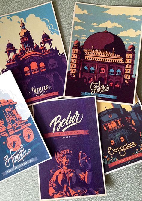
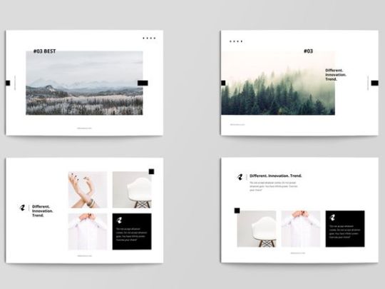
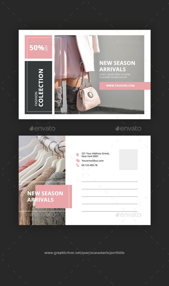
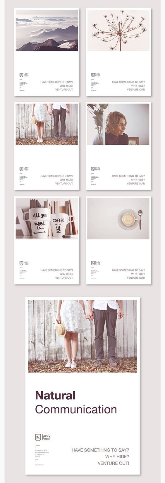



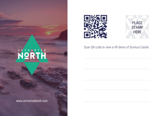
As I said in the last part, postcards have a traditional layout, while I still wanted to experiment I wanted to stick to this layout as much as possible. I spent sometime working with the composition, trying a few of offset styles that appear throughout my brand.
I thought that the demographic I would be reaching for would be tourists. Tourists can be of any age and so I thought I my design should attract the widest demographic, this is why I settled on the traditional postcard layout even though I quite liked the example with the navy bar down the side.
Another consideration was that now that I have been accumulating merchandise of the brand, the style was getting more defined and so future examples would need to fit within this brand and framework.
2 notes
·
View notes
Text
Project Conclusion
This is it… The 359th post. This is (probably) going to be the last post of my university life. It has been a long and hard journey that had its ups and downs.
Through the duration of this project, I noticed the biggest change in how I was handling the workload. I noticed how much faster I was creating my illustrations, how much more efficiently I was dealing with coding problems regarding HTML & CSS and how much better my app and website design was looking.
But one change that I am very proud of is my typing. I used to write with very advanced words that were making my written content harder to read. This changed when I listened to Dan’s explanation of why doing this was unnecessary. This change is very meaningful for me, I feel like my typing is much more “personal” now not only in my blog posts but even in everyday conversations on social media. It also means I am spending less time writing because I’m no longer double-checking if my sentences make sense. I know they do because I write them as I think of them instead of dwelling on how to make them longer.
Even before I started university, I wanted to create a boxing app/website that would advance the sport forward. I wanted to make a boxing project that was innovative, motivational, fun and educational. Now my biggest dream has been accomplished. Like I mentioned before, so many people give up the sport after just a few sessions. Motivation, fear and seeing others do so well are all valid reasons why people feel discouraged to come back into boxing clubs. This does not mean the end however; I still want to launch the app within the App Store(s). To do this however, I still have to include video tutorials to make the app much more effective in the teaching stage and I still want to add a lot more sessions. I want the app to last a lot longer than the initial 24-day introductory period, I have already half-achieved this with the introduction of the challenge mode but more needs to be done!
The biggest advantage for me was that I played to my strengths with this project; I mixed my passion for design & boxing to create this app. I knew what newcomers to the sport needed and had coaches, participants and martial arts forums to turn to for help. My project was driven on feedback and understanding and I feel this makes the app unique.
The biggest weakness of the project is that I wanted to quickly advance to the prototyping stage. I feel like I could have focused more on sketching more interfaces, trying out different monograms and playing around more with different colours. This weakness was reduced by the fact that I experimented with the app layout, colour, fonts and monograms later on which led to that huge rehaul and changed the apps direction. I can’t help but think what the outcome would be had I stayed longer in the sketching phase. I’m interested in this because the updated app idea came along when I was experimenting with the digital wireframes.
In conclusion, the project has been a big success in my eyes. Not only am I proud of the work I have done but I am also happy with how much I have progressed myself. The project has exceeded all expectations I had, I can proudly say that this app is something that can function in the real world like any other professionally designed app. That is a huge win for me, and hopefully for the boxing community it will be too.
0 notes
Photo
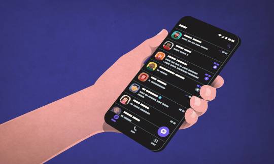
Why include Dark Theme?
Dark theme has a tech and design look to it, it looks new and it is marketed as a solution to problems that the user experiences, such as eye strain, persistent headaches and so on.
It is a personal preference - light text and other elements on a dark background. Some people find that it is a solution to eyestrain and headaches as science shows that the human eye is more used to light-on-dark which is known as positive polarity. Others view dark theme as a distraction because colours are emphasised. When we see something in positive polarity, our pupils constricts and in return we see sharper, more detailed images and text.
In dark-to-light mode, the pupils dilate and can cause blurriness, therefore making text harder to read. As a result, more strain is put on the human eye to focus and this leads to eye strain and headaches.
Dark theme works well when we want to scan a screen quickly looking for visual/coloured elements. Even before dark mode became “a thing” many UI’s were already dark. Take the Bloomberg trading screens what I wrote about in my dissertation. The content stands out well and important information can be easily found.
1 note
·
View note
Video
tumblr
Dash Walkthrough
This is a simple walkthrough of Dash. It shows the various features and functionality of the prototype.
You can view the prototype here
3 notes
·
View notes
Text
Promotion

Belfast School of Art instagram page helped spread the word of Bemind.
Promotion like this is free and powerful. Having the help of a well known influence is great help and sends the followers from there page to my page.
1 note
·
View note


