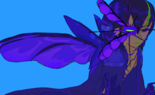
#ive been working on colour and lighting recently
Explore tagged Tumblr posts
Text

Made before the hard parts of Book 7 comes out and Malleus kicks my f2p ass
#twst#twisted wonderland#malleus draconia#malleus draconia x reader#lil' doots#gif#i am going to draw so much angst of this boy like i did with idia#ive been working on colour and lighting recently#the easter weekend gave me just enough time to create 1 thing#before i need to go back teaching again ;-;#love my class but i am swamped with work
3K notes
·
View notes
Text
Drawing Likeness: with Tem!
okaay since a few people actually showed interest in me sharing a bit of what I've been doing to figure out how to really capture likeness, specifically Temuera Morrison, I figured id do my best to write it out
I am also going to entice you with some of my recent clone art! (oooh some of it is unreleaaasedd)


I am putting the whole thing under the cut because I have a feeling its going to be long:
Read more!!!
a couple disclaimers before we start
-This is not some definite post about how everyone should be drawing clones, nor is it in any way claiming that this is the right way. This is just my musings as I stare at a mans face for way too long and try to replicate it
-I am inexperienced. As kind as you all are to me, drawing real people is relatively new to me, capturing a persons identity through their features is difficult for anybody, and I am no different. I have watched many a video on likeness and had my share of classes, but If im being honest, i rarely put it into practice successfully. So there'll probably be errors in this post or things i will come back to in a few months and wish I had said/done differently
ANYWAYs you guys get my vibe im just here to ramble and today we are rambling about mr copy paste. I am doing this for Law, my clone boy, because I plan on delving further into oc fanart and I want to put effort into representing him correctly!
SO LETS BEGIN
Before even deciding what specific pose of a person I want to draw, I tend to grab a bunch of references and compile them like so

(all of these can be found on my pinterest)
Why so many? Well, we are about to delve into facial features, so when we are dealing with photos we have to take into account that there are an abundance of circumstances that will influence how a persons face will appear, some of these include:
focal length: All of these are taken on different devices, and focal length can play a big part in distorting faces
age will play a part, your face changes a bunch throughout your life!
lighting, while not as major, can muddy the waters and make it difficult to interpret facial planes and features
SO, to make sure we get a proper grasp of what's really going on, I like to make sure we have lots of options to compare and contrast with.
Next up! What I like to do is block out the main facial features with colour on different layers, the features I block out usually are the general face shape, eyebrows, eyes, nose and lips. But what you are looking for is the defining features of a person, so that could include other things! Maybe a scar, or some particularly prominent cheekbones.

I dont have any rhyme or reason when it comes to picking my colours, all that matters is you can see all the shapes clearly.
Now I may be biased, because Ive been staring at these for 4 hours, but notice how it still looks like Tem? :D
Anyways, now we can break these parts down, and you'll see what I mean about compare and contrast:

We'll start with isolating the facial shape, putting all these next to eachother you'll notice they arent exactly the same (partly because of my shoddy work) But the distinguishing features run through each shape! Namely the very soft rectangular shape I sketched out in the bottom right there. Along with his soft, wide jaw structure.
I did the same for the rest of his features!


You'll notice I highlight the prominent shapes and ratios,
When drawing anything, it is important to start from the very base shapes and build up.
When drawing something you want to look like someone, those shapes relative to other shapes is what makes it look like them.

I didnt use the same technique with his eyes and lips, but I wrote out some helpful info for them! More importantly for his eyes.
When drawing eyes, I find the most important part is where exactly I draw the creases, (along with the overall shape of the eye itself) it is important to understand where those will present themselves with hooded eyes.
NOW, with an understanding of his facial features in place, lets take a detour to colours:
before I start, a couple things to note:
-Temuera morrison versus the clone troopers in the animated shows:
While I love the animated shows they don't exactly stay close to their source material. Im going to link here to an excellent post discussing whitewashing specifically in relation to the clones.
Temuera is Māori, of Te Arawa (Ngāti Whakaue) and Tainui (Ngāti Maniapoto, Ngāti Rarua) whakapapa, and also has Scottish and Irish ancestry.
The Māori people are the indigenous Polynesian people of mainland New Zealand (Aotearoa). Māori originated with settlers from East Polynesia. Māori people often vary in skin tone, Skin colour doesn't determine ethnicity. There's often a correlation but it's not a requirement.
But that is a tangent! What we are aiming for is to stay true to Temuera.

Bringing back my reference photos from before, Ive colour picked a buncha values and theyre all over the place. Why doesnt this work?
Similarly to earlier, you have to take into account the photos themselves. Many things like lighting, colour grading (when it comes to filmography) and makeup, can alter how a skin colour presents in photo.

You can attempt to get true to life by swatching from certain places on the face. Here I've tried to pick some photos with good lighting, and I've also tried to avoid overly lit/shaded areas.
Tem has a very warm, tan skin tone, Instead of colour picking I tend to try and replicate it myself, but I do often bring in references to make sure Im staying true to the source!

a brief intermission to talk about colour theory, something I myself struggle with alot. Often, when putting in flat colours without a background, I will forget to make sure the colours i intend to use will work with the skin tone i have picked! (something that is apparent in older works of mine, not just in relation to clones, but in general, the colours I end up with stray largely from their original sources and it is something I am doing my best to keep in mind and improve in! Although I don't think i am nearly experienced enough in the topic to say I have succeeded yet lol.)
anyways back to Tem :))

Now we can put all of that into practice! Things to keep in mind when drawing out a piece next to a reference like this:
the distance between the eyebrows? how far down his face does his nose go? Basically just, in relation to eachother, where do all those shapes we found earlier, sit?
The screenshot above is from before I did it myself, but instead of directly tracing from the reference, a handy trick I use it to complete your sketch first, and then overlay a traced version to see where your inconsistencies are! Alternatively, you could move your sketch over the image, but I didnt do it that way so!! uh!! im sure it works exactly the same!!!!
When it comes to a final illustration, or any sketch that isnt a direct study, of course you can push and pull and stylise! You'll see below that I'm not exactly 1:1 to my reference photo either.
The important thing with stylisation, or at least my own personal understanding of stylisation is that you need to thoroughly understand the thing you are stylizing! "You need to know the rules to break them" and all that. While shapes, lines and rendering can change, when it comes to drawing someone, and making it look like them, you have to make sure to keep their core features true to source. Caricature can capture a persons vibe whilst drastically exaggerating features, but it will only look like them if you KEEP THOSE FEATURES!!!! SHAPES!!! AHHH!!
But that is just my perspective on the discussion of style versus realism, please dont take is as Law, I dont know what Im on about half the time!!
anyways, after fixing your sketch, add local colours!

I rexified him because why tf not! But this is where you can go crazy with that clone personalization!

And then here is a very very barely rendered version (if you guys want me to explain how i RENDER that would need to be a completely different post, and I havent had anyone ask about it yet so who knows! maybe one day) But I digress, hopefully you learnt something new through my ramblings! It has certainly helped me organize my thoughts and I have also found some areas I would like to focus more on in the future to improve my own art!
TLDR: In order to understand an object, be it a face or a building or literally anything, you have to break it down to its simplest forms, understanding LARGER shapes will help you immensely in the long run
If you guys like this sorta content do let me know! I'd be down to do similar things for armor/anything really, I am very anti gatekeep so really anything at all you want to know! Send me an ask :))
also if you see a spelling mistake.. i don’t know how that got there
#can you tell im nervous#i’ve never done anything like this BEFORE SPARE ME PLEASE#star wars#star wars fanart#digital art#my art <3#digital aritst#the clone wars#clone trooper#temuera morrison#tutorial#soulars yaps#soulars tutorial
481 notes
·
View notes
Text
do you guys remember that post that was like. "be the friend you want to have. if you want to have themed tea parties with your friends, host a themed tea party for your friends." well. that also works for online relationships
if you want asks, send people asks. if you wish people would reblog your original works, reblog other peoples original works.
i see so many posts going around that are like "reblog if you want more asks", "reblog if its ok to come into your dms and start a friendship", "reblog if you want people to tag you in random stuff they think you would like" and its like. you gotta do those things my guy.
if you want people to do those things for you, reblogging a post probably isnt going to make them more likely to do it, especially not in the long term. they might see that post and do it right then while they are thinking about it, but a few posts down their dash and they're not gonna remember who reblogged that post and who didnt.
what they will remember, is the person who comes into their inbox every day just. telling them what they're up to, or asking how their day was, or rambling about something they've been thinking about recently
they'll remember the person who always reblogs their art and makes a comment about how good it is or how much they like the lighting or the shading or the colours
they'll remember the person who tags them in posts that they found funny or interesting
and they'll be much more likely to do those things in return because they'll begin to associate you with those things, and they'll know they won't be bothering you if they do it in return because you are always doing it to them!
i just. i know this is the autism website and we are all socially awkward, but with the amount of notes those kinds of posts get i think its safe to say that most of the userbase on here wants to interact with their mutuals more. so interact!! push yourself!! it gets easier with practice i promise, and you never know what kinds of friendships you'll end up forming. its worth it!!
and i know im a massive hypocrite because i reblog those posts too, but ive been trying to make more of an effort recently and it has really been paying off. if i can do it, you can do it.
thank you for coming to my TED talk
44 notes
·
View notes
Note
hey wsg cockmented! what are your tips on colours poses and shit
Hello Hist Histo Gold Historix . this is a really hard quesitons
im not very good at tips and tricks but here's what i do:
fiurst i really like pinterest here's my 2000+ pin board for art inspiration
for colors there are some things that seem right according to the Cogmented Guidelines which is just tone, atmosphere, feeling, balling, ETC...
out of the three art classes ive taken in my life all of which were in my most recent school years has been in charcoal, so a lot of what i pick is based on values too: ill turn the canvas black and white using hue blending mode, or take a picture on my phone and turn it black and white for real life things
my main goal for character pieces is to make the focus stand out but also be cohesive with the background, so ill use different values to differentiate those if colors are similar. red is much darker than yellow, even at the highest saturation, u get it. the rest is just using opposites on the color wheel
i also tend to use blending modes.. usually around 2-3 layers?
these are my base colors
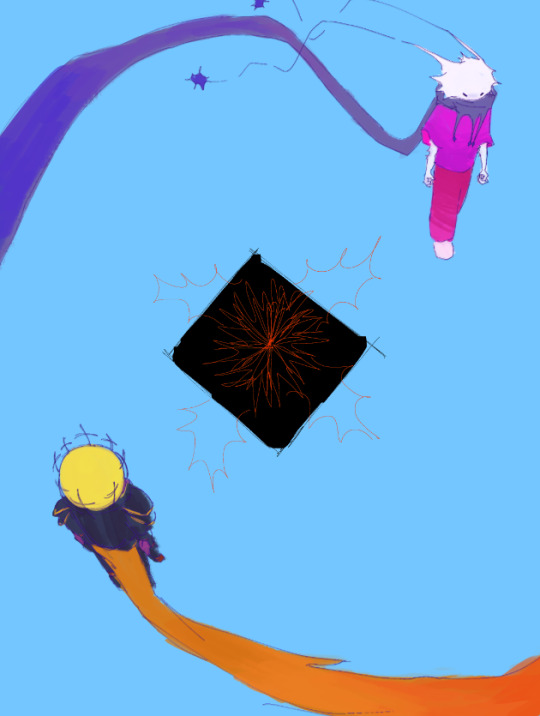
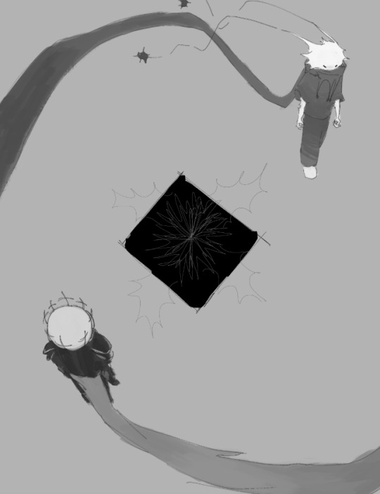
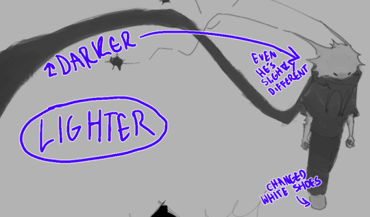
kinda hard to distinguish zam in the values, yeah? and planet's shoes are far too bright, i want planets face and arms and closed fists to be their focus

i use a wide variety of the blending modes, but here both of these worked to darken the characters while increasing their saturation


the similar qualities on the characters make them cohesive with each other despite the wildly different designs and colors.. this could also just be a "style" thing that makes it cohesive but that gets more into shapes and how i draw and i dont think i could even explain that
there's also just general inspirations.. i chose a light blue background for this probably because i was subconsciously inspired by an 8 year old pmv of hawkfrost and ivypool by m0zarts using the song that is in the caption (personal by stars) AND because it's a softer color outside of planet's intense pinks and zam's yellows
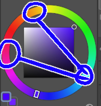
this is called like triadic color palette i think i cant remember
there are always exceptions to rules and based on the atmosphere i will make the character blend in more e.g.:
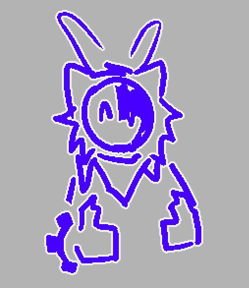
for poses jii dont know i have visions in my head AND pinterest boards: 1 2
a lot of my art is expressive through poses instead of expressions because most of my designs dont have the capabilities for human expression; you're left with actions and body language (im also mad alexithymic so that's probably another reason why)
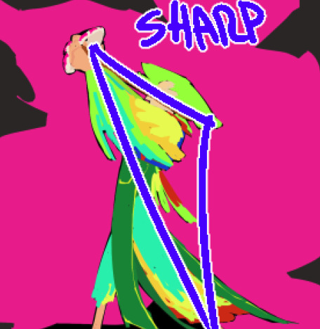
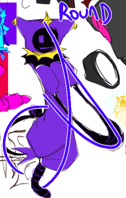
ignoring general atmosphere and art style, both are big movements but hold very different emotions ^_^ sharp and angry and desperate vs gay and carefree
the use of perspective further helps the emotions within poses, lower views make a character more intimidating, etc etc you get it for sure.
if you want to go hard on perspective, colors/lighting, and composition i highly recommend taking a film class or course or watching a video idk or something related to media-making.. drawing and film are very similar especially in regards to things like storyboarding.. the rule of thirds and camera angles that depict feeling are soo helpful to have in the back of your mind shoutout my one film and media class from 7th grade
ok thx for watching
35 notes
·
View notes
Note
Hiii your icons are so pretty, would you have a tutorial on them or tips on how to do it?
hello lovely and thank you so much!! i have been making icons for a long time, but have also just started with this style of icon, so i don't know how much of a help i can be but i'll try my best! i make all my icons in photoshop, but when i first started i used gimp, it works similar and i'd recommend it if you dont want to commit to ps just yet. this ended up getting kinda long because i went step by step on how i make my icons like the ones from this post, with a bunch of tips and tutorials linked, so i put it under a read more. i specifically go deeper into how to change the colours of his hoodie depending on your background/preferences. i hope i could help even a little bit!

1. the base
one of the first steps is deciding what you want the base to look like. you can do just a solid colour, gradients, patterns, etc. you can use the solid colours and gradients that are already a feature in photoshop, but there are also a lot of amazing resources and bases by other talented people either on here or on deviantart. just look up icon textures on deviantart, you'll be able to find a bunch of textures and pre-set gradients you can use as your base. this is a really great pack you can find on deviantart that offers a bunch of bases. if you'd like to make gradients yourself, here's a really good tutorial! i am not really an expert on explaining how to use textures because i've only really just started with headers.
2. the picture/png
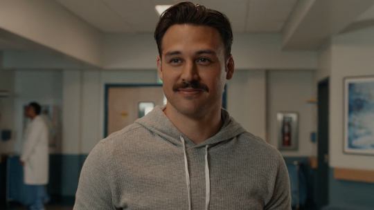
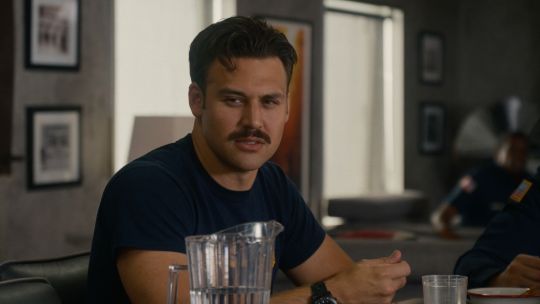
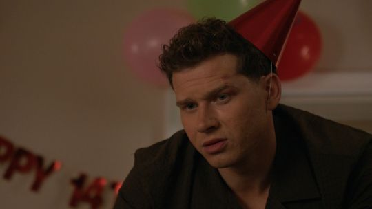
onto the star of the show - the person you want to have in your icon. i usually get those from screencaps from whatever show/movie i am making icons of. you can get screencaps of most shows and movies from screencaped.net. i then isolate the person i want to be in my icon so that the background is removed and transparent. you can do that yourself, here is a very good tutorial on how to do that in photoshop, or you can use other platforms like canva or adobe express, that have features to remove the background for you. you usually cannot adjust those, so if they dont cut out things the correct way you have to adjust in photoshop afterwards. when chosing a screencap you should make sure that the person and silhupette are clear and delinated from the background, without any obstruction in the foreground, so that you can cut out the entire figure easily without parts of their body missing. i usually also look for screencaps where the head and the sites aren't cut off, so that i can freely adjust the sizing and move the figure around. i also try my best to get a scene where the lighting is alright so that i don't have to fight for my life colouring it, but sometimes it can't be helped.
this is one of the screencaps i used for my recent eddie icons and it's a good example: his upper body is clearly seperated from the background, nothing is cut off, etc.
this screenshot is an example that i personally wouldnt use because there is a jug in the foreground in front of eddie that would be in the icon as well.
buck looks very cute in his lil hat but the shot is cut off on the right and on top, so i didn't end up using it either. you just kinda go through the screencaps you have (or take your own) and figure out which frames fit for the type of icon you'd like to make.
if you'd like to make screencaps yourself, here is an easy tutorial to follow!
3. basic colouring
when i make icons like these, i usually dont go too crazy with the editing, i mostly just adjust the lighting and colouring the create a well-lit base. here you can see the unedited png (first picture) and then once ive used a basic colouring (second picture).
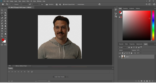


this is a very good tutorial on basic colouring using curves, hues, etc, as i've done as well. it is for gif-making but those same editing steps can be applied to still pictures as well.
4. colour isolation
the icons i am currently making are in a style that you can see a lot around tumblr - where parts of the person in the icon, usually their clothes and other accessories, are edited to be a certain colour that matches the background, and that colour can be changed to match different bases. you can see that the hoodie eddie is wearing has a different colour to match the different colours of the background.

i desperately tried to find the tutorial that i used to learn how to do this but i can't, so i'll try my best to explain it myself (brace yourself). i have seen people do this by drawing onto the png, but i use a different method. for this you'll need to have some basic knowledge on layer masks.
we're gonna start with our png image that already has the colouring applied to it (1).

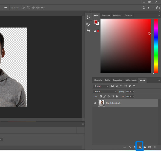
now, click on the layer and add a solid color layer (2). you do that by clicking the symbol i've marked on the bottom and then selecting "solid color...".
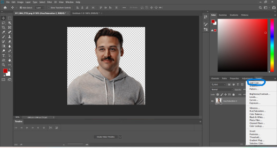
in the screen that pops up now you can select the colour you would like the accents to have (3). choose the colour you want and then click "OK".

your entire image should be in the colour you chose. now right-click on the solid colour layer in the layers panel on the right and select "create clipping mask" (4). this will apply the solid colour layer only to the cut out of your lil guy. it should looks like this now (5).


now we're going to adjust the blend mode. right now it should be set to "normal" (6). click onto the drop down arrow and select the blend mode "colour"(7).
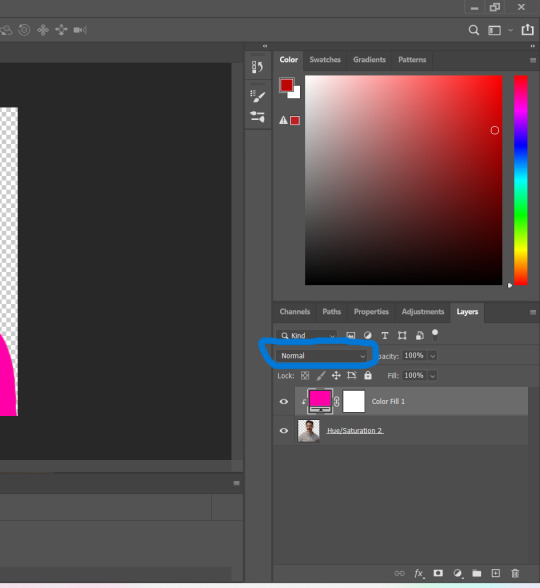

now we can see eddies features again! now we want to edit it so that the pink is only on the parts that we want to be colourful. for this left-click on the white box in your solid color layer (8) so that it's selected. after that select the brush tool (9) and make sure it's set to black. we use black to take colour away and white to add colour back in.
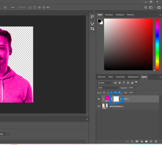
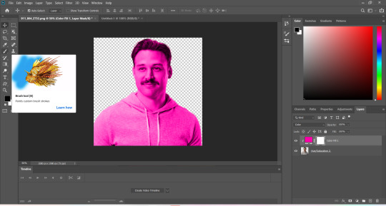
now go over all the parts that you don't want to be colourful. if you accidently take too much away don't worry, just switch the brush colour to white and go over what you want to add in again. it looks like this (10) for me afterwards.
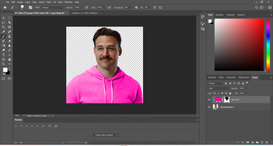
you can change your colour if you double click on the little pink box of your colour layer and adjust it however you want.
5. adjustments
after i've done everything listed above i usually group the two layers (your cutout and the solid colour layer) together so i can move them as one (11). after that i pull the group over onto my base and adjust it so that fits properly (12).

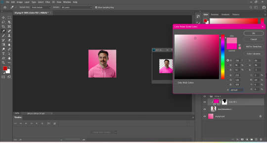
now that the cutout is on the base layer i usually go in to properly adjust the colours and make sure the colours on the cutout match well with the background. you can do that by changing the colour manually or using the eyedropper tool. and voilá! i know it sounds like a lot right now reading this, but once you've gotten the hang of it, it really isnt that hard.
i hope this was at least somewhat understandable and that i could help a bit! there are a ton of amazing tutorials out there for all parts of editing and photoshop in general that go deep into details in case there is a specific part you want to learn more about. for now i hope this gives you at least a small overview.
19 notes
·
View notes
Text
Experimenting with doing spells and rituals in minecraft again recently and noticing the difference from where i was back then to where i am now
I was and still am a witch in the broom closet, but getting a little older and more crafty and more observant i felt that my practice was a little stagnant and so i spent time branching out with spells and other relevant skills in the physical
Ending up with a lot of experimentation and exploration with types of spellwork since sigilwork wasn't doing it for me anymore
Eventually landed on something I was comfortable with, which was essentially container magic, filling it with herbs and plants that ive bought or grown the past year which was been pretty cool
I've needed the time and experience to develop some of my foundational skills that i thought i had a good handle on but didn't really, and i feel that i know how I can work best now and how to tap into my sense better and feel out energy
Which was interesting when i got back into doing spells with minecraft again
I was going through a tough time the past few days in my personal life, and while the source of stress and my fear had passed, there still lingered a feeling of heaviness in my heart and I wanted to help myself with processing it
So it felt like it was the best time to experiment
Last time, i had been testing and theorising about pixel sigilwork but again it just wasn't cutting it for me anymore
I let my instincts be my guide, and i outlined a few things it had to do
One, the main intentions are cleansing and healing, what i had felt has already been addressed and acknowledged, it just had to be nudged along, and i needed the beginning of my healing process to help me further move forward
Two, putting ingredients / components into a container like a barrel or shulker just wasn't going to cut it because instead of releasing the energy, i felt that that was just going to keep it so i had to take another avenue
Which led me to referring back to my correspondence posts and working on something there
I eventually found myself setting up in the birch forest, finding a nice area to set up the spell in
I have decided that biome due to the associations of birch being of new beginnings, and calming nerves and anxieties
Also i have decided on the idea of the idea of some of well build, since the idea was to throw the ingredients into lava to burn but i had another idea
A minecraft mechanic was that items automatically despawn after a few minutes if you don’t pick it up and i felt that that was the perfect opportunity to utilise it to make it so that each time one of them does, it's like it's releasing it's energy and intentions out into the world
So the lava was replaced at the bottom of the well, where i instead replaced it with water, and later covered the bottom with dripleaves, to signify that despite my trouble and struggles, there is still room for new growth

Also it made a very cool effect of drooping to drop the items i threw on top of it into the water beneath and i didn't want to pass it up
The colour schemes i chose were black and green, allowing myself to essentially build and texture a black well, surrounding it with a design at the edges with green and then lighting the area up with candles and froglights


The next part was choosing the spell components i wanted to use, and when that was done, I put away my blocks and my tools, leaving the ingredients in my hotbar and casted a circle in the game to set up the space
I won't really detail how i did that since im not sure that feels right now, so i'll be doing more testing in the future
Next was me trying to replicate what I tend to do to charge the ingredients of the spells with the specific intentions I was going for, and i found that in going down the hotbar, putting the component into my offhand and speaking my focus and intentions to it like that actually worked great
So slowly i worked with each of them, feeling when the energy settled or felt like it was ready before i threw it down the well
And once my hotbar was clear, i waited and felt out the energy, checking to see if the items below had all despawned completely
When it was, i winded things down and closed the circle, and found that the heaviness in my chest had eased quite a bit and i felt a little more settled
It was extremely effective, much more than i thought it would and I'll probably do more spells and experimenting in the future
Also more posts of correspondences to other parts of the game
Excited to do more!
19 notes
·
View notes
Text
9 People You Want to Get to Know Better
Thanks @nature-nerd-sarah here are my responses
Favourite Colour: Was red for a while but ive been feeling purple more so recently
Currently Reading: I Favour the villainess (Light Novel), Yamada to Kase-san, Whispering You a Love Song, The Locked Tomb, a bunch of other ongoing manga whenever they update
Last Series: The last one I finished was gwitch, and I'm currently watching Revue Starlight and Heartstopper season 2
Sweet, Savoury or Spicy?: All of them, whichever one or combination I want depends on how im feeling at the time
Currently Working on: Looking for a job, improving at bass guitar and I still need to get around to the gunpla that I havent finished
Tagging: @mysteryjune @yurinullification @alyssadotmp3 @itznarcotic @lynnrespawn @alleggnobasket @greatjoy @sarahthechill @bog-beth
39 notes
·
View notes
Text
Tag game!
so, i just discovered that the fanfic question id ussualy answer around this time is out of commision, so im making a tag game! for some reason the only thing i can think of is a poem-ish thing (it rhymes, thats the poem part.) for a list, so thats what we're going with! First ill give you an explanation of the question, before providing my own answer! With all of these, feel free to add a link to the story uyou're pulling from
something old
(here, please provide a bit you wrote a bit ago from an older fic taht you like! Is the question referring to an old fic you like, or a bit? you decide!)
my answer:
As she tugged on the cord next to the window, Masha couldn’t help but be reminded of a stage play by the way the warm, orange sunlight hit their mother- like a spotlight turning on at the lifting of the curtain. The angle also didn’t help, Placing Masha in such a position that mom was framed as a silhouette, like they were watching from the wings at the opening moments of a play.
(https://archiveofourown.org/works/47992501)
something new
(here, provide your favorite bit from among the three most recent things you've either published or worked on. Why three? Idk, maybe this post works by fairytale logic now)
my answer:
That isn’t to say that there’s no blue around her- there’s plenty, just not the Blue that matters. Theres the Blue streetlights, casting a light that’s almost negligible in the screaming buzz of neon billboards and signs, some of which are blue. The light- so sharp and loud its almost toxic- Cuts through the rain, and bounces off of the layer of water covering the street, and fills the thin mist that’s gathering above the ground, giving the entire street the feeling of being a mix of nightclub and dream. There’s blue everywhere around Red, but it only serves to remind her of the overwhelming need inside her- it’s like handing a cold person a candle, providing just enough warmth to dangle the possibility of comfort in front of them, but not nearly enough to stave off the cold.
Something borrowed,
(sharing time! share a bit from, or a fic, you enjoy from someone else. please credit your sources though)
my answer:
This is just a really good fic. Its also by a really good writer, who deserves all the love
Something Blue
If youve been wondering why ive coloured the headers up until this point, heres your answer: the blue bit.
(please either share a bit/fic you wroite taht made you, teh author , sad. And for those of us who dont do taht often, just provide something you think of with something blue. This might be getting a bit weird now, sorry.)
whoops, ive used my blue bits already at the top. Well, i did just remeber teh one other time i focussed on the colour blue. behold,
The girl that was looking back at them was dressed impeccably, Masha noted. She was wearing a long royal blue trenchcoat, the type you would expect on a noir detective. Gods, I want that coat. They also noted the fact that it was a crumpled mess. A coat shouldn’t be so messy and yet look so good on someone, they thought with a pang of jealousy. The coat wasn’t the only thing that was a mess though. The girl wearing it looked like she hadn’t slept in a while, indicated by light bags under her eyes that she obviously hadn’t tried to conceal.
(https://archiveofourown.org/works/47040430/chapters/118509421)
im sorry for the slight mess that was this post, i hope you people can have fun with it. I think that im supposed to give you numbers here or something, but i dont know that many writers here, so ill just tell you to tag who you want
following my own advice: @topheecoffee @queereldritch @oh-cramity-its-amity @sky-neverending @bonpocalypse @usernamemybeloathed
and for a riskier tag, @captainimprobable
15 notes
·
View notes
Note
OK I have to know what program or brushes you use?? Whenever I try to paint digitally the edges look too soft if that makes sense??
Hello! i've a fair idea of what style specifically you mean, but let me know if I didnt cover what you're asking about!
I mainly use Clip Studio Paint (Pro 1.0?), on the side I use Rebelle 7 Pro. Rebelle is for the traditional looking stuff I occasionally do, and everything i used for that comes with the programme. If what youre looking at is traditional-mimicking, its that! Other than that, probably CSP youre here for so... for that:
Main brushes? I use a collection of Daub brushes! Pretty much exclusively this brush... like... outside my sketch brush I basically only use this one:


Rectangular, textured. This is how it came Im pretty sure, but just showing you the shape and stuff because the shape i find is key in cutting lines into paintings. I dont remember which daub pack its in, but I can try and figure it out if you want it!


You can see it here in these pieces, it gives that fuzzy frayed end to things. That's genuinely fine? I find it's good for making sure shadows and edges aren't too defined without giving the very artificial digital art feeling airbrushes give, like as an example I dont really notice it in this piece at full size but it's very distracting zoomed in:


I just. am not liking it personally, which... I tell you to let you know I actually kinda struggle to get it to work the job I want it to and ive been looking to replace it. Used it for years, but it has flaws. It's been decent for my recent couple years break from serious art because its loose and gets the job done, but its kinda tough to work with (as any traditional-mimicking brush would be)
I've recently started using it edited a little to get rid of the fuzzy texture, which really just involved taking away the texture in settings. Theres some places on the arms here where i was using the textured version, and... yeah this is roughly rendered bc it was a quick piece but you get the idea:

I find it really helpful because it has an edge - it can paint proper lines - but then can be smoothed

Rough textured vs untextured, and heres.. where you can see it falls apart for what i do. That was solid black I was painting on the grey and i was pushing hard (more so going over and over it), textured version's way better for painting and blending but texture gets in the way, uh, trade off
It's definitely... not actually ideal for my art, I can say that much. i took a detour into using this brush exclusively after losing my last muse, it's definitely.... how do i word this. its not good at laying down colours and blending - Ive been hoping i can even that out in settings so maybe if you grab it you can iron that out but. Thats what I use!
It's probably more helpful to tell you what works? Uh. given that the brush i use I struggle against so
For things getting back to the style I used before - which. unfortunately i dont think i have current (relatively) sfw examples, so time to dig up the literal at the time old style art.... - for example in this:

deviantarts quality is fucking abysmal holy shit. This is kinda... What my personal style is, which is blending stark lines and colours, juxtaposing textures and stuff. To do that? I recommend having two brushes, something like what I just showed you and then something like Clip Studio Paint's default watercolour brushes. Theyre like airbrushes blended with paint brushes

I also then go over things with my pen tool, which is my own brush. I dont know if i can properly share it in any capacity because I cant remember where I got the textures from, but you know, under the table passed along, its here, its meant to mimic how i draw with pens on paper (light and almost invisible if you go light and fast, proper linework if you slow down and purposely draw)
You can see the whole entourage (Daub brush, watercolour brushes, pen brushes, if watercolours were even used) here:


Didnt circle everything that was pen because Im sure you get the idea. Its basically just... that brush to paint, waters if i need to smooth something extra smooth, and then anything that needs contrast and oomf gets added in pen, if your brushes cant provide edges its probably best to mix them up, use your soft brush for blending, a harder painting brush for laying down colours and loose blending.
Something that lays down paints with an edge - I really do recommend a non-round brush head, and something built for painting - and then something to smooth it out.... honestly ideally thatd be the exact same brush, thats a key i used to like with the Daub square brush is that i could paint and blend with it, I think I maybe manipulated the settings too much and took it way too far out of what it was or something because i swear it used to be easier to work with but. whatever the issue is its never been ideal, honestly for a brush id say seek out something that: Is square/rectangular (probably rectangular is best); lays down paint without too much pressure on your wrist and blends smoothly so you're laying paint and blending in the same stroke; puts down colour when you're pressing down over a certain percentage of its pressure limit and then only blends when you're pressing under that percentage. CSP lets you do this. Best brush experiences Ive had ticked all of those boxes
uh. if youre shopping around (buying or getting for free) you dont need to look for the "paints over x blends under y" because in CSP and other programmes (do check) you can add that in yourself, but yeah Id suggest some kind of shaped brush that isnt shy with paint to combat the soft edges!
#god. i really have been on an art break for like 4 years now. bruh. i did not realise how long itd been til i put this together#Yeah my recent art doesnt really have good examples bc ive had 0 patience for art since 2020/2021 but back when i was really comfortable#with my brushes and stuff? yeah. insert what i said about the type of brush to look out for#not art#an ask //
3 notes
·
View notes
Note
Hi, lovebird!!! Hope you're doing well <333 For the crafter's ask game, maybe 🌟🌼 and/or 💖, perhaps??? Wishing you a lovely rest of your day!
ahhh thank you for the ask! here ya go:
🌟 What is your favourite type of crafting (knitting, crocheting, sewing, embroidery, etc) and why?
so crafts I've done are knitting, crochet, and very recently have been dabbling in pottery
crochet is definitely my favourite! I knit for a few years and the stuff you can make with knitting is really cool, but my manual dexterity is actually not that great and knitting never really felt natural even just in terms of like, the basics of holding the needles, even after a long time of working at it. plus crochet just feels soooo fast compared to knitting and I love that quicker gratification. and I love all the squares! satisfying to make and super pretty
I gave pottery a go bc I like tactile crafts and it's definitely fun! doing it at a studio is expensive and kinda stressful though bc I'd rather make stuff in private. I think I’m gonna try doing air-dry clay stuff at home and see how that goes. I do want to do a wheel class at some point though!
🌼 Do you have a project (current or a past one) you want to talk about?
my current project is kind of on hold while I give my wrist a rest/fuck it up in a different way playing persona 5 all the time, which is a shame bc I'm very close to being done. i'm making myself a jumper and it's nearly done, just gotta do more ribbing and attach it all together:
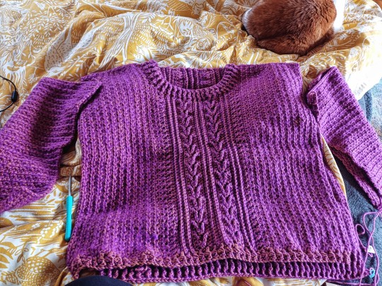
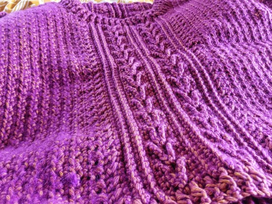
I made my dad a jumper last year and it was somehow very easy, I had to kind of eyeball size but it came out fitting perfectly without ever needing to adjust
this gave me profoundly unrealistic expectations for how easy it is to make a jumper that fits. goddamn. I'm a gauge checking convert thanks to this thing but even after checking and measuring a lot I've still had to remake sections of it several times
but I looooove the yarn so much:
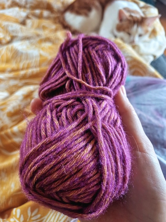
all the river washed yarn colours are amazing and it took me a long time to choose one. I really love yarn with like semi-subtle variance in the colours, and yellow and purple is one of my fave colour combos. in subtle lighting it just kind of looks like a nice purple, but it goes super vivid and almost pink in lots of natural light
💖 Which one of your creations are you the proudest? Show off!
it's definitely not the most technically complex thing Ive ever made but I adore this bag I made for my sister:
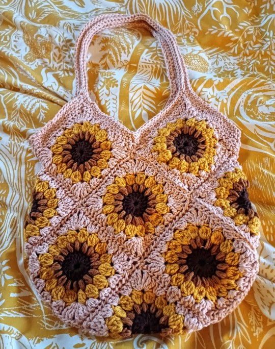
have never felt so conflicted about giving something away lmao. the colours work so nicely together and she gets compliments on it all the time
at some point I want to make a bunch more of these squares and try and make myself a cardigan
i'm also pretty proud of some of the stuff i made in pottery class that are not fired yet, gotta show those off once i pick them up next week
6 notes
·
View notes
Text
9 people you'd like to get to know better
tagged by @currentlyonstandbi ❤️❤️❤️ thank you so much !! ahahah loved reading your answers
last song: (💀🤚) omg HAHAHA it's boys light up by chillinit HDKDJDJJD ive been in my aussie rap era 😭😭😭
favourite colour: ahahahah yesss have to say black, but if people are being pedantic then sage green
currently watching: nothing really at the moment 😪 i don't have time for shows !!
last movie: talk to me 🧍🏼♀️🧍🏼♀️ AND IT TRAUMATISED ME !!!! i wake up in the middle of the night and im scared to look at the corner of my bedroom 🤚
currently reading: (also a star wars book) brotherhood by mike chen !! ahahahha it's been kind of a slow "read" bc i listen to the audiobook while i walk my dog ahahah. but im really loving it so far ❤️
sweet, savoury, or spicy: hmmmmm probably savoury bc that includes salty and im obsessed with salt sjkdksk
relationship status: 😪😪😪😪🤚 singleeeee
currently obsessions: HSJDJJDJD my family would probably say cricket 💀🤚 but me my dad and brother have all been watching it together so it's a collective obsession 🙄
last thing i googled: "australia v netherlands" and "thiruvananthapuram rain radar" ,,,, no cricket for me to watch tonight 💔 it's getting rained outttttt (WAIT OMG IN THE TIME IT TOOK ME TO EDIT THIS I THINK ITS ON !!!! YIPPIE !!!)
currently working on: myself 🤓☝️ ahahah ive been trying to eat better and exercise more ahahaha
im gonna tag some recent mutuals! don't feel like you have toooo ❤️ @snoopypilled @invisiblemonsters @kenromshiv @softhoursactivated @filmforwomen @asleepawake @milksoplivefeed
2 notes
·
View notes
Text
thank you @goldcrumble for the tag, your timing is impeccable i was getting bored✨✨✨
Are you named after anyone? the Soviet victory over Nazi Germany in 1945 no jokes. i was born on the day that commemorates it so my mom thought she was clever but she basically just saw “victory day” in an outdated calendar and went with it
When was the last time you cried? i have these biweekly micro-cries, nothing serious just airing out some emotions. i think last time it was me missing my cat who regularly visits me in my dreams ❤️
Do you have kids? no
Do you use sarcasm a lot? i think ive been toning it down recently. i have butter-hearted friends who prefer me shutting up.
What’s the first thing you notice about people? i want to say eyes but it’s not a detail i remember ever. i deff look at them first and forget about them immediately but STILL i’m trying to figure out if someone’s nice through them does that make sense
What’s your eye colour? one of them is green the other is blue and i’ll never shut up about it (mainly because it’s not that obvious of a green and it can only be seen in certain lighting and from certain angles but i’m a clown for it nonetheless)
Scary movies or happy endings? can’t scary movies have happy endings?? i don’t watch enough of them so i’ll go with happy endings
Any special talents? staying alive idk. i was told i always get things done the last fucking minute and it’s true. a talent that’s also the bane of my existence.
Were you born? …where? when? how? i’m lost. but i’m a spring child if that helps.
What are your hobbies? i have nothing, but i’ll make something up from my daily routines rn: going on hot-girl walks to the library, visiting cafés, reading, hiking, baking and getting dragged to workout classes by my friends
Do you have any pets? not anymore 💔 i had a 20 year old cat i loved with my whole life and miss every day but i’m sure her non physical form is still purring on my chest every morning!!
What sports do you play/have you played? I swam and danced ballet but i was horrible at both. now im just skiing in winters and going to the gym to watch shows on a treadmill.
How tall are you? 170 cm
Favourite subject at school? english, history and literature. i had the most wonderful and movie-like teachers for all three. i was deep in the dark academia aesthetic because of them.
Dream job: i don’t dream of work anymore 😭 i’d love to get paid for girlblogging, travelling and talking shit though, hit me up if u have smth.
In case you guys want to do it: @harrysonedirectiontshirt @harryanthus-annuus @louistour @therewassomeblissinthisblue @usertomlinson
5 notes
·
View notes
Note
9, 10, 18 :)
9. what are your favourite shoes like?
my favourite shoes are probably a pair of wide toebox brown leather with black soles mary janes bc unlike a lot of the other shoes ive own they feel very purposeful and like the match the wardrobe i want and not necessarily the wardrobe i have. i don't wear them often bc i struggle to style them :/ but i would like something similar in vibe in a closed shoe i think
10. what would your non-perfume/cologne signature scent be?
hmm if not vinegar which i answered here i would think laundry soap and detergent? i work in a laundry/drycleaners and the often come home smelling like a billion different detergents from being on the ironing station for the whole shift. goes past smelling clean and starts irritating my nose!
18. what’s your clothing colour palette?
it's a lot of earth tones rn! even when i wear blacks and greys im pairing them with browns and warmer colours. recently i have been using blues and light blues as more neutral bases tones which has been pretty fun to break up the standard browns/blacks/greys. my autumn coat is a bright sky blue so that's what people have remembered recently
0 notes
Text


BEFORE AND AFTER COLOURING TAG THING
thank you so much for the tag @chanrizard !! 🥺
lili vs the all bad no good yellowish greenish light (and the inconsistent gif height for no reason)
i mean its not much but it's honest work......... also i didnt wanna over do it but most recently ive been jumping between 540 width and 177 width gifs.. it's okay i liked these ones the most even if the change isnt like. Really Drastic.........
okay rambling over i'm tagging: @seokmingming, @daintyzerose @jjanguri and @hyunpic no pressure ofc. and also. if u wanna do this i'll literally edit the post for u. i am Not joking
12 notes
·
View notes
Text
Sef:“soft asks to get to know people” 4. what flower would you like to be given?
Well I suppose this is an interesting one
Theres only three people who have ever bought me flowers: my father, my mother and my ex - i expect this will change when my funeral comes around
I think traditionally umong my family I’ve been bought sunflowers- I’ve always liked them and had an affinity for them, I think in literature they symbolise death or something morbid like that
When I first moved away my sister wanted to paint something for me, I think it was in return a drawing I had given her on her birthday that year. Anyway when it arrived in the post I found that it was a painting of a sunflower, and on the back she had written something like “when sunflowers cant find the sun they turn and face eachother as a source of light, I hope that we can do that for each other when we cant see the sun” and that has always stuck with me
For my dads birthday this year I wrote a song for him to perform called “White Flowers” that commemorates the motions of life (babys born, weddings, funerals etc) the song idea came to me after a dream, my work is often inspired by my dreams- its one of my favourite songs ive written, my dad inspires me so much hes had such an amazing life story I’d like to write a whole album about him- I’ve always known what the album would be called “New Life in the Hay”
I suppose though I would love to be given roses (I love lilac, rose pink, pink and red, violet) that colour pallette does bits for me, I’m currently lodging with the nicest gay couple (I call them the gay dads in my head) and one gay dad bought the other one roses recently and it was the sweetest thing- inspires hope in me
Anyways so there you go, I love flowers, I think theyre dope as fuck, if youre reading this I hope you get given flowers soon
Sef
Sunflowers
Roses
0 notes
Text
My Final Manifesto!
Over the course of taking this class, I've done many post pertaining to art pieces, poems, music, and life. I've done posts on Women Empowerment, Abstract Art, Public Art, Love, Grief, Poetry, and Paintings. My women empowerment post represented natural beauty for black women , as the photo shows the natural hair embedded with powerful phrases and the beautiful skin. The details in the photo that are important are the words embedded in the woman's hair. The embedded words are to show that the women portrays those phrases and symbolizes meaning to them.The details that appeal to me is the natural beauty of a black from the fro to the fair skin tone and how the words embedded in her hair represents how she embodies herself to everyone around her, especially young black women/girls like myself. Abstract Art a painting created by Fernard Legar in the years 1918-1923 during his mechanical period. First look at this painting and you think its just a bunch of shapes put together and some color. It is much more than shapes and color, this painting reflects on Legar's mechanical period where he was obsessed with machines and modern technology.n Legar's painting he was trying to and I quote "bring to mind the urban architecture, new modes of transportation, and time-saving technologies that were transforming the modern world". Legar's aesthetic and fascination with modern technology and machinery has gained attention of alot of people and have called his work Tubism, as reference to the painter Pablo Picasso who was known for Cubism. Public Art a sculpture called the Cross Currents, sculptured by Albert Paley in 2001. It is currently located at Florida Gulf Coast University in the campus courtyard. Albert Paley is a world renowned metal sculptor artist and "In creating a work of art, besides my personal experience, my concern is how it emotionally and intellectually engages the viewer. A love poetry by Elizabeth Barrett Browning written in the 1850's. The love poems were written in dedication of her husband who was also a poet, Robert Browning. The meaning behind the "Love" poem is an expression of a female lover, one who is trying to demonstrate the intensity of feelings and emotions between two loved ones. I expressed my grief where I chose my theme to be Heart Broken because I recently suffered a heartbreak that I am still trying to cope with. Just recently (a little over 2 months ago) I lost my Grandfather on February 19, 2023 and it has been very hard as I am still grieving and learning to cope with his death. Ever since then I've gone down hill, with school and procrastination, hiding my feelings. Ive been throwing my self in work so I don't have to deal with it. But music has been a coping mechanism for me as it helps me calm down, and brings me hope and happiness. Although the music I chose are more based on relationship heartbreaks, I can feel there pain in there music, and I can relate to the pain. The painting to which i had to create a poem to go along with it. This painting is one of the most beautiful I've seen. The vibrant colors combine with a peaceful flow making it a strong centerpiece.Painting ''Expression'' is done by the Ukrainian artist Anastasia Kozorez. Painting with professional oil paints on canvas. The face woman is made in yellow, blue, violet and orange tones. A light color is associated with a light source or the light itself reflected in the composition. The bright colors describes the purity or strength of a colour. Bright colors are undiluted and are often associated with positive energy and intense emotions. My posts have portrayed, empowerment, love, excitement, vibrance and lose. With this course I've explored and learned many things and it has opened my perspectives on life. Although it has been a tough semester, I managed to try to get myself together with everything happening.
0 notes