#ive been trying out a lineless style :3
Explore tagged Tumblr posts
Text
FUTURAMA COUNTDOWN DAY 2!!
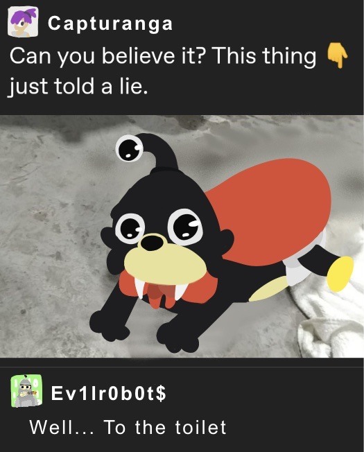
#futurama#futurama reboot#my art���☁️#ive been trying out a lineless style :3#bender bending rodriguez#turanga leela#nibbler futurama
109 notes
·
View notes
Note
top 10 jordans you made so far
good question! there are a lot of them that i like, though my faves would probably have to be
day 16: super proud of how this one came out and it's a bit personal to me <3 i think it does a good job of conveying the tragedy of his character..
day 35: this one's a style study; i think i nailed the linework more or less even if the coloring ended up being a bit too me, trying to figure out the perspective on everything was surprisingly fun
day 49: ive had the reference for this one saved in my pinterest board for so long i had to draw it eventually
day 28: this is probably the daily jordan post with the most notes? which is deserved i think, i was inspired in part by the lineless vector art that was popular in the 2000s and the 2014 powerpuff girls special because its art direction is awesome. i was imagining this being an illustration used for merch or something a la ppg's dream in style line from 2004
day 85: IT'S THE JORDAN FIGURE!!!! he's become three-dimensional... this is my first serious attempt at sculpting since like elementary school so im glad he turned out so well, i have him on my shelf and i occasionally take pics of him around my house. he's so cutes
day 8.5: this one was supposed to be day 9 but i fucked up while scheduling the post bc i was drunk so there were 2 jordans on that day lol. anyway ive been lowkey in love with 326's art ever since i looked into his work on gitaroo man which is one of my favorite games of all time, he's got one of the most unique styles out there with a very playful aesthetic. i tried going for a "what if jordan was a boss in gitaroo man" type of design here, i was originally going to try and design his gitaroo too but i got tired
day 21: had a lot of fun working on this one and trying to figure out where to place all the dots and in what order! ive been thinking of doing more pieces that encourage the audience to interact with the art in some way.
day 51: this one doubles as an artfight attack and im so proud of it still. i was listening to kmfdm while working on it and i think that's why it looks like that
day 97: probably the rawest daily jordan yet im really proud of how i drew the burn scar. not much to say about this one other than it's cool asf
day 50: if i had a nickel for every time i drew jordan turning into/partially summoning FS....
honorable mentions go to day 44/day 98 (me and my bestie came up with aus for these in vc), days 54-74 (forks) and day 92 (awooga)
2 notes
·
View notes
Note
alright! here's a more detailed post. you're going to need any digital art program that has two things: 1. layers, and 2. layer effects. being able to apply drop shadows to layers helps a lot, but when i started, i didn't use that and just faked the shadows using multiply layers.
my friend skitty is going to be helping me out. i use the same ol copy of paint tool sai ive been using since 2012, and i do some post-processing stuff in photoshop.
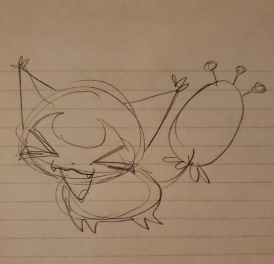
using this sketch, i start off with lineless art with each individual piece of it on a different layer. lineless art's not as scary as it seems! i use my sketch as the lineart & just delete it later. keep depth in mind when you're arranging your layers. things further in the back are going to be towards the bottom, while things closer to the viewer are going to be towards the top. you can draw on details with any traditional brush you'd like.
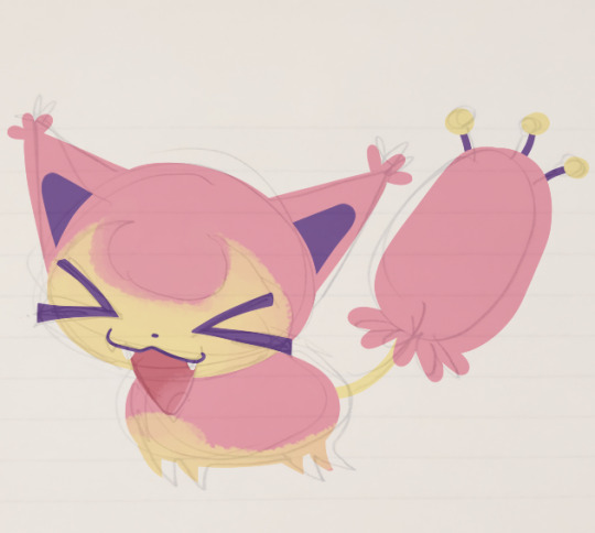
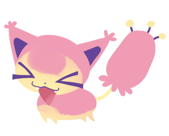
version with & without sketch for reference. here's what my layers look like. i tried to name them to make them easier to parse!
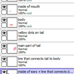
(that last one is supposed to read "inside of ears + line that connects dots to tail.) the locked layers are from where i drew on details that wouldn't need separate layers - mostly adding the yellow to the head + body.
next, you're going to need pictures of paper. you can find some online, or you can take photos yourself. i switch between stock photos of paper textures and pictures i took of crumpled up paper with my phone camera. you don't need anything too fancy.
here's the stock photo i'm going to use for my example. i use a different picture for every layer to give it more depth & intrigue - if you reuse the same picture over and over, your brain starts to connect that there's a repeating pattern and it can look a little "off".
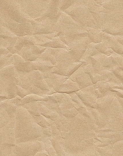
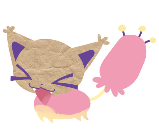
i'll copy and paste this on top of a layer and apply a layer clip/layer mask. this is called different things in different programs, but if you see it, i'm sure you know what i mean.
i set the layer mode to "overlay", which gives me this:
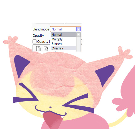
it changed the color a little bit, so i'll adjust the colors to make it grayscale + a little darker.

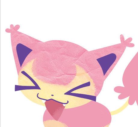
(comparing adjusted colors with & without the overlay setting)
then repeat this process for every layer.
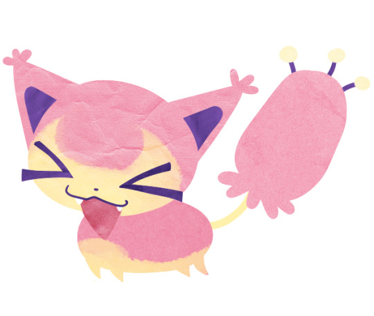
ta-da! we have textures! i recommend anyone trying this to have fun with this step. try out layering multiple textures over one part. try out different types of paper. you dont even need to use just paper! what about cardboard? plastic? go nuts!
at this point, i save the file as a .psd and migrate over to photoshop. transparency!
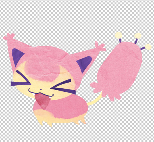
in photoshop, i start applying drop shadows to each layer's layer style. double-clicking each layer, i get to select:
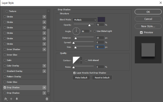
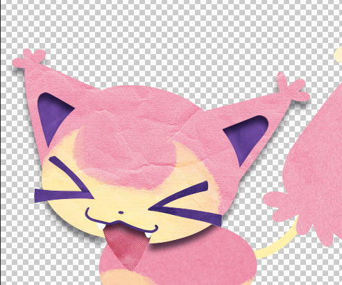
repeat for every layer. you can adjust the settings of every drop shadow to get different depths. i mostly change two settings, distance & size:

a large distance with a large size will make a layer look like it's coming forward more, while a small distance with a small size will look like it's closer to the layers underneath it. compare the head (distance 10, size 9) with the details on the face (distance 3, size 2):

repeat for every layer, and we get:
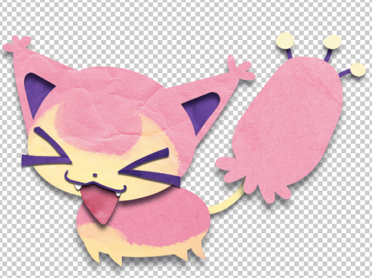
yay! yippee!
at this point, i start doing post-processing stuff. adjusting colors, contrast, etc. once that's over, i'm all done! ta-daaaa!
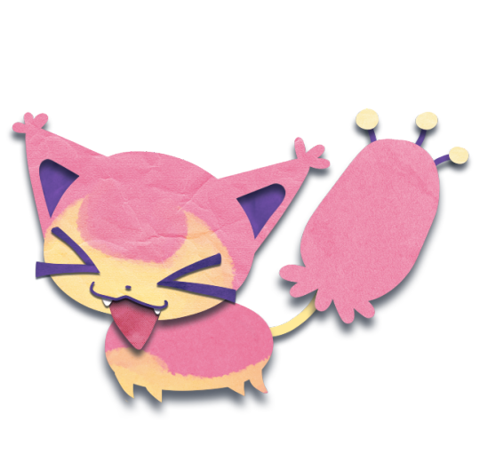
hi your paper cutout art style has fundamentally changed my brain chemistry ever since i saw it(like 5 seconds ago) and now the wizards in my brain are melting everything rapidly. can i ask you how you achieve such an edible and fantastic effect
thank you so much! the tl;dr is that it's a basic lineless art style with texture overlays + drop shadows but i can make a more in depth post to explain it more ^_^
240 notes
·
View notes
Note
hi! i have been meaning to ask for such a very long time but im not sure if it was rude to do. ive been trying to do a lineless art style and youre my biggest inspiration, im just not that happy with my own work. i think im doing something wrong? i was wondering if you ever did any speedpaints, or process gifs? (or maybe even psd files) i found myself learning easier when it comes to those! thank you so much!
hello anon! i’m so grateful that you like my work <3
it’s not rude at all to ask for pointers! unfortunately i don’t really have speedpaints or process work/psds for unlined work, but i do have a wips tag on my sketchblog that sometimes has layer information (this one i think shows best how i set up the initial image)
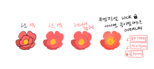
this is a tutorial i made for a friend as a way that’s similar to how i work but probably friendlier for people who are used to lined work! it goes like this:
1. make your (relatively) final lines, and block in colours underneath it 2. change your line colours to make things look ‘’’lineless’’’’ 3. merge layers (you can also duplicate both then merge the copies, which is what i normally do Just In Case) 4. if you need to, clean up your edges/adjust the resulting shape using an eraser etc. 5. add extra details (use a new layer if you’d like) and an overlay layer, both with a clipping mask. ETA: 6. if there’s anything i realize i need to change i just do it! it’s not just these five steps smoothly in order every single time with Perfection
one of the things you might want to check is your values, and how well your elements are layered like do they blur into each other? do you have good contrast and a good range of values, applied well so that you can distinguish different elements? the key to lineless art is making sure that your shapes are working well for you, and making sure that the key shapes stand out! though ofc this depends on the general aesthetic you’re going for
feel free to drop in again if this raises more specific questions! stay safe <3
-Frei
291 notes
·
View notes
Note
Artist wrapped: 5, 13, 15
3. how long did you spend creating in an average month this year? was any month more or less creative?
despite what it may seem on my art account, i do actually draw pretty often (it’d probably average out to abt once a week for 3-5hrs)! most of it are sketches, ideas for future Full drawings, oc stuff, etc etc so i generally dont post it
in terms of actual Full drawings that i post…. its variable. whether or not i draw something to be posted is up to my mood & whether or not i have any ideas to draw, so its less consistent.
july-september had a looong burst of drawing energy that led to a lot of stuff being posted, primarily bc i played through a bunch of video games which inspired me to draw and its when i finally started drawing transformers! june is probably the only month where i posted. nothing. i was finishing up classes & probably playing video games tbh
13. what pairing/character/subject/body part/object gave you the most trouble this year?
hmm. drawing sexy shao kahn emotionally drained me.
but honestly the thing thats given me the most trouble has been concepts/characters i Really want to draw.. but i have no idea what to do with them. this is about megs/warper. i dont do ship art very often so its an absolute nightmare trying to draw it like… what do giant robots even do together….. and more importantly what would megs & warper do together ??????? nightmare
some things that are. hypothetically going to be posted eventually. are some tf redesigns that include an alt mode concept. which this is genuinely the hardest thinking ive had to do since ive been in school. how does it all work together what the hell
15. is there any new style/technique/medium you want to explore next year?
i want to poke around with lineless art again with tfs! i’ve only done it once and i thought “oh man i cant ever draw lined tfs” and then i never drew lineless tfs ever again so. i should do that.
this has forever been on the back burner but ive been meaning to poke around with animation again. i dont remember if i ever posted anything involving animation on here or my art account but i did poke around in it quite a while ago, so its something i want to do again! even if its a pain in the ass
#ask meme#heliopauseentertainments#3. generally if i spend a lot of time drawing Posted Art my side art. sketches. oc stuff. etc etc will fall to the wayside#so its kind of like 2 meters where if one is higher than the other meter is shorter#13. drawing tfs isnt actually as hard as i thought it would be.. u know?#its just shapes! when compared to having to try & draw the human body its so much easier to simply draw a couple of shapes#of course i mean simpler tfs. the day i draw Complex tfs. well my hand will suffer a little more#15 i also want to fuck around with more comic stuff! its something i dismissed a couple of years ago bc it was such a pain in the ass to me#but ive been really enjoying it lately! of course that means i will need more ideas for comics but. hknow#it happens!#[azpf]
1 note
·
View note
Text
the always wonderful shelley @shanheling tagged me to do this thank u so much!! i think that everyone i wanted to tag has already been tagged to do this but if you feel like doing this feel free to consider urself tagged by me!! im putting this under a readmore bc its long and i ramble a lot
the piece i was tagged to explain my process on is this oc piece! unfortunately i have a habit of deleting my original clip studio file once ive finished my art and saved it as a new png file, so i dont have the file to show the sketch and different stages of this piece. but I still can go through my general process and talk about how i did that piece!
1. planning
honestly i think about the art that i want to do a lot, and in this last year or so ive thought about the art i want to do more than ive been able to actually create and finish that art that i want to do. for my planning i tend to do a lot of different thumbnail sketches for the art im thinking of
these are some examples of thumbnails, a lot of times ill do thumbnails just on pencil and paper and with some of these theyre done quickly with my fingers on my phone note function on a day where i was feeling too bad to get up and draw on paper but still wanted to get the thumbnail ideas down. two of these are for the same songxiao piece that i still havent finished and i have more thumbnails digitally on clip studio for the same piece, i do a lot more thumbnails when a piece isnt working the way i want it to and theres times where ill completely scratch a thumbnail or a sketch and start over in order to do more thumbnails because i dont feel happy with some aspect of it.
two of these are small gouche painting thumbnails for two pieces i did maybe a month or so ago, i did the thumbnails and then tried to expand on them digitally and im wanting to do more thumbnail paintings like this in the future because it was fun
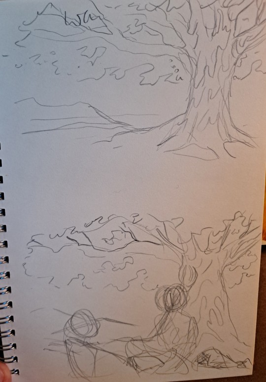
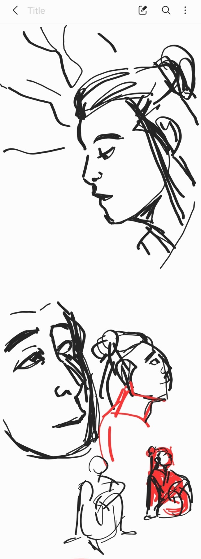
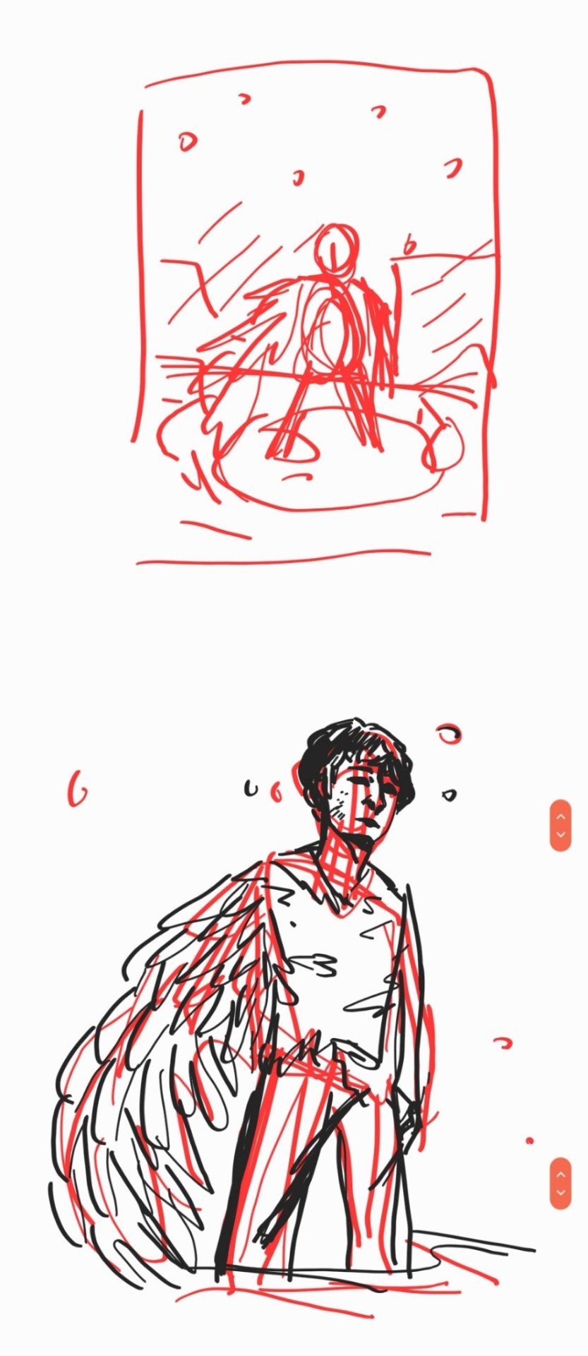
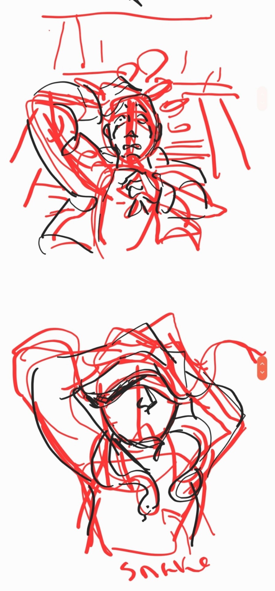
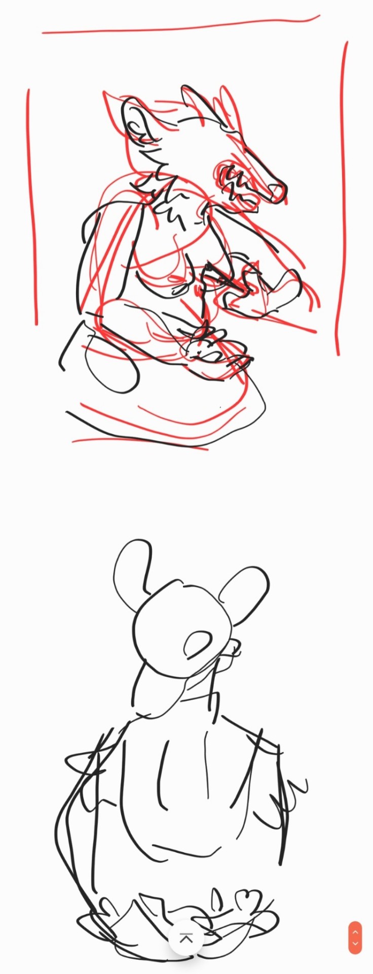
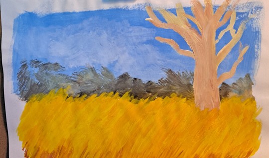
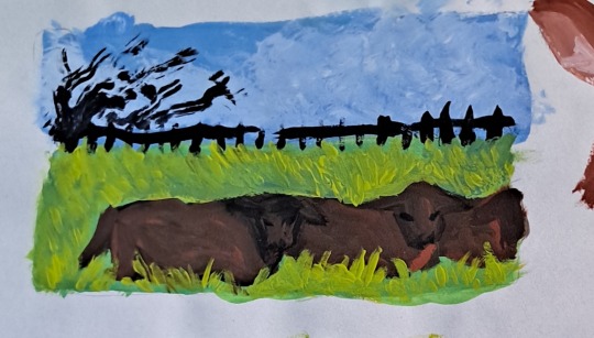
for the piece of my oc trio it was based off a series of ask prompts i got for a few different outfit prompt memes i had reblogged, so i based their outfits on the ones in the meme. when im drawing figures i tend to try and get the movement down in the poses when im sketching, i do several rough sketches of the pose before beginning to start setting down lines (if im doing lineart at all because sometimes i dont like doing lineart and do a more lineless painting kind of style). i really try to get my art to convey some kind of emotion, in the oc piece i wanted it to feel fun and like youre seeing three best friends while theyre out on the town having a fun night
2. creating
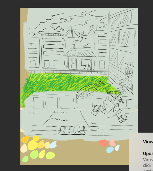
this is the only real example i have of a piece in the middle of being filled in and created, this piece is one that im really not very happy with & have had lying around for a while and ill probably scrap it and try to come at it from a different perspective at some point. but anyway it still shows what i do, i lay down a kind of neutral gray color underneath my final sketch/lineart if im doing lineart in that piece and then i start picking out the colors that i want for the piece and kind of setting out a pallette for myself. i dont do this color pallette thing 100% of the time but i do it really often, especially if im working on a commission or a larger piece where i know theres going to be a lot of colors or if its a piece where im not sure exactly what color scheme i want so laying out the colors together helps me kind of decide what kind of scheme i want. i am sooooo picky about my colors in my art i am genuinely obsessed with colors in art and there are times where i really have to stop myself from working on something forever just constantly adding more colors or putting little tiny changes and gradients in the colors.
after ive got the colors i want down i tend to try and block out parts of the piece with the base color for that section, and then i start to paint with the colors that i want to go on top of that base color from there.
once im satisfied with the colors/shading/rendering and everything ill go back and look over things and will fix things that look off or sometimes completely redo segments if they dont look right to me. when i was younger and mainly doing digital art using my phone and my fingers i would use a lot of filters and overlays on top of my art once i was done, and honestly im glad to not be doing that anymore because i dont think it made my art look any better. i do color adjustments and sometimes will put on a color overlay or a layer to emphasize the shadows and the light in the piece, but i try to keep those layers to a minimum and like i said before i have a tendency to obsess over the colors and ill spend a good amount of time in the color adjustment tool of clip studio and then ill just decide "actually it looks fine as it is" so yeah!
3. posting
i feel like i dont have a lot to say here gbfm i mean i honestly have a lot of thoughts about the relationship between artists and social media and how social media changes our views on art including our own art and how we can feel like we constantly need to be posting new art and just become content machines churning out new stuff. but ill save that rant for another time. i used to be really concerned about how many notes my art would get when i was younger, and i dont at all blame anyone who still is very concerned about that bc it sucks when u work hard on something youve created and then you dont get a lot of recognition for it, but honestly within the last two years or so i feel like ive begun to have a lot healthier relationship with posting my art. i really just post my art on my art blog, reblog it to my main blog, and then thats that yknow! i do really appreciate any and all support people give me, it means the world to me, but for me having the mentality where i dont need to post all the art i make and i dont need to be posting every day or every week or every month even has been a lot healthier for me because then im not constantly asking myself why didnt this get notes is my art awful??? and yeah i just kind of post it and my brain goes okay were done with that art we gotta make more
ive honestly been struggling a lot with art thru the pandemic and if youre reading this and have been struggling with creating in any way recently or even before the pandemic, please know theres no shame in having trouble creating and it doesnt make you bad at whatever it is u create!
thank you for reading this, feel free to consider urself tagged by me again if u want to do this!! love u all
6 notes
·
View notes
Text
OH HAY for the toonblr positivity event i got @onelinerminers !!
STRATO!!!!!!!! youre one of those ppl i really need to try to talk to more cause i think youre REALLY epic but from the conversations we have had, ive noticed youre super chill and fun and nice!
your sense of humor is really good OIDSJGIOSDJGSLJK i love it when i see you pop in streams and stuff cause im like "YEAH ITS PARTY TIME" !! your presence just over all is really good, you just radiate a really good energy if that makes any sense? like when youre around its like, ultra fun & at the same time im not stressed out at all? like sometimes my brain fries itself when too many people are talking but i dont get that problem when youre around :^0
also god from all of this i realized i wasnt following you for some reason? like i had been wondering why i havent seen you around so much but then WOW im just boo boo the fool
ANYWAYS!
your art?????? Your Art?????? is AMAZING hello?? i could go on about this one all day AAAAAAAAAAAAA i LOVE how cute and smooth your art is ;o; you do a fantastic combination of rubberhose + your own unique thing! i really like how you draw fluff and ears in particular... plus your expressions are really energetic and fantastic!! the way you are able to convey so much emotion in the eyes alone is really inspiring
and youre ultra skilled at both lined and lineless so [rubs my eyes all over the screen] id almost be jealous if i wasnt so happy and proud of how talented u are :^0!!!
your character designs & concepts are AMAZING too, so youre really out here creating OCs that your epic art style does INCREDIBLE justice & vice versa <3 __ <3
i really appreciate that you branch out and do different species and variations too! like, i think about the fossa & lykoi cat you did SO much... theyre so precious plus the fact that your sona is a pine marten is SO good HALE YES <3 __ <3 pine marten are really unappreciated animals + one of my friends who i like a lot also has a pine marten as one of their sonas so whenever i see one i think about him and im like "hell yes..."
i really want to learn more about your art and ocs (caradog is literally precious ;; and jillian is SUPER interesting, if you like OC interactions i also have a nasty jerk magician + another magician who isn’t a nasty jerk i could throw her way [eyes emoji]), but from what ive seen from them so far im already super in love & interested!! youre doing amazing ;o;;
im really glad i got you for this event cause it made me realize that i hadnt been following u before, so now i can actually see more of your art/ocs if you decide to post stuff!! which is epic >:D plus youre just a cool person in general ik we don't talk much but i love seeing you around!!
have a nice day !! ^^
10 notes
·
View notes