#its been a while since ive used my pen to draw
Explore tagged Tumblr posts
Text
should maybe take the 'my lines r shaky cus my hand is injured so I'm drawing with my left hand atm' from my pinned post cus they arent really shaky anymore lol
#farewell wobbly as hell art#it was fun while it lasted but also fucking torture#theyre still a bit wobbly traditionally if i use a pen#and theres certain motions that r still kinda a struggle to do but over all theres prob not a huge difference between my left n right anymo#speed and some precision n line weight control mostly#but i cant fucking say for sure since its been fucking Months since i could properly use my right for art.........#and its prob rusty as hell atm ...#ive started using it a bit for school work(need it for 3d modeling u_u shits hard 2 do one handed ive tried)#but not gonna risk drawing with it cus id 100% get carried away n could fuck it up again.. lmao#rambles
11 notes
·
View notes
Text
it's like this

in this case the knowledge being your expectations for how you want your art to look. it comes and goes in waves
How do people learn to draw without losing confidence in themselves 95 times a day
#and it takes a lot of practice! trust me ive been drawing since i could use a pencil (about 24 years)#and i still feel like i fall short sometimes. its part of why any art takes me so long#because i keep nitpicking at it to get it Perfect#also dont be like me. ive been drawing VERY little lately. and have been stuck in The Confort Zone for quite a while#which like isnt the worst thing but i know im not really improving much if at all rn#consistent practice will help a lot#years ago i realized i hadnt been drawing much so my mew years resolution was to draw something every day#even if it was a little doodle#and the first few looked like TRASH#but after a week or two my muscle memory had returned and my hand was a lot steadier#also a useful practice: draw in pen. with no pencil sketch. draw it in pen first#it forces you to be more careful and confident with your lines bc if you're not itll look shaky and messy#sketching is important for big detailed pieces but it takes a lot of skill to draw something without a sketch that still looks correct
431 notes
·
View notes
Text
I just checked out the new hobonichi line up for 2024 and damn. I only started getting into getting one last year. Got the green weeks and the yuka hiiragi clear case for said weeks planner. Honestly a really good combo.
Theres a seahorse design aaaaaa, i liked the embroidery designs from last year but felt they were kinda meh in some ways. The bunnies one felt too dark, like the colours used werent contrast-y enough tho i cant say how it looked in person. And while i loveeed the cafe one i wish it had only sweets on it instead lf various cafe foods.
But if i get the seahorse one for next year..i suppose i could just not use a case. Or maybe get the normal clear one... i dont really like the colours they chose for the plain ones. Or wait i could do navy. Thatd make the case i have really pop.
Choices choices...
#minty rambles#ive found i really enjoy using a planner#but i cant do bullet journaling. i need a layout already done#and found i really like how the weeks are formatted#i like writing things multiple times lol#so i used the week section to plan out my week..or try to. or more write what i do that day#or i draw the tbh creature if i do fuck all#and ill write important things or the main thing i do that day in the months section#and seeing the whole month helps me visualize when ive done things like showering#or anything really#literally no one cares about this but im rambling about it anyways#i used a multi frixion pen cause i fucking love being able to erase ink aaaa#but i specifically like how theres a 0.38m version tho i have to go onto fun sites to get it cause theyre jap only#i like thin pens#god yeah i might get that seahorse one#i love seahorsesssss#its been a while since ive been able to scratch my seahorse love itch#god i would love a largeish seahorse plush
0 notes
Note
hiii !!! love ur art lots, so i've been wondering, what program/app and brushes you use? i love the paper effect you give to your drawings, makes me want to eat em /pos
thank you so much!!!! i appreciate that a lot :D!!!!
(accidentally rambled a lot abt this HAHA)
i use medibang!! ive been using it forrrr maybe like 7ish years now... ive been meaning to one day get clip studio or something but i havent had the chance to buy it and im also a little intimidated at the idea of having to readjust to a new program HAHA
i use a few different brushes!! it depends on what im drawing and what i feel like using at the time (i should probably plan them out more often, actually)

oil paint, g pen, fluffy watercolor, and round brush (wet) are all brushes that come with medibang!!! i know i made Another Marker myself, and im pretttttty sure i made the first marker one too? my favorites are round brush and g pen though!!! i tend to use fluffy watercolor more for colors rather than lineart
(i also keep correction at around 12, i would use it more since my hands arent the steadiest but i find high correction to be kinda confusing so i just keep it low)
the paper effect is smth i learned liiiike maybe two years ago ish? and i have simply KEPT doing it ever since HAHA i do wanna mess around with more textures cus i dont want to be too reliant on just one texture for my art but it IS very fun and i like it...
medibang has a feature that makes it REALLY easy to do!!
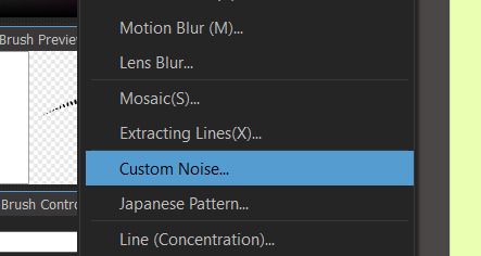
custom noise is my BEST friend. the sand, watercolor paper (specifically 2), and marker paper (specifically 2) are the ones i use most often!!!
i also will copy n paste color layers and lineart layer, add gaussian blur and do like 200 layer effects (i most often do this to lineart, then set it to hard light and somewhere between 30-60% opacity to mimic bleeding from ink!!). i DO often experiment w messing w colors wo layer effects cus its fun but sometimes its just more fun to use layer effects instead!!
medibang also has materials!!
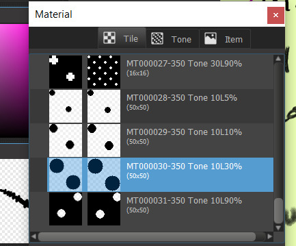
i dont use them as often but i like this one :D ive used it on a handful of things
and just for fun!!! things look suuuper different without this stuff. like the thing i just posted used a LOT of this (to be honest its cus i really really didnt wanna do shading for it LOL but it still felt too flat and i feel like these effects are a nice middle ground- but i will still often use this stuff when i AM shading things)

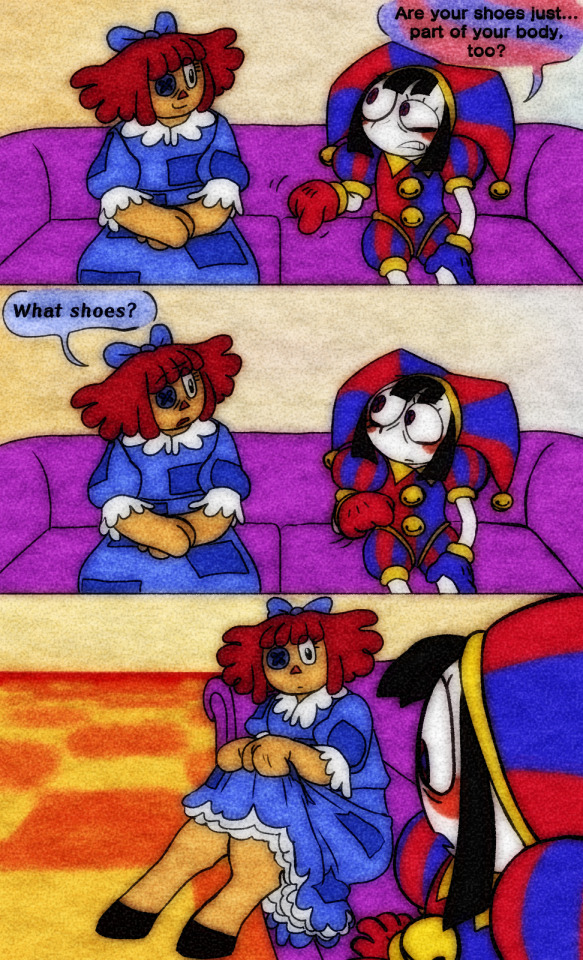
sometimes i will also use similar custom noise textures but for different parts of the image!!! like in this one i had a waatercolor texture for the bg but a seperate one for the foreground

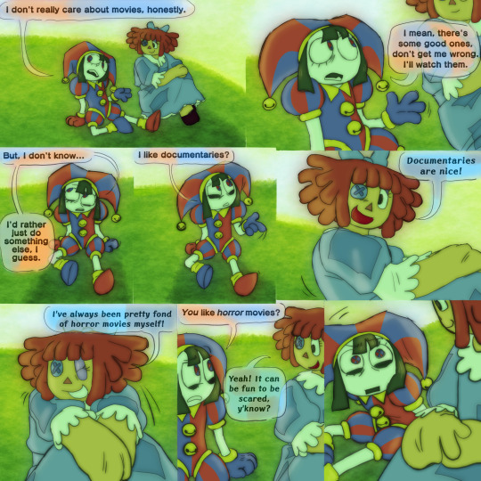
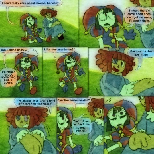
i DIIID a while back post a pic of kinger (its an older post on this acc- not old by most standards but it was during the first little while after i made this blog while i was still finding my footing w the characters) that used a bunch of different textures which i got from freestocktextures.com!! but i havent used them since. i keep thinking i should again
ANYWAY thats basically it!!!! i looove medibang theres a bunch of little things ive figured out abt using it over the yrs that im so fond of it. and THANK U again!!!!!! :']
#ask#i mentioned it but i DO wanna experiment more so i dont just do this and never anything else#but at the same time i DO genuinely rly enjoy imitating watercolor!!!#i try not to be too strict abt it and can and will add details that are not watercolor-y though#i just follow my heart <3#i have a screencap redraw i started the other day w the express purpose of maybe making it look a little like an illustration#i should return to that...#ALSO. oil paint brush is fun. but Be Careful....#THATS the one ive been using for the butch gangle image and its made it a bit unreasonably hard...#bc the brush is sorta like a lot of parallel lines theres like. a dip in the center of the brush with lower transparency#meaning when youre doing shading or lighting or even just coloring smth in youll end up w weird empty spots and its ANNOYING#otherwise a very fun brush though!!!#anyway!!! i love to ramble abt art HAHA this is all way longer than intended#dont even get me started on like. panel layouts or when i add small symbols or allusions or framing etc etc#i looove art. its so painful but i enjoy it so much#<- person who spent most of its life wanting to pursue an art degree then got scared midway thru hs and shifted gears to a bio field#but still sometimes laments what thing left behind...... i think about making comics like Properly sometimes....#gestures at a post i made a while back out of nowhere abt connecting w gangle. this was related HAHA#anyway i need to stop rambling i have another ask to answer!!!! i will be here forever if i tlak about art
9 notes
·
View notes
Note
DUUUUUUUUUUDE your alcohol marker works r SO sick i saw that sequence of process pics u had and my mind was just Blown . can you elaborate more on ur process ?!?!? /nf
hello ! thank you for your kind words. i apologize for taking a while to answer this. the process of coloring the drawing i did as an example was rocky, and ive been busy with school.
i'll preface this by saying that i have a few posts with process pictures on twitter (i treat it as a wip dump when i remember to post). heres one of the few where the pics are all together, but my media tab has a fair amount scattered around.
this is going to be long, so i'm putting the 'read more' here.
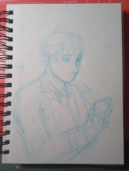
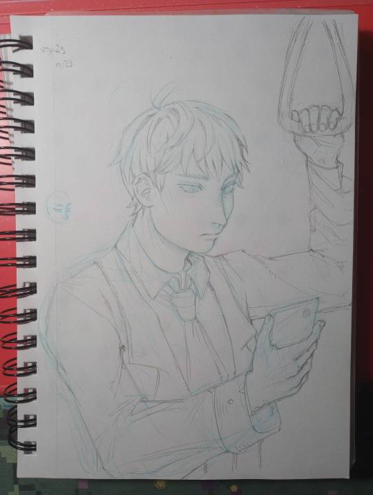
step 0 : sketch. i start with blue erasable pencil, lighten it, and do my lineart with a mechanical pencil.
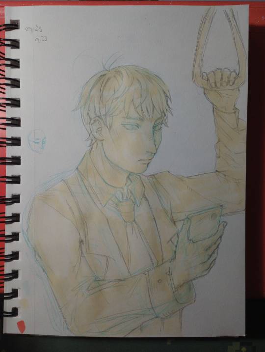
step 1 : base color. half frivolously chosen as a neutral color to set it off from the white of the paper, half "whats the color of the light / the lightest color being reflected by the material its cast on"

im going to stop numbering the steps. i immediately went too dark with the hair and failed to consider the strength of the light in the setting / how reflective hair is. also i colored the basic color of the eyes and the rough shadow under the jaw. dont get attached to any of this.
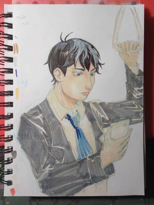
broke out the "ph. martin's bleed proof white paint" my mom gave me a jar of years ago. it does well enough at bringing back light, but the texture youre left with is not ideal. lightly shaded the face skin with a similar color. i also blocked in the rough color for the suit jacket and tie here. the marker doesnt have to be evenly applied because you'll be going back over in enough layers that it'll even out.
i wish i stopped here.
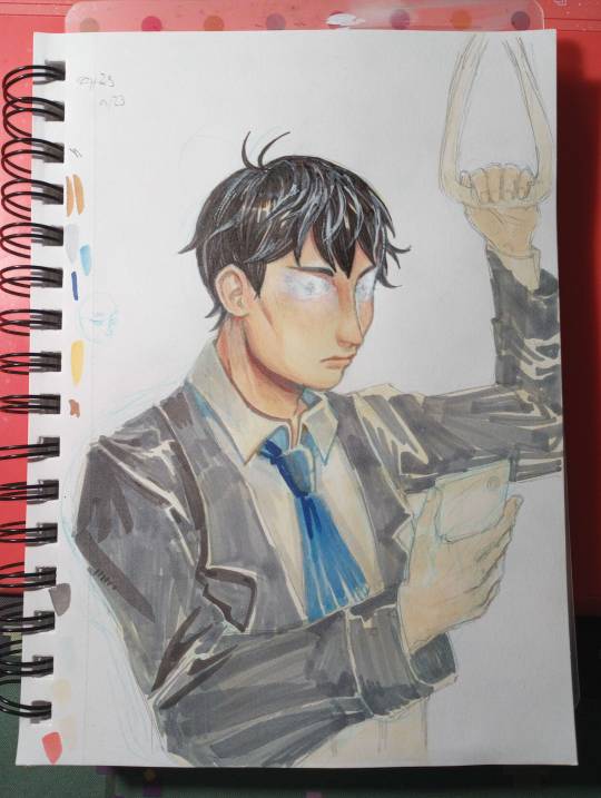
things start to go off the rails. painted over his eyes because "why did i give him double eyelids" tried to paint over just the eyelids. didnt go well. scorched earth. reshaded the hair, deepened shading on the face and neck, started on the shirt, and applied a cursory pass of shadow on the jacket. the light angle does not remain consistent with this.
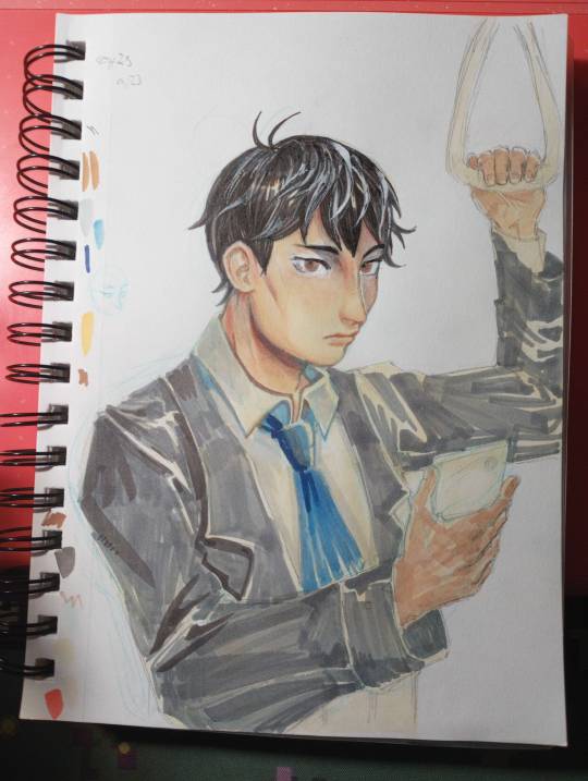
redrew the eyes. the angle feels uncanny. i wish he was still looking at his phone but the paint is not taking ink well and i doubt another layer would make it better. at some point i applied rough shadow to the hands. dont worry about the inconsistent lighting.
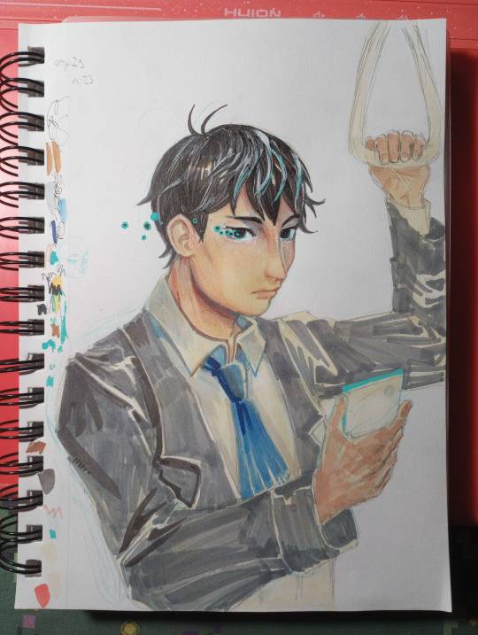
darkened the eyes so they were less creepy. didnt work. i assume the ink bled (alcohol ink soaks into paper, but since this is now on top of white paint, it just sits on top and pools out), so i embellished with posca marker to cover it up.
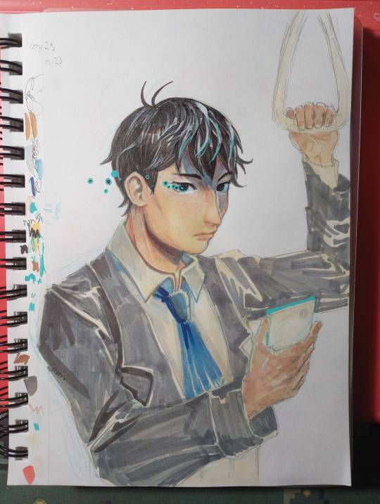
realized that with the length of the shadow the brow ridge was casting, the hair should cast a shadow too. light source starting to be established.

im really sorry. i didnt realize there was such a drastic jump between this one and the prior photo. basically, i started defining edges and areas of deepest shadow. fine edge definition was done with the cheapest ballpoint pen i own. dark marker blends fairly well, but only put it where you WANT it to be that dark, and blend outward from there to darken surrounding areas. many, many layers of grey and light blue, brown and darker brown for the jacket. now that i had a vague idea of the light source, i just had to place the shadows and follow the folds. hitting the points of shadow with brown (base color but darker + warm tinge to suit base color) and blue (reflected light).
this also wouldve been a fine stopping point.
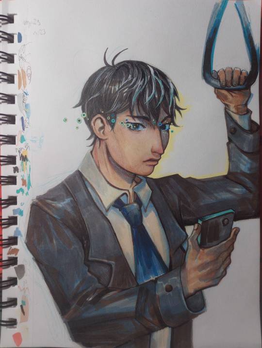
used posca to outline the edge of the face + sharpen edges. added more pupil-spots. messed up the mouth some more. whatever. calling it done here because the jacket looks good and the face is freaking me out.
overall, i treat alcohol marker like watercolor. a big wash of color, rough base colors. roughly block in shadows, gradually add washes of deeper shadow. define edges. etc.
its harder to blend colors directly than with watercolor but thats nothing more layering cant fix. and then white paint if layering doesnt work. and then more layering.
19 notes
·
View notes
Text
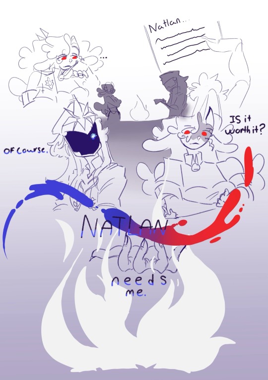
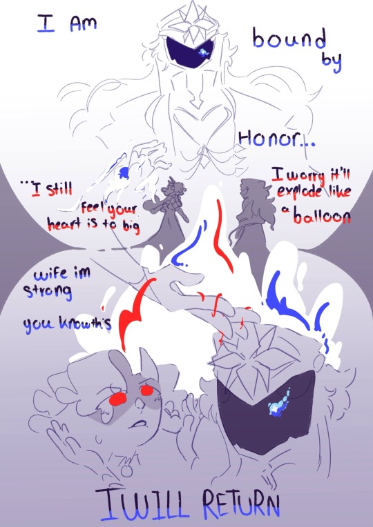
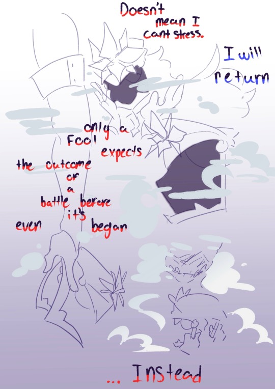
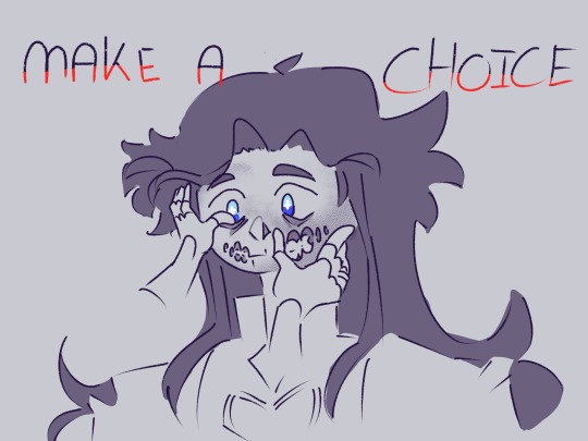
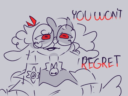
I spent an entire day on this and i feel you can tell based off how some bits are rushed. I wanted to make this before i play the update and learn whats gonna happen to capitano. Ive been struggling with what may or may not happen to this set of pixels and this is me using my oc i tied heavily to him as a means to almost tell myself its ok. (Under is ranting but no spoilers or leaks) ANYWAYS HAPPY NEW YEARS ^^
I hope i made capitano in character, he doesnt speak much but i tried to make him fit how i see him (a big hearted man of honor… that will do fucked up stuff for a good reason). If my pens didnt all die and i was forced to switch up programs i so would of made his face more scared and fucked up im sorry capitano fans its not rotten enough i know 😭
Esfir is iffy in this because this is specifically her after a LONG while of character development to the point where she can act like this (but in general she isnt like this)
I already made the decision to pull esfir from genshin but i will admit im a bit sad about it, i was planing alot of things about her in genshin like animatics and comics. Im still going to do those things and im probably going to make a genshin au but i feel genshins story telling is so… different than the story i want to tell. I hate having to change my story to fit into genshins especially since so much or her story isnt even related to the main plot. I love the game but im so tired and esfirs story is genuinely so important to me and i dont want to half ass it to fit into genshins story. It just sucks right when i was planning all my animatics and the order i wanted to make them in and the comics is when i learn what might happen in game. Her first genuine appearance is her last one and its not even a main thing tied to her its something i threw together last second
I had to switch the platform i was on in the coloring and editing phase cus all three of my drawing pens died which is why the last two photos are drawn differently, its not as rendered as i wanted but i just wanted this done before the update. Ill have time for au stuff and to work on esfir now separate project on a later date.
#genshin impact#genshin#genshin fanart#genshin capitano#il capitano#capitano#genshin oc#oc#oc's#esfir#esfir eres#capifir#bound by water and blood
15 notes
·
View notes
Note
DID I HEAR WK OC 👀
LMAOOOO Yes you did!!! i'll put some of my rambles under the cut lol
so she doesn’t have a name yet, because i suck at names tbh, and i figured i’d come up with one after she was ready. the name needs to be right, you know?
she's desi! Paki-american, which in theory should be easy because like, that’s the experience I've lived myself, so it should be the one i know best! but i’m like okay, i can give her the experiences sure. but the last name part gets a little tricky because a lot of last names for desis are also indicative of what clan/tribe they come from and the corresponding area.
but i was playing around with a couple picrews--not for OC purposes but because of my Desi Jamil Viper from twisted wonderland agenda--when i stumbled upon this specific picrew.
i loved it so much, and i had so much fun! and where i DID put together a Desi!Jamil, i also put together the face for my WK OC!
so here she is, created via the picrew linked above:

yeah it’s a picture i took on my phone of my brothers laptop screen lmao but it is what it is 😭
she doesnt have a name yet. ive struggled, but @novazentryx sent me some really cool name generators that i've been meaning to check out, so hopefully that will be taken care of soon.
she's 26. she's bi. she's always napping. she comes from a big family in which she is both Middle Child and Middle Cousin.
she is a bit of a gag character, and not really involved with the Tortuga crew.
she is a former NASCAR racer who got injured, badly, her very first season, and suffered permanent hearing loss in one ear, and partial in the other. before her injury though, people really thought they had an upcoming racing champion on their hands.
after the accident though, it took her a while to get behind the wheel again, and its something she still struggles with at times. despite all that, she is now a getaway driver for various WK villains.
(i imagine her card was passed around at the villain seminars)
and like the various VK villains, she is cringe (affectionate) she's cocky and a manipulative schemer, but she's also an absolute fool.
she's deep in denial and bitter about the end of her NASCAR career--she'll never get over the fact that it came to a violent end right when she was getting started.
there is a running gag where everytime she leaves her car unattended, she comes back to it totaled. like Kevin from Ben 10. so she literally cannot move on from the reminders of the end of her career, because she always in that moment again--her car, crushed, on fire, wrecked. and her not knowing how it got that way.
favorite animal: tigers, all kinds
favorite colors: cherry blossom pink, turquoise, lilac
favorite bird: peacocks
favorite flowers: cherry blossoms
favorite fish: siamese fighting fish and clownfish
Birthday: February 19th
favorite movie: speed racer and cars
favorite book: one thousand and one nights
crossover time: she used to be email/pen pals with debbie thornberry (the wild thornberrys) since age 14. when they met while the thornberry's were filming a documentary in Pakistan, while she was there visiting family over break. they had a falling out when they were both 20 however, and haven't talked since.
im working on learning how to draw bodies and poses so i can draw her, in the meantime, know she favors racing jackets and pants, but band tees when she's going casual. when its time for fancy though, she loves busting out the gorgeous and elaborate clothing--the salwar kameez, to anarkali, shararas, sarees and lehengas.
6 notes
·
View notes
Note
how do you make your oc screencap edits?? i also have a td oc and i dont really know where to start 😭
ok so!!! i use firealpaca which is just my usual drawing program. so i'll keep using it as a reference for my steps but of course im sure whatever similar program u use should have similar features
i'll be long winded for funsies as usual 💕
FINDING YOUR SCREENSHOTS
the key to decent td edits is to flat out trace screenshots whenever possible. stock pics will do, but of course itll be a lot more fun and less obvious if u use a screenshot from the show and put it into your new context
in terms of making your ocs, you will likely have to do what someone once called "frankensteining" your pics. this is where you use pics of other characters for their specific features and put them together since your oc doesnt have official screenshots to trace. this also absolutely comes in handy w canon characters! maybe you have a pose but u need them to be sitting. so try to stitch together two different pics to get what u need
it will look very scary but just trust the process. here is a random example i made using a dawn screenshot (where i removed the background), gwens eyes and eyebrows, and kittys hair

the sketching part is semi-optional. if you think you can freehand the lineart then go ahead but i assume your oc wont be a complete copy of something found in canon and therefore you will have to draw the newer/different features (such as the hair or the outfit) at least a little bit. and sometimes when i frankenstein the pics, my brain gets all overwhelmed so sketching makes me feel better jfbdjdnd
(in terms of my own oc, i screwed myself over bc his body type is so unique i gotta freehand it like all the time 😭
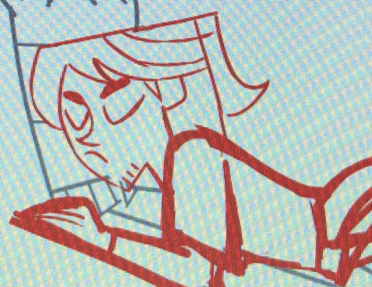
you can see i traced his head from his render (ALWAYS DO THIS BTW!!! TRACE CONSTANTLY), but then the body was freehanded using a canon pic as reference because tracing the pic wouldve been inaccurate)
THE LINEART
yes the iconic td thick, sharp, flat lineart. i achieve this by using a normal pen tool, turning off the pen pressure, and then turning up my pen stability to 40-60 (very high). you could use a curve tool if that works for you! but i would suggest against that for ALL of it bc the tool just wont respond well to rly drastic curves and such
the pen size varies on the pic. if the characters are close-up, itll likely be a bigger one. and then the characters' little details and facial features are usually a slightly but definitely noticeable smaller size. for the most part, ive had the bigger pen size at 13 while the details are around 9. or big size 10 and smaller size 7.
heres my technique:
as u can see, all of my lines go a bit too far. this is so that when im done drawing them, i can go back in and slowly erase where they meet and get them all sharp and pointy. this is just how i personally do it lmao. when it comes to facial features and other stuff that doesnt connect to anything, just get a close look at your reference to see how thick or how thin the edges get and do ur best to erase the edges to the point where they should be
THE COLORING
not much to it! the bucket tool is the best way to go. again just get a good look at your references just in case any parts have the lineart also colored in
THE BACKGROUND
you can find some generic td background pics on google or u could get them from the show and try to erase any character in the way lmao. if ur recreating something like, say, a dunc/ney scene w a different ship, then its very tedious but youll have to do your best to erase the canon characters and piece the background back together.
i like using the smudge tool a lot for this!!! just kinda pulling whats already there towards the characters. to save time, put your drawing visible on a top layer as you do this so that you dont have to edit the ENTIRE background, just what you need
THE RENDERING
ok so heres a big one imo. after youre done, youre gonna have to fuck up the quality at least a little. well not that u HAVE to but like..... to match the standard quality of a td screenshot? ive never seen a td screenshot in perfect hd quality outside of stock art. so u could blur ur drawing just a little bit. maybe add in the teeniest bit of chromatic aberration (just set it to 1 or -1). not ALL of them together but u do whatever u gotta do
my personal favorite is blurring just a little and then saving it as a jpeg (around 65-80%) so that its pretty crunchy and looks all the more real
obviously not a NECESSARY step but just something to point out. especially if ur background isnt the best quality so the characters have to match it
this one from yesterday i didnt even redraw topher bc i was lazy and he looks fine enough. i just put danny onto the pic to cover the other character. so i blurred danny a little bit and then saved it in a pretty low quality so that they match one another. look at those pixels. that crunch.
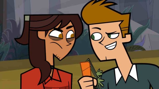
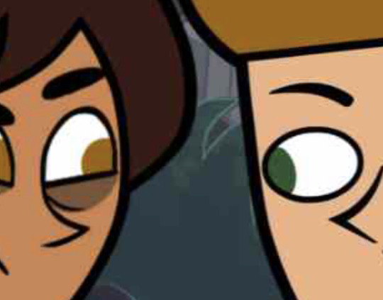
SO THE TLDR IS just trace and copy your references as close as possible. if you cant find a reference for your character, try finding another character w something close enough
28 notes
·
View notes
Text

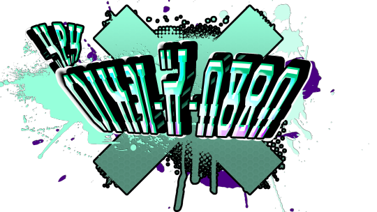
TLDR: Recently Ive been thinking alot about splatoon OCs me and my kid made and i started doodling little graffiti arts for them I liked how they where coming out and decided that i would dust off some photoshop and make them for real. I followed [url=https://youtu.be/uCDqQYMuf9Y?si=XO6S2ph0i_Vah9NX]This[/url] from youtube sine im bad at both handwrighting and drawing.
So recently I've been doing my best to find something to bond with my daughter over. In a lot of my sentimental times I think alot about when I used to come home from work and find her playing splatoon, or how she used to sing fan covers in the back seat of the car while we where on long car rides. I loved how she seemed to live in that world especially when I saw she named her account after her character and started cosplaying characters at conventions.
We started playing together and of course with her dozens of hours of experience I got whomped. (Whomp whomp..)
Soon after figuring out the controls and that I was clearly not meant to use this game's version of a sniper rifle (especially not in a 3rd online person arena) I started to get the hang of it well enough to begin playing against her on lunch breaks at work (because she was home schooled) as often as I could. Soon we had a mini YT channel where I was playing one of my favorite influential games with her (earthbound) and she was talking me though my first playthrough of Splatoon 2!
We had lots of jokes and I was collecting equipment like crazy. With that I was thinking more and more about what my splatoon character would be, and so was she. Fast forward a few years and a game later and every splatfest weekend I have her over at my house for the weekend and we're stocking up on Baja Blast and tacos to fuel our frantic splatastic bomb rush. We even came up with cheeky names for our online gametags. She was Lil' Hype-R-Bomb and I was Kil-R-Wail(because I'm not allowed the second L )
Soon I posed a question to her. "Do you have an OC?"
Not long later we started thinking of Hyperbomb and kilrwail as actual charaters with tragic backstories, lore and even a secret base made from an old Taco bell (for unlimited reserves of nuclear Baja blast of course!)
Soon at work I was doodling and thinking of my character's story, and trying to doodle up a tag for him in the style of splatoon and jet set radio. I found myselt trying to use sacred geometry to plot out the letters and make crazy shapes and trying to combine them with the baja blast logo. (BTW it doesnt look good when you suddenly stop working to scrawl these things out, I wont stop you just know its weird and so am I and I'll stop when I die.) I'm not much of an artist, my doodles usually consist of the same chao character I draw over and over and still cant get right. And my penmentship is relegated to an edgy script ithat takes me an awkward amount of time to scrawl out (it actually comes from a friend's design of my old online signature) So needless to say it came out like a pancake in an air fryer.
Soon I'm trying to dust off photoshop skills and failing off and on to get my tablet to et it right. My penwork isnt great but i couldnt get it to come out the way I liked with the pen tool. one night i was settling in earlier than normal and decided I had time to follow a photoshop tutorial and sought one out to help me decide on a style that I could make and edit easily enough if we need changes. I ended up learning a few things about layer styles that have changes since PSCS3 and its almost exclusively layer styles.
Anyway thanks for letting me rant into the void, I may start blogging the story of our OC characters, not sure yet. Whoomy!
#splat3#splatoon#splatoon fanart#splatoon graffiti#gamer tag#photoshop tutorial#photopea tutorial#websites#baja blast#splatoon oc
4 notes
·
View notes
Text
Introduction!!
hello hello party people!! i haven't properly posted on tumblr ever but i'm BORED!! (and as always, fuck meta, fuck twitter, and fuck tiktok)
why don't you say we get aquainted :3
to start! hi, i'm ace! i'm 20 years old, and i use he/him, ze/zim, it/its, and they/them pronouns
rapid fire!!!
i'm queer! specifically i am unlabeled, transgender ftm (but i do also consider myself non binary, i am a boy but get fooled it's also ambiguous), and on the aroace spectrum
i have a girlfriend :3 we've been together for 2 years, 7 months, and 22 days (6/1/22)
i am plural! i have a system so you might occasionally see posts from my headmates
i am an artist and creator! ive been drawing ever since i could pick up a pen, i've been writing seriously for 6 years, and i am a streamer/youtuber (currently on hiatus tho!)
here's a list of most of my hyperfixations so if you like these we should be friends :3
hermitcraft and life series (and double hearted, one of my fav things rn!!)
house
my little pony
gravity falls
regular show
adventure time
smiling friends
the owl house
spiderman into AND across the spiderverse
pokemon
the stanley parable
stardew valley
minecraft
my own ocs........
and many more!! PLEASE CHAT TO ME ABOUT THESE RAA
on my page, you'll see various pieces and writings of mine, as well as general blog posts! i'm not after fame, followers, reach, etc (numbers are NOT good for me) so this is just a space for me!
i am always open to make friends but i will let my boundaries be known!
i do not answer messages or comments that are very simple! ie "hey" "hi" "how are you?" etc! they make me very nervous and i am just not comfortable answering those
i do not want to talk to anyone under the age of 18 privately! i as well would like this to stay an 18+ space but anything explicit will be posted on a different page (not currently made and will not be linked here to avoid blurred lines) this is to protect myself AND you!!
i am in a relationship! it will never be open, and i will never stray. i love her more than anything. any flirting or advances will be met with a swift block
i will make posts about and while being high! i use edibles to control my pain since i have chronic pain, so if that makes you uncomfortable i get it!
i'll post if my boundaries changes and/or make a dedicated boundaries post but for now these are what i have :]
i look forward to being active here!
#introduction#intro post#hyperfixation#hermitcraft#house md#my little pony#gravity falls#regular show#adventure time#smiling friends#the owl house#spiderverse#pokemon#the stanley parable#stardew valley#minecraft#oc#my ocs <3#i love my wife#what else do i tag#friends question mark?
6 notes
·
View notes
Note
hi!! I love your art and have been wondering what brushes you use since they always look very smooth
omg thank you so much!!! 😭 that means a lot to me cuz im actually a rly messy artist so ive been trying hard to make my art neater and the lineart cleaner,, i actually use random brushes interchangeably so since theres quite a bit ill just expound below the read more cut :>

so for the entire year or so the main brushes ive used are wendy xu's esterbrook double elastic #135 vintage dip pen mimic and fine point sharpie mimic ! its pay what you like (min $1) and theyre only available on procreate. i highly recc them, they feel SO nice to use! ive been using them a lot esp in the recent (ivantill) comics ive been drawing but also for rendered pieces to clean them up a bit
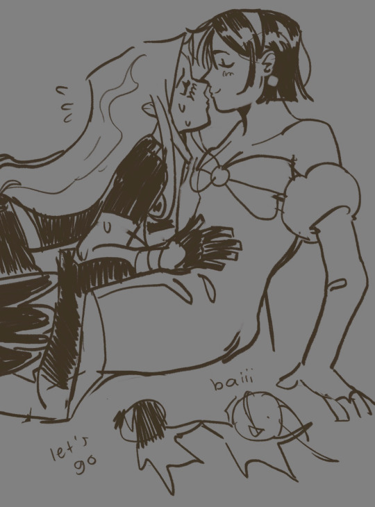
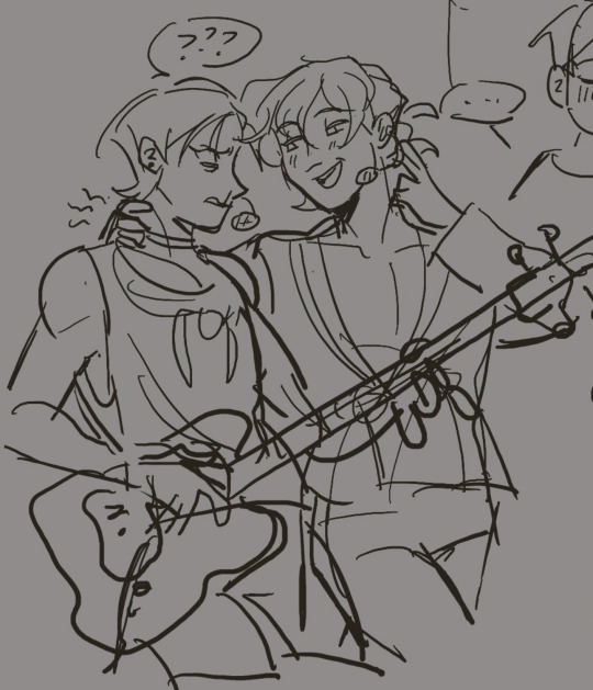
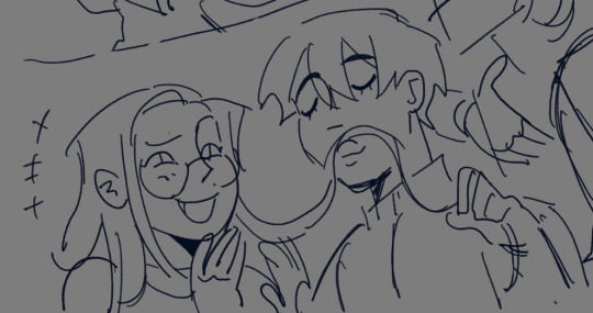
also rly fun to use for sketching / crosshatching! personally i love to use the mimic gel pen for sketching while the elastic is for clean ups
sometimes i also just use the default ink procreate brushes like "syrup" or "gesinski ink"


for more rendered pieces like the ones above ive been using rinreeper's procreate brush pack (pay what you like, min $0) and marmastry's brush pack (pay what you like, min $0). both of these packs have really lovely brushes that make blending a lot easier, and coloring becomes a lot more fun :> they've been a huge help for me for a long time now (i also used the aforementioned wendy xu brushes for inking and lineart)
these brush packs also come with their own lineart brushes and i sometimes use them too


for pieces that are blockier / not quite as blended i love to use twulf's procreate brush packs, specifically the draw and paint packs. its free and only on procreate! for the draw pack i use "filly 1", while for paint i use "002" and "basic rounded cube". this is perfect if youre not rly looking to blend your colors and rather lay it out as is
OK thats pretty much it, sorry if its incoherent in any way i wasnt sure how to like. format this;; but these are the brushes ive been using d entire year 🫡
4 notes
·
View notes
Note
So like I’m gonna assume you may have an idea on this but like how do you like get line weight on digital art? I’ve always struggled with digital and honestly I’m not sure why. It’s just something about the canvas feels off, how many brushes there are.
Like it feels… almost inauthentic? But I really want to learn how to draw like Japanese fanartists, and also WLOP style really intrigues me. Maybe its my ipad being really small…? I’m not sure.
Okay back away from that rant. How does… line weight work on digital? What I mean is how do you get your lines to vary in thick/thinness without having to manually edit it because manually editing just makes it look choppy, much unlike traditional.
In the meantime, I’m having fun with 20 min pen sketches because they’re really nice to loosen up with. Pen honestly just makes everything feel nice, because you learn to accept the mistakes, you get to see the shading, the form, yet you also leave the form to the mind to fill in, which nearly negates the mistakes. Plus, I think the looseness just… makes art more enjoyable? I stopped for a while just because art felt stressful. Pen kind of made it more fun for me hahah.
So here, take some art from a month ago.
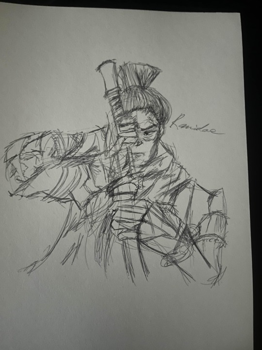
What do you use?
When i do line work i usually rely on pressure sensitivity but ive always had either a drawing tablet (like wacom or xp pen currently) or an apple pencil to work with.
One thing you can try to do is manually go over parts of the line you want to be thicker (or more in shadow)
Like this maybe?? (I dont think i showed it well since i usually use pretty heavy lines sorry)

Ive tried to find examples in my older artwork where i do it
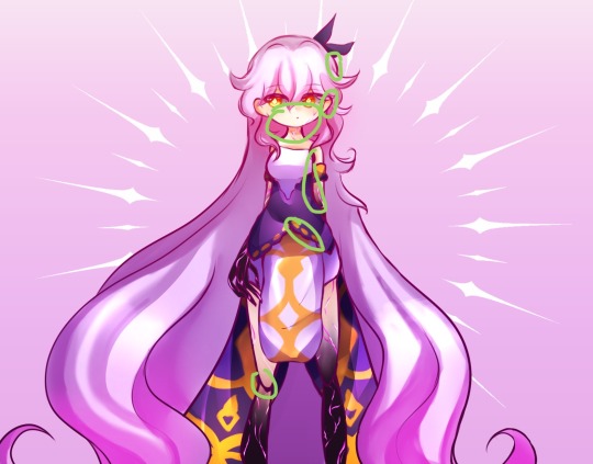
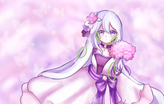
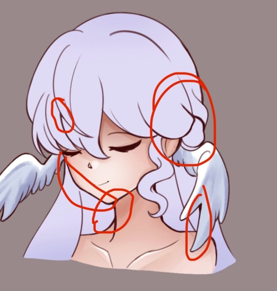
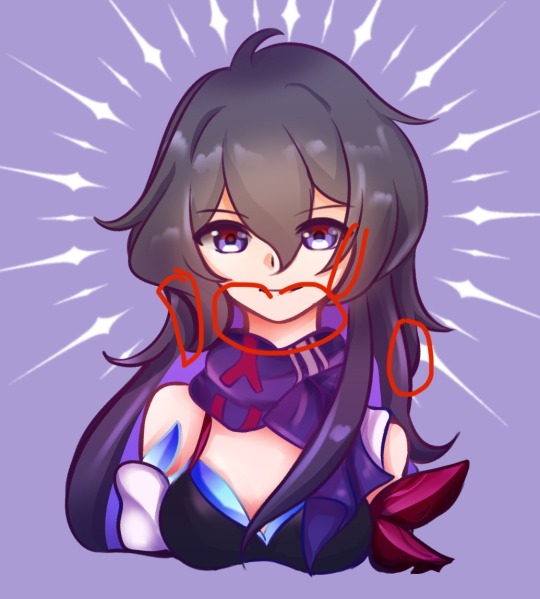
I dont know how much of a difference this makes but its just something i do
I should get back into doing pen doodles since ive been finding myself frustrated whenever i draw and i end up scribbling all over it whether its digital or not snjs
Thank you for reminding me about pen doodling!!
Also that drawing is so good!! You’ve improved so much!!
3 notes
·
View notes
Text
post mortem for my orv animatic bc i have lots of thoughts and yall are gonna hear all of them (that is a threat)
first is the obligatory special thanks/plagiarism declaration section but a lot of the shots in this are inspired by the original changgwi lyric video which like. please watch it there's a reason this song is a classic animatic song on bilibili like the music is good but the video definitely helped. also speaking of bilibili, special shoutout to this arknights chongyue animatic that introduced me to the song that will haunt the next 8 months of my life!
the original inspiration was the thought that the verse of the spirit telling the story of its own death felt very yjh coded but it took like another week of stewing on it to have the idea of using the final chorus for the dkos arc which was the moment i decided i have to actually make this thing

going strictly by when i started putting pen to paper (pencil to ipad screen? whatever) this took almost exactly 5 months since i created the first drafts in february but the first 3 months ish from february until may were also my school semester so. most of the progress (id say about >60%) was done in the last two months of me working on this every moment i wasnt at work (or playing project sekai, for some reason)
also! funny little detail but counting the drafts and some discarded frames my procreate stack for this thing has exactly 49 artworks in it! neat little easter egg i guess (yeah 51 wouldve been more fitting but whatever)
this fully slipped by both me (at 2am) and my friend whom i sent the finished version to (fighting the flu) but in the final edit i didn't actually include the second half of the last lyric?? it's 'i will take you to the mountain god' i apparently just wrote 'i will take you' and never finished the rest LMAO
speaking of the lyrics i dont speak korean and im not a huge fan of most english translations of this song that exists so on multiple occasions i was so tempted to just use the chinese cover someone on bilibili did because then i'd at least be confident i know where the fucking line breaks were (there's one line at the end where im pretty sure i didn't edit on the line breaks correctly but that was more of an intentional compromise because the timings would've been off otherwise. anyway) tbh the only reason i didnt do that is the atmosphere and delivery of the original song is. really unbeatable like the cover's also pretty good but it doesn't quite achieve the same effect
also speaking of things i fucked up im aware i drew sys in the wrong outfit for the dkos fight but like. ok full disclosure my orv reference folder is a complete mess (theres like 400+ images in there. for some reason) so on net ive gotten character outfits wrong while working on this thing like at least 3 times bc id just grab a random webtoon screenshot from my folder and go w it. it's just that by the time i realised i fucked up i'd already finished drawing all of sys's frames and i was too lazy to go back and change all of them LMAO

anyway yeah some other random things i wanted to whinge about:
there's a lot of effects i wanted to do that didn't quite come across due to. lack of skill/time/patience/all of the above but the one im really annoyed about is the yhk postchorus bit with the 3 circles bc. first off i think i drew those while halfway dozing off on the train to school once because uh. yeah

anyway poor drawing aside id really wanted to recreate the sort of. drawn-in effect on the circles and lines that the original lyric video had but i could NOT for the life of me figure out a way to execute that in capcut so. here we are (also you cant put transitions on overlays in capcut so that's why those also looked so bad. youre welcome)
honestly my timeline for this in capcut looks pretty ridiculous bc if you want to do word by word animations/effects you need to pay for the pro version so my workaround was just to have like five thousand text layers with 1-2 words on it each (do not recommend btw)
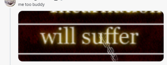
speaking of the text im a moron so i kinda forgot to account for the text when drawing frames and wow you can tell. yeah next time im just hand writing the text fuck this
and i have some more thoughts that are. mild to moderate webtoon spoilers so past this will be the spoiler warning line
__________________________________________________________
actually my original plan was to upload this the day dkos dies in the webtoon but a. i genuinely did think it was gonna be yesterday like i dont pay for the early access episodes so i was just kinda going off orvtwt LMAO b. i could feel myself burning out on this like the last few frames i drew for this were fucking dogshit so i figured either i finish it soon or i wont finish it at all
i will probably still draw something for dkos' death day though for those who celebrate (basically when i was thumbnailing for one of the frames in this i ended up with one that didnt fit the video aspect ratio at all but still looks pretty good so im promoting it to a full drawing. so look forward to that)
like for an idea of how fucking sick of this shit i was by like. last week pretty much like for the last few frames of the dkos fight i straight up forgot to draw dkos' wings and had to add them in halfway through editing last night. like that's how fucking out of it i was by then lmaoo
looking back its actually kinda funny cuz the whole put this up when dkos dies thing was my plan since february but i had literally no way of knowing when that would be especially since the webtoon stopped going with the novel chapter numbers exactly (i could.. guesstimate but my original estimation was in june so yknow. real useful) but like i can find evidence of me panicking about that deadline since may. why did i do that
given that deadline i knew i cant really include stuff from the novel past the dkos arc but man. the amount of times i wanted to use something from later (ESPECIALLY 1863 arc). i actually have another idea i want to test out thats like full epilogue spoilers partially because working on this for so long made me realise i really want to make more epilogue content <- what
yknow how i mentioned discarded frames yeah i had to draw dkos' death 3 times because the first two compositions just never quite panned out. i mean the current one is also pretty unreadable with the colour scheme but trust me the previous ones were way worse christ alive
#this is gonna be even more whinging but like. im fully expecting this animatic to flop actually#<- complete nonchalance. im just glad im done with it i dont particularly care how it performs#thats not a sign of. idk maturity or whatever im just sick of thinking about it JKSHFKJHD its been haunting my psyche for like 2 months#i have a lot of other animatic ideas knocking around bc ive been listening to a lot of music recently i guess#<- losing my mind at an IT internship#but i might have another something out... soon? depending on how much trouble procreate dreams gives me??#its meant to be more of me just testing out dreams before the alnst thing i wanted to make lol#asto speaks#oh yeab funny story i was trying to explain to my mum at one point the difficulty with trying to translate the line about dying to the tige#bc english translations will usually write 'i died while trying to catch a tiger' or something like that but in the original line#the died part comes after the tiger part#and the way i tried to word this to my mum was. 原来的歌词是 上山打老虎 然后死了 英文翻译是 死了 因为 上山打老虎#idk it just cracks me up
3 notes
·
View notes
Note
i realize how nothingish this question is regards to like answerability but like how do you get.... ideas...? or. i dont really ever have any kind of bigger things i want to draw its always like small stuff.... or... idk.... i want to make things that are like.. more... i want to make stuff that like... means something makes you think something... most of my stuff is just tiny little things with nothing behind it just something to get it down but i like want to make things that are interesting to look at.... idk..... okay wait ill share a self portrait i did.
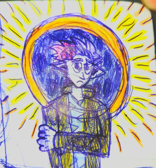
^ im really hapoy with this stuff theres color theres studf going on! an eclipse! right like its. its neat theres things theres associations being made theres questions theres something there this is the only thing ive made where i actually feel like ive expressed something that was in me and i just dont know how to do that again i want to make more things like that i want to get more out of my art than just putting stuff down thatll be forgotten the second its down i want what i make to be meaningful to me and idk how... uhhhh anyway thanks for reading thisif you do i just needed to get thoughts out or smth frustrated with this. doing this for six years and its just. ive managed like a handful of things id want to show people everything else is just things made because i just have to do this urghhh sorry about all this
Howdy! I had to take a bit to think of an answer for this question. I didn’t want to fall back on the statement everyone gets when they ask about art (practice), especially since you specified ideas rather than art appearance/style. So! Lets get into that! (gonna be kind of long oops)
First I want to say that I enjoy your self portrait, its very colourful and I LOVE colour. The choices in colour also complement each other very well, as yellow, orange, and blues go well together. Not only that, but the saturation of each colour help bounce off each other and bring it all together. Now, I assume the materials are a blue pen, and crayons? It might be markers, but the way the orange moves across the yellow makes me think of crayons. I adore it! I love crayons and haven’t been able to use them in a while, so it’s nice to see them being used.
Now, your question, I feel needs some context from my side of things before I can properly answer it. I have been doing art for about 15 years now, and I have done multiple mediums including painting (water colour, oil, and acrylic), drawing (crayons, pens, markers, pencils, etc.), fiber arts (knitting, sewing, crocheting), baking/cooking (i think the presentation counts and how its a medium that takes combing lots of things to make a singular outcome), and a few I wont share right now. I’ve had official art classes that made me do things very specifically, one that taught me art history and how different genres of art were introduced, another on creativity and how to help flourish ideas, and some others on how to use different mediums and styles. I also watch speedpaints, animatics, and animation progress videos to learn some quick shortcuts in digital art since I was never taught officially on digital art. Including all of these, I also have done LOTS of practice in art. Having said this, lets get into some of my own thought processes.
When I make art, the first things I tend to ask myself is “what do I want” and “what do I think would be interesting”? These aren't mutually exclusive, but they can be answered very differently depending on how I want to do something. For the Siffrin during the Mal du Pays fight piece, I actually started it by seeing a cat picture and thinking, “I want a discord reaction with Siffrin face down on the floor” which went into drawing Siffrin as the cat and then asking myself, “Wait, why is Siffrin face down?” which went into Oh! It’d be funny if it was Mal du Pays! So, doing that I decided to make it in the king's room which meant I had to draw a background. Eventually that transformed into “Okay but it doesnt look right, why?” the answer was that it didnt look like the game so I had to add some texture details and ta-da! Siffrin face down!
But this also comes from years of practice in knowing what I want and knowing how to draw it, some of my art pieces were, “I think it would be cool if I drew a character looking down at me in front of a skyscraper” but um,, I didnt know how to draw that ;-; so I had to just let my hands kind of try and finish the piece even if I didnt like it. At that point, I realized I needed to practice the character and my style more until I COULD draw what I wanted. Which led into my drawing, a LOT of things I couldn’t and didnt like.

As for symbolism in art, and how I got ideas for it, a lot of it comes down to knowing the character and how you want to translate your thoughts of the character into art. One of the ways I started doing this was adding flowers to the characters art, or learning what flower I considered “theirs” that way I could add hints to it in the drawings. Some of it also came from animals, others came from art genres and their historical significance, and some come down to theories (such as colour theory in art).


Finally, it really does come down to practice. As much as I hate to say it, a lot of the art pieces I do and share tend to lean towards “practice” or concept doodles so that I can better understand HOW I want to add it to a bigger piece. Most of my Siffrin and Loop drawings tend more to that as I need to better understand how their shapes and lines communicate to an art piece (Loop being a fucking star gets me so much) before i can add symbolism and make a bigger art piece. Even then, sometimes it doesnt work and the bigger art piece needs to be put to a back burner before i can communicate my thoughts on the characters as I wish to.
(Here’s also a neat little trick I do, write out what you want to draw and then draw thumbnails so you can figure out the composition of the piece you want. It helps you know where something goes and how you want it to appear without keeping it in our brain for a long period of time. Some of the things I share are concept doodles but I’ve shared pictures of me doing this before! It can be annoying but trust me, it helps when you can’t figure out the draft at all.)
Also, heres some of my REAL old art for reference when I say I’ve practiced a lot and didn’t always know how to do big art pieces ;;;;


Hope that helped answer some of my thought process on ideas and how that translates to art? I could go into more detail if you need me to discuss something further
#Answered asks#Sugarfrin ask#Im not very good at giving advice or how to do something ;;;; but I try!!!#Let me know if you need me to delete this :3 I dont know if you wanted me to answer this publicly
2 notes
·
View notes
Text
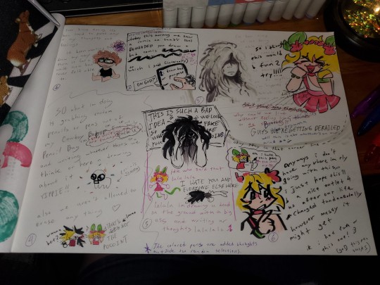
make a bad comic... take a bad picture of it..... the starry brain experience simulator 9000
readable(???) stuff below
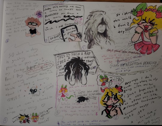
ever since moving, its been hard to parse any of my thoughts and feelings.
id been wanting to draw my way thru it for a while now but never felt able to.
today why did we cross that out
uh idk
this morning we saw a comic on tumblr that DEMANDED you draw a bad comic [fully blacked out writing] oh it IS a thing my bad!!
to which i said internally
"ON GOD?"
draw bad on purpose
so i thought this would b fun 2 try!!!!
ive been tired of not being able to draw. to create. to work. to think straight. to do anything im "supposed" to. which is stupid
dont say that thats mean!! X(
given no expectations are on me now
Aren't there some expectations?
why can't we live without feeling like we need to do something?
Brother i think it's the trauma
GUYS WE'RE GETTING DERAILED
well this is about whatevers on our mind so :/
SO what im doing is grabbing random pencils or pens out of my Cowboy Bebop™ Ein™ and family Pencil Bag™ (stop writing TM its not funny (FUCK U)) and writing whatever thots we think on here n drawing about it YIPIEE!!
(this is JIMMY)
also we aren't allowed to erase anything
(wanna bet?) (THAT'S NOT THE POOOINT)
THIS IS SUCH A BAD IDEA WE LOOK SO FAKE WHAT ARE YOU DOING
idk who said that lalalala
I HATE YOU AND EVERYONE ELSE HERE
lalala im drawing u dead on the ground with a big ass and writing ur thoughts lalalala
oh i hate this pen
the chisel tip :(((
anyways i don't have anywhere im rly going with this,,,
i just hope this'll b a nice outlet 4 us after our life changed fundamentally however messy it might get
ik i had fun w this one! :3
(goD this pen sucks)
#makeaterriblecomicday2024#brain diary#finally living up to thr diary element of my brain diary tag#i want to do more stuff like this ots like venting but not when i feel like ass just when i have too many thoughts in my brain#nyways thia was fun thank you terrible comic day for the motivation hooray!!
6 notes
·
View notes
Text
i finished drew a humanized(?) version of Hey Riddle Riddle’s logo on my sketchbook, and now i have finished digitalizing and coloring the drawing!!
the og sketch

and the finished drawing

this is Old Man Puzzles with a planet for a head so not sure how human this can be
with this drawing i tried something different from my usual process, i tried to follow Sam Does Art’s advice of ‘use less layers’ which is good for my phone storage methinks LOL
i also use a different pen than the kind that i usually use
before i used just the default dip pen on ibis paint x, but this time i customized it a little with the jitter function! i like the way it turned out, tho it is a little bit wonky in some parts but with more practice i’ll get better using it
its been a while since ive drawn at all, so even if this sucked i’d still be happy to have made anything at all LOL
im thinking of humanizing (personifying??) more podcast logos, esp Welcome To Night Vale’s logo (and the Desert Bluffs logo)
but thats a project for the future, for now im gonna go sleep!!
2 notes
·
View notes