#it was...a placeholder. from when i saved the url.
Explore tagged Tumblr posts
Text

+ 𝐓𝐇𝐄 𝐏𝐈𝐓.
independent + selective + mostly canon compliant w/ headcanon inspiration + multimuse rp blog + est. 2024 + written by reiikon
↪ feat. SETTRIGH from riot's league of legends, cole cassidy of overwatch, elliott witt of apex legends & more. click any of the links above to be directed to my carrd where you'll find my rules ( which you should read, they're not that bad — i promise ), my muse list, dossiers for each muse, verse information, as well as my mains and affiliates. please let me know if you have any accessibility issues with any of the information on my carrd ! i'll be more than happy to fix the issue or accommodate you any way i can — happy roleplaying !
#✘ — [ ooc ]#✘ — [ pinned ]#silly goofy reiikon...you never made a proper pinned post —#it's okay tho i fixed it.#i need to update my icon from sett's silly goofy discord icon that riot gave him...#it was...a placeholder. from when i saved the url.#but just like on all might's blog i am probably gonna forget and it's gonna be the same thing three years from now —
2 notes
·
View notes
Text
↬ OC Verse Trading Cards
Here it is! The reason (well, one of the reasons) for why I've been so inactive lately. I saw this super cool trading card template by @squea and @buttertrait and thought it was super fun, so I wanted to make something similar for my mutuals and myself. And, as you can see, I rediscovered my love for art deco on the way, so it's very art deco lol
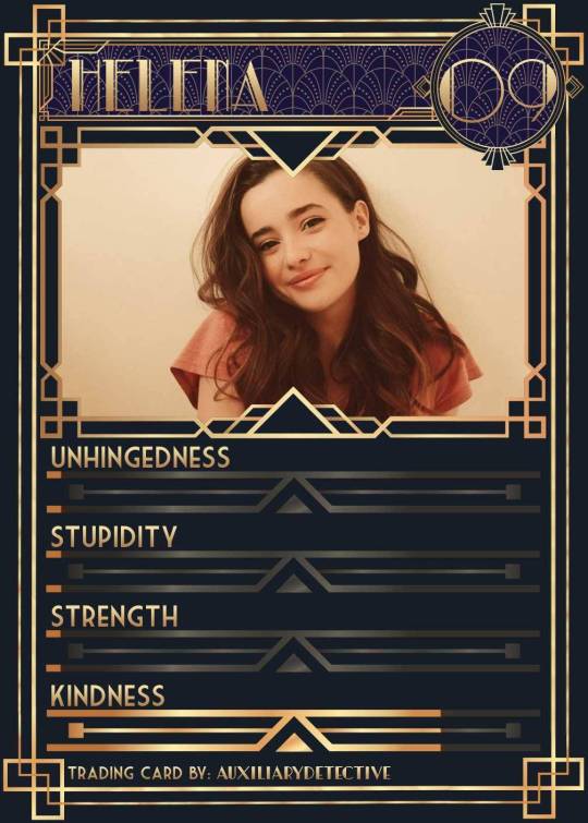
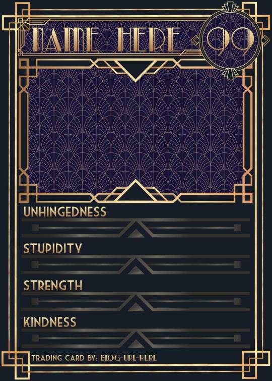
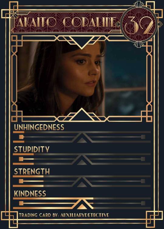
You can find the template to make your own cards here - and I explicitly encourage you to make your own, because I was kinda hoping I would get to see cards of you guys' OCs and we could collect them all in a binder like this one. It would be really fun! (The number next to the name is the power level btw - I wanted to imitate a set of Star Wars trading cards I used to collect as a kid) Make sure to @ me when you do and tag your post with #ocversetradingcards!
I tried to make the template as accessible as possible so that even beginners should be able to use it without any issues. So, I color-coded the layers!
The red layers are ones you shouldn't touch. They make up the main frame of the card. The orange layers are ones where you can play around with the colors, but that's for advanced photoshop/photopea users. The green ones are the ones where you put in text! Edit those freely. Blue ones are ones you have to select and move as a batch - if you don't know how to do that, check below the cut ^^
You'll need to download these fonts:
Park Lane (name & power level)
Market Deco (main text font)
Artisual Deco Black Italic (blog url)
Below the cut, you'll find a tutorial for the template and a list of the image resources I used - Quick info for everyone, including the more experienced Photopea users: Save your image at 50% quality. The template is a big file and the exported image will also be pretty big if you don’t save it at a lower quality. 50% is what you can see above and I think it's a nice size-quality ratio.
Tutorial Time
Opening the File
Step one: Get either Photoshop or Photopea. Photoshop costs money, Photopea is free and runs in your browser. Take three guesses which one I use. Yeah, it's Photopea. As such, this tutorial will be Photopea-centric, and I also have no clue what the Photoshop interface looks like, so I can't really help you if you work on Photoshop. But I'm told they're essentially the same, so...
Step two: Download the fonts listed above from the links in this post.
Step three: Click on the link above to go download the template. It's a bit of a big file, so I put it into a zip file for you. Don't worry, you don't need a special program to open it. Photopea will do that for you.
Step four: Open Photopea. Click on "File" -> "Open..." and select the "TradingCardTemplate" zip file.
Step five: Click "File" -> "Open..." again and select the zip files for the fonts. This will import them to Photopea. There are also preview images included in at least one of the zip files for the fonts, so just close the windows for those projects when they pop up by clicking on the little "x" next to their file name. You only need the "TradingCardTemplate.psd" tab to be open in your Photopea window.
Great! Now you're all set to edit!
Editing the name, power level and blog url
I decided to group these together because they function essentially the same way
Step one: Select the typing tool. It's the little "T" symbol in the toolbar on the left side of your screen.
Step two: Select the layer of the text you want to edit. The blog url one is in plain view. For the name and power ones, you need to open the corresponding folders first. They're the green layers in the folders!
Step three: Click on the text you want to edit. It's easiest to aim for the middle, that way you have the least chances of missing. The typing tool is a bit finicky with that sometimes, especially if the text is small.
Great! Now you can use your keyboard to delete the placeholder text and replace it with your own! The power level will only fit two digits and picking "00" will look bad. Your OC should have at least some power. They need it to breathe.
Changing the size of the name text
As you might be able to tell, the basic text size only works for fairly short names. So, you might have to make it smaller for your OC's name to fit
Step one: Enter your OC's name as described above.
Step two: Select the text as you would anywhere else in your browser.
Step three: Above the little tag where it says "TradingCardTemplate.psd", there's an options bar. You'll find a box there labelled "Size" with a box that says "150px" and a down arrow next to it. Click on the down arrow and a slider will pop up. Play around with that slider until your text has a good size. Then click on the checkmark.
Step four: Switch to the transformation tool. It's the cursor with the directional cross next to it, at the top of your left-hand tool bar. Move your text so that it aligns well with the left side of the frame but make sure it's below the middle.
Step five: You now have to select two layers at once. The text layer and the frame for the name tag. Do do that, either press and hold your control key on your keyboard while selecting the other layer or toggle the control key using the on-screen keyboard at the bottom left of the toolbar. If you use the toggle, don't forget to untoggle it after.
Step six: On your horizontal toolbar above your project window, click on the icon that's a horizontal line with two boxes centered on it.
Congrats, your text should now be centered!
Adding in your OC picture
Step one: Open the "Picture" folder and select the layer beneath "Add picture here". This will make sure your picture will be in the right spot. Also make sure to click on the eye next to the "Pattern" layer tag to make it go invisible.
Step two: Select "File" -> "Open & Place..." and pick a nice image.
Step three: Once the image has been imported, make sure you change the zoom percentage to 100%, that way the image doesn't look pixely or weird. Click on the checkmark.
Step four: Resize your image so your OC fits nicely into the frame. The image should fill the entire space inside the frame and can stick out as much as you want.
Step five: Right-click (or press and hold, if you're on mobile) your image' layer and select "Clipping Mask".
Perfect! Now your image should no longer stick out of the frame. Feel free to adjust your image's coloration, brightness etc. by selecting "Image" -> "Adjustments" and your preferred action.
Changing your stats bars
This works the same for each bar and I tried to make it as simple as possible.
Step one: Open the corresponding folder.
Step two: Select the set of three blue layers together. You can do this by selecting one layer normally, then selecting the other two while holding your control key or while having it toggled using the built-in on-screen mini keyboard at the bottom left of your screen. If you use the toggle, don't forget to untoggle it after.
Step three: Switch to the transformation tool (the one at the top of your left-hand toolbar, it's a cursor with a directional cross) and move your layers. By moving them to the right, you'll reveal more of the gold underneath the overlay. More gold = higher level of the corresponding stat.
Great job! Now adjust the bars to your liking.
Saving your project + card image
To save the project: Click on "File" -> "Save as PSD". This will download the current project under the same name as the file that you downloaded it as. So, it will be called "TradingCardTemplate (1)" or something similar. Make sure you change the name in your files so you know which is which. Alternatively, you can also change the name of the project by double-clicking the little square that currently says "TradingCardTemplate" and type in your new name. If you save again now, it will show the new project name! Make sure to save your project if you want to be able to recover it and/or work on it later!
To save the card image: Click on "File" -> "Export as >" and pick your preferred image file type. I suggest JPG for best results. Make sure to turn the quality slider to 50%, then hit the save button. This will download an image file of your chosen type, under the same name as the project name. To change that name, refer to the bullet point above or go to your files :)
Advanced: Changing the BG color of the pattern
Step one: Select the pattern background of either the name tag, power score or picture and turn it to 100% opacity.
Step two: Color-pick the current background color of the pattern.
Step three: Click "Image" -> "Adjustments" -> "Replace Color..." and click on the colored rectangle in the new pop-up. Replace the default color with your color-picked color. Now use the Hue, Saturation and Lightness sliders to get a new color that you like. Note down your slider values for later so you have them for the other elements.
Step four: Color-pick your new color and select the corresponding solid background layer. For those layers, click "Edit" -> "Fill..." and make sure you have "Foreground" and "Normal" selected, your Opacity is 100% and you have "Preserve Transparency" checked.
Step five: Don't forget to turn the opacity of your pattern layers back down to 60%.
Congrats! You have your colors changed! Repeat this process for the other two patterned elements.
Extra advanced: Changing the card's background color
NOTE: I DON'T recommend this. You can do it, but it's a lot of work.
Step one: Select the background layer and change its color to the new color you want. You can do it with the "Hue/Saturation..." adjustment, with the "Fill" edit as described above, or whichever way you want. Color-pick your new color.
Step two: Open the smart object PSDs for the frames for the frames for the picture, the name tag, and the power counter by double-clicking on the preview image of the layer.
Step three: Select the lowest colored layer of each and change its color to the same as your new card background color. Click on "File" -> "Save (Smart Object)". Close the project windows.
Step four: Open the folders for the various stat bars and select the "Color Overlay" layers. Change their colors the same way you did for the other layers. Warm colors and high-saturation colors will most likely not look good here and you might need to find a different way of making the stat bars look good. Playing around with the "Brightness/Contrast" adjustment layers above might help, but I can't promise anything. This is the main reason why I don't recommend changing the card background color. The stats bars are adjusted to the background color.
There we are! Either your card looks very pretty now or you understand why I don't recommend this. Either way: Good job!
Resources from Freepik:
Corners by tartila Power counter frame Picture frame by pch.vector Stats bar by tartila Pattern

Taglist (we're bringing out all fandoms today): @starcrossedjedis @oneirataxia-girl @daughter-of-melpomene @bravelittleflower @box-of-bats @fluffle-system @wheresmybloodynauglamir @nanukanal @supermarine-silvally @cody-helix02
#ocversetradingcards#artsy#photopea adventures#oc: akaito coraline#oc: helena#holy freaking shit i finally did it#look everyone!!!
20 notes
·
View notes
Text
People migrating to Tumblr from other social media sites may not be used to the blatant misinformation that often circulates on Tumblr; this is why it's important to look at the urls of people who post information here. The above post is by tumblr user @facts-i-just-made-up and as such is filled with misinformation:
Tomorrow will be Thursday: False. Thursday happened already, last week.
Cockroaches are active on Thursdays: False. To save processor time, insects are shut down Wed-Fri. You may see pre-rendered placeholder sprites that look like insects, but they aren't real.
A single month can contain well over 2 Thursdays: Technically true, but deeply misleading. Thursdember (the month that is spread out over the year on a roughly 168-hour cycle), generally has more than forty-five Thursdays each year, but it is the only one. No other month ever has more than one Thursday (except on leap years, when October may have two).
Deaths on Thursdays: Mostly False. While there are at least three recorded instances of nuns dying on Thursdays, it is incredibly rare, and poodles do not die at all (they just transcend the mortal plane). Physicist Albert Rose died on July 26th, 1990, which in modern times would likely be called a "Thursday", but the concept wasn't widely developed at that point and most people at the time just considered it an ordinary Jörmungandrsday.
Car accidents on Thursday: This is technically true, but is true for every weekday - each weekday has five times as many car accidents as one fifth of any other weekday because there are four weekdays and car accidents are illegal and therefore impossible on all of them.
Wearing lipstick on a Thursday will almost always result in pigmentary encrustation of the procheilon tissue: False. Procheilon tissue, believed to be a fire-like tissue released during combustion, is an obsolete scientific theory, which was superseded in the 1770s when Antoine-Laurent de Lavoisier demonstrated that the weight of the gas consumed by combustion could be measured, leading to the now-common philtrumation theory of combustion.
Many Thursdays are followed by resulting Fridays: False. This is confusing correlation with causation. Thursdays do not result in Fridays; Fridays, being liminal times only loosely anchored to the arrow of time, are frequently responsible for causing earlier Thursdays, but never the other way around.
This is a good example of why it's important to fact-check information that you read on social media.
Thursday Is Coming: What You Need To Know
As many of you know, tomorrow will be Thursday. Many people find themselves unprepared for Thursday and suffer the consequences. Here’s what you need to know to be safe:
Cockroaches are active on Thursdays.
A single month can contain well over 2 Thursdays.
Physicist Albert Rose died on a Thursday, as did several nuns and a poodle.
There are five times more car accidents on every Thursday than on 1/5 of any other weekday.
Wearing lipstick on a Thursday will almost always result in pigmentary encrustation of the procheilon tissue.
Many Thursdays are followed immediately by a resulting Friday.
Be safe this Thursday and remember that no matter what happens, no Thursday to date has lasted over 24 hours. For more information, please consult the Thursday Awareness hotline at 1627987185.
9K notes
·
View notes
Photo

Hello there! This is my new and (hopefully) improved tutorial on how to upload gifs for a gif pack page! Tumblr has changed in recent years when it comes to how to upload gifs and how they’re formatted (like .gifv coming in and ruining everyone’s day). People in the community have also made the shift towards more decorated and custom gif pack pages rather than strictly gif filled pages. As such, this tutorial will focus on how to prepare your gifs for those codes. Resources will be linked at the bottom!
NOTE: This tutorial is also available as a Google Doc (the recommended platform for reading this tutorial) with full size images that might be easier to see, however I know some users don’t like going outside of Tumblr to view tutorials, so it’s available on both platforms. To read the Google Doc version, please CLICK HERE.
Setting Up Your Gifs
Load all of your gifs as you usually would into a new post. I usually wait until I have around 20 gifs, then I get ready to move them. Moving them over periodically usually helps it feel like less of a strain waiting for a million gifs to load all at once. Make sure all of your gifs are under a READ MORE! This will prevent them from turning into the gifv format!
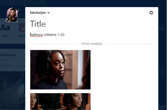
Once you’ve uploaded all your gifs, make sure to SAVE AS A DRAFT.

Next, you’re going to want to hit edit on the draft, again, this has to be SAVED before you can do the next step.
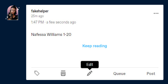
This is where all the magic happens. What we’re going to do is strip our gifs of any unnecessary code in a few simple steps. First, hit the gear icon at the top of your post and change the Text Editor from Rich Text to Markdown.
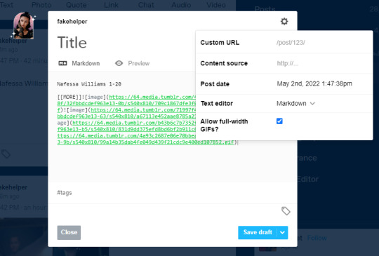
Next, you’re going to change it from Markdown, to HTML
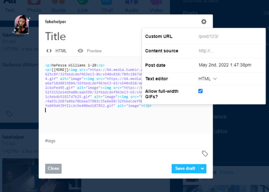
Now, you’re going to want to keep this tab open, and set up your sidepage!
NOTE: If you are using the beta editor, you may require some extra steps to clean up your code! Read more here.
Setting Up Your Sidepage
Now you can create your new page. You can do so by going to Customize and then clicking Add a page (I recommend using a sideblog for this as it can heavily clog your main blog, and if you ever change your main url, you can keep the url of your gif pages the same).

After creating your new page, make sure to change it from a standard layout to a custom layout using the dropdown menu, then give the page a url. You cannot save the page until you add a url.
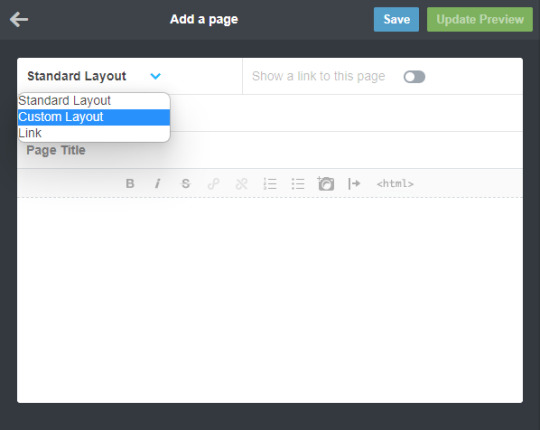

Okay, now for the next step, you can use any gif page code you’d like! I have a tag here with codes made by many different theme makers to choose from! If you’d like to use one of mine, you can find them here. Today I’ll be using my newest theme as an example. From the post, download the code and paste it into the page. It should look something like this.
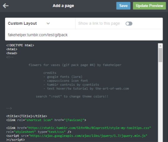
Now you’re going to want to find the section to add your gifs. In my older codes, you would be able to find it looking something like this:
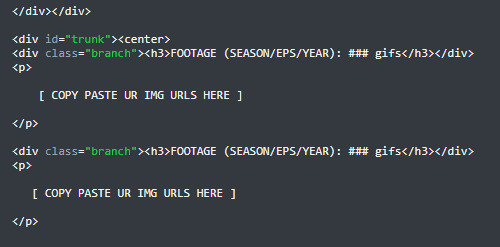
For this theme, however, I used placeholders because of the trigger warning feature. To figure out more on how to use that feature of the theme, please read the tutorial here. For the sake of this tutorial, however, you can DELETE THESE PLACEHOLDERS (highlighted by the blue box, make sure you keep the <p> and </p> tags).

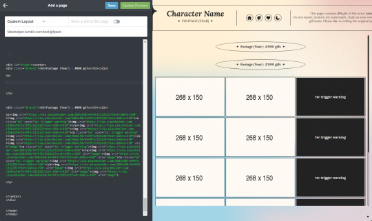
Once those are deleted, you’re going to go back to your tab with your gifs and select everything after [ [ MORE ] ] , but before the </p> tag, then copy it.

Now, paste your code in between the <p> and </p> tags. Hit Update Preview to make sure it’s loading correctly. Every time you add gifs, make sure there are NO SPACES between the img links. (aka make sure those < ... alt=”image”><img src=”...> are back to back instead of < ... alt=”image”> <img src=”...> leaving a space in between).
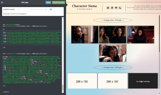
And that’s all! Make sure to change the other parts of the theme necessary (titles, fc info etc) and you’re good to go! Always make sure to hit save before you navigate away!!

Resources
My Gif Pack Page Codes
Recommended Gif Pack Page Codes (tag)
Previous Tutorial (How to upload to a Standard Sidepage)
Barebones Code (for previous tutorial)
#rph#rpc#rp tutorial#rp guide#gif pack tutorial#gif pack guide#mytutorial#fakecontent#PLEASE READ THE GOOGLE DOC IF U CAN INSTEAD#it's way easier to read lmao
119 notes
·
View notes
Note
papyrus and edelweiss!
papyrus ⇢ if you put your ‘on repeat’ playlist on shuffle, what’s the first song that comes up? what do you like about it / associate it with?
ezra furman - suck the blood from my wound. banger innit. i'm actually not that fond of the whole album but it's such a good opener lmao
edelweiss ⇢ how’d you think of your url/username? what’s it associated with to you?
the chelonate is a port in sunless sea :~) it's honestly just a placeholder url that i came up with on a whim and haven't thought of an alternative for yet (i have mobydickenjoyer saved and may switch to that when i can be bothered). but i enjoy sunless sea a lot as a Viddy Game with some gorgeous prose and a v rich + eerie world, and i'm a big fan of the idea of a settlement built on the back of a turtle corpse.
8 notes
·
View notes
Text
Ao3 Tips and Tricks
So I thought I would make a post about some cool stuff you can do with Ao3 and userscripts, and some tips I’ve learned from setting them up for myself! I promise it's not hard, though this is a lot of info. I'm happy to help if I can.
What You’ll Need:
First, you will need the Tampermonkey extension for your browser (depending on what browser you use, Greasemonkey is the equivalent). On Android, you can even run Chrome extensions on mobile with Kiwi Browser! It is easiest to configure the scripts on your desktop and then sync to mobile with Tampermonkey’s cloud sync feature or by exporting the configured scripts and importing in your mobile browser (I will explain how to do this later in the post). If you use any of the tweaks I outline below, be sure to backup your scripts in case your settings are lost.
Once you have Tampermonkey installed, you can get scripts from GreasyFork. The inimitable @flamebyrd also has some great scripts and bookmarklets and has been incredibly helpful while I figured all this out.
Find a script that looks interesting, click on it, and then click “install this script.” Pretty straightforward. Once you have it installed, you can go to Tampermonkey to configure it (only necessary for some scripts) by clicking on the Tampermonkey extension icon in your browser (under the three dot menu in Kiwi) and clicking “dashboard”, then clicking the edit icon next to the script you want to configure. When you’re done, click File->Save.
Scripts and instructions under the cut
Some of my favorites:
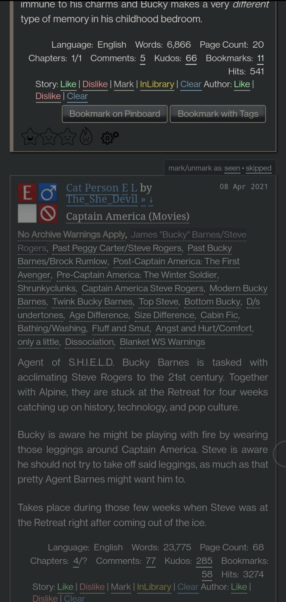
Flamebyrd’s Incomplete Works script - fades out WIPs on works listings, and displays the work stats (wordcount, chapters, etc) in red on single works to make it more obvious that they’re WIPs as you’re browsing:
Flamebyrd’s Ao3 to Pinboard bookmarklet/script - if you click the bookmarklet while on a work’s page, it opens the Pinboard save screen and prefills the title, tags, description, word count, etc, and adds ?view_full_work=true&view_adult=true to the URL so Pinboard’s archiver will archive the complete work and not the adult content warning screen (note that Pinboard still cannot correctly archive works locked to Ao3 users, so you may want to download them as a backup. I’ve asked him about fixing that.), based on your selections when configuring the bookmarklet on the linked page. If you use the userscript, it adds a button to the works listings page so you don’t even have to open the work to save it:
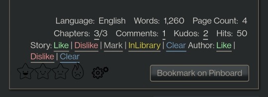
I tweaked this script so that it only grabs the first pairing tag, since I don’t typically care about secondary pairings and they were clogging up my Pinboard tags. It’s a simple fix (though I know nothing about coding so I had to do some googling and inspect-sourcing; kinda proud of myself tbh):
Just change this part of the script
if ( options.relationship_include ) {
- $(".relationships a.tag", $work).each(function () {
To this
if ( options.relationship_include ) {
- $(".relationships a.tag:first", $work).each(function () {
I also found this cool mobile-optimized Pinboard bookmarklet called Pincushion and combined it with Flamebyrd’s script. Everything works except the auto-tagging, but I’ve reached out on GitHub to see if he can help (according to Flamebyrd, there’s no tag field ID attribute to map to). However, this bookmarklet has tagging autocomplete features that make it easy to tag manually. For example, if you type “steve 21st” it will suggest “steverogersvsthe21stcentury” rather than having to type out “steverogersvs…” in order for it to autocomplete like it does on the regular Pinboard bookmarklet. I actually have two buttons set up (which you can see in the next screenshot) - Flamebyrd's to quickly grab the tags and close without me having to do anything, and then the Pincushion one to quickly edit the tags. If anyone's interested, I can explain how to do that.
To combine Pincushion with Flamebyrd’s script (so it works from the Ao3 works listings page as mentioned above), simply change this part of Flamebyrd’s script:
t = t.split(" ").join( options.space_replacement );
var pb_url = "https://pinboard.in/add?url=" + encodeURIComponent(q) + "&description=" + encodeURIComponent(d) + "&title=" + encodeURIComponent(p) + "&tags=" + encodeURIComponent(t);
void(open(pb_url, "Pinboard", "toolbar=no,width=700,height=350"));
To this
t = t.split(" ").join( options.space_replacement );
var pb_url = "https://rossshannon.github.io/pincushion/?user=YOURUSERNAME&token=YOURAPITOKEN&url=" + encodeURIComponent(q) + "&description=" + encodeURIComponent(d) + "&title=" + encodeURIComponent(p) + "&tags=" + encodeURIComponent(t);
void(open(pb_url, "Pinboard", "toolbar=yes,width=600,height=700,left=50,top=50"));
You’ll need to get your API Token from your Pinboard account and plug it in where it says YOURUSERNAME and YOURAPITOKEN (number part only) above.
FanFictionNavigator - mark fics as Like/Dislike/Mark/InLibrary, highlight with colors based on which option you select, hide/show based on category, like/dislike author and highlight with color. Only you will see how you've marked things.
You can tweak the colors for the highlighting by configuring the script (I find the default colors make the text hard to read because I use the Reversi skin on Ao3 for white-ish text on a gray background). I also changed it so that when I click “hide likes” it only hides liked fics and not liked authors (i.e. hides fics I’ve read, but not unread fics by authors I like), changed the color of the like/dislike/etc links to match the highlighting color and to show up better, and changed the way it highlights authors (I think the default is bold/strikethrough which doesn't really catch my eye. I changed it to highlight the author name in red/green):
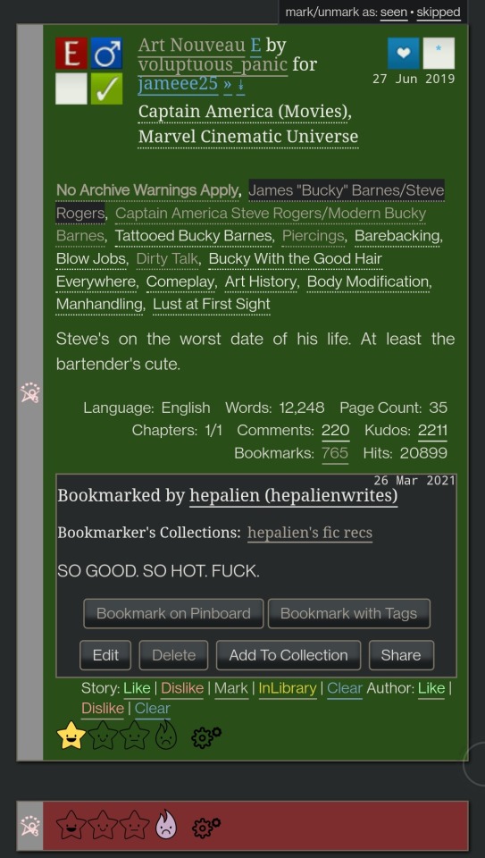

Here are my configured scripts if you’d like to use them instead of tweaking yourself (you need to install both):
FanFictionNavigator
FanFictionNavigator - Colors
Note: Your settings for this script will sync via Tampermonkey but not your data (i.e. fics you’ve liked/marked/etc). If you ever switch between browsers, you’ll need to go to your Ao3 Dashboard and click FFNOptions, export your data, then go through the same process to import it into the new browser.
AO3: Kudosed and seen history - highlight or hide works you kudosed/bookmarked/marked as seen. If you want to use this with FanFictionNavigator, you’ll need to turn off “highlight bookmarks” from the settings under the “Seen Works” dropdown that gets added to your Ao3 navbar or FFN’s colors won’t show. Again, data doesn’t sync between browsers but you can copy it from the dropdown settings. However, it pulls your kudosed and bookmarked fics from Ao3 itself, so that will always show. It's just seen/skipped that doesn't sync:
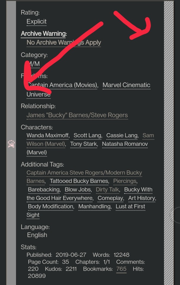
Ao3 download buttons - adds a download button to the works listings page so you don’t have to open the fic to download it. However, it also doesn’t play nicely with FFN’s colors, so I’m using AO3 Review + Last Chapter Shortcut + Kudos-sortable Bookmarks script which also has a download button that works with FFN (a small down arrow next to the author name). The download button doesn’t work as-is from that link, so here’s my tweaked version based off of this comment. You can configure what format you want it to download by default in the script. There’s also a tweak in the comments to fix kudos-sorting, but it overloads Ao3 and you get a “retry later” error for a few minutes when you try to open Ao3, so I don’t recommend it. I don’t know if any of the other functionalities of the script work because I don’t use them, but it looks like there are tweak suggestions in other comments you can try:

I was using Ao3 Replace Words to replace words in fics that bug me but I realized it wasn’t working on mobile, so I’m using zensurf instead which is not Ao3-specific but works basically the same way. If you want to limit it to just Ao3 (so it doesn’t change words on non-fic sites), just add this
// @include http://archiveofourown.org/*
// @include https://archiveofourown.org/*
Above this line
// ==/UserScript==
(function() {
You can // @include other fic sites like ffnet that way too.
AO3: Links to Last Chapter and Entire Works does what it says on the tin, but the creator was kind enough to give me a code snippet to add that makes the “E” (for Entire Work) appear next to all works and add ?view_full_work=true&view_adult=true to the work URL so that I can easily right-click and share to Instapaper and have it be saved correctly (not just the first chapter but the whole work + not the content warning screen for NR/M/E works). Here is the script with this tweak applied:

I think those are the only ones that I’ve done special tweaks for. Here are some others that I find useful that either don’t require any configuration, or should be pretty straightforward to configure and are explained on the script page.
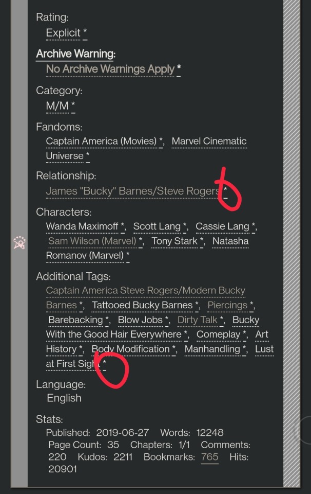
AO3 author+tags quick-search - doesn’t require configuration
Generates quick links from AO3 fics to more by the same author in the same fandom (or character/pairing/any other tag):
Remove leading spaces in AO3 - doesn’t require config
Removes the leading indents for paragraphs in AO3 works.
Ao3 Only Show Primary Pairing - you have to enter the pairings you want in the script, and you can change how early in the sequence they must appear before the work is hidden. Also works with character tags.
Hides works where specified pairing isn't the first listed. Hidden works show a placeholder that you can click to unhide:

AO3: highlight tags - have to enter the tags you want highlighted, as well as the color you want. It matches case so you may have to enter both “Dog” and “dog”, for example.
Configure tags to be highlighted with different colors. This makes a tag more obvious to your eye when browsing. I use it to highlight things I’m wary of in red so I don’t miss them and start reading a fic I might not want.
AO3: Tag Hider - configure how many tags you want to see before it hides them
Hide tags automatically when there are too many tags. Add hide/show tags button to browsing page and reading page.
AO3 Remove Double-Spacing - no config
Removes awkward double spaces between paragraphs on AO3. Doesn’t smush together paragraphs that have a single line break - it leaves those alone.
ao3 series collapser - no config
Collapse works that are later than part 1 of a series. Leaves a placeholder so you can uncollapse if you want to see it.
AO3 Blocker - no config, but you enter what you want to block from the added navbar dropdown in Ao3
Fork of ao3 savior; blocks works based on certain conditions. I find this simpler to use than Ao3 savior.
FYI there are also style scripts for Pinboard on greasyfork and userstyles.org (this site is slow af for some reason, so be patient while it loads). I use show unread bookmarks more clearly and Modern Pinboard Style (basically a dark mode). Neither require config unless you just want to tweak the settings to your liking. To install to Tampermonkey from userstyles, scroll down to “Install style as userscript”.
I also use these extensions in Kiwi:
Ao3rdr - Adds a star rating system (pictured in some of the screenshots above) to Ao3 works that only you can see. This one will sync your data between devices if you use the cloud sync option, which I recommend so you don’t lose your data if something happens to your device or browser.
Dark Reader - not really necessary for Ao3 if you use Reversi skin, but does make all browser pages dark mode if you want it on sites other than Ao3.
Speaking of Ao3 skins, I have another one set up in conjunction with Reversi that shows all the fandoms on a user’s profile, rather than having to click “expand”:
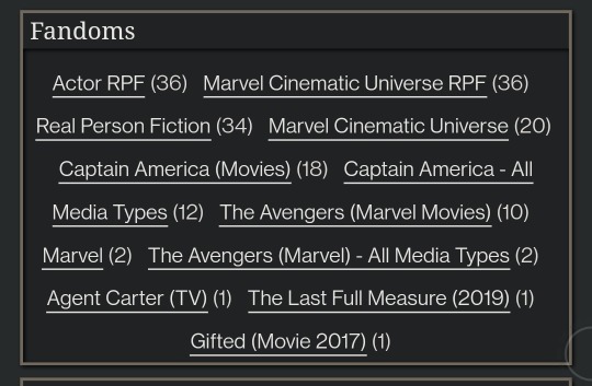
Unfortunately, I can’t remember where I found this. To set it up yourself, go to your Ao3 -> Dashboard -> Skins -> Create Site Skin, fill in the Title (has to be unique), and paste the code below in the CSS box:
#user-fandoms ol.index {
padding-bottom: 0;
text-align: center;
}
#user-fandoms ol.index li {
display: inline;
margin-right: .5em;
line-height: 2.15em;
}
#user-fandoms ol#fandom_full_list {
padding-top: 0;
padding-bottom: 1.5em;
display: block !important;
}
#user-fandoms p.actions {
display: none;
}
Then hit Submit -> Use. There are ways to hide or highlight various elements (ships, characters, blurbs, work stats, etc) on a works listing page using skins on Ao3. This is getting long so I’m not going to go into that, but I’m happy to help if you want to try it. It’s very easy.
Once you have everything configured on Tampermonkey on your desktop, you can migrate it to your mobile device in one of two ways:
Option 1: Go to Tampermonkey settings and change Config Mode to Advanced
Go down to Script Sync and select your preferred cloud service and save
It will ask you to log in to said cloud service
Install Tampermonkey in Kiwi and do the same thing
Wait for it to sync (this can be slow)
It should sync any changes you make moving forward, but again, it’s slow
Option 2: go to Utilities and check all 3 checkboxes under general (include script storage, include Tampermonkey settings, include external script resources)
Either export to your preferred cloud service or
Export as a zip file, move it to your mobile device, go to this same screen and import
I would recommend exporting as a zip for a backup even if you don’t use it to migrate your scripts
You can unzip and upload individual script files (.js) on this page if you ever need to reinstall a single script with your settings instead of all of them
Let me know if you run into any issues and I can try to help! The script writers are also super nice and helpful if you reach out to them. Yay fandom!
#ao3#archive of our own#fanfiction#ao3 resources#fandom#fanfic#tech#Tampermonkey#userscripts#ao3 tips#musette22#I hope you don't mind that I used you for the 'liked author' example ^_^#ditto voluptuous_panic#y'all should read art nouveau it's so good
483 notes
·
View notes
Text
Wayfarer Update 2020/11/01
Hello friends!
Early access to Wayfarer’s alpha build is almost ready.
I’ve really wanted to share my work with you all for a long time. So, for followers new and old, the alpha build will be going into restricted access later this week (on Nov 5 or Nov 6)! This means that it can be accessed through a password protected URL shared here on the blog (it will not show up in itch.io’s search or on my itch profile until the game releases publically).
What It Will Include
The Prologue (complete)
The beginning of Chapter 1 (the first section of Route A and the first section of Route B - Chapter 1 is not complete at this time)
Codex entries, though some entries are placeholders as the text for them hasn’t been written yet
There is roughly 95k words of content across all choices/options/codex entries. I’m not sure how long a single playthrough of existing material is in word count, but it should take roughly an hour.
Playtesting
Wayfarer will look its best in Chrome. I have tested it on Firefox and Internet Explorer and I am working on fixing a few cross-browser formatting issues. There are a few decorative things that can’t be executed in IE, but it’s not a major issue (I wouldn’t play using IE though ahaha). I think I’ve caught most of them, but something may have slipped through.
I do not know how it will play on Safari, Opera or other browsers. If you are playing on your computer, I recommend running it in fullscreen.
The game can run on mobile, but there are formatting issues that I don’t know how to fix at this time. (Responsiveness is hard when you don’t really know what you’re doing.) SugarCube’s Save API also does not offer the Save to Disk/Load from Disk option on mobile and saves everything directly in your browser. I can’t change this, as I don’t know enough about Twine’s engine to muck around with SugarCube’s APIs.
A bug report form will be linked in the game’s credits and also on this blog. If you are reporting errors, please use the report form rather than sending me an ask, it makes it a lot easier for me to track down where and why an error occurred.
Discord
I’ve created a Discord server for the game and its development. I will be sharing the link to that later this month.
Future
The game will release publically on itch.io when Chapter 1 is complete. Once the game is public, the alpha build (which will be a chapter ahead of the public version of the game) will become restricted to Patrons only (Patreon is forthcoming).
88 notes
·
View notes
Text
check in tag
okay okay i’ll do it! i haven’t done a tag game in ages... i was tagged by @soonhoonsol, @njaems, and @sanshine
1. why did you choose your URL?
because jaemin and ten are two of my favorite nct boys and they had just posted this selfie together :(
2. any side blogs?
i don’t have any active sideblogs, but i have a few URLs saved and i did run @daily-shua for a while
3. how long have you been on tumblr?
my first account is from like 2014, but i’ve had this blog since 2017.
4. do you have a queue tag?
nah, but i’m not here that much so it’s probably my queue. i usually schedule my self reblogs for 1 am / 7 am / 1 pm / 7 pm EDT so they’re not too annoying
5. why did you start your blog in the first place?
i was really into bts at the time and i wanted to have a separate kpop blog/account because i ran a few meme blogs on my “main” account. i don’t think i’ve logged into that account for two years now lol
6. why did you choose your icon/pfp?
out of all of the resonance teasers, it was the least painful as;dfkja;fdsk. plus i love blonde jaem + the outfit they had him in for departure version. i’ve thought about changing it lately, the newest candylab promo images are definitely my vibe.
7. why did you choose your header?
i suck at making headers and i was revamping my blog so i made the gif of markie as a placeholder. now it’s been there for like 8 months a;slfdkja;fdskdf; (i also should update that to the candylab shoot? or choose a black bg jaemin gif)
8. what’s your post with the most notes?
omg i thought it was this ateez gifset from their answer comeback, but renjun with the tiny kitties is actually beating it now!
9. how many mutuals do you have?
i think i’m mutuals with most blogs i follow, so probably 150+
10. how many followers do you have?
~12000
11. how many people do you follow?
225, but that’s probably inflated with a bunch of inactive blogs
12. have you ever made a shitpost?
oh i used to make a bunch of memes lol. a lot of them are embarrassing tho so i’m not going to share them here. i’ll just link this reblog from yesterday instead
13. how often do you use tumblr each day?
probably a few hours in the morning and then i’m done for the day~
14. did you have a fight/argument with another blog once? who won?
lol i usually try not to get involved with shit, but i definitely did not get along with certain seventeen blogs back in like late 2019. the tumblr fandom felt really cliquey back then. i think it’s much happier and cohesive now, especially since most of those people left for twitter.
15. how do you feel about ‘you need to reblog this’ posts?
i don’t reblog them.
16. do you like tag games?
tbh i usually don’t do them unless i’m tagged by like 3+ people, and then i’ll consider it a;slfdkja;fdk
17. do you like ask games?
yeah! i try to do one every few weeks~ i should probably do one soon when i have some more time
18. which of your mutuals do you think is tumblr famous?
in seventeen: @jonghan and @soonhoonsol / in ateez: @holy-yeosang @sanshine and @songmingki / idk yet in nct / in tbz: @hwqll and @leesangyeon
19. do you have a crush on a mutual?
nah, unless jaem is one of my mutuals lol
20. tags?
i have no idea who’s done this but @jonghan @holy-yeosang @songmingki @leesangyeon @hwiyoungies @ohoshi and @taeminnomuyeppeo
11 notes
·
View notes
Note
🤳 what does your url mean?
hmmm... well that's a bit of a toughly worded question. i can tell you how i came up with it, but it doesn't really mean anything! it's just pure nonsense!
(username breakdown backstory beneath the cut HAHAH)
the "vicen" part comes from vincent! pretty obvious, right? well, when i was younger, i wanted my name to be vincent. i thought it sounded very cool and regal. i don't care too much now, but if i could rename myself, i'd choose that name. ahhh... but maybe not, my friend's younger brother has that name...
part of the reason why i chose "vicen", rather than "vincen", though... is because it doesn't roll off the tongue! there were going to be a lot of 'n's, because the second part of my name would have to be "-non".
the "non" comes from one of my old usernames, "nonsans"! i used to frequent an undertale roleplay forum.
long story short, there was already a sans player, so i just cheekily when for "nonsans" when i learned the position was unavailable.
the people were very nice and i miss them a little, because we fell out of contact a few years ago! i don't know how to find them again, because i forgot to save their usernames or friend them... i've rebranded so much that it's probably impossible lol
most commonly, people call me "vi" now - less so because of the username, actually, but more out of preference from me. in another transitional time, i was trying to pick up a new, different name... but i was too indecisive. so i made a placeholder! "VI", for Very Indecisive!
and then... it stuck... for three years. and i forgot to come up with a new name...
5 notes
·
View notes
Text
Heads up if you’re considering launching a Patreon
They have just announced that they will soon be charging for the services creators currently get for free (we get charged a portion of what we make from patrons as a “processing fee”). There will now be a minimum charge per month of $3 for creator accounts, in addition to the usual processing fees. This might not seem like a lot, but for a lot of creators in the witchblr community we put in quite a few hours of work for our patrons at very low prices, most of us are making less than $50/month, and a chunk of that goes to supporting other witches (or other kinds of creators).
If you sign up now and set up a creator account, you can still get a “Founder’s” account (i.e. you will not be charged for having a creator account, even after the update).
If you’re not ready to start creating just yet, that’s fine! Just sign up for an account, set up a creator page, and save it for when you’re ready to actually start using it. You can change your url later anyway, just use something as a placeholder for now. Signing up doesn’t cost anything, and you won’t get charged any processing fees until you have patrons.
I know this information probably doesn’t apply to everyone, but I haven’t seen it posted or discussed anywhere else so please consider reblogging if you have followers who might be interested in creating content on this platform!
68 notes
·
View notes
Text
i really didn’t want to make a post like this, but myself & the others agreed this needs to be done. so here’s a full explanation of the domino/newheroes drama & proof that we DID NOT rip off any plot. below the cut will be proof that they have continuously sent anon hate to us, have sent anons to expose accounts about us, and lied about clearing the situation with other members that still lurk around the NH timeline -- despite saying that they believe we didn’t rip off the plot, their accusations are causing serious slander to be made against us.
for context, this is our plot
this is a screenshot of the plot that we “stole” and “only changed a few words around” (i had to go into google archive to find it)

the only slight similarity i see is that their ceo was mistreated & made their own company. but, this plot was never clearly implemented into the rp & i had no idea it existed ! i never joined a reverie group, so i never looked at the page. additionally, our plot is so much more than what they’ve written. with all the scandals involving the “older” idols & the debuts of these new, fresh groups, it inspired us to talk about having a music industry revolution. this was something we brainstormed for weeks, it was not a slapped together piece that we decided to make after reading reverie’s plot.
..........
the first thing i want to throw out here is a part of our conversation where we are BRAINSTORMING. you can see that we are coming up with ideas & taking inspo off of both our group name & the desire to focus on newer/rookie groups

the screenshot above is from march 22nd, which is aprox. when we first started to hash out the concept of the group. i hadn’t started a rough draft yet, but this idea was what pretty much stuck for the next few weeks and when i was writing.

and then my reply, emphasizing the focus that we wanted to have ! the blacked out is just us talking about personal life stuff.

here we’re talking about the plot again and this time thinking about how we could include the group’s url ‘domino’ in the plot ( domino was picked as a placeholder name, but we ended up getting inspo from it & keeping it for the url )

this was the first anon message we got after we put ourselves out in the tags, to which we replied with this. we thought it would end there, but then the full accusations started coming in and we were beyond confused/frustrated.

then we received these this. i didn’t get to take a clear screenshot on my laptop of the second one. but, for those can’t see, it says “you were all members of newheroes and one of you was an admin and your plot is a rip off of the plot they had for reverie save that reverie was founded by a soloist and yours was founded by groups AND the interactice ceos were their own idea. it’s a very clear rip off and t that someone with such a superiority complex can’t even formulate a single unique thing about a rp
i’d like to point out that interactive ceos were NOT their idea. the whole admin team can name plenty of rps that we’ve been in before new heroes that had interactive ceos.
also, no one outside the NH admin team knew that one person was apart of their admin team -- so it had to be one of them sending the hate.


after receiving the message, we talked in the gc and decided that i would message one of the admins & make it clear that we didn’t steal their plot. this was my first message & after being left on read, another anon was sent which i included under the DM screenshot. i then sent another message before finally getting a response.


this is what they said and then my response, where i asked for the anon hate to stop. it was agreed that the hate would stop, but the next few days would prove that wasn’t true. they also denied sending anon hate, but then admitted to sending one in the next message?


anyways ! after we saw asks being sent to rplayed, we decided to contact them & explain our side of the story ! we also included a screenshot of our brainstorming (shown earlier) & they were very sweet and understanding.

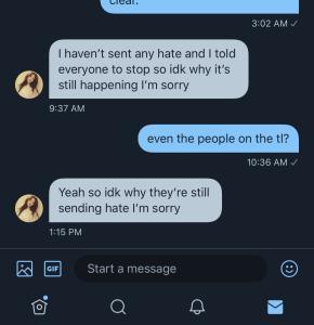
we thought the drama would be gone by this point, but then we saw another anon being sent to rpslayed and decided to message the nh admin again. as seen here.
so, i logged onto my old account where i am still following them (since they went on private) and found that they hadn’t cleared up things with the tl like they claimed ! which would explain why people are still saying we ripped off the plot. so, i went through the account and saw from where they first accused us of stealing the plot & that nothing correcting this statement was said
all in all, we just wanted to get this all out in the air and clear any bad rep on domino’s name. we’ve put so much effort and time into this rp, we don’t want to see it ruined because we’re being falsely accused of stealing another rp’s plot. i have a lot of other screenshots (plotting, etc), but i didn’t want to get away from our main point or make this post confusing ! anyways, thank you for taking your time to go through the whole post if you’re here at the bottom!
2 notes
·
View notes
Link
Live Stream: Feb 2, 2023 | Integrating OpenAI with a custom block. Part One | WordPress Tutorial
0 notes
Text
Good browsers for mac 10.7

#Good browsers for mac 10.7 mac os x#
#Good browsers for mac 10.7 archive#
#Good browsers for mac 10.7 plus#
#Good browsers for mac 10.7 free#
If there are multiple files in this folder, switch to list view. webarchive extension) that you just added. Once the Library folder is open, go to: ~/Library/Mail/V2/MailData/Signatures/.įind the signature (a file ending with a. On Finder’s top nav, drop down the Go menu and than hold down the Option key to see the hidden Library folder. Note: At this point you will not see your HTML signature design on the 3rd column yet. In the drop down menu, find and select your new signature. Select your preferred mail box in the first column and go down to Choose Signature at the bottom. Drag your new signature from column 2 into your preferred mail box in column 1.
#Good browsers for mac 10.7 plus#
Create a new placeholder signature by clicking on the plus icon at the bottom of the 2nd column and name it. There you will see 3 columns, the 1st one are your mail box accounts, the 2nd one are your custom signatures and the 3rd column is the signature detail preview. In Mail, open Preferences and click on the Signatures tab. Step 3: Create Placeholder Signature in Mail Give a name you can recognize and save it onto your desktop.
#Good browsers for mac 10.7 archive#
Make sure Web Archive is chosen as the format. Once you have created the HTML for your e-mail signature, the next step create a. Once you have created your HTML file, give it a name and save it to a directory that you will remember like on the Desktop. If you use another browser, find “View Source” somewhere under the browser navigation menu. Once you have the signature design opened in a browser, you may see the HTML codes by pressing down on Command + Option + U on Safari or Command + U in Firefox.
#Good browsers for mac 10.7 free#
If you use a DIV instead of a SPAN, each element will start in a new line.įeel free to use my HTML signature design as a starting point for your own signature creation. I placed each element inside its own SPAN division to have the text float left without it breaking off to its own line and so that I could use inline CSS to format each element. I have my logo on the left and the text on the right. When we get ready to save your HTML signature into Mail, make sure that only the relevant HTML is included in your document.įor my signature, I used a two-column table. Because of this, I recommend linking to your images by placing them on a web server rather than including them as attachments. I personally dislike e-mail signature images as attachments (it makes it easy to mistaken that image as a legitimate attachment). So all your links need to be absolute URLs. Relative paths won’t work for an e-mail signature. Campaign Monitor has a great summary of CSS support in e-mail to use for reference. E-mail clients tend to be very picky about which CSS properties they support. The style tag is not supported in Gmail, and support for CSS selectors is spotty. The CSS float property is not supported in Gmail or Outlook, making CSS layouts impractical. One major obstacle in designing HTML e-mail templates is that there are literally dozens of different e-mail clients out there (most if not all can’t handle CSS and HTML as well as our internet browsers can) so you have to keep your design and codes as simple and straightforward as possible. Step 1: Designing the HTML/CSSīefore we begin, here are some basic but important notes to keep in mind as you design your signature.
#Good browsers for mac 10.7 mac os x#
If you are still running on Mac OS X 10.6, please follow the instructions in my previous tutorial: Creating an attractive HTML Signature in Apple Mail. Just follow the instructions in this tutorial and you will have your own signature created in no time. On the latest version, Lion, Mac OS X 10.7, the setup has changed slightly. My original post was meant for Apple Mail in Snow Leopard, Mac OS X 10.6. For a small fee, I will design a few different options for you to choose from, write up the HTML codes, host your custom email images and help guide you through the installation process. If creating your own HTML signature seems a bit too much work or you just don’t have the time for it, please consider having me do it for you. This tutorial is for you! Many people have been having trouble setting up their own HTML signature for Apple Mail on Lion, Mac OS X 10.7 since the Library folder is now hidden making the signature folder hard to find. Are you are running your Mac on Lion, Mac OS X 10.7? You want to create your own HTML Signature in Apple Mail? You are in the right place.

0 notes
Text
Drawing inspiration from stale-while-revalidate
There's an http caching directive called 'stale-while-revalidate', which will cause your browser to use a stale cached value, while refreshing its cache asynchronously under the hood.
Making practical use of this setting within my projects proved futile, but it was enough to get me thinking; I want access to that asynchronous response when the browser receives an up-to-date response. I want to make an ajax call, and just have my callback fire twice. Once with a stale, cached response, and again when I receive up-to-date data. Lucky for me, this is actually pretty trivial to implement in basic javascript.
Use case:
I work on a SAAS product for managing inventory. The user's primary view/screen includes a sidebar with a folder structure, and each folder in the tree includes a count of the records beneath it. This sidebar is used for navigation, but the counts are also helpful to the user.
For power-users; this folder structure can become very large, and counts can reach the hundreds-of-thousands. The folders that are visible to the user may depend on the user's permission to individual records, and there are a number of other challenging behaviours to this sidebar. In short; it can take some time for the server to generate the data for this sidebar.
Natually, the best course of action would be to refactor the code to generate it faster. And I'm with you. Refactoring and designing for performance are the ideal solution long-term. But there is a time and place for quick fixes. In our case, we're bootstrapping a SAAS: fast feature implementation leads to winning and retaining customers.
One intuitive improvement we can make is to give users a more progressive loading experience. Rather than generating the entire page at once and sending it to the user as a single http response; we generate a simpler response, and then fetch 'secondary' information like the sidebar via ajax.
``` <div id='sidebar'> Loading... </div> <script> $(document).ready(function(){ $.ajax({ url: 'https://...', success: function(data){ $("#sidebar").html(data) ... // other initialization }, }) }) </script> ```
Now, the user's browsing experience feels faster, with the primary portion of their page loading more quickly, and the sidebar appearing some moments later. You do have a new user-state to consider here: the user may interact with the page between when the page loads, and when the callback is called, so you'll want to watch that your callback doesn't cause any existing on-screen content to move. You can usually address that by ensuring your placeholder 'loading' content has the same dimensions as the content which will replace it.
Implementation
So how do we implement the idea of stale-while-revalidate? There are just a couple things to do:
Add headers to the ajax response, so the browser knows it can cache it.
ex: Cache-Control: private, max-age=3600
Ensure that our callback can safely be called multiple times.
Perform the ajax call twice.
Ignoring step #2 for a moment, our new code looks like this:
``` <div id='sidebar'> Loading... </div> <script> $(document).ready(function(){ function sidebar_callback(data){ $("#sidebar").html(data) ... // other initialization } $.ajax({ url: 'https://...', success: sidebar_callback, }) $.ajax({ url: 'https://...', success: sidebar_callback, headers: {'Cache-Control': 'max-age=0'}, }) }) </script> ```
That's it! Now, when the user loads the page, their browser will make two http requests. The first will (ideally) obtain a response from the local cache, and the second request will retrieve (and cache) a fresh copy from the server. The user sees the primary portion of the page load, followed almost immediately by the appearance of the sidebar, and finally the sidebar updates in-place to reflect any new changes/values.
Unfortunately, there's step #2 to consider. Now that your callback function is running twice; you have a new state to consider: The user may interact with the site between callbacks. In the case of my folder structure; the user may have right-clicked on a folder to perform an action. My callback logic now needs to take that into careful account.
But it's worth the effort. Because once you've got a callback that you can call multiple times, we're into a new paradigm baby.
Taking it further
Once your javascript callback can safely be called multiple times; you suddenly have some new options.
You could periodically poll your ajax endpoint, and update your dom if anything has changed.
You could trigger a refresh of your ajax endpoint based on a user interaction, or an external signal from the server.
In my case, we implemented these improvements in stages - each one building off the last:
We built an MVP with strictly server-side-rendering (no fancy js frameworks).
When something got slow, we defered its generation to an ajax call (simple jquery).
Then we added this stale-while-revalidate idea.
We carried this idea over to a 'notifications' pane.
We added periodic polling for new notifications (poor man's realtime notifications).
We added some simple logic, so a new notification triggered a re-fetch of the sidebar (poor man's realtime sidebar).
We refactored the notification endpoint (server side) to use http long-polling, to make our notifications actually realtime.
Instead of asking the server for notifications every 10 seconds; the browser asks once, and the server intentionally hangs until a new notification exists. (Plus a bit of timeout/re-connection logic.)
Taking this incremental approach let us adapt and iterate quickly through the early stages of the product. For all of its functionality - very little logic was happening client-side - so we could get away with only hiring jr backend developers as we grew. Now that the SAAS has a strong user-base, a wealth of real-world usage data, a deep understanding of the user's painpoints, and can easily acquire funding: we're ready to hire a senior front-end developer to help us re-write the front-end as a single-page-app. The UI is ready for a major refactor anyway, so we can get two birds stoned at once.
Reflecting
Unless you're Google, you probably don't need to worry about performance until it rears its head. Don't polish a turd, and avoid goldplating. Instead, choose simple, boring technology to solve the problem you currently face. Keep your code DRY, and remember that every minute spent thinking about design, saves an hour of misdirected effort.
A warm embrace to you, fellow wanderer.
0 notes
Text
⟡ Study Guide: Integrated Office Applications ⟡
TERMS TO KNOW
Stet: proofreader’s term, to ignore a correction or alteration
Kilobyte: unite of memory = 1,024 bytes
Values: represents an entity that can be manipulated by a program
Wildcard symbols: placeholder in software represented by a single character. Includes * ! ? [ ] - #
Query: a question addressed to an official/organization to express doubt or check validity
Web server: system that processes requests via HTTP - the basic network protocol used to distribute info across the internet
Web browser: app for retrieving, presenting, traversing info on the net. Info is identified with a uniform resource identifier (URI/URL)
Trademark: recognizable sign, design, or expression that identifies a source
Appendix: section or table of additional matter at the end of a book
Glossary: alphabetical list of terms
Global search: operation in which a file/set of files is searched for every occurrence of a word or character sequence
Ergonomics: study of the effect of work environment on the health and wellbeing of employees
MAIL
Mailing notations should be placed below the stamp/postage area (printed labels may differ)
Address format is as follows: all caps and no punctuation according to USPS
BRIDGETTE JAMESON 22032 ISLAND AVE CARSON CA 90745
RIGHT CLICK
Copy: creates a duplicate
Cut: removes selected data * with both, data is stored temporarily
Paste: data is inserted
SHORTCUTS
CTRL + C: copy
CTRL + V: paste
CTRL + X: cut
CTRL + Z: undo
CTRL + P: print
CRTL + A: select
CTRL + S: save
CTRL + G: go to
CTRL + H: find/replace
CTRL + space: undo formatting
CTRL + R: right align
CTRL + E: center
CTRL + L: left
CTRL + J: justify
CTRL + B: bold
CTRL + I: italics
CTRL + U: underline
CTRL + select: select multiples
OBJECTS
Persistent: created by applications. Also a POJO class that represents rows in a database table
Dynamic: provide access to dynamic languages
Embedded: separate file not created by the program it’s placed in
Immutable: unchanging/unchangeable
Static: encapsulates data and any related functions, not always main
Dereferenced: no remaining references to the object
INTEGRATION
Linking: developed by Microsoft to help embed and link objects
In-line: a mixed symbol/numeric approach for solving differential-algebraic equation systems
Pasting: the act of inserting info using copy/cut/paste commands
COMPUTER
Absolute value is =SUM(A2:A14)
Clipboard holds 24 items
OCR - Optical Character Reader
Recognition allows data captured to be edit/searchable
ANY set of characters with text or symbols is considered text
FUN FACTS
The source document for a mail merge can be in Word, Excel, or Access
An Excel spreadsheet may be inserted into a Word document
Custom mailing notations include collect on demand, special delivery, registered, personal, confidential, hand-delivered
When you export data, it is converted from one program’s format to another
A ribbon consists of multiple parts: the file menu bar, the toolbar, and the title bar. The title bar displays the title of the document or program and minimize/maximize/close options
A cell range is a group of cells within a row or column. When all cells are connected it is an adjacent range. Ranges that are not connected are nonadjacent ranges.
When you link an object, you can edit the information in the source file & the changes will appear in the destination document
Excel adjusts the formula’s cell references to reflect the new location of the formula in the worksheet when copying & pasting
There are 1,048,576 rows & 16,384 columns in Excel 2016 ROW → COLUMN ↓
1 note
·
View note
Link

Change my mind: CSS is hard. In fact, I preach day in and day out that scalable CSS is one of the more difficult concepts to grasp effectively. Here are 7 tips to help you scale and manage CSS and its alternatives.
1: Keep Architecture Front Of Mind
To be able to scale styling effectively, you need to first think of the grander picture.
No amount of styling finesse will help you if your application cannot scale.
An example to provide here is the popular concept of Atomic design. While it is not the only paradigm out there, it is a great example into how you can think about how the parts of your application come together.
Atomic design is inspired by chemistry and attempts to take things from first principles. From this, Brad has broken down designs into five parts:
Atoms
Molecules
Organisms
Templates
Pages
While this post is not a deep dive into that thinking framework (nor others), identifying and isolating smaller components from larger ones such as the pages will go a long way into how you begin to organize your style files and avoid repetitiveness.
2: Where Appropriate, Use Processors
Pre and post processors such as Sass, Less and Post-CSS power up your workflow with style sheets and enable powerful modularity.
Simple concepts like nesting in Sass and Less can make a world of difference to ensure your styles don't "bleed" into other style rules unintentionally.
For example, take the following trivial example:
<div class="home-page"> <div class="component-one"> <div class="container"> <p>Hello</p> </div> </div> <div class="component-two"> <div class="container"> <p>World!</p> </div> </div> </div>
What happens if we add the follow stylesheet?
.container { background-color: #000; }
What naturally follows are two .container divs with a black background. Trivial? Yes. A troublesome reality? Also yes.
What happens if this is unintentional? While the example itself is trivial, what happens in a large scale app if your class name matches that in another part of the website? Unintentional side-effects, that's what.
Even the basics of nesting can help you prevent this:
.component-one { .container { background-color: #000; } } .component-two { .container { background-color: #fff; } }
As for tools like Post-CSS, it enables you to harness popular plugins such as the autoprefixer which enables you to forget about vendor prefixes altogether. You can see from their base example on the site how powerful this utility can be:
Before autoprefixer:
::placeholder { color: gray; } .image { background-image: url([email protected]); } @media (min-resolution: 2dppx) { .image { background-image: url([email protected]); } }
After processing with the autoprefixer:
::-moz-placeholder { color: gray; } :-ms-input-placeholder { color: gray; } ::-ms-input-placeholder { color: gray; } ::placeholder { color: gray; } .image { background-image: url([email protected]); } @media (-webkit-min-device-pixel-ratio: 2), (min-resolution: 2dppx) { .image { background-image: url([email protected]); } }
As you can see, we no longer have to write rules for variant of browser - a most troublesome foe indeed.
Cool - so we've managed to save ourselves some code and are preventing some side-effects with the basic capabilities of pre-processors, but we are still in a bit of a pickle. We can still abuse these powers and end up in a mess. So what can we do next?
3: Find Structures That Work For Your Team
There are a number of paradigms, naming conventions and ordering tips that can help make traversing stylesheets easier. Here is a list of a few:
BEM - Block Element Modifier
SMACSS - Scalable and Modular Architecture for CSS
RSCSS - Reasonable System for CSS Stylesheet Structure
Outside in ordering
Object-orientated CSS
BEM
BEM is a popular style of class naming convention that is approachable and helps you understand the purpose of a class from first-glance. This is an introduction from their home page of this application in action:
<button class="button"> Normal button </button> <button class="button button--state-success"> Success button </button> <button class="button button--state-danger"> Danger button </button>
.button { display: inline-block; border-radius: 3px; padding: 7px 12px; border: 1px solid #d5d5d5; background-image: linear-gradient(#eee, #ddd); font: 700 13px/18px Helvetica, arial; } .button--state-success { color: #fff; background: #569e3d linear-gradient(#79d858, #569e3d) repeat-x; border-color: #4a993e; } .button--state-danger { color: #900; }
The idea is that from seeing the button is the block, the state is the modifier and the variant (success/danger) is the value which leads the convention to block--modifier-value. There are a number of different preferences for implementing BEM based on preference ie block--modifier__value is another popular approach.
Outside-In Ordering
For me, this is an incredibly underrated helper. Outside-in is simply a way to describe ordering your CSS within the block scopes.
From the article, it aims to order CSS properties in the following order:
Layout Properties (position, float, clear, display)
Box Model Properties (width, height, margin, padding)
Visual Properties (color, background, border, box-shadow)
Typography Properties (font-size, font-family, text-align, text-transform)
Misc Properties (cursor, overflow, z-index)
Take the following example without this in mind:
.button { font-size: 3em; background: #196e76; display: inline-block; margin: 1em 0; font-family: Avenir, Helvetica, Arial, sans-serif; padding: 1em 4em; text-align: center; text-transform: uppercase; text-decoration: none; color: #fff; border: 0.25em solid #196e76; box-shadow: inset 0.25em 0.25em 0.5em rgba(0, 0, 0, 0.3), 0.5em 0.5em 0 #444; }
Now compare it to a block that takes this convention onboard:
.button { display: inline-block; margin: 1em 0; padding: 1em 4em; color: #fff; background: #196e76; border: 0.25em solid #196e76; box-shadow: inset 0.25em 0.25em 0.5em rgba(0, 0, 0, 0.3), 0.5em 0.5em 0 #444; font-size: 3em; font-family: Avenir, Helvetica, Arial, sans-serif; text-align: center; text-transform: uppercase; text-decoration: none; }
For such a simple concept, the latter block becomes far more approachable and is a small win for developer experience when those properties are grouped into relatable properties.
OOCSS, SMACSS and RSCSS
All three of these libraries serve as great guides and approaches to styles.
Websites such as RSCSS also provide great examples of common pitfalls that developers come across.
With OOCSS, it brings in the common programming paradigm to think object-first to help with re-useability and composition of styles.
SMACSS itself self-proclaims to be more of a style guide than a framework, so placing it in this section may be incorrect, but it certainly leads us to the next important point.
4: Use Style Guides, Linters and Code Formatters
The beauty about web development is that web developers are the first to create amazing resources for their peers to use! You do not need to ~re-invert the wheel~ make the same mistakes as our predecessors.
Style guides operate as a great resource for helping decide upon the rules and conventions that you as a team wish to use.
Linters can help enforce coding conventions decided upon by the team. This helps enforce rules into the codebase and is a great help for new team members onboarding into the codebase.
Code formatters can bridge the above two and help re-format your stylesheets automatically.
Here is a non-exhaustive list to kick start your research into this:
AirBnb CSS Style Guide
Dropbox CSS Style Guide
Stylelint.io
Prettier.io
5: Consider Frameworks That Support Compartmentalization
While this starts to verge outside of the style specific territory, frameworks such as ReactJS in tandem with bundlers such as Webpack allow us to compartmentalize our styles so that they do not affect others.
For a very trivial example, let's take two components ComponentA and ComponentB:
// ComponentA.css .component { background-color: #000; } // ComponentB.css .component { background-color: #fff; }
// ComponentA.jsx import "ComponentA.css" const ComponentA = () => <div className="component"></div> // ComponentB.jsx import "ComponentB.css" const ComponentB = () => <div className="component"></div>
Thanks to the separation and power of transpilers, the styling applied to both classes can be independent of each other and do not clash. This solves our previous issue around "style bleeding".
6: Consider CSS-in-JS
CSS-in-JS has been a relatively recent technology brought into the web development world.
I say recent, but even two months can feel like an era.
Modern libraries such as styled-components and Emotion JS bring the power of styling into JavaScript. This empowers us to use modern superpowers with ease such as application themes (think dark mode toggles), lets us use JavaScript concepts and data structures to help modify and maintain our styles and enables us to use powerful tooling such as static typing.
For those who want to harness these powers but still prefer the final CSS output, checkout alternatives such as Treat which enable you to do this.
7: Use Comments
This should be self-explanatory, but I have two requests:
Please use them.
Please don't write // HACK: my reason unless you are playing a prank on some poor developer inheriting your database two years later or you have a very, very good reason to do so.
Comments are powerful for humanizing the code and explaining what is happening in understandable terms. They are not an alibi.
Conclusion
These have been seven tips that I have learned along the way to help with my mortal enemy: CSS.
Here is to hoping that these resources help you in your own battle against maintaining styles!
Do you have any other tips that you have learned along the way? Share them below!
0 notes