#it was quicker to just work from photoshop
Explore tagged Tumblr posts
Text
Photoshop Tutorial #1 - Change Background & Add Reflections
Before & After


You will need
Photoshop
Internet Access
I was inspired to make this tutorial after facing a dilemma in my game. I wanted my sims to swim in Brindleton Bay, but, shock horror, the water there is not swimmable. Luckily, I know how to change the background of my screenshots to make it appear as though it is - and I'm going to bring you through the process of how!
Starting off, in game, I brought my sims to Tartosa and got my desired shot. Then, heading over to Brindleton Bay, I got some shots of the horizon that I wanted as a backdrop.
Here's a picture I took:

Okay! Let's open up Photoshop!
For reference, I have Photoshop 2024, but most if not all of the features I've used should be included in older versions too.

Here's our image! Now I'm selecting the Background layer in the layers panel and press CTRL J twice to create two duplicates.
I'll turn off the bottom two layers for now, (by clicking the eye button, for newbies) and go to the properties panel. this should be on the right hand side, above the layers panel, but if it isn't, simply go into window > properties to switch it on.
With the layer selected, I click remove background and voila! Photoshop has... er... done her best to remove the background (she sometimes gets it wrong, but at least it's a help)
You'll see that a layer mask has been created. (circled in image).

If you haven't used layer masks before, the only important thing to know is that black will erase and white will add.
So with my brush tool (shortcut B) selected and set to black, I can go around the image and erase all of the parts I don't want.
If you have a steady hand and a tablet/cintiq you can do the same job a little quicker with the lasso tool (shortcut L) by selecting any unwanted area and simply pressing delete
Once I've removed all that needs to be removed, I see that there's a little slice of her hair that needs to be added. I can change the brush colour to white and paint it in.
Done! Easy!

Okay, let's switch off this layer for now, and switch on the one beneath it.
This is the layer I want to make look like the Brindleton Bay sea. So I'll make sure to pull an image of the water up as reference for colour.
This time I'm going to create a layer mask using the polygonal lasso tool
It's easy.
Find the lasso tool in the tool panel on the left of screen (the third icon from the top - or by pressing L on your keyboard)
Left click & hold, and a menu will pop up. Select the polygonal lasso tool.
Click around the area you'd like to mask, in my case, the sea. Tip: if you hold down the shift key while clicking, you will be able to create perfectly straight lines.
Click on the layer mask button at the bottom of the layers panel (pictured)
Everything except the selected area should disappear!

A small thing here, but I don't want the reflection of the rock in the water in my picture. I'll select the layer (not mask), take the eyedropper tool (shortcut i) with the sample set to all layers, and use a soft brush (B) to paint it away.

Next I'm using adjustment layers to edit the colour of the water, to try and make the blue turquoise paradise look more like the horrible green bog water of the bay.
You'll find these next to the mask button in the layers panel.
For my picture, I'm using hue/saturation for the colour and levels for the light. you can fiddle around with any of the adjustment layers to find what works for you.
I've shown the adjustments I've made for my specific scene below, just for reference.
When I'm happy with the colours/lighting, I select all adjustment layers (shift + L click to select multiple), then right click and choose create clipping mask. This is to ensure that the adj layers don't affect any other parts of the image, just the area I want it to.
And there! My water is looking sludgy, just like I wanted.

Okay! I've decided that I'd like some texture in the water. It always annoys me that sims water looks so flat. So here's where Pinterest enters the story.
I like Pinterest because unlike Google, the majority of the images are not watermarked. You're also slightly less likely to find AI slop.
I wanted some water ripples, so I searched for something like Water Texture, found one I liked, and dragged and dropped it into my photoshop file.
From here, I transformed it (CTRL + T) by resizing & rotating the bounding box, then grabbing the corners while holding CTRL to create some kind of perspective that works for the image.
I didn't bother bringing it all the way to the horizon, because I intend to fade that out with a gradient anyway. I had to sacrifice the bottom of the image for the sake of correct perspective, but that's fine. I will crop that out later.
With the texture layer selected, set the blending mode to soft light. It blends nicely!

Now! Another layer mask! These are our friends
With the texture layer still selected, I create a layer mask.
This time, because I had nothing in the image selected first, the layer mask will appear white. That just means nothing has been masked yet.
With it selected, I find the gradient tool (shortcut G) if you press G and the paint bucket tool is activated, simply navigate to the tool panel on the left of the file, hold the paint bucket tool down and select gradient.
I'll change the colour to black, and make sure I have the foreground to transparent gradient selected.
Other settings are pictured.

I'll drag the gradient over the area I want to mask. In this case, the top of the water texture to make it appear as though it's fading away towards the horizon.
(Doubly make sure you've selected the mask, not the layer while performing this action.)
Looking good!
Time to drag the layer above your adjustment layers and create a clipping mask again.

Alright! Let's do the background.
I'll drag that image of Brindleton Bay that I took earlier into the file.
I want to place it below my sea layer, and above that original background layer (I am going to leave that untouched for insurance reasons)
Then, using the move tool (shortcut V) I'm simply going to move it to the correct place. Basically I just want the horizon lines to match up.
Tip: hold the shift key to drag an image in a straight line.
Enter to confirm.
You can see that the sky is now unfinished, but it's such an easy fix. I'll just select the sky colour with the eyedropper tool, then use the paint bucket tool & brush tool to fill in the sky.
Done!

Now - note that the sea doesn't quite blend in with the background. To fix this, I'm going to take my eyedropper tool (shortcut i) and select some of that dark green colour beneath the mountains.
I will create a layer (+ button on the base of the layer panel) and drag it above that sea texture layer I created earlier.
Then I'll create a layer mask to clip it to the sea.
I'm grabbing that gradient tool again (G) and creating a nice gradient on the horizon.
The horizon line is a little sharp, in my opinion, I want it more faded. So, using a soft brush (B) and that same green colour, I'm going to create a new layer & place it above that green gradient, this time I'm not clipping it.
Holding down the shift key, I'm going to draw a straight line right across the horizon. This helps to blend it all together a bit better.

Now! for Reflections!
Firstly, I'm going back to that sky layer with the Brindleton Bay mountains, and I'm going to duplicated by pressing CTRL + J
I'm dragging it above the sea layer, but below all of the other clipping masks. This will automatically create a clipping mask for the new layer.
Next, I'm going to edit > transform > flip vertical
With the move tool (V) I'm moving the image upwards so that the horizon lines meet and it looks like the lighthouse and mountains are reflecting in the sea.
Note: make sure auto select is off while using the move tool on a layer that lies beneath several others.

This leaves a little bit of a mess on the bottom on the canvas, which can be fixed by creating a layer mask & the gradient tool set to black, and dragging a gradient over the bottom of the image until it blends nicely into the sea.

With the mountains reflection done, I'm going to move onto the people.
I'll turn that top layer that I worked on earlier back on.
Then I'll duplicate it (CTRL + J)
Right click on the layer mask of the duplicate and select Apply Layer Mask from the dropdown. This simply bakes the layer mask into the image. Usually I try to edit non-destructively as much as possible, but in this case it's fine to destroy.
I'm going to rename this layer Reflection
With that new, reflection layer selected, I'll go to Edit > Transform > Flip Vertical, just like before.

I want to add a little water/shimmer effect to their faces, so I'm going to Filter > Distort > ZigZag
I'll just mess around with the settings here until I find something I like.
This is optional, obviously, I've done reflections in edits without doing any of this, but it just adds something a little extra to water scenes, I think.
Here's a time I didn't do that.

anyway, my sims are looking a bit crazy now, but it's fine, because I'm going to, you guessed it, add a layer mask and gradient.
But first, using the lasso tool (L) I'm going to draw around one of the characters and drag her into place. I can move the bounding box around a bit to make her shoulders meet in the right place.
Then I'll do the same for the other character.
Tip: Hold CTRL while moving, warping or resizing something for a smoother, more precise experience.

Now, I'm doing what I said I would, and I'm creating that layer mask. We know how to do it by now, right?
Make sure everything is deselected first by pressing CTRL + D
Create layer mask
Select Gradient (G) set to black
Drag gradient over bottom of reflection (If you ever need more precise gradients, you can select the round gradient at the top of the file. I needed it to blend the reflection on the right more, because the characters are not at an even height.)
In the Layer panel, change opacity to 20% (or whatever you like) and hit Enter to confirm

Using Crop (shortcut C) I'm going to crop my image, cut off that pesky strip at the bottom and just basically make the framing of the picture a little bit nicer.
And viola!

I could edit this image more, throw in bounced light, splashes etc etc but I'll leave it like this.
The only thing I will add in is a little lens flare to indicate sun, so again, I'm taking to Pinterest and searching for one that works.
Tip: make sure the background of a lens flare image is completely black. Otherwise it will be harder to use.
Below is the one I have chosen.
I'm simply changing the blending mode to screen, moving it and resizing it with the transform tool (T), and fiddling with the opacity until I'm happy.


That's it!
I made a video running through this whole process, with all of my shortcuts in the bottom right hand corner so that you can see exactly what is happening.
youtube
If there are other tutorials you'd like to see in future, please let me know!
And I'm more than happy to answer any questions!
Good luck <3
#sims 4 tutorial#editing tutorial#sims editing tutorial#sims 4 edit#photoshop editing#photoshop tutorial#sims 4 community#simblr#Youtube#sims 4 photoshop tutorial
183 notes
·
View notes
Text
Tangled Hearts

Pairing: FWB! Ethan Torchio x Photographer! Fem Reader
Summary: As much as you want to deny it, you want to be more than friends with benefits with Ethan.
Word Count: 2.9k
Warnings: Kinda smutty but no actual smut, Ethan is a lil bit of an asshole in this, at least I think he is. There's also a lot of swearing, bc there is, and mentions of conflicts with parents.
Masterlists & Taglist
A/N: So uh... it's been a long while since I last wrote on here. Idk if people still read these but here you go! I missed writing dearly. It's also me just messing around, trying to get back into the writing habit again. Might add a part two if you guys like it cuz I've got some ideas. This is also inspired by a request I got a while ago, however it's like the events that happened before the request, if that makes sense.
═══*.·:·.☽✧ ✦ ✧☾.·:·.*═══
A month left of the contract. That’s the very thought that has left a deep-seated sense of anxiety in your brain the more you let yourself think about it. For the past eleven months, you have been living the dream of traveling around the world with Måneskin and being their photographer. It was a job you would have never imagined having but one you are glad to have found.
It had been as much of a jump of faith for them to hire you with such little professional experience under your belt as it had been for you to accept the job. You left behind everything you knew for the opportunity to finally make a significant jump in your career that would make a difference in your future whether or not they renewed the contract for another year.
Then love made its way into the picture to mess everything up. Nothing could have prepared you for what you experienced during that first photoshoot alone with Ethan, the band’s drummer. The intimacy of the moment and the deep conversation shared as you set up your equipment was one that wouldn’t be forgotten easily, especially not when you got so close that it eventually led to the best night you had ever had while in Texas the night before a show.
Once the initial shock of what had happened wore off, you made a mutual agreement to keep it casual, despite the knowledge that whatever existed between you was anything but that. It worked nonetheless, for a long time, so you didn’t even bother questioning just how ephemeral it would be.
Your schedule, as well as the band’s, was full to the brim, leaving little to no time to think about your feelings with all the exciting things that had been going on around you. Until everything stopped and there were no shows or collabs to photographs.
Every single emotion pushed to the back of your mind has resurfaced as you sit alone in your bed for the first time in a while. It is the first night in a long time that you will be able to sleep in your bed instead of at a hotel or inside a cramped bunk on a bus. The whole thing takes you back to reality and helps you sober up from all the adrenaline quicker than you would have liked.
After such a long time away from your family, being back in your childhood room feels unreal. So does hearing your parents talk downstairs while you try to busy yourself editing pictured you’d taken at the last show. You want to take your mind off of all you have left behind and everything you would lose once your contract expired, which doesn’t happen as you look at the picture open in Photoshop. It is one of Vic spraying Damiano with the champagne she had opened to celebrate the end of the tour.
You smile to yourself as a bittersweet feelking makes its way into your heart. You know the band rarely keeps the same photographer around for more than a year and it has felt unfair to ask Ethan if you would be any different, if maybe they had grown to like you enough to keep you around for a little longer. So you just assume and accept that you will suffer the same fate as all the others before you.
The thought saddens you as you look up from your laptop and take a look around your room for the first time since you had arrived. On one of the walls hangs a picture of a college friend of yours you had taken for a photographic essay during your second semester. Close to it, you had placed one of your mother, which makes your heart ache as you look at it, knowing you would never be as close to her as you were when you took that picture.
Your parents have never been content with the idea of you being a photographer, especially not when both of them are engineers and have always envisioned a similar future for you. However, when you decided to go to college, they had been over the moon about it, despite you studying a photography-related degreee.
Sadly, all that happiness came crashing down when, during your fifth semester of college, none other than their manager reached out to you after finding your photography blog. He had gone on and on about how they needed a young and creative photographer in order to capture the band’s flare after their fame sky-rocketted.
You obviously accepted the job and put a pause on college for some time. Your parents had been against your decision and had stopped speaking to you for the first two months or so of you leaving. They eventually came around but things aren’t quite the same anymore. That is why you have found shelter in your room to avoid them and their hurtful comments they think they’re being more casual about.
You hate the situation you’re in much more than you’d like to admit, but what you hate above all else is feeling like an intruder in your own home when it used to be your safe place. You feel hot tears slide down your cheeks as you keep looking at that picture of your mother, asking yourself if the job is worth all this.
You haven’t even found an answer to the question when your phone buzzes. You pick it up from the bed and open the message, which happens to be from Ethan.
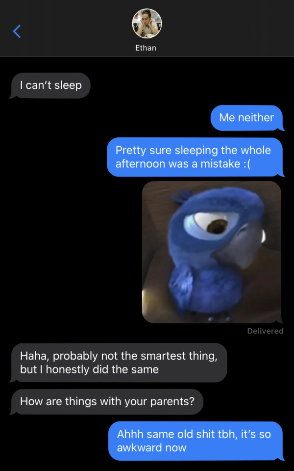
You hesitate while typing your next message. You want to tell him you miss him, but you fear it makes your feelings for him far too obvious. You’ve always wanted to be more than just his friend with benefits, but your fear ir far stronger than your desires. Still, without giving it more thought, you type out the two word message and send it through. Any worries fade away as you read his response.
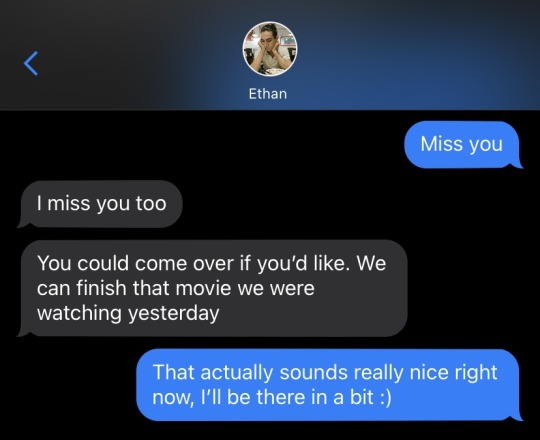
。゚•┈୨♡୧┈• 。゚
You shift your balance from your heels to your toes as you wait for Ethan to open the door. After you replied to his text, you didn’t waste a second to drive over to his house, completely ignoring your parents’ complaints.
When he opens the door, you feel a wave of relief wash over you at the sight of him. His dark eyes and easy smile do their usual trick and help you forget about everything else. Then, you feel your breath hitch when your eyes scan over his clothes.
Ethan is dressed in a loose-fitting white button-up shirt with the first few buttons undone, giving you a small glimpse of his toned chest. He pairs it with tight black slacks and polished black shoes. He looks absolutely stunning... as always, you think.
You meet his eyes after a few seconds of gawking at him and soon realize how absolutely fucked you are when you see his long hair is nicely gathered in a bun that sits at the nape of his neck, just how you like it.
That absolute fucker. You absolutely despise how attractive he looks, especially when your thoughts go straight to a few nights ago. You remember your hands tangled in his hair, completely ruining his bun. You remember pulling at it while his head was in between your legs, then while you were having sex. And now all you want to do is hide as you feel your cheeks heat up at the memories.
He lets out a hearty laugh, succesfully snapping you out of your little daydream.
“You’re staring.” Ethan says teasingly.
You roll your eyes at him, “You wish.”
He shakes his head and steps aside to let you in, “It’s nice to see you too, by the way.”
You let out a soft laugh, “We literally just saw each other yesterday.”
"Says the one who told me she missed me. Besides, it's always lovely to see you." He says, in such a relaxed and casual manner, as if it doesn't evoke any emotions within him, while it stirs up everything inside of you.
His place is small and tidy. There are books and plants here and there, scattered in random places all around the kitchen and living room, accompanied by the faint smell of vanilla coming from a lit candle.
Ethan catches you off-guard by wrapping his arms around you in a hug after closing the door behind you. Driven by instinct, your arms wrap themselves around him as you let your face rest on his shoulder for a few seconds.
You pull away enough to look him in the eye. He looks back at you with nothing but warmth in his eyes. Then he plants a gentle kiss on your lips that makes it so much harder for you to believe he has nothing but sexual feelings towards you. How could he kiss you with such gentleness if that were the case?
“I wanted to get out of there so fucking bad.” You mumble as an attempt to quiet down your thoughts.
Ethan gives you a knowing look. He’s the only person who knows everything you have sacrificed to follow your dream. He always tries to reassure you that you had made the right decision, but believing him never gets any easier. Especially not when the price you had to pay was so high.
“You’re always welcome here, dolcezza. Offer still stands if you want to stay until we’re back on the road.” He expresses. When Ethan had first brought the idea up, you had been so shocked to say anything. It’s still hard for you to understand how he is so casual about asking you to move in, yet turning into something other than fuck buddies is too much for him.
Rather than focusing much on your thoughts, you focus on observing him unscrew the cork on a bottle of wine that had previously been sitting inside the fridge.
“Being back here is so strange,” You say as he pours wine into a glass for you, “I didn’t spend a lot of time at home while I was at college either, so it kinda made me think I wouldn’t feel much different than how I did then...”
The words slowly die down in your throat, and your attention drifts away to the bright light over the kitchen counter.
“Hey, hey,” Ethan says gently as an attempt to get your attention. He leans forward to cup your cheeks, “All this you’re going through isn’t easy. I get it’s probably much more overwhelming when all this negativity is coming from your parents of all people.”
You place a hand over his and close the distance left between his lips and yours. The kiss is a comforting sign of understanding between you both, a silent way of saying that everything will be alright.
You tangle your hands in his hair to bring him closer to you, to feel more of his lips on yours. He smiles softly at your actions and reacts by brushing his tongue over your bottom lip, which you reciprocate almost right away.
This moment between the two of you feels like none you’d had before. You have grown familiar with messy quickies squeezed into every free space that could be found in your busy schedules. Unlike then, there is no recording session, interview, or show to stop you from taking your sweet time together.
Knowing he can, Ethan enjoys every kiss and touch with you, extending them as much as his body allows him to. He lets his hands slowly wander under your shirt as you break the kiss to catch a breath. His hands warm up your skin as they make their way up your waist and he lets out a soft chuckle upon noticing you were wearing nothing underneath your blue sweater.
“Something tells me you don’t just want to watch the movie.” He laughs as his lips trail down to your neck.
You laugh too, “I actually do, but this is pretty great too.”
He pulls away from you completely despite your protests and starts walking towards his room. You follow him with an eager smile on your face, happy to let him fuck away your worries.
─── ・ 。゚☆: .☽ . ゚☆º:. ───
You’re still wrapped in a curtain of bliss after the intimate moment you’ve had. Between his soft pecks and warm hands you slowly let go of any sort of worries that had still been clinging to your body and mind. Instead, you let all of your attention fall on the words that easily fall from his lips like calm rivers.
“You’re beautiful, sweetheart.” He murmurs through parted lips before they keep on sucking on your exposed neck. You do nothing but hum in response, basking in the pleasure his attention brings along.
He can’t keep his hands and lips off you. You’re already so overstimulated that you cannot even think straight anymore as he draws shapes on your back. So it happens, in only a few seconds and with a phrase that anyone but Ethan would’ve been happy to hear, you lose it all. While he places kisses along your collarbones and gently massages your breast while his free hand holds yours, you mumble out words you won’t be able to take back, ever…
“I love you.”
At first, his dark eyes look into yours with surprise and a slight touch of happiness, words still processing in the very back of his mind. Then, any trace of gentleness and adoration that had been previously present, vanishes. You lose the warmth of his hands against your naked body when he stands up and puts a distance between you that feels infinite.
You see his face harden as he leans down to pick up his shirt from the floor, your heart falling to your stomach as you watch him get dressed. He avoids your eyes, which you suspect is much more painful than if he were looking at you.
That moment of silence seems to stretch out into what feels like an eternity. You don’t know what to say, and by the looks of it, your words have also rendered him speechless.
You feel the need to get up and try to reach out to him. To try and make up an excuse that explains why you said it, but your body doesn’t move. You just wait impatiently for him to speak first.
“Please get out.” Ethan says coldly, your heart shattering as you search for any trace of that warmth that used to be in his eyes just seconds ago. But his expression remains neutral and void of emotion. An expression you have never seen before.
“Ethan, please,” Your eyes start getting watery as you plead. Your body finally responds and allows you to stand up and walk closer to him as you put your sweater back on. “Please, I’m sorry.”
There’s a part of you that feels pathetic at the sound of your wavering voice as you ask for forgiveness. An unmistakable desperation in your tone that you wish would disappear and a sharp pain in your heart that you want to ignore.
“I said get out.” You watch as his expression shifts into what you mistake as anger, but it’s nothing more than pure heartbreak.
“Please don’t, let’s talk about this. You can’t just kick me out before we do.” He’s still looking away from you, which makes you feel like your words are being dismissed by him.
“I can, and I will.” Ethan says firmly as he buttons his slacks.
“Come on, did our relationship mean nothing to you?” You say those words as a last attempt to bring him back to his senses. At first, you think it works because he’s finally looking back at you, but what he says next makes it clear that’s not the case.
“We are not in a relationship, we never were.”
“Fine, fuck this shit! I’m tired of just being someone you fuck whenever you’re bored anyway.” You see his whole expression soften at your harsh words. Ethan tries to reach out but you notice he debates on it before letting his hand fall back to his side.
Everything went to shit so quickly with those three little words. The friendship you have been building up for years has just been ruined in less than ten minutes and you have no idea what the fuck you’re supposed to do next.
“You know that’s not what this is! You’re so much more than that, you’re my best friend!” His voice is much gentler than it was, but you don’t notice it because of the anger that’s building up at his words.
“Well, you have a shitty way of showing it. Best friends don’t do whatever the fuck we do!” You turn your back to him and start collecting the rest of your clothes and car keys.
You feel his hand on your shoulder as you dress up, but you shrug it away, “Don’t. I’m listening to you and getting out of here.”
A part of you hopes he’ll go after you, but this is no romcom, so he doesn’t do anything to stop you and lets you leave.
56 notes
·
View notes
Text
hey all! (long text post ahead)
it's been a hot minute (again) but i'm here to say that i apologize for not being consistent for long over a year now. i hope the holidays brought you all joy in some way shape or form. i hope the new year brings peace and positivity toward you all. thank you to all the people who continue using my track tag (because i've missed out on so much, you tagging me allows me to have a quicker catch-up rate) and thank you all who keeps this community on tumblr still active! since i know i haven't been one of them for a bit now. it's been a long time since i've touched photoshop for this blog but life is life. i'm still figuring it out myself and i don't have all the time as i used to to be on my computer and making things. however, 2025 is bts year! so hopefully i can get back into the swing of things and get excited for the boys coming together again. if not, i know so many others will be excited no doubt!
this blog is still something i cherish and happy to have, but i know my era of being a full blown stan has passed me. i still very much support bts and look forward to their future projects but i know the creating gifs and fics and whichever else has been something that's left my hobby-list. i do enjoy the idea of them all, i just lack any and all motivation for the way i used to hustle on here haha (understandably so).
i still plan on being here! i love this little space. even though i feel very disconnected from any others compared to how it used to be for me - but that is ok! every person here grows. everything boils down to the support of bts and that's the main common interest with everyone.
i do want to thank anyone and everyone who has tagged me things in the past, i'm sure i've seen the notification but if i never reacted to it i apologize. i appreciate the thought of including me regardless and it means a lot to me! to those who i've lost contact with, i hope you are doing well. to those who i never really chatted with or got close to, the same goes to you! i wish everyone healthy and happy times. you all deserve it, honestly. <3
for me, who knows what'll happen. i'm just here and there for now. holidays have been good to say the least, the new years always makes me sad (same feeling whenever it's my birthday), and i'm still being active with work, gym, videogames, and volleyball! i'm just a gal figuring out life and i'll forever be figuring it out :)
best wishes to everyone, truly. and this is also a text i'm sending out to say "hi!" to everyone :D hope you all have a great day!
15 notes
·
View notes
Note
Hello! I love your gifs! How do you make yours so clear and high quality/What's your process? <3
Hi!! Thank you so much!! I've never really had to explain out my process to anyone and I don't know how much detail you need, but I'll try my best and try to be as thorough as possible just in case!!
For my D:BH gifs, the process starts out with recording my own game play. I have a gaming computer that already had the GeForce Experience app downloaded, so I use that to record my game play. It records at 1920 × 1080p, 60 frames per second, so the files can get... rather large 😅 The video of my playthrough of the Russian Roulette chapter (~11 minutes long) was just under 4 GB. So its not light...
From there, I figure out what in particular I want to gif (for the timestamp roulette series, I let a random number generator figure out whereabouts I'm looking). Once I know that, I open up VLC and use it to isolate that particular shot + a little more on either end.
After I have the shot(s) I want to gif isolated, I open up Photoshop. I use "File" > "Import" > "Video Frames to Layers" and choose the video I want. You can do this straight from the video of your playthough, but I find that the shorter the video is, the easier it is to work with in this step. I trim my video more, to about a click or two outside of the specific shot I want. Like so:

From there I delete any extraneous frames from the "timeline" section that comes up.

Then is cropping: my go-to crop uses the "W x H x Resolution" option - I put 540 px in the first box, 300 px in the second and leave the third blank.

After that, I have an action in Photoshop that does the next steps for me (to make things quicker), but what it does is sets the frame rate (which will have to be done again after saving the gif because Photoshop hates everyone apparently), converts all the layers into a single object, and sharpens the gif. I've only been gif-ing for about a year and a half, and before that I had exactly zero experience with Photoshop at all, so all the numbers from these steps are still the same as the numbers I pulled from the tutorial I used when trying to figure everything out. For those, you can look at this absolutely AMAZING tutorial, by hayaosmiyazaki, specifically steps 7. gif speed and 8. sharpening.
From there, I start adjusting the colors. From what I've noticed, I seem to do a good bit less color adjustment than some, or maybe even most, other gif makers. It's honestly all about personal preference, so play around with it and find what you like! I personally like to stick as close as possible to the original colors, while still brightening the image up enough to make it clearer and more legible. So, for a majority of my gifs, I only apply an "Exposure" layer, a "Brightness/Contrast" layer, and a "Hue/Saturation" layer (from the "Layer" > "New Adjustment Layer" menu.) The numbers here change dependent upon the lighting in the shot.
For example, here's a before and after of this shot I just did so I could type this out and make sure I got every step 😅 For this one, I did Exposure +1.0 (no change to Offset or Gamma Correction), Brightness +20, Contrast +10, and Saturation +5 (no change to Hue or Lightness).
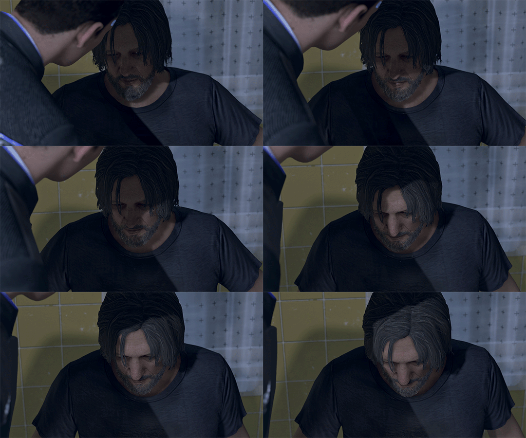
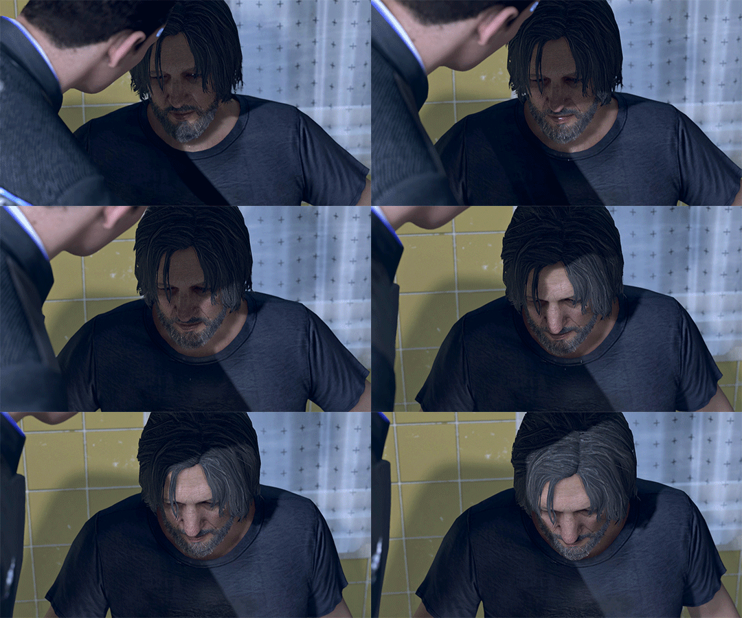
Once I'm satisfied with my coloring, I go to "File" > "Export" > "Save for Web (Legacy)". I watch the gif there to make sure it looks how I want, maybe go back and do a few tweaks to the coloring if I'm not quite happy, check the file size and then save it!
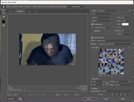
Tumblr's maximum file size is 10MB so if your gif is over that, you won't be able to use it on tumblr - in order to fix that, you may have to delete a few more frames. Or you can crop it to so there's less pixels in the "Save for Web" pop-up by changing the numbers in the "Image Size" section
And now, once I have my gif named and saved. I go back to "File" > "Open" and open up that gif. From there, I go to the little three lines icon in the top right corner of my "Timeline" section, click "Select All Frames" and then click the three dots on one of the frames and change the frame delay. For my DBH gifs, I do 0.02 seconds cause it looks best to me. Depending on how many frames per second your recording software does/what you personally like speed wise, this may be different for you. This is also different for gifs from live action or other media (for those, I prefer 0.05 seconds - it looks the most realistic to me.)
Then, I just save again, overriding the file from before I changed the speed, and voila! That's my process!
I hope this helps; if you have any more questions, my ask box is always open!! And again, thank you so so much 🥰 I'm so glad you like my gifs!!
21 notes
·
View notes
Note
hi sel! i was wondering if you had any tips or tricks or advice for making fic banners and dividers? yours are always so cohesive! ❤️🧡💛💚💙💜
hi nonie! omg i'm so flattered you asked me this 🥺 i’m happy you like them!! admittedly, i am a bit particular about the aesthetics of my fics, but don't really expect anyone to notice 😭
i am by no means a designer! but i'll share a few of the things that have worked for me 🥺 under the cut will be what i do for sizing, editing, and inspo!
SIZING (w x h dimensions, 300 dpi)
› banners: 1280 x 320 for my thicker banners. 1280 x 249 for my thinner ones. i've been preferring the thicker ones lately just because i prefer how it looks on the post compared to my thinner ones (more balanced and stuff!)
› dividers: 1280 x any size you want or 500 x 5. i have both jpg (thinner) and png (thicker) versions for my dividers, mainly because my jpg ones stopped working after a while* 😭 i use the png ones more now because the actual image itself is also bigger in height; there are transparent spaces above the bar itself that allow more control over the space your divider will have between text (please let me know if this is confusing! i'm not sure if i'm explaining it well).
*tumblr can be really selective with the media it allows on the feed and tags, and for some reason, some dividers have been causing that problem 😭 i still haven't figured out what characteristics/factors exactly cause it, but i suspect it might be a combination of size + colours. i usually have to do test posts to make sure it appears!
i'm attaching some screenshots below for reference!


EDITING
› software: photoshop, figma. though i know there are others you can use (e.g., photopea, canva, picsart, etc.)! i just use these because i'm more accustomed to them 🥹
› process:
find a manga panel i like and clean it up (background removers can usually do the trick)
find colours i like and use it as the base for the background
*if using photoshop/figma/photopea: set the manga panel layer as 'multiply'
add the text
*for dividers: i usually just grab from the background of the banner (either i crop a portion of it or colour a long, thin rectangle the same colour)
attaching what my editing board looks like on figma! (i could be more organised but i usually do these things in such a rush i could never be bothered 😭)


› things i consider
for general fic banners: i like to keep a consistent format, which is: character panel + name + identifiable colour because they're the details that i'd like to inform people of first when they stumble upon my post! (some people will put fic titles too, which i don't do bc i can't be bothered to mess with the spacing 😭)
*keeping a consistent format also makes it easier to duplicate elements of your banners into other banners you'll be making! ex. if i'm writing 2 different gojo fics and decide to change what manga panel to use, at least i can always duplicate certain elements (i.e., name text) and find colours along a similar saturation/hue! it makes things a lot quicker and easier.
for event fic banners: i usually pattern it after the event banner itself! so for example, the fics under my 'how to be your loverboy' collab share similar elements (i.e., the wavy edge) to the main event banner. sometimes i use the same colours too (i.e., in's and out's event).
*on dividers not showing up on the dash: i notice it a lot more with light-coloured banners (some neutrals) and super thin ones. to find a way around this, i either change the colour and/or the size OR i'll find a photo that shares the colours i want and crop it to the size that i want (for some reason, it works this way 😭)
INSPO
i usually browse through pinterest for inspo on digital design stuff! i learned a bit of UX/UI so there's also a part of me that's influenced by its trends.
lately, i've been really into gradients! because it's a fun and easy way to make things look clean but not boring, and i think it can evoke the ~vibe of the fic based off the colours you end up choosing!
when i can't think of anything and want to come up with the banner quickly, i'll usually choose a photo/aesthetic i associate with the fic and blur the image until all you see are kind of blobs of colours. they're similar to gradients but have more shapes and require less of your brain power 😭 (i.e., by your passenger seat, and there's something...)
... and that's it!
sorry for this really lengthy post, i hope it's helpful nonie 🥹 let me know if you have any other questions/if anything is unclear!
#sorry it took me a while to answer!! i was gathering what to say 🥹#i hope this was helpful!#ask#rep#anon#reference
8 notes
·
View notes
Note
I know it was months but, but the "Weirdly Specific Artist Ask Game", if you're still interested in answering; 1) Art programs you have but don't use 2) Is it easier to draw someone facing left or right (or forward even) 5) Estimate of how much of your art you post online vs. the art you keep for yourself and 8) What's an old project idea that you've lost interest in
O hello there! I still love this game so I will defo still answer 👀
1. Photoshop and Clip Studio.
I tried. I bought a whole new desktop PC to learn those damn programs *weeps* I still haven't given up hope. But in comparison to how light weight and intuitive procreate on the iPad is, those programs really quickly overwhelm and confuse my poor brain.
2. Depends on the day honestly. If I get to use the symmetry tool then forward no contest. But I would say facing left if I had to choose.
5. I actually post a fair amount of my stuff. I used to have a real issue finishing work or sketching w out fully rendering so I would put stuff out either slow or messier than I would have liked to share. But these days I'm actually having a lot of fun with lines and flats and it's made drawing quicker and easier if I'm just trying to get an idea down (huevember). I'm always hungry for that sweet sweet validation haha.
It's actually deciding what to draw that factors a little more for this question. I have a bad habit where I get self conscious of the subject matter I draw not appealing to my audience. If I think I can't post it and have it do well I tend not to be able to get inspired to draw it. Which is a real shame! And something I would like to work on changing!
8. Oh God how could I even narrow it down. I have the attention span of a goldfish. Looks at my fandom graveyard guiltily.
I thought of doing tarot cards for my OCS once. Like, the whole deck cuz I have so many. Yeah. No. That didn't happen.
Thank you so much for these questions! I always love hearing from y'all 😊💕
21 notes
·
View notes
Note
do you post AI art or did you make it
It's a mixture, I've been making art for about 10 years now but some of the more recent ones are incorporating AI. I'm currently combining older methods and techniques with AI to come up with some new and cool results. It still ends up taking tons of time and effort but I can get ideas out from my head much quicker and better now. I do get overly anxious and a sense of imposter syndrome because I'm not entirely doing things by hand but I've been trying to get over that. I've had a few people be negative or dismissive about me using it but I don't think they understand it's not as simple as me writing a couple of sentences to instantly get some masterpiece. I have a lot more I've worked on but I've just been too in my head overthinking it to post because I feel irrationally guilty? I mean most of my work is photographic except I've painted over them with a Wacom tablet in Photoshop which was also enough for me to feel the imposter syndrome and avoid making things. So yeah I am still super conflicted because I have a few hundreds artworks I've made throughout my life and then I have these newer ones using a blend of digital painting and AI to better assist in my process but I get anxious because I don't want it to discredit everything I've done but I also know with these new tools it's going to be harder than ever to keep up unless I use them. It really isn't worth me spending 30-40 hours on a single artwork when no one really cares and I'm not getting paid for it either, just sitting alone in my room suffering and forcing myself to make a single artwork for what? I actually had someone accuse one of my artworks as being AI made before I even used it until I showed them the earlier versions and the slow time consuming process. Like I am a bit cut up over AI because I spent so much of my life learning art and making sacrifices so I'd have the time and space for it.. but it's an adapt or die situation for digital artists. These AI models do keep getting better though so whilst not there yet it does make me debate what things will look like when they are good enough for you to simply ask it to make you an artwork of whatever you want and for it to instantly pull out a masterpiece. I find that scary because what is there left for me to do? What is my purpose in it all? Would that even be my own self-expression? (The overthinking list goes on and on lol) Perhaps it's just an ego thing though and the accessibility gives more people the means of self-expression which they previously did not have the opportunity. I guess the only part that worries me is that I put so much time, effort and thought into everything that the idea of someone dismissing or disregarding it is quite hurtful. (which tbh is the reason I barely post) All I really wanted to do was make cool things and have people go "wow, that's so cool, how did you think of that? How does your mind work?" as opposed to "Nice AI artwork". So yee TL;DR Mixture of AI but all my older stuff is done completely by me. I'm working on putting together a portfolio/collection of older works just so I can have some distinction there.
11 notes
·
View notes
Note
can you please make a tutorial for your santa gift graphics? i'm not totally new to photoshop but i could use some help <3
Ohh okay, this will be a bit long, so bear with me, dear Anon.
I'm going to use this one as an example:
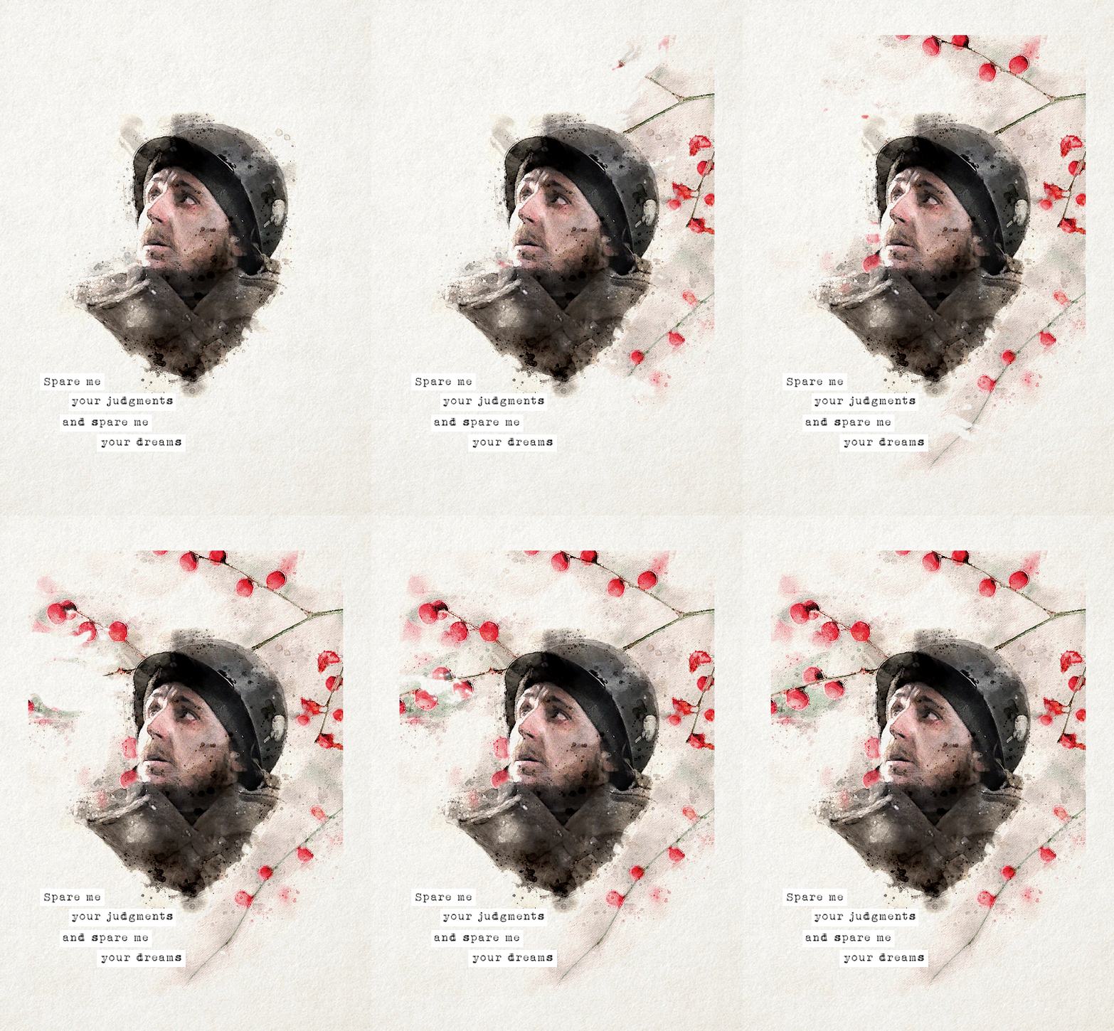
You'll need three new documents: one for creating the watercolour portrait, one for the watercolour elements in the background, and a third one for the final edit.

Let's start with the portrait. I'm using a free photoshop action for the watercolour effect, which you can download here with a complete tutorial. After using the action, you'll need to make some adjustments, but it's still faster this way. Change the blend mode of the "watercolor artist" group to screen and slightly turn down the opacity if needed to make the details more visible

In the second document, use the watercolour action the same way again to create the red elements in the background. You can download the photo I used here. I highly recommend using Unsplash, they offer plenty of free high-resolution stock photos, and unlike on Pinterest, the photographers are actually credited.
Create the third document; mine is 540x750. I used an ivory paper as a background, but it should work with a canvas texture or even a simple white/light layer. Pick whatever you like.
After you're done with the watercolour actions, paste the portrait into your third document. Adjust the size and position, then change the blend mode to multiply. Name the layer "portrait."
Next, paste the background elements too, and also change the blend mode to multiply. I changed the saturation and vibrance to make the red pop more, but it's optional. Name the layer "background elements." Now that you see everything together, you can play around with different adjustment layers, contrast, colouring, etc.
Now, open the video you'd like to use for the animation, in a separate document. I used this one, but there are other similar free videos on this website, pick what you like the most. If you want to make the process quicker, pick one that's already a high-contrast black and white.
After you've opened it, you can use the timeline to cut out the part you'd like to use, adjust the speed, etc. In this case, I just doubled the speed which you can do by clicking on that little triangle, and used the full video.

Create a video timeline in the third document. Go to Window -> Timeline -> Create Video Timeline. It's an important step, don't forget about it. Once it's done, copy and paste the video layer into the third document, and name the layer "video." Make sure the "video" layer is right above the "background elements" layer because you're going to need to create a clipping mask. You can do that by right-clicking on the "video" layer and choosing create clipping mask, or you can hold down the alt key and left-click between the two layers. When it's done, you can adjust the size of the "video" layer, rotate it, flip it, etc., depending on how you want your animation to look
After that, set the blend mode of the video layer to screen. If you've done everything correctly, you should have your animation now.
It's time to add the text. I used this font, size 16. I divided the text into 4 lines for easier adjustment of the position.
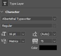
Once you're happy with the layout, create the white stripes, each on a different layer. This way, you can move them around separately if you'd like to change the position of the text. I like to make the text and stripe layers into a group so the layers are less chaotic, but you can skip this step.
The only thing left in the editing part is the invisible frame. Click on the "background elements" layer and add a layer mask. Select the brush tool, 50px, 100% hardness, and set the foreground color to black. Now, draw a line from corner to corner. Holding down the Shift key, click on one corner using the brush, then click on the next one, and repeat until you're done with all four sides. Your layers should look something like this now.

Before saving, make sure that all the layers on the timeline are the same length and start/finish at the same time.

If you're done, go to File -> Export -> Save for Web (Legacy). These are the settings I used for this particular edit, but feel free to experiment and use what you like the best.

I tried not to complicate it too much, but it's difficult to explain everything in writing, so if you have any questions, I'm always available :)
17 notes
·
View notes
Text
Quick Appreciation Post for GIF Makers
I have reached a whole new level of respect for GIF creators who edit in Adobe Photoshop. Most of the super high-quality GIFs are done with PS but it is a rather tedious process. And this is coming from someone who uses this program as part of work.
I do my GIFs with Adobe Premiere Pro, which is way quicker when you know your way around the basic tools, but when you're dealing with medium to low-quality files, editing is a challenge. Such was the case with the file I was working on. So I decided to try a new process out, carefully following a tutorial online, and it still took me HOURS. To be fair, I also had to download a program that extracts continuous screenshots and then I had to install it on my PC which turned out to be more complicated than most installations.
It's almost embarrassing that I didn't even end up with particularly impressive GIFs for all that effort, but there's still significant improvement from where I started (see below). It still has room for improvement but I have spent enough time on this as it is—time I really should have spent doing actual editing for work—so I'm just gonna leave it here.
ONE OF THE SCREENCAPS, FOR REFERENCE:

ONE OF MY EDITS ATTEMPTS IN PREMIERE PRO:

FINAL EDIT IN PHOTOSHOP:

So, yeah, cheers to the tireless, unpaid, talented GIF creators out there who bless our feeds with stunning HQ clips from our favorite movies and TV shows. They do it for the love. So do share your appreciation for them whenever you can!
#appreciation post#gif makers#gifs#gifset#daniel brühl#race for glory#race for glory: audi vs lancia#daniel bruhl
7 notes
·
View notes
Text
Animation
Reinvention in story telling
Three Blind Mice, Epic/Historical, Space Age (1957-present)
Week 3, 22-28/04/24
Monday
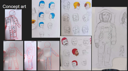
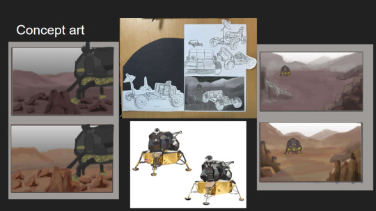
Did a zine workshop during the morning, I made a sad little zine with some bits of rough potential visuals for the project.
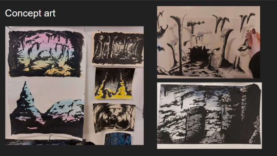
I then jumped straight into creating concept art and trying to figure out how to combine natural cave formations with architectural features. What I ended up doing that day was creating this rough pencil of some stalagmites and drawing arches and doorways on top of it.
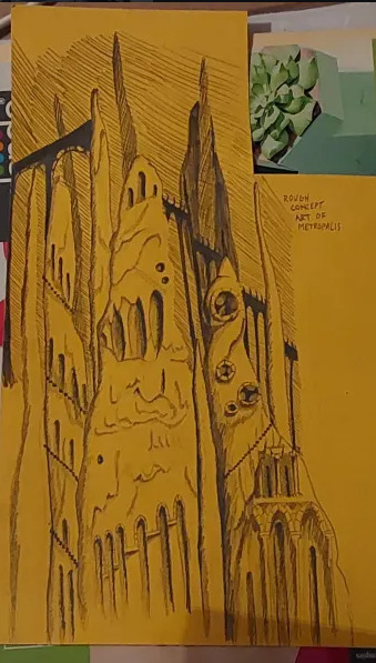
Using this as a starting point I went off and photocopied it a few times, which I then cut up and collaged together on a page to gain a rough idea of what this metropolis could look like.
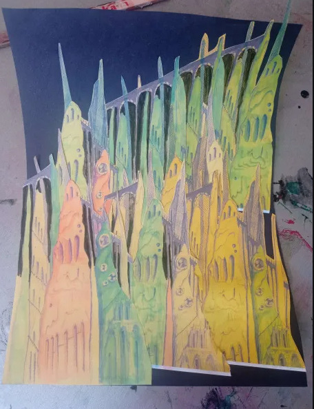
This is what I ended up with. I love how the buttresses came out but the perspective of the piece looks completely wrong, making it look cluttered without purpose. I tried colouring parts blue and pink to separate it a small bit, but I think the main issue is that all of the structures are the same size even at a distance, in future I'll have to make the ones in the back larger and more hazy looking whereas the ones in front smaller and more detailed. This was just an experiment so its not too important.
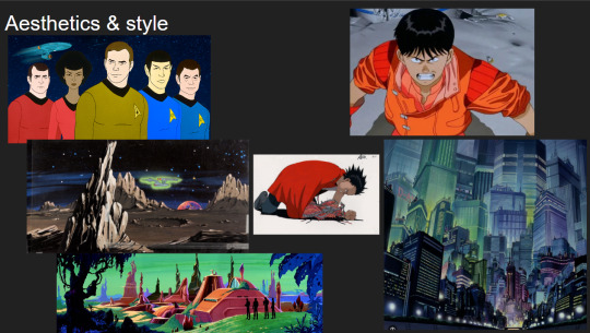
Later that evening I did a colour study of scenes from Akira to develop my understanding of cel shading, I also watched a few videos on the production of Akira. It ended up being very useful and I found myself very surprised with Akira's colour palette. I quite literally colour dropped the colours from the scenes and and did rough drawings of the scenes using them, I was really surprised to see that the colour I dropped was the same as the one in the scene. It was absolutely fascinating.
Tuesday
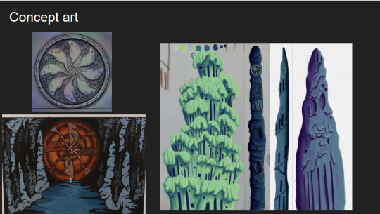
I further looked into combining architecture with cave structures by doing a quick study on Antoni Gaudi's building designs and did a study on different stalagmites.
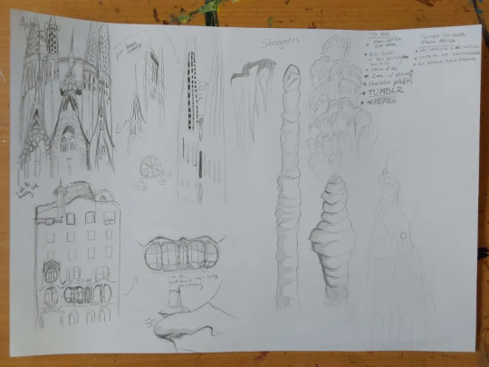
Looking at Gaudi's designs was interesting as he uses lots of organic shapes that almost look like they're melting in a way, and in other works like the Sagrada Familia he has lots of towers with unique features.
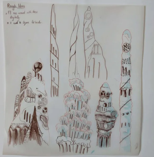
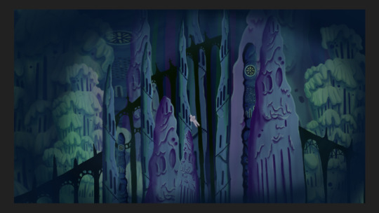
I tried combining these features to the stalagmites I studied to gain unique structures that would be believed to have belonged to an underground metropolis. I ended up with some nice designs, I worry a small bit that they might be too detailed but overall I'm happy with them, I still think these designs would have to be further developed but I don't have the time to do so.
At the moment my plan is to individually recreate these digitally and then photoshop them together in different ways to gain the illusion of having more designs than I do.
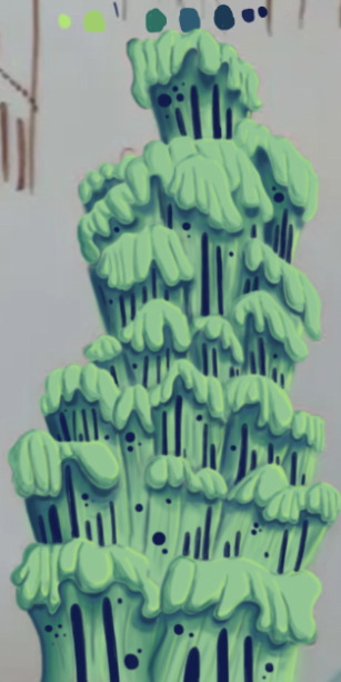
The photo is a small bit fuzzy but this was the first structure I recreated digitally. This took me around 6 hours to do, which was mainly because I've never done a proper digital piece before, so it took me a bit of time figure out what worked best and what short cuts I could take. I actually drew on top of a picture of my original paper sketch instead of redrawing it.
I created this solely using the air brush tool, and I love how it turned out, it looks so drippy. The only thing I can say really is that I wish I got it done a bit quicker, and that the values were much darker on my personal monitor.
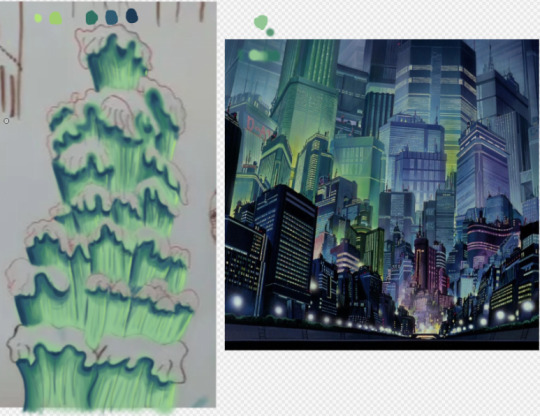
I used the background from Akira as a reference for the colours.
Thursday
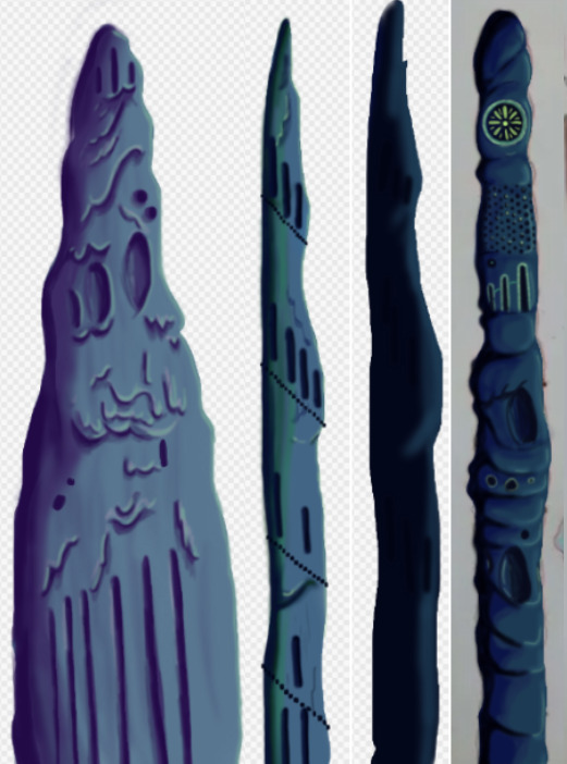
I made 4 more structures, significantly much more quicker too. While I spent too much time on the first one it gave me the experience needed to bang these ones out quickly and more efficiently. These were also done using the airbrush tool. For the backgrounds we actually made it a point to solely use airbrush as a way to commemorate the animations from the 70's/80's.
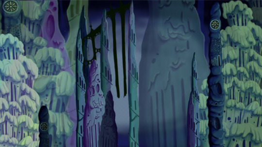
Since most of my pieces were done I got started on piecing them together. I tried making the buildings further back bigger and transparent and the ones closer to the viewer bigger. This was as far as I got on Thursday. If I'm being honest I'm not happy with the layout. I was using the Akira background as a reference but then realised it wouldn't work as the light source in the background is from behind, in my background the light source is from the front. I knew I definitely had to redo the layout.
Friday
We did a pitch workshop with Paul and Yvonne and then as a team discussed how we would go about our pitch . We discussed who would say what, what we thought a funder would want to know before investing in a project, we worked out costs, how many episodes, how many animators it would take to animate it in a year and ect...
We also did a few rehearsals in the studio improvising our lines and timing ourselves to get a feel for it. We decided that I would open and close our pitch, introducing our Nursery rhyme, genre, & time period while also setting the scene for our animatic.

Before work I managed to redo my background, I thought this one turned out way better. The perspective looked way better than last time too. I feel like with more time I could develop this further but I don't have that time so this is what I have and I'm happy with it.
Sunday
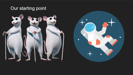
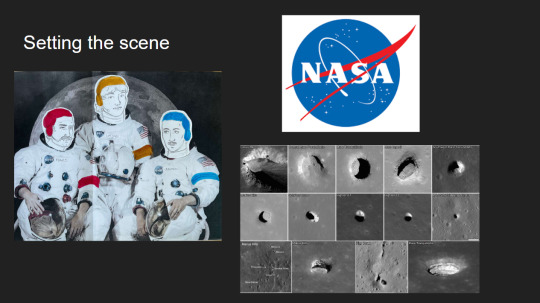
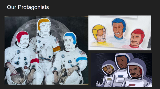
youtube
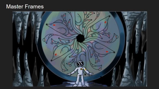
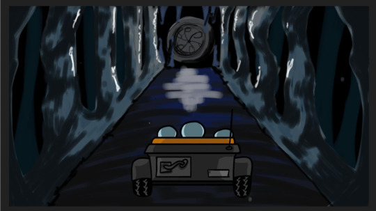
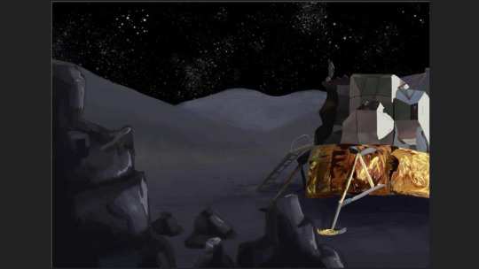
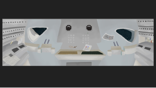
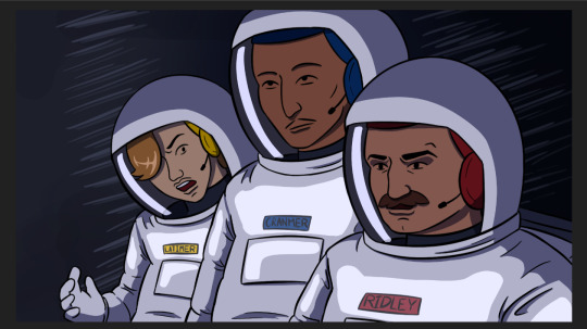
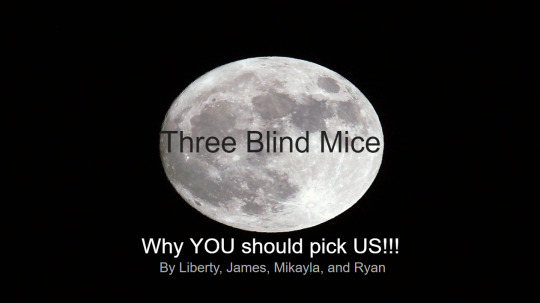
I made the presentation for our project, and the team went on call to rehearse our pitch. We did this twice.
2 notes
·
View notes
Note
I remember back when I graduated looking into KI and its so cool to see another young animator doing just that! I was curious though - I saw on a job listing that the animators were to use Blender Puppetshop, but wasn't able to find much info on it other than it being a kind of ancient plugin. Is that still true?
Thank ya! Yea, so the program we use is 3ds Max, and then we use a plug-in called Puppetshop to rig and then animate our characters. I hadn't heard of it until i started working here, and it is a bit of an older tool- i believe you can buy/download puppetshop externally and use it on your own in Max, BUT we do have KI-specific plug ins/tools that can be used with puppet shop. Like i think the way we export characters/animation files was a tool built internally at KI, so they're not available to use unless ya work here lol. Other animation/game dev studios will usually have some type of custom tools for their respective work flow, like i think Dreamworks actually has their very own 3d software all together.
(also, there are other, newer 'auto-rigger' plug ins out there, i think one is called CAT used for Max, but not sure on that. Puppetshop just works real well for us).
From what i've heard, 3ds Max is kind of the preferred software for game art/animation, while Maya (Maya is, for the most part, the industry standard like how photoshop kinda is, but is more often used for feature/commercial animation. You can use any 3d program to make either game art or feature animation/etc, like blender, but yea Max for whatever reason is more compatible with games.
We don't typically use blender for anything here, although one of our concept artists Adam Roush often will roughly model environments or sometimes characters in blender and then paint over them- this makes for quicker concepts.
If you're interesting in seeing a bit on how our animation work flow goes, check out Tony Gaddis's YT channel. He's an animator here, and makes a lot of animation how-to videos. I actually referred to them a lot when i started working here, hehe.
7 notes
·
View notes
Note
Hi, um do you have any tips for someone using photoshop CC for the first time? I heard trying to do line art in it is very difficult so...how is it easy for you?
Hey!
It's interesting because I've heard that other/newer programs are easier than Photoshop but I've just been using it for so long now. Haha.
TIPS I WISH I HAD DONE EARLIER: - PAPER vs DIGITAL The most challenging thing is the transition from paper to digital. I only started using a tablet in my Senior year of college. - I started by sketching on paper first and then inking in PS - Slowly started sketching in PS and then doing all the work there. It's a threshold everyone must cross, but if you remain consistent and develop a hand for the stylist, you'll pick it up quicker than you think. It's okay if you don't have it nailed by next week. Learning and adjusting take time.
- DOUBLE. TRIPLE. QUADRUPLE check that your line work is being drawn on a separate layer than your sketch. I can't tell you how many times I've gone to erase a mistake and realized that I was drawing on top of the original drawing.
- THE SMOOTHING TOOL IS YOUR FRIEND. As recently as 2019, I had been drawing/Cleaning line work with just the stroke of my hand in both my personal and professional work for animation. It wasn't until my Art Director showed me the smoothing option and it has been a game changer/wrist saver/timesaver ever since. Help yourself make that final linework and smooth!
- SAVE YOURSELF! (Frequent saving)
Back when I was working on a broken laptop that would just completely shut off daily, I lost a lot of work/progress that way. Photoshop itself is also unpredictable, so save your work frequently!
Honestly, there are still lots of things in Photoshop that I don't know about, and I'm currently still learning even after all these years, lol. But the best way to do it is to familiarize yourself and keep using the program until things become second nature!
8 notes
·
View notes
Note
Hello lovely helpful person! I have a question about Otis dof addon, is it possible to focus on two characters at the same time (in Bg3). Like a scene where tav and a companions stands next to each other or a romance/kiss scene, it seems that its only possible to focus on one point at once, if that makes sense? everything else gets blurry. Is this just the way it is or can you alter the focus somehow, so several things are in focus, like a group of 4 people? Thank you so much!!! Hope you understand my question (:
Hi anon!
Try to imagine the space in front of you in terms of linear distance from the camera to the farthest point in the distance.
When you focus, you're not focusing on a specific object per se, but rather on a particular distance between the camera and the horizon. Anything in the scene that is at that exact distance from the camera will be in focus, whether it's in the very centre of the screen, or off to the left or the right, top or bottom.
Anything you want to be in focus has to be at that distance.
Let's assume the camera is at 0 and the horizon is at 1, and half way between them is 0.5. If Tav is standing at 0.2 and Shadowheart is standing at 0.4 you can either focus at 0.2 or at 0.4 to have one of them in focus, but one of them will be out of focus. You can't set two different focus points because you'd end up with blur from both of them messing them both up.
There are a couple of ways to work around this, and as always with ReShade both involve compromise.
The first would be to change your composition so both characters are the same distance from the camera. That's nice and simple, but can sometimes ruin the composition you wanted.
The second is to adjust a bunch of stuff to mimic how a real camera creates blurred and in focus areas. Zoom (FoV) will affect how strong the blur is and how quickly it goes from in focus to out of focus. Theoretically, the closer you zoom in (the lower your FoV) the stronger the blur will become and the quicker it will start after the in focus area. Additionally, lowering the bokeh size in the IGCSDoF settings will also create a softer transition between the in focus area and the blurred areas. This can help create a wider zone of space that is in focus, meaning your characters may not have to be at the exact same distance away from the camera.
Unfortunately, because of the way IGCSDoF renders everything, that zone will still always be somewhat narrow, and, especially if you wanted rather strong blur in the background, you'll likely find yourself battling against some areas that aren't in focus that you wish were.
Luckily, there's a secret third way that can come to the rescue: Photoshop*.
I frequently find myself taking a shot with IGCSDoF, and one without, and then opening them in Photoshop to blend them together so I get what I want in focus. I do this a lot with close portraits where I want a decently strong background blur but find as a result only the eye is in focus and the nose and sometimes even the mouth is slightly out of focus. I layer the screenshots over one another, add a layer mask, and paint out the areas of blur I don't want so the in focus parts come through.
There are always going to be limitations with ReShade and screenshot tools more generally because it's trying to mimic real world behaviour in an artificial digital game space, so we have to get crafty sometimes!
*Other programs are available
4 notes
·
View notes
Text
I started creating 3D models for the game. I began with a simple enemy model: The Turret.

It is a low-poly, pixel-art UV'd static mesh. The model was initially made in a program called Blockbench.
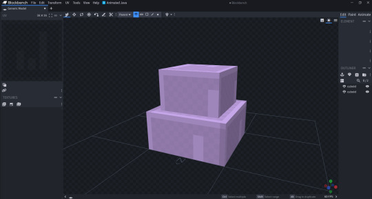
Blockbench is a modelling software similar to Maya and MagicaVoxel. But like MagicaVoxel, it was built to make a certain style of mesh. In this case: Low-Poly, Pixel-Art texured. This software does make it easy to do that. To make the textures, I needed a software that is easier to use when it comes to simple pixel-art. In this case I used the program: Paint.net. This is a image editing software based on the Microsoft product: Paint. It is much more lightweight and easier to manage individual pixels than Photoshop, whilst still having all of the adjustment tools that Photoshop uses.

This makes it much easier to create pixel-art UVs for meshes I create. There was an issue with using this combination of software to produce assets however. It was an extremely long process that I couldn't even animate properly. Blockbench does not support the same type of FBX file that Unreal does. Along with this, Blockbench would export all faces to have "Smooth Shading" on. This feature is great for high detail models. It essentially allows faces that connect to have lighting ignore soft edges. For low-poly meshes, we don't want this. It makes the edges blur together and make them less defined and ultimately looks terrible. This means I have to use a mediator to convert it from ASCII to Binary. And to turn smooth shading off. I simply used another modelling software called "Blender" to do this. This itself was annoying but not too difficult or time consuming. The issue came when I wanted to rig and animate the models.
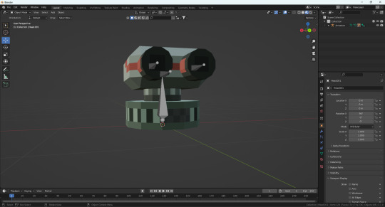

I wanted to set up an armature in blender and weight paint onto certain parts of the mesh. This was not too hard to do. Because of the low-poly nature of the object, weight painting onto it was much simpler than if it were a much more detailed model. The biggest issue came when I wanted to animate and export the animation into Unreal.

None of the animations or armatures would come through correctly if at all. Sometimes bones would in completely different places to where I wanted them to be, and sometimes they wouldn't even be exported. In the instance above, none got exported with the mesh. Sometimes some armature bones would come through correctly, but then have strange deformations. I checked in blender and everything seemed to be perfect on there. I searched online for answers to this and saw that there was not really one good solution to this. This one model at this point had taken just under 2 hours to complete and export into Unreal. Only for none of the animations or armatures to come in correctly. As an unfortunate result to this, I either have to spend time figuring out what I did wrong and spend time fixing it and any other strange problems for future meshes and animations, or abandon this idea. I only have 3 weeks remaining to complete the full project, so I don't really have a choice unless I want to risk running into more issues along with a longer development time. I decided to go with an quicker and easier art style for now, that being one similar to the original 3 DOOM games.

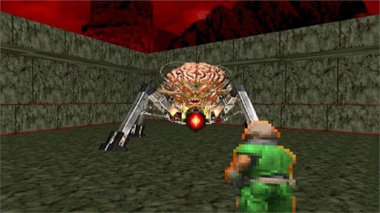
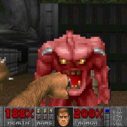
This is a concept known as: "Bill-Boarding". This style uses 2D images in a 3D space. By propping them up and having them face certain directions, it can mimic actual 3D elements. This style would work perfectly since my arcade idea only has one viewpoint. Meaning I can always guarantee that the player will see the textures from the correct side.
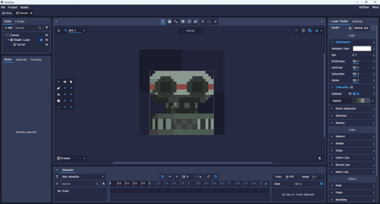
I saved time with the turret by turning the 3D object into a pixel-art 2D sprite using a program called: "Pixelover". This program applies custom shaders to 3D and 2D spaces to give them the impression that they are custom pixel-art. It uses down-scaling for the pixels and indexation for the colour pallete. With this system, I can keep making 3D models in Blockbench, make UVs in Paint.net and then create the sprite animations using Pixelover.

I can use key-frames, armatures and other effects in this software to produce animations in a much quicker fashion. Now I can work on the rest of the game.
0 notes
Text
Blog 10 - Generative AI and photography.

Generative AI is all the rage since the last few years, predictions have ranged from utopia where everyone is suddenly engaged in creative work to dystopia's where corporate companies control how people create, some where people don't even create at all.
While the philosophical implications of generative AI is another discussion altogether, I want to discuss and explore the content that generative AI makes.
Is it really new? other than for corporate art does it really disrupt the art ecosystem as much as maybe photography did back in the day? I mainly use photography as the comparison since they are compared with each other for their disruptivity in online discussion forums.
In his essay "The ontology of the photographic image" Andre Bazin proclaimed that photography had freed the western arts from its insistence on realism, something that had started with the introduction of perspective during the Renaissance. This allowed painting to explore its aesthetic values and its medium specific qualities.
By producing an image through mechanical means, Bazin argues that photography has given us the avenue to capture reality without the subjectivity attached to it when reproduced as a painting. Photography embalms reality and time, the reproduced photograph free from any artistic intervention other than the subject that the artist chose to shoot.
Photography had opened up a new form of artistic expression, with its own set of laws and aesthetics which have constantly developed over time, separate to the other arts. Digital photography has helped images become the way we interact with and understand the world, as well as playing around with the reality captured in photographs using digital editing tools.
Lets take a look at how generative AI works in the first place.
"Generative AI models use neural networks to identify the patterns and structures within existing data to generate new and original content." (Nvidia). Diffusion models like stable diffusion use a two step process of forward and reverse diffusion, adding noise to the training data upon layers to get the highest quality of output.
The main benefits of this type content is touted as a democratization of arts, where everyone gets to make what they want to make instead of having to rely on companies, where companies wont need to rely on people to get their art done. Creatives can create ideations in an instant to see whether it is worth pursuing or not. but ignoring the fact that a lot of it is trained on copyrighted data lets focus on just the output.
What does stable diffusion make at the end of the day? an image. regardless of all the different technology advances, the final output is not something radically different like VR/AR technology or the multiple different immersive experiences that are slowly developing. It still creates images, that people who are skilled can already make albeit making it quicker and easier to get a work that mimics the highest levels of human made art.
This is my main gripe with generative AI, the fact that other than easiness it does not introduce a new avenue for creation, but rather brings out the possibility of excess. To me its akin to photoshop, a software that will be absorbed into the artists pipeline rather than become the main tool with which they express themselves. The case of companies and their use of it is completely different but i would like to keep it to a personal point of view for now.
Citations:
NVIDIA, n.d. Generative AI Glossary. [online] Available at: https://www.nvidia.com/en-us/glossary/generative-ai/
Wild Reflections Photography, n.d. The Ontology of the Photographic Image by André Bazin. [online] Available at: https://www.wildreflections.photography/uncategorised/the-ontology-of-the-photographic-image-by-andre-bazin
0 notes
Text
The other thing about "I thought it was all CG!" is that if you have a photographer who knows what they're doing and has a fully-furnished camera room, it is actually much cheaper, quicker, and to do a lot of things the old-fashioned way with a camera than to do it with photoshop. I mean, of course there will be a bit of photoshop retouching afterwards, but then, back before computers existed there was retouching as well, they just did it with paint and ink. And even if you have an effect in mind that can only be done with CG, it's usually easiest/cheapest/fastest and best looking if you do as much as you possibly can with camera, set, and lights, and then use photoshop to get the final 10% of the look you're going for.
The thing is, you can use the same basic lighting setup to do a whole bunch of different things, and once you know what you're doing it does not take that long to set them up. Those are the sorts of considerations you have with literally every shot you take. You do not need to reinvent the wheel each time. There are a handful of ways to solve each problem, and you pick one and go for it. Maybe you try a couple of them, see which one works the best ... but even so, you're working from a fairly set playbook most of the time. Sure, there's times when something will be different enough that you have to stop and think things through and experiment, but most of the time you don't have to. A lot of times, getting the set put together (the background, everything you see in the finished image that's not the product or the person being photographed or the focus of the image) takes longer than getting the lighting set up.
And this is the case whether you're talking about still-life photography (photographing objects such as products) or people. It's even true of outdoor photography, though the natural environment complicates things. It's usually easier to use lighting and photographic skills when you take the image than it is to manipulate the image afterwards to give you the look you want.
Remember this joke?
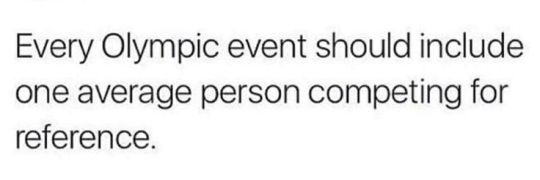
Well, I am going to do something similar only with photography. This is a photo someone took for an Amazon review of their Clinique products.
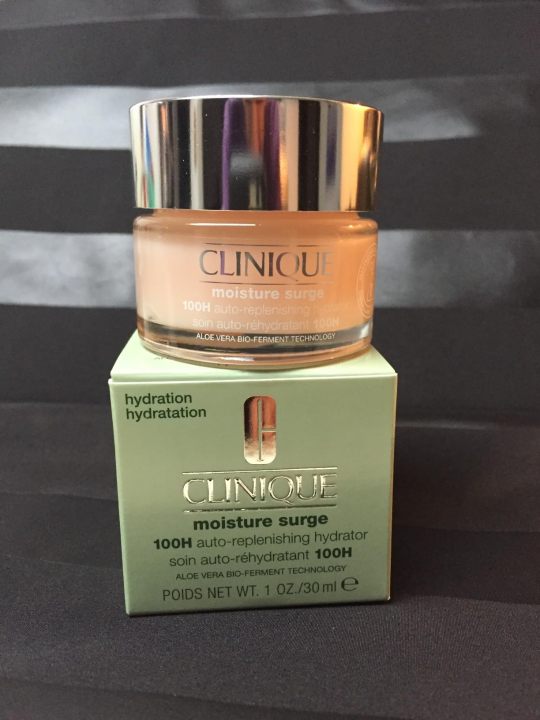
Honestly, it is not a terrible photo. They did some staging. They have an interesting background. All of the labels are legible. It is properly exposed. This would be a perfectly acceptable product photo for an Etsy page.
I've been taking these advanced photography courses in preparation for whenever I am able to create a new studio in the house. And my teacher is a photography badass. I just watched a 6 hour class on how to recreate a professional Clinique ad. And at first glance it looks deceptively simple. It's just some skin care products being splashed with a little water.
Which is why I wanted you to see an average person for reference.
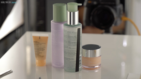
This is what Karl Taylor came up with.
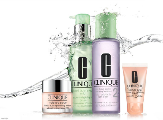
And I don't think I've learned so much about photography in one tutorial before.
Product photography is just loads and loads of problem solving. You have to light the chrome caps with a gradient. Which requires giant diffusion scrims.
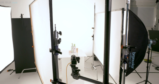
Those big white panels are literally only there for the two chrome caps.
You need a pure white background, but you can't let light spill all over the studio, so you put up giant black light blockers.
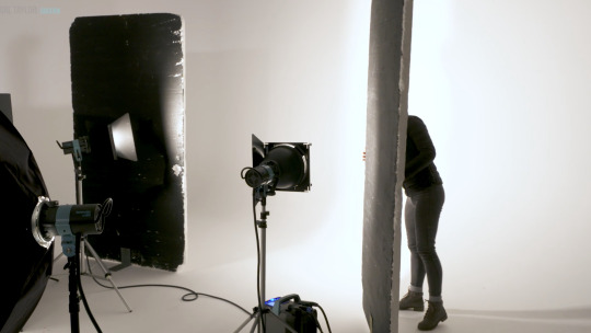
And you have to add another light just for the orange bottle on the right.
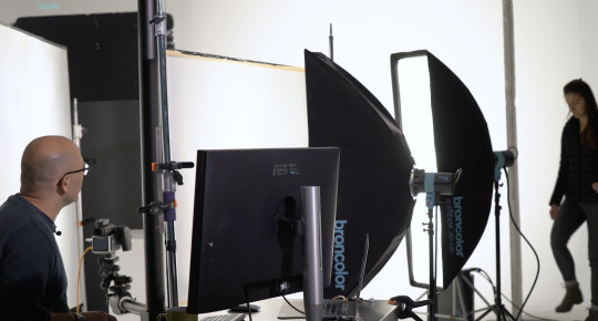
Oh, and if you want the bottles to glow, well, you have to hide a silver reflector behind them.
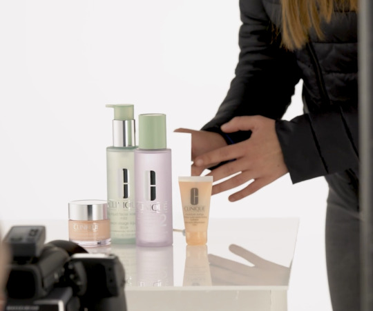
But you still want the edges of the bottles to be darker so they have some contrast. So you add some black tape to the sides.
And in order for the reflective labels to have bold black lettering, you have to reflect black cards into them.
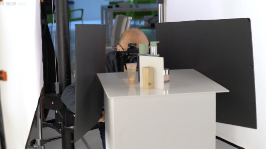
Ack! Karl's beautiful bald head is showing up in the chrome caps! He must put on the naughty blanket.
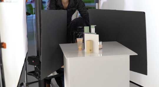
And once you get every aspect of every bottle perfectly lit, you finally get to yeet some water at it all.

I don't love product photography because I have a weird obsession to help greedy corporations make their wares look more beautiful. I love it because it is a complicated and challenging new puzzle every time. Every product is a different shape and requires a different technique to make it look its best.
I don't know if I will be able to live up to Karl's standards.
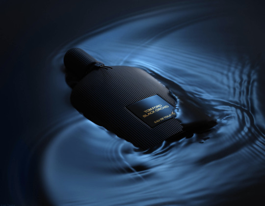
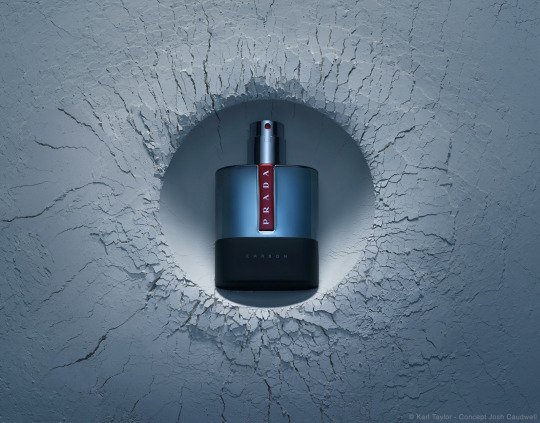
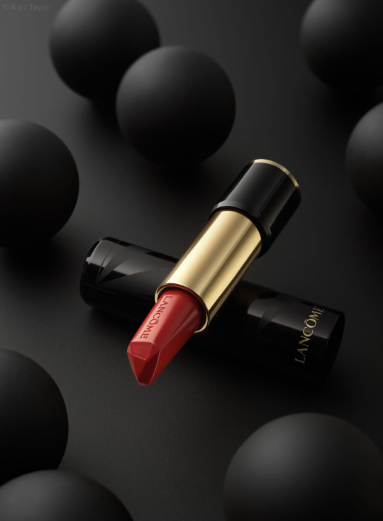
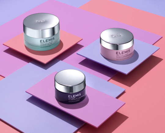

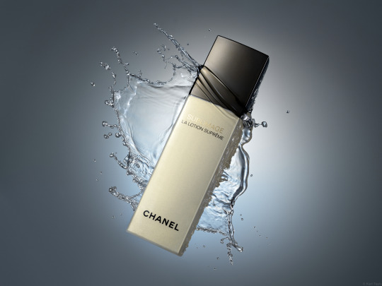

This is about the level I was at in 2017 before I quit photography.
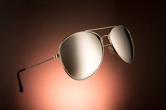
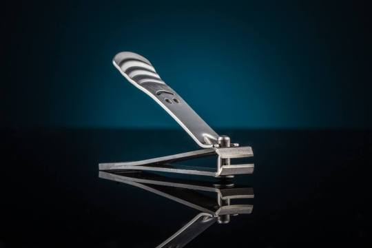
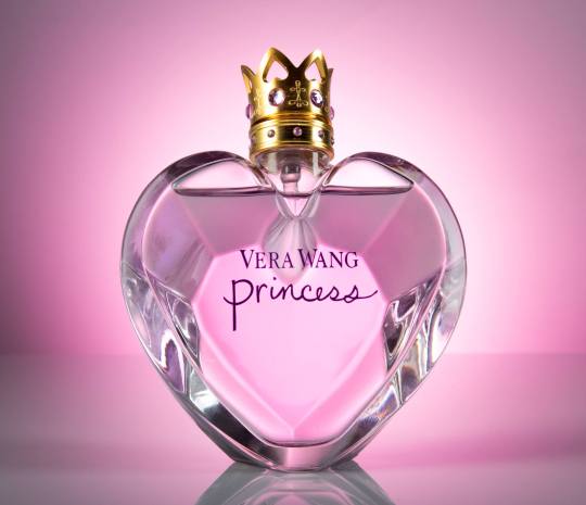
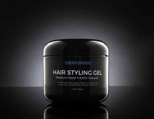
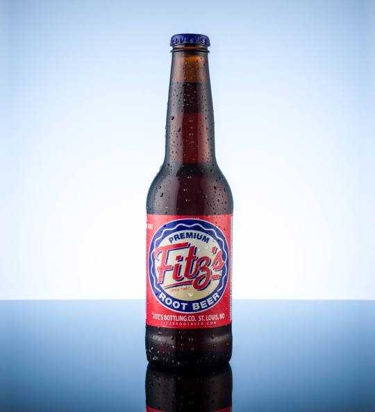
I have so much more knowledge in my brain now. I'm really hoping I can surpass that.
18K notes
·
View notes