#it turns out the English title is a figurative/interpretive title translation instead of a literal one
Explore tagged Tumblr posts
Visit Tumblr Blog
Explore Tumblr blogs with no restrictions, modern design and the best experience.
Last Seen Tumblr Blogs


Fun Fact
Total funding amounts to $125.3M.
Text
@yummysuika @ospreywhite I really appreciate your translation work; can you explain more about shichen timekeeping to me? Because I know a tiny bit of modern Mandarin Chinese, but I can't recognize the shichens as the zodiac animals:
Zi (I don't know "rat", so I actually can't make any argument here.)
Chou (I don't know "ox", but I reasonably could have expected "niu" for "cow".)
Yin (I know "tiger" as "hu".)
Mao (I don't know "rabbit", but to me "mao" is "cat".)
Chen (I know "dragon" as "long".)
Si (I don't know "snake", but now I find it interesting that it sounds like death, like snakes could be seen as evil in Chinese culture similar to how they are seen in the Christian world.)
Wu (I know "horse" as "ma".)
Wei (I know "sheep/goat" as "yang".)
Shen (I don't know "monkey", but I would have expected "Sun" or "Wu" or "Kong" because of "Monkey King".)
You (I know "rooster/chicken" as " ji".)
Xu (I know "dog" as "gou".)
Hai (I don't know "pig/boar" unless "pork" and "pig" are the same "siu".)
I tried asking my parents, but they just starting talking about how the Chinese zodiac is actually a 60-year cycle with the 12 animals and the 5 elements. So are these shichen names the "Pre-Han dynasty semi-descriptive terms"? Is it kind of like the difference between "midday" and "noon" in English? The former is a "descriptor", the latter is a "name", but they "mean" the same thing?
(I tried checking the etymology for "noon" on dictionary.com, so to be fair "ninth hour" is a descriptor, but in Modern English it's not really recognizable as such and so for the sake of my shichen question, I'm calling "noon" a "name".)
Or is this another language/dialect or due to the evolution of language (changing words and pronunciations)?
I was also looking up the Dragon Boat Festival being on the unluckiest day of the year, and it says, "The Chinese name of the festival is pronounced differently in different Chinese languages. Duanwu (端午) literally means 'starting horse'—i.e., the first "horse day" of the month according to the Chinese zodiac." so I was able to get the exact character for "wu". I think it's interesting that Wikipedia says "literally ... horse" but putting 午 into Google Translate yields "midday, noonday, seventh earthly branch, 11 a.m.-1 p.m." It's unfortunate that Wikipedia only says "different Chinese languages" for "Duanwu" instead of specifying them or time periods, but I appreciate it listing different romanizations by country for Cantonese.
Would you say there's any pattern to Chinese writers or English translators using the above terms vs. using "hour/time/head/body/tail of the (insert zodiac animal here)"? Like if one sounds better for a historical fantasy setting, or choosing to use the pinyin in English instead of translating to not be translating literally? ETA: I should have gotten onto a computer sooner. I asked my parents and then you guys because searching "shichen" in Wikipedia just resulted in https://en.wikipedia.org/wiki/Chinese_units_of_measurement. But further digging took me to https://en.wikipedia.org/wiki/Traditional_Chinese_timekeeping. I'll probably get answers there (Maybe I'll even be able to explain to my dad why he was thinking of ten stems and not matching mathematically with "60 is from 12 times 5, not 10 times 6" when he was trying to lecture on the 60-year cycle for the Chinese zodiac, lol.), so my apologies for bothering you. I'd still appreciate your thoughts on what was formerly the last paragraph about writing and translation choices!
#Chinese#Mandarin#language#writing#translation#timekeeping#shichens#Chinese zodiac#I think language is so cool and I am loving applying my interest to Chinese#Step aside English and Spanish and other Western languages#Also I am sadder for my parents that I haven't learned either of their dialects and I'm wondering about dialects dying out in China like ho#foreign languages die out in diaspora as immigrant generations increase#or like the formal eradication and reintroduction of languages like Hebrew and Welsh#Also me trying to flex my minimal Mandarin skills while reading needs to be taken with a grain of salt#I know just enough to hang myself (if even that much)#It's one thing to infer from context that a cardinal direction or number was untranslated in a name#But I was so wrong trying to figure out “Ballad of Sword and Wine” vs “Qiang Jin Jiu”#I was like I don't know “ballad” but “sing/song” is “chang/chang ge” so maybe the lower vocab word is used for multiple words and/or change#pronunciation slightly or the higher vocab word happens to be similar in pronunciation#maybe “jin” is a different spelling/pronunciation for “sword” as “jian” and of course “jiu” is “wine/alcohol”#But no when I did more digging and found fan translation notes and the Chinese characters even though the fan translation is gone#it turns out the English title is a figurative/interpretive title translation instead of a literal one#When I have the spoons I should retry finding the Chinese Wikipedia page for Li Bai's poem and plugging the poem into Google Translate#and attempting poetry analysis. I'm already having Thoughts about the title and the first book#not even the whole story#isn't available#I just love books so much and it's so cool how someone chooses the title for a story
3 notes
·
View notes
Text
Barefoot Gen
This was a really sad anime movie, but it was worth the watch. The atomic bombing scenes in the movie are very iconic, and I have seen them many years ago, but not the whole movie. Barefoot Gen really does the atomic bombings on Japan justice. WW2 was way before our time, and many people often don't truly grasp the seriousness of events such as this. When horrific events are depicted in textbooks, they are only written from a historical and academic perspective, so it is difficult to truly understand the event. I feel like this movie helped me understand this event better.

First, I'd like to share some interpretation of the Japanese language present in Barefoot Gen. Meaning cannot be extracted from the title Barefoot Gen in Japanese (other than the presence of the word 'barefoot', which I'll talk about later), as barefoot is written in hiragana (はだし) while Gen is written in katakana (ゲン). Hiragana and katakana are phonetic alphabets (like the English alphabet), as opposed to kanji, which uses logographic characters, where each character represents an individual meaning.
The kanji for barefoot is obvious: 裸足. Both kanji represents a different portion of the whole meaning, and by deconstructing it into its individual kanji, we can derive a new interpretation and better understand why they chose to use the word. 足 means foot, leg, or sufficient, but this doesn't really hold any additional meaning. 裸 on the other hand, means naked or nude. While Gen is literally barefoot in the movie, it also serves as symbolism of being "naked" or exposed to the harsh realities of war and atomic devastation. This also symbolizes resilience, as he continues to walk forward despite the pain and difficulty. Literally, Gen is exposed/vulnerable to the atomic devastation to the highest degree, as he traverses the scorching terrain with his feet and truly experiences the full pain of war. Given that Barefoot Gen is actually based on the author Nakazawa's own personal experience during this event, Nakazawa is actually making himself vulnerable by creating this work.
There are many kanji that use the sound Gen, so it is difficult to figure out which kanji truly composes Gen's name. Surprisingly, we can figure out the true kanji used for Gen as it's written in kanji on Gen's clothing! Written on Gen's clothes is the text: 中岡元. This literally translates to Nakaoka (中岡) Gen (元), his full name. In Nakaoka, 中 means middle, in, inside, or center and 岡 means hill. In Gen, 元 means origin or original. All together, Gen's name can essentially be interpreted to explain the overarching idea in Barefoot Gen, which is to provide a centered/grounded (中) elevation/perspective/standing point (岡) on this origin/massive historical turning point (元). As a footnote, the fact that barefoot was written in hiragana rather than kanji could be interpreted as emphasizing the childlike innocence of Gen, as hiragana is typically used for children's writing before they learn kanji.

The final part of the Japanese language interpretation section of my post is the large kanji on Shinji's shirt: 金. This kanji literally means gold, and is pronounced kin. The meaning shifts when you prefix the kanji with the 'o' hiragana お. お金 is instead pronounced okane, and instead means money in this form. Personally, I can't figure out why this kanji is on his shirt, and I cannot find any discussion about this topic on the internet. I was thinking maybe it would represent the fact that Shinji is one of Gen's treasures or something like that, but if that were the case, they would've probably used the kanji for treasure instead (宝). I'm interested in hearing anyone's thoughts about the potential interpretation if they have any ideas!
As a final footnote of this section though, the word pika that is used in the movie in the phrase pika disease to refer to radiation poisoning is actually an onomatopoeia for sparkling, or a flashing light. The phrase pikadon was also thrown out there a few times ("Every hospital is full of people with pikadon"), and don is actually another onomatopoeia for an explosion. Altogether, pikadon refers to the initial blinding light of the atomic bomb, and its subsequent explosion.
Now, about the actual movie! In the first part of the movie, it was a little off-putting to me to see how many of the citizens brushed off the effects of the war. When they go into the bomb shelter (12:00), while Gen's parents understand the seriousness of their situation, Gen does not take it seriously. Gen not only shows zero urgency in entering the bomb shelter, but also calmly tells his mother to relax and jokes that the planes are probably just scouting planes. Gen's lightheartedness serves as a psychological defense mechanism to cope with the overwhelming threat. Children often use humor or denial when faced with situations beyond their control or understanding. The contrast between Gen's attitude and his parents' anxiety highlights both his innocence and the population's varied responses to prolonged warfare. While some civilians maintain vigilance, others developed normalization or desensitization to constant threats. This psychological adaptation helped civilians maintain daily functioning despite living under persistent bombing campaigns, but it was still somewhat sad to see how normalized war seemed to become to most people in the movie before the atomic bombing.

There were also many elements of human nature in Barefoot Gen. The thing that got me the most was how Gen's mother cried from time to time, simply because of her powerlessness and inability to feed her sons well. This was especially emotional when Shinji asked their mom if he could have the fish's bones after she is done eating it. This specific scenario really highlights how difficult times were for them, and their mother cried because of her recognition of this. This is in addition to how selfless Gen and Shinji were for giving all of the food to their mother, even if they complained about how hungry they were in nearly every scene. It was also saddening to see how easily people turn on each other. Many people were outraged at how unfairly their lives were impacted, and a mother even almost killed Gen's baby sister over her jealousy, as her own baby had died to the atomic devastation. A more personal example occurs later on, when Gen and Ryuta care for someone who had the pika disease. This person with the pika disease had also lashed out at them due to his misfortune, but the worst part was how this person's brother and their family, who were close to him, immediately became distant and even hoped for his death after he contracted the pika disease. These moments really go to show how significantly misfortune, fear, and jealousy can impact a person.
It was very interesting to see the crowd's sentiment to powdered milk that came from America. The Japanese people didn't really seem to hold any significant grudge against the United States, and this sentiment persists to this day. From my understanding, many modern Japanese people even hold the United States up to a pedestal, and some Japanese culture and traditions stem from trying to copy the United States (e.g. loan words, baseball, Valentine's Day, Christmas). It's difficult for me to understand their perspective, given everything that happened during WW2. However, Gen's father holds a great stance. The aftermath of war shouldn't be about who was responsible for what. In a sense, it wasn't the United States that killed these people, but war. The problem is war.
9 notes
·
View notes
Text
Crew Log #1: Reminiscing On The Ride
A Reflection While Listening To "After We Ride" by Brave Girls
As the years go by… bit by bit… day by day, there are moments where some memories brush against my mind repeatedly. I have noticed it becoming more prevalent in the past 2ish year. Maybe it’s life transitions. Maybe it’s because I reached past the first quarter of my life. But sometimes when the memories flow by, I always seem to reminisce on a song sung by Brave Girls, currently going by the name BB Girls. That song is “After We Ride”, or according to the translated version of the full title, “Drunk Habits (After We Ride)”.
Now before we continue on, I would like to make a confession. When I was watching the music video with closed captioning the first few seconds of the song weren't transcribed so I assumed the ladies were singing repeatedly "20-ah-ah", as if reflecting on their early twenties. Upon reviewing it over at colorcodedlyrics.com which credits popgasa for English translations, it was actually Eunji singing "seulbeoreut" followed by Minyoung singing "drive, drive, drive, drive". "Seulbeoreut" roughly translated to "drunk habits". That line is in the caption and is apart of the song’s title.
Though that revelation did change my thought trajectory for this song, I could still relate to it in some aspect. To sum it up the best I can, the song is about what happens as a result of a breakup. I took it as both a breakup and the ending of a chapter. It doesn’t have to be romantic-centric and can be interpreted as something internal and happening to yourself.
I wish I could remember when I first listened to the song but it may have been at least a year or two after its release date, August 23rd, 2021.
When I listen to this song, I could feel the past memories rush back to me. Some happy moments. Moments of regret. Why did I say that? I wish some things were unsaid. Some moments that are achievements. A big step like getting a job. Getting the help I needed for my health. Loneliness. Friendship. Love. Romantic and platonic.
I could see myself at the steering wheel. Should I turn around like the ending line? Should I keep driving? What do I do in this new moment in my life?
It is tempting, isn’t it? Turning around would be, for me, to review my past. I think life isn’t meant to be a completely straight path. There will be moments where you’ll have to make U-turns, come across intersections and T-sections, where instead of driving you have to take the sidewalk or another means of transportation (or multiple for one trip or day). Granted this can be taken literally but I do mean figuratively as well.
For me, I kept on going for a bit until I realize that I needed to take breaks. I can’t keep doing too many things at once. So I had to leave. For my sake. I am still on the wheel, but not as often as before. The memories aren’t as stressful as before. Sometimes I do feel like life is a lot. But I’m not alone. I’m fortunate for the help. I’m starting to focus on myself and actually feel like I’m present with people, with life. And it’s not the end. I don’t want my life to end yet.
BB Girls/Brave Girls and the fans thought that “We Ride” was gonna be the end but it fortunately wasn’t. I’m fortunate that we got “After We Ride” after… well… “We Ride”. It is understandable if there will be moments where you have to turn around, and I don’t want you to be hard on yourself for it. Allow yourself the grace and comfort. The road ahead is still available.
That's all for now. Thank you for reading this reflective piece from me. This is the first time in a long time that I’ve published an essay or any reflective writing.
If you want to listen to the song, the music video is linked below.
youtube
If you're interested in learning more about the lyrics, I recommend checking out colorcodedlyrics which is focused on romanization of lyrics. If you have the means to, give them your support by tipping them on their Ko-Fi. I also recommend checking out popgasa.com which is focused on Korean to English translations of songs. They unfortunately haven't updated since 2022 but I do recommend checking them out as another source.
Also I recommend checking out the members’ work, whether through their social media and/or through their work. The Kpop Profiles link below has their social media and other info if you’re interested.
Also, I think Tumblr is only allowing me one poll per post so I will make a separate post where if you want an audio/video version of this piece where I narrate it, please let me know by voting on there if you see it.
So yeah… that’s all for now. Thank you for reading all the way down here. See you next time.
#brave girls#bb girls#after we ride#Kpop essay#Youtube#cloo-ssant crew log#p.s. this may be unbeta’ed so apologies for any grammar mistakes#I probably should be sleeping right now#I’ll edit it and note down when I made the edits
1 note
·
View note
Video
tumblr
《红颜旧》 - afterthoughts
We were talking about the three songs 《红颜旧》, 《风起时》 and 《赤血长殷》 from Nirvana in Fire in Langya Hall back in January. Someone wanted a poll to find out which was our favourite among the three, and thinking of how to answer that made me realise I couldn’t remember which I liked the most! So of course I had to go listen to them again, right? As it turns out, though it’s been about five to six years since first hearing them all, I still have quite a bit to say…
This will be the first of a three-parter on the NIF drama songs. I'll be rambling on (really just a whole lot of rambling lol) about my thoughts, feelings and new stuff found in the elapsing time between 2016 and now for 《红颜旧》. There’s also been so many translations! WOW. At least 6 full ones from English to Chinese - some of these have really interesting notes! One retelling in classical Chinese following the style of the Classic of Poetry (Shijing) and one tumblr meta about its use in the drama. There are many things I love about everyone’s work so I’ll definitely be mentioning them later as we go on.
Feel free to join in and chat, because nif song talk will always be welcome in this blog ~
The non-exhaustive list of 《红颜旧》 translations: 19 Oct 2015, Changing Face by 墨白妈妈 04 Dec 2015, Aging of a Beauty (and translation notes) by Joyce 02 Jan 2016, Fading Beauty by Fwoopersongs 03 Feb 2016, Bygone Beauty by xjc396 24 Jun 2016, 《红颜旧》by Yvonne 23 Mar 17, Shijing style classical chinese by 之���轩主人 06 May 2017, Faded Beauty by Kana @chiyanjun 30 Jan 2021, The Aging of Beauty, chorus only & meta on its use as an insert song in Episode 54 by @hunxi-after-hours.
All the kudos to Joyce’s ‘Notes Made When Translating: Aging of a Beauty’ because her cultural notes and analysis are just so good!!!! She did it for the other two songs and also the NIF game theme too. Would strongly recommend checking those out as I learnt a lot and had a fantastic and rather educational time reading them \o/ rabbit holing in song translation is such a MOOD.
ORIGINS
Lyricist: 袁亮 Music & Arrangement: 赵佳霖
Originally released as 《忍别离》 Endure Separation, the third song of Cui Zige’s guofeng themed album 《小美人》 The Little Beauty in Dec 2013, 《红颜旧》 was later adopted as an insert song of the 2015 drama, Nirvana in Fire. I thought it was specially written as Mu Nihuang’s character song, but apparently not! But it’s really the beauty of music and credit to whoever picked it that it’s just so easily relatable to her.
The one difference I can spot between the two songs would be in the last line, likely as an improvement for better flow:
不变是此情悠悠 - 《忍别离》 bù biàn shì cǐ qíng yōu yōu 唯不变此情悠悠 - 《红颜旧》 wéi bù biàn cǐ qíng yōu yōu
TITLE
As both Joyce and Yvonne have noted, 红颜 | hóngyán is used here to refer to the lovely features of a beautiful woman.
Although 红颜 is more often used to refer to a woman, sometimes in poetry it also evokes the image of a youth, young men or boys in the peak of health with fresh faces and pinkish-red cheeks. For example, this poem by Shen Yue of the Northern and Southern Dynasties and also this one by Du Fu of the Tang Dynasty. Before, I vaguely knew of the word 红颜 through the chengyu 红颜知己 | hóngyán zhījǐ, which one would call a close female friend and confidante. A relationship with a 红颜知己 is somewhere between platonic and romantic. Something like how we imagine Lin Shu and Nihuang’s relationship would have been like once upon a time.
Then comes 旧 | jiù, a word with many meanings! Yvonne covers most of them in her little preface; something worn out, something old, something from the past, perhaps an old lover.
Most of us seem to have gone with the ‘old’ or ‘growing old’ shade of meaning; choosing to use ‘beauty’ for 红颜, and rendering 旧 either as an ongoing process of aging/fading or as something of the past that is faded or bygone. There is something melancholy about this title I think, in the passing of a lady’s youth and beauty, but something strong in there too, in a young face that is aging with grace.
My first attempt at the title before making any attempt at translating the song was ‘Lady Love of Old’ and it was left as that for some time before I gave in to a nagging feeling and changed it to ‘fading beauty’, then eyed ‘bygone beauty’ for some time. I can still see it as all the options though. Especially when squinting (figuratively xD) and that’s why I prefer to call it hongyanjiu to this day. That way you don’t lose any shade of the meaning...
And oh! An interesting exception among us would be 墨白妈妈 who went with Changing Face, as a reference to the William Butler Yeats poem ‘When You Are Old’.
“But one man loved the pilgrim soul in you, And loved the sorrows of your changing face”
And you know what? This is so valid. I like it a lot as well!
OKAY, and now for the song! I’ve gone as literal as possible for all the interpretations. I’ll go over it line by line for interesting points in the original lyrics, plus across the various translations. Maybe a little bit afterwards on more feelings and/or why I chose to deviate a bit sometimes.
INTRO
西风夜渡寒山雨 A west wind blows past in the night; in the cold mountains, rain falls. 家国依稀残梦里 With home and country indistinct in fragmented dreams, 思君不见倍思君 thinking of him but not seeing him, my longing doubles. 别离难忍忍别离 Parting is hard to bear, but it is borne.
One of the things I’ve learnt since 2016, is that 西风 | xī fēng, a wind from the west is often associated with autumn wind, and with it a certain heaviness, sorrow, grief and loneliness. As an example, this poem (in English here) by Song Dynasty minister and poet, Ye Mengde, which I love for its imagery in the first two lines.
《水调歌头·霜降碧天静》 - Water tune prelude · after the snow falls // 霜降碧天静 秋事促西风 | after the snow falls, the azure sky is clear and all is quiet; autumn preparations are hurried by west winds. 寒声隐地初听 中夜入梧桐 | the whooshing of that chilling wind, indistinct in the beginning, rustles the parasol trees as we enter into the night

Photo source
渡 | dù, a word I’ve been thinking about lately, has multiple meanings. Crossing (a river), to cross, ferry or move pass. Here, because the location is in a 寒山 | hán shān cold mountain, the 渡 would be referring to the west wind blowing past. Both 墨白妈妈 and Kana used ‘sail’ in their first line as a nod to the word’s other meanings, which is very clever and a really nice touch because it calls the same associations to mind.
残 | cán, the word for fragmented of 残梦里 | cán mèng lǐ - within fragmented dreams - is the same as that of the word for cruel, 残忍 | cán rěn. When I first heard the song with the lyrics in front of me, I didn’t know 残梦 was a word by itself and understood it as ‘cruel dreams’. Home and country as you remember them being dangled in front of you, but barely in sight and out of reach. I still like that interpretation right now, and thus kept the line as is.
For the line 思君不见倍思君, the word 君 | jūn here refers to a man who could be her husband, could be a beau, could be a friend - Joyce covers it all already!
Special mention for 倍 | bèi, meaning many times over or double in this context of 倍思君: it was difficult to express that feeling (I gave up xD) of thoughts reaching out for someone, finding a void and only able to settle back - not subsiding but growing instead. It was so cool to see that someone did manage to capture it in the end! In Kana’s ‘Missing you but not seeing you, twice does the yearning grow’, that return of the yearning twofold is expressed so elegantly!
The fourth line of the intro along with some of the lines from the next verse calls one of Li Shangyin’s untitled poems to mind, so I’ll introduce it below.
VERSE
狼烟烽火何时休 When will the beacons of war rest? 成王败寇尽东流 Victors become king, losers - outlaws; it all flows east (to the sea). 蜡炬已残泪难干 Although the candles have burnt till only reside is left, it is difficult for tears to dry. 江山未老红颜旧 Before the mountains and rivers grow old, the beauty ages.
For the first two lines, Joyce already covers them with a really detailed explanation and pictures. Do go check that out if you haven’t already! I especially enjoyed learning about 狼烟 | lángyān, beacon fire, or more literally, ‘wolf smoke’, possibly being named that because a component of it may or may not have been wolf dung. She also digs into the next line pretty thoroughly. I’d just like to add on something I found out about the origins of the chengyu! (It’s a bit of a rabbit hole, so feel free to skip!)
The exact phrasing of 成王败寇 | chéng wáng bài kòu, succeed - hailed king, defeated - condemned outlaw, originates (at least, this exact phrasing does) from one of six short poems by Liu Yazi (1887 - 1958), a Chinese poet and political activist, for his review of the book《太平天国战史》on the Taiping Rebellion by Sun Yat Sen.
Rough interpretation following as I’m not familiar with the context, and none of this information is available in English:
成王败寇漫相呼,直笔何人纵董狐 chéng wáng bài kòu màn xiāng hū, zhí bǐ hérén zòng dǒng hú Victors are hailed king, losers condemned as outlaws, on this, all are in accord. (But) when it comes to penning down history, is there anyone who will give Dong Hu free reign?
(Confucious praised Dong Hu as a good historiographer of the Spring and Autumn period. His rule for writing was not to never conceal the truth.)

Snapshot source
Alright, back to 《红颜旧》!
Special mention to the Chinese classical poem rendition, because I really love the rhythm of this line: 王兮寇兮,滚滚东流 wáng xī kòu xī, gǔngǔn dōng liú, which is like (you can ignore 兮 unless it amuses you to read it as HEY! it’s actually a slightly gentler dragged out sound, but I heard it sung once in hokkien and the heyyyyy stuck fast xD) king, outlaw & the river surging east. But the word for surging is 滚滚, which also reads as boiling/raging/surging. When pitted against overwhelmingly powerful forces of nature, like raging rivers, like time, titles and labels are just words that feel so insignificant.
For line 3, 蜡炬已残 | là jù yǐ cán, is like ‘of the candle, only remnants are left’ and the following photo is roughly the image that pops into mind.

Why candles? Because recall:
a west wind blows past in the night; in the cold mountains, rain falls. with home and country indistinct in fragmented dreams, thinking of him (but) not seeing him, my longing doubles. parting is hard to bear, (but) it is borne.
It is still that cold Autumn night.
The last line of this verse is, 江山未老红颜旧, literally ‘before the mountains and rivers grow old, the beauty ages’. And the beauty of this (if you’ll pardon the pun) is that both the kingdom and the mountains and rivers? They are ageless. The passage of time will only be apparent to and on her. For this, I love love love how xjc396 puts it as ‘lands 'nd rivers are in bloom, but my beauty is past’, because of that wistful? mournful? feeling evoked by the contrast of placing something at its zenith and another in decline side by side.
And oooooo, so as mentioned before, there’s a little poem rabbit hole for the last two lines which extends also to the chorus. I’ll introduce it at the end of all this.
CHORUS Part 1
忍别离, Bear the parting, 不忍却要别离, even if you can’t, we still must part. 托鸿雁南去。 Entrusting the geese to go South, 不知此心何寄。 I do not know how to send this heart.
Again, Joyce has our backs with her Notes Made When Translating (thank you!!!!! haha I don’t know how you did it, and with such beautiful pictures too!).
It’s pretty obvious even at the first glance that we all have rather different styles. After all, in translation - at least, how I see it, the differences come from how we’re always balancing between these three things:

And of course, any personal associations we have with certain words in both the source and target language. Maybe there are more things? Idk hahaha. I’m just a hobbyist >.<. Back to the song!
So so so there are two versions that are similar which I like a lot, and then one which surprised me at first but then grew on me more and more. Starting with the two that I like:
Faded Beauty: I plead the birds to bring my message south. But how do I send my heart with them? 《红颜旧》: I entrust the swan-geese flying south with my heart, but I don’t know where to tell them to send it
The main difference being in their interpretation of 何 | hé in 不知此心何寄, which can mean both how and where.
‘I may write my hopes and longing into a letter and send them to you, but that isn’t enough. It does not convey my heart - would that I may be by your side too!’ - That is my understanding for ‘how’.
‘I would send my letter and my heart to you, if only I knew where (because you are no longer here)’. - This is my understanding for ‘where’.
I leaned toward the latter for my final version because 《红颜旧》, with its melancholy and resolve, feels like a ‘after Chiyan’ song. But really, I love both interpretations and regret that they must be split in English (but aha therein lies the awesomeness of multiple translations. It’d be weird if I post several versions of one song, but if a bunch of people do it together…)
The one that surprised me: 墨白妈妈: Letters may reach you. Envelopes fail to bear my heart
And just as as another example of a poem in which the poet sends his longing home with the returning geese (um metaphorically).
《次北固山下》- Stopping at the foot of Beigu Mountain // 乡书何处达 归雁洛阳边 | Where might my letter to home be delivered? With the returning geese to Luoyang.
CHORUS Part 2
红颜旧, The lady ages; 任凭斗转星移, Let the Big Dipper turn and the stars shift (and time fly), 唯不变此情悠悠。 with only these feelings remaining unchanged, unwavering.
THIS. This is the turning point of the song. Parting, war, home and country distant, pointless conflict, passing time wasted - keenly felt, lost bearings. But the bedrock of her resolve is love. And with that, though it is painful, even when she’s grieving, feeling unmoored, her love is unwavering.
The fact that it’s the last line but sung without calling any attention to it just before the verse and chorus repeats... it’s like, blink and you’ll miss it. But after that when she repeats the chorus again and again, it really hits home - the vulnerability but also steadfastness that comes with that love. I’m just so in awe, and usually in tears. Tao-jie’s singing + these lyrics are so emotive.
I want to specially mention the Shijing version here because how this last portion was ‘rephrased’ there is exquisite. But first to break down the last (and most important) line: 唯不变 | wéi bù biàn, (the) only (thing) that does not change 此情 | cǐ qíng, (is) this love 悠悠 | yōu yōu, that goes on and on
And then how it is said in Shijing version, starting from the line about the shifting stars (references not included...that would be a whooooole ‘nother post of its own): 浩浩河汉,无情之游。 The vast, boundless sea of stars, cold and unfeeling on their paths 我心匪石,永以弗休。 My heart will not be turned, forever shall it refuse to rest.
- and isn’t that just SO very much like Jingyan, Nihuang and Mei Changsu in spirit?
Final Comments
Overall, I feel like both Faded Beauty and 《红颜旧》 come the closest, in their own ways, to expressing the vibe of the song while very close to the original lyrics <3 all my kudos to them as a fellow translator.
I really love xjc396′s version (Bygone Beauty) as a whole. They have somehow managed to preserve the meaning of the song while also being very poetic and beautiful.
墨白妈妈 took the phrase ‘artistic license’ and ran with it, in Changing Face, keeping the core but getting there in a slightly different way. I really enjoyed their creativity!!!
I’m honestly still very impressed and blown away by the shijing version?????? IT’S SO GOOD. 之梦轩主人 \o/ \o/ \o/
Also, hunxi’s answer about its use in episode 54? so insightful! Seriously, go look at it.
Oh and one my tags from 2016 was this: #loving how this shows her as a warrior/general/princess/lady. And yes !!!! YES I still would shout this from the rooftops. Usually, these - forgot the word for them, but there is like a genre (?) theme (?) of poetry written from the perspective of ladies longing for their men who are garrisoned far far away, worrying for their safety while in the war. But it’s a little bit of a play on that trope here, because framed from Mu Nihuang’s perspective, certain lines can take on very different meanings from how they would ‘traditionally’ go.
For example, 家国依稀残梦里 | with home and country indistinct in fragmented dreams, as a general leading her troops in the South, who is doing so while grieving her father and her betrothed - very likely dead, labelled a rebel and forever disgraced… All these identities and the responsibilities on her shoulders. And her home and Da Liang forever changed.
Another example: 狼烟烽火何时休 成王败寇尽东流 | When will the beacons of war rest? Victors become king, loser - outlaw; it all flows east (to the sea). Instead of a deeply worried wife, resenting the pointlessness of the war, Mu Nihuang gets the front and center seat for witnessing the clashing of vipers and conflict stemming from the Emperor's painstaking balancing of power. Which is another, probably even more infuriating and disheartening POV to be experiencing to be honest.
...............................................................................................................
Okay and the final rabbit hole is another Li Shangyin poem!
Intro 别离难忍忍别离 // parting is hard to bear, (but) it is borne Verse 蜡炬已残泪难干 // although candles have melted, wax hardened, it is difficult for tears to dry. 江山未老红颜旧 //before the mountains and rivers age, beauty fades. Chorus Part 1 忍别离 不忍却要别离 // Bearing with parting is difficult, yet we must part Chorus Part 2 托鸿雁南去 // Entrusting the geese to go South,
《无题》- untitled 相见时难别亦难 | It is difficult to meet, difficult also to part; 东风无力百花残 | spring’s east wind weakens, its myriad flowers withered. 春蚕到死丝方尽 | Only unto death does the silkworm cease to spin its thread; 蜡炬成灰泪始干 | only when candles are burnt to the quick do tears begin to dry. 晓镜但愁云鬓改 | She sits before the mirror at dawn, distressed at the change in her hair; 夜吟应觉月光寒 | murmuring poems in the night, how chilling the moonlight must feel! 蓬山此去无多路 | Between here and the mythical Penglai mountain, there are few roads; 青鸟殷勤为探看 | may the blue bird often visit on her behalf.
That is not to say that the song either does or does not allude to this particular poem, because there are many mediums of creation that do use these themes and imagery. But just that I found the poem while googling that line about the candles’ remnants and tears drying, and it added an extra dimension to my reading of it. Because wow. This is so desperate and intense O.O
#红颜旧#琅琊榜#this is the simplest song of the three#idk how the post got so long omg#the other two are only drafts in point form I DREAD#lmao how do we even have THIS many translations O.O when did it happen#would anyone be interested in compiled lists of the songs like this?#hahhaha#it was initially bc i wanted a quick reference for comparison#but then i realised we have 8?????????? plus meta too#im so proud of all of us aaaaaaaa#and loyal blood especially has the least#like only 3 or 4 omg#my bb gets too little love#i've always been slightly jealous of our neighbours#that may or may not have been a tinyyyyy part of my motivation for writing this#heeeheeeee#i have no more energy to go crazy on the poem though#maybe a separate post in future
45 notes
·
View notes
Text
Bleach - Name Games
Continuing with the zanpakutou posts... One that seemed to get broadly misinterpreted is,
Katen Kyokotsu(花天狂骨)
...written as 花: “Flower,” 天: “Heaven,” 狂: “Madness,” and 骨: “Bone.” Viz translated this as "Flower-Heaven Bone of Madness," and later changed it to “Flower Crazed Heaven Bone Spirit.” But what I keep seeing overlooked is that Kyoukotsu(狂骨) is the name of a youkai; a white haired elderly man emerging from a well to act upon a grudge, cursing people who would drink from its well. (It’s also a homonym with the word for Kyoukotsu(胸骨) “Sternum” written “Breast”+”Bone” which is played on in Kyokotsu’s design for the anime as a skull-clad busty woman.) “Bone-Spirit” actually does seem like it’s referring to the youkai, but then it scrambles up all the other adjectives and nouns.
Kyoukotsu(狂骨) is also a slang term in some regions for someone in a state of looking wild and and in noisy disarray --which basically refers to either a a mentally unstable person, or a raucous drunkard. I think the logic in that might have to do with the idea of the Kyoukotsu cursing its well, and the idea that a belligerent or gibbering drunk being that way from having drank something evil... i.e. from a cursed well? Given the nature of zanpakutou as reflections of their wielders’ inner-selves and Kyouraku’s disposition as a frivolous drinker, it may have been meant to imply a darker side to that.
I’ll be honest, I can’t tell if Katen is supposed to evoke “A Flower (from) Heaven” or “A Heaven (made/full of) Flowers.” They more or less imply the same tone, but it’s the difference between a singular item or a whole landscape. The only more specific phraseology I can find that would point in one direction over any other is katengecchi(花天月地) which refers to a scene of flowers blooming in moonlight, and kind of makes me lean more toward the landscape imagery of a field of flowers so beautiful that it is like heaven. But I don’t know that those terms are even really related.
Together, at least to me, it seems to give off the impression of getting sloppy drunk in a field of flowers, which seems pretty in line with his general vibe.
But adding to these themes, his release call is notably longer than most, and appears to be specifically split up into one call for each of his two identical swords (and Ukitake’s the same, but noticeably Ukitake’s sword can’t be interpreted as two different names, like what they did with Katen and Kyoukotsu). These and Ukitake’s, more than any other zanpakutou calls, and more like the hadou spells, lean into Kubo’s affinity for poetry --something he also indulges in in his tankobon poems.
花風紊れて, 花神啼き: “Flower-Wind* in disarray, Flower-spirit(s) call out/cry/wail”
*I think... think... maybe... this is supposed to be an abbreviated form of Kachou-Fuugetsu(花鳥風月), written “Flower, Bird, Wind, Moon” which is a term used in classical Japanese art to refer to “the beauty of nature” as subject matter. It doesn’t have to literally include Flowers, Birds, the Wind, or the Moon. Basically, it just refers to a nature scene meant to display the beauty of nature (as opposed to being a slice of life or a strictly historical depiction, or other non-aesthetic-primary focus.)
Also the construction Kashin(花神) here written as “Flower kami*” doesn’t seem to refer to a specific deity, but worth noting is that it’s a homonym with Kashin(歌神): the kami* of Waka and of song --Waka being a traditional Japanese form of poetry, which are also sometimes translated as “muse” if that gives you a better sense of what they are. Functionally they are closely related, because it’s the spirit of nature that inspire poetry/song about the beauty of said nature. Moreover, as discussed previously, Shunsui has a distinct theme of both flowers and of music, so both feel kind of relevant here.
*I feel like this is kind of a Japanese mythos 101 thing to point out, but if you’re not aware, Shinto being an animist religion means they believe in an innate spirit in basically all things. The word kami does not mean “god,” it refers broadly to that innate spirit that all things possess. The most powerful kami are analogous to gods in other religions, but a kami’s only real definitive quality is that it is a spirit and that is exists... the spirit of a flower has no power nor grand design nor will, nor any other quality that would make sense attributing to what we call a “god” in the West. But that doesn’t make it any less a kami.
Also the naki(啼き) here is the same root as the nake(啼け) that Urahara and Benihime uses. It can, in this context, read like “yelps” or “wails” or even “screams” but all in the tone of, “cries of distress.” (As opposed to quiet weeping; it’s “cry” as in the sound, not the tears.)
Also it’s kinds awkward but the verb midarete(紊れて) is the conjunctive form of the verb “to disturb” but I don’t know how to say that in English without throwing a lot of extra words into it, and I didn’t want to imply that there were more words and their implicit meaning involved.
And then...
天風紊れて, 天魔嗤う: “Heaven-Wind in disarray, Tenma* laughs/sneers/ridicules”
I feel like “Heavenly Wind” here is supposed to refer to something more specific than just the two words mashed together, but I can’t really find anything that clarifies this for me... But my first assumption is that like kamikaze(神風) “Divine Wind” it’s meant to describe a favorable wind, sent to protect or relieve someone in need; hence it being “spoiled,” “thrown about,” or “dispersed” being a bad thing, in the same tone as the Flower-Wind phrase above. It’s the same verb, but i feel like “disarray” of something like “a wind” doesn’t visualize clearly.
And the specific term Kamikaze went from a general term to a specific title to refer to the two notable historic typhoons that coincidentally sank invading Mongolian fleets in the 13th century. For their immense power and convenient timing they were attributed to acts of the divine defending Japan. In turn it’s why the Japanese kamikaze pilots of WWII were so named.
*Tenma is the Japanese name of the Hindu Mara, of Buddhist mythos. He is a kind of temptor figure presiding over both lust and desire as well as hesitation and fear such that they interfere with a buddhist's ability to meditate, focus, and adhere to their virtues. In particular he's responsible for having tempted Siddharta Gautama Buddha with beautiful women. (in some iterations said to be the deva's own daughters.)
Yes, it’s the same Mara as the SMT franchise, but the giant penis monster Mara isn’t based on any real mythology, it’s actually a pun on the Japanese Mara(摩羅), written as “chafe/rub/polish/grind (against) thin-silk,” and used as a term meaning “obstacle to Buddhist practice” in accordance with the actual Hindu Mara’s role in mythology. I’ll be honest though, I don’t know if the construction is supposed to reference masturbation or dry humping. Maybe both?
So, trying to work all this into something a little more readable in English, what I think the overall vibe of this is, is...
“The-Beauty-of-Nature is being thrown into disarray, and the Flower-spirits wail; Saving-Graces aren’t going to arrive, and ‘The Devil’ laughs(mockingly).”
The theme here is that the beauty of nature suffers, a heavenly blessing is interrupted, and a demonic figure laughs at it: There’s nothing to sing about, there’s no relief, the tempter wins. It’s actually a little weird because thematically it feels very much the opposite of what his shikai actually does. I feel like he wanted Shunsui using his shikai to be that moment of serious-ing up, but by the time he came back around to actually using it, he wanted to keep Shunsui’s powers more in line with his personality and save the change of mood for his big bankai reveal instead. but we’ll get to that in a bit...
For context, Kyouraku Shunsui’s own name reading as “Capital(City) Music, Flower Water” points to his lazy personality: he’s a big city type who’s all about lounging and luxury and sweet indulgences. So, his sword release by contrast is those declaration that playtime is over, Kyoraku is done being lazy.
Broadly speaking I never really liked Masashi Kudou’s anime-original designs for most of Bleach’s filler arcs, other than just not really aesthetically fitting with Kubo’s design sensibilities(all Kudou’s designs look like bad cosplay with big swatched of empty solid space, flat colors, no color balance, and no implicit weight or texture) they don’t really gel with most of their names and themes, but Katen Kyoukotsu in particular got kind of tragically reduced to a generic waifu design. I honestly really hate that Kubo went and ran with that design for Shunsui’s bankai.
And speaking of bankai...
Karamatsu Shinjuu(枯松心中)
is tacked onto the end of the same name as the shikai to make the new bankai name. Kara(枯) and matsu(松) just read as “Withered/Withering PineTree.” Fun fact: when chapter 647 first ran in Weekly JUMP, the title was Kuromatsu(黒松) which is the specific species of “Japanese Black Pine,” Pinus thunbergii, which is the specific iconic tree used in Noh theatre.
And Shinjuu(心中) is written as “heart”/”mind” and “inside,” meaning “inner thoughts/feelings” but in the context of the bankai’s theatre theme refers to a “double suicide”/“lover’s suicide.“ It’s a theme in classical Japanese theatre and literature (but notably in Japanese puppet theatre) that when lovers, or sometimes parents and children are unable to live together due to social restrictions, they will tragically but nobly opt to die together with the expectation that they will be reunited either in the afterlife or in the next life via reincarnation.
I like the idea behind his powers and the progression of forcing people to play by the rules of children’s games, to forcing people to play by the “rules” of theatre plots. But I was surprised his bankai didn’t come with the drawback of forcing himself to abide the same limitations: they both get sick together, they both drown together, they both hang themselves, etc... The initial scene’s power walked right into this, but then the effect disappeared with the subsequent scenes...
All in all there’s just a lot going on in these names despite how little most of it ever really got addressed or elaborated on in the series. Like a lot of stuff that got sort of awkwardly shoehorned into the final arc it feels like it wasn’t really played out to its fullest potential, but it’s still a super cool assortment of themes and motifs to think about.
109 notes
·
View notes
Text
Book 16
Okay first off ONE is a master at storytelling. Vol 16 literally had me gasping and screaming, alternatively and at once. I just want to organize my thoughts from the turmoil of emotions here.
(*aaand the usual warning that I read the book in Korean so the translations might not be in sync with the official English version)
The final antagonist of the series is Mob himself, and with that ONE brings in the subject of being two-faced. (More like having multiple sides, if we go by the literal translation ‘two-sided’). Reigen plays a crucial role in solidifying the main message, which acknowledges the process of overcoming two-sidedness as well as the fact that having two sides is okay.
???% tries to classify Reigen as a mere liar and refuses to hear him out. He expects Reigen to do the same, to classify Kageyama Shigeo as a monster once he sees the side that Mob’s been hiding all along. But then Reigen gives up his title as a master Esper and contradicts the ‘liar’ identity. He faces it, accepts it, and shows the whole process to Mob. Instead of calming Mob down with his words like he normally does, this time Reigen talks through his actions. He says: I lied to you and used you for my own benefit but I will throw my flimsy non-psychic body to the wind and barge through a literal tornado to come meet you. See how I reconcile my double identity. You’re not alone—I have two sides to my person as well. As much as I hate it, people are like this…so you’re okay. You’re okay as you are. But you’ll still have to figure it out on your own since it’s not like there’s a formula to it. And that makes your pain, your agony, all of it, valid.
He speaks to ???% as if ???% is just another side to the Mob he knows. He recognizes the deep divide having two sides might bring but places it in the same level as just having facets to something that’s already whole.
The “몰랐어! 미처 몰랐어!” line was a real sucker punch. I’m not sure if I can transfer the nuance of the second sentence...the literal translation would be “I didn’t know,” but there’s also a slight implication on how he couldn’t have known, as if he’s acknowledging the sheer scale of it. He acknowledges the sheer scale of Mob’s torment…along with his inadequacy of being Mob’s master.
Not only is the problem of having two sides acknowledged, but the process of overcoming it is also given the spotlight. I think this line culls it best:
“I hate the side of me I hide from others, but the days we spent together weren’t so bad. ‘Lying’ allowed me to meet you...and you are where you are right now thanks to your powers.”
Reigen was supposed to be drawing a parallel between the two of them. By placing their meeting in the same vein as what Mob built up to this whole time, Reigen implies that meeting Mob was one of the best things that have ever happened in his life. Like it’s an achievement. Perhaps? Bc he longed for sth special all along? He lied and scammed and made everything seem fancy and spiritual with mere words, but now he’s really come face to face with a natural born Esper. I’m still mulling over how to read into this.
Or “you’re where you are rn” could mean that Mob found his way to Reigen’s place. (Korean—and Japanese—are such context-heavy languages, I feel like it can be interpreted either way). It was thanks to Reigen’s ‘lying’ and Mob’s ‘???%’ that they were able to meet. The catalyst, the moment itself, is included in the consequences and eventually helped them both mature. See, it all works out. It’s a journey and the flaw (‘lying’ and ‘???%’, the sides of themselves they try to hide) itself paved way for the eventual solution. Reigen says that it was fun. The process “wasn’t so bad.”
Mob going over to Tsubomi to confess is sort of symbolic of how he has to shoulder the toughest part of the journey alone. Confessing to Tsubomi for Mob is also linked with the desire to reconcile the outward ‘Mob’ and ‘???%.’ Neither gets solved in one go. Although Tsubomi turned him down, however, Mob is still friends with her, and probably started interacting more with her, too, since the rapport they had was close to nothing before. Mob might not have gotten a solid ‘yes’ to his confession but he still gets to be in her company and build up their relationship. Again, the process theme.
The last scene did it all. Mob’s carefree laughter was what had me floored. Hats off to the perfect ending scene.
Mob-really at ease with himself, knows how to fool around, outwardly showing emotions.
Reigen-had a whole roomful of people to tell him happy birthday. Cake in his face was the cherry on top. Reigen fails are the best 🤣
I feel like Mob and Reigen will eventually move past the master-pupil titles and become friends of a sort. Reigen did mention how it would be “the last” when he gives his advice/speech, though It might’ve just been because he thought he was letting Mob go. Mob decided to stay, even though he doesn’t depend on Reigen anymore to reconcile his two sides. (it was a role Reigen’s unintentionally been playing all along—treating Mob as a meek and innocent middle school kid but still giving an outlet for his powers) Mob learns how to do it on his own, and is probably still in the process. Even though he’s grown independent, he still sticks with Reigen…out of gratitude, perhaps, but I feel like there might be a tint of amity to it. He’s seen Reigen at his most vulnerable moment, which Reigen revealed in order to share it at the exact time Mob went through his crisis. They’ve gone through something extremely personal together. Which allowed them to move on from their need-based relationship to one where they both consciously choose to stay in.
I see I’ve kind of moved onto the impacts the final incident might have on the characters and their relationship, but I’d like to shift the focus back to the subject of the book and how it applies to real life. Putting up fronts and having a side to you that you try and suppress has to be something that’s relatable to everyone. It might be seen as a flaw that should be glossed over when we live in society. But ‘having two sides’ is also another aspect to your person, and an aspect nearly everyone shares. It’s still on you to reconcile or make do with the multiple sides, but the problem itself isn’t something unspeakable. The separation acts as a vector to events in life. And sometimes provides ground for connection with people who come from places beyond your horizon.
6 notes
·
View notes
Text
Telling the Story of Graphic Design
Let me just frame this for you: we're going to take a piece of production UI from a Sketch file, break it down into pieces of information and then build it up into a story we tell our friends. Our friends might be hearing, or seeing, or touching the story so we are going to interpret and translate the same information for different people. We're going to interpret the colors and the typography and even the sizes, and express them in different ways. And we really want everyone to pay attention. This story mustn't be boring or frustrating; it's got to be easy to follow, understand and remember. And it's got to, got to, make sense, from beginning to end.
I've asked my colleague Katie to choose a component she has designed in Sketch. I'll go through and mark it up (we mainly use SCSS, Twig and Craft but the templating language is not very important), then she will respond briefly. Hopefully I'll get most of it right, and then one or two things wrong, so we can look at how things get lost during handoff.
In white label or framework type front-end, the focus is on building pieces that are as flexible and adaptable as possible, as content and style-agnostic as possible (within the scope of the product), because you simply will never know where the code is going and for what, ultimately it is being used. But recently I moved to a web design agency, which has a complete inversion of this focus. It is particular. It is bespoke. It's all about really deeply engaging with the particular client you have and the particular clients they have, and designing something that suits them, as a tailor would.
Working so closely with a graphic designer like Katie, with highly finished pixel-spaced UI, instead of directly from wireframes or stories is an adjustment and an education, but there are still lots of things I can bring to the table. Chiefly: document design.
Document design, which admittedly is just the old semantic web with an accessibility hat on, is really looking at graphic design, engaging with it as a system of communication, and translating the underlying purpose of the colors/type/layout into an accessible, linearizable, and traversable DOM. It's HTML, kids. It's just HTML. You'd think we all knew it by now… but look around you. You'd be wrong!
Katie has slung me a Sketch file chock full of artboards, and she's pretty great at writing out what she wants so I don't have to think too hard:

Event card
First I look through the whole UI file and figure out what is actually a card on this site — it turns out there are six or seven components that use this paradigm. Let's make some observations:

Zoom out on section of artboards

Another card, classes this time.
A card is a block of meta data about a page on the site.
It has an image/media and metadata — it's a media object.
It's shown in a group of objects.
That group is always typed (there's no view where there are search results and news articles and classes are all mixed up).
Each object has a single link to a page and no other actions.
Each object has a call to action (Book, etc.).
Each object may have times, categories, badges, and calls to action.
Each object must have media, title, and link.
So a card is the major way my user is going to find their way around this site. They are going to be clicking through guided pathways where they get a set of cards they can choose from, based on top pages like "what's on" or "classes." They're not getting options on this card. It's not really an interactive element — it's a guide, an index card, that sets her onto her path: in this case a purchase path where she books a ticket for a show at this arts centre.
Before going on, let me just frame this for you:
Imagine you were looking at a flyer for a show and discussing it on the phone. If you actually wanted to go to this show in real life. What would you do? You wouldn't just read the flyer out, would you? That's the text. And it might have all kinds of random stuff on it if you started literally at the top. You wouldn't start with "Twentieth Century Fox" or "Buy Hot Dog Get Cola Free" or "Comedy Drama Musical Family Friendly." (I would actually hang up on you if you did!) And you wouldn't simply describe the color or fonts. That's the CSS. You'd talk through the information on the flyer. You'd say, "It's The Greatest Showman and it's on Tuesday, starts at 7:30. It's at the Odeon on Oxford Street by the tram." Right?
This is the document. Keep that person on the phone in your mind.
Count, group, and name
So let's say we'll deliver a card as the inside of a list item. We want a group and that group should be countable. We've already named the page with an <h1> so we'll introduce and describe the group with a heading, an <h2>. First we'll name it, then we'll deliver it, so someone using a screen reader can:
Get the list signaled in the headings overview.
Get a count up front of the number of items on a page.
Know they can skip to the next list item to get the next card.
Know they can skip the group at any point and go to the next page — the pagination is the very next element and it will be labelled as a landmark.
See the Pen Cards delivered as a countable list with descriptive heading by limograf (@Sally_McGrath) on CodePen.
Anchor
In this particular case, I'm gonna wrap this whole card in an anchor element (<a>). There's only one link on the card and I want to front load that information so someone can click as soon as they know it's the right card, instead of having to search forward for the action. A big clickable area is nice too, though of course that can be taken too far and make an interface a sort of booby trap! But these cards are not too enormous and I can see they have a nice gutter around them, so there's a rest space that will reduce accidental clicking for people with more limited dexterity.
Title

Event card "title" element
Then we'll jump down a heading level and mark up the name of each show as a heading, an <h3>. The designer has made this type the focus and we will too. Some people browse super fast by jumping to the next heading, then next heading, so I'm not going to put any important information before the heading — they'll jump right over it. I will put the image there, though, as I know in this case, I can't get meaningful image descriptions from the API so those images are hidden and have empty alt attributes. Now the user can guess (correctly in my case) that the developer is actually describing the content in some meaningful way and might flip back to headings overview (list headings level 3) and just get a list of the shows.
Now let's deliver our metadata. Let's list it:
Badge
Date/Time
Categories
Badge

Event card "badge" element
This seems to be something the venue adds to a card to highlight it. As a developer, I can't immediately see why a user would look for this, but it's emphasized strongly by the designer, so I'll make sure it stays in. Katie has moved the badge up out of the flow, but I know that with a headings jump our user could miss it. So I'll just put the wording directly after the title, I think. I'll either put it first or last, so make it easier to account for in a non-visual browse and not be too crazy paving in a tabbing, visual browse.
<p class="c-card__badge"><abbr title="Harrow Arts Centre">HAC</abbr> Highlight.</p>
...But on second thought, I won't put an <abbr> after all. It's the brand color, so it's really a statement of ownership by this venue, and we've already said HAC a million times by now, so the user knows where they are.
<p class="c-card__badge">HAC Highlight </p>
See the Pen Badge by limograf (@Sally_McGrath) on CodePen.
A quick aside: the 'badging' is very specific to this organisation. They want to show people clearly and quickly which events they've programmed themselves, and which are run by other organizations who've hired their venue.
Date/Time

Event card "date/time" element
Now date and time. Katie is keying me in to this decision point by styling the dates in bold. Dates are important. I'm going to pop it in an <h4>, because I'm thinking it looks like someone might be quickly scanning a page of events looking for the matinee, for example, or looking for a news article published on a particular day. I don't always put dates into headings, especially if there are millions on a page, but I do always make sure they're in a <time> element with a complete value so the <time>Thu</time> or <time>Mon</time> Katie has specified is read out as comprehensible English words "Thursday" instead of garblage. I could also have used hidden completion or <abbr> with a title.
Categories/ Tags
Event card "categories/tags" element
Next come the categories, and I'm putting them after badge and date. This section is next in the visual order reading top-to-bottom, left-to-right, of course, but it also seems to be deprioritized: it's been pushed down on the left and the type is smaller. This works for our linear storytelling. As a rule, we don't want people to sit through repeated or more general content (cinema, cinema, cinema) to get to unique or more specific content (Monday, Tuesday, Wednesday). Remember, we are inside our card: we know it has already been sorted in a few general ways (news, show, class, etc), so it's likely to have a lot of repeated pieces. We want to ensure that the user will go from specific to general if we can.
There is a primary category that is sorted first and then some other categories sometimes. I won't deliver this as a countable list as there's mostly just one category, and loads of lists of one item is not much use. But I will put a little tag beforehand because otherwise, it's a slightly impenetrable announcement. MOVEMENT! SPOKEN WORD! (I mean, you can work it out retrospectively, but we always try to name things first and then show them, in linear order. This isn't Memento.) I used to use title="" fairly heavily but I've gotten complaints about the tooltip so I route around. Note the use of colon or full stop to give us a "breath." That's a nice bit of polish.
<p class="c-card__tags h-text--label> <span class="h-accessibility">Categories: </span> </p>
Also I'm hard-coding in my spaces to make sure the categories never run together into complete garblage even with text compression or spaceless rendering turned on somewhere down the pipeline. (This can happen with screen readers and spans and it's rather alarming!)
There's a piece of this design I will do in the CSS but haven't really pulled into the document design: the color-coding on primary category. I am not describing the color to the reader as it seems arbitrary, not evocative. If there were some subtextual element to the color coding beyond tagging categories (if horticultural classes were green, say), then I might bring it through, but in this case it's a non-verbal key to a category, so we don't want it in our verbal key.
I'm sorting the primary category to the front of the category paragraph, but I'm not labeling it as primary. This is because there's a sorting filter before this list that sorts on primary category, and it's my surmise that it would be easier and less annoying to select a category from that dropdown than to read through each card saying Categories Primary Category Music Secondary Categories Dance. I could be wrong about that! Striking a balance between useful and too much labeling is sometimes a bit tricky. You have to consider the page context. We may be building components but our user is on a page.
See the Pen Dummies in page context by limograf (@Sally_McGrath) on CodePen.
Action
Event card "action" element
Last, the action. The direction to the user, to Book, or Learn More, or whatever it is, has been styled as a button. It's not actually a button, it's just a direction, so I'll mark it up as a span in this case. I definitely want this to come last in the linear document. It's a call to action and also a signal that we've reached the end of this card. The action is the exit point in both cases: if the user acts, we go to the target entry; if they do not, we go to the next card. We definitely never want any data to come after the action, as they might have left by then.
See the Pen Card by limograf (@Sally_McGrath) on CodePen.
My conclusion
This markup, which counts, groups, and names data, delivers linear and non-linear interactions. The page makes sense if you read it top to bottom, makes sense if you read parts of it out of context, and helps you jump around.
Katie, over to you...
Katie Parry, designer
What an ace article! Really interesting. (I particularly like that "Mon," "Tue," etc. on cards are read as "Monday," "Tuesday"... smart!)
One thing that struck me is that using assistive tech means users get information served to them in a "set" order that we've decided. So, unless there's a filter, someone browsing for dance events, for example, has to sit/tab through a title, badge, dates, and maybe several other categories to find out whether an event's for them or not. Bit tiresome. But that's not something you've got wrong — it's just how the internet works. Something for me to think about in the future.
Most of our clients are arts and cultural venues that need to sell tickets for events so I design a lot of event cards. They're one of the very first things I'll work on when designing a site. (Before even settling on a type hierarchy for the rest of the site.)
Thinking visually, here's how I'd describe the general conventions of an event card:
It must look like a list – so people understand how to use it.
It needs to provide enough information for folks to decide if they're interested or not. (The minimum information is likely an image, title, date, and link.)
It needs to include a clear call to action — usually a link to find out more information.
It needs to be easily scannable, visually.
Making information visually scannable is a pretty straightforward case of ensuring every information type (e.g. image, title, date, category, link) is sitting in the same place on every card and follows a clear hierarchy.
I focus a lot on typography in my work anyway but clearly: titles are styled to be highly prominent; dates are styled the same as each other but are different from titles; categories look different again – so that folks can easily pick-out the information they're interested in from simply scanning the page. I'm composing the card for the user, saying, "Hey, look here's the event's name, this is when it's on — and here's where you go to get your tickets!"
The type styles – and particularly the spacing between them – are doing a lot of work, so I will point out here that the spacings are not quite right in the code sample:

Spacing between the title and dates, dates and button, and button and piping don't match the design.
This is important. Users need to be able to scan information quickly as they aren't all looking for the same thing in order to make the decision to go to an event. Too much or too little space between elements can be distracting.
Here, let me tighten that up for you:
See the Pen Card with accurate spacings by limograf (@Sally_McGrath) on CodePen.
Perfect!
Some people just want a general mooch at what's coming up at their local venue. Others may have seen an advert for a specific show that tickles their fancy, and want to buy tickets. There are people who love music but don't care for theatre who just want a list of gigs; nothing else. And some folks who feel like going out at the weekend but aren't that fussed about what it is they go to. So, I design cards to be easy to scan — because most users aren't at all reading from top to bottom.
Despite the conventions I just laid out, cards certainly don't all look the same — or work in the same way — across projects.
There is always a tension in web design between making an interface familiar to the user and original to the client. Custom typefaces and color palettes do a lot here, but the other piece of it is through discovery.
I spend time reading-up about a client, including who their audience is by reading what they say on review sites and social media, as well as working directly with the client. Listening to people talk through how they work, what feedback they get from their audience/users often uncovers some interesting little nuggets which influence a design. Developers aren't typically involved much in discovery, which is something I'd like to change, but for now, I need to make it super-clear to Sally what's special about this event card for each new project. I write many, many (many) notes on Sketch files, but find they can tend to get lost, so sometimes we have a spreadsheet defining particular functionality.
And soon a data populator instead! :P
See the Pen Cards in page context, scraped from production by limograf (@Sally_McGrath) on CodePen.
The post Telling the Story of Graphic Design appeared first on CSS-Tricks.
Telling the Story of Graphic Design published first on https://deskbysnafu.tumblr.com/
0 notes
Text
Reimagining Old Friends at the National Theater in London
LONDON — Shall we all speed-read together? I mean, as in consume hundreds and hundreds of pages as fast as the human eye permits.
We’ll let our attention alight briefly on names of characters, central plot points and major thematic statements, via a text that has been helpfully illuminated with neon marker. And all those pesky auxiliary words used to summon nuance and detail will runtogetherlikethis into an inky cloud.
Such is the experience of watching “My Brilliant Friend,” the breathlessly paced, two-part stage interpretation of Elena Ferrante’s “Neapolitan Novels” at the National Theater. Adapted by April De Angelis and directed by Melly Still, this production compresses the acclaimed four-volume portrait of two women who come of age in mid-20th-century Naples into less than five hours of galloping onstage synopsis.
Though I haven’t seen any of the Italian television version shown on HBO (eight episodes so far, with a projected 24 more to come), I eagerly devoured each of Ferrante’s books as soon as they were published in English, so I was generally able to follow what was going on in De Angelis’s version.
But heaven help the innocent theatergoer who meets Ferrante’s characters for the first time in this production by the National Theater and the Rose Theater Kingston. After watching both parts of the show in successive performances, I saw fellow audience members stumbling out with glazed eyes and what-was-that-all-about expressions. “Well, it might make a good movie,” I heard one of them say to another.
“My Brilliant Friend” was one of three new theatrical adaptations I recently caught at the National, each of which inevitably inspired reflections on their differences from the works that inspired them and the perils and pleasures of recontextualizing the familiar. Less than 10 hours after arriving in London, I was plunged into the churning, fantastical waters of “The Ocean at the End of the Lane,” based on Neil Gaiman’s popular 2013 novel about a British boy’s encounter with cosmic forces of evil, which I had read on the plane from New York.
Two days later, I spent time with a set of unhappy women I have been enthralled and irritated by since I was 12. They would be the title characters of Chekhov’s “Three Sisters,” who have been reimagined by the playwright Inua Ellams as residents of the civil-war-torn Nigeria of the late 1960s.
Curiously, of these three productions, “My Brilliant Friend” was both the most faithful, in literal terms, to its source material and the furthest from what makes its prototype so seductive. The play manages to cover most of the entire five-decade course of Ferrante’s plot, while dexterously signaling political and social changes in Italy via period pop songs and video projections.
There are more than three dozen individual characters listed in the program, which doesn’t account for the many other figures who show up to flesh out scenes depicting weddings, riots and natural disasters. They are portrayed by a cast of 24 humans and several winsome puppets, who all tirelessly dash up and down the four steep staircases that dominate Soutra Gilmour’s otherwise minimalist set, while the revolving stage of the Olivier Theater turns. And turns. And turns.
So very much happens in the course of human events here that when an earthquake hits Naples, it feels neither more nor less convulsive than the more soap opera-ish plot turns that have been occurring all along. At the center of this off-the-charts Richter scale tumult are two enduring female frenemies, and fortunately they are portrayed here, from childhood into late middle age, by Niamh Cusack and Catherine McCormack.
Cusack is Lenù Greco, the bookish one who studies hard and escapes from their old, squalid Neapolitan neighborhood to become a celebrated novelist. McCormack is the willful and wayward Lila Cerullo, a person of infinite intelligence and perversity to match.
Both actresses are great fun to watch, especially McCormack, who has the showier part. But with reversals of feeling and fortune happening so abruptly, it’s hard to make much sense of this central relationship. Delivered in theatrical shorthand, finer shades of ambivalence in Ferrante’s prose become baldfaced contradictions.
“Three Sisters” is nearly as replete with historical detail and eventfulness as “My Brilliant Friend.” The script by Ellams (who wrote the wonderful “Barber Shop Chronicles”) provides equivalents for each of Chekhov’s original characters, starting with the wistful, provincial siblings of the title.
They are embodied with commanding grace by Sarah Niles, Natalie Simpson and Racheal Ofori. It’s Lagos, instead of Moscow, that’s now the unreachable destination of their dreams.
Ellams’s title characters are hemmed in by newly insurmountable obstacles when war erupts between Nigeria and the breakaway republic of Biafra, where they reside. Chekhov’s discussions about the meaning — and meaninglessness — of life have accordingly been expanded to embrace subjects like the evils of British neocolonialism and the erasure of cultural history.
In this version, the women’s new and unloved sister-in-law (an entertainingly overripe Ronke Adekoluejo) isn’t just a pushy parvenu; she’s Yoruban and may even be an enemy spy. And every so often, a spectral figure in ceremonial garb — a sort of spirit of place incarnate — shows up to roam Katrina Lindsay’s expansive indoor-outdoor set and chant forebodingly in the Nigerian language of Ibo.
It is to the credit of Ellams and the director Nadia Fall that so much historical and atmospheric detail is folded into “Three Sisters” without undue congestion. But the bigger picture provided here tends to make the sisters’ relentless worries — domestic, romantic and existential — feel kind of incidental.
When the threesome started moaning per usual after the local town market had been bombed, with devastating casualties, I found myself thinking of what Humphrey Bogart told Ingrid Bergman at the end of “Casablanca”: “The problems of three little people don’t amount to a hill of beans in this crazy world.”
Of course, when you’re still a child — like the reluctant hero of Gaiman’s “Ocean” — nothing seems more important than your own private fears. Gaiman’s book ingeniously gives a cosmic dimension to such solipsism, as a 7-year-old boy in rural England finds his quiet existence rattled by life-consuming, supernal forces of darkness.
Joel Horwood’s stage adaptation of Gaiman’s novel, directed by Katy Rudd, ages up its unnamed central character, who is now 12 and played by the very good Samuel Blenkin (and by Justin Salinger as the man he becomes). The play also diverges from the novel in making its young hero motherless.
Our hero’s allies in his battle against darkness are a mysteriously wise girl named Lettie Hempstock (Marli Siu, charming) and her earthy but otherworldly ma (Carlyss Peer) and grandma (Josie Walker). His mortal enemy is his dad’s perky new lodger (Pippa Nixon, having a great time), who sheds human form to become one really scary evil fairy known as Skarthach. (Despite placing a pubescent lad in mostly female company, sex never rears its inconvenient head here.)
This creature and the ungodly darkness from which she emerges are brought to nastily lyrical life by an expert team that includes Fly Davis (set), Samuel Wyer (costumes and puppets), Paule Constable (lighting) and the genius movement director Steven Hoggett. As such, “Ocean” is a pretty entertaining spook house.
What makes Gaiman’s book so arresting, though, is its summoning of the awful sense we have as young children that our darkest fantasies may be real. In externalizing those internal feelings, and making its hero an adolescent, Horwood’s play feels safer and more predictable, more in the mold of a conventional young adult adventure fantasy.
I completed my marathon of stage adaptations at the National with the impression that in such ventures, something is perhaps always lost in translation. All the productions did, though, make me savor afresh what I had enjoyed and admired about the pieces that inspired them. I am now wondering, by the way, if it’s too soon to start rereading Ferrante’s Naples quartet.
Sahred From Source link Arts
from WordPress http://bit.ly/36FdZCJ via IFTTT
0 notes
Text
Recaps of The OA Part 1 can be found HERE.
Welcome back, kids! Are we all ready to ride along with The OA as she questions the nature of reality and causes chaos in the world around her? Part 2 continues where Part 1 left off, with no time jump, though the extended opening segment introduces viewers to the new character Karim Washington, so it takes a while to find out what happened to the OA. Most of the rest of the original cast returns in some capacity.
While part 1 explored the interior of the mind, with themes of reality vs fantasy, the darkness inside, free will, captivity and willing sacrifice, Part 2 expands those themes, taking the dreams, visions and stories of Part 1 and turning them into an interdimensional reality where the boundaries between the dream world, the real world, and other worlds barely exist. It’s not quite as mind-bending as Part 1, but it’s still fun, with new ideas to ponder.
Let’s start with a quick video recap of Part 1, courtesy of Yiğit Sarı:
youtube
Recap
Angel of Death begins with the caption “7 hours 46 minutes earlier”, which refers to the time of Prairie’s shooting.
Pounding on a door can be heard, and a figure can be seen skateboarding at high speed on a rural road. The figure is lit from behind, as if a car is following closely with its headlights on. The skater passes a tall blonde woman wearing a red dress who’s standing off to the side of the road. It’s The OA. The skateboarder loses his balance and flies off the road, spinning through the air, out of control.
Private Investigator Karim Washington wakes up from the dream to answer the pounding on the door of his houseboat. It’s an elderly Vietnamese woman, who wants to hire him to find her missing granddaughter. He tries to send her to the police, but she refuses, because her granddaughter, Michelle, is invisible.
Karim doesn’t understand what she means, so he asks a friend to interpret. By invisible, the grandmother means they are homeless immigrants. The family was living in Michigan. Michelle’s father disappeared, and might have died. Her family was evicted and ended up in a shelter.
The literal meaning of saying Michelle is “invisible” is that the government has no official documentation for her, since she’s an illegal immigrant. In other words, she’s invisible to the government, and needs to remain that way, so the whole family doesn’t get deported.
But Part 1 also used the term “invisible self” frequently. It was the title of the final episode. Does Mrs. Vu also mean that Michelle has an exceptionally strong invisible self? Does she sense psychic sensitivity in Karim?
Michelle has been sending her Grandma money. She came to San Francisco because the money is better there. She was communicating with Mrs Vu frequently and sending money up until 2 weeks ago, then she just stopped. He grandmother came to search for her.
Karim asks to look at the texts, but they are in Vietnamese, so he can’t understand them.
We normally know Michelle Vu as Buck.
Mrs Vu shows them a photo of Michelle playing drums and says she’s a great drummer. Then she asks if Karim will look for her granddaughter. Karim asks if she has any money. She shows him that she has $31,000 in an Ether account, a form of cryptocurrency, like Bitcoin, but not as safe or established. Michelle sent the money just before she vanished.
Karim tells Mrs Vu that most underage girls who have been missing for more than 72 hours are either never found or found dead. Mrs Vu looks deep into Karim’s eyes and tells him to look for Michelle.
Karim starts by having an associate check police, morgue and hospital records while he and Mrs Vu take the train to visit the family Michelle was staying with.
Bao and Denise greet Mrs Vu warmly, while their your son Donald stands quietly off to the side. Karim asks Mrs Vu to wait outside. She refuses at first, but leaves when he threatens to drop her case. He keeps her phone and tells her he knows her English is better than she tells people.
Denise and Bao tell Karim that Michelle was quiet, shy and helpful. They took her in because the church asked them to. She wasn’t the type to sell her body or get into trouble. She gave them $50 twice to help cover her expenses.
Karim asks Bao to translate Michelle’s texts. They are what you’d expect, telling Mrs Vu that she wants to come home, that she’s trying to be strong, and that she’s trying to raise money so they can have a home again.
When Karim is done, he makes arrangements for Mrs Vu to sleep at Bao and Denise’s apartment, telling her he’ll call when he has more information. He stops to buy some M&Ms, then shares them with Donald when the boy walks by the store.
He asks what Donald wanted to tell him. Donald takes his hand and leads him to a big green house that’s a few blocks away. The mansion is abandoned, so Donald leads him inside and upstairs, then points at a set of double closet doors.
Karim opens the doors, and discovers Michelle has built a nest inside, with bedding on the floor, and drawings all over the ceiling.
The drawings are of math equations, religious and spiritual symbols, scientific and geometric patterns, and other figures. There is a labyrinth, and there are other shapes with repeating circles.
For a moment, Karim’s eye is reflected back at him by something in the wall, under the rose poster, as if another version of Karim is watching through the wall.
This slideshow requires JavaScript.
Donald tells Karim that Michelle wasn’t doing bad things. She was making her money from playing phone games. She was making thousands of dollars from the game, but the game doesn’t have a name, so you don’t talk about it.
It’s the Voldemort of games.
Karim finds Michelle’s phone hidden in a niche in the wall, behind a poster of a red rose. The house has a stained glass red rose window in the attic.
Donald puts the code into Michelle’s phone and shows him the game. Green lines forming successive rectangles move within the screen, like doors toward the viewer, or the infinite line of doors that would appear when two mirrors were held up to each other.
As a screencap, you can see that there is something else attached to the rectangles. Are they trying to escape or trying to go through the doors?
Suddenly, a guy jumps Karim and Donald, then grabs Michelle’s phone. He’s filthy and emaciated. Once he picks up the phone and gets into the game, he begins ranting,”I’ve solved them myself. I’ve solved everything. My brain can hold all the brains. My thoughts can dry water. I’ve seen a million versions of myself… [Karim tries to help him.] These are mine. I did this.”
When Karim tries to rest a comforting hand on Liam’s shoulder, Liam panics and jumps out of a window, which had been covered by crumbling, old shutters. He lies on the sidewalk, bleeding from a head wound. Karim sends Donald to school, with the promise that he’ll visit Bao and Denise again later, and he’ll definitely find Michelle.
While the paramedics prepare Liam for transport to the hospital, the cops harass question Karim. He’s been harassed questioned by these cops before, and every word he says is viewed as arrogant backtalk, no matter how innocuous. It’s clear that the police aren’t going to be of any more help than they have been so far, whether it’s investigating Liam’s jump and what goes on in the house or finding Michelle. Plus, they take Michelle’s phone into evidence.
Karim draws a quick sketch of the game on his phone to show to others when he asks around. His next stop is a warehouse of computer nerds doing black market work. A deaf security guard explains that the game really doesn’t have a name, but the kids call it Q Symphony and the players are called Q-kids. He confirms that the players make money from the game, then tells Karim he can find Q-kids at a house called Big Blue.
We’ve had red and green color references, but the only blue references I’ve caught are the sky. Now the blue references are about to start, with a giant blue tarp covering the front of what looks like a crack house, but is actually a gamer house, full of kids so absorbed in games, they’re physically wasting away.
Instead of looking to the sky or other people to dream, these kids look to their screens. They don’t even look up or at each other the see if they recognize Michelle, a gamer like themselves. There is no loyalty among gamers.
Big Blue: Question the Answers
Karim and his trusty orange car.
Come back in a few episodes and reexamine the wire sculpture.
This slideshow requires JavaScript.
Karim wanders through Big Blue, asking if anyone’s seen Michelle. No one has. In one crowded room, a kid sends Michelle’s photo to the rest of the kids in the room, who shake their heads “no” without looking up.
One guy does try to stop Karim, as he enters a room with handmade wire sculptures. Karim insists on entering, since he’s not a gamer. In fact, Karim hates games. The woman in the room, Fola (played by Zendaya), corrects him.
Fola: “It’s not a game. It’s a puzzle. A game is one side against another. There’s a winner and a loser. Puzzles don’t have losers.”
Karim: “Well, you lose if you don’t solve it.”
Fola: “No, you’re stuck if you don’t solve it. The designer wants the player to figure it out. It’s not a war. It’s a mystery.”
Karim, gesturing to the wire sculptures: “You built this?”
Fola: “We did, yeah.”
He pulls out the photo of Michelle, and explains to Fola that he’s looking for a girl who Made $31k playing Q Symphony. She immediately knows who he’s talking about, and tells him Michelle stopped coming to the house about 2 weeks ago- about the same time she stopped contacting Mrs Vu.
Fola: “Symphony doesn’t like people working together, and after a while, she did not need us.”
Fola doesn’t know where Michelle is, because Michelle surpassed her in the puzzle. Karim tells her he’s desperate to find the other girl. She explains that Karim will have to follow in Michelle’s footsteps, and “at a certain point, the game goes IRL- in real life.”
She takes him to a set of tall outdoor steps, decorated with a mosaic on the baseboards.
Fola: “The early levels on the phone are just about weeding people out. It’s really about getting here.”
Karim: “And that’s why Michelle came to San Francisco.”
Fola: “It’s why we all come.”
Karim: “How much can you make playing Symphony?”
Fola: “Well, there are five levels. Level one, it’s $50. Level two, 500. Level three, 5,000.”
Karim: “How many people do that?”
Fola: “Not many.”
Karim: “You?” Fola nods her head. “And they really pay?”
Fola: “Yeah, yeah, in ether. They want people to keep playing.”
Karim: “Why?”
Fola: “Level four is $50,000. I don’t know anyone who’s made it that far except for maybe Michelle. Level five is a million. Here. [Hands Karim back his phone.] Now that I’ve gotten you to this level, solve it.”
The first task is the solve the riddle “Above the sea, below the stars,” using a five letter word. The game turns Karim’s camera on and encourages him to view the world through the augmented reality it’s creating.
Karim tries “birds” then “plane”. Both are incorrect. Fola mentions that you only get three tries at the answer, then you have to wait a week before you try again. He realizes he needs to be more specific and gives the flight number of a particular flight he can see in the sky right now.
Possibly that serves to ground the player in this space-time?
He’s given the next clue: Three wise, man. To be solved with a six letter word.
Fola says that now he knows how good it can feel to solve the puzzle.
Fola: “Ultimately, a puzzle is a conversation between the player and the maker. The puzzlemaker is teaching you a new language. How to escape the limits of your own thinking, and see things you didn’t know were there.”
Karim: “Sounds like God.”
Fola: “Except it’s real.”
Fola tells us that this season, the game and puzzle makers will take the place of the gods and goddesses, like Khatoun, who guided the characters in Part 1. She assumes all puzzlemakers have a benign, selfless goal in mind for the player, and by extension, assumes that all gods and Goddesses do, too. Part 1 proved her wrong in that assumption.
Karim, on the other hand, always assumes the worst of everyone. He accuses Fola of helping him only so that she can advance in the game. She replies that she wants him to fall in love with the process.
Karim shows her a photo of Liam on the sidewalk after he jumped, and asks if that’s the way she wants him to fall in love. Fola replies somewhat coldly, saying that Liam was always unstable. If people climb mountains, some will fall. Something would have happened to Liam sooner or later.
The chance to find out what’s at the top of Puzzle Mountain is work the risk. She thinks Michelle won the game and her previous life doesn’t matter to her anymore, that’s why she hasn’t been heard from. They agree that only the people who’ve finished the game and the person who built it know what happens to the winners.
Pierre Ruskin sits in an expensive looking greenhouse restaurant and speaks with his fiance, Nina, on the phone. He speaks in English, she speaks Russian. Nina feels Pierre has betrayed her because of something that happened in a house. Pierre assumes that the woman who informed Nina has sent her photos or a video.
Nina asks how many were in the house and what he did with them. She says she can’t unsee the things she saw in that house. Pierre tells her to come to the restaurant, she’s still his partner in all things. Nina agrees to meet him, but she tells him that she’s not his partner anymore and she doesn’t want him near the house.
The scene shifts from the restaurant to a dock, where Nina Azarova is waiting to catch a ferry. When she turns her head, we realize it’s the OA, but not the OA. This is a different reality from the one the OA was born in. Nina hangs up and removes the ring from her ring finger as she walks toward the ferry.
As the ferry crosses San Francisco Bay, Nina looks back toward Alcatraz Prison and the Golden Gate Bridge. She hums the melody that Prairie frequently played on her violin, and fidgets with her keychain, which is decorated with a realistic looking blue eyeball.
Does she need to remember that she’s being watched? Or to keep her eyes open and notice everything?
Nina continues looking out toward the back of the boat, when she’s suddenly gripped by intense chest pain and collapses. She thinks she’s been shot, but a bystander tells her it’s a heart attack.
32:30 minutes into the episode, we transition to the ambulance which is taking Prairie Johnson, aka The OA, to the hospital, after she was shot in the chest during a school shooting 2 YEARS ago. Just in case you thought this was Nina/Prairie/OA’s story, you have now been informed that, in fact, she’s just a small cog in the machine.
I hope a few of you were smarter than me and fast forwarded to this moment, then went back later to watch the first half hour.
Prairie wills herself toward the light that is Homer, while Steve chases the ambulance, begging to go with her. Prairie flatlines, and a glowing light takes her spirit from this dimension.
Prairie: “They said it would be like jumping into an invisible current that just carries you away.”
There’s that word, “invisible” again.
Prairie gasps into consciousness in Nina’s body, her ears ringing intensely. She asks the paramedics where she is, they tell her San Francisco. Then Prairie has some unPrairie-like reactions and becomes upset because her hands and feet have nail polish on when she didn’t before.
The woman who was held captive and on camera in front of her captor for 7 years, who jumped dimensions on purpose, would be more clever than that in this situation.
Prairie wakes up some time later in a hospital bed. A nurse shows up within moments to test her sanity. She answers the questions correctly, except Joe Biden is president in this dimension, not Barack Obama, and she goes by Nina. The nurse lets her look at herself in a small mirror, and she realizes that her face looks like her, but not quite the same. She finally catches on that she must have jumped.
Prairie notices an orderly lurking nearby with a dose of a sedative for her. The nurse assures her that it’s just to calm her, but OA still has the same issues with doctors and medical care- namely, she gets panic attacks. The nurse won’t budge on the sedative, insisting it’s standard procedure for patients like OA, which I assume means patients who aren’t calm, cooperative and dignified at every moment.
The nurse tries to force the shot on OA, so OA tries to move away from her, then to run. The nurse calls out that she has a combative patient, a 5150. OA isn’t violent, just trying to avoid an unnecessary, unwanted medication, but she’s held in place by two huge orderlies and given the shot.
With that, we go to the opening credits, 38 minutes into the episode. Karim’s dream from the opening was 7 hours and 46 minutes before Prairie jumped into Nina. There’s still 30 minutes left in the episode.
It’s evening, and Karim plays basketball in the neighborhood with a bunch of computer types, so he can work them for information about the game. They immediately figure that it’s a recruitment tool. One woman, Tess, suggests that it could be about crowdsourcing a problem. She thinks sounds like something Pierre Ruskin would do.
She tells him that with his first company, Ruskin didn’t hire anyone. “Just posted a prize on some obscure message board. Five grand for the best low-cost carbon panel. Overnight, 200 people working for him, without a soul on the payroll.” She knows about this because, “I won the five grand for the best panel, and his name was on the check.”
Karim thanks her for the information. She says if he wants to thank her, to forget her name. She dribbles the basketball into the night.
Karim is on the phone before she’s out of sight, calling his associate for Pierre Ruskin’s address.
Piere Ruskin is trying to visit Nina/Prairie, his partner in all things, who isn’t easily swayed by spoiled men in any of her incarnations. The nurses fawn over Pierre, but Prairie declines his visit. He doesn’t take the news well, and trashes the waiting room. No one forces a sedative on him or puts him on a locked ward.
Next in line is Prairie’s newly assigned case worker, Melody, who has good and bad news. Prairie asks to hear the bad news first. Melody checked into Homer’s whereabouts for Prairie. There aren’t any in St Louis but she discovered there’s a psychiatrist in the Bay area with his name.
The good news is that Prairie’s other contact is waiting to speak with her on the computer- Prairie’s adoptive mother from her original dimension, Nancy Johnson. In this dimension, the Johnsons never adopted Prairie, so Nancy doesn’t recognize her and doesn’t know how to help her. She does answer Prairie’s questions, even when they get uncomfortably personal.
Prairie realizes that she never went to live with her Aunt Zoya in this reality, so Nancy and Abel adopted the baby boy they’d originally planned to in Prairie’s world. Prairie thanks Nancy for everything she did for her as a mother, even though it’s not the right Nancy. This Nancy seems to be feeling a connection to Prairie, just as her adoptive mother felt an immediate connection, but they aren’t allowed to continue talking.
When Prairie hangs up, Melody reveals that she now has very bad news. Prairie has been put on a 14 day psych hold. Prairie can’t bear the thought of another 14 days in that hospital, and insists she’s confused, not crazy. Melody explains they need to do this because Prairie threatened the nurse, but Prairie can go stay at a private clinic and it will be like a spa vacation. Prairie has no choice but to agree.
Melody’s bad news when she arrived to see Prairie was that Homer isn’t in St Louis. Then Prairie rebuffs Pierre Ruskin, he gets angry, and five minutes later, Melody has the hard news that Prairie’s on a 14 day psych hold. And, oh yeah, someone has pulled some strings to get her into a particular private clinic, Treasure Island. I guarantee that someone was Pierre Ruskin, who wants to hold her hostage until she cooperates with his control again.
Melody takes Prairie to Nina’s penthouse apartment to pick up a few things before they go to Treasure Island. Prairie can’t get her key to work, but the doorman, Al, is very kind and helpful. The penthouse is gorgeous. Prairie is overwhelmed that she’ll get to live there eventually.
Nina has a canary like the one OA swallowed in Part 1, and an aquarium, reminiscent of the one Homer found in his vision. OA examines Nina���s photos and realizes that her father and Nina were together until he was an old man. Melody tells her he died recently (shot in the bathtub). Then OA realizes that Nina wasn’t on the bus in Russia when it went off the bridge, so she didn’t go blind.
Melody reminds Prairie that they need to gather clothes and supplies for the clinic, so they look in Nina’s bedroom. Her closet is locked with a keypad and password that Prairie doesn’t know. Her clothing seems too formal for a clinic.
Karim has Pierre’s house staked out, and listens to an interview with one of his top executives, Bert Gabel. The interviewer says that the Wall Street Journal called Pierre “the prophet of the valley.” When asked how Pierre is able to accurately predict the next big thing, Bert says that Pierre knows where to listen and how to listen to the world, which is whispering its intentions all the time. Pierre hears things in a way that isn’t possible for most of us.
Karim gets a call back from his associate who does the research for him. She’s looked into the kids who are potentially playing the game and disappearing. We only hear Karim’s side of the conversation, which is cryptic.
Karim: “What did you find?… How many of them? Nationwide?… Those five kids in the Bay Area…. What do you mean f–ked up? All playing the game?… Yeah, but how many have a prior history of mental illness?… Yeah, so we don’t know it’s the game cracking them up… Yeah, cause there are like thousands of kids playing… High-strung, spectrum-y math types. How many would crack up anyway?”
He hangs up when someone leaves Rushkin’s house, and he follows them.
It sounds like she found some evidence that the game is messing kids up, but it’s hard to prove, given the types of kids who become obsessed with games and the societal prejudices against them. There were 5 kids in the San Francisco area that she took particular note of, but that’s all we know about them.
Now let’s take a scenic ride to Treasure Island. Two beefy orderlies escort Prairie inside. Her case worker isn’t invited in, which seems strange.
I think Karim’s soundtrack just went to Stranger Things for a second. That can’t be good.
He’s followed the car to a hidden, underground business called Curi. Michelle drew a picture of the sign in her closet, so Karim definitely wants to get inside. When a cleaning van passes behind him, Karim purposely backs into it. Once both drivers are out of their cars, Karim makes a deal to join the cleaning crew inside Curi for the night.
Once inside, the Stranger Things rhythm returns off and on, so we know we’re in big trouble here. Karim finds computer monitors with sheep and trees as the screen saver. In another room, technicians analyze audio recordings for key words.
He spots a young woman being escorted downstairs and through a set of doors, but the doors lock before he reaches them. They have a keypad exactly like the one on Nina’s closet, leaving no doubt that Ruskin is involved in both instances.
Karim peeks through a window into the room and sees exposed air ducts in the ceiling. He climbs a utility ladder to reach the ducts, then crawls through the ducts, in another callback to Homer’s vision. There is an ambient red glow throughout this sequence.
Karim finds an opening in the duct so he can spy on the room below. A dozen or so women are either sleeping or speaking into microphones, recording their dreams. There are other people in the room with them, monitoring them closely.
Prairie makes a diagram on the wall of her room in the clinic, illustrating the similarities and differences between her life and Nina’s. Nina got to live in Paris with Papa and go to college, while Prairie was a blind orphan adopted by an abusive family who made her think she was crazy, then she was kidnapped, held hostage and tortured for 7 years.
Getting on that bus really was a huge mistake.
Footsteps approach the door. Prairie sits down and waits to see who it will be.
You can tell he’s a different person because of the beard.
It’s Homer!!! It’s Dr Roberts, the psychiatrist from this dimension with Homer’s name and face, but not his memories. He’s a third year resident at the clinic. The universe has played yet another cruel joke on the OA, and Homer has no idea who she is. She gasps out his name, shocking him, until he decides she read it on his name tag and instructs her to call him Dr Roberts.
They proceed to have a confusing, if brilliant, little walk and talk, in which everyone but Homer tries to figure out if they’re dreaming.
The rooms and halls are all institutional and white. Homer helps OA up, and they briefly stumble over who wants to be called what. Then, he begins his standard new patient speech as he brings her to meet the director of the clinic. As they walk by the other patients’ rooms, one by one, OA sees every single one of Hap’s other captives- Renata, Rachel, and Scott. They look as shocked to see her as she is to see them. They all seem sure they’ve entered a nightmare again.
Homer’s speech- you’ll appreciate it later:
“I’m taking you to meet the director. No, no, no. [Makes Prairie stop pawing him.] He’s a remarkable man. I’ve been studying under him for my entire residency. I first read his book back in med school. It’s actually the reason that I chose psychiatry. It’s okay. He’s had tremendous success with his patients. There’s really no one like him in the field. You’re in good hands. I’d like you to meet the head of the clinic- Dr Hunter Percy.
Hap turns around and says, “Hi.” He excuses Homer.
We’re all gonna die.
The Angel of Death has arrived.
Once they’re alone, Hap moves closer to OA. “It is you, isn’t it? Hello, Prairie.”
Prairie lunges at him.
Commentary
Karim said he hates games, but he seemed to enjoy the word game Fola gave him that was part of Q Symphony. I think what he hates are lies and manipulations, the games people play between each other in their “real” lives.
I quoted Fola’s entire description of the game levels and pay off because I have a strong feeling that the game is connected to the type of dimension hopping the OA was teaching the boys and Betty. If so, then that would suggest there are five levels involved with dimension-hopping. We are given a few clues: the game designer wants people to win but to do it on their own,without collaboration; and few make it to level five, but they receive a large cash payout when they do.
Are these the levels between heaven and h–l? Levels signifying travel expertise and ease or the number of possible lifetime jumps? Do they signify the steps toward self-actualization/finding the ideal self and an ideal dimension? It has to be significant that the person who has a counterpart that’s involved with dimensional travel, who has practiced the movements, is one of the few to get the farthest.
OA is held prisoner and labeled mentally ill, again, after replacing a wealthy woman who should have been able to buy and lawyer her way out of that situation. Where were Nina’s Russian mobster attorneys? How can Hap and an upstart like Ruskin outmaneuver her old money? Surely her father left her set up with protection.
The kid in Big Blue who asks everyone if they’ve seen Michelle initially asks Karim if he’s the plumber. It’s an odd question, since they’re obviously squatting. Do squatters call in plumbers?
That could be a veiled reference to Homer’s vision, where the bathrooms were flooding. It could also have something to do with the game.
Liam said, “My brain can hold all the brains. My thoughts can dry water. I’ve seen a million versions of myself.”
My thoughts can dry water.- Is he the plumber? Before he lost it, could he control the invisible current one uses when dimension hopping, drying the flow to leave the current and enter a dimension?
My brain can hold all the brains.- Multiple personalities? Or multiple minds from multiple dimensions?
I’ve seen a million versions of myself.- If we assume Liam’s condition has something to do with the game, then something at a point higher than Fola has reached, either level 4 or 5 or both, appears to open the mind to the vastness of the alternate dimensions. Liam says he’s seen a million versions of himself, and his brain can hold them all. Did he touch all of those dimensions and now those minds have all jumped into him? Was he just driven crazy by the thought of so many versions of himself? Was he taken to millions of dimensions using time dilation, then returned? What happened to Michelle, and the others?
youtube
Images courtesy of Netflix.
The OA Part 2 Episode 1: Angel of Death Recap Recaps of The OA Part 1 can be found HERE. Welcome back, kids! Are we all ready to ride along with The OA as she questions the nature of reality and causes chaos in the world around her?
#alternate realities#Angel of Death#Brit Marling#Emory Cohen#Jason Isaacs#Kingsley Ben-Adir#metacrone#recaps#review#science fiction#speculative fiction#The OA#Zal Batmanglij#Zendaya
0 notes
Photo

What inspired the names just for the Super Mario Characters?
Nintendo heroes produce their VR (arcade) debut with fresh Vive driven Mario Kart
Bandai Namco showed a virtual truth of the matter edition of Mario Kart, Mario Kart Arcade GP VR, that will make the debut of its in a VR arcade the company is opening in Tokyo, Japan next month.
The game seems to trace the VR debut of 1 of Nintendo's flagship franchises, nonetheless, it's crucial to be aware it is certified by Nintendo and also developed by Namco - just like its non-VR predecessor, Mario Kart Arcade GP.Few particulars are currently available in English about the game, even thought it's listed about the arcade's site as walking on HTC Vive headsets and specially designed racing seats.
Nintendo has so far been publicly reticent around the promise of VR - last yr frontman Shigeru Miyamoto told investors that for VR in specific, we are continuing our homework, along with looking into enhancement with a head to just how our present key products are supposed for being played for a relatively long time period of time.
We are considering the possibilities of supplying an adventure that offers worth when played for a short time, he continued. And the way to eradicate the fears of long duration use.
When I discovered that out I did two things. For starters, I whipped out my message (yes, I maintain it that real/nerdy which I still have an old NES connected in the room) of mine and made certain I can still beat the game at will. (I can. Childhood not wasted.)
Secondly, I launched down a rabbit hole of reading through Mario sites as well as Wikis and Articles. In the process, I stumbled upon the etymologies of the names of many of the major players in the Mario universe. So, in honor of the video game which often changed the globe, in this article they're, presented in useful 11 item describe form.
Mario.
When Mario debuted in the arcade game "Donkey Kong", he was only known as Jumpman. (Which additionally is the generic label regarding that Michael Jordan spread leg Nike logo. Two of the most celebrated icons ever equally have generic versions of themselves called Jumpman. But only at least one has now arrived at the attempt of remaining so impressive that he shaved himself a Hitler mustache prior to filming a commercial and the balls were had by no one to correct him.)
In 1980, as the Nintendo of America crew imported Jumpman to elevate him into a franchise-leading star (Hayden Christensen style), someone seen that he looked just like their Seattle office building's landlord... a guy called Mario Segale.
Mario Segale didn't get yourself a dime for becoming the namesake of one of the most famous video game persona ever, however, he most likely isn't insanely concerned; in 1998 he sold the asphalt business of his for over sixty dolars million. (Or 600,000 increased lives.)
Luigi.
Luigi actually has one of the weakest brand beginnings of all the nintendo mario characters in the Mario universe (once again displaying precisely why, for life which is real, he would have a bigger inferiority complex compared to Frank Stallone, Abel or perhaps that last Manning brother).
"Luigi" is simply the result of a team of Japanese guys attempting to consider an Italian name to enhance "Mario." Why was that the Italian label they went with? When they all moved from Japan to Seattle, the pizza area closest to the Nintendo headquarters referred to as Mario & Luigi's. (It has since gone out of business.)
Koopa.
Koopa is a transliterated model of the Japanese name for the opponent turtles, "Kuppa." Stick with me here -- kuppa is the Japanese phrase for a Korean plate referred to as gukbap. Essentially it's a cup of soup with grain. From what I surely tell it's absolutely not related to turtles, above all malicious ones.
In an interview, Mario's originator, Shigeru Miyamoto, stated he was deciding between three different labels because of the high-speed of evil turtles, each one of that happened to be called after Korean foods. (The other two were yukhoe and bibimbap.) And that means among two things: (one) Miyamoto likes Korean foods and needed to provide it with a tribute or perhaps (two) Miyamoto considers Koreans are evil and must be jumped on.
Wario.
I sort of overlooked the debut of Wario -- he debuted in 1992, right around when I was hitting the era where I was extremely awesome for cartoon-y Nintendo games. (Me and the middle school buddies of mine happened to be into Genesis only. I was again on Nintendo within four years.)
Appears the title of his works both in Japanese and english; I kinda assumed the English way but didn't know about the Japanese aspect. In English, he's an evil, bizarro world mirror image of Mario. The "M" flips to turn into a "W" as well as Wario is born. The name likewise works in Japanese, when it's the variety of Mario and "warui," that implies "bad."
That's a very good situation, since, as I covered extensively in the listing 11 Worst Japanese-To-English Translations In Nintendo History, not every language difference finesses back and also forth that smoothly.
Waluigi.
When I 1st read "Waluigi" I believed it was hilarious. While Wario was an all natural counterbalance to Mario, Waluigi felt really comically shoehorned (just tacking the "wa" prefix before Luigi) -- including a huge inside joke that somehow cleared each and every bureaucratic phase and cracked the mainstream.
Well... according to the Nintendo folks, Waluigi is not just a gloriously lazy choice or maybe an inside joke also been huge. They *say* it is based upon the Japanese word ijiwaru, which means "bad guy."
I do not know. I sense that we would have to cater for them more than halfway to buy that.
Toad.
Toad is built to look as a mushroom (or maybe toadstool) because of the gigantic mushroom hat of his. It's a great thing the gaming systems debuted before the whole model understood how to make penis jokes.
Anyway, in Japan, he's considered Kinopio, which happens to be a combination of the name for mushroom ("kinoko") and the Japanese version of Pinocchio ("pinokio"). Those mix being something around the collections of "A Real Mushroom Boy."
Goomba.
In Japanese, these guys are named kuribo, which means "chestnut people." That is sensible because, ya know, if somebody expected you "what do chestnut people appear to be like?" you'd almost certainly arrive at something nearly similar to these figures.
When they had been shipped for the American model, the staff stuck with the Italian initiative of theirs and referred to as them Goombas... dependent off of the Italian "goombah," which colloquially means anything like "my fellow Italian friend." Furthermore, it sort of evokes the photo of low-level mafia hooligans without too a lot of skills -- such as people's younger brothers as well as cousins who they'd to hire or maybe mom would yell at them. Which also applies to the Mario Bros. goombas.
Birdo.
Birdo has absolutely nothing to do with this initial Japanese title. Right now there, he's named Kyasarin, that typically means "Catherine."
In the teaching manual for Super Mario Bros. 2, in which Birdo debuted, the persona description of his reads: "Birdo considers he is a female and additionally likes for being called Birdetta."
What I think all of this means? Nintendo shockingly opted to produce a character who battles with the gender identity of his and then called him Catherine. In the event it was a bit of time to come to America, they got feet which are cold so they decided at the very last minute to contact him Birdo, even though he's a dinosaur. (And don't give me the "birds are descended from dinosaurs" pop paleontology series. Not purchasing that connection.) In that way, we would only understand about the gender confusion of his if we have a look at mechanical, and the Japanese have been confident Americans were either way too lazy or illiterate to accomplish that en masse.
Princess Toadstool/Peach.
When everyone got introduced to the Princess, she was known as Princess Toadstool. I guess this made sense -- Mario was put in the Mushroom Kingdom, so why would not its monarch be called Princess Toadstool. Them inbreeding bluish bloods will always be naming the children of theirs after the country.
No one seems to be sure why they went the direction, however. In Japan, she was regarded as Princess Peach from day one. That term did not debut here until 1993, when Yoshi's Safari became available for Super Nintendo. (By the manner by which -- have you had Yoshi's Safari? In an unconventional twist it's a first-person shooter, the only person in the whole Mario the historical past. It's as something like a country music superstar producing a weird rock album.)
Bowser.
In Japan, there is simply no Bowser. He's simply referred to as the King Koopa (or maybe similar variations, like Great Demon King Koopa). So where did Bowser come from?
During the import approach, there was an issue that the American crowd would not understand how the little turtles and big bad man could very well certainly be known as Koopa. So a marketing group developed a large number of choices for a name, they loved Bowser the very best, as well as slapped it on him.
In Japan, he's nonetheless hardly ever referred to as Bowser. Over here, his name is now extremely ubiquitous that he is even supplanted Sha Na Na's Bowzer as America's a good number of famous Bowser.
Donkey Kong.
This's a far more literal interpretation than you think. "Kong" is based off King Kong. "Donkey" is a family-friendly means of calling him an ass. That's right: His label is a marketable variation of "Ass Ape."
Fantastic Mario Bros. is a video recording game released for the household Computer and also Nintendo Entertainment System in 1985. It shifted the gameplay far from the single-screen arcade predecessor of its, Mario Bros., along with instead featured side scrolling platformer levels. Although not the first game of the Mario franchise, Super Mario Bros. is really famous, and launched many sequence staples, from power ups, to classic adversaries like Goombas, on the basic idea of rescuing Princess Toadstool out of King Koopa. As well as kicking above a whole number of Super Mario platformer online games, the untamed results of Super Mario Bros. made popular the genre as a whole, helped to revive the gaming sector as soon as the 1983 video game crash, and also was mostly accountable for the first results around the NES, with that it's bundled up a launch name. Until finally it had been finally exceeded by Wii Sports, Super Mario Bros. was the best marketing videos game of all of time for almost three decades, with more than 40 million duplicates offered worldwide.
0 notes
Photo

11 Origins of 11 Super Mario Characters' Names
.
When I found that out I did two things. For starters, I whipped out my message (yes, I ensure that it stays that real/nerdy which I still need an old NES connected in the room) of mine and made positive I can still match the game at will. (I can. Childhood not wasted.)
Secondly, I initiated down a rabbit hole of reading through Mario internet sites as well as Wikis and Articles. In the process, I stumbled upon the etymologies of the labels of a number of the key players in the Mario universe. Consequently, in honor of the video game which often changed the world, here they are, given in useful 11 item list form.
Mario.
When Mario debuted to the arcade game "Donkey Kong", he was only known as Jumpman. (Which additionally actually is the generic brand regarding that Michael Jordan dispersed leg Nike logo. Two of the most legendary icons ever both have generic versions of themselves called Jumpman. But merely one of them has nowadays gotten to the attempt of remaining very powerful that he shaved himself a Hitler mustache prior to filming a business and the balls were had by not one person to correct him.)
In 1980, as the Nintendo of America staff imported Jumpman to elevate him straight into a franchise-leading star (Hayden Christensen style), somebody noticed that he looked like their Seattle office building's landlord... a guy named Mario Segale.
Mario Segale didn't get a cent for becoming the namesake of likely the most prominent video game character perhaps, but he probably isn't extremely concerned; in 1998 he sold his asphalt company for more than $60 million. (Or 600,000 additional lives.)
Luigi.
Luigi has one of probably the weakest label roots of most of the super mario characters in the Mario universe (once again showing precisely why, for actual life, he would have a greater inferiority complex compared to Frank Stallone, Abel or even that 3rd Manning brother).
"Luigi" is merely the result of a group of Japanese guys trying to consider an Italian brand to accentuate "Mario." Why was that the Italian label they went with? When they each moved from Japan to Seattle, the pizza place nearest to the Nintendo headquarters known as Mario & Luigi's. (It has since gone from business.)
Koopa.
Koopa is a transliterated model of the Japanese name for the enemy turtles, "Kuppa." Stick with me here -- kuppa is the Japanese term for a Korean plate called gukbap. Generally it's a cup of soup with cereal. From what I will explain to it's absolutely unrelated to turtles, especially malicious ones.
In an interview, Mario's author, Shigeru Miyamoto, stated he was deciding between 3 brands that are distinct due to the high-speed of evil turtles, all of that have been called after Korean foods. (The other two were yukhoe and bibimbap.) Which means one of two things: (1) Miyamoto loves Korean foods and needed to offer a tribute or even (2) Miyamoto considers Koreans are evil and have to be jumped on.
Wario.
I kind of missed the debut of Wario -- he debuted in 1992, right around when I was hitting the generation exactly where I was way too fantastic for cartoon-y Nintendo games. (Me and my middle school buddies were into Genesis just. I was back again on Nintendo within four years.)
Appears the label of his functions both equally in english and Japanese; I kinda assumed the English fashion but did not know about the Japanese aspect. In English, he's an evil, bizarro marketplace mirror image of Mario. The "M" turns to turn into a "W" and Wario is produced. The name additionally operates in Japanese, wherever it's a combination of Mario and "warui," that implies "bad."
That is a very excellent scenario, since, as I covered thoroughly in the listing 11 Worst Japanese-To-English Translations In Nintendo History, not every language disparity finesses back and forth quite efficiently.
Waluigi.
When I first read "Waluigi" I believed it was hilarious. While Wario became a natural counterbalance to Mario, Waluigi sensed extremely comically shoehorned (just tacking the "wa" prefix before Luigi) -- including a giant inside joke that somehow cleared each and every bureaucratic step and then cracked the mainstream.
Well... according to the Nintendo folks, Waluigi isn't just a gloriously idle choice or perhaps an inside joke gone huge. They *say* it is dependant upon the Japanese phrase ijiwaru, which means that "bad guy."
I do not understand. I think that we'd have to meet them much more than halfway to get that.
Toad.
Toad is made to look like a mushroom (or maybe toadstool) thanks to the giant mushroom hat of his. It's a good thing the gaming systems debuted before the whole version realized the right way to make penis jokes.
Anyway, in Japan, he's considered Kinopio, which is certainly a mixture of the name for mushroom ("kinoko") as well as the Japanese variant of Pinocchio ("pinokio"). Those mix to be something around the collections of "A Real Mushroom Boy."
Goomba.
In Japanese, these men are labeled as kuribo, that means "chestnut people." That is sensible because, ya know, if someone requested you "what do chestnut people look like?" you'd almost certainly reach something roughly similar to the figures.
Once they were imported for the American model, the group caught with their Italian initiative and called them Goombas... dependent off the Italian "goombah," which colloquially signifies something as "my fellow Italian friend." It also kind of evokes the picture of low level mafia thugs without very a lot of competencies -- like individuals younger brothers and also cousins who they had to work with or maybe mother would yell at them. That also goes for the Mario Bros. goombas.
Birdo.
Birdo has nothing to do with this first Japanese name. Generally there, he's named Kyasarin, that typically translates to "Catherine."
In the instruction manual for Super Mario Bros. two, in which Birdo debuted, the persona explanation of his reads: "Birdo thinks he is a girl and additionally would like for being named Birdetta."
What In my opinion all of this means? Nintendo shockingly opted to produce a character who struggles with his gender identity and then named him Catherine. In the event it was time to come to America, they got feet which are cold so they determined at the last second to call him Birdo, although he's a dinosaur. (And don't provide me the "birds are descended from dinosaurs" pop-paleontology line. Not purchasing that connection.) In that way, we would just know about the gender confusion of his if we read the mechanical, and the Japanese had been confident Americans have been sometimes way too idle or perhaps illiterate to accomplish that en masse.
Princess Toadstool/Peach.
When we all got introduced to the Princess, she was recognized as Princess Toadstool. I suppose this made good sense -- Mario was set in the Mushroom Kingdom, so why would not its monarch be known as Princess Toadstool. Them inbreeding bluish bloods will always be naming their kids immediately after the country.
No one seems to be certain why they went that guidance, however. In Japan, she was recognized as Princess Peach from day one. The term did not debut here until 1993, when Yoshi's Safari came out for Super Nintendo. (By the manner by which -- have you had Yoshi's Safari? In a bizarre twist it is a first-person shooter, the only girl in the entire Mario the historical past. It's like the equivalent of a country music superstar making a weird rock album.)
Bowser.
In Japan, there is certainly no Bowser. He's simply referred to as the King Koopa (or comparable modifications, like Great Demon King Koopa). And so just where did Bowser come from?
During the import procedure, there was a problem that the American crowd would not understand how the small turtles and big bad fellow might certainly be known as Koopa. So a marketing staff put together dozens of selections for a title, they loved Bowser the very best, and slapped it on him.
In Japan, he is still rarely known as Bowser. Around here, his label is now extremely ubiquitous that he is even supplanted Sha Na Na's Bowzer as America's most prominent Bowser.
Donkey Kong.
This is a much more literal interpretation than you think. "Kong" is based off of King Kong. "Donkey" is a family friendly method of calling him an ass. That is right: The name of his is a valuable model of "Ass Ape."
Super Mario Bros. is a video game released for the household Computer and also Nintendo Entertainment System found 1985. It shifted the gameplay far from its single screen arcade predecessor, Mario Bros., in addition to instead highlighted side scrolling platformer quantities. Though not the very first game of the Mario franchise, Super Mario Bros. is very iconic, in addition to presented a variety of series staples, from power-ups, to classic enemies like Goombas, to the basic premise of rescuing Princess Toadstool out of King Koopa. Together with kicking raised a few inches off an entire number of Super Mario platformer video games, the wild results of Super Mario Bros. made popular the genre as a complete, really helped revive the gaming industry after the 1983 video game crash, and was largely responsible for the first success on the NES, with which it was actually bundled up a launch name. Until eventually it had been finally surpassed by Wii Sports, Super Mario Bros. was the very best selling videos game of all of the moment for nearly 3 years, with over 40 million copies sold overseas.
1 note
·
View note
Photo

eleven Origins of eleven Super Mario Characters' Names
Nintendo heroes produce their VR (arcade) debut with fresh Vive-driven Mario Kart
Bandai Namco revealed a virtual simple fact model of Mario Kart, Mario Kart Arcade GP VR, that is going to make the debut of its over a VR arcade the company is opening using Tokyo, Japan next month.
The game appears to mark the VR debut of one of Nintendo's flagship franchises, nevertheless, it's essential to observe it's licensed by Nintendo as well as developed by Namco - just like the non-VR predecessor of its, Mario Kart Arcade GP.Few specifics are still obtainable in English concerning the game, nevertheless, it's mentioned around the arcade's site as running on HTC Vive headsets and also specially-designed racing seats.
Nintendo has so far been publicly reticent concerning the promise of VR - previous year frontman Shigeru Miyamoto told investors that for VR wearing particular, we're continuing our research, along with looking into enhancement and have a thoughts to how the present key products of ours are meant for being played for a rather lengthy period of time of time.
We're exploring the options of providing an experience that offers value when played for a short time, he continued. And the way to do away with the concerns of long-duration use.
When I found that out I did 2 things. For starters, I whipped out my copy (yes, I keep it that real/nerdy which I continue to have an old NES hooked up in my room) and made certain I will be able to beat the game at will. (I can. Childhood not wasted.)
Secondly, I launched down a rabbit hole of looking through Mario internet sites as well as Wikis and Articles. In the operation, I stumbled upon the etymologies of the labels of several of the main players in the Mario universe. Consequently, in honor of the video game that changed the world, in this article they are, presented in handy 11 item list form.
Mario.
When Mario debuted to the arcade game "Donkey Kong", he was just known as Jumpman. (Which even happens to be the generic brand regarding that Michael Jordan spread leg Nike logo. Two of the most legendary icons ever both have generic versions of themselves known as Jumpman. But only one has today arrived at the effort of simply being so impressive that he shaved himself a Hitler mustache prior to filming a commercial and the balls were had by not one person to correct him.)
In 1980, as the Nintendo of America crew brought in Jumpman to lift him straight into a franchise-leading star (Hayden Christensen style), an individual noticed that he looked like their Seattle office building's landlord... a guy known as Mario Segale.
Mario Segale did not obtain a dime for becoming the namesake of probably the most famous video game persona ever, however, he probably is not very concerned; in 1998 he sold the asphalt small business of his for more than $60 million. (Or 600,000 additional lives.)
Luigi.
Luigi actually has one of probably the weakest name roots of most of the mario brothers characters in the Mario universe (once again displaying exactly why, in life that is real, he'd have a greater inferiority complex compared to Frank Stallone, Abel or even that third Manning brother).
"Luigi" is simply the product of a team of Japanese men attempting to consider an Italian label to enhance "Mario." Why was that the Italian brand they went with? When they all moved from Japan to Seattle, the pizza area closest to the Nintendo headquarters known as Mario & Luigi's. (It has since gone from business.)
Koopa.
Koopa is a transliterated version of the Japanese name for the opponent turtles, "Kuppa." Stick with me here -- kuppa is the Japanese term for a Korean plate known as gukbap. Basically it's a cup of soup with elmer rice. From what I tell it's totally not related to turtles, above all malicious ones.
In an interview, Mario's author, Shigeru Miyamoto, stated he was deciding between three labels that are distinct for the race of evil turtles, each one of which have been named after Korean foods. (The alternative 2 were yukhoe and bibimbap.) Which means among two things: (one) Miyamoto likes Korean food and needed to give it a tribute or even (two) Miyamoto thinks Koreans are evil and must be jumped on.
Wario.
I sort of overlooked the debut of Wario -- he debuted in 1992, right around when I was hitting the era just where I was too awesome for cartoon y Nintendo games. (Me and my middle school buddies were into Genesis just. I was again on Nintendo within four years.)
Seems his name operates both in english and Japanese; I kinda assumed the English way but did not know about the Japanese element. In English, he is an evil, bizarro world mirror image of Mario. The "M" turns to be a "W" as well as Wario is born. The name additionally works in Japanese, when it is the variety of Mario and "warui," that means "bad."
That is a pretty good situation, since, as I covered extensively in the list 11 Worst Japanese-To-English Translations In Nintendo History, don't assume all language distinction finesses back and also forth very smoothly.
Waluigi.
When I 1st seen "Waluigi" I believed it was hilarious. While Wario became an all natural counterbalance to Mario, Waluigi believed so comically shoehorned (just tacking the "wa" prefix before Luigi) -- like a huge inside joke that somehow cleared each and every bureaucratic phase and cracked the mainstream.
Well... in accordance with the Nintendo men and women, Waluigi is not only a gloriously idle decision or maybe an inside joke become massive. They *say* it's based on the Japanese phrase ijiwaru, which means "bad guy."
I do not know. I feel like we'd have to cater for them more than halfway to get that.
Toad.
Toad is built to look as a mushroom (or toadstool) because of the gigantic mushroom hat of his. It is a great thing the games debuted before the entire generation realized how you can make penis jokes.
Anyway, in Japan, he's called Kinopio, which happens to be a blend of the name for mushroom ("kinoko") as well as the Japanese version of Pinocchio ("pinokio"). Those combine to be something around the collections of "A Real Mushroom Boy."
Goomba.
In Japanese, the men are known as kuribo, which regularly results in "chestnut people." That is sensible because, ya know, if somebody requested you "what do chestnut individuals look like?" you would most likely reach something nearly like the figures.
When they had been brought in for the American version, the staff stuck with the Italian initiative of theirs and called them Goombas... primarily based off of the Italian "goombah," which colloquially means something like "my fellow Italian friend." Furthermore, it sort of evokes the picture of low-level mafia criminals without too numerous competencies -- such as individuals younger brothers as well as cousins who they'd to work with or perhaps mom would yell at them. Which also goes for the Mario Bros. goombas.
Birdo.
Birdo has practically nothing to do with this particular initial Japanese title. Right now there, he's considered Kyasarin, that typically results in "Catherine."
In the training manual for Super Mario Bros. two, where Birdo debuted, the persona explanation of his reads: "Birdo believes he's a girl and additionally would like to become named Birdetta."
What In my opinion this all means? Nintendo shockingly decided to generate a character that battles with his gender identity and referred to as him Catherine. In the event it was time to show up to America, they got cold feet so they determined at the last second to call him Birdo, though he's a dinosaur. (And do not provide me the "birds are descended from dinosaurs" pop-paleontology series. Not shopping for that connection.) In that way, we would just understand about his gender confusion if we read the mechanical, and the Japanese were fairly certain Americans were sometimes too idle or perhaps illiterate to accomplish that en masse.
Princess Toadstool/Peach.
When we all got released to the Princess, she was regarded as Princess Toadstool. I guess this made good sense -- Mario was put in the Mushroom Kingdom, so why would not its monarch be named Princess Toadstool. Them inbreeding bluish bloods are always naming their young children immediately after the country.
Nobody seems to be sure why they went the guidance, however. In Japan, she was regarded as Princess Peach from day one. That name didn't debut here until 1993, when Yoshi's Safari became available for Super Nintendo. (By the way -- have you played Yoshi's Safari? In an off-the-wall twist it is a first-person shooter, the only one in the entire Mario times past. It's like the equivalent of a country music superstar putting out a weird rock album.)
Bowser.
In Japan, there is simply no Bowser. He is simply called the King Koopa (or maybe similar modifications, including Great Demon King Koopa). And so exactly where did Bowser come from?
During the import method, there was a problem that the American masses wouldn't see how the little turtles and big bad fellow could certainly be known as Koopa. So a marketing team developed many options for a name, they adored Bowser the very best, and slapped it on him.
In Japan, he is still rarely known as Bowser. Over here, the name of his is now extremely ubiquitous that he is even supplanted Sha Na Na's Bowzer as America's many prominent Bowser.
Donkey Kong.
This is a much more literal interpretation than you think. "Kong" is based off King Kong. "Donkey" is a family-friendly method of calling him an ass. That is right: His label is a valuable model of "Ass Ape."
Fantastic Mario Bros. is a video game introduced for the family Computer and Nintendo Entertainment System in 1985. It shifted the gameplay far from its single-screen arcade predecessor, Mario Bros., along with instead highlighted side scrolling platformer concentrations. Though not the very first game on the Mario franchise, Super Mario Bros. is the most famous, along with introduced various set staples, from power ups, to timeless adversaries as Goombas, to the standard premise of rescuing Princess Toadstool out of King Koopa. Along with kicking raised a few inches off a complete number of Super Mario platformer video games, the wild good results of Super Mario Bros. popularized the genre as a complete, helped revive the gaming sector as soon as the 1983 footage game crash, and was mainly accountable for the first good results on the NES, with that it was bundled up a launch title. Until eventually it had been ultimately surpassed by Wii Sports, Super Mario Bros. was the very best marketing video game of all of the time for almost three decades, with more than 40 million duplicates sold internationally.
0 notes
Text
Webcomic Whimsy: Parhelion
Welcome to the Woohooligan Weekly Webcomic Whimsy! I've given a couple of interviews in the past, but this is my first experience with reviewing. If you have any suggestions for improvements, feel free to leave a note. If you're a webcomic author and would like a review, you can see my announcement and review rules here.
Title: Parhelion
Author: Riley Smith • Twitter • Tumblr
Site: ParhelionComic.com • Patreon
Genres: Experimental, Dystopian, SciFi, Space Opera, Black Comedy, Experimental, Surreal, Action/Adventure, Gay Space Pirates, A day in the life of a bargain-bin Han Solo
Rating: PG, T for Teen - adult situations, some language
Updates: ??
Synopsis: (from ParhelionComic.com/about) - The World’s Collective, an ambitious plan to unite the galaxy, has just formally collapsed. A despondent interpreter hires a pirate to retrieve some personal files from his office, and they hit it off. Meanwhile, wheels are turning throughout the galaxy, with all kinds of plans at cross-purposes. Warlords lock horns, Boltzmann Brains fight for freedom, and plenty of people just want some peace and quiet.
The first thing anyone is bound to notice about Parhelion is its experimental art style. I suspect this will be a case of "love it or hate it" with very few people in the undecided camp. It certainly has its appeal, with a kind of "baroque simplicity", (which in English means it looks more complicated than it is). Although later chapters get some monochromatic coloring, there's never full color and it might be better that way. Even when a character is human, the lines of the form often don't intersect, leaving a gap at a joint like a waist or elbow, so full color might look out of place. With alien characters, all bets are off, as there's barely a passing nod to notions of anatomy. One drawback to this style is the ambassador from the Planet of the Floor Lamps! (See, it's like Planet of the Apes but...)
A small side-note: so far, Riley is the only author I've reviewed who maintains an annotated synopsis of all his chapters. It's a nice touch if you'd like to see the whole outline of the story in advance.
If you don't mind an occasional character who looks like office furniture, there's a dystopian space opera here that you might enjoy, hot on the heels of a failed galactic government called the Collective. The first page opens with, "like it or not, civilization is built on stimulants, pornography and worse." I'm not sure if the author thinks poorly of porn or if they expect the reader to. I personally think porn is like other industries, there's some bad stuff to be had, but there are also unscrupulous insurance people making money off of the death or misfortune of others. So I won't personally single-out the porn industry as "bad stuff", and stimulants? Meh... coffee is a stimulant. But if you're expecting any porn in this comic, remember that any dick picks will inevitably look like a Tinkertoy with this style of art. (There isn't any porn, it's T for Teen.)
But I digress... that opening line is intended to set the mood of Parhelion's dystopian future. The main character, Peter, is jaded while not being entirely cynical, describing the recently collapsed Collective as "a beacon of hope, smothered at birth by a pack of vultures."
Peter meets his alien, soon-to-be partner, a translator named Cerril, at a bar. In fact, Peter interrupts Cerril's week-long alcoholic bender, mid-gargle-blaster. You see, Cerril's an ivory tower jackoff who used to work for the Collective, before it's untimely collapse just days or weeks before the story started. That's why he needs all the booze. What he didn't know is that Peter needs a translator.
This is also a good time to point out another small problem with the art style, which is, when you use straight, perpendicular lines for your dialog balloons, especially when you're drawing in black and white, the dialog can easily get lost in the illustration, like it does at the bottom of the above page. Or it can create parallel tangents or fake panels like at the top of the previous page.
There's also a fair amount of black comedy or "gallows humor" in Parhelion, like Peter insisting to terms for his own murder, specifically that it be an involved and painful mano-a-mano affair. And Riley occasionally gets technical. Unlike Star Wars in which the function of the protocol droid C-3PO is simply assumed, Riley stops for a couple pages to explain why Cerril's job title is "translator" instead of "office clerk". Oh, but I was wrong about the Tinkertoys...
Several pages are devoted to developing the characters for Peter and Cerril before there's been any real plot. Peter presents himself as a happy-go-lucky space pirate, a kind of bargain-bin Han Solo. And it turns out that the falling-down-drunk Cerril isn't entirely cynical either.
I know I sound like a broken record here, but I see a lot of what I feel is slow pacing in the webcomics I'm reviewing. Maybe it's just me, maybe I'm being a little overly critical on this point. Having said that, I'm seventeen pages in and while I've gotten some good character development for Peter and Cerril, I still haven't seen any plot development beyond "you need to bring me the translator and you can't refuse because I'm your pirate-boss and you're in deep." For reference, a standard issue of a Marvel or DC title is twenty to twenty-four pages, so if this were one of their books, we'd be on the very last couple of pages with only just the basic character development covered.
That's when we see Peter's gnarly missing-eye scar... or is that mechanical? Hard to tell.
But I do think they make a good team... it's basically that bargain bin Han Solo teamed up with a drunken, curmudgeonly C-3PO.
Note that in the bottom half of this page, those are supposed to be fully human, factory-direct hands, with no modifications. It's that sort of thing that makes me say I think this art style will be fairly polarizing: you'll love it or hate it, there won't be a lot of indifference. The hand on the left looks like a bunch of straw sticking out of a sleeve and the one on the right looks like a garden rake. Yeah, he's a bargain bin Han Solo, but this picture makes him look like a badass, one-eyed, space-pirate scarecrow from the land of Oz.
At the beginning of their three-day trip, Cerril asked Peter to steal something for him. By day three, Cerril finally explains that it was just some personal files he wouldn't be able to retrieve from his offices after the Collective collapsed. That's when it's revealed that these particular space pirates are gay, although that reveal is weirdly subtle and kind of sprung on the reader out of the blue like a jump-scare in a horror movie, or maybe a Rickroll. (I'm bringin' back ALL the dated memes, bae!) Pete and Cerril mention "neck marks" without any indication they had been playing tonsil hockey, although that's preceded by some peculiar seating arrangements that weren't foreshadowed in any way. So in a storytelling sense, it feels like we went from teeth-clenched teamwork to the power of love while skipping the middle part where "I'm going to murder you in your sleep, you slaver" gradually becomes "let's slip into something more comfortable".
And then they touch-down on what appears to be literally the land of Oz, right off the yellow-brick road, just outside of the Emerald City. There's even an old-fashioned hand-made crossroads sign.
Just in time to let us know that three days alone in the ship wasn't nearly enough time for sex! Seriously, you need at least a week for a proper blowjob.
But if you thought Peter's missing eye looked painful, it's nothing compared to the hopelessly tangled earbuds that comprise the "face" of the tyrant known as the Basilisk.
Although some of the Baroqueness is rather nice.
We've had a few budget cuts, so the part of Parliament's architectural columns will be played by butt-plugs. (You can't unsee it! You're welcome.)
Starting in the second chapter, Riley starts getting creative with the lettering, occasionally replacing a character or two with an alien symbol. The only pattern I can see is that a particular letter or combination is always given the same symbol, so what would be "th" becomes a single symbol that vaguely resembles a J, making "the" look like "je". It's obviously not used for the purpose of censoring swearing, since the page starts with the phrase "fucking joke" (a priest, a rabbi and a minister walk into an orgy). Given that, I can only imagine that these random substitutions are purely for the purpose of adding an alien flavor to the narration or dialog of certain characters. Personally, I'm not on-board. Riley's already added some similar decoration around the dialog box, and I feel like that's the more appropriate way to create that flavor. These substitutions in the text keep interrupting my reading flow as I have to stop to workout what "video#at" or "fai#ful" mean. It's only a fraction of a second for any individual word, however even that fractional pause is noticeable and mildly irritating as a reader. Like I said, the style of this comic is experimental, and experimentation always comes with some risk and sometimes it pays off. I just don't feel like, as experiments go, this text experiment was a keeper. What do you think?
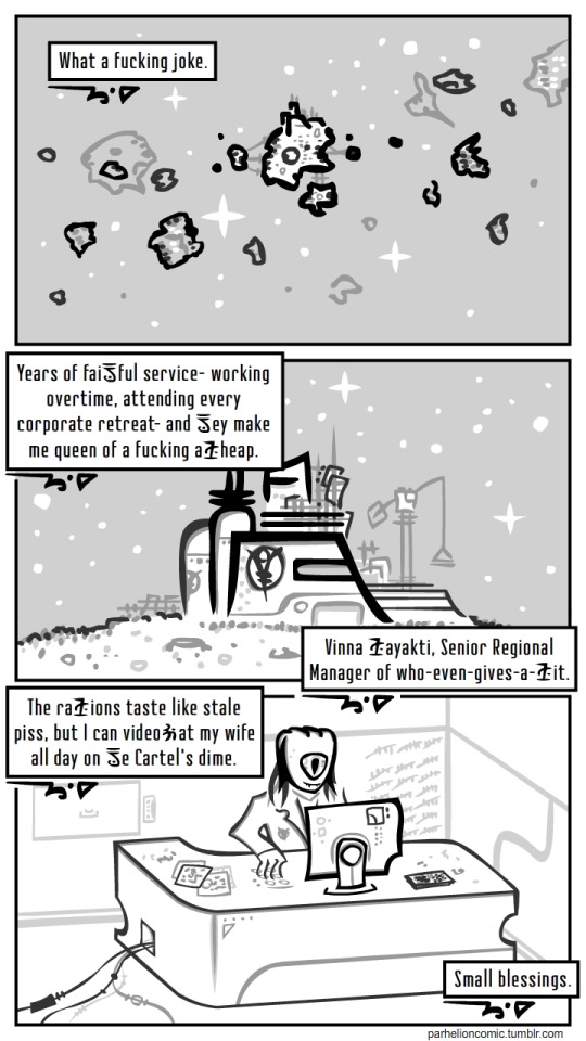
It isn't until the fourth page of chapter two that Peter and Cerril officially become partners, with a little light comedy that reminds me a little of C-3PO's pitch to uncle Owen in Star Wars IV, except that Cerril is arguing against going with Alison. (That may have a lot to do with my already saying Cerril reminds me of C-3PO.)
While the writing on this page is good and Cerril's body language is well done, the page as a whole has several trouble-spots. There are several ways the first panel could have been composed without letting the dialog cut into the top of Alison's head. While it's not hard to figure out in this particular case, dialog from a character off-camera is frequently shown as it is here in the 2nd and 3rd panel. This is problematic for a couple of reasons, one because there's no visual difference between these dialog boxes and a narration box. That's not confusing on this particular page, but I could easily see it becoming confusing on other pages. Second, and more importantly, I've seen a few more recent pages where this is done in a scene with three or more characters and it's not always apparent who's speaking. Use of colored dialog boxes or a small symbol indicating the character could resolve this issue, although as an artist myself, I would work a little harder to keep the speaking characters on-camera. I might still use the symbol on some infrequent occasions if I were having a really difficult time with the composition of a specific page. I just don't think the off-camera boxes should be a frequent occurrence... reserve them for when Dorothy finally meets the Wizard.
And on page six of the second chapter, we're finally on to our dynamic duo's first suicide mission (of many, natch). I'm pretty sure they have one of those hole-punch coupons, they get a free sandwich after every fifth suicide mission they complete. Loyalty is important, yo!
Don't worry though, the veteran Peter has a plan! Peter's plan is to show up unannounced to a definitely hostile, likely heavily armed facility, and say "Hi! I'm peter! Go fuck yourself!" Which, of course, works every time. No, seriously, nobody even mentions it being weird and they make plans with the manager of the hostile station to go get tacos later.
But Peter wants to to know you don't fuck with a space-pirate's tacos, you spineless corporate cuck!
And since Parhelion is more of a black comedy than an adventure (I'm sure it's in there somewhere), this taco tirade is the big mistake where shit gets real. (Yeah, no, it's totally not lazily waltzing in on a hostile, likely heavily armed base. That part was cake.)
I really like that dramatic last panel on page fifteen of chapter two, so that's where I'm going to end this review.
So there's my pitch. If you enjoy tongue-in-cheek space opera, surreal and experimental illustration, and gay space-pirates, it's worth a look at Parhelion!
If you are a webcomic author and are interested in a review from me, you can check out my announcement and my review rules here.
If you enjoy my reviews and would like to help ensure I'm able to continue publishing them, you can contribute on our Patreon or if you're short on funds you can also help me out by checking out and sharing my own webcomic, Woohooligan!
Thanks! Sam
0 notes
Text
Telling the Story of Graphic Design
Let me just frame this for you: we're going to take a piece of production UI from a Sketch file, break it down into pieces of information and then build it up into a story we tell our friends. Our friends might be hearing, or seeing, or touching the story so we are going to interpret and translate the same information for different people. We're going to interpret the colors and the typography and even the sizes, and express them in different ways. And we really want everyone to pay attention. This story mustn't be boring or frustrating; it's got to be easy to follow, understand and remember. And it's got to, got to, make sense, from beginning to end.
I've asked my colleague Katie to choose a component she has designed in Sketch. I'll go through and mark it up (we mainly use SCSS, Twig and Craft but the templating language is not very important), then she will respond briefly. Hopefully I'll get most of it right, and then one or two things wrong, so we can look at how things get lost during handoff.
In white label or framework type front-end, the focus is on building pieces that are as flexible and adaptable as possible, as content and style-agnostic as possible (within the scope of the product), because you simply will never know where the code is going and for what, ultimately it is being used. But recently I moved to a web design agency, which has a complete inversion of this focus. It is particular. It is bespoke. It's all about really deeply engaging with the particular client you have and the particular clients they have, and designing something that suits them, as a tailor would.
Working so closely with a graphic designer like Katie, with highly finished pixel-spaced UI, instead of directly from wireframes or stories is an adjustment and an education, but there are still lots of things I can bring to the table. Chiefly: document design.
Document design, which admittedly is just the old semantic web with an accessibility hat on, is really looking at graphic design, engaging with it as a system of communication, and translating the underlying purpose of the colors/type/layout into an accessible, linearizable, and traversable DOM. It's HTML, kids. It's just HTML. You'd think we all knew it by now… but look around you. You'd be wrong!
Katie has slung me a Sketch file chock full of artboards, and she's pretty great at writing out what she wants so I don't have to think too hard:
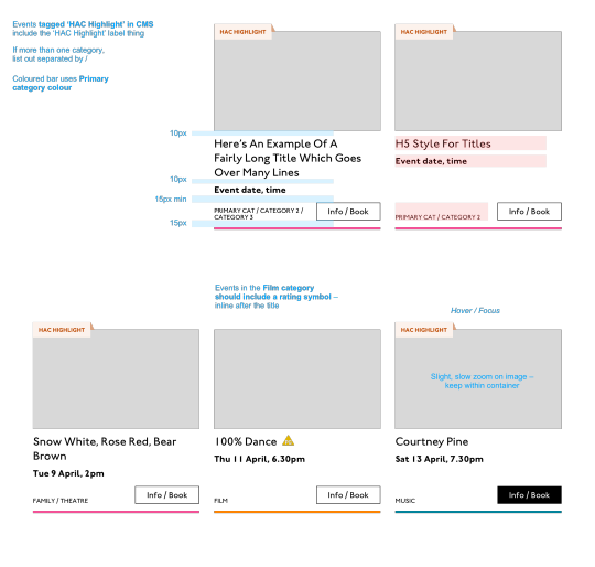
Event card
First I look through the whole UI file and figure out what is actually a card on this site — it turns out there are six or seven components that use this paradigm. Let's make some observations:
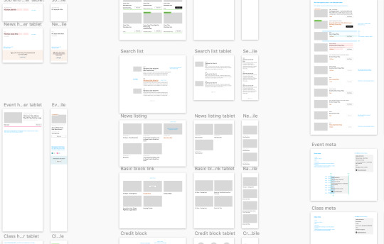
Zoom out on section of artboards

Another card, classes this time.
A card is a block of meta data about a page on the site.
It has an image/media and metadata — it's a media object.
It's shown in a group of objects.
That group is always typed (there's no view where there are search results and news articles and classes are all mixed up).
Each object has a single link to a page and no other actions.
Each object has a call to action (Book, etc.).
Each object may have times, categories, badges, and calls to action.
Each object must have media, title, and link.
So a card is the major way my user is going to find their way around this site. They are going to be clicking through guided pathways where they get a set of cards they can choose from, based on top pages like "what's on" or "classes." They're not getting options on this card. It's not really an interactive element — it's a guide, an index card, that sets her onto her path: in this case a purchase path where she books a ticket for a show at this arts centre.
Before going on, let me just frame this for you:
Imagine you were looking at a flyer for a show and discussing it on the phone. If you actually wanted to go to this show in real life. What would you do? You wouldn't just read the flyer out, would you? That's the text. And it might have all kinds of random stuff on it if you started literally at the top. You wouldn't start with "Twentieth Century Fox" or "Buy Hot Dog Get Cola Free" or "Comedy Drama Musical Family Friendly." (I would actually hang up on you if you did!) And you wouldn't simply describe the color or fonts. That's the CSS. You'd talk through the information on the flyer. You'd say, "It's The Greatest Showman and it's on Tuesday, starts at 7:30. It's at the Odeon on Oxford Street by the tram." Right?
This is the document. Keep that person on the phone in your mind.
Count, group, and name
So let's say we'll deliver a card as the inside of a list item. We want a group and that group should be countable. We've already named the page with an <h1> so we'll introduce and describe the group with a heading, an <h2>. First we'll name it, then we'll deliver it, so someone using a screen reader can:
Get the list signaled in the headings overview.
Get a count up front of the number of items on a page.
Know they can skip to the next list item to get the next card.
Know they can skip the group at any point and go to the next page — the pagination is the very next element and it will be labelled as a landmark.
See the Pen Cards delivered as a countable list with descriptive heading by limograf (@Sally_McGrath) on CodePen.
Anchor
In this particular case, I'm gonna wrap this whole card in an anchor element (<a>). There's only one link on the card and I want to front load that information so someone can click as soon as they know it's the right card, instead of having to search forward for the action. A big clickable area is nice too, though of course that can be taken too far and make an interface a sort of booby trap! But these cards are not too enormous and I can see they have a nice gutter around them, so there's a rest space that will reduce accidental clicking for people with more limited dexterity.
Title
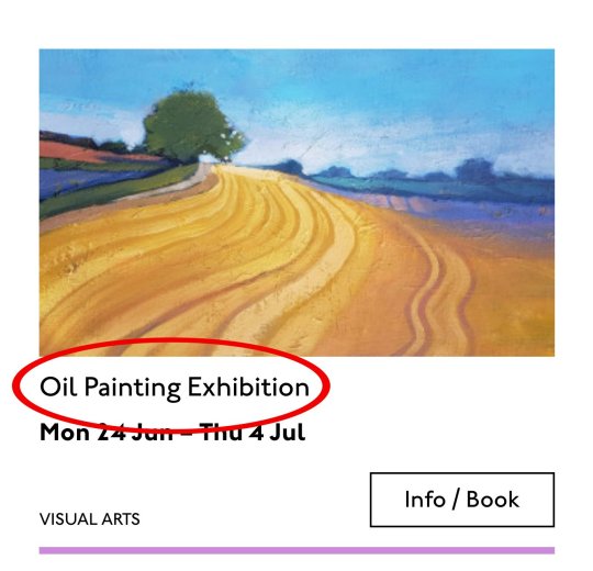
Event card "title" element
Then we'll jump down a heading level and mark up the name of each show as a heading, an <h3>. The designer has made this type the focus and we will too. Some people browse super fast by jumping to the next heading, then next heading, so I'm not going to put any important information before the heading — they'll jump right over it. I will put the image there, though, as I know in this case, I can't get meaningful image descriptions from the API so those images are hidden and have empty alt attributes. Now the user can guess (correctly in my case) that the developer is actually describing the content in some meaningful way and might flip back to headings overview (list headings level 3) and just get a list of the shows.
Now let's deliver our metadata. Let's list it:
Badge
Date/Time
Categories
Badge
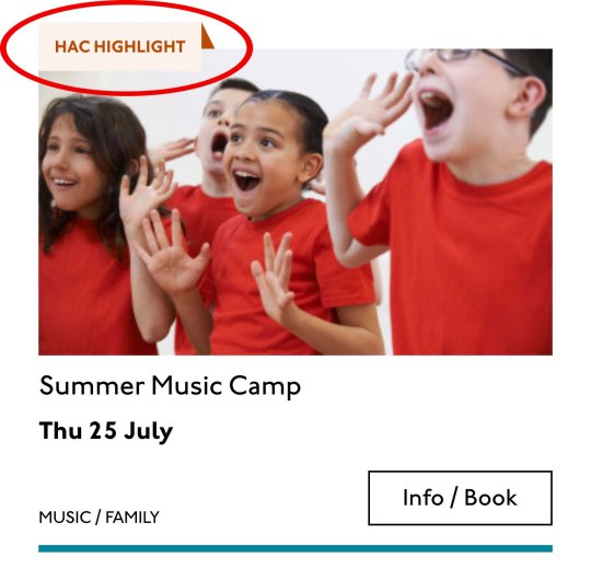
Event card "badge" element
This seems to be something the venue adds to a card to highlight it. As a developer, I can't immediately see why a user would look for this, but it's emphasized strongly by the designer, so I'll make sure it stays in. Katie has moved the badge up out of the flow, but I know that with a headings jump our user could miss it. So I'll just put the wording directly after the title, I think. I'll either put it first or last, so make it easier to account for in a non-visual browse and not be too crazy paving in a tabbing, visual browse.
<p class="c-card__badge"><abbr title="Harrow Arts Centre">HAC</abbr> Highlight.</p>
...But on second thought, I won't put an <abbr> after all. It's the brand color, so it's really a statement of ownership by this venue, and we've already said HAC a million times by now, so the user knows where they are.
<p class="c-card__badge">HAC Highlight </p>
See the Pen Badge by limograf (@Sally_McGrath) on CodePen.
A quick aside: the 'badging' is very specific to this organisation. They want to show people clearly and quickly which events they've programmed themselves, and which are run by other organisations who've hired their venue.
Date/Time

Event card "date/time" element
Now date and time. Katie is keying me in to this decision point by styling the dates in bold. Dates are important. I'm going to pop it in an h4>, because I'm thinking it looks like someone might be quickly scanning a page of events looking for the matinee, for example, or looking for a news article published on a particular day. I don't always put dates into headings, especially if there are millions on a page, but I do always make sure they're in a <time> element with a complete value so the <time>Thu</time> or <time>Mon</time> Katie has specified is read out as comprehensible English words "Thursday" instead of garblage. I could also have used hidden completion or <abbr> with a title.
Categories/ Tags

Event card "categories/tags" element
Next come the categories, and I'm putting them after badge and date. This section is next in the visual order reading top-to-bottom, left-to-right, of course, but it also seems to be deprioritized: it's been pushed down on the left and the type is smaller. This works for our linear storytelling. As a rule, we don't want people to sit through repeated or more general content (cinema, cinema, cinema) to get to unique or more specific content (Monday, Tuesday, Wednesday). Remember, we are inside our card: we know it has already been sorted in a few general ways (news, show, class, etc), so it's likely to have a lot of repeated pieces. We want to ensure that the user will go from specific to general if we can.
There is a primary category that is sorted first and then some other categories sometimes. I won't deliver this as a countable list as there's mostly just one category, and loads of lists of one item is not much use. But I will put a little tag beforehand because otherwise it's a slightly impenetrable announcement. MOVEMENT! SPOKEN WORD! (I mean, you can work it out retrospectively, but we always try to name things first and then show them, in linear order. This isn't Memento.) I used to use title="" fairly heavily but I've gotten complaints about the tooltip so I route around. Note the use of colon or full stop to give us a "breath." That's a nice bit of polish.
<p class="c-card__tags h-text--label> <span class="h-accessibility">Categories: </span> </p>
Also I'm hard-coding in my spaces to make sure the categories never run together into complete garblage even with text compression or spaceless rendering turned on somewhere down the pipeline. (This can happen with screen readers and spans and it's rather alarming!)
There's a piece of this design I will do in the CSS but haven't really pulled into the document design: the color coding on primary category. I am not describing the color to the reader as it seems arbitrary, not evocative. If there were some subtextual element to the color coding beyond tagging categories (if horticultural classes were green, say), then I might bring it through, but in this case it's a non-verbal key to a category, so we don't want it in our verbal key.
I'm sorting the primary category to the front of the category paragraph, but I'm not labelling it as primary. This is because there's a sorting filter before this list that sorts on primary category, and it's my surmise that it would be easier and less annoying to select a category from that dropdown than to read through each card saying Categories Primary Category Music Secondary Categories Dance. I could be wrong about that! Striking a balance between useful and too much labelling is sometimes a bit tricky. You have to consider the page context. We may be building components but our user is on a page.
See the Pen Dummies in page context by limograf (@Sally_McGrath) on CodePen.
Action

Event card "action" element
Last, the action. The direction to the user, to Book, or Learn More, or whatever it is, has been styled as a button. It's not actually a button, it's just a direction, so I'll mark it up as a span in this case. I definitely want this to come last in the linear document. It's a call to action and also a signal that we've reached the end of this card. The action is the exit point in both cases: if the user acts, we go to the target entry; if they do not, we go to the next card. We definitely never want any data to come after the action, as they might have left by then.
See the Pen Card by limograf (@Sally_McGrath) on CodePen.
My conclusion
This markup, which counts, groups, and names data, delivers linear and non-linear interactions. The page makes sense if you read it top to bottom, makes sense if you read parts of it out of context, and helps you jump around.
Katie, over to you...
Katie Parry, designer
What an ace article! Really interesting. (I particularly like that "Mon," "Tue," etc. on cards are read as "Monday," "Tuesday"... smart!)
One thing that struck me is that using assistive tech means users get information served to them in a "set" order that we've decided. So, unless there's a filter, someone browsing for dance events, for example, has to sit/tab through a title, badge, dates, and maybe several other categories to find out whether an event's for them or not. Bit tiresome. But that's not something you've got wrong — it's just how the internet works. Something for me to think about in the future.
Most of our clients are arts and cultural venues that need to sell tickets for events so I design a lot of event cards. They're one of the very first things I'll work on when designing a site. (Before even settling on a type hierarchy for the rest of the site.)
Thinking visually, here's how I'd describe the general conventions of an event card:
It must look like a list – so people understand how to use it.
It needs to provide enough information for folks to decide if they're interested or not. (The minimum information is likely an image, title, date, and link.)
It needs to include a clear call to action — usually a link to find out more information.
It needs to be easily scannable, visually.
Making information visually scannable is a pretty straightforward case of ensuring every information type (e.g. image, title, date, category, link) is sitting in the same place on every card and follows a clear hierarchy.
I focus a lot on typography in my work anyway but clearly: titles are styled to be highly prominent; dates are styled the same as each other but are different from titles; categories look different again – so that folks can easily pick-out the information they're interested in from simply scanning the page. I'm composing the card for the user, saying, "Hey, look here's the event's name, this is when it's on — and here's where you go to get your tickets!"
The type styles – and particularly the spacing between them – are doing a lot of work, so I will point out here that the spacings are not quite right in the code sample:

Spacing between the title and dates, dates and button, and button and piping don't match the design.
This is important. Users need to be able to scan information quickly as they aren't all looking for the same thing in order to make the decision to go to an event. Too much or too little space between elements can be distracting.
Here, let me tighten that up for you:
See the Pen Card with accurate spacings by limograf (@Sally_McGrath) on CodePen.
Perfect!
Some people just want a general mooch at what's coming up at their local venue. Others may have seen an advert for a specific show that tickles their fancy, and want to buy tickets. There are people who love music but don't care for theatre who just want a list of gigs; nothing else. And some folks who feel like going out at the weekend but aren't that fussed about what it is they go to. So, I design cards to be easy to scan — because most users aren't at all reading from top to bottom.
Despite the conventions I just laid out, cards certainly don't all look the same — or work in the same way — across projects.
There is always a tension in web design between making an interface familiar to the user and original to the client. Custom typefaces and color palettes do a lot here, but the other piece of it is through discovery.
I spend time reading-up about a client, including who their audience is by reading what they say on review sites and social media, as well as working directly with the client. Listening to people talk through how they work, what feedback they get from their audience/users often uncovers some interesting little nuggets which influence a design. Developers aren't typically involved much in discovery, which is something I'd like to change, but for now, I need to make it super-clear to Sally what's special about this event card for each new project. I write many, many (many) notes on Sketch files, but find they can tend to get lost, so sometimes we have a spreadsheet defining particular functionality.
And soon a data populator instead! :P
See the Pen Cards in page context, scraped from production by limograf (@Sally_McGrath) on CodePen.
The post Telling the Story of Graphic Design appeared first on CSS-Tricks.
Telling the Story of Graphic Design published first on https://deskbysnafu.tumblr.com/
0 notes