#it may be low quality screencaps
Explore tagged Tumblr posts
Text

corporate doesn’t want me to share the thoughts he’s provoking in me today
#THEY WON’T STOP ME I WILL SHARE ANYWAY#this is maximus settling down for the night and preparing to absolutely ***** my ****** and *** my *****#all my thoughts are redacted for general maximus#he inspires such longing such passion such devotion#I LOVE HIM#the armor only adds to the appeal#he may be covered from the neck down by by gum you can’t hide a man who’s built like a PILLAR#the way i need him to pull me behind that curtain and make me his#y’all. the thirst is real today#i am BEGGING him to marry me and let me bear his children#make me a traditional housewife i don’t even care anymore#save me big strong noble kind-hearted warrior save me#he’s so intensely precious and i want to both hug him and bang him senseless#we were made to be together i know it#one day#one day my delusions will become reality#gladiator#maximus#maximus decimus meridius#gladiator 2000#russell crowe#low quality screencaps of a high quality man
11 notes
·
View notes
Note
HELLO, I am here to ask how in THE WORLD do you get a trailer to look so good in gifs? every time I go to do something from a yt video....it always turns up, for lack of a better word, shitty. WHAT ARE YOUR SECRETS besides sheer talent?
aww thank you! but i agree, giffing from youtube videos is THE WORST i try to avoid it, but when WOT trailer season comes around, we have no other choice! in my explanation, i'll only talk about the tools i use, and if you don't have those tools and instead use other tools then i unfortunately won't be able to offer any insight because this is the way i've been making gifs since 2012 haha i am very set in my ways at this point!
my guess is that it might be more to do with the manner of capturing the video than any photoshop settings, because i've found that the quality of the source material is the biggest factor in the quality of a gif. when giffing from youtube (and from all other places), my method is to simply screenrecord the video as it plays in its original player, rather than download a copy of it. this may not be the H-est Q way to do it, but it's good enough for my taste!
i use the free xbox windows app, which has a screenrecording function in it:

then on youtube, i make sure the video is on the highest possible quality setting (so actually clicking on that setting rather than leaving it on the auto-quality default). i right click to loop the video, fullscreen it, start recording my screen, and start playing the video towards the end so that the youtube player will fade away after a few seconds and the video will loop back to the beginning and i can then have a clear screen throughout the whole thing (rather than starting my recording right at the beginning of the video and having the youtube player visible for the first few seconds).
i also suspect that youtube videos miiiiight take a bit of time after uploading to fully process the HD version - for example, i recorded the WOT trailer immediately after it was uploaded, but when i was giffing the next day, i went "wow this shot of nynaeve looks so bad" and went to try to re-record that shot, and sure enough it was noticeably better quality that time. (and i probably should have done the same for the entire trailer, but by that point i'd made a bunch of the other gifs and they were Fine Enough so i couldn't be bothered to redo all of them.) so it might be worth waiting some time after the upload to get your recording, or perhaps letting the whole video play through once to fully buffer as the HD version and then recording the second play? i'm totally just guessing here, who Really knows what caused a quality difference in my two recordings! but if you're screenrecording and notice a low quality shot, it never hurts to at least try to re-record it again and see if it's better that time; internet video players can be finicky in how good the quality is at a given moment.
next i go into photoshop. i've always used the "import video frames to layers" method for giffing, wherein you select that option in photoshop, pull up the video you're using, and highlight the portion of the video you want to turn into a gif, and then photoshop converts it into individual frames for you (i get the sense that the screencapping method is more popular, but it seems so confusing to me, so i've never tried it!)
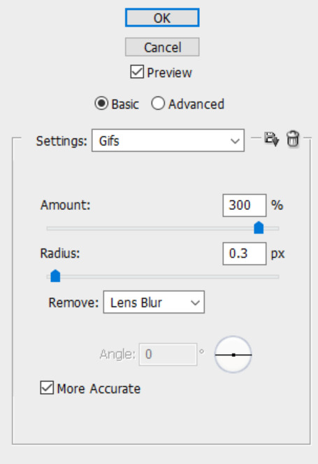
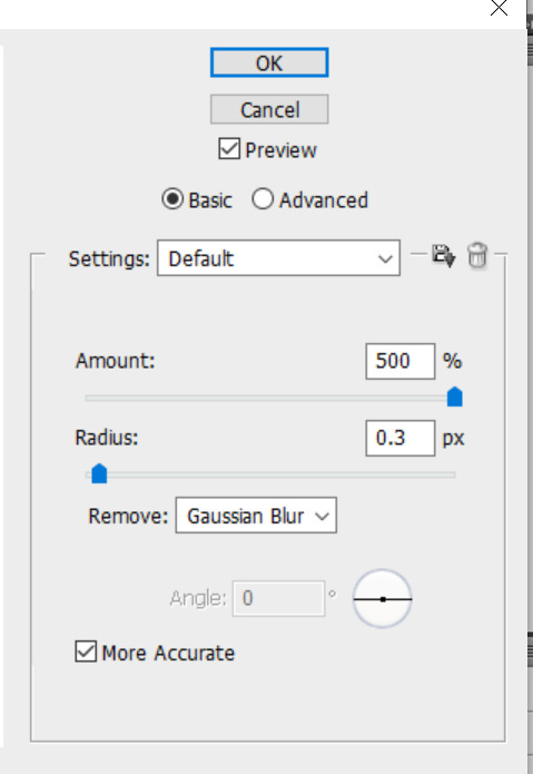
finally, these are my sharpening settings (using photoshop's "smart sharpen" filter). the one on the left is my usual setting for gifs, which is a more dramatic sharpening, and the one on the right is my milder sharpening settings, which i tend to use for screencaps/still images - i also used these milder settings on my youtube trailer gifset because i found that with the lesser video quality (compared to a gif from an actual episode recorded out of the prime video player), the more dramatic sharpening settings made it look kinda grainy and harsh, so the subtler sharpening ended up being better for those particular gifs.
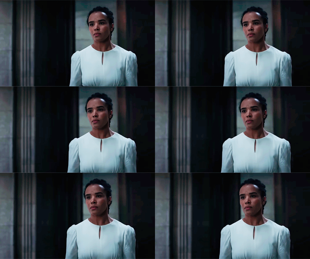
so, that's the basics of my process! like i said, i think the quality of the giffing source is by far the most important factor, and i've found that for youtube videos, screenrecording the HD version straight out of the youtube player works pretty well in maintaining as much of the original quality as possible. you can see here my 2 different recordings of the nynaeve shot. they have the exact same sharpening settings and coloring, but #1 is noticeably blurrier/more pixelated and it's solely because youtube was apparently in a better mood the second time and gave me a better-quality version of that shot for my recording.

16 notes
·
View notes
Text
Favorite Movie Costumes (pt. 1)
Recently got the line-up-your-toys urge to list and discuss my favorite tv and movie costumes-- my favorites are many and tumblr's image limit is low, so I'm not sure how many posts this'll eventually spread to, but here's the first crop.
The Queen's red gown - The Brother's Grimm
I don't think anyone on earth wanted to love this movie more than I did when it came out-- sadly, the film itself was generally a letdown. However, its costumes absolutely delivered, which should come as no surprise since they were designed by Gabriella Pescucci. The costumes for Monica Belluci's queen are my favorites of all, but this piece, the one she wears for most of the movie, may be my favorite costume of all time.
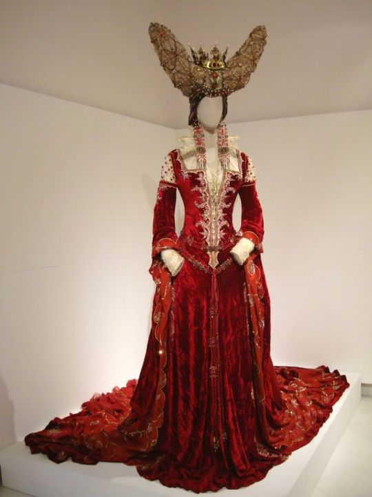

The costume has several iterations; it's paired most prominently with her enormous horned headdress (my fave), but she also wears it with a more delicate tiara.
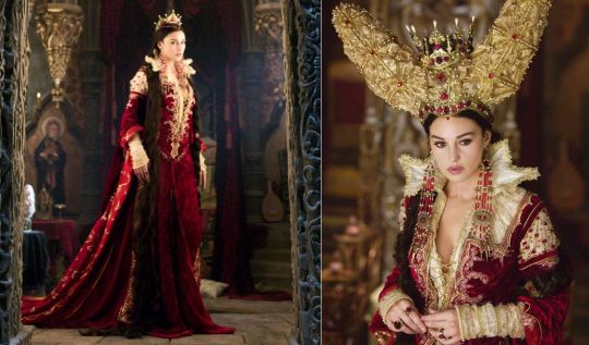
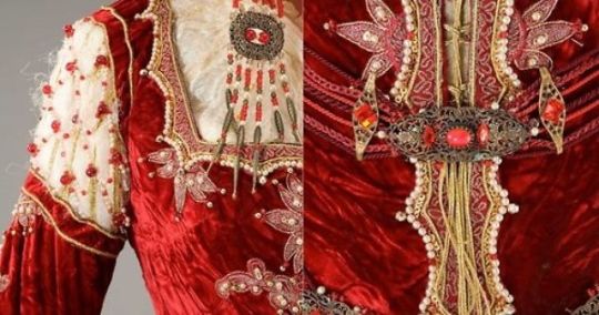
Marianne de Morangias' red riding habit - Brotherhood of the Wolf
Although Brotherhood of the Wolf is far from a good movie, I have a terrible soft spot for it, which is mostly due to its wonderful costumes, including a crowd of hunting costumes throughout, none more gorgeous than the one Marianne's debuts during the film's first hunt.
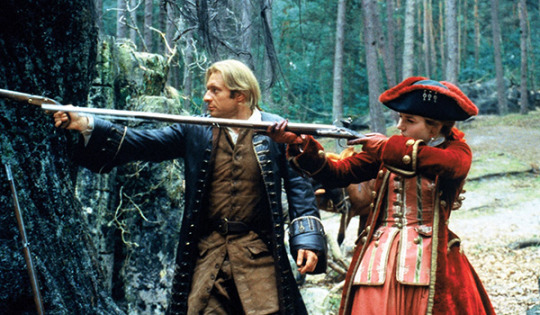
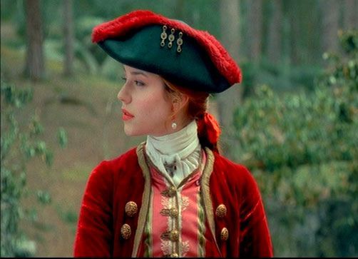
I probably owe my love of riding habits to American Girl's Felicity and her swoon-worthy green velvet habit-- they are sadly underused in movies (meanwhile Marianne not only wears this red habit, but also shows off an equally beautiful green one later.)

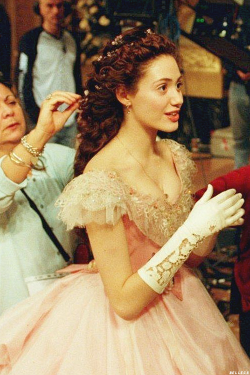
Christine Daae's masquerade dress - The Phantom of the Opera
Fun fact, I watched this movie as a teenager (after falling in with the inescapable junior high theater nerd crowd, who tried unsuccessfully to use this as a gateway drug to getting me hooked on musicals), then forgot about the vast majority of the costumes, and stumbled upon it again years later without realizing it was from a movie and completely fell in love with it.
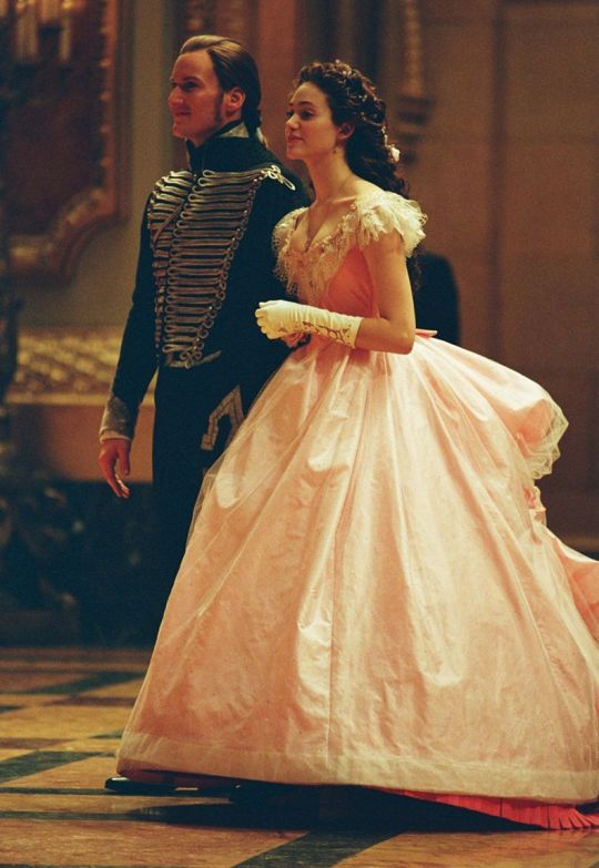
I'm very fond of the early 1870s silhouette in general, long trains in particular, and the back of this one is what really sold me. The frothy layers of chiffon?? the flowers?? the graceful tiered bustle?? Obsessed. (Another fun fact, this is one of the references I always bring up when discussing potential wedding dresses.)


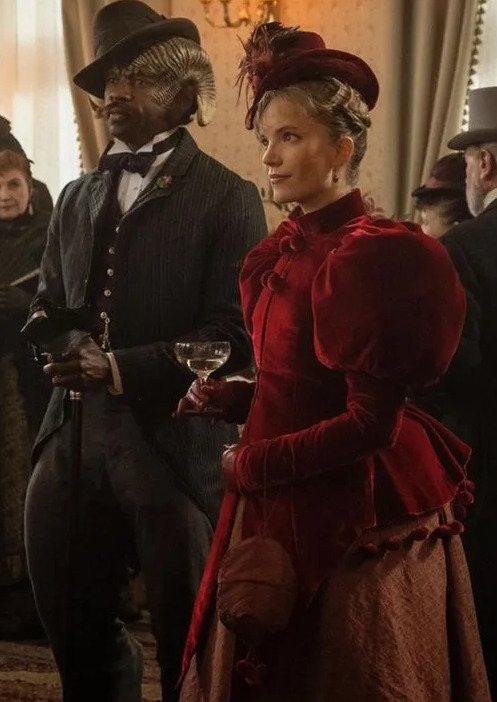
Imogen Spurnrose's red ensemble - Carnival Row

I know, another red velvet number ¯\_(ツ)_/¯ Imogen's wardrobe is full of lovely quasi-Victorian pieces, but this one had me GASPING when it came on screen. These pictures do not do the color or vibrancy of that jacket justice!

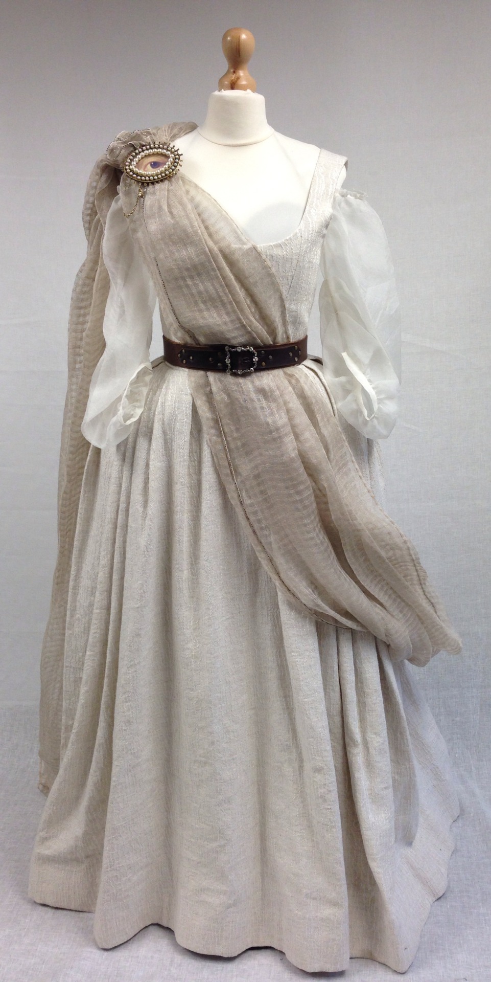
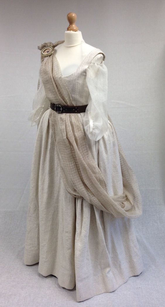
Geilis Duncan's white ballgown - Outlander
I'm usually not a fan of stripped down historical styles, especially ones this anachronistic, but something about the minimalist design of this dress just charmed me.

It reminds of in some way of artistic undress in 17th century portraits, and the lightness of the colors and material has this clean, airy, almost White Lady quality to it, and the simplicity and limited accessorizing really brings out the period silhouette. (Also I adore lover's eyes).

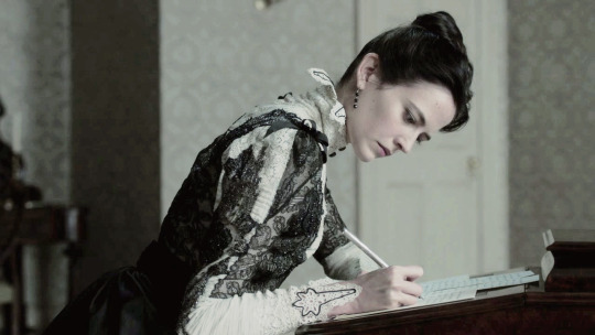
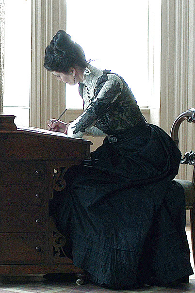
Vanessa Ives' lace blouse - Penny Dreadful
Vanessa has a gorgeous wardrobe (Gabriella Pescucci hitting it out of the park again) containing a number of delicate black and white blouses, but this one is my favorite.

The design is not that complex, but the wealth of tiny details, especially the petal shaped blackworked collar and cuffs, give it a huge visual punch; paired with the decorative belt and beautiful black skirt it's a very unique look that shows off some of the most beautiful elements of the period (last photo courtesy @periodcostumefantasylover)
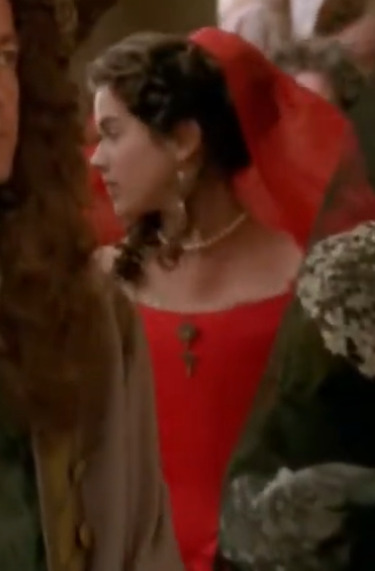
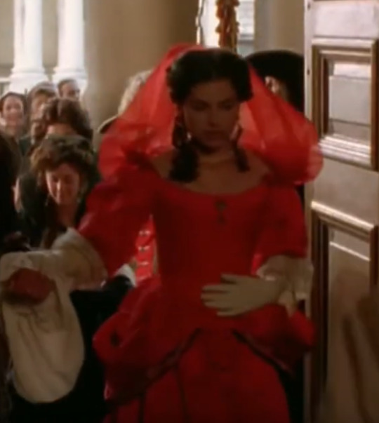
Lorna's church dress - Lorna Doone
YES another red number. And what a red!! This miniseries is so obscure I had to do my own (butt ugly) screencaps off Youtube, but despite being a fairly modest production, they do some nice 17th century looks in it.

This dress is glimpsed for a moment as Lorna catches sight of her separated lover through the crowd-- very dramatic, but unfortunately it means getting a good look at the beautiful dress is hard, but I did my best: here's the actual scene, if you want a better look (and I'd recommend the series, too!)


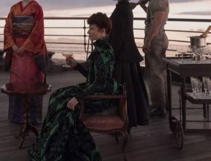
Virginia Wilson's Worth dress - 1899
Big shock, the replica House of Worth dress made it in *Oprah shrug* I've adored the original dress for years, so I went nuts seeing it on the show! On top of just top tier everything, the costuming on 1899 was great, and the fact that they decided to throw this dress in was just the cherry on top.
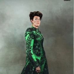
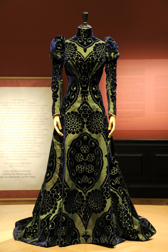
There are some minimal differences between this dress and its inspiration, most notably the change in pattern-- Virginia's dress not only incorporates the alchemical logo like all the rest of the characters, but the rounded edges in the original are all made jagged to match it, as you can really see in the last photo.

---- on to part 2!
126 notes
·
View notes
Note
I feel like you are missing the forest for the trees on the fanfic thing just because you keep insisting that there is good fanfic out there and pretty much nothing else. Like yeah obviously. But also bad fanfic has merit, has purpose. Fanfiction provides a relatively low risk space for people to experiment and learn how to write. How many Bad Fanfics are written when people are like 13?
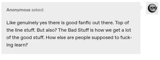
Hello! I've included your second ask as a screencap so I can respond at the same time.
I agree with you, quite a lot actually. I think maybe these comments come from the fact that I could have made it much more explicit in my other post that part of "finding what you like" in fanfic means reading and enjoying stuff that isn't perhaps the best written, for whatever reason. Maybe the author struggled experimenting with characterization or narrative arc, but the idea of their story is unique and cool enough to read anyway. Maybe the author struggled with formatting, or some other thing that makes it hard to read. The important other aspect of consuming fanfiction (and media in general, but that's it's own post) that I didn't really touch on to keep an already long post from getting longer (but should have, if you're thinking I'm out here saying I think people should only read 'good' fanfics) is getting comfortable with engaging with things that bring you enjoyment even if others think they are 'bad.'
I don't really think I've been trying to imply that there are only the "quality" fanfics worth reading and everything else is just shit, but I can see how that might have come across given the way I pointed to how some fics go the extra mile as an example of why it's wrong to characterize all fics as badly written. I think maybe we're talking in different directions about two conversations within fanfic discourse that can coexist with one another. My previous post was more about people who disregard ALL fanfic because some of it is, in their opinion, poorly written, and how this may come from not engaging with the medium. What you're really getting at with these asks is the idea that all fanfic has merit in some form.
And you are right! People's efforts to put themselves out there and try writing, whether they are 13 or 30, and crucially regardless of whether or not their writing skill ever improves, have value! To me, it's not really even a question of 'writing bad stuff to get good later.' It's more of 'all attempts at creativity have inherent value.' Someone's bravery to post their fic as a teenager should be applauded just as much as a seasoned fic writer who's been doing this for a long time.
I think we are both on the same page when it comes to understanding why all this matters. I could have made the underlying point of 'fanfic is worth reading if you decide its worth reading' much clearer in what I wrote earlier, and I'm sorry about that!
14 notes
·
View notes
Text


May 1991 - Lee Starkey and Ringo Starr at the opening of hers and Christian Paris' shop "Planet Alice" Boutique, in Melrose Avenue, Los Angeles, USA.
These tiny and very low quality photos/screencaps come from The Beatles on Film website, where it says it was aired on the Channel 7 News on June 1991 (I cannot find it on the IMDB). Nowadays it can be found in a rare Ringo video collection, “"Ringo 1989-1991" (FFD Productions) (cover below).

#Lee Starkey#1991 Lee#Planet Alice#Lee boutique owner#boutique owner#Ringo Starr#make up artist#makeup artist#stylist#fashion designer#fashion stylist#Beatles on Film#screencaps#Channel 7 news
11 notes
·
View notes
Note
I actually have some info on Springy And The Galaxy Gears. So, I have a (now passed) relative who worked for the company I'm pretty sure developed SATGG before it was scrapped.
In his attic, he had a floppy disk which contains a more experimental version of the current discovered version of the game. This version is actually a fairly complete game. FMV cutscenes are implemented, but use low-quality screencaps of storyboards and sometimes distort heavily. Multiplayer modes (being a CO-OP version of the Story Mode and a weird split-screen/LAN-based Last Man Standing mode) are included, but LMS maps seem to be unfinished and offline enemy AI seems to be glitched.
He also had an Atari Jaguar cartridge for what I assume to be a port intended for side-by-side release with the PC version. The game is similar, but in a 2.5D style. Maps, albeit modified to make use of the 3D-ish rendering with various turns and effects, are carried over but with a decent amount lacking textures for the extra dimension of view. Most enemies are implemented, but quite a lot use their original sprites as placeholders (I may have to note that this build used a Doom-like method for most in-game things in rendering sprites with rotations for each object/character instead of using models). The multiplayer story mode is included, and a strange split-screen deathmatch mode is added in place of LMS using the same maps. While there are fully completed sprites for second, third and fourth characters, none of them seem to be implemented as a recolored Springy takes the place of every multiplayer player character.
Oooh, interesting! Could you send us some footage from the disk, if you'd be so kind? -Mod Liam
4 notes
·
View notes
Text

ARCANUM NIGHTS : SECRET REVEAL 001
Glass House is known for its quiet and serene comfort during the day. Wisteria welcomes you in and taps your shoulder on the way out. Tonight, the venue is enticing with loud music coming from inside it's courtyard— but you can only get in with an invitation.
However, being a guest isn't just a prize tonight. Secrets that threaten the halos of Los Angeles favorite angels are woven into the decorations of the celebration for Glass House. They're subtly attached to the most simple of components, which could drive anyone to a paranoia to keep the rest from seeing if anyone's noticed at all.
Projected on to the walls during the DJ's take of the night, a silhouette paints the walls every so often from what appears to be footage of a low quality camera. No faces are shown, but certainly someone in the city knows the curve of those lips if not the body that dances for the camera. Most guests brush it off as a female model from stock footage, but there's a chance they know the sounds of pleasure that fill the space between songs.
Every napkin served with a signature cocktail has printed receipts and scrawled lines of debt. Names are cut out but there's no denying that even with the weakest of math skills, the total would make even the rich have their stomachs turn. All receipts, put together, come to a grand total of over 600,000 dollars.
In the restrooms, the speakers that are meant to carry the music into every corner of the venue seem to have an interference. Every so often, the music is drowned out by a voice that seems to be coming from a different source. The voice is that of a woman who seems to adamant about having papers signed, and follow up with contracts. No name can be heard except key points such as 'the show', 'the NDA', and 'the baby' which makes it evident that this is a private conversation.
Menus for drinks and food come with a superimposed photo in the background, but the details aren't given much thought when you're trying to read small text to order some grub. If you pull back farther enough, you'll see a surveillance footage screencap of a blonde taking an item from a store and then walking out the door.
Formal pamphlets explaining the success of Glass House can be found at the front. However, on some pages the history of the club house has been replaced with a poorly printed copy of a form from Planned Parenthood dated 2014. The names are hard to read, but there's a signature that is cut off in the printing signing as consent that may be familiar to those in a smaller industry. The loop of an R can be seen cut from the edge of the paper.
Printed on speciality drinks with cream on top is an image of what seems to be mugshots but the identity fizzles away quickly. The machine has yet to be perfected in its printing, but surely they'll fix it before the end of the night. With every drink, they're a little bit closer to making a clear image of a man with a strong jaw, a wide nose, and the curve of his ears beside his head.
Flashing the screens behind the stage every is a scroll through a set of text messages, though it's hard to read. If you pay any mind, the same set of words seem to be easier to read— are you sure, is it mine, how do you know, have you tested.
1 note
·
View note
Text
Hi hi there!
Another day, another bottle thrown into the sea tumblr, looking for help!
As you may have noticed, I really enjoy editing avatars & icons from various period pieces. And I would like to continue to expand my horizon a little and work on some turkish period dramas like Muhtesem Yüzyil, Saladin, Dirilis: Ertugrul, etc.
But my main issue, everytime I try to edit on such shows, is that I simply can't find HQ stills to work on... I only get low quality screencaps, overexposed... (I think it's because I'm based in Europe, with no clue where to look).
So I was wondering if you knew a website (or many) where I could find such pictures? Like, is there a Farfaraway for turkish dramas? Or am I doomed to get scraps from Pinterest?
Thank you in advance for your help 🥺🤗
1 note
·
View note
Text
good people // kim namjoon, loki laufeyson


#bts#bangtan#kim namjoon#bts rm#loki#loki series#loki spoilers#tom hiddleston#marvel#mcu#it may be low quality screencaps#i apologise
18 notes
·
View notes
Text
"This party is boring, I should leave."

"This is my birthday party"

#Fallout#Fallout 4#Danse#Paladin Danse#sry i had to#your low quality shitposting brought to you by yours truly#screencaps from my console#the image may not look proportionate on desktop i only did this with my phone sry fam
48 notes
·
View notes
Note
Katherine i think it'll be fun if you'll rate GJ dramas. please ❤️
I'm not particularly good at subjective rankings, so I've decided that the best way to do this is to come up with some scoring categories that sum up what I think we can all agree are the necessary qualities in a GJ drama. These are:
Homoeroticism
Manhandling
Sugar baby behaviour
Puppy eyes
Shirtless scenes
I've only seen (enough of) four of his dramas to give them a proper rating, but if anyone who's seen more would like to add to this then please do!
Word of Honor

Homoeroticism ✅
Manhandling ❌
Sugar baby behaviour ✅
Puppy eyes ✅
Shirtless scenes ✅
Total: 4/5
The only major loss is on the manhandling front. Unfortunately Zhou Zishu restrains himself to arm punches and minor shoves despite the fact that Wen Kexing would clearly love a nice bit of manhandling. All the other categories are checked off though, so Word of Honor is a strong start!
Advance Bravely

Homoeroticism ✅
Manhandling ✅
Sugar baby behaviour ✅
Puppy eyes ✅
Shirtless scenes ✅
Total 5/5
To be honest with you, I'm seeing a flaw in my scoring system. Or maybe it's a good system and this explains why it lives in my head rent free. Either way, it ticks off all the categories but at what cost?
Begin Again

Homoeroticism ½
Manhandling ✅
Sugar baby behaviour ✅
Puppy eyes ✅
Shirtless scenes ✅
Total 4.5/5
The half mark for homoeroticism is because of vibes (and the fact Lu Fangning keeps flirting with girls) but poor Ling Rui doesn't have any time to get a boyfriend between his busy hospital schedule and his wife trying to sleep with him. Otherwise a solid score! Lu Fangning may be smaller than her husband, but she's not going to let that stop her from manhandling him.
The Love Equations

Homoeroticism ½
Manhandling ❌
Sugar baby behaviour ❌
Puppy eyes ✅
Shirtless scenes ✅
Total 2.5/5
Ooh a low scorer! Another half mark for homoeroticism because Zhao Fanzhou's roommate keeps asking him to check out his body but he's too busy making eyes at Zhou Xiao to pay attention. He does try and make her buy him dinner, but as he's the one who pays in the end I can't give a mark for sugar babying. I've not actually got to the shirtless scene(s) yet, but I've definitely seen a screencap from one. It's there.
94 notes
·
View notes
Note
Heya Flyboy.
I don't know if you've been asked this before, and I hope it's ok to ask...
How do you make such clean and smooth gifs? Every time I upload a gif to Tumblr it completely destroys the quality.
Alola!
So I went and had a look at your gifs to see if I could see what's up with them. Your frame rate and colouring and sizing and everything is fine, so nothing has jumped out at me 💙
I think some of it may be an ACNH thing. The Switch produces beautiful screencaps of the game, but the videos are horribly low quality, and you need your source videos to be as HQ as possible for any gif you make. You wanna aim for 1080p as standard with 720p as a last resort.
I made like, one AC gif years ago and never again. The quality doesn't do the game justice.

You've got the process down pretty good 😄 So all I can suggest is that you try experimenting with settings. Gifs can be up to 9.99MB so you have lots of room to play. Try swapping between perceptual, adaptive and selective in the settings. Always aim for 256 colours. 128 is your bare minimum for Tumblr. Only go below 128 if you're absolutely desperate or if it's a black & white gif.
One trick I used to use back in the 1MB/no pink or blue/2MB/4MB days, was when gifs got really grainy because they were down to 128 colours and Johnny just = grain in every gif ever, try putting a texture over the top and setting it to overlay or whatever looks good. It helps to smooth out grain for those Johnny stubborn gifs that refuse to look shiny.
I hope that helps somewhat 💙
#Ask Scott Anything#i've been making gifs since 2009 and the software's changed but the methods generally remain the same#HQ source and as many colours as possible#<33
11 notes
·
View notes
Text
this may sound strange but i'm struck by how beautiful star trek is visually. like TOS is very unique and the set design and shots can be really impressive! TNG has some really incredible colouring and shot composition. idk it's just sometimes so genuinely beautiful to look at.
this is a low quality screencap, but the colours in this? the set details? on my screen it looks amazing...

anyway i don't actually have anything important to say. just. star trek <3
5 notes
·
View notes
Photo


#wwe#xavier woods#now you may be asking yourself#what led to this decision of horribly bright low contrast gifs and pastel pink#and the answer is: the gifs are shit#the screencap quality is shit#my talent with making content is shit#but i'll be damned if i wasn't posting something
14 notes
·
View notes
Note
Hey, if you don’t mind me asking. I’m making some icons for myself (badly to say the least) but they look blurry on tumblr even tho they’re 200x200 and looking fine on photoshop. Would you mind telling me how do you finish your icon so they look with good quality?
hi anon!! i'm honestly always still learning myself, so i don't know how much help i can actually offer you, but i'll give you some things i think could potentially be causing problems!
firstly, though, i want to direct you to soph's icon tutorial, bc tbh i still use it when i make my icons lol. she's really thorough and reading her tutorials is how i learned how to do a lot of the creating i do now! there may be steps in there you might not be thinking of bc i know everyone creates a little differently, so i think it's worth checking out if even just for a different perspective bc something in it might help!
the biggest thing i have, though, for anyone else who may be having the same issue, is to make sure you're sharpening your icon before it gets uploaded. that was the first thing i thought of that could be causing the blurriness issue, especially bc tumblr compresses images
more tips + maybe a mini tutorial? (we'll see! i'm not used to explaining my process so bear with me lol) under the cut:
(to start, actually, i want to say i always hate assuming lack of knowledge, so i apologize if you know any - or all - of this already!)
full disclosure: i actually always make my icons 300 x 300 because i like to be able to see them lol, but 200 x 200 should work fine, especially because they get smaller when they're viewed anywhere on tumblr anyway. but i wanted you to know in case any of my settings don't work properly for you specifically bc i'm using them for a 300 x 300 canvas! it's definitely worth noting this is just my method, so who knows how it goes for anyone else. it's probably wrong to someone 😅
so as for sharpening - as you'll see in soph's tutorial, do all your color editing and whatnot first, and then sharpen it! i have an action i found in one of the 3459083 gif tutorials i have used, so i unfortunately don't know how to get it to you, but i can tell you what it does! this is the way i sharpen gifs, but i find it works fine for icons too.
i'm gonna show you a screenshot of the action as a whole (which may look daunting at first if you're unfamiliar, but don't worry) and then explain each step in it with screenshots + my settings:
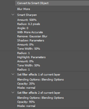
you're going to be using smart sharpen here, so you definitely want to select your image (the colored screencap or whatever) and convert it to a smart object first.
then, with that same layer selected, under filters, go to blur > blur more.
after that, go to the filters tab again, sharpen > smart sharpen. that will bring up a panel, and these are my settings:

i actually originally used 0.4 for my radius, which is what i generally use on gifs because i thought it helped make them look less grainy, but i legit just tried 0.3 on this icon and it looks better! imagine that! always learning, like i said. most folks use either .4 or .3 radius, though. but test them out! experiment! see which one looks best on your icon.
anyway! then, after you click OK and the smart sharpen window closes out, you're gonna click the lil lines over on your layer where you've smart filtered it and edit the percentages for both blur more and sharpen, as you can see in the following screenshots:


i usually stick to around 35% for blurring, but depending on how wonky the sharpening makes your image, you may need to increase/decrease the percentage. the point of blurring it is to offset some of that nasty graininess that comes from using smart sharpen.
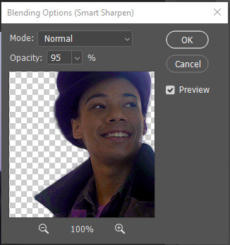
speaking of which! i usually wind up with my icons around 95% smart sharpening. as with blurring, this percentage really depends on how good/bad it looks as you tinker with the percentages. (like in the above screenshot, before i switched to 0.3 radius. even still, it will be tiny on tumblr, so i'm not SUPER worried about it, and sometimes having it be a little oversharpened can help it stay clearer when it's shrunk down)
and that's my sharpening done! i really think sharpening makes a HUGE difference when viewing images, especially icons. a lot of people will also paint over the colors on their icons to make them more vivid (which you can kind of see i did with jesper's shirt/tie thing).
the only other thing i would suggest is to also make sure you have enough contrast in the colors on your icon. i think if it's not contrasting enough, it could maybe look muddier when it's smaller. soph's tutorial has a lot of great tips on how to color icons and stuff to keep them vivid and contrasting too. (unless, of course, you're doing a pale/low-contrast one, in which case it may be less helpful lol)
anyway, i have no idea if this is what's been giving you trouble, or if you 100% know all this already, or if the issue is actually just tumblr, but that's how i get my icons to look crisper! i hope that if not my words but maybe soph's tutorial can help you, and i know she sometimes even links other outside tutorials in hers for even MORE in-depth help.
good luck!! 💛💛
#this got kinda long slfkjsdlfkjsd i hope literally any of this helped you!!!#i did try my best but again i'm decidedly not an expert lol#i hope your icon turns out well!!!!#b:answered#b:pshelp#anonymous
4 notes
·
View notes
Text

Low quality Gintama the final screencap(s) ( I may upload more )
5 notes
·
View notes