#it made me think a lot about where I actually draw inspiration from!
Explore tagged Tumblr posts
Note
do you have any favorite artists that you look up to?
I have spent a while thinking about this, because I do have certain artstyles that I really really admire and look up to 🎉
I've been gripped by the fantastic world of using a flat and angled lineart brush to draw everything recently, and that inspiration I took from artists on here, such as
@Wolfythewitch and @Crownorclower (I won't tag them, because I'm a bit shy to have them see this)
Wolfythewitch in particular I look up to their general style, particularly with painting realistically while still maintaining a stylistic outcome! I am a huge lover of the romantic-period (1800-~1870) and the Naturalism/Realism-period (Late 18th, early 19th cent.) paintings, so they just scratch all the parts in my brain with their art!
As for style and lines, I'm obsessed with @Zosanbrainrot, @Chippuyon, @Seagiri and themetalhiro
Real life artists, because I do look to actual paintings for inspiration sometimes 😭
I am obsessed with "P.S. Krøyer" paintings and the general "Skagens malere" of the romantic period.
"Hip! Hip! Hurra!", "Roser" and "Skagens jægere" are just a few of the ones I love from him!
"The woman in the garden" by Claude Monet and such paintings, they make me go completely insane, I love them so much
#ask#Thank you for the ask!#it made me think a lot about where I actually draw inspiration from!#I look up to A24 films as well for their cinnematography (and plots and stories of course but that's beside the point)#Robert David Yeoman's work on Wes Anderson movies as well!!
10 notes
·
View notes
Note
Hey, sorry if you’ve been asked this before, but I have ADHD and I’ve been following your comic for years and just now have started to write my own comic (partially because you really inspired me). But I’m really struggling with staying on the project even when it’s boring and getting myself to work on it in the first place. Do you have any tips on how to keep your brain invested or just to make yourself do the work at all?
I have excellent news, I literally just figured out something really important about this.
So when you're an ADHD kiddo or otherwise have difficulty staying on task in a structured environment where Task is the Priority, the main way people try to MAKE you stay on task is by removing your access to anything that is not The Task. No phone, no TV, no doodling, no going outside, etc. In practice, this just makes us miserable because it takes the boredom that's always simmering around a 2 or 3 and cranks it all the way up to 11. In the same way that you would have difficulty staying on task if you were in physical pain, this crushing existential monotony makes it very difficult to work. The work might get done simply because you have no other options, but it will not be done quickly or well, and it will take a while to recover from how much it hurt.
What I realized earlier this week is I caught myself doing this to myself. I had 42 pages of background colors to do, and I thought to myself "this sounds really tedious, but I suppose I have nothing better I can do." And I realized what I'd just thought, and got very alarmed.
Because back when I was an ADHD kiddo imprisoned by school scheduling and a million little factors that keep children immobile and restrained, I couldn't stop thinking about how big and exciting the world was, and how much I wanted to be anywhere but here. When I was feeling really crushed in I'd pick a random spot on the maps on my wall and just imagine being there instead of my bedroom. This was the impetus behind almost all of my creative energy. I've said it before - anything is a prison if you can't leave, and being in a prison makes it easy to imagine how amazing things could be outside of it. Aurora's initial worldbuilding was forged in the crucible of fifth grade misery. My enthusiasm for art and my creative drive are inextricable from my sense of wonder and yearning for excitement in the real world. Not escapism, but appreciation. Wonders unimaginable are out there, and I gain just as much joy seeking them out as I do conjuring them up in my head and sharing them with all of you.
So now that I'm a grown-up with actual freedom in every way I've been able to get, the idea that I was staying on task by making myself believe the world was small and not worth seeing was extremely alarming. It could keep me on task for an afternoon, but at the cost of slowly extinguishing the thing that made me want to make art in the first place - the hunger to experience and draw inspiration from all the myriad complexities in the world.
So what I've been doing is I've been purposefully and intentionally taking excursions whenever I catch myself thinking "I could take a break but it wouldn't be worth it, it's the same outdoors as always, I'll be uncomfy and unproductive and tired." Because that is never true. Every time I've put down the stylus and gone out, I've been renewed in one way or another, and when I come back to comfort fully recharged I get a lot of shit done. Because it is easier to work on anything if you remember why you wanted to make it in the first place, and it is self-defeating misery to just lock yourself in with it and tell yourself you're a bad person if you can't get it done.
I honestly don't know how widely applicable this is. I have worse wanderlust than anyone I know, so for me this has always been modeled as imprisonment vs freedom. I've also been extremely lucky to find myself in a profession that lets me set my own pace on literally everything I do. But I genuinely believe that when it comes to making art with ADHD, you need to give yourself freedom to move laterally, not just in the direction of obvious forward progress. We don't think linearly in any other part of our lives - art is no different.
1K notes
·
View notes
Text

Creator Spotlight: @jdebbiel
Deb JJ Lee is a non-binary Korean artist based in Brooklyn, NY. They have appeared in the New Yorker, New York Times, NPR, Google, Radiolab, and more. Their award-winning graphic memoir, IN LIMBO, about mental illness and difficult relationships with trauma, released in March 2023 from First Second.
Below is our interview with Deb!
Have you ever had an art block? If so, how did you overcome it?
That implies I am over my art block, but I’m still in it! I think about Kiki’s Delivery Service a lot and how she had to stop doing a thing, and that you can’t really force it, and you have to let it come back to you. It’s a pretty humbling moment, realizing there is more to life than just drawing. I’ve been trying to consume other content like reading or watching movies—anything that is not drawing-related—and to trust that it will come back to me. I think not being afraid to do the small pieces before committing to the big pieces is helpful. Because big pieces are what I am known for, I dig myself into a deeper hole, thinking that each piece has to be bigger than the last one. So yeah! Relaxing and doing the small things before overcommitting to a big piece is the best way to go about it for me.
Which 3 famous artists (dead or alive) would you invite to your dinner party?
I feel like these are all artists that I have second-degree connections with! Jillian Tamaki, Victo Ngai, and Tillie Walden would be my picks!
What are your file name conventions?
…What file name conventions? I mean, I don’t have specific file name conventions, but I actually have a public Google Drive archive! But I usually put “djjl_whatever-the-title-is_final,” and I would always know it’s the final and legit version.
What is a recent creative project that you are proud of?
I did an illustration for the whiskey brand Johnnie Walker. It’s so wild because I only had four days to finish it, and it usually takes me a week and a half if I rush. And honestly, it’s probably one of my best pieces from this year, which is funny. It was for the Mid-Autumn festival, so I made it as Korean as possible.
How has technology changed the way you approach your work?
I only use my iPad to draw everything now, and if I want to pretend that I have a steady workstation, I’ll use my Cintiq. I still am not as comfortable on the Cintiq as I am on Procreate, but it’s still pretty solid and nice. That’s the good part about technology. The bad part about technology is how AI art has been messing things up for me. I’m currently in a lawsuit about AI art as a class rep. Some of my stuff got turned into AI art late last year, so I have to give a deposition at some point.
What is a convention experience that has stuck with you?
Honestly, they’re all good! I feel like Lightbox Expo has been really nice because it’s truly been a convention for artists. I feel like that’s where most of my audience is, and they’re all around because their purpose is to be better at art. That’s where a lot of original artists do well because they’re getting art they’re inspired by, not so much fanart. I like the Lightbox Expo because it encompasses the pure love of art very well.
Top tips on setting up an Artist Alley booth?
Use a Y axis, not just your X axis! Take advantage of it! Branding is also something to think about. It is definitely something I’m getting better at. Having an assistant is also very important. I’ve also heard that 8.5x11 to 12x18 inches is usually a good size for prints, but I also provide postcard-sized prints because sometimes people don’t want to commit to a larger size.
Who on Tumblr inspires you and why?
You know this is so funny. I’ve been following @alicexz for over a decade on Tumblr and other platforms. I’ve followed her work since high school, and we’ve only recently become peers. I found her, and we met for the first time in real life, and she recognized me. And then I found all my drawings from when I was in my Alice phase, back in high school, and I was like, “Yo, this is when I was trying to be you so badly!” and she was cracking up and was like “Wow, this is so good!” It was such a sweet moment. I wanted to take a picture of her holding my drawing up. It’s really nice because now we’re peers.
Thank you so much for stopping by and sharing, Deb! Be sure to check out their Tumblr blog over at @jdebbiel.
2K notes
·
View notes
Note
Dear author,
I love your batfam series SO MUCH. I like the way you describe the feelings, how you use the words, how the depression of Y/N was shown, and the thinking of Batfam when they realize that Y/N had been heavily neglectful. Every time I read this series again, I still feel the hurtful of it and it actually makes me cry a lot T.T. And I love that feeling. And the series makes me want to draw, even though I’m not good at drawing.
The first panel, I draw Y/N in my thoughts ( sorry if you feel uncomfortable) and Conner. This one is inspired from a manga called “ Veil”.
The second one, I draw some scenes from chapter 3 (I tried to draw the ways Y/N calmed themselves down, but I couldn’t 😭).
From your series, I’ve thought about ABO au, where Y/N is a beta, they can’t be marked ; so the yanderes ( romantic one) are more yandere, because they know that Y/N never belong to anyone.
Last thing to say, I VERY VERY VERY LOVE your batfam series and this is one of the greatest fics of Batfam I’ve ever read. I also very admire your hardworking and your inspiration about this series. But I hope that you also stay healthy because I saw that you’re very productive ( how you can write so fast but still focus on the details TvT). No words can reveal the love in my heart to your series.
Sorry if I either bother you or my bad grammar ( English not my native language, this is also the first time I do this ). Thank you so much because spending your time reading this piece of mine. I just want to express my feelings and thoughts about your fic. Hope you have a good day!!!<333333

— masterlist !
a/n: the topic of a/b/o is written under this post. anyways, this comic panel is so absolutely brilliant and breathtaking omg... i love all the thoughts u have compiled here and i'm so sorry I wasn't able to reply to this quick enough 😭 but i appreciate this sm !! "even tho im not good at drawing" YET U SENT ME THIS !! i absolutely love everything about this don't say ur not good at drawing bec u are 😡
so like i said, don't be sorry if u draw the reader as female bec i portrayed them as gn so anyone can interpret them as any gender and it doesn't make me uncomfortable at all as long as i'm the one not being misgendered. anyways, veil is actually one of my fave mangas and if u ask me, i could say your relationship with conner is pretty much akin to that of veil's! which means conner is very touchy-feely with you and is uncaring of their status as a wayne and would rather... have you take his last name very soon, if you know what i mean hehe.
the second scene is absolutely heartbreaking even for me, especially the panel where your mom tries to comfort you by telling you it's all alright made my heart ache real badly because that's probably the last time you have experienced; the love of a parent that's soon taken away from you. your mom's last words would be reassurance, one that both comforts and disturbs you as the memory repeats itself over and over in you head like a broken record </3
and the abo au, for me personally (tho i never have written for it) is just going to threaten more angst with your family because not even your pack is willing to take you in and care for you. despite your hopes due to being a beta unlike your family who are comprised of strong alphas and resilient omegas, you are merely average in their eyes probably, average enough to be forgotten and discarded by a pack you had thought would take you in for you must be a misfit just like them.
yet despite the pain you had to endure for feeling unloved as a beta, it would also deepen your potential with conner as your love interest because although you could never be claimed by any past sweethearts, conner would always, and i mean always make a show that he loves you in a deeper, more symbolical way. he may not be able to mark you as your alpha, but a ring and an always protective hold on your waist paired with his scent and pheromones engraved into every piece of your clothing is enough to tell everyone to "fuck off, this one's mine."
and tysm for loving my fanfic 😭 even tho i have written it impulsively, look where it got now !! yes i am very productive but this is a mere product of my attention span and hyperfixations towards the dc storyline and no my health is very bad but trust me it's not from writing, it's more from me just being very ill every single day but im trying to take care of myself <33

#🍨... yael's talking#🧁... yael's misc.#series: again & again#a&a: fanart#yandere#yandere dc#yandere batfam#yandere conner kent#yandere conner kent x reader#yandere x gn reader#yandere x reader#yandere x y/n#yandere x you#soft yandere#platonic yandere#romantic yandere
404 notes
·
View notes
Text
"The Acolyte" wasn't 'woke' propaganda.
I had my issues with the show (you can check out my other posts to see what they were) but there's this notion that The Acolyte was created to spread The Message™ of "woke propaganda"... and I think there's a bit of a mix-up going on, there.
Because that's simplifying things a lot.
When you're a minority, you're not "being woke" when you're just being yourself! Conversely, you're not "writing to be woke" when you're a minority drawing inspiration from your personal experiences to tell a story.
I talked before about how George Lucas implemented elements of his personal life in his own films. In his own words:
"There's no way to write without writing from yourself. Y'know, the stuff gets made out of things that you care about… whether you've actually lived them or not. There are emotional issues that you deal with, and I think that's always a major factor with any writer. I don’t think— it's hard to write without having some kind of emotional connection to the material. I've never seen any reason not to. It’s easy to write that way. It's hard to write in the abstract. So when I write a scene, I write a scene that moves me or I care about, or is something that is personal to me." - George Lucas, Q&A with Lynne Hale, 1994 (StarWars.com)
Any piece of writing worth some salt needs to come from a personal place to some degree because that's where the heart of the story, the truth, lies. That's what an audience will relate to.
Example: The six original Star Wars films are purely George Lucas. As in, everything in those films, from the characters, to the cinematography, to the editing style, etc are all a reflection of who George is as a person and what he stands for:
anti-Vietnam / "fight the corporate & imperial machine"
60s-70s white kid from Modesto, California
single father of three
who defines himself as Methodist-Buddhist,
has an anthropology major and
a passion for Kurosawa,
cinema vérité,
cinema history in general
art and visuals and
car racing.
You see all that in those films.
Same thing with The Acolyte.
Leslye Headland drew from her personal experiences.
Among other things, Leslye is gay. So that's what she uses as inspiration to, for instance, craft Qimir's character motivation.
"I was on the treadmill being like, “What is [Qimir] gonna say?!” And my wife, who is a huge part of my creative process, finally she said, “What do you wanna say? Stop thinking of it like you have to somehow tap into a different guy.” [...] I was like, “I wanna say that people don't want me to exist as a gay woman, as a woman in this particular space, working in this wild sandbox.” There was a whole crew of people who believed in me, but deep down, I felt like, “I am unaccepted for who I am because of what I believe in and wanting to wield my power the way I'd like without having to answer to the legion of people that just exist out there.”" - Leslye Headland, Collider, 2024
She took this specific life experience of hers, and then made it more universal, so that a bigger audience could relate to it.
"By the way, I think everybody feels this way. I think that's why it resonates when you're honest about yourself, and you get personal about it. When [Qimir] says, “I want freedom,” that's what I want. I just want freedom. I want to be able to just be out there and be myself and be the type of artist I want to be without having to answer to anybody." - Leslye Headland, Collider, 2024
Same goes with Osha and Sol's relationship, or how she defines the Jedi Order. It derives from her own relationship with her father and how she felt being raised straight, in a Christian household.
If you have the time, listen to this audio clip where she describes that.
In the context of the whole interview, her voice goes down a few octaves and starts to crack a bit. This is a vulnerable moment, when she's talking about it... and it's this experience that she turned into fuel for her writing of Sol and Osha's father/daughter bond.
"There's this thing that's called benign sexism, and part of it is this paternal protectionism — it seems like this good thing, but like you said, there's this, “I have to protect you from everything. I have to make sure you're okay. I have to tell you what track to get on, and then once you're on that track, I need to support you.” Ultimately, what happens is — again, this is a father-daughter relationship — as women evolve in their lives and develop their own personalities separate from their fathers, at some point, they have to reject that protectionism. [...] She cannot stay a little girl or an adolescent or young adult. She has to, at some point, say, “I reject what you have told me I need to do to make you proud, to follow in your footsteps.” She has to do that." - Leslye Headland, Collider, 2024
Now... if we're talking consistency with the themes in Lucas' Star Wars, then yeah, The Acolyte misses the mark.
The Jedi Order isn't the patriarchy or the Catholic Church. They're more like Buddhist monks, George has stated so multiple times.
The Jedi teachings aren't narratively meant to be the same traits found in toxic masculinity or benign sexism.
When a Jedi tells you to be mindful of your emotions, it's not meant in the "boys don't cry" sense.
When they talk about letting go of attachments, it's not meant in a stoic "don't get emotionally involved" sense.
Anakin too, the whole point is that he's wrong, the narrative frames his fall to the Dark Side as his own fault, it's not meant to be perceived as a failure in upbringing.
But she's not the only one who does it. Filoni does it too, a majority of fans have this take on the Jedi.
And because of her experiences, I can see why her takeaway would be that. Same goes for Filoni, they're products of their generation, upbringing and experiences.
My point is:
Leslye Headland is writing from a personal place, when she's writing The Acolyte. It's partially informed by her politics because - like she quotes, "personal is political" - but when it comes to the writing of the show, it's personal first and foremost.
What this was, was a Star Wars fan (arguably the nerdiest one we've had so far, in terms of creators) putting all of herself in the creation of a show that perfectly reflects who she is and what she stands for, resulting in:
a story about growing past your father's paternal control and accepting that our guides aren't infallible,
where her wife holds a role and gets to wield a lightsaber,
a show about taking corrupt religious institutions to task
about the Sith and the Dark Side
and questioning the unquestionable
and exploring whether the good are really so good and if the bad are really so bad.
This was a project written from the heart, and regardless of whether the resulting art found its mark, I think it's important to note that it wasn't written to spread a propaganda message in some "pro-woke holy war" or whatever the hell the YouTubers are peddling.
223 notes
·
View notes
Text
A while back I got a comment that demonstrated a misconception as to what the character design process actually entails, and I thought it had real "teachable moment" potential. So let me make this perfectly clear:
Drawing a character is NOT the same as designing one.
Let's say I wanted to draw a guy. No backstory, no defined personality traits or preferences, no details about his current life, just doodling some random, generic guy who popped into my head.
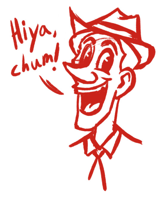
That's just a drawing.
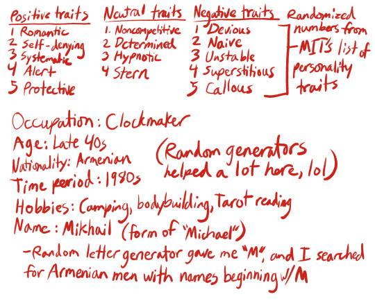
But what if I decided to flesh him out more? What if I wanted his appearance to reflect his lifestyle and inner life as well? Here's where the note-taking comes in.
And now for the visual research:

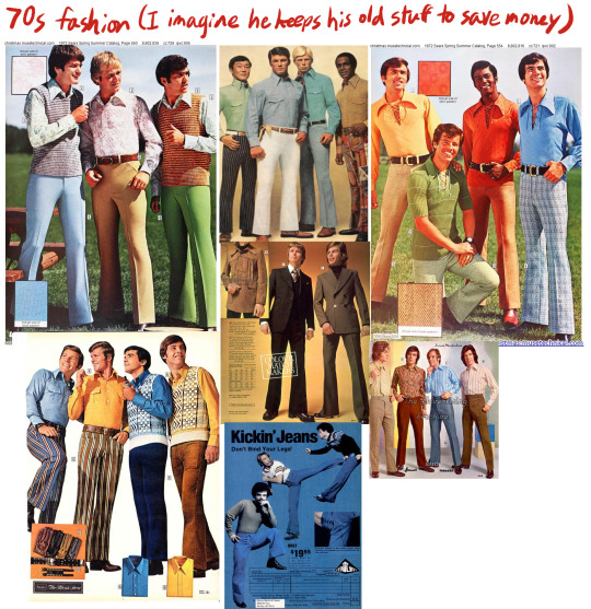
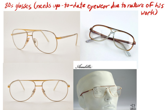
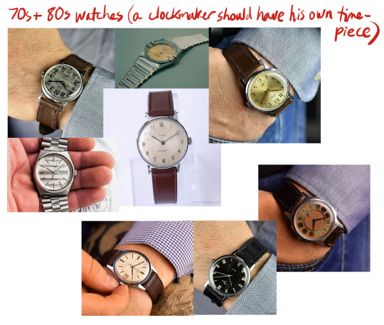
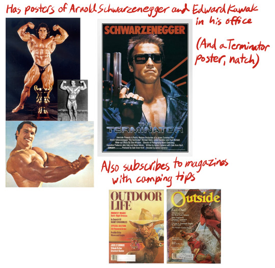

I thought the bodybuilding angle would provide a fun contrast with this guy's profession. The mental image of a huge, burly dude working on a clock or watch with tiny, precise movements just makes me smile. Perhaps I could give him small, nimble hands that would suit his line of work.
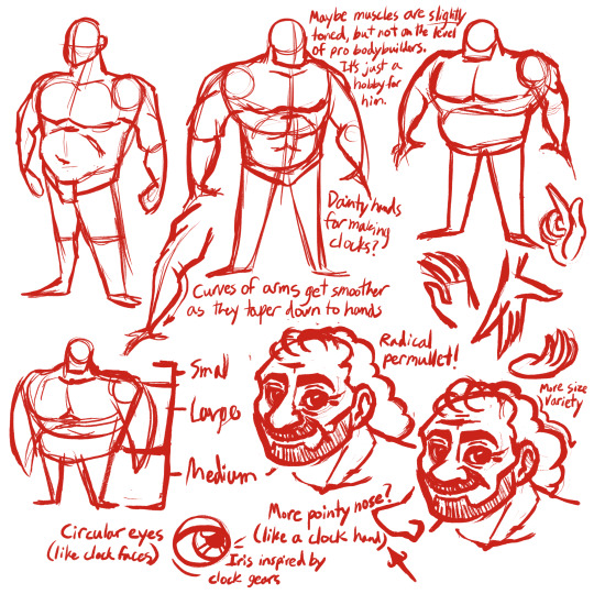

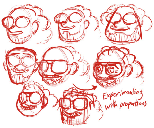
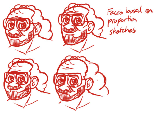
Now that I have a better idea of how Mikhail's face and body will look, it's time to establish a pose.

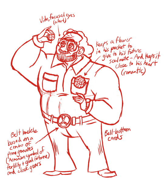
Of course, I never expected to employ all the personality traits I started out with inside this single pose; those were just a jumping-off point. No one drawing will ever be able to encapsulate every single facet of a character, unless they're extraordinarily flat and generic (see also: random guy I doodled at the start of this post). If I wanted to write a story with this guy, I'd have to figure out how all the traits play off each other and how they'd cause him to react to different situations. There would be a lot more note-taking and development involved, but for the sake of keeping this post (somewhat) brief, let's just focus on visuals for now.
On to color!
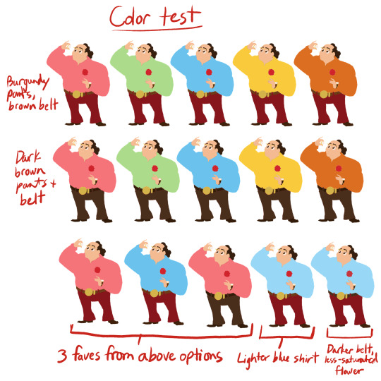
I decided to give Mikhail a carnation in his pocket (for its round shape), specifically a red one, which represents deep love and an aching heart. Thus, the flower needed to maintain its red color for the symbolism to come through.
For some reason I initially pictured this guy wearing a pink shirt (perhaps as an offshoot of the "romantic" angle), but I wanted to try some different colors inspired by the 70s catalog pages I found. I ended up really liking the contrast of the cool blue shirt with the warm red pants, and that option made it into my top three as a result. I lined them up next to each other to compare them, and in the end, blue won out over pink. I think it also reflects the "colder", more cerebral, less-emotional parts of his personality well (namely "systematic", "stern", and "callous"- one from each column!). Just goes to show that you shouldn't get too attached to your first draft, as better ideas are just around the corner.
I then lightened the blue of the shirt so it wouldn't compete so much with the rest of the outfit, and wouldn't be quite as loud and "in your face". Mikhail strikes me as a bit of an introvert, so the calmer, quieter blue is a better fit. I added a darker belt and watchband and de-saturated the flower just a bit to make the values feel more balanced, and I think we've got it!
Let's see the final result!
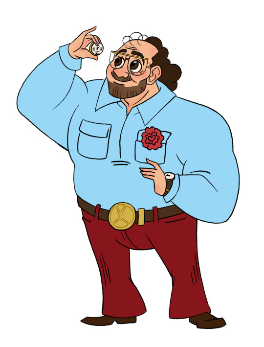
Y'all, I was not expecting this process to make me emotional, but there's something special about fully realizing a little guy you've spent hours working on. All of a sudden you look at him and go, "Oh my god, there he is. That's him." This man wasn't even a twinkle in my eye a couple weeks ago and now I'd protect him with my life.
And the thing is, the only reason I'm calling this design "done" for now is that I basically just brought it into existence to make a point. But if this dude were attached to a larger story, he'd be nowhere near finished. I'd have to make a ton more iterations and go a lot more in depth with my research than I did (especially with the Armenian cultural stuff). Overall, though, I hope this quick project properly highlighted the difference between a single drawing and a more fleshed-out character.
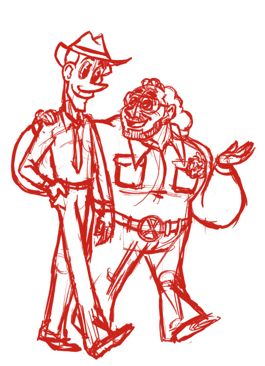
Later!
551 notes
·
View notes
Text
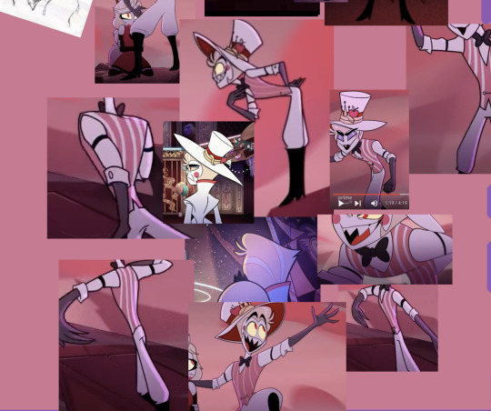
made a reference sheet for Lucifer! :) he's wildly inconsistent in the show, so this sheet has helped me a whole bunch
QUICK IMPORTANT NOTE: BECAUSE HE'S SO INCONSISTENT, THERE'S NO "RIGHT" WAY TO DRAW THIS GUY. JUST HAVE FUN, REALLY! AND DON'T MIND MY SHEET AND NOTES IF YOU DON'T WANT TO
(NOTE DONE) the facial expressions in the lower left corner are more inspiration for pushing his expressions since he's SO EXPRESSIVE!! :D ...rather than direct reference since too many features change between screenshots there
(close-ups of sheet at bottom of the post but before the cut)
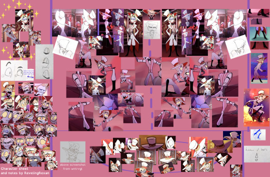
(his front view hair should actually curve in toward his two hair "sprigs" like it does in every other angle, but the way i drew it is just my own personal preference at times -- it helps me think of him as a bit more 3D)
below is how on earth i laid out that crazy-looking collection. there's a method to the madness! (the dashed line in the middle of the turnarounds is the "front view," and then the images spin Lucifer left and right from there. sometimes the screenshots in the turnarounds are just for body/leg/arm shape reference rather than face reference)

the note at the bottom of the "Hat angles" box says "The hat angles in the center of the ring are usually intended only for animation in-between frames, rather than for longer poses or for illustrations"
"The Ideal Man" in the upper left corner is a partially joking section name and is the Lucifer design i tend to aim for. i think of his face as "very round except for his pointy chin + his eyes are close together and take up almost the whole width of his face (except for in profile view, and except for when it doesn't look good)."
I WANT THIS POST TO STAY SORTA SHORT, SO UNDER THE CUT ARE SOME NOTES ABOUT HIS HAT plus some hat-less screenshots / screenshots where all or almost all his hair is visible
close-ups of reference sheet:
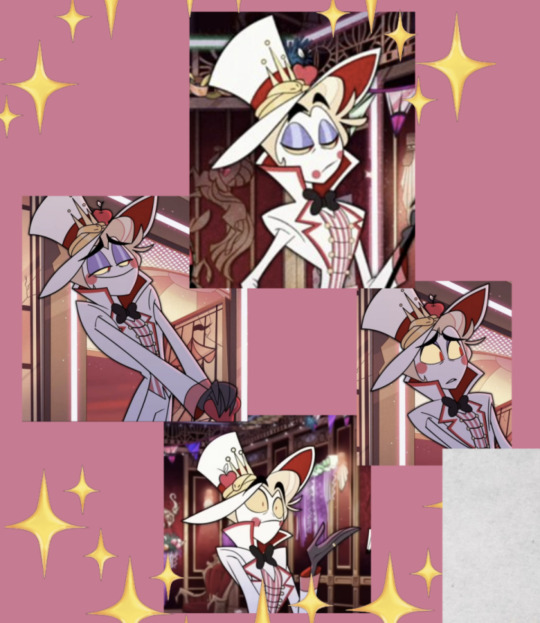
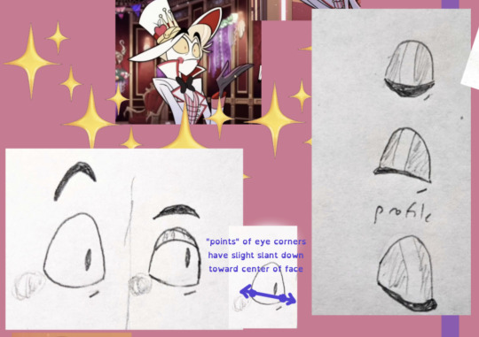
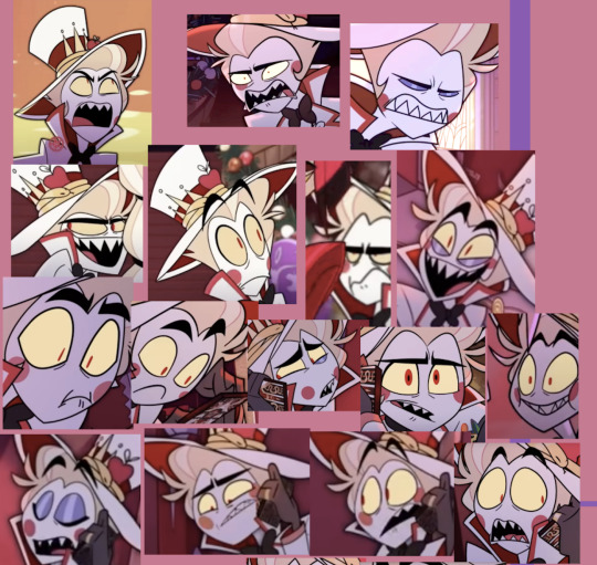


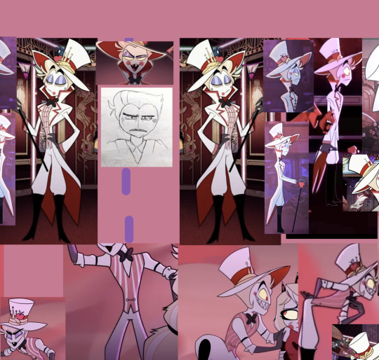
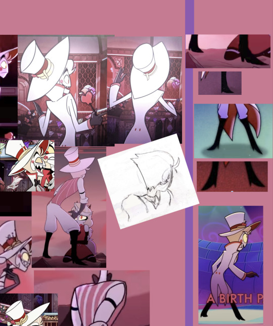
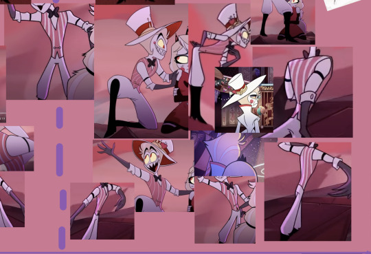
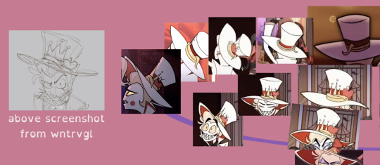
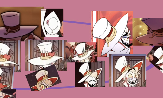

____
SO ABOUT HIS HAT. HIS HAT CAUSED ME SO MUCH CONFUSION UNTIL I THOUGHT OF IT AS A NON-PHYSICAL ENTITY LOL
short explanation: Vivziepop's art style, and especially Lucifer's design, is heavily based on what "looks right," rather than what is physically possible. so, my hat thoughts:
it's a droopy hat that folds down at the sides. so its brim droops in the back
BUT it also curves upward in the front, both to show his facial expression and in a way that sort of matches the curve of the top of his hair--
--so his hair doesn't look awkwardly cut off on the top
examples:
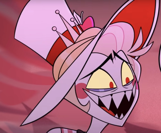
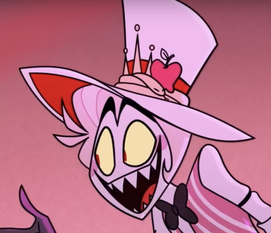

also, the top part of the hat has a smaller base than you might expect and then angles outward, with the front part always being taller and arcing down to the back
not every moment follows these rules, but they help me a lot when drawing him
(i often take liberties especially on the base of the hat and just do what feels right to me, usually based on similar characters i've drawn before -COUGHBLACK HAT FROM VILLAINOUSCOUGH- and based on where i sketched his head under the hat)
NOW SOME BONUS SCREENSHOTS FOR HAIR HELP. GET THAT HAT (MOSTLY) OUT OF THE WAY LOL


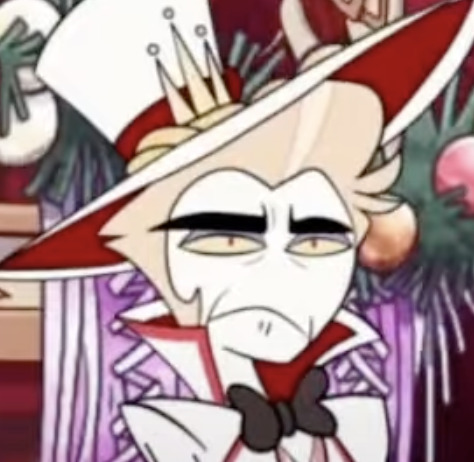
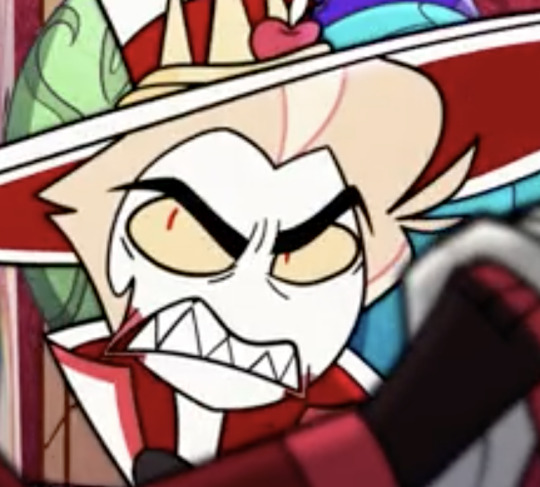


#hazbin hotel#hazbin hotel lucifer#lucifer morningstar#hazbin lucifer#hazbin hotel lucifer morningstar#'(MOSTLY)' LOL#WROTE THAT THREE TIMES IN THE POST WITHOUT INTENDING TO. 'MOSTLY' IN PARENTHESES#i've also got A LOT OF TEXT AND SCREENSHOTS I'M PUTTING TOGETHER on more details on his design#but i don't know when/if i'll finish that#so i wanted to at least be sure to submit this#I HOPE YOU ENJOY THIS YOU LULU NERDS AND ARTISTS (not mutually exclusive categories)
189 notes
·
View notes
Text
Knife's Canvas (Pt. 1)
Yandere Poly!Ghostface x Reader
warnings: mention of torture (not reader), planned stalking.
prompt inspired by @jadedstarlight03 's prompt to @creepyyanderegirl on yandere stu with artistic reader. I liked it and took my own spin with it since I simp for Billy too.

"I admired your sketch!"
The cursive note, adorned with a smiley face, stared back at you, earning an A+ grade on your inaugural in-class creative writing assignment at Woodsboro High. As a newcomer, you had hoped your depictions of characters like Garfield and Scooby Doo would endear you to the teachers, and it appeared they did. Sketched in red pen and colored with pastel pink highlighter, your drawings grinned up at you, surrounded by tiny glitter hearts.
"Oh, those are wicked!"
The cute blonde girl seated behind you leaned over your shoulder, her minty breath fanning into your face as she praised, "Do you draw a lot? Did you do those in class? It's pretty fast if you did."
"Yeah! I started doing art last year, but you get better and faster with practice," you replied with a warm smile, eager to make your first friend. "I think these took about 3-4 minutes each."
Your face warmed as she leaned closer, her chest lightly pressing against your back as she inspected your paper. She pointed to the little hearts, "Those are so cute!" Her approving face turned toward you as she introduced herself, "I'm Tatum."
"I'm ____," you replied, pleased to make introductions effortlessly. The teacher's allowance for 5 minutes of free time before class's end was a welcome opportunity for socializing.
"You should join my friends and me after our next class for lunch; maybe some of us will be in your classes!"
"That would be so nice," you said, relief evident in your voice. "I'm honestly pretty shy, so making friends can be intimidating."
Her dazzling smile accompanied her words, "Perfect! If you have Chemistry next with Mr. Scott, I'll show you where it is if you don't already know."
"Um," you leaned down to your backpack, sifting through your new student documents to find your schedule. "Oh, it's actually history with Ms. Johnson."
"Hmm," Tatum leaned back, crossing her legs as she thought. "I think Billy has that class. Maybe if you leave a little early, you can catch him. He's the guy with the, uh," she seemed to struggle for words, "grunge hairstyle? I think he's wearing a dark red t-shirt today if that helps. He's a little grumpy sometimes, though, so if you're too nervous or he's mean, we'll look for you at lunch."
The bell rang, and students not already congregating by the door got up to leave. You neatly tucked your graded paper into its designated folder and stood, slinging your backpack over your shoulder as Tatum rose in tandem.
"I'll try!" you said with a giggle, even though meeting Billy made you nervous. "It was nice to meet you."
"You too," Tatum said, pulling a pack of gum from her bag and offering you a piece before you left. "I think your next class should be in that building, right? I’m not sure if you had it yesterday or if it’s a Tuesday-Thursday class."
Thanking her again, you made sure your Discman had the CD you liked the most before connecting your headphones and heading off in that direction. You'd only have a few minutes of music, but it was worth it!

After finding your next class, you lingered around the door since you were early, hoping to at least place who Billy was from Tatum's description. After a moment of trying to not look awkward as you stood around, you spotted him.
He did have a grungier hair style, reminding you of a movie star you'd seen on TV recently. It threatened to fall in his eyes as he stalked towards the door, a bored look on his face. Now that you noticed him more, it was hard to ignore that he had a pretty face. Trying to not overthink it now that you realized you thought he was kind of cute, you pulled your headphones down from your ears until they hung around your neck as he came closer to the class.
When he noticed you looking at him as he drew closer, his eyes narrowed suspiciously, the scowl on his face deepening and making you feel even more nervous.
"Hi," you said somewhat sheepishly, "I'm ___. I'm new and met Tatum in my last class. You must be Billy."
His eyebrow raises and his eyes soften, but the scowl remains, “Oh?”
“Yeah…” you trail off a little, unsure of what to say since his response was sort of dry, “I’m from the more southern part of the state and we moved up here for my dad’s new job. I hear you guys experience the seasons up here so I’m excited to see them! The leaves never change in the fall where I’m from.”
His dark brown eyes have been boring into yours as you speak, making your face feel warm for the second time today. They dart down to the folder in your hands and he smirks as he says, “That’s cool.”
For your history folder, you’d tried to paint torsos and busts like the ancient historic statues from Greece and Rome you’d seen in a National Geographic magazine on the cover. They were naked torsos, but you had tried to make the nipples on the women look less prominent to avoid getting into trouble. If you had any sense, you’d have depicted something else to entirely avoid the possibility of getting into trouble, but you’d gotten irritated at the idea of censoring art.
“Oh, thank you! I hope I don’t get shit for the nudity, but I guess I could probably give them all clothes if I need to.”
He nods towards the classroom and you notice the hallways are getting quieter, “We should head in. There’s a couple empty seats near me.”

Ms. Johnson's strategy to get the kids interested in history was to start with the brutality of the medieval age, it seemed; with diagrams of the torture methods they created being the highlight of her second class after syllabus day.
The history class, guided by Ms. Johnson's unwavering enthusiasm, delved into the unsettling corners of medieval history. As the lesson progressed, she took a moment to present an image of a haunting artifact, projecting it onto the screen for the entire class to see.
"Now, can anyone tell me what this is?" Ms. Johnson asked, gesturing to the screen. It was a grotesque device, an iron contraption with a cold, heartless design. Sharp spikes protruded inward, forming a cage around the wearer's head. The unsettling silence lingered as the class peered at the image, growing discomfort palpable.
To everyone's surprise, ____ confidently raised her hand, her eyes betraying an unexpected depth of knowledge.
"It's called the Scold's Bridle," she answered, her voice steady. "An oppressive device designed to silence women who dared to speak their minds. The spikes prevented any speaking, ensuring their voices remained stifled."
Billy arched an eyebrow, intrigued. "How do you know about that?"
____ shrugged, a nonchalant smile playing on her lips. "I read a lot. History isn't just about dates and battles; it's about the struggles people faced, especially women, and respecting the challenges they went through."
Billy's skepticism softened as he nodded slightly. "Guess history is more twisted than we think."
____ leaned towards him slightly, a smile on her face that didn't quite reach her eyes and made his spine tingle slightly, "Oh, you have no idea."
"Ah, ____," Ms. Johnson said with genuine admiration and ____'s attention snapped back to her, "Impressive knowledge there. I'm eager to see your thoughts on this in more detail, perhaps in an essay. It's always refreshing when students connect with the material on a deeper level."
"Now, let's delve further into the complexities of medieval society. How these devices were not only instruments of physical torment but also symbolic of the societal norms of the time."
The lesson continued, and ____ slowly flipped through her sketchbook to find a fresh page, seemingly reviewing her previous art briefly as she did so. Billy faced the board, but his eyes were turned downward, toward ____'s hands. He caught a glimpse of previous drawings – a mix of cartoon characters and a few creepier depictions.
Angry faces splattered with red marks resembling blood and figures wearing intimidating masks (or just freaks with the scariest faces ever) caught his eye. Intrigued, he discreetly watched as she began absentmindedly sketching the torture devices described in class as she listened, switching out her pens to smear red ink on them. He caught his scoff before he uttered it when he realized she was drawing the devices in glitter pens, her eyes flickering from the images on the screen to back down at her paper.
He must have been too obvious, leaning in too closely or being too pointed with his staring now because she had flipped to a fresh page and locked eyes, an unreadable expression across her face. There was a pause before she tucked her sketchbook into her bag and turned her attention back towards the board.
Billy felt a mischievous idea forming in his head as he let his eyes linger on her, knowing she could probably see him staring in her peripheral. If she wasn't thrilled about him seeing her portfolio, perhaps there was more hiding in that sketchbook than just cutesy cartoons. It could be amusing for him and Stu to explore her place once they found out where she lived, hunting for more art she wasn't ready to showcase while they scoped out their new potential victim. If the glimpses of what he saw when she had flipped through it implied there was anything more beneath her vanilla exterior, Billy was confident that he and Stu could uncover it.
As the bell rang, she turned to him with what he'd call friendly eyes, the strange demeanor now gone, "Are you hungry or what? Is the cafeteria food at Woodsboro High edible or would I be better off hunting a bird?"
He huffed, "You'd be better off starving." Nodding towards the door, he started towards it, hardly waiting for ____ to collect her bag, "Maybe Randy will be enough of a simp to offer you whatever his mommy made for him."
Noticing the disdain Billy seemed to have for Randy's mother but feeling too tentative about the potential for conflict to ask more about it, ____ decided to leave it alone and hurry after him into the now bustling hallway.
#yandere ghostface#yandere stu#yandere stu macher#yandere billy loomis#yandere loomis#yandere!ghostface#yandere!stu macher#yandere!billy loomis#yandere!slasher#yandere slasher#fanfic#scream 1996#artist!reader#poly ghostface#poly!slasher#ghostface smut#billy loomis x reader#yandere x reader#slasher x reader#horror x reader#poly ghostface x reader#scream x reader#scream smut#yandere male#poly yandere#yansmut#yandere fanfiction#sidney prescott#tatum riley#billy loomis
543 notes
·
View notes
Text
In Defense of Bad Things
'Bad' here meaning mostly 'amateur'; stuff made enthusiastically by people at an unprofessional level. Art with visible gaps between what the artist imagined and what they achieved, products of flawed craftsmanship. I suppose everybody can appreciate them to some extent, it's a rare parent that doesn't put up their kid's drawings on the fridge in one way or another. But it turns out to be a fully general skill you can cultivate, and the more I do, the more I'm glad I did.
Partly, it's the teacher thing; finding delight in amateur work is one of the ways to find delight in the process of learning. Cultivating a love of striving-qua-striving can help make you a force for good in the world, as people start to feel safe trying to do things when you're around, even when their efforts are wobbly. You get to participate a little more in the process of atoms spinning themselves into ideas, even when there aren't any illusions about whether you're helping cultivate some revolutionary genius in the field.
And partly it's a fabulous way to build community. By necessity, our professional-level skills tend to be at the service of other people, performed for economic benefit; that's kind of how you get professionally good at something in the first place. When we're acting for our own sake, and among friends, most of what we do with one another is amateurish. I only cook middling-okay, I can't hold a tune that well, I'll never be a speed runner for anything. If you can only enjoy singing from the hundred best singers in the whole world, manufactured and polished by major studios, then you and your friends will sit shoulder-to-shoulder and passively listen to music. But it's so much richer an experience to sit face-to-face, actually singing together, even badly; you expose yourself to so many new ways to appreciate and respect one another, building relationships on what you've accomplished and not just by witty criticism or liking the same things.
And partly it's because some of the most powerful and innovative artistic experiences are in high-churn environments with low expectations and low barriers to entry, if only because those catch the passionate and driven young people that have been otherwise overlooked by our systems. The golden age of webcomics meant that a ton of the actual art involved was pretty lousy, but it also produced work that people still talk about today. D&D began as a profoundly unpolished collection of handmade rulebooks sold at cons in a plastic baggie. By the time these products of enthusiastic amateurs filter themselves through various levels of popularity and absorb mainstream cash influx, they're often risk-averse and missing a lot of the bold spark that inspired their fans in the first place; others will simply never drift towards the mainstream at all. I'm not saying you should be the person who goes out to dig through the slush piles of the internet looking for overlooked art, unless you want to be-- but sometimes a work of actual staggering genius also happens to be a Supernatural fanfic by a first-time author who's a little hazy on commas, and if that's a dealbreaker, you're going to miss out on some profoundly valuable experiences.
And hiding behind all of these things is, like...
Our appreciation of beauty has an odd structure, right? When things are done very skillfully, by brilliant artists with years of training, we can usually appreciate those accomplishments. And when we're looking at nature without human influence, and especially when we think very deeply about natural processes and understand them in context, we often rediscover that sense of beauty. There's just this bizarre hole in the middle where we declare things 'ugly'; as if a little skill is worse than none at all.
I really don't trust that gap. It feels like a trick my brain is playing on me, you know? It has me suspicious that a lot of what I consider 'ugly' or 'bad' is not a very direct experience of the world at all, or an informed judgment. That it is, rather, a declaration of (self-, social-) identity; a desire to be seen as a person of good taste, or as somebody who does things well, or just more primitively as one of the monkeys who is in the good-stuff-tribe and not one of the monkeys who is in the bad-stuff-tribe.
182 notes
·
View notes
Note
firstly: AAA YOUR ART AND COMICS AND STUFF ARE SO AMAZING!!!!
secondly: do you have any advice on how to come up with comics and then get them out of your head and onto paper?
BZHXHXHD THANK YOU SM!!!
And ooh that’s a good question
I usually come up with comics in one of two ways, either seeing something (whether another artwork, a text, something irl, etc) that inspires an idea for a comic, or via artworks I made that I expand on
Other times, it can actually be both
For example, the “A little life update” comic was actually inspired by this beautiful artwork, I saw it, and I immediately thought of Killer, idk something something about the despair of being stuck between a rock and a hard place etcetera etcetera (yes the comic that shows Killer to be in such a better place in life and show the hope he has, was inspired by crushing despair in actuality)
It made me wanna do something with Killer trying to call someone on a public phone, and so the first page came to be
Here’s the twist tho, I originally was gonna just make it into an artwork (yes, one single decision could’ve meant that comic wouldn’t have ever been made)
But a lil habit of mine is ask myself a shit ton of questions when it comes to my own artworks (it actually helps me turn what’s supposed to be artworks into comics), and that’s another way of how you can come up with comics, ask yourself questions, why is the character doing this? What are they doing? What if character did this? Etc
so I saw what was originally gonna be an artwork, and asked myself, who would Killer be calling if he ever did and why?
And the answer to those two questions that made sense to me most was Nightmare, but that led me to two more questions, when would Killer be calling Nightmare and for what?
And that led me to have a basic idea of how I wanted the comic to go
So it was basically like
Who would Killer be calling? Nightmare
Why would Killer be calling Nightmare if he ever did? That actually had different answers, to taunt him, to inform him of something, cause he misses Nightmare in his own fucked up way, etc
When would Killer be calling Nightmare? After he’s saved, or while still under him? After he’s saved makes more sense
What would Killer call Nightmare for? To give him an update about his life with Color
How would Killer be calling Nightmare? Through a public phone
Where would Killer be calling from? Somewhere in an AU in the surface
These six questions, what, why, when, who, where, how, are important to think of, they give you a basis to work on when it comes to comics in general
You don’t need to have a very clear answer to each of them to be able to work on a comic, but if you can at least answer 3 of them, that would give you enough information to work with in a comic
Now that I have a tiny bit of a clear idea about what I wanted to do (it doesn’t have to be perfect or completely concise) let’s talk about how you take these ideas out of your head and into paper
You can do that by imagining the dialogue in your head and then immediately putting it into paper, as I mentioned here, I actually struggle a lot with dialogue, art? No problem, I can easily imagine the art, but dialogue? It’s hell (please take the time to read the linked post, I talk in depth about how I handle dialogue)
That’s why you shouldn’t worry about perfection at this stage, just put every little piece of dialogue you imagine into paper, even if it feels like it makes no sense or is out of character, that’s something you can worry about later
Put in the dialogue, every little bit of it, and draw the panels that feels right for the dialogue
Here’s a little bit of example about what I mean when I say put the dialogue in then draw panels that make sense for it
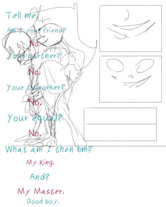
This is a comic I plan on making, I actually drew that first panel as a stand alone artwork, then that inspired the dialogue, I wrote the dialogue down immediately, it’s a rough version of it, maybe I’ll keep it the same, maybe I’ll change it up as I work through the comic, but so far, I’m drawing the panels based on the dialogue so far, see what I mean by write the dialogue down? It helps IMMENSELY
It doesn’t have to be perfect and it certainly doesn’t have to be the final version, but writing it down will help you imagine the art that comes with it
Does that mean you can never start with the art then think of the dialogue? NO
You absolutely can start with the art for the comic first, in fact, sometimes, doing that actually helps you imagine the dialogue better, other times you can’t really think of a dialogue but have a very clear image in your head about certain character interactions, draw that it’s ok, silent comics focusing on character interaction, is a thing that you can do without worrying about dialogue
Now when it comes to the actual making of a comic, first tip is find your own footing when it comes to comic making
Like listen, people are gonna tell you that the correct thing to do is that you have to make thumbnails for the comic before you make the actual comic to make sure the flow is good and you have room for speech bubbles and what not
Here’s the thing, making thumbnails for your comic is a life saver, it’s great, if you can do that go for it! But for a person like me with little to no energy, I can’t do that without losing interest and immediately abandoning my comic, I can’t do that without becoming frustrated and hate art for it
That’s why I say find your footing, if making thumbnails before working on the actual pages works for you go for it! or you can immediately just work on the actual comic itself like I do, it’s all about what you’re comfortable with and what makes more sense to you
That being said, when it comes to the panels themselves, always aim for less panels and more pages than the other way around
Sometimes, emphasis on certain emotions or aspects of the comic can only be done with fewer panels
That’s why my own comics would sometimes have pages that are either one or two panels max
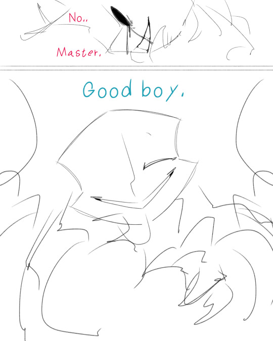
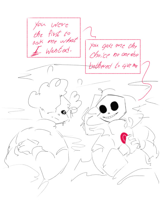
The less panels you have in a page, the more concise, clear, and easy to follow your comic is, one of the biggest mistakes I made as a beginner artist, is that I focused on cramping the story in as few pages as possible rather than focus on the clarity of the comic
Here’s an example
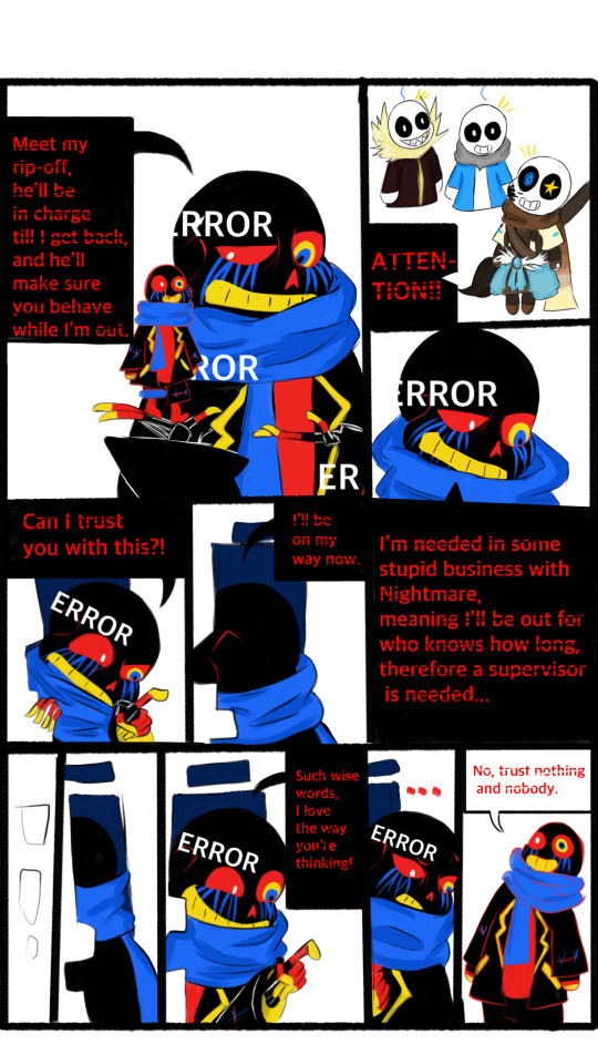
Good luck reading that dggxgdgdh
This is a very old comic I made back in 2018? 2019?, I wanted the comic to be one page so bad I cramped everything into it without thinking about the fact people are gonna have a very hard time reading it, like this easily could’ve been 3-5 pages but old me couldn’t imagine doing that many pages (if she could see me now with 15 pages comics dhhdhdg) not only that, but the panels’ arrangement makes 0 sense
So when you make your panels there are 2 things to keep in mind:
1- less panels and more pages = clear easy to follow comic, as well as a better emotional impact
2- panel arrangement has to make sense and should be easy to follow, you can make sure it’s easy to follow by reading your own comic over and over as you’re making it, if you find difficulty following the dialogue or art, then it’s best to refine, change or edit your panel or dialogue arrangement
Another thing to keep in mind when making the comic is the flow, the best way to go about making sure that the flow makes sense is by thinking of the comic as you would an animation, how did the character go from point A to point B?
For example this page
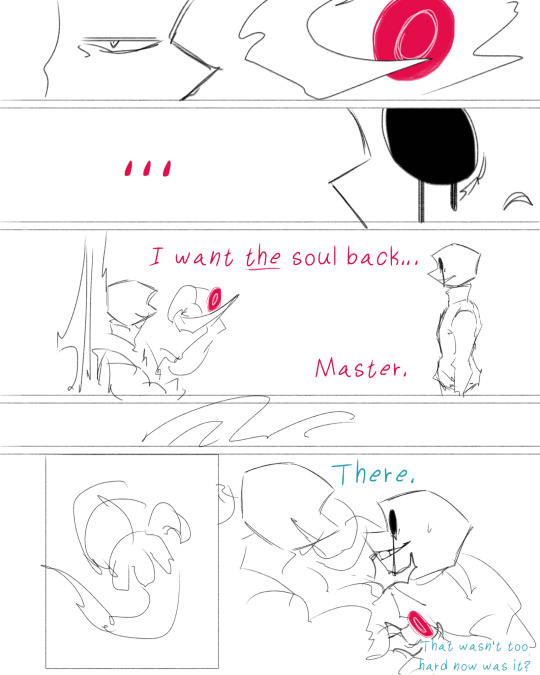
Killer clearly has a bit of a distance from Nightmare in the second panel, so how did Killer go from being at a distance (point A), to right in front of Nightmare in the last panel (point B)? That’s what the two panels in between the these two points are for, is to show you that 1- Nightmare is using his tentacle, and 2- that tentacle wrapped around Killer’s arm, the rest would easily be filled in by your brain that Nightmare basically pulled him closer
Now for the ending of a comic, not every comic has to have a clear ending where it marks the end of a story, but rather, you can go for whatever satisfies you as an ending, or keep an ending ambiguous or open, to expand on a comic later
I say that the perfect ending for a comic is what gets the point of a comic across, if the point is made, then it’s a good panel to end the comic with
Don’t be afraid to scarp any page or panels if they make the comic awkward or if they don’t make sense or if it seems out of character don’t hesitate to change, edit or completely delete it
An example is the “choice” comic, it actually originally was 4 pages, I just decided to scrap the last page cause of two reasons
1- it added nothing to the comic
2- it was out of character for Stage 2 Killer
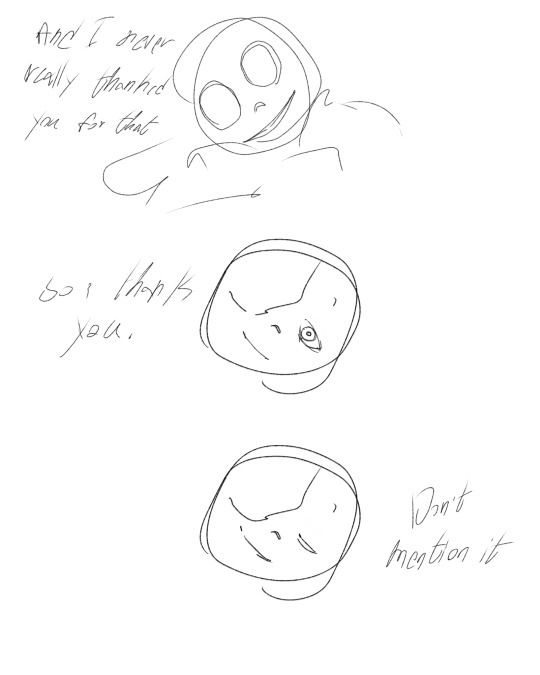
My last advice is don’t force the process, sometimes, the best way to go about making comics is to make them on your own time and slowly, sometimes, you get stuck with certain things in the comic, other times, you need a bit to figure out how to proceed with the comic, completely normal in the process, that’s why it’s important to work on comics in a way that suits you, but you can’t find what suits you without trial and error, so go and test the waters, you can never learn until you practice it yourself
Good luck, hope this helps, lemme know if you need more clarification or help, i’d be happy to help where I can <333
65 notes
·
View notes
Text
While waiting for me to finally finish the next chapter..
DESIGN ANALYSIS FOR MY VIGILANTE AU >:D

As always, let's start in rainbow order! But first things first; all CG members have matching eyes, in one way or another! Red has yellow eyes, Orange has green eyes, Yellow has orange eyes, Green has blue eyes, and Blue has red eyes!! I might change things depending on how it looks, though.
Anyway, Red!!
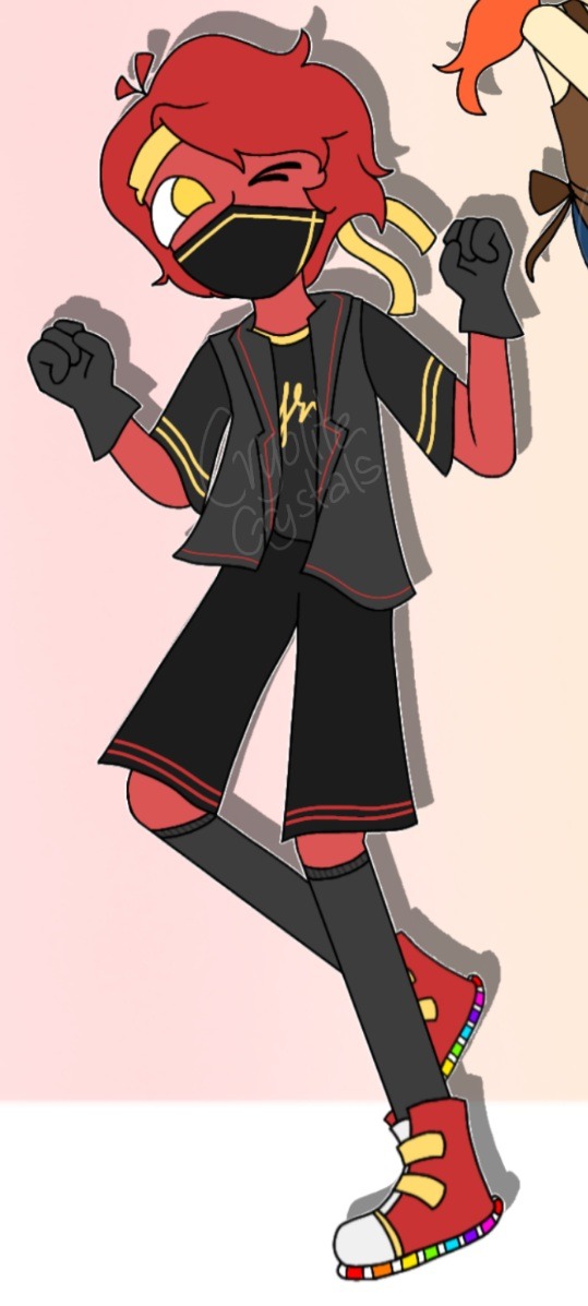
I'll admit, I'm definitely giving him a design upgrade, but let's talk about this one.
Ah, the classic yellow bandanna. How could I leave it out? It's iconic!
His hair is definitely the wildest out of everyone's. A lot of black and grey in his design, too, which makes the yellow bits and the light-up shoes REALLY stand out.
The yellow matches his eyes and bandanna, and is reminiscent of that media trope with seeing yellow eyes peek from the darkness. The mask is, of course, to hide his face. Red didn't really seem like the guy to wear a visor like Green, or cover his entire face like Blue, so he gets that mask! Might change that, who knows.
His outfit looks thrown together with not that amount of effort. Very casual, as Green pointed out. Before Orange, he was the latest addition to the team, which can mean he can be a bit inexperienced. Wanted to convey that somehow!
Light-up shoes, oh, light-up shoes... who doesn't love them? Green certainly doesn't, but Red disagrees!
Next one!
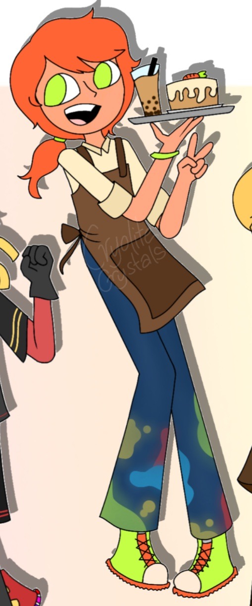
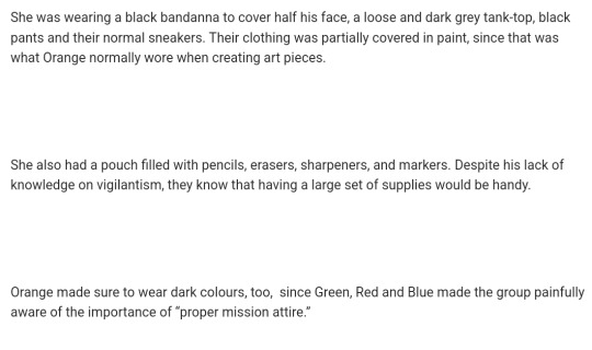
Orange/Sketch
Now, I didn't draw their vigilante outfit yet, but I added the description of it to give an idea!
I wanted her hair to give a very anime-protagonist feel, if that made sense? Not sure if I got that right but it works for me! And hey! Freckles!
Working clothes: His pants are covered in paint to give an artist-like feel. (I should know. I paint a lot and some of my clothes did NOT survive the process.) As for the top and apron, I wanted it to feel like an actual café worker's uniform without it being a basic starbucks rip-off.
Vigilante outfit: VERY reminiscent of outfits animated characters would wear in scenes where they're doing some graffiti on the streets. That was my main inspiration behind the design.
Also in dark colors. They have to blend into the darkness and stuff!
The pouch mentioned was for practical sake; as is something I like to do when thinking of designs. And it helps with the artistic urge to draw at any time, regardless of what the situation is.
Not much to say about Orange's design, besides the fact that I wanted to give it a very protagonist-y vibe.
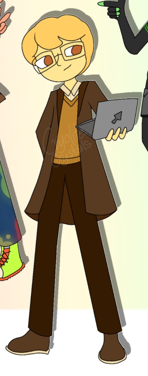
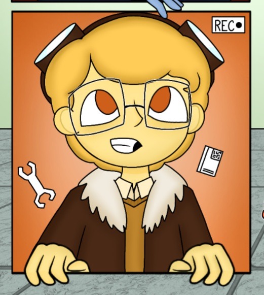
Yellow/Y
The second design is more or less his actual vigilante outfit, buuuut yeah!
Curly hair -despite my inability to draw it- and Yellow has been a favorite hc of mine!
His outfit is somewhat inspired by steampunk? Not exactly, but I DID have steampunk in mind while making it! The pilot's jacket was the best change yet.
Someone on a03 has told me that he looks like Alan, somehow! I'm not sure if I see it, so does anyone else see it? It would be a funny coincidence if so!
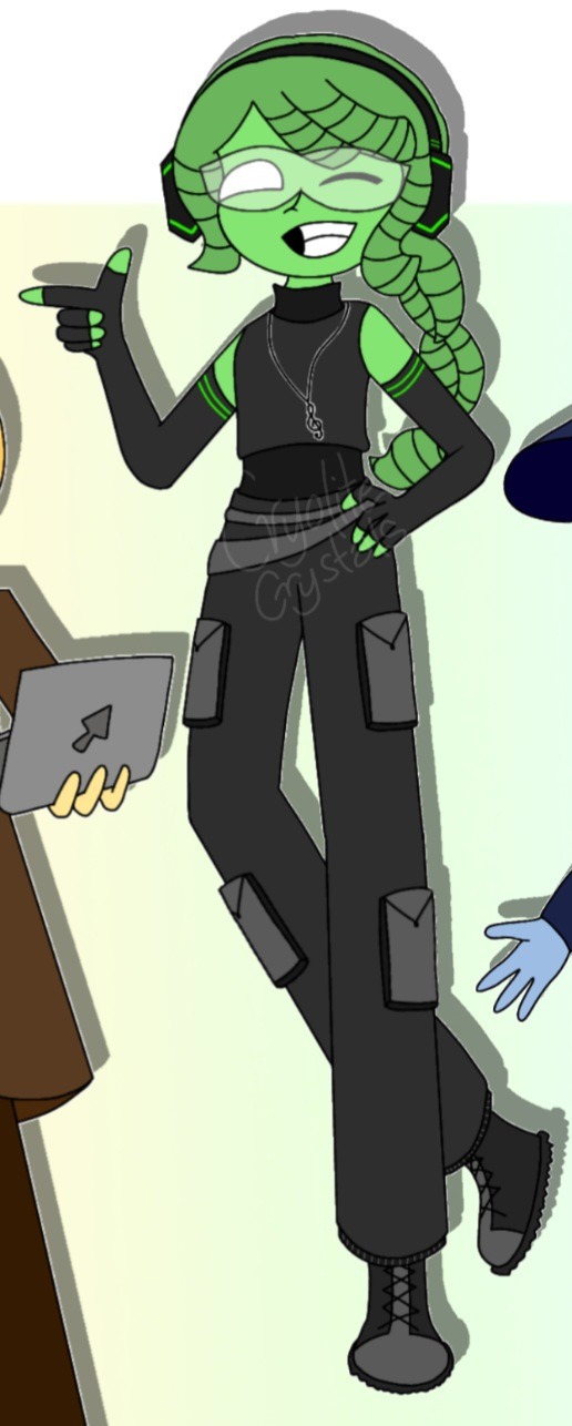
Green/Songbird
His hair is my favorite part of my Green design so I HAD to keep it! The classic headphones are there with a gamer-ish colour scheme.
VERY hip-hop and streetdance inspired! His visor is a reference to the sunglasses Orange gave him in the "More Faces" short, rather than his sunglasses in the Influencer Arc.
His clothes are a reference to the clothes I see my sister wear for her own dance training, and I love streetwear in general, so its a perfect fit! The necklace is just for show, though. Nothing practical about that, but it does look cool! Plus, it's a notion to his powers! His outfit is practical, but still shows off somehow, just like Green!
My vigilante!Green is the most experienced in the group, so I wanted him to look that way, somehow? And he definitely looks the most professional! I think!
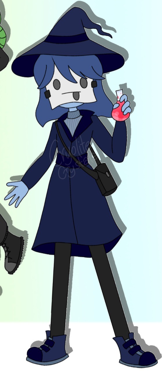
Blue/The Witch
The second member to join the vigilante team!
I HAD to give her a hat. The witch's hat is a must. Practical? Not exactly. Cool? Yes, indeed.
The mask is my favorite part. A direct reference to the "Faces" short, AND a good way for Blue to, ahem, mask her identity (hehe a pun)
The sweater and coat combination seems strange, but it looks a little like a modern witch outfit? Trenchcoats definitely give a vigilante vibe in a way, and Yellow already had one, so Blue gets a belt and a sweater to go with it!
Blue definitely needed a bag for her potions. She can't just make them on the spot!- well, she can, but it would still be a hassle! She'd be the most practical when it comes to her clothing for vigilantism, after Yellow.
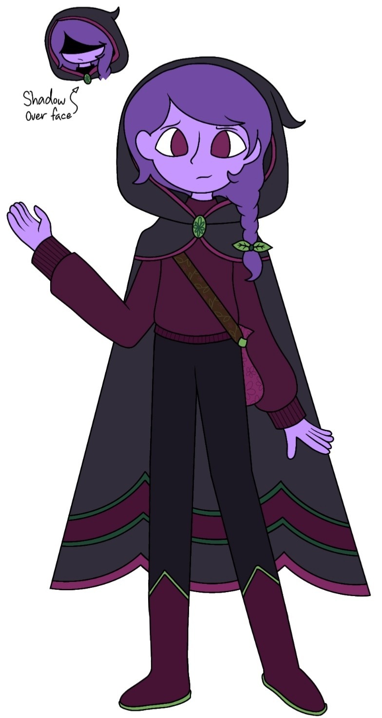
Purple/Aeolus!
Obviously, the cloak is a reference to elytra. The green hairtie, the bag and the cloak buckle is a reference to their mother, Orchid. You can see the vines on the bag strap, the flowers on the bag and buckle, and the leaf-shape on the hairtie.
There's also a lot of green on them, wink wink ;3
To hide their identity, they cover a majority of their face with the cloak hood!
It was hard to balance the colors, but I'm happy with the results! This one is simple compared to the others, but its still cool nonetheless!
Purple was meant to have ripped jeans but my drawing ability to low, so... sorry, Purple.
AAAAND THAT'S ALL! Sorry if this seemed boring or disappointing, or whatnot. I tried my best!
#avm#animation vs minecraft#avm green#avm purple#avm blue#avm red#avm yellow#avm orange#alan becker#crystalizedcryolite#ogtdwv#orange's guide to dealing with vigilantes#the colour gang's guide to heroism vigilantism and villainy#the color gangs guide to heroism vigilantism and villainy#avm au#TCGGTHVV#dang that's a lot of tags
56 notes
·
View notes
Note
i keep wanting to draw anthro maggots but they end up looking like beetle larvae instead- any ideas on how one might stylize a maggot person to make it a little more distinctly A Maggot? it's especially hard to me bc maggots are like THE MOST featureless insect larvae.... which i suppose counts as a defining feature in and of itself- but i dunno. im mostly just curious to hear your approach!!!
Yeah beetle grubs, caterpillars and a lot of other insect larvae have armored heads with complete jaws structures as well as six little legs, plus they often have a defined looking "top" and "bottom" with ridged and wrinkles almost like they got soft armored down their back

But maggots are weird! They streamlined EVERYTHING down to where they have no legs at all, not even vestigial ones, and their body segments almost evolved towards something like radial symmetry by being the same all the way around!
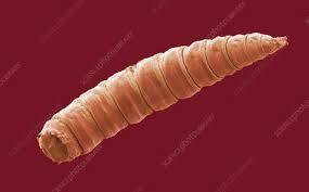
Then there's the fact that they sort of lost most of a "head." Not only is there no exoskeletal cranial case (bug skull) to protect it but there are no jaws and never any eyes; there's just a little hole for drinking liquefied food, a pair of tusk-like hooks for gripping surfaces, and a pair of eye-like knobs that are actually chemosensory (noses)
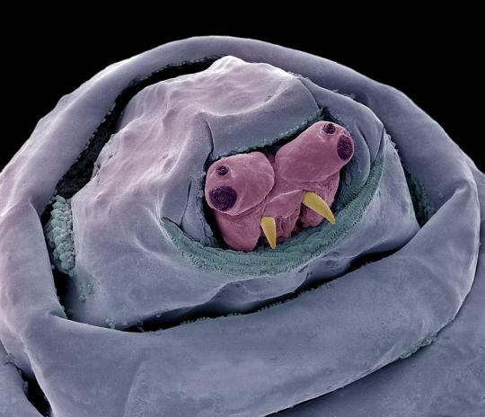
The weird, tiny walrus-face is totally unique! They don't have any chewing mouthparts because they only need to "drink" the particles of rotting matter they live on, and like adult flies, they help this along by secreting digestive enzymes!
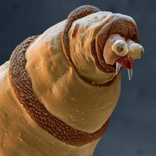
Maggots also have these very distinct, furry looking bands at every segment, which help them grip surfaces like a tire tread or the sole of a shoe. If you compare this photo with the one above you'll also notice how the segments can retract in and out like a telescope!
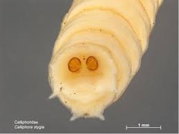
The last special thing about common maggot anatomy is that they are technically semi-aquatic animals, because maggots evolved to be buried head-first completely in their own food as much as possible and rotten corpses are WET. In order to breathe, maggots have a pair of breathing spiracles on their rear ends, which they try to keep exposed to the air!
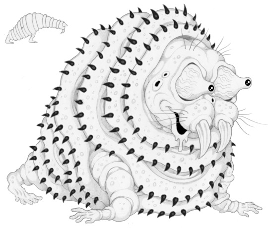
There are exceptions to all of this, though; there are species that can be fully aquatic, fully terrestrial, herbivorous, parasitic or predatory, and some ancient fly groups (including mosquitoes!) whose larvae still have fully armored heads and even eyes. Everything above is universal to the maggots you find in rotten stuff though, so what most people think of when they hear the term :) When I designed a hybrid human and blowfly maggot for the Mortasheen setting I deliberately made it look like a doofy cartoon Walrus, and I gave its segments large spines that can be seen in some parasitic maggots, including botflies:
And when I made a maggot character for my webcomic Awful Hospital I designed her like a little spacesuit or a parka (the resemblance to Kenny was an accident)
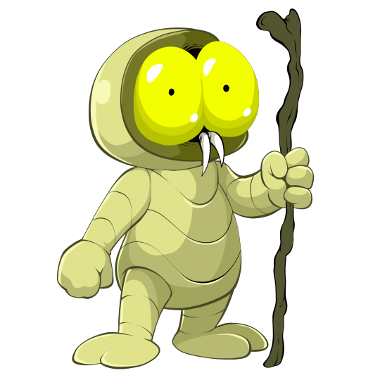
Actually I don't think I ever shared this most recent "main artwork" of Maggie. I don't know what idea inspiration any of this might provide but basically a maggot is a prickly living sock with fangs. Or I guess from a design and engineering perspective, a maggot is a biological drill. The tiny end starts a hole, the rest of the body is just a flaring cone perfectly equipped to keep making the hole deeper.
391 notes
·
View notes
Text
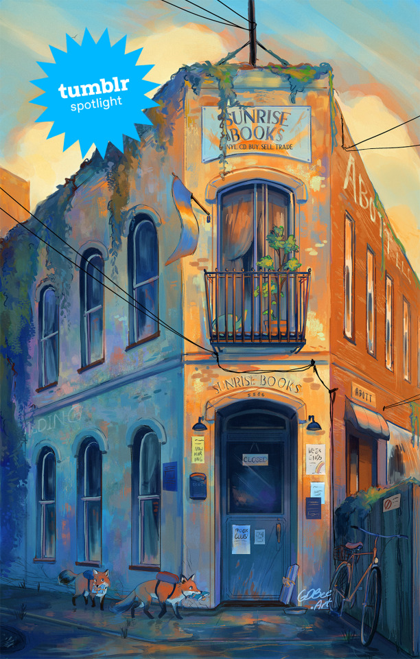
Creator Spotlight: GDBee Art (@prinnay)
Geneva Bowers is inspired by the wonders of the natural world around us, and enjoys manipulating colors to create art full of mood and feelings.
Check out our interview with Geneva below!
How did you get started with art? Did you originally have a background in art?
I’m going to say yes because that’s all I’ve known how to do. It started because I wanted to draw better horses than my sister, and it just spiraled from there. People started asking me to draw things because they saw me drawing horses. I was like, well, I can draw things that aren’t horses, and then it was just kind of all I did.
Have you ever had an art block? If so, how did you overcome it?
I have one right now! Honestly, with time, and I also collect art books; I think I have a couple hundred. If I really want to draw something, then I just flip through those and try to steal some ideas.
Which three famous artists (dead or alive) would you invite to your dinner party?
I mean, of course Van Gogh…I’m really inspired by Impressionism and Post-Impressionism, so I would invite Van Gogh, Monet, and Julie Dillon to a dinner party.
Have you ever wanted to dive into another medium before?
Yeah, actually, I currently am! I’m trying to do more traditional painting. I used to do a lot of acrylics, but I haven’t done it in years, and now I’m kind of bad at it. I’m trying to get into actual impressionistic art with oils and oil pastels. I’m like failing, but you know, you get there. Just fail until it looks presentable.
If there is one thing you want your audience to remember about your work, what would it be?
I guess it’s more of a feeling. I create art because I’m inspired by things around me, like certain video games. For example, I have been inspired by a Japanese RPG called Chrono Cross on PlayStation 1. They make me feel a certain type of inspiration to create something, so that’s kind of like what I’m hoping to leave behind.
Have any of your projects surprised you with their outcome?
Yeah! I did this Weapon Faerie series where I took three prompts: a weapon, a winged insect, and an herb, which I combined to make different characters. So, a faerie with a spiked club or a butterfly faerie with a katana. I made 13 of those, and they kind of took off! I wasn’t expecting that at all.
What is the hardest part of your process?
My whole art style is coloring, like the way it’s colored… but I hate the coloring process, haha. I like doing the color combos, but I don’t like the blending and shading. That takes like one-trillion years. It’s the part where I’m most likely to give up. You know how art kind of looks ugly before it looks good? I’m trying to trust that process.
What do you wish you knew when you started creating art that you know now?
I guess one big thing would be knowing how to use lights and darks. When I do color, it is definitely colorful, but when you switch it to black and white, you see that everything’s the same tone of gray. I’ve learned that if you just use some brighter colors and some darker shades, you create a bigger impact in the end. So, now, when I paint something digital, I make it black and white for a moment to see where all the hues are, and if something is weirdly dark or not dark enough, I can change it.
Who on Tumblr inspires you and why?
Oh, @feefal definitely inspires me. She does a lot of spooky art.
1K notes
·
View notes
Text
"Darkrooms" Binding
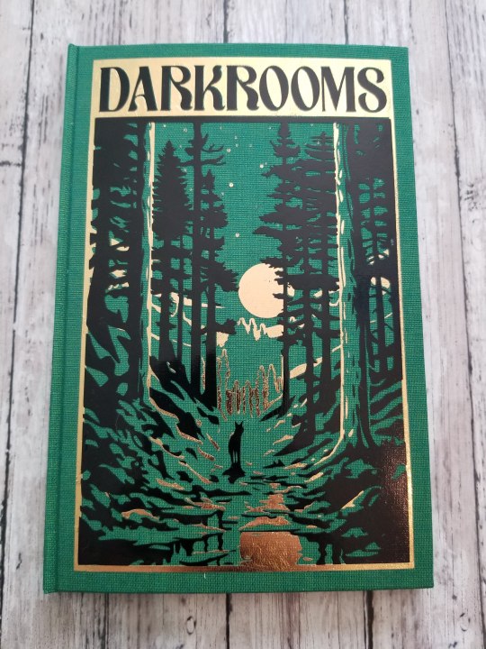
My latest binding! This is the author's copy, my copy is still in the press and looks exactly the same except I melted one corner with the iron, lol. It gives it character. Right? RIGHT?
This is a Red Dead Redemption 2 fic by Besselfcn featuring Arthur Morgan and Albert Mason--so well written, just an amazing voice and it's short but really packs a punch. I used covers like this and this for inspiration, although this one came out to be more complicated than those. Used some of my precious Duo bookcloth for the green, which looks amazing. Anyway, I think there are some really cool parts to this binding. More pics under the cut.
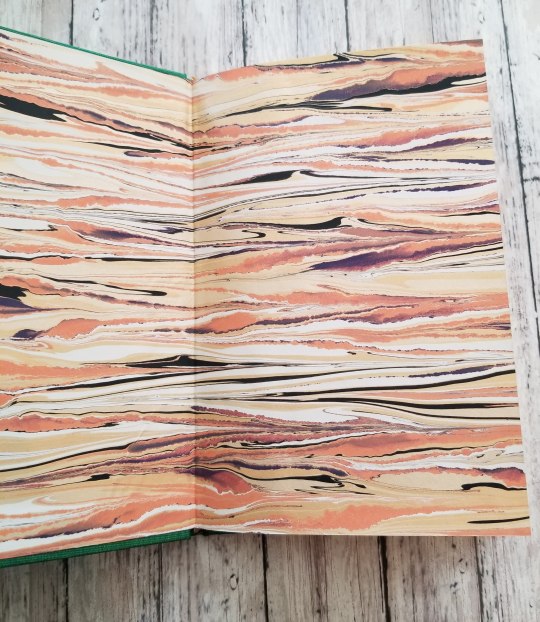
The endpapers, beautiful Renato Crepaldi papers that I knew I was going to use for this the instant I came across them on his instagram. They're meant to evoke a sunset (although they also look a lot like Jupiter to me--but the sunset part was what they were meant to look like, and the papers are part of the Skyscapes collection, so. Yeah.). It's so pretty up close, there are some really cool pictures on Crepaldi's instagram if you want to look at them more closely.

The spine, which echoes the wolf and moon theme from the front (I really like the spine, it's so small and usually so hard to line up right but this came out just perfectly)
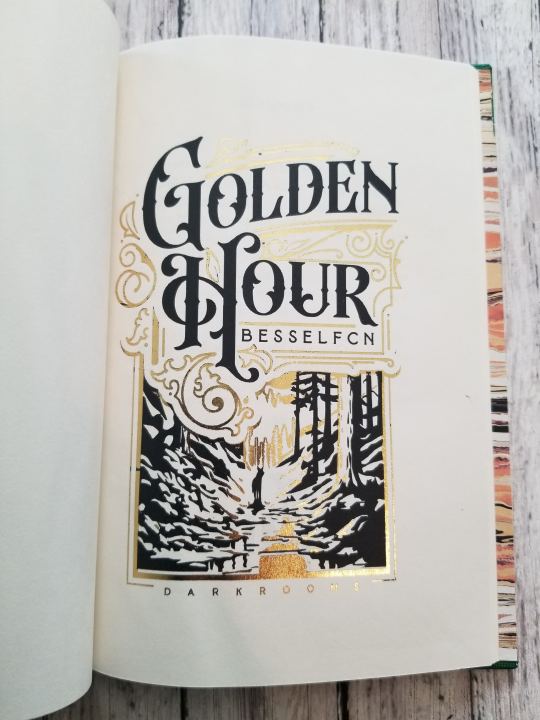
The title page, foiled with toner reactive foil--boyfriend designed everything and he really liked this title page, even if it's the name of the first chapter and not the actual collection of stories, lol. But I liked it so much I couldn't help but include it. Along with:
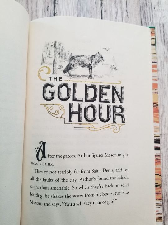
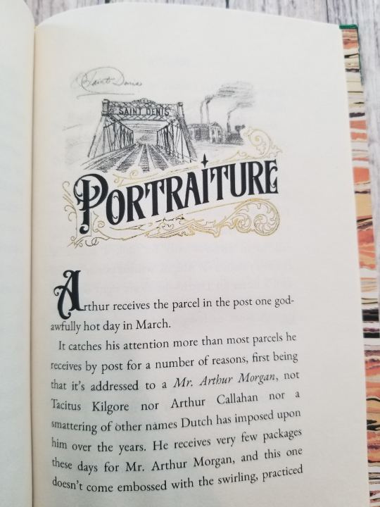
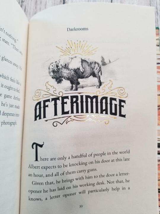
All of the font designs and curlies were made by the boyfriend, but the pictures are all Arthur's. I found this reddit post where someone had collected all of the pictures Arthur draws in his journal, so these pencil drawings (well, printed pencil drawings) are all Arthur's actual pictures from the game. I thought it was such a neat touch and, because Arthur's journal is an important part of not just the game but this story as well, I thought it was important to include them. There are a few more random pictures for chapter breaks, etc. but they're not super fancy like this.
Anyway, not much more to say about this binding. It's getting easier to do these and I make fewer mistakes--I made the case on this just a smidge too short, or maybe made the textblock a smidge too big, but that was about it--and although the HTV is always a pain it's getting more reliable as well. This cover was a pain in the ass to weed, though, and needing to do it twice kind of sucked. Anything in the name of art though! I'm so excited for the author to see this and I'm really happy to be able to add this to my collection!
92 notes
·
View notes
Text
ROUND FOUR
ROCK LEE vs HATAKE KAKASHI
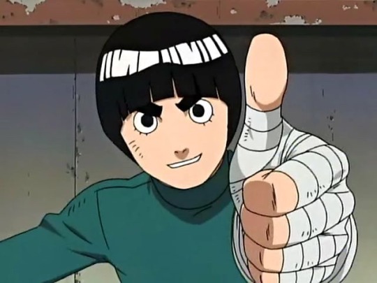
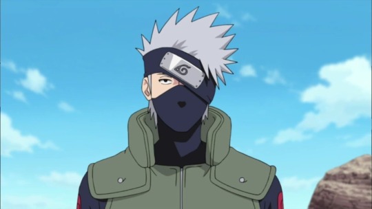
Reasons for submission under the cut
Lee
ROCK LEE VS GAARA
kind as can be; willing to jump to action to help his fellow comrades even after going through a life-threatening, major surgery
practical and fashion-forward with his bright green onesie. Function over form, and is prepared at all times by carrying around a spare onesie he will give without question to anyone - even complete strangers
has a surprising edge to him at the beginning of the series; he was ready to severely maim anybody that he saw as a genius
more dedicated than anyone. Was forced to face his own mortality and make a life-or-death decision in the name of his dream, after a literal crushing defeat, and he chose to fight for it. Inspiring
embodies the ideals of original series Naruto. True underdog, had nothing going for him, came from nothing with no legacy or powers, was so disadvantaged that he physically could not meet the bare minimum abilities of his peers. But he worked harder than everyone else and proved that he can be a great shinobi despite all the adversity he faced
Sasuke had to copy Lee’s moves with his Sharingan to succeed during Chuunin exams
cute as a button. Come on.
his fans are dedicated and make amazing work, fanart and fanfic
Kishimoto said he was his favorite character to draw. Boom. Favoritism. Love to see it.
pairs well with everyone. Platonic or romantic, Lee has a great dynamic with other characters
his summer outfit from Guardian of the Crescent Moon Kingdom was the best outfit in the movie
gave us Metal Lee! Blessed us with Metal Lee, really
was the character to beat in the early series if you wanted to show how strong you actually are
Gaara vs Rock Lee was one of the most iconic fights in the series, and everyone remembers where they were when they first saw Lee drop his weights. He owned that fight so hard that people forget he lost.
was wronged by the series. He deserves to win as justice.
got [submitter] personally through the worst times; his ability to persevere face of adversity convinced me I could do it too. He wasn’t special and neither was [submitter], but we didn’t need to be. We can make ourselves great. If no one else got me, Rock Lee’s got me
he’s one of the first non-jutsu using ninja so make such a big impact
was the first person to actually harm Gaara
played a huge part in Gaara becoming a better person
he’s one of the only people that can catch up to Sasuke and easily rivals Naruto in Taijutsu
his kind, determined and cheerful attitude is a joy to watch
Rock Lee removing his weights is easily one of the most iconic moments in the entire anime
has helped several submitters feel better by simply thinking about how he wouldn’t want them to think like that
objectively would’ve made a better protagonist based on the themes alone
KICKS MAJOR ASS
wrecked Sasukes shit, I like Sasuke but that was really funny
he looks like a frog. Who doesn’t like frogs
inspired Sasuke
fights are always entertaining, they’re very well choreographed
he forgave Gaara for nearly killing him and nearly ending his dreams; he was never even mad at him
Rock Lee vs Sasuke was iconic
his heart is so full of love
never did anything wrong
had a squirrel befriend him
hard worker
good friend
rises to any challenge
when he does diss people they are the most brutal yet entertaining disses you ever hear
positive, weirdo, energetic, enthusiastic, joyful, chivalrous, motivated, dedicated, sweet
Lee and Neji had something homosexual going on
YOUTH !!!!
Kakashi
relatable as an adult
he is just an overworked guy who was told to watch some kids w LOTS of issues
needs therapy
good presence and guidance in Narutos life
interesting
cares about and is dedicated to his students very much
he is just cool
he is trying his best despite what he has been through in the past
is up for having fun but still knows when to be serious
was a narcissistic shit but grew out of it
has good intentions
sexy
wonderfully complex and well developed character
incredibly resilient and supportive
a sad and deeply broken man
always willing to give his life to protect them and his other precious people
just wanted everything to be ok for once in his life
hated Danzo
his friendship with Gai is adorable
the way he teases Tenzo is fun
he’s known as cool and aloof but in reality he’s a huge dork
Gai would want him to win
422 notes
·
View notes
Text
Ghost Princess!Jazz design
So, since I'm posting chapter 24 of Friendly Neighborhood Vigilante, finally these will see the light of day!!!
Designs and drawing by the amazing @herbatahleb!!! I commissioned him these drawings so I could visualize the suit in my head better; and also so peeps could see what I'm talking about!
Thank you so much Hleb!
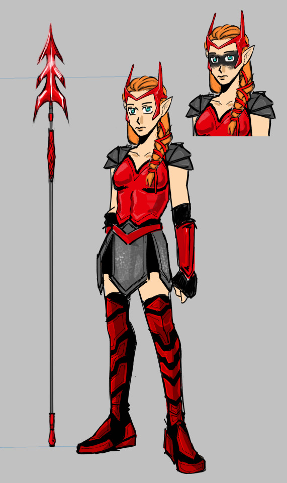
Alt version that was scrapped during the design process and me rambling about design ideas under the cut

So the Idea was that in this AU Jazz was trained by Pandora and the dead Amazon warriors in the greek afterlife.
Jazz doesn't use guns, not because of morality or anything, but because she sucks ass at shooting and is like the moment she hits the trigger it doesn't matter where she was aiming, she will cause an accident/hurt someone. (Weapons she doesn't have to actually aim are kinda okay, but you have to be ready for her blowing up something)
So she compensates and uses a lot of long range weapons, with her mom's staff being the one she uses the most. The staff has 2 settings: spear, which she uses for a more aggressive approach (think Okoye and the Dora Milaje from Black Panther)
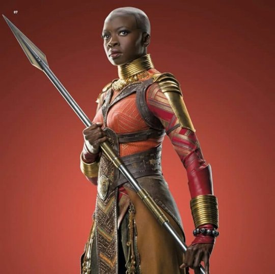
and War Mode, with the War Mode is the one that is in the final design. I sent Hleb a bunch of reference pictures and the lance is based on Ares' lance in Destripando la Historia (a spanish youtube series)
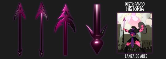
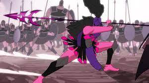
My general idea is that Jazz is inspired by the war god because she herself had to become one for Danny. She's one of their best strategist but she is also vicious in battle and the best at hand to hand combat and most versatile weapons-wise.
Her suit is also red because it stands out in the Infinite Realms. She makes herself a target so she can attract her enemies to her, since she can't fly or doesn't have a means of quick transportation during battle.
Armor is made for speed and agility, and it's charmed so it enhances her natural ghostly abilities and physique. Her arm pieces can project an ecto shield for defense.
For the crown I had a few references, but mainly Wanda's headpiece in MCU
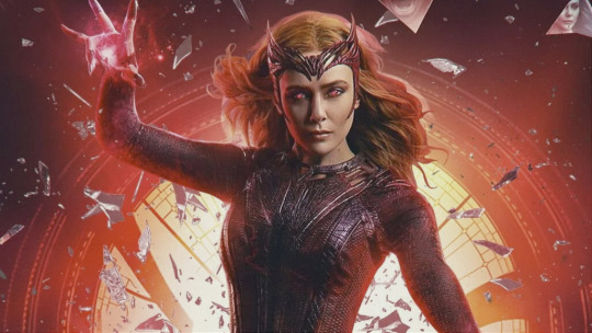
But also I wanted to include some kind of high fantasy crowns for her, because that's her crown as a princess. While Danny has the black metal one that's constantly on fire, Jazz would have this armor headpiece and only the "tips" would be on fire and then the actual crown appears out of thin air as a fire circle over her head.
For me this detail was important because it showed: first, how for Jazz her crown IS part of her armor and how deeply entwined being a princess is with being a warrior while Danny can be the king without the warrior; and second, to represent how "fake" as a ghost princess she is, since she's not actually dead-dead, because only 2 singular points are actually metal but the rest comes and goes and doesn't anchor to anything.
We also used a bunch of references of Kassandra from Assasins Creed Odyssey
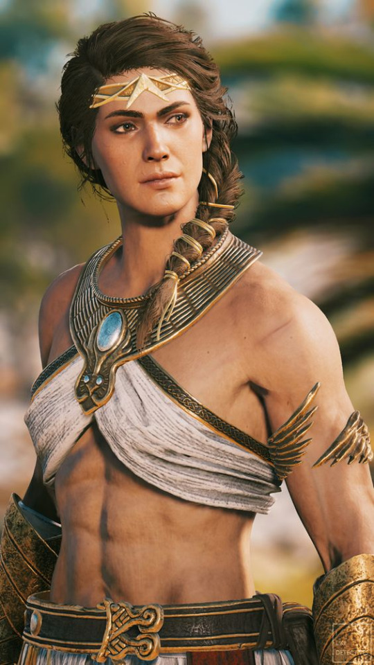
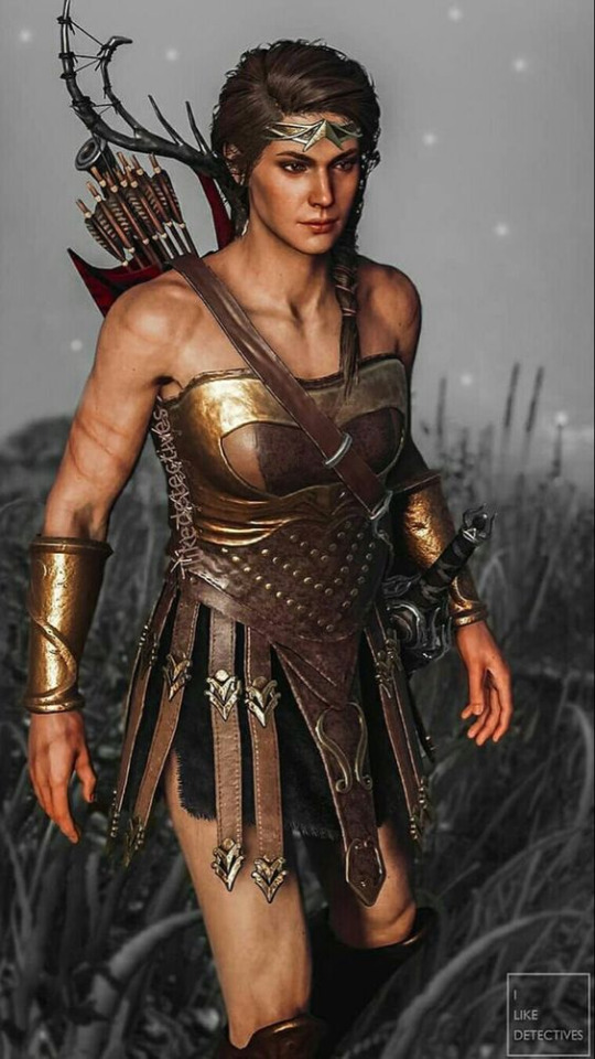
For the boots and other details I really just sent Hleb a bunch of pictures from the Wonder Woman movie Amazonian armor design

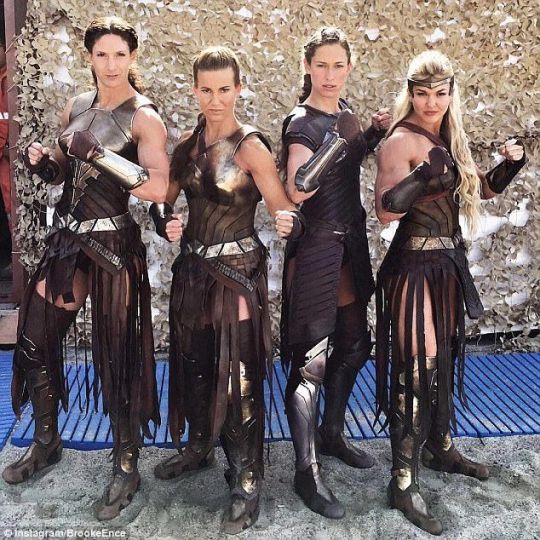
Anyway that's all my rant. I'm very happy with the final design and Hleb was very kind to sit with me and let me be specific about what I wanted. Love you, darling!
#gil talks#neighbors au#friendly neighborhood vigilante#danny phantom#jazz fenton#ghost princess!Jazz#tbh if someone wants to take this and run be my guest#i want more badass warrior princess jazz#is that too much to ask#also if someone has a question ill be happy to ramble about blorbo
162 notes
·
View notes