#inspired by 80s cartoons and their weird weird color palettes
Explore tagged Tumblr posts
Text
happy one year (and 5 days) to the van scene and jonathan's driving prowess
#inspired by 80s cartoons and their weird weird color palettes#animation#pretend you're watching this on a huge boxy tv okay#it's so vital#music- wildflower by beach house#shoutout to beach house they fuel me#2d animation#cartoon#will byers#mike wheeler#jonathan byers#argyle#byler#byler fanart#byler animation#stranger things#stranger things 4#fanart#stranger things animation#my art
3K notes
·
View notes
Text
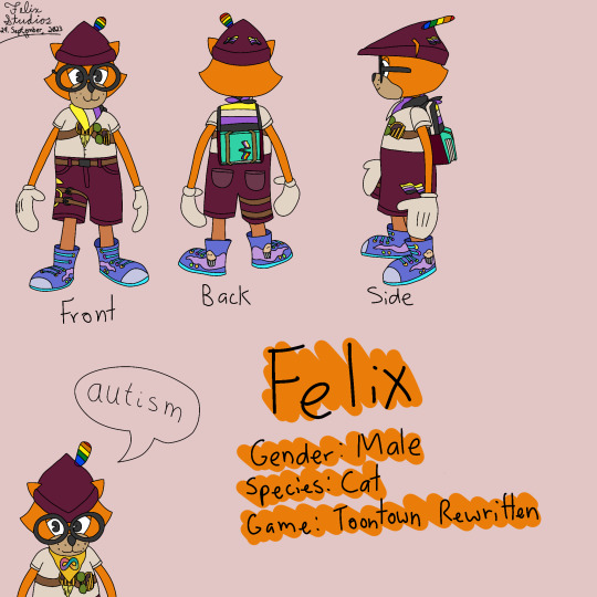
Infodump about Felix
Appearance rambles:
Even though he's covered in enby pride flags, Felix as a character isn't enby. I'm just projecting my pride onto his design since he's one of my main fursonas + he looks amazing in it
The pride flag on his backpack comes from a content pack someone named Trick made for me a long time ago. I asked for the texture to be changed and said surprise me, and that's what I got. I've kept it as his canon design since.
That also inspired me to add more enby flags to his design, which were added in with content packs {except the one on his shorts}.
The shirt and shorts are the ones they are 80% because I literally didn't know what else to wear and 20% because I actually thought it looked cool. Actually, that's... a lot of his outfit.
I got the shoes during ToonFest 2023 when all the previous codes became public. They look terrible on him and do not fit his color palette or aesthetic. I love them <3
He used to be a tall Toon, but I wanted to look closer in appearance to someone else's Toon so I changed him to a medium height Toon. He also used to be completely orange, but I gave him coral legs because I thought it was something I was obligated to do for being high laff because I saw all the high laff Toons with different colored legs. Past me, sweetie, those were elitists... but it's okay because now I love the coral legs and don't think they're an abomination!
Basically, he's very much thrown together from outside influences and I wouldn't change it for anything now because it became his "brand"
OC lore rambles:
So once upon a time a Toon named Ghostly Felix glitched so bad that his immersion in the world was completely broken and he realized he was in a video game. This was exciting at first and he hacked in max everything, cheated to be invisible so he could hilariously kill bosses with just bike horns or something, ETC.
But after a few years he got bored and basically started pondering his existence. So he created a Toon named Felix so he could be invisible and watch him complete the game so he'd have something to do. When just Felix was boring, he made Cap'n Felix, Doctor Felix, Mr. Felix, Judge Felix, Midnight Felix, Spooky Felix, Frozen Felix, Lucky Felix, Fairy Felix, Prince Felix... you get the idea.
Well, on the day Felix reached 140 laff he found Ghostly Felix by a weird glitch. At first Felix thought he was a new Felixverse addition, but realized that Ghostly Felix already had 140 laff and was acting really scared for some reason. Finally, Ghostly Felix spilled the beans about the fact it was a game and how he created the Felixverse
Felix was horrified to find out he was right, and he instantly got pretty bummed out and asked what the point of his existence is.
Eventually, this was his answer: "To have fun. You don't need to spend so long thinking about it or making it complicated- it really is that simple."
Other rambles:
His name is Felix because when I first played TTR, I tried to name him Shaun because that was my name at the time. It was instantly denied, so naive me thought "too many Toons must have that name already" and picked a random pick-a-name. I didn't expect to really get attached to my Toon or particularly care about him, which is also why he's such an obnoxious orange instead of literally any color I actually liked at the time. Well, orange is now my second favorite color because of him and I wouldn't change his appearance for the world.
He's not based off of a TTO Toon. I only remember one Toon I made in TTO, which was a red rabbit named Raboon {"rabbit" + "toon"}. I've already remade Raboon in TTR on a different Toon slot, but I didn't want to be a rabbit in TTR when I was first starting, I wanted to be a cat! So that's why I made a new Toon.
Originally when my Felixverse lore was much more resembling a kid's cartoon {yes the entire old lore that I told literally nobody was retconned lol}, he had a love interest Toon named Felixia. She was an orange cat who, like older cartoons, was basically supposed to be a copy/paste of him except feminine and cutesy. I do not have any Toons named Felixia in any of my TTR or TTCC accounts, but when I used to play Toontown Offline I did make her an unreasonably overpowered SOS Toon who would use marbles that did 200 damage.
Felix's name is actually pronounced in German, meaning that it's pronounced kinda like fae-lix rather than how most people pronounce it to me, which is fee-lix.
Speaking of his name, if it wasn't evident enough already, he was Felix before I was Felix. He basically became my identity online over time.
7 notes
·
View notes
Photo
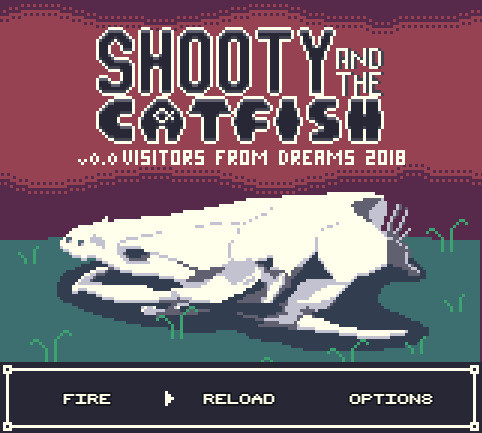


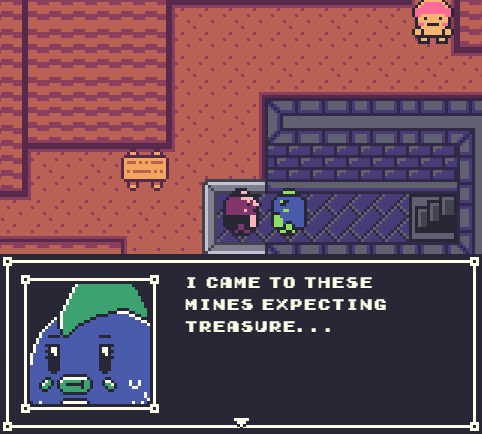

November’s Featured Game: Shooty and the Catfish
DEVELOPER(S): Daniel ENGINE: RPGMaker MV GENRE: Adventure, RPG WARNINGS: Course Language, Gore SUMMARY: Shooty and the Zaat are a dynamic duo solving monstrous mysteries!
Play the demo here!
Our Interview With The Dev Team Below The Cut!
Introduce yourself! Sure! So my name is Daniel, I guess technically I am an animator. I started out making flash cartoons around 2000 just for fun and became a professional animator in the advertising space around 2007. I have been working in media ever since, both in studios and as a contractor working under the Visitors From Dreams label which is also the label I use for my game development. I started dabbling with RPG Maker in around 2002 but I never got very far. Once I got into the media industry I wanted to pick it up again but with Mac being what almost all my work was done on, at home and in studio I didnt get the chance to actually get into it properly again until MV released, infact I was so excited that I purchased MV the day it dropped and immediately begun development on my first title Flatwoods. Ironically Shooty and the Catfish was developed on a PC, but I digress.
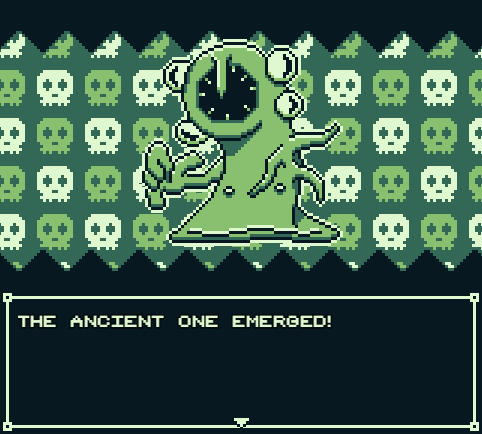
What is your project about? What inspired you to create your game initially? *Daniel: Shooty and the Catfish is set up pretty simply. The 2 lead characters, Shooty and Zaat run a sort of monster investigation unit out of their home. They get calls to different desitinations to deal with different monster problems. I really wanted it to feel like it was set up in a similar way to a lot of cartoons from the 80s, where every episode had a pretty similar but still managed to feel like a little self contained adventure. I have thrown in some little elements of an larger narrative but they are light until the final episode. Originally the series was pitched to Frederator for Cartoon Hangover, it got a little ways into early development but then Youtube changed its algorythm and animation on the platform became a struggle and the project was dropped. I didnt want to waste all the work I had done on the concepts and so I eventually tried to find a way to work them into a game, its taken me quite a few years to get as far as I have with development, but I would be even further back if I had tried to animate it all alone. I created Flatwoods to try and get a small project out, you know, to get some experience with the engine, little did I know how much more I had to learn!
How long have you been working on your project? *Daniel: I pitched Shooty and the Catfish back in 2013 from memory, but it didn't start to take shape as the project you currently see until the last 12 months. In that sense I am incredibly happy with how quickly the game has come together.
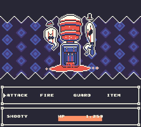
Did any other games or media influence aspects of your project? *Daniel: So many things have influenced my work its not funny... Where do I even start? Shooty and Zaat have a bit of a Finn and Jake thing going since when the project was originally pitched to Frederator and thats what they were looking for at the time. Resident Evil 4 (the closest any game has ever come to perfection imo) was the inspiration for the games ammo based combat system. Demons Souls originally derailed the project when I tried to emulate its non linear hub based design (you will notice the demo takes place on a single island instead), that created all kinds of balancing issues though so thats all been stripped back and is what lead to the decision to make the game episodic instead. One element from Demons Souls that remains in the game is a diverse mix of linear and looping level designs when it comes to mapping. The game also features towns that have layouts based on unused maps from the Pokemon GS 97 Spaceworld demo since they never made it into any of the actual games in the series. Pokemon GS also influenced the games visuals. I'm not a big RPG guy, but I played a hell of a lot of Pokemon growing up and Gen 2 is still my favorite. Trying to get MV to emulate the limitations of the Game Boy Color was quite the hurdle, I still cant believe I got it working as well as it is. I also have a lot of cameos from other peoples RPGM games, so there's that. Its a big ol' mixing pot of ideas and inspirations.
Have you come across any challenges during development? How have you overcome or worked around them? *Daniel: Countless, the biggest challenge is always scope though. I originally wanted the game to be like 3 hours long tops, now its well in excess of that and that's before I have even put in meaningful NPC interactions. That's why I have decided to break the game up into episodes, each one should be around an hour which is much more my jam. I don't have a lot of free time so I tend to gravitate towards games that are tight and short, I think that's why I am so determined to keep this game in nice manageable chunks. Now that the game is shorter I don't need levelling so I am starting to tone down the RPG elements. One change always leads to another, but episode one is getting damn close to completion. I say this before I have even had the chance to announce the game's going to be episode on my own blog, ha ha. Episode 1 January, The Great Spore Chore! Keep your eyes out for it!
Have any aspects of your project changed over time? How does your current project differ from your initial concept? *Daniel: As mentioned above a lot has changed, I feel the biggest change was when I tried to move the game from being episodic into one adventure after playing through a bunch of other RPGM games for ideas, it all started to feel a bit aimless and the storytelling techniques I had planned when it was episodic weren't translating well as the game progressed. So I guess now the game is episodic again we have come full circle! So many ideas seemed good on paper but ended up not really being fun or adding anything in practice. Oh yeah, and the transition from Game Boy green to color was a big one based on feedback from the demo. Some people were finding it hard to tell what elements were interactable, doors in particular, I hope that color has helped minimize that issue. Key items will also have an animation on them so they are hard to miss. I'm not a fan of hunting for items in big maps, it's certainly not something I want to subject people too in my own projects.
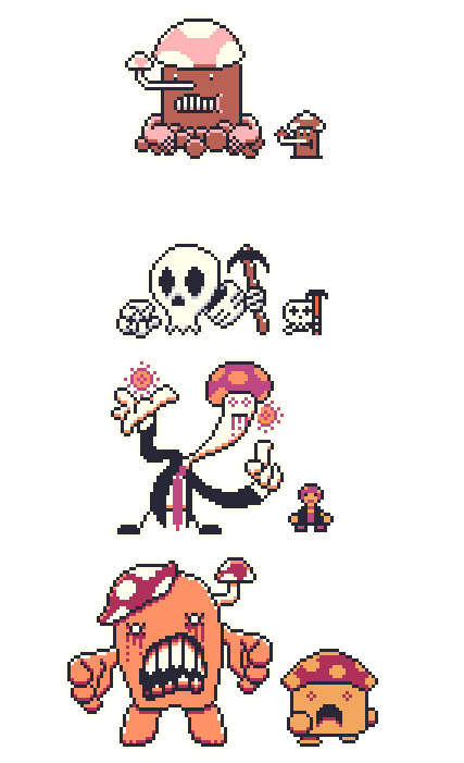
What was your team like at the beginning? How did people join the team? If you don’t have a team, do you wish you had one or do you prefer working alone? *Daniel: This project has had a few key people involved. Outside of myself I have worked with 2 musicians. One is an old school friend who did music for my animations back in the early 2000's. He has contributed a bunch of really cool EDM which makes up most of the games OST. On top of that there is also a number of optional bosses (one per episode) that have music composed by Secret Agent Ape who worked on Soma Spirits and a bunch of other upcoming games. I have been really lucky to get to work with such rad dudes.
What is the best part of developing the game? *Daniel: I love designing enemy battlers, my process usually involves me drawing a weird shape, sticking some eyes and a big goofy nose on it and trying to come up with a stupid pun to use for a name while listening to bands like Yes or Klaatu. It's bliss. I have a lot of people ask me why I have limited myself in terms of resolution and color palette, and it comes down to one of the important things I told myself when I got into game making as a hobby was that I would stop if it ever started to feel like work. I spend my days doing heavy visual effects and compositing, sometimes doing complex character animation. I want to keep that stuff as far away from my game development as possible. Ironically working within the incredibly restrictive limitations of the Game Boy has ended up being incredibly liberating and keeps things feeling fun as opposed to feeling like more of what I do all day to pay the bills.

Do you find yourself playing other RPG Maker games to see what you can do with the engine, or do you prefer to do your own thing? *Daniel: I always enjoy checking out demo's of upcoming games. Both Heartbeat and Virgo and the Zodiac's demos blew me away from a technical standpoint on the MV front. I still find it hard to believe those demos were made with the same engine I'm using. I guess it really shows what can be done when the engine is in capable hands. I wish I had more time to play actual full releases, I mean Jimmy and the Pulsating Mass just came out and I have no idea when, if ever I will have the free time to play it because its such a commitment. I feel like I am missing out on some great stuff.
Which character in your game do you relate to the most and why? (Alternatively: Who is your favorite character and why?) *Daniel: I guess I relate to different characters in different ways. Slim Grim is the one who hands out assignments to Shooty and Zaat, he is pretty much done with life, over people and the world itself, I think thats something we all have a bit of inside of us. Shooty is a very positive individual, his solutions to most problems is a bullet with a smile, and I think theres a bit of that in all of us as well. Zaats a bit of a cheeky smart arse, so I guess in a lot of ways I am most like her as a person. One of the episodes also features Gerkinman who is and has been a sort of self insert in my work since 2001 so I guess technically I relate to him most... ha ha, but thats cheating!

Looking back now, is there anything that regret/wish you had done differently? *Daniel: I wish I had done a better job keeping the project focused. I feel like a good few months were spent making the game bigger in ways it didnt need to be.
Once you finish your project, do you plan to explore the game’s universe and characters further in subsequent projects, or leave it as-is? *Daniel: All of my games are loosely connected, taking place in the same world. None of them tie directly into each other, im not big on the cinematic universe concept that seems so popular right now, but events in my previous 2 releases and the 5 planned episodes of Shooty and the Catfish are loosely connected in ways people who take the time to look can find. They are also tied into around 17 years worth of animated shorts I have released. I have no plans on stopping now!
What do you look most forward to upon/after release? *Daniel: Well, theres quite a few things... Mapping for all 5 episodes (outside of towns) is complete, so when Episode 1 is done I will be immediately rolling into Episode 2. I am aiming to have an episode out every 2 months which should be doable with so much of the game already finished. I also have a couple of short films I am looking forward to being able to invest some time into, things have slowed down in recent months due to freelance but I am eager to get to animate some of my own work again. I am also eager to see the comments sections on Lets Plays. Both Flatwoods and Hazmat got a bit of Lets Play action and a couple of those have some pretty substantial comment sections. The amount of theories people try to put together for these projects is staggering. I could never write something as entertaining as what the speculations in these comment sections contain in terms of what my games mean, it cracks me up and I find it quite flattering that random people have put more thought into elements of my stories then I have. Makes me want to keep things deliberately vague just to encourage more of it. Lastly I will be releasing all the build files for the project so if anyone wants to make fangames or whatever they have direct access to all of the core files used to build the games. Im a big fan of the concept of a mod community, and while RPGM doesnt exactly allow for that, id love to see people do similar things to my work as whats been done with a lot of LISA fan games.

Is there something you’re afraid of concerning the development or the release of your game? *Daniel: I don't know about being afraid exactly. I am curious about how my business model for the episodic releases will go over. I was planning on releasing them at $1 an episode and $4 for the bundle when it's all complete. I know some people think thats still charging too much, but some people have also told me im not charging enough and that it lowers price standards accross the board for RPGM content. The way I see it if I can cover the costs of Steam and the music I commissioned then I've done alright since this project was for fun, but that's just me.
Do you have any advice for upcoming devs? *Daniel: Just keep at it and set yourself small goals. If your working on a big project break it up into manageable sections. Take things one map at a time, ya know what I mean?
Question from last month's featured dev @overcast-rpg: If you could choose an RPG Maker gamedev to release another game; which one would you choose and why? *Daniel: Oh that's an easy one, The Catamites. I love Space Funeral, it's easily my favorite game made in the engine, and while The Catamites has developed countless games since its release, they have all been in other engines. It would be fun to see them return to the engine after all they have learned about game design since Space Funeral's release and to see what they would do.
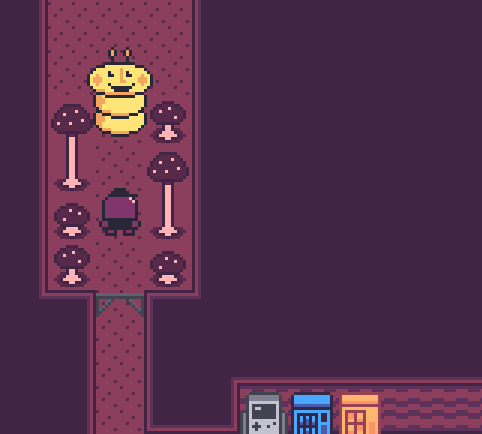
We mods would like to thank Daniel for agreeing to our interview! We believe that featuring the developer and their creative process is just as important as featuring the final product. Hopefully this Q&A segment has been an entertaining and insightful experience for everyone involved!
Remember to check out Shooty and the Catfish if you haven’t already! See you next month!
- Mods Gold & Platinum
#rpg maker#rpg maker games#indie games#free games#pixel games#shooty and the catfish#games#gotm#game of the month#november#november 2018#inktober 2018#gotm 2018#game making#game development
377 notes
·
View notes
Text
Skateboard Artist Profile: Lauren Ramer
New Jersey designer and illustrator Lauren Ramer’s skateboards give us a warm, nostalgic feeling as her graphics remind us of late 80s and early 90s deck designs. It was a time when skateboard graphics, much like the people who rode them, fit in very few scenes outside of its own culture. Of course Lauren has a contemporary take on deck design, but her obvious connection to the genesis of modern day skateboard graphics, and her delightfully repulsive designs, made us very curious about her first exposure to skateboarding as well as her creative process.
What was your introduction to skateboarding?
Growing up I had a lot of guy friends. I would hang out with all the skateboarders and so eagerly want to skate, but, unfortunately, lacked any and all talent for skating. Although I sucked at it, I would still try and I would fall… a lot, especially when I turned 18 and got my first longboard. I hit a huge rock, face-planted in front of my house, and was covered in band-aids for a few days. It was around this age I realized that maybe I would be a part of the community by using my artistic side to design skateboard graphics instead.
During those early days in the skateboarding community, were you influenced at all by skateboard graphics? Was it even something you noticed at the time or do you ever think back to those designs?
When it came to skateboarding the graphics were all I ever saw or noticed. When it came to brand, speed, style, etc. I didn’t really know any of it, but the bright and crazy graphics are what always stood out to me.
Your designs have a classic skateboard graphic feel, combining gross or dark subjects with a playful sense of humor. Was using skateboards as a canvas a natural progression for you or something that was always in your sights as a designer?
Designing skateboards felt like a very natural progression for my art style, especially since the subject matter I like to draw doesn’t fit into a lot of industries.
In the beginning, what drew you towards art or was it just something you always did because it came naturally? What were some of your earliest creations and inspirations?
I have been an artist for as long as I can remember, but I personally feel like I didn’t start finding my style and artistic voice until college. Over the years I tried to experiment with different mediums to find what I like, but I really like pencil and ink drawings followed by digital coloring. It just feels natural! Also, one theme that has really stuck with me through my art development is horror. Through high school a lot of my art revolved around horror, creepiness, and just overall weirdness. I’ve always had a love for horror movies and creepy characters so it felt natural I keep that theme in my work.
My designs always seem to take a cute, light turn and I honestly have no idea why. Whenever I begin a project with the initial thought of “Oh yeah! I’m going to make this gross, disgusting illustration.” it always ends up becoming cute and charming somehow. Also I think my use of bright colors also adds to this.
Who is the artist that inspired you the most when exploring this side of your creativity?
I was always very inspired by 90s cartoons like Nickelodeon and Cartoon Network. The weird characters and funky colors always got me so excited. One artist who really inspires me is Chris Piascik. One of my professors at college introduced us to him, and ever since then it made me feel confident that drawing weird and unusual creatures is something people actually want to see!
When creating graphics for a skateboard do you start with the idea that it’s going to look good on a deck or does that realization come after the graphic is completed?
For my skateboards I always take into account the strange long dimensions. I usually start with a small rough sketch of a skateboard shape, then I create my illustrations to fit nicely inside the weird shape. I like to think of things that are tall or long, for instance right now I am working on a really tall and gross cheeseburger deck.
What’s your process for creating a design as a skateboard graphic?
After I have have drawn a little doodle of a design inside a skateboard shape I redraw it at a slightly larger scale on Bristol paper, usually 11 x 14 [inches] or something. This is where I usually take a lot of time to draw in all the details. When I get to the inking phase with pens I don’t like to have to think about anything, so I take my time in pencil mode until I’ve got the drawing to where I like it.
After inking, I scan it into my computer and I color it in Photoshop with my Wacom Cintiq. Adding bright colors is my favorite part. Also, I’m so indecisive about colors. I usually go through like 6 different palette options before I find the one I like.
Describe your work space and the conditions in which you enjoy designing.
Currently I have my own small studio in the second bedroom of my house in which I use to create art. It’s amazing to have my own space considering over the years I never had an art studio. Before this I was living in a small 500 square foot house where my “studio” was just a corner of my kitchen. Now it’s great. I can listen to music or watch It’s Always Sunny… and lock myself in my studio for hours on end. It’s surrounded with all types of art and weird decorations so it definitely makes it feel like home.
Do you figuratively or literally ever go outside of your comfort zone when creating?
I feel like I haven’t really gone out of my comfort zone in a while, especially with my illustration, but I think that’s because I tend to dabble in quite a few different hobbies and crafts, so I don’t get bored of one thing. For example, I painted a mural in my house a few weeks ago and the style, medium is very different than my illustration. I tend to find other outlets to express creatively so I don’t ever feel a need to leave my comfort zone.
However, I will mention that I am currently doing Inktober this year and, although it’s not totally out of my element, color is my safe space, so doing strictly black and white illustrations is a little scary for me!
What’s the mural you painted in your house?
I feel like most people would expect me to say “Oh I painted a giant monster with boogers” since that is my illustration style, but I actually just painted a really simple mountain scene. I like my house to feel homey and serene. I keep the weirdness to my art studio.
Do you only create digitally or is there another medium you enjoy exploring?
When it comes to my illustration and my style, digital is what I love. However, every now and then I like picking up all sorts of mediums and tools for creating. Sometimes I like sewing and knitting, other times I even like acrylic or oil painting. I think I just prefer digital illustration nowadays since there is no mess and mistakes are easier to fix.
Where does the name Freak Head come from? Why was that choice made for your skate brand name?
When I was trying to think of a name for my boards I wanted something fun and strange. Not sure how those two words came together, but it felt right!
What would be a dream project within the skateboard industry? What about a dream project in general?
For me a dream project isn’t necessarily an individual illustration, but more of a dream to launch my brand into a full on skateboard and apparel company. It’s definitely one of my long term goals, but there’s much work to be done!
What advice do you have for other artists when tackling the concept of putting their designs on skateboards? What general advice do you have for artists getting started?
Just do it! Skateboards are a unique medium in which really anything goes for skateboard graphics. Any gross, pretty, silly, or simple graphic can make an awesome board design. So just start doodling, painting, or whatever it is you do and throw it on a board.
Lauren’s Freak Head skateboards can be seen and purchased at BoardPusher.com/shop/FreakHead, find more of her artwork at LaurenRamer.com, follow her on Instagram and most social channels @laurenramer, and, if you’re fortunate enough to be in Philadelphia this weekend, find her booth at the Philly Punk Rock Flea Market this Saturday, October 27th.
Skateboard Artist Profile: Lauren Ramer published first on https://laderaskateboards.tumblr.com/
0 notes
Text
January 2017, Pt. 2
The Gaze: Ep. 2 - Young Thug’s “Wyclef Jean,” Banks’ “Trainwreck,” & Missy Elliott ft. Lamb’s “I’m Better”
youtube
"Hallelujah Money” - Gorillaz
Released: January 19. 2017
Directors: Giorgio Testi & Gorillaz
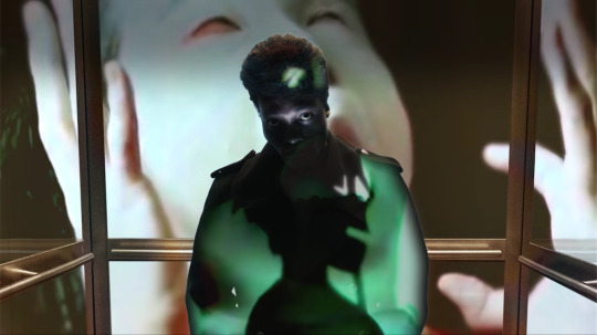
Hunty: This is supposed to be their anti-Trump video, right? My main problem, is that I’m having a hard time focusing on what he’s saying and correlating that to the imagery behind him.
Kirk: I miss when Gorillaz was a band that was giving us the vibe that it was actual cartoons making this music, and they were the stars of these videos. In recent years these characters are secondary to the music, and it’s primarily other artists that are featured in their videos.
I love the way he’s lit, though. It’s kind of vintage-looking the way they’re playing with the light and shadows. It goes back and forth between projecting on him and being a background projection.
H: I think we’re both big fans of videos where people use projection screens like this and in Rihanna’s “We Found Love” video, for example. You can do a lot with it because you can include any imagery you want, but also have a performance in front of it. The visuals in the background range from dark dystopian stuff, to cartoons, to psychedelia.
K: The beginning clips were darker so when the cartoons come in, they've been staged with a darker tone too.
H: I’m sure it’s saying something about the way we consume media. All this shit just mixed together.
With this book that he’s holding, the black outfit, and his hands shaking, it’s almost like he’s a hellfire and brimstone preacher. It’s very ominous.
K: It feels very apocalyptic. This video feels like he’s giving some sort of sermon-y address to the world and this is projecting in people’s homes telling us “The world is ending.”
H: That’s kind of exactly what’s happening, though.
"Touch” - Little Mix
Released: January 19, 2017
Directors: Director X & Parri$ Goebel

K: I hate it. I think everything about this video is bad. This Lisa Frank folder color scheme of the walls is just killing me.
I think all the looks are terrible and don’t work well as a group. I understand not matching, but there’s also a way to compliment each other.
The camerawork... it’s a lot at once.
H: I love the ripped up sweater with the pendants hanging off of it. That’s the only outfit that I like. I particularly hate the nude bodice over the baggy sweater.
But I agree. Two of them have really dark outfits and the other two are wearing pastels. Meanwhile, the walls have a mix of really bright colors with pastels.
K: Who thought it was a good idea to have nude tones against these bright easter egg colors? I don’t know who did the costume design and art direction for this video, but it just looks strange.
H: It is giving us some sugary-pop spice girls vibes, even if it is a Lisa Frank version.
K: The Spice Girls were never like this. If you think about the “Wannabe”video, at least it works in the sense that it doesn’t look bad, even if it is simple and people only like it because of nostalgia. It’s a simple setting with them showcasing their personalities, and that’s it. Any other girl group could do that and it could be cute.
Everyone now is into these CGI constructed worlds. You have access to literally whatever you want, and THIS is the color scheme you’ve chosen... If you’re going to do it, execute it well.
H: We’re not getting anything conceptually innovative. They have the elements of what a girl group tends to be, but nothing’s executed super well.
I think it maybe says something about the internet generation where if you’re going to drop something, you want to have the most attention-grabbing video. It might be an eye sore, but it has a lot of views. It’s so wrong and extra that it kind of entices you.
K: We’re going to look back in 10 years and be like “Oh, remember when pop groups were all just trying to have the most colorful video, so we’d watch it on Youtube?”
"Pops” - Angel Olsen
Released: January 24, 2017
Directors: Angel Olsen & Jethro Waters
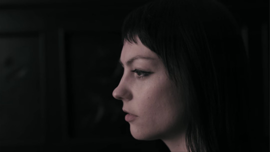
H: After watching “Shut Up Kiss Me” so many times, it’s nice coming back to the OG Angel Olsen aesthetic with these sad slo-mo shots. This obviously isn’t a banger off the album, and we don’t get the in-your-face imagery of the “Shut Up Kiss Me” video, but the song and video are both subdued and pleasing. A decent watch and listen.
K: I like that she’s giving us videos from the rock side and the indie-folk side of the album. She’s like “I can be quiet and introspective and also be a kickass rock chick.” It’s really inspiring coming from a female artist, since people really like to put female artists in a box.
H: This video reminds me of when an artist like Bon Iver or Sufjan Stevens convinces us they are these men from the wilderness when really they’re from Brooklyn or something, but she’s giving us something that is more realistically her world.
K: It’s like she lives in a very normal suburban place that any of us would live in, but the way this video aestheticizes the way she’s experiencing it makes us feel like she’s out in the wilderness by herself, which is a much more honest approach. It’s more of her being isolated in her inner world rather than this actually being the world.
I think it’s very easy to do a video like this and make it seem very trite, but it feels honest and sincere.
It really is a simple marriage between the song and images. It has a maturity to it.
“Kick Jump Twist” - Sylvan Esso
Released: January 24, 2017
Director: Mimi Cave
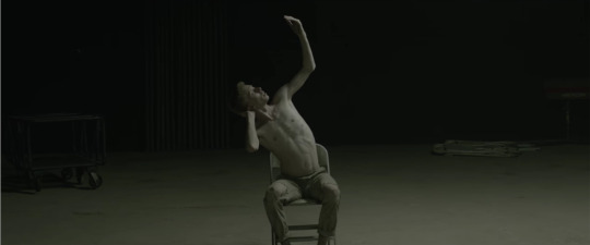
K: I love that somebody else besides Sia is playing around with modern dance.
H: Right? It’s nice to see a band who’s doing contemporary electronic-pop do something that’s more performance-arty.
I love that it’s a dance video with an unlikely star and in an unlikely setting. This boy is totally killing this dance even though he looks like he was plucked straight off a farm in the backwoods of Kentucky, where guys probably would be shamed for doing something “feminine” like dancing.
K: I like the dance itself. It’s mixing these very feminine and very masculine energies.
This dusty warehouse place looks like an old theatre that hasn’t been open for like 50 years.
H: The way the ground is sand that he can kick up and create this smokey look with the lights and then the lights flashing. It’s kind of like a lot of things we liked from the "Company” video: interesting choreography from the get and subtle aesthetic things that keep it interesting along the way.
K: It reminds me of the “Call Your Girlfriend” video by Robyn, because of the moving camerawork. This has been a long-take up until the cut to the crowd.
Also, the color palette is so good. The beige pants. The light pink wall. His skin tone and light red hair.
I didn’t care for this song, and now I’m very into it.
“Scuse Me” - Lizzo
Released: January 25, 2017
Directors: Quinn Morrow & Asha Maura
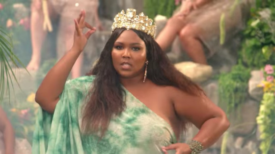
H: Lizzo’s literally taking us to church right now, so let’s listen up.
K: There are a lot of interesting correlations to be made between the subject material of the song and the setting of the church. The whole idea that she’s praising her body while in church and even the preacher is telling her to feel herself too. It’s giving you a taste of how spiritual it is for women to love their bodies.
H: And it’s a reversal of what religion normally tells women what to think about their bodies and sexuality.
Even this jungle waterfall scene has a religious feeling in an ancient goddess type of way. She’s like “I’m a badass queen, no matter where I am or what’s going on around me.”
K: I love songs about women feeling themselves metaphorically... or even not. Female masturbation songs are a powerful thing.
H: Yeah, her confidence is inspiring. Her music is like this weird hybrid of pop/soul/R&B/she’s also kind of an MC, but regardless she is selling it.
“I Don’t Wanna Live Forever” - Zayn & Taylor Swift
Released: January 26, 2017
Director: Grant Singer
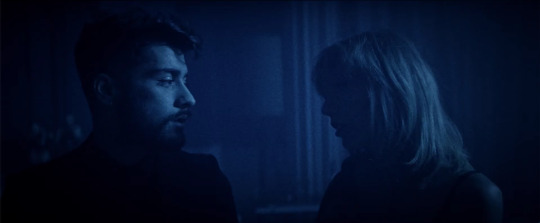
H: He is so pretty.
K: If he were a gay man, he would be evil.
H: He probably is evil!
K: I think when you’re that rich, good-looking, and successful you have to be evil.
H: He’s smart, though. He’s definitely not the best singer of the group, but he’s found a way to capitalize off of what he’s got, even if it’s mainly his looks, but like that’s what I’d be doing too, girl!
K: You have to be smart to be that famous. Although, I think this video is basic af.
H: It’s got kind of a cool noir-ish vibe to it, but it’s mostly very “We’re sexy people being sad.”
K: They’re too busy trying to be in without pushing forward for anything new. This is basically the stuff underground pop artists have been doing for years now. It’s like a co-opted pop-sheen version of what Sky Ferreira has already done that’s like... no.
H: That’s exactly what this video is. There’s no punch to it. If it’s supposed to be dark and sexy, we’re getting a very light palatable version of that.
(Side note: This video was directed by Grant Singer, who has directed almost all of Sky Ferreira’s music videos.)
“I Love You More Than You Love Yourself” - Austra
Released: January 26, 2017
Director: M Blash
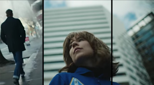
K: It’s got a really 80′s vibe but in a way that’s not super in your face.
H: It’s reminding me a lot of Stranger Things.
K: There’s something playful and campy about the whole thing like how she’s very obviously wearing a wig.
We’re out shopping, but it’s very clear that she’s on a very important mission.
H: These very quick, very close-up flashes of everything are doing a good job of keeping us intrigued but also aestheticizing what’s going on, because I still have no idea what’s happening in this video.
This album is called Future Politics, so I’m wondering what this is saying about modern society.
K: If I had to take a whack at it, I’d say it has the levity comparable to going on a mission to space for women to go and find the perfect look in an attempt to be these perfect image of a woman.
H: It could be addressing how the processes for women to maintain their appearance are often written off as frivolous even though they’re necessary to survival.
Then she doesn’t even use anything in the shopping bags at the dance club, so maybe it’s just trying to destroy this dichotomy between the career-focused female astronaut and the woman who enjoys leisurely shopping.
“Keep Running” - Tei Shi
Released: January 27, 2017
Director: Agostina Gálvez
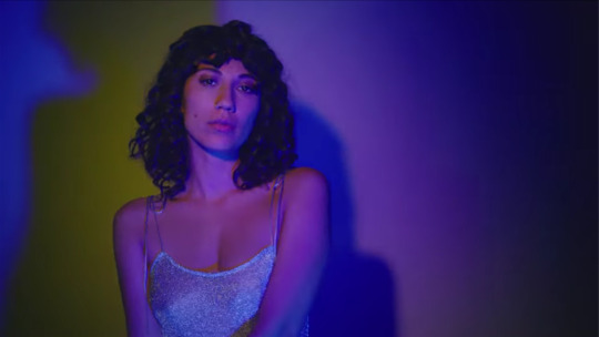
H: This is giving us Sky’s “Red Lips” meets Madonna’s “Hollywood” meets a Porches video meets Santigold’s “Banshee...”
It’s a perfect representation of the song. It mixes the chill, sexy, sultry R&B vibe with the neon-lit karaoke party vibe that highlights the synthpop sound.
K: It’s so simple, but it’s so well executed. There’s something very effortless about her.
The silk and the shiny floral wallpaper remind me of my grandma’s house, but it’s been sexed up.
H: All of those iridescent materials are super hot right now.
It’s fun that she’s being sexy in a very womanly way, as opposed to a girlish way that’s very prevalent in pop.
K: It’s like “I’m going to be sexy in the way that I want to be.”
H: Literally everything about this is perfect.
"Two Wildly Different Perspectives” - Father John Misty
Released: January 30, 2017
Director: Matthew Daniel SIskin
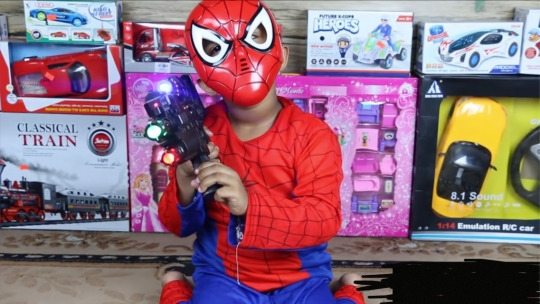
K: I love that this is shot like a home movie, since a lot of the aesthetics we associate with children on screen are in a home movie style.
H: You don’t realize the kid in the spider-man outfit is a person of color at first, but then he takes his mask off and the situation means something so different. It’s “Two Wildly Different Perspectives,” so I don’t know what I was expecting, but the contrast is really powerful, especially since the white kids are playing with real guns in some scenes.
K: I love that we’re getting these clips of a first-person shooter video game, and then a similarly styled shot using a camera and gun scope in real life.
This video’s amazing. This idea that we’re conditioning our children, especially boys, so young to think that violence and guns are a game.
H: It’s a statement about guns and violence are incorporated into how we raise men. I think it’s powerful to put the visual representation out there of how the typical American boy is socialized, but a lot of people don’t see the negative aspects of it until it’s a person of color, even thought this is how you’re supposed to assimilate to this culture.
K: I think it was really powerful having most of the imagery being of white people playing with guns and then the only imagery of the person of color playing with a gun is isolated to this one scene indoors, and the juxtaposition of those two among our political climate right now. In this video you make associations in ways that aren’t bashing them over your head. It’s subtle and delicate and guides you there.
Also, the music is the perfect backing to it. it adds to what you’re supposed to be watching.
H: There’s a softness to it even though it’s about guns.
K: There’s an innocence to it, and the fact that they do artistic things like the gun flashing in the dark. It hints at kids just having imaginative play and it not having to be about shooting other kids. These kids don’t know what they’re doing with these things.
H: We could just give boys toys that are not guns and not have differing expectations of a person’s relationship to guns based on their race.
“(No One Knows Me) Like the Piano” - Sampha
Released: January 31, 2017
Director: Jamie-James Medina
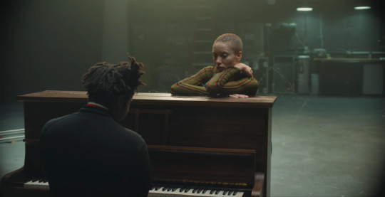
H: I think this scene of him playing the piano is going to be the whole video. That’s kind of the vibe of the song.
K: You know what this giving me vibes of? Peanuts.
*gasps*
I thought this video was one thing/ Now it’s this whole other thing, and I’m like dying.
Is she disintegrating?
I think she’s like his love interest or someone in his life that’s waiting for him, and she’s slowly sort of fading away because he’s so into the piano. That’s why it’s funny that it reminded me of Lucy and Linus from Peanuts.
H: Either way, it’s clearly this commentary on the isolation of focusing on your art and sacrificing relationships for that.
F*ck me up.
To see all of the videos we watched during the second half of January, check out our playlist on Youtube: https://www.youtube.com/playlist?list=PL5nKqMtDxQyb6S5CibxaWDTbOt3YRa7Aj
#Lizzo#missyelliot#banks#littlemix#zayn#taylorswift#youngthug#gorillaz#angelolsen#austra#teishi#sylvanesso#fatherjohnmisty#sampha#music#music video#music videos#missy elliott#little mix#zayn malik#taylor swift#young thug#angel olsen#tei shi#sylvan esso#father john misty
0 notes
Text
THIS IS SO GOOD AND SO ADORABLE I LOVE LOVE LOVE ITTT 🫶🏻🫶🏻🫶🏻
happy one year (and 5 days) to the van scene and jonathan's driving prowess
#prev tags#inspired by 80s cartoons and their weird weird color palettes#animation#pretend you're watching this on a huge boxy tv okay#it's so vital#music- wildflower by beach house#shoutout to beach house they fuel me#2d animation#cartoon#will byers#mike wheeler#jonathan byers#argyle#byler#byler fanart#byler animation#stranger things#stranger things 4#fanart#stranger things animation#my art
3K notes
·
View notes