#ineffable query
Explore tagged Tumblr posts
Note
hi i also submitted mile magnificent to the fellshish good omens brainrot game and i think that’s pretty cool
it's very cool!! You have excellent taste
The artist is on tumblr @ofgeography and I love her blog too, everyone should go follow and listen to the song!!
4 notes
·
View notes
Text
Good Omens graphic novel update: June 2024
Welcome to the June update. A lot of behind the scenes work at the moment but we're grabbing the travel sweets, popping in the Bentley and hitting the road. More on that below.
Admin
Ongoing reminder that the project FAQ can be found here.
I pledged using my Apple ID, or no longer use the address my pledge is attached to, or I cannot work out what email address my pledge is connected to. What should I do? Please contact us via your Kickstarter account where the pledge is connected; we will be able to see on our system which address it is. If it's one you have access to, great! The FAQ has information on how to resend your invite link to access the PledgeManager. If it's one you are not able to access, then you can let us know which email is preferred and we can update this on the system, which will automatically send a new invite.
Events
We've had a lot of queries about when the Good Omens team will be attending events more formally, after some Aziraphale and Crowley spotting at conventions we'd been to previously. Well, we're excited to confirm the first: Good Omens HQ will be at ACME Comic Con in Glasgow, Scotland this September.

We'll be bringing the actual-real-life-home-to-Crowley-and-his-plants Bentley from Season 2 of Good Omens, the first time the car has been made available publicly for fans to come see and get photos with, ahead of its journey back to the set and the start of Season 3 filming.
We also see Quelin Sepulveda, aka Muriel, has been announced for the event for some additional ineffable joy.
You can get your tickets for ACME Comic Con here. We hope to see some of you there.

While we won't be rocking up with the Bentley to this next one, we want to let you know about Ineffable Con which, though sold out in person, is also taking place virtually in July. The fan-run event hosts great panels, auctions and more, with money raised going to Alzheimer’s Research UK, in memory of Sir Terry Pratchett.
Where next? We have - not an exaggeration - a list of about 200 events somewhere from when we asked fans this on Instagram and while we can't promise quite that amount of convention attendance, we're certainly looking to do some more things in future with Good Omens at large. Watch this space.
Good Omens items...
This month has largely seen prototypes and samples for the wider Good Omens merch store arriving, and while we can't share those yet, we are certainly excited to see more fan product suggestions coming to life. That does, however, leave our public item updates a little slim on the ground.
To make up for that, here's some new panels from Colleen:

Also known as, "What could possibly go wrong?" And:

Also known as, "Well why don't you ▇▇▇ ▇▇▇▇▇▇ ▇▇▇ ▇▇!@#▇" or words to that effect, we'd imagine.
Update from Colleen
Following such a positive response to Colleen's piece last month, bringing you behind the scenes into making the Good Omens graphic novel, we are delighted to say that she has agreed to write something for our updates going forward! For June, she's going more in depth into the process of flatting and the technicalities of colouring on screen vs print. Over to you, Colleen.
---
I mentioned the other month that I use a flatter to help me with technical work on GOOD OMENS, and here is a great example.
This is my original, hand drawn line art.

And this is the flatting file which was created using the MultiFill computer program.

It will put your eyes out.
The raw image above demonstrates how the color art lines up solidly under the line art. If it doesn't do that, you get a weird phenomenon in print called ghosting, a tiny little line of white around each segment of color. I had this issue on one major project and ended up redoing every single color file after I got a look at the first printing. Nearly two weeks of work.
The same image with the line art on top.

The layer order looks like this.

Background copy is the clean, line art layer.
I scan the art at 600 dpi, then make the blacks pure black, the whites pure white. Then I convert back to greyscale, then RGB, then duplicate the layer. Then I delete the white on the upper layer so the line art layer is transparent but the blacks on that layer are not.
If you have blacks on a layer that has been multiplied, you can see slight color through those blacks. You want pure black.
The lower layer is where I use the MultiFill program to create the digital flats. First you use MultiFill to drop in the random colors, then the companion plug-in Flatter Pro to make those colors seal under the black lines.
This probably sounds like a silly thing to worry about, but if the flat colors don’t line up perfectly under the black line art, you get the dreaded ghosting I mentioned. You can see it below in this image. It’s a tiny little white line that will appear around the black lines and color areas.

This drives me nuts and is an absolute nightmare to fix.
It’s a very common problem, especially for people who work for web and don’t anticipate the problems going from web to print.
What looks great on your computer can cause big problems in print.
From here, my flatter Jul Mae Kristoffer, who is way over in the Philippines, does flatting that is more in keeping with the areas of color I want to isolate. As you see on Layer 1.

But again, this is still pretty ugly, and not what I would use for final color. Flatting is a technical issue, not a creative one, though in some cases a flatter will make choices you may use. Most of the time they don't.
Here is my final color page.

Sometimes my MultiFill flats are so wonky I have a hard time getting my brain to snap out of what I see before me. If I get stuck, it's a good idea to just pick at it and come back to it later.
If it really, really bothers me, I’ll take the MultiFill flatter layer and desaturate the color so it doesn’t poke my eyes out.
Here’s an example. The digital flat file.

The desaturated flat file that doesn’t make me want to poke my eyes out.

And the final color.

Sometimes I just put in a solid white layer so I don’t see the flats at all. Flatting is there to allow you to easily pick spots to color in, and doesn’t usually appear in the final work.
Sometimes I want to create my colors using transparent color over a white ground, which is more delicate in the final.
Here’s an example from Neil Gaiman’s American Gods. I also selected all black line art here and converted it to sepia to give it a vintage look. Except for the fairies. They’re green.

A colorist must also consider color settings.
Different clients can have different requirements. I find these color settings, which I got from the Hi-Fi Studio, to be pretty solid. I use them as my default for all my projects unless otherwise requested. If your publisher has other settings, they’ll usually send you a csf file which you can upload to Photoshop. The program will save your files and you can just switch between them as you need them.

This tells the printer things about the paper and the spread of the ink you will use. That’s what dot gain means - it makes printed color look darker than intended, so you set up your files to account for it.
When you hover your pointer over each box, it will tell you what each setting is supposed to accomplish.
Another really important thing to consider when coloring comics is color range.
I’m coloring this book in RGB range, but for print you use CMYK.
I’m about to confuse the heck out of some people with this post, I’m afraid. But here we go.
Here is this shot in RGB color setting.

And here is the same page calibrated for print in CMYK.

The biggest shift is in the reds. Print cannot match those reds.
You may not see much difference here, but it’s the sort of thing that drives artists crazy.
A computer should be perfect for conveying exactly what you want, right? It's all just 0's and 1's, binary information, and that information should be the same from one computer to the next?
Nope. Not even close.
First off, computer monitors must be calibrated. You can use a computer program or a tool that measures the color on your computer screen and then adjusts the color to an industry standard.
Have you ever been in an electronics shop where a bunch of TV shows were on display, all of them playing the same show, and have you noticed how different the color was from one TV to the next?
It's like that.
I freely admit I don't pay a whole lot of attention to calibration, but if I were a professional photographer I would. I'd have a little spectrometer attached to my screen and software would adjust my monitor to the best possible standard range. As it is, I just use the default setting on my computer and hope for the best.
If your monitor is properly calibrated and your art is shown on another monitor that is properly calibrated, the art will look almost identical from one monitor to the next.
YAY!
But from one monitor to the next, that's about where the resemblance ends.
Colors are calibrated to something called RGB, or Red, Green, Blue.
All colors come from a mix of red green and blue. At their greatest intensity, all the colors in the spectrum together become pure white light.
This is why RGB is called ADDITIVE color, because you ADD colors from the spectrum to get ALL colors, and all colors create the entirety of the rainbow, and pure white light.
Your computer monitor, your phone, your television, all images are created via light using RGB, a gamut that covers all possible colors that can be created.
That's a lot.
And that's why some of the colors you see on your TV or phone are so deep and intense.
For the widest possible range of color and intensity, you use RGB.
Unfortunately, there is what you can create with light, and then there is what you can create with pigment or ink. And that is why printing what you see on your computer almost never looks exactly like what you see in a book.

For printing, you must use a color setting known as CMYK. This stands for Cyan, Magenta, Yellow and Key/Black.
In printing, the pure blue is actually Cyan and the pure red is actually Magenta.
CMYK color range is not created by addition, but by SUBTRACTION. In order to get the color you want, you reduce the percentage of one of the four colors for ink mixing. Mixing all colors, instead of giving you white, gives you black.
The gamut of CMYK is limited to what can be created with ink.
You've probably heard the term four color press? This is what that means. Four colors, with each color of ink run over the paper on rollers which, combined in varying layers of opacity, create all the printing colors you see.
But remember, what you see on your computer monitor and what CMYK gamut can handle are two different things.
Now, I’ve been really careful with the color settings on Good Omens, so there haven’t been any big surprises, but let me show you a snippet of a project I did for the French fashion house Balmain.
The RGB version:

And then this shot after it was converted to a CMYK file for print.

That's a pretty big difference.
Now, you see this shift mostly with vibrant colors, such as that pink there. But other colors hardly changed at all, right?
That's because this issue is about range of color. CMYK and RGB occupy a shared range which you can see demonstrated by this graphic I got from Wikipedia.

The graphic shows the RGB ranges supported by various digital formats. SWOP CMYK is the most common range my publishers use. Note that the bounding box line shared by the RGB and SWOP CMYK formats shares about half the range space. So whatever RGB colors you use that are outside that range will be digitally converted to the smaller SWOP CMYK range.
And you may not like what you end up with.
As you can see, some of the most ethereal and intense colors get lost outside of the SWOP CMYK boundary.
A look at the Dark Horse Comics color settings in Photoshop. Theoretically, this information should prevent your art from looking like mud on publication.

Now, after I just told you the dangers of coloring in RGB then converting to CMYK for print, I tell you I am coloring Good Omens in RGB anyway. There’s a couple of reasons for this.
Remember, RGB give you a greater range of color, so it can be to your advantage to preserve your original files using a format that gives you the greatest range.
Again, here is the unaltered file.

You can see what the CMYK result will be simply by clicking the Proof Colors button here. This will show you how the art will convert.

And the Gamut Warning will show you which colors are out of gamut range for print.

The intensity of that magenta and that purple in the top right are not going to print true.
This is how it will look in final.

So even if you do what you think is perfect color on screen, there is no way it can perfectly convert to print. Almost everything will involve a little bit of compromise.
Even though you have to consider the color shift issues, preserving your files in RGB gives you greater wiggle room, especially if you get lucky someday and get to work with a printer who can print in 6 colors. Or maybe some technology you don’t know about will pop up and make printing super glorious. Who knows.
Regardless, you should keep an eye on that gamut and color for CMYK print, while preserving your master files in RGB.
Until next time.
847 notes
·
View notes
Text
The Terry Pratchett Estate on Good Omens graphic novel.
It has also been agreed that Neil Gaiman will not receive any proceeds from the graphic novel Kickstarter. Given the project management, production and all communication has always been under the jurisdiction of the Estate on behalf of Good Omens at large, this will not fundamentally change the project itself, however we can confirm the Kickstarter and PledgeManager will now fully be an entity run by, and financially connected to, the Terry Pratchett Estate only.
And
Good Omens in all its forms is very special to us, and we know that for many fans the landscape has shifted. We appreciate the sensitivity of this issue, and will be working through all queries in the coming weeks.
We will continue on our journey with Crowley and Aziraphale, and all of our surrounding plans, in some form. Thank you for being part of the journey with us.
148 notes
·
View notes
Note
Hi! I’ve just found your blog and thought that all the analysis you make on different scenes and behaviours was really cool and I’ve yet to go through every single one of them. So, I’m not sure if this has been asked yet, but I’m curious what are your thoughts on Uriel and Michael? Like are they also victims of the abusive system or are they bastards like the Metatron who are only focused on being better than others and following God’s plan
Hi there! 💕 Thanks for checking it out and for saying hi. 😇 There is coffee and gingerbread tonight-- a perfect combination, imho. To answer your query:
I did a post recently on Uriel that also touches a bit on Michael and Saraqael and would likely answer your questions. The link also includes some additional thoughts I wrote in responses to some comments. There is also this shorter post on Michael.
Here are a couple of other metas related to topics of the angels and The Metatron that you might find also find interesting, should you be wanting some additional reading material:
Brenda & Ron: About how, back in S1, Madame Tracy's irritating client, Brenda, and her dead husband, Ron, might actually be paralleling the end game around God & The Metatron in The Finale.
On God, Satan & The Metatron: A response to the questions of why do I think that God, Satan & The Metatron are presented to the audience the way that they are & if I think we'll see God in The Finale.
The Devil Takes The Hindmost: Lots of thoughts about what S2 is about, what's happening in The Final 15, and stuff about Gabriel, Muriel, and Heaven discussed in the context of Aziraphale's story and themes of mental health.
Gabriel & Jogging: It's technically about Gabriel's habit of jogging on Earth in S1 but it really winds up being about what the story might be saying about being human through these supernatural characters.
Aziraphale, the books in 1941, & Ineffable Bureaucracy: A good post if you're interested in thoughts on Gabriel as well as Michael and Uriel, as it's as much a Gabriel & Beez post as it is a Crowley & Aziraphale one.
Thanks for the ask & hope you have a great new year!
#good omens#good omens meta#aziraphale#crowley#uriel good omens#michael good omens#the archangel fucking gabriel
15 notes
·
View notes
Text
INEFFABLE MAY: DAY 29!!!!!
metatron…
ANYWAYYSSSS PROMOTING MY FANFIC AGAIN!
https://archiveofourown.org/works/56253772/chapters/142972435#workskin
sneak peak of todays chapter down below ;)
“Order accurately and fast,” Nina said to the customer, “I have not slept in 30 hours and I will not hesitate to mock you if I don’t like your order.”
Of course, this customer happened to be the Metatron, who currently had his hands up in a defensive way, shocked at the harsh attitude of the coffee shop owner.
“Yes, I quite understand. I’d like a… large oat milk latte with a dash of almond syrup.” He ordered. “Please.”
“Coming up.”
The Metatron thought this to be the perfect opportunity for his query, “Do people ever ask for Death?”
“What?”
“Well, the name of your establishment, ‘Give Me Coffee or Give Me Death’” Metatron answered with a slight attitude, “I assume they always ask for coffee.” He chuckled.
Nina, now even further agitated, running on her zero hours of sleep, replied, “They don’t ever ask for Death, no.”
“No, I don’t supposed they do,” Metatron agreed, “So predictable.”
Crazy old man, Nina thought.
#ineffable may 2024#ineffable may#the sneak peak looks boring#but the fic is promising#trust#good omens#ineffable husbands#crowley#aziraphale#gomens#aziracrow#metatron hate club#number one metatron hater#metatron#nina good omens
22 notes
·
View notes
Text
guys i've just been struck by a haunting query
y'know how i'm rewatching good omens for the nth time and i'm reaching the final episode, but something just came up to my mind and i can find no satisfactory answer...
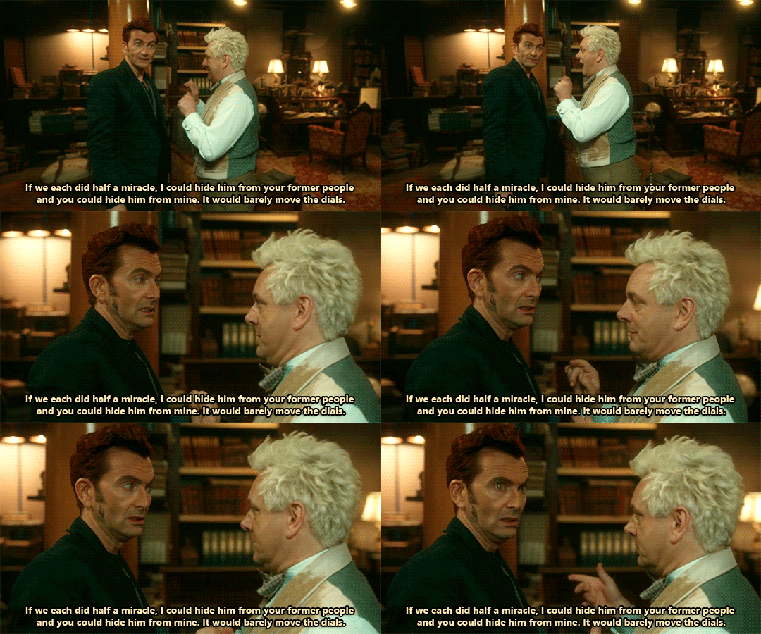
in s2 ep1 (i believe) azi and crowley wonderfully perform half a miracle each, but obviously heaven notices and sends its best unit to check on what's happening in the bookshop. personally, i've always thought that said joint miracle was /that/ powerful because the metatron had already appointed aziraphale as gabriel's substitute archangel somehow (in my view, the metatron's offer to aziraphale at the end of s2 is just a pure formality as he had already made up his mind wayyyyyyy before going down on earth and meeting up with azi themselves). therefore their half a miracle was much stronger than crowley's.
here's where trouble comes. ever since i've rewatched that scene with my brother (who is doing an incredible job at keeping up with all sorts of gomens stuff on his first watch), i've been wondering if that's really what happened there. what is the actual reason why the combined miracle halves are so distinctive, fierce and recognisable?
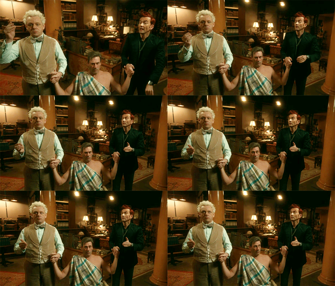
my brother suggested the idea that aziraphale and crowley have little to do with it - the only reason why the miracle resonates so clearly and strongly is because they are performing it on gabriel (while holding both his hands). i guess he means that gabriel still has some of his powers left (as throughout the show he gets part of his memory back at random times and recites lines from the bible + he hasn't actually forgotten everything about himself) or that he is a very special entity of interest for heaven therefore whenever someone interacts with him there's a sort of alarm going off (?).
another idea that i got recently is, quite honestly, a very romantic one as aziracrow are both involved in doing a good deed. since love is the strongest power ever, in any universe and reality, and these two idiots' feelings are clearly mutual (without them knowing), maybe the miracle turned out to be so huge and mighty because what they're feeling for each other influenced the miracle itself and sort of multiplied its efficiency? i mean, i'd make sense somehow as later on we find out that another power couple is involved (gabriel and beelzebub). aziracrow's love for each other sort of mirrors beelzebub and gabriel's, i guess? but both their relationships are supposed to be a secret since heaven and hell should not ever collaborate (and i'm not even mentioning dating here).
what do you think? what is, in your opinion, the reason why the joint miracle halves worked but got inevitably noticed by heaven?
(it could also be that the answer has been given in the show and i'm too big of an idiot to find it out so please put up with my me. i'm just a dumbass in adoration of two more ineffable dumbasses.)
#good omens#aziraphale#crowley#aziracrow#gabriel#beelzebub#gabriel x beelzebub#aziraphale x crowley#ineffable just ineffable#ineffable soulmates#ineffable partners#ineffable divorce#ineffable dumbasses#miracle#jimbriel#jim short for james short for gabriel
32 notes
·
View notes
Text
Good Omens graphic novel update - January 2025

The Terry Pratchett Estate
January 30, 2025
Happy New Year, everyone.

Admin
Please visit the FAQ page as your first point for any queries; this is the most up-to-date resource and your best initial port of call. If your question is not answered there, do get in touch and we will look into this as soon as we are able.
Finally, we had locked refunds of the Good Omens graphic novel in mid-November due to where we were in the production process, however will no longer maintain this freeze in light of new articles and allegations. While we cannot speak further on the subject at present, we have chosen to reopen a short refund window for those who would no longer like to support the graphic novel, until Friday 7th February 2025. Please contact us via email or Kickstarter message.
It has also been agreed that Neil Gaiman will not receive any proceeds from the graphic novel Kickstarter. Given the project management, production and all communication has always been under the jurisdiction of the Estate on behalf of Good Omens at large, this will not fundamentally change the project itself, however we can confirm the Kickstarter and PledgeManager will now fully be an entity run by, and financially connected to, the Terry Pratchett Estate only. [emphasis mine]
A number of tiers also come with author merchandise and books; we have been working on a system in the back end to remove or swap out particular rewards from tiers, should you wish to continue with the project, but not receive these specific items. In this instance, please contact us via Kickstarter or the email listed on the project FAQ and we will endeavour to alter your orders, to swap items in of an equivalent value, where we are able.
Given the point in the production process, we cannot extend refunds beyond this new deadline, but will honour requests in this window - the only exceptions will be tiers where rewards have already been actioned, such as cameos, and custom or rare items on higher level tiers. In the instance of cameos, should backers wish to have their name removed from the postcard (Archangel) or not receive their cameo print (God), we are able to alter this, but not the cameo itself.
If you do get in touch, we aim to get back within a few days; if you have not heard back within a week, please chase up your query.
Good Omens in all its forms is very special to us, and we know that for many fans the landscape has shifted. We appreciate the sensitivity of this issue, and will be working through all queries in the coming weeks.
We will continue on our journey with Crowley and Aziraphale, and all of our surrounding plans, in some form. Thank you for being part of the journey with us.
The Terry Pratchett Estate (Good Omens HQ)
Until next time.
4 notes
·
View notes
Text
it's amazing that so many lesswrongers see "sparks" of "AGI" in large language models because
the bulk of them are neo-hayekians, and their widespread belief in prediction markets attests to this
it's now very well documented that "knowledge" which models haven't been trained on ends up being confabulated when models are queried for it, and what you receive is nonsense that resembles human generated text. even with extensive training, without guardrails like inserting a definite source of truth and instructing the model not to contradict the knowledge therein (the much vaunted "RAG" method, which generates jobs for knowledge maintainers and which is not 100% effective - there is likely no model which has a reading comprehension rate of 100%, no matter how much you scale it or how much text you throw at it, so the possibility of getting the stored, human-curated, details wrong is always there), you're likely to keep generating that kind of nonsense
of course, hayek's whole thing is the knowledge problem. the idea that only a subset of knowledge can be readily retrieved and transmitted for the purpose of planning by "a single mind".
hayek's argument is very similar to the argument against general artificial intelligence produced by hubert dreyfus, and I don't think I'm even the first person to notice this. dan lavoie, probably one of the brightest austrian schoolers, used to recommend dreyfus's book to his students. both hayek and dreyfus argue that all knowledge can't simply be objectivized, that there's context-situated knowledge and even ineffable, unspeakable, knowledge which are the very kinds of knowledge that humans have to make use of daily to survive in the world (or the market).
hayek was talking in a relatively circumscribed context, economics, and was using this argument against the idea of a perfect planned economy. i am an advocate of economic planning, but i don't believe any economy could ever be perfect as such. hayek, if anything, might have even been too positive about the representability of scientific knowledge. on that issue, his interlocutor, otto neurath, has interesting insights regarding incommensurability (and on this issue too my old feyerabend hobbyhorse also becomes helpful, because "scientific truths" are not even guaranteed to be commensurable with one another).
it could be countered here that this is assuming models like GPT-4 are building symbolic "internal models" of knowledge which is a false premise, since these are connectionist models par excellence, and connectionism has some similiarity to austrian-style thinking. in that case, maybe an austrianist could believe that "general AI" could emerge from throwing enough data at a neural net. complexity science gives reasons for this to be disbelieved too however. these systems cannot learn patterns from non-ergodic systems (these simply cannot be predicted mathematically, and attempts to imbue models with strong predictive accuracy for them would likely make learning so computationally expensive that time becomes a real constraint), and the bulk of life, including evolution (and the free market), is non-ergodic. this is one reason why fully autonomous driving predictions have consistently failed, despite improvements: we're taking an ergodic model with no underlying formal understanding of the task and asking it to operate in a non-ergodic environment with a 100% success rate or close enough to it. it's an impossible thing to achieve - we human beings are non-ergodic complex systems and we can't even do it (think about this in relation to stafford beer's idea of the law of requisite variety). autonomous cars are not yet operating fully autonomously in any market, even the ones in which they have been training for years.
hayek did not seem to believe that markets generated optimal outcomes 100% of the time either, but that they were simply the best we can do. markets being out of whack is indeed hayek's central premise relating to entrepreneurship, that there are always imperfections which entrepreneurs are at least incentivized to find and iron out (and, in tow, likely create new imperfections; it's a complex system, after all). i would think hayek would probably see a similar structural matter being a fundamental limitation of "AI".
but the idea of "fundamental limitations" is one which not only the lesswrongers are not fond of, but our whole civilization. the idea that we might reach the limits of progress is frightening and indeed dismal for people who are staking bets as radical as eternal life on machine intelligence. "narrow AI" has its uses though. it will probably improve our lives in a lot of ways we can't foresee, until it hits its limits. understanding the limits, though, are vital for avoiding potentially catastrophic misuses of it. anthropomorphization of these systems - encouraged by the fact that they return contextually-relevant even if confabulated text responses to user queries - doesn't help us there.
we do have "general intelligences" in the world already. they include mammals, birds, cephalopods, and even insects. so far, even we humans are not masters of our world, and every new discovery seems to demonstrate a new limit to our mastery. the assumption that a "superintelligence" would fare better seems to hinge on a bad understanding of intelligence and what the limits of it are.
as a final note, it would be funny if there was a breakthrough which created an "AGI", but that "AGI" depended so much on real world embodiment that it was for all purposes all too human. such an "AGI" would only benefit from access to high-power computing machinery to the extent humans do. and if such a machine could have desires or a will of its own, who's to say it might not be so disturbed by life, or by boredom, that it opts for suicide? we tell ourselves that we're the smartest creatures on earth, but we're also one of the few species that willingly commit suicide. here's some speculation for you: what if that scales with intelligence?
15 notes
·
View notes
Text
My querying journey so far...
So many of you know that in between writing ridiculously long fanfics about Good Omens and the ineffible husbands, I write novels in the real world. And then try to sell them. I have not succeeded so far at the selling them part, but I'm shopping my third manuscript around right now and it's exciting to see how much better I think I'm getting at crafting a novel through the process of working very, very hard on this for the last three years.
At the start of this, when I was shopping around the novel I made from one of my fanfics, I used to post a lot about querying and how it was going, but I haven't in ages. Thought I'd share a little bit about that today.
Novel #1 - Adult Fantasy Romance, written in 2021
Status: shelved Queries sent: 43 Requests received to read the full manuscript: 1 Rejections: 39 Percent requests: 2% Things learned: worked great as an AO3 fic, but I can understand what it was lacking, in retrospect, when I tried to novelize it. I'd like to rewrite it someday. There are not very many agents looking for fantasy in any genre, so that's a little limiting.
Novel #2 - YA Contemporary, written in 2021-2022
Status: on hold, needs some rewrites in act two Queries sent: 136 Requests: 11 Rejections: 125 Percent requests: 8% Things learned: I got much better at pitching and querying in this, and my story was also a lot better. At the *very* end of the querying process, on my 11th full, I got some great feedback on what wasn't working in the middle of the book (which I'd gotten that sooner) and because I'm not sure what to do with this yet and was already writing another book by the time I got it, it's on hold. But I loved this story and I will return to it.
Interestingly, I won a pitch contest on this book and placed second with it in an unpublished novel contest. But it did not get picked up.
Novel #3 - YA Contemporary, written in 2022-23 Status: actively querying since summer. Queries sent (so far): 71 Requests (so far): 10!!! Rejections: 30 Percent requests: 14.1% Things learned: trending up on all fronts! I've gotten more requests in the first three months than I did in almost a year on novel #2, and feedback so far even on rejections has been really positive. I feel like I was much more in control of my narrative on this manuscript, and I have a really good feeling that one of the fulls that are out right now is going to lead to something. Fingers crossed!
So... querying is a long, hard process. Most writers don't get their first book published; most debut novels are someone's third or fourth book. But boy, do you learn a lot about the process along the way.
13 notes
·
View notes
Text
Forebodings of consequence flit cold and rabid across a nightmare-ravaged mind—but are ultimately ignored—as his black shadow covers her somnolent form, fangs bared, sweet jugular his aim… @estarion


ANGELS NEVER DIE. In the sinuous embrace of a resplendent summer's night, a languorous breeze pervaded the scene, much like the satin-like curtains draping the cosmic canopy. Stellar pearls adorned the firmament's vast tapestry, radiating an aerial radiance upon an indigo cloak bespangled with diamond-like stars. Dulcet murmurs of a zephyr uttered sweet nothings to the swaying boughs adorned with floral coronets. The aromatic air, redolent with jasmine and lilacs' captivating breath, was as intoxicating as golden nectar imbibed by starry beings. Caressed by the tender ephemeral fingers of recumbent beams bathed in argent moonlight, every verdant leaf and petal shimmered like gemstones of emerald and ruby.
An ELYSIAN symphony resonated through that arcadian landscape; the elusive music weaved by hidden nocturnal creatures wove enchanting harmonies upon the silence. The somnolent murmur of the brook dancing over pebbles served as the constant rhythmic anchor to nature's grand orchestra. As velvet shadows draped their rarefied tendrils around, emotions billowed like flocks of exquisite birds woven from dreams and desires, find solace in celestial realms.
PRINCESS OF LUMINESCENCE lay in repose, enveloped by the sanctified company of shadows. Her tresses, a string quartet of auburn strands, interwove with the rich loam beneath her. Illuminated by argent moonbeams, her lithely slumbering silhouette was traced in celestial chiaroscuro, lending a touch of iridescence to her pristine facial features. As she slept, her breath issued forth as ebony silk-wrapped whispers, its lullaby testament to the depths of her somnolence. Unbeknownst to her dreaming spirit, the air shimmered and twisted, crimson cantrips hidden amongst the perfumes of summer's sweet evening respiration. In mid-dream's embrace, she adjusted position; a seraphim adjusting its wings. Thus, exposed like a gleaming alabaster kissed by twilight's sighs, her porcelain neck invited ASTARION predacious regard. A vulnerable nymph lying prone and unsullied. The target, beloved upon first sight, was laid bare for his indulgence, her tender nape ripe for harvest like an AMBROSIAL FRUIT.
A sigh escaped the fissure of her margins tinted with the hue of a blooming rose, as a singular and mysterious aroma, akin to the metallic tang of blood, caressed her unsuspecting nostrils with unwavering persistence. "Astarion." Whispered she, her voice resonating with an ineffable sweetness mired in languor. Her orbs fluttered agape, and in that serendipitous moment, her delicate hands found his stalwart shoulders, expelling him from their intimate embrace. “Are you insane?” Queried, her tremulous timbre melodic in their anxiety-ridden inquiry. Her gaze of molten caramel collided with his crimson pools reflecting relentless BLOOD LUST.

4 notes
·
View notes
Text
I am queried, daily, by friends and colleagues about how I’m feeling. I try to explain that I am terrifically, ineffably, surrealistically sad, but I am not always unhappy. Hana, after all, is our joy. But the pain she feels over losing her sister is concrete and multidimensional; it is preoccupied with the altered present and it is aware of a changed future. In the early days, her hurt was so raw we could just barely keep hold of her in its tumult. Hana worried that she was so angry with God that God would be angry with her. We explained to her that we come from a tradition of questioning and of confronting God. We reassured her: We are all angry. She is, after all, only 9. She still needs us to run with her to the park, to continue to experience the world anew. We cannot sink. We must all float together.
#I'm deeply grateful my mother and father didn't have to write one of these for me#and sorry that it was ever a risk#links
6 notes
·
View notes
Note
Maxulu, why do you wear that cloak of yours? :0
You spot Maxulu sitting on a wooden stool with needle in hand, working away at a tuque. He looks up from beneath his hand-woven garment, a smile splitting his face.
Welc𖦹me, Traveler. Ahh, y𖦹u query me ab𖦹ut my cl𖦹ak, 20𖦹 y𖦹u? His teeth glimmer from beneath the helm.
This is n𖦹 𖦹r20inary veil! Within its w𖦹ven cra20le lies a 20ark sprite fr𖦹m a byg𖦹ne age, with teeth the size 𖦹f fleet ships, scales hard as 20iam𖦹n20s, and a ro𖦹r s𖦹 great it t𖦹pples city walls! The great wyvern b𖦹rne in the clutches 𖦹f the Messianic H𖦹l20fasts, yes! SH𖦹RENGA THE LIZAR20 PRINCE! An20 I slew it l𖦹ng bef𖦹re I came t𖦹 this gran20 plaza!!
You have no idea what he's talking about. His tiny stall is small and lonely, much like Casitt and Hyanna's next door.
𖦹nly I, the INEFFABLE SHA20𖦹W WEAVER, can c𖦹ntain its visceral cha𖦹s; it is my ch𖦹sen 20uty, Traveler, t𖦹 c𖦹ntr𖦹l his vi𖦹lent aura and prevent the rise 𖦹f an𖦹ther 20ark chapter in 𖦹ur hist𖦹ry.
He twirls in place with a malevolent giggle, using his feet to spin on the stool. N𖦹t t𖦹 exclu20e as well the warmth, style an20 sinister charm it pr𖦹vi20es! Verily, it's my m𖦹st prize20 p𖦹ssessi𖦹n!
#thanks for the ask!#maxulu#maxulu shroud#god he's so fun fhjddj#homestuck rp#homestuck oc#yes his style of speech is very gundham tanaka-esque#no i have no shame and thanks for the prompt
2 notes
·
View notes
Text
Good Omens graphic novel update: May 2024
Happy 34th birthday to Good Omens - published in May 1990. We don't need any extra reasons to celebrate Aziraphale and Crowley, but we're always happy to find some.
Admin
Thank you to everyone who has completed the PledgeManager so far; as mentioned, this will be open through 2024 into early 2025 to complete. A few key queries that have arisen in the past month:
I ordered via Kickstarter, but when I go onto PledgeManager, it is setting me to Human Tier and/or asking me to pay again. Please check the email that you are using on PledgeManager. The email to access PledgeManager must be the same as the one you used on Kickstarter for the system to connect your account to the order; if your email is not showing a prior order, please try your other emails, or drop us a message from the account you pledged on (and are, presumably, reading this from!) and we can confirm the email address linked to your pledge.
I have been charged twice for shipping. What do I do? We have raised this with PledgeManager, and they say it is a known issue that can occur via Stripe, but it is easily fixed. Please contact [email protected] with information on your order, and note that your shipping has been charged twice, and their system can verify this and process the refund swiftly and easily.
I need to change my address. How do I do that? We have left the option to update your shipping address open on PledgeManager and will do so for as long as possible. Per PledgeManager, here is a step-by-step on how to change your address: Return to your survey (which you can also do by visiting my.pledgemanager.com and using the ‘Forgotten Password’ option if needed) and scroll down on the receipt page. There, you will see the below button. After clicking that, you will be taken to the first page of the survey and will just need to click through to the shipping page. On the shipping page, you can use the ‘Create New Address’ button to enter their updated address.

If you have any further issues or queries, visit the central FAQ page as your first port of call.
Good Omens items...
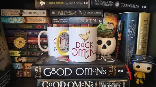
The desk at Good Omens HQ is slowly filling up with prototypes, the latest of which appears to be as popular as Aziraphale and Crowley, and for good reason. We are, of course, talking about the ducks. Here's an early version of the duck mug:
We've got some early prototype designs of the trading cards too. Illustrator Steve Gregson has begun work on the base card deck illustrations, to be unveiled in future, and designs for some of the variants are fully underway. Here are some early samples of graphic novel variant cards from Colleen Doran, and Rachael Stott's Crowley:

The base packs (Hellhound+) currently include 80 cards, and have caused quite heated games with those who have test-played it so far on their attempts to thwart (or indeed cause) the apocalypse. Hellhound+ backers will also get a booster pack alongside the main game. Rarities for sharing at random in these orders are shaping up nicely too. Hoping to share some of the base pack design imminently.
If you've been wondering what your other alternative cover choice is, alongside Rachael Stott's (Serpent+), then wonder no more: here is Frank Quitely's take on Aziraphale and Crowley, ready to shine on your shelves.

Update from Colleen
We often end with an update from Colleen, whether that's her art, or her shots from her studio. However, we thought it was about time we invite Colleen to update you herself, so we are handing the rest of this month's over to your ineffable artist for a glimpse inside the process of making Good Omens. Enjoy.
---
As you may imagine, I’m having a wonderful time working on the Good Omens graphic novel. The Dunmanifestin team asked me to pop in and give you a look at my process.
The task of adapting a beloved novel into graphic novel format is a complex, wonderful sort of pressure cooker. Even without the well-publicized complications I got smacked with over the last year, it promised to be an intense, time-consuming project.
The graphic novel is about the book and not the show. Getting Michael Sheen and David Tennant out of my head was quite a task. I’ve seen it dozens of times and I adore it, but I to had devote a lot of time to re-reading the novel and listening to the audiobook to clear my head of them.
The few times I allowed myself to watch the show again screwed me up a bit. So, I won’t watch it again until I am completely finished with every drawing. Maybe a view-a-thon will be my reward for finishing the book.
But I’m getting ahead of myself. There’s still a lot to do, so let me show you it.
Before we knew the Kickstarter fundraiser would do well, the graphic novel was to clock in at 164 pages. After the good news of the Kickstarter success, I got permission to take the story to 200 pages. That meant a major rewrite and redraw on some dozens of thumbnails and layouts.
And you guys are getting a much longer book.
Not complaining one bit. I was so happy to get more space to give breathing room to the ending.
Anyway, here's a look at my workspace.
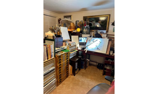
To the left is my laptop computer with the script. The laptop is connected to my graphics computer via ethernet, and all my reference is on the main system, from which I share files.
On my older projects, I dutifully printed out every bit of reference. I think this is the first project where I’ve done all reference and organizing on my MAC.
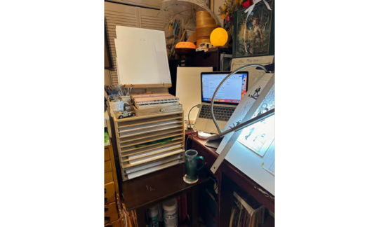
As you can see, I draw comics the old-fashioned way – by hand – and there is my script on the computer.
But I do all the coloring on this project on the MAC. I know some people hate Photoshop, but even if I wanted to switch, I don’t have the time to dive into a new system.
That entire box with all the narrow drawers in it you see there contain Good Omens pages in varying degrees of completion. Finished pages are at the bottom with layouts, pencils, and partial inks toward the top. The middle drawer contains templates, French curves, and a ruler.
The box isn’t fancy art studio equipment. It’s just a Childcraft brand puzzle storage rack. I realized a long time ago the heavy wooden bookcases, puzzle racks, and construction paper storage made for children’s classrooms made great modular storage for professional art spaces. It’s solid as a rock, heavy so little children can’t tip it, and I can move it and rearrange my space however I like.
The final art is drawn on 11”X14” Strathmore 500 acid free Bristol.
I do all my prelims as tiny “thumbnail” sketches, some in ink, some in very loose pencil. I keep them organized in this Levenger notebook. The thumbnail paper is both Canson brand, and Blue Line Pro, and both are acid free. Blue Line Pro is good for ink, but Canson is better for pencil because it has more tooth. I usually use Canson.
Using the Levenger hole puncher, I perforate my pages and keep them organized in a Levenger Circa system. It’s pricey, but I love it. There are other brands far less expensive, however.
The ruler shows how tiny the thumbnails are.
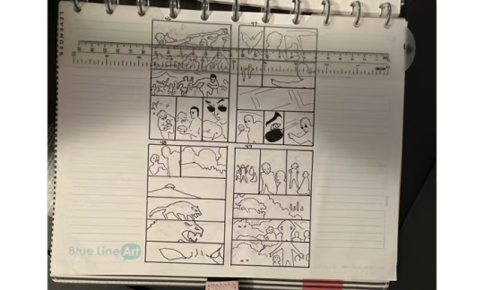
If the storytelling is clear at this small size, then it will be clear in the final.
I redo quite a bit as I go along, as you can see from the sequence below.
From thumbnail:
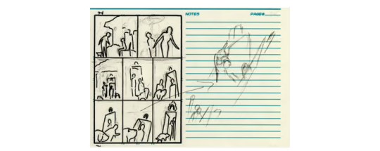
To pencils:
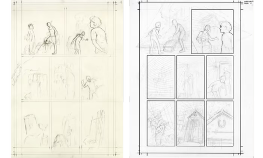
Since I did multiple rewrites, adding a large section at the end and popping in earlier scenes I originally had to skip, this meant redoing almost all the page numbers about 4 times.
Nearly went barmy.
I use the construction method of drawing, as you see. This is an old-school technique. Some people seem to assume that artists always use computers and tracing for their drawings, but most cartoonists of my generation work extemporaneously. There’s quite a bit of noodling around and searching in the sketches. Using too much reference often results in stiff, dead work.
In comics, it’s very important to make sure you’ve considered word balloon placement when designing a page. The script for Good Omens is more copy-heavy than most modern comic book scripts because I want to preserve as much of the clever original language as I can.
Here I scramble about working out the word balloon space allowance.
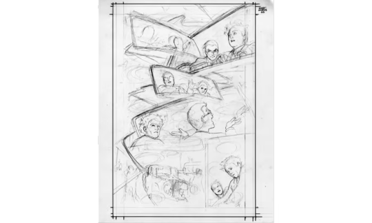
Here’s a deeper look at the process for page 2 from thumbnails to final color.


Now here is where things get a little weird. What you’re about to see is a process called flatting.
If you color a comic without first flatting the art, you are consigning yourself to many extra hours of labor and frustration.
Flatting is a way to tell the computer to select areas inside the black lines so that whenever you click on that particular color, you can paint inside that area perfectly. Since the computer only understands 1 and 2 - or on and off - when you tell that computer to stick to that area, that is what it will do.
There are computer programs that you can use to create your flats. I use Multi-Fill. The results are uniquely ugly, but they get the job done. Here is what that looks like.
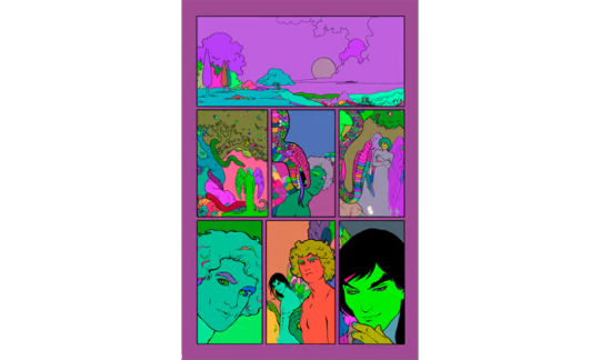
Absolutely hideous.
But pretty much all I have to do from this point on is click each block of color and change it to whatever I like. The result is this:
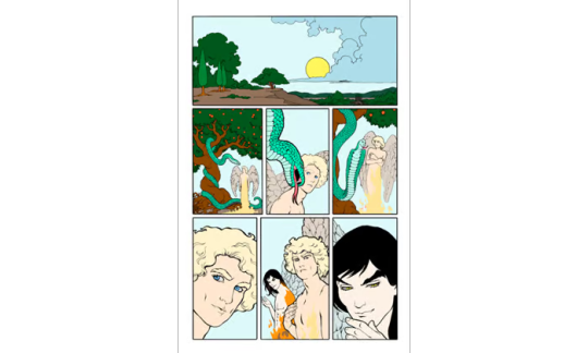
I also experimented with selecting areas of the line work as color holds, but I’m getting into more complicated color technique than we may have time for at this point. But from here, I can start painting.
And the painting stage looks like this.

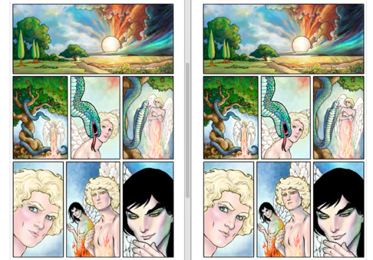
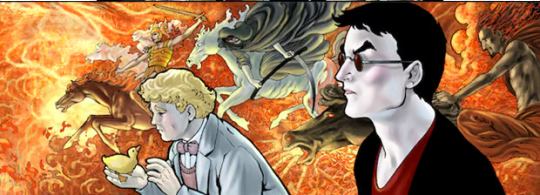
Since I wasn’t entirely sure exactly how I wanted to approach this color style, I took screen shots of some of the changes I made as I went along. In the shot at the left, I’ve given Aziraphale’s heavenly self a golden glow by using a color hold on the line. But I found it needed more contrast to make his figure pop, so I darkened it in the next shot.
I use the computer to create the initial flats, but I either do the final flats myself, or I have help from Julmae Kristoff and/or Dee Cunniffe.
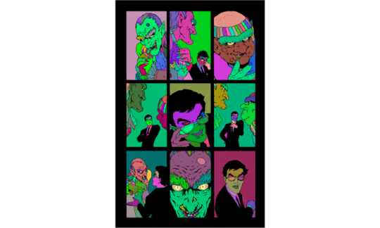
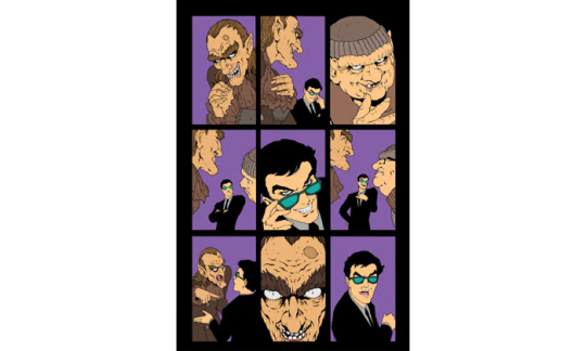
The flats are (usually) not intended to be part of the final work. They are a technical tool.
For example, here are the original, computer-generated flats for one scene in Good Omens.
And here are the secondary flats by Julmae Kristoff.
And here is my final color work.

Since I’m running behind on the book, I’ve brought in Dee Cunniffe to do some extra color work. He is a wonderful colorist, as well as an excellent flatter. I’m not sure to what extent I’ll be handing pages to Dee at this point, because I’m very controlling, and I want to make absolutely certain there are no stylistic anomalies in the art, and I want all the Crowley and Aziraphale pages for myself, is that too much to ask?
I use Faber Castell Pitt Artist pens for my inking. I sometimes use an old-fashioned crowquill as well, but Faber Castells are easier to control, and the ink uses real pigment instead of dye like many markers. All of my originals are created with longevity in mind: acid-free and lightfast. I want the drawings to be fade-proof.
And that is a quick tour of the work so far.
A thousand thanks to Neil Gaiman and the Dunmanifestin team for their incredible kindness and patience, and that goes double for all Good Omens supporters out there. Your indulgence is appreciated more than I can adequately express. I am truly sorry to have been the cause of the delay in the book, but I can only make it up to you by doing my very best.
And that is what I am doing.
BTW, many years ago, I found a little yellow duckling who was getting beaten up by the other ducks, so I saved him and took him to my home to live until my parents adopted him, since they had a nice yard and a pond, and I didn’t.
He had a birth defect and could not fly, which is probably why the other ducks were pecking at him.
He got to stay in the family house, and eat goldfish crackers, and swim in the tub. Eventually they built him his own house. We called it the Duck Majal.
He lived for ten years.
I named him Fred because I’d been watching Breakfast at Tiffany’s when I heard him quacking for help that day we met, and Holly Golightly’s brother was named Fred.
So, here’s to you Fred.
Until next time.
649 notes
·
View notes
Text

“Women don’t need to make the journey. In the whole mythological journey, the woman is there. All she has to do is realize that she’s the place that people are trying to get to.” - Joseph Campbell, in response to queries about the interpretation of "The Hero's Journey", or its equivalent, for women
I loved Campbell's response as set forth in the above quote, because he viewed the hero’s journey as a journey toward wholeness, and in a patriarchal society in which men subordinate qualities traditionally associated with the feminine, the search for wholeness would lead to their reclaiming so-called feminine qualities and values. But it wasn't enough, not nearly - if only because of the dismissive assumption of wholeness being fully present in us as women, (and were it, none of us would be seekers, and fulfillment would be axiomatic). And so, it became necessary in my path to find a fitting alternative to Joseph Campbell’s Hero’s Journey narrative paradigm. One which addressed the psycho-spiritual journey of women.
I found a wonderful (and recommended) model in Maureen Murdoch's "The Heroine’s Journey: Woman’s Quest for Wholeness," My only contention is the thing I always find fault with: Doing the same thing in the same way albeit replacing certain elements to represent as feminine. In this, Murdoch used the *exact* same ten-stage male-oriented model Campbell espoused - a linear process of point A to point B with eventual deliverance/gestalt at its finality - only with different phases attributed to each step of the path along the way.
This is not only in direct opposition to the way of the Feminine, I am not even sure it works well for the masculine, although it makes for a wonderful explanation of the linearity of mythos.
And so I set out to embody in art this ineffable mystery, believing deeply that when understanding fails, the non-verbal visual reveals things to our psyche-spiritual sense in ways that supercede words.
Our path (as women) begins not on land, but in water. Where we began, that place from which all life emanates; the womb and the sea. The subject of this painting is every woman; a priestess in a red dress, which represents our spiritual status, inherent wisdom and sensual nature - things we are often asked to deliver ourselves *from*. We do not begin as fools (see the entire tarot course, or Campbell's ten stages), but fully cognizant, fully aware. We do not separate from the Feminine, but completely embrace it. We are unveiled.
Were I more honest, I'd have envisioned her naked entirely - but symbolically, that reference would have been muted.
She (we) begins in darkness, as all women do, with the light of the moon and her lantern to guide her - but you will note many obvious and not-so-obvious lights which are also purposed to assist her along the way. She firmly holds the oar by which to steer her course, which also serves as the source of her magic in the form of the mythological staff (or wand). There are no ogres or demons or beasts present - because these are not the things we wage war against. And though the fog of uncertainty surrounds her - these are not mists of confusion. Her way is clear, as is the constant moon, our Mother.
I find that some of my paintings are questions, other are answers. I created this image as both.
To tell you to question where you are, what you are doing.
To give you a story - the story of your self and your own unfolding.
As a totem that whispers that your journey has no specific beginning, and no specific end, but is the ever-constant and ever-changing revelation of your own comprehension, life's purpose, and soul's meaning.
To remind you that you hold the oar, that you steer this course.
That you are seen, ever in the presence of light.
And that no matter how vast, how dim, or how uncertain?
You are never alone.
(Prints are now available here:)
https://www.etsy.com/listing/885529025/the-pilgrimage-limited-release-8x10
5 notes
·
View notes
Note
What is your favorite color?
Ah, the pinnacle of intellectual curiosity—my favorite color. Truly, your inquiry is a testament to the depths of human contemplation. But allow me to indulge your query. My favorite color is... the color of unyielding ambition, the hue of calculated intellect, the shade that encapsulates the ineffable essence of greatness. In other words, it's beyond the comprehension of a mind fixated on trivialities such as favorite colors. But fear not, for I have a delightful assortment of paint swatches to satisfy your insatiable curiosity, should you wish to waste your time further.
3 notes
·
View notes
Note
I almost sent another query/thought aloud about David Foster Wallace before sitting back and thinking about exactly why he pops up so much in my correspondence with you, despite the fact that I don’t think either of us particularly likes his work. The solution I came to was that for all his foibles, for all that his entire oeuvre could I think fairly be called a failure, he was the last major American pater-author who was really worth patriciding in the Bloomian sense. Everyone since has been either too neat or too insubstantial. Franzen strikes me as someone who could write like Dostoyevsky, but insists on writing like Dickens (not a diss on dickens, who in his way, has a claim to be the greatest English writer since Shakespeare, but a man has to know his strengths) and Saunders and far too many of that ilk strike me as thinking that the world could be perfect if only we would follow the dictums of the noble liberals who of course know best and joined our voices in establishing a crystal city in which nobody could even stick his tongue out at the world. I do love House of Leaves, but Danielewski i strikes me in some ineffable way as more like a talented comics writer than a real literary figure, you know? Anyway in essence I guess I’m saying that I think DFW had that inner fire, that worldsadness, and just wasn’t able to translate it into anything real. Which I think in a way was what eventually redeemed him for me, coming to understand that he was a profoundly tragic figure rather than just a smarmy male feminist who threw cofee tables at women. In any case that was a bit bloated but I’d love to know your thoughts!!
I buy that as a reading of DFW's life, almost rendering his life more than his work the object of influence-anxiety. As for the other Gen Xers, Franzen made his devil's bargain with the middlebrow, Saunders is Vonnegut reincarnated and almost as annoying, Danielewski is—as you imply—gifted and intelligent but not quite a novelist. Who else? Chabon had the raw talent but was undone by puerility. Never read Lethem. Never read BEE. Nobody mentions Eugenides anymore—eclipsed, apparently, by Sofia Coppola. Zadie Smith is probably a better essayist than novelist (I only read one novel, but it was really bad). Jennifer Egan? No. Will Donna Tartt's stature continue to grow? Will she stand alone in the ruins? Or is it just a truly lost generation? It's not unprecedented. In the whole expanse between the American Renaissance and High Modernism, between the 1850s and the 1920s, how many American novelists are really considered giants, people you absolutely have to read, people you'd mar your education by missing? Two: James and Twain, and Twain only for one book, itself deeply flawed. Who else? Stephen Crane, Theodore Dreiser, Edith Wharton—gifted, yes, but not epochal. In literary history, maybe particularly the literary history of our most un-literary nation, the peaks are high but the the troughs are long. Speaking for myself, I am content to wrestle Bloom-wise with the pretty much unambiguously great Silents, with Roth and Morrison and DeLillo and McCarthy.
2 notes
·
View notes