#if you click the link the whole chapbook is free to read online!!
Explore tagged Tumblr posts
Text

No Silence in the Fields, Rachel Mennies
#quotes#quote#poetry#poem#Rachel Mennies#id in alt text#if you click the link the whole chapbook is free to read online!!
82 notes
·
View notes
Note
So I had a coding question that I've been trying to find the answer for, for a while. I've tried searching up information online and such but haven't been able to find anything.
I was wondering though how exactly someone would go about creating a main menu screen with the whole being able to create a new game, load one or change the settings? Like I said I've tried searching it up but haven't been able to find anything except for information on creating a transition screen.
You’re going to need an understanding of CSS for this, but I’ll do my best to walk you through it, alongside some basic functions of the UIBar and UI APIs. Also, like pretty much anything to do with coding, there is more than one way to do something (and there may be a more efficient/effective way than mine).
Like all of my tutorials, this is written for SugarCube 2.34.1. Since this one mainly deals with CSS, I’m sure you could adapt it to another format, but I’m not familiar enough with Harlowe, Snowman and Chapbook to add specifics.
Additionally, I use the Twine 2 editor version 2.2.1. This tutorial can be used with later versions; some of my example images may look not look exactly like what you have because later versions of the editor launch test files in your default browser (the 2.2.1 version creates its own mini-browser).
Making a Main Menu Page
Step 1: Hiding the UI Bar
If you want a clear main menu page without the UI bar, you can hide it in several ways.
<<run UIBar.destroy();>>
This will remove the UI bar completely from your game. Not recommended unless you have an alternative way of adding access to the Save, Settings and Restart functions.
<<run UIBar.stow();>>
This stows the UI bar. It will still be partially visible on the side and the player can interact with it to open it. The UI bar can be unstowed manually (without needing the player to do it themselves) on the next passage with:
<<run UIBar.unstow();>>
If you don’t want the UI bar to show up on your main menu, but you want to have access to it later, you can use:
<<run UIBar.hide();>>
To bring it back, you will have to use the following on the passage where you want the player to have access to it.
<<UIBar.show();>>
You may want to use the stow/hide and unstow/show functions together. Hiding the UI bar only makes it invisible; it will still take up space on the left-hand side of your game. Stowing and hiding it makes it a little more even.
To use them together, you can do this:
On the passage you don’t want the UI bar:
<<run UIBar.stow();>><<run UIBar.hide();>>
On the passage you where you want to restore the UI bar:
<<run UIBar.unstow();>><<run UIBar.show();>>
TIP 1: Using <<run UIBar.stow (true)>> gets rid of the slide animation as the UI bar collapses/restores, so you may want to use this so you don’t have any weird animations when you menu passage loads.
TIP 2: If you main menu is the first passage of your game, you can run the scripts for storing and hiding the UI bar in your StoryInit passage and it will run it when your game loads.
TIP 3: You can also use the Config API to have the menu bar be stowed automatically when your game starts.
Pop this code into your Javascript:
Config.ui.stowBarInitially = true;
However, if you have any links that navigate back to the main menu without restarting the game, the UI bar will be in whatever state the player left it in last. If you can only access the main menu by launching the game or hitting restart, don't worry about this.
If you want to double-check the SugarCube documentation for these functions, see here.
Step 2: Tagged Stylesheets
If you want to create a menu page that has a different appearance to your game’s default look, you can do so by using a tagged stylesheets. When using a tagged stylesheet, every passage with the same tag will have its appearance overridden to match what you’ve adjusted in your Story Stylesheet.
Let’s make one called main-menu. You can tag passages like so:
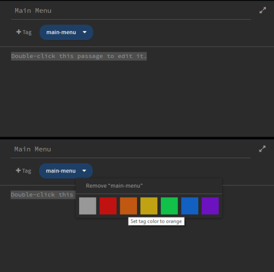
You can also tag the passage a different colour to make it special passages like this one stand out.
Step 3: Adding CSS
Now that the passage is tagged, you need to add a new CSS class to your stylesheet to change its appearance.
To change the appearance, you need to decide which selectors to target and what about them you want to change. Every default SugarCube game has the same set of selectors (you can find them here in the documentation). The most important ones are:
body – the body of the page. You can use this to change the foreground and background colours.
.passages – the element that contains your game’s main text. This is where you can change things like the colour that displays behind your game’s text, the font family, line height, letter spacing, all that stuff.
For the sake of this example, I am going to use the default SugarCube stylesheet and edit it from the ground up. You can find the code for SugarCube’s built-in stylesheets here.
In your stylesheet, you will want to use the tag you created earlier as the new class name.
.main-menu
Put this with the selectors you are going to change.
Let’s start with the body.
body.main-menu { color: #fff; background-color: #000; overflow: auto; }
The color property controls the colour of the font. Here I’ve set it to the hex code #fff and the background-color #000.
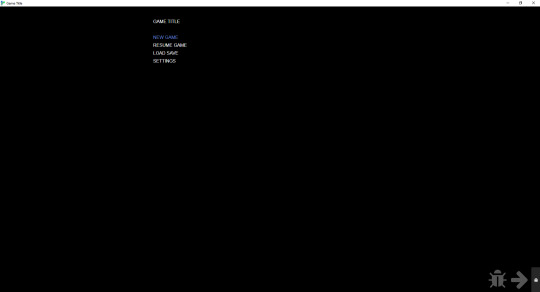
So now I have a black page when I start the main menu passage, and thanks to the code for the UI bar I put in earlier, the UI bar is gone.
Adding a Background
Now, we might want to spice up the background with an image to make it more interesting.
To add an image to the background, you need to use the background-image property.
body.main-menu { color: #fff; background-color: #000; background-image: url("images/main-menu.jpg"); background-attachment: fixed; background-repeat: no-repeat; background-size: cover; -webkit-background-size: cover; -moz-background-size: cover; -o-background-size: cover; background-position: center center; overflow: auto; }
You can read more about the different background properties and what they do here on W3Schools, but the code above will center your background image in the middle of the page and also make sure that it covers the entire container.
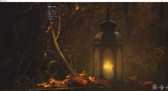
IMPORTANT: If you intend to upload your game as a ZIP file containing a .index HTML file (this is recommended if you have a lot of image assets or don’t want to link to an outside host, like imgur), you will need to use relative paths with any image URLs in your game.
Relative paths mean that the file is relative to the directory it’s in. In the example above, you can see that the background URL is "images/main-menu.jpg". This means that when the file is uploaded to itch.io, it will find the file—main-menu.jpg—inside the images folder, regardless of where the images folder is located.
For reference, this is what my game assets folder looks like for Wayfarer:
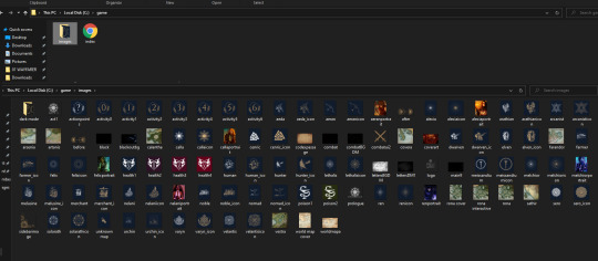
Relative paths are different than an absolute path, which begins with the drive letter. For example, the main-menu.png may be stored on my personal computer in a path like this one: C:/game/images/main-menu.jpg.
If I use this absolute path in the game, the image asset will not show up for players once it’s uploaded to itch because the image is not hosted on the player’s device in C:/game/images/main-menu.jpg.
This can cause some finnicky issues with the Twine 2 editor because the editor cannot find and display images from relative paths (unless you’ve put the editor in the same directory as the one you’re storing your assets in; I haven’t bothered to try this, so I’m not sure).
While working on your game in the Twine editor, you may need to use an absolute path to see what your asset looks like while you're editing. When it comes time to publish, make sure you switch it back to a relative path, otherwise the image will not load for players.
Step 4: Adding & Styling Links
Now that we have a background, we’ll want to tackle the links themselves.
Adding Links
You can link to the starting passage of your game using your preferred method—the [[ ]] link markup, the <<link>> macro, etc.
But for Saves and Settings (and also a Resume Game link, if you’re using the autosave feature), you’ll need to manually call the functions for accessing those dialogs. You can do that with this code here:
This will add a Load Game link that opens the Saves dialog when clicked.
<<link 'LOAD GAME'>><<run UI.saves();>><</link>>
This will add a Settings link that opens the Settings dialog when clicked.
<<link 'SETTINGS'>><<run UI.settings();>><</link>>
This will add a Resume Game link that loads the player’s last autosave.
<<link 'RESUME GAME'>><<run Save.autosave.load()>><</link>>
TIP: To enable autosaves on your game, add this code to your Story Javascript:
Config.saves.autosave = true;
This will autosave on every passage.
Config.saves.autosave = ["bookmark", "autosave"];
This will autosave on passages tagged bookmark or autosave.
Styling Your Game Title & Links
So this is where you can get get fancy with your CSS. For now, we’re going to keep everything within the .passage element (which is where any text inputting into the editor goes), but I will show you how to move the links and title to wherever you want further down.
Importing Fonts
First, go font shopping.
Google fonts has a very large library of free-to-use fonts that you can import directly into your game via your Story Stylesheet. After you browser Google fonts for the fonts you want to use, scroll down to the Use on Web section and click @import. Google will automatically generate the code you need to import the fonts you want to use.
Ignore the <style> </style> and copy everything else inside it and paste it in the top of your Story Stylesheet.
For this example, mine looks like this:
@import url('https://fonts.googleapis.com/css2?family=Almendra+Display&family=Nova+Cut&display=swap');
TIP: If you are importing fonts that a bold weight and italics available and intend to use bold and italics, make sure you import the bold weight and the italic versions of the font as well as the regular one. This will stop your fonts from having weird printing issues when you use bold and italics (especially on non-Chromium browsers like Firefox).
Below the import button, Google will show you the CSS rules for each font family. Keep these in mind, you’ll need them later. Mine, for this example, are like this:
font-family: 'Almendra Display', cursive; font-family: 'Nova Cut', cursive;
Basic Styling
In your stylesheet, you’ll want to target the .passage element with the .main-menu class.
.passage.main-menu { background-color: transparent; font-family: 'Nova Cut', cursive; font-size: 3.5em; text-align: center; }
Make sure there isn’t a space between .passage and .main-menu, otherwise it won’t work!
Here, I’ve changed a few properties.
font-family – this changes the font to Nova Cut
font-size – this changes the font size. I’ve used the unit em, which is relative to the element size (you can read more about CSS Units here)
text-align – this centers the text to the middle of the .passage element
I have also added:
background-color: transparent;
This makes the passage background transparent so you can see the background image. This is only necessary if you’ve added a background-color to your default passages.
Now, for the links.
Links have their own separate selector.
a means is the link as it usually displays
a:hover is the link when the player hovers their cursor over it.
It's generally a good idea to use different colours on the links—one for the normal display, one for the hover—so the player can visually see that they are hovering over a clickable link. If you don't want to use different colours, you should consider using some other visual cue to make that differentiation.
.passage.main-menu a { font-family: 'Nova Cut', cursive; color: #C57C25; text-decoration: none; }
.passage.main-menu a:hover { font-family: 'Nova Cut', cursive; color: #dcb07c; text-decoration: none; }
I’ve added an additional property here:
text-decoration: none.
This gets rid of the underline that happens on all default links in the default SugarCube stylesheet. Currently, this only targets the links on passages tagged main-menu; if you want to get rid of the text-decoration on all links, you can change the styling of your links like so:
a:hover { text-decoration: none; }
Choosing Colours
If you’re not sure where to start when it comes to picking hex codes, color-hex.com is a really helpful site. It gives you related tints and shades of for every hex code, which makes it a lot easier to find colours that are slightly darker or slightly lighter than your base hex code.
For choosing colours initially, there are plenty of hex code colour palette generators available online. One of my favourites is the one on Canva, which lets you upload an image and then it creates a colour palette from there. You might not want to use the exact colours it pulls, but checking the colours on color-hex can help you narrow down something that works for your aesthetics.
This is what our template now looks like:
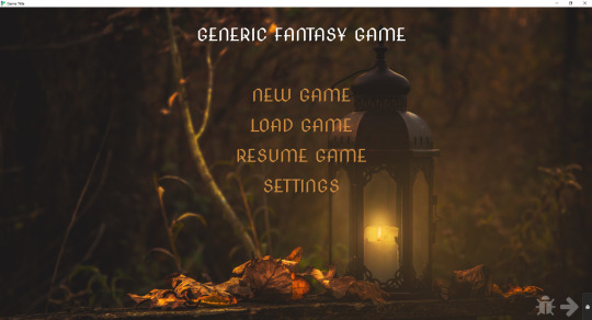
Giving the Title a Unique Style
Right now, the title is styled by the .passage.main-menu selector and it’s default font size and font type is the same as the links below it.
If you want to style it differently, you can make a new class for it. In this case, I’m going to drop the .passage.main-menu and make a class called .game-title.
.game-title { font-family: 'Almendra Display', cursive; color: #ca893a; line-height: 1.0; font-size: 1.8em; text-shadow: 1px 1px #dcb07c; }
Because the font I selected didn’t come with a bold version, I cheated a bit a used the text-shadow property to bulk it up. I also had to adjust the line height. SugarCube’s default .passage styling gives everything a line height of 1.75 and there was too much space once the new font family and font size were applied.
To add this styling to your title, go into your main menu passage and wrap your game’s title in a span, like so:
<span class="game-title">GENERIC FANTASY GAME</span>
It now appears like this:
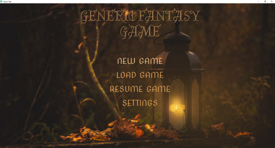
TIP: If you want to play around with your appearance, you can use your browser’s Inspect tool to see the page’s CSS and play around/edit it. Either right click and hit Inspect or hit CTRL + SHIFT + I to open the Inspect tool. Once opened, you can go in and adjust things. If you make and a change and like it, remember to copy the code over to your stylesheet before you close the inspect tool.

Placing a Title & Links Outside the .passage element
If you want your game title and menu links to be elsewhere on the page, you’re going to need re-write some of your CSS and add some additional CSS.
The first thing is that you’ll want to remove the styling from .passage.main-menu. I’ve left background-color to transparent, but you’re not going to be using this to style your game title and menu links.
.passage.main-menu { background-color: transparent; }
For the title:
I’ve created two elements, one called .main-title and one called .main-title-item.
.main-title creates a container that will hold the title. This is what I use to tell it where on the page to appear.
.main-title { display: block; justify-content: space-evenly; position: absolute; top: 10%; left: 4%; }
.main-title-item styles the actual text.
.main-title-item { font-family: 'Almendra Display', cursive; text-transform: uppercase; font-weight: normal; font-size: 6.5em; line-height: 1.0; text-align: left; color: #cf944d; text-shadow: 1px 1px #cf944d; }
To apply this to the game title, go back to the main menu passage and apply your new elements to the game’s title:
<div class="main-title"><span class="main-title-item">GENERIC FANTASY GAME</span></div>
For the menu links:
Here, we’ll do something really similar—a container to hold the links and a separate element to style them.
.subtitle { display: block; flex-wrap: wrap; flex-direction: column; width: 60%; justify-content: space-evenly; position: absolute; top: 46%; left: 8%; }
.subtitle-item a { font-family: 'Nova Cut', cursive; font-weight: normal; font-size: 3.5em; text-align: left; color: #cf944d; line-height: 1.3em; }
.subtitle-item a:hover { font-family: 'Nova Cut', cursive; font-weight: normal; font-size: 3.5em; text-align: left; color: #dcb07c; text-decoration: none; }
Go back to your main menu passage and apply the elements. Because all of the menu links will be in the same box, you only need to open/close the .subtitle element once.
<div class="subtitle"><span class="subtitle-item">[[NEW GAME]]</span>
<span class="subtitle-item"><<link 'LOAD GAME'>><<run UI.saves();>><</link>></span>
<span class="subtitle-item"><<link 'RESUME GAME'>><<run Save.autosave.load()>><</link>></span>
<span class="subtitle-item"><<link 'SETTINGS'>><<run UI.settings();>><</link>></span></div>
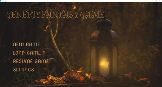
If you want to change where the title and menu links appear, you can use the Inspect tool to figure out different percentages and spacing until you find something that works for you.
There are a lot more things you can add (like animations that appear when you hover your cursor on the link), but I’ll leave it there for now.
Additionally, if you intend to make your game mobile compatible, you’ll want to read up on media queries and learn how to adjust font sizes and any other units of measurement for different viewports. This is how you shrink things appropriate to fit on small screens.
I hope this helps! If you have any questions, please let me know. I’m still a newbie at CSS (so I’m sure there are ways of doing things more effectively), but these are some of the things that I have helped me along the way.
106 notes
·
View notes