#idk where this sketch is going might color might not lol
Explore tagged Tumblr posts
Text
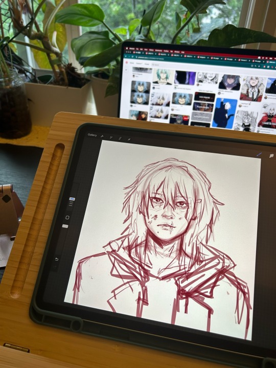
I’m trying to fix himmmm 😭😭😭🤲
#lol lowkey high key I love loser shigaraki haha#idk where this sketch is going might color might not lol#mha#bnha#my hero academia#my villain academia#boku no hero#mha art#shigaraki tomura#tenko shimura#pjseveryday#illustration#anime art#art#fanart#sketchbook#digital illustration#wip#bnha art
48 notes
·
View notes
Note
I can't help but notice you haven't posted any angst in a while and I'm suspicious
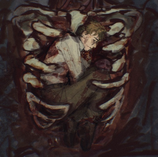
whipped this one up just for u anon
#a guy can only post 3 happy artworks before the people get concerned.....#LMAOOO jokes jokes#heres a .. colored sketch?#anyway behold the recurring dream ive given pete where hes ummmmmmmmmmmm inside uncle bens ribcage#i think abt it all the time but ive never actually done anything w it so here we go#blood#gore#not actually i dont think but im straying on the safe side#i messed around w it enough where u cant even see any organs or anything (much)#bones#idk#skeleton#i feel like thats everything maybe#ask to tag#might make a nice finished piece w this who knows#anon#asks#thanks for the ask!#glad to know angst is still my brand#such is life as a noir blog#peter benjamin parker#spiderman noir#spider man noir#spider noir#my art#bOOM thats so many tags#double art night guys who cheered#this and the stupid ass music one LMAOO the range#made this in an hour and a half lets see what i think of it in the morning when i wake up lol
217 notes
·
View notes
Text
might get around to it later, but i was gonna sketch a concept for leon's hair
to where, like an octopus, he can change colors depending on mood. overall mood, it's not instantaneous. maybe it takes a few weeks, few months.
it's quicker than simply growing out. like fiberoptic lights. think of his hair as "hollow" strands. glass-like. some science shit that works like octopus skin. chameleon skin. some light refraction illusion, some funky hormone response. idk lol
the happier he gets, the lighter it looks. the sadder, the darker.
leon's hair changes color constantly in re4r? it appears to get darker in re6 kinda (still very blonde but idk how to explain) ? vendetta it's brown, and in death island he has lighter streaks?
it's just his visual display of his depression. death island getting lighter streaks -> he's about to go blondie mode again.
#the debate of leon's natural hair color lol#i love the idea of him just dyeing/bleaching (personally like the dyeing idea)#but what if it was weird?#what if he went bioweapon early on and was naturally ashy blonde?#i mean he's miserable in re4r but like#listen lmfao#leon deserves to have his emo dyeing phase but he goes blue#leon but one day he shows up and his hair is blue but he's kinda stressed lookin#gets awkward looks and lots of compliments#and he whispers to hunnigan 'it just did it on its own-"#i think hunnigan would keep secrets for him...
8 notes
·
View notes
Text

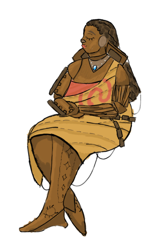
As my friends know, I am both a long time lover of Moana and currently obsessed with the transformers. So when I wanted to make transformers art but had no ideas I looked at my tiny Moana doll and was like what. What if she turned into her boat
Info on design +refs used bellow cut (I ramble a lot, be warned)

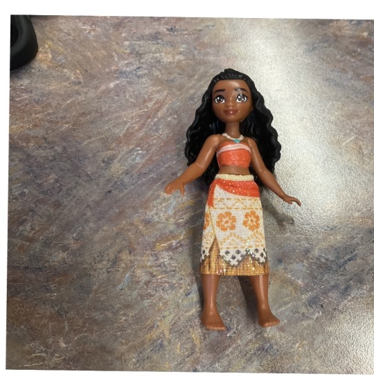
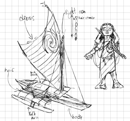
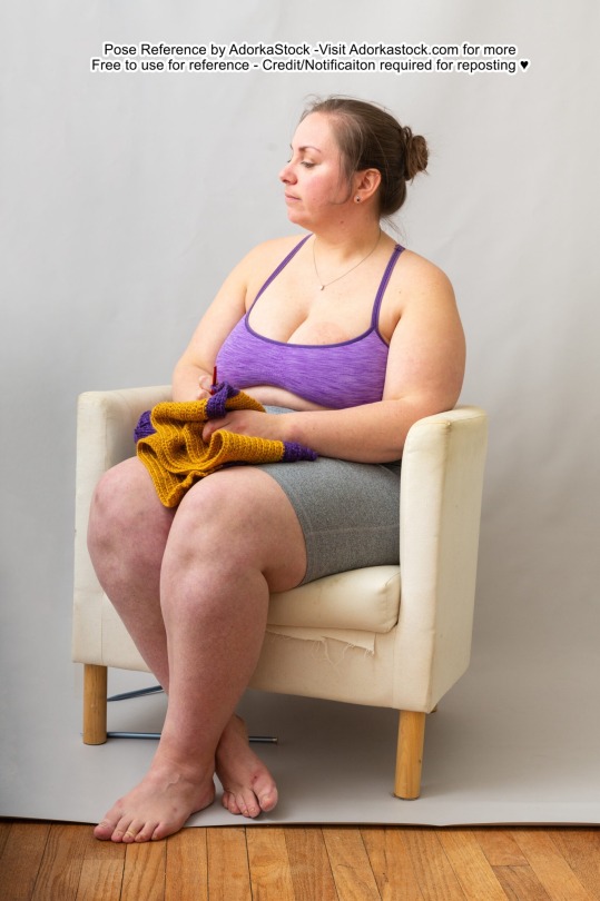

I basically traced a picture of my tiny Moana doll and an image of her boat to design the initial concept and because my friends thought it was cool I wanted to color it, so I sort of traced the vague shapes of the sitting lady reference and made the second pictured sketch from that. I colored over the second sketch, and decided that while I usually don’t do line art it would look better with it, so i did that but after finishing up I didn’t like how little color it had without a background so I spent a little time doing that. Procreate tracked 3hrs36 but I was sketching some random bullshit before I had an actual idea so it’s probably about 2-3 hours? I think? I am completely time blind even on my meds.
Another note is that I didn’t consider how an actual transformation would work at all, just that the parts had to go somewhere. I imagine the head folds under between the two storage compartments
I actually have a lot to say.
The hair was tricky, I wanted to still evoke her hair texture as she wears it in the movie but couldn’t really do that so on the final drawing I ended up just implying that shape of the hair. The idea was that any little sticks and bits would be segmented with some rope running down the middle so they could move, but it looked a lot like braids, which while cool, isn’t really what I wanted.
I thought several times about how it would be cool to know about the actual wood types used in this type of boat and how the colors I was using likely would not match up with this, but did not end up doing any research to incorporate into the final piece. I think the tones I used get the job done but aren’t really true to the movie or any sort of real world boat. If I draw this design again I’ll definitely keep fiddling but for now I’m happy that the sail at least looks right.
Back to the hair (lol) I thought a bit about replicating her bun instead, but couldn’t quite figure out what to make it with. I might try a redesign that doesn’t have any hair, maybe with some segmented sticks going down her head but stopping at the neck, but idk
If I draw her again I also want to focus on more of the little details- sail texture, wood grain, the little pattern on the hull/legs, I’m just impatient af and rush everything I do (also probably why the hair didn’t quite work out, I can’t slow down enough to do it properly)
I also need to look at more references, the ones I included are literally the only ones I used, and there are a few things that would look better if I did
I didn’t incorporate her oar into the design, thought I wanted to, I both worried about messing up the scale (honestly the rushed background kinda did anyway, whatever tho) and unsure how to incorporate yet another long stick. Most of the design I got around the stick issue by segmenting them but I don’t want to do that with the oar, because while breaking it doesn’t compromise structural integrity it does have a more visible role in the plot. Also, I’m not entirely sure where to put it, because again, it’s more plot relevant than other individual boat components and I’d want it to be clearly visible.
You know I think this is what art teachers wanted from me. And I’m just doing it for fun now
8 notes
·
View notes
Text
making character sprites as a one-person indie game developer
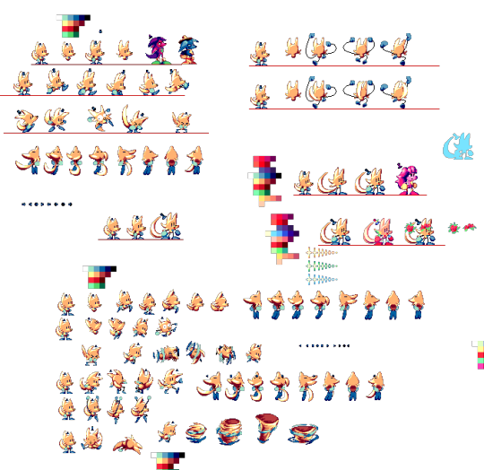
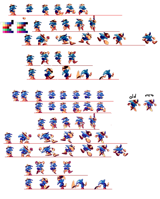
(huh. turns out this post on cohost didnt have a “read me” section”. o well. i will put the read me section Here, before any of da actual text. click it if u dare !!)
so, i've been meaning on making a Big post talkin all about how i actually Make my games and my processes n such ,but also ive been procrastinating on making it for so long that i thought i might as well just make One part of that post now .. and its about making the Character Sprites for my games .
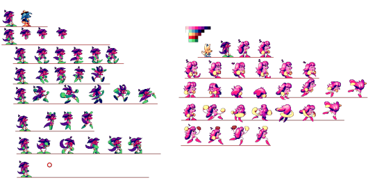
So. these images are the (mostly) full sprite sheets of the three characters from my game UNITRES Dreams, taken directly from the big giant 'charactersprites.png' image that i used for nearly every sprite for Most of the game's development. some quick things to make note of: First off, Trees (the first one) was one of the earliest things i made for the game, and had their sprite sheet redone Twice since then.. this first picture doesnt contain the latest sprite sheet as the new sprites were done on aesprite and im too lazy to make a sprite sheet out of them right now.
Secondly, the Second character (the pink one), had two different designs, being completely redesigned as i didnt like their first design all too much. their redesign's animations was done in aesprite, but i made a sprite sheet out of em before so i was able to just put them here. Lastly, the Third character (the blue one with the big silly hat) remained mostly unchanged as their original sprites and design were pretty good, but they needed to be cleaned up and given better colors so i ended up polishing all of their sprites.
Anyways. it's going to be hard for me to explain my actual process, as i am Bad With Words, but i will try my best.. So. for Most of my time as a game dev, I've used Paint.NET for Everything. This includes backgrounds, tilesets, and every animation ever in all of my games. For my character sprites specifically, i usually start with making the color palette (which is a whole different process where i mess around with the RGB values until i get a specific color that i think looks pretty ... its hard to describe). When making a new character, i usaully start with an Idle animation, just so i have a good base to make all the other sprites on. I just make a sketch of the character, then i do the flat colors (as my games dont have line art), and once i have the colors i start doing the rendering , where i try to pull off a sort of Sonic CD-esque , celshaded style while Also including a bit of anti-aliasing and other modern pixel art techniques to give the sprites more Depth and make them look Sharp. Idk. it's hard to describe my process in words ... i Did make a video Years ago showing off my process, but its old and my editing in that video isnt the Greatest.
So., that's my process Lol . the only thing thats really changed is that Now i use Aesprite for making the Actual Animations , as making animations with Paint.NET is Really Difficult and Annoying , as i have No Idea how the animation will Look until it actually appears ingame .. which results in the early versions of each character's animations looking a little weird (such as Trees' first two versions, the first version of the Pink character, and the Blue character's animations.. .though the blue character isnt as bad as the other two and i kept their animations mostly the same in the final game LOL).
Something that people have kind of criticized about UNITRES Dreams' animations is that some of em dont exactly ... Look Good. a lot of animations are pretty Inconsistent , with characters like Trees having inconsistent sizes in some animations and the movement in animations such as the Pink character's walking animation and various other animations (Especially the ones made in Paint.NET) looking Unnatural.
And Well .. here's the thing about making animations and sprites for something like this. When you're the Main person making an indie game, you have Tons of different parts of the game that need to be worked on while having Very little time to work on others. On Top of making every single animation for UNITRES , i had to make every single Tileset and background for every single level, On Top of making the Level Layouts , Programming , and even making sprites for things like the UI. And you have to constantly Test the game to make sure everything works and things Look good.
So. i had very little time to work on the sprites, and i Knew this. Something you have to consider is that, not only are you making the animations for the main character , you Also have to make Tons of animations and sprites for Literally Every Other Aspect of The Game . this includes Enemies , Level Gimmicks , NPCs, And the UI .. so you end up having to work on Thousands of sprites by yourself in such a short time.
I ain't the best animator , nor the best sprite artist . But , for this game I chose an art style which is Kinda simple and comfortable for me, which made making things like tilesets and backgrounds so much easier for me. The character sprites specificially only use a few amount of colors ,but also i tried my best to give them as much depth and make them as Colorful looking as i could. Also , something you might notice is that all of the playable characters dont actually have a whole lot of animations .. each of the characters only have the Exact amount of frames and animations necessary for them to Look Good moving around the levels. Aside from a few Gimmick Specific animations that arent in the sprite sheets i posted , there arent many Extra animations or animations with Tons of Frames that i wish i could have added .. and it Kind Of Sucks . Having to split my time across Three Different Characters , i had no time to make any animations Too Crazy or Too Smooth , and i couldnt include any extra animations that could add a bit of personality to the characters ... In Fact ,the Idle "animation" isnt an animation , its just a still frame. I didnt have time to even make a simple waiting animation !!
It Is What It Is. For what its worth , Ithink Im pretty proud of the animations i did for UNITRES Dreams. while i think ive become a much better artist and animator since then, i still think some animations and some of the frames look really good ..just looking at some of the still frames is really nice .. so i think i did a good job, especially for a game that was made in 2 years and is Free. And Hey, while the animations in UNITRES Dreams may not be the best or have the most smooth animations , i Did get to experiment with making more smooth animations for TREES' ADVENTURE. while ,now, i think some stuff could use some work, i am Really Proud of how some of the animations look .. ididnt get to make Too Many extra animations (there still isnt even an Idle animation), i Did get to make some cool extra animations , such as individual animations for your Jump that are based on how fast you're moving . (the original post on cohost had a buncha gifs of da animations but im Too Fuckin Tired 2 post em here LOL !!!)
So Yea . the moral of the story: making video games is kind of hard and time consuming , Especially when you're like , the Only one working on them. just make sure to plan ahead and try not to overwork urself .. make what you can and do it when you can. Thats what i think , anyways.
#TreesThinks#UNITRES#UNITRES Dreams#art#artists on tumblr#artwork#pixel art#pixelart#pixelartist#pixel artist#game dev#gamedev#game development#game developer#indie game#indiegame#indie developer#indie game development#indiedev#indie dev
56 notes
·
View notes
Text
ok, this feels like it needs to be the next post on this account before people start getting REALLY confused LOL
so, because i mentioned before that i have furry designs of everyone (even moreso than im planning to showcase here, the others are just gonna have to come w time i think, this shit is scary to admit LMAO) but they might be hard to identify without proper explanation. oh, and cw for nudity, i guess, i had to draw a picture of gabs w/o clothes because i needed a proper reference for his markings/gold stripes.
so we're starting w the blue bitch itself. uhh, let's establish this rq- i have nicknames for everyone. *everyone.* i usually just call it "vee" or "vibri." idk how these accumulated. sometimes, i'll use other pronouns as slang for it, usually being "he" or "she." i don't see it as either male nor female, these are just because i like the sound of these words LOL.
here's what the bastard looks like:
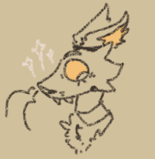
what a beast, huh? well here's some more examples:
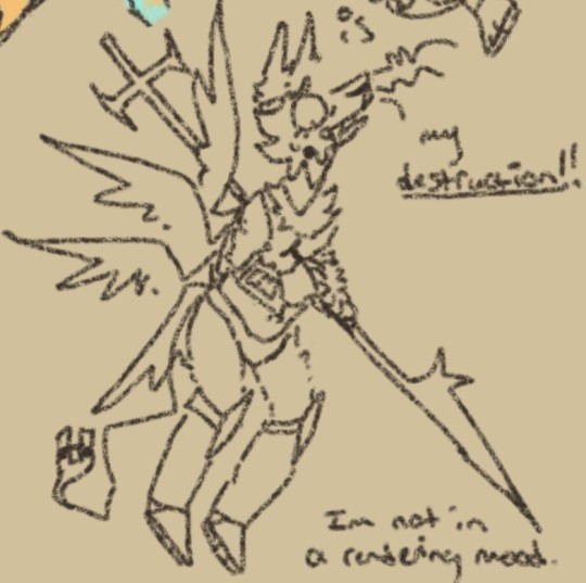
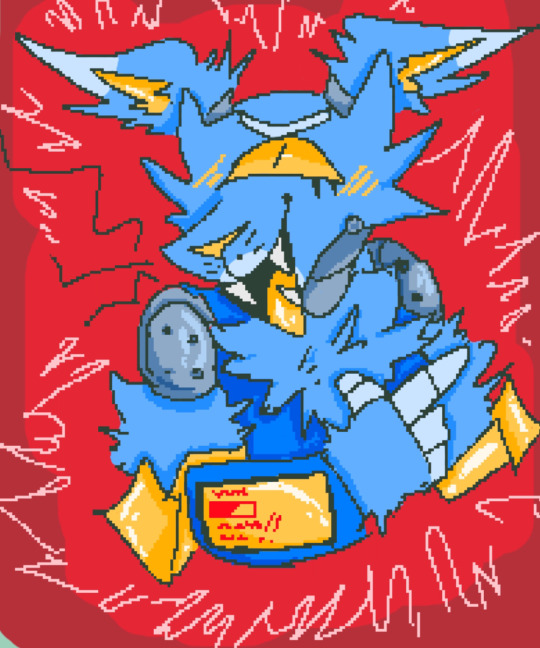
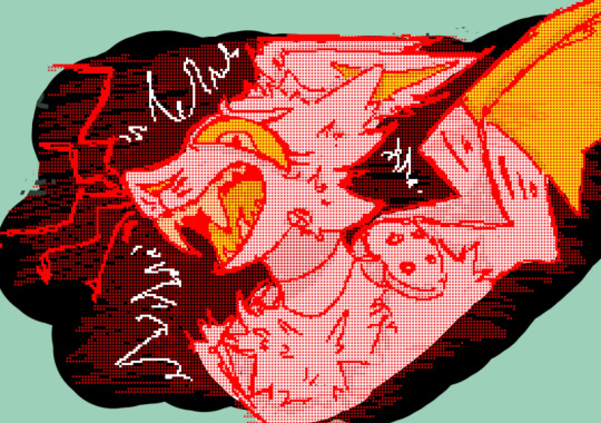
as you can see, i get pretty varied w my art and depictions of these guys. the top one is the newest sketch, but the other two are pretty good so i included them anyway :3 ive started making it's wings more frilled/feather-like, but they are still the same material. i just like the way it looks.
the next one we'll be talking about is the evil red thing- again, w the nicknames, we usually just call her "two," and again w the pronoun thing. i like she/her-ing it, though.
here's a quick, thumbnail example:
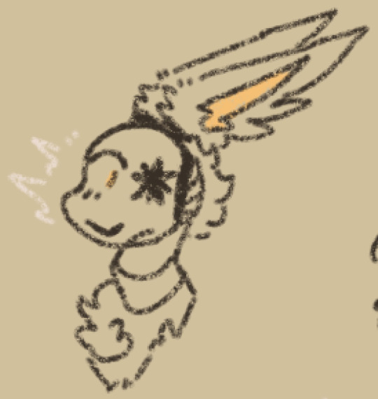
and a couple more, older examples:
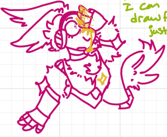
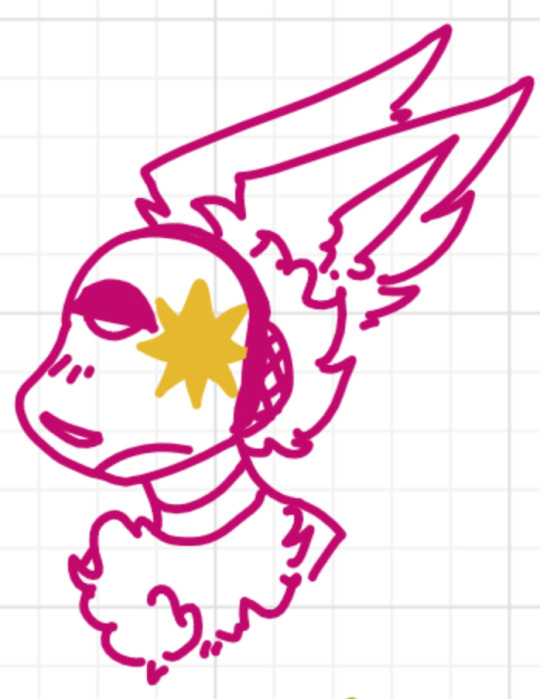
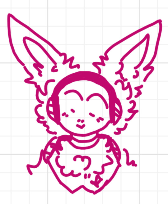
i'm not sure what animal it is!! i think either a bunny or a jerboa. some kind of prey animal, but not exactly meek. rabbits aren't pushovers, if you didn't know, they're very fierce little things. these are all kinda old, seeing as i don't draw her as often as. well.
you guys are gonna have to get used to me calling him nicknames as well, because it's just funny to call a grown man cute nicknames. so. gabby.
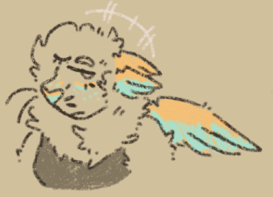
he may be hard to initially identify, obviously, but if you're confused, i did plan for that!
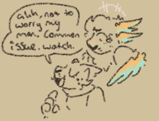
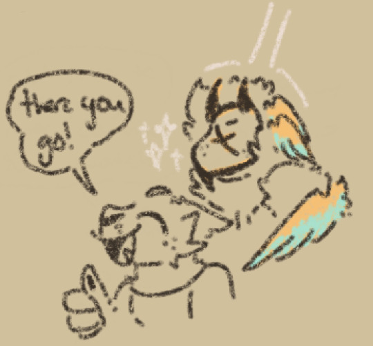
i like drawing the armor, but i'm usually drawing more casual situations, and i uh. don't feel like drawing allat. sorry LMAO. plus i like his face markings, i think they're pretty!!
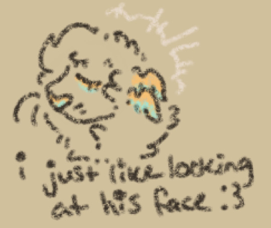
OH and the halo is dynamic. it changes depending on mood, and how he's presenting (w the more "classic" pointy look being more for formal occasions.) i strayed a lot from canon w his design, in that i typically have his face uncovered and put him in pretty dresses, as opposed to the armor. he's fun for me to draw, so it'll be mostly him and vibri that you'll be seeing ;w;
here's some other examples of the big man himself (oh, and the last one, uh, naked jumpscare, its a ref for his patterns/stripes. i give him a lot of those.) (the one w the safe is in reference to a joke me and my friend have going on fffucking roblox, where we steal from people, and generally cause problems, hence the odd outfit for vibri. its the most recent armor reference i have :shinijchair:)
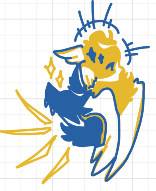
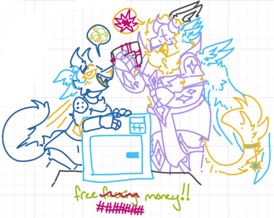
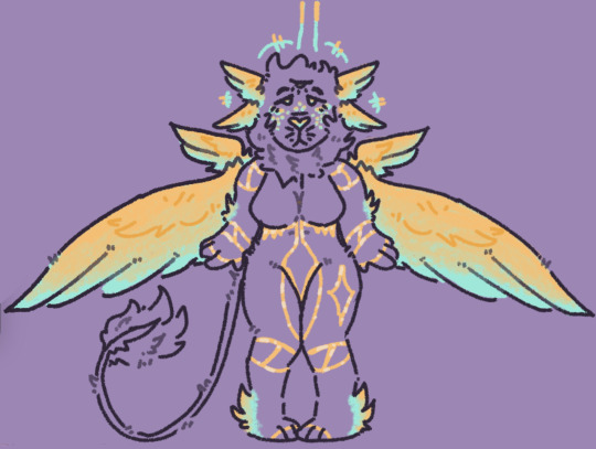
even this pattern ref is a little outdated, because i've started making his tail color-shift as well!! its more of a feather-fan now.
i have designs for a bunch of other characters as well, but i think these three are a good starting place ^^; so yeah, this should help w any amount of confusion anyone has!! also, if this is ur first post seeing me, hi!! i promise im normal LOL
#staticairspaceart#staticairspacedoodles#murderfurries#ultrakill#ultrakill v1#ultrakill v2#ultrakill gabriel
8 notes
·
View notes
Text
PROFESSOR LAYTON BUT CARTOON I SUPPOSE?????
I have not practiced my Hanna Barbera-esque art style in like a few weeks so I am crusty af but I still did try making smth similar so here are these bc one of the projects I do wanna work on eventually is making a bunch of fake screenshots of a Professor Layton Saturday Morning cartoon lol.

Idk what I was going for with the Descole one but hey, I think it's funny I based the background a bit on FNAF 3 lol

This one is a crossover with the InvestiGators series! [please read the books, they are amazing and I think the characters from there would get along so well with Layton, Luke and Flora!!!] Fun scenario with Mango taking Luke on a little stroll around the city.
Kind of, Idk, Unwound Future/Lost Future spoilers below, I'm not sure!!!
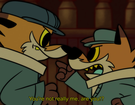
The obligatory furry stuff because drawing them is so fun!!! Here's the scenario where Luke kind of goes like 🤨🤨🤨 and is like "Maybe this isn't really me from the future..." I think he's a very confrontational guy at times so lol.
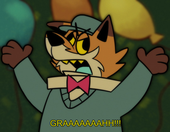
This one has another version below!

THERES NO CONTEXT, I JUST WANTED TO MAKE A RANDOM THING LOL
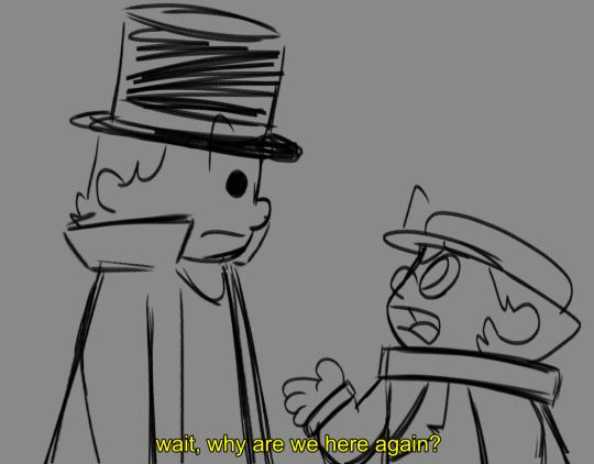
here's a sketch, I might try to properly line and color it, maybe.
#professor layton#luke triton#pl#clive dove#furry hell yeah >:]#hershel layton#art#furry art#jean descole#so when i tag descole do i technically also tag desmond sycamore#also remember pls read investigators by John Patrick Green#I love my silly alligators who solve silly mysteries#I have a cool idea of a Professor Layton and InvestiGators crossover#i may work more on it again at a later date#i was gonna add emmy to the last one but i got lazy and didn't feel like drawing 3 characters sob sob#also at a later date ima go back to practicing my hb style bc this just aint looking like it at all sob sob#uh pl cartoon is related to another project which is main priority rn so follow if you wanna see that ig#it still has pl in it and also a bunch of other silly stuff
28 notes
·
View notes
Note
GUESS WHO KINDA FINISHED THE CONDUCTOR IDEAS
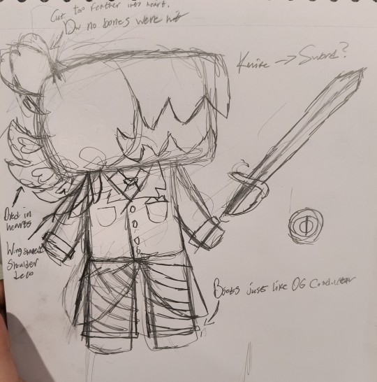
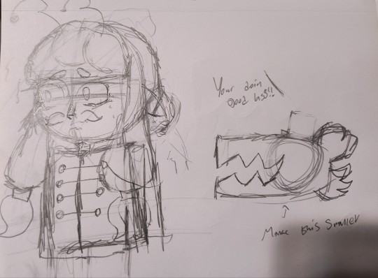
It's gonna be mostly writing + sketches cause I'm struggling a lil bit on drawing Conductor but MAIN DESIGN W/O COLOR AND A GOOFY DOODLE FINISHED!
I saw a dragon + MU in a prince-like outfit for Act 2 and my brain immediately went "Fantasy??? Fairytales perhaps??" I imagine he was inspired by his grandkids and fairytales he heard growing up as a child! Unfortunately, as he kept going, he became more focused on one-upping Grooves and winning the Annual Bird Movie Awards, and the vibes of his movies changed for the worse unfortunately. :(
He still has an explosive temper, but tries to manage it or at least tone it down in front of the cameras. Unfortunately, if you choose him as the winner, he pulls the same stunt Grooves did in the original. I imagine he even accuses you of rigging the previous Bird Awards via time travel (even though it's your first time there... Idk he's prolly delirious by this point lol)
Also imagine Bow Kid or Hood Kid telling the winning bird about the time travel aspect to the Time Pieces?? Or one of them notifying the losing bird that Hat Kids is in danger?? I'm pretty sure it was hinted that M.U had an effect in the Dead Bird boss fight, but IDK if it's canon or I just remembered a hc.
Also does a bomb still get strapped to Swap!MU in the second phase or is it something else?
(P.S: Lemme know if I'm overstepping a boundary!! I was reading this over and I'm scared that it reads like telling you about the characters in your own AU lol)
HELP POOR MU LOOKS SO SCAREEDDD.. Also I'm so loving this idea what... Conductor making movies and plays based on his grandkids ideas is so cute and the way he LOSES SIGHT OF HIS ORIGINAL VISON??? I saw a headcanon post one time about something like this... I LOVE THAT SO MUCH.
Him keeping his temper would be pretty funny.. especially if he tried to hide it. Grooves is more passive aggressive and cold, I want him to take on some of og conductors traits?? Like his recklessness and apathy towards his workers.. Conductor I can see being very short tempered, but he just does breathing exercises to not yell at anyone HELP. Like MU makes a mistake and he just starts counting to ten before telling her that shes doing great LMAOO
And I wanted Hood and Bow to have a role in this chapter too! In the finale they might be the reason the winning director knows about the timepiece power, but not because they told him.. maybe because they try to steal it, fumble a little, it rewinds time after being dropped, and then the director who saw it happen goes crazy?? Bow realizes they've fucked up, and drags Hood out of there before they die HAHAHAH or something.. in the other acts I was thinking maybe they're in the 'O Romeo O Romeo!' act and they are literally forced to be the villain.. in my og concept I was gonna have Hood forced to act as the damsel in distress because Conductor caught her sneaking around, but then ashfluffys gave me the FUNNIEST IDEA EVER to make the damsel an owl so that idea changed, so she and Bow might play as a villain in that act? I'm rambling now BUT for the DJ grooves levels I was thinking they're in space rush? The act where the spaceship is crashing towards earth! I can see them maybe getting stuck on there trying to find a timepiece and trying to race Mu to the end, sabotaging her, etc, or all that..
ALSO I FUCKING FORGOT ABIUT THE BOMB???? YES HELP OH MY FUCK HAHAHAH.. and for the stage in the fight where the parade is meant to follow you, idk, maybe- the fucking dragon comes back and tries to set you on fire HELP
I really want to work on Grooves' levels now ,,, I've worked on Conductors a lot, and I do have clear visions for Grooves' levels, I just gotta figure him out... Design wise and stuff. I don't normally draw the less humanoid characters, not my forte, but here's a crack at Conductor! I drew your design for him and tried to make up another one!
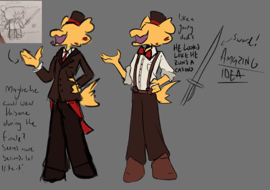
Mus guitar actually turns INTO a sword, a rapier! The prince costume does that.. I was thinking of a custom "royal medallion" to cue the costume change or something.
You know the whole "losing his creative vision" could actually be a damn good storybook. I don't know what the title would be, but it'd probably be his grandkids telling him a story, him remembering the ones he made as a kid, then he got to writing and producing a small local play for his grandkids and the other kids where he lived, it got the attention of big studios, he got hired at Dead Bird Studio as a director, ran into Grooves and his whole creative vision went down from there... OUUGHSGKHDFKHSHF
Anyways THANK YOU SO MUCH FOR SHARING YOUR IDEAS??!!! You guys have no clue how much it means to me. I love hearing all your ideas for my au and working on it as a collaboration with y'all is honestly so much fun.. it rekindles my passion every single time. I don't think giving me ideas will EVER 'cross a boundary', I love hearing all of your concepts !!! I'll try super hard to incorporate all the ones I think fit, and to be honest, all y'alls ideas not only fit my vision but expand upon it and help me think of all the small details I never would have noticed beforehand... THANK YOU SO MUCH. IM INDEBTED TO EVERY SINGLE ONE IF YOU GUYS FOR HELPING ME MAKE THESE CONCEPTS MWWWWWAH 🙏 THIS AU WOULD BE NOTHING WITHOUT ALL OF YOUR SUPPORT
#a hat in time#ahit#ahit swap au#dead bird studio#ahit conductor#conductor ahit#conductor a hat in time#a hat in time conductor#dead bird studio ahit#ahit dj grooves#dj grooves
6 notes
·
View notes
Text
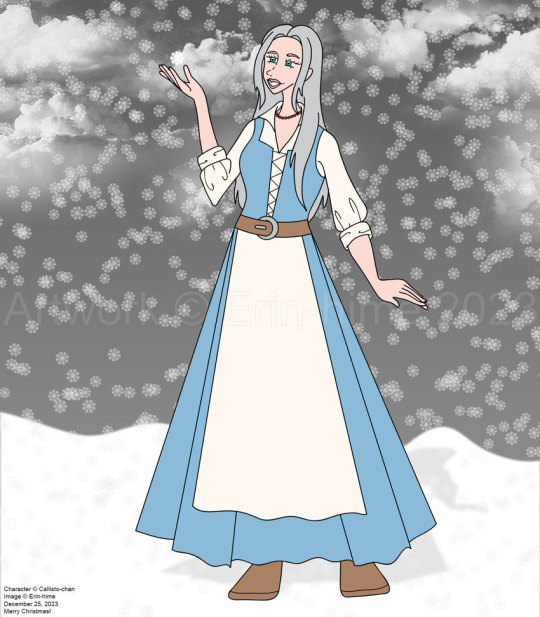
Okay, look, I decided to redo the Christmas picture I had done for @callistochan87 ten years ago after giving her the idea to do the same for me. Now, I'm obviously not sure at the moment if she actually went through with it, but I figure, hey, why not? I mean, she did a computer colored piece for me for m birthday, so I figured it was okay for me to do one for her for Christmas.
The problem was that, well, I basically sketched it out and inked it before she put up the official design sheet of the character, so now it's not really accurate. I took the parts I liked from each of her designs (the one from when she first turns human and then a year later), and sort of made ti a transitionary thing? IDK.
I didn't want to make this a straight redraw. I had already drawn Aoide/Coral in her fancy dress, so that was out. So I figured I'd make it, you know, less dumb? Yes, she's still out in the snow with bare arms, but eh - I might not have drawn her with the correct body type, but she does have extra protection going for her. :P
I know she's probably experienced snow before - I kinda get the impress that where she was from originally was a lot colder than the main kingdom. But this is the first time she's experiencing snow as a human. (But at the same time, if she's anything like the Coral of the past, it wouldn't matter - she'd be excited to see snow every time it happens. :P)
I do plan to further the present by streaming it's completion. Just need to figure out when I can, lol.
Hope you enjoy this!
8 notes
·
View notes
Text
✨Weekly Progress #32-33✨
It's been an emotionally tough two weeks. Much (if not all) of what I've been planning hasn't been going well ^^;;
Weekly Progress #32
Posted devlogs
Worked on Outlines
Finished Punk BL Part 1 Outline
Finished SFB sprite lineart
Concepted + outlined VF project
Wrote 2.1k+ words for VF
Sketched VF sprite
Weekly Progress #33
Wrote 2k+ words for VF
Finished 1 VF sprite
Flat colored other VF sprite 4/5 outfits
Finished Punk BL Part 2-3 outline skeleton
Designed 1/4 LIs for Buggy BL
Wrote 6k+ words for Punk BL
Finished Buggy BL outline skeleton

When 2024 started, I had some goals and plans for my devwork this year. I hoped to start developing commercial games. I didn't expect all of my plans to work, but I also didn't expect none of it to work the way I planned.
So while I said to myself, "Welp, that just means I gotta replan and make a new schedule for 2025!" it was still difficult for me to hype myself up for that.
I planned to join Velox Fabula 2 to cheer myself up, but despite writing over 4k words and completing a sprite... my willpower simply disappeared and I gave up completing the project.
I might finish it in the future, but the stars misaligned this time.


It is a Quick Transmigration, multi-lifetime story between two people. The story was planned to be vignettes of moments between the two characters, but I realized I wanted something more and the scope was already too big for a small jam like VF2.
Punk BL Game
That's not the title, I have no idea what the title will be. I hope an epiphany will hit me soon because idk how to tag my posts otherwise. Or I'll have to go back and edit a lot of posts.
It's a rather big and ambitious idea. This will be a turn based battle/hybrid VN with some dating sim elements. I wish I had a single word to describe it. Perhaps I'll have to do some more researching for similar games.
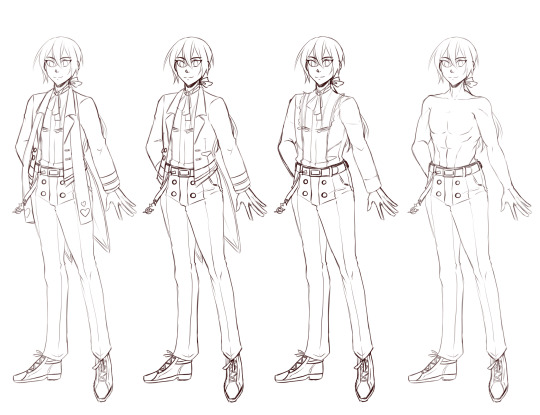
The story is about Silver, whose been ordered to defeat the gangsters who run Lucidus City. If he falls in love with one of his rivals, well, that'll depend on you...
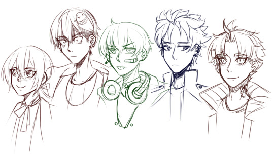
(did I post this image before? I feel like I have, but I can't find it on my own blog LOL...)
The story is split into four parts (currently); writing for ith as come so naturally that I did 4k on Friday night. These are sketches for the main characters of the first part. The MC, Silver. The "love interests" (once again, I hesitate to call them so because they won't get traditional romance routes. I'm still unsure if they'll get actual romantic endings) for part 1 are: Drayton, Gordan (Danny), Caleb, and Evan.
Any guesses to who the yandere in this story will be.
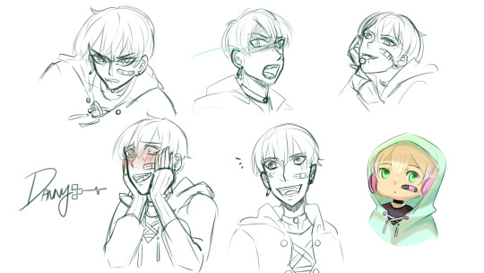
(Just some expressions I picture him making throughout the story)
Buggy BL Game
The other untitled BL game I've been daydreaming about. Thanks to discussion with some friends, the basic concept is: a bunch of bugs get stuck in a death game, similar to the idea of Kodoku.

I only have the base outline and one of the LIs designs finished. Meet Butterfly, one of the more uncooperative love interests you get to meet in the death game.
Actually, all of the love interests are quite uncooperative...
I haven't finished developing the rules and stakes of the death game yet, but I know for a fact that variable control will be essential to this game. I have a bad feeling future!Pumpkin will be ambitious and try a system where who you let die early in the game will affect later trials of the game...
Other than that, I'll be finishing a few owed artworks this week before I dive into rescheduling my long term gamedev goals for 2025 and beyond.
#devlog#visual novel#vnlink#indiedev#vndev#punkbl#buggybl#by the way I'm afraid of bugs#but they're fascinating design inspirations#even if they made me scream in horror once
6 notes
·
View notes
Text
omg I just remembered. I had a dream last night where brian and dan had rented out a small cottage or something, and were writing stuff late into the night. (I was there too for some reason, it's a dream don't worry about it lol). There was also an animated music video demo that they got to watch which was so goddamn cute with in-universe stuff. Danny's hair was particularly floofy and bouncy in it
I vividly remember two "shots"/"scenes" from this, and even my dream self tried to sketch one of them out so I wouldn't forget lol
one was of the two of them sitting opposite one another in, I wanna say couches? armchairs? but they were both huddled forward on a coffee table over their respective papers (no laptops for some reason idk), clearly both extremely tired. In particular I remember brian's face being closer to the papers, and dan's head was just kinda squished against his forehead. Also dan was wearing a beanie. idk why I remember that specifically but there you go
another was a bit later when they decided it was enough and were reading each other's papers together on a separate, two-seat couch, all huddled up. I think dan was lying on brian's shoulder and brian was resting his cheek on top. Can't remember if there was a blanket involved, there might have been one. Cottage vibes and all that
The last one I vividly remember was from the unfinished video, a sort of birds-eye-view of a restaurant/diner/bar booth of some kind. There was a whole animated sequence of Danny grabbing NB from the aisle and picking him up bridal style and then sitting down on the "bench" (for some reason the table wasn't an issue) and he was absolutely giddy about it. NB's reaction was to look directly into the "camera", blush hard, and then the animation skipped a little through rough storyboards until the next animated shot which was NB somehow having gotten out of Danny's grasp and was now dropping him on the floor. Still blushing, still looking at the camera.
Oh and we all had a brief discussion about the video, wherein some of the unfinished parts only had maybe two-three colors, which were clearly supposed to be overlays of some kind. Lots of purples and lilacs and blues n such. We all agreed that it made everyone in it look like "bubble people" and had a bit of a laugh
There was some other completely unrelated stuff later but these are what i remember the most.
Personally I blame this on the comic that just came out lol
#ninja ship party#in universe ninja ship party#do i tag this as#mod's fics#? seems kinda weird to do so but eh whatever pfft
3 notes
·
View notes
Note
AYO CAN I GET UHHHH number 9, 22, 24, 29, 30 and can i get some fries with that?
Ask meme here!
9: How much time do you spend drawing on an average day?
Very hard to say just because when I'm hyperfocused on art I might spend two hours a day or so and fill up like ten pages a day, but then go like two weeks without touching my sketchbook lol. Currently not in a drawing mood so iiiiii haven't actually touched it in a sec. Last thing I drew were maps for dnd
22: Are you confident that you’re improving steadily?
Absolutely. To a degree. I'm positive that I've always been improving in my art, except for my health crisis in 2021(? Ish) when I spent two years without picking up the pencil. Both for mental health reasons and because I literally couldn't hold one lmfao.
Getting back into art after that was hard. Having to train myself to hold a pencil was rough and my skill definitely suffered. I don't think I've gotten back up to where I was in skill before that time. Sometimes it's really, really frustrating. But also I've found that I've gone a bit of a different style since then as well, which I think is really cool and interesting. Some things I'm picking back up faster than others. Fuck, sometimes I SHADE my art now. I never used to do that lmao
24: Do you feel jealous when you see other people’s art, or inspired? (Be honest!)
Nope! My personal journey with art has taught me a lot about the technical skills that go into art. My personal problems being unable to draw for so long taught me how to sit back and stop thinking about what I can't do, but to admire what others Can. I don't get jealous of other people's art- I'm just in awe of it. It's amazing what different people can create with different skill and ability sets and I think there's something real fucking magical about that. Sometimes I use other people's art as inspiration, seeing little techniques I wanna try out, but overall... idk. Leaving art for the reasons I did gave me a much bigger appreciation for everything about it and I just can't find it in myself to compare art because everything is unique and amazing
29: For traditional artists: How do you usually start on a big piece? (Light sketch, colored lead, sketchpaper, etc)
I use a really cool red toned oil pencil from Faber Castel for my under sketches! Then I follow it up with just normal pencil lines. If I'm feeling spicy, I'll lightly shade or add deeper values with the red. I'm a simple lad. My art is almost entirely sketches and anatomy work because that's what I love to do
30: What inspires you to not just make art, but to be a better artist?
*points up to 24* All of that. My personal experiences have given me a pretty solid love of all artwork and it all inspires me.
Most of all? Collaborative work of any sort. Fandoms are considered collaborative work. Drawing things for my own writing. Drawing things for a friend's writing. Drawing OCs interacting. Shipping friends' OCs, with each other or Canon ships! Making stupid funny shitposts that haunt the collective mindscape for years to come. (I don't think the Trollhunters Fandom will ever forgive me for Thiccmar) Writing something that inspires someone to draw. Drawing something that inspires someone to write. Art trades. Are collabs. Countless role-playing. My friends who commission me to draw or write them the craziest shit that I have an absolute ball with. Just stuff that makes other people see it and go "I can play with these toys too!"
Collaborative work fuels my fucking soul and I love love love getting to do things with other people, when I have the capability of doing so
#my stuff#ask meme#ask#bloopsalot#this one got serious but eyyyyy#my person journey with art gets real fuckin dark for a solid two years#where i wss too terrified to pick up a pencil bevause of how fucking awful it is#to pick something up and try to hold it and completely fail#it was fucking awful and terrible and it hurt so i was too scared to even try#i spend months just working on my hands with writing worksheets and playing video games#before i would touch my sketchbook#because fuck man that shit terrified me#so my art journey is kinda dark but i came out the other motherfucking side bayby#tw depressing stuff#tw chronic illness
1 note
·
View note
Text
okay here are the things Qllie is interested in improving/Investigating
line art colors (i've seen some people do completely colored line art based on shapes it's outlining, colored line art only inside of objects but black outline around, no line art at all, line art only in select places, etc etc )
Proportions (I did learn how to do this in high school/middle school several times but I can't remember all of it lol)
wrinkles in clothing (where do they go and how)
boobies (big fat boobies)
shading? i kind of know generally what to do but like. idk. maybe i'm good right now?????
I'm trying to pick things that are more interesting to me so that i'll actually do them? like yeah i could improve with hands but honestly i'm more interested in clothes and general shapes rn....like i feel like i can keep drawing blob hands and be happy lol. I know my sister does those like 2 minute sketch from reference pose things (idk what it's called but it's basically really fast practice so you pick apart poses better) but that might bore me to death idk if i want to do that....
0 notes
Text
This is a nice way to poke around peeps, batty buddy! Thanks for leaving this open to grab (I hope what I'm doing in replying like this is fine)
Alright, let's unpack:
Currently, I'm working on 6 sequential artworks for my usual rarepair because I have a month without doing something for them and since the past year I have this thing dated to be posted on 11/11 (tomorrow).
Tho, a few hours ago I finished setting up a cardboard box to be my new photoshoot lightbox... tho I will need to delay the testing of it because I discovered my trusty lightbulb lamp broke u_u
This was quite a sunny weekend! Today the sun was so strong it helped to dry clothes and of course, the glue and painting I applied to the cardboard box I mentioned before x) So, it was a productive weekend with what I can manage in my current creative energy.
You already know what project and why I'm excited about it coff ISAID-
I doubt you want to know how many WIPs I put off for years. LMAOOO, there are too many to count, but if I need to pick one, it's making a Meet the Artist sort of presentation (I have the sketch, but I haven't inked it… since February orz).
My color scheme to go is usually the Magenta/Cyan/Yellow combo, LOL, but I like to pick other colors from this palette!

Show finished recently: Batman Animated Season 01! It is one of my oldest visual inspos, with the clear sharp grimdark + art deco mix that characterizes the cast and mature themes it shows. Show started recently: Scooby Doo Mystery Inc; I'm taking so many screenshots because the backgrounds with those grunge textures and abandoned feel is hella rad!
Comfort characters: I've been with the same rascals you know for three years right now. Four? LOL It's difficult for me to get attached this hard and for a long time to fictional characters. Though I can't call him a comfort character, I enjoyed the Penguin on Batman Animated! There was an EP where they let him show such an awkward and gentlemanly side that I just WANTED TO SQUISH HIM.
Books read: AFTER THREE YEARS I FINISHED KING'S DANSE MACABREEEEE. I saved lots and lots of QUOTES I will be citing and using in my work for decades to come MUHAHAHA coff I want to start reading NEXT YEAR Frankenstein: I left it half there idk why so, I will need to start over. It's for the better.
Someone that inspires me… Y O U The end
Re-reading/Rewatching: in my bookcase, I always have The Little Prince and Lovecraft Anthologies (quite the contrast, eh?). Now if we go very personal-intimate: Neverending Story will always be absolutely groundbreaking to me, it really deserves its in-book title of "the book of all books". In the movie department, I'll never get tired of Scooby Doo's animated movies between 1990-2000s, the animation and storytelling were top! In a memory stick, I have tho Treasure Planet and Atlantis: Los Empire for similar reasons.
About the rewatch/re-reading effects mmm I think it affects me but to certain games: movies and series are unilateral in interaction, with games the interaction depends on you and I admit even if I like a game with all my might… there's always a level or part of the story I loathe to do again orz
Collecting wise: I never was into it until robot hell tackled me and it made me brave to spend and be more versed in buying this or that figures and toys was quite an experience. Out of that… I print official artworks and plaster them in collages around my journal, that counts? xDU I don't live in a place where merch is easy to get. And yes I draw fanart so technically I printed my own merch too skdfhskjdhf
Laughing is a rare thing from me daily I'll refrain from replying because *explodes*
I personally see my art better as stickers and postcards in format… I never designed art for t-shirts and such… or even tattoos idk, I feel a tad uncomfortable in general to take my art in such bold ways? Something rare because I worked before doing logotypes and such mmmm
I'm stupidly multifacetic x'D From drawing traditionally and digitally with inks, watercolors, and acrylics to then sculpting with clay, and cold porcelain to then designing maquettes for packaging (I'm learning to use the cutting plotter) without counting baby steps knowledge on game coding… I would LOVE to sew my own plush toys but %D I don't have that level of patience… same with SCULPTING IN 3D??? Idk, that's witchcraft to me!
… Too many hobbies you can guess from what I said before this point HAHAHA Aside from character design and goofy worldbuilding mmm Board game design? Big dream of mine.
Something new I learned: using the cutting machine!!! Was like going back to my Illustrator era roots sdkfjhsdjf On a personal level… I turned back to my witchy side and created my first magic servitor, my first spell on the 31 of October and I'm excited to try more things during rituals!
I think I have enough of this year? Even if at times I feel like it won me over… it wasn't so bad. But I need to take action in setting more habits I left aside like walking more frequently and respecting my sleep schedule (I slipped bad so many times in the year, I think that's why I'm feeling so sleepy lately).
That's all I think! I hope you find it educative entertaining haha
Thanks once more for the opportunity x)
To bring a bit more social into social media…
Tell me what you’re working on!!
How’s you’re weekend going?
Do you have any projects or plans you’re excited for?
What’s one thing you feel like you need to work on but keep putting it off? (could be a wip or practice with drawing backgrounds, house hold chores ect.)
Do you have a color / color scheme you are obsessing over right now?
Have you watched any shows/movies you really fell in love with?
What is your favorite comfort character right now??
Have you read any good books lately? What cute characters in there made you laugh or smile?
Who is someone that inspires you?
What is a show / movie / book that is so precious to you that you keep reading it over and over again?
Can you reread / rewatch a beloved thing over and over or does that bug you?
Do you like to collect merch from favorite shows, or are your favorites so obscure you have to make your own??
What’s one thing you’ve seen online recently that has made you laugh?
Do you enjoy making your work / pieces into wearable art? (making merch ect.)
Do you like to do artistic things? ( Draw, write, music, sewing, jewelry, scultping, crafts)
What hobbies do you have?
Have you learned anything new this year?
If you could learn one new thing this year what would it be?
23 notes
·
View notes
Note
Could you talk a bit about how you design your OCs from a visual level? I really love their designs. Only if you have the time and energy of course <3
Thank you so much omg 💕 I was trying to think of a good way to answer this question, but the truth is my methods are very nebulous and hard to define! I’ll do my best though 🥳
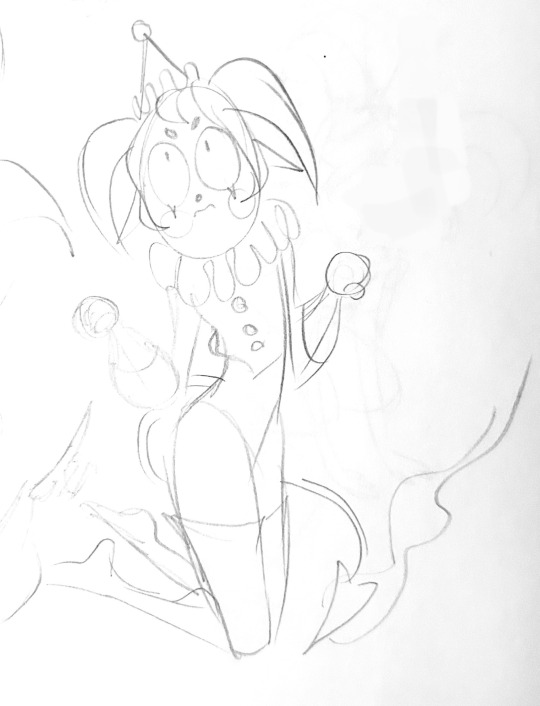
Some characters come to me very easily, some go through a few revisions, and some go through a meat grinder of revisions lol. Rune was easy, her design was just in my head right off the bat from years of drawing/thinking about demons. Yorick was a little different. Awhile back I played a ttrpg and designed this character:
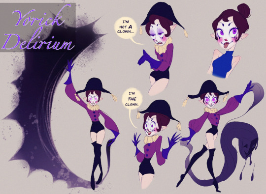
Look familiar? This is prototype Yorick!! (I have this on my portfolio at a higher res if you wanna zoom in or something idk) She was a character who was kind of elfin and was a clown who controlled shadows. When I started pinning down the stories and characters of A Slowly Beating Heart I KNEW I had to put a demonic clown in there, and I thought of this design.
A phase I go through when designing characters when im not sure how they’re gonna look is doing a bunch of iterations based on vibes. Here’s some of the earliest Yorick sketches I could find, you can see how they don’t quite look “right” yet:
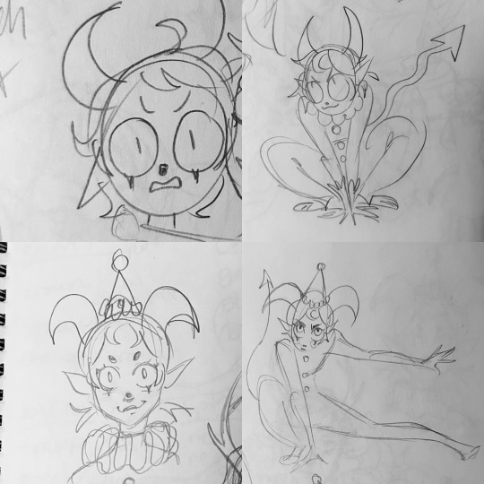
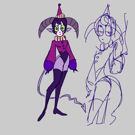
Like the vibes were there but that’s not our Yorick! Here’s what I think might be the first or second sketch I did where they look right:
I used the old Yorick I had designed but finally modified the outfit and design in a way that pleased me. I went with this design, and went through some minor edits with the colors, and boom, the demon clown was born! (Though even in this image they aren’t quite right, in the final comic I got rid of the lines on their horns and saturated the green parts of their eyes):
Melody is another story. Versions of Melody had also been living in my mind for almost as long as Rune, but never as a solid design. I have a zillion sketches of Melody that don’t look at all like how she looks now. It wasn’t until right before her appearance in the comic that I actually decided to refine her character design. Since I had never quite solidified how she looked in my mind, getting her on paper was quite the task. Her hairstyle was already on my mind, but I did a bunch of different versions of her halo and outfits. I put a bunch of designs together and sent them out to my friends to ask them to vote on their favorite outfit to help me decide 😂:
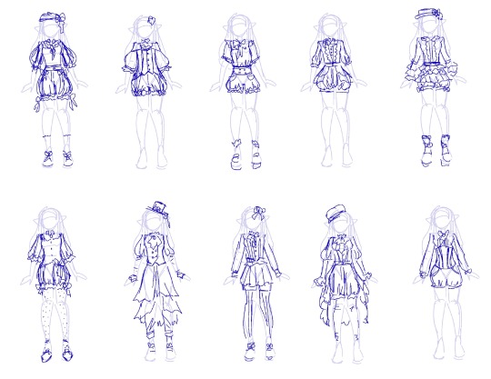
In the end Melody’s outfit didn’t quite look like any of these, because they’re all somewhat complex, and I need things to stay really simple for comics. Once I had designed the outfit the struggle still wasn’t over, cause now I had to do colors. Here’s just a small sampling of the color pallets I went through:
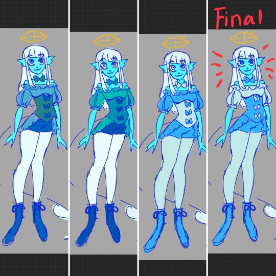
I guess if I was gonna break down my process into steps, it would be like this:
1. Sketch a bunch of ideas based on vibes
2. Choose my fav and then refine it further by tweaking the outfit/hair ect
3. Try out a lot of different colors and keep adjusting them until they look right
4. Give birth to my Art Child 💃✨🙌
I don’t always do all that, and some of the design processes for certain characters happen a little differently. But that’s basically it! Sorry this was super long, I hope it helped!!
#my art#character design#art tutorial#tutorial#original character#Yorick#melody#a slowly beating heart#asbh#frenzy post
90 notes
·
View notes
Text
Welcome!
hi, you can call me mayor or dea or delia, formerly known as mayordoi. i'm an aroace artist who really likes kagamine rin and robin fire emblem. this account is where i post art i make :) while i wanna keep it focused on that, i will still answer any asks that come my way!
things of note
art tag -> #mayor doidles
my carrd (contains all my main important links in one place)
my website, which is currently a wip but is slated to replace my carrd once it's progressed enough. links to some extra goodies such as my newfound blog, a qotd, and a guestbook! :-)
my "main" blog (which appears in notifs when i like a post or follow someone) is @mayordeas-clone. that account is where i just reblog things.
reposting my art/using for monetized content such as youtube videos: credit strongly encouraged and appreciated
personal use of my art (such as for profile customization): no permission needed. credited appreciated but not required
as long as you don't get people to think that you drew my art it's all good
i currently have commissions open! option of three styles with three body crops each, with options for extra characters and complex backgrounds. they're on ko-fi and vgen, so check em out! general pricing info:
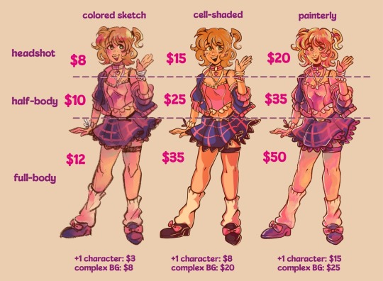
some more detailed things about me below the cut :]
what i draw
i draw a lot of fanart of whatever interests me! so please don't follow me if you only want to see fanart from one thing lol. all pieces considered fanart can be found in the #fanart tag.
the most consistent subjects i draw is vocaloid (mainly the mascot characters and how they appear in different songs) and fe awakening (mainly robin, of either gender).
i also have ocs that i might occasionally subject you to. you can read detailed info about them on my toyhouse (linked in my carrd). by the way, all art of my oc can be found in the #mayors ocs tag~
supplies and brushes!
in case you're curious about the things i use to make my art, here it is. i like making both traditional art and digital art depending on how i feel.
traditional supplies
paper - i almost always draw in sketchbooks. for full colored pieces, i'm fond of strathmore's visual journal sketchbooks (the ones i'm using atm are mixed media). for on-the-go sketches and doodles, i use a notebook with dotted paper, nothing fancy. sketching - i like using a red grading pencil (essentially a waxy colored pencil with an eraser) for sketching since markers and paint blend into it which means less erasing. i also use a regular mechanical pencil or gel pen for concept sketches or doodles. inking - there's a lot of inking tools i like! i like using staedtler pigment liners for simple lines and hatching, as well as tombow brush pens for quick line weight. markers - my primary coloring tool. while they're not perfect, i primarily use ohuhus; they're great if you're starting out since they're quite cheap! i also use a grab-bag of other marker brands like tombow or copics, but those are my mains. colored pencils - prismacolors, baybee!! i mainly use these for lineart and additional shading and texture. paint - also far from perfect, but i use the himi jelly gouache for paintings even though i'm kinda ass at it. i also used to use a very crusty windsor & newton watercolor kit. as for brushes, idk i inherited most of mine and they work fine.
digital stuff
program - i use procreate on an ipad to draw digitally. i know it's basic but it gets the job done for me default brushes i like - my go-to for all of procreate is the dry ink (in the inking section), modified with a higher maximum thickness and some slight stroke jitter (tweaked in the color dynamics settings). amazing for both rendering and lineart! others that i like but don't use as frequently are: HB pencil (sketching), 6B pencil (sketching), technical pen (inking), gel pen (inking), honeyeater (vintage), and campagnia (vintage). would like to make a detailed brush list eventually TwT brush packs i like - i download a lot of brushes. there are two in my current process(es) that i like a lot: real inker, use for lineart/coloring. the way it tapers, fades, and generally makes regular lines look is extremely satisfying. a watercolor brush, i cannot for the life of me track down the source (it was one of the first i downloaded). well, it was free, so i will supply a download link myself (when i get to it). ones that i don't use anymore but still like: jingsketch basics is a must-get for anyone that likes digital painting. i use "soft chalk" to render. rusty rakes is a set of textured line brushes i love to use to add extra hatched textures to my paintings. mainly rely on rr dark. i also use a halftone brush to add texture to my art, but unfortunately i cannot find it or the author! will update when i do~
anyway
thank you for reading. this post might get updated in the future when i think of more stuff to add or change. i would add a new and improved meet the artist, but to be honest i don’t really have a “sona” anymore 😅 maybe yall don’t get to meet me…
bye bye!!
27 notes
·
View notes