#idek what’s going on
Explore tagged Tumblr posts
Text


figure practice that became jegulus as usual
#anatomy study#greek mythology#patroclus and achilles#jegulus#starchaser#sunseeker#james potter#regulus black#idek what’s going on#everything i draw becomes them my brain is so rotted
190 notes
·
View notes
Text
“Donatello is a fellow who has a way with machines”

My sister asked me to make this, so…. You guys can have it too ig
#idek what’s going on#she said#“in the intro it says ‘Donatello is a fellow who has a way with machines’#it was so funny#I put effort into this#pls appreciate#:’3#tmnt donnie#tmnt 2012 fanart#tmnt 2k12#tmnt 2012#security breach#fnaf security breach#glamrock freddy#2012 donatello#donatello#tmnt donatello#fanart#cursed
224 notes
·
View notes
Text
Ugh is it normal to feel immense envy and jealousy when you see a picture of your friends hanging out because goddamnit, I know you are all my friends and that was one night and you invited me and I couldn’t go but I want to laugh with her right now and I want to run around and I want to have those memories
5 notes
·
View notes
Text
I don’t know if any of these what if they kissed drabble/starters/idek make any sense to anyone. But wanda enjoys them and you know what? That means a lot. Wanda is feeling DOWN and so these are nice
#I am so sorry#I ramble#idek what’s going on#I just write and hope for the best#do they make sense???? are they good??? who knows#but wanda is feeling DOWN so it is nice#you get a kiss and you and you and you
5 notes
·
View notes
Text
literally every single time kevin and jean talk about neil they sound like a divorced couple arguing about their child...i thought it was just TSC but the first time jean meets neil 😭 even then it's giving 'you had custody! why didn't you raise him right?' 'we should accept him as he is.' 'fuck all that! he needs manners!' and neil is sitting there like why are my parents arguing about my behavior in rapid french no one but i can understand? i literally said please, i tried to be nice.
#they're going to be this way for the rest of their life#neil overprotective child telling his dad to grow a spine and his mom to stand up and live his life#lmfao idek what#this probably says smthn abt me but i won't look too deep into it#aftg#kevin day#neil josten#jean moreau#234
3K notes
·
View notes
Text
jesus christ i blame the refs for that one
1 note
·
View note
Text


the heart killers - coming november 20th
#the heart killers#firstkhao#kantbison#joongdunk#fadelstyle#jojo tichakorn#gmmtv#thai bl#bl drama#upcoming bl#bitch idek what to say about this skjdhdf#imma need a few business days#this was extremely hard to gif bc every shot is 2 frames long lmao#but i had to post something so here you go#im SHOOKSPEARE FR
631 notes
·
View notes
Text


i haven’t really been drawing these last few months but like. let’s make a post.🩵
#ducktales#ducktales 2017#della duck#donald duck#idek what my style is i just be grabbing that apple pencil#eto bleh#my art#hello people i scheduled this last night let’s go
644 notes
·
View notes
Text
#SEVERANCE: [ i'm a busy woman ... ]
#severance#no but really where in the world is harmony cobel?#i'm queueing this b4 episode 7 drops so... idek what to expect#sorry gotta tag the fuck out of this one cuz it's like really fucking good#sometimes you go to your corporate 9-5 and go to a boxing pilates class after and get sent a vision on the drive home#and then you go back to your 9-5 the next day and start making this when nobody's paying attention#and really that's sort of the message behind severance#hope everyone likes this one cuz i love it#especially maya user @hellyrigs Ur likes were invaluable encouragement#severance spoilers#harmony cobel#ms cobel#mrs selvig#cobelvig#patricia arquette#fancam#fan edit#my edit#sabrina carpenter#busy woman#seth milchick#tramell tillman#adam scott#mark scout#britt lower#helly r#helena eagan#john turturro#irving b#dylan g
304 notes
·
View notes
Text
Im watching Spirited Away for the first time with absolutely no context as to what it’s about but
Buddy
You are eating the fae’s food
#idek if there are fae type creatures in this movie or what the plot it#but you don’t just walk into a completely abandoned town#and go into an empty restaurant with unattended hot food#and start esting it#you absolutely do no do that#nothing good comes of this why are you doing this
413 notes
·
View notes
Text


so how are you all feeling about this
#hickgib#hickeygibson#idek what their ship name is bc I don't go there but I'm sitting on the sidelines going holy shit. ok.#The Terror#davechella#Starky's original posts#THE WAY IT'S ONLY ON THE UNDIAGNOSED PLAYLIST........ JESUS CHRIST. HAVE FUN WITH THAT I GUESS.
207 notes
·
View notes
Text

Therapy's going awful great.
Based on a dream I had a few days ago (I expanded upon it since it was just the first panel and the Axolotl floating around. Also, more excuse to draw Bill lol)
Textless version under da cut:

#gravity falls#the book of bill#tbob#bill cipher#the axolotl#theraprism#the book of bill spoilers#tbob spoilers#jic... it's literal end of book spoilers#thisisnotawebsite.com spoilers#FORGOT a specific detail was spoilery to the site lol#this came out better than i expected tbh#but ig that's not a high bar when the bar is 'idek how i'm going to finish this what am i d o i n g lol'
164 notes
·
View notes
Text
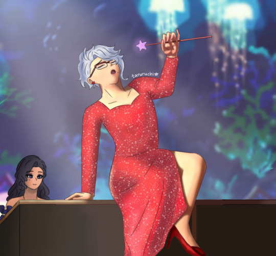
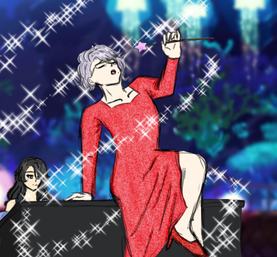
The similarity is uncanny... Fairy godmother being Azul's grandma is starting to look more and more canon /j


And what if I say I had a secret fem azul ver I mean what. Who said that
Anyway, non-sparkle ver is utc! (Coincidentally, Sparkle from Your Name just started playing)


I bet you didn't expect to see the ver I made last year. But yeah bro when I colored I made them look like ghosts idk 😭😭 The glow up goes crazy, all in the span of 11 months (tbf to past me, I was also lazy and speed ran it)
Taglist: @solxima @angelwishess @scint1llat3 @distant-velleity @twtysevapr @cynthinesia @h0neybane @viperbunnies @linabirb @thehollowwriter @wafflethewitchboy @siphoklansan @jewelulu @skibidibabygirl @gimmeurmoneyagh (ask me if you wanna be added/removed!) Sorry I know y'all probably weren't expecting to be tagged for. whatever this is 😭😭😭
#Get this to 1k and I'll post a fem azul one challenge (impossible)#Idek what I was thinking when I first made this OANODNFKSF#But I'm very proud of it. This is my magnum opus#Now I wonder how different my art will look in a year#twisted wonderland#twst#twst art#twst fanart#azul ashengrotto#twst azul#And featuring:#taruchi#It barely shows how I plan for her mostro lounge outfit to look like HAHAHA#Anywhoozle... Off to the war (math assignment) I go#☆ taruchi's drawings 🖌
194 notes
·
View notes
Text
misc baberoe doodles + renee


#do we fw genderbends around here....#girl idek if theres alligators where gene is im not american....sweats#btw these were done from like. memory.#so if anything looks off it's that! ok tq!#++ modern aus intrigue me bc how would u adapt their situation to modern life. like.#also idk what they would wear i was going based off vibes#kinda took inspo from the uniforms#sorry i just dont wanna draw uniforms im a chronic doodler and details make me lazy#also fem!baberoe was mostly based on vibes less historical accuracy#babe screams long hair to me idk why#n e wayz this is all my juice outta me ill come back to tumblr in a month#band of brothers#band of brothers fanart#eugene roe#baberoe#babe heffron
193 notes
·
View notes
Text


Moonpawwwww
#my art#warrior cats#moonpaw#idek know whats happening with her aside from the voice in her head (hoping its some kinda misdirection godddd)#erins if you make headmatepaw/starpaw evil i will do something inadvisable#(by misdirection i mean her being described as sinister#changing skies spoilers#in other news i think janus moonpaw is gonna be like. my go-to#i love drawing janus cats i should make an oc#and i think janus moonpaw is fun :)
199 notes
·
View notes
Text


If I didn't have the fanbase that I did, I wouldn't be on stage it's as simple as that. They really give me the fire in the belly, confidence to do that. And I hope that because of that mutual benefit, they take a lot in that, they take a lot of pride in that. They see me feeling good on stage, and enjoying the show like I will tonight, that's literally all thanks to them.
#louis tomlinson#feqw livestream#for every question why livestream#fitfwt mexico city#what a difference HQ makes!!!#it takes ages but it is what it is (lol when are we seeing that tattoo again)#should i be tagging accounts idek what's going on anymore#my gifs#michael blackwell#isaac anderson#louis and fans
349 notes
·
View notes