#i've figured out at least that i like the black and white illustrations more than the recent colour illustrations
Explore tagged Tumblr posts
Text
songbird's brain: I think we ought to have a personal copy of the Chronicles of Narnia in our personal library. As a treat.
part of songbird's brain that has been keeping track of the literary 'treats' purchased in the past few months: says WHOSE WALLET
#once upon a time i owned copies of those books and LOVED my copies#because each were a different edition/different cover and each had a story behind it#like my LWW was the small movie release one with colour stills from the 2005 movie in the middle#because that was the copy my second grade teacher gave me as a goodbye gift. i still remember how it smelled#and i had two copies of the dawn treader which made me very frustrated for some reason#and then songbird's mother gave them away during one of the moves (sigh) and I have never replaced them#well. i DO have three copies of LWW#what for? I DON'T KNOW#but i do#songbird again#anyway i'd buy them individually if i could... i just need to visit a lot of secondhand stores and see#i've figured out at least that i like the black and white illustrations more than the recent colour illustrations#the paper for those ones is too thick and have a strange texture and for whatever reason i don't like that#MORE rambling in the house tonight!
28 notes
·
View notes
Text
Monster AU - Risotto Nero research notes
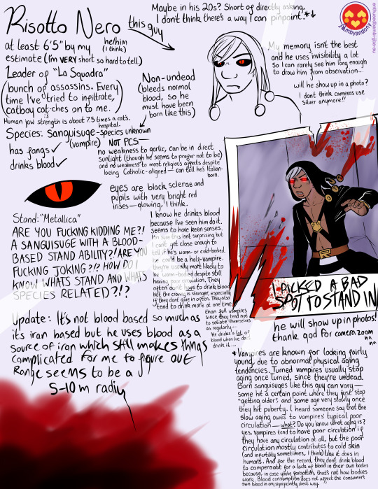
You weirdos really wanted me to try and study this guy. It’s… been interesting! Here’s what I have:
[
[A paper of notes about Risotto Nero. The paper has tape in various places.]
[On the left side:]
Risotto Nero
he/him (I think)
At least 6'5" by my estimate (I'm VERY short so hard to tell)
Leader of "La Squadra" (bunch of assassins. Every time I've tried to infiltrate, catboy catches (:3) on to me.) Human jaw strength is about 7.5 times a cat's. hospital.
Species : Sanguisuge ('vampire') - species unknown
has fangs (yes)
drinks blood (yes)
Non-undead (bleeds normal blood, so he must have been born like this).
Not P.C.S (Pop Culture Standard)—no weakness to garlic, can be in direct sunlight (though he seems to prefer not to be) and no weakness to religious affects despite being Catholic aligned—can tell he's Italian-born.
I know he drinks blood because I’ve seen him do it. seems to have keen senses. I’m sure this isn’t surprising but I can’t get close enough to tell if he’s warm- or cold-bodied. he could be a half-vampire. They’re usually more likely to be warm-bodied despite still having poor circulation. They often don’t have to drink blood, but the craving is stronger, especially if they don’t give in often. They also tend to drink more at one time than full vampires since they tend not to satiate themselves as regularly… he drinks a lot of blood when he does drink it.
[There's an illustration depicting one of Risotto's eyes. The 'whites' are black, and the irises are bright red, and the pupils—also black—appear slit, like a cat's.]
Eyes are black sclerae and pupils with very bright red irises—glowing, I think.
Stand: "Metallica"
ARE YOU FUCKING KIDDING ME?! A SANGUISUGE WITH A BLOOD-BASED STAND ABILITY??! ARE YOU FUCKING JOKING!? HOW DO I KNOW WHAT'S STAND AND WHAT'S SPECIES RELATED!?!?
Update: its not blood based so much as its iron based but he uses blood as a source of iron which still makes things complicated for me to figure out. range seems to be a 5-10m radiu [The writing trails off at the end. There's a lot of blood on the corner of the page.]
[On the right side:]
Maybe in his 20s? Short of directly asking, I don't think there's a way I can pinpoint for sure.*
[There's an unfinished rushed illustration of Risotto Nero.]
My memory isn't the best and he uses invisibility a lot so I can rarely see him long enough to draw him from observation...
Will he show up in a photo? I don't think cameras use silver anymore!!
[There’s a partially-ripped photo of Risotto Nero, in dark lighting, presumably in the process of using his Stand, taped to the page. There's blood splattered over the photo. Frantic writing at the bottom of the photo reads "I PICKEDA A BAD SPOT TO STAND IN"]
he does show up in photos!! thank god for camera zoom haha...
*Vampires are known for looking fairly young, due to abnormal physical aging tendencies. Turned vampires usually stop aging once Turned, since they’re undead. Born sanguisuges like this guy can vary—some hit a certain point where they just stop “getting older”, and some age very slowly once they hit puberty. I heard someone say that the slow aging owes to vampires’ typical poor circulation—what?? Do you know what aging is? Yes, vampires tend to have poor circulation if they have any circulation at all, but the poor circulation contributes mostly to cold skin (and infertility, I think) like it does in humans. And for the record, they don’t drink blood to compensate for a lack of blood in their own bodies because, in case you’ve forgotten, that’s not how bodies work. Blood consumption does not affect the consumer’s own blood in any significantly direct way. ]
Guess it must be lucky to be a sanguisuge whose job is offing people… he’s hard to get close to because I usually catch him when he’s uh. You know. Doing his job.
He still hasn’t realised I’ve been tailing him though! I… I think. Like with his age, short of asking him directly, I can’t really be sure, and as I’m sure is obvious, that’s not really a good idea.
if anyone has any questions or insight… go ahead?
I could use any info.
~Bambi
#golden wind#vento aureo#jjba#jjba fanart#monster au#jojo fanart#jojos bizarre adventure#jojo's bizarre adventure#jjba monster au#jojo au#jjba au#monster au lore#la squadra#risotto nero#enthused cryptotaxonomist moments
36 notes
·
View notes
Note
What color would u say Akira’s eyes are? I see a lot of people say gray and I’ve also seen red, but I always thought they were a dark brown
You’re starting a cult around him so I figured you’d have an opinion
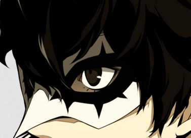
ok 1) not starting a cult that's just an in-joke making fun of a silly anon i got. 2) yes i do have an opinion. but also ...... FACTS !!! I usually go grey as the normal default but I understand the confusion. Official artworks for merchandise range from black to a light blue 😭. Lets take a trip down model / reference lane, shall we? First up: P5D!

We'll rope P5 / P5R into this too, because it's the same colour. Akira's eyes appear this shade... almost always! The metaverse, the real world... grey as graphite. Ah, but "almost! almost!?" you cry! Yes, yes. There's one exception.


Recall the persona awakening scene. Recall *all* of them, actually. All persona users have their eyes turn yellow when tearing their mask off.
This holds true for their models as well! For a few frames, during the summoning animation, their faces turn black and their eyes turn yellow. It's easier to see on some characters than others. (Others being joker. this took me SO long to scrub for.) Now, lets look at his sprites! So I guess we can call this part uh, Persona Q.A? (That's what these sprites are from, anyway...)
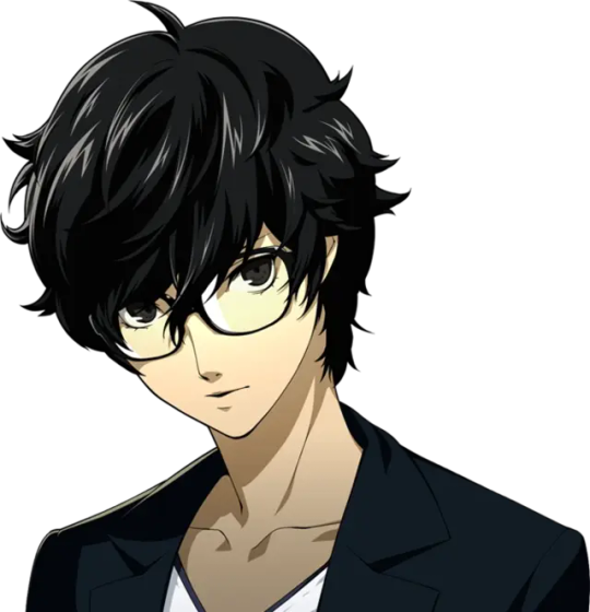
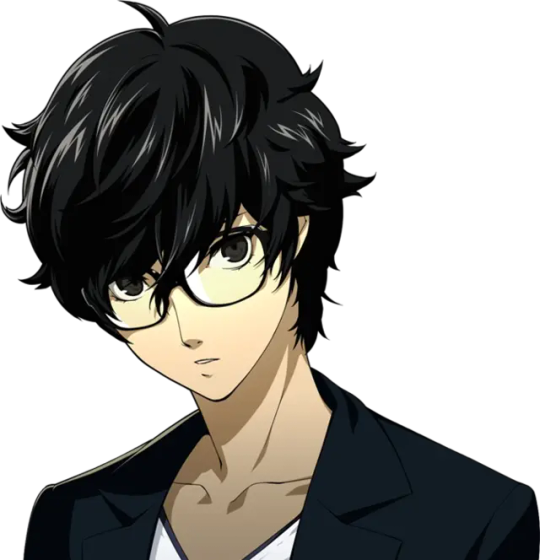
Now these eyes definitely look black! Honestly I think you could argue that the previous set were black too. On their own, they seem grey but the key thing to compare them with here is Akira's hair. They're both the same colour in the sprites and uh, that's definitely not grey hair. Now the anime! I won't be covering P5A: The Daybreakers because. Well. It'd just be more "Wow it's black. Now it's black again." P5A Is interesting because I swear to god his eyes were red when they were in mementos. but i must've imagined that???
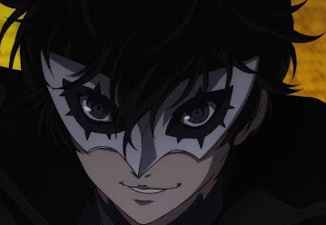
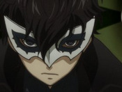
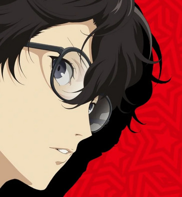
That's just not a thing that happens! It's grey! The only exception is the... [shudders] All Out Attack. (Which also happens in P5:the game. forgot to mention that earlier; but it could be chalked up to mere aesthetic choice)
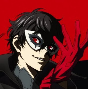
My assumption about red-eyes is at least partially true though. Nnnot in the sense that what I thought happened, happened, but more-so... Whenever Joker is depicted with red eyes, it's in his PT outfit. And like... only that outfit.
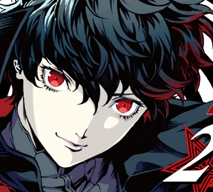
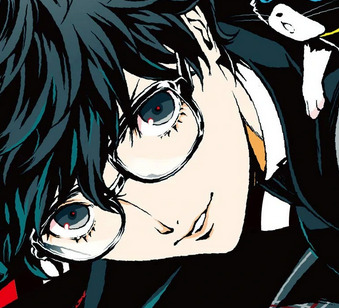
Mementos mission loves doing it. p5a does it. Artists do it. my BRAIN does it. Q2 also does it!! (hi all out attack. again)

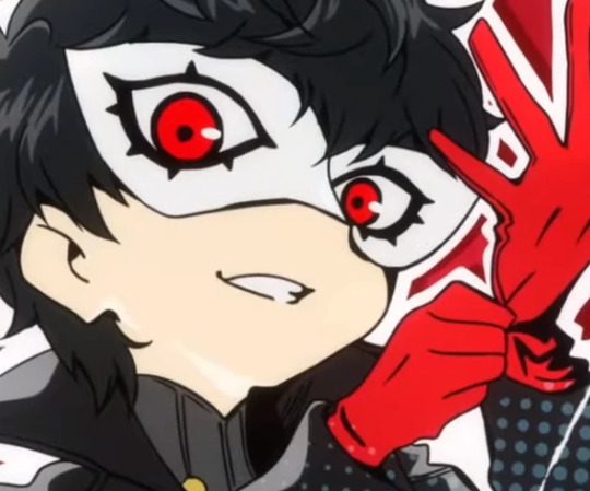
other notable mentions for Doin' It Red While Being Joker are Akirby and the Official Jonker Nendo. Idk what that means but! Yeah


A few promo arts do the red-eyes thing like this original key art and multiple official illustrations for p5's release. I think it's just a fun aesthetics thing honestly. p5 is red. akira is from p5. slap some red on that bitch on him eye.

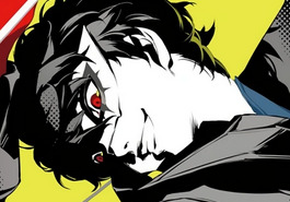

[ key art | strikers art | og p5 art ] So that solves that mystery. I think the idea of brown eyes either comes from being realistic (black eyes irl are just really really dark brown) op's colour palette ooooooooooor.... misunderstanding an official palette!

This is Q2's cut in graphic. The eyes look kind of brown, right? But it's mostly just a lighting thing. The face is darkened and the eye's colour is lightened to give that slick piercing-gaze-through-the-shadows effect.
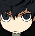

(Q2 Akira is pretty pasty, as we can see here. the skintone matches the brightest highlight in the cut-in image.)
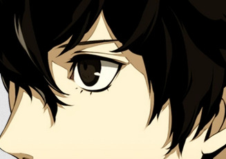
striker's sprites eyes look pretty brown too, but if you look at the hair and shadows, you can see it's because everything has a brown hue. we're doing black without doing black! (...except for the deepest shadows and lines, but cmon. if you put black on black its just gonna look like a big ol' blob.) this same effect is often used in many tribute artworks for p5 that aren't in the usual black/white/single colour style or crossover artwork because............ well it's basic colour theory. The only exception to the "rules" i've laid out here I have ever seen is the artwork done for Persora The Golden Best 5th Album artwork.
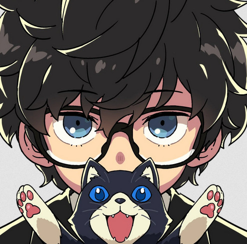
WHY ARE THEY BLUE. THAT'S WRONG. anyway. hoped this post helps you. my personal opinion is grey / silver if i wanna get all OOooh FANCY when writing a fic and waxing poetic and then yellow when summoning a persona or using some kind of spell in mementos. don't see brown in the slightest and red... yeah, i'll pass on having that be his default in mementos? maybe? idk i go back and forth on it lol. just get jiggy with it
#persona 5#persona 5 royal#akira kurusu#ren amamiya#oh christ this is long but if i put it under the cut now it'll fuck up my entire entire post im so sorry#headcanons#image heavy#long post#p5ram
71 notes
·
View notes
Note
sodaa !! can i pls hear anything u want to share or say abt ur dgm insert !! im rly all ears !! (@dmclr)
HIIIII CLARA HIII thank you so much honestly... I have so many thoughts cause none of my friends are into d gray man and there for have. no idea what I'm talking about!
this is a long post so have some songs I listened to while writing it <:3
⛈️ ⛅ 🌨️
I was going to make this like a big lore post but I realized there's a bunch of things I wanna figure out first and a bunch of things I'd have to explain and I don't wanna leave this in my ask box for. Months! So instead I'm gonna use this post to talk about my current design process hell. I'm like aware self insert designs don't need to be complicated or directly match the source material but. Mine does actually! No it can't just be me it needs to fit with the LORE
a big problem I've been having recently is colors... I would consider my s/I to be like... part of the main quartet to some extent and all of them have main colors I associate with them.
Allen is generally white or a pale grey but I could understand if someone argued for red because of his scar and arm, but red is more an accent color than a main color for me. when illustrated in a simpler way Hoshino will usually focus on including his pale-ness before his red accents so I consider that more important in his color hierarchy


Lenalee is obviously purple. her hair is canonically black but whenever hoshino stylized her its just. purple. and she also has purple eyes either way. shes purple.


Lavi's in an orangey red or just orange in the a very "He is a ginger." type way. you could also just say his color is ginger and i'd be like. yeah.


and then finally, Kanda's is very much blue, even in canon I think during the Alma arc when he went insane his hair turned blue. even if that wasn't true, like Lenalee his eyes are blue is canon, and when given the chance his hair is also stylized as blue.


that being said when the characters are so clearly color-coded I find it important to also color code my self insert a little which leads to the dilemma of: which color do I give them?
i know my blog's theme might lead one to believe otherwise but my favorite color is red, so of course that was my first choice, but even with red not being Allen's main color. it's still very prominent in his palette and felt like stepping on his toes a little, plus even excluding Allen, Lavi will often stray into red and i don't want to deprive him of that versatility in my art just to differentiate the two color-wise. there is the option to make them into more of a pinkish red so when i push Lavi into more red, they'd become more pink so palette-wise they stand out from each other but I'm iffy on that.
this is also to say it isn't unheard of for characters to share a main color but it's usually with purpose. Like Alma's main color is arguably blue but i think that's purseful seeing as Kanda and Alma's stories are extremely intertwined. it shows that they're connected to each other in a way others aren't, these two characters' bond is unique.
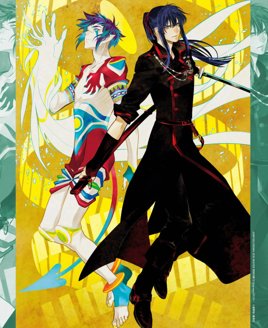
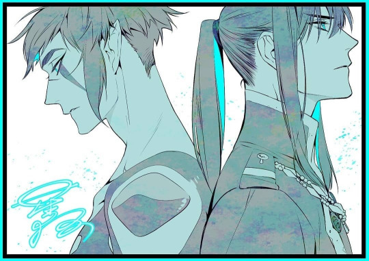
I also like to think that Kanda and Lanelee having similar colors with Kanda occasionally slipping into more indigo than his usual blue shows that they have a unique bond in their own way too but :3c that's more just wishful thinking on my part...
Allen's mentor Cross's main color is red, which very much makes sense to me with Lavi and Allen's dubious claims to red as their central color since all three of these characters have a connected history. I would get into how the histories are connected but then this post would NEVER END so we can't do that. not today at least.
that being said I DID consider my self insert blue as a central color because my character is obviously very connected to Kanda, but I didn't like the idea of them having the exact same shade of blue so I thought of making it maybe a little lighter or a little darker. i also did not like that though because it reminded me too much of one of my moots ships. WHICH IS NO SHADE TO THEM BTW I love his ship a lot and that's partly why I think my brain has decided they have a claim over that specific color combo.
besides even if all of the above wasn't true I think Alma and Kanda's bond is very specific and unique and I feel like sharing their color might... intrude upon that instead of building upon it, if that makes sense? My s/i is still connected to BOTH in a way but, at the beginning of their relationship especially, not in the way they're connected to each other. I don't like the idea of them signifying a sense of unity with Kanda by sharing a central color with him when that's simply not true for them until WAY later. maybe they'd wear each other's colors to show that or something...
At the moment I'm really considering yellow for multiple reasons...
an orangey yellow to be specific! partly because it would still connect them to Kanda and Alma in a weird way of being their opposite of the color wheel but also showing their distance by again, being their opposite. i think it also goes with some design themes I was playing. them being a warm yellow in contrast to Kanda's cool blue... i also liked the idea of their ability to involve a flash of light somehow. especially since i planned to make them light-sensitive and get migraines like meee :). its funny to me.
i believe that is all my thoughts for now!! at least the coherent ones. i might post some design concept later... for nyow, thank you for coming to my ted talk! like genuinely if you read all this thank you!!! i talk a lot.
#🫧.blub blub#🐚. moots#🦐. asks#tag later#debating wether to put this in the main tag or not...#yes im posting this at 7am at a Wednesday. what of it#🗡#📕#👢#🌱#what of allen and alma emojis...#thats what the tag later is for i guess.
3 notes
·
View notes
Text
Lautity Week Prompt 1: First Meeting
Dusting off this old writing blog again, because I've been thinking about starkid and hatchetfield again ever since Nerdy Prudes Must Die came out. I wanted to write some stephgrace, so I'm glad this little event gave me a reason to. Not going to put this one on AO3 yet because I haven't had time to edit it, but I figured I'd at least post it here.
(In which Grace reconnects with an old friend in an unexpected way.)
((Content notes: Steph is trans here, and while she is not misgendered and her birth name is never stated, I wanted to mention it because it's a significant part of the fic.))
When Grace was in first grade, maybe about five or so, she didn’t know why the other kids didn’t want to play with her, and it made her feel lonely.
(When she got older, she still didn’t know why the other kids didn’t want to play with her, but she tried not to let it get to her as much.)
There was a little boy in her class, though, with scraggly brown hair and the deepest brown eyes she’d ever seen. He would play with her sometimes. He didn't seem to mind the fact that she didn’t read any books other than her illustrated children’s bible, or that she wasn’t allowed to use the internet, or that she didn’t know any of the cartoons the other kids watched.
He played with other kids, too, but sometimes he would come over and play with her, help her with daisy chains, offer to push her on the swing set. He didn’t know the bible stories, but he was willing to sit still and listen to her read them to him, which was a lot more than she got from other kids. Her parents told her he was the mayor’s kid, but that didn’t really matter much to Grace. She was just happy to have a friend.
She wasn’t his best friend, but he was the closest thing she had to one. Except Alice, but Alice was two years older than her, and they only got to see each other on Sundays, and if Grace was being honest, she was pretty sure she wasn’t Alice’s best friend either.
Throughout the rest of elementary school, they were never in the same class again, which meant they didn’t have the same recess. Grace made a habit of writing little notes, decorated with little flowers, folding them until they were small enough she could hide it between her chubby elementary school fingers, and tucking it in the knothole at the base of the playground stairs, the ones that led up to the tunnel.
She checked every recess for a response. She never got one, but the notes kept disappearing. She hoped that meant he was getting them. She had no way of knowing. Maybe one of the kids who giggled behind their hands when she talked about God was secretly taking them in order to show them to his friends to laugh at. But she liked to imagine her…friend? Classmate? Kid she played with? was reading them. She liked to imagine they made him smile.
Sometime around middle school, she had more or less given up on running into him again. And then she met Stephanie Lauter.
*
Before Stephanie had started wearing black lipstick and ripped jeans and rock band t-shirts that showed a hint of her stomach hanging out, she’d shown up to school in lacy white dresses and pink lip gloss and flowers in her hair.
Also, seeing her for the first time melted Grace’s brain. The most beautiful girl she’d ever seen walked briskly through the cafeteria and sat down about five lunch tables away, tucking her skirt beneath her as she did, and somehow Grace lost the ability to form words.
She tried and failed to get the courage to go over to the popular kids’ table to introduce herself. Eventually, she ended up catching Stacy as she got up to get a carton of chocolate milk.
“Who’s that?” she asked her. Stacy followed her gaze to look at Stephanie.
“That’s Stephanie Lauter. The mayor’s daughter.” Stacy looked at Grace quizzically. “Do you have a problem with that?”
“No, she’s just…” Grace didn’t think ‘makes me recite the dangers of worshipping idols to myself’ would be taken as a compliment, regardless of whether it was true or not. “She’s so beautiful.”
Stacy’s expression softened ever so slightly. “She is.”
“I guess… I just wanted to tell her that.”
Grace went back to her seat and carefully cut the apple she was eating into segments. Intent on her task, she didn’t notice Stephanie approaching until she was already standing over her.
“Thank you,” she said softly, which made Grace almost jump out of her skin.
“What?”
“Stacy said you told her I was beautiful. I thought it would be polite to say thank you, Grace.”
“How did you know my name?” Grace asked, which was exactly the wrong thing to say.
Now it was Stephanie’s turn to look nervous. “I’ve heard it around,” she said. “Can I sit with you?”
“Please,” Grace said, wincing at how eager she sounded.
They talked, and it felt oddly easy for someone she’d never met before. At least, it did until she ventured on the topic of the mayor’s other kid, but Grace felt like she owed it to him to at least ask.
“Did you ever have a brother who went to Hatchetfield High?” Grace asked. Stephanie choked on her cold pasta.
“Um, yeah. I had… have a brother who went to Hatchetfield. He was, uh, pretty dumb. Got held back a couple of grades. My dad had to transfer him to another school,” Stephanie said.
“Oh,” Grace said quietly. “Well, can you tell him that he was kind to me?”
Stephanie made a soft noise. “Of course. I’m sure he’ll appreciate that.”
*
It was when Grace was spending the night over at Steph’s house that she found it.
Over the course of the past two years, Steph had stopped wearing so many sundresses and switched to chokers and cropped tops, and some part of Grace honestly wished it made her think about Steph less, but of course it didn’t work that way.
So here she was, lying on Stephanie Lauter’s bed and trying not to think about how much it smelled like her perfume. She hadn’t been meaning to pry, honestly. But the pinboard was right at eye level, and when she looked at the large, loopy childish handwriting, she noticed the careful flower border around the edges.
When she was making those notes, she’d always taken care to draw the flowers as neatly as she could.
Grace carefully unpinned the note from the board and looked at it, but there was no mistaking it. She heard the bedroom door creak open and turned to see Stephanie, eyes wet.
“You told me your brother left for another school,” Grace said.
“I don’t have a brother,” Stephanie admitted, a few tears running down her cheek. “It was me, Grace.”
Grace didn’t move as Stephanie slowly approached her, palms up, like speaking to a cornered animal. “If you don’t want to be around me anymore, or if you’re scared of me, I’m not going to apologize. So please, Grace, if you’re going to be angry with me, please just-“
Grace cut her off by throwing her arms around her. Stephanie was still as stone in her embrace.
“I can’t believe,” Grace said, shoulders trembling with repressed sobs, “you’ve been caring for me all this time.”
Stephanie stepped back slightly, tilting Grace’s chin up and rubbing her thumb over her lips. “I can’t believe you’d ever think I’d stop.”
Their first kiss was messy and awkward and both of them were still crying and Grace couldn’t wait to try again.
15 notes
·
View notes
Text
I collect figures, among them Disney Princesses and I prefer to have them go together, as sets. Something very satisfying about seeing all my girls in the same style.
And the way the princesses of color are underrepresented in their figures is infuriating me more and more and more with every year, quite honestly.
Especially when they do bother to include white princesses who were released later in the same series.
Like the Q Posket "Dreamy Style" - which is the wedding dress line.
I love that line and it got me so excited and hyped because it featured all the First Six Princesses in their wedding dresses, not just Jasmine, Cinderella and Ariel, who were shown wearing them in their respective movies (or sequel, in Jasmine's case), but also Aurora, Belle and Snow White. All three who never had any form of on-screen wedding; their dresses were only used in the illustrated book continuations. So it was really cool to get these.
Now, in the chronology of Disney Princesses, the first six are followed by Pocahontas, Mulan and Tiana, as the last 2D Princesses, before we get into the 3D Princesses with Rapunzel, Merida, Moana. We're gonna leave Raya out of the conversation because she's still very new.
But Pocahontas and Mulan have been around for a very long time. And though I'll admit, I don't know if we ever got a wedding dress for Pocahontas in a book, she did get married. And I do know that we have an official wedding outfit for Mulan from her sequel. And Tiana! Tiana has two wedding dresses, so you can't even get away with the excuse that her first wedding dress keeps being used as her official princess dress because she has an additional second wedding dress.
But the line skipped right over all of these and the only other princess included is Rapunzel. Even though Pocahontas, Mulan and Tiana all are married women too.
Mulan at least has three figures, two large ones, one small one. It's not a lot, but it's at least more than the average character has.
Pocahontas got one. And you can't tell me it's about the limited wardrobe. She could have different poses. Rapunzel comes in the same dress in various poses.
Tiana got two. One of her sitting on the ground in her official princess dress and one of her... in her waitress uniform. She has so many amazing outfits. And instead of just straight-up making half a dozen Tianas - BRIDE, princess, blue ball gown, the original costume from the ball that got dirty, her 1920s dress from her dream sequence, and yeah okay also the waitress - the princess and the waitress are the only ones you make?
Moana just straight-up doesn't exist. She still doesn't have a singular Q Posket figurine. Don't tell me she's too new, because Elsa and Anna got Q Poskets of their sequel movie, which released three years after her.
And then came Rapunzel - and she is in everything. She skips the line so often and is just... included with the First Six, or even as part of them - and replacing Jasmine. I've seen sets of six figures that features the First Six but somehow managed to leave out Jasmine but instead include Rapunzel. Gee. Most of the time, Jasmine gets to stay though, because she has earned her seniority and popularity. But Rapunzel always jumps over Tiana and Pocahontas and usually also Mulan.
Don't come at me with "but Rapunzel's movie was ~more popular~!", because the Disney Princess line and name should be about that alone, and be separated from their individual movies.
Alice has more figures than Pocahontas, Tiana and Mulan. And nobody can tell me that the 1951 Alice in Wonderland standalone movie that never got a sequel or TV show is such a banger hit with today's youth that it outdoes Disney's only black princess. Or freaking Mulan.
And the majority of the princesses got the so-called Avatar Style line, which is them in their Ralph Breaks the Internet outfits - but that line is looking quite white so far too, because the ones who haven't gotten ones yet are Moana, Tiana, Pocahontas, Merida, Elsa and Anna.
I took Q Posket as the main example here, to work with some actual numbers, but I collect figures outside that brand too and this is not a Q Posket exclusive thing. It's near impossible to find any figures for Moana and Pocahontas in particular, and far too hard to find them for Tiana considering just how many perfectly marketable outfits she had.
Racism doesn't even make sense here. You already made this movie. There is so much money to make off of the Disney Princess brand by actually featuring all the princesses in it.
You chose to make all of them official princesses. You could have chosen to bury them and ignore them like Eilonwy, Kida, Tiger Lily and Megara, who are all canonical princesses too but are not part of the line. But these? These, you made official Disney PrincessesTM so treat them that way?
Tiana is getting her own TV show this year, Moana is getting her own TV show next year, so how about you start marketing them right and featuring them in all the lines where you manage to put Rapunzel in too? And put some damn respect into Pocahontas and Mulan's names too.
#Disney#Disney Princesses#Racism#it's just. it's so fucking wild to find Cindy#in the same damn dress posing 3 different ways#and even getting a figure of her ugly ass first dress#or Ariel who comes double anyway because mermaid + human#but even SHE is getting the FULL WARDROBE treatment#like. the damn purple sparkly dress she wore for like 10 seconds#and. yeah. put some respect into the First Six. I'm all for it#but RAPUNZEL Anna Elsa are getting MORE AND MORE AND MORE#while you can HARDLY ever find Pocahontas Moana and Tiana??? that's just. that's unreal#and I'm emphasizing Raps here because I know the Frzen brand#is it's own behemoth separate from the Disney Princess brand#but how much and often Rapunzel gets featured in things#where princesses older than her are just _skipped_???
12 notes
·
View notes
Text
Intro to my next project
Ok, so I watched a video called "You need a product, not a project" from Jake Parker and it called me out specifically. I know that starting and completing things is the only way to get better, and having a focused goal only helps. Once I start doing things to completion, I'll get way better way faster than just tweaking one thing over and over.
Now Jake offered a dozen possible project ideas you can turn into products, and I kind of tweaked one of them- illustrate a public domain story. So my plan is to illustrate a bunch of short stories.
I know it doesn't exactly have an end goal like a novel does since I'm gonna be picking and choosing which ones I do, so I'll make one myself. I want to do twenty public domain short stories.
Jake also suggested that the project take longer than a month but no longer than a year. So I'll make a deadline and say I'll have all of it done in four months. That's five per month, which is approximately one a week therabouts. The rest of the post will be under a readmore because I'm not that mean, lol.
Is it ambitious? Yes. Do I think I can do it? Probably, but it'll be a stretch, which is perfect for goals. Too easy and it's not really a goal, too hard and you give up. Plus, it'll force me to set aside dedicated time for my art, which is something I've been meaning to do for a very long time.
I won't limit myself in terms of medium, whether it be digital, ink, watercolor, acrylic, or gouache, but I will set a limit and say it needs to be a) more than pencil or pen and b) even if it's ink, it needs at least three shades- white, black, and a midtone.
I also figured I'd share my game plan. For this project, I have seven phases for each story, to be taken one at a time.
Phase one: choose stories
I've read a lot of short stories in my life, but I can't name twenty off the top of my head unfortunately, and I didn't know if any were public domain until I looked it up. I found an article that was a good jumping off point because it had not only individual works but also collections. I quickly skimmed through a few I wasn't immediately familiar with, and came up with the first nine stories. That's a good enough list to start, because I'm excited to do just that- start. Normally starting is the hardest part for me, so I think I'll just take my nine and do them, thinking of the others after.
I'll see if any of the short story collections are available in my library, and I already borrowed Tales of Terror and Mystery by Sir Arthur Conan Doyle digitally and recorded myself reading the first story out loud and plan on doing the rest during the two weeks I have the rental. This way, I have the story without laboriously typing each word and I can just listen and take notes. So my first nine are:
The Landlady by Roald Dahl
The Lottery by Shirley Jackson
The Monkey's Paw by W.W. Jacobs
The Murders in the Rue Morgue by Edgar Allen Poe, specifically part 3 of the story
The Killers by Ernest Hemingway
The Yellow Wallpaper by Charlotte Perkins Gilman
The Monkey by Stephen King
All Summer in a Day by Ray Bradbury
Harrison Bergeron by Kurt Vonnegut
As I said, I'll think of more after I do those first nine. Pulling those together took me a day because I was up at 1:30 AM for some Godforsaken reason before work and did some of it before and some of it on my break. Then it's time for...
Phase Two: Read stories carefully, one at a time
I've already read all of these, but either a long time ago or just briefly skimmed. I want to read each one at least three times through, taking notes of any ideas each time, before I illustrate. Ideally, I'd like to print out the stories and mark them up by hand, but I don't feel like printing that much paper. Digital will have to do.
I'm a pretty fast reader, but I do want to intentionally slow myself down and really think about the story, preferably with breaks in between readings. But since I set the deadline of four months, leaving me with roughly a week to complete a story's illustrations, I probably won't be able to take breaks of more than an hour or two and not the entire day I really want. So I'll do the read-throughs and notes on one day. Then the very next day will be time for...
Phase Three: Thumbnails
I want to make this project as good as I can make it at this point in my artistic journey, so I do want to make thumbnails. I want to try out things on a small scale before I have to live with mistakes on the actual scale. Plus, it'll give me a bit of leeway to change my mind without a lot of time wasted.
I'll probably spend a half day on this since I'll be in a time crunch.
Then it'll be time for...
Phase Four: Sketching
After the thumbnails, I'll sketch out however many the story calls for. I don't want to limit the number of illustrations each story gets, because each is so different- not just in length but in imagery it evokes in me.
I want to have the sketches fairly clean because I can't really wing inking like some artists can. That's partially why I want to do thumbnails- I can be really loose with those, then cleaner with the full sketches.
I want to spend the half-day left from the thumbnailing and then half of the next day, which is a full day. I'll make sure to take breaks so my wrist doesn't fall off.
Then it'll be time for...
Phase Five: Inking
Whether this is actual ink with my dip pen or using a paint outline will probably depend on both the story and my mood.
I want to do this over a full day, so half the day from sketching and then half the next day.
Once that's done, it'll be time for...
Phase Six: Color
As I mentioned before, even if I think the story warrants black and white, I want at least one midtone with each piece. If I feel it warrants color, I want to do both flats and light shading.
This will take longer, maybe a day and a half.
Phase Seven: Post
I want to keep myself accountable, so I'll be posting the finished pieces, along with probably one or two progress shots for each one.
Taking good photos and thinking of captions won't take long (I'll probably think of a template for a caption so I won't have to think of something clever).
That's my plan on the technical pieces of this project. Now it's time for the tricks I hope will help me on my journey.
I made some progress bars in a journal when I got home from work, but my computer's being a butt about uploading them so I can show you.
Basically, I have phases two through seven (since one is already done) with twenty notches for each one. As I complete them, I'll color them in.
Referring back to my estimated time table, the breakdown is as follows:
Day one- Read through story three times, taking notes each pass. Take hour break in between passes.
Day two part one- Thumbnails.
Day two part two- Sketching.
Day three part one- Finish sketching.
Day three part two- 'Inking' the sketch, in whatever medium I choose.
Day four part one- Finish 'inking'.
Day four part two- Colors and shading.
Day five- Colors and shading
Day six- Post
I hope this post either entertained or inspired you for your own project-product. If it did the latter, I encourage you to plan it out and then announce it in some way.
#what you missed#public domain illustration project#i need a better tag than that#but that will have to do for now
1 note
·
View note
Note
This is something I've been thinking about for awhile, but I feel like while Stan Lee has always been on a pedestal since he branded himself as a Walt Disney-esque figure, I remember it was easier to find more nuanced attitudes that acknowledged his flaws and how he screwed over artists like Jack Kirby before the MCU; but MCU stans act like he's a godly religious figure above criticism, and like he single-handedly created every Marvel character ever, nevermind his co-artists or actual creators.
i ended up doing a read more link because this got longer than i expected. i would also like to apologize to you, anon, for the huge delay in answering this ask
tl;dr: stan lee certainly did a lot of incredible things, but we do have to acknowledge that he was a human. not to say that all humans make awful, awful mistakes, but that one should always be hesitant to put a human on a pedestal. attacking people for pointing out his wrongs and misdoings doesn't change the fact that he had committed wrongs and misdoings
stan lee constantly downplayed the contribution of his co-creators, most notably larry lieber (his brother), steve ditko, and, as you mentioned, jack kirby
larry lieber is in part responsible for the creation of ant-man, iron man, and thor. he illustrated most of the amazing spider-man (by that i mean the daily comic strip)
steve ditko co-created spider-man and doctor strange. ditko said in an interview that lee only created the name (spider-man) and ditko created the costume, the web shooters, and the spider signal. he also developed him into the angsty young man that has consistently been one of peter's main characteristics
jack kirby is arguably the one stan lee wronged the most in terms of comic book creations. nowadays, many people (mcu fans) believe lee to be at least partially responsible for the creation of captain america, when in reality it was kirby and joe simon. that isn't necessarily lee's fault, but he never did anything to dissuade that particular opinion. it can be argued that the fantastic four, the hulk, and black panther were created almost solely by kirby, even though most people (mcu fans) believe lee to be the main creator
marvel comics wouldn't be where it is without stan lee, but it also wouldn't be where it is without larry lieber, steve ditko, jack kirby, and countless other creators and artists
stan lee also liked to label himself as a caring and accepting man, but, well, he is partly responsible for this:

will reblog with image id
i'd like to end this with a quote from the Are They Gay? - Deadpool and Spider-Man (Spideypool) video:

[image id: a black and white photo of stan lee with the text "he existed" 1922-2018]
along with an image id for the first photo in a reblog, i will include my sources
#ask#anonymous#sorry for the late reply :/#stan lee#marvel comics#jack kirby#larry lieber#steve ditko
36 notes
·
View notes
Text
July 2021 Mid Monthly Report

Hello hello everyone! I have exciting news regarding Project : Desert's status that I hope y'all will be interested in hearing.
Before I begin, I have some general housekeeping things I'd like to mention. I will be taking a break from the project for about a month; I've made some incredible progress this last year that I think I've earned a short break to recuperate and further tune my skills outside the project.
So with that little bit out of the way, let's begin!
Project Progress
Zero Draft
I am proud to finally say I have finished the zero draft of Project : Desert!

My god am I happy to have finally done it! It's really insane to me thinking about how far I've come this last year. To think, Project : Desert started out as a short story for a zine only to culminate to this.
Of course, I still have a long way to go; this is only the first step of my journey, and I hope you all will accompany me.
Character Redesigns
So as I've stated in a previous report, I am planning to redesign all of the characters that are featured in Project : Desert. With how drastically my skill level developed this last year, I figured it was appropriate to make some better designs for the characters.
Here are the redesigns I currently have done of our two main characters, Vinnie and Orias.


Vincent Helio is the current Prince of Trin; however, it is a role he adamant about not upholding, repeatedly forming plans to escape the city that fail more often than not. But his most recent excursion turns disastrous when he and his retainer are attacked by eldritch creature; he's only able to escape thanks to the help of a shapeshifter by the name of Orias.


If you were to ask Orias about his origins, he would give you an unclear answer. The truth is that even he has no idea where he's from or who he is; all that he knows is that he once had been human, but that humanity has long since left him. Now he is a shapeshifter who's been trapped within the desert for over millennia. But perhaps there still hope for him when he has a chance meeting with the Prince of Trin.
With Vinnie and Orias' redesigns complete, my next designs I will be tackling are Niv, Briar, and Reese. Niv's I plan on working on along side the Valley concept, which will be one of the first things I work one once I'm done with my break, so expect those designs sometime around September.
Goals
As stated at the start, I will be taking a month long break before I start working on the project again. So while I do have a couple of art related goals this month, they won't be related to the project.
Here are my goals from June:
Outline the remaining five or so chapters and complete Act 3 by July 15th. [done, hell yea!]
Complete the Valley concept by July 31st. [pushed off for the time being to work on with Niv's redesign]
Begin Character redesigns (Vinnie, Orias, and Niv) and have something tangible by July 15th. [2/3 complete; Niv's design I pushed off to work on after my break]
Create separate posts for the Maramagia and Agujero concepts by June 21st. [done]
July Goals:
Create separate posts for Vinnie's and Orias' concepts by July 26th.
Create at least two black-and-white illustrations.
Do an art study on various animals (including, but not limited to, birds; cats; deer).
Do at least two scenery art studies (sketches are fine, but colored is preferred).
That sums up my report for this month. As always, thank you for reading, and I hope you will continue supporting Project : Desert. Let's make it another great year!

#writeblr#dev log#monthly report#Mid Month Report#Project : Desert#jasper.txt#jasper's archive#MMR2021
3 notes
·
View notes
Note
hi! i've always loved your hnk panel redraws and recently i've been so inspired by them that i've tried my hand at coloring some panels too! if you don't mind me asking, do you have any tips?
oh i certainly do! some of these are a bit generic/art related but they’re definitely useful in this case too. I’m adding a read more because unfortunately it got a bit long but here you go:
1) Get to know your tools!
Since you weren’t very specific, I’ll assume you aren’t too familiar with art softwares (and if you are, you can just skip that part it’s not That deep). I’ll start with the basics; I know this is obvious, but please bear with me, because understanding how your program works WILL make you a lot more efficient.Here are quick descriptions of some features I think are very useful - I use Clip Studio Paint, but I believe most programs have equivalents. If you don’t know them, please experiment with them, they’ll come in handy!
- Locking transparency :
Locking the transparency of a layer means only the parts where something is already drawn can be modified. Basically, you can recolour something that already exists in a rather precise way.
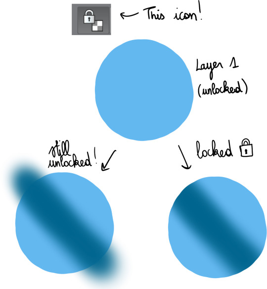
This is very useful for gradients, which I’ll talk about a bit later.
- Clipping layers :
This gives the same result as locking a layer then drawing over it, but the difference is that you use more than 1 layer ; one as the bottom layer, defining the part of the canvas you can draw on, and the others, clipped on top, where you’ll draw. This can be more practical than locking transparency, because if you have a lot of details to add, doing everything on a single layer may make things more difficult.

I use this a lot when I shade, but just like gradients, I’ll bring that up later.
- Layer settings :
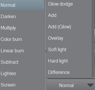
These options change the way the colours on a layer blend with the colours below. As an example, addglow is pretty good for colouring very bright light sources or for adding highlights on gems :

Basically, using those isn’t a necessity, but they’re still pretty useful so I’d recommend experimenting with them whenever you feel like it!
- Magic Wand :

Not the most complicated to use, but damn it’s really useful. It allows you to make selections based on the colours you’re targeting, so basically, if you need to colour an entire area a certain colour, you can just select it from the original panel, go on the layer where you’re colouring, and colour nothing but the part you selected. That’s about it!
There are lots of others, but these are the main ones you need to know about when you’re getting started.
2) Colouring stuff
This is where it gets interesting! I guess! I’m not too good at just coming up with these kind of tips, so I’ll illustrate with some colouring, hopefully it’ll help you out?
I usually colour in 5 parts : 1) Preparing the panel(s), 2) Applying flat colours, 3) Adding gradients, 4) Adding shading, 5) Finalising with details.
I always prepare pages in the same way: first, I use the magic wand to select everything i do NOT want to colour ; the frames around the panels, the speech bubbles, the sfx, etc. Once they’re selected, I copy them, and paste them on a new layer. Then, I select the original layer, and turn it transparent so I can colour below while still keeping the lines. To do that, I go in Menu > Edit > Change brightness to opacity (in CSP at least, it depends on your program tho but most of them support this, I think!).
I end up with something like this :
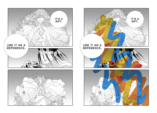
Two layers, one on the bottom with the semi-transparent page, and another on top, with everything that I don’t plan on touching. On the page on the right, you can get an idea of what it looks like when you add a layer below these 2 and draw on it.
Now that I’m done with the panel, I can start adding some (flat) colours.
I think it’s a good idea to start with the background, because it’ll help you figure out the feeling you want to give the panel.
The airbrush is a pretty good tool for gradients btw, just make sure you use a brush that is big enough so the transition in colours looks natural.
Next, I add a new layer, and colour the shape of the characters (and here the vessel as well), so it stands out from the background. It’ll make colouring less complicated, since the lines will be clearer.

As you can see, I was kind of confident, so I directly added a gradient. The bottom of the panel is a bit “darker”, because I wanted the main light source to be the reflect on Phos’….. head thing?
Here’s something kind of important about your choice of colours : if you’re colouring an area that is already shaded in the original panel, I would recommend taking a colour that is more saturated than it should, or else the colour may end up looking dull because the original shading will make it darker.
Next, I do more flat colours. Nothing too fancy, and pretty much everything is on different layers. The clothes are left uncoloured because the background colour already fits, so it’s okay honestly
Then, I added some gradients using clip layers :
As a reference, I used some overlay layers for Dia’s hair, and some addglow layers for Phos’ alloy.
I mean it when I say gradients are important! They make your colouring feel more complete even when they’re barely visible. quickly coloured bortz for reference, assuming tumblr won’t compress the colours too much:
the bastard on the left has nothing but flat colours. They’re nice, but when you’ll have shaded everything, chances are it’ll look kind of …. i dunno, like something is missing? So yeah, gradients : good, though i would recommend you keep them in the same tone as the base colour. I’ll talk about this a bit more later if i don’t forget.
Ok! next:
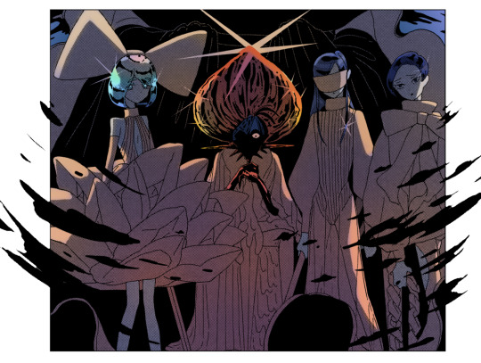
I felt like golden colours weren’t quite fitting the mood, so i added a layer with blue on top of it to make it colder. It’s at 40% transparency, so you can still see the colours behind well enough. Some parts were slightly erased because i liked the idea of these parts being lighter (you can see it a little bit around phos’ neck, or above dia’s knees : these parts are yellower than the rest of the pic)
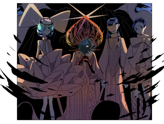
I added some shading! Nothing too fancy. also not to sound like some gradient-freak but you can add some of those in shading as well, it’s usually a nice touch.

After than, I added some lightings, which are on a layer clipped on the original manga panel (so basically only the black parts of the original image changed colours, and the colouring work I did on the layers below wasn’t really affected, if that makes sense?)
The red lighting is the obvious one (it’s an airbrush, and i used an eraser to clear the part near Phos’ head so it looks like it’s coming from above/behind them and not from themself).
There is another lighting at the bottom, which is grey/blueish, to contrast with the warm colours on the top of the pic. it also kind of looks like smoke but yeah
Now the panel is mostly done, and I’m starting the “details” part.
Something I find really bothersome in the manga is the *original* shading : while it’s always really good, colouring under it will leave some grid of pixels on top of your colours, so to counter that i just colour on top of the grid by colour picking and painting on a layer above the manga layer.
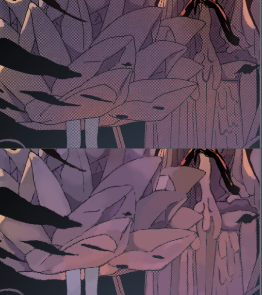
It’s a bit tedious but it has a texture that makes it look like a painting. The downside is that the colours can be altered since you’re colourpicking from something with an irregular pattern, but it can end up making your panel look less boring, honestly, it just depends on what you’re aiming for!
I end up with something like that :
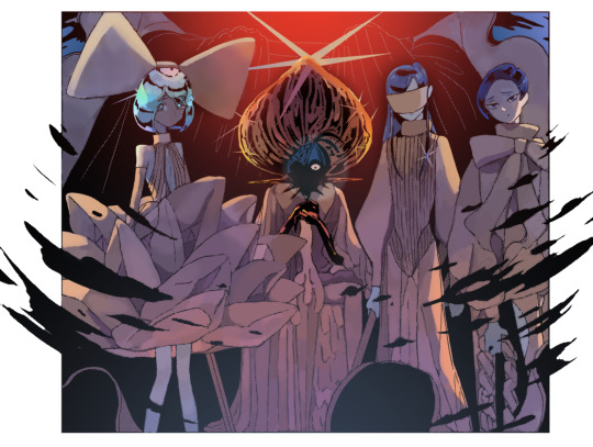
And then it’s just. Whatever man. I added a black border and some highlights, sparkles, etc, it’s the kind of things you do when you’re basically done.
For the technical aspect, I’m not sure I have a lot more to add. If you want some advices for picking colours, tho…
3) General colour stuff :
These are just recommendations! Licherally these are mental notes i came up with ever since i’ve started colouring, so they’re kind of personal and if you don’t follow them you’ll be fine, i suppose. But so far they’ve been useful to me so consider them whenever you’ll be colouring something:
- Do not use pure white! Unless it’s for something CLEARLY meant to stand out, such as the frame of your pages, a speech bubble, sparkles, or a light source/something very shiny. If you’re just colouring something that is not meant to draw attention, use some other shade of white, but not the #ffffff one if you see what i mean?
- Same about pure black, to be honest.
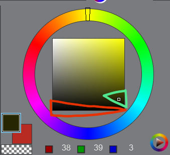
The shades circled in red tend to look “emptier” than the ones circled in green (here the hue of the colour is yellow but it works with most colours). It doesn’t mean you can’t use it, just, use it sparingly or it may make things look dull I think? I would recommend trying a few shades before taking a decision.
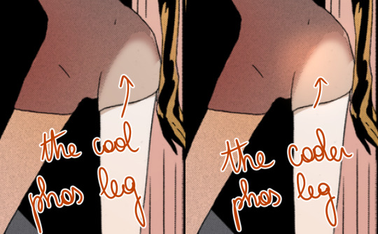
- Sometimes adding highlights where the shading starts can make the transition look smoother:
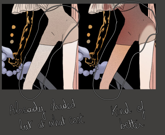
- Even if a panel is already shaded in the original page, I would recommend shading it again, because the manga shading is a black shading and shading a coloured drawing with black usually doesn’t look that good. (hence why i said something about using saturated colours in shading earlier).
- Even if a panel isn’t shaded in the original page, consider shading it anyways, even if it’s just a very light shading. It’s worth it :o)
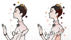
I’m running out of things to say oh well
#i didnt mean to write so much. it just happened i hope it's not a pain to read#also i hope it was clear but if it wasnt. (points @ my inbox)#whenever people tell me theyre getting into panel colouring i go... [powercry emoji]... its really fun and honestly i dont see that many#ppl into it so i get really enthusiastic ? thats it#personal#asks
118 notes
·
View notes
Text
To begin, I feel I need to revisit some things I've said about the vampire genre:
Vampires are the embodiment of repressed sexuality. They represent the ideas we are drawn to--those figures whose attention we crave but are not supposed to crave. There is a reason that some of the biggest fans of vampires are queer people/people of color. There is also a reason that everyone else (for the most part) thought vampires were scary until Stephanie Meyer stripped them of their queer coding for a while.
(Spoilers ahead for those who have not watched either version of Candyman.
Trigger Warning: Black Trauma under cut.)
I bring this up, because Candyman (1992) shares similarities with the classic Hollywood vampire (emphasis on Hollywood, not classic literature). Candyman chases after Helen believing her to be his reincarnated lover in a similar fashion that many versions of Dracula chase after Mina. He doesn't die (at least, in the traditional sense...he is a vengeful spirit). He murders Helen's best friend, Bernadette, just as Dracula kills Lucy (we could argue that he is "killing the competition" if we want to believe there is some queer subtext in these friendships--which is worth its own post).
But what repressed sexuality does Candyman represent?
I think the answer to this question is clear when you consider the fact that Candyman '92 is told from a white woman's perspective. Helen's story is an illustration of a white woman's fear and attraction to Black men.
If you are familiar with several takes from Black critics about this movie, many will agree that Helen is a likeable protagonist. However, Black critics and audiences alike have noted her behavior reflects that of white people who do not mind their business. Candyman begins as an urban legend that fascinates her enough to write a thesis surrounding the myth, but as she continues her research, she realizes that he is, in fact, very real to the Black residents of Cabrini-Green. Bernadette (who is Black) is hesitant to even go near the area, but ends up going along after being convinced by Helen. As the movie progresses, we kind of see Helen's goal expand to disproving the myth, and for a short period, she believes she does after she is attacked by a gang leader using the name "Candyman" who is then booked after she identifies him to the police. It is only after all of this that she is confronted by the real Candyman. It is here where we see the trope we so commonly associate with vampires. The trance:

From the above picture, we can see that Helen's expression is one that isn't completely terrified. There is a dazed look in her eyes and her lips are curled the slightest bit upward. We can only imagine what is going through her head--She is married (to a man who we will soon find out is cheating on her). She is also white (in the 90s). And here comes this devastatingly handsome Black man with a hook for a hand. She should be scared, but she's not.
It should also be noted that the majority of Candyman 92's victims are Black, despite the fact that his backstory has him killed by whites angered over his relationship with a white woman that resulted in pregnancy. For many of us, this does not make any sense--until we realize, again, that this movie aligns more with the 'forbidden fantasies' of white women than it does with said fantasies of Black audiences. Candyman '92 is not a revenge fantasy. It's a tragic love story that centers around an interracial relationship from the perspective of the white woman involved.
Candyman '21 treats him more like a mythical being. First off, his true backstory is unclear. First, there is the Candyman from the original '92 movie, Daniel Robitaille, the son of a slave murdered for impregnating a white woman he was supposed to paint. Additionally, one Candyman is said to be a young boy wrongfully accused of assaulting a white woman and sentenced to death (likely inspired by the stories of Emmett Till and George Stinney). Another Candyman is said to be a character by the name of Sherman Fields who was killed by police for being thought to be the person hiding razor blades in children's candy. However, after his death, the razors continue to be found in candy. It is also implied during the credits through shadow puppetry that another Candyman is someone inspired by James Byrd Jr. who was brutally murdered by white supremacists after accepting a ride from them. Throughout the movie, as our main protagonist Anthony (the baby Helen rescued from Candyman in the original) learns more about the legend, we see a bee sting infection slowly progress and cover his body. All the while, character William Burke (who was there as a child when Sherman was murdered by police) is devising a plan to turn Anthony into the next Candyman. He believes that by removing his arm and setting him up to be gunned down by police, he could recreate the image of Candyman to symbolize vengeance. In the end, Anthony does transform. His girlfriend is there when he is gunned down by police and is put into one of the vehicles to be arrested. She then summons Candyman who arrives to kill all the officers. We now see that he has completely transformed into Daniel Robitaille, the face we all associate with Candyman, and he instructs Brianna to "tell everyone."
When Candyman '21 was released in theaters months ago, I had expressed that I wasn't interested in any negative reviews white critics might have had about the film, because honestly, I was pretty sure that this installment was going to treat themes of racism in ways that aren't known to appeal to white audiences. As I pointed out earlier, Candyman '92 was told from the perspective of a white woman (a well-meaning white woman, but a white woman all the same). In some ways, we can even say that it can be treated as an escapist fantasy for white women to have such a dark and enticing figure (who just so happens to be Black) pursue her, overcoming his spell, and *still* being revered as a hero among Black people. His victims are mostly Black because while he is meant to be scary, he cannot be too scary for the white woman. Candyman '21, I feel, was more representative of how myths and legends change over time and adapt with the people who give them power. We see this all throughout the world and throughout time with different beliefs and spiritualities. Unfortunately, we also see beliefs get demonized by oppressive forces. Closed African American spiritual practices are grossly misunderstood by the masses, and as a result, are feared even by Black Americans. However, thanks to the internet, there is wider access to information and there is a younger generation of Black people learning that these practices are not evil. These spiritual beliefs are being reclaimed, just as we see Candyman get reclaimed at the end of the '21 sequel/reboot.
In the end, both of these movies are entertaining, but the original appeals more to a white audience seeking a tragic gothic romance involving a Black man. Candyman '21 gave the figure's power back to the Black characters and the Black audience in a way that it's more likely for white viewers to walk away with nightmares than Black viewers.
I have some thoughts on Candyman (1992) vs. (2021)...specifically, who each movie made for.
#candyman#candyman 1992#candyman 2021#media analysis#analysis#racism#anti-blackness#film analysis#candyman analysis#vampires#vampire#symbolism
19 notes
·
View notes