#i'm using too many dpis
Explore tagged Tumblr posts
Text
some more sketches

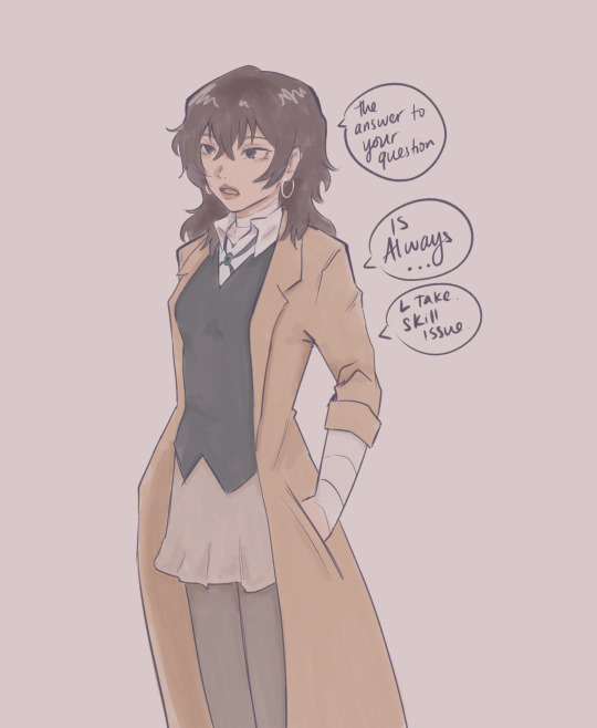


femzai propaganda part 2 ( ^ω^ )
#i cant lie this is loosely based on my own appearance#him...#NO#her...#i love dazai id love him in any form even if he was a worm even and tbh especially if he was a woman#bsd#dazai osamu#bungo stray dogs#bsd dazai#bsd fanart#femzai#QUAL FS ME UP IN MOBILE WHY WHY WHY#i'm using too many dpis
233 notes
·
View notes
Text
Perler Bead Flight Flags
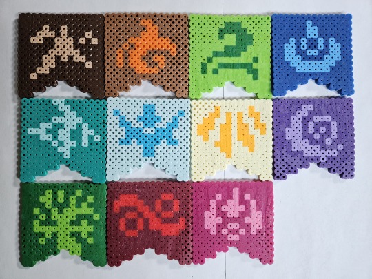
Made these flight flag coasters a bit back, figured it was a good time to post 'em! I do enjoy Perlers, they're like pixel art but at the end I can hold them and stuff.
Crafting details after the break, if y'all want to make your own.
These are using the original 2013 flag designs/colors on a 14x14 board, with standard 5mm beads. If you wanted to do the current flag designs, they'd need a little bit of tweaking as many are more symmetric in the current art (and also, I'd recommend a 16x16 size, since then you have room to put the current art's border). You could also try out an odd-sized flag, 15x15 maybe, but the angles at the bottom will look a little off. Doesn't hurt to try stuff though!
I got most of the beads for these out of variety packs and various kits, which don't necessarily label the colors in them, but these are my best guesses to what I used:
Earth: Tan design on Brown base
Fire: Butterscotch/Orange on Light Brown base
Wind: Dark Green on Kiwi Lime
Water: Light Blue on Dark Blue/Cobalt
Lightning: Toothpaste on Parrot Green
Ice: Turquoise on Robin's Egg
Light: Cheddar on Creme
Shadow: Pastel Lavender on Purple
Nature: Kiwi Lime on Dark green
Plague: Red on Cranapple
Arcane: Pink on Raspberry
(Most of these came from the Multi Mix packs or the Neutral Colors/Fun Colors trays, but Cranapple in particular was catankerous to get ahold of. Fitting for Plague, I suppose! Anyways, there's some wiggle room on hue for a lot of these, too, I was just using what I had onhand as much as possible)
As for what I would do differently if I made another set of these? Well... I've gotten a bit better at getting the melt level consistent, so there's that. Learned the hard way that trying to melt two designs on the same pegboard, even if said board is big, isn't a good idea (and it's near-impossible to fix). Also, I was using one of the freebie folded pieces of parchment paper, so some of the coasters have creases... On non-ironing notes, I think it would be fun to take a stab at a micro-bead variant, since they support a higher dpi and all!
Anyways, if you decide to make your own set, please uh... I'd say ping me, but I'm not actually sure how that works here? I think it'd be cool to see 'em, that's all. Happy crafting!
#flight rising#frfanart#fr fanart#perler bead creations#flight flags#I picked the 2013 flags because I prefer the palettes used on them#There's no arguing that the newer flags' art is cleaner#I just miss the cream/gold Light Flight banner as opposed to the yellow/brown#I will say that Fire's newer colors are more my jam though (debated making just that one new colors#but decided the mismatch would be worse)#Personal taste really#...I say “new” but the flags changed in like... 2016... I'm old.#Anyways my desk is covered in coasters now; send help?
333 notes
·
View notes
Note
What do you use to draw with? Like what device and drawing app? I finally graduated high school and want to get back to drawing and maybe start posting it but I wanted some advice
Hi~
I'm just gonna go and give you my full setup (plus health advices coz trust me they're important).
These days I use an IPad Pro 11" and Procreate. My friend has the bigger version but I hurt my elbow using it because it made my moves too big, so I settled for the littler version. I suggest you chose based on your feelings for that. If you want a bigger screen to see more of your work, it's perfectly valid.
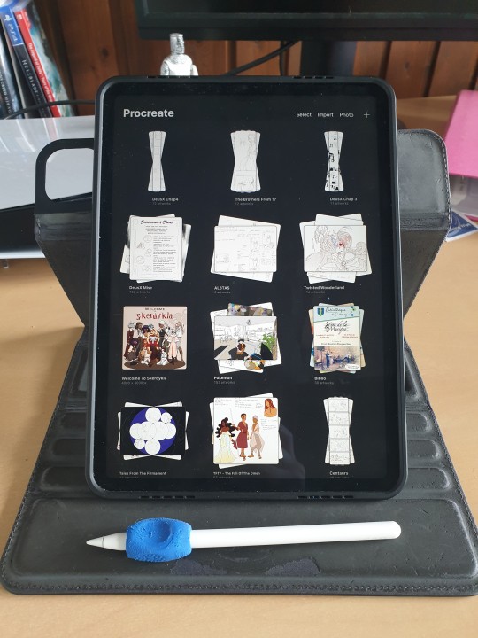
If you do take those two, I suggest you also take the ICloud save. (I have the 200Go save and that's only 3€ a month, but the 50Go save in free!) Should your IPad eventually break, you'll be able to retrieve ALL your art files from the Cloud, which is a huge lifesaver!
(I used to use a simple computer plus graphic tablet plus Adobe Photoshop, but it kept crashing so much that I had one too many rage quits. Plus it's super expensive since it's subscription based, and nowadays they take your art from the Adobe Cloud to feed their AI, so I can't really recommend that. Photoshop is an excellent tool but the direction Adobe is taking does NOT suit me.)
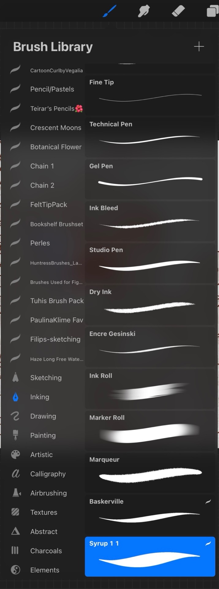
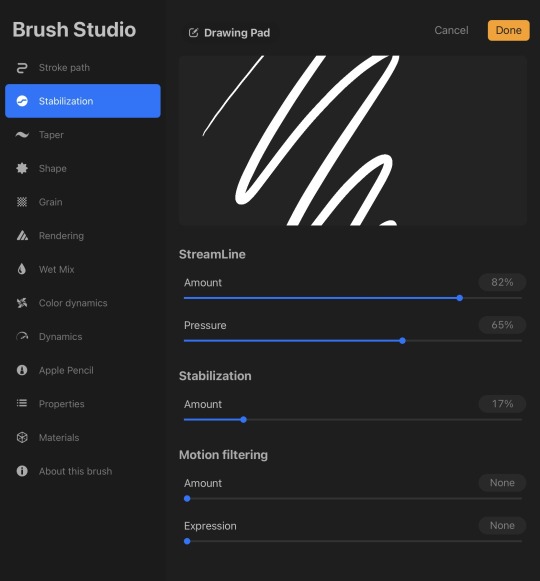
For brushes I just use the default Procreate Pencil. For the eraser I use Syrup, which is found in the default Inking Brush set.
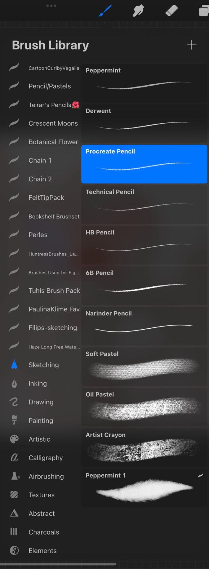
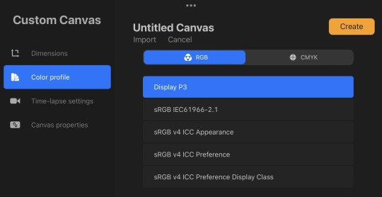
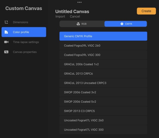
My base canvases are 4000x4000px with a DPI of 300 (I suggest you improve the DPI if you do illustrations or really precise work. I only do little fanarts and comics with that DPI). For posting online please be careful to chose an RGB color profile (I use the default Display D3). If you ever want to print though, you should chose a CMYK color profile (I use the Generic CMYK Profile then).
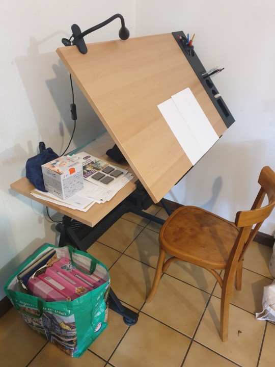
Now back to the real world! I'm going to strongly suggest you make sure your paper/computer/screen is at least at an angle, at best right in front of your face. The least pressure you have to put on your neck (bending), the better it will be. If you do traditional art, I'll suggest actual art tables that you can adjust in size and angle. Here's mine.
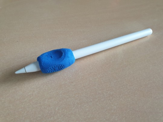
To prevent any pain in my thumb I use one of those hold-helpers thingies kids use to hold their pens properly! It increases the size of the grip which prevents from holding the pen too tight (trust me, it's important). You can also find special tape to roll around your pen if you need an even bigger grip.
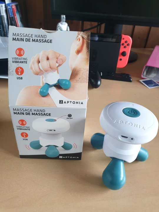
I wish I had a proper desk and chair because that will also be very important for your posture and health, but rn I'm not in my own flat so eh. What I'll encourage you to do instead are stretches and exercises BEFORE and AFTER an art session. Fingers, wrist, elbow, shoulder, back, neck. If you want to avoid medical costs (masseur, kine, osteopath) you need to take great care of your body. You can also find little self-massaging gadgets in sports shops to help with your muscles.
(Talking from experience there. I'm only 25 and I already had to undergo surgery on my writing wrist because I f*ed up. Your health is important!)
I'm aware most of those are extremely expensive to get (it took me half a year of intense working and savings just to get the IPad) but I've found that they were 100% worth it in the end. It's alright to get things little by little if you feel they are going to be important for you. I strongly suggest you invest in your health first though!
Once you have decided on your preferred setup, I guess the only thing left to do is train, experiment and have fun!
I think that's all? If you need more advices on setups or art or whatever, I'd be happy to help, my DMs are always open!
Also congrats on graduating highschool!
#that's probably a lot more than you asked for lol#I'm physically incapable of giving simple answers sorry#ask me anything#art setup#health#advices#art tips
37 notes
·
View notes
Note
Hi!! Love your art and your hilarious comics! Devlin is so funny, I'm always eager to see more of her! About comics, can you recommend a specific canvas size? Or better, any advice on how to layout comic panels? I know Tumblr posts are supposed to be not very big and I'm not quite sure how to handle that.
Hello and THANK YOU!! I appreciate that so much!! 😭❤
Here's my typical canvas size for a comic page:
W: 6.5 in (1950 px) H: 11 in (3300 px) Resolution: 300 dpi
How I layout panels depends a lot on the comic narrative! For example, with my erotic comics, I doodle a lot of sexy stuff and then stitch a story together from those doodles. But with my humor comics, I write out a full script.
Sometimes I prioritize the images. Other times I prioritize the text. This is the great push-pull of making comics! 😆
Under the cut I've included a list of things I do when I panel and layout my comics. Maybe some of these things might help you too!
Thumbnail. I always thumbnail a small version of the comic first! This is just a series of squiggly lines to help me roughly establish panel size, order, and composition.
Establish the text size. The size of text matters because it affects the scale of everything around it! I set mine to around 10 point (pt) which is standard for lettering comics (it can vary depending on the font but for reference, I often use Blambot’s DIGITAL STRIP FONT)
Place the text/bubbles before drawing the art. This is to avoid awkward bubble placement and overcrowded text.
Shot composition. I look at a lot of film for inspiration. Variety is essential for dynamic storytelling. And when I inevitably find myself with too many medium close-up's of people talking...I go check out Wally Wood's 22 Panels That Always Work!!
Think in "tiers" and page ratios. My canvas size comfortably fits 3 tiers - meaning the art and the text each have plenty of room to breathe. Note: a page with more than 4 tiers doesn’t leave much room for dialogue!

Formatting comics for online platforms is always a struggle! I don't have a great answer other than to experiment. There are only really hard rules around Design Specifications when you want to print your work. But if you only intend to work digitally then it's just about finding what you think looks and reads best!
Hopefully that helps some! Feel free to send any follow up asks if you're curious about specifics. Cheers and happy drawing!! ^^
17 notes
·
View notes
Note
I saw that post about what Tumblr is supposedly planning to do... I found out about your art a few years ago and I love your style, and I know it's frustrating to have the threat of your work being put on AI and such, I understand the feeling as an artist too (although I haven't uploaded my art yet to Tumblr)
You don't have to answer this message, but I wanted to send this because I found out about an interesting tool that can be helpful against the AI problem that you may like: https://www.tumblr.com/does-this-look-inanimate-to-you/740926391530487808?source=share
Sorry for the bad English though, it is not my first language. I really love your art and hope I could get as good as you someday!
Thanks for your kind words anon.
I know about Nightshade and Glaze, even used the latter a couple of times, and I admire the team's efforts... BUT realistically I can't use it:
they still haven't addressed the issue with 1660/1650/1550 GPUs (and I don't have any spare money to buy a new GPU just to make Glaze and Nightshade work)
iirc the only Glaze version that worked for me was 0.0.3 and that's simply because it didn't use GPU at all; their latest "non-GPU" version on download page still switches to GPU for an unknown reason and produces the same black image error again;
I contacted them three times trying to troubleshoot this and they never replied;
I have access to webglaze, but it barely solves any problems. It has a limitation of 10 glazes per day and 40 glazes per week. This might seem like a non-issue since I post stuff once in a blue moon, but let me illustrate what the problem here is with an example - here, look at the glazed version of the screenshot with Jam that I posted on twitter:
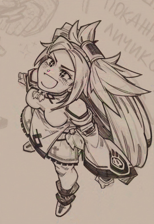
As you can see, glaze artifacts here fuck the whole image up like some really bad jpeg compression, there's even some weird pink blob on her face. These artifacts are a common problem for artists who use clean lines and colours instead of painterly style. To be fair, you can still make it look much prettier, like some kind of a fancy texture, but for that you literally have to run it many, MANY times, like some gacha. Ten glazes are NOT enough. If I had a working app, I could run it twenty, fifty, heck I could run it hundred times to figure out better settings and image properties. I have no such opportunity, so instead I just tried sending it to webglaze one more time, got another result with a pink blob across Jam's face and opted for posting a non-glazed version.
I guess I sound like some ungrateful bitch but honestly I'm mostly disheartened that the only tools to protect my work at least somehow are just posting smaller images with 72 dpi resolution and blocking AI bros to avoid targeted attention. I'm tired. So fucking tired. And I can't even "draw for myself" and keep my work on the hard drive away from people's eyes because it's quite literally a form of communication for me. Duh.
7 notes
·
View notes
Text
【Magi】 Judar 🖤❤️🐈⬛


Full Size


Intro Rambles
Doodled a quick Judar yesterday (last one) but I think I like the 1st and 3rd ones the best. The eyes are really striking on this one...
I also like the others, but the 1st and 3rd ones are my faves
I think the 4th and 5th one have nice expressions too, I just think that for the last one, I should tilt the shoulders to match the head tilt
I just need to decide whether I want to make it a simple ref like how many OC ref sheets have it as a simple standing pose to use for art ref purposes, or whether I want to give it an actual pose hmmm...
I guess it's up to me to decide what I want 🤔
Art Process Rambles
Also, if y'all are curious about my canvas size, I usually draw on A4 paper size (8.5 x 11 inches), though a lot of times, I draw small on the canvas (especially if it's a quick doodle)
I always draw on 300 dpi, which is the recommended minimum requirement if you want to print your works. 300 - 600 dpi is recommended for printing purposes.
Iirc, you get sharper lines at 600 dpi when it comes to printing
I then scale up the drawing later if needed (when the drawing gets more refined)
I like to draw on vector layers so I can edit, adjust, move, resize (scale up and down) and adjust the line thickness of my sketch lines without losing quality.
On CSP, you can also change the brush type of vector lines too! I'm not sure about other art programs?
So this means that I can also scale up my arts if needed!
Vector layers take up more file space since it uses math to calculate lines, but it's worth it for me since I adjust my lines a LOT
I'm trying to get better about finishing art. I really want to finish something soon.
I'm satisfied with my current art growth and really like my art style, and I tend to remind myself a lot that kid/younger me would be very proud of my art journey.
Kid me's biggest art goal in life was to be able to draw hot people (hot/cute/pretty people) and I think I've succeeded at that 😎 But I want to become even better!
I should get back into gesture drawing again... It's hard for me to stick to consistent schedules as someone ND-spec.
I'm so picky with my arts as someone ND-spec because I want to be able to capture my faves' beauty, so I constantly redraw my own arts to outdo my sketches and make them better each time.
I think I've been sketching a lot lately for the past few years cuz quick sketches usually only take 45 minutes - 1 hour for me (on the first sketch pass)
And also cuz I know that my full art process (from sketch to full render) will be very time consuming and will take me at least several hours for one piece. I think rendering and actually finishing art will be very worth it and satisfying though...
4 notes
·
View notes
Text
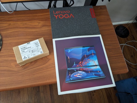
Lenovo Yoga Book 9i Review
The hype for this device is warranted. That said, some of the features are incomplete, or "coming soon." There's a lot of really great reviews of the device that talk specifications. In short, the specs are great. This review is going to about how the device fits into my own use case, and the features that mattered to me most.
Yep. I'm going to make it all about me.
Text Entry
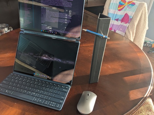
Being able to use two screens in landscape, one above the other, or side by side in portrait mode is a show stopper. It's really difficult to have that set up, and have it fit comfortably in your daily carry bag. Being able to set a document window to cascade between both screens in stacked landscape mode is done by tapping five fingers on the screen. It's so good.
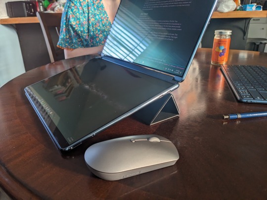
Also, it comes with a Mystery Triangle. No idea what it's for, but it is magnetic and has instructions on it for assembly. I found at least one thing it can do, but probably isn't intended for.
Pen holder?
Pictured below: 65w Charger, Lenovo 2-channel quiet Bluetooth mouse, keyboard accessory, stylus, and Mystery Triangle.
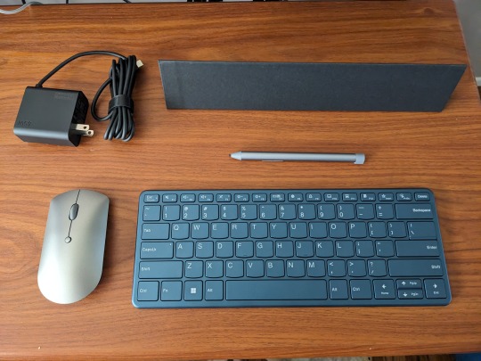
The Bluetooth keyboard accessory is excellent. Best of all, the keyboard is included. Literally, the best travel sized/weight Bluetooth Keyboard accessory I've seen is just quietly bundled with the Lenovo 9i.
Key travel, latency (I type very fast if I want to), and feedback are great. I know the device is designed to take pen input, but I love making text with it. They way the keyboard rolls up into the stand to protect the keys from havoc while traveling in my bag is really nice. A lot of thought went into the accessories for the Yoga Book 9i.
The effort paid off.

Pen Entry
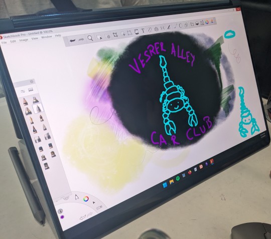
You make some sacrifices here, but I'm not convinced it is Lenovo's fault. Being able to draw on the deck display while using the lid display to view your reference material is awesome. Pen input is pretty good, but I'm still wrestling with getting tilt and other functionality to work as I'd prefer. It doesn't seem to matter which application I use, there is a little jitter.
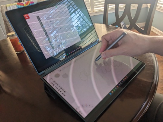
The device will take pen input on both screens simultaneously but that experience is heavily dependent on the applications, and what pen protocol they are using. Overall I'll be doing my finishing work at 300 dpi at home on my Thinkpad with a Wacom Cintiq. Will I do front end digital art, pixel art, and sketching on my Yoga Book 9i?
For sure.
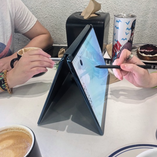
It's an 8.5 stars drawing experience that feels like a 10 because the displays are both OLED, and vary closely matched in both color and brightness. I haven't applied any film to the deck, but the included stylus has pretty good resistance without it. My other favorite stylus works great, too.
User Experience
Microsoft's software products have been in steady decline for over a decade. I didn't think Microsoft had anything left to ruin after Windows 10, but they broke new ground with Windows 11. User experience isn't anywhere on Microsoft's list of priorities these days, and anything Windows 11 does well feels accidental.
Fortunately, Lenovo goes all out to smooth things over wherever they can. They have software running that helps curate the experience for the user. In some cases it does better than put lipstick on the pig that is Windows 11. With screen gestures and touch input particularly, I forget the pig exists.
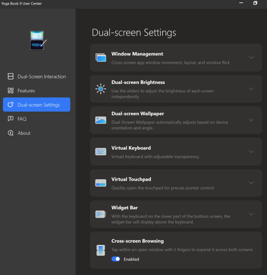
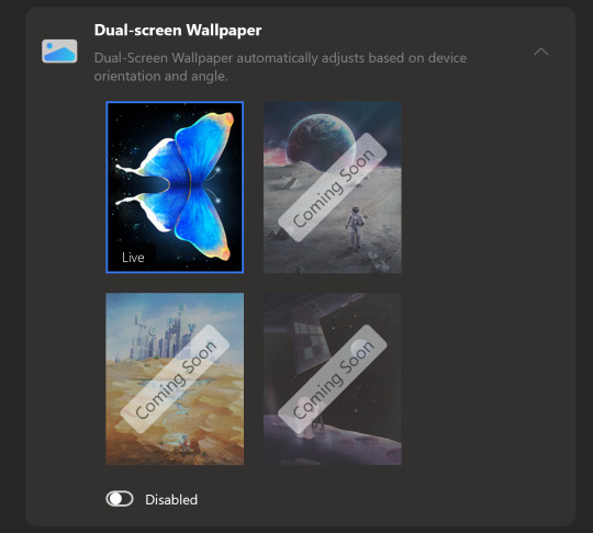
There are many "coming soon" features that promise to make the experience great, utilizing both displays for function and neat visual aesthetics. If Lenovo does all they've promised with regard to features, the user experience would go from good, to great.
The bad news is that the display scaling is kinda stuck at 200%. You can change it, but you have to change it for each display, every time you log in. When you turn your computer on in the morning to get started working, you'll be changing the scaling, if you don't like it at 200%
For me, the 200% scaling is perfect, and I imagine it will be a for a lot of people. If that is not ideal, it becomes an arduous daily chore to open the display settings, and change the scaling to the desired amount. It is likely that Lenovo will fix this with an update.
If you're having this issue, head to Lenovo's Forums and hit this post. It has some work arounds, but also reply in line. Bump it up. Thanks.
I'll update this review if I find a silver bullet or if Lenovo issues and update that fixes the issue.
Darkness
During the Pandemic my spouse was ill (not with COVID, something else). Being able to sit next to her in the dark, and continue my work without disturbing her was pretty important. At the time I had an Thinkpad X1 Carbon that I had Lenovo's power management settings on it. With the screen brightness bottomed out, and the machine set to run quiet as I could get it, I was able to continue working.
After my spouse's recent surgery, I found myself in a similar situation. She basically needed to sleep for a month to heal, and I needed to be able to watch over her, and continue my work.
Using the Yoga Book 9i in a dark room to make text is great. With the backlighting turned down to nothing, the software keyboard (Lenovo's, not you Microsoft) is perfect. It can be set to give feedback, and a little noise, or nothing at all. The OLED displays turned all the way down are perfect for viewing text, without adding enough illumination to a room to disturb a sleeper.
It's also really cool looking in the dark. Perfect for writing science fiction.
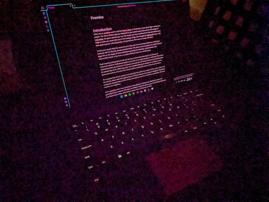
My ears ring constantly after having COVID, and now I'm pretty sensitive to coil whine from devices. The Yoga Book 9i is almost as quiet as a fanless ARM SOC. Almost.
Sound
The Lenovo Yoga Book 9i can be really quiet, but it can also be really loud. If you were using it to run Dungeons & Dragons at a venue, and needed something to play music and sound effects, this device has the best sound on a portable device I've heard. I have one other Lenovo Yoga with a sound bar hinge from a couple years back. The sound on it is really good, but nothing like the Yoga Book 9i.
You can take the Bluetooth speaker out your bag if you're carrying one.
That said, make sure you fully update all the sound drivers. My Yoga Book 9i came with a lot of crackle pop out of the box. Once I updated all the drivers, the sound was perfect. I didn't need to touch a thing.
You will absolutely annoy other people at the coffee shop while watching cat videos on YouTube.
Mobile Workspace
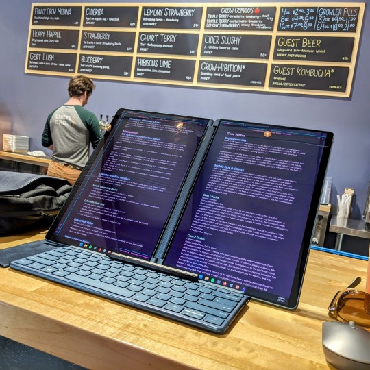
I've been carrying a Thinkpad X12 Detachable Tablet, a Thinkvision M14 portable display, Lenovo Pen Stylus, and Lenovo Bluetooth Mouse as my standard portable workspace. It sets up nicely on a coffee shop table, and let me do my things while I'm traveling.
It's a really nice set up, fits well in my bag.
The Lenovo Yoga Book 9i does the same thing without all the hunting for accessories. Everything you need comes with it. Also, you aren't stuck with two landscape displays stuck side by side, or with extra stands to make your preferred viewing experience work.
It also takes up less space on the table, and I don't have to bring another keyboard as a sidecar to render digital artwork with the pen.
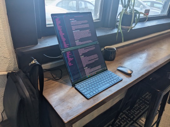
I haven't run into battery life issues with the Yoga Book 9i. I really expected to find myself searching for an outlet more often, but it hasn't been a thing. I assumed the magnetic stand and keyboard accessories would mess with it my bag, and I'd find the device running fans and being crazy in standby mode. Nope, it's been fine.
If it sounds like my expectations were low in terms of the hardware, it is because they were. I was pretty sure I'd buy one, review it, and return it. I'm keeping mine, and riding out the bumps as Lenovo updates and completes software features. I think it'll be worth the wait.
Accessories
All that's missing is the perfect bag or sleeve for the Yoga Book 9i. I'm using a Waterfield Designs Sutter Tech Sling right now, and it is pretty ideal. I have a number of Lenovo's other two-compartment cases that worth pretty well, but nothing that is "the one."
Other than that, carry an extra big microfiber cloth. With three Thunderbolt 4 ports I haven't found the need for dongles or docks unless I'm at home.
Bundled Software
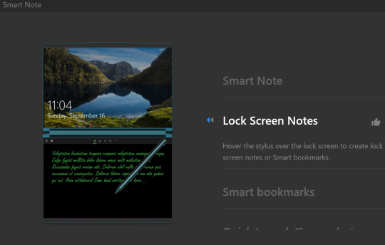
Lenovo ships this device with a Smart Note and Journal application. You can take a Smart Note on the Lock Screen, save Bookmarks, and there is a Smart Reader app in the works. I usually dismiss bundled software, but Lenovo gave these apps some great features.
I might not use Journal, but I will be using Smart Note.
Branding
I've owned or laid hands on every version of Lenovo's Yoga Book devices over the years. My Yoga Book Gen 1.5 (Ruby Red) and Yoga Book C930 still get used, because they are that good. I've had the Android version of the Gen 1, Windows Version of the Gen 1, and used the LTE (Eurozone) Yoga Book C930.
Is the Yoga Book 9i a "Yoga Book" as Lenovo has defined them? Yes, and no.
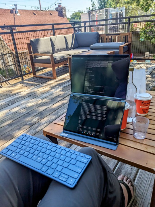
The Yoga Book 9i is not a 10" ultraportable that defies the traditional categories of clamshell vs. tablet / detachable device. It is a 13" clamshell laptop that comes with the best wireless keyboard and mouse offerings, and the second best stylus Lenovo offers. The stand accessory that bundles everything up is awesome.
It does not fit in my vertical computer bag designed for 10" - 12" form factor devices. It would be unwieldy to hold like a book, in hand, and read text from the displays.
It does provide a computing experience you can't get anywhere else. Lisa Gade didn't even try to explain this in her review. You'll either look at this device and wonder who it's for, or know instantly that you need one for your use case. Like other Yoga Books of the past, there is nothing to compare the 9i to.
youtube
There are other dual-screen devices, but they don't compete with the Yoga Book in my opinion. They are not necessarily better or worse, they just don't provide the same experience.
Have a question?
Find me on most social media platforms, @ArthurHWalker
Pictured Below: One use of the Mystery Triangle?
8 notes
·
View notes
Text
The actual next big post I need to write is about how great Fire Emblem Engage is and how Not Ok the Gamers have been about it, but for now it's time to complain about how disappointing Donkey Kong Country: Tropical Freeze is.
I literally waited years to find a copy cheap enough I could justify picking it up, all the while seeing people go on and on about how good it is and how it's a shame it's been so many years since there was a new DK game. I finally managed to find it semi-affordable and grabbed it, ready to see what everyone had been talking about.
The short version is that it's extremely polished but also just not at all fun for me, at least up through the first main boss at the end of world 1, and I kinda suspect if I haven't gotten into yet it I'm not going to.
I guess I probably should've expected it. My history with the DKC games goes back to the original SNES one, and I've always thought they were only ok. I especially never understood why people thought the SNES games looked so amazing because they kinda looked like ass to me. The hardware just didn't have the power to display the pre-rendered sprites in a way that did them justice. I liked the art style enough in the promotional material and other places it showed up higher DPI and a decent color depth, but crushing everything down to fit in the SNES limitations just killed it for me. Thankfully newer games on modern hardware can actually handle it, so it looks perfectly fine even if it's not my first choice of aesthetics I'm into.
But more importantly I've never loved the way the DKC games feel to play. Something about the speed or momentum of the characters or something always feels slightly off to me, and that hasn't changed in this one. I'm not the biggest fan of the style of level design they use either, but it's fine I guess. I didn't get into any of the ones I played in this game enough to have any interest in going back and finding the collectibles I missed or other secret stuff though, which is not a good sign.
Also I just kind of find the general vibe of it kind of annoying? I think I like the Donkey Kong characters less after having played like an hour of this. There's nothing fundamentally wrong with them, but it just really doesn't click with me. Ironically one of the biggest complaints I've seen about Fire Emblem Engage is that too many/most/all of the characters are annoying, but I just happen to personally like the way those weirdos are annoying and not the way these weirdos are annoying, I guess.
Anyway, DK64 continues to be my favorite DK game, Beaver Bother and all, despite being the only 3D one and the least like the others (or maybe because of that), but also it's been over 20 years since I played it so who knows what I'd think now?
0 notes
Note
Ooo I totally get the lineart thing!!
The most important part I've noticed is line weight.
The easy version of this is when you line your work be mindful of where you want to place shadows later and thicken those lines either with pressure sensitivity but that's quite hard at first (I still struggle after so many years) so I typically just go over them again to thicken them up just a bit. Then parts you want to stand out should also be slightly thicker, along with possibly the outside of the person/ object you're drawing. Where lines meet, so for example where the neck meets the jawline I thicken the corner up slightly too towards the inside of the person.
It's hard to explain in words ah
Also be mindful of how many details you add, meaning, if you have to zoom in suuuuuper far an add a bunch of little things with a tiny brush things can end up a bit cluttered and in return make parts where there isn't that level of detail look flat and unfinished, so be sure to zoom out a lot or keep a little reference window (under canvas in settings for procreate i think)
Something that I do for personal art a lot too is just skip the lineart and simply clean up my sketch and essentially turn it into lineart!
Another tip is to make use of the liquify tool! It's my savior and one of my fav features tbh, especially with lineart.
The blurriness could just come down to how big your canvas is. I have a past in graphic design so I'm quite familiar with it but I totally understand how the technicalities could get confusing. I usually just stick to either a 3000 x 3000 px canvas or 3000×4000 px for personal sketches and somewhere around A4 or A3 for work related things and then export in either jpg or png. It's good that you're using 300 dpi though!
Sometimes different apps mess with it too, so depending on where you post/ transfer stuff that could be the reason for the blurriness.
With layers just stick to the basics at first, my layer sandwich normally looks like this:
Lineart
Shading on a clipping mask layer (with multiply on)
Flat colors
Sketch (normally hidden)
But the biggest tip I can give is to just have fun. In the end the art is for you and it should be a fun progress, everything else comes along eventually :>
- art anon
hey art anon,
sorry for the late reply I was studying 😭
Thank you for all the tips I will definitely try them out and see how they work. I haven’t drawn much recently (bc of the studying) but I think for now I will stick to just cleaning up my sketches and go from there. It’s all a lot to process honestly and I’m just giving myself some time to try things out and see how they work.
Eventually I will get better but I’m not pressure myself rn (and I can always go back to traditional drawing which I haven’t perfect either but at least I know how that works for me personally)
0 notes
Text
Zelda Korok I'm Too Tired 4 This SVG - Breath Of The Wild SVG PNG, Cricut File
Zelda Korok I'm Too Tired 4 This SVG, Breath Of The Wild SVG PNG EPS DXF PDF, Cricut File, Instant Download File, Cricut File Silhouette Art, Logo Design, Designs For Shirts. ♥ Welcome to SVG OCEAN DESIGNS Store! ♥ ► PLEASE NOTE: – Since this item is digital, no physical product will be sent to you. – Your files will be ready to download immediately after your purchase. Once payment has been completed, SVG Ocean Designs will send you an email letting you know your File is ready for Download. You may also check your Order/Purchase History on SVG Ocean Designs website and it should be available for download there as well. – Please make sure you have the right software required and knowledge to use this graphic before making your purchase. – Due to monitor differences and your printer settings, the actual colors of your printed product may vary slightly. – Due to the digital nature of this listing, there are “no refunds or exchanges”. – If you have a specific Design you would like made, just message me! I will be more than glad to create a Custom Oder for you. ► YOU RECEIVE: This listing includes a zip file with the following formats: – SVG File (check your software to confirm it is compatible with your machine): Includes wording in both white and black (SVG only). Other files are black wording. – PNG File: PNG High Resolution 300 dpi Clipart (transparent background – resize smaller and slightly larger without loss of quality). – DXF: high resolution, perfect for print and many more. – EPS: high resolution, perfect for print, Design and many more. ► USAGE: – Can be used with Cricut Design Space, Silhouette Cameo, Silhouette Studio, Adobe Illustrator, ...and any other software or machines that work with SVG/PNG files. Please make sure your machine and software are compatible before purchasing. – You can edit, resize and change colors in any vector or cutting software like Inkscape, Adobe illustrator, Cricut design space, etc. SVG cut files are perfect for all your DIY projects or handmade business Product. You can use them for T-shirts, scrapbooks, wall vinyls, stickers, invitations cards, web and more!!! Perfect for T-shirts, iron-ons, mugs, printables, card making, scrapbooking, etc. ►TERMS OF USE: – NO refunds on digital products. Please contact me if you experience any problems with the purchase. – Watermark and wood background won’t be shown in the downloaded files. – Please DO NOT resell, distribute, share, copy, or reproduce my designs. – Customer service and satisfaction is our top priority. If you have any questions before placing orders, please contact with us via email "[email protected]". – New products and latest trends =>> Click Here . Thank you so much for visiting our store! SVG OCEAN DESIGNS Read the full article
0 notes
Text
first, it's already a great start! it looks so cute :3 i have a bunch of tips and tricks, and i broke them down into similar categories. bit of a warning, i'm self taught, so how good/helpful these will be is uncertain
set up
this is all the boring stuff before you actually draw. the main thing is make everything easy to access for you and streamline it, so you can focus more on drawing than fiddling with settings
pen pressure setting: procreate has a universal pressure sensitivity that i recommend playing with until you find what works for you. for example, if you find you struggle with getting darker strokes, move the line a bit to the top left. the default of a linear curve from bottom left to top right works just fine though. for reference, these are my pressure curves (the right one is from a different software)
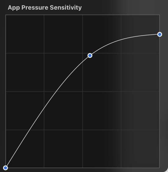
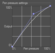
i don't recommend copying mine from the left since it's to make drawing darker without much pressure since i have tendinitis
canvas size and resolution: honestly the "screen size" preset is pretty good for anything. you can also change the canvas size and resolution once you're in, so if you realize you need something bigger or smaller, it's an easy fix. my general rule of thumb is at least 2000px for the smallest dimension and at least 100 dpi. my default is 2480 x 3508px at 300dpi, and i downscale it to about half the size at 72 dpi for posting because the files are too big. if you notice your lines look a bit "jaggy" and it's not from the brush texture, that's pretty good indicator that your resolution/dpi is a bit too low
shortcuts and gestures: highly recommend putting anything you notice you use a lot as a gesture or in the quick menu which i think is tap and hold by default. this can be actions like flipping the canvas horizontally or switching to the eraser brush
brushes: anything goes! try out a bunch and settle on a couple that are your go to's. this also applies to brush settings. tweak settings to your liking! if you didn't already know, you can have preset sizes and opacities on the slider by tap the slider and then the plus icon. if you're lost, there are only three main brushes you'd need for anything: a hard round brush like monoline (caligraphy), a pressure opacity brush like round brush (painting), and a soft airbrush like soft brush (airbrushing). the main reasoning is that you can get the variation for hard and soft edges for anything.
technical tips
these are more for tricks specific to digital art than the "how to draw X" kind
liquify: need to make small adjustments like moving the nose, but you don't want to redraw it? liquify is your best friend! it's under the magic wand/adjustments setting. liquify also works on multiple layers
reference window: under the actions setting and canvas, you can toggle the reference window. by default it shows a small version of your canvas, but you can use it to put a picture to use as reference. very handy when drawing a character! (side note: you can also color pick from your reference by tapping and holding over the reference)
flipping the canvas horizontally: also under the canvas tab is the "flip horizontal" action. it does what it says on the tin. it's benefit is that flipping the entire piece sorta refreshes how you see it. the oddities jump out more since your eyes got used to seeing it in its normal orientation
layer effects and blend modes: by default, every new layer is a normal layer, but you can change it to one of the many different types. there are way better explanations and tutorials explaining what each does, so i'm just gonna go over the ones i use most: multiply: it'll make what's underneath darker using whatever color you use. it's best for applying shadows quickly add: it'll brighten what's underneath with the color you're using. i like using it for bright highlights or lighting, but it's often too strong to my taste, so i lower the layer opacity afterwards overlay: it's kinda like a tint for what's underneath. if you use a blue overlay layer, everything will have a bluish tint to it. i use it to quickly change the setting (sunset, night, etc) and to add the bluish hue to the bottom characters and a yellowish hue to their faces
post processing: these are the fancy effects done at the very end to add the extra cherry on top. all of these are under the adjustments tool. the first four let you change the colors after the fact. again, there are much better explanation than what i can provide, but my go to's are: noise at ~5-8% and for more finished pieces perspective blur and chromatic aberration at ~3-5%. none of these are necessary. i just find them fun to use
foundational tips
these are the general drawing tips not exclusive to digital art
references: references are great! whether it's for poses, outfits, settings, or the character themself, references make drawing much easier
construction: everything can be broken down into simpler shapes, and by building off of simpler shapes, it's easier to notice and adjust things compared to something like a fully drawn face. what guidelines you choose to use are entirely up to you. as long as they're helpful, that's what matters!
stop to think: sometimes, it can be really easy to get lost in drawing and go on autopilot. slowing down and trying to draw with intention often helps to combat drawing what you think you see vs what you actually see
resources
marc brunet has been my resource for learning pretty much everything
emiliodekureart has amazing tutorials on drawing figures in movement
marco bucci has amazing tutorials on painting and lighting
chommang has easy to follow tutorials on drawing various faces and poses
proko has phenomenal and in depth videos on fundamentals and anatomy
i hope this helps! this was very long, and i hope it wasn't overwhelming or anything
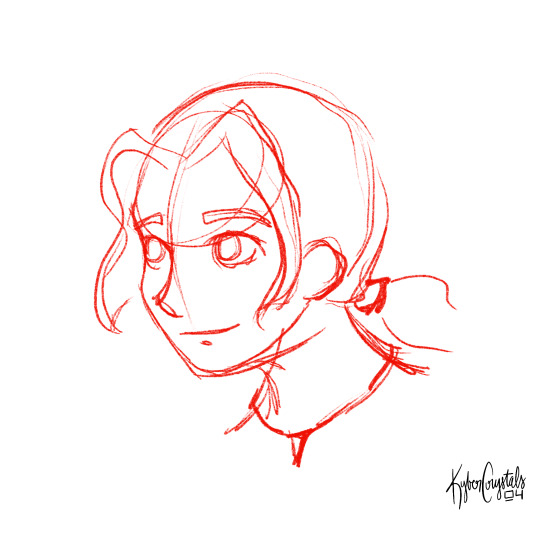
I love art. I love doodling. Sketching. This took me under 3 minutes to scratch out on my tablet…but getting past this point is so hard for me!
I use Procreate on my iPad … to my fantastic, artistic peoples…what are some tips and tricks (and maybe some YouTube videos) you use that can help a newer digital artist??
27 notes
·
View notes
Note
could you tell me more about spoonflower? i'm interested in uploading my own designs, but i'm not entirely sure how it works or how much it pays. thank you!
Sure! When you first upload your design, it'll look like this.
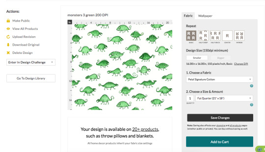
The standard DPI for printing on all the fabric sites I've seen is 150, and since I made this pattern at 200 DPI that means Spoonflower will print it bigger than I want it unless I change it here. So I click on the "change DPI" thing, type in "200" and click "change". Sometimes I find it doesn't save, so I always go back later to check and make sure it did save the right DPI.

(You can avoid this by just changing your image to the right DPI before uploading, but sometimes I want the option to make it a bit bigger, just in case.)
If you want to make multiple sizes of the same pattern available you'll have to upload a different version for each one and change the size individually. For example, I drew my Bathroom Dinosaurs pattern pretty large and at 150 DPI, and left that as is for the big version.

But I wanted a small version too, so for that one I changed it to 670 pixels per inch so it'd print much smaller.

You write in the title, tags, and description, and you can put any links to other pages or references in the "Additional Details" section.
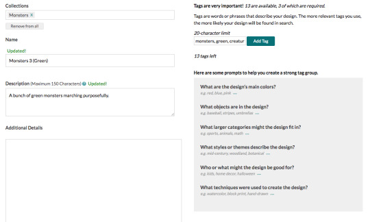
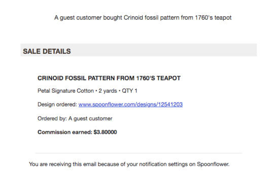
(Leaving links isn't usually necessary, but sometimes it is, like how I wanted to leave a link to the original 1760's teapot for my crinoid fossil pattern.)
At this point, you can order things printed with your design, but nobody else can yet. You have the option to show the design publicly, but I like to keep it private until I've ordered my proofs and can sell it.
Now, to order proofs! DO NOT GET THE CUT SWATCHES!!! They are SO much more expensive than getting a fill-a-yard, because cutting and packaging all the little pieces is a lot of extra labour. Wether you have a few designs, or a lot, just get a fill-a-yard.
To make a fill-a-yard you first need to make a collection. Collections can be either public or private, so I keep a private collection called "new designs to proof", and I put all my new designs in there until I've ordered them. You can also add other people's patterns to a collection, so if you have extra space to fill up or you want little bits of a bunch of other people's patterns for a quilt or something, add whatever you want to your collection.
On the collections page when you hover your mouse over one you'll see a little patchwork symbol show up in the middle along the bottom edge, and you click on that.

That'll take you here, and you choose a layout and a fabric.
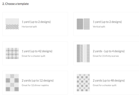
For some reason the fabric options here are a bit limited and vary depending on the layout. I like to get either the 1 yard/42 designs in cotton poplin, or the 2 yards/48 designs in cotton sateen, but there are plenty more you could try.
I'll click the latter for this example. (The squares in this one are the perfect size for pleated face masks, and I have a few made from mine and my friend's fabrics.)
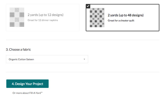
Then you just click on a design and click on however many squares/rectangles you want it to fill. It usually takes a few seconds for them to show up.
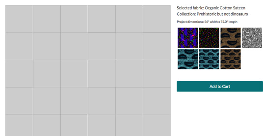
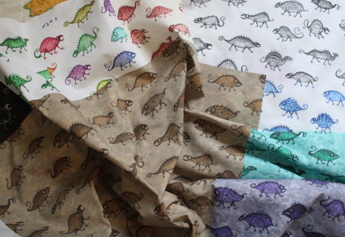
You can have just one little sample of each, or you could make half the fabric be one design and fill up the rest with little samples. (That's what I did for my brown monster waistcoat - I printed juuuust enough of a fill-a-yard to cut out a waistcoat from, and the rest was other samples.)

You can change it around if you want. Once you're happy with it, put it in the cart and buy it!

I'm not going to order this one since it's an example with designs I've already proofed, but here's what my monster patterns looked like when they arrived.
Also, I want to point out that you could VERY easily make some really fun pride flags using the fill-a-yard! You might have to have it be only part of the fabric, depending on the number of stripes, but you could make it be any texture or pattern you want. Here's a quick example I did with other people's patterns by searching "(colour) marble texture".
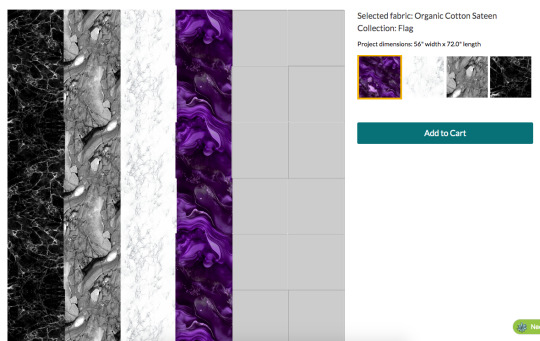
With only 4 stripes I'd have to fill the rest of the space in with something else and cut it off, but it would still be pretty big! (The edge of that purple stripe looks jagged in the preview, but they print perfectly straight.)
I have not done this, but someone should! Just wash it, trim the blank edges off, hem it, and you've got a flag!
(Don't do this with the 2 yards/4 designs option though, it looks like nice stripes in the thumbnail but it's made for infinity scarves and there's a gap and dotted line down the middle for cutting. Bleh.)
Anyways, once your samples arrive you can make the designs available for sale! If you have any changes you'd like to make, to the size it prints at or the pattern itself, you can make them now.
I found the small version of the Bathroom Dinosaurs print was too small when I first got my proofs, so I just reduced the DPI a bit.
And you can replace the image with a new, edited version by clicking "upload revision".

So when my brown coffin pattern printed really washed out and grey, I replaced it with a more saturated version and was good to go, no need to order another proof.
Down at the bottom of the design editing page you can now click on the options to list it publicly, and to sell it on fabric and/or wallpaper. I make all of them available on fabric, and some on wallpaper if I deem them to be appropriately large.
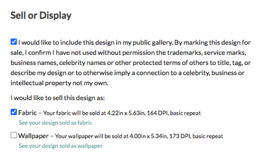
They'll pay you 10% of the sales price of the fabric, or slightly more if you sell over a certain amount in a month. There's a whole page of questions and answers about it.
You also get a 10% discount if you order fabrics with your own designs. (Although, personally, if I'm ordering my own designs on fabrics for me then I'd prefer to get them from somewhere like ArtFabrics, since they use reactive dyes instead of inks, so their blacks actually print black and don't make the fabric stiffer like Spoonflower's do. And also because they're here in Canada so there's less shipping cost. Sadly they don't have an option to sell your designs though.)
Spoonflower also has weekly design contests which are announced a few weeks in advance and have pretty big store credit prizes (the first place one is 200 USD), and I've entered a few times, but I don't vote often because Spoonflower is such a huge site that there are frequently over a thousand entries and it's really time consuming to scroll through them all.
Ok, that's everything I can think of! I also put all my patterns on sone things on Redbubble, since they have options for repeating patterns on some things.
2K notes
·
View notes
Note
I love ur art so much!!!! are the recent brushes you use still the same as the ones listed in ur FAQ or do you mess with the settings at all? And what size canvas do you work on? 😍✨
hey!!! thank you!! my recent art is pretty much just from this set, especially "Casual", so yeah still the same ones listed in my FAQ! if you see any art I draw with flat coloring and monolines (most of my stickers), that's probably with Narinder Pencil which is a default brush in Procreate, except that i made it more dense/darker. I don't mess with brush settings too much except to make the size of the brush larger or to make it darker.
the size of the canvas depends on what I'm drawing for (illustration? sticker?), but for an illustration it's usually at least 6x9" at 300 DPI (1800x2700 px). I think the largest canvas I've drawn on is 16x9". it sucks that the bigger the canvas, the fewer layers you get to work on in Procreate, so sometimes I'm forced to draw smaller. if I want to print it bigger, I export it into Clip Studio Paint and scale it up in there, because Procreate's Transform tool sucks sooo much.
the brush I use the most comes in a pack that costs money, but I would feel terrible if I recommended it to you and then you end up hating it and wasting your money.. maybe you can download it from here first and if you like it a lot then you can pay for it. I know I've downloaded many brushes before after seeing other artists recommend them, only to use them once and never again 🥴 so you might not even like this brush, who knows
DISCLAIMER I do own the Sketchers brush set legally though!!
25 notes
·
View notes
Note
Hey there Miyabi! How do you get such high-res, beautiful, and professional scan quality? What's your process?
Thank you! I certainly don't think I do anything that professional, so glad you have been decieved into thinking that about them! LOL I started doing this scan of the day stuff just to bring better quality to a lot of the older contributions of mine floating around the web. Looking at them on here, the Megaman wikia and other places, they just felt small and dirty. Especially as basic technology had gotten better over the decade or so since I first scanned them. I have 2 different scanners, one of which is a fancier Epson that I bought specifically to scan film slides a year or so ago. Still use it for basic scans from time to time. But honestly, for the settei, I'm still just using my general home HP Envy printer/scanner combo. I always scan at 600 DPI. After that part is done and the bitmap image is scanned to my computer, it's really just doing some heavy touchup. As I have alluded to in some recent posts, some of these sheets will take me an hour to an hour and a half just to clean up, because they have so many artifacts and dotty garbage on them. Settei at auction are mostly just scanned copies themselves after all, so there's a bit of residue to clean up. Ever wonder why sometimes I don't post these at a regular time of day? That's why, I'm still working on touchup before I post (and probably off from work, so I'm not prepping the night before, like when I post at a scheduled time).
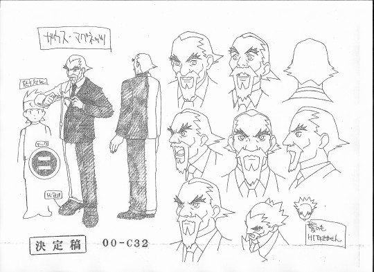
Let's use this recent Gauss sheet as an example.
The original scan was pretty messy. Probably can't see it as well in tumblr resize scale, so here's the original scan. But it is dotted all over the place, there's like a smudge line which goes through the whole bottom of the sheet, where the "Final Draft" stamp, character/episode number marking is, and through some of Gauss' headshots as well. You can also probably see some black on the edges, where the sheet comes to an end within my scanner.
The first bit of touchup I usually do is within my image viewer. I use FastStone Image Viewer to help organize and view everything. In there, I will adjust the brightness, contrast, and sometimes the gamma, to get the sheet background a bit lighter and the lines darker.
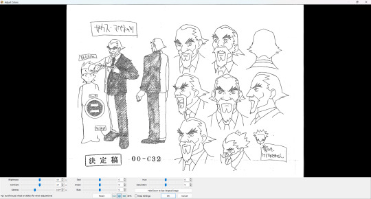
I just like the number 14. Is it always 14? No. But that's usually my baseline starting point. After that's saved, into the photo editing program of choice we go. I match my brush color to the background white and just paint over all those ugly dots and wipe those black edges away.
Zoom in at 100% to try not to miss those artifacts you don't notice zoomed out. Look at Gauss' speckled fingers. Ugh, cleaning that stuff up is hell. But I do it, so you all can see clean-ish looking art. Do I get everything? No. But I try to at least get the major issues out of the way.
Some things I take liberties on. The shading on his jacket goes outside the lineart. Should I leave it as is for authenticity? Probably. But if I'm cleaning it, I'm gonna clean it all. So you'll see in the finished version I posted, those shading lines are all inside the lineart only.
Some people are jerks and could easily resell these settei just by printing scans and claiming them as original. Another way I try to have a way to differentiate my edits without slapping a watermark on is my editing of the text boxes. See the top left and bottom right of it above Netto? There's almost always some overhang on the originals. I have usually taken the liberty of editing that overlap line off, so that the text box is a clean rectangle where the line stops at each corner, as close as I can take it. It's a dumb, but simple way for me to tell if it's my edit.
Otherwise, that's really it. Just a lot of added effort in touchup, honestly.
Cel scans are a little different, because most of them are too big for either scanner. Especially cels with backgrounds. So many of those involve 2-4 scans and then stitching them all together. Much less touchup that I do to them, but otherwise it's mostly the same. 600 DPI, and some brightness/contrast or slight color saturation adjustments to them, if needed.
And now you know!
9 notes
·
View notes
Text
Hello!
I'm going to try and go through as many of your concerns as possible, so this might be a LONG post. Feel free to ask me any questions at any point.
My credentials: I did graphic design as a freelancer and got paid for it!
Which programs do you use?
I have used Canva before and I find it's pretty good. I personally use photopea because I am familiar with photoshop and it is essentially a free online photoshop.
And do you have any tips? Anything about formatting and such?
Design tips:
design is essentially the process of guiding your viewer's/reader's eyes using the different principles of design that exist. this video explains it really well in 5 minutes
youtube
(you can absolutely ask me for clarification, more info <3 etc)
more about contrast in the context of text: it's important for there to be enough contrast between the text and its surrounding so that it's easily legible.
the contrast in color ought to be comfortable and clear. notice how dark mode tumblr isn't white on black, but more of a white on very dark gray. to make it even more comfortable it would be a very light gray on a very dark gray. Here's a contrast checker to help you out with picking your colors and making sure they read well
this next video is on composition grids, so formatting, I have linked specifically to when he starts talking about grids, you're mostly going to be working in column grids (he explains some terminology here), maybe modular grids, however you can watch it through the end, it's 14 minutes altogether, and the parts I'm recommending start at around 2:21 and end at around 5:37
youtube
now this next video is about creating guides in canva specifically. This will help you with mapping out your layout and making sure things are aligned. guides exist in most software, photopea included.
youtube
This next video is about typography, and it will help a lot and explain a lot about fonts and picking them. So you'll understand kerning, tracking, serif, sans-serif, how to pick fonts, and how to pair them too it's 6:23 minutes long and a little over 3 if you play it on 2x speed.
youtube
to help with font pairings I found this site to get you started. It depends on your own preferences and how things look in the end.
Any websites you would recommand for intructions, templates, or images?
images: pngs with transparent backgrounds freepik make sure to use the filters to find the free stuff!
vectors are amazing, they're often flat (think sleek and clean), the designers often have a png format for downloading, and they can come black and white which means you can do modifications to them!
Tutorials For Software:
This is a short video with the basics for photopea she has more tutorials in this playlist. I recommend the gradient and clipping mask tutorials. Removing the background of a photo is also really nice, but not necessary.
youtube
this guy is giving the basics of layers in 2 minutes. layers are super important and you can do a lot with them. they're part of the ABSOLUTE BASICS and if you can get them, you're set for a lot of things in my opinion.
youtube
this video is about selection tools, which are so so so handy, its one way you can change the black and white graphics into something not black and white.
youtube
this video is about changing colors of objects and it's 2 minutes and introduces you to the idea of clipping masks and adjustment layers.
youtube
Templates, Dimensions, and dpi:
canva has a tumblr banner template that is under their social media category.
Canva Tumblr Banner Dimensions: 3000 x 1055 pixels press the purple " + create a design button" and then type in tumblr it's the one that's 3000 x 1055


lemme help with dpi really quick:
dpi = dots per inch 144 dpi is more than enough for tumblr in my opinion 300 dpi is like semi-professional grade
you can set a higher dpi and then go lower, but the reverse can bring you problems (if I'm remembering things correctly)
higher dpi = larger file size
Things looking unclear / not great
there are multiple culprits:
your color profile: your stuff is meant to be viewed on the web/on screens so you need to use the sRGB (or RGB) color profile, or color space. This is the generally the default? so long as you don't specify that this is for print.
changing your color profile is easy in photopea: image > mode > RGB
CMYK stans for cyan, magenta, yellow, black and is for print materials
Canva...probably has these settings good to go in its template
another thing is when you export, it could be your compression settings. I go for "visually lossless" generally
for quality percentage sliders I think 80% and above generally is okay, depends on you
Working files vs final exports
a working file is the original file with layer and adjustment data. things like .psd, .clip, .gimp, .tiff .ae to list a few. if you're on canva, don't worry about it.
save a copy of your working files when using things like photopea. It has a save to .psd feature, make sure you do, that way if you want to make changes you can.
.tiff files preserve the layer data for you if you don't want to save as a .psd
NOTE: font files aren't saved with the tiff/psd
a final export, is the .png or .jpeg image that you export out as a final product.
.jpegs have smaller sizes but don't have transparency (great for web)
.pngs have larger sizes and transparency! (they work for web too, might take longer to load - it's okay)
Final Tips
you can use more than one software! we do this all the time in graphic design. I could be using illustrator to make my graphics, photoshop to modify some photos, and inDesign to arrange them all into a layout. so you can use photopea to make graphics and then canva to arrange them all.
web searches are great ie: how to change color profile photopea how to create guides canva / canva how to create guides
I am open to answering questions and helping out! Happy designing!
Banners
Shoutout to anyone that has virtually any knowledge whatsoever of making banners for fics!
Hey, guys! I've decided to try making banners for my fics but I've never been much of a digital artist... Which programs do you use? And do you have any tips? Any websites you would recommand for intructions, templates, or images? Anything about formating and such?
I've made 2 (update: 3) so far. Made the one for Electric Blue (and the new one for A Penny for Your Thoughts) with the free version of Canva, and the (old) one for A Penny for Your Thoughts with Krita. Krita has a gazillion of options and settings - like, I am sooooo overwhelmed. Trying to get the image up has been hell since either the colour or the clarity kept disappearing. Had to drag it through Paint to settle it more or less... Still not quite happy with it if I'm being honest... As far as the effects and such go, I'm sure that's just a matter of practice. But there's also tons of settings about graphics, colouring, sizing, etc. and I don't even know where to start to be honest...
Canva:

Canva:

Krita (& Paint):
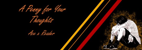
Any help would be greately apprecited!
4 notes
·
View notes
Note
����, 📚 and 🐻
📏What’s your go-to canvas size? I pretty much always start with a 3000x4000 canvas at 350 dpi but often adjust to make it narrower (closer to 3:5 or sometimes, more rarely, 3:7). This does mean that my canvases get ginormous and too large to upload to tumblr or discord but then I just scale down to whatever makes the shortest side 3000 pixels again
📚How many layers do you typically use?
Haha ha oh no
For pieces like these it’s usually like 2-4 (bg is always separate, and then I sometimes do separate layers for each base color but also not always)
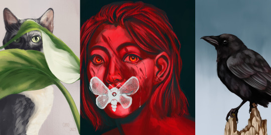
whereas pieces like this are usually between 30-70
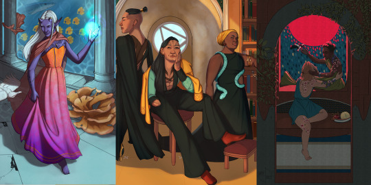
in general, I try to consolidate and keep to as few layers as I can while reducing the risk of me getting 3 hours in and being like FUCK why did i merge those D:
HOWEVER this is (I'm pretty sure) my record for # of layers at 218 because the tiling effect in the background was made by duplicating a folder group 36 times 🤡
🐻Your go-to things to draw when you need comfort? ....y'know I didn't have an immediate response to this but I think it might just be Callebero suffering which is not a great sign since I often draw Callebero suffering :| in a more serious vein, I just don't draw as much when I'm upset. I'm more likely to write or run it out
🌼Artist Ask meme!🌼
2 notes
·
View notes