#i’ll be redrawing a bunch of phrases like this
Explore tagged Tumblr posts
Text

cool caption
#did u know i already joined cjfs???#og says: нам не треба повторювати двічі нам з першого ПОХУЙ!#chonny jash#cj heart#cj mind#startistic#i’ll be redrawing a bunch of phrases like this
56 notes
·
View notes
Text
Mochizuki Jun The Case Study of Vanitas Anime da Vinci Interview - pt. 2 -
An interview conducted by Anime da Vinci with mangaka Mochizuki Jun regarding The Case Study of Vanitas. Part one of my translation is here. I said it was going to be two parts there, but I’ll be releasing it in 3, sorry.
In summary: A more in depth description of how Vanitas and Noé were developed, how Mochizuki wants to represent their relationship, Mochizuki’s feelings on “evil,” and how she wants to incorporate death.
Includes translation notes.
Initially, Vanitas was the vampire, and Noé was the human.
- The way Vanitas and Noé are depicted within the story is quite charming. How did those two come to be as they are? With that, how would Mochizuki Jun-sensei go about introducing “this person is Vanitas,” and “this person is Noé (a vampire)”?
Mochizuki Jun: Initially, Vanitas was the vampire, and Noé was the human. Drawing from Sherlock Holmes, Vanitas took the role of Holmes and Noé of Watson. But, no matter what I did with that concept, my boss would look at it and go “I mean, looking at this, the feeling I get is just... well, isn’t this kind of ordinary? In my opinion, it’s just... not interesting,” when providing consultation. Then, I got the advice of ���hey, what if the vampire and the human roles were switched?!” I was like “huh? A human Holmes and a vampire Watson? Wait, that’s- really extremely super cool!!” And it felt like I was suddenly looking at a completely different landscape. Vanitas’ prominent canine teeth are vestiges from those drafts.
MJ: A different friend of mine criticized my design for Vanitas, which is how he ended up developing those two-level side bangs. Noé’s design completely changed from the first drafts to serialization. Originally he had glasses and was more of the straight man of the comedy duo. I was forced to part with those and other ideas.
MJ: If I were to introduce them with a single phrase, it would be like:
Vanitas - A self loathing deviant.[1]
Noé - Body of a man, spirit of a maiden!
- Speaking of those two, even though they’re always butting heads, they still choose to be alongside one another, and end up fighting together to cover each other’s backs. That relationship is so endearing. In what manner does Mochizuki-sensei mean to depict the two of them?
MJ: They’re not friends, and their goals don’t exactly align[2]. Sort of contrarily, they always fight like dogs but still feel a mutual draw to one another. There’s not enough room to cover it all here, you know what I mean? Noé’s naivety frustrates Vanitas, but his foolish earnestness makes Vanitas harbor a desire to be close to him. Noé sees the light of Vanitas’ power which can do things far beyond Noé’s ability, and feels an attraction to the darkness that lurks in Vanitas’ shadow.
- The characters of Vanitas, especially in the case of when a depressed disposition shines through a carefree countenance, always have such impactful expressions. Please tell us if you have any points of fixation when it comes to drawing expressions.
MJ: I don’t have any specific points of fixation when it comes to expressions, but I usually end up redrawing the expression several times when I make a new panel. Whenever I draw a character’s face I end up making the same expression on my own face, so I leave a really bad impression when I draw in front of other people...
MJ: Aside from that, when I read manga by other people I’ll often go “oh, that’s a really good expression!” In those cases, I’ll try to analyze what about the drawing communicates the right emotion, follow that as closely as possible, and keep it in mind when I increase the stock of my own drawn expressions. I wanna get good at drawing...
Try to contain meaningless death within The Case Study of Vanitas.
- Though there are even humans who regard vampires as enemies, neither seems to be “good,” nor does either seem to be “evil.” Please tell us about the feelings you held when you decided to depict neither side as an axis of good or evil.
MJ: Simply rewarding good and punishing evil is bad storytelling. Those easy to swallow “I’m looking for world domination!” type characters always make me ask “Why’s this character want world domination?” “How do they intend to achieve it? For what purpose?” “What about their history led them to that conclusion?” “In the first place, when talking about evil, how was it that what we’re calling evil was decided to be evil?” It’s a really obnoxious way to get my head spinning with ideas as I try to look for an answer I can accept. Before I know it, that “easy to understand enemy” doesn’t really exist to me, no matter where I look.
MJ: Since I wholeheartedly reject “evil,” I think authors who create antagonists whose feelings you can see and relate to are extremely admirable.
- That monologue which began in the first chapter’s finale seemed to contain all sorts of foreshadowing. Has Mochizuki-sensei already envisioned the plot all the way up to the final chapter?
MJ: I haven’t firmly decided all the way to the end yet since I’m the type to not know what she wants to draw, but I’ve pretty much got the rough outline until the story’s conclusion. On my way to that final station called “the story’s end,” there are some stations at which I’m absolutely, inevitably going to have to stop. Still, I feel like it’s up to me as to which route I take on my way there.
MJ: For he who may have stuck with me since my previous works, I’m trying my hardest to work my way up and make the railway line of this current story feel more like a roller coaster.[3] Since in my previous work, Pandora Hearts, I wanted to make a bunch of distinctive events on their way to the last scene, which was supposed to be the highlight of that character’s arc. Because of that, most deaths in Pandora Hearts were made to be cathartic. In The Case Study of Vanitas, I think I want to try to include completely meaningless death.
---
[1] The word Mochizuki uses is 自分嫌い天の邪鬼. 自分嫌い is pretty directly just “self hating,” but 天の邪鬼 literally means “demon from heaven.” In speech, it’s used to mean “pervert” or “contrarian.” The manga translates 天邪鬼 (the same word spelled differently) as “bad tempered,” which I don’t like.
[2] Since I saw another translation for this part: Mochizuki specifically says 仲間とも違う, nakama to mo chigau, which means more literally “[their relationship] is also a different thing than a comrade.” 仲間 is sort of an infamous word among Japanese translation circles. It frequently implies “friend,” but is closer to “person with whom one finds commonality [in faction, ideas, goals, etc.]” Another translation might be “kindred spirit.”
[3] Yeah she starts using a train metaphor it wasn’t fun to translate
-
Part 3 here.
125 notes
·
View notes
Photo
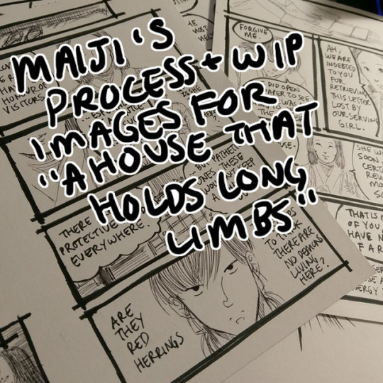
Process and wip images for A House That Holds Long Limbs (Part 3)
Previous process and wip documentation: Part 1 / Part 2
Read the pages for part 3 here (full complete version will be linked from YYH North Bound master post)
In Parts 1 and 2 I went through the transitions between idea, script, thumbnails and final art in quite a bit of detail. This time I’ll share script and thumbnails and point out some of the biggest changes, and then talk about how I scan and clean the final artwork.
Script and thumbnails

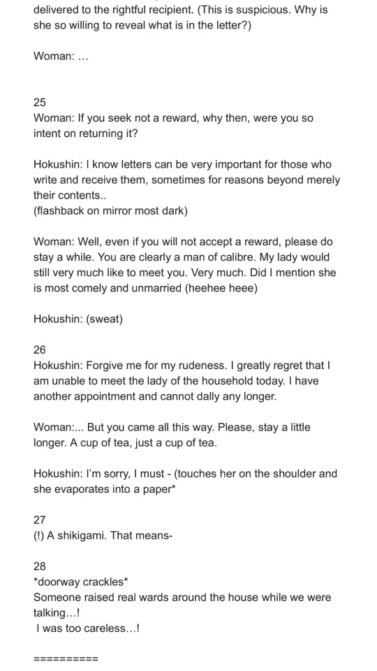
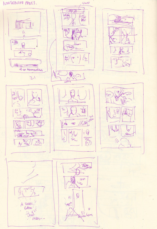
Biggest changes:
Dialogue changes every-freaking-where. Changes in word choice, moving things around to make the dialogue flow better, rewriting to make things flow better up to the umpteenth hour (i.e., right when I’m inking).
Page 24 “It is enough to know the letter has been delivered” - this thought has been transplanted onto the next page. I was also running out of space on each page for so many wordy words. Looking back now I’d probably like to move Hokushin’s “I can read it, not that she needs to know that” earlier in the sequence of panels, but it’s too late and whatever.
Page 25 split into two pages because 1) the dialogue started growing on the first of the 2 pages and I wanted to give more emphasis to the woman dropping her “tee hee I’m matchmaking” bomb and Hokushin’s “lol get me out of here” expression.
The last page with Raizen did not exist in the script or the thumbnails. I tacked it on at the last second because the previous change increased the page count to 9. I’m drawing 2 pages up on an 11x8.5 sheet of paper (so each page is about 5.5 x 8.5), so this meant I was left facing an empty page. I impulsively threw in a “meanwhile, Raizen’s shenanigans” for fun.
As an aside, this level of dialogue is what I was anticipating the hypothetical “let’s separate Hokushin and Raizen with some random NPC offering a job” scenario to involve (see Part 1 process and wip discussion). You can see why I was so eager to ditch that idea and find something simpler and more efficient.
I feel like "I was (too) careless!" is such a stock (shounen) manga phrase. Therefore I must work in "Seems like I underestimated [...whatever thing they underestimated]" and "Impossible!!" into upcoming parts of the story lol.
Inking
Part way through inking I actually ran out of ink in my new cartridge. I had started the comic with 0.3mm Muji black pen, and it ran out a while back. I switched to 0.4mm (because that’s all they had in stock at the time)... and then actually ran out of the ink part way through on these pages. @atorier lent me a 0.3mm refill so these pages mix both thicknesses in the art. I can’t really tell the difference though... can you?
Part 3 was super fun to illustrate because it’s 90% subtle facial expressions, one of my favourite things to draw. The downside is WAY TOO MANY WORDS BEING SQUEEZED IN EVERYWHERE. I’ve never been very good at managing my speech bubbles - drawing them, positioning them, and fitting words in them. I never give them the time needed for proper planning and I often write rather impatiently, as if I am jotting down a note, instead of carefully lettering each word. They’re simply very sloppy, which results in a lot of mistakes...
It used to be that when I made a mistake in the later stages of the art (mainly, inking) I’d cry and throw everything out because I’m a complete failure, this is all worthless, etc. Nowadays I’m like uhhh... #@^&^#$!!! Oh well. Depending on the mistake I still have moments of I’M A COMPLETE FAILURE, but then I just redo it on the side or add a note to myself to fix it on the computer for the final version. Here you can see a whole bunch of mistakes around lettering and placement of things.
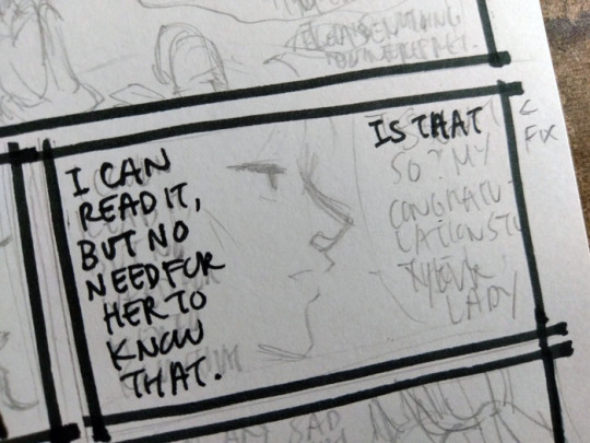
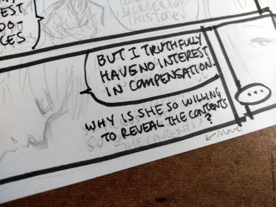
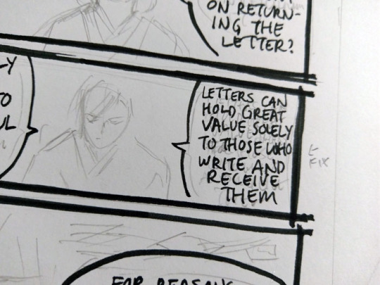
And this is just to make it more legible. It’s still ugly lol. (That’s why I use a font for my webcomic...)
Scanning / editing
Long Limbs is drawn in black and white which makes it a hell of a lot easier to scan/clean/prep final art. I use an old Canoscan LIDE110. I’ve upgraded once or twice but always to another Canoscan (basically whatever the latest version of this series is). It’s a cheap workhorse and lots of other scanners use Canon’s scanning technology so it’s always suited my purposes very well.
For black and white lineart, I scan at 600 dpi black and white. These are my settings as they show up in the default scanner software:

For clarification, the only parts I really pay attention to/change is Color Mode (black and white) and output resoluton to 600 dpi. Most of the other stuff was already calculated or set.
Industry practice is generally 1200 dpi for black and white line art, with 600 being a “if your computer can’t handle it and is gonna blow up... this is sufficient”. I rarely bother going up to 1200 mainly because I don’t usually have applications where I need it for output (this comic is not intended for print, for instance. And even if I ever do someday print it for whatever reason, it’s not likely to be bigger than a small comic). Scanning in black and white mode also conveniently kills most of the pencil lines I still have left so that post-scan cleanup work is minimized to a degree.
Here’s a shot of the page that was scanned.
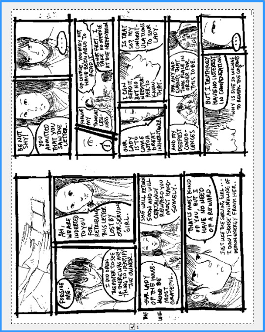
Oh god look at all the mistakes that need to be fixed hahaha.
On the computer, I crop the individual pages and save them separately. Then I blow up to 100% and start selecting/deleting unwanted dust/artifacts/dots etc. Sometimes I also just use the eraser for cleaning fine details, but select+delete is faster for large patches.

This is also the opportunity to make corrections. To be honest, there’s not much retouching on these pages because I am lazy and trying to get them out as quickly as possible, so it’s mostly getting rid of artifacts, a few stray lines from ink smearing if I smudged or erased before it was fully dry, cleaning the shapes of a few letters to make them more legible, deleting errors and pasting the fixes over where the errors used to be, and any really stupid mistakes I’ve made - like drawing the fixes to Hokushin’s hitatare in Part 2. For redrawing/adding new parts on the computer, since the art is in black and white mode at such a high dpi, almost any brush will work great and look indistinguishable from the scanned lines when scaled down.
I save a high res TIFF for my archives. Then I convert to greyscale (better for maintaining details when I resize, since black and white can drop things that aren’t 100% black or white), and resize to 72 dpi at 700 pixels wide. 72 dpi has long been the standard for on-screen viewing - nowadays screens can display higher resolutions (e.g., retina) but this looks fine to me so I’ve long stuck with good ol’ 72. I arbitrarily picked the 700 dpi width - it seemed a good balance of “not too small” and “looks big enough to let you see the art nicely” on Tumblr. Below are my settings to resize:
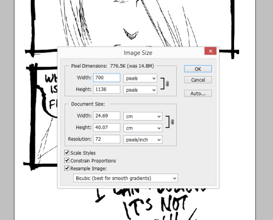
Again, the above I mostly only pay attention to width and resolution. All the other stuff is mostly default or autocalculated. All my pages are different heights, which I don’t really care about since I’m just posting them on tumblr and pixiv. Finally I save as JPG for posting.
Ta da!
#yu yu hakusho#comics#fanart#hokushin#raizen#wip#process#drawings#yyh north bound#art by Maiji/Mary Huang#scanning artwork#cleaning artwork
5 notes
·
View notes