#i was going to actually draw it but i didnt like how the sketch was coming out
Explore tagged Tumblr posts
Text

filler
#xmen#xmen comics#cherik#charles xavier#erik lehnsherr#magneto#professor x#snap sketches#fun fact there was dialogue but as i was listening to music i found i liked it better without vjaLKJALK#at the very least the dialogue was just meant to allude to the fact charles just wanted erik to kneel down so he could give him a kiss#but using his wheels getting stuck as an excuse... like girl he didnt actually expect a rock to be there... lol ...#ive always wanted to try dialogueless comic/s anyhow.... so thats fun...#double fun fact i was actually going to abandon this. i got tired after the sketch fjERKLJJKAL#but then i lined the close up of mags and i was like Oh.. i must finish this so i can share THAT panel specifically#and ilke yeah i guess in review the whole thing's kinda cute... whatever.. I GUESS i like it..#i enjoy that about myself i liek how i'll dislike something and be Not Confident about it and then ill be like 'oh its ok acutally'#trust the process or whatever..#anyways. ive been drawing these two too lovey lately and magneto especially cuddly.. whats that about...#next time i draw them he's gonna be in charles' lap i swear. or killing each other whichever i decide#ANYWAYS. im gonna be meeting a friend later !!!!!!!!!!!! so exciting..#i cant wait to start working on the next comic i have in mind ... me hopes you all enjoy it#im gonna lock in for it so i prob wont post anythin for a while.. or at the very least it'll just be lil doodles#we'll see.... ANYWAY good night !!!!!!!
911 notes
·
View notes
Text
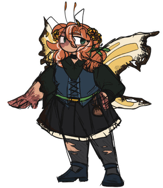
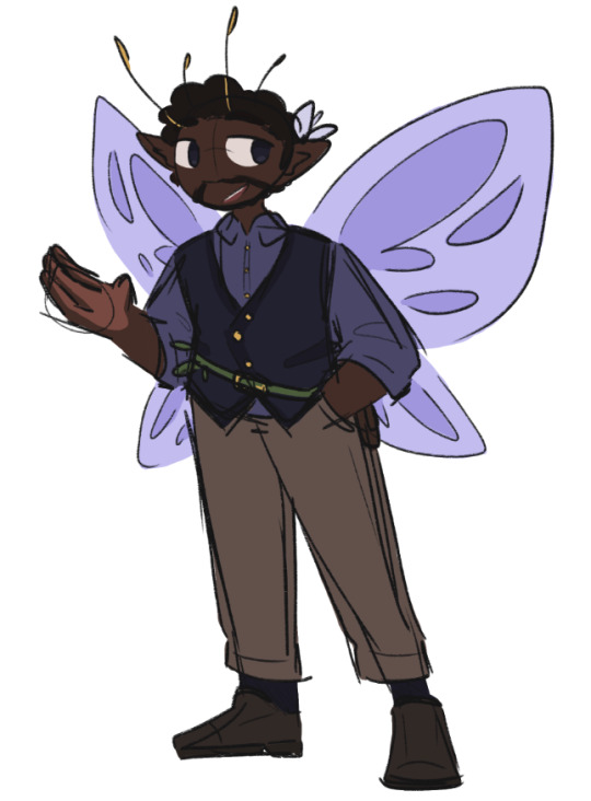

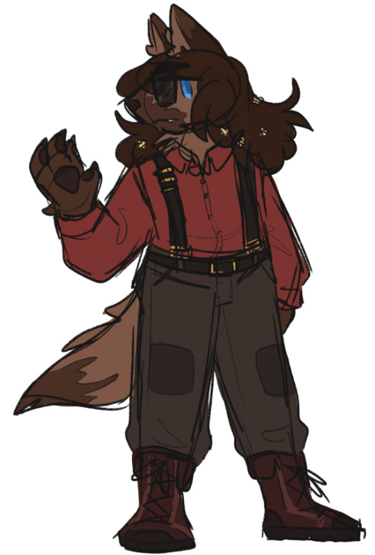
a bunch of bugs and one dog
#ren is not a werewolf he is simply straight up a dog man lol the dog is the only actually accurate description in the caption#also cleo wouldnt be burnt up like that until after the betrayal (getting caught in their own fire and not being resistant against it)#but thats the design i colored so thats what weve got 🤷#pre-betrayal theyre basically the same designwise but with complete wings and an intact sleeve and not scarred hands#some of these designs arent going to 100% be the ones i stick with since im still figuring out how to draw all of them except cleo#but theyre a start and i still like how they all came out i just feel like i could push things further especially with bigb#life series#mcyt#life series smp#zombiecleo#ldshadowlady#rendog#bigb#last life#fairy fort#w1f1 sketches#since i was doing fairy cleo i didnt want to also do zombie so thats how we ended up here. the splotch on their face is like a birthmark#but its in the same spot as where i split the colors with the stitching for double life#so i think thatll be something consistent across all of the designs i do for them where over that eye is a different color...............
114 notes
·
View notes
Text


a … a gift from the talented @kruinka 🥹 thank you so much!! ദ്ദി ༎ຶ‿༎ຶ)
#彡 moevie!#彡 cherishing.#kruin …. !! you sent this a few days ago but i am still . reeling in . /pos because i cannot believe i am seeing moze ( and myself ?! ) in#your !!!! style !!! your !! adorable !!! and beautiful !! style !!! and there is a lot i have to say — i am in the chattiest mood despite my#sleepiness !! FIRST omg ): thank you ?! thank you !! THANK YOU !!! for being so kind to me and drawing out a sketch that i will treasure for#eternity really 😭 !! i will gaze at this whenever i wake up … gaze at it before i sleep …. gaze at it when im sad … when im happy ( to#amplify the happiness of course !! ) OOOOH KRUIN. kruin . words can absolutely NOT describe how much i love your style … i just cannot ?!#figure out how to put it in words ?? i can’t just say ‘i like how you do this’ ‘and this’ because it’s the literal entire thing that i love#aiwnendjdkke and ): before i get too deep into that — i must thank you another time kruin !! because i know you’ve been busy — and of#course you must be ?! im sure life becomes much more hectic during the holidays and new years like this — so i’m just so soft over the fact#that you spent time to do this for me and i :’) i really appreciate it from the bottom of my heart — i would like to say ‘you really didn’t#have to!!’ BECAUSE YOU DIDNT !!! YIU DIDNT NEED TO DO ANYTHING FOR ME — YOU DIDNT ): IM JUST SO SAPPY AND MUSHY THAT YOU CHOSE TO AND ):#and the background being pink . i love pink !!! i know exactly where this specific shade of pink will prosper ( give me a second .. when i#awake ) .. BUT OH )): thank you so much kruin … it means so much to me .. more than i could ever try to explain !!! BUT IS IT OKAY IF I TALK#ABOUT HOW YOU DREW MOZE BECAUSE . i’m dead on the floor -> x0x this is me because you made his cheeks SO squishy HIS SIGNATURE SQUISHABLE#LOOK . I WONDER HOW ARTISTS MAKE HIM LOOK SO SQUISHY ?? the squish technique ?? BECAUSE HE LOOKS SO CUTE SHJEJD ): KRUIN YOURE SUCH AN AWESO#ME ARTIST . SO TO BE ABLE TO SEE HIM IN YOUR STYLE ….. *thanks everyone for allowing me to have eyes* a wonderful day !! to have eyes !!! i#will actually risk disintegrating into evieparticles if i even so much as mention the blush on his cheeks so — instead . YOU GAVE HIM SUCH A#oh no . the look on his face T T kruin i don’t want to talk about it !!!!! but you — the look on his face !!!! must you draw him in such a#cute manner /pos i am starting to feel speechless trying to talk about how pretty he is in your style because . perhaps toopretty for me#to even make any type of comment ( instead — i sneak a glance and then turn away because if i stare too long …. IF I STARE TOO LONG .. *expl#explodes* ) kruin i think i will just cry seeing the level of detail you put into this ): like my hair ): i think i will just kneel in front#of you and cry and apologize over and over as i wipe my tears on my sleeve because my tears make it difficult to properly thank you /lh#the fact that there are sparkles T T the world is full of sparkles when mr shadow exists !!! a lovely . YOU KNOW WHAT . the sparkles are#there because KRUIN EXISTS . I LOVE YOU KRUIN. I LOVE YOU SOO MUCH ))): I DONT RVEN KNOW HOW TO DTART EXPRESSING MY GRATUTUDE#tldr - i am gobsmacked & staring at this for the next ( infinite amount of time ) thank you kruin !!! ): wishing you only the best .#aggressively wishing you only the best * aggressively turning to go O_O at anything that dares threaten a lovely day for you!!!!
62 notes
·
View notes
Text

this blog is 11 years old now 🎉
I drew the siblings ever to celebrate as usual
#loz#wind waker#legend of zelda#toon link#aryll#I wasn't gonna draw anything but then I sketched link real quick and I was like okay wait i can do this#and then my brother dragged me outside ☠ but i still got it done today!#the anniversary is today. tumblr sent me a notification like ravio is 11 years old now! ravio the character is actually 11 years old.#albw released in2013. i received two reminders this morning. ravio drawing soon maybe. coming this year definitely. maybe#arylls like big brother use a damn fork#<- that was the tag when I first started drawing them in 2018#also i noticed when I draw aryll i always draw her in her blue dress so i decided to change it up. i only play 2nd playthroughs of wind wak#r because fun fact: i hate link's green tunic and hat. i finished a first playthrough years ago with a finished nintendo gallery#and then when i want to start a new playthrough i fight ganondorf again go through the credits cry and then BAM new game no-plus#i miss link's green tunic now though. its been so long. im so sick of champions garb...............idk the green is iconic idk#im not a huge fan of it but i think his base form should be green again. with the hat. let him look doofy as a default again#he was green in echoes of wisdom but i need them to follow through after again.#i didnt finish echoes of wisdom yet (SOON IM TRYING IM STUCK I NTHE SONIC ADVENTURE 1 WEB HELP) but what I saw of Link there?#he was kinda terrifying lmao its always funny to see that link is so extremely competent because i am not. that boy efficient#im stuck in the sa1 web because everyone is always talking about how good it is. so i played the pc port and. its apparently awful idk it i#thats just what sa1 outside of emerald coast plays to me tbh. but the dreamcast is supposed to be better. and i own a dreamcast. free me#i played on gamecube too. 12 years ago. it made me sick. maybe one day i'll install some mods that make it play better#why does it feel like the month is over when its only january 6#i played sa1 as a kid btw. just emerald coast tho. ALSO I DIDNT BUY A DREAMCAST FOR THIS I ALREADY OWNED ONE
62 notes
·
View notes
Text
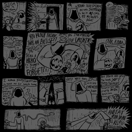
[<==PREV PAGES] [NEXT PAGE==>(not out yet.wait a year.or maybe more.imagine.]
saw alot of comments on prev pages; saying 'i HATE that mean teacher! im gonna FIGHT HIM!!' & i LOVE the energy!! it WOULD be nice. to have that catharsis. but the story of young tidestrider is Not one of catharsis. it is a story of being so small and so special and sucking so bad.
#jrwi fanart#jrwi show#jrwi riptide#gillion tidestrider#GONNA START FORMATTING MY COMICS BETTER. W THE PROPER 'PREV' 'NEXT' LINKS#REALLY DIDNT EXPECT TO CONTINUE THIS SERIES BUT AAAUUUHH MY BRRAAAIN MY BRAIN IS SO IDEASSS. I HAVE 3 OTHER PAGES SKETCHED OUT#NO PROMISES ILL FINISH EM ANY TIME SOON OR EVER. MY WHIMS ARE THEIR OWN BEAST AND I ONLY DRAW ON MY WHIMS#THAT BEING SAID IF U COMMISSIONED ME ILL GEEETT TO YOUUU IM SORRYYYY. ART IS AN EMOTIONAL RELEASE FOR ME N BABY I HAVE EMOTIONS.#ESPECIALLY ABOUT GILLION TIDESTRIDER CHAMPION OF THE UNDERSEA HERO OF THE DEEP.for the desc here i put smth that i typed up in the tags of#another thing i made. i gotta make a proper Baby Gillion tag or smth. eventually.. eventually...I LOVE DRAWIN THIS LIL BABY GUY..#i also LOVE depicting the teachers as just being so fuckin mean. ofc theres variation in that. just like in all things.like the teacher her#idk if itll be mentioned but the octo lady is named Ms Octburn.an octopus pun based off the name of an actual councilor i had#when i was in elementary school i got bullied alot but teachers never did anything. i hated adults and didnt trust them.#but this councilor o mine was so genuinely sweet. i remember spending alot of time w her. she doesnt work there anymore.#but that one school adult that actually earns ur trust and is there for you when they can be.its SO important for a child i think#i hope she knows how much she helped me.youll see in the next page that ms octburn isnt perfect either.but she tries. they all try.somehow.#ALL these comics are gonna be inspired by somesorta experience o mine in the school system. school is so fucked up u ever thing abt that#AND GILLIOOOOONNN IN THE MOST FUCKED UP LITTLE SCHOOL OF ALL. MAINTAINED BY A CULT. CENTERED AROUND HIM. OUR CHOSEN ONE#I IMAGINE ALOT BANKS ON HIS SUCCESS. THIS IS THE WORLD. THE WHOLE WORLD. THE PROPHECY IS GOING TO COME TRUE N UR TELLIN ME#THAT ITS THIS LITTLE IDIOT THATS GONNA BE SAVING US? WHAT IF HE FAILS. IF HE CANT GET THIS RIGHT THEN HE WILL FAIL AND WE WILL DIE#WE NEED TO TRAIN HIM. WE NEED HIM TO LEARN. AND TO SUCCEED. OR ELSE WE'RE DEAD. WE'RE ALL FUCKING DEAD. I IMAGINE THAT MUST BE STRESSFUL#in other news i hope ppl actually giggle when they read these. they ARE intended to be comical. dark humor or whatever. like its also sad#this is intended to be a sad comic series. but a funny one too. does that make sense? god i hope so.saw some1 say they had flashbacks-#-reading this. like YES!! THE INTENDED EFFECT!! YOU GET ME!! i love seeing ppl get upset on this lil baby boys behalf. i LOVE seeing ppl-#-wail n weep n cry in the comments. i LOOOVE seeing ppl RELATE to baby gillion. and i love letting u all know that this wont be a happycomi#gillion gets his happiness arc in the actual show. this series is one of unfortunate events. teehehehe. do u guys remember that show#i keep listening to the lil songs from A Series of Unfortunate Events for inspiration. GOOD STUFF!!#anyway uuhh uhh thats all i got in my brain. for now. feed me ur comments give me ur input i NNEEEEEDD THHEEEMMMM
155 notes
·
View notes
Text
There are some spoilers for crosscode down here ok forge forge dont look


an IRL Lea (hornless beast) my buddy cikie (cikrovat on tumblr) gave me the idea for this and also talked about it with me and helped me develop ideas if you dont know them are you insane theyre cracked please stare at their art but yea fun irl au, idk all the details exactly yet (i keep automatically thinking of it as like current day au but idk if i want that or i want it in the same time period as the game is set). There's a couple more art ideas I have for it but idk if ill ever get around to making them. idk exactly what to do with her parents because i know she gains a lot LOT more freedom at some point which i really doubt they'd just allow with this image ive made of them, so they might be dead rip sorry lea
#art#digital art#fanart#buttercatrho art#lea crosscode#crosscode spoilers#crosscode#shizuka crosscode#crosscode emilie#satoshi crosscode#downside of shizuka and lea being identical twins in this is that i cannot be immature and make leas chest bigger#im actually p happy with the quantic wave band logo#it is completly illegible which makes me happy#what the fuck is a quantic#random facts i based it off a sawtooth wave because it made my ears hurt the most#'i was going to clean up the drawing of lea and shizuka but im not the most proud of how it came out so i didnt L#i prefer the pencil sketch so i mightt clean that one but probably not#i am not 100% sure about the casual outfit i drew lea in#i feel like it should be less soft and more 'oh my god my fucking eyes' somehow#but idk how to design clothesss i wear the same jumper every day#i think drawing lea and emilie making out short circuited something in my brain more than usual cause its not focusing on shit#roe and cik's irl crosscode au
47 notes
·
View notes
Text

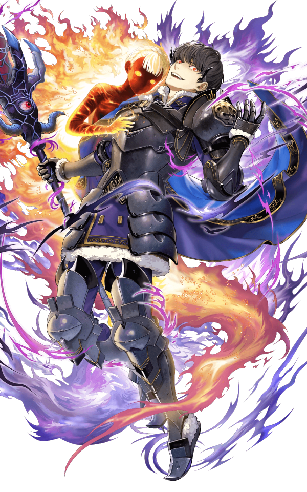
In echoes, witches are made by sacrificing someone to the Mad God, and one of the final bosses involves a character we've seen turned into a unique fire-elemental witch. Her fight is more sad than scary, since she's just a silent, soulless echo of the kind woman we saw before.
I really liked combining this idea with the witch-hunt vibes in Bring it On. In my fantasy au, Fuuta wrongfully leads his band of knights against a village girl, resulting in the townspeople burning her before all the facts were laid out. She was using magic, which is what Fuuta called her out for, but she wasn't using it for any malicious or witchy purposes. When she dies, the bit of magic in her flares up with her emotion and she returns as this type of fire spirit. As well as Fuuta's abstract haunting guilt, he now has a silent, destruction-bringing ghost haunting him each time he tries to run away from what he did.
#milgram#fuuta kajiyama#this was actually one of the very first milgram things i started drawing after my gun yuno adfsdfs#i just kept struggling with it and it never worked but i redid the sketch and was finally able to move forward with it - i was so happy to!#i didnt have the whole au ideas worked out but i still felt there was a connection at that point#my au thoughts bounce between the characters just vibing in a fantasy setting and going off on new adventures/tragedies#and the characters once again imprisoned for their murders but theres just a fantasy skin over the whole thing#this drawing falls into the first category though i still dont have a ton worked out#most of this au is just vibes that live in my head asdfsdf#i wanted to put them side by side to show what i was going for#but now its extra clear how my fire looks like crap next to the original LMAO
64 notes
·
View notes
Text
I drew all of my historical AU Sebs!!!!
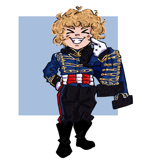
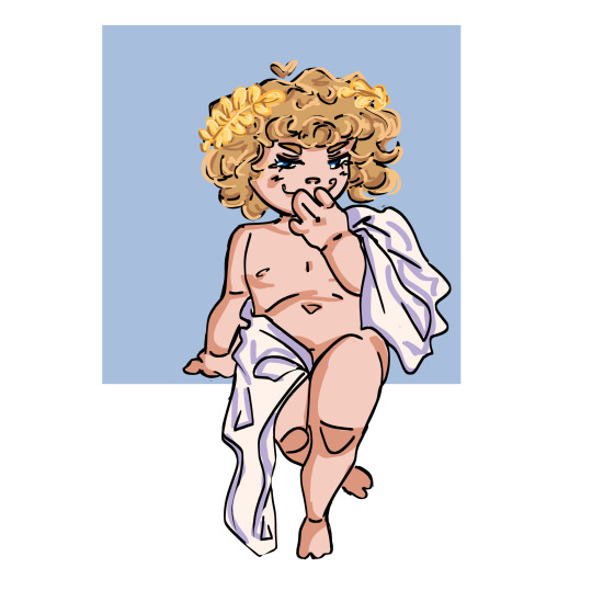
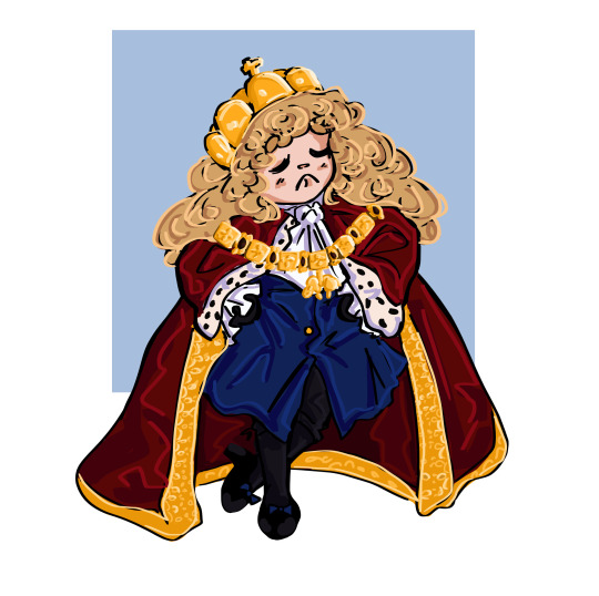
In order they are(with relevant links to lore info if you are curious!!): Napoleonic Hussar Seb(x), Renaissance Muse Seb(x) and Boy King/Emperor Seb(x)
Let me know which you like best!!!
#oh my fucking god this was truly the endurance race of drawing sessions#i just drew for four hours straight or so......FUN!#and it is now almost 5 am on a school night so pls wish me luck in school haha#basically this spawned from me seeing if i could sketch all 3 of my Sebs easily and then whoops 4 hours later they are finished!#i think now i can draw the hussar uniform with my eyes closed. it was so comforting to draw honestly ;;;;#this is actually the first time ive drawn boy king seb with colors!! so i think it turned out pretty well?#hey guys do you notice what all of the Sebs have in common...? they all have a gold motif...GOLDEN BOY CODED!!!#anyways i think the most developed of these AUs is boy king seb which is funny bcs its the one ive created most recently#but gaahhhhhh ive done so much research and im literally brainrotting over it constantly#now i need to draw fernando in his 3 AUs hahaha but drwing Seb is sooooo much more easy/comfy for me#did you guys also notice i have a fondness for a specific seb hairstyle? malaysia 2010 my truly beloved youve served me so well#i mentioned this already but like i dont get how drawing these kinds of clothing is far more preferable to me than drawing racesuits#well anyways i have so much fun researching into these different eras!! and then very fun to mix it with the drivers#im very surprised i was able to draw this. im not usually able to draw good chibi anatomy#but like seriously i think i was posessed by my thoughts of boy king seb and i just couldnt stop drawing#in didnt really have any mental roadblocks which is surprising#but then again these drawings are me mixing my two major interests atm so ofc it'll come to me easily and make me passionate!!#anyways time to go sleep pwease dont let this flop my hands literally are overheated from drawing LMFAO#catie.art.#sebastian vettel#f1#formula 1#f1 fanart#formula 1 art#formula 1 fanart#f1 art#boy king au#renaissance muse au#hussar au
101 notes
·
View notes
Text

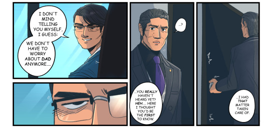
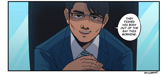
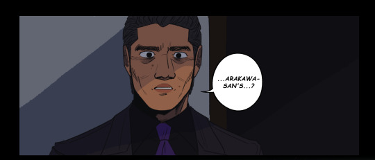

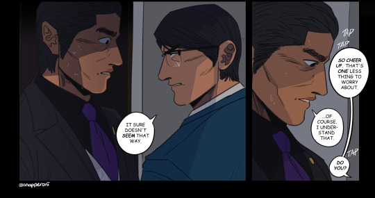
sequel to this cause Uh Oh !!!!!!!
#rgg#ryu ga gotoku#ryu ga gotoku 7#yakuza series#yakuza like a dragon#jo sawashiro#ryo aoki#masato arakawa#snap sketches#if theres mistakes idc this is TWO DAYS LATE i have a COMMISSION TO DO and im GOING OUT WITH MY BRO AGAIN#we are SPEEDING THROUGH PLEASE FORGIVE ME#anyway. hey :)#part of me feels like this would have been better in b/w but OH WELL#part 95 of I Almost Trashed This but i didnt want to whenever people were already expecting it and saw me draw it SO. <:]#eveyrone from the stream lookin at this like 'snap what the hell did you do this is totally different' GIRLS I TOLD YOU IT'D BE TOTALLY DIF#ok not 100% diff but. i redid pretty much the whole thing#i still have the old draft actually LMAO i had to yoink soem bits from it but now i dont want to delete it...#there was just a lot i didnt like with the first one that i wanted to see if i could adjust to my liking and well. Good Nuff#theres SOME bits i dont like but thats more so how i drew it opposed to the thought or composition#ok maybe a lil bit of the latter but anyway. Enjoy :)#also you'll have me gutted like a fish before i try to learn how to draw croc skin like we'll just have to save that for another time#do i have anything else i want to say. no LMAO if i do im just gonna end up explaining all the composition and panels#and id rather leave that up to yall lookin to see if you wanna take anything Extra away from how i set things up SO :)#bye for now. i have to run around my house ☠️
85 notes
·
View notes
Text

POISON 🦄🦋💝🖤
#street fighter#sf#poison#street fighter poison#sf fanart#street fighter fanart#capcom#art#digital art#procreate#doodle#poison fanart#poison street fighter#yaaaaa#this was fun#i didnt even have to rely so hard on refs#i suffer from that audhd art problem unfortunately where no matter how much I’ve studied and practice my brain cannot picture or let me draw#out actual forms in Motion and angles without having to sketch go over erase redo adjust like 73836 times#unless I practice anatomy extensively every single day and my brain doesn’t forget or have trouble picturing it in a way where I can draw it#Idk it’s hard to explain#it has to do with spacial awareness issues I learned a while ago which SUCKS#I’ve studied anatomy and other things for years and even attended figure drawing classes and have books#but I’m trying to train my brain more effectively to draw fluid poses just naturally and by doodling without having to prepare sm#it’s hard but becoming more casual and childlike with art helps tremendously
103 notes
·
View notes
Text
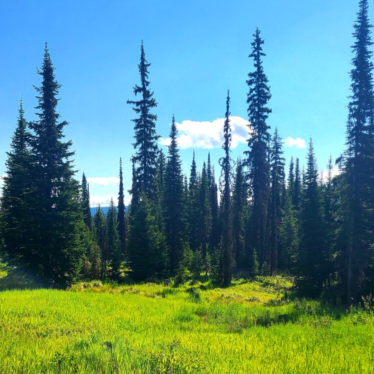
...
#hello to anyone who happens to b interested in the saga of my life... also maybe the irl person i gave my url to... hopefully my blog#didnt freak her out too much lol. anyway so its been a busy week? 2 weeks? month? year? life? its been a lot. my parents helped me move#across the country from the desert to somewhere that's beautiful and green. my dad is so jealous of me lol its so so so pretty and theres s#so much to do. will i do any of it? that remains to be seen but im gonna try to be better about that sort of thing. try to get some help#with the thoughts in my head that keep me from doing and enjoying most things. its weird like im decorating my new room which i love. the#location and living situation seem ideal and i really hope i can stay here all 5 years of my program but i was picking a lot of bright#colors and now it feel uncomfortable. like if i wear things that r too bright or my room is too bright without dark contrast it feel weird#like if im wearing it it kinda makes me feel sick. idk what thats abt. anyway. ill try to heal my brain and im just so happy to b out of the#southwest. i was so so so excited when we were leaving thr city and even more so when we left the state. i cant believe im here. in December#it felt like a million years away and i really truely could not fathom how i was gonna survive that long. my thoughts were so distorted. but#i did and here i am. and in like a month i should b starting my phd program and my parents were telling me how excited ppl r for me and#jealous of where im living and im glad. im glad they're excited. i think i am too but its under a layer of: if i get excited it wont happen#im not allowed to b excited or it wont happen. which is irrational but ya kno. anyway so that's yeah. im so happy to have a fresh start and#the town seems super cool. a liberal blip in a sea of... not that so theyre very visibly pride forward haha and i think itll b way easier#for me to get around without driving. and im gonna try to make friends. i need someone to tell me where to get tattoos haha. so yea im happy#but exhausted and i dont wanna go back to work and so so greatful to my parents for being wonderful ppl idk how bc both of them had fucked#up childhoods. like my mum will say the saddest shit and im like bro this is y i don't wanna talk to my grandma fuck her and my dads parents#r so fucked. like my nana is the reason im so fucking control freaked out but i kno i have issues and she has no insight and thinks shes#better than everyone. anyway hopefully i can get back to drawing a posting more now. ive been drawing it its been in a sketch book#like an actual sketch book for sketching big ideas thst r gonna take fucking forever to draw 😭#so that's all. just uprooted my whole life. thats all. but in a good way :-]#unrelated
34 notes
·
View notes
Text

happy birthday isat :)
this took me Wayyyy longer than i thought it would so thats why its a bit late.. ehheh.... i really like how it turned out though !! extra stuff under the cut
okay. okay im gonna get a bit sappy here. bear (🐻) with me
isat has very quickly become my favorite game of all time which is not an exaggeration. never have i played a game that felt so real in its dialogue, characterization, and character interactions. it makes it so easy to relate to them all and so difficult to pick just One favorite. it cured my art block watered my crops fed my family etc etc. i had originally bought it nearly a year ago now. on christmas day to be specific! and for some reason i didnt actually Finish the damn thing until may. and whew did it consume my every waking thought. i havent had this much fun theorizing and being part of a fandom in general in so so long. thank you adrienne for making such a wonderful game and thank you isat fandom for being so kind and friendly! i actually feel like i can make an effort to have a presence here more than anywhere else and i hope i can become closer with all my mutuals and anyone else who wants to talk about isat with me for one million years
okay enough Heres the art you came here for

first time in like. actual years i did sketch then lineart instead of just cleaning up the sketch a bunch LOL so here is the sketch for this one

the dreaded lineart. this took the longest time and i never want to draw again (joke)

self explanatory. i had an idea to add loop but do Not have the energy to execute it currently. oh well!
if you read my big big paragraph of rambling thank you :3c That is all. Im gonna go take a break from drawing for a day or two and lay on the floor
#my art#isat#in stars and time#siffrin#isat siffrin#isat odile#isat isabeau#isat mirabelle#mirabelle chevalier#isat bonnie#isat boniface
428 notes
·
View notes
Text
Drawing Likeness: with Tem!
okaay since a few people actually showed interest in me sharing a bit of what I've been doing to figure out how to really capture likeness, specifically Temuera Morrison, I figured id do my best to write it out
I am also going to entice you with some of my recent clone art! (oooh some of it is unreleaaasedd)


I am putting the whole thing under the cut because I have a feeling its going to be long:
Read more!!!
a couple disclaimers before we start
-This is not some definite post about how everyone should be drawing clones, nor is it in any way claiming that this is the right way. This is just my musings as I stare at a mans face for way too long and try to replicate it
-I am inexperienced. As kind as you all are to me, drawing real people is relatively new to me, capturing a persons identity through their features is difficult for anybody, and I am no different. I have watched many a video on likeness and had my share of classes, but If im being honest, i rarely put it into practice successfully. So there'll probably be errors in this post or things i will come back to in a few months and wish I had said/done differently
ANYWAYs you guys get my vibe im just here to ramble and today we are rambling about mr copy paste. I am doing this for Law, my clone boy, because I plan on delving further into oc fanart and I want to put effort into representing him correctly!
SO LETS BEGIN
Before even deciding what specific pose of a person I want to draw, I tend to grab a bunch of references and compile them like so

(all of these can be found on my pinterest)
Why so many? Well, we are about to delve into facial features, so when we are dealing with photos we have to take into account that there are an abundance of circumstances that will influence how a persons face will appear, some of these include:
focal length: All of these are taken on different devices, and focal length can play a big part in distorting faces
age will play a part, your face changes a bunch throughout your life!
lighting, while not as major, can muddy the waters and make it difficult to interpret facial planes and features
SO, to make sure we get a proper grasp of what's really going on, I like to make sure we have lots of options to compare and contrast with.
Next up! What I like to do is block out the main facial features with colour on different layers, the features I block out usually are the general face shape, eyebrows, eyes, nose and lips. But what you are looking for is the defining features of a person, so that could include other things! Maybe a scar, or some particularly prominent cheekbones.

I dont have any rhyme or reason when it comes to picking my colours, all that matters is you can see all the shapes clearly.
Now I may be biased, because Ive been staring at these for 4 hours, but notice how it still looks like Tem? :D
Anyways, now we can break these parts down, and you'll see what I mean about compare and contrast:

We'll start with isolating the facial shape, putting all these next to eachother you'll notice they arent exactly the same (partly because of my shoddy work) But the distinguishing features run through each shape! Namely the very soft rectangular shape I sketched out in the bottom right there. Along with his soft, wide jaw structure.
I did the same for the rest of his features!


You'll notice I highlight the prominent shapes and ratios,
When drawing anything, it is important to start from the very base shapes and build up.
When drawing something you want to look like someone, those shapes relative to other shapes is what makes it look like them.

I didnt use the same technique with his eyes and lips, but I wrote out some helpful info for them! More importantly for his eyes.
When drawing eyes, I find the most important part is where exactly I draw the creases, (along with the overall shape of the eye itself) it is important to understand where those will present themselves with hooded eyes.
NOW, with an understanding of his facial features in place, lets take a detour to colours:
before I start, a couple things to note:
-Temuera morrison versus the clone troopers in the animated shows:
While I love the animated shows they don't exactly stay close to their source material. Im going to link here to an excellent post discussing whitewashing specifically in relation to the clones.
Temuera is Māori, of Te Arawa (Ngāti Whakaue) and Tainui (Ngāti Maniapoto, Ngāti Rarua) whakapapa, and also has Scottish and Irish ancestry.
The Māori people are the indigenous Polynesian people of mainland New Zealand (Aotearoa). Māori originated with settlers from East Polynesia. Māori people often vary in skin tone, Skin colour doesn't determine ethnicity. There's often a correlation but it's not a requirement.
But that is a tangent! What we are aiming for is to stay true to Temuera.

Bringing back my reference photos from before, Ive colour picked a buncha values and theyre all over the place. Why doesnt this work?
Similarly to earlier, you have to take into account the photos themselves. Many things like lighting, colour grading (when it comes to filmography) and makeup, can alter how a skin colour presents in photo.

You can attempt to get true to life by swatching from certain places on the face. Here I've tried to pick some photos with good lighting, and I've also tried to avoid overly lit/shaded areas.
Tem has a very warm, tan skin tone, Instead of colour picking I tend to try and replicate it myself, but I do often bring in references to make sure Im staying true to the source!

a brief intermission to talk about colour theory, something I myself struggle with alot. Often, when putting in flat colours without a background, I will forget to make sure the colours i intend to use will work with the skin tone i have picked! (something that is apparent in older works of mine, not just in relation to clones, but in general, the colours I end up with stray largely from their original sources and it is something I am doing my best to keep in mind and improve in! Although I don't think i am nearly experienced enough in the topic to say I have succeeded yet lol.)
anyways back to Tem :))

Now we can put all of that into practice! Things to keep in mind when drawing out a piece next to a reference like this:
the distance between the eyebrows? how far down his face does his nose go? Basically just, in relation to eachother, where do all those shapes we found earlier, sit?
The screenshot above is from before I did it myself, but instead of directly tracing from the reference, a handy trick I use it to complete your sketch first, and then overlay a traced version to see where your inconsistencies are! Alternatively, you could move your sketch over the image, but I didnt do it that way so!! uh!! im sure it works exactly the same!!!!
When it comes to a final illustration, or any sketch that isnt a direct study, of course you can push and pull and stylise! You'll see below that I'm not exactly 1:1 to my reference photo either.
The important thing with stylisation, or at least my own personal understanding of stylisation is that you need to thoroughly understand the thing you are stylizing! "You need to know the rules to break them" and all that. While shapes, lines and rendering can change, when it comes to drawing someone, and making it look like them, you have to make sure to keep their core features true to source. Caricature can capture a persons vibe whilst drastically exaggerating features, but it will only look like them if you KEEP THOSE FEATURES!!!! SHAPES!!! AHHH!!
But that is just my perspective on the discussion of style versus realism, please dont take is as Law, I dont know what Im on about half the time!!
anyways, after fixing your sketch, add local colours!

I rexified him because why tf not! But this is where you can go crazy with that clone personalization!

And then here is a very very barely rendered version (if you guys want me to explain how i RENDER that would need to be a completely different post, and I havent had anyone ask about it yet so who knows! maybe one day) But I digress, hopefully you learnt something new through my ramblings! It has certainly helped me organize my thoughts and I have also found some areas I would like to focus more on in the future to improve my own art!
TLDR: In order to understand an object, be it a face or a building or literally anything, you have to break it down to its simplest forms, understanding LARGER shapes will help you immensely in the long run
If you guys like this sorta content do let me know! I'd be down to do similar things for armor/anything really, I am very anti gatekeep so really anything at all you want to know! Send me an ask :))
also if you see a spelling mistake.. i don’t know how that got there
#can you tell im nervous#i’ve never done anything like this BEFORE SPARE ME PLEASE#star wars#star wars fanart#digital art#my art <3#digital aritst#the clone wars#clone trooper#temuera morrison#tutorial#soulars yaps#soulars tutorial
481 notes
·
View notes
Text
I have a lot of penny sleeves for pokemon cards so I got the idea to use them as packaging!


Also I don't have a good printer, so instead you get doodles wheeeee.
The backing postcard thing for the pokemon energies I made with posca markers. Maybe I'll have to print em onto cardstock, but that's just a prototype! I'm thinking "ooh what if they were different pokeball, but that would be too much, no?


My hole puncher can't reach the middle so I taped the fairy energy to the paper instead haha
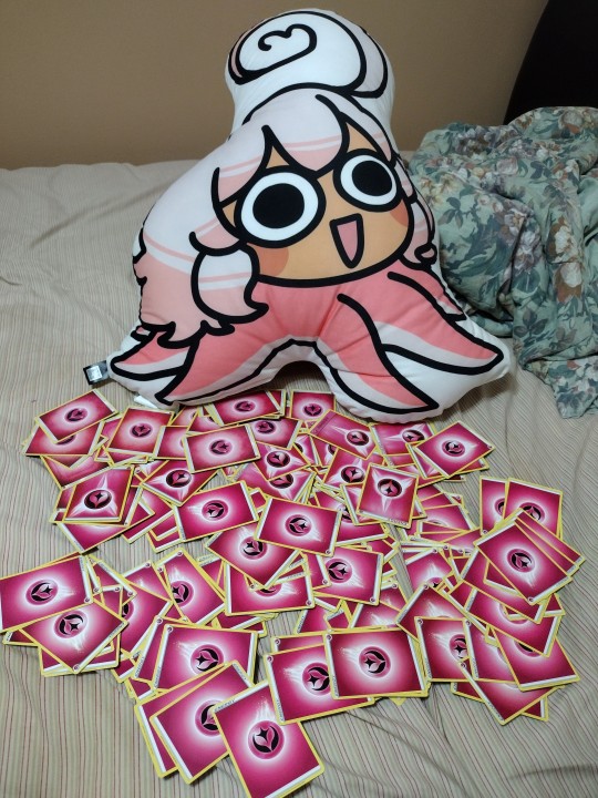


Look guys! I'm making buttons again (and injuring myself again because I work too hard.)
But I've successfully acquired myself over 200 fairy cards from shuffle through dozens of card shops bulk cards. They're hard to find, man.
I'll open my Etsy shop once I get my tablet and am able to draw digitally again heeho! But it's gonna be stickers and buttons until I get the confidence to get charms made. So keep an eye out!
#i see you dotty. your enthusiasm and recognition of my hardwork brings me to tears 😭#i wont go into detail. i will actually cry. im not well right now. physically or mentally. i am shriveling up. but i have omanyte#i went to gamestop before work and they remembered me from rhe other day and pulled out the omanyte figure that came out today#i was doing calculations at work and i didnt have a ruler so i used my pokemon cards i had. each cards is 4 by 3#my idea was a 6 inch diameter circle max so i made the sketch at work but when i got home i found a giant corcle sticker i got#years ago that i couldnt find a place for. perfectly 6 inch diameter. im glad. i have a stencil if i gotta hand draw the backings uergh#i need to sleep now but i really like explaining my process on things#i went on a large rant at my friends on how i had a genius idea on getting the perfect alignment using the etb box#HOWEVER not ever card is centered perfectly because even the factories machines mess up so things can be off centered by even a nanometer#and that can lower the psa rating of cards and lowrr my CENTER RATING ON MY ENERGY CUTOUTS SO IM JUST#SPENDING AT LEAST A MINUTE TRYING TO CENTER IT PERFECTLY BY EYE#its been good so far. the pic of my little station with the chansey family only four of them are noticably offcenter#i had a meltdown over those but my friends said they would still buy them so that cheered me up#i loterally said i needed to sleep. but i gotta ice my arm first jfjdd goodnight yall.#other#sorry for ramblling
39 notes
·
View notes
Text
Ej, Lj, Masky, Hoodie, Masky, Ticci Toby and Bloody Painter x reader who draws them
Prize 5/5 for @reivelmin !! I hope you've enjoyed all of your prizes WOOHOO!! I had a blast writing them, hardly ever get the excuse to write for some of these characters EHEHEHEHE
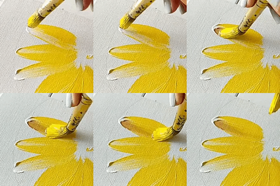
EYELESS JACK
I've always headcanoned that Jack was always a bit of an artist himself, although the most he does it sketch every now and then to keep his kind busy. He points out some techniques he recognizes and asks you about it. It.. actually takes him a moment to realize that all of the drawings are him. You can practically hear the gears turning in his head before he tries to move on. This opens the window for the two of you to draw together every now and then.. though jack is always a little embarrassed.. flustered.. with the knowledge that you have so much of him in your book
LAUGHING JACK
Very loud when saying he loves it. Hes flipping through the pages before pausing, looking you dead in the eye. He makes a comment about how you must be soooooo obsessed with him. Hes teasing you, of course! He offers to draw you in return.. though dont expect anything crazy, Jack's not.. the best artist- and hes okay with that! Loves looking through your art whenever you offer it. Would kick his feet in the air while looking through the pages. Sometimes you give him sketches to color, to keep him busy while you have to go do something
MASKY
He already knew what you were drawing him before you ever have the chance to show him. The man is silent and is constantly keeping an eye on you.. he does NOT know how to be a normal roommate!! You probably dont get the chance to show him yourself, because he points at a stray pencil marking that you forgot to erase. Worst jumpscare of your life, if you werent already aware of his presence in the room... he.. actually gives a thumbs up. Which doesnt seem like much but considering that he doesnt really emote, that's a huge thing... now does he think it's a little odd that you have a bunch of sketches where hes the reference? A little, but he does offer some good poses and lighting due to him tending to lurk in the shadows
HOODIE
Very similar to Masky but at least he pretends to not know. You walk up to him with your sketchbook and hes so obviously playing dumb but its.. sweet that hes pretending. He takes his time looking through all of the art, where some of the others get too excited and flip through it all. He doesnt talk, but he does communicate that he thinks it all looks great via sign.. oh he would definitely start leaving sticky notes with doodles around for you to find
TICCI TOBY
I think Toby would be a little overwhelmed, he didnt think anyone would be interested in him enough to want to fill an entire sketchbook with him. He tries to cover up his shock by lightly making fun of the situation. Though every tease he tries to draw out falls flat, as everytime he goes to poke fun of something about the art he trails off. Besides, he couldn't bring himself to actually make fun of the stuff you make.. if it's a gift, you offer to take it back but he quickly shuts that down. Its like the Bob's burger friendship bracelet audio, "no fuck off its mine"
BLOODY PAINTER
As an artist himself, he asks you about what materials you used as well as the techniques you used! Unlike EJ, Helen is more thorough in his questioning and knows a lot more fancy terms.. he points out the good parts of your pieces, and catches himself before giving his criticisms.. he at least makes sure that the criticism is wanted before just unloading (and even then hes constructive! Hes well aware that just dunking on someone does nothing to help them grow). It actually strikes his ego a lot that you would dedicate so much time and material to just him, and it inspires him to make something for you in return. If he didnt know you were an artist prior to this, he offers to paint with you.. whether as a collab or just simply working parallel to one another! Just please pay no mind to him staring at you more intently while hes at his canvas...!
#creepypasta x reader#creepypasta x you#creepypasta imagine#eyeless jack imagine#eyeless jack x reader#eyeless jack x you#laughing jack x reader#laughing jack x you#laughing jack imagine#masky x reader#masky x you#masky imagine#hoodie x reader#hoodie x you#hoodie imagine#ticci toby x reader#ticci toby x you#ticci toby imagine#bloody painter x reader#bloody painter x you#bloody painter imagine
465 notes
·
View notes
Text
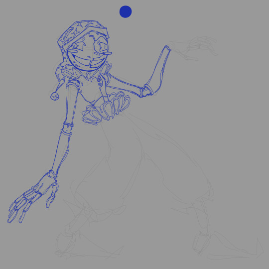
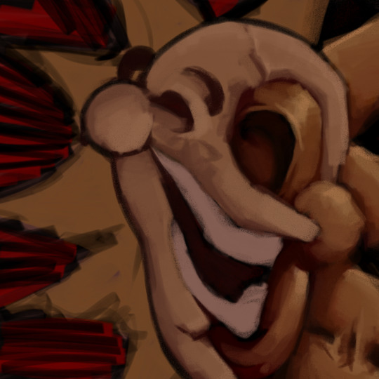

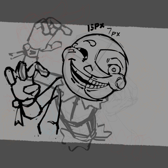

assorted dca wips i probably won't ever touch again (sorted from newest to oldest!)
very rambly explainations for each image under the cut ^_^
1.) aug 28th, 2024 -- i started this around the time where i'd just gotten into something else and basically just detached myself from the dca... and therefore all my art with them got way more experimental and personal to me and my tastes bc i'd just stopped caring about them LOL
i do wish i'd finished this one though because i love how the body looks! i don't remember ever starting this with much of a plan though and i very visibly got bored once i drew all the fun parts (i hate drawing their legs)
2.) oct 1st, 2024 -- this could technically be considered vent artwork? i wanted to make something purposefully grotesque and unnerving because i was just really angry at the fandom all the time... and it doesnt help that whenever i get into something new i go through a weird breakup phase with my old interest (which might not make sense to some people lol) which causes some weird feelings.
a less angsty thing i can mention is that i was also very purposefully trying to be more relaxed about the way i paint things here! i usually strictly adhere to a set palette i make for myself, so this drawing was me pushing myself out of that comfort zone and forcing myself to freestyle the colors a bit... the result didnt really end up how i wanted it to be though (^^;; )
3.) oct 9th, 2024 -- iirc this was me elaborating on a physical sketch i made where i was playing around with their face... i actually still really, really like this style and this drawing might've been the best way i've ever done it. fluid and expressive but still grotesque enough for it to stay true to their original design! this is the thing i reference whenever i draw them this way (and if you look at my most recent post you might notice some similarities?)
4.) may 11th, 2024 -- MANN i wish i'd finished this one!!! it was a redraw of this drawing based off of "chimera" by deco*27!! i've always associated that song with the dca but i didn't give it justice the first time i drew it due to the time constraints so i wanted to do it better!!! but then i got stuck on the hands 😭
if i was ever going to pick one of these back up again there's a good chance it'd be this one
5.) jul 18th, 2024 -- nothing truly profound to say here as this was actually just a test... never got around to adding a body to it, mainly because i just like drawing their face more than i like drawing the rest of them. you can probably look at all of these and realize that for yourself though LMAO
#my art#anyway everyone look at my new pfp. it's so cutes#not tagging this post btw fack you 🖕 but rbs are ok
127 notes
·
View notes