#i wanted to practice panelling and composition with intent and storytelling
Explore tagged Tumblr posts
Text

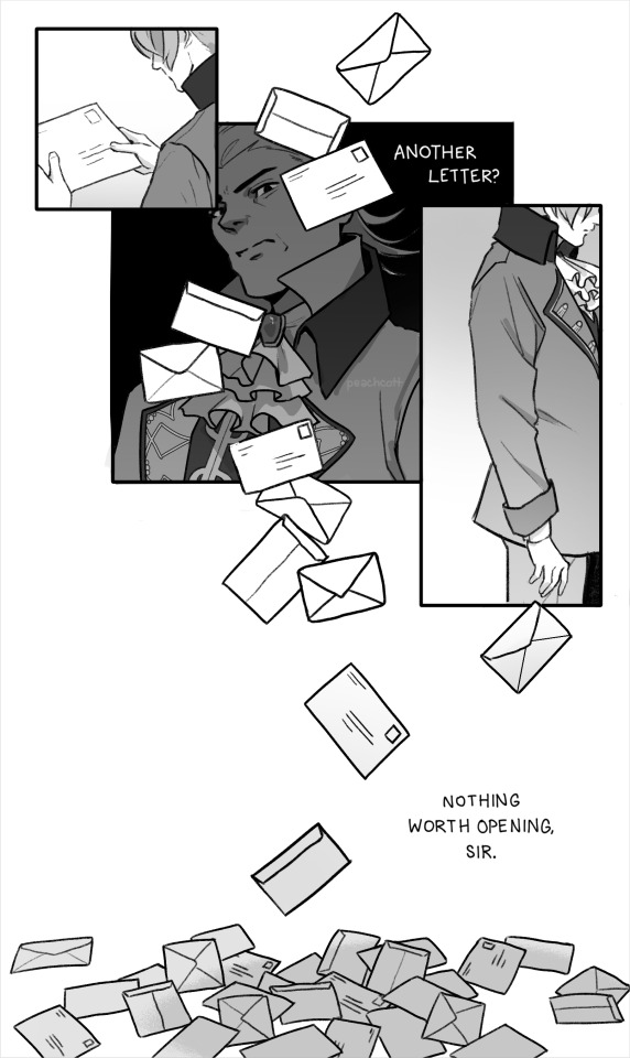
letters, unread. ✉
#mine#ace attorney fanart#phoenix wright#miles edgeworth#wrightworth#naruhodou ryuuichi#mitsurugi reiji#narumitsu#AUUU#i tried REALLY HARD to frame this well!!!#i wanted to practice panelling and composition with intent and storytelling#i think i did okay!!!#i wrote out that whole letter from phoenix by hand btw bc i wanted it to feel like his handwriting JKWHGJKLHD#and i wrote snippets of a faux newspaper article!
4K notes
·
View notes
Text
notes on the castle library, bards as historians, coven auditions, && the oldest magic on the boiling isles.
please know that the following are headcanons, specific to my portrayal of raine && how i imagine the bard coven working. i am in no way claiming any of this to be practical theories, although i have extrapolated the majority from canon, && if you see something that resonates with you, feel free to use it. DO NOT REBLOG THIS POST. this is an RP blog, and i don’t want it circulating && clogging my notifications.

in human culture, music is one of the most ancient forms of storytelling to exist ; it is often referred to as a universal language. music is everywhere, in every culture, && has been... forever basically. it stands to reason, therefore, that bard magic, which is the use of sound && music as a vessel for spell-casting, has also been around forever. we know that elemental magic is what ancient witches on the boiling isles first practiced, the oldest form of wild magic in existence. but music is just as old as the elements. bard magic IS wild magic, for all intents && purposes. instruments (including voice) are simply a way to channel the magic that exists all around you, in the same way palismen && glyphs do.
so what does that mean? it means that the earliest witches were all practicing bard magic, even if that’s not what it was called back then.
but let’s take a look at the actual definition of a bard: a poet, traditionally one reciting epics and associated with a particular oral tradition.
bards are storytellers. yes, they are rightfully associated with music, as ancient depictions of bards featured their recitations accompanied by a harp or a lyre or other similar instrument. but first && foremost, their role in society is to pass down stories — real, fictional, or mythological (something in between). bards in the demon realm embrace those traditions as part of their culture. being a bard is not just about playing an instrument and casting spells sonically— it’s about the music, it’s about the performance, it’s about entertaining an audience, it’s about telling a story, && it’s about sharing history.
to be accepted into the bard coven, you go through an audition process. the first round is spellcasting via playing an instrument (or singing), though it is not judged entirely on quality of music or accuracy, but rather the level of magic able to be generated. this is not a gatekeeping tactic, but rather a way to ensure that the witches who join are proficient enough to be able to cast a wide variety of spells once their other magic is sealed away. the second round is telling a story to the panel of moderators. the final round involves the recitation of a tale from ancient history, with musical accompaniment, && the recitation must result some sort of spell being cast. about 60% of candidates to make it to this stage perform pre-existing epics, 40% perform original pieces (raine performed a variation on their own piece, raine’s rhapsody). from the final applicant pool, less than 20% are accepted on average, though there is not a capped maximum.
upon entry into the coven, new bards continue their studies for 2-4 years depending on skill level && topics of interest — they may learn anything from music theory to new instruments to composition, but all with an emphasis on history. raine studied baroque music && instruments, including the harpsichord, timpani, viola, && lute. after the completion of their graduate studies, bards are expected to contribute to the traditions && culture through various means. they can choose to join an orchestra or smaller musical ensemble && perform concerts, they can pursue a solo career with recitals and/or recording for public release, or if they prefer not to pursue performance they can conduct, they can compose, or they can go into archiving && historical documentation. this is the path raine chose, && often goes hand-in-hand with or leads to a career in teaching.
because bards are storytellers, they are natural historians as well. therefore, it is safe to assume that at any library in the demon realm, a majority of the librarians are bards. the emperor’s castle contains the bardic library, which is the oldest collection of texts and magical history on the boiling isles. the library has existed since long before belos was in power, && when he established the coven system, the castle was actually constructed around it, so as to ensure containment of bardic practices within the nine magic tracks.
the library contains three levels of books, scrolls, recordings, sheet music, && ancient artifacts. the basement has soundproof practice && recording rooms, as well as a massive concert hall. there is a partial fourth floor, just below the bell tower, where the head witch of the coven resides. there is always music playing, or someone telling a story — this is not a library where silence is encouraged. because of how long bard magic && tradition has been around, much of the demon realm’s mythology (including that of the titans) deeply involves bards or witches whose usage of bard magic features heavily in their stories. the bard coven boasts a large pantheon of literary && mythological figureheads, many of whom are depicted in stained glass imagery that lines the first floor windows. bardic practices bear a strong resemblance to the early church ; ancient bards resisted persecution && prejudice based on magic type or ability or possession, preferring to be truly united under the titan, as demonkind. one of the practices that has persisted into the modern day is the bardic library as sanctuary — a sacred && peaceful place where anyone could seek refuge without fear of extradition of punishment. despite the fact that the emperor’s coven has since absorbed the bardic library into the castle, it is still accepted that the library is a place of sanctuary for those in need. only the head of the coven (or theoretically the emperor himself, however it has never come to that) has the power to circumvent a call for sanctuary, though the repercussions would be extreme regardless of the direness of the situation.
the library is a place of peace, of spirituality, && of respect for tradition, as well as care. to continue pulling the religious allegory thread, if the bard coven were to be compared to any sect of christianity, it would be the jesuits. but you do not need to be a bard, nor use bardic magic or practices, to enter the library, use it’s resources, or simply go to read, to learn, to listen to a story, or simply catch your breath after a long day. for most members of the bard coven, the library is like a second home — it certainly is for raine.
3 notes
·
View notes
Text
Alienated #1
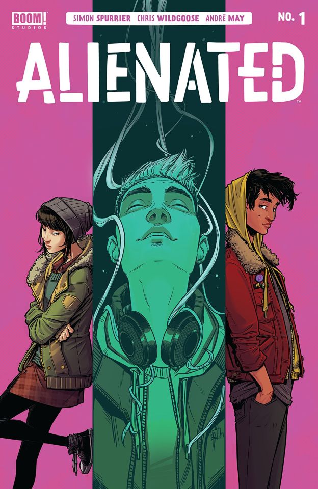
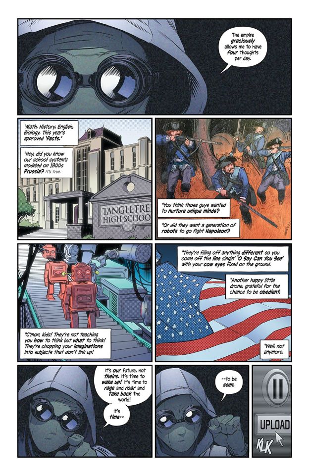
Alienated #1 Boom! Studios 2020 Created & Written by Simon Spurrier Created & Illustrated by Chris Wildgoose Coloured by André May Lettered by Jim Campbell Acclaimed writer Simon Spurrier and artist Chris Wildgoose present a subversive coming-of-age story about having all the power to change the world but the unready hands to truly wield it. Three teenagers, each an outcast in their own way, stumble upon an unearthly entity as it’s born. As they bond over this shared secret and the creature's incredible abilities, it becomes clear to the teenagers that their cute little pet is a superpredator in the making—and it’s in need of prey. Guided by the best intentions at first, the teens' decisions soon become corrupted by adolescent desires, small town jealousies, and internal rivalries, sending them into a catastrophic spiral of their own making. First things first Run don't walk, Corre, no comines, to your shop or simply call, message them or however you get your boos ASAP! There's a reason the first issue sold out before hitting shelves and by golly you don't want to miss this! This is the years hottest debut and it's well deserving of me saying that! Simon really manages to do something special here and in some weird way I feel it's a modern day science fiction take on Stand By Me. As odd as that sounds I hadn't quite realised it until I started writing this but it really does feel that way to me. The opening introduces us Samuel, Samantha and Samir oh let's not forget Leon too as they all head to school and how Leon affects each of their lives. It is poignant, powerful and completely true of being a high school student at given point in time in history and I know I feel that connection and it pretty damn near immediate. There shouldn't be a person alive, unless you were completely home schooled, that won't be able to relate to what is being portrayed here and it's powerful stuff. The way that this is being told is practically perfect in every way. The story & plot development that we see through how the book is structured, how the reader learns information and how we see the sequence of events unfolding is bloody effin brilliant! The character development is utterly sensational as we get such a good look at three very different kids and the world that each lives in. The pacing is superb as it takes us through the pages revealing the twists and turns along the way and it keeps the reader glued to the page. The way this all works together to create the ebb & flow for the books is a kind of lulls you into this amazing cacophony of the unexpected. The interiors here are so gorgeous. The linework is laid down with such aplomb and the varying weights being utilised to bring out this level ad quality of attention to detail is so gorgeously rendered. The way backgrounds are utilised throughout makes me happy! They do wonders in setting tone, mood and feel as well within the composition in the panels bring this depth perception, scale and overall sense of size and scope to the book. And the detail oh the detail and that extends to the colour work as well as Samir's pants more than adequately demonstrate. The utilisation of the page layouts and how we see the angles and perspective in the panels show us this really rising star's eye for storytelling. The creativity and imagination we see, especially that two pager and the last few I mean wow. The colours here are amazing and to see and sometimes they just a smidge past expectation and it works superbly that way. To see how the various hues and tones within any given colour are utilised to create the shading, highlights and shadow work is sublime. Look regardless of what I say or think or feel I think you should check this out and see for yourself how well this book is done. Maybe you'll see other connections, feelings or even comparisons I don't know, I hope you'll let us know I'd be interested in hearing that. For me this now blew me out of the water but they did it with the power of a single feather.
2 notes
·
View notes
Text
The Last Jedi Teaser Poster Anyalsis
Worth a Thousand Words
An Analysis of The Last Jedi Teaser Poster
Having just returned home from Star Wars Celebration: Orlando, I am filled with emotions, excitement and anticipation for the next installment of the Skywalker family saga. I was fortunately enough sit in the The Last Jedi panel, after 20 hours of sitting on a concrete floor, and an additional 10 hours before hand, queueing outside. However, that panel was worth every second of the wait time. And while most people will say the long anticipated teaser trailer stole the show, as an artist and illustrator, for me, the star of the show was the teaser poster, that was also revealed.

My jaw literally dropped as I stood in stunned silence as the crowd cheered around me. In fact, my line buddy, a member of the 501st by the name of Matt, repeatedly asked if I was okay as stood agape at the poster, amazed in it’s brilliant design as well as very clear and intentional use of visual story telling. I was flabbergasted at the bold choices made by Lucasfilm in this teaser poster, and I do believe that this is more of an indicator of the film’s story, rather than the trailer. This poster tells us, the viewer, everything we need to know about the direction of the upcoming movie, as well as helps dispel the rumors that The Last Jedi will be nothing more than a carbon clone of The Empire Strikes Back.
Before I go into detail I just want to say that it’s no secret that I ship reylo, however, for the purposes of this discussion, I am setting aside my implicit biases and talking about the facts stated in this poster, rather than fan speculation and conjecture.
First and foremost, what stood out to me is the simplicity in the poster’s design. We see only three characters, Rey, Luke and Kylo Ren. After doing extensive research, I found that this is the ONLY poster with just three characters. All previous Star Wars posters depict the main ensemble of cast members, as far back as 1979’s A New Hope. Never before has a Star Wars poster depicted only three members of the cast, and it is a clear statement that these three characters are the most important in relation to the story. There is also a not so subtle nod to Luke Skywalker in the original promotional theatrical poster for A New Hope. Both Rey and Luke are positioned in almost the same spacial area, in the same pose, with an ignited light saber raised up. For Luke, this symbolized his acceptance of his heroic journey, and the inherent power he possessed. For Rey, however, the meaning is vastly different. The sequel trilogy is very much about passing the torch from the old generation to the new, and unlike in The Force Awakens, Rey is present and accepting of that power, physically and metaphorically, in The Last Jedi, the second installment, rather than the first. Rey is our new hero, now heroine, embarking on her own heroine’s journey.

Now I know not many fans like Kylo Ren, and in fact they perceive him as a whiny emo cry baby, trying his best (and failing) to emulate Grandpa Vader, but his importance in the story cannot be overstated! He is the descendent of Darth Vader, and Leia Organa, and as much as most fans dislike him, that’s just simply a fact! The Star Wars trilogy movies are about the Skywalker family, and he is the new Skywalker of the trilogy. He is important to the cinematic universe as a whole, and characters from the The Force Awakens who easily had double the amount of screen time as him, such as Finn, were purposefully omitted from the poster in lieu of Kylo Ren. Regardless of how much fans like his character, he is going to play a very impactful role in the film to come. I know that he is not the most important character or the focal point of the poster, however, given the overly negative response he solicits from fans, I felt that it is important and necessary to make my position, and the poster’s narrative clear; even if you don’t like his character, Kylo Ren is a key player in the Skywalker family saga, and the cinematic universe as a whole.
When analyzing any piece of artwork, regardless of the the medium, the best jumping off point is the focal point. In The Last Jedi teaser poster, the viewer’s eye is immediately drawn to Rey, brought forth by the strong contrast of the blue halo of light emitting from her lightsaber. In terms of visual hierarchy and storytelling, she is the most important element to not only the poster, but in the movie it represents. Her position, in the lower center of the foreground suggests that she is the most grounded of the three characters, and thus the one that we, as the viewer, is meant to relate to the most. However, she is removed from both Luke and Kylo, positioned below them, which indicates that she was not a initially part of their conflict. And originally, she wasn’t. Rey was just a scavenger, abandoned by her parents on Jakku, struggling each day to survive. At that point, Rey didn’t know or care about the Force, Resistance or the First Order. Her primary goals and motivations were pure and simple, survival.
This coincides with the backstory indicated in not only The Force Awakens but also in Claudia Grey’s novel, Bloodline. There are no indication that either men knew who Rey was or her origins until she found BB-8 and became tangled in fight with the First Order. Luke and Kylo have a contentious and tumultuous past, filled with conflict and anger, as they stand on opposite sides of Rey’s light saber. This is a visual metaphor for the Force, and where Luke and Kylo represent the Light side, and Dark side respectively. Separating them is Rey, and the light of her saber. Although she is removed from their history, Rey has been flung into the foreground of the struggle between opposing sides of the Force. She is part of their present, and thus their future. In short, the resolution of Luke and Kylo’s conflict rests on Rey’s shoulders, both metaphorically and visually in the poster.
The struggle been Kylo Ren and Luke is an interesting and important to the story, but what is more important is what it represents! At its core, Star Wars is a fairy tail, and was intended to tell stories and teach children about the human condition and morality. Understanding every detail of Luke and Kylo’s past is less important as what their struggle represents. It is the timeless struggle of good vs. evil. If the timeline in Bloodline is to be trusted completely, and there are no extra twists and turns in the interum, Kylo Ren turned to the Dark side of the Force approximately six years prior, and has been unable to locate or confront Luke since his disappearance. What has changed in that time? Why will Kylo suddenly be able to locate his former master on Ahch-to? The answer is right in the poster, Rey!
This of course opens the doors to a whole new set of theories, such as a Force Bond, or Snoke obtains a copy of the map and so on. But there is practically no solid evidence to substantiate any of these claims, and at this point, they are pure conjecture.
I also find Rey’s placement in the middle quite interesting in the wider context of the history of the Force itself. One of the central themes Star Wars has always been finding balance. In the prequel trilogy we saw this through Anakin’s development from the heroic Jedi knight, to the Sith Lord, Darth Vader. And yes, Anakin is responsible for choosing his actions and must therefor accept the consequences of such actions, however, the biggest contributing factor to his descent into darkness was the Jedi Order and their absolute refusal to acquiesce to the basic human nature of love and attachment. In fact, one can argue that the Jedi Order is even more barbaric and cruel than the Sith. Companionship and attachment is one of the hallmarks of humanity, and by denying them, they are essentially denying being human. But the Jedi Order in both the prequel and and original trilogy was the personification of the Light side of the Force, while the Sith representing Darkness. Too much of either side’s influence causes the Force to spiral out of balance, and thus the galaxy is thrown into chaos again. This was demonstrated numerous times on both sides, such as Anakin’s betrayal, or the New Republic unknowingly creating the groundwork for the First Order.
In short, the brighter the light, the darker the shadow. Both light and dark must be present in order to achieve balance, and Rey’s placement, directly between the light and dark, makes her the fulcrum, or the point of equilibrium. In essence, it is Rey who is who is going to bring about that balance.
Another interesting observation I made was that all three characters, Luke, Rey and Kylo Ren are all colored in red. I cannot stress this enough, the psychology of color is important! Specific colors invoke particular and subconscious imagery and responses. Color theory and its use in marketing and illustration is a universal language. In fact, color tells just as much, if not more, of a story as the composition! There are two primary colors in the poster, red and blue. Red is the color of darkness, evil and passion. Blue on the other hand conveys serenity and tranquility. Why is Kylo’s lightsaber red? Not because he uses the Dark side of the Force, but because the color red has a strong visual impact and the human brain automatically associates red with darkness and power. It’s no coincidence that the color red is associated with the Sith, while blue is attributed to the Jedi! Everything you see on screen or in print was designed to create a specific response from the viewer and convey as much information as possible with no words.
Further more, in both The Force Awakens and the teaser trailer for The Last Jedi, it’s made quite clear that our heroes and villain are all experiencing a crisis of faith in the Force. Rey had her entire existence turned up on its head looking for guidance and training. Luke, it is suggested, fell into despair and solitude after the death of his acolytes because his teachings and philosophies failed to save his own nephew. Kylo, who just recently murdered his own father in hopes of committing himself entirely to the darkness, felt more weak and confused than ever before (this is said nearly word for work in The Force Awakens novelization). Because the color red is frequently associated with the dark side of the Force, and I find it quite compelling that all three figures are bathed in red. To me, this suggests that the trio are all going to be struggling with their inner demons, which often implies the temptation of the dark side. In fact, the only beacon of light and hope comes from Rey’s light saber. Some have argued that the light comes from Rey herself, but when you compare her upper body to her lower body, you can observe that just like the figures above her, Rey’s form is red, and the blue reflected in her face is emanating from the lightsaber, rather than Rey herself. This coincides with Rian Johnson’s choice to make the Episode VIII title font red, and maintains visual continuity. The most logical conclusion one can extrapolate is in The Last Jedi is going to delve into much deeper and darker overtones and story lines than it’s predecessors.
The positioning of Luke and Kylo in relation to each other is another aspect to this poster that I find intriguing. Luke and Kylo’s heads are above Rey; in this poster they are literally watching over her, and her choice to accept the Skywalker lightsaber. However, they are on opposing sides of the saber, as described above, representing the light and the dark. As a viewer, this design illustrates a sense of tension and conflict in both Luke and Kylo, but also in how they view Rey, and her choices. This image is clearly setting up the overtone that Rey has to struggle between choosing accepting either Luke or Kylo. In other words, it’s another iteration of the never ending struggle between the light and the dark.
Looking back in The Force Awakens for a moment, we remember that Kylo Ren extended the offer to teach Rey, “You need a teacher. I can show you the ways of the Force!” We all know the choice Rey makes at the end of the movie, but what about Luke? Will Luke even want to teach Rey after his previous failings at reviving the old Jedi Order? The following does begin to tread into the territory of conjecture and theorizing, however I do believe there is solid evidence to back up what I am about to speculate, or else I would have omitted it form this analysis. At The Last Jedi panel, Daisy Ridley, under the watchful eye and ear of Kathleen Kennedy, did reveal some very interesting information. We, as the audience were MEANT to know this information prior to viewing the poster, or else the CEO of Lucasfilm would never have permitted that information be divulged (like the Rogue One mishap at Celebration Europe 2016). Summarized, Daisy stated that Rey indeed does meet her hero, Luke Skywalker, and like in real life, how we (Rey) envision our heroes does not always coincide with the reality of our heroes. This very clearly sets up the idea that Rey and Luke are going to have a less than harmonious relationship in The Last Jedi. This is also backed up by some previous leaks and spoilers from MakingStarWars.net, however until we know the veracity of those rumors, I do not treat them as fact, like I do the things said directly from the people at Lucasfilm. The statements from Daisy Ridley at the panel, however, were purposeful in sparking ideas and igniting the flame of this idea that Luke and Rey will not have a peaceful mentor/mentee relationship in the same light as Yoda and Luke’s relationship.

Mentorship has always been another key themes throughout the Star Wars saga, from Anakin’s tutelage under Obi-Wan Kenobi and Qui-Gon Jinn, to Luke studying with Yoda. There is every indication that those reoccurring themes will continue, but in a different fashion. It’s been made pretty clear that Rey is going to struggle with Luke’s training, and we already know of Kylo Ren’s unrelenting conflict within himself, stemming from the teachings of Supreme Leader Snoke. Snoke ordered Kylo to kill his own father, an act that he did follow through with, but the novelization has proven that that act made him more conflicted than ever before. Where it should have brought him strength, instead he found weakness and doubt.
And all of this ties back to Kylo Ren’s original offer to Rey to teach her. It is my belief, based on the evidence above, that Rey is going to struggle between the teachings of Kylo Ren and Luke. You may ask “how will Rey learn from Kylo? They aren’t on the same planet?” Well even that is partially answered in Episode VII, and confirmed in tweets made by Pablo Hidalgo. Pablo definitively said that Rey learned so much so quickly at Starkiller Base because she extracted the information from Kylo Ren’s mind during the infamous interrogation scene. So in a way, Kylo has already become her first mentor.
Both the Light and the Dark are justified in their beliefs and teachings. Adam Driver previously stated in an interview that Kylo Ren vehemently believes he is and was justified in his actions, and it’s quite clear that Luke fully intended to disappear into the galaxy as a frizzled old hermit. What will happen if Luke does not agree to initially train Rey? She has all of these newly awakens powers, and no way to control them. Just like Kylo stated, she really does need a teacher. But which teacher? The Light or the Dark? Or, at what this poster suggests, something in the middle!
By placing both of Rey’s mentors above her, two Force users who are much more skilled and honed than she is, it indicates that both mentors are going to be fighting within Rey’s psyche. Luke will be teaching her one method, while Kylo and his Dark side influence will be pulling Rey in the opposite direction. This is wiring and character growth done right! The setting and characters have been established in the first film of the sequel trilogy, while the second installment places challenges and obstacles in their path. Without those challenges, characters will not grow or develop. Even more evidence for this is Rian Johnson’s prior statements that the characters in The Last Jedi are going to be tested and pushed beyond their limits. What would challenge Rey more than knowing she is can identify and relate to the person she hates the most, Kylo Ren? That would force the characters into a position where they have no choice but to adapt and evolve into something that spans beyond the juxtaposition of the Light and Dark side of the Force.
In other words, Grey Jedi!
Most likely it won’t be in so many words, but the concept behind it will remain the same. A world of Force users that are not bound by the narrow dogmatic codes of the Jedi or Sith! And while I do find both of their ideologies absolutely fascinating an an integral part of the Star Wars canonical universe, by constricting Force sensitives to Jedi/Sith, Good/Evil, Light/Dark is extremely limiting and grossly inhibits the idea of character depth, subtlety, progression and nuance. Maz Kanata and Ahsoka Tano are prime examples of Force sensitive individuals in the Star Wars universe who are canon and are Force sensitive, but do not fall into the dichotomy of Jedi and Sith. There has never been a main hero character in the films (which are the primary story telling means in the entire franchise that reaches the most viewers and has the biggest impact on mainstream pop culture). Luke Skywalker was seen as universal good, the epitome of the Joseph Campbell’s hero, who embarks on heroic journey on behalf of goodness and justice. The passing of the torch from Luke to Rey indicates a paradigm shift in the understanding of the Force for not only the characters but the viewers and fans as well.
The light saber in the poster is another piece of evidence for this! There is no partition between red (Darkness) and blue (Light). Instead there is a gradient emanating from both ends of the lightsaber, further emphasizing that this story will not be so simply as “kill the monster, save the world” but instead of dimensionality and gradation. There is middle ground to be found in the Force between the Light and the Dark, and Rey is the key to unlocking it. Or as Rey quite simply puts it in the trailer “balance.”
********
On a personal side note, I do believe this teaser poster does further add fuel to the Reylo fire, and it makes be believe even more fervently that Reylo will eventually become canon in some iteration, but I wanted to keep my personal biases and theories out of this analysis. If anyone enjoyed reading this and would like to read my views on The Last Jedi teaser trailer and how it relates to Reylo, I’d be more than happy to comply. But I wanted and needed to get this poster off my chest first. My mind has been boiling over, wanted to put these thoughts down in some sort of organized fashion because as someone who is fluent in the language of illustrations as a medium for visual story telling, this poster blew my mind. I stood just flabbergasted at how blatantly the story implications were, but when I asked people about their thoughts they all came to different conclusions. And yes, that is the point of this poster, to get people talking and theorizing about what it all means, however visual story telling generally complies with a set of rules that are universally, albeit often subconsciously, understood by the viewer.
Whew! I wrote this entire analysis in a single sitting. I apologize if there are any immediate grammatical errors, but I proof read this a number of times, so I am pretty sure that it’s correct. EDIT: Thank you to @sleemo who helped me fix the grammatical errors in this!
487 notes
·
View notes
Photo
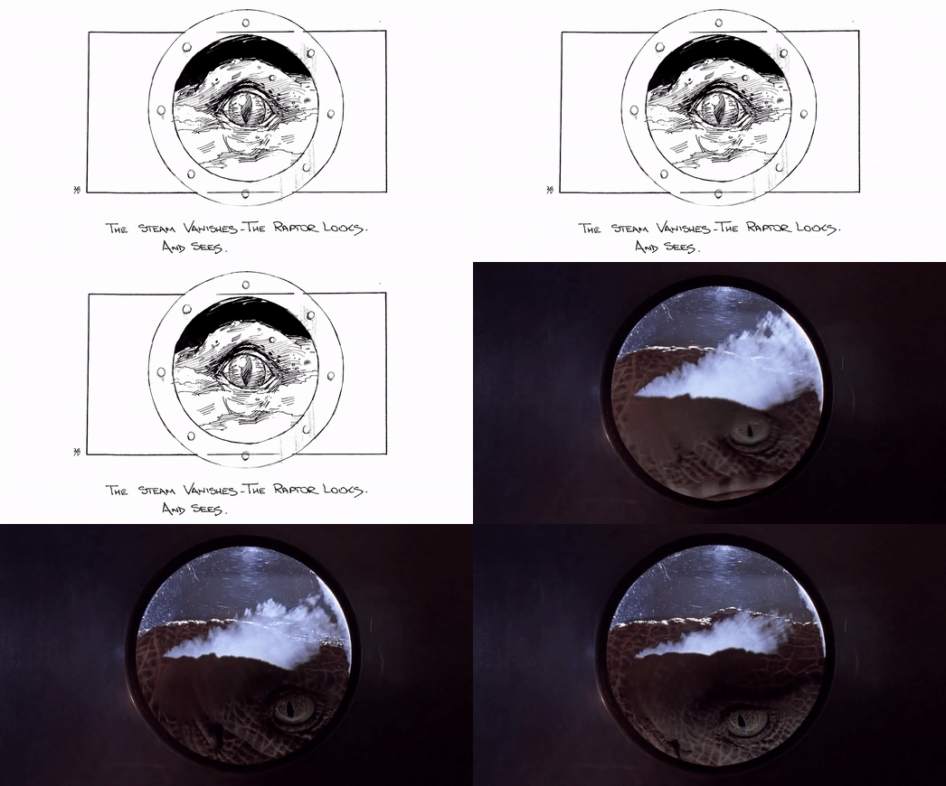
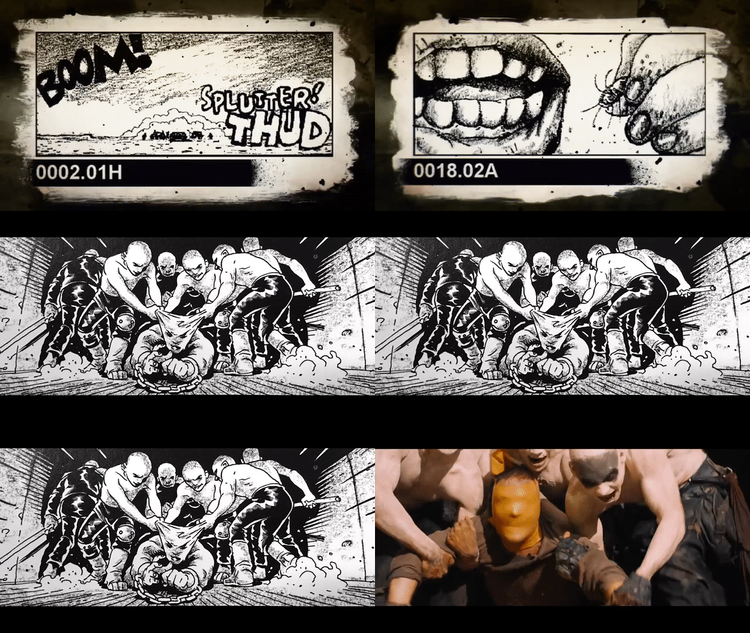
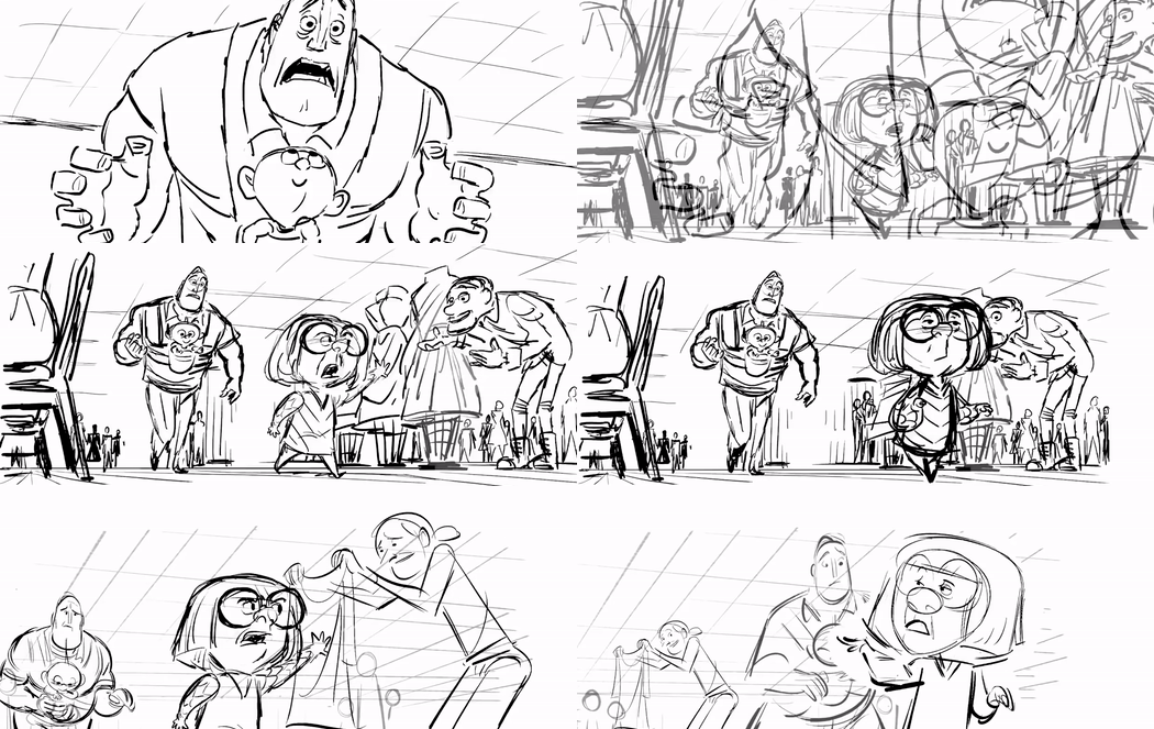
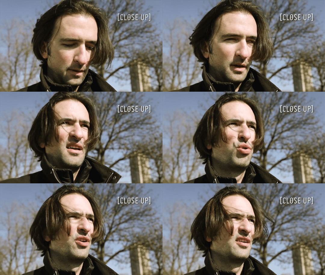
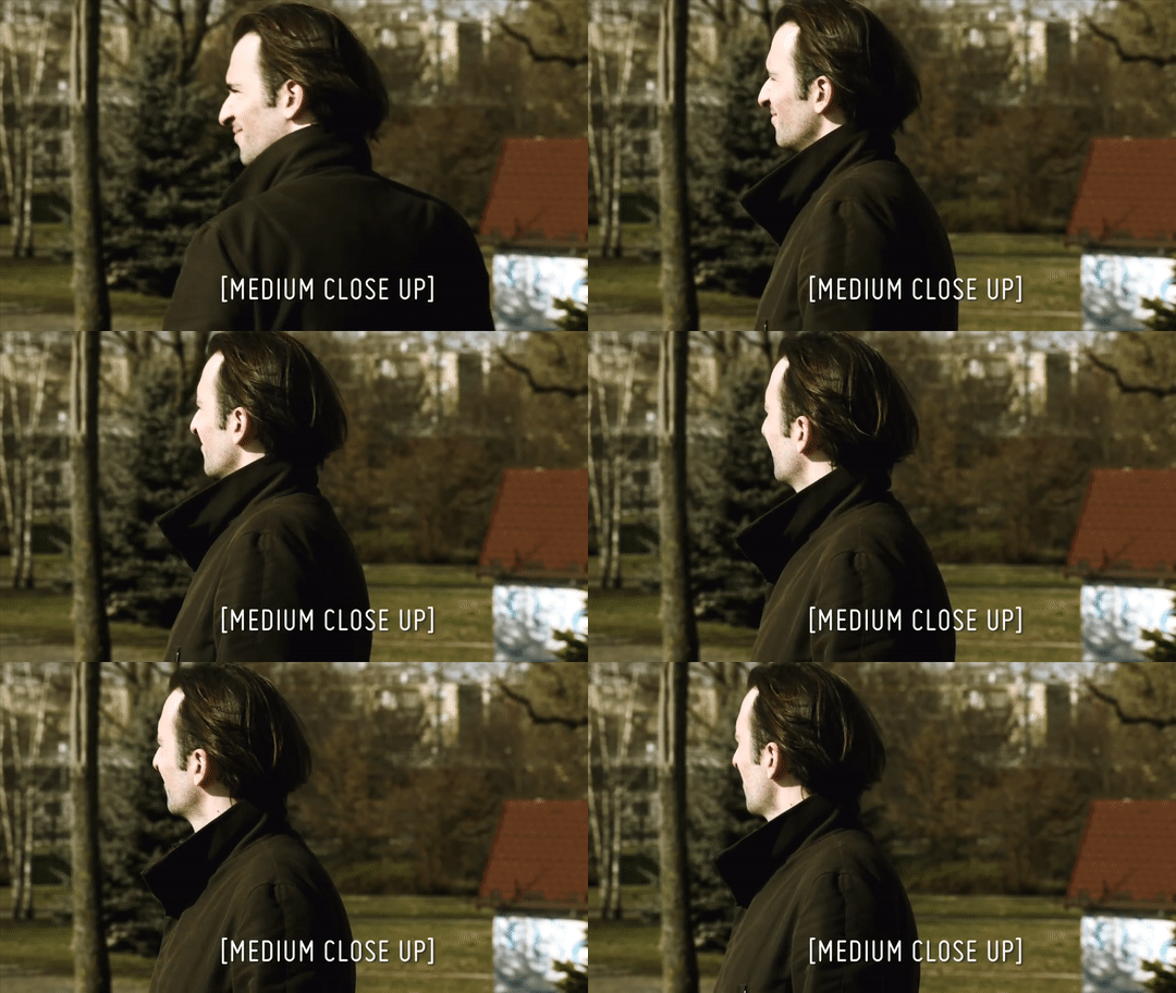
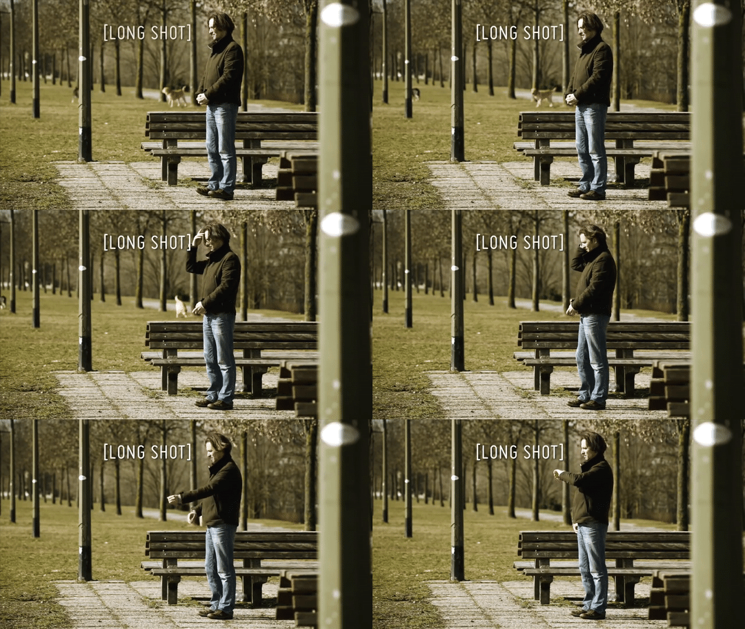
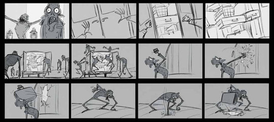
Storyboarding Masterclass: Industry Practice (2/3) In this post, I’m discussing the various storyboarding practices found in the industry, exploring the different types and uses for storyboards, and how different types of shots can impact visual storytelling.
Types of Storyboards There are several types of storyboards, but they always follow the same structure: a collected series of single pictures, which tell the story of the project. There are two main types of board, and within these two specifications, there are many options and subcategories.
Firstly, there is a presentation or pitching board. These are used for advertising and commercial projects, to achieve funding from potential investors to create the animation. These are usually clean, polished and seductive: giving a good idea of the look and feel of the project, acting as proof of concept and usually illustrated by a panel per scene.
Lastly, there is the shooting board: these are less polished illustrated sequences that tell the story ready for animators and filmmakers to develop upon. The focus is less on seduction and polish and more on clearly telling a story through visuals. Within this, there is a range of storyboard uses:
TV Series These storyboards are always clean, on-model and are often used as layout and animation keyframes in 2D animation. These typically include a detailed breakdown of action and character performance, as well as the beginning and end of each scene. Instead of working across artists like features, there is usually only one board artist per episode.
Animated Features These are the storyboards we most likely think of: rough, expressive and highly detailed action. These storyboards detail the camera and character performance with less focus and emphasis on being perfect, polished illustrations or having the character remain ‘on model’. Panels must be ‘read’ quickly, and artists do not have to stick to a particular ‘house style’ as they do with tv series storyboards: artists use their own visual style and are cast to their own personal strengths. These focus on character acting and composition, not worrying about staying on model and generally possessing a loose drawing style.
Finally, live action films are also storyboarded. These are normally used as a tool to plan out complex action and FX sequences before spending money on expensive visual effects: a tool to communicate what the director wants from a specific shot.
To put it simply, storyboards are used because drawings are cheap. This allows the director and artists to visualise a scene before spending the time and money to create visual effects and the final animation. Throughout pre-production, there are frequent stages to the script. It’s a constantly evolving process, and storyboarding helps iron out any confusions or ideas in the script.
Elements of a Storyboard When structuring our narrative (meaning deciding on the sequence of panels), I need to consider what information I want to give to the viewer at what point in time, and what emotion do I want the audience to feel? Helen established that the same images, when cut in a different sequence, can create suspense, interest, humour etc. What we leave out of the frame is actually as important as what we show.
The basic units of visual storytelling in film are: a single panel, a shot, a sequence and an act (a structural element formed by a group of sequences within a longer narrative). A beat board is a shorter version of a storyboard, covering the narrative ‘beats’ or steps of a single sequence or even entire film.
Cutting the Fat Every shot has to serve a purpose: cutting is used to shift the audience’s focus to important aspects of the story. It’s important to make sure that the viewer will be able to follow ‘the flow of the shots’ and scenes without getting confused or taken out of the film for experimental, exciting shot composition. In traditional films and animations, the focus has to be on storytelling.
With these types of storyboards, drawings can be loose: making use of shading or spot colours only to separate out background and foreground, and most importantly, to direct the eye to the most important information and focal point of the shot.
During the session, we were also reminded of core compositional ideas and principles: such as the rule of thirds. This is an extremely common framing tool, as artists place the focal point where imaginary lines intersect - this helps give the sequence a sense of focus and placement. This can be seen in almost every film, episode, and visual advertisement.
Storyboarding also allows us to exercise a key principle of animation: staging. How we stage a shot can drastically impact how the audience resonates with a specific scene. This requires us to make a choice about where to ‘put the camera’ and what angle the viewer will see the shot from. In order to do this, the first thing we need to establish is our message of the shot: what are we trying to say? This is our compass to follow as we try to figure out the most effective way to present your idea. We need to consider what the message is, and what is the best way to convey this message.
In this, storyboard artists often explore a range of potential compositions and angles before deciding on a final shot to develop into a more refined story illustration. Animators and directors then use this as a starting point.
Finally, we explored the ideas of shot types in a storyboard: and how we can vary these to evoke different emotions and responses in the viewer. Close-ups, medium, and wide shots create visual rhythm and help to convey the atmosphere and emotional content of a story. Close-ups, in particular, are usually used to draw attention to a detail that might otherwise go overlooked, or to demonstrate an emotional reaction in a character: focusing on small features that convey a specific feeling or emotion.
In comparison, wide shots can establish our character and situation, without the need for lots of lengthy explanations or narrative exposition. An up-shot can make a character look threatening, whilst a down-shot (the audience is looking down at the character) gives the impression of isolation, weakness and sadness. There are several types of shots and angles, and should only be used with good reason. These shots can add variety and drama to the sequence, and make a shot more visually interesting to the audience.
Finally, Helen presented us with a series of tips and ‘pearls of wisdom’ from herself and her team at Locksmith animations. This was the final part of the lecture, and represents a series of tips from industry professionals that I wanted to include here:
‘Make sure you know the intention behind each scene. Work out how best to serve the story. To ground your ideas, connect them to your personal experience.’
‘Don’t wing it. Make it a plan. Do research. Set yourself little rules and stick to them.’
‘Don’t go for cool compositions and extreme perspective. Keep it clear and simple. Immerse the audience. They should forget they’re looking at a cartoon, not stop and say ‘wow, cool shot’.
‘Be open to changes. Get the first pass out of your system, then look again and see how you can make your board better / clearer / more interesting. Learn to draw loose but clear.’
And never forget to have fun.’
With this, I’ve been able to cover the main lecture points of the workshop. Here, I’ve been able to delve into these ideas in more detail and will apply this new understanding to my storyboarding practice moving forward in the course. Helen was able to discuss the fundamentals of the art form, and her own experience when working in the industry. This was an invaluable experience, and although my initial storyboard was ultimately too complex, I found some real value in this workshop.
Next, I’m going to explore my initial response to the task set in this workshop, exploring the use of alternative shots and angles for effect in my mystery box sequence.
References
Introduction to Storyboarding. Rocket Jump Film School. https://www.youtube.com/watch?v=RQsvhq28sOI
Basic Shot Types. Little Film School. https://www.youtube.com/watch?v=laU2MI6X48I
The Incredibles 2 - Deleted Scene Clip “Edna’s Fashion Show”. https://www.youtube.com/watch?v=bUWZzy2h6Jo&t=28s
Early Storyboards and Beatboards for Hotel Transylvania by Luc Desmarcelier. http://livlily.blogspot.com/2012/12/hotel-transylvania-2012-storyboards.html
1 note
·
View note
Photo

Preamble:
The stories collected in the first five volumes of Hellboy, ranging from Seed of Destruction to Conqueror Worm, featured a Hellboy working with the Bureau for Paranormal Research & Defense. Although we were told he had taken breaks from the organization, it was where his family was--in Trevor Bruttenholm--and what he considered home. The main narrative took that away from him, killing his adoptive father and alienating him from a society that once accepted him and his kind. Coupled with questions about his true nature and building his own destiny, he quit the BPRD.
Hollow Earth was born out of a desire of Mike Mignola’s to expand the universe beyond just Hellboy. The first five volumes of Hellboy served largely as a first act for the broader narrative and Hollow Earth kind of began an interlude. Along with the concurrent Hellboy: The Third Wish series, the full direction for the next act didn’t really materialize until Plague of Frogs. From Third Wish to The Island, there was definitely a feel of experimentation going on to find out what worked both in terms of style and narrative.
Which in itself was somewhat interesting, since it fell over Hellboy’s 10th anniversary and the release of the first Guillermo del Toro directed film. This interlude included finding out how BPRD could work on its own, collecting the humour series Hellboy Junior, and presenting a variety of voices telling Hellboy and BPRD stories in the Hellboy: Weird Tales series and a number of BPRD one-shots that were collected in The Soul of Venice & Other Stories. Like when Mignola was starting out with Seed of Destruction, a look and tone wasn’t set fully in stone yet, but at least there was a template from the mother Hellboy series.
In many ways, Hollow Earth was also the sequel and epilogue to Conqueror Worm, still working within Mignola’s own framework of storytelling, and, while bringing in new talent for story and art, still adhered to the bits and pieces of the previous story. It continued on the narrative of Liz Sherman, Kate Corrigan, Abe Sapien, and Roger the Homunculus from directly where Conqueror Worm left off and is kind of unique in that regard of this period. Where Hellboy became a bit more esoteric in The Third Wish and The Island, the BPRD became the torchbearer for the main narrative established in Seed of Destruction.

BPRD: Hollow Earth & Other Stories: “Hollow Earth”
Story: Mike Mignola, Christopher Golden, Tom Sniegoski | Pencils: Ryan Sook | Inks: Ryan Sook & Curtis Arnold | Colours: Dave Stewart | Letters: Clem Robins
Originally published by Dark Horse in BPRD: Hollow Earth #1-3 | January - June 2002
Collected in BPRD - Volume 1: Hollow Earth & Other Stories | BPRD: Plague of Frogs - Volume 1
Plot Summary:
As the BPRD deal with Hellboy quitting, Abe receives a cry for help from Liz deep in the Ural Mountains. As he and the BPRD go to investigate, they find the remnants of an ancient civilization that have kidnapped Liz’s spirit to power their infernal machines.
Reading Notes:
(Note: Pagination is in reference to the story itself and is not indicative of anything in the issues or collections.)

pg. 1 - I love the establishing shots here for the mountains and the temple atop it.

pg. 2 - Relocating Agartha to the Urals is an interesting choice. Traditionally it’s an underground kingdom, basically being the “hollow earth” of the title. Helena Blavatsky and the Theosophist Society relocated it themselves to the Himalayas, probably conflating it with ideas of Shambala, but it was still an underground mystical place and the home of the Secret Masters. Moving it to Russia kind of combines Blavatsky’s heritage and the use of Russian folklore in prominence in Hellboy.

pg. 3 - Ryan Sook was definitely a good choice to launch the first BPRD book, maintaining a style similar to Mike Mignola’s own, making this feel visually like an extension from the Hellboy series.
pg. 4 - The mentions of other cases, throwaway events that don’t get followed up on, are an interesting touch. They give a little broader idea of what’s going on in the world. Kind of makes you wonder what the average BPRD agent is doing every day.
pg. 6-7 - Pretty much a word for word flashback of Hellboy’s quitting.

pg. 8 - Great design for Johann Kraus.
Also, I think this is the most amount of character development we’ve seen from Tom Manning. He’s not just an exposition-delivering cipher, we actually get to see a person there.

pg. 9 - These panels remind me more of Kevin Nowlan or P. Craig Russell than specifically Mignola, but it seems to show a similar set of influences on Sook.
Liz Sherman exploring how to control her powers through meditation and practice is a welcome development.

pg. 10/11 - “Heca Emem-Ra. Black Goddess. Neb Ogeroth.” -- I think something is being seeded here as we get a name shift for Hecate and elaboration on Thoth within the Hellboy mythology.
pg. 13 - Love the explanation of Johann Kraus’ situation. The design and colour for the flashback is also very nice.

pg. 15 - I love the character work that Mignola, Golden, and Sniegoski are doing here, pretty much with all of the characters. While there are definitely moments of introspection in Hellboy proper, the mothership tends towards a certain kind of stoicism and silence. The characters discussing how they feel and their motivations give a different, deeper feel unique to BPRD. It also serves as an excellent introduction, or re-introduction, to the characters.

pg. 16 - Great page design and sequence overall. The ghostly appearance of Liz and cry for help is great.

pg. 19 - Great reaction shot.

pg. 21 - There’s an interesting bit of plot reiteration here as the BPRD find Liz in a state not dissimilar to what happened to her in Wake the Devil & Almost Colossus that led to her leaving the BPRD on this excursion in the first place.

pg. 22 - Like the Kirby-esque design to creatures.

pg. 24 - The opening to the underground and its seal is an interesting development, putting the temple high in the mountains more into perspective when it comes to Agartha.

pg. 26 - There’s an interesting concept in this dead creature’s explanation of his society and the divergence of the two working classes. In Western occult traditions and magick there’s the concept of the left-hand and right-hand paths. Some will break it down as simply as black and white magic, respectively, with the former being typified as embracing taboos and the latter embracing some sort of purification, sometimes broken down as “evil” and “good”. Personally, I think that’s bunk. There’s just magick and the will and intent of the magician defining their morality and ethos, but this dichotomy still exists in many practitioners.

pg. 26 - This is probably the funniest sequence in the entire series.
pg. 29-30 - Johann’s fascination with Hellboy is interesting, especially as it allows Abe and Roger the opportunity to explain what they thought of him and how his quitting the BPRD is affecting them.

pg. 30-32 - Like the flashback earlier for Johann’s origin, I love the colour washes Dave Stewart is using to separate this out from the main narrative. It gives it a unique visual flair.
Also, reinforcing Hellboy as this massive force for good, for the best of humanity and understanding, is pretty beautiful. As is Sook’s Hellboy.

pg. 34 - This ambush just looks stunning. Great framing and angle.

pg. 37 - The discovery of this “junkyard” is fascinating in how it reveals the ancient civilization. The designs of the constructs themselves are pretty neat, reminding me a bit of machinery designs from old black and white sci-fi movie serials.

Also, further explanation of what happened to the Hyperboreans.

And of course there’s bloody Nazis down here.

pg. 39 - Love this scene checking back in on Kate and the other BPRD agents on the helicopter. Not really sure why she wouldn’t have made a base camp in or around Agartha itself. I would think it would have been warmer. Maybe a fear of those creatures rising up and attacking again?

pg. 41 - Again just love the composition Sook is delivering here. It also gives a massive scale to just how big this underground civilization’s city happens to be.

pg. 42 - It doesn’t translate as well without chapter breaks, but the character cliffhangers for each issue were very well done.

pg. 43-45 - The central battery in which Liz’s life force is entrapped has a very interesting design. Breaking down its appearance across multiple panels leading to a sign of Liz within builds a very nice amount of tension.

pg. 45-47 - Again love how Sook, Arnold, and Stewart approach these flashbacks visually.
And Hellboy’s reaction to Liz is extremely heartwarming. He treats her just like a scared and frightened little girl, instead of the monster that the rest of the BPRD are even if unintentionally. It also establishes the little sister feel that we get from the comics in regards to the Hellboy/Liz relationship. It’s very sweet.

pg. 48-49 - Short but great action sequence.
pg. 49 - There’s also an interesting character quirk we see hinted at here for Roger. His personality seems malleable. It seems like the man of clay can be moulded by the behaviour of those around him. It kind of makes you wonder, was his altruism in Almost Colossus and Conqueror Worm innate or were they reflections of Hellboy? I’d want to say a little of both, given his rejection of his monstrous brother even without outside stimuli, but it makes you question how impressionable he might be.

pg. 50 - The little things like the slave revolt itself makes you wonder what happened here. It doesn’t necessarily need to be answered, but it gives another avenue for a potential story somewhere down the line to fill in some details.
pg. 51-53 - Finding what happened to Liz nicely steels Abe, Johann, and Roger’s resolve. Also, another impending hero moment for Roger.

pg. 55 - The King of Fear definitely has an interesting design, playing off bits we’ve seen of the Hyperboreans, the monks above in Agartha, and the other slave creatures, but somehow bigger and seemingly more intelligent than them.
pg. 56 - Abe, Roger, and Johann hearing this speech unintelligibly in the creatures’ natural language is a nice touch. Even though we got it translated for sake of character and plot advancement, seeing what the protagonists hear adds the understanding that they don’t know what’s’ ultimately going on with the guy.
Also, it’s neat that it ties back in to whatever the language is that Mignola & Co. have been using throughout the broader Hellboy work.

pg. 57 - This scene is just a perfect storm of visual storytelling. Great work from Sook, Arnold, Stewart, and Brosseau.

pg. 60 - Booty.
pg. 60-63 - Explosive results from Roger enveloping all of the stored energy and driving it into the ground. I love that the King of Fear gets his hopes up when he sees the Hyperboreans’ old war machines start gaining power, only to be sorely disappointed.

pg. 64 - Nice establishing shot, and increase of snow on the helicopter.

pg. 65 - Probably the second funniest scene in this story. Both in regards to the lack of pants and in Roger wanting a sheep.

pg. 66 - Standing around at the end discussing what happened and what’s going to happen is one of the best stylistic links to the rest of the Hellboy series. Also good to see Kate, Abe, Liz, Roger, and Johann together, partially defining what may be the core team as we branch off into this new direction.
Final Thoughts:
Hollow Earth was kind of in a weird place. As I said above a concrete direction wasn’t really set for what BPRD would become, so this serves as a kind of bridge from one act to the next. Christopher Golden was a great choice for the series, not just for his (and Tom Sniegoski’s) storytelling ability, but because he’d already written a pair of Hellboy prose novels and edited a short story collection at this point.
As such, Hollow Earth carries on much of the same tone and style as the earlier Hellboy stories, even as it ushers the characters on to their own possible path. I also love that it brings Liz Sherman back front and centre and begins to flesh out some of the background of our main BPRD protagonists.

d. emerson eddy is actually kind of terrified of caves. While they’re neat to explore in fiction and through the lens of any of the archaeology expedition television shows, he doesn’t really like going to them physically himself.
#Give 'em Hellboy#Hellboy#BPRD#Hollow Earth & Other Stories#Mike Mignola#Christopher Golden#Tom Sniegoski#Ryan Sook#RaisingHellboy#22
0 notes