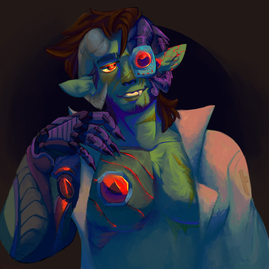
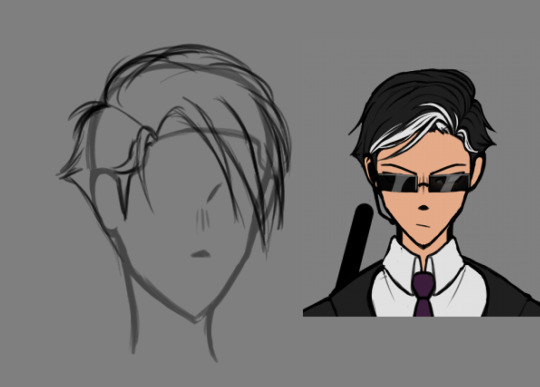
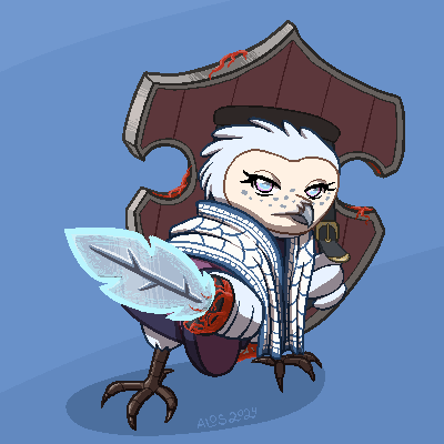
#i want to redraw this later and render it
Text

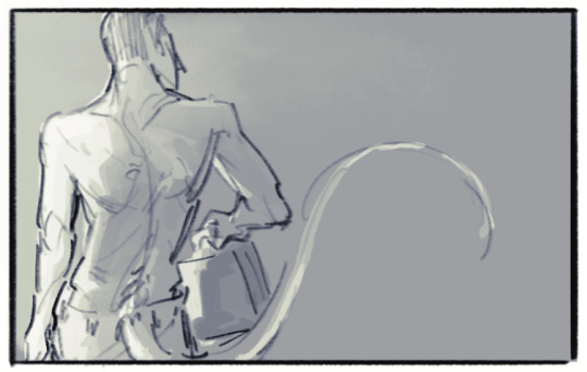
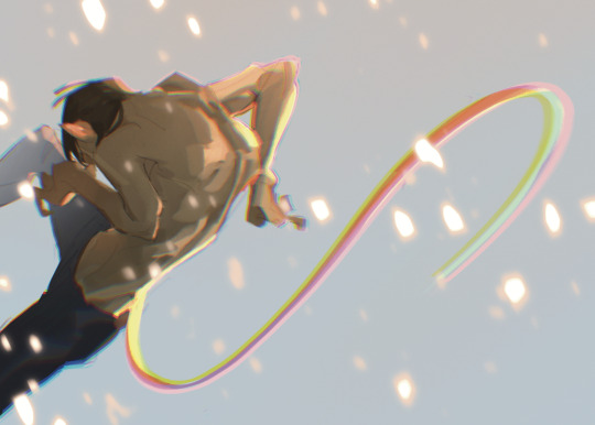
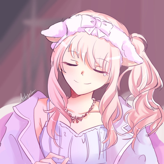
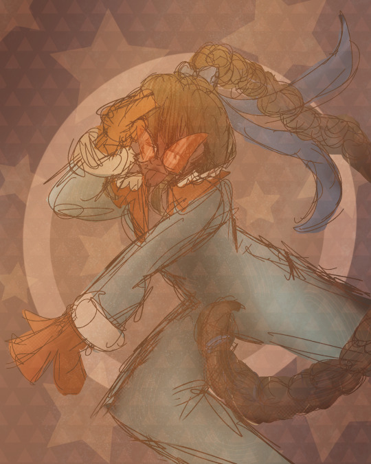
The last ask made me want to sketch out the aftons together with some hot cocoa
#i want to redraw this later and render it#🥺babs#my art#fnaf#william afton#five nights at freddy's#digital art#purple guy#clara afton#mr and mrs afton#the aftons#spoiledmilks art
100 notes
·
View notes
Text


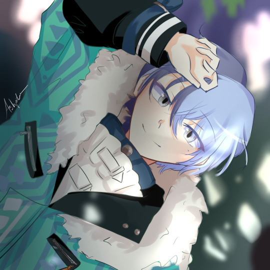
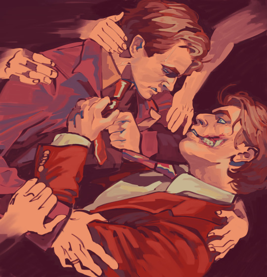
FINALLY T_T IM SORRY IT TOOK ME SO LONG BUT I WAS STRUNGLING WITH LINEART SO MUCH. I propably should work more on background but w/e i just wanted to finish it asap. Fake hook up scene from chapter 18 "Of Saints and Sinners" by @morningstarwrites I changed it little bit, cuz it literally started as one panel (from the middle of this comic xDD) I may redraw only this one panel full render cuz i just love Lucifer expression on this one :3. Anyway enjoy my suffering <3 I have also a cute little fanart from the 22 chapter but i don't wanna spam too much ill post it little bit later :3
636 notes
·
View notes
Text
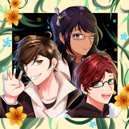
Hermitaday Day #14 - Doc
Heh I think you can tell when I hit a favorite hermit because how much it gets rendered lmao. Definitely not an ethogirl and doc fan no siree /sarc.
But no I just wanted to spend a little bit more on Doc's day because it'll help later with finalizing his design in the headcanons. This is pretty close to what it'll look like. Also wanted to test out a theory of lessening details in shadows by combining values together, plus fully rendering metal. Also also this is technically a redraw from like 2022.
Original and Variations down yonder!
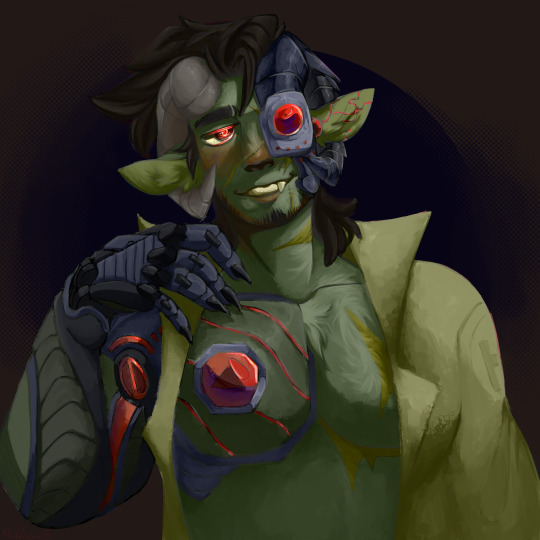
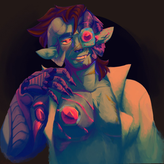
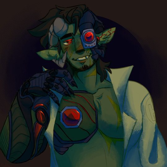

I really like the first variation because it's just the flats over the finished piece. It works really well by itself but I'm a sucker for colors and hue shifts so the final product will always reflect that. The second one is just me messing with tonal curves then it goes pre-rendered shades and then flats.
Side note: If anyone cares I've gone through the majority of the star wars movies and I'm now on to Etho's s2 of his lets play series. I'm currently on episode 122 and or 17.
Another side note: Yes the little lines on his right pec his inspired from recks au Etho. If anyone was wondering. I just really like how that looks.
Also please let me know if you guys enjoy these more rendered pieces or lineart heavy. I like both but rendered takes like 2-3 days if I'm super busy where the lineart ones I can get done closer to a day.
256 notes
·
View notes
Note
Tip/advice for drawing fast?
Of course! Let's see:
Practice speed drawing studies until you have the kind of speed you are happy with! It'll help you synthesize shapes and train your hands to do them in as few strokes as possible. It will also help you understand anatomy (for example) well enough that you can simplify it on the spot.
Collect references in advance!!! As in, one day earlier at least, so you can start the day with a general idea of how the picture will look like and without tiring yourself looking for references. Choice fatigue is a thing and finding references will take a lot of it.
I use PureRef to collect references for commissions and about any other thing i want to draw or I have ideas for:

Zoom out. In the beginning and at the end of every stage (coloring, render). It'll help you get the areas of the drawing that can be solved with one stroke solved in one stroke, instead of multiple because you chose a small brush.

Use a big brush for a start. It'll force you to not focus on details. Add details gradually with smaller brushes.
Start with rough shapes rather than bit by bit. If you are drawing a character's full body, you should have the general structure in 10 seconds (general structure can look like two balls and a box, depends on what helps you best)

Redraw instead of fix. If you are stuck, it's probably better to redraw a piece of your picture or even the whole thing.
Don't do lineart. Use the sketch and refine it instead. Of course, this might depend on your style, but keep the choice in mind.

If you are going to render, exclude as many 'flat details' as possible. Body patterns, seams, even wrinkles (occasionally) will make the render more complex, when you can add them over the rendered piece afterwards and take less time.
When you start to render, begin with the borders of the figure. It'll help with blocking and by the time it's finished, it'll help you judge just how much you DO want to render
It's generally not got to only draw one thing unless it's very much by choice, but if you draw something similar very often (let's say, a bodyshot looking 3/4) you will get faster at it. Acknowledge your strengths. Even when branching out, you might want to start by diverging just a bit from it rather than a composition you are not familiar with at all

You might want to start pictures in monochrome and with a big brush instead of using base colors. This might or might not help you work faster depending on if you like refining art.

Schedule your art. Specially commissions. Knowing WHAT you will be drawing every day will help you get in the mind space to get it done and in how long you should.

That's what comes to mind! I might have more I'll add later
138 notes
·
View notes
Text
LEGO MONKIE KID SEASON 5 SPOILERS BELOW CUT (SCREENSHOT REDRAW)
Yooo so this scene? This scene was fucking wild oh my god I haD to redraw it- expect more scene redraws and possible a rework of this later, I rlly want to fully render this at some point but it'll take some time (small ramble about the season below LMAO)

OK SO THIS SEASON? HOLY SHIT EVERYONE KNOCKED IT OUT OF THE PARK. From the writing to the voice acting??? And the new animation team did AMAZING with it being their first season and I cant wait to see them improve next seasons- overall hella enjoyable, I was physically dead by the end of the season bc of how intense it was but damn it was sO good...SOO good (if for some reason ur looking at this and havent watched the season and/or youve never watched LMK plzz give it a watch it is such a fun watch lol
45 notes
·
View notes
Text
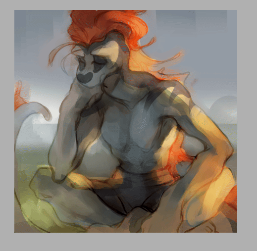
I wrote this on twitter but I thought I'd put it here too, since I occasionally get asks on how I draw/any tips I might have. On twitter I also made the caveat that I don't feel I'm qualified to give anyone tips, LOL, but I was drawing today for an assignment and felt like this is worth noting to any beginner artists who have a tendency of clinging onto sketches that they feel like they finally got right! (A.K.A, a habit I still have years later HA!) This isn't so much of a tutorial as expressing my thought process in this discovery of how to draw more dynamic pieces. I found it to be satisfying on my end, seeing it unravel, so hopefully it can help someone who may be struggling with the same thing I am.
MAKING MORE DYNAMIC PIECES, A PERSONAL STUDY!:
I wasn't upset by this drawing, but I could tell there was something stagnant about it so I ended up pushing it and redrawing it a million times to see if I could somehow make it look more dynamic.

Here's one part of the timelapse - I'm clearly adamant on trying to make this pose/composition work but while the sketch itself may look better, the stagnation hasn't changed. Perhaps this works for some people, but anyone seeking a dynamic visual will be able to spot that this simply isn't working as anything more than a semi-decent anatomy study attempting to be applied.
I changed the position of both arms, I tried to play around with the angle of the head, I tried to just the hips forward more so that the spine had increased curvature, but the main issue, really, was that the initial composition lacked the dynamism in general. It prioritised dramaticism over dynamism. Both can exist in the same piece - it did not, in this one.
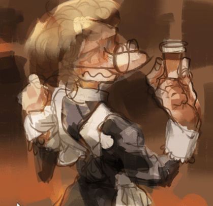
This was the new sketch I started with. Less rigid base to go off of. Just getting down the general shape I wanted to score - make the spine and tail take a sort of mid-whip path, shoulders hunched, hips cant forwards, as if he's curling in on himself. I think for a dynamic piece, it's more helpful that your initial sketch uses the body as a general marker as opposed to something to do lineart over (granted, I don't really do lineart anyway, my sketch is usually the extent of my "lineart", but since this is just looking at creating a more dynamic composition, I think it still applies!)
Here it's the same principle. For the left image (the legs) I've established where the knee of the right leg goes, and where the hip that precedes the left leg will sit. These are just base anatomical structures that help me figure out 1. Whether or not the mere idea of this composition will work, and 2. where I have to stop once I start drawing. For me, having some sort of limitation for the body helps me stay within range of proportionate anatomy (not that I particularly care for the anatomy to be realistic, just proportionate to the style I'm drawing in)
On the right image is also the same principle. Establishing the movement of the arm, the elbow/arm bend, and the hand. (If you see the full sketch before the two above, I established the hand in that one too - it really is helpful figuring out the placement of the hand ahead of time.) If it looks atrocious afterwards I always have the lasso tool/eraser to save me.
The new attempt brings me to this. While preference in art is subjective, I do think I'd be staying in SOME realm of objectivity when I say this is more dynamic than my initial sketch, LOL. Of course, lighting/rendering choices help push the composition a little more, but this achieves what I couldn't do with that first sketch. I had a general idea, but it's important to know when to let go of something that clearly isn't working.
Would love for anyone to add their own tips or ideas to this post - I'm not particularly known for dynamic pieces so I'm always looking to learn. This was a really valuable study for me so I wanted to share it, but everyone has their own method and what works for me may not work for the next person!
There's a few other asks that asked me for tips on general anatomy, and more specifically legs (oh dear god, I'M going to need to study for that before writing out any sort of resource guide for that, lol) that I hope to get around to doing in the near future. Thank you for your guys' vote of confidence, haha! ❤️
#nc111 tutorials and studies#sketch#art tips#art help#study#I had a lot of fun with this piece so while part of this was definitely to passively respond to my inbox requests#a big part was also just me wanting to talk about my brain expanding as I realised how to Push A Composition#I can't wait to try more things in the future to try and get more dynamic compositions#let me know if this was helpful let me know if it was utterly useless#I'm not a great teacher but I used to tutor my neighbours 7 year old daughter and she found my methods boring but hey she got better
68 notes
·
View notes
Text
(Cracks knuckles) Alright folks I remember how to draw
Fat fuck Vulpes by yours truly, Blaze Lander. Inspired by the lovely drawing by @yourmateyoya ,egged on by @legions-top-dog , and because i force you to deal with all my shitty drawings, @noomycatz
Yes, once again, i have put too much effort into a shitpost. Roughly 2 hours as I reused a canvas on ibis paint for a 5th drawing lmao
Yall can burn me at the stake later lol
Process below hehe i like to ramble
And just because i like to talk about my drawing process for characters with complex outfits, this is how my lobotomy brain does it:

First i do silly fun colored sketch. I use different colors to differentiate the "skeleton" from the, euh, fleshy bits, and the clothing. You can see lots of lines that would not be shown in the final product so it makes it confusing to look at.
Next i do a clean sketch.

This is where i clean up everything before doing the final lines. I use one color and a thin brush to make it easier to line over. Here i add any extra bits (like the top football armour) and "render the physics" as i call it, so properly drape cloth and the uhhh squish of stupid fat fuck vulpes' boobs and stomach. I also will balance the drawing here by flipping it and redrawing or using the drag tool.
Next is lining.

For this drawing, i used a 9.0 digital pen with a taper. Its my standard :þ. I kept my pen at the same size for this piece. Sometimes i line the outside darker to make the drawing stand out more. I decided not to as i wanted to give the drawing a more "serious" tone. (How serious can this be though lol-)You may notice on the arms little bits of the lines are missing, thats because i gave him some arm hair. I like make little details like that show over the lines. But since the one shading technique i used works with clipping masks, i had to but the arm hairs on a layer lower than the line art. Next is colour:

I colour in the drawing with midtones. Simple as. I tried to stick with warm colours besides his eyes, which are grey blue. Idc if they arent, im too lazy to google it. I mostly use flat colors but i did make his shirt a gradient. Next is do simple cell shading:

Depending on how i feel i shade with or without the colours in the back. I went with a sorta "non decrepit" light source here. Didnt want too much intensity. I used a deep marronish orange on a multiply layer on 45% opacity. Soft shading/lighting next:

I get intense with the soft shading. I use the airbrush with a deep maroon to add dark gradient and airbrush with a light pink to add a bit more depth. I usually use less light and more dark because im evil i like the intensity. I keep the layer the same amount of opacity and multiply it with the darks and soft light for the lights. Next are the shine highlights:

I use the dip pen hard with a taper to add light highlights of white on shiny bits like metal and eyes. I uses pure white, set the layer to 25% opacity, and use normal blending.
I also shade the lines because it makes the lines softer. I use a clipping layer on the line art, set the whole thing to a dark grey, and airbrush in darker and lighter parts. (I felt like a picture wasnt needed cuz its hard to notice.
For the background, i used a dark red i stole from the cell shaded layer, drew a vine pattern with the kaleidoscope ruler, and added a vignette. Vignettes are my cheat code for background hehe~ it makes the subject stand out while keeping suave, seriousness and formality. To make a subject pop out more, put the vignette behind the character but in front of the background. For more intensity but it on top of both.
Also- I usually draw with a level 10 stabilizer (i got shaky hands) but i drew with a 2 stabilizer so im surprised it came out so smoothly-
Also i gave him goggle tan lines because if i have to have them from playing tennis with sunnies, so does he.
#fallout#fnv#new vegas#drawing#digital art#fallout new vegas#vulpes inculta#shitpost#i put way too much effort into this#dont ask why i draw this type of shit good i swear i will blow up in a million pieces and cry if you do
20 notes
·
View notes
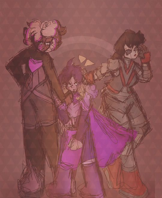
Text
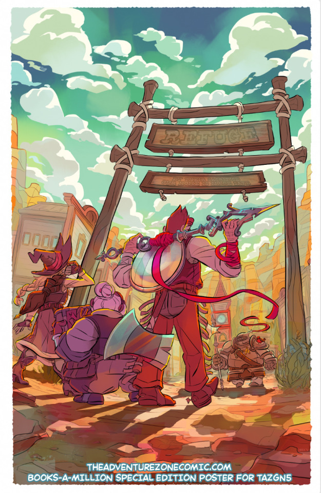
Here's a writeup about the process of making this 12x18" poster that's in the booksamillion special edition of TAZ: the Eleventh Hour GN! It looks like there are still some available for preorder!
Long post about how I got from the initial options I sent to my editor to the final below the cut (or unlocked on my patreon here).

We found out pretty late in the life cycle of making the actual book artwork that we were going to get to do a special edition that included a poster, which was nice because it meant I had a good sense of what cool moments in the book we might want to highlight... and what existing art I might be able to use as scaffolding, because these books are on extremely tight deadlines and there was not a separate timeline for painting a whole poster. So when we can avoid doing that, it saves me a lot of time and heart/wristache... but it's not always possible! spoilers: it was not possible this time around.
I started out by sending my editor two options for poster designs: one that would save some work by letting me reuse cover & interior elements that happened to be drawn at a large size, and one that was loosely based on a page with a fun splash panel, but would require total redraw and repaint. As I said in an email,

...Unfortunately, we both agreed that the one that was going to be more work (A) was the cooler choice & would make for a better poster. Also, by this point I was thinking about doing a version of the cover for a lenticular, and I didn't want to double-dip with fun promo materials. So it goes!
The composition was off, since this was based on a comics page with, y'know, dialog and other panels on it. We talked about whether adding some kind of a text treatment might help balance it out, but ultimately,

[narrator: she would later regret this.]
ANYWAY, once I was all-in, it was time to get goin! First, I made a small color thumbnail, then scaled it WAY up for print and took it back to pencils to space out the trio & give everyone a little more room.
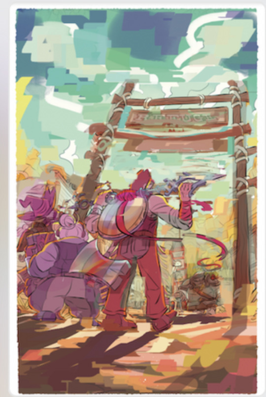
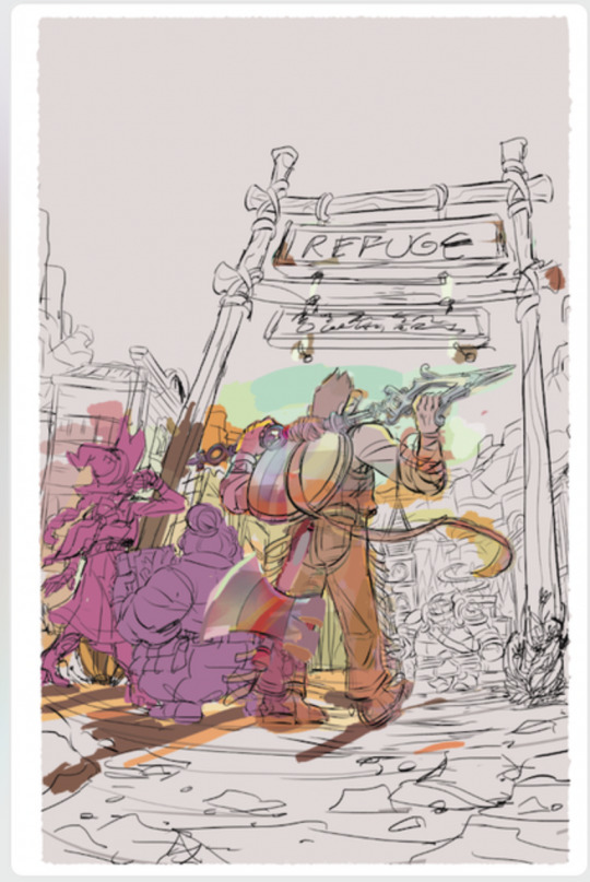
Next I inked and flatted it! Flatting is the only time I can really zone out & watch something while I work, it was a nice break.
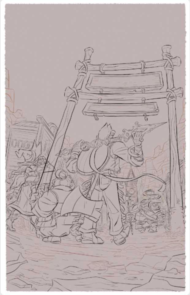

Then I blocked in big hue shifts for the ground and sky; painted big shadow shapes, and drew in the text; and finally added some details like bounce light and atmospheric perspective blue shifts.
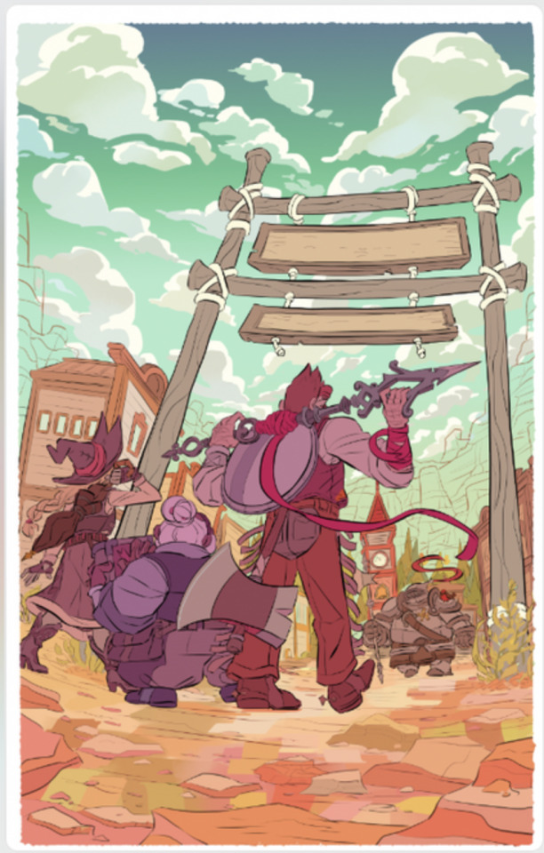
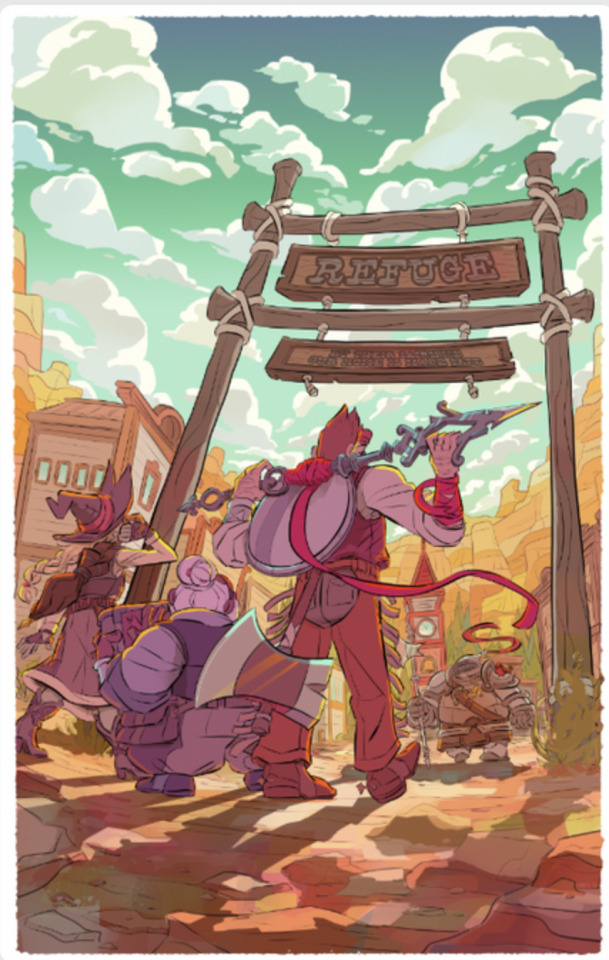
One final touch-up pass with some additional cool tones-- If I were to do this again, I might tone it down a LITTLE bit on the reflections on Magnus's gear… but then again, it looks cool, so I might not.
And there it is!
Next time I do this, I want to try to keep the initial color thumbnail much looser- I got frustrated at the rendering stage because I'd done most of the fun work of thinking about color already, and ended up feeling like I was treading the same ground twice. It's tough to find a balance between enough planning to be ready and not so much that I lose something in the work!
I'm always happy to get process questions over on patreon, it's fun to talk more about this sort of thing!
317 notes
·
View notes
Note
HOW DO YOU DRAW THE HAIR OMGGGNEJK IM ACTUALLY CRAZY FOR IT YOU DON'T UNDERSTAND TEACH US YOUR WAYS /nf /pos
Okay, okay, okay, you don't need to yell
Hair tutorial? Art process??? Choose for yourselves
Assuming you're talking about Agent's hair in the latest art posts, it'll be exactly what i'll use as an example. So, first things first, we need a head to put our hair on. It doesn't need to be perfect, we're using it as just a guide.
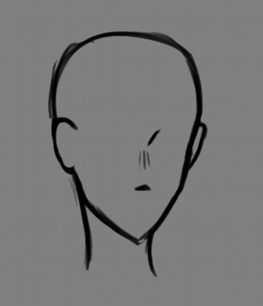
Then i personally like to add a little line showcasing where the hair will go Now our fella doesn't look so bald anymore!
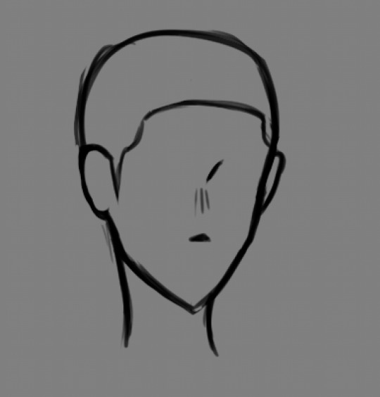
Then i figure out what kinda hair flow i want to have. Usually its determined by the hairstyle itself and how messy it should be. Personally, i just wing this whole process, but having a proper reference will help immensly.
In case of Agent the hair is being separated into two halves that flow against eachother. From here you start building the overall shape and volume (Don't forget, kids! Hair has volume!). Don't be afraid to get messy with this. Sometimes best shapes come out out of chaos. You'll be able to clean all of this mess later should you wish to, but for now just relax and get with the vibe.
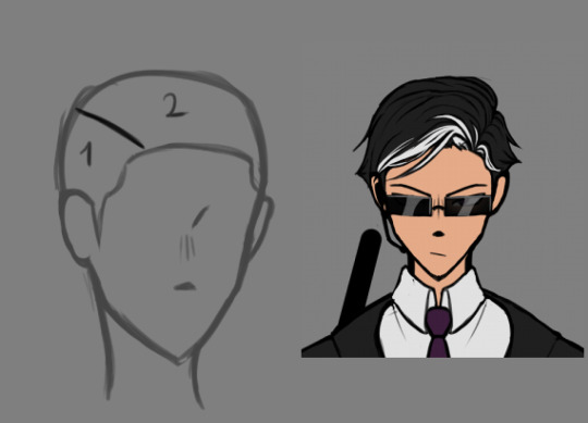
After that is done you can start adding details to your hair, like loose strands, more layers and stuff like that. This is where you make the thing pretty. Don't be afraid to erase and redraw as much as you want. No one's rushing you, just enjoy the porocess.
It can take me up to 4 tries to get the hair right, so you really have nothing to worry about.
Also, if you like the look but not the shape you can always use transformation tool to adjust it.
And once you're happy with the result it's... Kinda it.
Unless you're interested in my render process... But that's a different topic xD
17 notes
·
View notes
Text

Happy Easter, folks <3
I wanted to draw something fun for the holidays, but I'm still stuck with this year's redraw + working on worldbuilding a lot lately + had some new ideas that required my attention + I'm forcing myself to get some rest too. But this year's redraw is almost done (at least I hope so), probably share it during this week :D
Putting this aside, I'm still proud how this version of Lash turned out. I really enjoyed the rendering process, finally got some ideas how to implement her in a storyline and I also converted her into the 5e system, making her a Circle of Witherbloom druid because of her arm.
Speaking of which, the full storyline isn't clear yet though, I only know that she touched a cursed item somewhere at some point, and that deadly curse spread rapidly from her fingers, blackening her hand, later on her entire arm, stealing her lifeforce in the meantime. She was able to travel back home just in time, where her mother, a powerful druid, helped her immediately, though her arm was in such an extremely bad shape, that it had to be removed. They couldn't lift this nasty curse fully either, so her mother replaced the arm with the branches of a magical tree, that now slows down the effects, giving Lash another century or so to live. Thanks to these, now she is able to wield necromantic powers, though every time she does so, it'll take away months, or even years from her lifespan, blackening her new arm just a bit more.
#digitalart#characterillustration#dnd#woodelf#dnddruid#characterdesign#myoc#originalcharacter#ocart#ttrpgcharacter#characterart#characterartist#illustration#illustrationart#digitalillustration#digitalartwork#artwork#artist on twitter#speedpaint#timelapse
24 notes
·
View notes
Text
Mitsurichan3 commissions information & Terms of Services
Contact:
Means of contact:
Tumblr DMS
Email: [email protected]
(please subject it as COMMISSION REQUEST - details).
Payment methods
Paypal - through invoices sent via email
Ko-fi commissions page
Payment is done in US dollars, through paypal or Ko-fi. I am flexible in terms of payment, with 100% of the commission amount paid upfront, 50% upfront-50% once completed, or discuss multiple payment plans on a case by case basis. I am unable to provide refunds at this current time, so please keep this in mind.
General information:
Thank you so much for taking time to read through my TOS and commission information. I am Diana, aged 25, and am currently unemployed. I am open to answer questions, discuss details and talk about pricing so feel free to reach out!
I am opening commissions in order to pay my monthly bills
Please do not ask for updates every few hours, I also have a personal life and things pop up last minute.
Later this fall I will be going back to university, so commissions will stay open to help pay the costs of graduate school as well.
Commission price will also have tax applied to the final cost.
By commissioning me in any kind of way, you are agreeing to the terms of service above and below:
Detailed information:
Can draw:
Humans
Ocs / canon Characters
Ship Art
Nekomimi / Usamimi
Suggestive outfits
Please send me references, they are super helpful! Even a simple stick figure and a lot of written descriptions will go a long way!
Cannot/wont draw:
Hate art
Gore
NSFW
Mecha
Feral/anthro
Furry
Animals
Terms of Service:
Once the commission is paid for, I cannot do any refunds
I’ll only accept upfront Paypal payments through Paypal invoices, or my Ko-fi commissions page. Do NOT send me money independently. After receiving payment I will start on your commission
I reserve the rights to use/display your commission on a portfolio, artist website, and social media. However, if you wish to keep your commission private, please let me know ahead of time.
Turn around times vary between 3 weeks to 2 months, depending on complexity of the artwork requested.
I will give periodical updates at each step of the process (sketch, line art, flat colors, full rendered and email finished piece).
Sketching usually takes a week once payment has been received. I will contact you to approve the initial sketch. Clients can make 1 major change at this stage, before being charged an additional $5 per change afterwards. This will be added to the total price.
I will send the finished product through an email address of your choice.
I reserve the right to decline any commission I am not comfortable working on, for any reason.
My Art cannot be used to train AI or make NFTs.
You may NOT claim my work as your own, trace, recolor/redraw, or redistribute my work for profit.
You may NOT use or repost someone else’s commission piece without my and the buyer’s permission. If you receive permission, you must use/post with credit
Your commission piece is NOT for commercial use. This is for personal use only.
If you are the buyer, you may post the finished commission whenever you want but please credit properly, or share it from my social media accounts.
If the commission is a gift for someone else, you are allowed to share the piece with the receiving party. (PST! Let me know what they think too!)
I can accept requests if you don’t have the adequate visual reference of your/the character that you want me to draw. Do your best to communicate effectively and I will meet you halfway. I will ask a lot of questions to better understand your request.
Picrew/ Character creator images (for ocs) are accepted, as long as you have another actual reference to pair it with: i.e. using the picrew to outline an outfit you want, or a change in hair/eye color. I will accept a Picrew/Character creator image if it's exactly what you want.
Thank you so much for reading! And thank you for considering me for a commission!
#artists on tumblr#signal boost#ask me for commissions!#commissions open#commissions#please help a sis out#reblogs are very much appreciated
13 notes
·
View notes
Text
md's fun silly little top 10(ish) arts of the 2023!*
*pretend there's a fun cute doodled banner here (i was going to make one earlier and then i forgor)
doing a lil recap of my top 10 15 (it was supposed to be 10 and i could not narrow it down oops) best(? this is subjective as fuck i guess it's more like my personal faves) drawings of the year! *the crowd cheers* (it’s me I’m the crowd)
15: paradise by the dashboard light! i hate to rank her so low bc i spent ages on her but it seems i don't love the result that much anymore so :/ a for effort for me tho this was ambitious
14: cheer girl loml <33 not my best art technically by far but i went way out of my comfort zone for the background and the art style (for no good reason really) (i just wanted to do a comic book thing bc superhero vibes or whatever) (it did not come out the way i was hoping it would bc i think i got too frustrated) and we simply must acknowledge that. atog did things to me that i cannot explain
13: barbie meme brittana! not my best britt but truly sooo fun to work on. there's nothing quite like finding a fun rendering process and then never using it again (i don't even remember how i coloured this but i like it)
12: cowboy barbie brittana <3 they look good, they're about to kiss, cute outfits, pretty sunset, probably went overboard with the rim lighting, what's not to love? a banger, i think
11: i say a little prayer! i think the background is. questionable at best. but this is still really fun! i think i got possessed when i got to the uniforms bc goddamn they look good
10: klaine?? on this blog???? almost unheard of lmao i truly did not think i would like this one as much as i did. i'd consider ranking it higher if i wasn't constantly Unwell over brittana but again, i'm biased, and no one here should be surprised about that
9: pre-wedding kiss my beloved! with how insane i've been over this kiss it could perhaps be higher. i am gnawing on my desk as we speak i'm not even sitting at a desk rn
8: rutherchang x black swan!! ohhh u guys i don't talk about this one enough i think it's so pretty i don't even remember how i did the colours for it but rhgfdkngd?? love her, love pushing the glee x bts agenda, if any of u gifmakers are interested in making a mike chang x black swan lyric gifset i will love u forever
7: colour wheel challenge! busted my whole tiddies and ass for this one fellas. labour of love etc etc i think staring at the bright colours for so long made my eyesight worse and i'm ok with that
6: mistletoe brittana <33 easily the best instalment of this series by a long shot! recency bias (and also just. regular bias) made me rank her much higher originally but technically she is not the most intricate piece so she must sit down here
5: prom queen kurt! dare i say a girlslay on my behalf? i think i dare. every time i see it i think i should do more glosters (glee posters) and then i don't. i could tho they would be really cool (source: dude trust me)
4: churro kiss redraw!!! genuinely Not Sane over this! never have been, never will be! redraws are like crack to me and so is this kiss
3: furtana!! i neglected them for far too long this year but if neglecting them results in art like this i may have to do it again
2: heart kiss <3 if we're being really honest and vulnerable in the chat tonight i think this is technically my best of the brittana kiss screencap redraw things i've done this year? which i did not see coming but i guess practice means refining the process etc etc so. it makes sense ig. mwah to them <3
1: black or white gcv animation <3 it's not what i would call my best drawing (bc it's, yknow, not just one drawing) but it is what i would call the product of a very obsessive thought and some frantic art sessions. objectively it's the coolest thing i've done this year so it deserves the top spot. i'm proud of it i hope to glanimate more next year. also this isn't art but it's a relevant post that i still stand by months later
#md rambles#idk what this is kdfghk i'm so sorry it's 5am and i've spent the past hour ranking these and just saying shit#if i were more awake i would be more specific about actual art things i'm proud of. but i am not. so#sth sth made a lot of bangers this year i think sth sth vv proud of myself sth sth fun list bc i feel like it
23 notes
·
View notes
Note
random ahh q but how did u develop ur artstyle? :D
HIYA!!!! oh yeeeesh this is gonna be such a long answer 😭😭 it’ll be under the cut…… but um. warning for old Ashi art HAHAHA it’ll basically just be me guiding you through my gallery from all these years <3 I HOPE IT CAN HELP A LITTLE!!!

old Ashi Art JUMPSCARE
BUT BASICALLY. YEAH! this is me starting digital art in like? 2020 and getting into a3! <3 as you can see. this is my kind of sad attempt at replicating the style ??? you can tell from the way I colored my eyes, hair, and copied the way the hair is drawn!! it’s not OVERLY obvious but if you look you can see that I REAAALLY referenced it. which is kind of a big thing for creating an artstyle

and queue in my art around a year later!! 🤔 kinda more used to drawing the a3! characters (which mind you were the ONLY characters I drew for like. a whole year) and so naturally I adopted the artstyle more into my own art. learnt more about airbrushes would reference the original art a LOT. redrawing really helped me 🙏 once again. lots of referencing and looking at character references. and while I didn’t always redraw it exactly, looking at the character designs themselves made me pick up quirks of the original artstyle to better display the characterization and charm of the characters!!

then 2022 rolls around and I start getting more into proseka. start finding little things about this artstyle that I liked— whether that be finding that out through redrawing the art or trying to replicate the style. started picking up things like the smaller face shapes (as compared to twst and a3! which I was focused on previously) the way they drew the hands, the bodies, etc etc!! along w softer brushes and rendering 🫶
at around the same time I return back to a3! and make attempts at replicating the artstyle (left) or making edits to the predicting art to try and make it blend in (right). as you can tell I start playing around more w hair highlights and the rendering and all that stuff!!! 🤔 sort of like picking up new skills that I missed out on the first time. starting noticing more of the little details
and SO then I returned yet again and begin redrawing a3! cards!!! but you can tell that there’s more of a concrete style w the squisher faces and more experience the rendering 🙏🙏

and I did a LOT of redrawing. 😭😭 a3!’s artstyle is soooo dear to me because it has so much charm despite not being insanely rendered or having too much detail. and I LOVE that. so to try and add it to my own art I redraw and redraw and MIMIC in attempts to gain that exact same energy.


🤔 and though it’s not twst art…… this is when I started replacing the twst style and picking up on it’s quirks, then adopting what I thought was fun about it. most notable the varied opacity rendering. and you might notice that my lineart is more see though!! I MUST SAY!!! THAT WAS JUST BECAUSE OF A LITTLE EXPERIMENT I WANTED TO DO and I enjoyed it SO much that I dropped solid lineart sketching IMMEDIATELY!!!!! I think developing an artstyle is really dependent on you being willing to step away from your “art style” and look at others. maybe try some new things. pick up smth else and try to mimic it, and see what ingredients are used to make that artstyle succeed in the way that it does. between these three images you see such a change because behind the scenes I’m trying all of these different things, and seeing if I like doing them!!
🤔 sorta like….. oh I like this ingredient. so I’m gonna take them and add it to my own food because I like it. if that makes sense?
AND SO YADDAH YADDAH. you follow my blog you know my art and where it is now
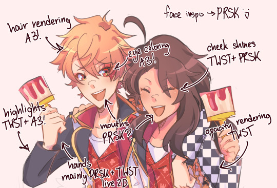
A SNEAK PEEK FOR ASHACE ART SINCE YOU READ THROUGH ALL OF THIS….. and like. as you can see my art really is just a mutant combination of all of these things that I like from the artstyles I enjoy. slowly it came together w no rush and I’m sitting here now satisfied with a signature artstyle that everyone can recognize.
!! I REALLY DONT THINK YOU NEED TO WORRY TOO HARD ABOUT HAVING AN ART STYLE especially if you’re a beginning or learning artist still. and don’t think that art styles just come out of nowhere!!! art is a combination of stealing parts of things that you like and putting them together. as all things are 🫶 but yeah!! the Ashi gallery HAHAHA
#if you’re wondering this is most likely why I’m so good at replicating art styles#when you’re constantly looking and drawing fanart you start to pick up things. especially when you draw so close to canon like me HAHAHA#making this post really threw me back….. crazy#who knows maybe I’ll steal smth from eitori next#prob have stolen from some moots too…… tehepero#art styles are reaaaally neat but they take a while to cook#like good soup!!!#hopefully this made sense www#ashi’s asks ♪
7 notes
·
View notes
Text
So, everyone, I got a story about this picture right here. I will include some pics from the process and there's even a moral at the end.
So the client approached me about it, I sketched it out, standard affair. It was supposed to be a gif image and I imagined her moving side to side while her sword glowed.
Mistake number one I did not plan out the side to side movements. This was the only rough I did before I started rendering it.
"Wow this is going to be so cool" I thought.
"This is going to be a piece of cake"
I wanted to animate it on Clip Studio Paint EX that I got this year specifically so I could do animation there.
I ended up drawing all the assets and I was happy with them. Side note, in pixelated animation it is better to use as little colors as possible, and I ended up having a lot more than 256 colors with the colored lineart here n stuff. That was my mistake number two. I really need to work on that.
I warmed my hands as the program was opening, ready to do some animation, only to come across a very unexpected problem.
In the end I have made a reddit post describing it, but you can basically see the results of it in this test animation

I spent an entire freaking day trying to figure out what to do with the blurring. It seems that it functions as intended, but it would be really nice if CSP didn't do this. I had to go back to photoshop to do the actual animation.
... I couldn't quite do the diagonal movement I wanted. Right, so I settled on this.

I drew like 3 movement frames for the white and blue cape and ended up not using it because it looked awful. And the sleeve movement is so wrong.
This is why you test these things, guys! In sketch phase!
So I made these static gifs, thinking this is probably over now and I did a good job.

Nope. Not even close.
My big brain missed one crucial detail in the initial sketching phase...
IT WAS SUPPOSED TO BE A BIG BEEFY GLOWING SWORD!
To be fair the initial glow was cool, the client didn't realize what I've been drawing. So we both missed it. Okay, fine. I decided to just redraw the glow, thankfully it didn't take long at all.
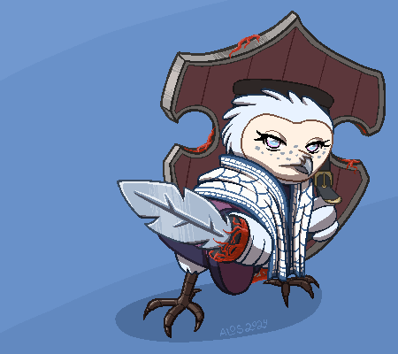
... Right we got another problem. How do I animate a sudden burst of energy coming from the sword?
... Oh no.
My head drew a blank.
I felt... I felt... Like a failure. I failed the client. I thought I could do this but it's not right.
I decided to slap a glowing effect and hide the burst under a white screen.

I couldn't imagine anything better.
Despair, utter despair.
In the end the version that looked the best was this one.

Feeling horrible, I decided to make a free quickie for the client to make up for my failures.
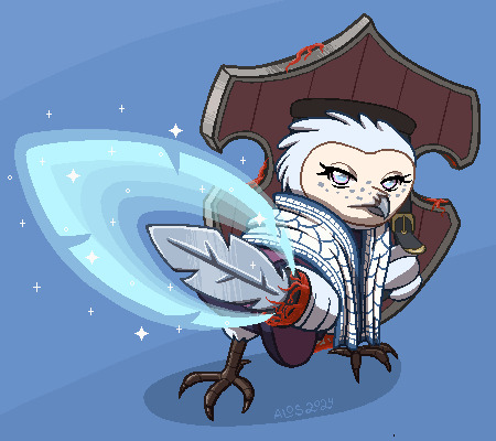
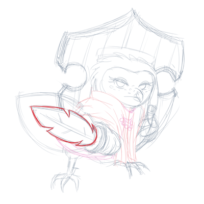
I poured my disappointment with myself and my ability to come up with cool animation into this little tiny owl that did nothing wrong. I gave her the most adorable but angry stare I could muster.
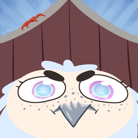
She's angry because she's short
... too short for this picture.
The client assured me that my work was fully acceptable from start to finish and that it's all great. That I shouldn't beat myself up.
But I usually get it all from the very beginning, you see. I typically don't do too much revisions. This kind of situation is not common. I wasn't able to see my clients needs and make the kind of gif that was needed from the beginning.
And I've been tipped extra for this picture too.
It's like the money I got was not quite worth the gif I ended up with.
I suppose it covered the extra useless work I did drawing the assets, but... I feel guilty, like I ripped off the client.
If I just needed to draw the static gif with some glow I could've made it cheaper.
Perhaps I undervalue myself and it costs more than I charged for it.
I don't know.
The moral of the story is DO TEST ANIMATIONS IN SKETCH PHASE. ALWAYS. FOR EVERYTHING.
I swear I got it the first time, why make this mistake so many years later? smh...
9 notes
·
View notes
Note
ur art is so, so amazing, is there anyway u could do a tutorial bc I wanna draw like u so badly
i can try but idrk how to explain myself or make tutorials lol
i think my style is just a product of my brush and what im trying to get out of my art, which is trying to portray the characters as accurately as possible. i rly just want it to look like it could be a stylized redraw of a deleted scene or something
my process is kinda everywhere bc i just move on to whatever step will probably make me hate the piece less when im done with it. i draw with a more square brush (blurring marker 1 on ibis) which i def recommend. its great for focusing on shapes in ur art and it helps me not overblend/forces me to think of more interesting lines/shapes. my sketch is a thicker size of the same pen, focusing on the major shapes and proportions and i just make as many additional layers overtop of it, lowering the size of the pen and adding details as i go
once im at the lineart i usually use a site that creates color palettes based off images (usually just steal some from old catholic art) and i steal my base colors from that. it doesnt matter how terrible ur base colors look as long as they make sense and r what ur generally going for.

these were my original base, i use colored line art and shade the basic shadows using the line art mixed with the base color, highlights r whatever is the lightest color in the palette. after that i duplicate and throw it through this filter
i play w the colors and use it as a color/hue/luminosity layer on top of the original version, lower opacity and render now that theres more colors on the canvas (the filter creates more contrast between the lame base colors i mix, then i can add bounce shadows and shit).
i use a shit ton of digital cheats. single color overlay layers at the end of a piece, pizza face overlay glow, using vignettes around the border to draw the eye towards the subjects at the center, filters, color palette generators, etc. they make things sm easier so u can worry abt experimenting with other things.
i dont rly know how to explain how i do clothes or hair other than focusing on the shadows and worrying abt lights later. this is honestly the best tutorial i can think of bc in my head im just drawing what i see as best as i can with the pen i use. use a fuck ton of reference, do actor face studies, and try to experiment with ur style everytime u draw. ur never gonna learn how to use ur programs or expand if ur bogged down by trying to achieve a specific look. sometimes that thing u were nervous abt bc thats not how ur style usually works is the best thing on the piece at the end.
actually draw only what u want to draw in that very moment and use that as an opportunity to experiment however u can. i just draw chainshipping and find ways to trick myself into learning 👍🏻 sorry this is so bad if u have any specific questions i can try to answer those better
edit: this is what i mean when i say just draw with whatever base colors and use the lineart to add value. i thoroughly hated this piece at this stage but once i adjusted the pallet it felt much more cohesive and i could continue on with the drawing. the best thing i can say is to have absolutely no process past the same few first steps and resign urself to a cycle of self hatred and throwing random bs at the wall to see what sticks
#sorry this is so bad these dubious ass shroom carts beating my god damn ass HOURS later#i deadass woke up saw this and said Fuck bc i knew id want to answer it but i deadass cant think#sorry this didnt make sense. my style id just however i personally fail at achieving complete realism#also merge ur colors and lineart after the base idk makes it less stiff#ive always thought painting is much more forgiving than lineart and cell shading#theyre scary#most of my art is just how i compensate for being unable to rly fully stylize#i havent been able to since high school so i just stick w realism while i unlearn my old bad habits from having an exaggerated style#GOD ANYWAYS#rambling#larry.txt
22 notes
·
View notes
Text
2023 YEAR IN REVIEW!!!


My artstyle changed a lot this year, especially after my shift from ibis paint to procreate after getting my iPad (drawing on an iPad is the BEST btw 100% recommend I love it way more than a phone and it didn’t die after a month like my old wacom 💀💀). I’m relatively happy with where my art is atm and I hope to continue to improve in 2024!
Explanation of all the silly art down below! (Mostly so I can tell y’all who the fanart is for but also cause I like rambling)
January: A drawing of my Rise Leo human design I did to test out a pixel brush I found for Ibis Paint. He’s very fun to draw hehe I need to draw him more-
February: I wanted to learn how to draw the future designs of Leo and Mikey along with CJ so I planned to draw them all together! I struggled with Leo though so I just got rid of him. Sorry Peepaw 😞😞💔💔💔
March: Fanart for @beannary ‘s TLP au! I love it so much so I had to draw smth for it hehe 😈😈💥💥💥 which reminds me I need to draw more at some point- might redraw it at some point cause I’m not super happy with how it turned out but I do like the idea a lot
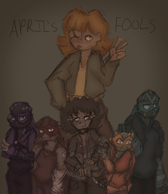
April: The month I created Reticent! April’s Fools was the first episode I came up with so I drew a chapter poster! It ended up being very different to the chapter cover I drew a couple months later but it’s still cool :D Leo is being weirdly affectionate to Mikey though what the heck that isn’t like him smh. Although I guess it was meant to be purposefully exaggerated sooooo 🥰
May: Reticent Casey!!! I don’t have much to say it’s just Reticent Casey HDKSGXKSHD this wasnt a very good art month
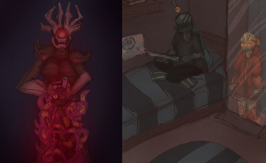
June: Krangified Donnie is literally my favourite concept ever thats it that’s all I have to say dbskdbwkh I adore Krangified Donnie and if the Rise brainrot takes over the Reticent brainrot for a while then I will probably be drawing Krangified Donnie during that time sorry not sorry
July: Reticent Chapter 3’s cover yippee!!! Still my favourite Reticent cover although Chapter 8’s is a close second (I can’t wait to post it once it’s been betaread yippee!!!). The scribble over Leo’s eyes is literally just because I was struggling to draw his eyes and i was getting annoyed dbskdbskdb it’s actually a very common issue with him (common Ret!Leo L). Also Mikey being reflected in the mirror is a reference to Mirror Man by Jack Stauber which I’ve basically considered his theme song since @aaronymous999 introduced it to me ebwjcbkwhd thank you Mr. Aaronymous! Also somebody said he was in the barbie box and I still need to draw that to this day because Mikey would’ve killed to go see Barbie.
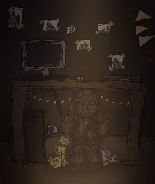
August: RET DONNIE WOOOOO he’s being bullied again!!! I drew that piece for a colour palette challenge request and realised I got the prompt wrong so I just made it into its own thing 💥💥💥 it’s usually a flickering light gif but I chose to just use the version with the light on for this post. The photos in the background were really fun to draw hehe either April’s or Mikey’s is my favourite.
September: MY 500 FOLLOWER DTIYS YIPPEE (/my 150 follower DTIYS for tumblr). This one took me. Forever to draw and I love it to pieces hehe it was really fun to design Mikey’s room and figure out outfits for the sillies and idk the concept of a sleepover just seemed really fun to me dbskbdkdb- and all the entries I got were so so awesome I loved them all to pieces!!! I still look at them all the time hehe
October: FANART OF @endlesslogo ‘S HUMAN RISE LEO DESIGN WOOOOOO!!! This was the piece I started rendering on hehe it was so much fun to draw!!!! Although I did have a fight with rendering the hair for over an hour svsjegksbdk HOW DO PEOPLE DO IT FR!!!
November: Me and my friends were working on a crossover between our TMNT iterations so I drew all of our Karai’s together!!! Confluence Karai is on the left, created by Salem and Marine, New Stars Karai is in the middle created by Starla, and Reticent Karai is on the right created by me! All our Karais have such cool designs AHHHHH literally dead over them constantly/pos
December: Most of December I spent drawing Christmas presents so this was my present for Salem!!! Confluence!Jonatello my beloved….
11 notes
·
View notes
Last Seen Blogs