#i want a different design for each puppet. maybe it just changes one main color hmmmm
Explore tagged Tumblr posts
Text
W what if. What if manynnew glamrocks. What iff. What if there's a new "magical" section. With. With Springbonnie, Fredbear,. Baby. Ballora., Manglee,,,, but all as new Glamrocks. None of the remnant for them or whatnot. Faz Ent just took the IP of older characters and.gave them a new spin.
Spring and Fred are the introductory segment, a skit "pull rabbit out of my hat" with a tiny Spring that runs around the place and aha! Gotcha! And big Spring appears. Then Spring becomes Fred's assistant for whatever trick they're about to perform together.
Then Baby with balloooooons. She inflates balloons right at her fingertips. She can even dispense ice-cream :)! But without..uh. any of the murder.
Ballora is a ropewalk act, and you can try on stilts! Different heights depending on the child's age, hoping to attract a wide arrange of ages. You don't quite get to be so high up as her, but it's still fun to try!
Mangle is a "cut in half" attraction, except... they stay cut in half the rest of the show! They can hold their torso up with their hands, even walk gripping their separated hit. Their legs and body can be on complete opposite sides of the room too and it's very entertaining. I'm not sure yet how to incorporate the "put apart and back together" element of their attraction for children to do themselves, but I'm cooking.
#carime rambles#fnaf au#five nights at freddy's#i am having Thoughts#and all because of one glamrock springbonnie drawing i made hdkshckd#thinking of adding a puppet for each arcade area. mini puppets :) they exchange your tickets for a prize! :D#i want a different design for each puppet. maybe it just changes one main color hmmmm#anywayyyy hehehe. magical act glamrocks.....
2 notes
·
View notes
Text
Im gonna be honest. I have worked on none of the designs-. I was wanting to work on the designs in order, however whenever I tried I got unwilling to do so. So im kinda doing it out of order.
The order
Los Villanos
The toys
The nightmares (+plus extra nightmare characters)
Own villian ocs (very excited for this one)
The funtimes (+ extra funtime characters)
Spring(and the phantoms((got some ideas for those)).)
The weirdos (aka puppet, bb, jj, ect ect)
Some ocs
The rockstars (cause i love fnaf 6-)
The scraps (- scraptrap cause. No, well maybe if i feel like it)
More ocs
The glamrocks(+extra characters)
The animatronics
The shadows (which is just the actual shadows ((not like fred/ there are two variations of shadows for me-))from the games but that might need a name change)
Other fnaf fan games/media (candys, popgoes, walten files, and whatever i find interesting)
Even more fnafhs ocs
Actual animatronic ocs
Now, I think the main reason ive been holding this off is because im worried or scared. Like I have been in the full force of the dandys world fandom, and after that I think you would be scared too. You have a different perspective and opinion on a character that originally had no other canon prospects and people start coming at you with pitch forks and torches.
Im not saying everyone in the fandom would do that, but there would be some strong supporters of certain ships that will probably try to hang me. (For example, I dont like bxb. I always seen them as rivals or that they dont like each other. Same goes for fede x felix. Especially when that one audio surfaced of them arguing.)
I dont like most of the character designs. Like for fede and him being skinny(ish) and white. I like to think of him as albino and big. And Bb(loon) I really dont like looking at him and people (sometimes) going “awww sweet lil shy boy”. This is the same people that look at the og balloon boy and absolutely hates him. He’s annoying, yes. Why not make him an annoying little kid like he is?
This is something I also noticed when I was a young preteen watching this. And thats there isnt much diversity in it, ive seen alot of people put their headcanons in it and i love that. But looking at the actual series, its kinda baren when it comes to skin color, hairstyles, culture, body types, interests, and hobbies (other than singing/music),
If the few seeing this would like me to talk more. Then please, send asks! Wanna complain at me about my personal opinions? Go ahead (just dont harrass me, be respectful). Wanna just ask genuine questions about the characters and how i view them? Yes! I would like that alot.
But, as of now I will bid a farewell
#fnafhs#rambling#i dont know what else to put#im also very sleepy so if you see any spelling mistakes#you can make fun of me#just dont be too harsh#also forgot to mention#some book characters might make appearances or become full characters
2 notes
·
View notes
Text
here’s some thoughts about the newest yttd chap! if you want to discuss any of the topics with me send me an ask and ill tag it under #tazunass talks
keep in mind these contain massive spoilers!
main thoughts:
alright. Midori. what the hell did he do to Shin? originally most of the fandom thought the two of them were twins but they’re just similar-looking “friends”? what’s up with their matching scarves? did Shin keep Midori's scarf when he died and Asumaro wanted to keep Midori’s design similar to when he had been gaining information?
Shin seemed to act very weak in comparison to Midori (covering his head when confronted by Midori/turning off when Midori appeared in the control room, although the second one could be just because Midori is a floor master), when shin adopted Midori’s original name “Sou Hiyori” in previous chapters, he seemed to act very similar to the real Sou/Midori, cunning, mysterious, and evasive. because Midori exerts complete control over the floor, Shin is in the inferior, and isn’t putting up his usual front as he would have previously.
maple is most likely the monster in the pink bedroom (basing this on her character design with the liquid running down her head that looks like maple syrup) is going to have a boss fight or be at least an obstacle in the next chapter. i find her pretty interesting because of the depth she has compared to the other monsters, why is she so intelligent compared to the body/book monsters? will that be a factor in defeating her, or does she even want to fight? maybe it has to do with her connection to Midori because of her linger on the name “Hiyori...”
considering the fact that everyone human recognized the consent form and Sara did not, does the consent form relate to signing up for the death game/Sara? where would the form be in the timeline before waking up in the first trial?
are the dolls really dolls? when Sara touches Mai’s shoulders they’re clearly very soft, implying that they have the same texture as human skin. maybe Asumaro wanted to conceal that by concealing Mai in her coffin when she died in an alternate route. i know this can be easily debunked but i wanted to put it in here.
side thoughts:
Sou is as quick-witted as ever, even if he wasn’t as liar-ish. it was satisfying to see Keiji confront him about his protective feelings for Kanna.
the coffins contain have a logo with the letters “AS” on them, giving an early clue that Asumaro are the puppeters
Ranmaru reminds me of shuichi. just a bit. maybe less nervous. he’s probably my favorite newest character. what was he going to say to us while in the pink bedroom? i would assume it would be the partner killing but he seemed... reluctant to do anything with/to Sara.
Keiji’s role models have the same brown colors, the woman with brown eyes and the criminal with brown eyes and hair. just an observation.
puzzles were relatively easy compared to the other chapters, not that i’m complaining
also??? Q-taro’s speech was so uplifting i love the man, he deserves better.
what was the point in bringing up old environments from different characters’ pasts?
Kanna and Midori have very similar color schemes, don’t they..?
where is Sara’s father? we saw him appear in a past chapter,, where is he now? is he monitoring the whole game?
who could the traitor be? assuming that the new characters are really just dolls, then i would probably assume Sara. or Gin. does the traitor have to be someone alive..? (i actually assumed Ranmaru or Hayasaka at first)
each time i see joe pop up i die a little more... i miss him
most characters have a pretty close connection to Asunaro, Keiji’s role model trying to expose the police force cover, the orphanage Q-taro grew up in, Hayasaka gathering information for them, etc.
Sara seems to be very predictable in shin’s point of view. i wonder if that will change after her choice in Keiji’s situation in the ending
i miss joe still. ily buddy and i wish you could come back soon.
62 notes
·
View notes
Text
A (late) Review of Moby-Dick: A Musical Reckoning
I saw Moby-Dick: A Musical Reckoning by Dave Malloy last month, and I can basically divide it into “The Good, The Bad, and the Racist/Queerphobic/Ableist etc”
Some background: As most people who’ve ever spoken to me will know, I have a special interest in Moby-Dick AND Dave Malloy/Rachel Chavkin musicals (I truly believe that Great Comet is one of the best works of all time) and I consider Malloy and Chavkin both to be my biggest heroes and inspirations, at least when it comes to their respective style of writing and directing. That being said, they’re not perfect. I waited for this musical for about two years, and music/set/etc wise it exceeded my expectations, but it also majorly let me down in a lot of ways.
The Good: The cast! The crew! The set! (It was literally The Pequod - like, they got rid of the stage.) The lighting design in particular was really good - thank you, Bradley King. Manik Choksi, Andrew Cristi, and Starr Busby are gods. I do not have a singular bad thing to say about the cast or the design team! Even the stuff that was tacky/campy (i.e. some of the puppets) was tacky/campy in an enjoyable way. And the “fun” parts of the show were REALLY fun - the fact that they invited the audience on stage, the fact that they TRIED to make Moby-Dick more accessible even if they didn’t do it perfectly at times….the music, when not problematic, was BEAUTIFUL. Listen, I’d be lying if I said Dave Malloy wasn’t one of the best composers when it comes to skill. Everyone in that show sure can act, and sing…the band too, was marvelous, I heard no errors from anyone. This is, what, a three hour long show? And the cast/band was just like, “oh, no big deal.” Which makes “the bad” and “the racist” even worse because these people deserve better. This show deserves better, it deserves to be better.
The Bad: Well, as a book fan, I disagreed with a lot of characterization…most of which can fall into The Racist etc, so I’ll just focus on the “bad but not inherently problematic��� here. I really didn’t agree with a lot of things about Ahab’s characterization, i.e. I did not read him as just a bad white guy who’s the epitome of privilege. Stubb, on the other hand is, a canon white supremacist in the book and that barely gets acknowledged in the ways that it should. I do get what Dave was trying to go for, especially in re: Ahab & climate change, but this wasn’t the show for it - or at least, Ahab wasn’t the character for it. Which brings me to my next point: Most of the time, I’m a fan of the quirky Malloyian anachronisms and parallels to modern day issues, but I feel like he was trying too hard here and stepping out of line. Loose adaptations can be fun, anachronistic adaptations can be fun, even INACCURATE adaptations can be fun…but this just wasn’t. It didn’t feel like Moby-Dick, but more like a story vaguely inspired by it. If that had been what he was going for, it would’ve been fine, but he really acted like this would be an accurate adaptation of the book, so I felt let down. The only anachronism/breaking of the fourth wall that I somewhat liked were the talks of Melville and Hawthorne, honestly, and even those I’d sacrifice in favor for accuracy to the source.
And now…The racist/etc.
So.
Where to begin? I suppose chronologically. Queequeg. Who, according to Dave Malloy, is a stereotypical flamboyant queer person of color! and also a quirky cannibal! He’s trans in the musical, apparently, but there’s not much indication of that in the show beyond from him wearing a binder and a skirt. Now, I am all for trans Queequeg of course, but he was a caricature in this particular adaptation. I do not blame Andrew Cristi. I blame Dave (and mayyyybe the costume designers to some extent). I felt baited. Also, early production rumors and quotes said that there would be a song in which Queequeg saved someone from drowning. That never happened. It pains me to say it, but he didn’t feel that much like an important character (due to the bad writing -- again, it has nothing to do with the actor).
Additionally, Dave Malloy said that Queequeg and Ishmael would be a clear gay relationship…but the musical left so much room for them to just be interpreted as friends. It somehow became less gay than it is in the original Melville novel. The marriage was excluded, as were the quotes about them being a cozy and loving pair and about Queequeg holding Ishmael like a wife. They were replaced with the “I don’t wanna sleep with a cannibal” song, which was fun to watch at first but way too grossly stereotypical for me to genuinely enjoy it. Queequeg deserves a fun and light-hearted song, but he does not deserve a racist/homophobic one. My advice? Replace it with the actual chapters from the book, please. I do like the fact that The Pacific was a romantic duet and that they sing directly at each other during Squeeze Of The Hand, but those two songs are mere scraps especially compared to, for example, the Bosom Friend chapter of the book. It looked like they were going to kiss during The Pacific and I was very disappointed that they did not. Perhaps the team should keep the songs the way that they are for future productions, but add more romantic staging.
Pip-not-Pip/Elijah/??? (Ashkon Davaran’s character) and Fedallah were also major, major, issues. Not the actors, I love them. Not the book characters, I love them. But the musical characters.
Basically, Fedallah gets this 20 minute long monologue that can be summed up as “religion is bad” and a lot of other things including but not limited to egotistical fake-woke praise on color conscious casting and how badly America is fucked. And that’s not even mentioning the fact that Fedallah is Parsi and Zoroastranian in the book (and it is NOT good rep in the book by any means, trust me, I’ve been calling Malloy out on his racism but I can’t act as if book!Fedallah was anything less than an ~exotic caricature~ either). However, that’s beside the point, at least in this review. Musical!Fedallah is not Parsi nor Zoroastranian. Don’t read this the wrong way, I’m all for Black Muslim rep! But with a character who is already canonically something else? Take a white character and make them a Black Muslim, I encourage that, but when a character is already something else, no.
If the monologue was influenced/written by the actor, that’s one thing and I’d have less issue with it, but I think Dave wrote the vast majority of it, which…yikes…
My constructive criticism: Cut the Fedallah monologue. If the creative team still wants the actor/character to have the same amount of stage-time as he does now, replace it with a different monologue, maybe something from the book? Something about whaling history?
Another thing that needs to be cut or at least completely rewritten: Tambourine. The song starts off with an ableist verse that can be summed up as “you think you’re crazy because you get nervous on the subway? No! I’m more crazy than you!” Don’t take this as me saying that Pip’s trauma/PTSD shouldn’t be addressed at all, but this is the absolute worst way to address it. The song also has a lot of performative lines such as “is god cisgender?” Which, considering this is the same musical that also has trans bait, I truly hate it. Not that I think God should ever be viewed as a cis white man, but much like the “America is awful” stuff in the Fedallah Monologue, this is an offensive and fake-woke way to address such a topic.
Part IV was really heart-wrenchingly beautiful. No criticism there.
To summarize by part-
Part I: Cut/replace the campy Queeqeug song, but otherwise keep it as it is.
Part II: Cut/replace the racist and xenophobic Fedallah monologue.
Part III: Cut/replace Tambourine. The rest of the Ballad Of Pip (starting with Kim Blanck’s beautiful song) is alright. Good, even.
Part IV: Great! No editing needed besides from the typical tweaking that writers may choose to do after their first draft.
In general: Make Ishmael/Queequeg more obvious, make Queequeg less of a caricature, do some major editing to Fedallah and Pip-Not-Pip/Elijah/???. Tambourine and Fedallah’s Monologue need to be completely rewritten, but I get that the creative team may not want to take scenes away from the actors, which is why I encourage them to remove all of the racist bs and create something completely new/different for the actors to perform.
I understand that Moby-Dick is clearly a work-in-progress on all levels. I do not dislike for the show for being a scrappy rough draft. I judge it for its racist, homophobic, ableist, etc messages. Dave has acknowledged that this first copy is far from perfect, and I sincerely hope that the racism/etc. is the first and main thing that he fixes.
62 notes
·
View notes
Photo

IN CHARACTER DATE : december 25th, 2020. TRIGGER WARNINGS : n / a.
the department of mysteries hadn’t changed much in the past decade, aside from the new security in place to deter the likes of them from breaking into its depths once again. no windows, one door, black tiles that reflected their pallid faces back at them, albeit fuzzily featureless. it was almost like stepping back in time.
after they had gotten the entirety of their group into that first long corridor ( and for good measure, double checked to make sure that the door at the end was not likewise blocked off to them under some new security measure ), RON stupified THEODORE and left him slumped over outside of it. they considered bringing him further, debating it for a long minute after someone put forward the notion that he may be needed along the way - but it wasn’t fair to HERMIONE. however willing she was to take the necessary steps, it was one thing to use him and gain access to the now forbidden level and another entirely to choose bringing him along for the rest of the night, a puppet to their whims.
they had one chance to turn back, and it was in that moment before the heavy black door was pushed open. all of them seemed to realize this in the same instant, and there was a tense sort of pause while they each steeled themselves, broken only when AURA finally twisted the ornate doorknob and pushed her way inside. those that had been there before let out a breath they didn’t realize they were holding - much like the hallway, it was unchanged. a circular room also tiled darkly and lit only by blue flamed candles greeted them, with a number of handleless doors surrounding them. CASSIA, the last one to step inside, went to close the entrance door out of what must have been a remnant of politeness - she was stopped by GINNY, who shook her head and explained to the group, loudly ( even while pulling out her wand to put a glowing red ‘x’ over the wood ), “the room spins whenever a door is closed. to...- make exactly what we’re here to do even harder.”
as promised, there was a rumble when it was finally allowed to fall closed with a muted thump, and the wall began to spin - the doors blurring ( red ‘x’ becoming a line that they could track in the confusion ) and making everyone feel a little queasy before it finally came to a shuddering stop, entrance now solidly across from them. a shiver ran through the group, and NELLIE was the first to ask the obvious, “how do we know where to find the wand?”
“we’ll have to try every room. some we know we don’t need to dwell in - they’re not going to keep the elder wand in the hall of prophecy, and i doubt the brain room-”
“brain room?”
“you don’t want to know,” RON muttered, darkly.
“- i doubt that’s where it would be kept, either. we can split up and get this over with as quickly as possible.”
everyone seemed rather agreeable to this, but there was once again another glaring hole in the plan : “how will we know when someone’s found it, then?”
they didn’t all have their da coins on them, as it turned out - and they couldn’t guarantee that their amplified voices could be heard through what may very well have been soundproofed doors. they cycled through a number of suggestions, all swiftly shot down, before LUNA piped up. “string. like ariadne.” there was a spark of recognition in some of the gazes that were turned towards her, though the weasley’s ( notably ) didn’t seem to grasp the reference. “it’s a muggle myth. ariadne provided theseus with a string that he used to trace his steps through the minotaur’s maze. i’m sure there’s a spell we can use that would mimic it, and when we find the wand, we can tug the string to let the rest know.
it was a rather good idea. HERMIONE obliged quickly, a dark blue thread - that snaked off in various directions - erupting from the tip of her wand after some brief consideration. she explained it would lengthen as they walked while she conjured it, and the larger group broke into smaller numbers with little issue. friends partnered with friends, family with family, all with the distinct air of just not wanting to let the other out of their sight. given the events of the evening, this was understandable. prepped now for their excursion ( and reminded to mark the door of the rooms they exited with a different colored ‘x’, though no group really needed this reminder ), a deep breath was collectively inhaled and a look shared amongst them all before they set off in different directions.
the FIRST group managed right off the bat to choose the hall of prophecy. you never would have known that almost a decade before, the shelves inside had been destroyed by six reducto’s - the chaos they had imagined was waiting had probably been cleaned up in no time at all, and the endless shelves of lightly glowing blue prophecy spheres were just as uniform and dusty as they had been on that first break in. no one expressed any interest in going much further than the threshold, and no one objected when the string bearer turned back around and abandoned the room - marking the door when everyone had exited again.
the first door tried by the SECOND group was locked until someone cast a powerful unlocking charm on it - alohamora, way back when, had been the only such spell in their arsenal, though the same could not be said now they were older and far wiser. a sickly sweet smell any potioneers in the group would have been able to recognize as amortentia assaulted them all, though it quickly shifted ( as amortentia had the tendency to do ) into a different scent for all of them. this room - misty in a way that evaded description, something bubbling up ahead - was clearly not it, but there was a small amount of difficulty in extracting every member. the string bearer, taking up the rear, took a gulp of stagnant ( but clear ) air from the circular entrance room and urged everyone to follow, but the others footsteps were slow and one of their number attempted to move forward, zombie like, until grabbed at the elbow and forced to leave. for good measure, they didn’t just mark this door - they also locked it once again.
the THIRD and final group stumbled into the brain room that ron had insisted no one wanted to experience, and anyone who may have doubted him very quickly understood why. the rectangular space, filled with tanks of green, viscous liquid in which a number of brains ( or brain like creatures ) swam was eerily offputting, and the glimpse of a tentacle was the only thing they needed to see to hurry their way along - they stayed close to the wall as they crossed to one of the doors further inside, and abandoned the room without a glance back.
so they continued, for a while : unlocking doors and searching the rooms that they found, venturing inside and past further doors only when needed. no one touched anything - a warning uttered by more than one of the individuals who had previously been present in the department was heeded by their charges - and the desire wasn’t really there to. they crepy quietly through the department, one door at a time, half expecting to run into an unspeakable or several, and were whittled down to a final five doors in the main entrance way when the string was tugged.
they had tried four unlocking charms before they found one that forced the door open, they whispered. that alone had caused their hearts to quicken and the thought that this would be the one to cross their minds, but they had made their way into the pitch black room to make sure before they had sent word. a lumos maxima lit up the space, and at the end of a long room that seemed almost to be carved from the very bedrock that presumably surrounded the underground itself, a glass case sat. inside on a velvet cushion lay the object of their late night search : a wand that in all honesty was unfamiliar to them all... but so important to their cause.
“it isn’t very...”
a breath.
“impressive?”
and it wasn’t, really. aside from the fact that the wood itself seemed aged in some indescribable way, the wand wasn’t much to look at. smooth & undamaged & hilted unremarkably with two connecting spheres for design choice, it looked like just about any wand that could be purchased at ollivanders ( or any shop that sold much the same ), and none of them quite knew what to make of that. there was a certain reverence to the way they all crowded around the case, something in each of their eager faces that betrayed they had all been expecting something more - but an undeniable DISAPPOINTMENT as each of them realized that it really wasn’t anything special.
perhaps there was something to be said about the power a name held. maybe a myth was all the wand had ever been, and that was there all of its strength had come from - they were all thinking much the same, but it didn’t really matter. even if it was unexceptional in all ways but legend, they couldn’t leave it here. words were exchanged quickly, the best strategy surmised, and then RON used his elbow to break the top of the case.
they braced themselves, half expecting a security siren to begin frantically beeping like it would have in a muggle movie.
this, too, was silly.
the department of mysteries didn’t need such things to be perfectly protected, or at least, no one who worked in its depths imagined that it did - several of them stood there testament to the fact that they needed more than just a woman in the elevator accepting access codes to keep the secrets of their life’s work safe.
ALICIA lifted the wand from its cushion, carefully, on the urging of the others.
the group turned as one to the door - their exit - the only door they knew would lead them back to the one that they had come through - and froze.
their blood ran cold.
“i believe the muggles have a word for a situation, such as this -”
a woman with wild, dark hair stood in the doorway, framed on both sides by masked figures who blocked what little remaining space existed. the smile that curled her lips at both edges was not friendly, or warm - it did not extend to her eyes, black as coal.
“- deja vu.”
#nox.event009#nox.important#hp rp#harry potter rp#appless rp#fandom rp#canon rp#oc rp#mumu rp#established rp
1 note
·
View note
Text
April 4th-April 10th, 2020 Creator Babble Archive
The archive for the Creator Babble chat that occurred from April 4th, 2020 to April 10th, 2020. The chat focused on the following question:
What is something you’ve improved with in regards to writing or comic creation thanks to working on your story?
carcarchu
Oh this one i can answer definitively. it's 100% lineart. forcing myself to have to do lineart for hours everyday is definitely a way to force yourself to get better at it while i still don't like it it's something that i can do now without being scared about it
shadowhood (SunnyxRain)
Colouring. I had to get really creative in expressing emotion and hinting plot devices with colour. Also got much better with drawing gesture drawings due to looking at a lot of references!
Cronaj (Whispers of the Past)
Either writing dialogue or drawing/painting backgrounds... I used to be particularly awful at writing dialogue. It was too stiff and formal, and sounded a lot like old prose. Now, because of writing a comic and going through several scripts, the dialogue is a lot more natural, and the pacing is more realistic to actual conversations. And the other: backgrounds. I really used to not even draw them at all, and doing a comic forced me to have to think about environments in scenes. So I went from drawing floating characters to having to consider where they are and how it affects the story/mood.(edited)
Feather J. Fern
Paneling! That was my main focus to figure out how to do good paneling to have clearer pages
Deo101 [Millennium]
Honestly? Everything. It's all gotten better and I've learned so much. I would say my biggest improvement is probably in my time management, and art wise is probably composition and layouts. But it's hard to pick because I've grown so much in every aspect!
chalcara [Nyx+Nyssa]
Biggest thing I learned was to keep the story small and focused - and that the smaller, more human struggles are much better in creating tension than the whole default "the world's gonna end!" thing. Mind you, I still love a good "world's ending" story, but you gotta make people CARE about the people in that world first!
Holmeaa - working on WAYFINDERS
ohohohoooo I have done more drawing in photoshop in this short time I have worked on Wayfinders, than the rest of my life! That has given me some skills for sure! Coloring is another one, and generally just efficiency and flow in a comic
Nutty (Court of Roses)
For me it's been my use of color, and getting more confident in experimenting with it to really drive home a scene's mood!
LadyLazuli (Phantomarine)
The clearest improvement I always notice is my layouts - I’ve gotten more adventurous with panel shapes and placement as time has gone on, experimenting with more interesting designs for the whole page. Some of those experiments haven’t been totally successful but it always feels like a worthwhile try. I’ve gotten some really, REALLY cool layouts out of these experiments, and I love seeing how dynamic the panels have become compared to my first chapter. Also speed. I’m so much faster now. Thank gooooooodness (edited)
Eightfish (Puppeteer)
@LadyLazuli (Phantomarine) I've definitely noticed the experimental panel layouts! They're really cool.
AntiBunny
Planning. Book 2 is when I started using sketchbook thumbnails to plan ahead. The luxury of that first draft meant I could rethink panel layouts and how to best express the events happening if I first had an idea of what was happening laid out.
Also digital art by necessity since I switched to digital during the current arc. I was decent at lineart already, but other aspects have really challenged me to grow as an artist. I had to totally rethink the way I create backgrounds for instance. During this time the background quality actually declined a little while I got used to a new method, but experience has improved my skills greatly as I force myself into new methods.
DanitheCarutor
Hmmm maybe paneling, speechbubbles and backgrounds? My current project is my second real attempt at doing a comic, but I have learned a lot of stuff from the community and general art and story tutorials. Backgrounds and bubbles were the worst for me when first starting out, I only read manga before starting so the speechbubble shapes did not fit with how English is written. Plus I've only drawn wooded fantasy settings before making my comic, so using a ruler, figuring out perspective points and drawing buildings was very new to me. I still hate drawing cities and such, but I've gotten a lot better at it and it is easier to do now. Since I mostly stuck with B&W before my current project, coloring also kind of improved? Depending on who's looking at it. Lmao If I were to think about story/characters/dialogue, I have no idea if I've improved. Honestly, I don't pay much attention to the quality. Also my brain kinda says it's all bad regardless of what I make.(edited)
Joichi [Hybrid Dolls]
For my Improvements: I'm getting better at my comic panels, as I adjust to the vertical style. Before I've always drawn the standard format. It's more than just boxes, I try to keep a variety of sizes. I'm picking up roughly how much 'gutter space' I need per 2-3 panels.etc I'm also improving on choosing colors that fits my love of detailed linework.(edited)
OH! I'm also learning about Clip studio shortcuts, how to use the assets they provide which makes the process, abit easier on me. Things I need to change, is I want to get a good speedy coloring style, without referring to my usual coloring.(edited)
Tuyetnhi (Only In Your Dreams!)
the more I worked on the comic, the more I feel ambitious in making different angles and perspective. So it's really hitting me out of my comfort zone which is good! lol Though I'm trying to keep in mind of my speed, what I feel like I've improved a bit is trying to keep in mind of paneling and dialogue.
FeatherNotes(Krispy)
Process! Space and i have definitely figured out the most productive way to produce content at the rate and quality that also provides us with time for our own projects. Comics are a useful tool that helps you discover ways to better organize your creative workflow for sure!
sssfrs (JOE IS DEAD)
I think probably scenery. I used to dread drawing inanimate objects but now I feel more confident in filling in a scene & even look forward to it sometimes. Maybe also page composition and paneling but I still have a lot to learn there
eli [a winged tale]
One of the reasons I embarked on the webcomic journey is to push myself to improve not only storytelling but also utilizing art to create a reader experience that would be difficult to replicate with just words. I’d like to think that 9 months into making A Winged Tale, I’ve improved on deciding when is a good opportunity to invest more into backgrounds vs character dynamics and when should be focused more on sequences of panels and composition. While the comic is written in a four panel format, more and more I’m finding areas where the story could be told by breaking those rules (attached pic). It’s a balance and I hope going forward I will improve more in pushing the limits of panels and find ways to express the story in fun and interesting ways.(edited)
Joichi [Hybrid Dolls]
Wow that's a very good description @eli [a winged tale] I look forward to reading more of your story journey
eli [a winged tale]
Thanks so much Joichi! I’m eager to keep learning~
Capitania do Azar
I'm gonna go with planning and actually getting it done. I'm so much faster because now the process is much more streamlined to me
kayotics
My whole comic was started s an exercise to just get better at comics generally so I’d probably say every part I’ve improved at? The biggest things are probably colors and the upfront planning process
Phin (Heirs of the Veil)
Ooof hard question. I think my main improvement lies with page and speechballoon layouts and writing natural feeling dialouge. I'd say maybe also character acting?
Joichi [Hybrid Dolls]
I'm slowly learning how to create more engaging comic narrative. I read and research in the polished prem webcomics to see what makes them engaging? Like I'm going to challenge myself by creating a series of short stories with a reoccurring set of characters. Every new comic series I create is an experience, trial and error. Sometimes I skip the writeup and just go in blind, trust my own instincts. I'm glad to reach out and talk about it than in my own head. I hope by this year, I'll have at least 2 chapters of Hybrid Dolls out.(edited)
keii’ii (Heart of Keol)
I've definitely gotten better at planning/ outlining multiple chapters ahead of time. I did not even do this when I was doing the first 10 something chapters. (I did attempt an outline before I began the comic, but the story changed significantly from the outline by the time I started the comic, and I did not try to do it again for a long while.) I can't remember when I started, but I do recall having a lot of trouble the first time I tried to do it. It's gotten a little easier each time, though. In fact, I just spent the past few days outlining the next few very important chapters, de-tangling some big tangles. I'm really glad my outlining (and overall writing) skills had leveled up, because HOO boy, I don't think my 2014-2015 self could have done this!
I also became friends with enviros. I had already become somewhat comfortable drawing perspective when HoK started, but I had a sort of mechanical approach to it, like "oh I need some enviro for these establishing shots, guess I'll draw them." But now I LOVE drawing enviros! (some types anyway...) It's my comfort activity, something I treat myself to after a long day! In the thumbnails for my next few pages, there's a few enviro-heavy panels that I have to remove, because I drew too many of them (and the pacing got too slow as a result). I have to stop myself from drawing too many of these.
My biggest improvement is probably I've come to understand my characters and my themes much better, but that's more of a "I got better at making HoK" than a "I got better at making comics." There's definitely a difference between the two.
Joichi [Hybrid Dolls]
@keii’ii (Heart of Keol) ah I totally understand I tried the outline method before I start but my story changed alot after I drew it. So it start to feel like a waste of time for me, but I'll still write an outline to make sure to plan where my story heads(edited)
keii’ii (Heart of Keol)
Yeah! I needed to draw those first few chapters to understand the direction of my own story.
The drawing part is an essential part of self-reflection, to try to understand what it is that I want out of the story. The answer has always been there in my heart, but I'm not able to see it clearly from the get-go.
Joichi [Hybrid Dolls]
I end up breaking scenes and put them in for future episodes, since I want to get a certain flow in the story.
It could be tricky to see what it is you want out of the story until you are in at least 3 chapters in?
keii’ii (Heart of Keol)
I needed way more than 3 chapters -- though granted, my chapters are short, so that could be a part of it
Joichi [Hybrid Dolls]
I see the early first script as testing the water. like a test to figure out the characters personalities. Unless you are bringing in old characters which you knew before?(edited)
keii’ii (Heart of Keol)
Even if the characters have been with you for a while, unless I have made a comic with them, there is a big chance that the characters will completely change, too.
DanitheCarutor
You know, I was thinking about about this, mostly about how I wouldn't have been happy if I was able to finish my comic the day I started. Then I realized I'm happy that I didn't. The first chapter wasn't the best, I was just learning how to coloring a comic, still fleshing out my characters and was still brainstorming small kinks in the story. I also still didn't have as much of an understanding of perspective, or panel and bubble layout. Even though I still have a lot I need to work on, I've gotten a lot better in all those aspects. Even though my use of color is weird, I've definitely gotten much more confident in it, enough so that I experiment and take a lot more risks with style. Even though my panelling can be boring, I have a much better understanding of how I want a page to look. I've improved a lot with my planning as well, like even though my thumbnailing/storyboarding only takes maybe 30, I've learned to step away for a bit if I don't like a layout, or analyzing why I don't like it and brainstorming ways to make it better. If I had magically finished the comic all at once, it would look really bad and may have been less readable.
Joichi [Hybrid Dolls]
That is inspiring to hear about your improvement @DanitheCarutor
Natsu-no-Hikari
Chiming in! Just this week, Miko (my co-creator) and I were discussing how far we've come from when we started our first comic (https://liarsgotoparadise.com/) vs. where we are now. I think there have been a lot of learn experiences, such as art, dialogue, general editing - but especially with pacing and character interaction. We regret that we didn't stop to focus more on that interaction, as we wanted to move ahead in the story...and now we can't change that, except to start now and not allow ourselves to grow impatient. Take our time and enjoy the journey - that's our new motto. There's a time to rush ahead in perilous moments, but there's also definitely a time to catch our breaths and let the characters mingle and speak. It's an improvement that will become more noticeable going forward in Liars and our second comic as well.
#ctarchive#comic#webcomics#indie comics#comic chat#comic discussion#creator interview#comic creator interview#creator babble#comic tea party#ctp
1 note
·
View note
Text
DDR:LF Progress Log
Hi everyone! Welcome to the first progress log.
It’s a post where I put all the things I’ve done for the fanganronpa so far that I haven’t posted anywhere; most of them are WIPs or Betas. It also works for me as a way to keep track of how far I’ve come.
Today’s post contains the following:
Character Bios (previously only available in the DR amino) and FAQ
4 WIPs of important CGs (well... more like 2)
3 Different types of Animation Tests
WIP/Beta of the GUI Design
Next objectives
If you’re interested in checking this post, keep reading it down below!

By the way, feel free to join the fangan’s discord server by going to this link https://discordapp.com/invite/aSd6PN4 ^^ with that being said, let’s begin the post~!
-------------------
Character Bios and FAQ
To start this blog AND this post on a right note, I’m finally posting on tumblr the character bios, which means you can now access to the information from each member of the cast of DDR:LF, which was previously only available in amino. You can find them in this post.
As for the other part, I wrote a FAQ with the main sort of questions there could be about the fangan. Feel free to give it a read here if you want to know about some basic stuff about the project, and if you still have doubts, please do send an ask! I’ll gladly answer it ^^
WIPs of CGs
You didn’t think that the only drawing I was working on were sprites, right?
In today’s post, here are some CGs WIPs that I didn’t get around to finish yet (since their priority is below the character sprites, but it’s a nice change instead of doing sprites 24/7).
First, the pre-trial CGs!
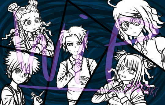
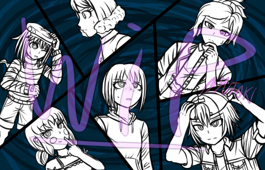
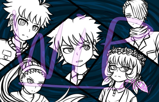
There are some expressions/positions that I might be willing to change, although that’ll come in later when I gotta sit down to finish these. But yeah, later. (Also, just to be clear, I drew these waaay back, so the designs might not match the current ones).
In a trial, depending the type of chapter, the 1st CG and 3rd one will switch places. The one that appears last will be the one that contains the protagonist whose POV we are witnessing.
Second, one of every prologue’s main CGs. “The killing game has begun!”
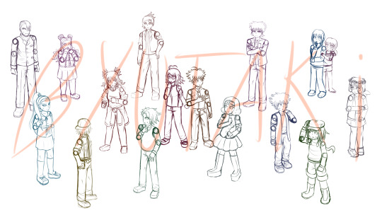
Looks of doubt and deceith are flying across the room! Who will make it through the end of the day? And who’ll be left behind~?
It might seem pretty basic without them being colored, but hopefully it’ll look better in the future!
Animation Tests
Man, this was a lot of fun to work on, and it was all worth it! I hope you all enjoy these as much as I did while trying to materialize these concepts!
#1 - Prologue Title Card
Every chapter of this story has a title card, just like the original danganronpa games. In the case of DDR:LF, this is more or less what each card will look like.
youtube
It’s kinda basic; elements being added to the screen here and there, as well as some silhouettes appearing.
What are these silhouettes, you might ask? It’s none other than the cast of the fangan, but it’s not just anybody who’s randomly picked. The silhouettes belong to the victims and the murderers of the current chapter, so for example, chapter 1 will have the silhouette of the 1st victim and the 1st murderer, but it’ll be modified enough for the silhouette to not be easily recognizable; nobody wants to get spoiled the deaths right at the start of the chapter, right?
Of course, the prologue is an exception... maybe.
A bit of the BGM was done by me, while some other elements of it were taken off from royalty free sound effects/melodies websites.
---------------
#2 - Pixel Execution
As you all know, there’s always a pixel animation that starts off an execution. I have that too, of course! and in order to avoid spoilers + show you what I was able to do, I put myself in the place of the culprit. (I swear I didn’t kill off anyone yet... only after the fangan has started I’ll be considered guilty).
youtube
The background music was also composed entirely by me, although in the future it might change- but I don’t really know for certain, so get used to this for now :)
---------------
#3 - Execution style test
I’ve recently downloaded the program Live2D, and what for? For executions, no less! After trying it for a while, I’ve concluded that it’d simplify my job a lot more than if I used sony vegas for animating the executions (not to mention it looks smoother with this new one).
youtube
For this test, I’ve used Seiji as my puppet. It might be simple, but it was to test out the limits of the program. It turned out really good imo! So I’ve decided to use Live2D to animate the executions (or at least, do most parts of them with it). I learnt some stuff while experimenting around with the program, so next time I’ll finish these sort of things even faster probably.
Also I put it on loop because a 2 second video is rather sad.
GUI Design
Now, I'll admit that I'm not the best at GUI design, but I tried my best to come up with my own design for the fanganronpa's interface, which I made based on a water-ish looking theme. The (not final) result of that is the picture below.
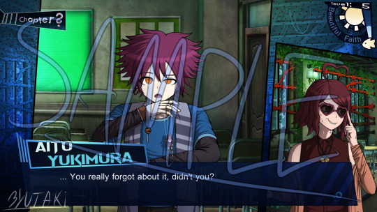
In case that you’re wondering, no, this isn’t any sort of canon conversation. It’s just the phrase I could come up with.
And yes, the background is from V3; I don't have any backgrounds at all for the project yet lol.
The sun and the fish on the top right corner will change depending on the time of day; but that's something that I'll keep to myself until the moment I start posting the story.
I have conflicted feelings with this GUI though, I don't know if I like it or not. It looks somewhat good but still off at the same time? Although it might just be me. If anyone has any feedback or suggestion for the GUI's design, the inbox is always open to receive such help!
So what's next?
Currently, I have loads of assignments at college, so it's kinda hard to make a balance between the project, social life and college work. However, the project is something that won’t stop.
The fangan has only one member, which is me of course; that means it’s going at a slow pace. I'm willing to make a recruitment for help, but that’ll be later once I have the basics to let someone else help me. If you’re willing to volunteer for this project, keep heads eyes up for the day I call out for help.
In the past, I tried to learn how to program with unity, but it’s hard to follow it up when the free tutorials are scattered here and there. When I have free time and everything art-related has been set up, I might try to pick it up again. I say might because I’m gonna start a tiny course for unreal engine at college. Maybe with the basics that they teach there, I’ll be able to do a better/quicker job than if I did it with unity (which I have 0 experience with). But the future is uncertain, so I’ll be the judge of that once I’m done with that course!
With that being said... as of now, the next objectives for the project (not ordered by priority) are the following:
Finishing Default Sprites.
I only have 7 default sprites done out of the 16 students, and I’m already working on the 8th. Half-way there?
Concept Art for each Room/Place.
While I have written down all the places in each dome, there are some that I need to draw the concept of the place, since the idea in my mind keeps changing them, I should settle them down.
Finishing Writing the Prologue and the Basics of Chapter 1.
I mean I already have like a half of these two things or more, but since I keep changing it, they never get any actual progress. Maybe I should learn to let it be as it is lol.
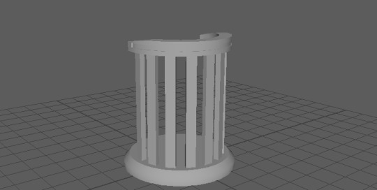
Creating 3D Assets.
Of course, I’ll make the 3D models for the rooms and props... well, I might do them; that is if I can’t find anyone that can make them. Pros of this is that I can do things exactly how I want them; cons are that it takes time and I’m not an expert in 3D modeling.
Trial GUI.
Class trials in danganronpa have a different GUI than the one used outside of them. We have a beta for the general GUI up there, now we need one for the class trial’s as well!
Concept Art for... a Trial Thing.
It’s no surprise that there are special things in fanganronpas, such as making changes to certain game mechanics, or creating completely new ones. The one I’m refering to in this case is a change to an already existing mechanic in the DR games. Can you guess which one it is~?
Splash Art.
During the first year of birthdays, I drew some sketches for the characters; those are the base for their future splash art.
---------------------
And last (and currently least important)
Recruiting Volunteers for the Project.
Obviously, I can’t do everything in this project by myself. In the future, once I have made a base for every ground of the project, I’ll recruit people that can work from there. Artists (GUI,CG and Sprite), Compositors, and 3D modelers are the ones that I’ll be looking for in this recruitment. In an even-later recruitment, I’ll make a casting call for voice actors as well. Please be patient though!
---------------------------------------------
I suppose that’s it for this very long post. It took more days than expected to put everything together, but at last I can release it now!
Now, June and July are pretty busy months at college, so unfortunatelly the progress will slow down a lot more than usual for the next few weeks. Thanks for sticking around this project despite the long road it has ahead! ^^
See you all in the next post! And if you read this entire thing, thank you for your interest in the fangan! <3
8 notes
·
View notes
Text
Devlog #34 - Status Update, Character Design, and UI

Hello! It's time for another update on the development status of Brassica. It’s also our first actual devlog purely about Brassica!
After working on separate projects for a while, we are now in the process of getting back on track working on the same game again. Because of that we're happy to announce that the rest of Brassica's Act 2 will be released in March!
It grew a bit in size from what we originally planned but that just means more game for you~
The exact date will be announced when we can more clearly estimate how long the remaining tasks will take but we're in the process of finishing everything up so it shouldn't be too long.
As for Act 3, our current plan is to release it in April. From now on development should be a lot faster but because we mainly worked on it on the side until now, that is still only a rough estimate. We'll definitely keep you updated on any developments regarding the release dates though!
Well, and that's about it for the status update. Because it's been a while since our devlogs actually described much of our development process (and we haven't shared much about our thought processes behind Brassica), we decided to bring that back with today's devlog.
PECTIN will tell you a bit about Saffron and his design while eZombo describes the development of the UI. So without further ado, here we go:
Art - PECTIN
Saffron is the curious prince the player takes control of in Brassica. Before I began concepting him Felix and I defined his character. At this point we already knew he would be one of the princes Sappho tricks into going on the journey. (And would then fall in love with another prince because YaoiJam'18). We soon agreed on naming him Saffron. So I already associated the colours of the spice "saffron" with him here. We also wanted to make him a protagonist with his own personality. Thinking of the player who role-plays him we thought it would be cool to have his character split into three separate personalities he could have: - the cunning and a bit wild prince - the typical goody two-shoes type of hero - and the soft boi who's overwhelmed by the whole predicament and really needs a hug Another external influence was, my intention to try and fuse traditional things with modern sportswear. Brassica is a fairytale but it's told in a contemporary voice. That's where the idea came from. ...Okay. So I had his name, colours I could associate with him, the three archetypes and my goal to fuse sportswear with traditional clothing. Having all of these "pointers" I began looking for reference pictures. I browsed through online stores of popular sports brands to find things that would fit the character. Due to Saffron's character ranging from cute to rather untamed (in the sense that he would climb a tree without hesitation) I thought that wearing shorts would be most suitable and comfy. But for the top and the overall outfit I wanted to let myself get inspired by traditional elements. The name "Saffron" reminded me of the spice and then its use in Indian culture. I never designed a character with Indian influences before and thought researching into that would be interesting. I found a lot of stuff I could translate into the design. Even the leggings Saffron wears were intially inspired by my findings about Indian culture. Here's a visual breakdown of what inspired what (excuse my srawly handwriting >-<):

During the process of drawing out his design, as I always do, I thought about how each component of the outfit would "flow". There're lot's of lines and intersections in his outfit that guide the eyes along the his body:

And here is our boy again as a sprite. Not much different right? Here I put one of his hands in his shorts' pocket, because I think it would suit someone who is either unsure and does that or feels liking hiding something.
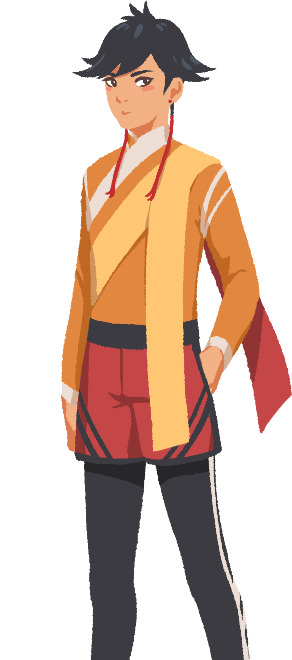
That's it about Saffron! I could go on about his colours but I'll save that for when I explain the general artstyle of Brassica! :3
UI - eZombo
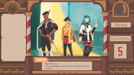
Because Brassica was planned as an entry for Yaoi Jam 2018, we thought about ways to keep the scope small. One idea we came up with was to reduce the size of the screen that shows backgrounds and characters so producing the art is a bit faster than filling a full HD 16:9 canvas. One inspiration for that was Sticky Zeitgeist by Porpentine & Rook but something like the Undertale console version where the graphics at the border of the screen change based on the in-game location was also something we considered.
When it came to actually planning the screen, Undertale's influence came through again, because the main area of the screen actually has an aspect ratio of 4:3. This obviously leaves a lot of unused screen space but one thing we knew we could definitely use to fill this was the text box. Having it separate from the main screen also made sure that it didn't overlap with the characters or backgrounds so the space that was reserved for that could be used to its full potential.
With two elements already on the screen, we still had the sides to fill with content. Just using graphics as borders definitely was an option but because Brassica's story plays out a bit like a road movie, we thought having a map of the game world would definitely add to the feeling of that. And to make the UI visually more balanced again, the last bit of free space was then filled with some information on the time of day and how many days were left for the quest of the princes which basically added all the important context for what is going on in the center of the screen.
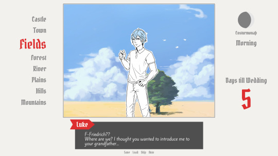
A first mock-up of the UI featuring a familiar face and St. Bernard...
Around that time, we also developed the idea of presenting the whole game screen like a paper or puppet theater. This seemed like a good way to bring all these different elements together while still supporting the colorful fantasy-ish look of the game art.
I did a quick sketch of how this could look, which turned the mock-up into this:
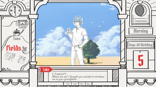
Aside from adding some more purely graphical elements, I adjusted the text box and the flag that showed the name of the character that is currently speaking. The map was graphical now instead of just a list (which would have given away future locations) and I was overall fairly happy with the direction the UI was going in. A few of the border elements overlapped with the main screen now but I tried to make sure it only happens in areas where we wouldn't put any focus.
After getting some feedback from PECTIN I then went on to work on the final lineart while also trying to simplify all the shapes. By then, the characters were also being concepted so instead of Luke I could put Ode into the mock-up (along with a reference for a possible background style).

As you can see, some unnecessary lines, elements, and text were removed to simplify the look of the UI and make sure that the important elements aren't overshadowed by anything else. Overall I tried to keep the lines clean without making them look overly sterile, so any round shapes are generally drawn freehand instead of using any vector shapes. Except for the compass, moon, and their enclosing arcs. Those just looked sloppy when they weren't exact. Not using fixed line widths was another way to make the lines more organic even when they were perfectly straight. The idea to use different colored flags for each character also came into play now, although Ode's color here is actually used by Hans now…
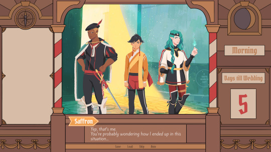
Colors were next on the agenda. First a basic pass, followed by some adjustments and line colors to make the lines fade more into the background. Having the concepts for the three princes was very helpful for this step because it was important that the UI colors fit into the overall color scheme while keeping the focus on the actual game art. That's why red is only used close to the center and for important UI elements (the current location on the map is also marked in red). The rest of the colors are rather muted and monochrome on purpose with only a little bit of gold to break it up.
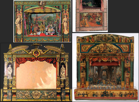
Throughout the whole process my main references were old paper theaters but especially during the coloring process I deviated from these references in favor of using colors that would match with most backgrounds.
Once we were happy with the colors, I did a relatively quick shading pass, just adding shadows with a fairly abstract light source to keep most shadows parallel to the lines. I also added some subtle noise to make everything look a bit more organic.
For the most part it still looked too clean though, so PECTIN suggested overlaying the UI with some watercolor textures.

Which lead to this final mock-up and not only solved the problem but also gave the UI a more painterly look that didn't interfere as much with the general artstyle.
Well, but as always, there are still a few things that changed on the way into the engine.
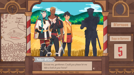
The map was obviously added (which could probably fill a devlog by itself), the text on the side was changed to better reflect the current quest of the princes (although the other sign may or may not return in future acts...), I added a CTC icon and updated the quick menu (although I can't remember why "Load" was removed so maybe that will return again), but most importantly: The text box was reduced from three to two lines of text. This wasn't as much an active decision as it was caused by the fact that small line spacing in Ren'Py cuts of parts of some letters until all lines of text are displayed. There are some games that still do this but personally I don't really like how it looks while the text appears. Increasing the textbox would have caused a lot of work because I would have had to shift around more elements of the UI to keep a balanced layout so it was simply easier to remove a line of text and increase the line spacing.
This had a pretty strong effect on the writing because sentences have to be fairly short now or if that doesn't work, broken up into multiple lines. Even if it wasn't exactly planned, it still influenced the writing style of Brassica and further distinguished it from our other games (although there's more to say on that one) and in hindsight, only two lines of text also look a lot cleaner in this layout.
I could go on about the actual implementation of the UI but this has already been a pretty lengthy post so maybe I'll save it for another devlog.
But that's it for now! We'll be back in two weeks with some more development insights and our current status. We also plan to start posting these devlogs regularly again, so stay tuned for that! As always, thank you so much for reading and we hope you could find a few things of interest in this devlog.
#brassica#fairytale#devlog#gamedev#game#development#otome game#romance#tutorial#visual novel#indiedev#indie#okay
8 notes
·
View notes
Text
Steven Universe “Change Your Mind”
....YOOOOOOO
AAAAAH
*Flailing arms*
Oh, I meant, all in a good way.
But seriously, YOOOOO!
[spoilers below]
Thoughts:
* Okay, but what is there to make another season and movie about? Didn’t we just wrap up the main conflicts, threats and questions that have been driving the show for 5 years? I am confused. I hope the SU team isn’t just stretching stuff out.
* Fav rewatching parts: Obsidian sequence and the whole sequence with Steven’s gem and reuniting part. (James Baxter animated bit is a fav.) I think I read that the production crew spent the most time on the gem-and-reuniting sequence, because of the emotional significance etc of it. It shows, and I think the sequence is really strong endcap to Steven’s character arc where he spent 5 seasons questioning who his is and has been existential. Or whatever. What are words. I’m just still really excited and feel Feelings about that sequence, it was so interesting.
(Which is why I’m like “Wait, there’s another season? Of... what, though?”)
*Also characters becoming white diamond’s puppets is rewatchable for the creepiness -- how their bodies move. I read comments about how Rebecca Sugar should do horror, but honestly, there’s already a lot of creepy horror that is low-key woven into Steven Universe already?
*Also seeing and getting to know all the new fusions in general. And the leitmotifs for each one. Again, Obsidian soundtrack, so cool. And the temple statue is modeled after the Obsidian fusion!? Also the character design of Obsidian - the aesthetics, gosh! Wow, I guess I just really dug that fusion. And a cursory search of Obsidian fan art on Tumblr shows that apparently a lot of people are also fan-ing out.
* I’ve read that some people don’t dig how the animation style changes between different animators or whatever, but I kind of like it. Even when it happens within a single long episode.
*...was that really Connie in 3 different places in the same scene, at the end at the Beach City concert (wide view shot)? A commentor pointed it out and it kind of looks like it. Huh. Unintentional?
*I’m... half-interested in Lars’s story (I guess I want to know if he’s gonna be a pink zombie person forever or what). I’m more interested in Sadie’s story. Also... I thought Lars and the Off Colors were going to do more. Maybe that’s what the 6th season is for.
* The giant pink legs spaceship parading around is and may be the strangest thing, and no one really comments on in-show. But also, I like how they’re parked in wonky unladylike stances. Actually the more I think about it, the funnier that spaceship is. Also, the photos with the SU crewmember who made a giant rice-crispie cake of the legs ship and the SU office people decorating it with pink frosting.... What...?
* I read a commentor wishing that Steven’s design would age a little in the 6th season, and actually, that would be a decent reason for another season. It would make sense, given all that’s happened. (I mean, he can fuse with the other gems now, just to show how he’s definitely grown more and is their peer.)
4 notes
·
View notes
Note
hi! i know you probably have a lot of asks right now, but i wanted to get some clarification on something. what exactly do we know about remnant? do we know anything except that it's what the scuper was designed for?
Yes and No!
The secret ‘insanity’ ending is the only time we ever see Remnant being mentioned. But we need to keep in mind that like with everything else in FNAF, being directly told about something is just meant to be a hint to look for context clues!
Longer post under the cut because there’s a lot to be said here and it’s image heavy because I just woke up!
edit: I realized partway through this that gameverse Afton might be injecting himself with whats essentially robo-ghost blood and it’s really fucking funny to me, sorry for obviously laughing about this for the entire post.
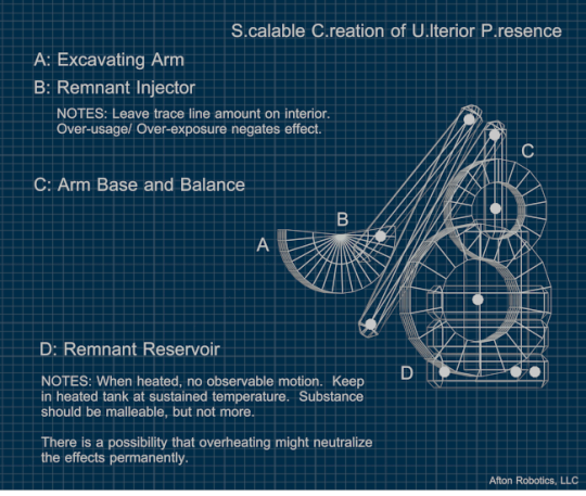
First up we see the SCUPer, A B C and D functions, and the Afton Robotics, LLC trademark. Let’s go over them!
NAME: S.caleable C.reation of U.lterior P.resence

Ok so you can see that either Afton or Scott are really weird with names, because this.. is honestly weird word choices, but they sure made it fit the ice cream theme. Rammed it right in there. But let me work these words down;T.his M.achine M.akey G.hosties. Call it Thingmmagig.
Scalable Creation refers to being able to generate more [ghosts] and likely also be able to remove (or relocate..?) [ghosts]. Ulterior Presence is.. actually a little funny, because it means ‘Secret Secret Ghosts’ kind of. And honestly these ghosts aren’t really hidden, unless you count that no one was sure if the Funtime animatronics were haunted or not. Maybe in-universe, the fact these robots were haunted at all was a huge secret and only like, 4 people knew. Maybe to everyone else, blood and mucus coming out of robots is normal. Whatever.
BLUEPRINT PART A: EXCAVATING ARM
No bonus data given, this is just the weird… partial cylinder. I’m not sure why A wasn’t put on the actual folding arm structure. Maybe the A is on the end because that is the part that, well, scoops you. slurp
BLUEPRINT PART B: REMNANT INJECTOR
NOTES: Leaves trace line amount on interior. Over-usage /Over-exposure negates effect.
Honestly the fact that there’s an ‘injector’ here somewhere is weird because it seems Scott made this thing really lowpoly and didn’t add much if anything when he went ‘lets make this a blueprint!’ because there’s clearly no… tubes, or needles, or… hell maybe the whole things hollow and it just kinda opens a hatch and it gloops out. I can’t see scott
Anyway this part of the blueprint identifies that.. somehow, there is an injector!So not only does this blueprint have one, we also now know that, yeah, there is a reason to inject people with whatever ‘remnant’ is. People and/or machines. So it clearly has some sort of reaction when placed inside other substances, and… actually why isn’t the SCUPr itself haunted. Scott probably didn’t think of that…. Moving on.
BLUEPRINT PART C: ARM BASE AND BALANCE
It seems that both wheel-shapes are just balances, given how low the D is. Weird design but not an important part of the machine, aside from making it sturdier while it tears things open.
BLUEPRINT PART D: REMNANT RESERVOIR
NOTES: When heated, no observable motion. Keep in heated tank at sustained temperature. Substance should be malleable, but not more. There is a possibility that overheating might neutralize the effects permanently.
Here’s the juicy stuff. Remnant is something that moves, and when heated, it stops moving and softens up. If it gets too hot, it neutralizes ‘effects’. So now we know that whatever Remnant is, it’s heat sensitive and moves on it’s own, so it’s alive in some way. People who have looked at the game files might remember something like that…
Also a weird fact here is that heating may neutralize the effects, but isn’t clear on what effects, or if it means while they’re in the tank or not. This could either mean that the remnants will get heat-resistant in the tank, which us unlikely, or…
Whoever uses Remnants for the SCUPr’s intented purpose needs to be kept cool at all times, or the effect, which we assume to be immortality, will wear off. What’s a coolant that we have in all games, and are only able to disable in FNAF 6? The fucking fan. THE FAN KEEPS MICHAEL AFTON ALIVE, LITERALLY. In theory anyway thats just a theory … but god would it make some god damn sense.
—————————————————————————
FACIAL RECOGNITION FILE 0072
Remnant is also mentioned in this blueprint!

SECURITY TAGS ACTIVE:001 “Funtime Freddy”002 “Funtime Foxy”003 “Ballora”
It’s unclear here if the numbers are the security tags (which implies funtime freddy is the first animatronic on the tag system, ever?) or if Henry was just absolutely prepared to have to write blueprints on a 100-tag hell machine. It’s probably just aesthetics. Either way, as referenced in LEFTE’s blueprints, all of the animatronics have security tags, or bracelets, or security receivers.. actually it’s likely
Henry’s robots: Security Receivers are so animatronics, Toys especially, can connect to each other to keep out bad people and protect children.
Afton’s robots: Security tags, so he knows where the robots are at all times, and doesn’t let the robots escape.
FE/AR Staff: Security bracelets so the robots know the difference between staff and patrons, and theoretically know staff by name. You guys know the theory that Lefty is submitting Henry’s frequency to the Puppet / his daughter? Shit’s sad.
That aside, come to think of it, would William have sent Michael a bracelet with his number on it, just to make sure the robots think Michael ‘looks’ like him to the animatronics? Michael goes through a lot of name changes over the series, but it’s possible. Maybe?
Anyway the main point here is that Molten Freddy is Freddy, Foxy and Ballora (Chica? Suzie?). No Minireenas, no Bonnie hand puppet, no pre-Ennard, no Yenndo, and especially no Circus Baby.
Priority One
With the most amount of Remnant collectively in it’s structure, this amalgamation of Afton’s constructs is a necessary element of Paragraph 4.
Paragraph 4′s direct meaning still isn’t really clear aside from that it has to do with the end of the game where Henry sets fire to Molten Freddy, Circus Baby, Springtrap and Lefty/his daughter, setting them all free. Of course with Molten Freddy being multiple spirits together, he’s the top priority: Even if Henry can’t stop the Aftons or save his daughter, he needs to save the most kids he can.
That said, note the wording: The most amount of Remnant. Not ‘the most spirits’ or ‘Likely to have the most attachments’ or anything clearly stating dead kids: the most Remnant. So although Remnant was only stated in Afton’s SCUPer blueprints, Henry is not only aware of what Remnant is, he clearly knows how it works, and how to remove the haunting ‘effect’: Heat. Fire.
This implies that Henry may have still worked with Afton even while Afton was doing a side job with Afton Robotics, despite Henry saying he built at least some of the robots. It’s very unlikely Henry would build.. child-grabby machines, so we’re assuming here that they just.. both made robots. At the same time. Oh timelines…
—————————————————————————
SO WHAT IS REMNANT?
In short, Remnant is some sort of life essence that may or may not always mean ghosts. The way we see the SCUPer work, through Circus Baby’s lines and Ballora’s scene in the Springsuit game (which the springsuit was distracting you!), is that the Funtime Animatronics capture kids in some way, ‘malfunction’, are taken to the SCUPer, and have the remnants of the kid scooped out.
Why don’t we see some kid’s corpse get mangled up and slurped out when we see Ballora get scooped? Well, maybe she opened up just off screen, orr it’s that it’s a kid’s game. There’s probably a better reason here, I just am not sure what it is.
Here’s a brightened gif of her being Scooped, which I was too lazy to reupload.

The eye color might be from my de-blueing it, so I won’t bring that up.However, what we see in the scooping process is odd. It’s not really a scoop, she just looks like she got uppercut in the face, twice for some reason. And that whatever the scooper’s doing, it’s causing a flash of light each impact. Whatever it’s doing seems to take a lot of ‘energy’ from Ballora, since she slumps over after as if she’s tired, but is clearly still possessed… or at least has the energy to be creepy while the Real Ballora is now inside the Scooper’s Excavating Arm.
It’s important here however to remember Scott’s intended view of this sprite:

This. This is all you get. By the time the faceplates open up, Ballora’s already staring at you slumped over. However, something also hidden by the faceplates, that perhaps Baby was specifically hiding from you, is something that isn’t present on the sprite. Because when different objects animate on their own, Scott makes them their own little object and spritesheet in game.
Because anything moving down there, you wouldn’t see them. Something wiggling, moving, because the scooper is extracting them, and they’re just not warm yet. Something that, just like the Insanity ending, we’re not supposed to see.


111 notes
·
View notes
Text
First 25% of short story
Original piece by R.D.
Winston was cruising down Crenshaw Boulevard thinking angrily about how he was sick of all the rotten heat and that he needed to buy a car with better a/c. He tried walking every chance he could get but still managed to maintain a weird paunch and a second chin that seemed permanently scrubbed with a thin layer of stubble. His burgundy off brand polo shirt had a big three piece white stain in the middle of it. There was one big stain, a smaller one, and a smallest one. It was like an island chain of cum. It had really come from a bowl of honey nut cheerios and milk he had been eating on his walk to work, but he invited people to speculate about whether or not he was a faggot and a slob.
This was the day Winston had been waiting for since he’d ordered the package six months ago. It was a rarefied product he’d been looking for, and he’d found it, but the salesman told him he’d have to wait. First the guys had to extract the honey from the Ugandan beehive, freeze it into a cube, cure it with chemicals, adulterate it, and crush it into powder. The result was Adhuru, a super powerful African designer drug that you snorted through the nose. Winston heard that the result was an out-of-body, multi-day psychedelic journey through a version of heaven or hell, depending on what kind of person you are.
Apparently the time dilation was intense and the journey felt like it took the user years to undergo, a strange, drug induced life extension. Winston had become obsessed with life extensions since he had started physically showing signs of aging around his early forties. It was finally clear that he wasn’t born with some special invincibility to the rules of biology, despite what he’d originally thought, but he was going to try and fight the passage of time with every thing in his arsenal.
And he had the Rube to help him, which meant he was a bit better off than even the richest and most intelligent of humans. The Rube, you see, had attained immortality and had been leading Winston along the Righteous Path to Infinite Control, which was the title of the Rube’s manifesto.
Plus he was willing to trip sit for Winston, which was a must when one did Adhuru. It was a certainty that the user would be out of commission for at least two days, usually three. Winston made sure Cynthia was staying at the house too, because the Rube tended to be a little unreliable. The safer, the better.
He finally saw the neon lit sign that marked the entrance to the post office locker room and nearly jumped out of his skin. This stuff would get you fucked out of your skull. He gingerly slid the key out of his pocket and, with shaking hands, approached his PO box, #123421, inserted the key and turned it. A small brown package tied with string was sitting on the inside. It looked like something out of a poem.
Winston pocketed it furtively and shuffled into the elevator and out of the building. He ripped off the brown paper and revealed a small clear doggy bag filled about an inch up from the bottom with a blue powder. Score. He tried to drive home as quickly as possible, swerving in and out of mid-day traffic. Once he got to the house up in the Hills he swerved the car into the garage frantically like a madman.
He dove into the door to his house and called out for Cynthia and the Rube to come up to his bedroom, which overlooked cliffs above the Pacific ocean surf. He collapsed comfortably into his plushy white bed and pulled the comforter over himself as Cynthia strutted over to the bed holding a large ovular mirror with gold handles.
Winston cracked up two huge lines of the crystalline powder. Cynthia pulled out a huge bowie knife and took a tiny little bump of the powder. She shivered a bit and then nodded at Winston. The three of them joined hands and muttered in crescendo: “antitha bududha nevari keparu, temami exploitus tormeemo dormamu!” Then Winston spoke.
“Goodbye friends. Please see to it that I stay safe. Thank you so much for making this happen.” He railed the two lines and patted his nose.
The old Ugandan shamans say that with Adhuru, if your soul is pure then you ascend into a kind of heaven. Apparently it’s different every time but the beginning is always the same. You begin to glow brightly white, in your own mind of course, as if an incandescent bulb were being gradually turned on inside of your body. You begin to vibrate with intensity and increasing frequency.
Slowly you ascend into the air as if crucified, like in the exorcist, and as you begin to vibrate faster and faster you blip out of corporeal existence, dissolved instantly with a loud “pop!” into an iridescent mist that blows away lazily in the wind or wafts to the ground and fizzles away naturally with a crackling noise and sparkles.
The same, they say, is true about Adhuru hell. Every experience is different, but the come up is always the same. This is what happened to Winston and it went about like this:
Winston had been sitting up on the bed under the blanket but he fell down on his back spreadeagled immediately after doing the lines of Adhuru. Almost instantly his nostrils began to tingle with intensity. He got excited because he interpreted it as a signal that he was going to light up and shoot into a few years of heavenly hedonistic bliss. That was, after all, the reason he had taken Adhuru in the first place. He wanted to live longer, but not in hell. No, he was expecting paradise, damn it all.
Instead he felt a skeleton’s hand tap him on the shoulder. He looked to his right, where the tap had come from, and a hand grabbed his skin tightly by the scruff of his neck from his left hand side. It pulled a disembodied translucent version of himself up into the top corner of the bedroom and held him there by the scruff of his neck like a baby Hamster. He could see his breathing, unconscious body lying on the white king-sized bed wearing nothing but a silk bathrobe. It was like something out of Calvin and Hobbes, he thought to himself in his state of profound mental disorientation.
From his position he saw his body start to change. It got older and older, faster and faster. First it rewound almost instantly back to infancy and aged with alarming speed, through adolescence, youth, and on through early adulthood. Once he caught up to middle age things hit a new gear. He saw his body grow to seventy, one hundred and twenty, five hundred, until finally he died after a millennium of bedridden aging. He wasn’t sure why he had survived for so long, but he decided to go with it.
By the time his body died, the Winston on the bed barely had any muscles or fat left on his body. What he did have left decayed quickly along with his eyes, organs, and hair. All that was left over at the end of the vision was the outline of a pointy skeleton covered by a decaying layer of epidermis. The epidermis began to grow holes and started to look like Swiss cheese. This was the point where Winston realized there was something wrong. He’d made a mistake. He felt like he was going to vomit up ghostly ectoplasm.
Then the hand that had been holding him in the air flicked him back into his decrepit body with a noticeable air of indifference to his comfort. It used just its pointer finger like it was flicking a marble or an annoying piece of dirt off its shoulders. He noticed his body flicker back into its natural and shape as he tumbled, end over end, back into his meat puppet. He felt a heavy thud as he re-entered his flesh, so heavy that it caused his body to fall through the bed into a deep, black void. Bright glowing green and blue tessellations followed his hands like tracers in the pitch blackness as he grasped for anything at all. He was tumbling, end over end towards a strange red dot that was far away and glowing with a brilliant light. Before he reached it, though, a gurney appeared below him, spotlit by an unknown source. The rolling gurney was sitting on top of what looked like a hand made out of psychedelic patterns, pulsing and changing colors ambiently every few seconds. Straps on the gurney seemed to magically lift themselves up and restrain him as he saw the fingers on the cosmic hand begin to close into a fist around him. Before long he was in a submarine like chamber made of psychedelic tessellations.
Then all of a sudden he was beneath florescent white lights, passing his field of vision, quickly, periodically with high frequency. Nurses that looked like aliens or maybe angels flocked around him as they pushed his bed down what seemed to be a hospital emergency room intake hallway. Perhaps the psychedelic hand had been a cosmic ambulance. The nurse’s faces had an interdimensional quality to them, morphing in color and shape as light hit them from different angles. They had no eyes or mouths and they looked like wooden artists’ models wearing old school white nurse outfits with red crosses in the centers of their hats. They all had three fingered hands that looked like they had octopus like suction cups on the fingertips.
He felt long IV needles being pushed into each of his main arteries, including the ones in his neck. Gradually he began to feel sleepy, as if he were being sedated. He knew now he was entering his first stage of hell. To attain enlightenment one must wake up, and the first thing that was happening during this trip was sedation, being put to sleep. He figured this was as good a sign as any that he was descending into a hellscape.
These journeys were always productive and necessary. Adhuru only revealed heaven to pure minds which did not have large flaws in need of immediate attention. Winston was flawed to the core.
“No sympathy for the devil.” Winston quoted one of his favorites, “Buy the ticket, take the ride.” He braced himself for whatever and whoever was to come next as he felt himself drift off into a poisonous but undeniably pleasant state of sedation.
(to be continued)
0 notes