#i used the lasso tool to paint it btw---------
Explore tagged Tumblr posts
Text

"don't fear! Amy Rose is here!"
Just trying to get better at drawing her! Finally figured out something for her quills!!!!!!!!!!
#amy rose#sth#sonic the hedgehog#sth fanart#my art#i swear i CANNOT draw her quills lile canon#i tried#so i figured I'd try something different#i personally love it#also experimenting with their expressions!#its a bit hard#but im getting the hang of it#I ALSO GAVE HER THE LITTLE THING FROM SA1#I recently finished it#and i thought it looked cute alright?!?!#i used the lasso tool to paint it btw---------#digital art#oop- forgot to change the tag
38 notes
·
View notes
Note
Hello there 💜 as someone who’s trying to figure out cel shade and wrap her head around the use of airbrush and hard light, and…your style??! my eyes?! It’s so PRETTY!! The way you shade just draws the viewer in instantly! And points for the art of Astorian ✨
could I possibly ask how you go about your shade/lighting process? If that’s a question with a lot of undertaking then please don’t feel obligated to answer! Just know that your art is beautiful!
Thank you! 💛 I honestly don't really think my art style is anything special like you said it's just cel shading, but still thank you it's nice to hear that my art looks good to other people.
Anyways there's has been a lot of people who asked about the "process" I am going to give you a very simplified version because otherwise I'll start rambling and it's going to be too long I mean look how much I've written already.
First of all I work with PS, but you can replicate this anywhere.
So first I have a base color layer, the line art and the base color are separated.

I select the entire base color layer with a quick selection tool, and in a new layer that will be above the base color but below the line art with a paint bucket tool I fill it with my desired color, the layer blending mode must be set to hard light. This is the shadow layer.
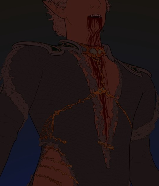
Now in another new layer above the shadow layer, I use the polygonal lasso tool to select everything that will be in the light layer, once I am done with that I will fill it with whatever color I want. Btw you can use a brush for this I just use the polygonal lasso because I just like it that way.
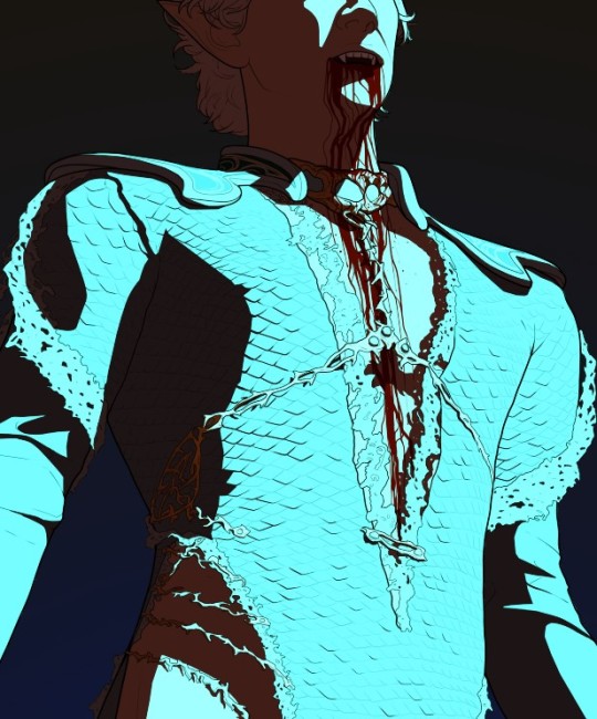
In another new layer with the layer blending mode set to Linear Dodge (Add), I select with the quick selection tool everything from the light layer, I hide the light layer and in the new linear dodge layer I create a gradient with the selection. I usually use a radial gradient since I think it gives a more natural look but you can use whatever fits your art. If you don't know how to use a gradient, you just drag it from the direction of the light source. And you should have something that looks like this:
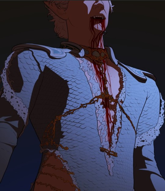
This is a very simplified explanation I add a lot of more gradients and lots of layers so this is just the base.
I'm sorry if this is incomprehensible, I also struggle with written instructions so if something isn't clear just ask me again I'll try explain it in detail and add more screenshots 💜
#ask#hope this helps!#and sorry to all the people who asked me for a tutorial before 😭#i know i never delivered but i had something prepared i was just like do people still care?#clearly they do lol#tutorial
202 notes
·
View notes
Note
hiiii i saw the ask thing and i was curious about your drawing process? if you don’t mind sharing
Hiii !!!! Okay so i Made a tik tok about it once and I think that having it visually might help better so here :
I usualy go just by instinct i don’t know how to explain. I use Ibis paint and it’s the program that i feel the more confortable with mainly because of the lasso tool that I find very useful. Like i say in the video i'm very quick into making my sketches, sometimes I do a "placing shape" sketch and then a "more understandable sketch" because having an understandable sketch help the cleaning process to go faster.
My hands are kinda shaky so when I draw, lineart isn’t my main strength, so something i started to do to compensate is using textured lineart because that way my bad lineart isn't that noticeable and i like textured art ! I usualy use pastel / pencil brushes.
talking about texture I always use the same grainy layers who's simply a watercolor papper. Sometimes I just use noise.
Regarding shading I love shading with purrple and magenta, idk something i really like with this colors. I do often correct my colors once my artwork is finished by making a color effect layer to make it more vibrant.
Now on everything regarding posing / Expression i go by instinct, I have my habits and 95% of the time i create the skeleton with my anatomy knoweldge ( that need an update btw ) so if needed advice : learn your anatomy and mirror your canvas to spot errors !
10 notes
·
View notes
Note
Thank you so much for sharing timelapses of your drawings!!! 🙏🙏🙏 I adore your style of rendering like nothing else, it's such a pleasure watching you go from lines to a full refined drawing 💕💕 If I may ask, how do you get such smooth transitions from dark to light? Do you use a blending tool or just have godlike pressure control? btw I love uriyah she's so #serve
Hiii Thanks a lot for the kind words!! Really means a lot <33
So these days I usually just use a brush with Pressure Density/Opacity and soft(ish) edges, like her:

And then I just sort of paint back and forth; I lay down the lightest and darkest shades and color pick whats in between, then paint with that color. I color pick almost every stroke and dont press down hard, so that way the strokes are transparent and blend together. Sometimes, when manually painting a gradient would be too patchy, I use a big airbrush and lasso select the area.
Heres a (i hope somewhat comprehensible) explanation of how i render:

Also (pro tip): hide any area that doesnt turn out smooth with a screentone brush or some hatching!!!
Hope this answers your question! :)
#i didnt know how else to word it but “manually chosen” means from a color palette or the color wheel etc#and “color picked” means with the eyedropper!!!
14 notes
·
View notes
Note
Just wanted to ask (and feel free to not answer), but how do you draw so much so quickly? I'm always impressed by how fast you doodle or paint. Also, wanted to say that I appreciate your Barok and DGS art as a whole.
and with this ask i have finally reached an artist milestone 😭
Well theres a short answer and a REALLY long answer (which ill put under cut when i get there).
short answer: practice + refs
which.....can be an annoying thing to hear. And as someone who studies art and has bought a LOT of online courses trying to figure out how industry people can just churn out work like nothing. it feels like a let down every time i find out their big secret. just practice and photo refs. Every. Single. Time.
LONG ANSWER:
its how you studying your refs. heres how i do mine
sorry if this is rambly. but ill try my best to at least be clear. BUT THIS is the EXACT way i taught myself how to be quicker.
I do not know if youve taken any art classes but essentially one of the ways to study gesture drawing is by first tracing ur photo ref to get a sense of the flow/proportions of the body. youve probably seen a billion of these tutorials floating around:
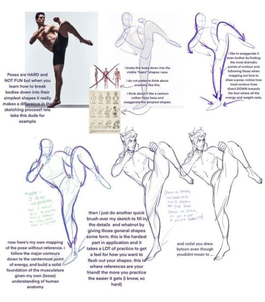
So last year around hmmmm june/july? i was NOT looking to get better at my anatomy or gesture. i was actually trying to get better at clothes. but my problem was it took me so long to draw out a figure (which i was fine with cause i liked how my people looked at the time) that i could never really just focus clothing part.
So i told myself look. ur not looking to draw in this style like this forever. so for now SIMPLIFY SIMPLIFY SIMPLIFY!!!! I WANT THE BAREBONES OF A HUMAN HERE TO MAKE A MANIQUIEN FOR CLOTHES OK
but how do i do that....
Im gonna use this piece as an example from my rise and yosuke fashion palooza month. FIRST u see i got all my photo refs together. i like those poses on the right and i want to switch out the clothes for the other ones i picked out. i trace out my poses. kind of like the tutorial up top but since this is about draping i was focused the exact places their waist/arms/legs/etc would bend.
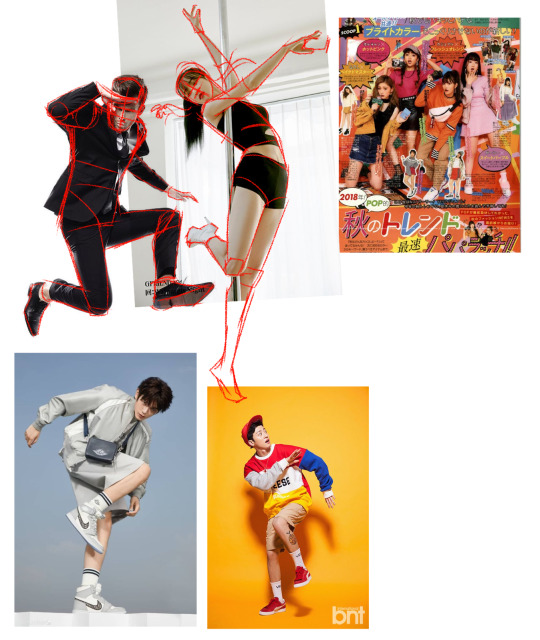
and like the tutorial u turn off the photo ref and do a drawing based off that traced piece.
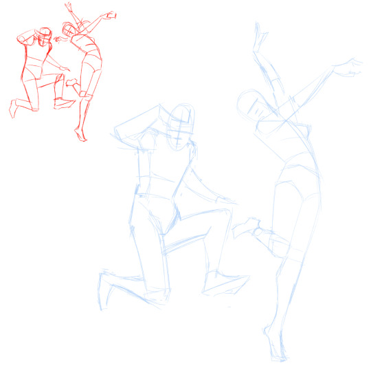
then i would turn on my refs and add on my clothes
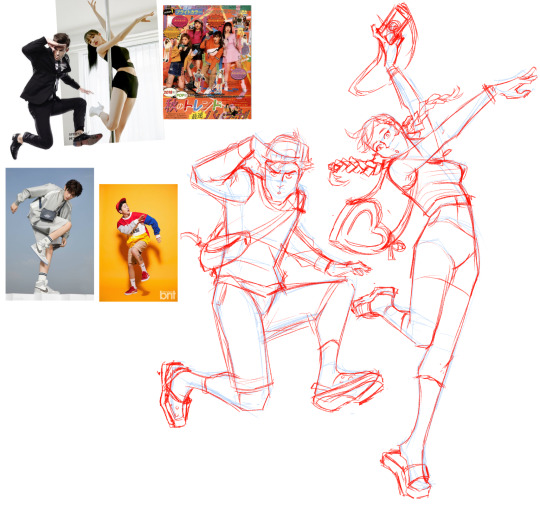
And after a month of just doing that over and over and over. i was surprised to find that figures and poses were so much easier to understand when i would break them down like this. and once u get familiar with them the faster and more confidently you'll draw them.
I and still do this btw. heres my otasune from the last week
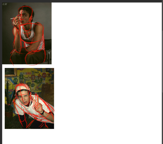

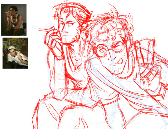
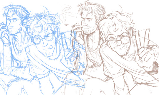
i used photo refs for all my sketches. if i cant find anything online to match what i want i just take photos of myself. and some might say well arent u just relying on reference TOO much?
AND AGAIN take it from someone who has spend a lot of money buying classes from their fav artists in the industry. The Secret of how they churn out so much cool work so fast always turns out to be this. practice and photo refs.
Every. Single. Time.(tho this is omitting a lot. im not getting into like they way they stylize their art work. that actually the fastest and funnest thing to do once u have ur base down)
Now PAINTING
The thing is, i dont actually post up all my work on this blog. So theres a ton of stuff you havent seen me do. These are some paintings i did 2 years ago for a class.
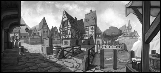
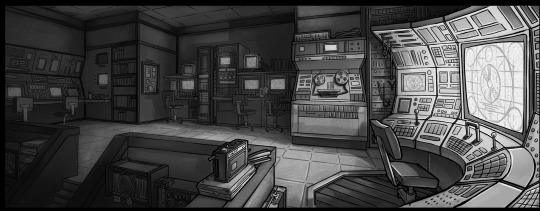
I already know how to pick my values and set up lighting. When you see me painting my figures now. i am not focused on learning these basics im actually just honing a technique.
you might see me post readmores with these kinds of wips. I lay in all my colors and lighting with the lasso tool. ALL THE MAJOR DECSIONS ARE DONE HERE
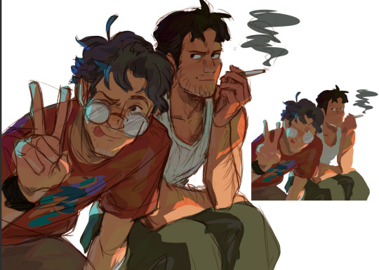
(the little miniature i add on the side basically tells me what the overall feeling is going to be when i blend in the lineart to be cohesive with my colors) ( also if you had any questions on my prepainting process tho. feel free to ask!!!)
and if you compare this wip to my finished piece youll actually find that i dont stray that far from what i've laid in.
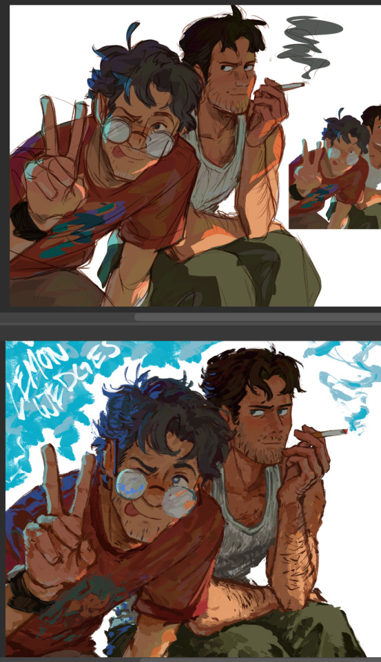
everything happening at THIS stage is about feeling out how i want the textures to blend with one another and getting funky with some brush strokes.
and thats it? im not sure if any of this is helpful but if anything. i hope you come away from this feeling like what ive been doing here is nothing special. "THATS IT???? THATS ALL THERE IS??? well i could have done that :T"
exactly man. you can do ALL OF THIS aND MORE!!! I BELIEVE IN U :D
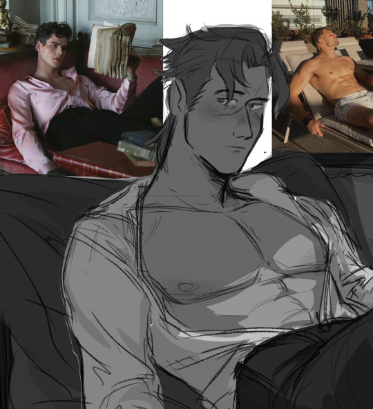
but ill let this be the last thing i leave u with my friend: my barok sketch and the refs i used for his boobies
76 notes
·
View notes
Text
I actually posted about this on bluesky but I like making bad isekai and the current one I’m working on is “I got reincarnated with a harem but I’m evil and gay”.
The Plot is that some kid gets reincarnated as a prince(our protag Lucian) and another kid gets reincarnated as the chosen hero(love interest/secondary protag Oliver). Anyways the king dies by natural causes(the causes being gravity) and Lucian assumes throne. He also makes all of his suitors his hench women. Plot shenanigans ensue as Oliver keeps trying to kill the new king(and they fall in love lol).
Also I figured out how to use the lasso fill tool on ibis paint so I drew all of the main characters.
I forgot to add it in Oliver and Lucian’s art but they’re like 28-29 when the plot kicks off.


Oh btw Oliver get a katana instead of a standard short sword like most heroic swords are because I wanted to switch it up slightly more
2 notes
·
View notes
Text

I tried something new. (btw haii helloooo :333)
Personally, I don't like using the lasso tool in Ibis Paint, but this time I wanted to give it a try!!
2 notes
·
View notes
Note
Do you use an app or program to do your art? Love your art BTW
First of all thank you so much!!
And to answer your question, I used to use Photoshop pretty much exclusively. But I started looking for other options after they made it a subscription service instead of something you could buy and own.
I know a lot of people use Procreate for tablets, and I tried that as well as Sketchbook because they were both free (I think?), but I wasn't a huge fan of either on.
I finally just decided to buy Clip Studio Paint because everyone said it was the best for comic making.
And, well, yeah. They're right.
The only features I miss from Photoshop are the lasso tool for selection, and adding text because there are more options, but in every other aspect CSP has been a hundred times easier. So it's definitely something I'd recommend, especially for comic making or digital painting.
Plus you can animate in it??? Which is something I want to try out eventually!
20 notes
·
View notes
Photo

Layer Mask
In an earlier tutorial, I mentioned that masks are a vast topic. Here is one way to use Layer Masks.

I'm pretty sure you can see the obvious problem in this picture. But luckily, there's an easy fix. First of all, learn how to use the cinematic camera in your game. If you have no clue what I'm talking about; use google or check out @tiallussims post. To delete the setting, you have to locate the file named VideoCameraStates.ini. Btw, this file is editable even when your game is open.

Now take two identical pictures. Actually, identical would be pointless. Take two pictures—one where you can see the issue, one where you can't see the issue. Okay, let's move to Photoshop. I'm going to select from the spare parts picture what I want to use. And then I’m going to use quick key Ctrl+C to copy it. Next, I'm going to open my main picture and hit Ctrl+V to paste my copied selection. And now I have a floating ear! Mission accomplished. There are many ways to make a selection - different Lasso Tools, Quick Selection Tool, Object Selection Tool, Magic Wand Tool, Pen Tool, even Marquee tools can be used. Use what works for you.

Now I'm going to align two layers and add the Layer Mask to Layer 1. The white rectangle is my mask. With black color and Brush Tool, I can start revealing the layer underneath. By default, Photoshop sets your foreground and background colors. But I think in some earlier versions, you had to set those yourself. Before you start painting, make sure your mask is select and not your layer.

Let's say I messed up. I just have to swap the Foreground color, and paint over this spot again. Masks are non-destructive; you can make an unlimited amount of edits. That's why I always prefer masking over erasing. The last thing is to merge the layers, and that's it.

I'm not a professional. Everything I know about Photoshop has been acquired through (almost) 15 years of experimentation.
22 notes
·
View notes
Note
Hiii ms kendra just want to ask how your experience with procreate has been? Compared to sai how does it feel to you? Because i use sai but idk sometimes it feels incomplete as in i feel like there are features that i think are basic but isnt there in sai (though maybe i havent explored it yet) i wanted to get an ipad (btw may i know which ipad u use?)
omg i was just thinking abt giving a lil review! i primarily use sai bc i like how lightweight it is compared to clip studio and photoshop. you never get any lag nd blending is snappy but you're right pts is missing a lot of basics like making straight lines nd circles nd stuff which is why i supplement it with photoshop. but procreate feels like the middle step btwn photoshop and paint tool sai? it feels really really responsive so if you want to get that painted feel it's really easy in procreate my only complaint is that blending in procreate is way harder to get perfectly smooth like sai but im still experimenting. it has all of the color editing filters, lasso tools, cropping, etc. nd you can even pull up a reference! oh nd it even automatically records your drawing for a time lapse video. so i really like it! its not enough for me to give up my big graphics tablet for good bc im more comfortable doing more detailed pieces on my laptop but ill definitely sketch more on my ipad! oh nd i got the newest ipad air!
#im more of a glossy marker girl on pts so trying to do that in procreate doesn't feel right#but im gonna try out these oil paint brushes nd see how that looks#procreate is really good for emulating traditional texture but i don't always like that 😭#plus i use a bunch of references nd the reference pop up only lets you use one at a time so i will always need my laptop#but procreate is capable of a LOT with no lag nd really nice rendering!#asks
11 notes
·
View notes
Text
Sky Tutorial
I was asked about how I made the sky in the Mistbreak cover, and I have no idea why I put it off for so long. It took like 10 minutes to get the screenshots XD.
End product:

Tutorial below the cut.
First off, I started with a plain blue background. I used the “Gradient” tool set at “Foreground to transparent” to add lighter blue above and darker blue below. It’s a slight difference.

I also sketched out where I wanted the clouds.

In the next 3 images, I used “Opaque Watercolor” with varying sizes. For the farther clouds, I started with dark blue from the bottom, then added onto it using light blue from above and lighter blue for definition. For the closer clouds, I started with the light, then added the dark and lighter. Vary colors as much as you want. Clouds are natural and random. (Note: This can work with any sky, including sunsets.)


Next, I did this. I already decided where the sun would be. (This was experimental for me btw.) I believe I used “Polyline” lasso tool, then simply used fill bucket.

I duplicated the layer and hid the top one. I blurred the second one by using Filter<Blur<Gaussian Blur and set it until it felt right.

I set the clear one to 10% Overlay, and the blurred one to 15% Normal.

Lastly, I used a tiny bit of yellow with white in the middle using either “Soft Airbrush” or “Opaque Watercolor” to paint the sun. I used “Sparkle A” (under Effect in Sub Tool [Decoration]) with varying sizes for the sparkles.

Here are the final layers:

Enjoy! (And tag me if you want, I’d love to see what people make!)
#tutuorial#art#sky#clouds#sun#artists on tumblr#art tutorial#sky tutuorial#cloud tutuorial#digital painting#art tips
25 notes
·
View notes
Text
How I Color in Photoshop
I’ve been asked before how I do coloring. I hesitate to call this a tutorial as that implies this is the RIGHT way to do it. Instead, this is just how I do it. My image is a bit risque, but I think Tumblr will be okay with it. This assumes you already have a drawing saved as some sort of file that can be opened in Photoshop. The principal is the same in about every program, but the specifics of how to do things are different. So I’m starting with this:
(BTW, if the images are too small, try right-clicking and Open In New Tab. Seems to show a bigger image.)
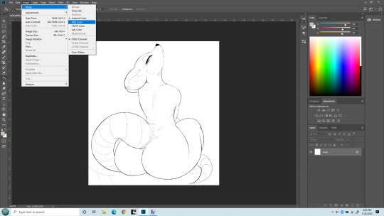
So first off, you may need to change the mode to RGB to work with it. I’ve opened the file here and am changing the mode to RGB. (Edit > Mode > RGB). Once that’s done, we can start working with adding a flat color, a soft shade and a shine layer to it. That’s what I’ll be up to here.

Next, I like to make the line layer editable, so I click the little lock icon there. By default when you do this it will name it Layer 0. That’s fine. If you’re anal you can change it to Line Layer or something.
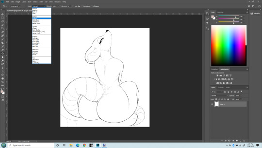
Next I’m changing the Line Layer to Multiply. This is pretty critical. You can do it from the top menu there, or there’s a place just above the layer name (where we Unlocked earlier) too. Either does the same thing. As best I understand, Multiply says to combine other layers with this layer So when we color, the white areas will be colored, the black lines won’t be.
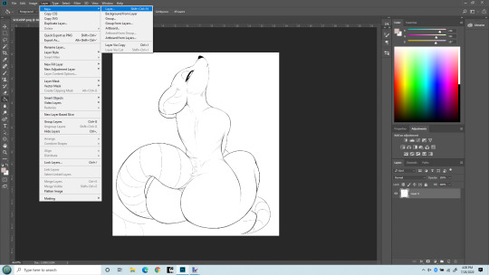
Now I’m adding a new layer that my flat colors will “live” on. It can be a Normal layer since it’s going UNDER the line layer and nothing needs be seen underneath it.

Okay, you can see my new layer on the bottom right I named Flat Color. That’s where our actual colors will be painted. (or more accurately, PENCILED!). You can drag layers above and below each other there, and this layer needs to be under the line layer. I used to make this the Multiply layer and had the line layer underneath it. That works, but will lead to issues later on as you learn to do more layers, so best to just always keep the line layer on top and MOST other layers under it.

Last step before we get to work. I do NOT paint flat colors with a paintbrush. I use a PENCIL. Because the pencil tool is pixel-perfect. That is, there’s no soft edges on a pencil line. Each pixel is either fully colored, or it’s not at all. Even the hardest brushes still have bleed over from pixel to pixel. The size of the pencil really depends on the size of the lines in the line art, but typically I set it at about 5 pixels. That’s pretty small, but lets me get into tight places. I’ve seen others do this differently - but this isn’t about them. It’s how I do it.
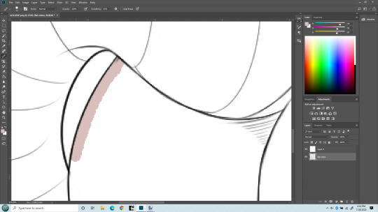
Time to zoom in and get coloring. I’ve chosen my color. Obviously this pencil is bigger than 5 pixels, but I wanted it to be clear what I’m doing. I’m drawing with my pencil right into the line itself. If I stray outside, I use the eraser (ALSO SET TO PENCIL SO IT ERASES PIXEL PERFECT) and keep the edge of the color underneath the black lines. I don’t care about the other side because Flood Fill/Paint Bucket will handle that later.
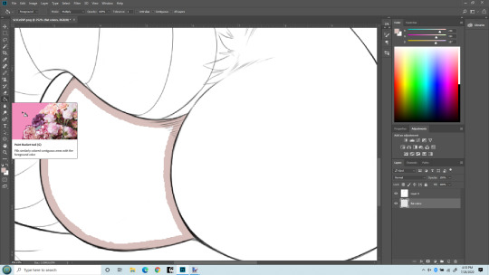
Here I’ve finished drawing the color inside her butt cheek, keeping the edge under the black lines. In practice I’d have gone on to everything that needs to be colored with the same flat color, but keeping this simple. Now I’m switching to Flood Fill/Paint bucket and am going to fill in the rest with one click. It normally will fill the entire section pixel-perfect, though sometimes around very tight angles it may miss a few. Those I fix with a pencil directly.

Bang! Butt cheek filled with a solid flat color. Now draw the rest of the damn owl. No, but seriously I will do this for the entire character with the various colors I want. For her I did this color for her body, a pinkish color for the tail and nose, a white and a green for the eyes. But there’s another advantage of doing this - I can select entire body parts by just selecting the Flat Color layer and use the magic wand to select everything that is that one color. Trust me, that’s a real benefit. You can get stylish later on, but having this flat layer is still awfully handy to keep FLAT. Okay. On to shading. Notice I now have a 3rd layer in between the Line and the Flat layers. It’s where I’m going to do Soft Shading. I also put it in between the line and flat layers, and I set the layer type again to MULTIPLY. Because I do want the flat colors showing through it.
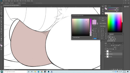
Now I’m getting ready for soft shading. I almost always you a greyish-purple color for shading. For me, it just seems to work the best. I know there are more intricate things, but this is a basics lesson. Another thing, when doing Soft Shading, I use a HUGE paintbrush set to the softest possible setting. Typically the brush spans the entire size of the body part I’m painting. I also SELECT just the part I’m shading. Sometime that takes some patience with the lasso tool, sometimes you get lucky and can just use the Flat layer to select, then move back to the Soft Shade layer. The important thing is to select only the part you are going to shade. You’ll have to do it over again on the other parts. Ideally the separation between the body parts will be a nice line you can hide the transition inside of. Othewise the Smudge tool is your friend to correct small mistakes in shading.

HUGE soft round brush. I think I used about 400px here. But the important part is, you don’t even put the center of the brush inside the section you’re shading! The shading is done with the edge of the brush. Essentially you’re almost doing a gradient.

Zoomed out with a nice soft shading. I did use a similarly soft eraser to work it back a little too.
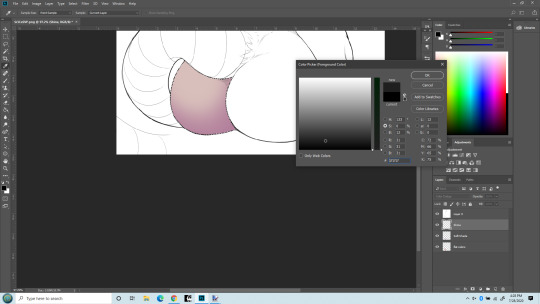
BONUS! Notice the new layer? SHINE layer! I put it above the soft shade. Really I’d probably do a hard shade layer in as well, done similarly to the soft shade in the same color but with a smaller, harder edged brush and just in limited places.
But I want to show the MAGIC of COLOR DODGE! That’s what my Shine layer is set to. Essentially if you color in black, nothing changes. If you color in a grey, it lightens the colors underneath. If you color in white, no matter the underlaying color, you get white. There are other blending types that work similarly but I just like the effect of color dodge best.
Also, note the color I’m chosing. It’s ALMOST black (which would result in no change). It takes only a very small bit of not-black to make a big difference. Going to give that cheek a highlight. First, with a soft brush at maybe 40px.
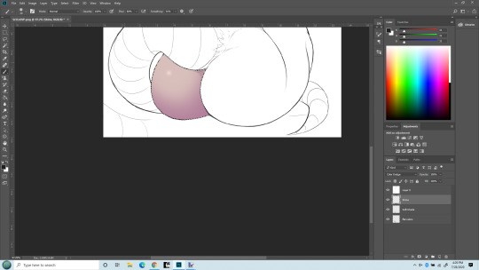
What a difference a little dot makes!!! Now that cheek’s really popping out! The type of brush used when making a highlight makes a big difference too. I do tend to overdo this, I know - but I like it! I can’t help myself! One last thing - what if I use a hard-edge brush instead of soft for the highlight?

Same size brush, but now its hard edged highlight. Really the softness (or other texture used) defines the kind of surface it’s on. The soft looks more natural, esp. on skin. The hard edge looks more like rubber/latex surface. (Neither look like rat fur, but sometimes you don’t care!)
That’s it. This is how I do stuff. Plenty of other things I could have mentioned. Reflection layer is a biggie. I like to do both soft and hard shading too. Eyes of course. Nothing makes a picture shine like good eyes. And then there’s what I truly call Highlights - a layer that goes on top of the line layer, so it can obscure even the lines. Backgrounds, which I’m not very good at but I almost always do them anyway because I like pictures that define a place and time as well as just a character. Shadows (as opposed to shading) which is frankly an art form in itself. But I’ve already put in more pictures of a rat butt than Tumblr is happy with so I’ll end it here.
5 notes
·
View notes
Note
hey Jannelle I love your Rhett and Link fanart!! I was just wondering how you scan your paintings and make them look so good digitally?
Hello~!Aw gosh, I’m super happy you love my Rhett and Link fanart c’:I usually do scans as well as take photos from my phone camera and sometimes another camera and decide which one represents the colors the best from the original piece (or at least as close as possible haha)I dunno if it’s similar on other computers, but for windows I go through control panel > devices and printers > right-click the printer/scanner > start scan and this will show up:

You can preview the scan first, and adjust to what you feel looks best. c: I then usually edit in an art program (any art program that offers adjustments/tonal correction can work) haha I tend to use the adjustments of brightness/contrast, level correction, hue/saturation, and color balance. I also put a separate overlay/soft light layer(s) at a low opacity too.You can also have separate correction/adjustment layers so you have room to decide what looks best for you.


(These screenshots are from Clip Studio Paint Pro btw haha)
I will also select parts of the piece with either the lasso tool and/or quick selection tool to edit to match what I see from the physical piece.Hopefully this is helpful for you, anon! ;v;

#Anonymous#replies#late replies#long post#sorry this took a while to answer i kept forgetting to post this from my drafts :'0
38 notes
·
View notes
Note
do you mind me asking what app you use to draw and what brushes you use:3 (btw your art is so stunning!!)
Hiii ! I use ibis paint on my phone and pc ( paid the prenium option on pc which was 30€ for a year )
Tbh my general process is fuck around and find out so i have a lot of brush for fun but here are the main ones.
I use this custom brushes :


This free brushes :


Bur my main tool isn’t a brush it’s the fil up lasso tool ! It’s a bit hidden but basically you hold on the special brush and it will give you this page


Here is a lil speedpaint
Hope this can be of help !
17 notes
·
View notes
Note
Your advice for drawing was very inspiring and helpful! thank you!! Was just wondering if you had any advice on what specific drawing tools/brushes you use to create your art or if you'd consider maybe doing a guide on it one day? :):)
Nonnie!
I’m so sorry it took me so long to reply to this. I’m glad my last reply was helpful and I really hope you’re still around to see this 😶
SO let’s talk brushes/tools. 👇Under the cut for length👇:
Tools: It’s nothing special. I’ve been using a portable version of CS5 for a while now and I draw on a Medium Wacom touch and pen, which I’ve had for 4 years and it’s traveled well. I’ve used PS Elements, Paint Tool Sai and Corel in the past, with Corel being my least favorite.
Brushes…well, I have to confess that I’m a brush hoarder. I have amassed a large collection of them over the years from all different kinds of artists. Some were free and still available, some I’ve paid for…..and yet for the most part I use the same four brushes for everything.

-I use a hard round opacity brush for sketching and another hard brush for line art (Deharme’s “hair single”). The line art brush has a bit of a texture and tapers nicely so it feels a bit like a mechanical pencil, which makes it my favorite.
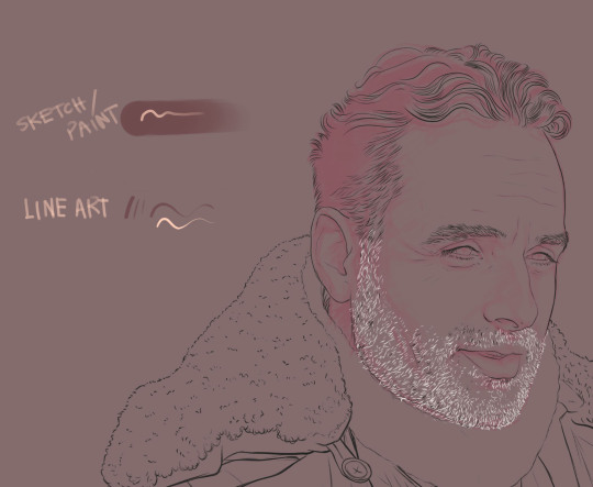
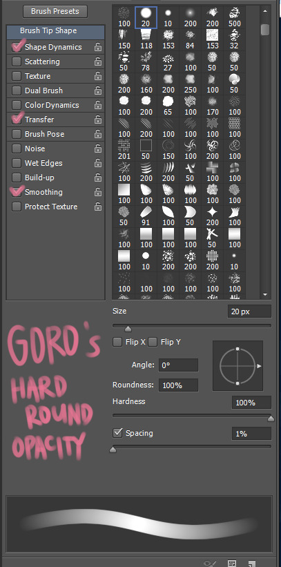
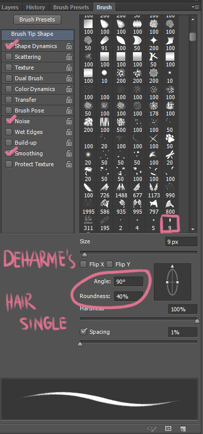
-For blocking off colors, a simple Hard Round brush or for large areas sometimes i use the lasso tool and paint bucket. The hard round brush is exactly as it sounds it’s just a blunt, full opacity brush. No bells or whistles.
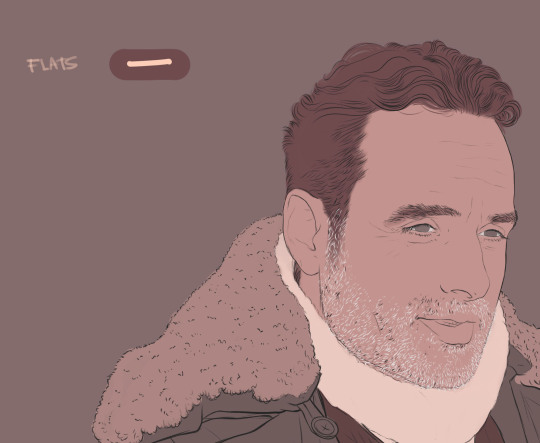
-Finally, the Hard round opacity brush again and a soft round brush to flesh out the details. Shading and highlights, that kind of stuff. The hard brush feels a bit like a marker while the soft brush is more like an air brush.
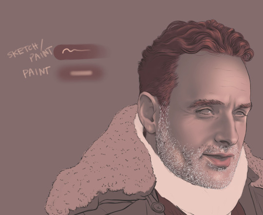

I use the same versions of these brushes as an eraser btw, whenever i need to.
Here’s the link for Deharme’s brushes. His set is really great because it has a ton of other brushes you can experiment with to do details and fun highlights or textures to your finished piece. He has a particular set of brushes for painting skin that’s really challenging but awesome, if you have the patience for it. I couldn’t find the free link to Goro’s brushes anymore but here’s his site if you wanna go digging around. Really, though, you could just experiment with the presets of the PS brushes you already have and you’ll have the same version...they’re pretty basic and straight forward.
For things like Michonne’s hair, I use a brush with more texture. I was lucky enough to snag Kyle Webster’s brushes before they became exclusive to CC. If you use it then the old brush 2 or the rough cutter from his inkbox are great.
If you want to know more about experimenting with brush presets to create your own, here’s a great tutorial I came across recently:
http://zuzartii.tumblr.com/post/179635817705/some-photoshop-tips
The last thing I would strongly recommend is an extension program called Lazy Nezumi Pro. It’s a pen stabilizing tool. If you have an amazing steady hand drawing on the tablet you won’t need it or if you’re using Paint Tool Sai, it’s a feature that’s already built into the program. Unfortunately, PS doesn’t have it and I don’t know about you but even though I have very steady hand, my lines still look like I drank ten cups of coffee. Now this one you have to pay for but imo, it’s totally worth it. You can do a free trial, it has a student license option if you’re a student and it’s a lifetime license so you don’t have to purchase it again (unless you change OS). I love the thing. It also has a bunch of other features I never use but that you might find useful.
ok... These were the very basics, I hope it’s somewhat helpful? 😂😂😂 and let me know if I can help w/ anything else. 💖
44 notes
·
View notes
Note
Hello! I can't believe I've never seen your art before today. You have the most incredible use of color I've ever seen, it's so inspiring! Btw I was wondering, can you give any advice on clean edgework without it looking artificial/lasso toolor relying on line? I always struggle with keeping objects from blurring into the background when i paint. Thanks!
Hello ! Oh, thanks man, still a lot to learn though.
About the clean edgework, actually I do use the lasso tool a lot. I think the idea is use it to get the form crisp but a the same time have a very volumetric sense while painting into the form. Clipping mask are great to layer your painting, I always have the crisp solid form color at the bottom of my layers and then a series of clipping mask for shadows, lights, temperature.
To “kill” the sharpness when you have to do it, smudge tool on edges will do.
It’s a lot of experiment though, There is no good or bad way to paint, it’s all about finding the way that suits you the best !
Cheers!
38 notes
·
View notes