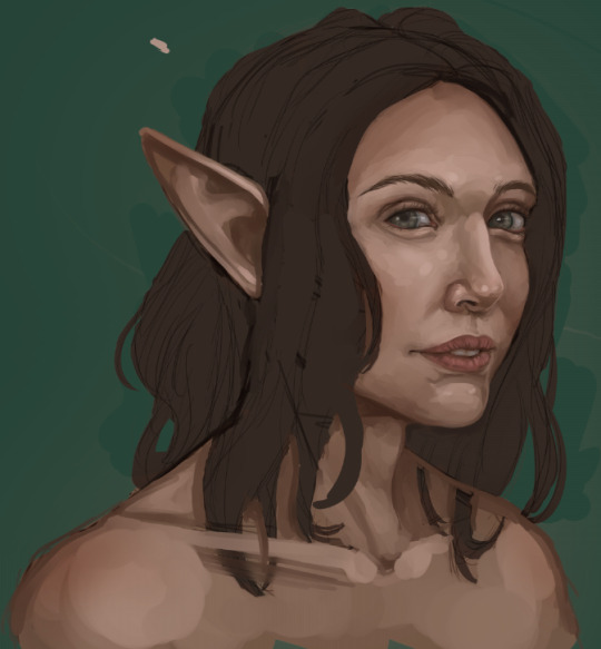
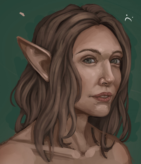
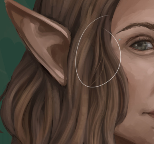
#i tried really hard to make the portrait look like... kind of sort of painterly but im really shit at that kind of texture.
Explore tagged Tumblr posts
Visit Tumblr Blog
Explore Tumblr blogs with no restrictions, modern design and the best experience.
Last Seen Tumblr Blogs


Fun Fact
Post activity is at the highest at 4:00 pm EDT; notes peak at 10:00 pm EDT.
Text

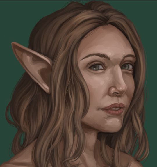
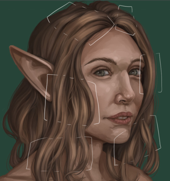
Anwyn visits the royal castle and comes across a portrait mourning the dead.
Non-curtain version below because I worked so hard on it just to cover it all up like a FOOL

#my art#artists on tumblr#my ocs#anwyn ashstone#why yes this is tangled inspired. how did you know#favourite arts#I NEVER KNOW HOW TO TAG STUFF. HELP#i tried really hard to make the portrait look like... kind of sort of painterly but im really shit at that kind of texture.#idk if it came across. BUT I TRIED AND TAHTS ALL THAT MATTERS.#maybe i'll try to get better at lineless art this year.#probably not.
18 notes
·
View notes
Text
Lava’s Art Masterpost
Hey, all! Welcome to my art masterpost! I have no idea if this is a thing that is done typically for art, but oh well, I like organizing things, so here we are! What you’ll find here is mostly Dragon Age, with a few non-DA pieces in there, and there’s a range of styles I like to use, depending on my mood. But a lot of what you’ll see will most likely combine lineart with some other form of coloring/shading.
Feel free to browse at your leisure, and I hope anyone who stumbles upon this enjoys what they find! :D And thank you to anyone who sees this and likes, or reblogs, or even just stops by to peruse a bit!
All that said, away we go!
Digital Portraits:
1. Portrait of Nameless Woman, 2020 - This one is just an experiment with a watercolor brush that I did. It’s not anatomically perfect, but I enjoyed playing around with shading.
2. Sketch of Aja Amell, 2020 - This one is basically sketch practice with my Amell~ Not really the most expressive pictures, but it’s a start toward drawing her more expressively. Full disclosure: Aja is one of those OCs of mine that I have had trouble with deciding on a definitive appearance for several pictures, and I really want to work on upping my level of consistency when drawing her.
3. Long-Haired Fenris, 2020 - Exactly what it sounds like; this was for practice drawing Fenris’s features (I love how distinct they are), but with long hair because I am weak for it. This one was a fun piece to shade, and mixing the stylized lineart that I normally use with a greyscale shading spectrum was really enjoyable.
4. Portrait of Ilorin Lavellan, 2016 - This is an oldie. Basically practicing expressions, and it is technically a WIP, but I’m still very happy with how the shading turned out, especially because this is actually (aside from the unfinished hair) one of the more minimal pieces I’ve done in terms of lineart It’s still there, and it still shapes the flow of the picture in some ways, but it also ends up flowing with the shading instead of standing out next to it, which I like. (Both styles are good, though, and I love seeing other artists try both too.)
5. Old Portrait of Aja Amell, 2016 - Much older picture I did of Aja; she... honestly looks very little like the newer one, I think, and that consistency is something I’m still working on, but this one was the first picture of Aja with that particular hairstyle I drew. What I like about this picture is how young she looks; it fits with her image as a fresh and sheltered Circle mage who’s only about 20 years old at the time of DAO.
6. Old Portrait of Trilyn, 2016 - They very first piece of art I posted to tumblr~ It’s not exactly how I envision Trilyn anymore, but it was still very fun to draw, and helped me get a feel for drawing him in the future.
Dynamic Movement Pictures/”Moment’s in Time”:
1. Tabris in Arl’s Estate, 2020 - TW: blood. I am super proud of this one. My ultimate goal is to draw all of my Warden DAO OCs, and I could not believe I’ve never drawn my Tabris, and so here she is. This was, in large part, practicing expressions because I absolutely love art that depicts characters in motion, or capturing some kind of expression.
2. Velyn in the Rain, 2017 - This one was actually based on some art that I saw in a Teen Wolf fic! It was an experiment with a more expressive style (and one of the first pieces I did without lineart left in the finished version) and it was a huge step out of my comfort zone. But overall, I am extremely happy with how it turned out.
3. Jem Nocking an Arrow, 2016 - And here is the lineart version. This was entirely an excuse to draw my DAI baby, Jem, and to do a cool archer pose because archers are my fav, and I love characters in motion.
4. Solas Teaching Trilyn Fade Magic, 2016 - This one was a painterly picture that was also (like the Velyn picture) something which I tried to keep lineart out of. Overall, I am proud of a lot of parts of the pic, but I think I would definitely go back over it and change a few things now if I had the patience.
5. Trilyn Closeup WIP, 2016 - TW: injury, blood, mention of abuse in the author’s note. A lot of early pictures I have are of my OC, Trilyn, and this is one of my absolute favorites. His entire upper body is technically in the picture, but I hadn’t finished rendering it yet, so this was what I posted. And it was an experiment with a cross-hatching style with the pencil tool for some texture, with air brush shading and a blurring tool. It’s a style I had fun playing around with!
6. Trilyn Blood Ritual, 2016 - TW: blood, injury (the slight cut used to supply the ritual with blood). This one was definitely a sort of “captured moment” from a backstory I gave Trilyn, and I think what I was really going for was an atmospheric piece that could fit with any potential fic I wanted to write for Trilyn. And then it ended up being practice for extreme lighting/shading techniques, and drawing the blood and the gross mass of demon ichor (or whatever the heck that is) turned out to be highlights of making the piece for me.
Art + Text:
1. Freedom and Control, 2020 - TW: scars, but very difficult to see. This one was ambitious for me! It started originally just as Solas and my Tal-Vashoth OC, Saara, facing each other, because I love the dynamic I’ve built for them in my head, but then it turned into an attempt at a tarot-esque background, and just sorta grew from there... Overall, I’m happy with how it turned out, especially with how Solas and Saara themselves turned out. The version you can actually see a larger view is here.
2. Marianna and Delia Codex and Art, Pt. 1, 2020 - I love writing my own codex entries, first off, and I love combining art with text to create a (hopefully) seamless work. This work was an attempt to flesh out these OCs of mine with both art (because unique facial structures are hard for me to get down, but so important regardless) and text (because writing~). I think it turned out well overall, but there are elements of the portraits that I might at some point touch up a bit.
3. Marianna and Delia Codex and Art, Pt. 2, 2020 - Part 2, with what I refer to as a “DAI Outfit Change” because I have always loved seeing fans show their own OCs as they look in DAO, DA2, and then finally DAI. So I absolutely wanted to jump on that bandwagon myself. The skin tones are a little off (and I’m sorry about that!) because I was playing with the watercolor brush at that point, and it dilutes the colors I use. Still working to figure that out, but I was very happy with the overall lineart and structures of the faces.
4. Alistair/Aja Amell Picture with a Blurb, 2017 - Ooooold, old, old, old, OLD! I still love the art, and I’m soooo happy with how the interaction between Alistair and Aja turned out (drawing kisses is extremely difficult for me; I always end up creating a distorted weird lip-creature, instead of realistically puckered lips...). I’m not as happy with the blurb that went with it? At that point, I was still very much figuring out my own DAO worldstate, and the characterization for everyone, so, eh. Take it with a grain of salt!
Unfinished Costume Designs:
1. Ancient Elvhen Armor with Dwarven Influence, 2018 - People who do costume design work are amazing and mystical beings, and I wish I could do what they do. This was an attempt at merging the Keeper robes from DAI with a more dwarven armor aesthetic, solely because I created an ancient elvhen character, Ceda, who was taken in by the Cad’halash dwarves mentioned in the Witch Hunt dlc, and I wanted this character to have a mix of the elven style of armor and the dwarven style. I’m overall decently happy with it, but there’s still that persistent level of self-criticism present.
2. Herald of Andraste Outfit WIP, 2016 - This was a very old picture, not one I showed around a lot, but the idea for this was entirely born of my intense interest in how fashion and outfit designs could be used to create a symbolic image for the Herald of Andraste. In general, I love the combination of ceremonial armor with long and flowing cloth, so that was what I went for here. I’m still actually very proud of how this came out, and headcanon something similar for my Herald in my canon DAI worldstate.
Pencil Sketches:
1. Quick Saara Sketch, 2019 - TW: saarebas mouth scars. Exactly what it says; very quick sketch of Saara I did in a small notebook I carry around with me. This was basically a test for myself to see if I could manage to draw Saara with the features and facial structure I envisioned for her without needing to use a lot of references.
2. Mass Effect Character Sketch; Jesse, 2018 - Similar reason for drawing this one as the above Saara sketch! With these characters, I love sometimes the way they can turn out with the specific character creator used for them, and when I draw them, I enjoy trying to create a definitive look for them using what I get from the CC, and my own knowledge of Hooman Faces.
3. Saara Sketch, 2017 - TW: saarebas mouth scars. A more detailed sketch of Saara than the one above, and one I definitely put more time into overall. It’s currently the profile picture I’m using for ao3, and is the definitive go-to reference picture I use whenever imagining Saara in a fic, or for other Saara pics I make. I am extremely proud of this picture, and feel like I should work in graphite more often. It’s such fun, and the texture is so nice to look at.
4. Sketch of Nameless Alamarri Woman, 2017 - This was a sketch I did of what I envisioned some Alamarri tribes to look like; I used artistic depictions of Gaul tribes and hairstyles for inspiration, and have used this as a go-to reference for my version of Alamarri tribes. Nothing super notable about this one, but I really liked the way the shape of her face turned out.
Events and Gifts:
1. Another Scar, 2020 - TW: blood, injuries, gore. The most recent piece of art on the list, and a gift for @cartadwarfwithaheartofgold; featuring sisterly love between Rica and fem!Brosca, which was her requested prompt. This was a tough piece for me because of the difficulty with the lighting I dealt with. For some reason, that one particular element of it gave me so much trouble. Overall, I’m very happy with how it turned out, though, especially the skin tones of the sisters; Brosca I always sort of like as having this greyish, more gaunt look to her, while Rica I like seeing with a darker, richer, and warmer tone to her.
2. A Very Cousland Christmas!, 2019 - This was for a holiday exchange for a server, and I drew a friend’s Cousland (Elissa, the girl on the left) with my Cousland (Gazza, the girl on the right). I love kid-fic, and I love kid-art, and so I decided... baby Cousland art! Drawing kid proportions was the toughest part, I recall, and I thiiiink it turned out well, and I’m still quite proud of it overall. Elissa’s design came entirely from my friend, but I added the holly~
3. Exchange Gift with Dis Brosca and Mabari, 2018 - This was an exchange gift for @fanfoolishness, using her lovely Dis Brosca, and was my first real attempt at backgrounds... I struggled with the coherence of the foreground and background a bit, but I’m still very proud of how it turned out, especially with the colors I had to work with. What I also really enjoyed working with was the lighting and the expression on Dis’s face. Backlit subjects are always fun to play around with!
4. Inktober Picture, “Deep”, 2017 - TW: scars, injury, mentions of abuse in the author’s note/attached dialogue snippets. This was for an Inktober prompt (the only one I’ve ever done, sadly... because I am bad with deadlines...), and again features Trilyn. Trilyn’s backstory has him a former slave in Tevinter, and a lot of the early works I do for him are sort of deep-dives into his life there. It’s all meant to be an exploration of the things he endures, and then those moments when he overcomes it all and takes back his own autonomy and self. This art is definitely provocative, and I can understand if not everyone likes it, but to me, I just wanted to show just what he faces (without glorifying it) before showing the moment of his own triumph.
5. Christmas Holiday Picture with my Brosca and a Friend’s Amell, 2017 - This was a piece of art drawn first by a friend of mine, @nanahuatli~ She drew the Amell, the background, the mistletoe, etc. All I did was add my Brosca to the mix to finish the image. It was a lot of fun to do, 1) because it was fun trying to match her style so that the picture looked cohesive, 2) because I love doing collabs with friends, and 3) because it was just such a fun thing to imagine my surly short Brosca, looking at this weird plant/fungus/thing dangling over some puckering human! It was an absolute joy to do this collab with her!
6. OC Kiss Week Pic of Jem and Saara, 2017 - TW: saarebas mouth scars. A spur-of-the-moment thing meant to demonstrate just what kind of dynamic my OC, Jem, has with my other OC, Saara (both of whom are members of Leliana’s network in DAI). This was a very quick picture (deadlines...) and was mostly just to have fun drawing these two characters interacting, and to see if I could make them look like themselves. I think I did a decent job with it overall, especially with Jem’s kissy-face! (Again... drawing kisses are the bane of my existence, although hands and feet take a close second.)
11 notes
·
View notes
Text
!!!HEY!!! Someone asked for a hair tutorial, so I took some screencaps of the process while I worked on one of my commissions and wrote up my thoughts to go with it! If that’s something that interests you, click through the readmore!
Step 1: Lose the screencaps you took of your actual sketch, starting the tutorial off on a great note!
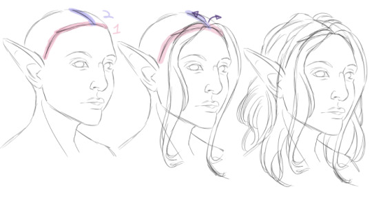
Whoops. I ended up drawing over my partially-rendered piece to reproduce it. (My actual sketch was much messier. You’ll be able to see a little bit of it later!) The actual Step 1 is: Draw head. Sketch hair. I rough in the shape of the skull, the facial features, and whatever part of the body is in-frame first. Then, I sketch in the hairline, highlighted in red. Hairlines come in all shapes, from rounded to square to widow’s peaks! Next, I draw in a part coming back from the hairline, following the curvature of the skull. From there I start drawing in “chunks” of hair, working front to back and from the part, out, in sweeping curves. All hair has at least little bit of lift- It grows up and out from the skull, then “droops” downwards. Depending on the texture, it may have more or less lift. This hair is fairly fine, so it falls down not far from the root, but even that little bit of volume makes it look more three dimensional. :v Pay attention to anywhere it parts around 3d objects and be mindful of which pieces go in front of your character’s shoulders (if any) and which pieces go behind (if any). Hair overlaps itself, too- Consider having pieces cross in front of and behind each other, or spiral together. This step can be messy and fairly imprecise, you just want a general shape to guide you later.
Next come the flat base colors. I choose and fill in my background color in a new layer beneath my sketch. On a layer above that (but still beneath the sketch!), I fill in behind my sketch with flat colors and a hard brush. I like to work from dark to light, so I pick a dark midtone or shadow color for this step- Since the character is going to be blonde, I went with a milk chocolate sort of color for the hair. You can see pieces of my original sketch here (everywhere but the face)- There are some bits showing through where they shouldn’t, like the jaw through the hair, but that’s fine. I lock my sketch opacity and change the color, usually to a brown, and set it to multiply, so I can blend it into the figure later. Then I merge it down onto my flat colors.
Like magic, the face appears!!! I neglect the hair for a while and do a rough render of the face. This isn’t quite what the final product will look like, but it’s a start. I’ve also pushed the hair around a little to reshape the face and removed the jaw lines in the hair. Around her shoulders I painted over some hair bits, but that’s going to be all covered later anyway. You can see how my rendering gets lighter than my base colors here, too.

For my darkest darks, mostly around the face, I colorpicked the bits of the sketch that were in the hair and filled in a little bit, mostly on the far side of the face where i felt like the edge was getting lost.
Keeping in mind what color the hair is going to be in the end, I pick a lighter midtone and start layering it over top of the base color. I’m using Clip Studio’s default oil brush here, since it picks up underlying colors and blends but preserves a fairly hard edge. You could get a similar effect with other low-opacity brushes. Keeping my hand light and my wrist loose, I start making quick strokes out from the roots, following the direction of the hair every time! My brush is just a little bit smaller than whatever “chunk” I’‘m working on to start..

...but as I start to build up more color, I progress to smaller and smaller brushes. Keeping your strokes really quick and messy creates a natural, organic streakiness that forms the beginning of your hair texture, and since the oil brush picks up a little bit of the underlying color on each stroke, the area you’re coloring gets closer and closer to your selected color every time you go over it. In this case, it’s getting brighter. So, keeping my brights concentrated towards my light source, I build up layers, and where I see those streaks starting to form I emphasize them and start dividing the chunks in my sketch into smaller segments. Since the sketch is on the same layer and a darker shade of brown, it almost immediately starts to blend away.
More texture! Also, roots. With a small brush I sharpened her hairline, and you can see the texture I’m emphasizing as I go, using a small brush to pick out pieces of hair. I’ve also swapped back to a darker brown for a few seconds to add furrows between pieces of hair that were solid beige from the last step.
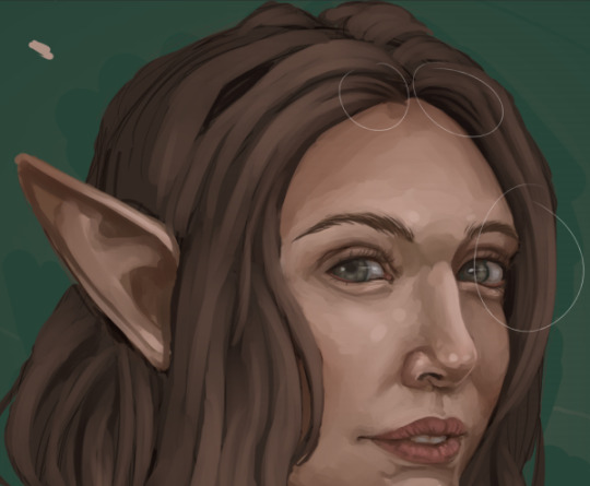
This is what the whole head looks like at this point. That streaky swatch in the upper right corner is what I’m using next- it’s the “Painterly Sparse Bristle” brush from Frenden. It comes in a third party brush pack you can find with a quick Google, and I do love it- But you could get the same effect with a small brush and a few more strokes.I picked a lighter color for the next layer- I tried the color of the x on the left at first, and it was a little too grey, so I went with the one on the right.
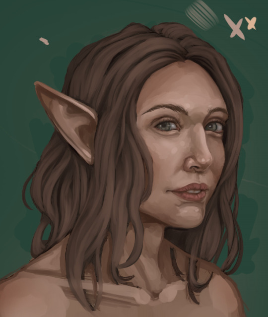
Light hand, loose wrist, following the direction of the hair and avoiding the shadows with the sparse bristle brush to lighten the hair overall and add texture. The shape of the brush gives me more strands per stroke and cuts down on time. It’s a little patchy where my strokes begin and end, which is fine- It’s also still too grey, as it turns out.
I picked a soft yellow, a soft brush, and set a new layer to “soft light”, then shaded over the hair to brighten it up. Not a super standard step but it does explain the shift in hue. Then I merged it down. It’s a little bit blotchy, but that will blend away as I work.
Up close, the edges of that sparse bristle brush look kind of square and chunky. Yuck.
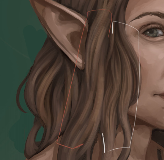
It’s fixable, though! I’m done adding new colors for a while. Instead, I zoom in closer and move around the piece, colorpicking off different parts of the hair and going in with the default oil brush at a tiny tiny size. I’m doing two things: Blending out the less appealing parts of those “sparse bristle” brush strokes, and emphasizing shadows and highlights to suit my taste. The orange section is untouched- The white section has been worked on a bit. Loose wrist, fast strokes, always in the direction of the hair! This is where I start making a lot of conscious decisions about my shading, refining a lot of the haphazard streaks into coherent shadows and highlights. Remember that the chunks of hair are objects in a three dimensional space that cast shadows on each other.
While I’m zoomed in close, smoothing things out, I tend to start picking out areas where loose or flyaway strands would work well. The idea here is to break outside of the boundaries of your sections with finer pieces and individual hairs. Disrupting the edges of the smooth shapes in a few places makes the hair look less like a sculpted helmet and more like..hair. You don’t have to do this everywhere- Just a few flyaway pieces can be enough to establish the illusion of a head of individual strands. I tend to go a little bit overboard for stylistic reasons, adding a few more than I strictly need to, and separating them a little bit further from the body of the hair than they might realistically be, almost like the flyaway pieces are being buoyed upwards by water or a breeze. This is just a matter of taste, though. :v
Something to remember: Whenever you’re working on details / zoomed in to a piece, you should zoom out and look at the piece as a whole, often. Otherwise you might find that something that looked good while you were really close to it looks out of place in the context of your painting as a whole!
Moving around the hair at a high zoom means you’re going to run into the ends of the hair, and if you’ve been working with blendy brushes they probably look like this.
This is another great place to put some loose strands. I use the default “darker pencil” tool at a small size and sharpen the edges up, then blend a little bit on top with the oil brush if I need to. A little bit of a sharper curve at the ends of the hair, where there’s less weight pulling it down, can add some life- I tend to go exaggerate here, too, making the ends a little bit floaty, or a lot floaty, or swirling the ends of straight hair into spirals. It adds a little bit of magic to an otherwise static portrait.

Do the whole head! This is the most time-consuming part, but it can be really soothing, too. Take your time and work steadily, section by section. :> Speaking of exaggerated swirls, that piece starting to twist up on the (viewer’s) far right is a good example- That hair probably wouldn’t twirl up that way, but it DOES add a little bit of visual interest! I don’t have any loose hairs on the outside of the outermost edges of the hair here, though.
And now I do. I like to add the loose hair on the outside edges on a layer beneath the figure- That way, I don’t have to worry about blending the ends into the rest of the hair. When I’m done, I merge the two layers together.
Anddd highlights! I picked the lighest coor I’d put down, made a new layer above the figure, set it to “Add-Glow”, and used light, short strokes with the sparse bristle brush. Avoiding the shadows, I arranged the highlights in horizontal bands, keeping them dense towards the light source and fading them out as they moved back.
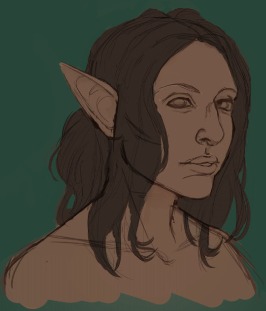
At this point, I still have some work to do, especially on the face, and I’m guaranteed to do more with the hair along the way. But anything I do from here on out is going to be a repeat of one of the above steps- More blending, more flyaway hair, etc. :> I change things around a LOT as I work, so no part of a piece, hair included, is for sure done until the whole piece is polished up and saved! If you want to see how the finalized painting came out, hair and all, you can click here!
I hope this is helpful to someone! If there’s anything else you’d like me to break down, let me know, and I’ll see about documenting my process the next time it comes up.
77 notes
·
View notes