#i think it's because of all the decora details i added the outfit
Explore tagged Tumblr posts
Text
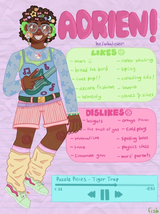
first character sheet done- adrien!! i'm planning on doing the rest of the gang this week
(please reblog this if you give it a like!)
#this took me eight hours ahhhh#i think it's because of all the decora details i added the outfit#but the rest of them should be faster because there's less to do#anyway! i hope people like this :)#fish draws#blub blub#oc stuff#oc art#original art#digital art#queer art#trans art
24 notes
·
View notes
Text

i think it’s LAME that none of the other magipa have human designs so i did it myself. also spiced up hughie’s fit n myamu’s new fit from episode 39
(notes + close ups under cut!)
going from left to right: first up hughie
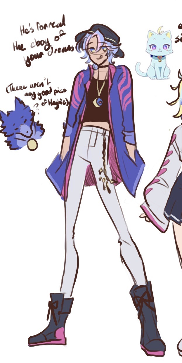
his normal civilian outfits are… weirdly tame? at least if you compare it to the fabric drape hell of his magical realm outfit, so! since he and myamu are supposed to be color palette parallels (+ toma and matsuri) i gave him yellow in his eyes to match myamu’s pink also because i’m not sure why??? his eye color changed between forms.
his palette Is mostly blue and white (to look nice next to toma’s warmer reds and blacks) so he’s got some Very dramatic white pants. wanted his jacket to be the statement piece to everything else is relatively reserved. the chain is supposed to match his necklace, and the bucket hat that inspired the look is from his disguise when matsuri and myamu snuck into omega hq
2nd is myamu!
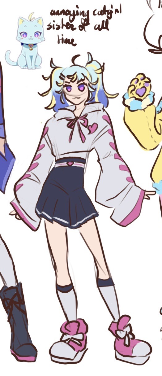
this is just her outfit from episode 39 cranked up a little since i though the gray hoodie and plain skirt were a little boring. she’s got a heart/lace up pattern on her sleeves and a cute belt. also changed the type of hoodie she has and the hoodie strings
third here is hanitan <3

i Think her and miruki’s aesthetic is decora kei with a hint of lolita and angel aesthetics, so i went with a comfy pajama look since hanitan’s sleepy. she’s the only one to have her animal aspect Obviously in her design since teddy bears and bows are cute and decorated headbands are Super cute. the heart cheek mark is for my own amusement though. draculara moment or whatever.
her hairstyle is two pigtails pulled up front, which is a very warm way to wear your hair. the stitch detailing and patches on her hoodie are in reference to her teddy bear form. she’s got bear gloves to match miruki’s main outfit too. the ugg boots are something hanitan wears just to annoy miruki since they’re a little out of fashion.
fourth to batter: chimumu!
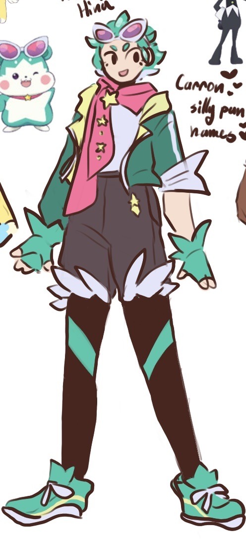
i hate green. teal is a little better but jesus christ this palette was a little bit of a nightmare. anyways, i don’t know what cool sportswear looks like so i was winging it. the most obvious thing is the star motifs, her gloves, hair, short fluff, and sneaker lips are all shaped to look star-like.
the white under-part of chimumu’s hair was added later since i remembered after i was done coloring patano that the magipa usually have multicolored hair so. extra cool points. the scarf and the star pattern on it being exaggerated was to help convey how overconfident chimumu is in both herself and hina, and the sporty look of the outfit was also to enable chimumu to keep up with hina’s training. the yellows also got a bit more lime. the warm yellow was clashing.
fifth in line is carron!
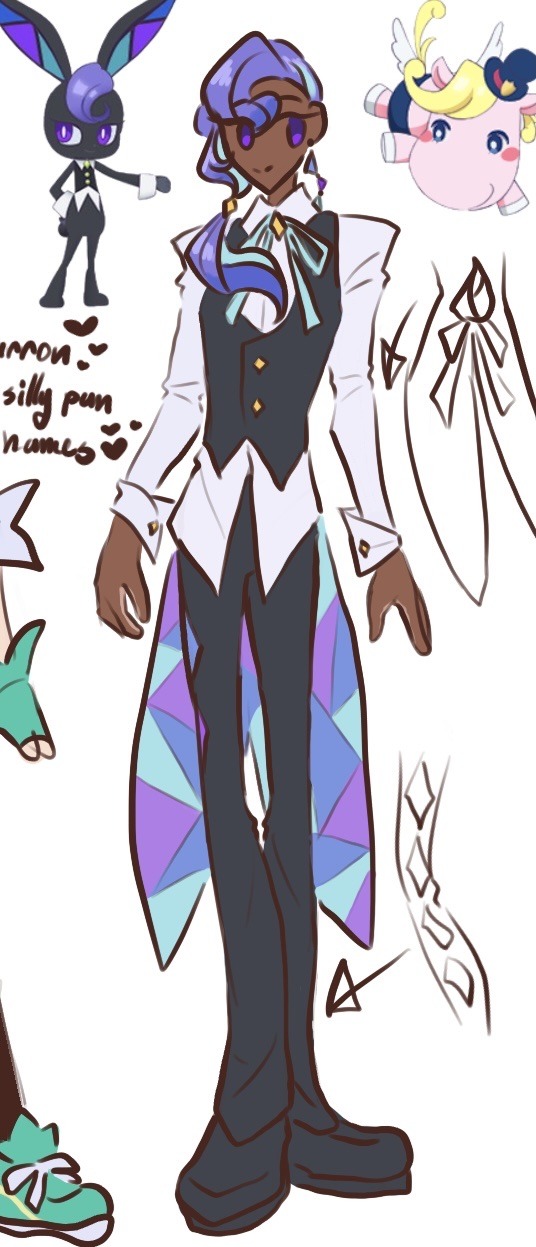
i think she should be tall like the boys. that’s all.
anyways, i think she’s probably the most straightforward translation? like her hair got extended into a ponytail and her stained-glass bunny ears got turned into tailcoats and that’s really about it. she looks basically the same as her animal form otherwise, i even kept the leg shape pretty similar since i didn’t differentiate between her pants and shoes. oh! her pants have a diamond pattern running down the side, to really hammer home both the stained glass and diamond theme.
otherwise i’d say she’s just a cute butler!
the grand finale: patano!

you might not believe me but her fit’s 100% the simplest next to myamu’s. which is why her’s was boring until i Spiced it Up with some patterns (the roses + stripes)
i’m pretty sure her design is supposed to evoke a little german boy in the swiss alps yodeling or whatever so i went with that while also keeping in mind the Loud ruffles of amane’s takarazuka revue aesthetic. so, a boyish outfit with a feminine charm. if i have the energy though i would like to take another stab at patano’s design since i didn’t incorporate her wings, which i think are Very cute. also the wiki is insane i think she’s supposed to look as clumsy as a hippo but she’s clearly a pegasus/horse?? she has a hair tail and hooves and pointy ears, the big snout doesn’t make her automatically a cartoon hippo.
#primagi#waccha primagi#hughie#myamu#hanitan#chimumu#carron#patano#art archive#jesus christ that’s a lot of tags#anyways these aren’t Serious designs or anything just some practice for fun#also because i think it’s a little disappointing we didn’t get human designs because i want to see More magical realm fashion#more outfits even! lots of missed opportunities is what i’m saying#i might do the humans but we’ll see (it’s just going to be more casual outfits. i don’t Know high fashion well enough)
100 notes
·
View notes
Text
Tokyo Street Styling: The Aesthetics of Japanese Street Fashion
a.k.a. why do some outfits have a ‘very Japanese’ aesthetic and others don’t?
If you’ve ever scrolled through the TokyoFashion instagram, you’d see outfits of all types and styles, ranging from the ‘classic’ harajuku staples like decora and lolita to the more street-style based coords of which an overall style is yet to be properly named.
Over the years that I’ve been an observer and a follower of these styles, I’ve noticed a gradual but significant decrease in actual Japanese people wearing the ‘classic’ sub-styles and more and more venturing into the realm of the nameless umbrella which is ‘tokyo street fashion’.
And yet harajuku fashion isn’t really dying, it’s transforming into something completely new (mentioned in this post). And what interests me the most is how these new styles are so different from the so-called OG sub-styles and yet are distinctly Japanese.
So this post will attempt to talk about that in as short of a post as I can manage
This other post already mentions the basics of Japanese street style so I won’t go over that in much detail again.
❀❀❀
First, a quick background of Japanese colours.
Japanese colours in the Edo period were originally split into three categories:
The Colours of Animals
The Botanical Colours
The Colours of Nature
And these colours in varying proportions would evoke certain seasons or feelings. Some colours are tied to spring, others to autumn. And borrowing from confucianism and taosim, there are colours that are tied to specific elements.
Nowadays, these are not completely strictly adhered to, since the West introduced their own colour theory after the Edo period, but there is a lot of the original colour theory of Japan that is still relevant in their aesthetics today.
Sources: 1, 2
❀❀❀
Next, a quick introduction to some of the main concepts of Japanese aesthetics:
♔ Wabi-sabi
The idea of embracing transience and change, but also imperfection and incomplete objects, as it is natural. Think of the sakura that only blooms for a short while, the idea of things growing, flowering and then decaying, and finding beauty and peace in that process is part of wabi-sabi.
♔ Yūgen
Referring to “something dim, deep and mysterious, something that cannot be understood”. The Japanese also don’t believe this feeling can be expressed in words, but I think the closest explanation is a sense of profound melancholy and gentle grace.
(Think of mode, karasuzoku, outfits by Rei Kawakubo, can possibly be applied to mori kei)
♔ Iki
A combination of intellectuality and sensibility. It is simplicity and sophistication, or maybe even sophistication in simplicity. It refers to the unselfconscious, measured and straightforward. It usually is used to relate to a person, but we shall see how it applies to fashion in a bit.
(Mori kei is the first thing that comes to mind, but also pop kei and classic lolita)
♔ Shibui
The aesthetic of simplicity and unobtrusiveness. Shibui refers to things that are overall simple, but when observed more closely are detailed and textured and refined. It has a balance of complexity and simplicity.
And of course the most important one to this context:
♔ Kawaii
The concept of cuteness and being loveable, found in most Japanese street fashion.
I find that these, in their various combinations and proportions, make up a lot of what is Tokyo Street Fashion.
Sources: 1, Aesthetics of Colours in Japanese Paintings and Woodblock Prints in the Edo Period (Siying Wang)
❀❀❀
So. How does this all apply to fashion?
I’m going to use some examples here to describe what I mean.
♔ Strawberry Candy Outfit
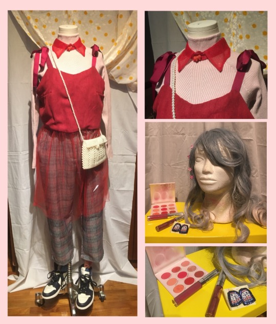
I call this the strawberry candy outfit because it is indeed the colours of a strawberry candy. So outfit breakdown: why is this an example of Japanese street fashion?
Firstly, the use of layering textures and sheers is a common part of Tokyo street style, as well as the use of colour blocking. The overall colour palette is based around pink, so the makeup and accessories would match that, and the blueish-grey of the hair and the blue accents on the shoes and the earrings provide the littlest bit of contrast.
So colourwise, I’ve decided to use pink as my main colour, and the red, white and grey are all secondary to that, though by playing with proportion, I can ‘even out’ the amount of pink and make it less overwhelming. Pink is made of red and white, so I broke apart the red and white, and then added grey to make the look more neutral, but also feminine.
The main aesthetic concepts I am following here are Shibui and Kawaii. There’s an overall cute energy that comes from the bows, red tulle and pearls. And yet it’s a very balanced look, not overly cute. The idea is to play with the textures and patterns to give it more dimension.
♔ The Utilitarian Office Lady
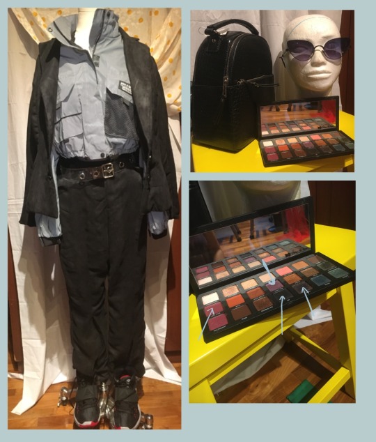
This coord is based around a monochrome palette, the suit is made of a pair of flared trousers and a boxy jacket, which on its own can make a cool base for a karasuzoku outfit or a mode outfit.
But here I layered the suit jacket over another jacket of reflective grey fabric, with a lot of utilitarian elements to it, and also added a plastic belt with grommets punched into it. The hair could just be a really long sleek ponytail, and the faux reptile skin backpack and dark makeup would go nicely to give it more of a street-style edge. The shoes are black Nike Kyrie 6 EPs but really any chunky black sneaker will do.
This one is more following the aesthetics of Shibui and Iki. It’s unobtrusive in the way that it is sleek and monochromatic, but it’s also very detailed in all the contracting sheen and texture of the outfit. The matte suede of the suit with the reflective polyester of the jacket, as well as the reptile skin and the mesh. There’s a subtle contrast there.
This outfit, I would say is very straightforward and simple, but there are so many interesting layers about it that give it more dimension and personality.
♔ The Edgy Gyaru
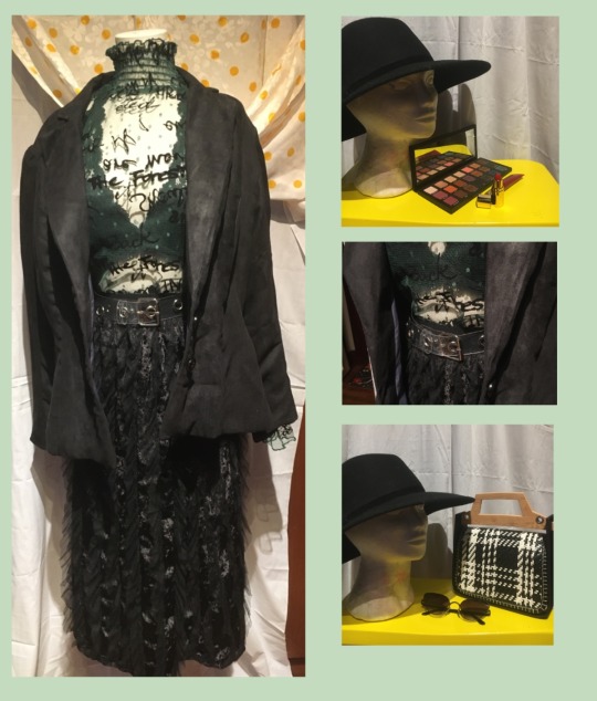
This outfit is inspired by the modern gyaru. The sheer top can easily be paired with a shorter skirt and knee high boots to be Even More Gyaru, but I’m going with this skirt because I find it more interesting. This outfit leans more towards the Rokku Gyaru sub-style, and would go with light ash grey coloured hair and the typical gyaru makeup.
This look is a mostly Iki sort of aesthetic. There’s a sexier type of sophistication in this look, and it’s mostly in dark muted colours, but the details make it far more interesting than it first seems.
This is the most ‘mild’ of the looks I’ve shown here, and it’s largely because this one has the most western influence. This look will be a lot more tokyo street with the makeup and the hair styling factored in, but just as it is, it’s actually more of a blank slate.
❀❀❀
If you’ve read this far, thank you! It’s been a long post, but to conclude:
The world is becoming very interconnected and very globalised. Which is great for spreading word of a style or a trend, not so great for maintaining the so called ‘purity’ of that style or trend. And as styles and trends progress over time, they can die out, they can change into something new, and I am of the opinion that that change should be welcomed.
However, we can’t forget where the original trend came from or where the style evolved to add another layer on top of an older trend or to completely reject it and become something even newer and unseen.
Other countries and cultures have been adopting Japanese aesthetics into their street culture ever since the ‘big 3’ of Japanese designers were introduced to the world in the 80s. There are elements of Japanese street style in Parisian and New York streetwear, just as there are western influences in Japanese street style.
In fact South Korean, Chinese and Japanese street style is becoming more and more homogenous, and sometimes it takes me a while to even figure out where the specific outfit i’m about to share is from.
I hope this post was helpful in explaining how to spot the core aesthetics that make Japanese fashion so Japanese, and I hope you, my dear readers, can use this info to craft your own outfits.
The traditional Japanese colours and aesthetics aren’t a hard and fast rule, but if you want to dress more to the style, it’s a pretty good guideline to really ensure you’ve got the coord right.
#tokyo street style#tokyo street fashion#japanese street style#japanese aesthetics#street fashion#styling tips#verdant talks#verdant styles
8 notes
·
View notes
Text
Harajuku Outfit Ideas 2
This set of ideas is based around a specific garment. In this case: A yukata. This is meant for those who have a yukata at home already or want one but don’t know how else to wear it.
A yukata is a casual summer kimono worn during the warmer months, and its often worn during the summer festival. They’re typically made of cotton, but more modern yukata are made of synthetic materials too.
Each of these coords has a yukata incorporated into it, and maybe also the obi. These are pretty simply done with just the yukata worn over, but there are more styles which I will plan for a future post. The few here are done according to different colour schemes that you can draw inspiration from or dress more to a preferred substyle.
(Note that yukata have to be worn with the left side over the right. Wearing it right over left makes you look like a corpse.)
♔ Black + Purple

This coord was styled largely with a punk style in mind. It consists of a simple black tank top and an asymmetrical skirt with high socks and pink shoes to match the flowers. There’s also a holographic belt and some chain detail. It’s matched with a skull purse, a black and purple neck corset and a key necklace. If you don’t have a neck corset, you could replace it with a scarf or with a pile of necklaces.
To top off the whole look, I added some black lace gloves and some colourful rings.
For hair and makeup, I suggest a more edgy look, so dark or gothic style makeup and hair. You could do a bun or an updo for a more traditional look or go with your natural hair with some clip on extensions.
For an alternative, here’s a look I did with the same yukata a while back. This one has a black lace top and shorts with graphic stockings and the same gloves. And instead of a traditional obi, I used a faux leather corset belt with a skull printed scarf below for contrast.

♔ White + Blue

The main feature of this yukata set is the yellow accents and obi, so when styling this look, I tried to bring those out in a few small areas, so it’s not too overwhelming. The base is a floral blue romper with the yukata worn over, and the obi tied around the waist. It’s paired with white sneakers and a simple fan, as well as a yellow clutch and gudetama socks.
An alternative is this other look which features the same accessories, but instead of a romper, it’s a lacy white top and yellow pants.

For makeup and hair, I suggest something very natural and feminine. So wavy curls and orange-pink or yellow and blue eye makeup. If you want to go more ott, I’d recommend bright yellow hair to really tie the whole look together.
♔ Red + Black

This yukata set has an interesting obi, one side is matte red and the other is metallic gold. And I wanted to show elements of that gold without it being too bright.
This look consists of a black sweater dress and the yukata worn over and tied off with the obi and a leather belt. The obi isn’t tied in ay particular style, it was just done in a way that left one end long and that shows off hints of the metallic gold underside.
I also matched it with red and black bracelets, black shoes and a red handbag. An alternative is to have all gold accessories, so gold jewellery and even gold shoes or a gold bag.
For makeup and hair, I suggest something that’s more glamorous or edgy. And this look would go nicely with a wide brimmed hat.
♔ Pink + Stripe

This is a pic taken a few walks ago, and as you can see, it’s a yukata coord. For this look, I wanted to combine elements of traditional japanese fashion with modern decora elements.
So for this look, I went with bright, youthful colours and lots of pins and clips to keep to a decora style, with a pink and pinstriped yukata as a base.
The main things to keep in mind when putting an outfit together is:
♞ Pick a colour or two to focus on
Many modern yukata have bright or colourful prints, and it can be very overwhelming to try and match every colour. (Unless that’s what you’re going for then, just be careful to not overdo it.) So just pick an accent colour, like the yellow in the second coord, and match accessories or clothes to that colour.
Think about ratios when matching the colours. For example, when the coord has hints of yellow, but lots of blue, you can pick a ratio like 3:7 for yellow:blue. And keep checking your coord to see if you’ve matched your chosen ratio.
The ratio helps a lot for me, because it prevents me from picking too many things that are of the same colour, and making the main colour shift to an accent colour.
♞ Pick a key point/focus point
If you want a certain element of your coord to stand out, try and match your accessories or build your outfit to suit that element. Like in the red and black coord, the key point was the gold accent, so I tried to keep the other elements roughly the same colours so that the gold would stand out.
Next post found here
#harajuku fashion#harajuku style#harajuku fashion tips#fashion tips#fashion ideas#harajuku#japanese street style#yukata#yukata fashion#verdant thoughts#verdant styles
6 notes
·
View notes