#i think i tried that kind of lineart once
Explore tagged Tumblr posts
Visit Tumblr Blog
Explore Tumblr blogs with no restrictions, modern design and the best experience.
Last Seen Tumblr Blogs


Fun Fact
Tumblr has been banned in Indonesia for providing people with access to pornographic content.
Text
“There’s a WHAT?!”


be careful this bitch is lying theres NO caterpillar in ur hair. in fact when you start trying shaking it off he'll try to stop you bc what if you accidentally hurt it and something gross stays in your hair? LIAR HE JUST WANTS AN EXCUSE TO TOUCH YOUR HAIR. AFTER HE DOES IT HE'LL SHOW YOU THE CATERPILLAR HE “SAVED YOU FROM”. HE CAUGHT IT IN THE BUSHES BEHIND AND HID IT IN HIS SLEEVE
#this took like#way too long#time i could have spent studying but psych is melting my brain#anyways uh#idk why i felt the need to a) make this cedlock and b) add to this post at all#but i um yeah#i just did#(actually the reason is because cedric scared of bugs headcanon that i cannot fucking let go of)#(i haven’t done pixel art in a fucking while damn)#sofia the first#cedric the sorcerer#greylock the grand#stf fanart#nox draws#also just so you know i love your lineart#who cares if it’s “not real”#it looks super cool#i think i tried that kind of lineart once#not for me personally but p fun regardless#also greylock would pull this shit#ALSO ALSO i like the little orange greylock icon thing for the dialogue (idk what it’s called)#adorable#btw if you saw any mistakes no you didn’t
60 notes
·
View notes
Text
Today is Dungeons & Daddies’s 5th Anniversary!

I haven’t been listening for nearly that long but the podcast and all its characters means a lot to me. Happy Anniversary!!!
Throwing the cropped sections under the cut because there’s a lot of stuff going on and I know Tumblr likes to throw half the pixel quality out the window. And also so I can ramble a bit about this piece!!!
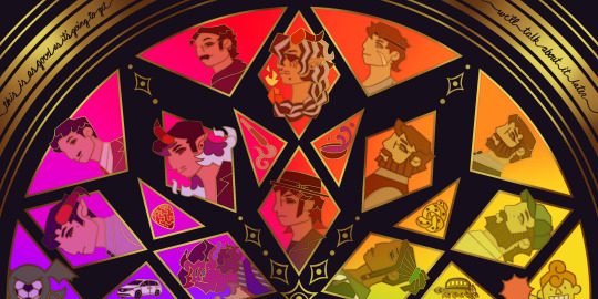
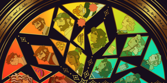
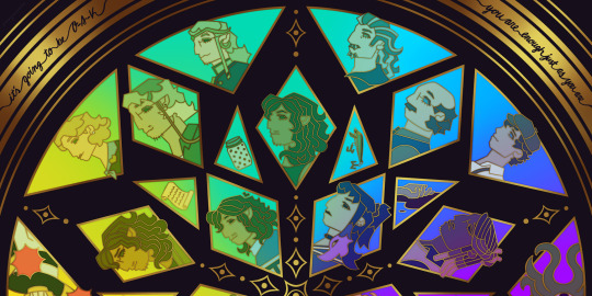
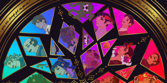
This piece has been months in the making, possibly an entire year. And by that I mean I’ve had a sketch of the comp scribbled on my whiteboard for ages because I wanted to save this specifically for 5th anni art. Now onto design stuff!
(First off a random thought: I really love how the garlic knot came out, I kind of want it as an enamel pin.)
I knew I wanted to make this a stained glass piece since the beginning, but I was also going to add flowers at one point but quickly dropped the idea. It felt like too much and I also didn’t want to fuss over flower language assignments for everyone. I was also going to add Doodler tentacles, but also dropped that idea pretty early. Kind of on accident, right at the end, I figured out how to make it even more stained glass-like but taking a duplicated lineart underneath the regular layer and turning the brightness all the way down, then setting it to overlay and adding a guassian blur. It’s very subtle but it adds that tiny bit of depth that makes it look more real. As for shading on the lineart/gold, I tried adding more highlight on the characters who died but once I evened everything out it wasn’t as noticeable anymore so I’m throwing that thought here so the attempt at least known lol.
The order of characters only changed a little bit from my original comp, I flipped the Wilsons and the Oaks so the rainbow could work. As for the anchors, specifically in season 2, I lined them up to the teens since the season 1 anchors lined up with each dad:
Tony —> Scary: his death was the beginning of Scary’s betrayal arc and also Willy killed him.
Guitar Pick —> Taylor: it’s not really aligned with Taylor at all, but the anchor was with Glenn so I put it next to his blunt.
Scroll —> Normal: was only because it was the last left to give him, but there’s the whole scene of him and Hermie in the Green Room so it still works!
Garlic Knot —> Link: one of two that he broke, but the more significant of the two with him telling Grant he never wants to see him again.
Small notes on the season 1 anchors: I put the layer of mold in the overnight oats but you can’t really tell with the overlay. And to make the supper bowl more interesting I added the fantasy sodas mix they dumped into it. The lure of actually drawn before so I just traced my own art lol.
As for the other smaller triangles, it took me a bit to figure out what I wanted to put there. I didn’t even think of adding the vehicles until two days ago but I’m so glad I did. I don’t really have my own take on the mascot version of the Doodler (yet?) so I borrowed the design from one of the stickers in their merch shop. Teeny was terrifying as just a front facing head so I made him cute again.
In the outer circles, I put what I felt was the most significant quotes for each family. I really wanted to use “It’s okay to be angry, it’s not okay to be cruel” but it was just a little too long.
That’s all I can think of! If you read all the way through, thank you for indulging me in my excitement to gush over this piece.
#dndads#dungeons and daddies#dndads fanart#dndads s1#dndads s2#dndads glenn close#darryl wilson#henry oak#ron stampler#jodie foster dndads#nick close#nicholas foster#nicky swift#grant wilson#sparrow oak#lark oak#terry jr#taylor swift dndads#lincoln li wilson#normal oak#scary marlowe#hermie unworthy#bill close#paeden bennetts#barry oak#willy stampler#meryl streep dndads#robert wilson#hildy russet#stud stampler
2K notes
·
View notes
Text
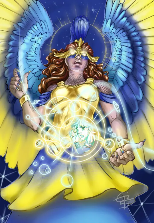
Don't ask me how I did it – I just did it – it was hard.
Late, late entry for @mircsy's 'draw this in your style'-challenge #AthenaDTIYSmircsy
That is as far as I got. So far. Might do reworks later. Actually my first DTIYS - never did one before, but I see the fun in it now. No, really, it was a lot of fun, I learned a ton with this, even if I'm not fully convinced of the result.
Also, when I saw mircsy post it, that was an 'immediate HELL, YES'-moment, because I love her art and designs so so so much. Her Polyphemus is who ultimately sold EPIC to me after a total of 3 seconds screentime. I am seriously amazed at the quality all artists and animators produce for the musical accompanying it on its journey to release, but mircsy's art was special.
👀 more yapping, WIPs and progress notes below 👀
It made me want to draw characters again, brought the fun back to drawing and painting for me, and somehow invited me put them out there, again - I can't put a lot of time into it, but I missed this as a joyful hobby and just watching the animatics breathed life back into it for me. So, this lil dtiys entry is a big heartfelt thanks for a nudge I bloody well needed.
So - if you ever read this, mircsy: Rock it all as hard as you can, superstar, make your mark and just enjoy the ride - you're cut out for it! ✨🎆 Wish you the very best for all your endeavours. 💜✨
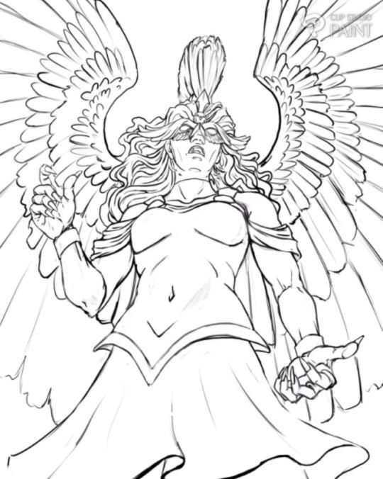
Progress notes: I tried to challenge myself with this and do stuff out of my comfort zone (*cough* cell shade *cough*). A few things went well, and I am proud of those (metal parts, hands, wings, lineart, i finished it under 5 hours total, stars were fun) and other things I'll need to practise more (soft light + cell shading wtf was I thinking 🙈, glowy stuff, ornaments, less perfectionism, line dynamics, took more time out of me than expected ... (we don't talk about facial expression ahahaha its a nightmare 🙊 i really need to learn how to shade and light these kinds of angles omg 😨)).

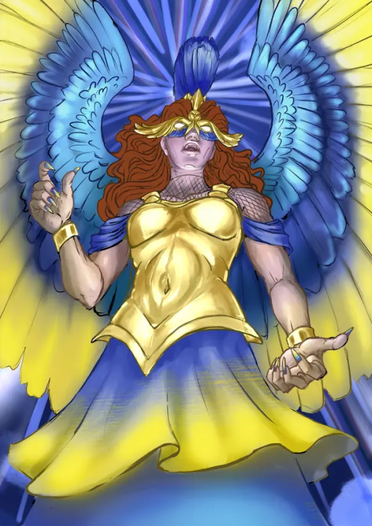
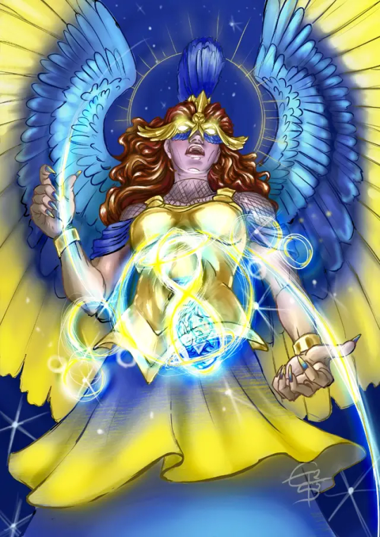
As you can see above - the glowy stuff gave me the hardest nightmares, I had no fucking clue how to do that - that was fun, but also took so much time to figure out. Once I had a concept, it went down fast, but up until then... bzzzzzt braindefunct - it's inspired by the Antikythera Mechanism in the end, so Athena can make complicated astronomical calculus while in quick thought to see where Ody ended up.
... her mouth changes in every single picture... 😭🙈
#epic athena#AthenaDTIYSmircsy#mircsy#epic the musical fanart#dtiys entry#eintausendschoenart#digital#etsart
177 notes
·
View notes
Text
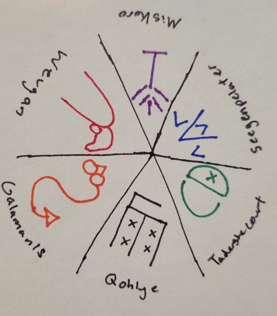
I've said for the better part of two years, well before it was even announced, that a Misfits and Magic season 2 might kill me, and in fact it tried (in only the best ways)! And not only did it give me the gift of a new all-time favorite D20 episode (sorry, Neverafter's "Once Upon A Time," there's a new dealing-with-PC-death-in-the-most-perfect way episode, and it's "A Place of Knowing"), it also gave me something I've been waiting years for: little lineart symbols that perfectly match my usual tattoo aesthetic, so I can finally get the D20 tattoo I've been dreaming of, for my favorite campaign, no less.
Just one problem: I'm not much for social media, and having consumed all the MisMag season 2 content I can find, I still can't find anything that confirms what all six of the little creature symbols should be. So I figured I'd farm the question out to the internet, and see if anyone saw/heard something I missed. So: the index cards.
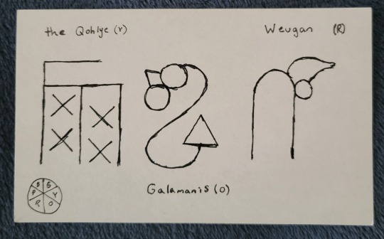
The warm half of our color wheel, as depicted by the Gowcentric Orrery, is straightforward. The symbols appear on Tabby in direct coordination with their names when the Pilot Program visits Galamanis, the Qohlye, and Weugan in episodes 2, 3, and 6. They also all look reasonably recognizable as their animals (I'd say the Qohlye the least, and Weugan the most, but there's still a winged goat, a lizard, and a dog in the shapes). So that was easy. The problem is, unless I missed something, we're not shown the other three island/creatures in as straightforward a way.
Across different episodes, we do see symbols that clearly represent Tabby, the knotted symbol for magic's rules, and, of course, Tabby's enemies to lovers best friends relationship with Jammer, but because they're recognizable, I discounted them from my research. But, in episode 4 (on Seegenpelater) we do see three other symbols, which are never formally explained on the show, appearing when the Pilot Program are conversing with text-Tabby. Without finding anything to confirm or deny it, I've assumed that these three other symbols are in fact the cool side of our color wheel, breaking Tabby's pictogram language into the six basic magic principals he was made to coordinate. Which leaves the problem of working out which symbol is which of our favorite little magic guys.
With limited understanding, the only clues I really could think to go off of were the general shape of the symbol, and the word they appear before on Tabby's tablet when he's doing his magic-eight-ball routine. I'm almost 100% certain the above symbol is Seegenpelater's. I'd say this looks about as close to a two-headed camel as the warm side of the wheel looks to their animals. It also was accompanied by the word "doubtful" on Tabby's screen, which I do think corresponds reasonably to Seegenpelater being the basis of illusory/enchantment magic (ie, magic that casts reality in doubt). That would make it the blue wedge, opposite Galamanis, and leaves us with purple (Miskoro) and green (Tadershecourt).
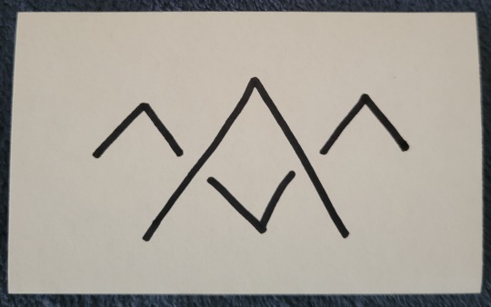
This is where I hit the snag. I don't think either of these especially resembles our boy Tad. I could honestly see an argument for either depicting an antlered creature. My best guess is that the one on the left is Miskoro and the one on the right is Tad: I'd say the left looks to me like a winged guy with a tail, and the right does have a vague skull shape to it. We also see both of these symbols used twice. The left symbol accompanies the phrase "likely," while the right is joined with "ask later." I don't find that particularly helpful, since both phrases to me could be associated with Miskoro's transformation magic, but given that Tad's is a magic of curtailing/lessening, I'd be more inclined to give him the latter (also, I think it looks like a power button, and it's fun to think about Tad's symbol literally being a kind of off switch).
Assuming I'm correct, and that these symbols do all correspond to the orrery (as opposed to us just not seeing some symbols because it didn't come up during gameplay), that would make our full, official Gowcentric Orrery look something like this (apologies for the quick, shitty sketch):
Does anyone know a confirmation one way or the other if this is right? If @quiddie or the Dimension 20 art team has released an official version? I've literally been thinking about this for the past two months, so if anyone else has an answer, or even just a theory, I'd really love to hear it!
#my thoughts#dimension 20#d20#d20 mismag#d20 spoilers#misfits and magic#evan kelmp#k tanaka#sam britain#whitney jammer#aabria iyengar#hopefully thats enough tags that at least somebody with an answer will see this!#I've definitely gotten symbol tattoos from shows without confirmation before#cough cough circular galifreyan#but this one i really want to get right#also d20 merch team release pins for this season#or literally any new mismag merch#im begging you#misfits and magic 2#d20 meta#mismag meta
70 notes
·
View notes
Text
fuck this shit again

have the voice of the opportunist, and this is really making me realise how much I suck with colouring in my drawings. the lineart looks like this

oh, there's a little teaser for para in the corner. oops.
though I think I've probably made oppy just as slimy and sleazy as he was meant to look. so that's a point in the drawing's favour, I guess. he probably looks like a dilf if you squint hard enough.
broken's done so now there's like nine more to go hoooo boy.
by the way the thing I'm doing where I cover their right eyes with their wings isn't just a cheap cop-out for me to avoid drawing said right eye. it's symbolism (oh totally). because they can only experience a very specific point of view. it limits their perspective. in the end, the voices can't always truly see the right thing, and the way they are restricts them into seeing only what's left behind. so their left eye remains uncovered.
now i don't have anywhere as much to say about the opportunistic bitch but I do have a bit. for one, I'm not part of his massive hatedom. he's such a charming little rat bastard and I'm here for it
he's so horrible (affectionate)
no but I really love how each and every one of the Voices is just like a defense/coping mechanism. individually, they were developed by TLQ to make sense of the situation and adapt to whatever bullshit he's being forced through at the moment, right? but in excess, or even when the situation takes the smallest unexpected turns, they can get pretty unhelpful pretty quick.
oppy in PatD perfectly encapsulates this. (wow, what a profound insight, captain obvious. who could've guessed. not like every third post about pristine cut says this already.) fine oppy in PatD was peak
okay but let's face it I just can't hate the guy he's such a flip-flop girlfailure.
well it's kind of interesting how, in a way, this dude also exhibits another potential reaction to fight or flight situations. there's freeze but we're not talking about that today. and then there's fawn. the opportunist wants power, but that's not just what there is to it. in the end, this desire for power stems from an underlying need for control. often, he's manifested by a taste of control for the first time. control spawned from betrayal spawned from fear. from apprehension. from the need for autonomy, met with a lack thereof (thanks narrator you son of a gun), but then regained in triumph.
the opportunist clings to each sorry sliver of power he can get. because once he's tasted it, he requires it so deeply it's become something he just has to have, like an addiction. and he may appear kind of pathetic, or risk everything else for each new taste of power. and he may stop himself from letting himself stray too far, may force himself away if he must. and affection, or kindness, or connection, or trust- they cannot exist, not for this control he craves so much. yes, he's selfish. but being anything else that's not selfish isn't even a choice at all in the face of this power, this control, this sheer craving of his.
but in the end all the opportunist wants is belonging. he wants a purpose and he wants meaning, especially to others. he wants to matter. and having control is surely a way to show that you matter, right? being at the top has to show that you mean something. that you're not pointless. that you exist and have a right to exist.
even if all the actions you take, vile and scheming and despicable, tell everyone else that you shouldn't.
then again, his perspective blinds him. as with all of the other voices.
now it shouldn't be too much of a hassle to figure out the symbolisms in his design but in case it wasn't obvious enough his tie brooch was supposed to be an ouroboros. I thought it was neat when I first designed him. I'm having second thoughts now. plus, I tried to steer his design in a different direction from most others, who tend to stick with "tumblr twink in a nice suit". um...well, I don't know if it worked.
and GOD why did I choose this specific shade of green. I mean, it's unnecessarily tacky? and bright? and way too obvious like him? hopefully it matches? oh well.
#stp#slay the princess#slay the princess voices#stp voices#voice of the opportunist#stp analysis#stp opportunist#slay the princess fanart
31 notes
·
View notes
Note
hi hi! could I request a Pitaya Dragon x Dark Cacao fan child? an example of a name might be dragonfruit choco, which my friend came up with for this ship they came up with. their dynamic is two big guys with swords and anger issues that are besties but also maybe more??? :000
oh and snapcube sonic and shadow

I only realized now that there was a suggestion for the character. Sorry about that. Anyways, this here is Dark Sapote Cookie
Also one thing to note, I basically had Dark Sapote finished months ago. I think you can tell by the way their lineart doesn’t entirely match what I do now. Literally all that was left was the sketch, which I did today. There’s another fankid in that boat, so she might get posted today too (among others that I just have forgotten to post)
But also on top of that, it’s been a good while since I’ve thought about Dark Sapote, so I may miss some stuff
Anyways, on to Dark Sapote. They’re half dragon and live in the Dark Cacao Kingdom. They have a more dragon like form they can transform into, though it’s more of a drake than a dragon, and they don’t turn into it often. They’re technically an heir to the Dark Cacao Kingdom throne, but they don’t do much of anything, so they aren’t really considered such. They also choose to live outside of the Citadel in a cave somewhere
Dark Sapote is extremely chill and often very sleepy, to the point where they’re pretty lazy. However, this isn’t entirely due to their nature, but rather due to the temperature. Because the kingdom is so cold, their body’s essentially in a low power state, as they subconsciously are in a brumation state, but also aren’t reptilian enough to actually go into it, so they’re just stuck like this. And they specifically have this problem because Pitaya is from a tropical and more fiery climate, and Dark Sapote inherited biology for a warmer climate, not a colder one. No one is really aware that this is the reason Dark Sapote is like this, not even Dark Sapote themself
In higher temperatures, they become more active and energetic, and in addition they become more powerful. But because they live where their power is dampened pretty much all the time, they don’t have the best grasp on their full power. If they were to go to say, Dragon’s Valley, they’d likely unleash mayhem with their uncontrollable power. Not quite sure how they haven’t encountered this problem yet, but whatever
They grew up in the Dark Cacao Kingdom simply because they liked Dark Cacao more than Pitaya, but they kind of all unwittingly created this giant problem for Dark Sapote, leaving them in this state
Anyways, on to the design
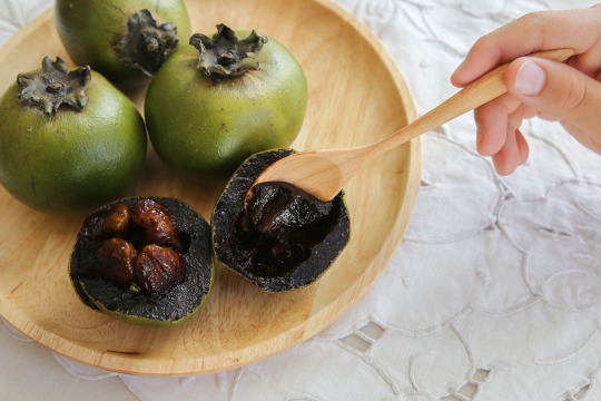
So Dark Sapote is a name I’ve had on file for a long time, after I discovered the existence of black sapotes, which is what they’re based on. Black sapotes are a tropical fruit like pitaya, and apparently when ripe, they taste similar to chocolate pudding
Black sapote:
So to look for things to say on their design, I watched the time lapse video Procreate makes, and now I remember, Dark Sapote was hell to design. And if I’m being honest, I think the rough sketch is the best version of them
They were apparently originally going to have horns or a crown of sorts, but I decided against it or it just didn’t work. Side note, but I need to give my characters more accessories, especially in the hair. That’s how they end up looking so plain
Their hair is supposed to be the same between the sketch and the final design, but you can’t really see it with the pose. Apparently I tried other hairstyles that would make it visible but for some reason I decided against them
Their side hair thing is supposed to be from Pitaya, with their side bang things, but I don’t think I executed it super well
The colors on the armor were such a pain, mostly because Dark Sapote has so many dark colors, making them all blend in with each other and the black lineart (I only color it at the end once colors are finalized). That was what made me shelve them for so long, because I couldn’t get them to look right, until one day I came back and was like “yeah good enough” and colored the lines, and then left because I was out at the time
Also the colors themselves aren��t the most appealing. The green and brown come from the fruit itself, but they aren’t the nicest to look at
To be honest, I think Dark Sapote needs another shot at a design. The final product isn’t the worst, but it definitely could have turned out better. And also, I like their character
And yeah, that’s Dark Sapote. If you see a redesign of them later on, don’t be too surprised. But regardless, I hope you can enjoy them in some capacity
#I need to figure out how to make them look better#cookie run#cookie run kingdom#pitaya dragon cookie#dark cacao cookie#fankid#fanchild#cookie run oc#dark sapote cookie#my OCs#my art#requests#answers
40 notes
·
View notes
Note
any advice 4 when u want to keep drawing 2 improve but u cant get over perfectionism ? like when u just dont care how its gonna turn out, if its bad its bad yknow?
ahh yes lowkey ive struggled with this a lot. not as much now as in the past tho, and honestly its beecuz ive developed a more neutral view on myself/my art in general. its going to take time to get to this state of mind, so dont be too hard on yourself when you find yourself falling into bad habits.
advice under the cut (kind of long winded) ⬇️⬇️⬇️
the first thing ive done to overcome perfectionism is focus less on details and more about overall shape and form. when i sketch im trying to get roughly what i want, and i limit the strokes i do in certain parts of my sketch to like 1-3 depending on what im drawing (im ngl i also am very impatient and have created a workflow that makes it so i am able to start and finish pieces as fast as possible LOLOLOL. shrugs. i just like drawing fast).
a good example would be this thing i just drew:
in all of my sketches i tend to use as few strokes as possible and just get the basic idea down. good for not overly focusing on teeny tiny details and worrying about them later (i also use the same technique for lineart, but just end up connecting the lines. thats another tip i have, if you like your sketches more than your fully lined pieces, just line the same way you sketch! or you could also use your sketch as your lineart :P)
another tip i have is to draw from references, and once again, focus mostly on shape/form/the big picture of your subject before going into details (do you know how many planes there are on the human face....i still dont know howta draw faces properly but im not mad at myself anymore about it, i just open up a reference and try to learn). i also recommend having a drawing session where the goal is to draw awfully. draw something you want to draw, but that you're not sure if you'll draw it right, and draw it. dont try to correct it, acknowledge that what you made isnt perfect, and then draw something else. you're learning! of course its not gonna be perfect. but inevitably, you're going to get frustrated. just remember if its something you really want to go back to, you will be able to revisit it in the future. feel your anger and frustration, but do your best to not direct it inward.
small side tangent about shading- I AM SO SHIT AT SHADING SKFHSAFDJHS. people dont tend to notice (surprising), since ig my shading style is considered "beautiful" or something, but if you looked at it on a technical level, there are mistakes everywhere. i havent really tried to improve it. i dont really care most of the time b/c i just like shading for fun. and especially when im shading my sketches, i already have it in my mind that its not supposed to be perfect. its a sketch. this is where im supposed to make all of my mistakes. once i start making my way to the final product is when i start worrying more about if i did the lighting correctly (even then ik im not good at it im not trying to be a god im just trying to draw things that make me happy).
additionally, i really rec u dont try and fudge a sketch until its better if you're deep in a Perfectionist moment. keep the old sketch and start over on a new sketch taking bits and pieces you liked from the original, and improving on those that you dont (shitty thumbnails are also good if you have a vague idea in mind but need ta figure out howta place subjects in your scene). honestly drawing the same thing/idea over and over gets me a better understanding of my subject each time, so naturally each iteration looks better. it doesnt take me that long to sketch tho, so if sketching takes you forever (sometimes if sketching takes you forever its b/c you're a perfectionist skjfskdjf) just think about how much time you're willing to spend on something. remember☝️ its okay to give up/take a break on something and try again later. sometimes you just needta stop looking at your art and like. look at a tree or something lmfao.
i will also say that im not looking to go into a career in art, im more of a hobbyist. ik school environments dont exactly.....help with perfectionism lol. there are certain expectations put on people who go into the art field that are inescapable. if this is the case for you, i still think what ive discussed before can help you, but i also think that you may need to lean more on the mental tips i have also provided below.
alright! mental health tips in regard to art:
so, i have c-ptsd, and with that comes a lot of self image issues that ive had to work on. my feelings about myself extended to the way i felt about my art. it was shit, it was awful, i cant draw like this other person can so why bother, if its not perfect i shouldnt draw at all, etc. and honestly, something thats helped is affirmations. my affirmations are c-ptsd related, but ive noticed a shift in the way i view myself, and by extent, my art since ive started repeating them to myself daily. and honestly, i think a requirement of overcoming perfectionism is telling yourself that your art doesnt hafta be perfect, A LOT. LOL. LIKE YOU ACTUALLY HAFTA ACTIVELY TELL YOURSELF YOU'RE NOT AWFUL LMAOOOO. its funny, we dont think much about how we naturally are self critical about ourselves, and we dont realize that we are basically repeating negative affirmations about ourselves over and over and thats why we're not improving (mentally).
even when you're not drawing, i think it would benefit some people to have some kind of notification on their phone to remind them to tell themselves that their art doesnt hafta be perfect daily/however often you feel you might need it. and then with that affirmation, practice Shitty Drawing. one of the best tips ive ever gotten for this was from one of my friends monnie. get out your sketchbook or some printer paper, take out a shitty pen, and DRAW. and then any mistakes you make are permanent and you cant just endlessly try and fix them. it forces you ta sit with this uncomfortable feeling that something you made isnt perfect. eventually your brain will realize that when your art isnt perfect, you can still draw and you're ALLOWED to continue to draw even if what you make isnt spectacular. if you dont want to repeat an affirmation daily, try to remember to at least repeat it before you sit down to draw. something along the lines of "my art doesnt hafta be perfect in order for me to want to draw. im allowed to draw even if its not perfect" or something else. it depends on what you most struggle with in regards to your perfectionism. im ngl its probably going to feel cringe at first, but i promise you, it really works if you put it into practice longterm.
shoot for neutrality instead of positivity first. let me tell you thats where i am now and its so much less exhausting drawing lmfaooo. i make something that looks like shit and im just like. i dont fucking careee i dont give a fuccckkkkk
those are my tips :] i hope this was helpful!
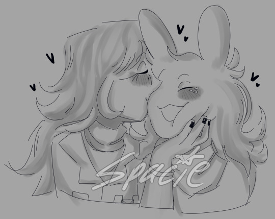
#spacie spoinks#art tips#kind of?#art advice#i would have added more art but i dont have my art saved on this device KSHFSKJDFH#i copy and pasted my art above from my tumblr post 💀💀💀💀💀💀#anyway#have a great day anon!!
10 notes
·
View notes
Text

Dancing underwater Outer wilds fanart
I started the day wanting to practice some clothing rendering, something about folds, it's kind of awkward, I'm really not material inclined, oh yeah sure let's throw it underwater, that's not going to confuse things at all. Anyway, I started the day trying to work on my line art, at the moment I'm more focused on my sketches before worrying about lineart again. I think once I feel like my lines start coming out more confidently in the sketches I'll start lining again. For now, the extra sketchy lines have been helpful for getting in a bit more of the flow, something like you might get in a gesture drawing? Next up are the colours, I realised all my latest pieces have been that typical warm/cool split, I guess they're starting to feel a bit too similar in construction? I'm testing what I can do with different colour palettes, the idea behind this one was to try an analogous palette (similar tones - blues and greens), then I threw in a complimentary band of red originally, it was more like a desaturated pink? I think it was putting the focus away from the face too much, so I tried fixing it with some hue shifting, both a layer and just straight up replacing the base, lesson learned, sort the base palette out before the shading. Similarly I'm not the biggest fan of that seaweed green for the horns and feet, I'm not 100% sure what I did, maybe a few clicks too many towards the green, looks a bit too vibrant. Ah I won't worry about it too much, it's not super egregious, just something to look out for in the future. Otherwise, for a first try at rendering water, I'm pretty pleased with how it turned out.
#outer wilds spoilers#owlk#eote spoilers#underwater#digital art#drawing#outer wilds fanart#outer wilds
11 notes
·
View notes
Note
Hello! first off I just want to say that I love love love your art!!! its so amazing! 💖 So, I’ve been asking this question around online, so I hope you don’t mind! (Please feel free to ignore this ask if you don’t feel like answering!) Anyway, I’ve been drawing for a good while now. It’s always been something that interests me, but, in all the time that I’ve done it, I’ve never once found a style that is unique to me and that I’m good at. So, I was just wondering if you have any tips or advice on how to find your own style? I’ve tried so many though I can’t ever seem to like any of them or actually stick to it. One thing I really have trouble with is proportion. I want my style to be more chibi-esqe, but not completely if you knows what I mean lol. If you have any advice for a fellow artist I’d really like to hear it!! Please share your wisdom :D
Hello and thank you !! I don’t mind at all ! Let’s see…
For finding your art style:
► Define what you want to tell with your art. Not mandatory, but i think it helps. What do you want people to feel when they see your art? Do you want them to feel the emotions of the characters you draw? Or be impressed by the technique? the colors? All of the above?- I think your answer will lean you to something more specific in terms of style. For example, I tend to focus on characters expressions and feelings. So i have a relatively simple artstyle that allows me to focus on facial traits a bit more. (Also... i'm lazy- So i like to tell more with less)
► Observe drawings from artists you love ! Try to analyze what you like so much about it. Is it the lineart? the specific way they draw eyes or any specific part of the body? Is it the colors or the rendering style? And try to reproduce it yourself. Not in a plagiarism kind of way, but more as a study !
► Try, fail and retry again. Once you have analyzed the things you like, try to incorporate it into your own art. It might come off badly sometimes, but you also might create happy accidents ! Both outcomes are good learning. And while I don't think it’s possible to have a style 100% original, it doesn’t mean you can’t create an artstyle that you own and feels as uniquely yours !
► Be patient (trust the process and don’t be too hard on yourself). Defining your artstyle might take years to refine itself. Decades even… With practice and dedication it will come naturally to you ! But as with any discipline you have to be patient, there will be ups and downs and very frustrating moments but you never cease to learn.
For proportions:
► Don’t be shy about using references. There is no such thing as cheating in art (if used properly). It builds your visual library, so help yourself as much as you can ! Professionals use them all the time too.
► I don’t want to be the bearer of bad news, but…. We can’t really cut anatomy practice- I avoided it for so long myself and I regret it bitterly. So don’t be like me and practice your anatomy ! Even if you aim for a simple or semi-chibi style. The trap is it seems easy to draw , when in reality a lot of chibi artists already master anatomy to a certain degree. It’s much easier to simplify shapes when you know a little more about the structure behind them.
There are a lot of websites to help you, here’s a few ! http://reference.sketchdaily.net/ https://line-of-action.com/ https://www.posemaniacs.com/
My advice is to start slow. Most of those websites have a timer by default, but don’t set a time limit for now and take your time on each pose. Try to breakdown body parts into simple geometrical shapes. It helps grow your visual library and it’ll get easier to draw with better proportions !
___
Here you go ! I realize it's very generic sorry - TLDR: don't give up ! If you want anything more specific don't hesitate to ask again, I'll do my best ! Good luck on your art journey ! ♥

15 notes
·
View notes
Note
When i first started digital i would make a layer for everything basically for the face clipping make several layers to it and same for the hair/ background/ every piece of clothing...etc
I did take it down a notch recently and all but i just saw a video from samdoesart and noticed he LITERALLY JUST USES ONE LAYER FOR THE WHOLE PAINTING!!!??
sorry was wondering if you'd recommend a certain number of layers
the amount of layers you use is highly dependent on the style you're going for, the complexity of a piece, your personal drawing style and preference etc so i really don't believe there should be a certain amount of layers you should use. I myself fluctuate between using many layers or just painting everything on one so there really isn't a correct way or number to go for.
Howeverrrr, i think there is a certain threshold where layers become too excessive and turn into more of a burden than an aid, something that you probably noticed as well. If you find yourself becoming frustrated with the constant switching between layers for every single part you've singled out, then it's better to take notice of that and just tone down the number a bit. Samdoesarts, despite his guynextdoor vibes, is a professional and so of course he doesn't feel the need for many layers because he knows what he's doing and has a very clear workflow and style in mind. To some extent, i believe that using a minimal amount of layers does also stem from a place of confidence in your skills and/or process.
Me personally, I tone down the layer amount moreso out of laziness and because i don't like to have my flow interrupted by some "technical" errors as in "whoopsie i painted on the wrong layer again" so i just., really try to keep it as low as possible; sometimes it works sometimes it doesn't and i suffer
I add new layers every time i want to " try something new" or fix something whenever i'm still unsure of how it will turn out. New layers are for experimentation. I treat them like some sort of backup or checkpoint of some kind- that's their primary function for me. If the new thing i tried painting over doesn't work out i can just hide the layer i painted on and either try again or give up on that idea as i concluded it doesn't look good. A safety net, if u will.
One rule i do follow however no matter what is to always always have a separate layer for the hair- both color and lineart. that is the only thing i make a conscious decision to keep separate (because of previous struggles and failed attempts) For everything else, I just paint it on one layer with those aforementioned experimentation layers on top. Same for rendering. And i always merge them together once i think it looks good
I really don't like having too many layers cause it becomes annoying and messy. The only time I deliberately use a shiton of layers is for commissions, really.
i know i didn't really answer your question, but i really don't think i can recommend a certain number, so i just shared my experience with layers instead. Bottom line is, as long as you find them helpful, use as many layers as you want but don't overdo it
#i have a lot of pieces that i gave up on exactly bc there were too many layers and it was too overwhelming#so yeah less is more#tbh i have more hidden layers than active ones#my so-called “backups”#that i never refer to and refuse to delete “just in case”#i have maybe 2 or 3 active layers so to speak#i'd recommend being very loose with drawing and not very strict#but what do i know it's just personal preference#ask iztea
27 notes
·
View notes
Text
Two previews or WIP (Work In Progress) for the next designs references.

Sunbeam reference. Will redraw it probably as the lineart and colouring is a bit sketchy for the references sheet, but I feel this is the design pattern I'm after.

Brightheart reference. This one is more advanced than the previous.
I spent a lot of time trying to find a design that fits her well because of how special it is for me the character and because of her complex design. I've made countless sketches in the last two years but I never felt it looked right. But I think I've finally found the design. I tried to research references for these kind of injuries aswell as recalling from a close real experience, but I truly appreciate any critique that can help me improve the portrayal of her scars.
Thank you all for supporting. Expect soon these designs to finally be done, once I regain more free time.
#warrior cats#warrior cats designs#bigiswarriorcatsdesigns#a starless clan#the prophecies begin#brightheart#sunbeam
83 notes
·
View notes
Text
Brainstorming random general Junkrat headcanons that i consider as an official canon at this point
I wrote this at 4 am cough
- mother issues, and not in the kinky way but like really bad espresso depresso mother issues. He's like a newborn duck who thinks that anything that comes near to him is his mother (also based of his voice lines i think he was an only child and probably lived only with his mom)
- he doesn't care about what he's wearing, dress, pants, skirts, like he's able to walk around in anything that isn't tight or scratchy
- he sees Roadhog as his father figure/older brother and they just kinda adopted each other without the paperwork (ALSO pls don't take this like I'm trying to shittalk on ppl who ship them, this is just my personal view on their relationship so pls don't yell at me or I'm gonna cry ;-;)
- you can't tell me that my boy doesn't have adhd and ptsd, like C'mon
- he's on aro/ace spectrum, he spend his entire life in wasteland so he's rather looking for family and friends than partner, at least not just a quick flirting etc.
- but I can also see him that something like a personal space doesn't exist for him (he's extremely hungry for any physical touch like someone hug him already holy hell) i feel like he doesn't really understand social interactions (kinnie moment) . Idk how to describe it but like imagine he would randomly walk to you and gave you flowers or smth, just trying to be friendly not realizing smn could interpret it differently
- but also he has no idea what flirting is, like u could hit on him for months and he would be for the entire time like :) 🧍♀️"love ya too mate" while patting your head
- he actually can draw pretty well, like the concepts he drew for his bombs etc? He has such a clean lineart holy shit
- hardcore/trash punk and kpop/classic 2000s pop, nothing else.
- literally the biggest fan boy (a little meow meow u can say), Lucio? listens to his music non-stop, Hammond? has his stuffed animals and signed peg leg, Junker Queen? gosh, if he doesn't have at least one lunch box with her, I'm throwing hands than
- the pokémon sodas edition, he would love them, cherishem them, worship them, like if he loves pachimari u can't tell me he wouldn't love strawberry yagult pink soda with Mew on the can
- he's losing his hearing so he uses hearing aids (that he made himself ofc), also him and roadhog know sign language and using it pretty oftenly, during missions, when Junkrat's having a panic attack etc.
- so like ppl say he's egoistic but i think there's a huge difference between his ego and Junker Queens ego, she's very confident and sure about her role/look/skill etc. While Junkrat is more self-ironic and tries to hide that he is actually pretty insecure about pretty much everything
- can speak fluently many languages which always throws everyone off , like he just randomly starts speaking Chinese fluently in a middle of meeting or something, and everyone arevlooking at him like 🧍♀️
- shitty phantom pains, he may know how to build his prosthetics from a literal garbage but has no idea when it comes to take care of himself so he just curles up into a ball and sobbs
- he and Roadhog give each other manicures at least once a month, that's the only thing he can actually take care of
- unhealthy addiction to coffee and sweets (someone should take away the coffee machine he has in the workshop) (his teeth are rotten at this point)
- his sleep is more broken than the queuing system (haha funny), usually sleeping like 3 hours per day, that's why the coffee addiction
- if u would show him any kind of love he would start stuttering while trying to come up with smth funny, blushing, sweating and sit on the ground and think about life for the next 30 mins cuz of how much he's not used to being praised
- also my man is a huge emotional wreck, he's getting new emotion every 5 seconds
- honestly i can't decide if the only thing he ever read was a recipe on frozen dumplings or if he's the biggest nerd u can imagine who's walking around with Franz Kafka or Sigmund Freud while sipping his boba tea
- he's missing an eye - I read the theory that he doesn't have an eye and that his fake eye is actually the real treasure with a code or smth, and omg, im obsessed, yes, my boy is like a cool mad max pirate, absolutely canon, at least it would connect him to some actual lore in the story, he's just wobbling around for last 6 years just give him something already;-;
- he likes comics, i just think he likes to inconspicuously steal a new issue of Batman whenever they're pulling a heist
- you know those French toasts that are basically just normal bread soaked in condensed milk? that's his ass

#junkrat#junkrat ass discourse#roadhog#junker queen#wrecking ball#overwatch 2#overwatch#overwatch headcanons#pats his head#hes my boo#my little skrunkly#headcanons#jamison fawkes#mako rutledge#overwatch junkrat#overwatch lucio#overwatch junker queen#overwatch roadhog#overwatch hammond#junkers#comfort characters are better than therapy#brainstorming#aromantic#asexual#aroace#asexual spectrum#aromantic spectrum
84 notes
·
View notes
Photo
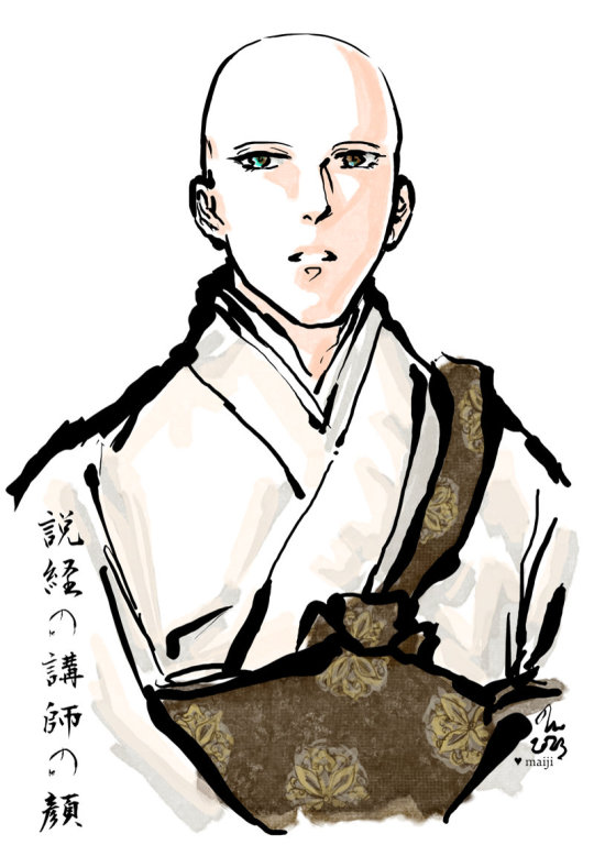
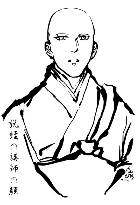
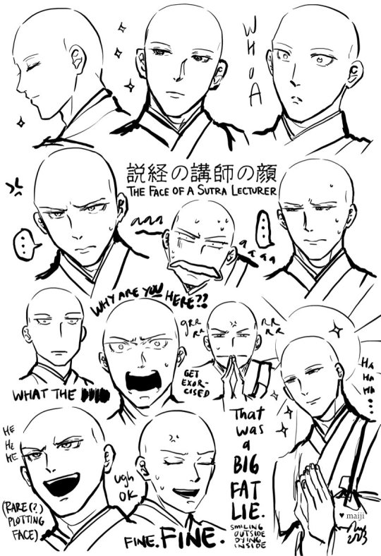
[image set: 1) Digital ink brush-and-watercolour-style illustration of the Buddhist monk Byakken from Nubatama wa Oujou Shinai in ceremonial robes. His lifted head, hooded eyes and slightly open-mouthed expression give the impression that he is in the midst of giving a talk. 2) Same illustration, but with only the lineart. 3) Byakken with a variety of facial expressions, looking serene, shocked, stressed out, annoyed, etc.]
説経の講師は顔よき。講師の顔をつとまもらへたるこそ、その説くことの尊さも覚ゆれ。 - Sei Shonagon, 枕草子 (Makura no Soushi / The Pillow Book)
“A priest who gives a sermon should be handsome. After all, you're most aware of the profundity of his teaching if you're gazing at his face as he speaks.” [translation by Meredith McKinney (2006)]
"A preacher ought to be good-looking. For, if we are properly to understand his worthy sentiments, we must keep our eyes on him while he speaks [...]” [translation by Ivan Morris (1967)]
More commentary below the cut!
I chuckled at this quote from The Pillow Book (and the entire story built around it) in Nubatama wa Oujou Shinai. (If you’re unfamiliar with The Pillow Book, it very much is like reading the blog of a thoughtful, witty court lady from the Heian era! Sei Shonagon can be quite tongue-in-cheek, even sarcastic, and in a lot of ways it’s amazing to see how little humanity has changed over a thousand years.) I also thoroughly enjoyed drawing Byakken-sama in ceremonial robes!
On the topic of faces, one of the many reasons I love Byakken is because of his extremely relatable facial expressions. Kuze Banko gives him a lot of these perfectly serene expressions, but also has no problems pulling him in extremely over the top directions too - usually from shock or stress, he seems to get into those kinds of situations very easily lol. I feel his emotions one hundred and ten percent! Because of the well-done range and writing, it really gives you the impression that even his serene expressions have something more behind them (like exasperation, resignation…).
For example, the (very minor early story spoilers!) context for “That was a BIG FAT LIE” (smiling outside, dying inside) is that Nubatama happily tells all the sobbing wailing people in her household that she decided to become a nun because she was so profoundly moved by Byakken-sama’s preaching and decided to leave the material world behind. Which as we know is a complete fabrication especially since Byakken spent most of his time with her arguing with her about why she shouldn’t become a nun. But everyone who hears the story is like hmm yeah!! That makes total sense!!!! And thus The Amazing Tale of How Princess Nubatama Was Inspired To Become A Nun gets around. The panel that cuts to Byakken standing in front of a bunch of people talking about this, with his beatific Mona Lisa smile that somehow manages to be really flat at the same time, captioned with a giant USO (“lie”) kanji, is pitch-perfect. The entire setup and background gives him this impression of “Ah, yes… that familiar feeling… of THE DESIRE TO COMMIT MURDER”. Every time I look at it, I laugh.
It was a good challenge attempting all the different faces while still trying maintain a sense of consistency about the character, especially thinking about how I would render him differently relative to all the other Buddhist monk characters I also draw. I tried to manage that through his eyes - his very expressive eyebrows, heavy lids, and the little lashes at the corners of his eyes and his lower lids, and some of the dips/head shape near his temples. It’s also interesting to click between the colour and the ink/line-only versions and see how the effect of an image can change subtly, yet noticeably once you bring in shading and colour.
#digital art#fanart#nubatama wa oujou shinai#the pillow book#sei shonagon#byakken#art by maiji/mary huang#heian#kuze banko
20 notes
·
View notes
Text

ena vaguely inspired by girl with a pearl earring
timelapse and insights under the cut
in general, when i draw, it tends to be relatively normal humanoids whose proportions might vary, but are still overall leaning just kind of toward standard humans. i usually aim to have at least semi-realistic anatomy and i mostly draw with curved lines, and sometimes use a lot of them to messily find my way through a shape. ena, for me, was kind of the opposite of a lot of things that are normal for me. her design is pretty geometric and much more inherently cartoonish, i think, and benefits a lot from lineart, which i do infrequently enough that i actually don't really have a specific workflow for it. i saw a post once that suggested blurring the sketch to make lineart easier to distinguish from it and avoid that feeling of "man, i can't match my sketch" and tried that here, since i didn't feel confident enough to paint her, and wanted to try some other things i've picked up over time, like using linear burn/light to shade and... actually yeah no that's about all i can think of. but either way, it's a departure from what i'm used to
anyways, i had actually been thinking about ena for a little bit, but when the dream bbq trailer dropped i literally swerved back into the series. i had to do something immediately. like as soon as i managed to scrape my brain back together i had so many ideas about it, but i wanted to do at least one yellow/blue ena before working on anything for the new ena (i've seen "season one/two" thrown around?). i actually did this a little under two weeks ago, but i'm only posting it now because i originally planned on posting it with a different piece. i didn't actually start it yet bc i wanted to warmup with painting things in a different way than i have before, but it quickly spun out of control so like. here we are
#i might be a little incoherent. i'm a bit sleepy. you know how it is#my art#ena joel g#... um... normally i would tag the character here but i kind of already did that by tagging the media.. oh well#lined art#i kinda dont like that tag. i want something different and a bit more specific but it's a placeholder here i guess. whatever#csp#timelapse
11 notes
·
View notes
Text
Weekly update June 23, 2023
Getting back into the swing of work. Exhausted. I tried getting artstuff done this week.
Finished up storyboards for TRGA today* they aren’t lipsynched yet. I need to lipsynch two or three more shots I forget. Then I’ll try to doll up the puppets tomorrow, and I’d like to do a quick test for some effects as well. I’m also wanting to try actually getting and using Adobe after effects, but installing hasn’t been kind and I do have plans for effects that I can just do in animate so I’ll stick to those for now. I’ll try to make it quick, I did that one promo animation for TRG Colo this year in one day, so I can do a basic little movement in a couple hours, then screw with effects from there.
Artfight I’m a bit more worried about. I *think* I have Mikey’s refsheet done (there’s a bit of empty space but it’s probably fine because I can’t think of another aspect of his design that needs to be highlighted to fill it). I’m partway through Shaun’s refsheet, which shouldn’t be too hard since I don’t need to do all the float effects and transparency (although I’m still doing a bit since it allows me to show off more of his design). Anastasia’s thumbnail is done now and I’ll try to do her refsheet once Shaun’s is done. I’m definitely getting faster at lineart, which is good because that means I can keep my commissions cheap.
I’d love to poke music but I don’t think I’ll have time this week. I have a bunch of paperwork and stuff to mess with, plus I should fix up the puppets for TRGA. I’m a bit disorganized and a bit messy but I think I have leeway for next week being a bit slower since I was able to keep up with stuff this week. I’m still going to try stuff but I’m a bit disorganized at the moment. I’m sure I’ll be okay, though.
2 notes
·
View notes
Text
Directed Study [Ice Cream Designs]
For our directed study today we were tasked with creating ice cream designs. This was to do something creative and also test our composition skills.
We were tasked with creating four designs, so I managed to finish them all.


So I chose orange, lilacy blue and pink. I blended it together with the smudge tool (it was very laggy so it took a bit) and then I drew a cute design over it. I added the black lines to indicate blush and added some cute eyes.

I then put it on top of the cone and coloured it in. I didn't draw the cone but I wanted to add extra detail later.

Then I added a darker edge to the lines for texturing and then coloured the lineart.
I also copy pasted the cone I did and added it to the 3 other cones to make it faster.

Here is the second ice cream I made, using various teals and blues. It was hard to see against the background but once I added lineart it was a good barrier.

Here's the two ice creams next to each other.


For the third ice cream I used pink, yellow and white. Kind of like strawberry mixed with vanilla. I think it's a little hard to see but the smudge tool was difficult to work with. Next time I'd definitely use darker colours.


For the last ice cream I used pinkish red, orange and yellow in fire colours. In my opinion it is the best mix as they work very well together.

Here is all my ice cream designs together. It was a fun little activity since it wasn't too hard and it got my creative juices flowing. I liked thinking of colour schemes and it's fun to think of the flavours of what these ice creams could be. I tried to give them all different expressions/personalities but I'm not sure if it came across that way.
I still found this fun and it was simple enough to pass the time.
0 notes