#i really like helvetica but mostly when its bold and not when its in all caps
Explore tagged Tumblr posts
Visit Tumblr Blog
Explore Tumblr blogs with no restrictions, modern design and the best experience.
Last Seen Tumblr Blogs


Fun Fact
Tumblr Inc. is using 66 technologies for its website.
Text
i've been tempted to start one of those tumblr gimmick blogs but its "identifying fonts in posts" because i. am autistic about typography. and in my daily life a million times i will stop what i'm doing and comment on the font something is written in
#'if you were a true nerd you would know fonts and typefaces are different' I KNOW THIS BUT NOT EVERYONE DOES#AND I MUSTNT BE TRULY OBNOXIOUS I AM ANNOYING ENOUGH AS IT IS#i really like helvetica but mostly when its bold and not when its in all caps#helvetica neue can stay but its on thin ice. i dont like it as much even though there are only marginal differences#some people will say Arial and Helvetica are the same. i tell these people there is a special layer of hell made just for them#joking. but they are very different#i hate copperplate gothic and every time i see it i lose a year off my life#futura is Okay. its also on thin ice. when its good its really good but its also a bit oversaturated rn#anyways.
9 notes
·
View notes
Text
Font Recs/Typography Tips
@weatheredlaw was looking for some font recs and I was kinda planning on doing a font rec/typography tutorial post thing anyways, so here goes:
(I got carried away!)
1. A NOTE ABOUT ORGANIZING FONTS
Okay so... first of all-- I highly recommend using FontBase to manage your font files (It’s free and it’s available for Mac, Windows, and even Linux). The reason being, that as you install more and more fonts on your computer, the font menu in Photoshop will start to load really slowly. Which gets really frustrating really fast.
FontBase lets you organize your fonts into neat lil folders and activate/deactivate them as needed with a click, so you can keep the Font Menu Bloat at bay. There’s also a premium version (aptly called ‘Awesome’) that costs $3 a month and has some nifty extra features, but that’s neither her nor there. Yes, I throw three of my hard-earned dollars at them every month.
Also? If you have a work computer and a home computer, you can install FontBase on both systems and point it to a Dropbox or Google Cloud folder so that your font collection always stays in sync across both devices. 👌✨
2. WHERE TO FIND FONTS
Google Fonts So... Google Fonts is technically a webfont CDN, but all of the actual font files are available for free download from their Github repo. Alternatively, you can use FontBase to sync them directly to your computer. Which is nifty.
What I like about the Google Fonts library is 1) there’s some really NICE, high-quality font families available, and 2) it’s easily searchable.
So pop on over, play with the search filters, and if you find something you like, grab it off the Git Repo or sync it via FontBase.
League of Moveable Type It’s a free, open-source font foundry. How cool is that? The selection is pretty small, but there’s a lot of typographic staples to be found, and the quality is top notch 👌✨
Free Design Resources FDR is a great site for all kinds of design resources, but their font offerings are the most impressive. Particularly, it’s a great place to look for handwriting, script, or any other kind of ‘display’ fonts. 99% of them are demo versions of not-free fonts, but really that just means they don’t include special characters, which lbr you probably don’t need anyway.
Creative Market So as the name suggests, Creative Market is a marketplace for design resources. AKA the stuff ain’t free. HOWEVER, every week, they offer six products for free download-- a mix of fonts, textures, photo packs, etc. So create an account (it’s free) and keep an eye out for the weekly freebies.
Design Cuts This is another site that isn’t really free, though they do have a small selection of free stuff. I figured it’s worth mentioning because a lot of the fonts and textures I use, I buy from here. Every month (or two weeks? Or something?) they compile a bundle of about 20 products (be it typefaces, texture packs, or filters/actions/etc) and offer it at a massive discount (usually $30). Their stuff is always really great quality, so if they release a bundle that feels worthwhile to me, I bite. (As of this writing, they actually have bundle of some textures, fonts, and other assets available for $2)
3. A PRIMER ON DIFFERENT KINDS OF TYPEFACES
So most people are probably already aware of the categories of Serif, Sans Serif, and Display fonts. But you can split Serif and Sans Serifs up into further categories.
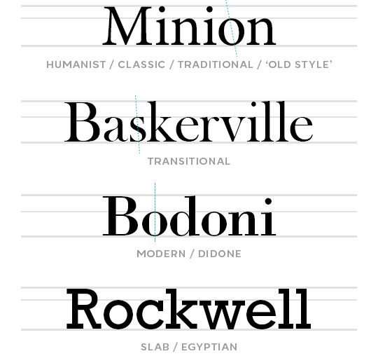
Here are four kinds of Serifs: Humanist, Transitional, Modern, and Slab.
The most immediate difference between these types of serifs is the stroke widths.
If you look at the modern/didone serif Bodoni, the horizontal strokes are hairline thin, and the vertical strokes are very thick. Modern/Didone typefaces are characterized by this extreme contrast in their stroke widths, and typically have a perfectly vertical axis (meaning the narrowest parts of the strokes are at the exact top and bottom of the letterform, as illustrated by the green dotted line). These features give them a bold, modern, and stylish feel.
The humanist serif Minion has the least contrast in its stroke widths, and has a diagonal stress (again, see the green dotted line). These features make them easy on the eyes and well-suited for paragraphs of text and small font sizes. Humanist typefaces most closely resemble calligraphy, and thus have an elegant, classic feel.
Transitional serifs are, well... transitional. They have more stroke width contrast than humanist serifs, but not quite enough to be considered modern/didone, and may or may not have an angled stress. Their ‘voice’ is more neutral, academic, and timeless.
Slabs Serifs, as the name suggests, are kinda blocky. The stroke widths are generally very solid and consistent, and the actual serifs (or ‘feet’) are... y’know. Fat blocks. It makes these typefaces feel more casual, more down-to-earth, approachable, and perhaps playful? A lil rebellious, even?
So with that out of the way, here are some different types of Sans Serifs: (There’s a point to all of this, I swear.)
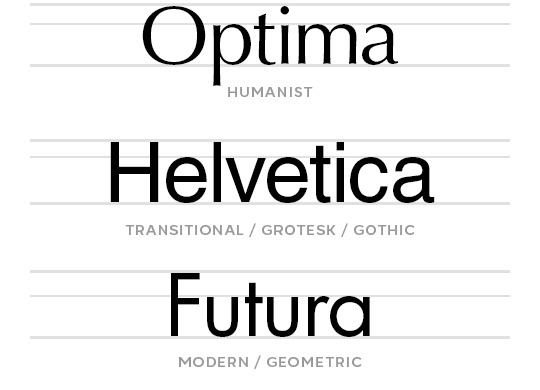
Unlike Humanist Serifs, Humanist Sans Serifs actually have the most contrast in their stroke widths. In the above image, this is most apparent on the lowercase ‘a’. Again, this feature makes humanist sans serifs easy on the eyes and optimal for paragraphs of text. Compared to other sans serifs, they tend to have a more casual and approachable personality.
Transitional Sans Serifs will have little to no stroke width contrast. They maintain their readability at small sizes, and their ‘voice’ is very neutral, which makes them easy to use in a wide variety of designs. There’s a reason Helvetica is the go-to for many a graphic designer: it, along with many other Grotesks/Gothics, almost never feels out of place. They’re the chameleons of fonts. They’re versatile. Invisible. Carbon-neutral.
Geometric Sans Serifs, as the name suggests, are typefaces whose letterforms are based on geometry. O's and C's that are (mostly) perfectly circular, V's, W's and M's with sharp, consistent angles. They generally have very consistent stroke widths, but the harsh angles make them poorly suited to paragraphs of text. They feel modern, technical, and stylish.
4. CHOOSING THE RIGHT FONT
(We are now arriving at the point.)
Here are some questions to ask yourself before choosing a font:
How much text do I have?
If you have a lot of text, you’ll want something that’s easy on the eyes for reading. Aim for things with mild stroke contrasts and favor things with a diagonal axis. Basically, you can’t go wrong with a humanist typeface here-- be it serif or sans serif.
Now, for graphics and gifs, you’ll probably have a lot of text almost... never. But if you’re ever designing something that does (like a magazine spread, or a brochure), it’s something to consider.
How much space do I have?
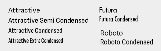
Let’s say you’re giffing a scene and you gotta cram a long caption onto a tiny 278px wide gif. You could just make the font size super tiny, sure. OR, you could look for a font with a narrow character width. A nice, robust type family will usually include Condensed or even Super and Ultra Condensed versions of the font, which will be much better suited to that purpose.
In these cases, you’ll probably want to avoid geometric sans serifs since those circular forms are very wide, relatively speaking. But some geometric type families (such as Futura) do have Condensed varieties:
How large or small does the text need to be? (or do I want it to be?)
When your text is large, you can kinda go nuts and do whatever without worrying about anything getting hard to read. But there are two things to consider when you’re using a small font size, be it out of necessity or For the Aesthetique™--
stroke width contrast: At small font sizes, typefaces with consistent stroke widths are going to maintain their readability best-- so steer clear of Modern/Didone serifs, and tread carefully around Transitional Serifs. If you’re itching to use a Serif, you’ll want to look for a humanist/traditional/old style one. If you’re super attached to a modern/didone serif for a design (as I often am) understand you’re gonna have to compromise a bit and use a larger font size for it.
For sans serifs, both Transitional and Modern types will have nice, solid strokes that won’t get lost at small sizes.
x-height: A typeface's x-height refers literally to the height of the lowercase 'x'. But in more practical terms, it's the ratio of the heights of lowercase vs uppercase letters. If you plan on using all caps, this won't matter much (if at all), but if you will be using lowercase letters, a typeface with a more generous x-height will be easier to read at small sizes than a typeface with a small one.
Generally, Transitional/Grotesk/Gothic Sans-serifs will have the most generous x-heights (for example, see Helvetica). But x-heights vary a lot even within subcategories of typefaces, so be mindful of them!
Speaking of all these metrics... one of the things that makes the Premium version of FontBase well worth my $3 a month? The Super Search feature:

I can just... highlight segments of those histogram chart things on the right to filter out fonts that don’t have the contrast, weight, character width, or x-height I’m looking for. Like magic. #blessed
What ‘voice’ do I want to project?
I mentioned earlier how different styles of typefaces have different ‘personalities’. If you’re not sure whether to go with a Humanist or a Transitional Serif, remember that humanist ones tend to feel more elegant, more classic, more intimate. That Transitional ones tend to feel more objective, more confident, more business-like. Which makes more sense for your design?
After you’ve narrowed down your options with the above considerations, then you can start to be really subjective. Follow your heart. Pick whichever one has that certain je ne sais quoi. Or the one that has the ‘Q’ with the coolest tail. The one that just makes you feel a certain kinda way. Because it’s art. It’s design. Have fun with it.
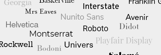
5. SOME OF MY PERSONAL FAVORITE FONTS
So... my taste in typefaces is pretty conservative. I don’t really use handwriting, script, or display fonts. When I do, I tend to use them just the one (1) time and forget about their existence immediately afterward. ¯\_(ツ)_/¯
Most of these are tried and true Classics you may have already heard of, and some of them might even be default fonts bundled with your operating system. If not, be very careful looking for them, because it would be a terrible, horrible shame if you were to get your hands on one of the many freely available bootlegs of some of these typefaces... :/
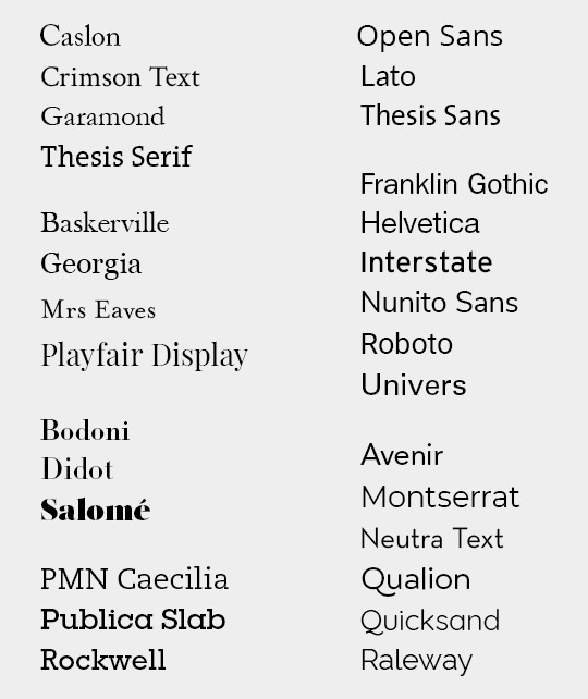
With all these lined up together, you can get a better sense of how varied the x-heights can be from one typeface to another. For a particularly stark example, see Mrs Eaves vs Playfair Display, or Montserrat vs Neutra Text.
SooOoOoOoo... that’s a wrap? I guess?
Congratulations 🎉 you now know way more than I’m guessing you wanted to about typography.
120 notes
·
View notes
Note
weird asks?
1. coffee mugs, teacups, wine glasses, water bottles, or soda cans?
coffee mugs
2. chocolate bars or lollipops?
chocolate bars!
3. bubblegum or cotton candy?
both?
4. how did your elementary school teachers describe you?
probably something along the lines of “weird, but brilliant. also really small and tiny”
5. do you prefer to drink soda from soda cans, soda bottles, plastic cups or glass cups?
plastic cups
6. pastel, boho, tomboy, preppy, goth, grunge, formal or sportswear?
ideally, grunge
7. earbuds or headphones?
headphones all the way babey
8. movies or tv shows?
not really a big fan of either
9. favorite smell in the summer?
um, like campfires and stuff
10. game you were best at in p.e.?
didn’t really have p.e. in school, but i always liked kickball and dodgeball
11. what you have for breakfast on an average day?
just a spoonful of peanut butter, along with my meds
12. name of your favorite playlist?
either “h” or “oliver!”
13. lanyard or key ring?
key ring i guess
14. favorite non-chocolate candy?
smarties?
15. favorite book you read as a school assignment?
hamlet, probably. if you’re looking for a novel, a prayer for owen meany.
16. most comfortable position to sit in?
the comfy one
17. most frequently worn pair of shoes?
i have these shitty dad shoes (air monarchs) that i wear a lot. mostly because i keep them tied, and i often don’t feel like tying another pair of shoes when i go out. so they’re basically slip-ons
18. ideal weather?
70 degrees, mostly cloudy, maybe a light rain, or a soft breeze
19. sleeping position?
i usually sleep on my right side, but sometimes i roll over to my left
20. preferred place to write (i.e., in a note book, on your laptop, sketchpad, post-it notes, etc.)?
depends what i’m writing, but i like notebooks and my laptop
21. obsession from childhood?
quite a few. gas stations, legos, baseball, phineas and ferb
22. role model?
not sure i have one, i look up to all of my friends in different ways
23. strange habits?
i chew on my knuckles a lot, it’s a nervous stim i’ve had since i was young. dunno if i have any others
24. favorite crystal?
um.... the pretty ones
25. first song you remember hearing?
i have no fuckin idea my guy. maybe 99 luftballons
26. favorite activity to do in warm weather?
exist in an air-conditioned room
27. favorite activity to do in cold weather?
put a hoodie on and go for a walk
28. five songs to describe you?
“your heart is a muscle the size of your fist” by ramshackle glory; “after you” by good morning; “dip you in honey” by the wombats; “i’m against the government” by defiance, ohio; “new loved ones” by toro y moi
29. best way to bond with you?
probably helping me out when i’m in a bad situation
30. places that you find sacred?
dunno that there are any, really
31. what outfit do you wear to kick ass and take names?
karkat t-shirt, black jeans (that unfortunately don’t fit me anymore), probably some cute socks
32. top five favorite vines?
hang on i have a list. mychael with a B, this bitch empty YEET, the AA-AAA-AAAA battery one, bbq sauce on my titties, and “is that allowed?”
33. most used phrase in your phone?
i. what does that mean
34. advertisements you have stuck in your head?
none, fuck capitalism
35. average time you fall asleep?
probably like 2am
36. what is the first meme you remember ever seeing?
i. have no idea
37. suitcase or duffel bag?
suited case
38. lemonade or tea?
tea
39. lemon cake or lemon meringue pie?
pieeee
40. weirdest thing to ever happen at your school?
one time a teacher set a dollar bill on fire, i think. i wasn’t there. also a bat got into the bathroom once or twice
41. last person you texted?
my sweet, precious baby boy @literally-an-envelope
42. jacket pockets or pants pockets?
p a n t
43. hoodie, leather jacket, cardigan, jean jacket or bomber jacket?
hoodie!!!!
44. favorite scent for soap?
vaniwwa
45. which genre: sci-fi, fantasy or superhero?
sci-fi perhaps?
46. most comfortable outfit to sleep in?
i usually sleep in a tshirt and pj pants
47. favorite type of cheese?
pepperjack probably. i had a dream about gouda last night, though
48. if you were a fruit, what kind would you be?
a blackberry. idk
49. what saying or quote do you live by?
“All people are good for something. The important thing is finding what.” (Tom, MLB Power Pros 2008)
50. what made you laugh the hardest you ever have?
fuck if i know dude
51. current stresses?
is “everything” an answer
52. favorite font?
helvetica
53. what is the current state of your hands?
slightly sweaty
54. what did you learn from your first job?
sprite with grenadine.... tasty
55. favorite fairy tale?
idk bro
56. favorite tradition?
my family usually goes to chuck e cheese on new years eve. its fun
57. the three biggest struggles you’ve overcome?
bold of you to assume i’ve overcome anything
58. four talents you’re proud of having?
writing, singing, pitching (baseball), and punting (football)
59. if you were a video game character, what would your catchphrase be?
y’know, like nya?
60. if you were a character in an anime, what kind of anime would you want it to be?
slice-of-life, or a sports anime
61. favorite line you heard from a book/movie/tv show/etc.?
shrugs
62. seven characters you relate to?
are these all gonna be homestuck characters? probably. karkat, tavros, kanaya, dave, john/june, jade, and kankri. ok those are just my favourites but fuck you
63. five songs that would play in your club?
i’d probably have a really chill “club” that just played like, indie music from bands i like
64. favorite website from your childhood?
poptropica
65. any permanent scars?
yeah i have a few, although they’re fading and healing, idk if they will be on my skin forever.
66. favorite flower(s)?
i like tulips
67. good luck charms?
stuffed animals
68. worst flavor of any food or drink you’ve ever tried?
black liquorice
69. a fun fact that you don’t know how you learned?
fun fact! why do they call it oven when you of in the cold food of out hot eat the food
70. left or right handed?
right, but i swing left
71. least favorite pattern?
idk
72. worst subject?
like in school? physics
73. favorite weird flavor combo?
shrugs aggressively
74. at what pain level out of ten (1 through 10) do you have to be at before you take an advil or ibuprofen?
like 5
75. when did you lose your first tooth?
i have no clue
76. what’s your favorite potato food (i.e. tater tots, baked potatoes, fries, chips, etc.)?
probably fries
77. best plant to grow on a windowsill?
shrug
78. coffee from a gas station or sushi from a grocery store?
neither?
79. which looks better, your school id photo or your driver’s license photo?
school id, i think
80. earth tones or jewel tones?
jewel tones
81. fireflies or lightning bugs?
ain’t those the same thing
82. pc or console?
i guess i prefer console, but most of my games are on my laptop
83. writing or drawing?
writing
84. podcasts or talk radio?
podcasts, i guess?
84. barbie or polly pocket?
shrugs
85. fairy tales or mythology?
mythology?
86. cookies or cupcakes?
cookies !
87. your greatest fear?
losing my loved ones
88. your greatest wish?
am i allowed to say “to be dead”
89. who would you put before everyone else?
my fiancé, for sure
90. luckiest mistake?
i.... don’t know
91. boxes or bags?
🅱️oxen
92. lamps, overhead lights, sunlight or fairy lights?
sunlight!!
93. nicknames?
yeah
94. favorite season?
spring
95. favorite app on your phone?
tumblr, or discord
96. desktop background?
something from homestuck. it’s terezi
97. how many phone numbers do you have memorized?
four (mine, dad, mom, fiancé)
98. favorite historical era?
i don’t know that i have one
3 notes
·
View notes
Link
Your browser does not support iframes.
News Punch — The 2020 Red Wave Could Be Starting Already – In...figure{margin:0}.tmblr-iframe{position:absolute}.tmblr-iframe.hide{display:none}.tmblr-iframe--amp-cta-button{visibility:hidden;position:fixed;bottom:10px;left:50%;transform:translateX(-50%);z-index:100}.tmblr-iframe--amp-cta-button.tmblr-iframe--loaded{visibility:visible;animation:iframe-app-cta-transition .2s ease-out} /* Colors */ body { background: #FAFAFA; } .blog-title { font-family: 'Gibson', sans-serif, "Helvetica Neue", HelveticaNeue, Arial, sans-serif; font-weight: bold; } .blog-title a, .description, .search-no-results, .likes-no-likes, .related-posts-wrapper > h2, .loader .loader-bar, .widget-title { color: #444444; } a { color: #529ECC; } #pagination a, .nav-wrapper .nav-item .label { color: #529ECC; } #pagination a.next:after { border-left-color: #529ECC; } #pagination a.previous:after { border-right-color: #529ECC; } .header-image.cover { background-image: url(https://66.media.tumblr.com/9791e3ac6b55616ef7caa5d5fffa1886/a7d065b9e5472bd4-b9/s2048x3072/99073094cbce7211a3c690be13d7bda8cca20e58.png); } .user-avatar { background-color: #FAFAFA; border-color: #FAFAFA; } .avatar-style-square .user-avatar { -webkit-box-shadow: 0 0 0 4px #FAFAFA; box-shadow: 0 0 0 4px #FAFAFA; } .no-header-image .logo-wrapper, .contain-header-image .logo-wrapper { color: #529ECC; } /* Adjust logo for light accents on light backgrounds */ .light-on-light.no-header-image .logo-wrapper, .light-on-light.contain-header-image .logo-wrapper { color: #444; } /* Adjust logo for dark accents on dark backgrounds */ .dark-on-dark.no-header-image .logo-wrapper, .dark-on-dark.contain-header-image .logo-wrapper { color: #fff; } /* Logged-out compact Tumblr iframe */ .tmblr-iframe-compact .tmblr-iframe--unified-controls { min-width: 100%; background-color: #FAFAFA; } /* Sticky nav colors */ .nav-fixed { background-color: #FAFAFA; } .nav-responsive .inline-nav::after { background-image: linear-gradient(left, rgba(250,250,250, 0) 0%, rgba(250,250,250,1) 100%); background-image: -webkit-linear-gradient(left, rgba(250,250,250, 0) 0%, rgba(250,250,250,1) 100%); background-image: -moz-linear-gradient(left, rgba(250,250,250, 0) 0%, rgba(250,250,250,1) 100%); background-image: -ms-linear-gradient(left, rgba(250,250,250, 0) 0%, rgba(250,250,250,1) 100%); background-image: -o-linear-gradient(left, rgba(250,250,250, 0) 0%, rgba(250,250,250,1) 100%); } @media screen and (max-device-width: 568px) { .header-image.cover { background-image: url(https://66.media.tumblr.com/9791e3ac6b55616ef7caa5d5fffa1886/a7d065b9e5472bd4-b9/s2048x3072/99073094cbce7211a3c690be13d7bda8cca20e58.png); -webkit-background-size: cover; background-size: cover; } .avatar-style-square .user-avatar { -webkit-box-shadow: 0 0 0 3px #FAFAFA; -moz-box-shadow: 0 0 0 3px #FAFAFA; box-shadow: 0 0 0 3px #FAFAFA; } } /* Custom CSS */ {"@type":"SocialMediaPosting","url":"https:\/\/newspunch.tumblr.com\/post\/620381956453122048\/the-2020-red-wave-could-be-starting-already-in","mainEntityOfPage":true,"datePublished":"2020-06-08T18:52:18-04:00","author":"newspunch","image":"https:\/\/66.media.tumblr.com\/77f889677306fee98b68da988fd042be\/df722d4e886b54bc-e8\/s540x810\/4362c9fdf8cd4c361b7bf323ce8a4cab4d6b14b8.png","headline":"The 2020 Red Wave Could Be Starting Already \u2013 In Virginia, Citizens Just Voted 3 Democrats Out Of Office","articleBody":"Democrats won a majority in Virginia\u2019s government. Soon after, they began to push a radical left-wing agenda.\nIt got even worse during the pandemic, as their governor took drastic lockdown steps. Extending them, like many other liberal states.\nBut it looks like their moves may be backfiring. An...","@context":"http:\/\/schema.org"}
News Punch — The 2020 Red Wave Could Be Starting Already – In...
1.5M ratings
277k ratings
See, that’s what the app is perfect for.
Sounds perfect Wahhhh, I don’t wanna

News Punch
The 2020 Red Wave Could Be Starting Already – In Virginia, Citizens Just Voted 3 Democrats Out Of Office
Democrats won a majority in Virginia’s government. Soon after, they began to push a radical left-wing agenda.
It got even worse during the pandemic, as their governor took drastic lockdown steps. Extending them, like many other liberal states.
But it looks like their moves may be backfiring. An election was this week. And voters are striking back hard.
From Daily Caller:
Republican candidates Mark Robertson, Amy Darby, and Steve Claffey all joined incumbent Andrea Oakes in a four-seat GOP sweep, WHSV reported. The three incoming council members replaced Democratic incumbents Erik Curren, Ophie Kier, and James Harrington all almost doubled their vote totals from 2016, yet still lost.
Woah. A Virginia city that went for Obama in both elections just ousted Democrat leaders in a landslide result.
Three Democrat incumbents were voted out, replaced by GOP candidates.
What’s amazing is that all three Democrats got more votes from 2016—but still lost.
That means voters came out in force to back the Republican candidates. What does that tell you?
Reports say that Republican voters came out in numbers close to a governor race, a big election.
Our Take:
Why did voters come out in a May election—during the ongoing crisis—to push out these liberals? I think you know the answer.
According to reports, voters were particularly fired up over the state’s aggressive gun control measures. We’ve covered much of what Virginia’s Democrat lawmakers have tried to pull.
On top of that, it looks like voters have gotten sick and tired of the governor’s COVID-19 lockdowns.
That is a trend we’ve seen in recent special elections. Earlier in the month, two special elections in Wisconsin and California went for Republicans.
Republicans flipped a CA blue seat red. Many point to the strict lockdown measures California’s Democratic leadership endorsed.
All across the country, Americans watch Democrats enforce tough orders that cripple the economy.
Meanwhile, conservative states have safely reopened, and it looks like the virus is mostly under control.
There’s a pretty big difference between both party’s leadership during this crisis. And after all the things Virginia’s Democratic leadership has tried to pull—should we be surprised from this turnout?
But what does this mean for the future of the state? What will happen in November, when more elections in VA take place?
Will this trend continue or will the swamp continue to drown Virginia?
SHARE if you are ready to see a Red Wave this November.
Source: Daily Caller
Jun 8th, 2020
Open in app
Facebook
Tweet
Reddit
Mail
Embed
Permalink
var Optica = {}; Optica.ENDLESS_SCROLLING = true; Optica.SHOW_NAV = false; Optica.LAYOUT = "regular"; Optica.GRID_LAYOUT = (Optica.LAYOUT === 'grid'); Optica.TITLE_COLOR = "#444444"; Optica.ACCENT_COLOR = "#529ECC"; Optica.BACKGROUND_COLOR = "#FAFAFA"; Optica.NU_OPTICA_BLOG_CARDS = true; Optica.RELATED_POSTS_CTA_VARIANTS = [ { variant: "C", text: "See the rest of this Tumblr" }, { variant: "D", text: "See newspunch's whole Tumblr" }, { variant: "E", text: "You scrolled this far. Check out the rest." } ]; Optica.NO_LIKES_VARIANTS = [ "This Tumblr hasn't liked any posts yet.", "This Tumblr doesn't like anything…yet.", "No likes! Sheesh!", "Amazing! This Tumblr doesn't like anything.", "Incredible! This Tumblr doesn't like anything.", "Neat! This Tumblr doesn't like anything.", "Apparently this Tumblr is hard to please.", "Wow! This Tumblr hasn't liked anything ever.", "This Tumblr hasn't liked anything yet. How very intriguing.", "This Tumblr has never met a post it didn't not like." ]; Optica.NO_POSTS_VARIANTS = [ "This Tumblr hasn't made any posts.", "This silly Tumblr hasn't posted anything yet.", "This Tumblr is cool, but empty.", "This Tumblr is content-free.", "This minimalist Tumblr has no posts.", "Meditate for a while on this empty Tumblr.", "Posts? Nah.", "This Tumblr has hardly any posts. \nNone at all, in fact.", "This Tumblr hasn't posted anything." ]; Optica.NO_FOLLOWING_VARIANTS = [ "This Tumblr hasn't followed any other Tumblrs.", "Aw. This Tumblr isn't following anyone.", "Nope, this Tumblr doesn't follow anyone.", "This cool Tumblr doesn't follow anyone.", "This far-out Tumblr doesn't follow anyone.", "This fiercely independent Tumblr doesn't follow anyone.", "This Tumblr doesn't follow anything except for its own rules.", "This Tumblr doesn't really \"follow\" anything." ];
(function(){ var analytics_frame = document.getElementById('ga_target'); var analytics_iframe_loaded; var user_logged_in; var blog_is_nsfw = 'No'; var eventMethod = window.addEventListener ? "addEventListener" : "attachEvent"; var eventer = window[eventMethod]; var messageEvent = eventMethod == "attachEvent" ? "onmessage" : "message"; eventer(messageEvent,function(e) { var message = (e.data && e.data.split) ? e.data.split(';') : ''; switch (message[0]) { case 'analytics_iframe_loaded': analytics_iframe_loaded = true; postCSMessage(); postGAMessage(); break; case 'user_logged_in': user_logged_in = message[1]; postGAMessage(); break; } }, false); analytics_frame.src = "https://assets.tumblr.com/analytics.html?_v=9f5febfd57a8a649c598d888f2d9e062#" + "https://newspunch.tumblr.com"; function postGAMessage() { if (analytics_iframe_loaded && user_logged_in) { var is_ajax = false; analytics_frame.contentWindow.postMessage(['tick_google_analytics', is_ajax, user_logged_in, blog_is_nsfw, '/post/620381956453122048/the-2020-red-wave-could-be-starting-already-in?fbclid=IwAR1Ikt_n3UKMHhGep2a__aGpZtb-XKxdb0LtuI7GxPrwG6ZwIzSIWVD95hk\x26route=%2Fpost%2F%3Aid%2F%3Asummary'].join(';'), analytics_frame.src.split('/analytics.html')[0]); } } function postCSMessage() { COMSCORE = true; analytics_frame.contentWindow.postMessage('enable_comscore;' + window.location, analytics_frame.src.split('/analytics.html')[0]); } })(); !function(s){s.src='https://px.srvcs.tumblr.com/impixu?T=1591649709&J=eyJ0eXBlIjoidXJsIiwidXJsIjoiaHR0cDovL25ld3NwdW5jaC50dW1ibHIuY29tL3Bvc3QvNjIwMzgxOTU2NDUzMTIyMDQ4L3RoZS0yMDIwLXJlZC13YXZlLWNvdWxkLWJlLXN0YXJ0aW5nLWFscmVhZHktaW4/ZmJjbGlkPUl3QVIxSWt0X24zVUtNSGhHZXAyYV9fYUdwWnRiLVhLeGRiMEx0dUk3R3hQcndHNlp3SXpTSVdWRDk1aGsiLCJyZXF0eXBlIjowLCJyb3V0ZSI6Ii9wb3N0LzppZC86c3VtbWFyeSJ9&U=DELMMFIAIF&K=0c5830dcbba147aa18c2480dc4785ab8162107a560ead123b17370865a2d932b&R='.replace(/&R=[^&$]*/,'').concat('&R='+escape(document.referrer)).slice(0,2000).replace(/%.?.?$/,'');}(new Image());

!function(s){s.src='https://px.srvcs.tumblr.com/impixu?T=1591649709&J=eyJ0eXBlIjoicG9zdCIsInVybCI6Imh0dHA6Ly9uZXdzcHVuY2gudHVtYmxyLmNvbS9wb3N0LzYyMDM4MTk1NjQ1MzEyMjA0OC90aGUtMjAyMC1yZWQtd2F2ZS1jb3VsZC1iZS1zdGFydGluZy1hbHJlYWR5LWluP2ZiY2xpZD1Jd0FSMUlrdF9uM1VLTUhoR2VwMmFfX2FHcFp0Yi1YS3hkYjBMdHVJN0d4UHJ3RzZad0l6U0lXVkQ5NWhrIiwicmVxdHlwZSI6MCwicm91dGUiOiIvcG9zdC86aWQvOnN1bW1hcnkiLCJwb3N0cyI6W3sicG9zdGlkIjoiNjIwMzgxOTU2NDUzMTIyMDQ4IiwiYmxvZ2lkIjo0OTk4NjczOTUsInNvdXJjZSI6MzN9XX0=&U=KCHJFMAHHG&K=3710a4ac9d0af7874b9d4f2dec171976473922f8077749e79846901e770bbc15&R='.replace(/&R=[^&$]*/,'').concat('&R='+escape(document.referrer)).slice(0,2000).replace(/%.?.?$/,'');}(new Image());
1 note
·
View note
Text
30/9/19 Concepts & Ideas- Assessing resources workshop.
Brief: ‘Make a zine’
Below are some samples of work that I created in the second ‘Concepts and Ideas’ session. As part of the brief for this session we were required to work in a team and create a zine.
For the first part of the session, I met with my team to discuss the brief. As a team, we discussed the requirements of the brief and looked at the magazine that we were given to base our zine on. The Magazine we were given to research for this task was ‘Riposte’. Riposte is a magazine that is targeted towards women. Its articles are mostly on women-empowering topics and issues. After examining the magazine we then agreed on a strategy on how were going to create our zine. As part of our strategy we assigned ourselves to the task of creating a section for the zine, my task was to design the front page of the zine, for example.
When coming up with an idea for the design of the zine’s front page, I looked closely at a number of Ripostes’ front covers. This helped me gain inspiration for the design of the front page. I noticed how Riposte stays with the same art theme for each issues’ front covers. The theme is always the title of the magazine being at the top of the cover with text underneath it, being in list format. The text is always in bold, one colour, in list format and its content is always a female’s name that is featured in the magazine.
I created the front cover using Adobe Illustrator as I felt that this was the best program to use for the task of designing the front cover. As a team we decided on using one font type throughout the zine due to be Riposte partly doing the same. The font we chose was ‘Helvetica’ due to it being a simple and bold looking type of font.
I also played a role in helping with the creation of the poster section of the zine. I noticed how Riposte often uses the same colour schemes so, as a team, we decided on using the same colour background as the front cover of the zine for the poster section.

Above is the final outcome for the ‘Make a Zine’ project. Due to the nature and content of the magazine we were basing the zine on, we decided as a team to use a mixture of bright colours, illustration, photography, typography and collage to fill the sections of the zine with. As a team, we chose to design the zine digitally, creating the designs for our sections of the zine on ‘A6′ files. We then placed each of our sections onto an A3 file to print out as our final outcome.

Above is the poster section of the zine. The magazine we were using as inspiration for the project is all about simplicity, therefore we decided to make the poster section of the zine as simple and bold as possible. Due to the nature of a zine and Riposte magazine, we chose to add a quote from an empowering female that is currently trending in the news on social media sites at the moment. The quote belongs to a Greta Thunberg who is a Swedish environmental activist. The quote has been taken from one of her speeches on climate change which is a very bold topic. Therefore, we chose to use just one bold colour to visually reflect the power of the quote and to make the audience really take in what is being communicated.

Above is a collection of photos that I took of the magazine we were basing our zine around, ‘Riposte’. It documents the visual research that I carried out during the project brief. I chose to take photos of Ripostes’ front cover, back cover and double page spreads to look at and gain inspiration from the colours, fonts, layouts and image placing that the magazine uses. I really like the use of one colour block bold colours on the pages and use of illustration mixed with photography in the magazine.

Above are some zines that I researched. I looked at zines to gain a greater understanding of what they are, what the purpose of one may be and how they can be designed. When researching zines, I found one website to be quite useful. This was ‘ peopleofprint.com’ and is a website that has a variety of designers/ illustrators who have designed zines on there. Two of my favorite designers that I discovered when researching into zines were ‘Samuel Eckert’ and ‘Holly ST Clair’. I really like both of the designers’ styles and their use of illustration in their zines.
Evaluation-
I found this session very enjoyable to do. I liked working as part of a team to carry out research and design the final outcome for the zine.
I feel that I learnt quite a few valuable skills from this session, including- time management skills, communication skills and team-working skills. I also learnt that questions can be answered visually.
I think that my team worked well together. We were able to communicate well which enabled us all to communicate our ideas for this project successfully. I think that it also helped that we spread the workload out evenly so that we all had something to do and contribute to. sharing the workload made it fair and also encouraged communication among the team.
If I were to do this project differently, I would add more photography to the zines’ content due to the magazine that we based the zine on, ‘Riposte’, having a lot of photographic images in.
0 notes
Text
Pub 231 Journals
Week 1: “What does Design means to you?” (How do you see/ use design in daily life?)
Before taking any SIAT course, “design”, this word just tied with aesthetics, and how we can make something aesthetic and appeal to our eyes.
Now, I believe that design is a process of problem-solving for specific purpose. Other than aesthetic, design combines with functionality and meaning to be a sustainable and effective solution serving for its purpose. Having a core purpose (like what the clients want), designer will do research, brainstorm ideas, select ideas, iterates again and again while reminding the match between product and purpose and creates prototype to test the product. Design is like a journey to create something needed in the world.
Design is a kind of communication to me as well. Our choice of font, colour, composition, text and image are crucial to how well and effective we tell the story, information. How it can attract and be understood is something we have to think about when designing with purpose and target audience. It is like telling a story in other medium indirectly. Therefore, design is like a communication to me and it is designer job to form the most effective communication required by clients.
Week 2: Print Production
Varieties of Paper:
1. Uncoated paper
for business cards, brochures, invitations, books...
have surface textures: wove/smooth, linen, laid...
2. Coated Paper
for magazines, brochures, annual reports, advertisements
(not always glossy/ reflective)
variety of finishes: gloss [shiny finish] , satin [good for img], matte [flat finish, ink just lays on top]
More info: http://designingforprint.com/3-things-to-know-before-you-specify-paper-a-shortcut/
Week 3: Who is a Typographer? (Create a list of typographers, collect an example of work for each: when the piece was done...)
Typographer [Definition]: a person who specializes in the design, choice, and arrangement of type matter (according to Merriam)
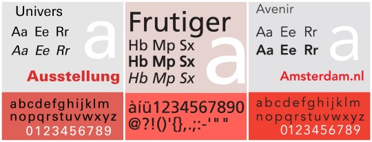
1. Adrian Frutiger (Swiss): An important san-serifs typefaces designer
Univers (1957)
Category: Neo-Grotesque
Similar to Helvetica as both are based on Akzidenz Grotesk
Has variety of weights and widths (flexible!!)
Similar Font: Nimbus Sans, Aktiv Grotesk
Font Pairing: Univers+Glypha
Frutiger (1976)
Avenir (1988)
Category: Geometric
Slightly humanist features: e.g. tail on t; o -->not perfect circle
Similar Font: Neuzeit, Sailec
Font Pairing: Avenir + Century Schoolbook
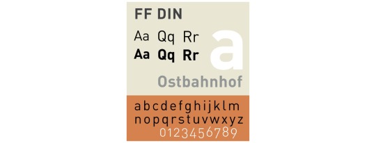
2. Albert-Jan Pool (Dutch): san-serifs
DIN (original version in 1931 for use in engineering and technical applications such as traffic signs)
Linear (1994)
Imperial (1994)
FF DIN (1995)
FF DIN ARABIC (1995)
FF OCR (1995)
FF DIN ROUND (2010)
Similar Font: Interstate, Nudista
Font Pairing: DIN + Aachen
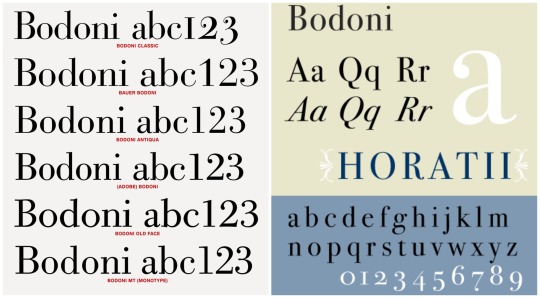
3. Giambattista Bodoni (Italian): serifs --- admirer of Baskerville
Bodoni (1798):
Category: Transitional—>Modern
Extreme contrast between thick&thin strokes ==> more suitable for display face than a text face
Similar Font: Didot, Modern 216
Font Pairing: Bodoni+Futura
Week 4: What are cool books about design?
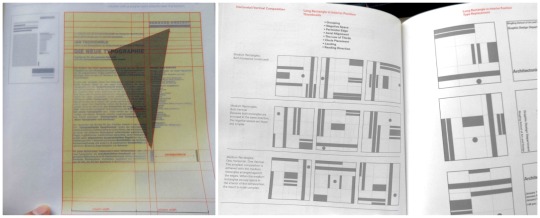
1. Grid Systems: Principles of Organizing Type by Kimberly Elam (2004)
This book mentions what to pay attention when we are designing the layout: proportion of elements, negative spaces, grouping, etc. that affects the overall visual hierarchy. It also provides many ideas on different composition like Horizontal, Vertical and Diagonal Compositions.
One cool thing about this book is that there are pages with grids and instructions that we can see through these pages and analyze the layout on the next page. This is quite helpful.
2. The Art of PIXAR Short Films by Amid Amidi (2009)
The book includes characters and storytelling design process of many Pixar short films. From the initial character design: sketches on the facial expressions, motion, modeling, character wireframe in software…to the storyboard of the short film, we can take a peak of the details of these successful animations.
The layout of the book is simple and organized. As it assembled many short animations, it goes in the same flow:
Initial sketches of the character
Notes to pay attention to
Character development (motion and emotion)
Digital visualization (finished work)
storyboard in sketches
Final digitalized scene
The photos are in full bleed and there is a yellow colour page to indicate the start of another short film. It has a dark blue hardcover with the stamped signature of Pixar — Lamp
Week 5: (Type)
Pay attention to:
Remove double spaces
Set italics
Replace hyphens with em or en dashes where appropriate
Remove widows and orphans
Do not break any proper nouns (names)
Do not break with less than 3 characters(what-ever=ok, whatev-er=no)
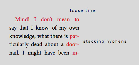
Do not stack more than 2 broken lines
Check that quotation marks(”) and apostrophes(’) are not primes(")
Adjust loose and tight lines
Set small caps and text figures where neccessary
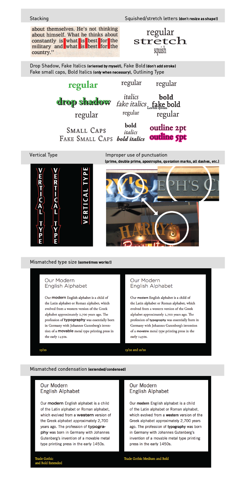
Type Crimes: (ones that I mostly will forget)
Orphan & Widow, terrible rag, double spaces, Improper hyphen break
NOT using appropriate ligature or dot-less i
Negative leading collision
Small caps with lining figures
Full caps with old style figures
Terrible contrast
Text only in all caps (sometimes works!)
Overly tight kerning/ tracking
Overly loose kerning/ tracking
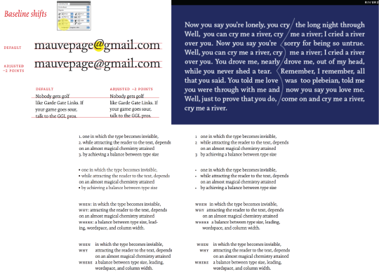
Baseline shift not adjusted (character or line of text)
Use of virgules rather than solidus for fractions
Too many typefaces (be careful of context and execution, sometimes in can work)
Rivers
NOT using hanging punctuation (numbers, bullets, indents, quotation marks)
Baseline shift not adjusted (character or line of text)
Week 6: Think about colour.
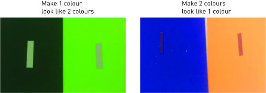
(What were some of your findings from playing with this mixing colour papers?)
For option 1: To find colour from achromatic.
For option 2: Have to match value of two different colours? To choose colours that has close values so it will look the same colour.
Week 7: What are interesting magazine about design?
(Find a design article that intrigued you and write about the most interesting and useful point of the article; take note of when the article was written)
Book Cover Design: (March 25,2019)
https://www.designweek.co.uk/issues/25-31-march-2019/book-covers-that-never-made-it-rejected-designs-revealed-in-new-book/
The article is about a new book called No No No No Yes, which includes 4 versions of book cover that did not make it (4 NOs) and the final used book cover (YES). The article mentions suggestions and reasons why the covers might have won the writers’, publishers’, and other production teams’ heart and why some nice covers got rejected. It is an interesting collection of covers that allows other designers to observe and analyze what clients may be looking for when designing. It is not only about the aesthetic, it is also about the communication of message. Here’s the takeaways:
For printed book:
“But a “direct” and “simple” message and good use of “colour” is often the key to finding a design that works, he adds.”
For electric book:
“so something bold often draws the eye over something restrained”.
Week 8: Publication design principles
Balance
Proportion
Sequence
Unity
Contrast
Things/Terms that I will probably forget:
Week 9: Find a really good and really bad book or magazine cover; analyze why they are good & bad.
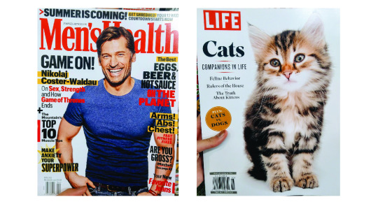
Left Cover (Bad):
Unclear Hierarchy: too much colours, the use of many shapes (star, bars), too many bolded/ highlighted/ drop shadowed word: which is hard to know what is more important as everything seems screaming out
No whitespace, everything is compact: for eyes, this might be too much, tired to read before actually start reading
The only success is probably the use of handsome guy to attract potential customers.
Right Cover: (Good)
Image matching heading “Companions in Life”: Correct image choice as I cannot agree more when looking at its eyes. (using empathy to attract readers)
Simple and clear: The hierarchy, theme is clear. It does not list all the potentially interesting feature articles title on cover. It only puts shape and use different font (probably bolded) typeface to create the contrast, which is simple and on point.
* Both covers interestingly used RED as main heading/theme, which is really popping out and readers can know the theme of the mag immediately.
Week 10-11: AUDIENCE, CONCEPTS & SEMIOTICS
1. Signifier: SFU
2. Signified: education, mountain, expensive
3. Icon: (it resembles the signs or the idea) e.g. F ~ facebook?
4. Index: (direct link between the sign and object; a reference; an indicator) e.g. toilet signs (the cartoon)
5. Symbol: (abstract sign; no logical connection between the sign and what it means; culturally learnt) e.g. country flag
6. Paradigm and Syntagm :
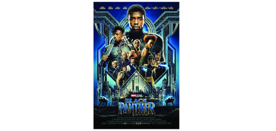
Paradigm: a chain or collection of signs which invoke each other because they are culturally, paradigmatically
Black Panther: power, authority
Syntagm: the structural relation that combines signs in code-specific ways.
Color: blue, gold, silver= wealth, high-technology, weapons, royalty
Size of characters: like the order of importance to the narrative; who got most of the power and who is threatening the power
Hierarchy: top-down, from big to small to title
Symmetrical balance: fight to be a stable, steady country?
The pointing “N” in title to sub-heading: metaphor the use of weapons/ metals, fights for the power
0 notes
Photo


CDS III Week03: On Web Typography review
Chapter 1: How we Read
The most interesting thing about typography is a chain reaction of time and place with you as the catalyst. To present something is always depends on the intention of the text and need to give it meaning through reading. The type and typography are existed because of our need to express and record information. The way of reading is mainly complex but one we know how it is a kind of muscle memory that we will think about it. Because reading is so intrinsic to every other thing about typography, it’s the best place for another new designer to begin and improve it. One of design’s functions is to delight and entice. The designers have to consider the reader and make them convince to keep reading their information.
Legibility means that text can be interpreted as tree bark is edible. Readability combines the emotional impact of a design with the amount of effort it presumably takes to read. If it’s too long, no one is going to read. The designer can’t just assume everyone to read the same way as they did. Reading is not only informed by what’s going on at that moment but also governed by how our eyes and brains work to process information of what they see and what they are experiencing as they read these words.
As our eyes move across the text, our minds gobble up the type’s texture. The sum of the positive and negative spaces inside and around letters and words. People don’t linger on those spaces and details; people’s brains do the heavy lifting of parsing the text and assembling a mental picture of what we are reading. Our eyes perform a series of back forth movement called saccades. The best solution for typography is to make it perform as well as it can in all situation. The experience of reading and the activeness of the message are determined by both what we say and how we say it. Typography is the primary tool we use to communicate.
Chapter 2: How Type Works
Whether online, typography is the primary vehicle we use as designers to communicate our message. Most of the communicative heavy-lifting in our designs hinges on text because we’re inundated with things asking for our attention, our typography needs to put its best foot forward. The majority of typefaces were created for traditional printing processes. Type designers took factors into account like the thickness and texture of paper, how ink gets absorbed and dries, and the speed and physics with which printing happens.
In the mid-1990s, Microsoft approached Carter to design typefaces for screen use. The font of Verdana and Georgia are the most notable and lasting results of Carter’s work. We are just on the other side of a transitional state in typography. Until recently, if you wanted to get type onto a web page, you were limited to a few options. Such as System fonts; you could take the easiest route and tell a browser to use fonts installed on nearly every computer, for example, Times, Verdana, Arial, and Georgia. Images; you could load your typeface as an image, which freed you to use any typeface you had on your computer. The text replacement; you could also programmatically hide text on a page with combinations of images, CSS, Flash, and others. Any hidden text was then replaced with an image.
Half of the battle in understanding typography for the web or any other context is becoming familiar enough to talk about it. To know how to point out a serif or lowercase numeral. To develop your gut instinct for typography, start by learning the language of type.
Chapter 3: Evaluating Type work
Two common terms you will see thrown around when talking about typography are typeface and font. A typeface is the name for the design in full, whether it’s a style or family of styles. Such as Helvetica is a typeface. Font refers to the format or storage mechanism for that design. All typefaces fall into some sort of class action. However, there has been little consensus on one scheme to rule them all. We struggle with these systems because typefaces are thoroughly dynamic works diverse in visual structure and historical context. You are probably familiar with these class cations in a casual capacity. Groupings like serif, sans serif and script, are well known. When thinking about typefaces for use in my designs, I mentally sort them into a few common groups: serif, sans-serif or others which is mostly made up of anything that doesn’t into those other categories.
To understand the most basic class cations helps you the vast number of typefaces out there and can be handy for searching on the web when you have a rough idea of the look or feel you are after. Two given typefaces may belong to the same class but spark very different responses, be depending on their intended use or when they were made. Look to the typefaces themselves to support a feeling or mood in your design.
Typefaces are specialized tools, but they’re also the expressive creation of a typeface designer. Some of the choices those designers make when creating a typeface may be based on a personal preference or technical reason. All letterforms are made up of a variety of strokes, a general term for most parts of a letter. Typefaces whose strokes vary in width to several degrees, from hairline thin to very broad, are known as high-contrast.
The contrast of a typeface refers to the divergences in the thick and thin strokes of its characters. A monocline typeface has the absolute least amount of contrast. A typeface with low contrast has some, but relatively little, variation in the thickness of its strokes. Weights and styles; Many typeface families have at least four basic styles: regular (sometimes called Roman or book), italic, bold, and bold italic. A style’s weight refers to the thickness of its strokes or their boldness. On the web, we commonly employ numerical CSS font-weight values. These currently range from 100 to 900 nine in total, each on the whole hundred values with the lightest weight at 100 and the heaviest at 900.
Chapter 4: Choosing and Pairing Typefaces
Choosing typefaces relies on weighing the context of what you’re designing against your technical requirements, typographic knowledge, and gut instinct. Just as the best co ee machine won’t necessarily make you the best cup of co ee. Good typography depends on the ingredients you choose, the particular combination of those ingredients, and the ways you combine them. Your typeface choices must t the circumstances you need them for and so must your design. And we’re back to that old chestnut about rules: there are many right answers, and no answers are really wrong; there are just different degrees of good.
Know your context, as with any creative process, there are many approaches to choosing a type, and it’s a personal pursuit of what works best for you and what feels most productive. But you have quant able considerations too, like the conditions under which you’re going to use a typeface.
Type to live with is the text we spend a lot more time with, usually long-form text like an article or book. The typefaces you use here can mean the difference between someone reading or not. If a typeface is a too loud, too high contrast, or otherwise disruptive, we might lose the reader. And we can’t blame them either. The texture of owing text is the sum of the typeface’s color (the general combinations of lights and darks in and around letters), the actual color of the text and its contrast with the background, and the size of the setting.
Choosing type for extended reading
Scient x-height
Low or medium contrast
Recognizable and distinct letterforms
Methods for choosing typefaces
Word association
Comparisons of real text
Appropriateness
Avoid ready-mades
Be careful with free fonts
Narrowing the end
Methods for pairing
Look for distinction
Look for harmony
Start with one and build outward
To sum up, you have many avenues for choosing and pairing typefaces. It pays to be a design sponge in the world, so take note of what works and keep reining your visual palette.
Chapter 5: Typographic Systems
Typography is an art of finding and shaping the relationship between elements, from largest to smallest and smallest to largest. A typographic system establishes hierarchy; it helps us prioritize content based on individual elements and relationship between them. It also helps our readers easily scan chunks of information and understand what they are looking at. When done right, a typographic system feels intuitive, like an unspoken set of instructions. Hierarchy and contrast: size is one way to achieve hierarchy, but you could also do so with color or placement; the real heavy lifting happens when you combine two or more of these properties. Contrast is in my humble opinion, the most crucial tenet of graphic design. It instantly forges connections and distinctions between elements and when used in concert with other tools like a grid, it helps our viewers discern what’s vital, what’s related and what’s not.
Paragraphs are where we spend the most time when we read, so we need to be certain we’re using a typeface that is comfortable for a long stay. It’s more a matter of not making something uncomfortable to read.
Type size is the best way to approach sizing is to consider the reader and the reading distance. Most people sit about 18-24 inches away from their screen when it comes to a desktop.
Measure and line-height; awareness of line-height are especially important when dealing with responsive websites. As blocks of content expand and contract, you may need to adjust line-height values along with the font-size to ensure the type remains in a comfortable measure.
Headlines are the attention grabbers. People skim them to decide whether or not to keep reading. Headlines come in a variety of forms, from straightforward article headings and subheadings to big marketing taglines and everything in between.
Big type is best considered in the same way you might a photograph: a picture of a type that anchors a layout or creates the sort of mood you might spot on a movie poster or book cover.
Small type is comprised of an unassuming variety of supporting elements. Interface. Which we’ll cover shortly, is a common kind of small type, but article-special categories like captions, footnotes and asides are also important to distinguish.
Chapter 6: Composition
A grid helps you organize your content and reinforce your typographic hierarchy. While hierarchy lets you plan your typography at a micro level, a grid allows you to arrange the type and everything else it interacts with on the page at a macro level. It helps readers traverse content and exposes an informational system to them. Grids have gotten a bad rap because, on the surface, they appear too restrictive a tool for layout. Many folks are still under the impression that grids limit and force a designer to simply out prearranged buckets with content and images, like a design paint by number kit. A grid allows you to frame your layout with the purpose to align page elements and build hierarchical relationships. Put plainly, a grid is an essential building block for intentional design.
A hierarchical grid slats horizontal module vertically one after another, moving down the page. This linear procession, like Hansel and Gretel leaving a trail of breadcrumbs, gently leads a viewer down a path. The vertical ow from top to bottom focuses the design on one message, in this case, the article—and reinforces a natural hierarchy. As a bonus, a hierarchical grid easily lends itself to the stacked, one-column layouts common in responsive web design’s smaller breakpoints.
A baseline grid is a series of rows spun out of the spacing between baselines in the text, or the invisible line that letters sit on. It’s a means to horizontally align all the type on the page, including captions, headlines, and running text.
Alignment and hyphenation; Most magazine and book text are justice and makes ample use of hyphenation. Until recently, this has been very di cult to do on the web. Hyphenation wasn’t readily available, and—depending on factors like font selection and size.
Every typeface has color, and when set, it gives the overall page a color too. I’m not referring to an actual hue; I mean the gray value. To see what it looks like, squint your eyes at the bits of text in
Fonts with less color may need a tighter line-height to carry more weight, and fonts with more color can usually do with a bit more line-height to temper their heaviness
Whitespace frames the content in the center, which provides a focus for the eye. It also imbues the text with space to breathe, which in turn gives the reader comfort to enjoy reading. These small touches go a long way, and like most of the niceties of design, they aren’t usually apparent unless they’re missing. Whitespace is our design’s picture frame and a watchful guardian against the ever-advancing forces of clutter.
Devising a system for sizing and spacing your typography has many advantages. It standardizes a method to your typographic madness in a reproducible way, enables consistency across a team of designers, and can make a lone designer’s job easier by creating a framework.
0 notes
Text
Elegant Fonts That You Should Include in Your Designs
If you didn’t already know this, I’ll say it. Elegant fonts are trending lately among designers and people who like good typography.
You will see them used in lots of logos, social media images and site hero sections. Some of these elegant fonts can be a bit artistic, while other elegant fonts can be used for more sober designs.
Nevertheless, they all look good and can be used successfully in modern designs.
Below you will find a selection of some of the best typefaces you can currently get.
Brayden
Brayden Family is an elegant font that includes 3 weights on script fonts + 1 Sans serif font to create a beautiful combination. It includes initial and terminal forms in all the weights of the script font.
Controlling with Contextual Swashes makes it easier to change turning on and off the initial and terminal forms. This font is Great for Logos, Lettering, Clothing Design, Poster, Label, Quotes, etc.
Blenda
Blenda Script is a free experimental elegant font inspired by Lobster font, a bold vintage script. It can be used for various purposes. Such as news, posters, logos, badges etc.
Distorted Fashion
Roicamonta
Roicamonta font looks very feminine and delicate. Perfect fit for invitations, greeting cards and other printing where soft and elegant writing is required.
Bleakerst
Bleakerst is a free version ( Free for Personal / Commercial use ) from Sortdecai Cursive Script with wild style.
Banthers
Construthinvism
Valkyrie
Valkyrie is a new type family designed in 2013 mostly for top fashion brands and designers. This is a serif set of fonts based on thick and bold parts with geometrical elements in a modern style.
With more than 186 glyphs per font (including punctuation marks and accented glyphs) for a total of 12 elegant fonts, Valkyrie has been created to emphasize all kind of fashionable and luxury projects from photos to videos or branding & visual identity.
Badhead
Badhead is a fresh looking elegant font, perfect for branding, greeting cards, logotypes, or any design with a strong and elegant touch. Mix alternate characters to add an attractive message to your work.
246 glyphs and alternate character included with opentype features. Stylistic alternates, Ornament, Swash and more. You can access all those alternate characters by using OpenType savvy programs such as Adobe Illustrator and Adobe InDesign.
Break
Break is modern and elegant font family that contains five weights from Bold to ExtraLight, Uppercase, Lowercase, Numerics and symbols, could be use in variety of projects.
Ditasweet
Ditasweet contains more than 400 symbols including numbers, glyphs, ligatures and accents. It might be used in any European language and also in Russian, of course.
Bear & Loupe
Bear & Loupe is a font family of 3 faces absolutely free for personal and commercial use! Outstanding hand written style will perfectly fit for headlines of all sizes, print graphics, logos, badges, t-shirts and other designs.
Glamor
GLAMOR is new chic & modern free type family with a set of 24 elegant fonts, from light to bold, with more than 200 unique characters per font. All fonts are now available in OTF & TTF formats.
This type can be used for personal or professional projects such as online/offline magazines and/or books, posters, photography, websites, branding & identity, TV spots and much more.
Wisdom
Wisdom Script was originally designed for Woods of Wisdom, a 50 part poster series on bad advice.
Metropolis
Metropolis comes from the the industrial movement of the 1920’s where skyscrapers where born. “Using a double line technique, I wanted to create my own Art Deco style font that represented this era. The result is a bold, bumptious typeface with a stolidly calm disposition.”
Roselina Script
Roselina Script has a contemporary calligraphy, with a vintage feel, style calligraphy with moving baseline and elegant touch. This elegant font features 417+ glyphs and 183 alternate characters, including initial and terminal letters, alternates, ligatures and multiple language support.
Cylburn
Cylburn is a semi-connected script structurally based on Roundhand but written with a pointed brush and restrained tension that separate it from its traditional roots.
Clicker Script
Clicker Script finds its inspiration from RCA Records Stereo Action Series from the 1960’s. This signature elegant yet slightly bouncy script truly sings, and lends a happy go lucky flavor to any design.
Lavanderia
Based on lettering found on Laundromat windows of San Francisco’s Mission District, Lavanderia features numerous opentype features and three weights.
Lovelo
Lovelo free font is remake of the original Lovelo Inline – designed by Renzler Design, Vienna, Austria.
Valencia
Monastic
Brotherhood
Braxton
Abrakatebra
Geomanist
geomanist has a contemporary sans design, clean and elegant, with a combination of geometric shapes and humanistic beat.
Moon
Akzidenz-Grotesk
First released by the Berthold Type Foundry back in 1896, this may very well be the most beautiful typeface ever designed. After being re-developed in the 1950s with multiple weights and variants, Akzidenz influenced a lot of other fonts, such as the infamous Helvetica, as well as Adrian Frutiger’s Univers.
However, neither of the two have the elegance and detail of this one. The strength comes from the neutrality, and the fact that it doesn’t dominate severely over the other elements, thus giving you a lot of freedom, as well as versatility.
New Baskerville
This is one of the best serif typefaces you can get. It isn’t particularly showy, but is full of confidence, and it’s known as a transitional serif typeface, originally designed by John Baskerville in 1757 in Birmingham. The transitional typeface sits between the old-styled typefaces by William Caslon, as well as the modern ones from the likes of Bodoni and Didot.
Many versions were made since then by a lot of type foundries, and the New Baskerville is one of them. The way that the italic and roman versions are used, both individually and together, is stunning.
DIN 1451
Designed for the Deutsches Institut fur Normung (or German Institute for Standardization), back in 1931, the font looks, and behaves, like it has been made today. It has all principles of the Bauhaus, and hasn’t dated a single day.
It is a condensed font, which creates a strong mass which may turn into a shape when used as a text, and it also has a beautiful rounded detail, making it feel like it was designed for the modern age. These two things make it a beauty to use.
Franklin Gothic
Made by Morris Fuller Benton back in 1902, Franklin Gothic is a reflection of what America would become – bold, confident and expressive. It is simply American, through and through.
The bold version comes with a powerful blackness, and the font has more character than other sans serif fonts. It looks stunning, especially next to a more sensitive font. A good example is Fabien Baron’s work for Vogue Italia, back in the late 1980s.
HTF Didot
This is a revival font, which is similar to Bodoni. However, the particular cut is something that gets really close to perfection. It was originally created for the Harper’s Bazaar magazine in the 1980s, for the Fabien Baron mentioned earlier.
It feels exactly like a fashion font, it is beautiful without any special effort, yet crafted and honed. However, being so delicate makes it tricky to use. You should handle it with care, and if you do, you get a truly beautiful font.
Sabon
Jan Tshichold, a pioneer of graphic design, was active in what is possibly the most influential period when graphic design history is concerned. He worked in England between 1947 and 1949, and he looked over hundreds of paperbacks for Penguin Books being redesigned.
Even though most graphic designers aren’t exactly good type designers, Jan is an exception. Having created a couple of fonts, the 1966 Sabon serif is his most popular one. It is based on the Garamond typeface, and the roman, italic and bold weights are all the same width, making it unique.
Ending thoughts on elegant fonts
All of these elegant fonts are stunning, and you can very well use them to add elegance to any of your designs. Go ahead and work with one of them or go all out and use a combination.
If you liked this article with elegant fonts, you should check out these as well:
Download These Fonts Free For Commercial Use
Retro Fonts: Free Vintage Fonts To Download
Best Thin Fonts: Free Light Fonts To Download
The post Elegant Fonts That You Should Include in Your Designs appeared first on Design your way.
from Web Development & Designing http://www.designyourway.net/blog/resources/elegant-fonts/
0 notes