#i originally drew all of them on one big canvas
Explore tagged Tumblr posts
Text
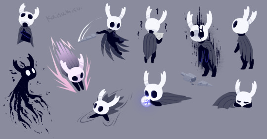
did anyone order a metric fuckton of ghost holow nite
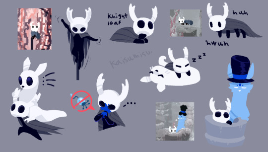
obsessed with the skin for rw actually, feat. @lightosoul

ghost deserves to have swag wings
#hollow knight#hollow knight ghost#hollow knight game#little ghost#the knight#rain world#rain world game#slugcat#art#fanart#drawing#doodles#kaisucreations#i originally drew all of them on one big canvas#(and reached the layer limit on sai lol)#but i split them up into categories for easier viewing#thats why the formatting may seem a bit odd with the empty spaces#anyway ghost is so easy and fun to draw its great#i am not immune to ghost is cute propaganda
2K notes
·
View notes
Text
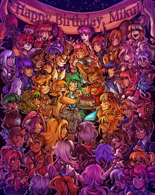
Happy birthday to the number one princess in the world!! 💖
~from her biggest fans :)
ramble of my scattered thoughts on the piece under cut as usual cuz i love talking 😋
This has been an idea I've been cookin for a while, and it was so cluttered and unlike any other ensemble piece I've made... and I decided I oughta do it anyway. I love Miku, I love Vocaloid, and I wanted to do something really ambitious and crazy for her anniversary. Crazy that she's turning her "canon" age this year TwT
I had the idea floating around since like, May...? And then finally started acting on it around June 18. I'm terrible with deadlines, obvious with how I can never make a silly birthday post in time, so I started wayyyy ahead to make sure I have some room to be lazy lol, especially with an idea as ambitious as this.
This was finished on July 12! So I had to sit on this for an annoying amount of time. Very difficult for someone like me who just wants to talk about everything I'm working on to the masses. But at the very least, that gave me the time to work on the draft for this post.
~~~
Here's some ~behind the scenes~ scribbles leading up to the finished piece!
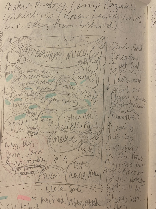
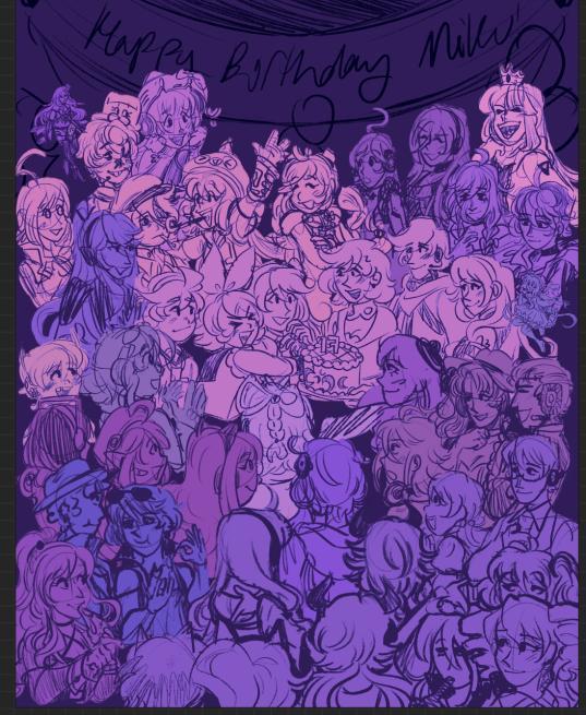
Left is the chicken scratch plan i made in my handy dandy notebook (whenever things are getting real and ambitious, i always made a rough ROUGH plan in there. Usually I'd do a rough pass of the full thing, but this was too complicated for me to do traditionally. I majorly benefited from digital tools to make this possible). CyberDiva and CyberSongman were considered, but I ended up cutting them cuz I just didn't feel like drawing them sorry-- (just pretend they're off to the side. They gave Ruby and Clara the pizza lol). Right is the "final" completed sketch (before I decided to include Chika mid-way through coloring and VY1 and VY2 near the finish line). I started by drawing the main "groups" separated on a different canvas so I can plop them into the main canvas for easy rearranging and transforming. However I got lazy and ended up drawing everyone in the bottom right corner directly on the canvas since I liked seeing the big picture of everyone's positions. Y'know.
Almost excluded Chika! But I like her design so much that I just felt like including her last-minute. You win this time, Chika fans. VY1 and VY2 were very close to being cut! I added them when I began doing the banner and thought "eh why not". I figured their non-human designs would be pretty easy to include pushed back in the bg. Ik VY1 is more commonly associated with the fan design, but I referenced the hairpin cuz it was simpler and the fan looked very annoying to draw 😭
Sorry to the fans of many Vocaloids I had to cut because this composition was insane enough as is. I promise I wanted to include fellas like CUL, LUMi and Sachiko 😭 I will admit I was a little biased on who I wanted to include over others. Like, I don't normally care for Bruno and Clara, but I wanted to get some more international 'loids in the mix. Also wanted to stick in the realm of official designs and not fan-designs since, as much as I can appreciate those, are just a whole "wait who is that guy supposed to be" situation I didn't wanna deal with. I also did wanna include even more character references through the balloons, but they ended up being kind of ugly and overcomplicated the BG :,) (Oh, and while this was originally planned to be a Vocaloid-only piece, I did end up including Teto, Neru, and Haku 'cuz those are Miku's besties dude!!! They may not be Officially in the club but they're her girls and it would be criminal to not invite them to her birthday).
Anyway, this project marks the first time I've drawn a lot of Vocaloids. Lily, Piko, Rana, Yuki, Yukari, Miki, Maika, and many more lol. All of 'em I've heard or seen in passing, but now I actually drew them, and some have really cool and fun designs!! I got into a habit of drawing Merli after this since I just love her design for example. And I'll probably be drawing more lol!!
Oh and the last thing I'll add for now!! The cake is indeed made up of various song references!! I wanted to reference the "big four" producers, just absolute icons in Vocaloid history. The pink/black checkerboard is "World is Mine" (Ryo), the crescents on the side is "Rolling Girl" (Wowaka), the smiley faces is "Matryoshka" (Hachi), and the three hearts on the side is "The Vampire" (DECO*27, which is sort of a symbol of his whole Mannequin album tbh). I know "The Vampire" is a bit modern but I couldn't think of anything else off the top of my head. I'm a fake DECO fan I know 😔 "Matryoshka" was originally going to be referenced in the colors of the candles but believe me it looked like shit so I just went for something else last minute 😭
That's all I have to say!!! Hope you didn't mind the text wall if you made it here. I hope you like it as much as I do!!!! Happy freakin' birthday Miku!!!!
I have to deal with tagging all these characters now for my page,,, in the drafts my tags got cut off after a certain point so I think I'm massively breaching the tag limit 😭 um... I'll figure that out later...
not losing sleep that i can't tag everyone, even for page organization purposes because some characters have pretty generic names and some are a little hard to see in full yknow. If you're one of those people who tag every character in the art piece you reblog... I am very sorry.
#mayor doidles#fanart#vocaloid#hatsune miku#miku#kagamine rin#kagamine len#rin and len#meiko#kaito#megurine luka#gumi#kamui gakupo#ia#vflower#mayu#kaai yuki#oliver#otomachi una#fukase#sf-a2 miki#utatane piko#yohioloid#big al#sweet an#kasane teto#i literally dont think i can tag everyone. um. so you get the idea right#digital art#cell shaded
2K notes
·
View notes
Text
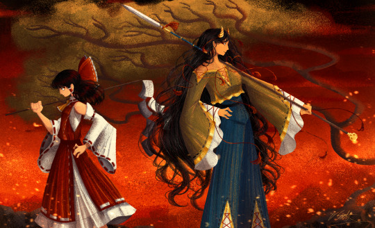
[Click image for better quality]
I FIGURED OUT A WAY TO FUCKING MAKE THE IMAGE SMALLER FOR POSTING ON TUMBLR WITHOUT SACRIFICING THE ACTUAL QUALITY OF THE IMAGE OH MY GOD
Ok so, what I did is go into the clip studio paint file, make a new file, copy and paste the group in the original file, merge everything, get rid of the extra stuff outside of the canvas, and then make the flattened image smaller and crop the canvas. Once you have that, export it and you're done. This helps maintain the actual quality of the image and also helps shrink the file size down to something actually postable (if anyone has a better way of doing this please tell me)
[Edit]: Ok I guess posting something to Tumblr just naturally compresses the image a bit more somehow because I'm looking at it now and zooming in too much makes it a bit blurry so I'm still gonna have to futz around with image quality for future pieces oof
Artist's Note:
I'm so glad I figured out a way to do this because I like working on a big canvas so I can get as much detail in as I possibly can. Only problems are how laggy it gets while drawing lol.
I had an idea for a drawing with Reimu and Zanmu because I really like thinking about their potential dynamic a lot. I also wanted an excuse to draw Zanmu again but in my normal rendering style because last time I drew her she was in my more sketchy style with generally flat colours so I wanted to draw her again. Speaking of, looking at the sketch for this is a jumpscare that I never enjoy seeing, like, man am I glad I didn't use those for my final piece.
Also about her spear. I was originally gonna make it like the ones she had in game, but it kinda threw off the whole piece. It was too big, too blue, and too flat, so I just went "fuck it" and gave her a different one instead. My headcanon justifying this is that the ones she uses in game are for danmaku battles whereas in any other fight she just uses a proper yari, or she still uses the yari and just makes it all glowy to power it up, maybe both lol. I pulled as much inspiration as I could from Sengoku era spears, and even put in some blue into the decorative part of the spear and also added a little skull to pay tribute to the original spear. Also, in my research I saw some art of izanami and izanagi making japan and saw that the yari izanagi has had a little decorative tassley thingy on it so I took some inspo from that and just made it one of Zanmu's tassles (Idk when that art was from or if the spear was still accurate to Sengoku period Japan but hey, probably the same reasons Eirin puts little bow ties on her arrows, it's just for personalization purposes).
I love rendering hair and clothes so much omg, while I like the super curly hair Zanmu, the longer, wavier hair suits her better for this drawing (I imagine it only does that like how Ghibli characters hair moves when they feel angry lol). I love making Zanmu's hair all messy and crazy, as well as giving her grey hairs, this woman has aged like a fine wine. Also, if the hem on the ends of her sleeves, top of her shirt, and her pants look like gold to you, that's because it is! It's fairly light so she's not collapsing under the weight, but it's gold! (I don't care how impractical it is, it's just cool). Not the undershirt though, it's made of a gold fabric. I had a cute idea with Reimu's hair to make it have a red shine to it. I also changed up Reimu's outfit so it isn't just a blob of red. I like it a lot when Reimu's skirt and outfit is segmented into different layers, so I wanted to incorporate that.
I tried to draw their hands differently as well, but IDK how noticeable that is. Also, I am super happy with how the side profiles for the two of them turned out, I used to struggle a lot with how to make the side profile of a character actually look like the character, so I'm really happy that they actually look like themselves.
Also added in the tree and rocks in the background as an homage to Zanmu's character art in Touhou 19, just because I was getting kinda stumped on what to do with the background lol.
In terms of a story idea with Reimu and Zanmu, idk why but the potential plotline of Zanmu wanting to ascend to godhood is so fascinating to me. Like, it is very possible that if she just convinced everyone she was a god (which would be very easy for her to do), she would become one in a heartbeat. Also, if she were to become a god, with her ability to return stuff to nothing, could she hypothetically get similar abilities to (Jojo Part 5 spoiler btw) GER? Like, idk about the death timeloop stuff, but the concept has been haunting me every night as I have been trying to find loopholes in GER's ability for a while now ( for no reason in particular). Back to the main topic, I imagine that she would probably tell Reimu that if she were to become a god she would take over the Hakurei shrine since the god there might as well be dead, and Reimu just says to her, "Over my dead body bitch." Like, I have no idea how to summarize their dynamic but like, it's the type of hero-villain dynamic where the phrase "We're not so different, you and I" would definitely be a phrase said during a fight. I think that if another IN style game were to release, Reimu and Zanmu would be in a team together. They could also have an interesting mentor and pupil kind of dynamic. Can you tell that Zanmu has been charging my mind rent these part few months? Like, instead of living in my head rent free, she kinda just uno reversed the whole situation and now she's the one charging me rent. What happens if I get evicted from my own brain? Actually, scratch that, I don't think I wanna know.
#touhou project#art#fanart#touhou fanart#touhou 19#touhou#東方project#zanmu nippaku#unfinished dream of all living ghost#reimu hakurei#東方
276 notes
·
View notes
Note
alright here i go
for the weird ask: 5, 11, 18, 20, 30, 33, 44, 55, 61, 69, 76, 83, 94, 98
(mwahahahaa)
omg
5. Do you prefer to drink soda from soda cans, soda bottles, plastic cups or glass cups?
Cans... that little *crrrk* *hissssss.......* augh!! And then you can crunch them when you're done. Marvellous. Thank you inventor of the aluminium can.
11. What do you have for breakfast on an average day?
Salmon bagel :))
18. Ideal weather?
WARM! Let my bones rest 😭 warm very warm but with shade and cold drinks and all that jazz.
20. Preferred place to write?
My phooone. No laptop, though a note pad suffices if my phone is out of reach. All 300k words of bbb (that's plus unposted possible chapters) was done on my phone. with my fingers.
30. Places you find sacred?
THIS PLACE!
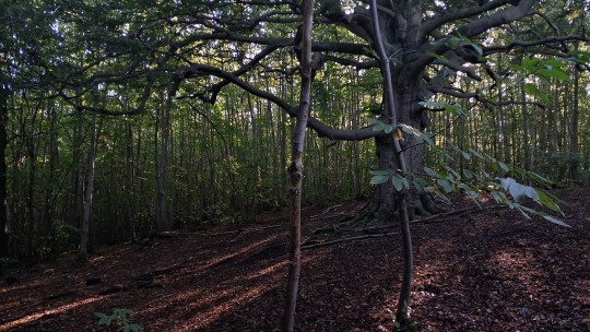
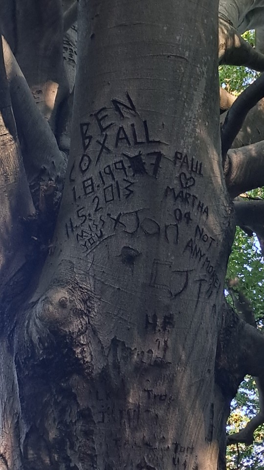
BIG tree! Hundreds of years old. Four swings hanging from the branches! Howw many people sat there? Carved their names into it to be immortalised, swung on those swings?? The energy there.
I'm not a religious person, but if I were, I'd worship the tree.
33. Most used phrase in your phone?
Augh this one's difficult because it implies I am conscious of what I put down but its probably omg
Like on its own. Or HELP that one's common.
44. Favourite scent for soap?
I bought @airlocksandaviaries some nice soap one time and bought myself some Lily-of-the-Valley soap. And I have Not used mine because I like the scent so much...
55. Favourite fairytale?
Always been a fan of the tragic ones. The ones that were originally deep and dark and nasty, before they became Disney-fied. The original Rapunzel was nice, not that I don't like the new one, but it was nice. The original message behild Little Red Riding Hood — a young girl flowering into womanhood who is approached by a strange older man who wants to make her his — has always fascinated me because !!! Argh beast metaphors and hunger and. Yeaaahhhh bbbcore..
61. Favourite flowers?
Orchids are nice. Tulips were for a while!
Recently I found THESE
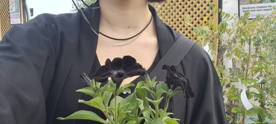
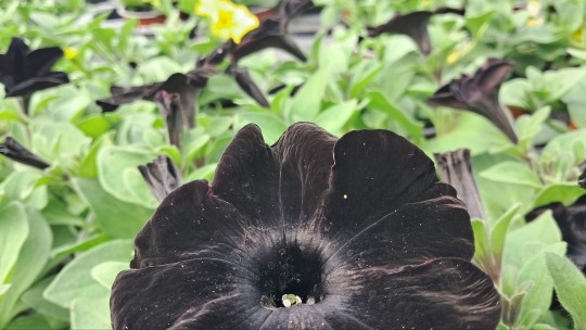
Black petunias!! I tool them because they're JUST LIKE ME FR! And they smell awful, like burnt rubber and bleach, but I LOVE THEM!!!!!!
69. A Fun Fact that you don't know how you learned?
@chaetophractus-vellerosus — most doors are universally 6 foot 9 inches, so it's easy to guess someone's height based on whether they have to bend through a door. Finch, I asked my friend where we had found that out, and apparently I knew it Before we had used it to work out Drew Gooden's height. So. I actually dunno where the information came from.... got that doortism though.
76. Favourite potato food?
AAAUGGHGH POTATOEEESSSS!!!!!!!! I like fried potatoes, I had real patatas fritas like a month ago and almost died it was so tasty. I like all manner of potatoes though. Give me the potatoes...
83. Writing or Drawing?
Both? Both!! I absolutely adore putting my thoughts onto a canvas. Whether that be a digital one where I'm throwing notes at a wall and seeing what sticks or a physical one where I'm just figuring everything out by swiping paint on white paper.
94. Favourite season?
SUMMER! Ironic because in Britain we (used to...) don't get very hot summers. We're almost there folks!
98. Favourite historical era?
A question I'm not sure I know the answer to! Dropped history almost as soon as I started it, to take geography instead, so I'm gonna say the devonian era and be done with that:)) (that's when bony fish were evolved and doing their thing with no dinosaurs to tell them what not to do)
CHOCO. I LOVE YOUU !!!!!
5 notes
·
View notes
Text
hello and welcome to my hasty tutorial! it's on private now but i really should clean this up and post this method public & on clip lol so i'll do that later
anyway for brush & pattern making it doesn't matter what size your canvas is, just that it is big enough to draw on and is set to greyscale. I made a bigger canvas than my ribbon:
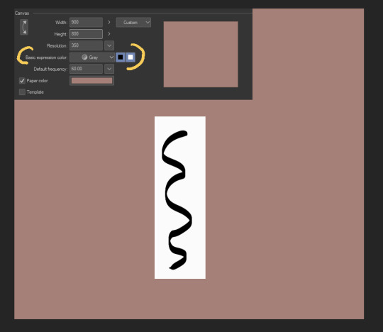
I made a white rectangle where I should draw my repeating object, then drew on that white rectangle in black. This is all on one layer - we'll be separating the lineart it from the background in a bit.
Next, I cut somewhere around the middle:
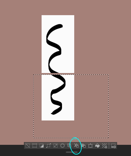
Then, I move.
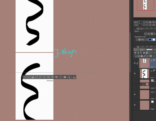
I use the white rectangle part to align, then merge the two.
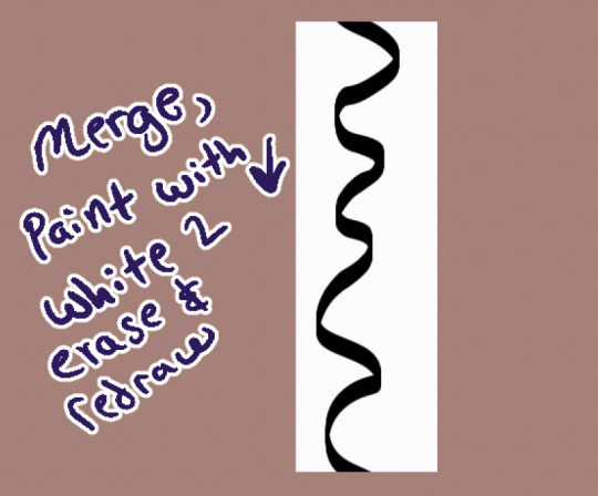
I use white as an eraser & redraw it. You can also make a bigger space between the two and then draw more in between like this:
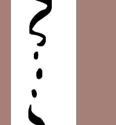
Whatever you do, the upper and lower parts will connect as long as you properly realign the white rectangle you drew them on. :D
Now that we have our shape connected, let's get rid of the background. Go to Edit > Convert Brightness to Opacity & wham, your white background is gone!
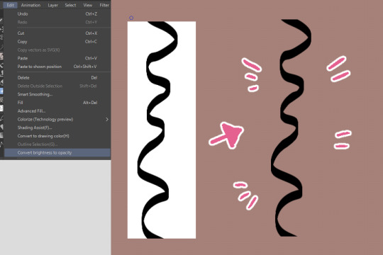
This function was created to get scanned-in lineart done traditionally onto its own separate layer, but can be surprisingly used for other neat tricks like this.
From here you would register the material if you're confident it repeats. If you're not, you can test it like so:
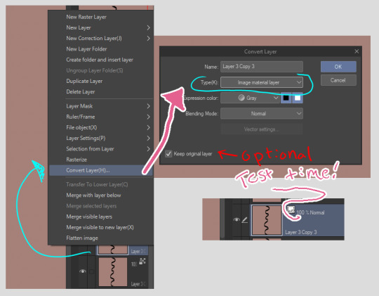
First, right click the layer. Then, convert it into image material layer so it is an object.
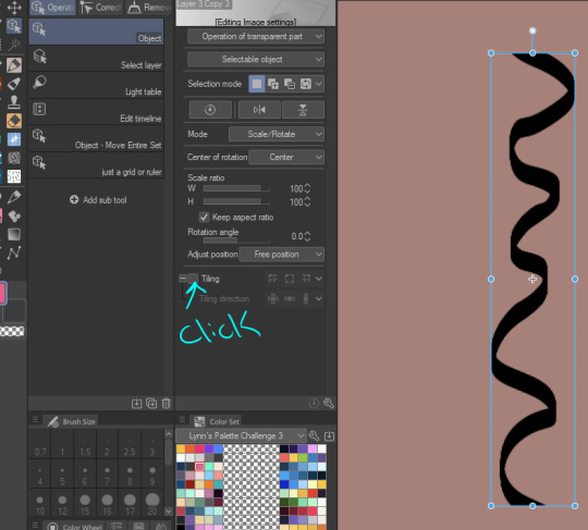
After you made it an object, you can click on the object tool to manipulate it. My icon set is very werid because I've customized my layout and have 40023043204.9 billion brushes I've been playing with, but you'll find it up top somewhere I think. We click on "tiling"...
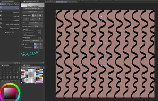
Aww yeah. Success. It works.
You wouldn't register the "image material layer", you'd register the original raster layer you drew it on. If you want to only use vector lines for the whole process, my suggestion is to use the grid tool instead - customize it so it aligns with the top & bottom of your object, then do the same thing we did but with the grid as your actual white box.
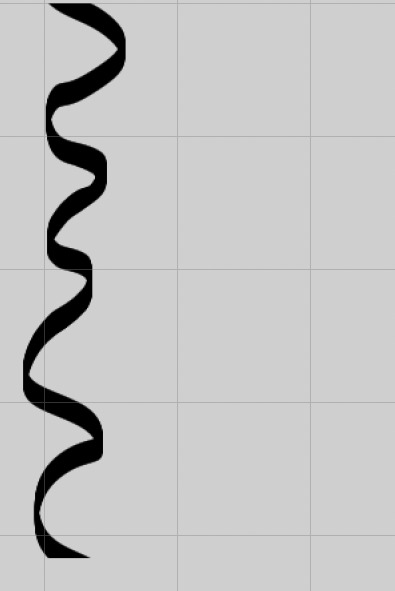
This isn't the right size, but the idea would be to make the grid, draw so everything is located within a certain amount of squares in the grid, copy the layer (so you have the original in case something goes wrong) and move the copy around so it re-aligns with the grid.
bonus:
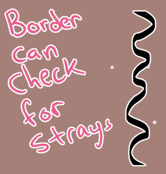
Occasionally I wonder why something isn't repeating. Sometimes it is because there's some stray pixels somewhere that I forgot to erase or left by the brush. You can use the border function to check this & erase them. :D
2 notes
·
View notes
Text
Well I’m not making any commissions before they pay anymore, I hand drew a replica of an old original piece of mine they spied and liked which wasn’t for sale but they really wanted it and… well I didn’t want to give it away so I offered to replicate it. Instead of do a print. They approved it, said they’re going to frame it for their new place and everything and then just ghosted for like a week. I’m only charging £15 and it was pretty hard esp as I’m in a lot of pain atm with un healed injuries… and I just asked if they were still interested and they got aggy at me and made me feel bad for asking and now are just not speaking again either after saying they just needed to get stuff done yesterday. Ughh. I didn’t sign up for this. I wish I didn’t go into art I swear down. I love it which is why I did but, christttt be respectful about our hard work. If I just get a no answer, I can sell it elsewhere but atm I’m making nothing because I’m in limbo. And apparently I don’t seem to even be allowed to message them about it either.
I also got super stressed recently and removed most of my art from my walls in a Give Up stint, but I ended up tearing one of my most special old pieces I made at my peak point in drawing horror cartoons and I just… ugh. Man my brain went “that’s a signal it’s over”. But my kid came in and noticed the next day and requested I put them all back up (which made me feel like I had a reason to keep doing art) and I said I would whilst he was at his grandmothers house but he was like hmm ok and but I didn’t as I didn’t feel up to it as it’s a big job and my back is basically out again, but he specified about the key on the canvas piece so I did manage to put that one up for him. That was warming. He makes me feel like it’s worth doing it still as I’ve lost the passion almost totally until I actually get started on something and then it comes back.
#personal#ventauz#vent#artists on tumblr#support human artists#small artist#queer artists#artist struggles#artistsupport#artists
3 notes
·
View notes
Text
WOO BUDDY! BUCKLE IN! THIS IS GONNA BE A LONG ONE!!!!
Not even kidding, my hand flew to the reblog button the moment I saw this. Literally. I didn't even have time to take in the full piece. I LOVE THE ART STYLE AND THE COLORS AND AAGHHHHH!!!!!
One of the first stings I noticed was the use of texture not only in the background but on Ruggie too. The texture really helps accentuate the whole pop culture vibe of the piece. It makes it feel gritty in a way, but not like hard gritty. Like canvas gritty. I don't think I can describe it better unfortunately.
The sketchiness of the lines also really drew me in. I know a lot of us artists do something similar: using the cleanish sketch as the line art, but this feels so much more distinctive. The brush simulates the look of drawing with actual ink. That would already be such an amazing detail on its own, but then the artist took it a step further and changed the colors of the line art in some places. I feel like this also adds to the pop culture feel since pop culture tends to be big on color and rawness. I especially loved the lightened part of his hair's line art.
While I'm on the topic of hair, I also just want to point out how hard it can be to draw Ruggie's hair due to the harsh color sectioning. Despite this, however, the artist totally crushed it! I also really like how fluffy they drew it.
Ruggie's facial expression is really making me feel something bro. The grittiness of the lines matches perfectly with his expression. Facial expressions can also be a really hard thing to get right but the artist did do well that I can practically feel the expression (idk if that makes sense)
Now for the part I've been most excited to talk about...HIS EYES!!!!!! Can we just take a minute to admire how pretty they are?! Many artists (including me) aspire to draw eyes that look delicate and magical in a way. Kind of like little pools of water. Ruggie's eyes, however, appear to just be a mix of colors, for lack of better words (i'm sorry), scribbled in. I feel like something like that is actually pretty hard to get right. It can be hard to keep the colors balanced. When I first saw Ruggie's eyes I could've sworn I was looking at a swirling rainbow. I just really REALLY love how the artist drew them. I know I'm not doing a good job at explaining this, I just physically cannot find the words to describe why I love them so much.
I also really liked his cheeks. I just think it's a really cool and distinctive way to draw them.
I really like the pure white highlights. They're obviously not drawn like typical highlights, but I think that's a good thing. It makes the art even more incredibly distinctive than it is. I think they were definitely the best choice for the style. They really bring it all together.
Lastly, I want to talk about the background. I know some of you may be thinking "What is there to talk about? It's just a simple background." It may just be a me thing, but I struggle with backgrounds, even when they're just a mix of different texture brushes. Not only is choosing a color for a background difficult, but so is making sure it looks balanced. You have to choose textures that look good together in colors that look good together, and all of that has to look good with the rest of the piece and match its mood. I love the bold color of the background and how it really just makes Ruggie pop. I love how it gives the effect of glowing and provides a backlight for Ruggie.
The whole piece gives me a really strong pop culture vibe. It's a mix of modern and the original with a massive emphasis on the POP part in my opinion.
I always have a hard time getting me thoughts out when something makes me feel particularly strong emotions, and let me tell you, I STRUGGLED with this one. There's just so much about it that I find amazing that I can't put my finger on or properly describe. I want to be able to describe it in a way that makes everyone else see it as indescribably amazing as I do, but some things are just too hard to describe with words.
Closing thoughts, I love this piece. I think the artist is really talented and I really enjoyed looking at this piece and noticing new, little things that make me love it even more. Not sure if the artist will ever see this, but if you do, you're an amazing artist worthy of so much praise. I can tell you're very talented.
Thank You for not only making such a beautiful piece but for sharing it online for all of us to enjoy <3

Ruggie my guy 💛
#artists on tumblr#twisted wonderland#disney twisted wonderland#twisted wonderland fanart#disney twst#twst#twst fanart#twst ruggie#ruggie bucchi#twisted wonderland ruggie#artwork#art#art appreciation#give the artist some love#that's a threat#seriously
368 notes
·
View notes
Text
The Grey, WIP: 7/7/23
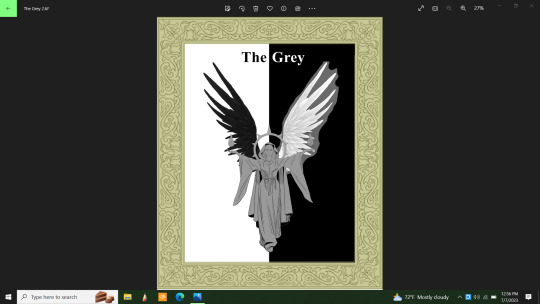
Well, I wish I had realized yesterday that by painting the base coats of the wings and then just fading out the references over the top of them, I could have saved myself some time and trouble. Now all I have to do is erase around the white wing and it'll be mostly done...save for some highlights I might want to put in.
This was a single image, then a doubled one because my graphics program has a tendency to merge all layers prematurely once in a while. A glitch that I'm not at happy about. I was just able to remove the bulk of the reference picture today. Look so much better without it there.
I was going to do a half gold and half silver halo, but with all that black and white, there's need for more splashes of color. So, the halo will be solid gold and have red jewels set into it. The flames will also add some color as well as the lady's skin. A nice brown. Her hair will be black.
References for the bits I need to see are still there, just invisible at the moment. Except for the frame design. I'm doing my best to eliminate anything I copied from online as fast as possible. Except for the wings of course. I need those.
I will lighten the hue of the cloak; I usually start dark and work lighter then darker again in spots as I go along. I even have brushes that will do fabric textures. I think I might try that. In spite of the need for more color, I still insist that the cloak be grey. Maybe I can add some patterning or something. I'll think about it.
Anyway, I never meant this drawing to look like a playing card. In fact, the main elements of the drawing just showed up randomly in my head when I wasn't really thinking of anything particular. But I liked what I saw, so I'm drawing it.
Yes, I know I'm cheating a lot. This is because sometimes I have trouble translating what's in my mind onto canvas. I can draw the human figure but haven't had a lot of practice at it. Nor do I have a lot of practice drawing clothing. It was just easier to find what I needed online to help me out this time. I don't know who all the artists are who put out all these free resources for me to use. Though angelic figures are common, I can say with confidence that this idea is uniquely mine. Just for the fun of it I did a general search image for a moment and found lots of angels, but nothing exactly like mine. So, there's that.
I can and to draw freehand. I'd do it more often than I have been lately if I had more time. My time off is sporadic at best/worst. Given the choice, I'd spend more time doing everything in my head. Taking a few hours a day just to draw. I can do a solid three hour session of drawing before my brain gets tired and I have to take a break. I rarely get that time lately.
Ugh. This is devolving into a bitch session. I won't do that here. Anyway, when this is completed, people who are into games like Dungeons and Dragons or similar games may use this character as part of your game. Just ask me first because I want to know about it. Give me credit for the design. No, you may not sell it. I need the profits far worse than you do.
I came to think of The Grey as a kind of judge for contests and legal issues...and maybe other things. She knows there's more than one facet to every story, there isn't just pure evil and pure good. There's always those shades of grey. And she's an excellent and fair judge. A living personification of justice and a powerful force for the good side. My mind had to work on this for a while as I drew her "card." Because originally, she had no story, no meaning. I'm still inviting people to have an open interpretation of her character however.
I can also see this as a big poster over someone's bed simply because it looks cool. It would be a nice decoration, especially if it turns out as nice as I want it to.
I'd appreciate it if no one used my idea until it was completed. I might make some changes along the way that I won't know about until I get there. Not that I think anyone will really. Every offer of free resources I put out gets ignored. I don't know why.
I will also post this on Redbubble when it's done and send a link. I can't seem to completely let my optimism go even though I'm aware that no one wants to buy my artwork. I don't know why.
#cherokeegal1975#digital art#wip#work in progreess#original character#original D&D character#free resouce
0 notes
Text
Tate Modern
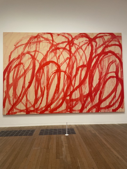
The Gallery of modern art certainly stuck to its name. Not only were their exhibitions modern they were also contemporary. What makes them so is the relatability of the pieces on display. Their contents varied by culture, gender, socioeconomic, political standpoints, and race. I wasn't sure how the exhibitions were laid out during my walk through the gallery. However, that did not stop me from finding this room with three large paintings on its three big walls. When I first entered the room I questioned if they were all the same. I then sat on the bench and the middle and thought of two things. The song Red by Taylor Swift which I then proceeded to quietly sing with my peer @melodierosasblog. And that those big angry-looking red swirls were probably what a period cramp was on a canvas. I then decided to read what the artist had said the piece was about and was satisfied with the original intention. He mentioned that he drew inspiration from the Greek god Dionysus whose rituals involved drunkness and dancing, but he was also associated with violence and apparently, his followers would eat raw flesh. Meaning that the red swirls on the canvas are meant to represent both the wine and the blood.


There were also another two pieces that caught my eye which were a few floors above this one. With these two pieces I didn't really focus on what the artist wanted to convey but more on how I could relate myself to the art. The piece to the left which is a collage of different brown pigmentations made me smile when I saw it. I was so happy that I found myself getting as close as I could without crossing the string and pointing at the shade that closest matched my skin tone. I recall joking about the way it looked like a foundation line. The piece to the left had me intrigued for different reasons. The flags that I immediately recognized were Haiti, Jamaica, Kenya, and Barbados. I then noticed that the one thing all these countries had in common was the fact that their populations were predominately black. Seeing their very colorful flags in black and white made me theorize if the artist was commenting on the impact of white colonization in these places. however, I decided that I would rather enjoy not knowing and simply keep theorizing.

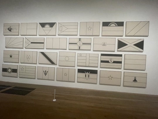
P.S. This is a candid photo probably taken by @leo-in-london
0 notes
Text
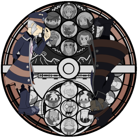

Happy 2000-- er... 2400 followers! I suppose this is what I get for overestimating how long it would take me to do two full bodies and 14 busts which I wound up cropping anyway lol.
Bonus commentary under the cut!
Link to the version with no commentary (x)
So first off, this was a considerable challenge for me since I don't normally draw in an anime style, and I think that shows. There were a lot of wonky proportions that I ended up having to go back and sort of fix in post. Irida, Rei, and Akari were especially bad-- my own sister told me that Rei looked like "a cross between a Victorian orphan and a frog". I decided to redraw all three of them, but since I drew them on a smaller canvas, I think it messed with the resolution a little when I shrank them down. I'm not sure anyone would notice if they weren't looking for it, but I've been staring at this for so long that I can't unsee it.
Next was the brilliant decision to put Emmet, Elesa, and Drayden on a light background. They initially faded right in, so I went back over some of the outlines to make them more readable; I had also tried putting the whole Unova set on a darker background, but found that it drew too much attention and unbalanced the piece.
On to the good things!
I adore how Melli and Zisu turned out. I don't know what it was, but my art game was on point that day.
I also had a lot of fun trying out different motifs. I knew from the outset that I wanted to play around with the duality of black/white, the duality of past/future, and the idea of making the whole disk resemble a PokéBall. The center design had me stumped for a while; I had initially used screenshots of the Highlands and Gear Station as placeholders during my planning stage, but around halfway through I decided that would be too busy and changed it to a simple railway track design instead. Then I decided I didn't like that either, and at the last minute I went back to a simplified version of my original concept. I think the stylized Coronet mountain range and subway train work nicely.
Other trivia:
During my planning phase, I used everyone's official art as placeholders-- except for Zisu, who for some reason I couldn't find any for. I used a screenshot for her placeholder, and referenced her TCG card for the final drawing.
Emmet being the only character drawn from a head on angle was deliberate. I wanted to subtly highlight his importance while still being able to place a key Pokémon in the center of both groups.
I drew all of my initial sketches on paper, lined and colored in Clip Studio, and compiled/edited everything in GIMP. I am a chaos gremlin and I will not apologize.
The reason I settled on a Station of Awakening as a follower celebration is threefold: The first is that I was hanging out with some good friends, and we wound up playing Melody of Memory. I forget exactly how it came up, but it was definitely a joke at the time as I do recall saying that it would take me forever... which it did, lol. The second reason is that I later realized that my first post on the blog (after the original "Ingo shouldn't be in old timey Hisui" (x) post) was Kingdom Hearts themed (x). The circle of stupidity is complete! And finally, I'm old enough to remember when making one of these for your blorbo was The Big Fandom Thing ™ that everyone did, and I wanted to indulge in a bit of nostalgia.
#my art#I'll keep this version out of the main tags so I'm not spamming#I'll add links to the other version of either post in a sec
139 notes
·
View notes
Note
Since I was tagged I feel like I might be able to add more to this? I do have like 3 years of streaming under my belt. (this is also going to be a behind the scenes of myself I fear, and also I wanna plug myself a bit ok) This is also going to be my experience and literally beauty of streaming is you dont have to follow any of this
Def agree with just steal what you like. Connoreatspants, Sneegsnag and others are big inspirations for my content, editing, and look on stream fun fact.
I started on a separate account than I use now as like a tester with my sister and just got used to the program before making my entire addaxbones character and doing branding stuff off of that. Personally I like my own cohesive branding, helpful for viewers to have a solid image in their brain of you within like a minute of seeing you. I also just threw together stuff I liked, purple, antelopes, skulls, ect. I took about a month before going live making and drawing up branding and paying some artists for some images i could use as profile photo, ending screen, chatting screen. (I really like streaming and see it as just a hobby to put some extra cash into)
OBS is great, i also love streamelements for alerts, chat overlay and chat commands that add some interaction. Triggerfyre is how I do all my channel point videos (you can also add commands if you dont have channel points) fossabot and nightbot are also pretty common for chat control stuff. I would also personally recommend getting bttv and ffz for your chat and picking out some free commonly used twitch emotes, these are what originally drew me to twitch as the site has a great sense of community and like a weird almost language you don't see around much. I also just love emotes.
Fun twitch things to consider, turn on your vod saving!!!! Many people lose their first streams to this as its auto off (if you are me remotely record every second you are live and put into a folder to upload to a vod channel 1 year later so nothing is lost) You can also go in and perminently save vods as twitch will get rid of them, watch out! Also Im putting this here USE MORE CLIPS. I just want everyone on twitch to use clips more but if you have a moment on stream you liked, clip it, use that clip to post to other places, idk watch it 72 times
In terms of actually streaming, just play games however you want, if you want to make a whole show go for it, or just chill and play a game with people. Just make sure you are having fun, Dont look at numbers as well, they are really fun to look at stat wise but sometimes you dont need that viewer reminder
Something I know I struggle with, you can just kick people from your chat if you dont like the vibe, its your space. Or, get some cool mods like zircon
Also schedules really help, in whatever capacity you have if you commit to it it makes it easier. Of course you can take breaks and stuff but having a schedule helped me so much of actually forcing myself to sit down and just play a video game for a couple hours. Also viewers know when to expect streams from you and consistency helps a lot.
I might put a bit more obs technical stuff and personal stuff that I find fun here so im putting my own read more
In terms of like things to consider, most twitch streams nowadays in the space have like a starting screen ~5 min, maybe a chatting screen, gameplay, brb, and ending. You'll learn what other sceens you personally are going to need as you need them.

these are mine (the ones on the bottom are nestled scenes I use to clear up individual scenes, kinda like folders)
Most of my current scene backgrounds I've just honestly used Canva to make slight gifs, mixed with my own editing and layering.


I did this like 2 years ago when I took a month off after surgery so I could come back to a nice updated stream that I am still really proud of.
I also made a png-tuber during this time, as much as sometimes I wish I did facecam mentally I dont think im ready for that. so I drew all the parts myself and used HONK which was really fun to learn, all the drawings had to be in very separate layers so they would move how I want and now my little guy talks and moves his head and moves his ears and blinks and can change outfits


there are also free programs to do this like veodotube but personally I really like how much I can change with honk and how it has different mouths and doesnt jump every second, looks cleaner to me and well worth the 12 bucks.
Fun obs facts, You can color code your scenes


I like this :)

this is my audio nested source since every other sorce uses these audio chanells zircon was talking about. Personally, audio is really important, I check and modify my audio after almost every stream cuz I'm paranoid and still dont feel like ive reached a good spot. Obviously not actually needed just something I personally prioritize. also wifi (ive been in a battle with telus this past week) wifi and your computer strength will play a part in what games will physically work
more fun things, I have so many streamelements custom commands that just say shit into chat and videos that randomly play


did you know streamelements also has stats?


and speaking of stats, twitch tracker is really useful (just dont morally compare yourself to others u know) its really fun to see how others are doing compared to yourself just dont take it personally


also an about section is really handy, its what i look at when looking at new people to raid, also raiding people when u are done stream is free and helpful for both sometimes, its nice to share the community u know, helps you both grow sometimes.

i think that's long enough, anyway follow me pls :) hope this was at least interesting and maybe helpful
hellooo zircon, for no particular reason (/silly) do you have any tips for beginner streamers? Your streams are always clean and well put together esp from a technical side imo so I trust your advice on this one :) - @helsex
This is gonna be long so get comfy.
#1 best tip: Get familiar with your streaming software of choice (most likely OBS) and don't be afraid to play with it. Your first streams are not gonna be a polished as you'd like no matter what you do. You don't need to know the software inside and out to use it well and familiarity will come with use. The best approach (in my opinion) is to figure out what you like in other streams and figure out how to do that for yourself, don't worry about learning absolutely everything right from the start.
Another good tip is to do some mic checks beforehand, if you just record instead of streaming you'll be able to see what your mic sounds like on stream, and there are tons of tutorials out there for figuring out mic settings (this is the one I followed I think, although with some differences just for my own preference).
Yet another helpful resource: this is a link to an obs plugin that will help manage audio sources so you can actually control what plays on stream, instead of it just playing your whole desktop audio. (I think OBS has a version of this going now? But I tried using it and didn't get far) You'll have to add an audio source individually for each application but the greater control is a godsend.
For overlays (things like chat on stream and alerts that play when people follow/subscribe/raid that sort of thing), there's a few routes you can go down. Twitch has their own alerts thing but personally I use streamelements (they also have a very popular chatbot which I don't use myself but may be worth looking into if that's something you want). Whichever service you end up using should give you some sort of link, which will be added to your obs as a Browser Source. (Also if you're using the obs plugin I linked, the browser source audio would be under the name "obs-browser-page.exe" after you set up the browser source)
My final bit of advice is that hotkeys are your friends! It is absolutely worth setting up a few hotkeys to make controlling your stream while in game easy. Personally I have hotkeys set up for toggle muting my my mic and discord audio, as well as for changing between my most common scenes (Also my catcam when my animals deign to show up). Typically if you are just using a regular keyboard you'll want to use key combinations as hotkeys to avoid accidentally activating one while trying to type in game (Something I have done many a time, but hey you never stop learning!).
Shoutout to @addaxbones for teaching me literally everything I know about streaming btw. He's the guy that got me into this mess and also the reason I met most of my friends today. (love that guy)
One last thing under the readmore to cover my shame /silly:
I am flattered you consider my streams "clean and well put together", and you can maybe take this as proof that on screen != behind the scenes, but here is my desktop from a few streams ago, not a tidy look I can tell you that.

It doesn't normally get this bad, but it's also not a whole lot better.
#but really all you need to do is press a go live button and not dox yourself. the rest you figure out on the way#If you want growth tips#idk man#ive been pretty stagnant and theres other to look for for that. not being faceless helps but oh well.#streaming#long post#i dont normally post stuff like this and got carried away sory#I just really enjoy streaming and have put a lot of work into this and want to share it with more people#if you want to know more in general or more specific stuff please ask
31 notes
·
View notes
Text
Part 3 - Chapter 16 - I-Island: Exploring The Expo
Blank Canvas Part 3
AO3 - here
Fanfiction.net - here
And we're back continuing our journey on I-Island! :D We've got a bunch of friend fluff coming your way this update so I hope you enjoy! ^________^ Editing took a bit more time than usual because I had some parts I still had to flesh out. Didn't help that I had a really long week at work last week. On top of that I also caught a cold, but I managed to survive!
Alright, enough complaining. Let's get to the chapter!
Reminder that it isn't just Izuku who came to I-Island in BC. We've got Hitoshi, Shouto, and Mei tagging along under Present Mic and Hound Dog's supervision. All Might is here too but currently with David Shield.
Linktree to all the things!
End notes for the chapter are under the line.
All the friend bonding! :D Izuku's friends really like to tease him and Melissa got to meet some peeps from Class A. No Kirishima though. :/ I could have brought him as well with the working the expo thing but I wouldn't think he would want to leave Bakugou behind by himself. Especially since the rest of the Bakusquad did go to I-Island. You're probably wondering how it's going to go down without Bakugou or Kirishima, but I'll just tell you throw canon out the window for this one. :P I've got a plan and I think you'll like it. I do anyway.
Sh-sh-shout out to cooper and Baltimoresurvivor for their help with outfit suggestions! (really thank you, I'm quite fashion illiterate...) :P I was originally going to keep Izuku's the same as cannon but Baltimoresurvivor had some fun ideas for changing it up as well as something for Hitoshi. Which I think I made it work? ^____^ And cooper even threw together some schematics for Mei's which I then drew up which you can see here!! :D To give you a better idea of her outfit. So thanks!
Flirting. Just a whole bunch of flirting this chapter. ;)
Also reminder I have no idea how coffee works. I don't drink the stuff myself so I made stuff up in an attempt to write something cute. If anything, I see it as Kaminari made that coffee himself also without much knowledge how it works. So there, that's my logic. :P
Fun Facts About Japan:
Let's talk restaurant etiquette! Now in the US, good customer service consists of the wait staff regularly checking in with their tables and seeing if there's anything they need and if they are doing okay. Very much attentive service without the customer having to ask for it. That is actually not the case in Japan. In fact, it's kind of the opposite. In restaurants and food places, they don't come unless you call for them as they don't want to interrupt your meal or socializing. In fact, a lot of places have a call button for that specific reason to notify them you need something or ready to place your order. There are also places like conveyor belt sushi that they will have tablets and such you can use to order your food without even talking to a person. I experienced it where those places will either serve your order to you via person or conveyor belt depending on the restaurant set up. This also goes for karaoke booths as well. You order through the tablets or indicate you're ready to order. Then they come and get your order and give it quickly once it's ready so that you can maximize your enjoyment of the experience. (also karaoke is super duper fun in Japan and they do have a large selection of English songs to choose from over there)
Another difference is tipping. In the US, tipping is a big part of the restaurant industry and are part of restaurant staff wages. The better the service, the better the tip. (at least in theory) In Japan, they don't tip. Top service is considered to be a part of the job and no extra compensation is expected. Which was really hard to wrap my head around at first because customer service in Japan is top notch. They are just so kind and determined to get it right the first time. You just feel like you want to tip them anyway but it's just not a cultural thing there. Like how I previously mentioned that if you're in a convenience store and they notice what you are buy is expiring, even that day, and they will go out of their way to get you a fresh one. I strongly feel this is tied to their cultural mentality of the betterment of the group verses the individual. Get it done right the first time and everyone will be happy.
That's all for today! I hope you liked all the fluff this chapter. 'Cause next chapter is the attack itself and just plain drama. A nice balance. ;) Thank you for your patience and have a great two weeks!
#mha#bnha#fanfic#quirkless au#blankcanvasfic#blankcanvasheritage#i-island#midoriya izuku#todoroki shouto#shinsou hitoshi#hatsume mei#present mic#pro hero hound dog#pro hero all might#Class 1-A
3 notes
·
View notes
Note
Your theme is everything !!! (*゚▽゚*) ITS SO PRETTY if u don’t mind sharing how did u make it?
AAAAAA PARDON LATE REPLY THANK YOU !! sldhldns i appreciate it wah TwT <3 ✨ and :O idm so ... !! this won't be like. a full guide or anything LDBSKD like a complete walkthrough ?? but >< :
i'm on laptop but uhh tbh any gadget wld work? apps/websites used: canva, photopea (editing/graphics) !! for the gradients on my pinned, i used this ^^
so like uhhhhuhhh idk how to really explain well sorry but simply put, for the dividers in my pinned, uh. it's a Bit Complex and tbh there's easier ways to do it prolly but i made them w canva using 1000x40px (40 is the minimum so ya)! so that's for the big one in pinned, but to make the smaller ones i made them w photopea w say, 1000x5, 1000x10, wtvr to make the dividers smaller! yeah!!
meanwhile for the picture in pinned :O w the cat & watermelons! i just used canva for that, altho the gif required work in photopea >_< bcs it's originally a cat that like. runs from left to right and sleeps in the middle, then ofc its a gif so it repeats, so i used photopea to remove the running and just keep the lil sleeping cat! and then put that into my canva ^^ i used the tumblr banner preset size (?) and mostly it's just uhh put a picture in, add borders, & then put a little overlay (w lowered transparency) to make it look more designy yeah! basically just that ><
and then for the header !! it's like uhh a transparent gif of the (cat) ears of my favorite character :] i removed the bg and all and yeah, just left the bits i wanted - then uhh edited the picture w the colors and whatnot, making my own filter/psd? which can be done through right-clicking the file in photopea, clicking blending options, and changing stuff w color overlay! if you wna try doing that, i suggest just playing around w it yourself ? >< and then for the designs in the gif, i made a copy of the ears and all so i cld have two pictures there, and make a gif! so basically just drew diff designs on both of the pictures, and that's basically it yeah!!
there's uhh a bit more complexities (like how to actually make it into a gif ^^ there's like uhh _a_ needed at the beginning of the file i think? smth like that?) and etc but thats basically it >_< sorry if this is long or anythinfFJSBDKSN i just word vomited my thoughts and all hehe so ^^ but again thank u uwah and i hope you have a great day, kaze!!
#i also do believe this is our first time properly interacting!! so hello !!! <3#I MEANT TO ANSWER THIS LIKE. a whole 9 days ago actually but i do't remember why i didn't answer it yet when i actually answered!#i think i wanted to be on laptop... idk why anymore SOBS but i hope this is okay! ty again AAA HAVE AN AMAZING DAY! <3#⋯ ꒰ა my galaxy ໒꒱ *·˚#⋯ ꒰ა letters of stardust ໒꒱ *·˚#— kaze! ♡
8 notes
·
View notes
Text
i was gonna draw tonight but i dropped my tablet pen and the barrel of the pen broke off and flew somewhere underneath (??) my bed (?) and now i cant find it so I’m just gonna answer asks before bed instead. just some art asks and more mentions of infinity train LOL
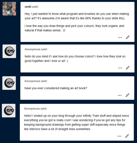
What program and brushes do you use when making your art?
@ravki hi! part of this is in my FAQ but i’ll say it again anyways LOL: I use photoshop CC and have used photoshop for pretty much....my whole art career. I’ve dabbled in clip and paint tool sai in the past but photoshop is my true wife, we eloped away from her awful father adobe many years ago and are very happy together.
as for brushes... I should prob put this info in my FAQ too lol,... my default brush set is actually free to download here! Tho I will say I also use steve ahn’s storyboarding brush sometimes and lately i’ve been using shiyoon kim’s brushes A TON. Shiyoon’s cost a couple bucks but they’re super worth it imo
How do you choose colors?
This is kind of a difficult one to describe from scratch but hmm.... I’ll put it this way. Generally when I go into coloring or painting something I already have some colors in mind. Like for a certain piece I know I want a bright green, or a magenta, or a dark blue in certain areas. A lot of the time I know a mood I want. So I’ll start with that core color tone and build around it. I’ll use an example from a recent piece
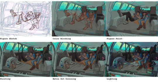
So you can see here that the first color I accessed was that bright cyan. So I start with that bright cyan and then bring in its “friends” in the form of analogous colors (shown below on the far left)

greens greys etc. THEN I know I want the characters to stand out against all the blue so I start laying down warm contrasting colors for them (middle group). the mat under them is orange, skin tones are warm, ryans flannel is red etc. then to get them to work together I work more cool colors into the shadows and slightly warmer (not too warm because its a cool img overall so in this case, greener LOL) colors into highlights.
hope that makes sense? for me choosing colors is a lot about story and composition. If you know what you want to say, the mood you want to create, where you want to go, the path to get there becomes a lot clearer imo.
Have you ever considered making an art book?
I have! But I don’t think I currently have enough...original illustrations for one LOL? Not that an art book has to be all original work but if I were putting fanart in an art book...at that point I’d just make a fanzine. I’m making more original work lately though so maybe this year....? Who knows. For now, I do have a sketchbook up on gumroad. Hoping to do one of those next year too.
Any tips for keeping background drawings from getting super stiff, especially since things like interiors have a lot of straight lines?
This is a really interesting ask. Really great question that I don’t think gets asked enough - forgive me if I get a bit art school here but I drew up some examples.
First I think we have to investigate the assumption that straight lines make things stiff. That seems true on an instinctual level and certainly proves to be true very often But I don’t think its actually the straight lines themselves but the sort of arrangements and compositions they tend to dictate. Take this for instance.
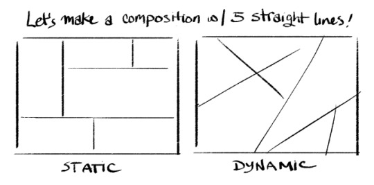
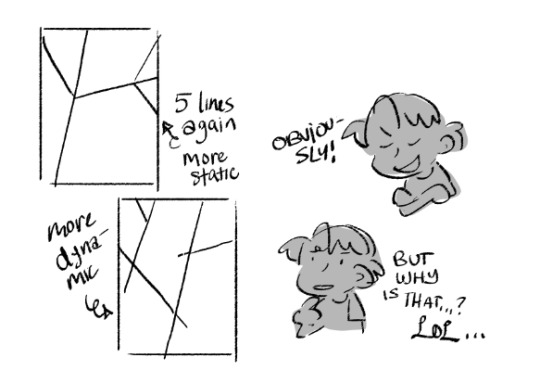
pretty big difference, right? there’s a couple things that make a composition feel stiff and one of the most significant is lines that are perpendicular and parallel to the frame. it feels locked in and solid, like bricks. but the moment you shift these angles even a little the composition instantly becomes more dynamic because our innate senses of weight, gravity, and directionality can sense movement.
But it’s not just diagonals let’s take this one step further
when lines meet and terminate together those tangents can flatten and lock space so the best way to solve this is with overlap and complete intersection, forms continuing past or behind each other feel more layered and less like a flat mosaic... again, even in the simplest line drawings. So how do we apply this to a background?
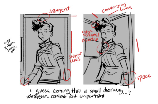
ok I drew this really fast so its potentially not the best example but I think the idea is there. This space isn’t even particularly deep, it’s basically a room, a doorway, and a hallway behind it, and we’re not seeing that much of any of those things LOL. but when you draw an environmental object like a doorway in a way that lines up with the perpendicular and parallel lines of the canvas you’re automatically flattening it and making it look rigid.
and when you create tangents with objects and characters you flatten the space around them and make it difficult to tell what is actually in front or behind or if they’re on the same plane.
GOD I HOPE THIS MAKES SENSE. Anyways. avoid those things and you’ll instantly have less stiff bgs no matter what kind of bg you’re depicting.
I wanna mention however that this isn’t to say a stiff bg with flat space doesn’t have its purposes.

sometimes you want to create parallels and tangents. it can make characters feel closed in, trapped, regimented, part of a routine, etc. it’s also great for making a composition look ornamental (especially combined with symmetry).
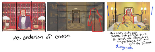
directors like wes anderson can even use these compositional elements to make images feel uncanny or harrowing! its very versatile. I think the important thing is to just be aware of when you are making something rigid and when that’s the last thing you want to do. conscious choices.
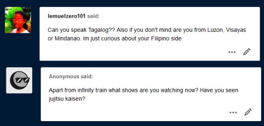
Can you speak Tagalog?
@lemuelzero101 I can! BUT NOT VERY WELL LOL ;;; both my parents are from Visayas! but they met and had me in the states lol so I’m pretty American born and raised. We go back to visit family on occasion but not regularly. My tagalog is mostly absorbed from listening to relatives at parties lol and my parents speak bisaya at home so I’m marginally better at that. Sorry to any filipinos out there hoping I’d be better educated, I’m like a little baby...
I do love meeting and talking to other filipinos online though, I grew up in an area that was relatively diverse but the asian population was small and the filipino population basically non-existent. I was like one of maybe 2 filipino kids in my highschool of 2000.
Apart from infinity train what shows are you watching now? Have you seen jujitsu kaisen?
Man this is gonna sound so boring but I haven’t watched a lot of tv lately. It’s not really part of my daily routine. Let’s see... I was sort of watching Amphibia, Craig of the Creek, and the new Digimon Adventure 2020 but I keep falling off watching those for one reason or another. Also there’s a lot of episodes, it doesn’t feel like something I can just binge and be done with.
The last thing I binged was Succession. I want that show and Euphoria back so bad, when I’m done forcing all my friends to watch Infinity Train im cancelling my HBO subscription until Succession and Euphoria return so they know exactly what I’m on their list for LOL.
I have not watched jujitsu kaisen but I’ve kept up with some of the sakuga news (I keep up with anime industry news and production info like x5 the amt i keep up with actual anime) for it and their compositing/editing looks dope. I’ve read the manga actually LOL or at least part of the beginning. I wasn’t super keen on the whole finger eating thing. Also to be honest I kinda feel like its the new Bleach and I never particularly cared about Bleach. Characters look nice enough tho. I wholeheartedly support jjk fans.
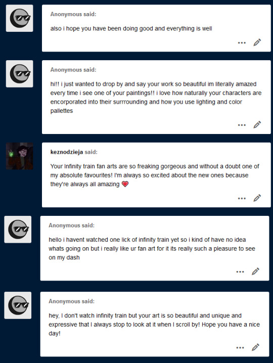
Thank you! Thank you @keznodzieja! <3
And thank you anons who don’t watch infinity train LOL...it’s always nice to hear when people enjoy my fanart despite not knowing the source material because it lifts a little bit of the “oh god am I being annoying???” fear off my chest. But also I think you should watch infinity train because it’s really good I have no reservations recommending it.
231 notes
·
View notes
Note
what is your opinion on s2 e12 btw. this sounds odd but I wanna talk about it. kinda. idk.

OK OK SO UH LEMME JUST PULL THAT EPISODE UP
Gonna start off my saying i don’t like how most of the fandom portrays LB’s and PB’s relationship </3 especially in shipping. People portray Paintbrush as irrationally angry and mean, which i see mostly in shipping context but also in just that’s their character context. Which is just, not them at all. Yes they tend to lash out and snap but not in a irrational sense. Their anger is something that builds up and once it’s reached it’s limit it’s hard for them to control and they snap, their anger has never come from no where
Saying this because this episode focuses on that relationship (while also balancing the focus with the relationship with of LB and TT) and this relationship is something that gets misread by fans a lot. Paintbrush isn’t a mean or irrational character they just have trouble regulating their emotions, and they certainly aren’t mean to their friends
This episode is great one of my favourite episodes though it’s an episode i really think should have had more focus on Paintbrush. I love Lightbulb and Testtube and their shenanigans and i like the inanimate insanity infinity thing, though i feel like we were just robbed of Paintbrush moments </3
They do definitely get some focus here but it’s shared with Testtube and Lightbulb who arguably got more focus on. The conflict (?) between Lightbulb and Paintbrush was a big focus on this episode, which i liked, they got much needed focus and development on their relationship which is good. I just kinda wanted more on Paintbrush’s feelings towards Marshmallow leaving, it was something that definitely had an impact on them and something i wish could have gotten a little more focus on
I really loved Testtube and Lightbulb interactions this episode and their relationship, which was something that wasn’t really touched on before hand. Testtube learning to see things through Lightbulb’s perspective was great
Paintbrush struggling to paint something the whole episode was super relatable (probs to a lot of other artists as well </3 them splashing paint on a canvas and just hoping to work off that is something I do- a lot-)
“Just Like Me!” Is maybe my favourite song in ii just because ough the narrative it comes with. Lightbulb being surrounded by people who are just like her, she feels like she belongs, she feels free but then that reality she starts building up falls apart. The reprise version is i imagine in both Paintbrush and Lightbulb’s perspective where they finally start to see and understand each other
I really like Paintbrush’s coming out scene, i think it’s really good and i think we need more scenes like this in literally anything. It’s wonderful to hear how much this scene means to people
I have a lot of thoughts about Salt and Pepper this episode and inanimate insanity infinity but ik there are posts out there that explain them way better than i ever could </3
Oh also fun fact Testtube originally drew sailor moon for her painting on this episode. I think about this everyday
#GONNA END THIS HERE CAUSE WOW THIS IS LONG#i could talk about other characters too but just sticking to the ones that had most focus on this episode <3#(except mic and taco oops#i’ll talk about them eventually#oh and also mephone4#primarily the scene with the cobs painting. tho again someone else has made a way better post about this then i ever could#cookie-beeloved#txt
3 notes
·
View notes
Text
RM: “I hope I’m on my way somewhere”
There are two gears in his life that RM shifts between: when he has to pick up speed as the leader of a worldwide hit-making group, and when he makes his way back home and slowly cracks open some artist’s catalogue. Let’s take a look at the time in between, at the young artist’s journey to seek out his own canvas.
Do you still work out? Your stature looks very different. RM: It’s been around one year? Since I started doing it four times a week without fail. It’s like my lifeline. (laughs) Since, if you exercise, your body gradually improves. I like to feel like I’m doing something and getting better. If you look at other people posting their progress, you can see their bodies change dramatically, but I’m not very strict about my diet, so it’s not like that for me. (laughs) Still, I can feel my frame changing bit by bit.
I saw in the “ARMY Corner Store” video uploaded to YouTube for the 2021 FESTA celebration of your eighth anniversary that your life is focused on doing work and making appearances these days. Has following that repetitive routine led to any changes in your life? RM: My daily routine has become very clear-cut. Now that it’s been exactly a year since I started doing this mid-last year, I kind of think, So is this how people live? I have to go to work and come home, then there’s things I need to do there, and things I have to keep up with like exercise. And same for checking out exhibits. And so I thought my nature itself has changed a lot over the course of a year, but I don’t know whether it’s good for me as a creator.
Why’s that? RM: There was so much that happened with BTS, but with the current situation, sometimes it felt like those things were just things happening on my phone. When I’m listening to other music or watching something I’ll sometimes think about how I would do it, but my life is what it is right now, so I can only draw on things from my own life.
In that case, how did it feel to keep up the energy for your Grammys performance and for everything related to “Butter”? RM: I was really happy that we added one more thing to our list of accomplishments. I think our team really needed the work itself. It made me realize we still have things left to achieve. And I want to thank ARMY above all others for making all of this possible. I’m Korean, so I’m no stranger to finding joy in accomplishment. (laughs) It was really satisfying and nice. It would’ve been better if we got a Grammy, but so what if we didn’t? In the end, getting it means you have one more trophy at home, and after that your daily routine repeats.
How was writing the lyrics for “Butter”? Your performance with SUGA works to kick the energy of the second half of the song up a notch, but I also think, strikes a balance to improve the song as a whole. Your short rap feels like a fusion of American pop and BTS’s distinctive style. RM: That’s the part I spent the most time on. Even though the song’s in English, I thought we should make it feel like our own, so we kept the original but put a little of our own flavor in at the end.
I felt that fine-tuning turned out well. It’s short, but I think it would’ve been a very different song without that part. RM: It’d feel like something’s missing if it weren’t there, right? (laughs) I felt like we absolutely had to have it in there. There’s something different about us from American pop stars. Our DNA is different.
How was making “Permission to Dance”? You can count on one hand how many BTS songs have a message as positive as in that song. RM: Right. They talked about putting some rap in “Permission to Dance” while we were working on it, but we said it would never work. I have more fun when I’m singing and dancing than anything else. I think this song was one of the few times that I felt like I was just having fun while singing and dancing on it. It feels amazing to give into the song with your whole body and just laugh instead of thinking about it too much. I think that’s the power of the song. I wasn’t stressed preparing for it like I was with “Butter.” When it came to “Butter,” I had to think about what we should show off and how I could do that. I’m always careful not to be a problem within the group dynamic. But I didn’t really have to worry about that with “Permission to Dance.” Honestly, I felt like I only needed to add just a dash of the enjoyment I felt.
After the unimaginable continued success of “Dynamite” and “Butter,” this song feels a little more laid back. RM: Oh, this is really fun. Just like that. And there’s a line in the lyrics that says, “We don’t need to worry / ’Cause when we fall we know how to land.” The message is universal, but you could say it’s also something BTS has been saying all along.
You talked about “2! 3!” on “ARMY’s Corner Store,” saying, “2015 to 2017 was a tough time for us and our fans.” Were you able to say that because you ended up knowing how to “land”? RM: What I do can be thought of as a sort of business—a person-to-person kind of business. That’s why I want to be as honest with ARMY as I can be, almost obsessively so. They say it can’t happen in the world of K-pop, and there’s an aspect of good faith to that because I don’t want to worry the fans, but I want to tell them about the things we’ve been through as much as I can. Another reason I talked about those times was that I wanted to pay off my debts to a lot of people. To pass over this story like it never happened would be like saying “that’s not us.” And because it’s in the past. I think that, since it’s in the past, and since we’re doing all right now, and since those days were clearly necessary, I think we have to be able to talk about just how difficult a time that was.
It feels like that was something you wanted to convey to your fans, too. RM: Sometimes we’re artists whose souls are full to our very cores, sometimes we’re meticulous office workers, and sometimes we’re part of the hyper-patriotic “do-you-know club.” We’re many things all at once—that’s why we talked about persona and ego. It’s sort of painful and lonely to want to talk about these things to this extent, but I guess that’s who I am. I want to express myself in full.
Would you say that the song “Bicycle,” released during 2021 FESTA, shows who you are as a person? You talked about your everyday emotions using a bicycle as a metaphor. RM: I’ve faced a lot of pressure while making music throughout my life to move ahead a little more or make music that stands out better, from minor things like my rap technique to bigger things like trends. I wanted to be good at rapping and I wanted some recognition. In that sense, you could say “Bicycle” is somewhat defiant. I wanted to release a song to celebrate FESTA, but the subject matter is really important to me specifically. Bicycles hold an important place in my heart, so that’s just what I ended up writing about. The song’s something like a compass, telling me where I’m at right now, I feel like. My present-day life is the input, so that was going to end up being the output one way or another.
There’s a part in the lyrics where you say, “When you’re happy, it makes you sad.” I imagined you riding your bike and contemplating your life. RM: My feelings kind of go to extremes whenever I ride my bike. My personality used to run to both extremes sometimes, but it also comes back to me again on its own when I ride a bike. When I ride my bike, I’m free from the pressure of the things I’m supposed to feel and think about. I don’t care if people recognize me, and that’s the closest I get to feeling free, mentally and physically—when I’m riding fast and feeling like I’m up on a cloud.
In my case, there’s a big bookstore in my neighborhood, and there’s times when I’ll walk all the way there by myself and think over what kind of person I am while choosing which books to buy. Somehow it makes me think of that. RM: I read a book by Lee Seok Won from Sister’s Barbershop recently. He was contemplating why he likes bookstores. He remembered how not only is it noisy, but everybody’s staring at their books and not looking at anyone else, and there’s a kind of freedom in that. I really sympathize with that. So I make time to go to the bookstore and spend a little more time reading.
I end up talking to myself just by looking at all the book covers at the store. In a way, it’s contemplation on contemplation, but it seems to be an especially necessary time for you. RM: I think I’d be pretty bored without it, since I’ve been too sheltered lately. Read! Work out! Go to galleries! Ride my bike! (laughs)
So writing “Bicycle” was an experience that you had to go through anyways, even though we’re not sure where you’ve come from, where you’re at now, or where you’re headed to. RM: Exactly. It was exactly that kind of milestone of a song for me, and I think I kept that in mind to some degree when I released it for FESTA. I agreed to do something at first, but then I asked myself what I should do and that came to mind immediately: Let’s just do something about bikes.
Even the music has deep connections to all the music you’ve ever listened to, from folk to the hip hop and Korean indie scenes. RM: You’re right. I drew on music from the people who’ve had an impact on my life—artists I’ve been listening to lately, like Elliott Smith and Jeff Buckley, and groups like KIRINJI.
It’s interesting how the end result is a song whose style is difficult to attribute to any one era. Neither the sentiment nor the sound is retro, nor do they reflect current trends. RM: I, and our team, are, you could say, at the forefront of pop, so after I made “Bicycle” we wondered whether we should go with it. But that’s actually why I ended up doing it this way instead. Because that’s what my life looks like right now. It’s good for me just to get to know myself this way, but I don’t want to trap myself, either. On the other hand, I’m interested in artists from all around the world who are totally different from me. There’s even people who make music on a whim and who don’t care about the genre whose music I’m interested in now. It’s—how should I say this? Anyway, I’m at some place in my life, I guess. (laughs)
Last year, in an interview with Weverse Magazine, you said, “I’m just 27 in Korean age.” I think “Bicycle” might be your own response to that statement—the song of someone who grew up listening to Drake in Korea. RM: You got it. Exactly. Drake’s the one who made me think I could sing, too, back in 2009 (laughs) and that’s what brought me all the way here. In the past I wanted to do something just like Drake—he influences Western music as the musical style he’s after changes. But because I don’t live my life the way they do, I can’t make the exact same music as them.
And for that reason, I figured it’s the kind of song that would end up on the playlists of people like you, as it has a style that can express that sort of person’s overall feelings more than any specific genre can. RM: That’s how it usually turns out eventually. I sometimes think this way: Can’t I put “Bicycle” on the same mixtape as some songs that are made totally off the cuff, like I just talked about? I wish I had that kind of flare or image when I made songs, but nowadays I’m really slow at making them. I can’t think of lyrics as well as I used to, either. I have more avenues to absorb new things, and yet the output coming from inside of me is ridiculously limited, and extremely slow. They say there’s plenty of stories of artists from the past going up to their canvas and being unable to pick up their brush and screaming, “Who am I?” That’s sort of how I’m feeling. I’ve been working on a mixtape since 2019, but I haven’t finished that many songs.
Well, maybe it’s because the direction you want to take with your lyrics has changed. That is, that you’re trying to express the ideas you’ve built up inside yourself, instead of your experiences or social commentary. RM: That’s why I can’t write lyrics as fast as I used to. I don’t know what I’m doing, so I have no choice but to just write first. And that’s why I think Yoongi is such an amazing person. I mean, how does he make that many songs, and so well? Maybe it’s because he takes a producer’s point of view, but I can’t do that. Not only am I jealous, but I also think the starting point when I’m making music has to be the lyrics. I just—I hope I’m on my way somewhere. But that’s how I always feel (laughs) so when I listen to my stuff from two years ago now, it already sounds old.
You’re featured on eAeon’s “Don’t,” which boasts impressive lyrics as well—lyrics that start with the color of waves and end with an image of pebbles. It seem like it’s your interest in art that allows you to keep developing such visual images. RM: I can’t say for sure, but it’s likely a strong reflection. I had seen an article where an artist said that pebbles are the perfect form: a rock worn down over and over in a series of incidents and coincidences, made into some round shape in the end. It said the artist collected pebbles for a long time, saying pebbles are so perfectly smooth without any edges, although they’re neither perfect circles nor ovals. Also, I absolutely love Lee Qoede. I saw a quote in a book about his art: “Let’s become entangled. Let us stand united. Let’s not argue. And let’s become pebbles in the new leadership narrative of my country.” He wrote it in a letter while he was working during the country’s liberation period. I thought it was, what, a very modern way to express things, for someone who lived through the chaotic political circumstances of 1948 to want to become a pebble. I felt like his words still have meaning—like they live on. I guess those two artists’ use of the word “pebble” made a very lasting impression on me.
I was impressed how the relatively large waves give way to the image of small pebbles, and then you end the flow with lyrics like, “Don’t take that name away, the one only you know,” and “I hate being just any wildflower,” about a small presence that is defined by others. RM: Yes, it was fun. I once thought how people’s relationships are like crashing waves, and I think that mixed together with my thoughts about pebbles and it came out all at once. There’s a sentence I wrote down a long time ago while I was thinking by the sea. I thought, Is there any color in the waves? When people talk about waves crashing in, what waves are they talking about? The blue waves, or the white waves? I went completely overboard with emotion when I was thinking that (laughs) but again, that’s just me. So I wrote this one sentence—“I wonder what color the waves are”—and listened to the music eAeon gave me, and it sounded to me like fog rolling over the ocean. It was really easy to start writing the lyrics since the sensory perception of that sentence overlapped with what he gave me. It was a so-called “aha moment” (laughs) and whenever that happens, the lyrics come out of me all at once. It only took about an hour and a half to write the lyrics. I thought of more lyrics later on, but I ended up sticking with the first ones.
What are you looking for that you’re thinking that much? RM: In the end, it’s really important for me to ask about who I am, and I want to express who I found myself out to be, but I’m having a really difficult time because I don’t know if what I found is right. So for now, “Bicycle” is also the result of collecting the selves I found who I think represent the best of me. Even while making a song like “Bicycle,” I have to convey—how do I put this? It’s just about me, this kid from outside the big city—an essence that I can’t get rid of, I guess. I can’t let go of the kid who used to perform in Hongdae. It’s not really something I want to express or hold onto; it’s my essence, so I don’t really have a choice. (laughs)
You’ll just ride your bike, anyhow. RM: Exactly. Exactly that. (laughs)
© source
44 notes
·
View notes