#i only signed up to design the poster in the beginning 😭😭
Explore tagged Tumblr posts
Text
going to sue the student council for causing me sleepless nights over this event
#this is of course a joke but also not#like this is voluntary work i chose to do but the event we're hosting next week is worrying me so much#it's like we as the student council are hosting it but somehow i ended up being the main responsible person#like i'm the contact person for the venue and i'm the officially responsible person to the venue on the night#and i know there's gonna be other ppl there but like none of them are guaranteed to be staying til the end or to be staying sober or#i also seem to be the only person trying to get an overview over everything... okay that's not quite true i don't handle the band and djs#but everything else basically#i only signed up to design the poster in the beginning 😭😭#sorry i just need to get this out of my system i can't sleep because i'm so anxious about this#i know it's not my fault if anything goes wrong and i know everyone else in the student council is rlly appreciative of what i do but yk#it's still a responsibility i feel responsible for#man#emma talks
3 notes
·
View notes
Text
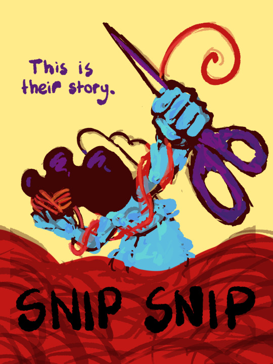
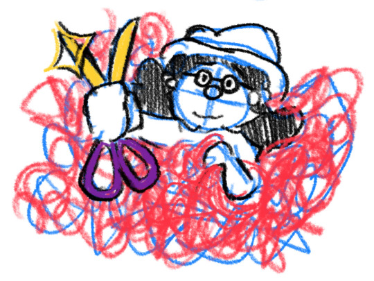
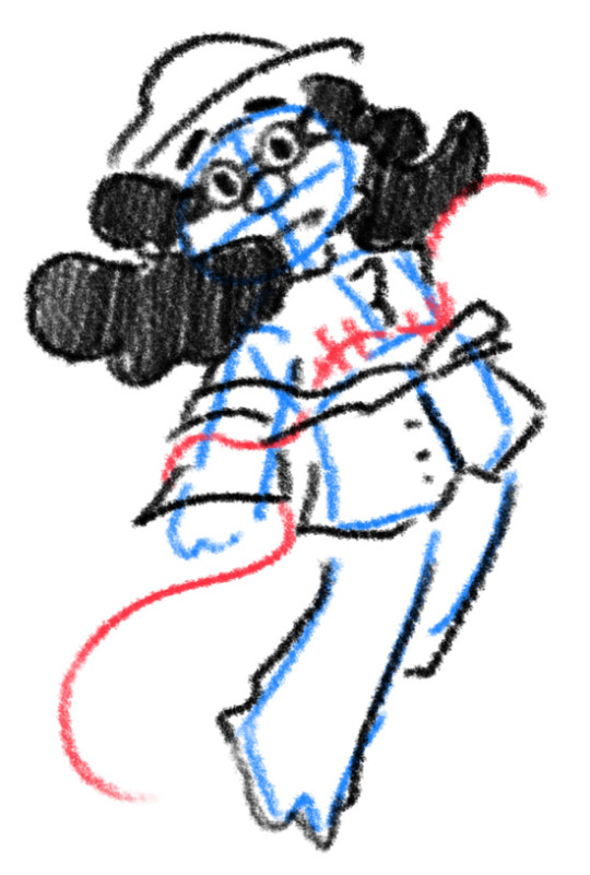
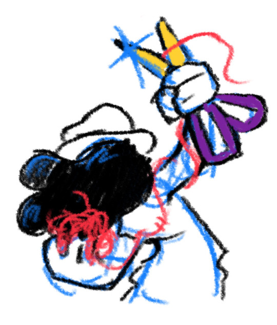
I thought I'd share the sketch of this poster/book cover as well as my initial concepts! You can click the "Read More" button for more in-depth explanations on my design process.
Thhis is all for my latest fanfiction, Snip Snip, so if you'd like to check that out, then...
Now let's crack in!
For the release of "Snip Snip", I actually had several different directions in mind! One was a comic of one of the scenes from the fanfic—specifically the one where the Professor breaks down in front of Kate and Joyce with the line "I don't like being a woman"—and the other was a series of doodles showing the Professor's transition. Unfortunately, both directions met dead ends as I couldn't find the motivation to do either. The most progress I made were these sketches.
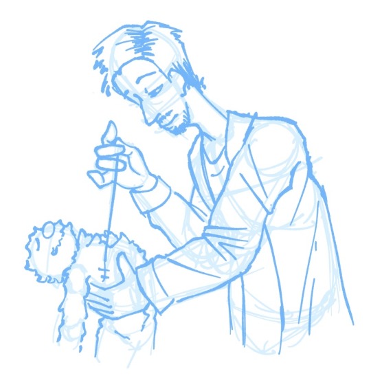
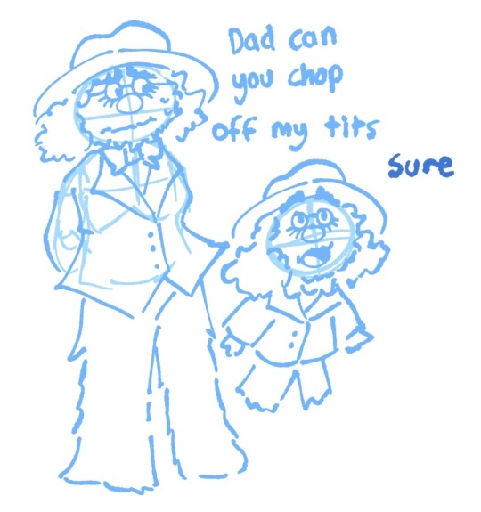
If you're wondering, "The first one looks familiar..." that's because I reused that pose for my first promo art! It was too good of a pose. I couldn't waste it :P
But anyways, after a period of getting extremely frustrated over the lack of progress, I realized my main problem: I was biting off more than I could chew. I didn't know this at the time, but I was dealing with burnout from school assignments that made drawing more ambitious ideas like the ones I had very difficult. Hence, I had to scale it down. It made me think, "Why not do something like a movie poster or a book cover?"
That's how the sketches at the top of the post came to be! I consulted a friend of mine over which pose to choose, and he picked the third one which I understand why so. The obscuring of the Professor's face not only made it cool, but it adds symbolism in how we don't really see his true identity—the real him—until his transition. Here's the first sketch!
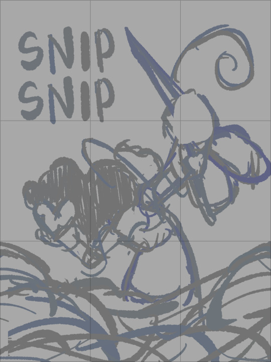
As you can see, the title is on the top left corner! However, I moved it to the bottom for two reasons
It's advice I learnt while looking up how to make movie posters since moving the title to the bottom tends to bring more focus to the illustration above.
I couldn't find a font that fits! And the idea of doing typography again (especially after the Keep Yourself Safe poster...) was really not what I signed up for.
But then it left the problem of the top corner looking empty. It was too distracting! So what did I fill it in with? The subtitle: This is their story. The composition is now more balanced, and also the subtitle tickles me.
As I said before, I looked up movie posters for this! Special thanks to the Nashville Film Institute and Muse by Clio for their articles that guided me during this poster making process. I will say though I got really sidetracked watching Filmmaker IQ's The History of the Hollywood Movie Poster 😭 It's really interesting, I'd recommend watching it!
One thing I learnt is that movie posters limit their colour palettes. Of course, this is good advice for art in general, but movie posters emphasize on its colour usage to attract the audience with their simple yet bold schemes. It is a piece of advertisement after all! Following their footsteps, I limited my colours to the primary colours (red, yellow, blue) and purple to make the scissors pop and allude to the nonbinary flag colour scheme.
And from there, it was just a matter of experimenting with rendering! I wanted a mix of pop art and storybook illustrations, so I mixed lineart with lineless, and I wanted to retain the energy of the sketch while still polishing it, so I cleaned the sketch, merged it with the colours, and painted on top of it rather than make a separate lineart layer.
Overall, I'm extremly proud of the end result! The struggle of figuring out the promo art for this fic has been tormenting me since the beginning of the year, so I'm glad to bring it to an end. Thank you for reading my ramblings! I hope you learnt something or at least had fun? Either way, have a good day!!
#this truly has been a rambles moment#i really really recommend watching that video by the way it is FASCINATING#the professor#shane madej#puppet history#poster design#art process#design process#art#artists on tumblr#sketches#concept art#chris p fried rambles#chris p fried art
14 notes
·
View notes