#i need to draw some areas out. Also iterator placements
Explore tagged Tumblr posts
Visit Tumblr Blog
Explore Tumblr blogs with no restrictions, modern design and the best experience.
Last Seen Tumblr Blogs


Fun Fact
US Tumblr user growth rate is estimated to slow down to 4.1%.
Text
Was SO SO very happy to finally get to Pebbles not only bcuz Pebbles moments but also because I finally got to ditch the MAP I HAD TO CONSTANTLY KEEP UP TO TRY TO MAKE SENSE OF.
Good news; Map gone! Bad news; Gotta make my own region maps now
#taking life as is#tlai fic#umbilicals severed au#so so glad I dont have to watch the canon maps anymore#i have to look at farm arrays and sub system a lil but thats just to base an idea off cuz our guys are going a slightly different way#im not unhappy as i sound designing stuff is rlly rlly fun#but i find it rlly funny#i need to draw some areas out. Also iterator placements
30 notes
·
View notes
Text
Week 9 - Digital Iteration & 3D Printing
To begin this week off, I began by making some minor adjustments to my fusion 360 model file. After seeing some models made by others, I realised that the lid for my bottle was very plain and boring, it was really just a cylinder which sat on top of the main figure. This didn’t look very cohesive on my foam model, so I took my model back to Fusion and made the lid look apart of the bottle rather than two separate components.

3D Studio Max
When I first opened 3DS it was extremely daunting, there were so many different tools, icons and windows, it was virtually impossible to know where to begin. After Robs tutorial however, it was much more clear as to how to navigate the program. Sorting out the tools and the overall user interface was vital as there were many commands that were useless for the work being undertaken.
Working with the different tools for editing shapes were actually much more simple than I imagined. It was interesting learning how they all work, and the extent rectilinear and curvilinear shapes which could be made. So beginning with a sphere, centering the gizmo was actually a little bit difficult at first as finding each tool amongst the multitude of different icons available proved to be the first challenge to overcome. After repeating this process a few times I eventually got the hang of it.


FF tool

Twist Tool

Relax + Taper tool

Bend Tool

Symmetry Tool

Playing with movement tool
Inserting .stl Fusion 360 Model
After watching Robs tutorial, I noticed he used a particular tool that allowed him to subtract matter from the model in a spherical shape. This tool turned out to be the proboolean tool, which allows the user to draw a 3D shape and use it as a subtraction from the base model. This interested me as my original design on photoshop had a significant divot in the centre to act as thumb placement on the bottle. I did some more research on this tool and watched this video https://www.youtube.com/watch?v=fzfEgFCtyJE. This taught me how to use the Boolean tool, very similar to the proboolean tool, performing the same function. I quickly tested it on a rectangular prism and subtracted a sphere from it, it worked extremely well.

Transferring this tool quite easy on my own model, I had to place my model in 3DS Max to establish the base component, then insert the component that will be subtracted from my model. I used a sphere, and adjusted its shape using the scale tool to suit a divot that would fit a thumb.


I also did a similar subtraction along the bottom of the bottle using cylinders, and subtracted the shape from the base.
It was amazing how I was able to make such a drastic change to my model in 3DS Max that took no time at all, but in Fusion would have taken hours to figure out. The ability to transfer the base shape of the model from Fusion and then using 3DS Max to make minor adjustments to the shape was quite amazing, and really worked in my favour.
Exporting model and inserting into Cura

I struggled a little bit figuring out which settings to use when inserting the file into Cura because when I tried to open Cura with the file supplied by the DFL, an error occurred, so I had to watch the tutorial a few times over and look on other peoples posts to see their settings used. At first I noticed that theres the Ultimaker 3 which is what the DFL has, and an Ultimaker 3s, these were actually two different machines which at first I chose the wrong one and had to set up the settings properly once again. I think some of the most important thing to consider was ensuring the model was scaled properly, ensuring the correct PLA and nozzle was selected and the speed and thickness of material coming out. At first I had the wrong nozzle, using 0.1mm and the model would have taken 9 hours to finish. Luckily, looking on other peoples posts I was able to fix my mistake.

I was unsure whether to add the supports at first, when applied the setting, the supports came up and I assumed that means they are needed in that area. Thinking about it, it makes sense that it would need them, but the general rule I discovered was that if an angle exceeds 45 degrees, then the model would need supports. I’m also quite suprised at how simple the process from slicing the model in Cura and sending to the DFL was. I sent the file, paid for it and within two-three days I received the email saying it was ready for pick up.

Overall, it was a $9 well spent. This activity was probably one of my favourites as we were able to really explore the use of different CAD programs and actually print our very own design which begun as a simple drawing. I’m really glad I fixed the lid as well, because the model looks so much better, it looks like one complete model rather than two separate components. I think doing this activity again, i’d make sure I do everything properly from the beginning to minimise the amount of time taken to make small adjustments and have to redo particular activities.
10 notes
·
View notes
Text
Creating the Book
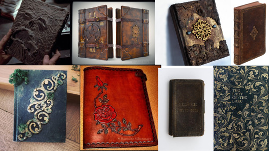
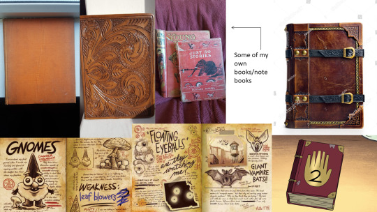
Before sketching ideas, I did some research on books that could inspire the look of my design. This included the Necronomicon from The Evil Dead (1981), the journals from Gravity Falls (2012) and a pocketbook made from the skin of William Burke, an 1820′s murderer who sold corpses to surgeons for study (bottom right image in the first moodboard, next to The Lady of the Lake).
I’m really drawn to the examples bound with aged, brown leather; there is something that feels so historical and significant about the material compared to paper or cloth covers.
I also really like the idea of including buckles on the book- suggesting there is something inside you are forbidden to see, or something trying to get out.
In my scriptwriting work, the book does something that alerts Mary’s attention, like flash with light or move slightly, so I need to include something on the cover that I could use to signal her with.
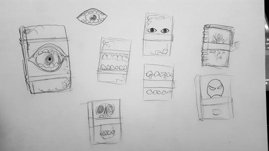
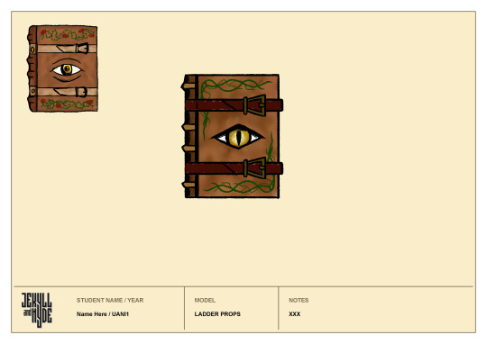
So, in these thumbnails I experimented with different covers- thinking maybe the moving jaw of a skull, gnashing mouth or a blinking eye would work well. I also played with the placement of the buckle, which was a little awkward because it needs to be either one in the middle (obscuring the cover art) or two at the top and bottom (forcing the cover art to take up a smaller amount of space. So, I decided 2 buckles would be my best option.
A blinking eye would have a real supernatural feel to it- like the book is living, almost like it is a character in of itself. Plus, it is such a subtle movement that I can believe not many other people would notice it. So, I decided to push this idea further:
As cool as the eyeball in a mouth looks, I don’t know if closing the mouth would read to the viewer as a blink. Plus, I think this is just one too many elements to try and fit on the cover, so I switched to a simple eye that looks like it has been embedded in the leather. Then I experimented with the placement of the vines- and decided it would work better around the edges of the book than surrounding the eye.
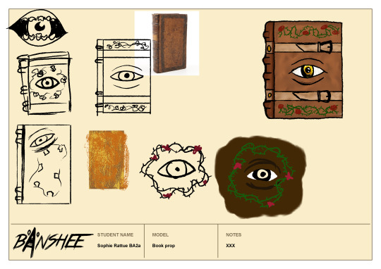
I liked the overall look of the top right iteration, but still felt like there was more I could do to refine the design. It didn’t feel ‘evil’ enough; the lines are too rounded and the colouring too light & cheerful. So, I began by re-drawing it in my chosen art style, with textured back lines. For the colouring, I used a mix of browns blended together with the smudge tool in Photoshop (eye-dropped from my moodboards) and followed this tutorial:
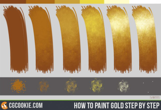
(by CGCookie (2012) Gold Step by Step tutorial, available at https://www.deviantart.com/cgcookie/art/Gold-Step-by-Step-tutorial-327175040 [acessed 10/01/21])
to give the eye a golden colour. Then, I darkened the spine to differentiate it from the cover and tried a deep red for the buckles. I think the darker buckles were a step in the right direction, but with the addition of red, I thought everything was starting too look too warm & saturated, and it was losing the ‘edge’ of my original idea.
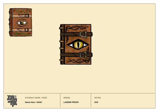
I tried to remedy this by giving the eye a sharper form and recolouring the vines in black and the straps in brown. This did help in making it feel darker & more evil, but it still looked quite bland.
Then, I added a red hue to the eye and I feel like this immediately improved the design- giving it a more malicious feel. After that I added green vines again to try and alleviate the blandness, this time as a border. To me this looks much better, it frames the eye really nicely and I used a darker shade of green so that it doesn’t look too natural or comforting. Next, I added the roses, also in quite a dark shade and I think this was the finishing touch the book needed; they compliment the red of the eye and red undertones of the leather nicely and they mark out the corners of the cover, creating additional framing for the eye.
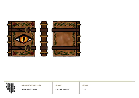
So, next I made the back & side views easily enough by copying and flipping what I’ve already drawn, and using guidelines to match up the bumps on the spine.
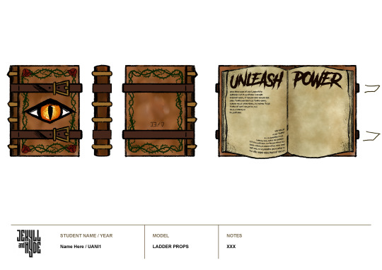
For the open position, I was heavily inspired by the journals from Gravity Falls- with their scrawling text and sketchy drawings. I began by referencing an open book, to see how the pages lie:
Then, I used a variety of textured brushes to fill in the page colour, blending them with the smudge tool and adding random speckles to the edge of the page to indicate fading or mould or water damage.
Once I had the blank pages, I then went back to the horror fonts I downloaded for making the logo and picked one called ‘Another Danger’ by The Branded Quotes on https://www.dafont.com/theme.php?cat=110. With this I added the ‘unleash power’ title and used lorem ipsum to fill out some small areas, leaving room for illustrations.
I think this font works really well, the title looks almost hand-drawn and it makes the smaller text look so much more complex- almost as if the letters are from a different alphabet.
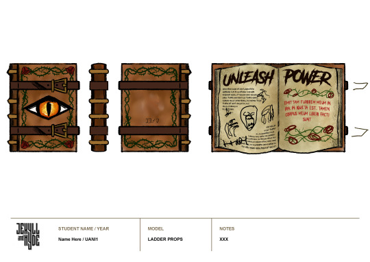
Once again taking inspiration from Gravity falls, I then planned out some illustrations and added the inscription to the other side- framed by the rose and thorn vines in order to to carry the motif through the book.
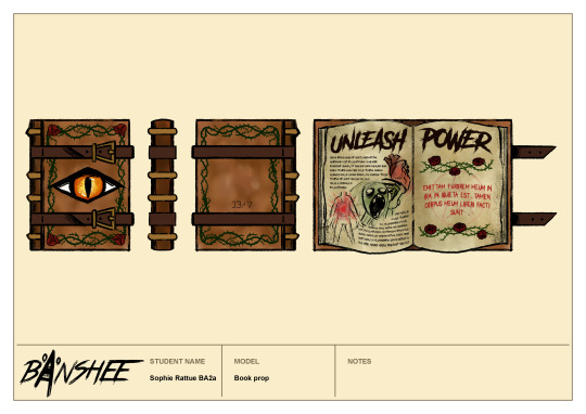
Then, I cleaned up the vines, doodled a few scratchy drawings to fill the space between text and added a faded pentagram behind the inscription. And coloured the now unfastened straps.
Overall I am so pleased with my final result. I think gathering all of that research and iterating until I was completely satisfied has made this design feel really polished. I especially love the colour palette I ended up using- it has a warmth that I can see Mary finding enticing but it also has deep, blood reds and blacks, indicating its sinister power. I’m not sure where I would improve this, maybe the leather of the book looks a little bit blurry but I don’t think this is too much of an issue. I’ll be really interested to see what critique I receive in the next tutorial.
Next, I want to try and achieve this same level of polish with the pub sign- so I’ll gather loads of images for reference to start with.
0 notes
Text
Top 30 Anticipated at Essen Spiel 2019 (#30-21)
Welcome to my Top 30 list for Essen Spiel! I wanted to do a shorter list than Gen Con, but what can I say? When there are over 1,100 games on the SPIEL ‘19 Preview List (found at www.boardgamegeek.com --thanks to W. Eric Martin for putting the list together!), then it’s no wonder that I couldn’t trim it down. However, since I had more time to put this list together than I did for Gen Con, I’m actually putting games in order from my least-to-most excited about. Keep in mind that I haven't played any of these games before. My impressions are based on information found on BGG and Youtube. All pictures found in this blog post were taken from BGG. Thanks to the people who posted photos of these games. Now, without further ado, let’s take a look at the list.
30. Pangea - Coming from Redimp Games, Aleksander Jagodziński is the designer/graphic artist, joined by Joanna Kwaśniak for the artwork. Speaking of which, the art looks fantastic! Player pieces look like fossils encapsulated in different colored rocks. The player boards feature realistic creatures that could easily pass as some long-forgotten evolutionary species that predate dinosaurs.

In this game, 1-4 players will spend 1-1.5 hours evolving and migrating their creatures across Earth in an effort to survive the catastrophic event at the end of the game. I believe there are a few different catastrophes, such as a giant meteor, to give the game more variability from play to play.
Although the game looks beautiful, I have reservations about how much I would enjoy gameplay. I like the sound of researching the time track to try to figure out where on the board the disaster will hit, but the main mechanism is area control. In general, area control isn't my favorite game mechanism. I also worry that the game might be too heavy for my tastes. Boardgamegeek (BGG) weights it at 3.5/5. In the past, I've found that my gaming group always acts interested in heavy games, but then they seldom hit the table. At the end of the day, I'm left wondering if this is a game with cool components but just so-so gameplay for my personal taste.
29. The Aquicorn Cove board game - Based on Katie O'Neill's graphic novel, she's listed as the artist for this board game, which I think is pretty cool. I like it when original content creators get involved with other iterations of their work. The publisher is Renegade Game Studios, and a team of designers worked on it: Ben Eisner, Tim Eisner, Steve Ellis II, and Tyler Tinsley.

There isn't much information on BGG about this game (for instance, there's no estimated time length or age range listed), but what caught my eye is the environmental theme and the fact that it's co-op. I like that this game is about being good stewards of the earth, highlighting human interaction with an aquatic environment. The main question I have about this game is the audience--is it a family game geared toward younger kids, or is it challenging enough for adults to enjoy, too?
28. Greenville 1989 - Designed by Florian Fay with art by David Sitbon, this looks like a darker version of Mysterium. This game is for 3-6 players in 20-45 min. and is published by Sorry We Are French. I noticed the recommended age group is age 16+, and I believe this rating is due to some graphic game content.
In this cooperative game, players have experienced a supernatural event and must describe their location, so their friends can find them. The card art evokes horror/suspense.
For example, a card might depict a creepy clown or zombie arms reaching out to grab you.

Whenever players don't guess the correct location, that character gets pulled closer to the void on the game board. If a character is lost, all players lose because this is a co-op. Together you stand, divided, you fall.
27. Race for the Chinese Zodiac - Designed by Christina Ng Zhen Wei and Yeo Keng Leong with artwork by Ray Toh, this is a racing game for 3-5 players in 40-70 min. There are two publishers listed, Starting Player and Simply Complex. I'm not sure if it's because it's an Asian game and has to go through different distributors to reach a worldwide market.
I dig the theme here. Players are animals of the Chinese zodiac, racing to be the first to reach the Heavenly Palace. Whoever comes in first will be honored as the first in the twelve-year zodiac cycle. Players simultaneously play 2 cards from their hand in order to make progress in the race. There are a couple of YouTube videos out there to help learn how the game plays (look up Heavy Cardboard and/or Jon Gets Games).
The main reason this game doesn't rank higher on my list is because my main gaming partner and I have had bad-to-neutral experiences with other popular racing games. I suspect you need higher play counts to properly enjoy most racing games.
26. AVGhost: Paranormal Investigation - Published by Mystical Games, the designers are Beatriz Alvarez and Pablo Miras, and the artists are Henning Ludvigsen, Pablo Miras, Jarrod Owen, and Nicoleta Stavarache. This horror-themed game is for 1-4 cooperative players age 16+ and takes 1.5-3 hours to play. It's a move and explore game that seems similar to Mansions of Madness (2nd ed.), but darker. Again, note the age limit.
The twist is that every character pawn has a flashlight. This game is meant to be played with the lights off. There are different flashlight lenses that will change the light's color. I think to get rid of certain spooks or to find certain clues, you have to have the right colored flashlight equipped. It seems cool, but I worry it might be a gimmick game only to be played once for novelty. Also, I'm not really a fan of horror, despite how many horror/suspense games have made it onto my list this year. What can I say? I can't get enough of co-op, and horror seems to be the popular theme for cooperative games this year. Maybe it's the success of Stranger Things and the revival of It. Who knows? I'd say it's because Essen Spiel falls close to Halloween, but that's true every year.
25. Chakra - Published by Blam! and designed by Luka Krleza with art from Claire Conan, this is going to draw eyes to the table. The gems are so shiny, the player boards are colorful and pretty. This game supports 2-4 players and takes about half an hour to play.


I'm hesitant about this game because respected board game reviewer, Tom Vasel, posted a critical review of this game on YouTube. His main complaint is that you can spend the whole game getting chakras aligned on your player board (ie. getting 3 of the same gem color lined up in a row), just to find out after the fact that the particular chakras you aligned aren't as valuable as another color you could've pursued. This makes winning feel more luck-based than skill-driven. If your opponent happened to get lucky in completing higher-valued chakras than you, you have no way to mitigate that. Despite Tom's valid critique, I would try out this game if I had the opportunity. I'm always looking for eye-catching games with simple rules that I can play with friends who aren't yet familiar with modern board games.
24. 50 Clues: The Pendulum of the Dead - Next up is the first of many "escape room in a box" type of games that made my list. "Escape" puzzle games is a fairly new genre that has taken tabletop enthusiasts by storm! This one appears to be self-published by Jeppe Norsker under Norsker Games. It supports 1-5 players age 16+ and takes about an hour and a half to play.
This is the first of a trilogy of games that should be played in order. It has adult content that can be very, very dark, so you if you're squeamish about violence, don't pick this one up. I have no experience with the game, but another reviewer on BGG who has played it warns that the content can be too heavy for some people. He wrote, "One of my co-players ended up leaving the table in the middle of playing the second story-box, and they did not want to return for the third. I have never seen this strong of an emotional reaction to a board game (not even playing This War of Mine)" (https://www.boardgamegeek.com/thread/2273440/review-escape-room-enthusiast). In case you aren't familiar with it, This War of Mine is about living in a war-torn country, so that should give you an indication of how dark this game can get. I consider myself to be the type of person who doesn't prefer violent/dark/scary content, but because this is an escape game and it has a rich storyline, I'm curious about it. I realize I've been warned, yet I'm still drawn to it!
23. It's a Wonderful World - This card drafting game for 1-5 players is created by Frédéric Guérard, illustrated by Anthony Wolff, and published by La Boîte de Jeu. It takes about 30 min. to an hour to play. I'm guessing it only stretches to an hour with 5 people or one analysis paralysis (AP) prone player. I like card drafting and engine building, although my spouse tends to beat me at this style of gameplay. I like the sound of the campaign mode, but from the BGG description, it sounds like you would have to buy expansions to play it.
22. Skytopia: In the Circle of Time - Published by Cosmodrome Games, designed by Ivan Lashin, and illustrated by Timofey Mazurenk and Andrey Pervukhin, this game supports 2-4 players and takes 40-60 min. to play.
Honestly, the only reason this game is on my list is because it has a big golem on the cover that reminds me of Century: Golem Edition. Kudos to the artists for grabbing my attention!

As far as gameplay goes, I don't have enough details, but I know it's a worker placement card game with a clock/rondel that determines cost of the cards. It's hard for me to judge this game because there's so little information. Even in terms of images on BGG, there's only the cover art! I'd be cautious with this one due to lack of information.
21. Rolled West - This is a roll and write game set in the same universe as Gold West. One of the illustrators, Adam P. McIver, is the original artist for Gold West, but this time around he's joined by artist, Ariel Seoane. The publisher is the same, Tasty Minstrel Games (TMG). TMG is known for high production games, such as Orléans, Yokohama, and Chimera Station, but they've had misses, too. They were criticized for the artistic direction they took in the reprinting of Colosseum. The designer for this game is Daniel Newman, who didn't design Gold West. Originally, I was more excited about this game, but I saw mixed reviews from Tantrum House on YouTube (https://youtu.be/zGNnZ40om5s), so I've tempered my enthusiasm.
That concludes my bottom 30. Stay tuned for my next post as I count down to my #1 most anticipated game at Essen Spiel 2019!
0 notes
Text
3 Easy Ways to Optimize Your Website Without a Developer
Website optimization whether it be for conversion, traffic, or anything else is something everyone knows (well, hopefully, knows) they should be doing.
Unfortunately, it usually gets back-burnered for new content, pages, and other initiatives.
Why does that happen?
Well, typically optimization is viewed as difficult and time-consuming. Plus, you need a developer to make edits to your site for testing, right?
Wrong.
Optimizing your website doesn’t need to be difficult or super technical. It can actually be pretty fun, or maybe that’s the geek in me talking. ;)
Here are three ways you can make it easier even without a coder by your side.
Note: I’ll be sharing more on website optimization at IMPACT Live in just 2 weeks! Get your ticket to join us here!
1. Gather Data on Your Website
Before jumping into what experiments you should run, what you want to test, and what results you’re hoping to get, there’s something very important you should do.
Get real data on how it’s already doing.
Having an actual site and user data to refer to, set benchmarks with, and compare your results to is key.
After all, without it, how can you know your optimization was a success?
You can’t.
You’ll want to have roughly 5,000 visits per month to actually draw conclusions from. If you don’t quite have that yet, bookmark this article and focus on traffic building first.
If you have this, let’s talk about gathering data from it.
There are tons of tools out there that you can utilize to gather the real user data. Here’s a peek into my data gathering “starter kit” if you will. ;)
Site Analytics
The first place to start, which isn’t (well, I hope isn’t) a shocker for anyone is Google Analytics and Google Search Console.
These tools give the visit trends and user insight foundation to help guide your experiments, and ultimately understand where you should be testing.
With Google Analytics, you’ll be able to discern what pages get the most traffic, which is typically where you want to begin optimization experiments, as well as other great pieces of information such as browser and device usage, time on page, bounce rate, and more!
Google Search Console, on the other hand, will let you peek behind the curtain of the search engine.
Put simply, it lets you manage and maintain your presence in the Search Engine Results Page (SERPs) by submitting updates to your sitemap and viewing which pages are actually being indexed and crawled.
Heat-mapping Tools
Traffic aside, you should also learn how users interact with your website, content, and calls-to-action.
Tools like Lucky Orange or Hotjar are phenomenal for this.
Using heat maps and scroll maps can shed light on areas of your website that users either don’t find value in, don’t even see, or actually get confused by.
You can even record user sessions so you’ll be able to pinpoint any roadblocks they encounter during their session.
Reviewing your heatmaps can pinpoint areas of your website or page that are important, but users never see, or that they gloss over.
That information can help you identify experiments to run regarding your button placement, hierarchy, or other elements to determine what creates a better user journey and experience. On-site Search Analytics
A pool of user information that’s usually overlooked is your on-site search. Sure, looking at the SERPs and how users are finding you is extremely important, but what are they searching for once they’re on your website?
That’s where tools such as Cludo, SearchIQ, and others come into play.
They allow you to look into your on-site search analytics to see what search terms your users are using once they’re actually on your website.
With them, you’ll be able to see what terms users are actually searching and the pages they’re clicking on so you can generate more tailored messaging and content to solve for what they’re not seeing on your site.
If users are searching for it and it’s not immediately accessible for them - that’s a big user journey issue!
2. Start Small
It’s easy to want to make big changes to your website in hopes of seeing huge spikes in results - but that can ultimately lead to missed opportunities, testing too many things, and usually require a developer. .
My advice is to start small with your optimization efforts.
Focus on high impact website pages, the 20% of your website that delivers 80% of the value.
These are typically the homepage, pricing page, and highest traffic product page, and rather than tackling huge iterations, try small tweaks. Changes in these three areas are some of the easiest and most effective changes you can make:
Messaging
The content of your page is one of the easiest things for a marketer to test and get great results with. Oh, and usually without a developer’s help
Your homepage value proposition is a strong place to start. Take your current messaging and experiment with adding statistics to show the value you can provide the user, or try explaining what you do a bit more clearly.
The messaging here should pass the 5-second test: the user should know what you do, whom you do it for, and the value you're provide in 5 seconds or less.
You can also experiment with other high-impact pages like your product page messaging.
Look at things such as how you explain the value of the different features - Does shortening it improve the scroll density on the page? What about the click-through rate on the calls-to-action (CTA)?
There are plenty of places on your site that you can find messaging to test and improve on.
Need some help with messaging? We’ve got a messaging workshop that will get your content perfectly aligned with your personas. ;)
Call-to-action (CTA) Colors
An often overlooked place to test is your CTAs. Experimenting with the color of your CTA can result in an immediate boost in click-throughs.
Optinmonster wrote an awesome call-to-action color theory article that digs into the psychology of color, and what colors typically convert best
Understanding how your specific users react to certain colors can be tremendously helpful in guiding them on their journey. It’s a great idea to create a CTA color hierarchy, where you have a specific color tier to each part of the funnel.
If it’s a top of the funnel, learn more type button, choose a more subtle color. Is it a bottom of the funnel, get started CTA? You might want to stick to greens, oranges, and reds.
ConversionXL digs even further into the CTA color debate and shows that over four different experiments, red usually does help boost conversions, but Peep Laja, Founder of ConversionXL, brings up a very, very good point.
That’s not the end-all be-all for CTA color.
Sure you may see an immediate jump in conversions by using a certain color. That’s a great start, but you need to really know what’s driving those clicks because you ultimately want quality conversions based on relevancy and fit.
Not gut-check clicks based on the button color.
Form Length
The third easy area for experimentation that can boost your conversion metrics, is form length.
This is especially helpful on your consultation request forms or another bottom of the funnel conversion points. These are typically the larger forms found on a website because we want ALL of the information, but do you really need it? Probably not.
If you’ve set other conversion points up to help you, it’s likely you’ve already collected a good chunk of information about the user, so, you can strip away a good amount of fields and leave only the important stuff.
If your form has more than five fields, and some are big questions, you’re likely losing some users. More often than not, some of those questions are things that you can get from the user after they’ve converted if they’re really a fit.
Shrink those larger forms to 4-5 fields at most, and you’ll likely see a nice conversion percent spike.
3. Use The Right Tool
You’ve done your prep, gathered data, and planned out what you want to test, so let’s get to it.
There are a plethora of choices when it comes to testing software with a range of prices. I’m partial to VWO, Unbounce, or HubSpot’s inherent A/B testing because they’re relatively easy to dive into without a developer (though it doesn’t hurt to have one)
When starting your test, it’s critical to set up controls (a variation that hasn’t been changed) that you can compare to at the end.
You’ll also want to make sure you’re not testing too many things at once. That will muddy your resulting data and make the analysis more difficult.
It’s a good idea to try and test one major change at a time, but you can also get some interesting data from testing larger changes all at once.
Whatever you do, ultimately, you’ll want to gather enough data from the experiment to see user trends and make decisions based off when you can review and analyze everything.
It’s a good idea to let your experiment run a minimum of 2 weeks, assuming you have a good amount of traffic as I previously mentioned.
If you get ~5,000 visits in 2 weeks awesome, take an early sample and begin the analysis, then see if it changes after a full month. But, if getting 5,000 visits takes a month, hold off and view it all at once.
If you can, get direct user feedback!
While the tools I mentioned can definitely give you great insight into aggregate user behavior, how they interact with your experiments, and show you solid data, it’s always a great idea to get as much direct user feedback as possible.
First-hand feedback on your designs, layouts, and user flows can shed some interesting light on areas you’d likely overlook.
It’s not as easy as you’d think to fully get into your user’s head and see things from their point of view, so what better way to do that than ask them directly!
Most companies have a few clients that have a special place in their hearts, and that’s where you can get your first round of direct user feedback.
If you have a great relationship simply ask the client for an hour of their time - if not, it usually helps to offer a small gift card for their opinions and insight.
This real-world data can help finalize your results from the experiments you ran, and clear up any final concerns you have about what you saw in your A/B tests.
You’ve heard it before, but it really is better to measure twice and cut once - and this is the way you can do that on your website :)
Test it Out!
Testing doesn’t have to be hard, as long as you keep it simple and focused. By experimenting with messaging, placement and your calls-to-action, you can make significant discoveries that may take your website to the next level.
So, get out there and start testing!
If you’re hungry for more website optimization insights, make sure to come to IMPACT Live. Christine Austin and I will be presenting a website throwdown case study detailing the good, the bad and the in-between of an optimization.
I’ll see you there!
from Web Developers World https://www.impactbnd.com/blog/optimize-your-website-without-a-developer
0 notes
Link
The following blog post, unless otherwise noted, was written by a member of Gamasutra’s community. The thoughts and opinions expressed are those of the writer and not Gamasutra or its parent company.
Hello, I’m Antonio Uribe, better known as Fáyer. I’m the Co-founder and Director of HyperBeard Games, an indie game studio based in Mexico City. The following text is a combination of an analysis and the story about the development of KleptoCats.
HyperBeard before KleptoCats
At the start of the development we weren’t in the best position. We were sad. The office had lost half of its people because the game we made before wasn’t the success we needed financially speaking, and we were a couple months away of losing the other half. All the people involved in the project thought that this was going to be the last game we made together as a team. But well, if you follow us on Twitter you know that we actually made it and we are still making games.
Where did the idea come from?
While working on the game before KleptoCats, we noticed there was a feeling of discontent towards the players of mobile games- that they only wanted free games and didn’t want to pay for quality content. With this in mind Joe and JP made a prototype as social criticism. The idea was the user would send a cat out and it would return with a random object, and the time the user had to wait would increase more and more from seconds to minutes, hours, days, weeks… The only way to make the cat come back quickly was by paying or watching an ad. I liked the concept a lot, because the objects they chose were really interesting and they caught my attention quickly. Unfortunately, The Balloons (the prior project mentioned above which failed financially) was still under development during our exploration and our boss thought the prototype was kind of silly. So, before we got to explore these ideas further we archived the prototype in our “to do” folder.
After The Balloons wasn’t the success we expected, we immediately started to work on other games. Half of the team worked on a shoot ’em up and the other half worked on a pet game with cookie clicker and world building mechanics. The whole future of the studio depended on these games. By January of 2016, only Joe, JP and me were working for the company. The boss visited us to check the progress on the pet game, which we decided had the most chance of success. The game wasn’t close to playable, the ideas were all over the place and nothing was clear. Disappointed with the state of the development he asked us if we had something that could be done before March, the official closing date of the branch. We remembered the cat idea and with a frown on his face he let us make it. After the first iterations, he was super happy with the project. I make him seem like an asshole but really he’s not so bad (he made me add this part).
Throughout HyperBeard’s history we have paused and canceled many games. This never means that the idea dies, only that it is saved for the future. The pet game was canceled at the time, but KleptoCats was influenced by it and from other games paused in the past. Alchademy, for example, took a lot of inspiration from another game that we developed years ago, mixed with a game that we are about to release soon and with the waiting mechanics of KleptoCats.
Development through iteration
In the beginning, the prototype only had the cat, several objects, and the waiting mechanic. We didn’t know where this game was going, we just started working and ideating with what we had. In three to four weeks we implemented 100 cats, 100+ objects, and the first room. We also added other mechanics like feeding, petting, the mini game, and sounds (that we did ourselves with a mic). With that we decided to soft launch in Mexico and Canada to see if people had any interest in a strange game like KleptoCats.
Thanks to that soft launch we learned a lot and found more things that players wanted in the game. In the next two weeks we added music, accessories, the possibility to change the cats’ names, displaying inactive cats in the background, GemDog, the golden cat, and the object’s descriptions. We also gave ourselves the opportunity to experiment with other ideas. We considered giving the players the ability to place the objects in the room as they wanted. We also considered having different types of cats or even other animals. At the end we decided to continue on the path we already had because it made the most sense for the current game and sometimes the benefits of the ideas didn’t make up for the time we needed to invest.
After the experimentation and the soft launch, we launched globally on March 17, 2016 on iOS and Android. We had valuable feature placement in both stores and a lot of people shared screenshots and more in their social networks. We realized even before we launched that players actually liked sharing stuff about the game.
Not everything went super smoothly, the Android feature got us a lot of attention and with that attention we were flooded with 1 star reviews because the game didn’t work on several low end devices. Those reviews put our game below the 4.0 stars threshold and it was dropped out of the feature. Lucky enough, we managed to work on some optimizations and the game returned to a good position. Now it’s a rated a very respectable 4.5.
KleptoCats’ story and fan theories
If you’re a fan of the game, you’ve probably come across some strange objects that seem to suggest that the game is somewhat more complex than it seems. KleptoCats has a story that is developed while collecting objects. Due to the randomness of the order you may collect the objects, some users may discover it sooner or but for others, it may take a while. The object that makes it very obvious that something is strange, is the mirror.
While we were developing the game, JP (the lead artist) had thought it was a good idea to put a mirror in the center of the room and draw someone tied to a chair in the reflection. That was the origin of the back story. The idea is that the character who is tied up in the mirror, IS the “player” in a certain way. That player is also the voice that describes objects and is the one who experiences what happens in the game. Something that makes the mystery more interesting is that the reflection is only seen when the object is placed. It’s not shown in the catalog and its description says “nothing to see here, just a regular mirror.”
From there we developed the story into the game and added many more objects that took the story to another level, ending with the secret codes hidden in each of the first 4 rooms that, when entered into the safe, open a special secret level for really dedicated fans.
Because of this secrecy, and the way it unfolds differently for each person depending on what objects you find, there are many fans who developed theories about what was going on. A simple Google search reveals several videos, images, and posts with theories. On our side, to keep the lore going, we decided to make a comic that gives a bit more information.
The weirdness of an idle mechanic and the mobile game dev scene
KleptoCats is weird on several levels, but the weirdest thing, by far, is the wait mechanics on which the whole game is based. Most game design strategies are meant to keep your players happy and make them play a lot. In our game we try to have them interested a couple of minutes and then let them leave because there is nothing else to do. The game was designed like a small window to a strange world. Although we make money from the little patience that some players have, we always recommend to wait instead of rushing to find everything.
We didn’t invent the waiting mechanic and we were definitely not the first ones to make an idle collection game with cats (there is Neko Atsume). At first we were criticized for having stolen this other game but, if analyzed, the games are very different. Yes, both have cats, collections and idle mechanics, but how they are played and the purpose of each are very different. I think fans knew to differentiate and appreciate each one for its unique ways.
I think the comparisons happened because both are mobile games, an area of the gaming industry that is not well received. Gamers say that mobile games are not real games, the video game press rarely talks about them, and platform users think that we are only interested in money. Mobile game developers never get respect, and the few times a mobile game catches the attention of the world or the press is because it is making a lot of money. Nobody sees mobile games like the games on console or PC.
The mobile market is a complicated platform. Not only do we get little respect in the industry, we also have to find a way to make money in an ecosystem that refuses to pay and is saturated with free high quality options such as Supercell, King and in recent months Nintendo with IPs like Pokémon and Mario. This topic could be explored even further but for now I do not want to get too distracted.
Passing along to other teammates and combatting momentum
HyperBeard is a small team, when we started KleptoCats we were only 3 people, and now we are 7. The project started with Joe (programmer), JP (artist) and me helping with everything else that was necessary. This team developed the game to the third room. From there we hired a couple more people to add more details and eventually take control of the project. Mario, Marms, and Kyu developed the game from the 4th to the 6th room. The 7th (and those that follow) are currently being developed in collaboration with another branch of the company that owns HyperBeard. Even though to our standards KleptoCats was a success, after months of work and trying to do something new, we found trying to continue the project got tiresome. That’s why we decided after months of working, it was a good idea for the original team to move onto other things while the new members could take it and give it a fresh and different vision. After a month with the new core team, we again decided that it was better to take it to other people. We discovered that it is better to cycle development teams so that it does not feel monotonous and that others can adapt part of their tastes and cultures to the game.
For games like KleptoCats content is very important, it ensures that the app stores pay attention to the game and players stick around and invest in it. Even more important than the content is the people who are working on it, you have to maintain a high morale and also keep the interest of the creators for the project. If you get to lose interest the game will suffer the absence of creativity. That’s why we decided to cycle the development.
The Dupes (duplicated objects)
Having a success doesn’t mean that everything we did was perfect. An example at the beginning of development, due to the randomness of the game, there were many complaints from the players because the cats were bringing repeated objects. Although in the game when this happens we give more coins to the user, we wanted to do something so that the player did not feel like it was a mistake.
To correct the issue, we decided to remove the repeated objects and instead show a bag of money, so it would be more obvious that we were giving more coins. It did not work as expected, although internally the game worked the same, many users complained because by only showing the money bag it was much more obvious when the cat was not giving you a new object.
Not long ago we added another feature to the game where we showed a bubble with the description of the object that the cat brings, because of that, we decided that it was a good idea to return the repeated objects so the user could see again the descriptions that are an important part of the game. Again, it backfired, there were many complaints because the cats were bringing repeated objects and many thought it was a bug in the game.
In all iterations about duplicate objects, things worked exactly the same, the changes were only graphical. Either way the fans always reacted in a negative way, which taught us that sometimes it is better not to pay too much attention to what they say and it is better to see how they act on it.
Merchandise
If you follow us on social networks, you’ve probably seen some pictures of the plushies we made of Guapo (the main cat in KleptoCats). By chance we found a local manufacturer that had some cat plushies that looked very similar to ours and we contacted them to do some tests. We liked the results so much that we shared it online and made a mailing list for anyone interested in getting one. In a couple of weeks, we gathered more than 10,000 subscribers and decided to order 100 units to test.
Selling the plushies was not difficult but we never considered how complicated and expensive it is to send the merchandise to other countries, considering that almost all the fans were from outside Mexico. The entire process took a long time and surely that was more expensive than what we recovered when we sold them. Either way, it was not a bad experience and it was worth it just to see fans from various parts of the world with their KleptoCats plushies.
Besides plushies we did other things, too. A friend helped us with a webcomic that illustrates a bit of the lore of KleptoCats. We also made several stickers to distribute in events and to our friends. The KleptoCats page has a paint tool where you can create KleptoCats and we also have a section of wallpapers for phones and PCs.
KleptoCats Today
The game’s birthday is on March 17th. Today the game has 7 rooms, 280 cats, 844 objects, many accessories to dress the kittens, and is translated into 8 languages. We are still working on the game and a new room will be released soon.
From its first day until its birthday the game has been downloaded more than 6 million times and has generated more than $800,000 (53% from IAPs and 47% from ads). In total, all users have played about 8 million hours, which is almost a thousand years.
We are very happy with the success that KleptoCats has had and in addition to putting HyperBeard on the map, it gives us the money to continue chasing crazy ideas. We are currently developing a couple of ideas and we are getting ready to be publishers for projects similar to ours.
If you read the whole post, thank you very much for your time. If you have any questions or comments, you can always go to my twitter (@fire_tony) or HyperBeard’s (@HyperBeard). On the HyperBeard website you can find more information about our other games and the contact information. Please follow our social networks, on there we are always sharing what we do.
0 notes