#i made this mostly to simplify the design for other projects i have in mind
Explore tagged Tumblr posts
Visit Tumblr Blog
Explore Tumblr blogs with no restrictions, modern design and the best experience.
Last Seen Tumblr Blogs


Fun Fact
BuzzFeed published a report claiming that Tumblr was utilized as a distribution channel for Russian agents to influence American voting habits during the 2016 presidential election in Feb 2018.
Text
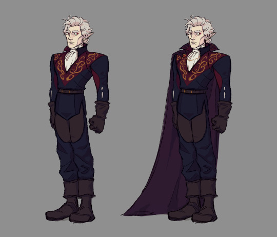
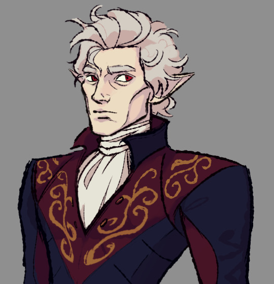
my take on astarion's new outfit!!
#astarion#bg3#baldur's gate 3#baldurs gate 3#my art#i made this mostly to simplify the design for other projects i have in mind#ill probably simplify it way further honestly#also if anyone wants to do something with my “”redesign“” feel free to#oh i should add that the back is pretty much just a simplified version of the one you can see on his concept art#The concept art is so good you guys.
749 notes
·
View notes
Text
My experience growing up as an Artist (and trying to get a job)
Buckle up, it’s a long one.
I’ve never really thought about doing an actual written blog entry on here before as I’ve normally not really had much to say and prefer to talk about my work. But I thought it could be helpful to share my personal experiences of trying to get work post-university from the perspective of an illustrator/artist. This could be helpful to you if you’ve just graduated, are thinking of doing a course at uni or are currently freelance and are wondering how to get your first break in a full-time art job. Emphasis on could.
So for those of you who’ve never met me (which is pretty much 99%+ of my followers), I’ve always drawn characters from games and comics etc. If I saw a character that blew my mind as a kid, I drew them. I had a big, lined, A4 notebook and drew in with biro pen. I drew in class when I wasn’t supposed to. I drew in my weekly planner for lessons (where you were supposed to write homework and deadlines etc) and then got into detentions because of them where I was even made to go through and cover them all up using paper and glue...Art at secondary school DID NOT help me. At all. A lot of schools don’t understand/recognise the games/comic/entertainment industry (or at least seemingly prestigious ones from the north where people make money by farming and/or settling into a mundane plane of conformative existence revolving around having kids way too early and peaking before you’re 25 before forever there after living in a bubble safely tucked away from the rest of the world and society). To be fair, schools have to cover a potentially very broad spectrum and kids don’t always know what’s best for them and where they want to end up. But sometimes kids DO know where they want to end up. To also be fair, my art teachers could see that fine art wasn’t my thing and that I was technically a good artist when it came to drawing, so they sort of gave me a lot of leeway when it came to work guidelines (one of my main teachers also looked and acted like Dean McCoppin from Iron Giant which was pretty much the best thing that could have happened there).
Anyway, moving onto University. In the UK, 2011 was the year the university fees basically tripled...The work I did at that school didn’t really help me much when applying for places. No one I knew wanted to do anything similar. And there were no adults who had any idea what I needed to do to get to the places I wanted either. So I was on my own. Suffice to say I failed at getting onto a 3 year course (which I’ve always imagined was potentially due to increased demand just before the fees went up). The lecturer doing a portfolio review with me said I had “too many werewolves” and the less said about all of that the better. I think maybe there was two werewolves, done in the same style the point of which being that one was male and one was female and I’d tried to make that visually evident. However, I was offered a place on a 1 year Art and Design course (yay...). Ironically, the foundation course turned out to pretty much help me un-learn EVERYTHING that I had spent the last 7 years being told to do. Crazy right? It annoyed me that I had to spend an extra year there (though not from the social point of view and uni life) and straight after the course, I finally began a 3 year Illustration and Animation course.
At 20 y/o (a year later than most) I started my 3 year course. I won’t say too much about the course itself as there’s a slight conflict of interest in regards to me potentially going back to lecture there soon. But in those 3 years, I gradually felt more and more comfortable to focus on producing work that I always felt I was supposed to be doing. Nothing great came out of my first year, the second year was arguably better/more professional and then finally in my third year I created a 26 page comic about monsters (which I drafted a good friend in to write the script for, bearing in mind he was on a course at the time too) which I called “Stubble” and it was the pinnacle of my artist achievements. It was a comic, but I had really developed these two characters from fairly in-cohesive and random creatures with rubber tire armour and boring shapes/silhouettes to these very much simplified, strange, stubble-y polar opposites of one another. So I figured that the ability to create characters and demonstrate that, would help get me into the games industry regardless, if I wanted to go that route.
Then we had the end of year exhibition where we could showcase our final major projects. This got me noticed by a nearby toy design company in the area. It was exactly what I’d always hoped would happen, a job offer fresh out of university. They loved my work and I did a small-ish art test for them before being invited to a job interview that went really well. Their only major concern was my art style and whether I could adapt it appropriately for the sort of work they did. I was 23 y/o at the time, I was still no expert and hadn’t spent a whole lot of time doing product design on my non-product design based course (surprise surprise). I didn’t hear back from them for a while and because I’d never applied to salaried jobs before, I just thought it was the norm. I moved to London with my then gf and pretty much lost all motivation artistically when faced with the real world and trying to make ends meet in the most expensive part of the UK as a poor ass ex-student. Six months later, they got back to me. It was a no. They wanted to stress I was very much in the running along with 2 other applicants and choosing between the 3 of us had been the subject of much debate. So that sucked. And then not long after my long-term relationship fell apart which was a nice addition so I was back to square one at home with mummy and daddy and a seemingly useless degree.
Thankfully, I had made some good friends who were still studying at my university and staying to live in the area afterwards to get work (they were all car designers). So at 24 y/o I pretty much begged them to let me move in with them so I could regain some independence and start again. I should probably mention that freelance work had been coming in post-uni in dribs and drabs. I was doing the work when I found it, but it was few and far between and not really helping me to create a uniform portfolio. I was applying to concept art and character art jobs where ever I could find them the whole time, despite really not having the portfolio to back them up because it was filled with irrelevant work such as cartoon cats I was doing for a legitimately crazy cat lady who was supposedly running a charity (but years later came to the conclusion she was more of an opportunist perpetually trying to reclaim her lost wealth and the life it had afforded her). I managed to end up working for Marvel and Lego which was weird. Though technically it wasn’t directly with either as the Marvel work was for a company who owned the rights to create licensed trading cards on Marvel’s behalf and the Lego job was outsourced to me through an agency that did media production and stuff for other companies. People always say to me “but the fact is you worked for Marvel and Lego”, and maybe it’s impostor syndrome speaking, but I don’t think they fully understand the way that kind of work...works (which is fine, but also perhaps trust the guy who’s been doing this for a living). I’d say I worked for Lego more legitimately than I did for Marvel.
24/25 y/o and my confidence was taking a beating. I kept thinking how it was never meant to be this hard (getting a job). I’d been told by pretty much everyone I’d ever met, professional and otherwise, that I was talented and yet I wasn’t getting anywhere. Add to that the fact I was having to watch all my friends find work in their chosen fields easily and I’m honestly surprised I didn’t have/haven’t had a mental break down of some sort (especially after seeing how some people my age reacted to small periods of uncertainty). I DIGRESS, I started getting bolder with my applications and began sending them to places I thought were too good for me anyway and that would need me to be some sort of artistic veteran to even stand a chance at being considered. I’d mostly stuck to companies within the UK at this point, but I was having to move further afield because I’d exhausted what seemed to be every single games company the UK had to offer and felt like my work was more appropriate for what I deemed to be as bolder and more imaginative US companies. At the time, I was obsessed with League of Legends and had begun to learn about the company behind them, Riot Games. So I thought “fuck it” and I sent an application to their studio in Hong Kong despite being terrified by the prospect of moving there. And guess what?
They got back to me.
Again, I don’t want to go into too much detail. But let’s just say I did another art test for this one. And then another. And then another. And then also another. I didn’t have a job, I was relying on my incredibly unreliable freelance work but pretty much prioritising the application process over everything else going on in my life. I was doing good work in my mind, quantity AND quality, the best of both worlds. I was pushing myself to get into a design frame of mind and applying my extensive knowledge of League of Legends to solve problems that I knew needed addressing in the best way I could.
You can see where this is going.
I didn’t get the job. I found out midday as I recall, which meant I had the whole day to wallow in self pity. But hey, I had a heap of new work for my portfolio. I was proud of it all for a few months at least and now I just feel like I have to include it in my portfolio because of how extensive it was and how much I threw myself at it. I realise now that quantity isn’t always the best thing. And I will never ever ever again draw that many iterations of a character in pencil with nice line work. It was a dumb way to work and it was slow as hell. You don’t focus on line work when you’re trying to develop ideas at an early stage, even if you’re trying to impress a big company. Part of the job is narrowing down ideas. But at the time I didn’t feel that it was my place to say what was and wasn’t good as I was trying to get in to a entry-level role and was expecting someone to make those decisions for me. I was the grunt, they were the overlord. Several months is a lot of time to exchange for a fairly simple lesson. Especially when you feel like you’re trying to play catch up in life and are now 2 years behind everyone else your age. But I’ve got to stress that I wasn’t an expert, I was still young and unlike most other people I knew, I literally had no one to advise me/ look to for tips. Which I think is something pretty much most artists go through at some point in their life seeing as we all end up pretty secluded.
The thing is, I felt obligated to share the work I did from that application because it’s unfair to ask someone to invest so much (UNPAID) time and effort into something without letting them then use that to further their job hunt if you’re to turn them down. Art tests in general are unfair. Apply the idea of an unpaid test to most other areas of employment - marketing, banking (even bar tender jobs will pay you half the standard rate if they’re trailing you for the day) and people generally respond with something like “yeah I wouldn’t do something like that unless I was paid”. Because it comes across like you don’t respect yourself. And yet that is unfortunately the world we live in as artists.

Moving on. Still 25 y/o going on 26, after posting pretty much all of that work on this very blog and whilst on holiday, I got an email from a guy called Ben saying he was from Riot Games and wondered if I wanted to collaborate on a comic together. I’d become accustomed to the word “collaborate” being synonymous with “free” so I was initially sceptical and didn’t think much of it. Instead turning my attention to the shrimps I was bbqing and jokingly telling my friends that some schmuck wanted to get free work out of me again. However, it began to become more real and eventually I understood that it was going to be a real job. Still freelance, but real. And for one of my favourite companies as well. I became one of 4 artists making web comics for Riot at the time and became pretty good friends with Ben. We made “Olaf Vs Everything” whilst the other horsemen of Ben’s apocalypse made “Crystal Quest”, “Academy Adventures” and “Punches and Plants” with him. It wasn’t perfect by any stretch of the imagination, but we had fun and did what we could with the limitations of the gig. Season 1 of the comic turned into season 2 and things seemed to be picking up. I was networking and making friends with like-minded artists across the world and suddenly didn’t feel so alone anymore.
I was super lucky to get invited to Riot’s HQ in L.A. along with a bunch of these other artists as part of Riot’s first Art Lab. It was a really crazy time in my life and didn’t quite feel real (sort of still doesn’t). I suddenly felt like I had something to back up my abilities to the friends and family around me and for once wasn’t a huge failure in my chosen field. It was a nice feeling and impostor syndrome definitely went away that week.
That was over a year ago now, which is nuts. But I still know all these guys (and more). They’re a very talented bunch and for the most part, it seems like we’re all watching each other grow and actively try to get our dream jobs. Unlike the majority of artists I met at university, who seemed to only be in it for the qualification and have long since given up pursuing a career as artists. But don’t get me wrong, there were definitely some talented folks who made it work and some who really deserved to but I don’t think have done. Skip forward a bit and I actually started work as a part-time lecturer at my university in 2018, teaching the students taking the same course I did all those years ago. Working with the lecturer who 6/7 years prior had said my portfolio had too many werewolves in it (it’s some sort of running joke). It’s nice to see that they seem to be slightly more thirsty for knowledge than my year group was. The quality of their work is also a better I’d say. More diverse. And every single one of them has a drawing tablet in their first year (most of my year group didn’t get them until 2nd year, some never did).
And now...
I spent the last few months actively sending out applications for concept art jobs again with my portfolio now containing my Artstation King Arthur competition entry in it (which has been helping me out more than I thought it would and you can see here: www.artstation.com/artwork/nQLePX). Side note - do an Artstation challenge if you can, they can be fun, push you and look great in your portfolio/cover letter. I found a job I really really really wanted that was nearby. It ticked all the boxes and almost seemed too good to be true. I did the procedural art test (unpaid of course) and had an interview. Everything felt good. Didn’t get the job. This time seemingly because of not being able to start immediately, despite the fact that all commitments I had had lined up for the next 2 months were completely cancellable. You can’t make this stuff up. So from now on, I will habitually write in capital letters on my cover letters “I CAN START IMMEDIATELY, I DON’T EVEN CARE IF I HAVE TO SLEEP ON THE STREETS IN BETWEEN WORK DAYS UNTIL I CAN FIND ACCOMMODATION, I’LL MAKE SURE I CLEAN MY TEETH BEFORE I COME IN AT THE VERY LEAST” as well as potentially screaming the word “IMMEEEEEDIATELYYYY” at any future interviewers upon hearing a “when can you start” related question. I would advise you to do the same. Well maybe not exactly the same, but y’know, just make sure they know you can start immediately. Bums in seats. Being able to start sooner = more important than being a good fit (sometimes anyway, so take that into consideration).
I’ve mostly spent this past year realising that if I ever want to have a moderately “normal” life (aka having disposable income) then I had to give up doing comics in favour of concept art. I’d already felt that way for a long time, but this year I’ve actively avoided committing to big comic projects because they simply aren’t worth the time and effort in most cases. And to note, I did have a completely separate portfolio of comic page samples I sent out to publishers in an effort to up my game and I got absolutely no where. I’m not trying to dissuade any one else from succeeding where I’ve failed by any means. But you have to be prepared to fail a lot and if you can deal with that then by all means you should try. But for me, I really don’t like the prospect of taking a huge backwards step at this point in life, and by that I mean moving back home where it’s rent-free. Perseverance is an admirable trait. Persevering despite overwhelming odds. And though there is a very big difference between quitting and knowing when to quit, I think artists more so than any other profession don’t really know how to quit. Which is a pretty brave thing in most cases. Meanwhile, with each year that passes I feel like I can relate more and more to episodes of the Simpsons where Bart and Lisa were all grown up and the major difference between the two career-wise. I love (ew grosss) my younger sister, don’t get me wrong (and don’t tell her) but she’s starting to make me look bad ahah.

Next month I’m going to be doing a crash course at Escape Studios in London learning how to model/sculpt and animate a character of my own design in roughly 4 weeks. I’m hoping that broadening my skill set to 3D will increase my employability. It will at the very least mean I can eventually apply to character art jobs and stand a chance. However, after that course I am potentially going to look for part-time/full-time work in an unrelated field of work because I don’t really have a choice.
I will keep looking for the concept art/ character art job out there that I know I’ll be good at. Because I’m in this for the long haul. And if you are as well, then I wish you the very best of luck and hope that something I’ve written here may help you out.
Your hairy neighbourhood friend,
- Tom
#illustration#art#artist#concept art#character art#jobs#game#game art#game jobs#getting a job#breaking into the industry#game industry#art life#university#graduate#no work#experience#story#life story#blog#my experience#applications#cover letter#resume#cv#drawing#school#growing up
9 notes
·
View notes
Text
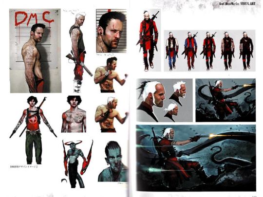
DmC Devil May Cry- Six Years Later
A few weeks ago, I wrote an essay about Dante from the Devil May Cry series and his character development across his six mainline appearances. Doing it got me thinking about the franchise and got me to get around to finishing the DMC games I own in my possession- Devil May Cry 4, which has a great combat system but is let down by having far too few environments and missions, and DmC Devil May Cry, the black sheep of the franchise and one of the most controversial reboots of a franchise. Finishing DmC gave me a perspective that only finishing something yourself can provide.
I’d owned a copy of the original launch version of DmC but found it dreary and sold it less than a quarter of the way into the game, before grabbing its Definitive Edition during a Christmas sale on really a glorified whim- sort of a “Let’s see how bad it can really get” vibe, but then I put it down and didn’t come back to it for three months because other games and other projects took prominence. But about a week ago I was bored and decided to knock the entire game out in one day due to a lack of anything better to do, and after a few days to mull on it, I decided to write an essay about DmC and how this oddball entry into an otherwise mostly beloved franchise has aged.
1) Pre-development
Devil May Cry 4 was a success for Capcom, selling about two million units in its first month of release when Capcom were hoping for 1.8 million by the end of the fiscal year. On a critical level too it walked away satisfied, with Metacritic rating both the PS3 and 360 releases of the game with 84/100, praising the fluid gameplay and intricate combat system, but knocking points off for a very repetitive campaign which saw Dante literally backtracking through Nero’s stages. But Capcom were hoping for more from DMC4. This was the debut of the franchise on not just the Seventh Generation of Consoles, but the franchise’s Microsoft debut, and the hopes were that DMC4 would be a smash success potentially on par with the numbers Western games like Call of Duty 4 or Halo 3 had made the year prior. 2.1 million was still good, but Capcom wanted more.
The mid-2000s marked a turn in Japanese game development, with the increased costs of HD modelling and Japan’s home market becoming more apathetic about buying games (some Japanese games reported only 10% of their total sales from Japan itself), while the West began booming. With the 7th Generation, gaming went mainstream for many people in the West- as an example of this, I’m sure we all know at least one person who went to college after 2007 and can share stories of nights spent playing Halo over XBox Live. The mass success of the God of War franchise in the West also told Capcom that this gold mine of a market was ready and willing to enjoy some classic hack and slash action gaming.
The decrease in local sales gave Capcom the idea that they needed to begin outsourcing their properties to the West so they could appeal to a larger market, which led to such projects as Lost Planet, Dead Rising and Bionic Commando being made by Western studios. This was largely the brainchild of Keiji Inafune, nowadays known for the utter disaster of the Mighty Number 9 Kickstarter game. Inafune had a mindset of “doing the same thing is going to get us the same results (if we’re lucky). Let’s try something from a different perspective.” Unfortunately for Inafune, his different perspective failed to set the world on fire, with only Dead Rising proving to be a success and making it into the 8th console generation when handled by Capcom’s new Vancouver team, and even that series has suffered some fatal blows due to the poor launch of Dead Rising 4.
Even though Inafune cut ties with Capcom in 2010 (a month after DmC was announced), his idea of Westernizing several dormant properties was still in effect and Devil May Cry became one of the franchises that was outsourced. British company Ninja Theory, known for their games Heavenly Sword and Enslaved Odyssey to the West, were the company Capcom gave a phone call to. While known nowadays more for Hellblade, back in 2010 Ninja Theory were known for two very simply action games that relied more on their stories and usage of motion capture and facial captures to fill in the gaps. What didn’t help was that in the interim period between 4 and the reboot, DMC1 director Hideki Kamiya had since formed Platinum Studios and proven themselves to the West with Bayonetta, a game hailed by many as a spiritual successor to the DMC franchise.
Capcom had faith in Ninja Theory to translate DMC’s vision to the west, and as such at TGS 2010, the first trailer for DmC Devil May Cry was released and... well the rest is history.
youtube
The fanbase’s hackles were immediately raised and knives were out within seconds of the launch trailer dropping. A series that had become known for its over the top cutscenes and wry sense of cheesy humor had been Westernized into another gritty, bleak product. Dante went from the goofball who quoted Shakespeare to a gravelly voiced methhead who smoked. And for a series that prized itself on action and combos, that no proper gameplay was shown at the reveal was a worrying sign. The reveal trailer tainted the whole game right out of the gate; alongside Ninja Theory’s less than stellar track record with action games the fanbase was ready to hate this game on principle if it followed what had been done to Capcom’s other franchises that went on a foreign exchange trip.
Being fair to Ninja Theory though, several extenuating factors must be addressed. Among them is series director Hideaki Itsuno’s admission that he didn’t want to do Devil May Cry 5 yet after having worked on three straight games for the series out of concern that he would suffer from burnout. He wanted to go off and finally make a passion project he had been dreaming of for years in Dragon’s Dogma, which launched in 2012. Additionally, Ninja Theory did try and make a more faithful rendition of Dante, one who even kept the white hair and vibrantly red jacket, but these initial designs were shot down by Capcom, who told them to “go crazy.” In fact one of the people who rejected the designs that were close to classic Dante was Itsuno himself, who saw little point in Ninja Theory just copying Dante’s look if the whole point of the project was a new approach on Devil May Cry.
But the fanbase at the time didn’t know that Capcom were actively encouraging Ninja Theory to experiment, and what didn’t help was the quotes coming from the game’s director, Tameen Antoniades, which would prove to be a series of disasters that plagued DmC’s PR campaign. Tameen, put bluntly, wasn’t ready for the backlash to the game and its visual style and shot back at the fans. When asked by Venturebeat how he felt about the fan reaction to the TGS trailer, Tameen “took a drag of his cigarette and without blinking or pausing to exhale the smoke from his mouth, said: ‘I don’t care.’” People began to mockingly compare Tameen to Dante as seen in the trailer, which caused some fans to question if Tameen had used his own likeness as the basis for Dante.
And unfortunately for Capcom’s PR team, he didn’t stop there, mocking Dante’s original design in a later interview when saying that what was and wasn’t cool had changed in the years since DMC1: “If Dante, dressed as he was, walked into any bar outside of Tokyo, he’d get laughed out.”
I’d like to remind you that Tameen as director of the project likely signed off om some of these alternate concepts for Dante and keep that in mind whenever Tameen or a Ninja Theory staff member talk about A) what is and isn’t cool B) Original Dante’s character design.
The fanbase didn’t exactly make a good case for themselves after the game’s announcement though, with Ninja Theory reporting that they received death threats from some more hardcore fans. It still doesn’t make Tameen admitting he didn’t care if his game sold “a thousand or two million copies” look stellar, nor his derisive attitude towards the original series and its depiction of women, mocking Lady and Trish as “prostitutes with guns.” Ironically, despite being insistent that he’d made the game he wanted to play, Ninja Theory did dial back on methhead Dante, redesigning his model to be more beefy and replacing his voice actor, alongside redoing some scenes to make Dante crack more jokes.
On a technical level, hype was low from the hardcore fans due to simplified combat and, more egregiously, the game being locked to 30FPS on launch unless bought on PC which offered an upcapped framerate. For those unaware, all prior Devil May Cry games had run at 60FPS, including DMC4 which had come out some years earlier on the same console. 60FPS was a requirement by many pro players due to how it made animations silky smooth, so DmC being capped to 30 was an immediate red flag. Suffice to say, the fandom was ready for DmC to be a disaster at launch and began prepping their funeral pyres.
2) Gameplay
Early reviews for DmC were quite positive, with the game earning a Metacritic rating about even with DMC4, but the fanbase were far less forgiving. The 30FPS framerate lock outside of the PC port (which was admittedly one of the more polished ports of 2013, as covered by the late and great John Bain) had tainted the well pre-release and then came back with a vengeance to haunt the console launch in 2013. Without a lock on system, movement felt sluggish compared to the other games, hurting the flow of combat.
Difficulty was a major criticism of the game from long-term fans, particularly pertaining to how the style rank system rewarded damage done over pulling off varied combos. Whereas in the older games the player was punished for repeating moves over and over, DmC’s style ranks were so easy to abuse that so long as the combo was never broken due to taking damage, achieving a SSS rank was child’s play. Aquila’s Tornado and Arbiter’s Trinity Smash were especially broken in this regard.
Being fair to the game, it did introduce several mechanics that were later incorporated into DMC 5 in 2019- enemies get a subtitle during their first appearance (taken from Bayonetta), weapons getting a slight glint when the player pauses to let them know they can launch a pause combo attack (also taken from Bayonetta) and a dynamic soundtrack that racketed up the higher your style rank got, alongside the killing blow at the end of a fight getting a cinematic camera angle. These are all features that were genuine improvements over Devil May Cry 4, and while Bayonetta likely paved the way for most of these improvements, DmC still served as a test-bed to experiment on their integration with Devil May Cry as a whole.
The level design was also a huge step up from the earlier games. Dante’s whip functions made platforming far more varied that it had been in prior games, and these new traversal mechanics allowed for the level designers to stretch their legs. DmC arguably has, even in light of 5, some of the best platforming in the entire franchise, and a gorgeous color palette in some areas when Dante is in Limbo. Gothic European cities were cited as a huge influence by the team, Barcelona in particular, and it shows whenever Dante is outside as he gets dragged into Limbo. The idea of the city itself being a weapon of Mundus that tries to kill Dante is inspired, with obvious homages to Inception, and allows for the designers to make environments that at the drop of a hat can try to kill Dante. The team did their best to bring their unique aesthetic mixture of grunge and color to life, and even goes through a full color script. The downside is that exploration is rarely allowed beyond side paths that lead to collectables, meaning the player is on rails for much of the game.
DmC’s largest gameplay addition is in Dante’s Devil Arms. As he progesses through the game, Dante absorbs angelic and demon weapons from the bosses, gaining Angel Weapons that serve as fast crowd control, and Demon Weapons that are single-target but heavily damaging. Both of these sets of weapons are accessed by holding a trigger button during combat, allowing Dante to fluidly switch between weapons as the situation calls for it. One of my personal favorite applications of this tactic was to use Rebellion’s opening two slices to lead into Arbiter’s Trinity Smash as it was easier for me to read the above-mentioned glint tell on Rebellion. Alongside Dante’s firearms, it gives the player eight different weapons to switch between in combat, allowing for some unique combo potential, albeit potential that isn’t as deep as the original games. Dante losing his styles from DMC3 and 4 alongside the unique moves from those styles like Royal Guarding and jump cancelling was a particularly heavy blow for the hardcore fans, to say nothing of the revulsion generated by the color-coded enemies who could only be hurt by specific weapons.
Another heavy blow for the fans was the handling of Dante’s Devil Trigger, which gives Dante his traditional color palette, slows time to a crawl and gave Dante an attack and speed boost, alongside automatically sending most enemies flying into the air upon activation. The air-boosted hurt the usage of Devil Trigger in the long run, as it reduced whatever encounter it was activated in a stomp for the player- even Dante’s basic combos could tear through enemy health with DT active. Devil Trigger in the original games was a mixture of emergency button and power boost, but here it just serves as an “I win” button on whatever enemy irks you today.
And yet for all that can be said of DmC at launch, it could have been worse. Despite being busy with Dragon’s Dogma, Itsuno still served as an executive producer of the reboot and often gave Ninja Theory advice on areas to improve the gameplay mechanically. One such story goes that Itsuno saw a design for an enemy with blades in its arms. Upon asking what purpose the blades served in combat and being told they had none, Itsuno ordered that the blades be removed. Capcom producer Motohide Eshiro later noted in a Famitsu interview that Ninja Theory had to be reigned in on several occasions in spite of the “go crazy” approach given to them in early design, in order to avoid the game receiving a rating that could potentially stonewall it being sold in physical stores in Japan.
Ultimately the gameplay failed to impress for DmC in 2013, which reflected poorly in its sales. Capcom initially hoped for DmC to break 2 million units like DMC4 had back in 2008, but then quietly lowered the projected sales to 1.2 million. Rumors circulate to this day that Capcom were so desperate to boost the game’s poor sales that when DmC was part of the PS+ membership offer in January 2014, Capcom counted PS+ downloads as part of the sales for the game. In a financial report for 2013, while not speaking of DmC by name, Capcom spoke of a "delayed response to the expanding digital contents market," "insufficient coordination between the marketing and the game development divisions in overseas markets," and a "decline in quality due to excessive outsourcing." Capcom would only report in June 2018, a full five and a half years post-launch, that DmC had met the original sale goals of 2.3 million units. But it wasn’t the gameplay that ultimately turned off the fans and prevented Capcom’s sales pitches from becoming reality. No, that matter fell to the story.
3) Story
DmC’s story isn’t so much a straw that breaks the camel’s back, as it is an anvil. Regardless of your opinions on the gameplay, the story is where DmC comes to a grinding, screeching halt and fails to capture any of the essence of what made Dante and characters from the original setting interesting or even cool. Before we dive into the narrative itself, we need to discuss what started the controversy back in 2010 at TGS, and that’s Dante.
Dante is simply not likable in the reboot. While the original Dante was a goofball and a bit of a jackass, he always backed up his actions with flashy deeds and was ultimately a good-hearted man. In this setting, Ninja Theory try so hard to make Dante cool and badass that it loops around and makes him look like a petulant child’s version of what’s cool- a hard-drinking loner who has threesomes with strippers in his trailer by the amusement park. Dante in DMC4 threw Shakespeare quotes out at Agnus, while Dante in DmC screams “Fuck you!” at demons and writes profanity on clipboards. Nothing about Dante carries that effortless swagger that the original had. His smug, IDGAF attitude tries to make him cool and more fitting for the gritty tone but it’s so different from the original Dante that the subsequent tonal clash makes Dante a much more poorly written character. Again, this is something that must be put at Capcom’s feet and not Ninja Theory, as they were the ones telling the developers to westernize Dante, but the end product stills fails to match up with what came before.
While Dante does have an arc over the game that sees him develop concern for the people close to him and humanity as a whole, the characterization and framing regularly undermines his arc. Dante is written as the archetype of “Jerk with a heart of gold,” but as a direct violation of a core rule of this character- that they must be fun to view and see their antics as an audience member- Dante fails to meet this tenant and it makes his obnoxious, smug and asshole moments taint the character and make it difficult to care for his struggles. Rather than see Dante’s dark backstory that puts his behavior into context and makes you understand why he’s so sullen and bitter, the audience just sees Dante being a smug jackass, and one who takes himself too seriously to be fun like mainline Dante. The one time I buy that Dante genuinely cares for other people is at the Order hideout raid when he stays in order to guide Kat through being arrested, and stays with her as the SWAT officers shoot her and beat her unconscious. His facial expression sells his anguish at seeing Kat be brutalized like this and it contains the best acting from Tim Phillips.
Ironically, despite how hated Methhead Dante was, I do have to wonder what the game would have been like had the developers stuck to their guns and committed to their original idea for the character- someone with psychosis who has no clue if he’s actually seeing and killing demons or if he’s just a mass murdering lunatic. It might have been even worse or it could have made the game work. It’s probably for the best we don’t know what Methhead Dante would have been like, but part of me can’t help but wonder.
It’s important to understand all these problems with Dante, since as the protagonist, the story partly rests on his shoulders. While older Dante had the charisma in most of his appearances to be able to sell the weight of a story moment when he stopped fooling around, reboot Dante’s heavy angst focus means that feat is harder for him to accomplish, and it doesn’t help that his supporting cast are less than ideal.
I mentioned earlier Tameen’s “prostitutes with guns” remark aimed at the DMC female cast, and I think it’s amazing how little self-awareness he must have had to say that when his own story’s approach to female characters is frankly insulting. DmC has one of the most sexist stories I’ve yet seen in any media, and it’s galling when compared to the mainline entries, DMC3 in particular. Kat, Eva and Lillith are all plot devices, Eva being long-dead and existing just to give Dante motivation to kill Mundus, Lillith being the stereotypical sexy villainess who gets reduced to her womb, while Kat is basically the subject of a snuff film with how she gets brutalized by the plot and the camera makes sure you see all of her injuries in extensive detail. And this all goes without saying how the second act revolves around the two female characters in the narrative being traded like Pokemon cards only for Vergil to perform the now-infamous sniper rifle abortion.

It doesn’t matter what joke you’re making in your head right now, it’s still not half as tasteless as this actual scene
Speaking of Vergil, his depiction in DmC is genuinely upsetting and while I’ve seen people argue for Dante’s arc in the reboot, Vergil is almost universally despised and seen as a black mark on the prime version of Vergil. Putting aside the sniper rifle abortion, Vergil is just not written well and he never gives the impression of being powerful. Vergil’s opening scene has him say point-blank to Dante “I’m powerless to stop you,” words that should never flow out of the mouth of anyone claiming to be Vergil. It doesn’t get much better as throughout the game, Vergil hands all the major physical parts of the plan against Mundus to Dante to preserve the secret of Vergil’s Nephilim heritage. The problem with this is that Vergil subsequently never gets to show his stuff in a fight until the very end of the game when he fights Dante and suddenly has a lot of his moveset from the old series transplanted. It makes moments like Vergil hiding behind a barrier at the hands of one demon that Dante has to kill undermine his character and make him look like a coward, to say nothing of his awkward heel-turn which just shows up for the sake of having a final boss. Compared to the depiction of Dante and Vergil’s rivalry in Devil May Cry 3, which was amazing on a thematic and character level, DmC falls flat on its own shoelaces. And the character Vergil gains through his DLC is just further unpleasantness as he rips off Bleach and the Hollow Ichigo fight wholesale. Vergil is just a mistake in this game, and alongside Dante is the cardinal sin in its writing.
Mundus represents a lot of the larger problems with DmC’s story, in particular its on-the-nose message and symbolism. The game is so focused on making sure you get the point that “Hey, we’ve seen this niche film called They Live and it’s the sickest shit also FUCK THE MAN, CAPITALISM SUCKS, WAKE UP SHEEPLE,” that Mundus doesn’t really get to be a proper villain. He’s just this stereotypical slimy corporation guy, with one slight hint to his character in that he’s obsessed with continuing his lineage. The problem is that his lack of writing makes him boring and one-note, a cliche rule-the-world dictator that’s been done to death. He’s not even a major threat in gameplay, his boss fight just being a giant blob monster. It’s visually drab and has the most boring boss fight in the game. Mundus may not have had much personality or screentime in the original DMC1, but he made up for it with a powerful presence that made him feel dangerous. This Mundus is just a bald guy in a suit. The only fear he puts in me is the fear that I’ll drop my controller when I fall asleep.
DmC’s story is a mess. While structurally well-put together, its dialogue is often weak and cringeworthy, most of the villains have no real staying power beyond Barbas, Vergil is a waste of the character name, Kat and Lillith are plot devices and Dante is just a jackass. It’s a cast of unlikable people being unlikable jerks to each other and when the story it’s making me sick with how repulsive it can be with its tone deaf themes and sexism, it’s putting me to sleep with how fucking dull it is.
4) Definitive Edition
The post launch years of DmC weren’t kind to Ninja Theory or Capcom. Capcom retracted their Western development philosophy after a string of flops resulted from it, while Ninja Theory became the whipping boy of the action community for several years post-launch, which led to the now infamous GDC presentation where Dante was photoshopped onto scenes from Brokeback Mountain by someone who had no hand in designing Dante’s old costumes:
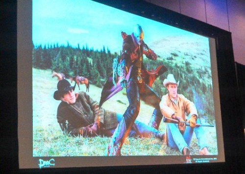

Revenge, evidently, is a dish best served cold
What didn’t help them was that 2013 also saw the launch of Metal Gear Rising Revengeance, Platinum’s take on the Metal Gear franchise that quickly gained the adoration of the action fanbase while leaving DmC in the dust. According to Dante’s voice actor Reuben Landgon, Itsuno apparently was extremely close to retiring after DmC, and Capcom had to offer him the chance to finally make DMC5 before he decided to not quit (though this story has been disputed by Capcom USA producer Matt Walker).
Capcom, like many publishers, has taken Sony and Microsoft both refusing to have backwards compatibility in the PS4 and Xbox One as an excuse to re-release many of their old titles on the new console platforms, often slapping a new coat of paint onto the game and potentially adding achievement/trophy support and calling it a day. In the case of DmC though, the team went above and beyond in solving many of the mechanical problems that players had complained about in the following two years.
Released in March 2015, DmC Definitive Edition was handled more by Japanese side of the Capcom team, and they set to work on making DmC more mechanically in-line in with the mainline entries, as covered by this extensive changelog. 60FPS was an advertised feature on the box, Dante got multiple costumes that let players play with white hair, the style rank system was retooled to punish repetition more harshly and a slew of balance changes were made to the core game- some even based on PC mods players had made of DmC’s original PC port like a lock on function, though sadly the adventures of Donté, el exterminador de demonios didn’t serve such a function.
youtube
Rest in piece, you brave soul.
The Definitive Edition goes leaps and bounds in solving the pressing issues of DmC. With the combat balanced and framerate bumped up, the combat had a much better flow to it. In particular the addition of a new mode, Must Style, where Dante can only damage enemies when he has an S Rank or higher, received a warm reception from the fans to the point where it was hoped that DMC5 would adopt it. With the DE upgrades, DmC goes from a flawed game with potential to being one of the best attempts by the West to emulate Devil May Cry’s frantic, stylish mode of gameplay while adding variety to how the combat and level design was handled. But even two years on, the damage had been done; while Definitive Edition was well-received by hardcore fans, it still failed to set the world on fire sales wise, and in fact was outsold by DMC4′s own HD remake that launched that year, even though the Special Edition was a digital only purchase outside of Japan. In fact, DMC4SE’s sales were so strong Capcom noted them as being behind the company having a good financial quarter during 2015, which many saw as an ironic nail in the coffin for any hopes for the DmC universe getting continuation.
There was no saving the story unfortunately, barring removing Vergil’s laughably pathetic fedora and one especially cringeworthy line from Lillith (”The world is at last your bitch, as am I. Nothing left, but to grab it by the hair, bend it over and-”), which means that much of the issues that DmC’s story presented are still haunting the overall product. One new scene added in the game has Dante calling out Vergil for shooting Lillith and causing countless deaths from Mundus’s rampage, but the scene was itself criticized for missing the point in the fan anger to Vergil’s .50 caliber coat hanger. And the further away the player and time gets from DmC’s outdated-at-launch messages and symbolism, the more the script just fails to entertain or educate, leaving just apathy and the ability to mock it.
5) Conclusion- Left in Limbo
DmC Devil May Cry is... alright. It’s not the worst game I’ve ever played and there’s far too many good things here for me to even call it a boring game. The level design and color palette has real moments of beauty, the combat system is a decent showing from Ninja Theory with Capcom supervision and the Definitive Edition showed that the teams from both cultures acknowledged the feedback and made a more mechanically satisfying game to play. DmC is one of the best Western attempts at emulating the over-the-top action of Japanese games alongside Darksiders 2 and does deserve credit for being a satisfying experience to play.
Where it falls apart is whenever control is taken from the player. This story is just terrible and wrought with bad choices that haunt the entire experience and taint the game by association. DmC’s cutscenes are almost slimy in how detestable they are, and it is odd that they inspired such loathing from me on my first run while I was left feeling nothing towards the entire cast other than pity towards Vergil due to what had been done to him on a writing level. I must repeat that I have never played a game as derogatory in its depiction of women as DmC and I pray I never will.
DmC is a flawed experience, perhaps one that you should experience yourself so you can formulate your own opinion on the matter. I wouldn’t recommend it for full-price but if you see it on sale for ten bucks, you can do worse- if nothing else, get some friends over and laugh at the story to get past the cutscenes and onto the mostly-decent gameplay. But you can also do a lot better, being honest. Ultimately DmC is this weird relic of Capcom’s attempts to branch out into the West, and one that ultimately just.. happened with no real lasting impact. Itsuno went on to make DMC5, Ninja Theory and Tameen redeemed themselves in the eyes of many with Hellblade and then got bought by Microsoft, while Capcom finally started to turn around and starting with the 8th console generation, made a concentrated effort to return to the “Capgod” reputation that they had before the 7th gen. Everyone came out of this story with a happy ending and got what they wanted, but that leaves DmC as this odd relic of a weird time in gaming, albeit one that certainly made... memorable experiences.
Thank you for reading.


I guess a million years just comes in at... about five or six.
#devil may cry#dmc devil may cry#dante devil may cry#devil may cry 5#vergil devil may cry#devil may cry analysis#kat devil may cry#ninja theory#capcom#hideaki itsuno#tameen antoniades
34 notes
·
View notes
Text
Sonja Danowski

In this post, Sonja talks about the creation of her latest picturebook ‘Smon Smon’, and she shares lots of illustrations and work in progress. This stunning work is published by NordSüd Verlag in Switzerland and NorthSouth Books in the United States.
Visit Sonja Danowski’s website
Sonja: When I was little, my bed was close to the window and the curtains should not be closed so I could see the night sky with its sparkling stars. I still like that today. I always wondered what’s going on up there, and imagined fantastic beings. While I lay safely in my bed, it felt very cosy, imagining all those peaceful beings and worlds.
I had planned to set a picture book story in my fantasy world for a long while, but I wasn’t quite sure how to start. There is this strange boundary that makes it almost impossible to bring our fantasy into reality without losing all its magic. But reality also brightens our imagination – like when we read a story and mentally visit entire sceneries. It’s also exactly this brightness that makes it possible to illustrate texts. Among others, I’ve illustrated two moving novels by Chinese writer Cao Wenxuan. They take place in China in the 60s and 70s, and I loved the challenge!
Illustrations and films often succeed in capturing the atmosphere, but it is always somehow different from our imagination, or it’s incomplete. With my new book idea, I had the advantage that no one except me had ever visited my fantasy world, so no one could be disappointed by my attempt to depict it. One thing that I particularly love about making picture books is that once I have a book idea, it won’t let me go and everything around me gets a new meaning. In my sketchbook, I noted what might be of importance for the plot: fast-growing mushrooms, plant forms, rock formations...
I use sketches as a tool for development, but I really have to work out an entire scene to immerse myself emotionally in the emerging imagery. Instead of making a whole storyboard, I trust that the result will tell me what’s going to happen next. With my own stories, I always work intuitively, and I especially like inventing fictive places in my illustrations, such as the home of the main characters in my picture book ‘Little Night Cat’.
Inspired by reality, I combine all sorts of things that exist in our world in order to create completely new, fictive spaces out of them. I draw and draw until the scene seems somehow authentic to me and the details tell little stories while looking at them.
With ‘Smon Smon’ I could go a step further. I enjoyed creating a world where the impossible is possible and craziness takes the place of familiarity.
I like natural-white drawing paper with a matte, smooth surface, and so thick it doesn’t curl when wetted. My first pencil drawings are always quite detailed; while playing with shapes and stony structures, I can delve into my drawing for hours, a condition I like so much! I’m not good at simplifying things; I’m a master at losing myself in details and complexity. I’m always impressed with how other artists can create a meaningful drawing with just a few lines and shapes.
When all picture elements had found their place, I could concentrate completely on the colours that added depth, light, shadow and warmth. For colouring, I used ink and watercolours, and for the final touches, sepia and soft crayons. I like ink and watercolour, which always behave unpredictably on paper – much better than I could have planned it – and I’m fascinated by how we perceive colours differently each time in relation to the adjacent tones. The planet was supposed to be a mysterious, surreal, somewhat gloomy place, so I mostly reduced the palette to a few colours that I prefer to paint with: English-red, sepia, sienna, transparent blue, and the myriad of blends.
First, the creature was on four legs and had fur, and the eyes were far too small and kind of scary; it seemed as if it hadn’t made any effort to appeal to me. It took a small eternity for me to find my main character: weird enough to pass as an alien and sweet enough not to scare. I thought that the anatomy of the beings should be adapted to their habitat, and gave Smon Smon (I later called it) an accordion neck that allowed it to pick high-growing fruit and withstand some difficulties in its search for food. I also discovered two other species on the planet: the small and strong Klon Klons and the flying Flon Flons.
Also, the plot is based on the idea of foraging. Everything doesn’t go smoothly for Smon Smon, but of course there is a happy ending. As in my childhood memories, it is a peaceful world; the beings help each other out of serious situations, and they are generous.
Finding the right words for this world happened spontaneously. This sentence came to my mind: ‘The Smon Smon live on the planet Gon Gon.’ Words with double syllables like ‘Mama, Papa’ are of elemental nature, and I found that the form and sound of the vowel ‘O’ went perfectly with the organic environment. Working out the next scenes, I picked up the rhythm and I wrote: ‘In the morning, the Smon Smon hangs its last ron ron next to its won won on a lon lon and floats away in a ton ton.’
I firstly wrote the sentence in German, but then had to test whether it also worked in English and other languages. It worked fine; it can be translated almost literally, without losing the language’s rhythm. I also liked the idea of giving the few characteristic details in my pictures newly invented names, so readers have to puzzle out their meaning and make the connections themselves. With each page and repetition it becomes easier to remember them, and there are also some clues to find in connotations: lon lon are long, ron ons are round, Flon Flons fly...
The more seriously one reads the book’s text aloud, the more absurd and funny it sounds, and the best is that all the nonsense also makes sense.
Creating a comprehensive illustration project means absorbing the story’s atmosphere very intensively. Often I felt as if I lived in my depicted world. I was fortunate to be surrounded by friendly creatures that surprised me with their weirdness and brightened my mood. While drawing, these strange creatures developed a life of their own and encouraged me – despite all the difficulties and self-doubts – to stay the course until the book was completed.
Illustrations © Sonja Danowski. Post edited by dPICTUS.
Buy this picturebook
Smon Smon
Sonja Danowski
NordSüd Verlag, Switzerland, 2018 NorthSouth Books, United States, 2018
Sonja Danowski takes us on a journey into a beautiful, mysterious world where cooperation and generosity save the day.
‘Weird, wonderful, and proof that journeying to places of uncertainty and unfamiliarity can feel extraordinarily exciting.’ —Kirkus Reviews
German: NordSüd Verlag
English: NorthSouth Books
Italian: Orecchio Acerbo
Romanian: Propublic / Signatura
Korean: Booklight
3 notes
·
View notes
Text
How to Use Visual Design to Simplify Complicated Ideas
Graphic design is a great career for people who are creative thinkers and enjoy art, technology, and communication. There are design needs across every industry, so short term graphic design courses in Pune have many opportunities to take on a range of new and exciting projects.
In business, you occasionally need to use the entire toolbox to simplify and make understandable complex ideas. Different people connect emotionally and learn in different ways. That holds true for product design, business-to-business branding and marketing, as well as both.
In essence, one of the most effective ways for people to connect is through visuals. We have used art to convey ideas ever since the first drawings appeared on cave walls. (Gifs, animation, and 3D have just made us a little more advanced.)
As the founder and CEO of a creative agency, I have found that photos, videos, infographics, and other graphic elements that are interesting and pertinent to the message work the best for messaging. Nowhere is the adage "a picture is worth a thousand words" more true than in the world of brands.
A brand is built on images.
It can be difficult to grasp a brand's values quickly. You only have a second to make an impression, so you need it to stick. Just picture the white polar bear, which stands in for Coca-cool, Cola's refreshing taste. I once went to a hot air balloon festival where a blimp advertising the brand didn't even need to fly with the name of the business on it. No one needed to know the brand name because the white polar bears on the balloon had grown so synonymous with the soft drink. Numerous iconic brand animals have become household names, including Smokey Bear, the Budweiser Clydesdales, Tony the Tiger, and the Geico gecko.
We are all aware that brands have narratives. How then do you employ audience-resonant images that are memorable? Here are some pointers:
• Choose images that seem genuine. Images that appear overly staged fail to connect with viewers.
• Keep graphics understated. Don't try to tell everything at once because it will clog up the visual.
• Use visuals to your advantage. Make a collection of images, graphics, and videos for your business that you can use to promote your brand.
Written and spoken content is driven by images.
Despite the value of visuals, many businesses create content strategies that primarily consist of the written word in posts, blogs, and articles. A product is frequently written about more the more technically advanced it is. However, the use of visuals is crucial because they can increase the overall impact of written or spoken content.
Thus, graphics, images, and videos must still be included in well-written content. For presenting data and viewpoints, you might think about using infographics. Sharing images of actual customers using your products, as opposed to stock photos, strengthens brand recognition.
Video content can be added to written or spoken content. Videos are quickly replacing written explanations as the preferred format. When using video to explain complex concepts, keep the ratio of spoken or written language and visual design in mind. Even without using words, visual storytelling can increase consumer engagement with your brand. Despite only using the song lyrics that were playing throughout, Chipotle's "Back to the Start" commercial is a perfect illustration of an advertisement that connected with its target audience.
A logo is created by visual design.
The development of a logo is the one instance in which visual design is more important than anywhere else. Companies devote a significant portion of their marketing budgets to spreading the word about their logos.
Take Apple as an example initially: How shocking was it to see an apple being bit off as a logo for a computer company? When the company was founded in 1976, no technology company was performing that. There are numerous, mostly untrue tales about how Apple's logo was created. CNN reports that some claim it was done in memory of Alan Turing, whose research served as the foundation for the computer and who passed away after biting into a cyanide-laced apple. Others have hypothesised that it represented information from the Adam and Eve story in the Bible. According to CNN, some people have even suggested that the logo represents the apple that Sir Isaac Newton believed to be the source of gravity.
What has Rob Janoff, the logo's creator, finally said about its genesis? According to a Forbes contributor who spoke with Janoff, he didn't receive a creative brief from Steve Jobs and decided to use an apple to demonstrate how user-friendly and entertaining Apple computers are. To avoid being mistaken for another piece of fruit, the apple was bit into. He later discovered the concept of computer "bytes," but he insisted that this was unrelated to the design. Doesn't that make for a great story?
The point is that a great logo should have a narrative and an approach (even if the customer is unaware of the narrative at this time). If you're just starting out with logo design, consider the following advice:
• Create for your target market. What emotionally appeals to them? What are they concerned with?
• Align the logo with your company for the present and the future. Be open-minded; once you choose a logo, you'll likely want to stick with it for a while unless your company undergoes significant changes.
• Conduct a competitive analysis. You don't want a logo that is too similar to those of your competitors or even those that are widely recognised and currently in use in other markets. See if you can find anything else with a similar look by performing a reverse image search on Google.
• Make it stand out. When people see your logo, will they remember your company? Before you make a decision, conducting some quick focus group testing is one way to get an answer.
• Ensure that your logo functions in various contexts. How does your logo appear on advertising and sales materials? Exactly how does it appear on social media? Are both small and large formats effective?
To make the most of this crucial asset for the expansion of your business, the answers to all of these questions are crucial.
0 notes
Text
June 2nd, 2022
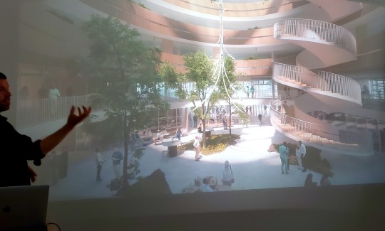
Today started with yet another bike ride (seriously, after walking 20,000 steps on some of these days, I am so, so happy that we’ve shifted back to using the bikes! What a relief on my pain. Now I’m just sore in my legs haha). We biked in some (ugh) light rain under a grey sky to find today’s studio, Yoke. Not going to lie, it was a confusing search. Google Maps lead poor Beia astray more than once, and the area, as we approached, was surrounded by housing/apartments- it definitely didn’t look at all like a place with office space enough for a design studio. But, sure enough, we turned a corner, saw a grocery store, and found Yoke tucked away surrounded by housing. Fed up with the rain, I parked, and sat waiting for everyone to arrive, shivering.
Our presentation from Yoke was so mind-opening. I feel like I’ve been saying that kind of thing a lot, but it’s so true. I had no idea that you could use design the way that Yoke does- as an immersive, interactive experience in which the technological side of things is mostly hidden. They talked about their past projects, and I was hooked. One had viewers blow the seeds off of a virtual dandelion with a hairdryer- others created interactive materials, like liquids and splashes of paint that would respond to viewer’s motions. Watching the videos, it looked as though viewers got so engaged in the experience that they may have even forgotten that tech, code, and design were involved. It seemed like an effortless bridge between the real and the digital. I honestly admired their dedication as a company to keeping the user/viewer in mind first and foremost- their experience matters more than certain aspects of creative nitpickiness, which is something I need to constantly remind myself.
I think, however, what I found coolest from this presentation was how they walked us through the creative development process of their current project for a building going up in Sweden in the next few years (if I’m remembering correctly). I forget exactly what the building is to be- perhaps a library? Either way, they first revealed that their concept was to create a piece that visually discussed the interplay between art and science, based on the idea that art and science really aren’t that different- they are both tools of understanding, exploring, and reflecting upon the world around us- one merely seeks to understand our world quantifiably, the other is more intuitively. They then showed us installations that they were using as inspiration- such as one where a bunch of mirrors would move as though alive, then, the moment a viewer walked on to their stage, they would all snap and face the viewer (like an audience, but all they’d see is their own face). Another inspiration was a room where rain would funnel down on everything except the viewer. They then showed the specific visual-conceptual inspiration that shaped their current planned outcome- neurons. Their planned final project is intended to look like minimalized/simplified versions of how med students/teachers draw neuron structures. Hearing them talk about the reasons for the choices they made were so cool- with the neurons lighting up on many individual LED panels, each ball of light (each electrical signal in the neuron) representing one person in the building- so the neurons would be firing intensely if the sensors at the doors counted many people in the building, and on slow days, only a few signals would be bouncing up and down the neurons. Honestly, I’ve never considered making designed installations of any kind, and had kind of given up on learning how to code for creative purposes, but this has honestly made me reconsider. I think, at least, I will be picking back up learning code once I’m home and have free time, if nothing else. The possibilities for design are seemingly more endless than I had initially perceived!
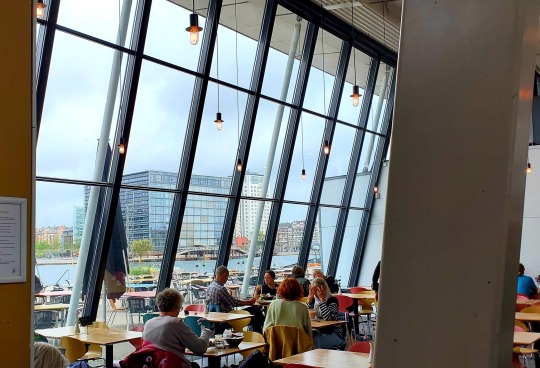
Anyways, walking away from Yoke feeling inspired and energized, I was ready for a good bite to eat. Trusting Travis and Michelle’s taste in food, I followed them to Kulturhuset, a fancy-looking cafe with a cool view of some water and other nearby buildings. I got myself some macarons (SO good), a chai latte (been drinking a lot of those lately), and a veggie burger. Travis and Beia, who also got the veggie burger, realized as quickly as I that it was so, so messy (but so good). Everyone sat and talked for a while, and I kind of went into my own head for a bit to recharge my social battery, occasionally butting in to others’ conversations when talked to or when it was relevant. I overheard Dane talking about his mission to find some cheap AirPods so that he’d be able to listen to music and navigation while still here- and his frustrations with trying to meet up with some Danish stranger on Facebook Marketplace. I only mention this, because I wound up tagging along with him to a nearby mall in his pursuit of AirPods.
Beia, Alice, Tessa, Dane, and I spent a good few hours in this mall (Forget the name, sadly). It had a huge, cool metallic sculpture, and a lot of very bougie stories. There was a huuuuge design/home store (there seem to be a lot of those here) that seemed really cool, until you realized that the cheapest item was around $20… So sad, found some good potential souvenirs, but not for the price they were. Seriously, I found a cheap piece of plastic hair clip that I could get at the Dollar Tree…. On sale for $22! AS if. It was a cool store to window shop in. Got some inspiration for a couple art projects there. We then wandered into a strange, kind of sketchy store. The first half, as you windingly walked in, was filled with fidget toys and weird, off-brand bootleg Among Us figurines. Then, as you went in, there was a brief office supplies section, and most of the store turned into party supplies? There was also cheap candy and a sketchy boba bar attached that I didn’t try, boba lover as I may be. Some things are too sketchy for me, and I wasn’t about to find out if that boba was any good. We had some more fun wandering in and out of stores. Their was somebody filming something in the mall, taking up a huge chunk of walkway, then, later, we helped Dane pick out some polos (decidedly, green is his color). There were also these cool walkways that they had instead of escalators, that was like the ones you’d find in an airport, but for going up. We decided to chill and try some of the weird Starbucks flavors available here (oddly enough, this was the very first Starbucks I have seen literally the entire time that we’ve been here. The only one.). As we sat, we discussed zodiac signs, why not to trust air sign men (especially aquarius men), and found out that I had known Alice’s ex boyfriend, Vincent, who apparently was an Aquarius man! Makes sense. As we drank, some weird band came walking by through the store- with a bunch of men who had interesting haircuts (ponytails only, basically, bald elsewhere). So that was neat. We eventually finished our drinks, made a few more stops to windowshop, then decided to leave and head separate ways.


Beia, Tessa, and I headed back into the city to walk around and do some shopping. The entire time I’ve been here, I’ve been meaning to research nearby metaphysical stores, which, lucky me, I wound up just randomly stumbling upon one! It was similar to ones I’d been to back home, but a lot more organized- and with some really cool tarot decks. Mind you, I already have 6-7 tarot decks at home. But I have adult money, and cannot help myself, and bought this amazing Art Nouveau inspired deck that the woman at the counter recommended. Got a nice crystal as well. We left, kept walking around in search of a cart that had been on the street the other day selling roasted nuts. No such luck. Tessa wound up taking off, since the dorms were just a block or so away, and Beia and I, hungry now, revisited the delicious bagel shop we went to one of our first days here. I really should have tried another flavor, but I couldn’t help but to get the Serrano again. Mouth-watering. So much pesto… so many crisp, fresh veggies… whatever meat goes in a Serrano…. Literally nothing tastes this good in the states. Nothing. I am spoiled rotten and probably am going to hate all of the food once I get home. I mean, how can’t I when I’ve stayed this long in a country where even McDonalds burgers look like fine dining! Not. Fair.

Beia and I were getting tired, but wanted to make a few more stops. We wanted to check out this amazing poster store- they had a little bit of everything for every one. Some of the posters were huge. I wish I could’ve gotten something, but I didn’t want to risk taking a poster home and bending it. But seriously- they had vintage art, modern graphic art, art of the city, music-based art, cartoons, modern musicians, and a lot of art historical posters. Could’ve spent hours in there if my feet weren’t acting up and were I not bummed out that I couldn’t get anything big. We then went to go check out a building I had biked past that, in Danish, translates to “Woman House” and had a bunch of cool, eye-catching feminist merch in the windowsill but, alas, its interior was shut down for the day. Before either of these stores, I also had tried to go to a nerdy store to get Mason a souvenir, but the guy inside wagged his finger at me and shoo’ed me away. Bummer.
Anyways, we would have been done for the night, as I personally was super tired, however, there is a 5-6 day rave called Distortion going on all throughout the city, and I wanted to say that I had at LEAST been to it once. So Beia, Tessa, and I geared up, got snazzy, and hit the city to head to the meat-packing district for a “Distortion Street Party.” Figuring out the train was soooo confusing. We almost went to the wrong machine, couldn’t figure out how many zones we needed, barely knew how to get our tickets- almost didn’t because the machine was being stubborn… It was a lot. All for them not to check our tickets once anyways. Lame. Anyways, we made it to Vesterbro (again, the meat-packing/red-light district) to, in fact, find a street party of hundreds and hundreds of people. But, the further we walked in, the more we realized it was just people sitting at benches with friends getting wasted beyond all recognition. We, at this point, had a faint hope of partying for at least an hour, and got some cheap fruity vodka in a can drink. There was, maybe, music in one or two corners of the Main Street. Mostly benches, and garbage, and drunk humans falling over, and broken beer bottles, and people going around collecting cans to make money off of returning them to machines. Seriously. Might have been fun if we were drunk, but seeing all of this sober/buzzed at best just had me feeling sad for the people who have to clean up the mess.
We were going to head to the club that I had gone to a few nights before, Jolene, in hopes of recovering the party spirit of the night (and hoping not to have wasted our time and train ticket), and, in our quest, found a few areas of dancing. One spot seemed very promising- Beia was just talking about wanting to go to a Silent Disco, and a silent disco we found! Excited, we crawled into line for headphones and got ready for a new experience. We got closer, and closer….. and the guy said “We’re closed!” Right as we reached him. So that was fun. We, again, headed towards Jolene. Stopped again, found another area of dancing- a tightly packed crowd that, closer to the stereos, had more dancing and excitement. But, really, most of the people were awkwardly standing around and talking. Super hard to get your boogie on if people just aren’t into it. So, tired, and having an early morning the next day, we gave up on our quest and headed back to the station. Did you know that they charge you to pee in Copenhagen’s Central Station? I was going to fall for the scam, but my card reader didn’t work on their machine. What a scaaaam. Anyways, figuring out the train home was a little bit stressful as well but we got ourselves sorted out. We hopped on, made it back to Norreport, and immediately snacked at the 24/7 McDonalds. I got this weirdly foamy banana shake (probably just not artificial, ngl) and some nuggets with this delicious garlic sauce. Again, gourmet McDonalds compared to the phony stuff American McDonalds sells you. Really fresh food to actually savor, not to buy out of desperation (Which we kinda did anyways). We just went home after eating, but maaaann was I sore. I think I’m falling apart at the seams, pain-level wise, but it’s all kind of numbing together. Both excited for tomorrow- revisiting Sweden for a longer time than just for lunch- and scared- for my poor, poor pain levels. What a day!

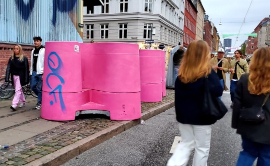
(P.S.; These were the “bathrooms” they had available for women at the street party…. Quite literally zero privacy)
0 notes
Text
Escape from Boring Embroidery and think of Applique as well as CUSTOM PATCHES
Although hand embroidery and appliqué have actually been around for millennia, digital equipment needlework is only about 40 years of ages custom patches . Before its advent, the Schiffli needlework equipment was designed in 1863 which was a fully automated device that later on utilized punch cards to embroider CUSTOM PATCHES.
Sports jerseys always have been the most preferred kind to utilize appliqué in our industry, complied with by preparation and college looks. Appliqué-- stitching stacks of fabric in addition to a history fabric-- was modernized with digital machine needlework, which considerably sped up manufacturing and also made it extra price effective. Abercrombie & Fitch, Starter and also many vintage streetwear brands helped leader exactly how we use appliqué in custom apparel. Applique is different than the CUSTOM PATCHES.
Today, appliqué and also specialized stitches-- past the satin and fill ranges-- can aid you damage free from fundamental, level embroidery as well as offer your clients a garment that will attract attention and also develop greater perceived value. Anyone can digitize a logo and include it to a garment, but have you sought various other stitches that have even more passion and also retail appeal?
Below, I will certainly share stitches I have utilized or seen in retail that could fit your demands, relying on the CUSTOM PATCHES style as well as general look you want to achieve.
Specialized Stitches for applique
Bean: This stitch type is more common with slim manuscript fonts or developing lays out of beefy typefaces or concept layouts. Choices include a single-row bean sew that has 2 to 3 stitches or a chunkier appearance with five to six passes to give the appearance of hand-embroidered thread.
Chain: This stitch type mostly was stitched by hand up until the 1800s when a maker was created to replicate it. You require a special equipment to create a true chain stitch, however a typical needlework device can produce a synthetic chain stitch. It essentially utilizes triangulars layered on top of each other to give the appearance of a chain loophole. I like this stitch due to the fact that it can take on several style styles. It is likewise made use of in CUSTOM PATCHES styles.
Lofty as well as Loose Satin: This appearance is attained by utilizing washaway felt beneath the stitch, but in addition to the garment. By producing a loose satin stitch, the really felt runs away during a post-production wash. Burmilana or cotton-wrapped polyester strings provide this stitch type a vintage, hand-sewn appearance.
Cross Hatch: According to the specialists, some specialized stitches, such as cross hatch, can be simplified to carry out by your software application. A specialized device for point-and-click project or an unique fill kind that respects each "cross" on a grid can be triggered so as not to plant or split them at the edge of a defined form.
Specialized Threads
Burmilana, a 50% acrylic/50% wool thread, has a natural thread appearance. Kramar says it's ideal to postpone webcam timing with this thread type to give the hook more time to order the loop. Due to the thicker string, there is even more friction than your typical polyester/rayon string. Usage polyvinyl alcohol (PVA) backing with this string type, as it totally washes away in the first wash. If you do not have access to PVA backing, use a tearaway selection. PVA is also used in CUSTOM PATCHES production.
Various other specialized strings consist of Spun Poly, an option to Burmilana string with more tensile strength as well as a vintage look. Matte Frost is a true matte-finish polyester embroidery that is an alternate to regular string that has sheen.
Coloreel modern technology is a development that immediately colors embroidery string during manufacturing with unrestricted colors. The device can be included in any type of existing business needlework machine as a head accessory, making it possible for special layouts and also greatly boosting overall manufacturing performance. A terrific way to make vivid CUSTOM PATCHES.
Appliqué & Fabrics
Appliqué is an underused decor technique that can generate considerable worth for your business and customers. Modern modern technology allows this technique to be achieved with a laser. Unlike 10 years ago when it was hard to source appliqué domestically, makers are presenting extra economical lasers so it can be performed in home.
A couple of providers also supply pre-made appliqués that can be applied either via needlework or warm press. Below are some typical and also specialized fabrics that will aid you get familiarized with appliqué. You can likewise utilize CUSTOM PATCHES as applique with unfinished edge; then do the side on your embroidery equipment.
Tackle Twill: These can be letters and numbers utilizing nylon or poly twill that give a sports look. When reduced with a laser, the artificial textile's sides can be singed so it looks ideal with a zig-zag or satin-stitch boundary.
Felt: This textile supplies a typical prep/collegiate appearance as well as is perfect for fleece. It likewise can be singed when cut, so utilizing several laser passes with much less power will certainly assist lessen any type of scorched appearance. Bean or chain stitches are excellent tack-down alternatives, and also really felt additionally helps achieve vintage and streetwear looks.
Jersey: Using single or several layers of jersey offers a soft, pliable appearance. If the sides are revealed, the textile will certainly huddle when washed. If you utilize Multiplayers, Use contrasting shades with multiple layers to add aesthetic interest.
Various other fabrics, such as cotton twill, canvas, Bedford twill as well as denim, additionally will certainly fray with exposed sides, leading to a vintage appearance that has actually been repeatedly cleaned. PU Leather, which features a polyurethane surface, as well as mini suede can be engraved, debossed or embroidered directly. They give a rustic look and also are suitable for the outdoors as well as farming/ranching markets.
What Big Brands Do
The objective is to make your needlework or appliqué show a style that looks authentic. Designers do it via screen printing, so why not here? To learn more about what's prominent on the market, begin a Pinterest board to collect pieces that vary and appealing. Include vintage items, sports designs and also streetwear looks to cover most audiences. Brands like Abercrombie & Fitch, Hollister, Aeropostale and also American Eagle all have a lot of eye candy for embroidery and also appliqué. Multimedia decoration using display printing and appliqué also is preferred with such brands.
Take notes on garments shades, textures as well as typography. Modern brand names like Superdry, Ralph Lauren and also Jack & Jones frequently use specialty stitches, CUSTOM PATCHES, and appliqué throughout several designs. Don't forget to get more innovative with your customers in the process. While the here and now instances might not resonate with your clients, come to be a branded-apparel expert and also reveal what is possible when timeline, budget as well as target market are considered.
If you don't have the experience or tools to do this in residence, look for calculated partners that can aid. With the best vendors in place, you can supply extra for clients and also the internet earnings will certainly be more than what you can achieve in house.
Do not wait to try out specialized stitches, strings as well as appliqué-- even if you utilize an existing design. Your brand is a fantastic means to reveal what you can do for clients. If you are looking for even more sources to enhance your skill level, contact me and I 'd rejoice to direct you in the best instructions. Just bear in mind: Thread is not dead.
0 notes
Text
Genice Chan on BNA and Collaborating with Studio Trigger
Studio Trigger is no stranger to cross-cultural exchange. Their anime projects (Promare, Kill la Kill, Little Witch Academia) frequently pull inspiration from Western sources ranging from American children’s cartoons to Hollywood blockbusters. Their latest merging of East and West comes in the form of an unexpected hire: the young Chinese-Canadian illustrator and animator Genice Chan (Twitter, portfolio site), who works at Canadian studio Giant Ant but provided concept designs and directed the ending animation for Yoh Yoshinari’s noir-tinged anthropomorphic animal saga BNA. Yoshinari is himself a fan of Western animation, but Genice’s colorful, graphic style really grants BNA a unique look and feel compared to its Japanese contemporaries.
In a podcast episode available exclusively for Ani-Gamers Patreon subscribers, I sat down with Genice for a lengthy interview covering her remarkable career, striking art style, and the challenges and rewards of working remotely with the Trigger team. The following transcript covers a small portion of our conversation. For the full interview, subscribe for $5 a month on the Ani-Gamers Patreon!
Ani-Gamers (Evan Minto): You worked with Yoh Yoshinari and other members of the team during the design phase. What kind of references did you use during that process?
Genice Chan: In the very beginning there was a Pinterest board. But then, throughout the production, they would also put together packages of reference pics of the direction they had in mind and stuff like that. Then on calls, they'd be like, “what should this character’s cloak look like?” And I'd send them a picture of a Snuggie. Then they’d send me a picture of these Star Wars soldier dudes. The stormtroopers or the red robe guys.
Ani-Gamers: Oh wow yeah! That could either be the ones from Return of the Jedi or The Last Jedi.
Chan: Yeah I think for that conversation it was about Nazuna’s cape. They were like, “we want her to have a cape but we want her arms to be able to stick out.” So I'm like … “cape where the arms can stick out ... a Snuggie?” They were like “what’s a Snuggie?” so I said “here’s a Google Image pic” and they like “huh, no.” And then I think it was [Trigger producer] Will Feng that was like “how about those Star Wars dudes?”
Ani-Gamers: What kind of adjustments did you have to make to your art style for BNA?
Chan: I kind of see my style as a toolbox where I have a bunch of different tools. Depending on the needs of a piece or a project I just pick up different tools and throw them together. I think for BNA, what they liked from me is probably the colors, but also maybe the graphic-ness. And the focus on shape language in some of my work. So when I did image boards and stuff for them, that's kind of like the area that I leaned into. (EDITOR’S NOTE: Image boards are colored pre-production sketches showing vignettes of key scenes and locations.)
Ani-Gamers: So you got initial sketches from Yoshinari and then did image boards based on those?
Chan: What I was doing was a mix of character design and image boards, or character concept design. So for character concept designs, a lot of it was based on sketches that I would receive from Yoshinari. For the image boards, sometimes I only had the script to work off of. Other times there were also storyboards, which are usually by a mix of people.
Ani-Gamers: It sounds like you were integrated on an episode-by-episode level, not just doing a bunch of overall pre-production for the style of the show. You were actually on each episode getting in and designing stuff?
Chan: Yeah. There are a few things that ended up directly in the show, which I think is pretty cool.
Ani-Gamers: What are some of them that you're proud of?
Chan: For the sequence in episode eight with Shiro’s backstory, the art style change, I got asked to do the visual development for it. I did some frames for them and some of my art ended up in the final scenes.
Ani-Gamers: You were the character concept designer, but Yusuke Yoshigaki adapted your designs into the final animation-ready ones. How closely did you work with him?
Chan: I actually never interacted with him. Would love to though.
Ani-Gamers: Wow, so you basically left sketches and notes and things, and then it was communicated through Yoshinari or [producer] Naoko Tsutsumi?
Chan: I think Yoshinari and Tsutsumi would pass things down to people. I would write stuff when I could think of stuff to write, and then everything needed to get translated. I'm not actually sure how much of the stuff I wrote got translated. I think sometimes not all of it was.
Ani-Gamers: How developed were the initial sketches from Yoshinari when you got them? How many of the decisions were already made about what the characters were going to look like or even what animals they were going to be?
Chan: For the main and side characters, everyone that has a role in the story, they decided the animals. In my opinion Michiru and Shiro’s designs aren’t too far off from the very early concepts. But for the rest of the people there's quite a mix.
There are some that I didn't get any sketches for. For example, Mayor Rose. I think that was mostly from scratch. There are other ones where I got a bunch of sketches, but they’re in a lot of different directions. So what I do is I kind of pick and choose a few things, put my own spin on it, and then send it back to them.
Ani-Gamers: There are a few designs in the show that read as more “anthro” or “furry” designs than the other ones, particularly the ones with larger snouts. Was that something you were specifically going for?
Chan: I think whenever I designed people's beast forms, I tended to lean a bit more anthro or animalistic, but then in production it sometimes got pulled a little bit back. For example, I think I've done one or two concepts of Nazuna’s fox form and I always gave her a bit more snout. But then in the final version her face is a bit more similar to Michiru’s, which is kind of flat.
Ani-Gamers: Did you have any involvement in the show once it hit the animation phase? Were you consulting at all or taking a look and making sure things still matched up?
Chan: No, basically I just handed stuff in and then took it wherever they wanted. I think it's also tough because I'm overseas and working remotely. There’s the time difference and also the language barrier.
Ani-Gamers: The ending animation has an even more pronounced neon-colored art style than the rest of the show. How did you land on that? Were you worried about it not fitting in with the rest of the show?
Chan: I was a bit worried. At one point I asked Yoshinari, “are these colors too bright?” I've been looking at this for so long. I feel like I'm kind of getting blinded by this pink.” And he was like, “no, it's fine. Don't worry about it.” Which was nice.
I think the color direction of the ending was guided by a few things. First of all, there was the Pinterest board from very early in the pre-production. I think it was like Tsutsumi or something that put it together and that's kind of the reference I had to guide the style I used for image boards and stuff. When they asked me to do the ending, they said they really liked the image boards I had done and they wanted something in that realm. They also liked the first key visual illustration that I did, and they were interested in having something in that style. Also, I think around that time I had also watched Promare and I really liked the version of the credits that I saw when I went to see it in theaters. It was this bright pink with black text on it. It's simple but really slick. So that was on my mind as well. When I designed the BNA ending credits I tried to mix all those things together.
The other thing I had to keep in mind was that our manpower and our timeline was pretty limited. So I had to come up with a lot of ways to simplify things and make life easier for my animators.
Ani-Gamers: What were some of the simplifications?
Chan: First of all the backgrounds are really simple. There are a few scenes where we reuse the animation too.
Ani-Gamers: The ones where Mitsuru is split into four mirrored versions of her?
Chan: Yeah, you just change the color palette, but it's really one animation.
Ani-Gamers: Right. It's a great example of how that stuff can look great even when you're cutting corners, because you’re doing it in a creative way.
Chan: Yeah, exactly. I think those were the main ones. Like the run cycle in the first scene is the same one as the one in the stars scene. Also, in each scene like there are only one or two characters.
Ani-Gamers: You have this really unique experience of having your day job at a North American animation studio and then doing work with a Japanese studio. Were there any big differences you noticed in the process or even just the creative outlook that the team had at Trigger?
Chan: First of all, my experience with studios is super duper limited. I basically interned at a TV animation studio on a kids TV show doing background layouts. And then I've been at Giant Ant, and then I've worked for Trigger. But I would say the differences that I noticed are more differences in the industries that we're in.
For example, at Giant Ant we specialize in motion graphics. We do a lot of one-off short projects that focus on advertising, presenting an idea or product. Also, we're a very small studio and team. So what happens is a lot of people do work in multiple areas, and then everyone's in positions that kind of change depending on the project.
Whereas with TV animation and bigger studios, the project is more long-form. There's a bit more of a focus on telling a story and developing characters and stuff. Also, because the studio and the project is bigger, each person's role is smaller and more specialized. That’s just what I’ve noticed.
I think there’s a bit of difference between the Eastern and the Western approach towards animation as well. I think in school and watching Disney or whatever, there's a lot of emphasis on high budget equaling high frame rate and staying on model, etc. Limited animation is associated with cheap, lower budget animation, whereas something that I find very interesting in anime is the use of limited animation in a high budget way.
Ani-Gamers: Yeah, the frame rate modulation techniques that they do.
Chan: Yeah, I think that's super cool. But I also noticed that as both of the industries develop, there's more overlap between the techniques that people use.
Ani-Gamers: And overlap in staff, as you’re evidence of. Thanks so much for your time Genice!
Chan: Thanks for having me!
For the full interview in podcast form, subscribe for $5 a month on the Ani-Gamers Patreon!
Note: All images in this post are original artwork by Genice Chan!
Genice Chan on BNA and Collaborating with Studio Trigger originally appeared on Ani-Gamers on October 6, 2020 at 3:52 PM.
By: Evan Minto
0 notes
Link
Data is now recognized as one of the founding pillars of our economy, and the notion that the world grows exponentially richer in data every day is already yesterday’s news.
Big Data doesn’t belong to a distant dystopian future; it’s a commodity and an intrinsic and iconic feature of our present — like dollars, concrete, automobiles, and Helvetica. The ways we relate to data are evolving more rapidly than we realize, and our minds and bodies are naturally adapting to this new hybrid reality built of both physical and informational structures.And visual design — with its power to instantly reach out to places in our subconscious without the mediation of language, and with its inherent ability to convey large amounts of structured and unstructured information across cultures — is going to be even more central to this silent but inevitable revolution.
Data visualization pioneers such as William Playfair, John Snow, Florence Nightingale and Charles Joseph Minard were the first to leverage and codify this potential in the 18th and 19th centuries, and modern advocates such as Edward Tufte, Ben Shneiderman, Jeffrey Heer and Alberto Cairo are among those responsible for the renaissance of the field over the last twenty years, supporting the transition of these principles to the world of Big Data. Thanks to this renewed interest, a first wave of data visualization took over the web and reached a broader audience outside the academic environments where it had lived until then. But sadly, this wave was ridden by many in a superficial way, as a linguistic shortcut to compensate for the natural vertigo caused by the immeasurable nature of Big Data.
“Cool” infographics promised us the key to master this untamable complexity and, when they inevitably failed to deliver on this overly optimistic expectation, we were left with gigabytes of unreadable 3D pie charts and cheap translucent user interfaces full of widgetsthat even Tony Stark or Minority Report’s detective John Anderton would have a hard time making sense of.
In fact, visual design is often applied to data simply as a cosmetic retouch of important and complicated issues in an attempt to make them look simpler than they are. What made cheap marketing infographics so popular is probably their biggest contradiction: the false claim that a couple of pictograms and a few big numbers have the innate power to “simplify complexity.” The phenomena that rule our world are by definition complex, multifaceted and mostly difficult to grasp, so why would anyone want to dumb them down to make crucial decisions or deliver important messages?
But not all is bad in this sudden craze for data visualization. Not only are we now realizing that there is still a substantial distance between the real potential that lies hidden in vast pools of data and the superficial imagery we often use to represent them, but most importantly, we realize that the first wave was successful in making others more familiar with new terms and visual languages.
Now that we are past what we can call peak infographics, we are left with a general audience that understands some of the tools needed to welcome a second wave of more meaningful and thoughtful visualization.We are ready to question the impersonality of a merely technical approach to data and to begin designing ways to connect numbers to what they really stand for: knowledge, behaviors, people.
Data represents real life. It is a snapshot of the world, in the same way that a picture catches a small moment in time. Numbers are always placeholders for something else, a way to capture a point of view — but sometimes this can get lost. Failing to represent these limitations and nuances and blindly putting numbers in a chart is like reviewing a movie by analyzing the chemical properties of the cellulose on which the images were recorded.
In its second wave, data visualization will inevitably be all about personalization.
The more ubiquitous data becomes, the more we need to experiment with how to make it unique, contextual, intimate. The way we visualize it is crucial because it is the key to translating numbers into concepts we can relate to.
So how do we move forward?
EMBRACE COMPLEXITY
Accurat for Corriere Della Sera. Series of exploratory, dense, data-driven narratives published in La Lettura, the Sunday cultural supplement, 2013.
Complexity is an inherent feature of our existence — the world is rich in information that can be combined in endless ways. Creating new points of view or uncovering something new typically cannot happen at a mere glance;this process of revelation often needs and requires an in-depth investigation of the context.
Whenever the main purpose of data visualization is to open people’s eyes to fresh knowledge, it is impractical to avoid a certain level of visual complexity.
In a collaboration that lasted more than two years with the newsroom of Italy’s largest newspaper, Corriere Della Sera, my design company, Accurat, had the opportunity to work on a series of experimental data visualizationsfor their Sunday cultural supplement. Our role was to conceive visual narratives, based on data, that achieved the same thoughtfulness and depth of the other essays published in the supplement — pushing the boundaries of what visualization can do with high-density data rife with multiple attributes.
The Future, as Foretold in the Past, Accurat for La Lettura, 2013
Each week, we chose an interesting topic to explore, and we searched for multiple data sources, both quantitative and qualitative, that we then combined into a single elaborate visual narrative. The goal was to move away from a simple measurement of quantity; we transformed raw information into interconnected knowledge, presenting unexpected parallels and secondary tales to supplement the main story.
The Brain Drain, Accurat for La Lettura, 2013
Since clarity does not need to come all at once, we layered multiple visual narratives over a main construct that served as the jumping-in point for readers to begin and follow their interest. We call this process nonlinear storytelling; people can get happily lost exploring individual elements, minor tales and larger trends within the greater visualization, while being naturally invited to engage with the visual on deeper levels.
Painters in the Making, Accurat for La Lettura, 2013
We can write rich and dense stories with data. We can educate the reader’s eye to become familiar with visual languages that convey the true depth of complex stories.
Dense and unconventional data visualizations promote slowness — a particularly poignant goal to set in our era of ever shortening attention spans. If we can create visuals that encourage careful reading and personal engagement, people will find more and more real value in data and in what it represents.
MOVE BEYOND STANDARDS
One size does not fit all. Business intelligence tools and dataviz tools for marketers have led many to believe that the ideal way to make sense of information is to load data into a tool, pick from among a list of suggested out-of-the-box charts, and get the job done in a couple of clicks. This common approach is actually nothing more than blindly throwing technology at the problem, sometimes without spending enough time framing the question that triggered the exploration in the first place. This often leads to results that are not only practically useless, but also deeply wrong, because prepackaged solutions are rarely able to frame problems that are difficult to define, let alone solve.
As Steven Heller writes in the introduction to his book The Infographic Designers’ Sketchbooks “Making enticingly accurate infographics requires more than a computer drafting pro- gram or cut-and-paste template, the art of information display is every bit as artful as any other type of design or illustration, with the notable exception that it must tell a factual or linear story”
Thoughtful design comes to the rescue again. What I always do when I start a new data project is to move away from the screen and start drawing.
I draw with data in my mind, but with no data in my pen: I sketch with data to understand what is contained in the numbers and in their structure, and how to define and organize those quantities in a visual way to create opportunities to gain insight.
Accurat for Corriere Della Sera. “Nobels, no degrees”- Exploratory Sketch, 2013
Sketching with data — so, in a way, removing technology from the equation before bringing it back to finalize the design with digital tools — introduces novel ways of thinking, and leads to designs that are uniquely customized for the specific type of data problems we are working with. I draw to freely explore possibilities. I draw to visually understand what I am thinking, I draw to evaluate my ideas and intuitions by seeing them com- ing to life on paper, I draw to help my mind think without limitations, without boundaries.
Accurat for Corriere Della Sera. “Nobels, no degrees”- Final Visualization, 2013
Drawing with data is an invaluable tool to discover what is unique about the numbers at hand. It also raises new questions about the data itself. This limiting practice helps to reveal new possible analyses to perform: Instead of being overwhelmed by the size of a dataset and by millions of numbers,we focus only on their nature, their organization,and doing so often opens new opportunities originating from this vantage point.
To expand their data-drawing vocabulary, designers can access hundreds of years of visual information encoding — the evolution of music notation from medieval times to contemporary music, the experimentation with geometric shapes that characterized avant-garde artists of the last century. These visual languages, while clearly pursuing different goals, have a lot in common with data visualization: they draw on common perception principles and use simple shapes, select symbols, and a defined range of colors to create basic visual compositions that deliver a message and please the eye.
SNEAK CONTEXT IN. (ALWAYS)
A dataset might lead to many stories. Data is a tool that filters reality in a highly subjective way, and from quantity, we can get closer to quality. Data, with its unique power to abstract the world, can help us understand it according to relevant factors. How a dataset is collected and the information included — and omitted — directly determines the course of its life. Especially if combined, data can reveal much more than originally intended. As semiologists have theorized for centuries, language is only a part of the communication process — context is equally important.
This is why we have to reclaim a personal approachto how data is captured, analyzed and displayed, proving that subjectivity and context play a big rolein understanding even big events and social changes — especially when data is about people.
Data, if properly contextualized, can be an incredibly powerful tool to write more meaningful and intimate narratives.
To research this realm, I undertook a laborious personal project: a yearlong hand-drawn data correspondence with information designer Stefanie Posavec. We have numerous personal and work similarities — I am Italian and live in New York, and she is American and lives in London. We are the exact same age, and we are only children living far away from our families. Most importantly, we both work with data in a very handcrafted way, trying to add a human touch to the world of computing and algorithms, using drawing instead of coding as our form of expression. And despite having met only twice in person, we embarked upon what we called Dear Data.
For a year, beginning September 1, 2014, Posavec and I collected our personal data around a shared topic — from how many times we complained in a week, to how frequently we chuckled; from our obsessions and habits as they showed up, to interactions with our friends and partners. At the end of the week we analyzed our information and hand-drew our data on a postcard-sized sheet of paper, creating analog correspondence we sent to each other across the Atlantic. It was a slow, small, and incredibly analog transmission, which through fifty-two pretexts in the form of data revealed an aspect of ourselves and our lives to the other person every week.
We spent a year collecting our data manually instead of relying on a self-tracking digital app, adding contextual details to our logs and thus making them truly personal, about us and us alone.
For the first seven days of Dear Data we chose a seemingly cold and impersonal topic: how many times we checked the time in a week.
On the front of my postcard (shown above) every little symbol represents all of the times I checked the time, ordered per day and hour chronologically — nothing complicated. But the different variations of my symbols on the legend indicate anecdotal details that describe these moments: Why was I checking the time? What was I doing? Was I bored, hungry or late? Did I check it on purpose, or just casually glance at the clock while occupied in another activity? Cumulatively, this gave Posavec an idea of my daily life through the excuse of my data collection — something that’s not possible if meaning isn’t included in the tracking.
As the weeks moved on, we shared everything about ourselves through our data: our envies, the sounds of our surroundings, our private moments and our eating habits.
FINALLY, REMEMBER THAT DATA IS IMPERFECT. (AS WE ARE)
Let’s just stop thinking data is perfect. It’s not. Data is primarily human-made. “Data-driven” doesn’t mean “unmistakably true,” and it never did.
It’s time to leave behind any presumption of absolute control and universal truth and embrace an informed depiction of the big numbers and small imperfections that work together to describe reality. And data visualization should embrace imperfection and approximation, allowing us to envision ways to use data to feel more empathic, to connect with ourselves and others at a deeper level. The more effort we put into researching and translating, the easier the reader will understand and relate to the stories we tell.
But this requires a paradigm shift in the way we represent information visually.
We should learn how to include and render the more qualitative and nuanced aspects of data. We should experiment with how to visualize uncertainty, possible errors and imperfections in our data. And most importantly, we should keep in mind how data can be a powerful tool for all designers, bringing stories to life in a visual way and adding structural meaning to our projects.
It is an uncommonly exciting time to be a data visualization designer; projects and opportunities are more and more complex and challenging, and the field is growing and becoming even more popular. We have to find new languages, and explore how to convey knowledge and inspire feelings simultaneously with data. We have to explore how to be faithful to scientific accuracy while allowing space for exceptions to flourish. We have to bring data to life — human life.
I believe we’re primed for the future. Let’s get started.
0 notes
Text
I have a lot of ideas for improving the state of tournament and recreational Scrabble, mostly revolving around the technological aspect of things. I am aware that there are many other ways in which it is lacking, but my expertise is in technology, and that's probably the best way I can make an impact.
Let's start with some projects I have already built:
Aerolith
https://www.aerolith.org is my word study website. It's been around in some form or another since 2007; I believe I launched it as a downloadable desktop app around the time of the Players' Championship. I rewrote the whole thing in 2011 as a web app, a considerable undertaking as I knew nothing about web programming, but the experience acquired here helped me obtain a job as an early employee-turned-cofounder at a YC company (Leftronic), which was then acquired a few years later, giving me some minor version of success.
I've used it as a bit of a technological testbed; I added and removed sockets at some point, I've rewritten it with the latest in JS tech (React.js at the time, although it looks like that's here to stay for a bit longer), and played with backend deploy technologies like Kubernetes (mostly a mistake, honestly, especially for such a small site). I get a few hundred users a month, around 450 monthly actives and 150 daily actives last I checked. It's a nice site that I'm pretty proud of, and is mostly self-sustaining in that I get just enough in donations to cover running it for free.
As far as the usefulness of it, it's a bit debatable. I certainly like using it and have learned a lot of words from it, and many people enjoy it and tell me about it, but it has at least a few glaring omissions. The one that comes to mind is some programmed way to study; i.e., something like spaced repetition / cardboxing. I've collected a ton of data on word difficulty that I could use, but I haven't had much time to add more features to my app recently. The deployment of it is also suffering, and I need to greatly simplify it.
For the future, the main things I want to add to it are spaced repetition / some sort of intelligent way to study words, which would keep per-user and global statistics on words that are easy or hard and know how to ask these of the user. I think this would make the tool much more useful. There are also a ton of small improvements, like showing previously guessed anagrams per question, allowing user to easily continue when their time runs out, untimed quizzes, etc.
Macondo
Macondo is not released yet; it is intended to be a machine-learning version of Quackle. I am still quite early in the development of it, although I have made a bunch of progress. Mostly, it can play games against itself with some preliminary "superleave" values for every rack. We need to determine these superleave values in a better way and have them converge to, or at least be close to Quackle values (or explain why they're not).
Machine learning hasn't been done with Scrabble yet, but I think this field is ripe for innovation. I think a proper machine-learning enabled AI can beat Quackle's Championship Player at least 60-70% of the time. The ideal place to showcase the finished AI would be in a best-of-X match against a top player (ideally Nigel Richards!) with some sponsored prize money on the line. I think this would provide great publicity for the game of Scrabble. Additionally, the tool would make huge strides in making players even better.
Some improvements I would add to it as well:
Automatic rangefinding
Heat maps for simulations, other statistics
A great pre-endgame solver, with a UI clearly showing winning and losing variations, etc
A great endgame solver (this is a prerequisite for the pre-endgame solver). The Quackle one is good but has issues with stuck tile endgames. I have spent a ton of time building a minimax-based solver with alpha-beta pruning; it's quite slow and buggy. I think I can significantly improve its speed.
Lots of graphs (showing values of tiles as the game progresses, winning % as game progresses - for easy analysis of famous games, etc)
It's still quite early and it's hard to find time to devote to both projects and my full-time job. Progress can be found here: https://github.com/domino14/macondo
Crossword Online
Or whatever we want to call it. The state of the art for playing online Scrabble sucks to put it mildly. ISC has an ancient interface, may actually have legitimate randomizer issues (I don't fully buy it but I've heard enough anecdotes and some data), and its phone app is not very functional. EA Scrabble is awful and is going to be discontinued. Its replacement is not getting rave reviews. We need something akin to lichess.org for Scrabble - this beautiful online Chess site is mostly a one-man job it seems. It is my dream to build something like this for Scrabble, but a giant undertaking in terms of time. I actually started on a game viewer and made a lot of progress on the front end for this app, but have almost no server code, and abandoned it once I saw ISC was releasing a phone version. However, after seeing the phone/browser version of ISC it's clear we still need a good solution.
From another perspective, I think an app that allows us to have proper tournaments would be great for the environment. I don't think it's sustainable in the long term for people to be flying everywhere constantly. I'm not saying the world will turn into Ready Player One anytime soon, but with an awesome app and proper anti-cheating technology we could start having some more high-profile tournaments without players having to travel to each other. I do, however, still prefer the analog feel of Scrabble, the actual tiles and board.
Once I decide to tackle this again, I should be able to salvage a lot of my front-end viewer code, and combine it with Macondo to provide a back-end engine. I'd just need to write multiplayer code. The app should support both live games and correspondence games.
Phone apps for everything
Conrad has designed some nice mocks for Aerolith Mobile, and the Crossword app should also have a mobile app. I can probably use React Mobile to make it easy to cross-develop for Android / iPhone. I've never built a phone app before, but can always learn!
Aeroblogs, articles, etc
People write ephemeral tournament reports / blogs / strategy articles nowadays as Facebook posts. That's not ideal. They're hard to search, and if you're not on Facebook when they're written you might never see them. LiveJournal was cool while it lasted but people moved on. I think we need a proper blogging platform with actual Scrabble integration (imagine pasting a board diagram in ASCII and it generates a viewable board, with comments, etc, or links to tournaments on cross-tables, etc etc).
I also want to have strategy articles and video content easily available for search on this site. I'm thinking it could be something like channelfireball.com (for Magic The Gathering). We'd need to get content makers, but I think we have a few people who are willing to do that.
What do I need?
Time and funding. Even though I have some time on weekends, I need to be better at managing it. I am considering setting up a Patreon to see if people are interested. None of this makes much sense if people are not interested - after all, people vote with their wallets.
0 notes
Text
What do all of these projects have in common? – A Summer recap
It’s no secret that I use Art Challenges with prompts lists to create new work and content for my portfolio when commissions are slow, they give me ideas for my own briefings and help me keep a daily practice. For me, it’s important to have a goal behind this self-initiated work like to get better at poses, although it could be just for fun, or as a warm-up, in my case, is the way I procrastinate for the most part. But once in a while, there is a list that sparks my creativity, that’s exactly what happened with the drawings I’m sharing in this post.
Here are just some of the places where I find challenges:
- Instagram and hashtags like “Draw this in your style”.
- Lisa Bardot and her awesome website Making Art Everyday;
- the Portfolio Club Group (for Instagram) and Illostories Group (operates on Facebook), mostly Kid Lit Art oriented instructions, ideas, and tutorials;
- They Draw And Cook has different topics for their submissions.
__________
Circus
July’s theme for Portfolio Club (monthly Instagram challenge) was Circus and I wanted to draw some characters (with no animals) at the time. I started with the Fortune Teller which sounded more of a Carnival Show, so I went with a vintage look and incorporated my characters in a deck of cards. I decided to use limited colors from the beginning, and as usual, that made it so much easier to simplify the composition, but, because the drawings were made spread out over the month, I don’t find them very cohesive, except for the colors of course. In a way, this is very similar to what I am sketching right now (see Animals with jobs).
__________
Food Illustration
I made a lot of watermelon salads this Summer and I even drafted a recipe for TDAC but then I saw that the new TDAC HandPicked Design Challenge was perfect for it, so I finished the watermelon recipe and scribbled a couple more ideas for the topic (Food Geometry). I only managed to submit one more simple illustration but I am happy to report that my Citrus and “naturally spherical fruit” submission will be featured in the Uppercase magazine.
Naturally, I would love to be commissioned to illustrate food for any type of project.
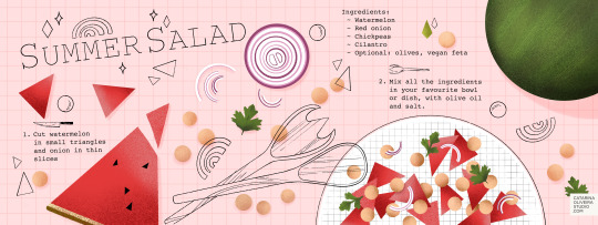

__________
Tiny Houses coloring pages
2 weeks ago it was Lisa’s week of drawing Objects as houses. I’ve always loved tiny houses and suddenly I couldn’t stop drawing them. I would like to make a coloring book one day, so I took this opportunity to draw in black & white and focus more on the details instead of adding color. These drawings took some time as I can get lost in little tweaks for hours (I love that) so eventually, I missed a couple of the 7 prompts and ended up coloring 2 of my drawings in bed, just for relaxation. It was a good exercise though, to draw more backgrounds and environments.
I plan to release these as PDFs you can download, print and color!

__________
Animals with jobs colored sketches
And before I even finished my last draft for the teapot Tiny house, I came across with a prompts list for Sketchtember. I was hooked despite being already August 31. My first sketch was very loose and simple but that’s the whole idea of Sketchtember right? (some people use it to do the sketches that they will ink in October for Inktober, so smart).
Anyway, I was in the mood to switch gears again from those detailed drawings, and it is always a good idea to practice poses, besides I love drawing animals.
My goal with these is to push my composition and movement skills and ultimately experiment with colors. Too much pressure?
I'm writing this as I finish my 5th sketch and honestly, it might be my last, not because of the lack of fun but of time! I am not very fast or good at setting time limits, it’s the perfectionist in me.
1. Lion, pastry chef. 2. Bear, fitness trainer. 3. Sloth, officer (pilot). 4. Mouse, waitress.
Prompts list created by Mia Gillenkirch.
To wrap up this post I’m sharing a bit of my process and 2 of my top tips when it comes to Children’s Illustration (KidLit or YA) and these quick/simple sketches:
I draft my idea without any references first (I draw very poorly as you can see in this time-lapse video), and then I look at photos of real animals to draw some realistic features. But things like bikes, yeah I need references. In terms of composition, I start with a very simple straight pose before starting to push it forward by playing with proportions (big/small) like a huge nose or long arms. The other thing I keep in mind is to decontextualize objects to create a more interesting story, like an unexpected color choice, or giving a different context to a situation. It helps to get pose ideas, for example, instead of thinking of a hairdresser you can approach the crocodile (the hairdresser) as an artist looking at his art. I ask questions like, is there an emotion showing or is it dynamic enough? I draw a lot of versions of the same thing until I am okay with it, then I pause it (if I can), come back with fresh eyes and that always helps me noticing improvements I can make. That’s it! A third tip would be Keep it simple!
Let me know if this was helpful and if you would like more of these posts.
__________
All of these were done with an Ipad Pro & Apple Pencil, in the App Procreate. One brush used, called Dry Ink.
There are Art Challenges all year round but this is my favorite season, starting with Setchtember, Inktober, anything Halloween, leading all the way to Christmas and its countdown. At the moment I don’t have anything planned but I never know when Procrastination kicks in and says, “You have to do this challenge!” :D And no, I haven’t discovered the magic secret to finishing a drawing challenge, but I tend not to take these things too seriously. Have you ever participated in one?
To see the complete projects and all of my sketches check my Instagram @catarinaoliveirastudio.
0 notes
Text

This question’s been sitting in my askbox for WEEKS now, apologies for taking so long to respond to this!
To preface this post it’s important to note: I’m not a professional, and don’t have professional experience. All thoughts are based on personal opinion, preference, and prior experience designing characters for personal projects!
Click the jump for a big post with me rambling about character designs I do and don’t like, and why I do/don’t like them!
So several months ago I went on a tirade about character designs in all these big multiplayer games coming out. You know the ones! Overwatch, Battleborn, Battlerite, Gigantic, Splatoon, etc. etc., there’s a thousand of these released every few months it feels like. At any rate, one of the big draws for all of these titles are the characters you control in them obviously. Partially thanks to the success of MOBAs like League of Legends and DOTA 2 we’ve seen more and more focus on games with these characters referred to as “heroes” and “champions”. While this should be really exciting for a lot of those who are interested in the character design aspect of titles such as these (like me!), I feel as though a lot of them miss the mark for one reason or another.
There’s several important aspects to designing a character, I believe the most important are all tied to their shape/silhouette. Ornate details and color are important, but in terms of character design hierarchy, a good shape will trump all other details. A silhouette is what you’re gonna see first always, you might acknowledge decorations or color choice first, but your brain is focused on the outline they’ve got. This is where my problem lies with a lot of these games (which stems from my love of diverse shapes and sizes in these rosters.). Most of these games feature characters with proportions that don’t stray too far from reality as to not scare people away with stuff that’s too unfamiliar, or in some cases “too cartoony”.
For example, let’s take a look at some Overwatch’s characters for a moment.

Here we’ve got a small sampling of characters from 2016′s GAME OF THE YEARRRRR: Overwatch. Notice something with these 5? They’re a bunch of people in fancy costumes, coupled with some stock personalities. This isn’t a diss at the art itself (courtesy of Blizzard artist Arnold Tsang), the art itself is great. These characters are the result of focus testing to reach as broad of an audience as possible. They are played as safely as possible as to not offend with their depictions of race, and are shaped in ways that are very safe to people who don’t typically play video games too much, let alone first person shooters. I think this is boring. They didn’t play around with the different characters shapes to identify them better, instead we’ve got a few very similar body types dressed and animated differently (the in-game animations are actually really good, and I don’t want to discredit Blizzards work on a lot of the character animations).
Now, that’s not to say Overwatch is riddled with designs I perceive as boring, I think there’s a couple strong, unique designs in the game that actually look good, one of which stands above the rest. Look at this big asshole:
This is Roadhog. This is a character with a clear, concise concept and idea that’s executed as perfectly as they could within the constraints they have with the characters. He has an immediately recognizable shape, he’s decorated appropriately, every aspect of him visually conveys what he is and who he is. He’s big, he’s bad, and he’s ugly (in the best possible way). They really went all out with this particular design, and it saddens me a lot of the other characters feel under-cooked compared to him thanks to how safe they played it with most of the cast. SHOUTOUTS TO Reinhardt, Reaper, Torbjorn and Zenyatta for doing their best to break the mold as well.
With Overwatch out of the way let me gush for a minute about Gigantic.
This is a game that gets it, the people at Motiga have created a colorful, diverse cast of characters in terms of shape and size and they’re each immediately recognizable from just their silhouettes. They’ve gone with more stylized and unconventional shapes not typically seen in MOBAs (LoL, DOTA, etc) or games like Overwatch, Paladins or Battleborn. Let’s get a sample of Gigantic’s characters.
Look at this! Look at how much they’ve stylized the proportions, how unafraid they are to make characters with these shapes. The little round man, the hulking armored juggernaut, the top-heavy bull, the short and squat witch, and the elegant and mysterious masked warrior: all with completely unique bodies. Not only are they shapes unique, the colors used throughout either support aspects of the character, or are used masterfully to break up the color in ways ideal for 3D character animations. The animations in-game are incredible as well, every single character oozes personality through just their movements and designs!
Unfortunately, characters like these don’t appeal to everyone. They aren’t as immediately appealing as the Overwatch cast due to their unorthodox shapes and stylized bodies. Some will deem them “too cartoony”, others will insist the characters are “ugly” because they aren’t familiar with characters stylized like this.
Overwatch and Gigantic are going for two completely different looks overall, and especially with their characters. But there’s one comparison I want to make that demonstrates the philosophies behind both, but more importantly shows why Gigantic’s direction is so strong.
These are Zarya, and Zandora, respectively

Zarya is the absolute weakest design in Overwatch. She’s an awkward mashup of shapes that convey absolutely nothing. She’s got big arms and a short haircut to clue players in on how powerful she is. She totes around a big gun too, ain’t that somethin’?
Zandora is what Zarya’s design should have been in several ways. Her power isn’t overstated with a bevy of cheap visual cues slapped onto something that’s just “large”. Her power is communicated through the strong shapes that make up Zandora: the top heavy armor, the overall wider build, big in-your-face hair, and a sword that was crafted to compliment her. What might be most notable is her star-shaped silhouette. It’s handled so tastefully and executed perfectly. I want to say that her design is by Devon Cady-Lee, who also did these illustrations below that show how good that idea looks on paper as well:
Gigantic is paragon of quality among a sea of games full of safe, boring marketable designs made to attract the largest possible crowds. It pains me knowing this game won’t reach the same success Overwatch will partly because of how visually distinct this title is.
While I clearly have a bias towards Gigantic, I will admit Overwatch as a whole is mostly competent. The character designs serve their purposes, even if I happen to think they’re boring.
What about those other games? Here’s a game that I’ve enjoyed playing recently: Battlerite.
Battlerite is a top-down arena brawler. One might call it a MOBA, but it’s a team deathmatch game sort of. Your goal is to defeat the enemy team in a first to 3, 2v2/3v3 match. You moved with WASD and you’ve got keys for abilities, vaguely similar to games like LoL or DOTA 2 in a way.
Battlerites case is very much “we want the MOBA crowd”. This sounds like a really lazy descriptor that lacks any value, but hear me out: Battlerite is the spiritual success to a game just like it called Bloodline Champions that came out a few years ago. Here’s a sampling of characters from Bloodline Champions:

Bloodline Champions is a game with a unique, clear visual identity. Whether or not you like it, it’s clearly something wholly unique in terms of color and how they’ve decorated their characters. Weird shapes (top left, top right) as well as familiar ones with distinct ornate details (bottom two). They all adhere to colors that the games overall aesthetics thrive from, it’s very gritty and twisted.
SO WHAT DO YOU MEAN “WE WANT THE MOBA CROWD”??? JERK
This is what I mean. The first character showed off that wasn’t a direct adaptation of a bloodline champions character was Pearl. Here’s Pearl:
Pearl is the epitome of the differences between Bloodline Champions and Battlerite’s character designs. Half-baked ornate details because without them, the characters would end up more generic than they already are. Battlerite’s cast is comprised of archetypal MOBA character stand-ins. They’re boring, and hollow uninspired renditions of characters that had a lot more style in a previous life. Here’s some really boring Battlerite characters:
BLAH. They’ve got the Overwatch “problem” but even worse. These guys really just look like cosplayers doing characters that don’t exist. Staff man. Sickle man. Gun woman. These designs convey nothing beyond what you see. I don’t mind cool characters for the sake of cool characters, I’m the last person to complain about it, but Battlerite really tests that for me. The in-game camera doesn’t do these designs or models any favors too, unfortunately. There’s a single very standout design among the roster.
This is Pestilus.
He’s shaped strange. He’s round, he’s got really stubby limbs, and he’s got these big bug legs on his back. Pestilus is cool! Lookit’ his gnarly teeth, wowie. Unfortunately the in-game model doesn’t do him justice:
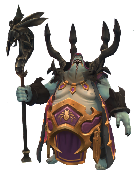
He’s paler, his teeth are simplified and lack the character his chompers had in the above illustration. I still like this one, he’s in a league of his own compared to most of the rest of the cast. HONORABLE MENTIONS GO TO RUH KAAN AND ASHKA:

I’ve said that the worst thing a character design can be is mediocre. Not good enough, not bad enough. Battlerite rides slightly above that line. There’s a few interesting characters here and there. Some have unique silhouettes (Ashka, Ruh Kaan, Pestilus and Rook) and most server their purpose. They’re boring, but they’re not aggressively boring/mediocre. That line of design goes to a little game called. . .
Paladins: Wizards of the Coast or whatever the fuck the subtitle is
Chinese bootleg overwatch. A game that was trying to be a bit unique before a lot of changes were made to match a similar, “hero”-based shooter game where you push payloads and capture points. This is a game with aggressively boring characters. The characters are in this game because if you had none, you wouldn’t have anything to play as. They’re crude facsimiles of better looking, more thought-out characters and designs. Here’s a sampling of these lot of losers.
These characters are nothing. Their silhouettes are bland. You’re either big, small or medium with no rhyme or reason. You have a gimmick. Your colors don’t serve much purpose beyond “we needs color-keys to recolor for skins”. Very rarely are they in service of the shapes in question, or to break up monotony in big stretches of solid color. The knight on the left is dull as dull can be. Sure, knights are done to death but good lord they’ve really found a way to try and make him exciting but failed miserably thanks to:
A silhouette that is nothing beyond “TALL MAN”
Colors that are gray all over, his armor is supposed to be metallic but the textures and shading do it no favors. The yellow in there doesn’t do enough in breaking it up because they’re only along the trim of each armor piece.
His shield doesn’t compliment him, it’s an obligation. He has a lance, he needs a shield, and not one that works in conjunction with anything solid.
There’s a single design in Paladins that I don’t think is the absolute most mediocre thing in the industry: Bomb King.
He’s big and loud both visually and personality wise. He’s got a standout silhouette, and colors used mostly tastefully to break up his main blue coat. Bomb King doesn’t look like he belongs in this game, and is strangely. . . Toyetic. I kind of like Bomb King.
Paladins is mediocre. Paladins is very unimaginative and dull, the most recent characters are some of the most unmemorable I’ve seen in recent times, when it comes to these games. While Paladins is mediocre, at the very least it isn’t. . .
COMPLETE, IRREDEEMABLE SHIT.
ENTER: BATTLEBORN-

Battleborn is a game that isn’t aggressively boring, it’s aggressively ugly. It’s annoying. It’s messy, it’s loud, it’s busy. Battleborn is garbage. This game is rife with characters that convey nothing, silhouettes that are awkward and make no sense who are modeled in one of the most unappealing looking games of the past 5 years. This one is so bad I really don’t want to post a sample of characters because I hate looking at 99% of the roster, but I have to. . . I have to. . . Here’s a sampling of Battleborns characters. . . eugh. . .

Do you like any of these designs? Legitimately curious. Unnappealing shapes, ugly facial features, completely mangled details that are hard to make out, poorly balanced silhouettes. . . There’s so much wrong with all of these designs. Some of the ones in the game wildly stylize proportions, mostly very poorly, some are very restrained and more realistic, some are complete abominations like the monster in the upper left: Attikus.
It’s worth singling out Attikus because his concept art has something very interesting behind it: He didn’t look like complete fucking shit, his shapes were solid and his silhouette would’ve worked perfectly, but they seemingly went out of their way to get the ugliest possible outcome they could achieve. See below, Attikus thumbnails:
These are all so much more sound than the final product. Why didn’t they go with any of these four beyond “We gotta make it uglier to fit in with everything else!”. While still asymmetrical, the shapes here tell you he’s powerful and ready to rip and tear through every living thing in his path to victory. That final Attikus looks like it tried to go with something weirdly proportioned like some of the Gigantic characters, but with a fresh coat of grime.
At no point has this stream-of-conscious post has been about nitty gritty things like facial features but Thorn looks vile:

There are no honorable mentions for Battleborn. The very best of the bunch is still very boring and half baked. They’re plain, and that’s really it. They don’t assault your eyeballs with how putrid and gaudy they are, which, by default, makes them the best.
One thing worth nothing is that there are piece of concept art here and there that actually look great, but are put through Battleborns poor “World of Warcraft” + “Disney Infinity” + GREASE filter don’t look nearly as good. The one I like most is this rendition of one of the first DLC characters, Pendles. Here’s the piece in question:
Very lovingly rendered. I don’t want to talk about Battleborn any more. I’m sick of looking at it.
Anyways, there’s some insight on what I think does and doesn’t work in the form of this weird stream-of-consciousness, giant post. Feel free to ask more and I’ll weigh in on it as poorly as I did here! I’d love to hear what everyone has to say about these games and their character designs, and what you like most about the, as well as what you like least about them!
399 notes
·
View notes
Text
SEO Checklist: Never Forget Anything About SEO Ever Again

Original Publish Date: May 8, 2015 Most Recent Update: January 16, 2019
Why You Need An SEO Checklist
Yup, never.
Some 8 years back, when I was just starting to get serious with this SEO thing, I scoured the Web for an SEO checklist that would help me remember all these new things that I was learning.
I found nothing.
Besides a list of linking strategies that included profile links, forum signatures and spamming bookmark sites, I never really did find a good one.
It would’ve made it exponentially easier for me to learn SEO if I could have printed out something and marked it off manually back then. I could review it, internalize it and plan out tasks better.
Time traveling to the present day: I snapped out of my unproductive daydream, I put my glass of wine down and I told myself to stop reminiscing about the past.
Then it dawned on me. Why not make one?
That small epiphany became this blog post and infographic. You can also download a bonus printable version at the end of the post, which includes local SEO checklists that aren’t in the infographic.
Click here to download a free SEO checklist that you can print out and use today, whether you are still learning the ropes or already running an SEO campaign. PLUS, bonus local SEO checklists that are not found in the infographic.
Grow your digital presence to get more leads with this FREE newsletter (and free resources)
.content-5c42867986c86 .cp-form-container label:not(.cp-label) { display:none;}.content-5c42867986c86 .cp-form-container label { color: rgb(153, 153, 153); font-size: 15px; font-family:; text-align: center;} .content-5c42867986c86 .cp-form-container .cp-form-field select { text-align-last: center; direction: ;}.content-5c42867986c86 .cp-form-container input:focus:not([type='radio']):not([type='checkbox']):not([type='range']), .content-5c42867986c86 .cp-form-container textarea:focus, .content-5c42867986c86 .cp-form-container .cp-form-field button, .content-5c42867986c86 .cp-form-container .cp-form-field input, .content-5c42867986c86 .cp-form-container .cp-form-field select, .content-5c42867986c86 .cp-form-container .cp-form-field textarea { text-align: center; font-size: 15px; font-family: ; color: ; background-color: ; border-color: ; padding-top: 10px; padding-bottom: 10px; padding-left: 15px; padding-right: 15px; border-radius: 3px;}.content-5c42867986c86 .cp-form-container .cp-form-field .cp-label { text-align: center; font-size: 15px; font-family: ; color: ; padding-top: 10px; padding-bottom: 10px; border-radius: 3px;}.content-5c42867986c86 .cp-form-container .cp-submit { padding-top: 10px; padding-bottom: 10px; padding-left: 15px; padding-right: 15px;}.content-5c42867986c86 .cp-form-container .cp-submit.cp-btn-flat { background: #ed0e0e!important;border-radius:4px;}.content-5c42867986c86 .cp-form-container .cp-submit.cp-btn-flat:hover { background: #e00101!important;}.content-5c42867986c86 .cp-form-field.cp-enable-box-shadow > div { border-radius: 3px;}
JOIN THE FREE NEWSLETTER >>
We hate SPAM and promise to keep your email address safe

Share The Ultimate SEO Checklist Infographic On Your Site
</p><br /> <p><strong>Please include attribution to LeapFroggr.com with this graphic.</strong></p><br /> <p><a href=’https://www.leapfroggr.com/seo-checklist/’><img src=’http://128.199.238.119/wp-content/uploads/2015/05/Ultimate-SEO-Checklist.png’ alt=’The Ultimate SEO Checklist’ width=” border=’0′ /></a></p><br /> <p>
I wanted this SEO checklist infographic to be the longest infographic you’ve ever seen… literally.
I know the stats about how it’s not ideal. How it’s not the best thing to do and how stupid an idea that is to make such a long infographic.
Sometimes, you just need to do something different.
Besides wanting this to be remembered as the longest infographic about SEO ever, I wanted it to be REALLY useful.
There are a lot of people out there that can benefit from this, much like I would have if I am starting all over again today.
So, with that said, let’s get started with some quick explanations of why I think each one is important.
Research
Research is arguably the most boring part of SEO for many, but I personally love it. You have to embrace the research part to get a feel of what you are up against and what you will be doing.
Your whole SEO strategy will depend on your depth of understanding so DO NOT ever skip the research phase.

Market Research Market research gives you a feel of the whole landscape.
Chances are, you will be working on a more specific website. By doing market research, you open your mind to what’s out there, what they are doing, what’s working for them and so on.
Look around, vertically and horizontally. The information you learn here will come in handy when you start creating your SEO plan and link building strategy.

Niche Research It’s time to niche it down. Who are you going up against directly? What’s the overall state of the niche when it comes to SEO? What types of results is Google showing you when you search? Local? Maps? Mostly Yelp? Video dominates? Are news sites being shown?
Knowing these will help you prioritize what you need to do to get visibility as soon as possible.

Competitor Research Who are your direct competitors? What are they doing? How aggro are they?
Compile your direct competitors. Search using the keywords you are targeting on Google and list down all your competitors.
Compile their link profiles, identify which site is getting the most links, note down the link types they have and what their audiences are sharing.

Keyword Research Now that you have done your competitor research, you can use the data for this phase.
You’ll be able to see the keywords they are ranking for based on the anchor text from their links and you can use tools like SEMRush to find out what other keywords they are ranking for or bidding for.
Compile those keywords and add your target keywords into a list.
Whip out Google’s Keyword Planner, paste the keywords in and watch the magic happen.
You’ll get a ton of suggestions you would have never thought of in the first place.

Data Gathering Now, it’s time to start compiling the data you’ve researched and gather some actual stats about your website.
Compile the initial keywords and backlinks you’ve acquired from the research you’ve done above. Put them into organized lists.
You also need to answer things like: What’s the current status of your website vs your competitors? How optimized are their websites? How many links do they have now?
You need to activate Google Analytics so you can get data about the site you are working on.
You need to crawl the site you are working so you can have the data by the time you get to the on-page SEO phase.

Google Search Console
We love today’s version of Google Webmaster Tools. You can get a ton of data simply by using this.
You can:
Check for crawl errors
Check for penalties
Check if the sitemap has been submitted already
Check HTML improvements needed
Check for broken links
Grab all the data you can and fix them now or until you get to the on-page SEO phase.
Bonus: You might also want to submit your site to Bing’s Webmaster Center. Just for the sake of it. Just do it.
On-Page SEO
This often gets the most criticism from die-hard link builders but nowadays, a lot of them have come to accept on-page SEO as a major part of the overall SEO process.
Today, a lot of pages can rank purely from relevance and good on-page SEO work so never neglect it.

General
For those that are new to SEO, you might not be aware of some of these.
These are best practices that you must apply early on and throughout the life of your website.
The following items are very basic so if you have questions about any of these, please feel free to ask in the comments area.
Start with these:
Add an XML Sitemap
Add Navigation
Add Menus
Use Breadcrumbs
Add a Robots.txt file
Check for Canonical
No-index thin pages – Tags should definitely be no-indexed. Category pages that don’t have unique content should be as well.
Fix all the problems found in Webmaster Tools
Title – ensure keyword presence / check for H1 tag / use long-tail keywords
Check Meta Tags
Fix all pages missing Meta Titles (Stick to 60 characters)
Fix all pages missing Meta Descriptions (Stick to 150 characters or less)
Fix all images missing Alt Text
Check h# tags (e.g. <h1>, <h2>, etc.) and order them properly.

Optimize Content
Now it’s time to check your site’s existing content.
For many of you, you will be thrown into a project for big website that’s pretty messed up, with content that has been built over the years.
Do not be afraid to change the content if it will improve it and do not hesitate to cull those worthless pages.
Review Visual Design
Keywords
LSI keywords – Use LSI keywords to make your content more relevant.
Publish the usual static pages (Privacy/Terms/Sitemap/About/Contact/Etc.)
“Try” to keep indexed pages static
Refresh or update your site’s content regularly
Monitor Bounce Rate
Externalize Code (CSS)

Performance Tweaks
The performance of your website is IMPORTANT, especially in today’s SEO landscape.
Though the Mobilegeddon update has been underwhelming so far, it will become more important as time goes by so fix your website today.
Check multi-browser-friendliness

URL Optimization
Your URL structure can be easily neglected but it can have a good impact on your rankings and even user re-call.
The best practice is to keep it as short as possible, aim for below 100 characters.
Incorporate primary keywords into the URL
Use absolute URLs
Simplify dynamic URLs with mod_rewrite (Say no to dynamic URLs when possible)
Use 301 redirects for rewritten URLs
Set up non-www to www redirect (or vice versa)

Using Schema
Less than 30% of the websites out there actually use it. Take advantage of that. Schema is here to stay. It doesn’t mean that it’s useless because Google Authorship is dead.
Though its direct impact to SEO is still not actually “proven” in a concrete way, it’s indirect effects are actually very obvious.
Whatever you believe, like I always say, optimize everything and you will succeed in SEO.
Refine/add markup for possible schema (Official Logo, Articles, etc)
I highly recommend that you check out SEOGadget’s (ok, BuiltVisible, I miss the name…) guide on schema over here.
Off-Page SEO
Clearly the most popular part of SEO is your off-page work, more commonly referred to as link building. It is where you want to spend the bulk of your time besides planning and creating your content.
Some of the strategies below are old-school, some are new and some are really niche specific. If you have question, feel free to ask them in the comments area or you can start a new conversation over here.

Set Up Brand Alerts Setting up Google Alerts, TalkWalker and Mention are practically staples in any SEO campaign today. Moz also has neat built-in tracking tool, so if you are a subscriber, be sure to make use of that.
The reason you’d want to do this is that you want to know immediately when someone mentions your brand (and any other relevant keywords) anywhere in the Internet.
This allows you to track your reviews, negative press, blog mentions, forum questions and more! You’ll have the chance to get a backlinks by jumping in early and you also get to build better brand loyalty by showing that you care enough to respond to their posts or issues.

Find Unlinked URL’s and Brand Mentions If you are working on an established site, then chances are, there will be a ton of unlinked mentions out there for you to take.
Tip: There are a lot of ways but start with the simplest method by using Google
Brand -Brand.com (LeapFroggr -leapfroggr.com)

Competing Company Links Find your competitors, look around vertically and horizontally in your niche and category.
Compile them and check their links. Then go out and get those links. They got it, why can’t you?

Ranking Competitor Links Search for your target keywords and find those direct-ranking competitors. Chances are, you won’t see a lot of them during your competitor research phase.
Now compile these sites and check their backlinks.
Find Important Links Using Link Intersects Basically, you want to find the links that already link to your competitors.
Why? There’s a higher chance that you can get those links quickly.
You can use Excel after you export your competitor backlinks to see which domains link to them but for those rare SEO’s that don’t really like spreadsheets (like me) – then CognitiveSEO has a tool for it, so does Link Research Tools and as well as Moz.

Create Social Media Profiles Create your social properties and make sure to put a link back to your website.
If you can’t use them yet, then treat it mainly for branding purposes and to reserve the name when the time comes that you might actually need them.

Broken Link Building Broken link building is basically a strategy to start a conversation with a webmaster.
You give them something and they might eventually do you a favour. That’s the basic idea.
Knowing that, you can get creative with it. Here’s a great article from Erika about broken link building.
Richard Marriott over at Clambr also put up an awesome tutorial.

Utilizing Relevant Pinterest Boards Join or ask to get invited on Pinterest Group Boards. PinGroupie is a good place to start.
True, Pinterest links are no-follow for the most part but Pinterest can bring you tons of traffic and visibility.
You will get links that you would never get by doing normal link prospecting. You can even take it a step further and check the people that shared your pin and reach out to them. You can message with people directly in Pinterest now, just in case you haven’t been using it lately.

Join Expert Roundups Expert roundups are a dime a dozen nowadays and they are getting bigger and bigger each day just to stand out and squeeze out the most social shares.
You don’t have to join all of them but you should join some of them.
For the most part, these are on blogs with their own readership, so it’s a chance for you to get your brand out there and eventually pull in more links.
Oh, you can also be the one to do expert roundups and offer that as part of your outreach. Lots of people will link to it if you use a proper angle for the roundup.

Guest Posting on Influencer Websites Guest posting is not dead. They should rephrase that.
It’s more like guest posting on blatantly fake blog networks is almost dead.
People keep complaining about it but it really isn’t dead. In fact, it’s more important and more precious now than ever.
Find the right sites, build the right connections and create great content for their audience without over-using anchor text.

Blog Commenting To Build Relationships
Blog comment links are mostly no-follow. The real value is in the relationships that are formed.
I’ve met a ton of people simply by doing guest commenting and I got connected with new people that eventually linked to me because I took a bit of my spare time to build these relationships.
I met Matt Capala through blog commenting and he has sent business my way and exclusive connections. (Blatant Plug: Buy his book.)
Some relationships are started through email, some are started by joining local networking events and some can be started simply by blog commenting.
If you want to learn by example, my friends Adrienne, Donna, Harleena, Sue, Don, Carol and Ryan are great people to learn from.

Utilize Quote Directories Sounds funny, but there are many quote directories out there that can be used for links.
Since we are talking about directories, go ahead and look for blog directories, startup directories and niche specific directories. The links can be acquired easily and for the most part, free.

Get on Sites that Offer Awards If you are running a pet website, then you can find sites that offer awards both locally and internationally. Run a service business? There are plenty of business awards you can join. If you run a blog, go out and find sites that offer blog awards. Run a podcast? There are awards for that, too.
In many cases, being nominated can get you a link already… but do try to win so you can show off the award and get other perks.

Contribute to Newsletters Consider this as a way for you to get your brand out there. It’s also a way to get targeted traffic and acquire loyal readers.
So where does the SEO part come in? You can find sites that would allow you to publish content exclusively for their subscribers. It’s like guest posting but only through an exclusive list of people.
You can also get on newsletter publishers that publish recommended content each month. Many of their subscribers use the newsletter content when publishing their monthly or weekly link roundups on their own blogs. That’s where your link is going to come from!
As a side benefit, believe it or not, some people will copy the newsletter content directly and paste it on their site.

Get on Institution Websites Confused? These are also known as .gov and .edu links.
I could talk about hacking their sites, I could talk about manipulating their Moodle platforms and others but…this is sort of a white-hat blog.
The traditional way is to get on their resource page. You can also offer work to them in exchange for a link. One of my older tricks is to track down the student editor and give him beer money.
The .Gov sites will sometimes have forums that give do-follow links. Sometimes you can be a supplier to a project or event depending on your niche. It can open lots of doors for you if you do it the right way.

Get Links from Local Chamber of Commerce Websites Local CoC websites are plenty but the rules are different for each one.
In most cases, it’s pretty easy to get links from them. Just ask what you want do for them or what their requirements are.

Don’t Overlook New Bloggers New bloggers are going to look for mentors. They look for people that are already where they want to be. They will ask questions and they will need guidance.
If you have people following you or somebody emails you, do not hesitate to help them out. Relationships built out this way can net you links you will never really get by simply doing prospecting.
Also, when building out your prospecting list, you will encounter new blogs. Do not hesitate to reach out to them. It doesn’t mean that they don’t have readers and it doesn’t mean that the link you’ll get is worthless since they are a PR-0 site.
Often, these bloggers have really die-hard followers that jump on any recommendation they make and these followers are usually bloggers too. Imagine the extra links you’ll get.
Oh, and in time, the link you get will become more important as they become more important in the space.

Do Guest Podcasting Podcasting is BIG right now and 99% of the time, these podcasters have their own blogs so they can put the show notes there. You don’t have to even start your own podcast.
The idea here is to get on those podcasts. That’s a 100% sure, high quality link.

Submit to Curating Platforms Curating platforms like Scoop.it can share your content out and link back to you. In many cases, these are no-follow links but they have users of their own. Plus these users that curate have blogs. The things they curate get sent to their blogs and their readers get to find your content because of their referral.
My personal favourite is Flipboard. It has brought me a ton of traffic already and readers actually do stick around.

Use LinkedIN Pulse I only just started with LinkedIN Pulse but it’s pretty good so far.
The reason isn’t really for the link, but for the brand visibility. You can assume that the people that follow you and see your work on LinkedIN already have their own social presence online. They might also have blogs.
With my few articles so far, I have gotten some new links because they found my site from my LinkedIN posts.
Plus, you can republish your content on LinkedIN Pulse so it’s not really duplicate content. I don’t do this but a lot of other people do. Maybe you should try it out.
For tips, Paul Shapiro made the best article about it (ever) over here at Noah Kagan’s blog.

Get on Publisher Websites I consider the top tier publishing sites here, such as Entrepreneur, HuffPo, BusinessInsider and more. Depending on your niche, you will find other really big publishers so make sure to get on them.
I also consider the viral sites, like Buzzfeed, under this category. The normal way to get on these sites is to write on their backend and try hard to get your work on the main site. If not, then it won’t really be indexed.
If you want to be creative, my favorite tactic to get on these viral sites is to start from the smaller blogs and work my way up. I spread news or rumors on smaller blogs that I know these viral sites take news from. Once it’s picked up, you push it again on the next level and things will again, snowball from there.

Find Community Websites Community sites like and Kingged can give you some good initial traction. You’ll be able to meet new people, share your work, gain visibility and eventually, links.

Don’t Forget StumbleUpon and Reddit If you look at the StumbleUpon idea, it can look so Web1.0 but it can still bring in good traffic. Their Ad platform is also good if you plan it out right and know how to get it to catch on. Once it does, it will snowball. You’ll get links, one way or another. One of the people I’ve been following since forever is Ross Hudgens. They put out this cool guide about SU that you can check out here.
As for Reddit, it is only getting hotter so people can say whatever they want about how worthless it is for SEO but for me, Reddit has brought my sites tons of traffic and netted me links from hardcore, badass sites. Ain’t too shabby. Plus, it can do this…thanks for the spot Dan.

Find Uncredited Images It’s inevitable.
People will steal your images. Steal? Sounds harsh. Well, sometimes bloggers just grab it off Google images. It’s a completely innocent thing to do so I understand.
Good thing we know SEO! That practically means a free link in my eyes.
Use Google’s image search and upload a photo. It’ll show you places where the image was used. You can also use Tineye to do this.
Oh, infographic promotion can fall under this as well.

Submit to Slideshare If you do speaking gigs, present to your company or other groups, then you probably have a collection of slide decks. Simply use sites like Slideshare and share your content there!
Do you create blog posts? Repurpose your blog content into slides!
Need more Slideshare tips and tricks? Then get it from no other but the queen herself, Ana Hoffman from TGC.
Note: You can also submit PDF’s to Slideshare but there are also places to submit PDF’s so you can share your book or whitepaper to the world.

Get on Magazine and News Sites Local ones will tend to be easier to get featured on to but bigger, global news sites are still possible. It will just take a bit more work and patience.
What I do is to find the editor or a connection to the editor. Once I get introduced, it’s easy to submit a piece and get a piece published.
Joining HARO, which will be mentioned shortly, can also help you get on some of these sites.

Find Resource Pages Resource pages is one of the oldest plays in the book and it’s still one of my favorites.
Why? Competitors neglect them and I don’t have to worry about content. Easy, relevant links. Boom.

Join HARO and Participate Help A Reporter Out aka HARO is one of the best ways to get free press.
You get emails with different topics. You reply to the reporter and send an expert direct-to-the-point answer.
HARO isn’t the only game in town, I listed down some of the others here.
Here’s a tip: Use your mail to filter out the daily emails to find relevant phrases or words so you don’t have to check each one.

Use and Monitor Hashtags like #PRRequest Besides HARO type sites, there are hashtags out there that are used by journalists. It’s a way for them to get stories and participants. You can tweet out your topic with the hashtag or just monitor it.
Again, much like HARO, you need to pick your spots and be patient with this. Once it works for you, it’s gold.

Do a Link Bait You basically write about something controversial, something timely, something that’s not the norm. Put it out in front of the right people and BAM! You get links!
I covered it a bit more on this post.

Create Badges This is old school but still effective today, especially for certain niches today.
You create a gimmick badge, you share it to the community with a link back to you to show their support or to brag about their level in the community.
It’s sort of like those blog directories that want you to put their link on your site first to confirm your ownership. Then you forget to remove the badge and you just gave them a free link.

Find Links Pointing to Your Social Media Account but Not Your Website This is simple yet highly neglected.
By doing a simple backlink check on your own social profiles, you can dig out some pretty easy links.
To take this a step further, compile your competitor’s social accounts and check their links.

Use a Service? Submit a Testimonial! If you use a service or bought a course or maybe you are a member of a group/newsletter, then you can try to share your learnings, testimonials and results to the owner.
If you are purely in this for the link, which I know you are, then make sure the site you are contacting has a testimonial area.
For a more extensive process, Bryan Harris, THE poster boy, explains this like no other.

Support Crowd Funding Projects I mentioned it briefly here but I have talked about this on the newsletter pretty extensively in the past.
You basically find crowd funding projects that offer a link from their websites. You support them and get the link when they go live.

Charities to Support There are tons of charities you can support. Look around your local area and find those with websites.
Of course, you need to be aligned with their vision. >_>

Q&A Sites Q&A sites are mostly no-follow links but they bring in relevant traffic. They also rank pretty well and can get you spots in Google’s results.
That way, you can get more visibility, new users and eventually, new links.

Find Forums Forum links are not dead. They are still really nice and they still bring in targeted traffic.
You just need to look for relevant forums and jump into the conversation… or you can manufacture a way to start a conversation and jump in later to pitch your link.
Google removed my fav filter, which is “discussions” so just for you, here’s my secret. This nifty Chrome plugin.
Note: Just don’t go out there buying mass forum signature and profile links.

Research How an Author Did it I love this technique because I can sort of see how someone I look up to got to where he is today.
I could see how hard they worked, how they did it, the creativity they showed and more!
I could then do something similar and set myself apart from what he already did.
I talked about this extensively on the newsletter and I mentioned it on my post over here.

Supplier Websites This is mainly for e-commerce websites where you have suppliers that have sites. Just ask for those links.
If you are a business or a blog and have someone you work with that has a site, then you can also ask for a link from them. Easy, high quality links are always welcome.

Do Successful Content BETTER As mentioned in my previous post, my go-to strategy when it comes to link building is simply just doing better content than what’s already working out there and get all their links!
It basically means that people are interested and you can get those links.
Brian Dean calls this the Skyscraper Technique so if you want to learn more about this, check out his blog post!

Comment Scouting Comment scouting is a way for me to simply get ideas from the comments area (be it in my own blog or another blog) and create content for whatever the need I see there.
Then you contact the commenters and commenters on other blog posts with a similar topic.
I am creating a post about this and I’ll be posting it soon. Signup for our newsletter so you never miss an update!
③⓪① Build Category Specific Sites – 301 Them Category pages on a website are probably the hardest pages to get links for. E-commerce sites will benefit from getting links to these pages greatly so one way of getting links is by creating separate websites.
Cultivate them, get them links and then 301 those domains to your main category. #WIN
Since you read all the way here, here are a few bonus strategies that aren’t in the infographic!
Speaking and Conference Links Volunteer to speak in front of an organization or a conference. That’s almost a guaranteed link.
Does the conference have sponsors? They probably mentioned the conference on their website as well. Ask for a link back to your site!

Management and Sponsor Links Let’s say you are working on a celebrity’s site, then get a link from her agency’s site. Get links from her sponsors and magazines that mention her.
Are you getting paid to show off products? Get links from your sponsor’s website!

WikiPedia There are certainly different ways to get WikiPedia links. Knowing a moderator, sheer luck or WikiGrabber.
Use it and find a way to get a link. Don’t forget your etiquette.

Infographic Links Lastly, infographic promotion. Submit it to directories, reach out to sites that already publish infographic posts or sites that can be granted exclusivity.
It’s really a versatile way to build links so you can get really creative with it.
BTW, if you liked this infographic, please use our embed code that you saw at the bottom of the infographic.
Tell us about it and we’ll help you promote it. We’ll even write a unique intro for you!
Everything Else
Once you get to this point, it’s basically icing on the cake. Most of these are things that can’t be qualified under the categories above.
Some are minor, some are really vital once you start ranking and some are just for maintenance.

Social Media
I had to start it off with this.
When it comes to discussing social media’s direct effect to SEO, it will almost always be controversial. No matter what people say, social media is a part of our online and offline brands moving forward.
For me, social media does not have a direct effect, but a more indirect one. Actually, there are plenty of indirect ones!
The point of this being included here in the checklist is that you need to make sure that your website is set up properly and linked to your brand’s official social platforms.
Create those social media accounts – these basically help with SEO indirectly as they carry your brand name.
Adding social sharing buttons can potentially help you acquire new users and eventually links.
Link these social media accounts to your website – For example, Google+ can ask you to verify your site and page.
Also, you can use Schema to link your official social profiles.

Conversion Rate Optimization
CRO, which is an art on it’s own, does have processes that affect your overall SEO. Plus, it doesn’t hurt to convert more of your existing visitors.
Some of the things you need to do are:
Continue to speed up your website
Check your bounce rates
Be sure you don’t cause duplicate content when A/B testing
Track if you are ranking the correct page (that is converting)
Sound familiar? They should be.

Knowledge Graph
The knowledge graph is still a mystery for many. If your brand is still not an entity within the Knowledge Graph, then you need to start taking some steps to include yourself there.
Start by getting a Freebase account (by the time you read this, Google might have moved over to WikiData)
Check out Andrew Isidoro’s post as well as Krystian Szastok’s post.

Rank Tracking
Rank tracking is not as talked about as it used to be but if you are serious about your SEO work, then it’s still a must.
The Google Webmaster Tools data you get about your rankings are simply an average of where you place.
If you want more accurate data, be it local or country specific, then you need to track it yourself, be it using software (we use Rank Tracker and Advanced Web Ranking) or one of the many cloud hosted rank tracking tools out there.
Just to throw it in here: I get this question a lot. Does it hurt your ranking if you keep checking the rankings daily? I haven’t seen any evidence of it as I track things pretty aggressively.
Reputation Management
Skeptical?
Let’s start by mentioning that you need to claim your brand’s identity everywhere. It will save you a ton of time and headaches in the future when the brand you are working on is big enough.
You also need to monitor mentions about your brands either to stop negative things from escalating or get links.
So, can online reputation management be a part of SEO? Definitely.

Ongoing Server Configuration Checks
Your server will need to be tweaked regularly. Especially as you grow your traffic more and more.
The last thing you want is a slow site or a site that is down for long periods of time.
Things can get misconfigured, it’s just the way it is so doing regular checks are important.

Other Avenues to Improve Branding Online
You can do more besides traditional link building.
You can build up your brands on different ecosystems that are also crawled by Google.
From YouTube, to Apple and even Amazon. These are all major search engines on their own and building your brand within them can add to your SEO… and they take up space in Google’s results so that’s another bonus for you.

Keep Up with New Google Guidelines
Google’s guidelines will keep on changing. It’s just the nature of the game.
If you don’t monitor SEO news regularly, make it a point to pick your favorite SEO websites and subscribe to their newsletter (like ours) or RSS feed. Schedule a time in the month to do quick reading sessions to keep yourself up to date.

Schedule On-Page SEO Checks
As you publish more and more content, things can get lost in the shuffle.
Maybe you don’t have a system in place yet for other authors that publish within your site. Maybe you are just forgetful when it comes to SEO and just want to focus on creating content.
Doing a regular on-page SEO checkup will only help you in the long run so don’t overlook this.
Screaming Frog is our favorite but Google Webmaster Tools can also give you some good data.

Schedule Regular Backlink Profile Checks
This is probably the most ignored thing EVER. I cannot stress the importance of this especially if you are already working on a popular site or a competitive market.
Things can go wrong rather quickly (penalty/de-indexed) or it can be the reason why your site is being held back from improving in the rankings.
Checking your link profile regularly will help you see what’s wrong. Maybe you are over using your anchor text, maybe somebody is sending you spammy links or maybe you just aren’t doing enough.
I would suggest using and even Google Webmaster Tools when doing link profile checks.
Now Here’s How You Can Put It to Use
As I mentioned earlier in the article, we created a FREE SEO checklist that you can download and print out.
It’s basically a group of printable checklists, including 2 checklists for on-page and off-page local SEO.
Here’s where you can download the checklist:
Grow your digital presence to get more leads with this FREE newsletter (and free resources)
.content-5c428679880b1 .cp-form-container label:not(.cp-label) { display:none;}.content-5c428679880b1 .cp-form-container label { color: rgb(153, 153, 153); font-size: 15px; font-family:; text-align: center;} .content-5c428679880b1 .cp-form-container .cp-form-field select { text-align-last: center; direction: ;}.content-5c428679880b1 .cp-form-container input:focus:not([type='radio']):not([type='checkbox']):not([type='range']), .content-5c428679880b1 .cp-form-container textarea:focus, .content-5c428679880b1 .cp-form-container .cp-form-field button, .content-5c428679880b1 .cp-form-container .cp-form-field input, .content-5c428679880b1 .cp-form-container .cp-form-field select, .content-5c428679880b1 .cp-form-container .cp-form-field textarea { text-align: center; font-size: 15px; font-family: ; color: ; background-color: ; border-color: ; padding-top: 10px; padding-bottom: 10px; padding-left: 15px; padding-right: 15px; border-radius: 3px;}.content-5c428679880b1 .cp-form-container .cp-form-field .cp-label { text-align: center; font-size: 15px; font-family: ; color: ; padding-top: 10px; padding-bottom: 10px; border-radius: 3px;}.content-5c428679880b1 .cp-form-container .cp-submit { padding-top: 10px; padding-bottom: 10px; padding-left: 15px; padding-right: 15px;}.content-5c428679880b1 .cp-form-container .cp-submit.cp-btn-flat { background: #ed0e0e!important;border-radius:4px;}.content-5c428679880b1 .cp-form-container .cp-submit.cp-btn-flat:hover { background: #e00101!important;}.content-5c428679880b1 .cp-form-field.cp-enable-box-shadow > div { border-radius: 3px;}
JOIN THE FREE NEWSLETTER >>
We hate SPAM and promise to keep your email address safe
The post SEO Checklist: Never Forget Anything About SEO Ever Again appeared first on LeapFroggr.
This content was originally published here.
0 notes
Text
Research Point
Research into the still life genre
Still life was only made a genre in the late 16th century when more western professional artists started doing it. Since then it’s been developed in different ways through different mediums and is still used now. So I observed some still life works from the 16th century to now.
Fede Galizia, ‘Still Life’, 1607, Oil on panel
So what I notice first are the peaches in the dish. They are bright and stand out from the dark background. This makes me notice the artists arrangement. The peaches are the main focus of the painting with leaves and flowers to frame it right in the middle. The half cut apple and bell peppers (?) with one of the flowers helps to connect the main object with the background to balance out the painting. She’s made a clear choice of colours by keeping the warm peach colours together with the the dull greens, blue and grey around it. The placement of the green fruits create a rounded effect that makes your eye travel from left to right which complements the glass fruit stand.
Willem Kalf, ‘Still Life with a Nautilius Cup’, 1662, Oil on canvas
I noticed a lot of artists liked to use a half peeled fruit, a lemon or orange. I guess it looked fancy. The spiral is interesting to paint and the inside of the lemon too. It’s almost too bright here. The dish and platter reflect light to try and balance it out but I don’t think it worked. It looks like it was cut and pasted there. It’s like the artist wanted to show off by focusing on these three objects mainly and how well they are painted. The other objects are painted nicely as well but the lighting or something is off for me.
Simon Renard de St. André, ‘Vanitas Still Life’, oil on canvas
I like the still life paintings that have instruments and music sheets in it. They’re more interesting for me. A lot of the paintings like this one have skulls in them. I found that it’s called ‘vanitas’ which I think literally means vanities. It’s originally a term from the bible but it was used as an art term to describe a still life artwork which has objects designed to remind the viewer of their mortality and of the worthlessness of worldly goods and pleasures. This also linked to another art term called ‘momento mori’ which is supposed to remind the viewer of the fragility of human life. The objects chosen by the artists, in these paintings, would have to symbolise material wealth or the attachment to material objects that in reality aren’t worth anything.
Chardin, ‘The Attributes of the Arts and their Rewards’, 1766
The sculpture of the man is nearly in the centre and the colour allows it to catch the most light but also have a lot of shadow. The sculpture is like an excuse to draw a person in a still life. I think with the lighting and the warm colours it gives a homely sort of feeling. I notice that some still life paintings look like just an observation while others seem to connect different objects to tell a story or a message.
Paul Cezanne, ‘Still Life with Apples’, 1893-1894, Oil on canvas
From the sixteenth century to the seventeenth, the still life works still look very similar. It started with just objects then moved on to symbolical objects. This eighteenth century still life by Cezanne shows an immediate change from the older paintings. The choice of objects and arrangement are still the same but the way it’s painted is very different. While the older paintings focused on portraying the objects realistically, Cezanne seems to focus on how he paints the objects. It’s like he looked at the apples and thought “ if I get the shape, colour and texture right without going into detail, it will still look like an apple”. He picked out the main colours and tried to simplify a still life.
Paul Cezanne, ‘Still Life with a Skull’, 1895-1900, Oil on canvas
In this piece I can see that he has expanded on the idea and simplified it even more. The shadows around the objects have become harsh lines and give an almost flat look if it wasn’t for his colour blending. It almost looks like a cartoon. It’s hard to tell what the background is but it makes makes everything look distorted. Theres shadows in the back that look like pineapple leaves but there’s also hint of actual pineapples behind the other fruits.
Georges Braque, 'Still life with clarinet’, 1927, Oil on canvas
Moving into the nineteenth century there’s another drastic change. Braque has broken down the dimensions of the objects into shapes. You can make out different sides of the cup. The colours are mostly natural but you have to look closely to notice the shadows. The overlapping of some of the objects helps to distinguish which objects are closer and which objects are behind. Some things are hard to make out but you can still get a realistic image in your mind of what the setup might have looked like.
Pablo Picasso, ‘Nature Morte’ (Still Life), 1960, Colour Aquatint on Arches Paper
True to his cubist style Picasso brings out a still life like no other. At first glance it looks like a bunch of shapes and loopy lines but after that it’s easy to see three pears, a fruit bowl and a jug on a table. The pears actually have more detail than Braque’s fruits in the previous painting. He’s given two of the pears a rounded shape which lets you see the third pear the same way even though it doesn’t have the same shading to make it pop out.The jug seems to be flat but Picasso used darker colours at the top and bottom of the jug which makes the lighter colour in the middle stand out. By doing this he gives the jug dimension. The three triangles are like lenses. They stand out from the white background and the grey pears so they look like the first layer of the painting. It’s like you’re looking through them to see the dimension of the objects. It bring colour to the pears and even the handle of the jug is brighter. They tie the three dimensional pears to the two dimensional jug which balances out the whole painting.
Still life today
At first I couldn’t think of any examples of still life today. It’s actually very silly. My mind got used to seeing still life as paintings that I forgot that still life is around us all the time.
“Essentially, the subject matter of a still life painting or sculpture is anything that does not move or is dead”
We’ve come really far from the sixteenth century and things are changing a lot faster. Still life can be seen in photography and sculptures. There are still artists who paint it however the subject matter is very different to traditional still life. Traditional still life started with painting objects as they are, there were a lot of fruits involved and flowers involved. It then moved on to changing the objects to symbolise and represent different things that were important at the time and to give a message to the viewer. Then it went on to changing the way in which the objects are painted. An experimental style which really changed the traditional way of doing a still life.
I think it was the cubist approach that really allowed people to confidently take on still life in different ways. The change of subject matter is definitely due to the time period. The traditional still life have similar subject matter because the interests at the time and what artists wanted to portray were mostly the same. I haven’t seen any older still life that steps out of the box. The cubist still life works look different but use similar objects to the older still life.
Now we can see artists from different countries and cultures using still life in completely different ways. There’s such a variety of artists that we can see many different approaches. This could also be because we now have the internet, social media and books that gives us access to look at art from around the world.
Here are some examples I found:

Cindy Wright, ‘Nature Morte 2′, 2010, Oil on linen
I think this painting is similar to older still life because it uses a fish and is painted very realistically like the original still life. It is also similar in that it is trying to give a message to the viewer. However the message may be different to the old still life. I am not entirely sure what the artist wants to say. From what I can see, the huge fish has been stuffed into a goldfish bowl and looks like it is staring at us (the viewer). It’s kind of disturbing. Is she talking about the way we view animals or is it for the people who eat fish or other animals?

Mark Quinn, ‘Self’, 2011, Sculpture, Blood (artist's), stainless steel, perspex and refrigeration equipment
This has an element of momento mori in it as it’s literally a head made of blood. The description for this project says that the sculpture depends on electricity to keep it’s frozen appearance but it also makes you think of what would happen if the electricity was stopped. It would probably fall apart and I think this is what makes it moment mori. It’s like a reminder that death can come at any time.
0 notes
Text
Top 10 Web Development Frameworks in 2019

We all are living in such typical Web-arena where satisfying with a low-featured web product is not an intelligent move. One who has a website or app always tries to impress his customers with feature-rich and updated web product. For which, he starts wandering for the best technology and frameworks. A huge list of latest frameworks claiming to be the best generally creates havoc in one’s mind. What to do then… Only a well-versed and experienced web developer can help you. He can suggest you the best web development framework from the pool of several new frameworks that are available in today’s date.
The Important Factors That Are Taken Into Consideration While Doing Ranking
As it is essential for reducing the web complexity, top web development companies like SemiDot, take a sensible approach to help their customers. Our tech specialists have endorsed a catalog of top 10 web development frameworks which are mentioned in this blog post. While doing the ranking of top frameworks, we consider the following important aspects of web development-
Security
Database access
Database configuration
Database mapping
Web services
Web APIs
Web templates
Web resources
Caching
As a top website development company, we take the sheer responsibility to serve solid web frameworks to our valued customers. Know which current frameworks can simplify the complexity of your web product in 2019.
Check-List Of Top 10 Web Development Frameworks On Which People Keep Drooling In 2019
Ruby on Rails
Make your developer happy and give him a joyful environment with Ruby on Rails for your next project. Furthermore, you may find interesting to know that this super-cool framework has come out as a powerful back-end software which is mostly recommended by tech-experts. It is initially released almost twelve years back i.e. on December 2005. Soon after its release, it had started grabbing the attention of the development industry. All credit goes to its ‘easier approach’ and ‘high flexibility’ that make the entire web development- a fun folic process.
2. Symfony
Symfony is the second most favorite framework of mine. It makes the daunting task like web development- a smoother ride. Although it is also an old PHP framework like Ruby on Rails, it ensures you to give extensive web solutions for large-scale projects with amazing features. Another key benefit of using Symfony is- its reusable components which speed-up your app development.
Lastly, it is a mature web framework on which any business can rely on for next coming years.
3. CodeIgniter
CodeIgniter is a lightweight web PHP framework. As the name suggests it makes small-size footprint (its total size is just about 2MB) in your system. It means that you need not to make extra space for this software. Moreover, it has MVC architecture, in-built security toolkit, better error handling and great documentation which make it an ideal framework for making solid performance application.
4. Laravel
Laravel is a popular open-source framework that helps businesses to make their customized applications. Introduced in 2011, it is the most loved software which makes the development process a painless task. It gives you ease of doing common tasks like routing, caching, sessions and authentications. So you can opt this technology for your future complex project. It has the potential. Using which you can easily make a fanatic web product for your web-customers.
5. PHPixie
Launched in 2012, PHPixie is a pumped-up PHP based framework. This prime framework is mainly designed to build read-only websites. For example social networking sites, custom web apps and web development services. As this is relatively new technology, so it lacks in having major community support. Other than this, it is perfect for input validations, standard ORM, authentication, caching and authorization capabilities.
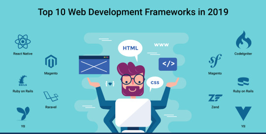
6. Yii
Yii stands out from technology-horde with a bang as it is an easy and evolutionary PHP framework. It is also called as a universal web framework. Using it, you can effortlessly build complex web products. As it endeavors high-performance and speedy web products. People have trust in it. Here is why from building an e-commerce enterprise project to making a simple web portal, you will find that tech-gurus often suggest businesses to deploy their app in this extensive software.
7. CakePHP
Just like its name, CakePHP is a beautiful yet elegant framework that has a well-versed tool-kit. Using which you can build feature-rich and visually impressive websites. Right from its easy installation, it impresses every programmer by offering premium community support and high-quality security features. I would especially like to mention that it is a master choice for making excellent commercial applications.
8. Zend Framework
What prime features of a website put a great impression on its user? Obviously, your answer would be -its robustness, seamlessness, enhanced-security and better performance. Fortunately, you will get all these features in the web product made on Zend framework. Although Zend is a high-geared and exclusive software that is more suited for building big enterprise-solutions. So, you need not to worry about the quality of your final app. With Zend, it is quite obvious that you will get a superior quality, standard mobile app for sure.
9. Vue.js
Vue.js is the most promising latest technology that offers its user a perfect blend of data-binding features and server-side features. Whether you want to make a light-weight app or want to offer effective user-interfaces to your web-users, it is a highly recommended framework that delivers several benefits to its users.
10. React.js
You can also find a solid scope for React.JS in 2019. As of now, it is the best choice for making highly-scalable enterprise’s applications. It is a JavaScript-based framework that is maintained by a group of tech-experts lead by Facebook. Its higher scalability and enhanced security are the basic key-points that generally attract the web developers. Seeing its future scope, its maker is also started thinking to bring an updated version of this software with more features. The name of the updated software would be- React Fiber.
Click here to join hands with best PHP Web Development Company.
0 notes
Text
Leap and Lights
As mentioned in the post about my trip to Den Haag, the use of lights as an ambient visual feedback mechanism would become quite a large part of my work.
As soon as I came back from the Netherlands, I knew that I wanted to figure out a light-based feedback system. While I had previous experience with DMX light control (making a moving-head act as a spot-light. The light would be placed on a table at the end of the room, and would follow a viewer around. As the viewer got closer, the light got brighter, blinding the person and pushing them away), I was afraid of going down that route in fear of the costs involved.
As such, I initially I thought about using standard light bulbs, and controlling them via an arduino and a pcb acting as dimmers, however, upon consulting Jen about this, she recommended simply asking around if anyone has some DMX controllable lights that I could borrow for a little while. That same evening, in a GSA Sport Executive Board meeting, I had the chance to ask our student president if she could inquire the student assosciation’s in-house lighting technicians about having some spare lights I could borrow. A few days later, when I was in the space designing the fashion show projections, I had the chance to go pick out something I wanted. I knew I wanted a SunStrip, and for testing, I also borrowed an LED RGBY spot.

I have to say, the hardest part about getting all of this to work must have been actual getting the lights in the first place, and even that wasn’t hard. Initially, I borrowed an arduino-based DMX controller board from Jen for computer-light communication. By the end of the day, I was controlling the SunStrip purely based on my hand-position. Which of the 10 bulbs on the SunStrip was on was determined based on the hand.pos.x, and the intensity of the light was based on the hand.pos.y. Even in this simple state, where it would only work with one hand, and one bulb, the interaction felt quite organic, and was very fun to interact with, even though it seemed like one would get bored very quickly.
I only had the SunStrip out on loan for a week initially, and so I was quite short on time to get everything that I wanted tested out. Trying to simplify the control method, I decided to replace the arduino with the openDMX USB box that we had in our studio. The issue was that no one had gotten it to work with Processing yet, yet after a day of downloading various drivers, installing a hundred different libraries, I stumbled upon a github repo for a windows-only processing library for the openDXM controller. A few minutes and bit of code modification later, I had taken out the need for another programmable device - the arduino. [to be fair, it only needed to be programmed once, but in my mind, the arduino had a greater potential for failure than the openDMX box simply because of the exposed wires, PCB, etc.]

Once I had the openDMX box working, I began working on improving the interaction methods. At the moment, it was very limited in the effective interaction range. The way the lights theoretically worked was an intensity of 0-255, where 0 is off and 255 is full intensity; however, in practical use the range was more like 50-180. The effective y-range of the Leap was up to almost two meters (in perfect conditions). This meant that at the moment, if I just mapped the intensity to the y-postition, you could basically see the lights increase in brightness step by step, it was not a smooth transition. So how do I maintain a smooth increase in brightness, while not limiting the interaction-height range? What I decided would make sense was to keep the one light at a smooth range, i.e. if your hand was at the desk, the light was at 0, and once your hand was around a third of the way to the max height, the light was at full intensity. but doesn’t that decrease the effective interaction height range? Yes! But we can circumvent that by then turning on the lights next to the one we were triggerring initially! so if we have light i on, once it’s fully on, we turn lights i-1 and i+1 on as well!
Initially this ended up being a rough way of working, but after a bit of tweaking, the lights worked beautifully. I modified it to start gradually increasing the other lights before the first had reached full intensity, making a smoother transition. And then I found that I still hadn’t used the full effective range, so now I turned on lights i-2 and i+2 as well! Just after a bit of experimenting, tweaking, more experimenting, and just trying out various methods of interaction, I had created an effective feedback mechanism. For one hand. At the moment, it always defaulted to being controlled by the first visible hand. If both were visible, the left hand was always hand[0], so the left ended up controlling the lights whenever you tried to put both hands in. So what about the other hand? I decided a different control mechanism altogether was an appropriate way of going about this. This was supposed to accompany a musical performance, made of various stages to both introduce the viewer to the interaction methods, and just to build up different layers of melody, etc, as one would with a song (rather than just starting out with all instruments playing at the same time).
As it happened, the SunStrip has ten bulbs, which beautifully coincides with the number of fingers on two hands. This only seemed like a natural way to progress, so I decided that the next ‘stage’ of interaction would be with the two handed method, where each finger controlled a single light.
youtube
Now, as soon as you put two hands in, the light would completely change. Each light cooresponded to one finger (and I’ll be honest, there was a bit of difficulty in mapping these correctly, as the right hand is inverted from the left, and I wanted the system to be versatile for either orientation of the Leap and Lights). If you closed your fists - no lights would be on; the lights would only trigger for an extended finger (done for a variety of reasons, both for added control and also the position of a non-extended finger is just a guess by the Leap software, meaning it was mostly inaccurate and all-over-the-place). Then, each finger’s height was mapped to the intensity of the light.
Additionally, I worked on having the sound provide spatial feedback as well, in the form of stereo panning (to start with). Each hand was playing an audio sample, which would move around the space in accordance to where the hand was. The idea was that once there were more voices, each finger would control the sound characteristics (speed, pitch, etc) based on the offset from the hand position, whereas the panning would be controlled by the hand position on its own, meaning you would move five sounds with one hand, five with the other. So there would really only be two ‘sources’ of audio, but through these small changes in the sound through the specific changes of each finger, the illusion of many more sources of audio comes out, without actually having to deal with sounds coming from ten different (virtual, for the moment) places.

Finally, the whole system was designed to be scale-able, such that I could just plug in more SunStrips, add a few lines of code, and it would perfectly work. In the videos and images below, the cable ‘mess’ is not really a mess. Initially, I worked with a very clean, sterile environment. But as people kept interacting with it (this was around the time of interviews and such, so I was able to use many people as guinnea pigs), they did not realize what/how was happening. Basically, I was toying with the idea of the final installation being a single leap on a plynth, and the speakers/lights against walls/corners, yet instead of hiding the cables, everything would come out from the plynth, directly indicating that this one small device was controlling everything else, and allowing people to figure out what the installation might be without actually having to interact with it, hopefully making them curious enough to come up and try it out for themselves.
youtube


An additional experiment that happened much later was using the same documentation videos as above. While trying to decide what the project could become once it was clear that the composer was not going to be able to create something, I thought it was interesting to explore the actual performativity and look of the motion of hands. Personally. I have quite bony hands, long skinny fingers, meaning that with nice lighting, the hands become very theatrical, out-of-this world even. While I ended up staying away from this this time around due to a lack of time to properly explore it, I really think that a future iteration of a performative installation using the Leap would benefit largely from a second part, where a camera records the movement of the hands and distorts things.
As at the time I was switching ideas and transitioning to using Max for audio, I was scared of trying out the visuals. Instead, towards hand-in, I came back to the idea for further development and iteration of the project. I used the videos above and AfterEffects to play around with some ways that the performativity of the movement could be exaggerated. The first is a simple tiled/mirrored video that creates interesting patterns. The second - a video where the red channel is being used for time displacement and map displacement effects. While I made an echo video too, I think we’ve all seen enough of these kinds of things.
youtube
youtube
1 note
·
View note